Archive

Archive for August, 2016

How to Cut Out Hair in Photoshop

August 1st, 2016 No comments
Dansky_Learn How to Cut Out Hair in Adobe Photoshop

In this tutorial, we’re going to learn how to cut out hair in Adobe Photoshop.

The Steps (1-9)

1. Open your photo in Photoshop.

2. Right-click the Background layer in the Layers Palette, and select Duplicate. Switch off the Background layer, and keep this hidden in case you need to use or reference it again in future.

cutout-hair-adobe-photoshop-1

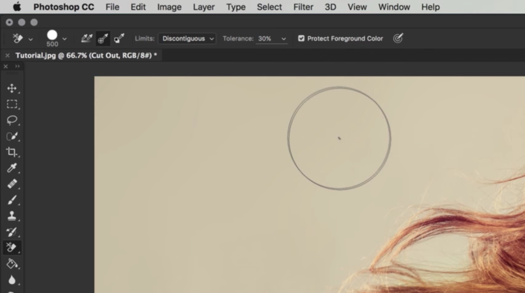
3. Select the Background Eraser Tool, and select a circular shaped brush at 100px in size. Set the Hardness to 50%.

cutout-hair-adobe-photoshop-2

4. Along the top of the screen there are several other options for the Background Eraser Tool. Set the Sampling method to Sample Once, and set the Limits to Discontiguous.

cutout-hair-adobe-photoshop-3

5. Setting the Tolerance level will require a bit of trial and error, depending on the complexity of the hair in your photo. If the Tolerance is set too low, not enough of the background will be removed, and if set too high, the Background Eraser Tool will remove other parts of the photo as well as the hair. For this tutorial, the Tolerance was set to 30.

6. Using the Eyedropper Tool, you can also Left-click on part of the hair to sample this colour. Next, with the Background Eraser Tool selected, select Protect Foreground Colour in the box at the top of the screen. This will protect any hair (and similar shades) that matches the foreground colour. This step increases the likelihood that the Background Eraser Tool will only cut out the hair, and not remove other parts of the photo accidentally.

cutout-hair-adobe-photoshop-4

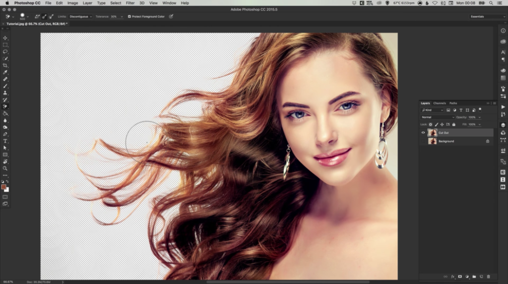
7. Once your settings are correct, Left-click on the background and continue to Drag over the image. If the settings are correct, only the background will be removed, leaving the hair cut out on a transparent background.

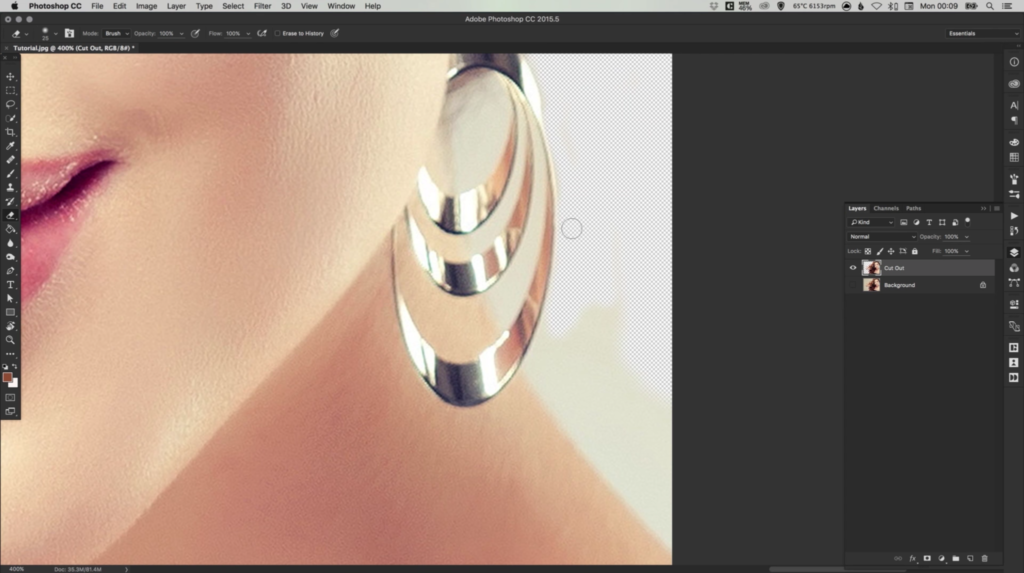
8. Any other parts of the photo that may have been accidentally removed, can be reversed by going to Edit > Undo. If the Background Eraser Tool cannot effectively remove the background in certain parts of the photo, simply switch to the normal Eraser Tool, set a suitable Brush Size and Hardness (between 50-100%), and remove the background manually. Take care when cutting out the photo manually, and zoom in/out where necessary using the Zoom Tool.

cutout-hair-adobe-photoshop-5

9. Once you have cut out the hair/photo on to a transparent background, you can also add a New Layer underneath this layer in the Layers Palette. Using the Fill Tool, you can add the selected Foreground Colour (eg. white) to the new layer underneath the photo layer, allowing this to work as a background behind the newly cut out photo.

cutout-hair-adobe-photoshop-6

Download Adobe Photoshop.

Read More at How to Cut Out Hair in Photoshop

Categories: Designing, Others Tags:

High Performance SVGs

August 1st, 2016 No comments

I recently worked on a project that was getting a ton of traffic but users were bouncing because the page load was too long at around 10 seconds. They called me in because the majority of the images on that site were SVGs, and they were animated. I trained the team how to decrease the file size on the SVGs while preserving the appearance and functionality, finally getting the load time to under 2 seconds. The bounce rate dropped dramatically and conversion was restored.

If I was designing these SVGs myself, I would not have run into many of these issues, but it’s a more likely scenario that the engineer and designer are not the same person on a project. In this post, I’ll chronicle some of what I trained them on to ensure stellar performance for SVGs.

Note: I use Illustrator for the creation and optimization of my SVGs because I’ve found the export and tooling superior to Sketch’s. I’ll readily admit that there might be ways that Sketch works with SVGs that I’m not aware of. But I will say I have seen it make strange s in the place of paths, which makes me steer clear of it. For the examples below, I’ll be using Illustrator. Use whatever works for you.

Talk Upfront

This piece is not always possible, but whenever it is, try to talk to the designer before they do a lot of the work, to explain what they should be thinking about when they are creating SVGs.

The most easy to convey piece should be that simply drawing something on paper and then tracing it in illustrator will come with a lot of junky path data and should never be used as-is. Simple shapes and pen drawing paths are preferred. Very complex objects can become large very quickly, so the less points the path has to draw, the better for performance.

This doesn’t mean that you can’t make seemingly complex shapes. But hundreds of path points can sometimes have the same appearance and interest that thousands of path points do. For most of these examples, I am using this Github Spiderman Octocat that I found in their awesome Octodex and traced to make an animation.

Reduce Path Points

If you’re going to create a hand drawing, you can trace, it, but past that point you should use Object > Path > Simplify.

Path > Simplify with Preview”>

You will need to check the box that allows for preview because this can potentially ruin the image. It’s also worth it to say that the image degrades quickly, so usually the most I can get away with is 91% or so. This still gives me a good return, with a high number of path point reduction.

This is also probably the quickest way to accomplish this type of reduction. A more labor intensive way, that I will use for smaller pieces that are unnecessarily complex, is to redraw it with the pen tool.

Sometimes this is very little effort for a large payoff, but it really depends on the shape. You can also put a few shapes together, merge them with the path tool, and then modify the points with the white arrow, to simulate existing shapes.

join shapes together

It may seem intimidating at first, but you can use the pen tool to really quickly make more complex areas. Then take all of these shapes and use the pathfinder tool to merge them all together. If it doesn’t look quite right, don’t fear! You can still reduce the opacity on what you made by a little (helps so that you can see what you’re trying to emulate in the shape underneath). Then you can grab the direct selection tool, (A in quickkeys, the white arrow on the toolbar), and drag those small points around until you get a more refined shape. Never hurts to zoom in a bit to see the details there.

direct selection with handle

Remove Repeated Gradient Defs

By default, Illustrator and other vector editing tools will, at best, create a gradient and put them in defs, but at worst, create jpgs of the gradient or add many separate gradients even though just one can be reused. In the latter case, use Jake Albaugh’s gradient optimizer. It’s a smart tool that will collapse multiple unused gradients into only what’s necessary. I’ve seen it reduce the file size of an SVG by half, though that was a file with an unusual amount of similar gradients.

In the case of the former, you might find you can write the gradient by hand instead of using the png or jpg that the editor provides. Here are the values that SVG needs to create a gradient:

  • It needs to be defined in defs
  • It needs to be contained within a linearGradient block, and needs to have an id so that you can reference it in the CSS to apply it to SVG elements
  • It uses stop offsets from 0-1 with stop-color attributes where you specify what colors you want at which points.
<defs>
  <linearGradient id="linear-gradient" y1="75" x2="150" y2="75" gradientUnits="userSpaceOnUse">
    <stop offset="0" stop-color="#fff33b"/>
    <stop offset=".5" stop-color="#f17b3e"/>
    <stop offset="1" stop-color="#e93e3a"/>
  </linearGradient>
</defs>
.path-class { fill: url(#linear-gradient); }

Reduce the size of your Canvas

Making your canvas not too large but not too small helps with the weight of the file because the larger the number, the larger the number of all of the path points. Too small, and you might get a lot of decimals, that when trimmed, warp the image. If you have a nice range (I prefer somewhere like 100 x 100- but this is worth experimenting with), your path points will be small as well without breaking into decimals.

To quickly change the size of the artboard in Illustrator (the viewBox in SVG), you can go to Object > Artboards > Fit to Artwork Bounds. Sometimes you will want to be a little more precise about it, and in that case go to File > Document Setup > Edit Artboards. This will allow you to hand-tweak the visible area or even specify the units you want precisely. You may have to change the size of the artwork within a little after doing so as well.

Export, then Optimize

I prefer to use Illustrator because the export settings for SVG are more advanced than Sketch. I don’t use Inkscape but I know some people love it. If you are using Illustrator, use Export As > SVG not Save As > SVG for better results. Even after that step, though, I optimize. Here are some options:

  • SVGOMG– this is a web-based editor that uses SVGO, it also offers service workers for offline capability
  • SVGO/SVGO-GUI– this NodeJS-based tool is extremely well done with a lot of options. I recommend using the GUI with it, though, because SVG export can change its appearance.
  • Peter Collingridge’s SVG Editor– I’m still a fan of this one even though it’s not quite as fancy. I also like playing with the experimental editing tab.

Be mindful of the toggles here. The ones that I find myself checking and unchecking the most are:

  • Clean IDs– this will remove any carefully named layers you may have.
  • Collapse useless groups– you might have grouped them to animate them all together, or just to keep things organized.
  • Merge paths– nine times out of ten this one is ok, but sometimes merging a lot of paths keeps you from being about to move elements in the DOM around independently.
  • Prettify– This is only necessary when you need to working within the SVG, for animation or other manipulation purposes.

Use SVG Filters instead of Appearance Effects

A few times while working with an SVG from another designer, we discovered that using the effects in the appearance panel, such as drop shadow, produced a monster base64 file that was cumbersome and expensive. This problem can be solved by using an SVG filter instead, available at Effect > SVG Filters and then choosing one from the dropdown. It’s worth mentioning that these will be available to you only when the file is in .ai format, not once it’s in .svg format (which is why I recommend always keeping the .ai source file). By swapping these out, not only did we improve the appearance of the SVG, but we decreased the filesize from a whopping 1.8MB to 1.2KB!

Using SVG filters from the Illustrator Dropdown

Create a Large Background Shape

When tracing an image, oftentimes you will be handed an image with pattern or multiple images “on top of” a background. But Illustrator will not understand these shapes as one large shape beneath a pattern or many other shapes – it will break the base color into the shapes between the pattern.

All Selected Shapes

Here is an example of an easy win because you can remove all of these shapes and replace it with one big background image. I find it easiest to trace around the whole containing unit first before removing anything. Remember to make this layer a different color from everything else.

Many times the shapes behind can be grabbed all at once by using Select > Same > Fill Color (or Fill and Stroke). This allows you to grab many shapes at once and delete them all at once very quickly.

Select Same

Conclusion

These aren’t the only ways out there to work with SVGs for better performance, but the main key takeaway is that the less path data you have the better. Being mindful of what you’re loading in your SVG files – double check the SVG DOM for cruft and remember to optimize. Going the extra mile designing for performance can shave vital seconds off of the page load of your site.


High Performance SVGs is a post from CSS-Tricks

Categories: Designing, Others Tags:

CSS Writing Mode

August 1st, 2016 No comments

Ahmad Shadeed with a bonafide CSS trick:

I noticed a CSS property called writing-mode, this was the first time that I know of it. After some research, I learned that its purpose is for vertical language scripts, like Chinese or Japanese. However, the interesting thing is that when using it with English, we can create a vertical text very easily.

Even in English, writing-mode: vertical-lr; help us lay out text vertically without a bunch of positioning, placeholding, and transforms.

Direct Link to ArticlePermalink


CSS Writing Mode is a post from CSS-Tricks

Categories: Designing, Others Tags:

Learn how to take a punch

August 1st, 2016 No comments

Getting punched hurts, but in our line of work you need to get used to taking some once in a while. The work we do isn’t for us or even for our clients. It’s for our client’s clients. And to reach those people, you need to put your work literally out there.

Be it the internet, the streets in the form of a outdoor or a bus advertising, or even on TV, your work will always be public. And if all goes well, people will see and connect with it; each individual will react and have an opinion about what you created.

Everyone’s a critic

Unfortunately for you, everyone has the right to an opinion. And in design, more often than not, most people have one. Maybe they don’t agree with the copy, maybe the choice of the model is not what they expected for that product or service. Whatever it might be, sometimes these criticisms are just straight up mean, aggressive and they land just like a punch, right in the gut.

It’s hard to hear bad things about your work, but it’s something you need to understand and accept. For instance, this article in itself is a piece of work that will be criticized or praised by people, mostly in the comments section or on twitter. Being aware of that beforehand and understanding that it’s part of the process helps make it less personal.

And you have to understand that when your work is intended to a huge audience (ie. the internet), people from different countries, cultures, backgrounds will have access to it, and with them come different opinions, thoughts, and comments. You will never be able to please everyone with your work, so try to do the best work you can regardless of what people say about it.

Don’t be afraid to show your work

If you only retain one thing from this whole article, I hope it’s this: Don’t be afraid to show your work.

This was a major problem for me for a long time. Personally and overall, I was never that confident. Be it about my looks, skills, or knowledge; I always lacked confidence, regardless of how good or bad things actually were. My pessimistic attitude was the reason that made me lack this confidence. And this affected my work.

I wasn’t proud of it, I was aware of its flaws, but worst of all, I was afraid. I was afraid of being criticized, being told that I’m wrong, that my work sucks and afraid that I would realize that maybe I shouldn’t even be a designer after all. And just like I did, I know that a lot of people suffer with lack of confidence.

If I didn’t put my work out there…I wouldn’t learn, I wouldn’t get feedback and I would never be successful

I would be very defensive and sometimes even a bit aggressive, always trying to justify what I’ve done against what I was being criticized about. But this ended up being one of my biggest lessons in the last 5 years. During my Masters degree, I often held off presenting my work to my lecturers just out of fear.

I thought that if I delayed presenting, maybe the criticism I’d get wouldn’t be as bad. A ridiculous thought, obviously, but a genuine one at the time. Eventually I was made aware by one of my teachers of how that was a problem. That I couldn’t be afraid of showing my work, and if I didn’t put my work out there I wouldn’t be able to progress in any way. I wouldn’t learn, I wouldn’t get feedback and I would never be successful.

The struggle is real, but it’s a matter of finding the right attitude and confidence.

Is it criticism, or feedback?

I was pretty pessimistic about getting criticism about my work. Whenever anyone commented on my work and pointed flaws or suggested changes I would call this “criticism”. A negative word in general, as it denotes that something is wrong.

After realizing how this attitude was affecting me, a couple of things happened. First, I started showing my work more often, publishing it and sharing it on social media, with my friends, network, etc.

This is how you start “putting it out there”; you’ll break the fear of exposure by exposing your work and getting used to having it seen and commented on. And second, I stopped thinking about people talking or commenting on my work as “criticism”, and I started calling it “feedback”.

Feedback is a great thing, as it allows you to have an understanding of how people see your work, what might be wrong with it and how you can improve on it. And feedback is extremely important for you to create the best work possible, otherwise how can you, alone and without different perspectives, fully realize the depth of the work you just created?

Try to learn from the people who don’t like your work, as those are the people who have most to teach you

Different views and backgrounds contribute to a diverse group of opinions that will improve your work. And this is a much more optimistic view on comments, it’s a good way to view and understand when people comment your work.

It doesn’t mean that some people won’t just be mean and say that your work is “crap” without even caring about how you could improve it, but that’s part of having your work public and available. And if they do, try to understand that person. Ask them why do they think that, and what would they do differently, and even how. Try to learn from the people who don’t like your work, as those are the people who have most to teach you.

Learn to admit when you’re wrong

Criticism is tough on a personal level, especially when it’s towards something that you created, where you invested so much of your time, put your passion and focus. Especially when you’re younger and just starting off you tend to be really protective about your work.

First, it’s hard to admit when, in fact, you did a bad job. But if you want to create a career worth having with clients that respect and hire you again and again, you need to be your first and biggest critic. Learn how to identify good work and bad work.

If someone tells you that your work is weak and unoriginal, this doesn’t mean that you are

Compare yourself to others. Compare your work with people that do better work. Is it good enough? Does it hit the objectives? Could you do better? Try to be aware of the quality of the work so that you can improve on it as fast as possible, and if you analyze your work and criticize yourself first, you’ll see that what others might tell you won’t come as a surprise. Don’t fight criticism just for the sake of defending your work.

You are not your work. If someone tells you that your work is weak and unoriginal, this doesn’t mean that you are. It means that you should put more effort into it, and finding the inspiration to do better and better.

Stand your ground

We’ve covered how criticism might actually end up being good feedback if you listen and ask the right questions. But should you always budge and look to change your work every time people aren’t happy? Of course not. As Henry Ford said about the car, “if I had asked people what they wanted, they would have said faster horses”.

It is up to you to digest and analyze the feedback you get. You’ll get very different feedback. People will want different colors, some think that you should go with a bold typeface, some say you should go with a a light typeface, some say purple, other scream green.. filter the feedback.

Ask for the opinion of professionals who have more experience and know better. But in the end, you are the judge. After all it is your job to make that final call and understand how you can make your work better. And sometimes, especially with very famous brands, you get a lot of whiplash and a lot of press reactions.

Remember when Spotify changed its green color to a more vibrant one? Some called it “puke green”. And when Airbnb changed their logo to their new “A” icon, which some people even compared to female and male genitalia? And what about Instagram with their new icon and gradient background? The internet very quickly reacted to it and created memes making fun of the 80’s feel and vibe of that gradient.

But in the end, all of these brands held their ground. They listened to people, they replied in some cases, they explained their decisions, but ultimately they stuck to their guns and their beliefs and didn’t change a thing, no matter how unhappy some people were with it and how much press they had. And today, you won’t see many people complaining about these brands. People don’t like change, and you can’t be pressured to change your work based just on fear of the public.

5,000+ Professional Text Effects from John Forsythe – only $29!

Source

Categories: Designing, Others Tags:

User Memory Design: How To Design For Experiences That Last

August 1st, 2016 No comments

The two charts pictured below changed the way I think about thinking. Reproduced from a classic 1996 psychology study, the story behind these charts is a vivid illustration that the way we humans feel in the moment as we experience the world can be very different from how we feel when we think back on those experiences later.

Understanding the difference between experience and memory — and the ways they are related — can make us more sophisticated experience designers. In this piece, I’m going to provide some tips for designing for experiences that leave a lasting positive impression. But first, I need to explain the following two charts.

The post User Memory Design: How To Design For Experiences That Last appeared first on Smashing Magazine.

Categories: Others Tags:

Ornate and Florid: 20 Free Texture Packs

August 1st, 2016 No comments
watercolor textures

Although the interfaces around us still look flat, it does not mean that there is no space for some dose of artistry achieved through skillfully applied textures. Of course, overall usage of these high-quality crafty images or pixel-perfect close-up photos has been decreased and the technique slightly fell back into the shadow. But, they did not disappear entirely nor became obsolete whatsoever.

There are still websites that owe their beauty to intricate backgrounds or fully illustrated environments where textures play the first fiddle. Their potential is enormous. When it comes to web design, they are able to give some warmth to the artificial environment, incorporate personality and add charisma. They nicely interact with illustrations, drawings and sketches, to say nothing about the patterns. Intricate typography can also benefit from such cooperation. Besides, with an upsurge of projects with visual storytelling experiences, they have become more sought-after.

Today we have collected a list of fantastic texture packs that are available for various purposes. Use them in your projects and artworks to make them more sophisticated.

10 WaterColor Circle Textures

Creator: Rafi
License: Declared as Free, no proper license given.

Free Cracked Earth Textures


Creator: Alex Zeppelin, Alex @Graphicdome
License: Attribution-NonCommercial-NoDerivatives.

The Noise v.01 – FREE TEXTURE PACK

noise textures
Creator: Hearted™ Design & Estratégia, Guilherme Mazzo
License: Attribution.

36 Wood Textures

36 wood textures
Creator: Krzysztof Bobrowicz
License: Free for personal and commercial use.

10 Free Dust & Dirt Overlay Textures

dust and dirty overlay textures
Creator: Rafi
License: Declared as Free, no proper license given.

10 Textured Backgrounds

textured backgrounds
Creator: FWStudio StockPhoto
License: Attribution-NonCommercial-NoDerivatives.

Low Poly Background Texture

low-poly textures
Creator: Rounded Hexagon
License: Declared as Free, no proper license given.

5 Free High-Resolution Paper Background Textures

paper bgs
Creator: zippypixels
License: Free for personal and commercial use.

Free Textures

b&w watercolor textures
Creator: John Mata
License: Declared as Free, no proper license given.

High Quality Wood Textures Pack

wood textures pack
Creator: DESIGN LAZY
License: Declared as Free, no proper license given.

20 Creative Abstract Photos

abstract photos
Creator: deeezy
License: Free for personal and commercial use.

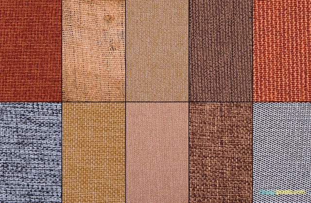
The Free Texture Pack – 10 Beautiful Jute Fabric Textures

fabric textures
Creator: ZippyPixels
License: Free for personal and commercial use.

Icons, Backgrounds and Textures Pack

bundle with textures
Creator: BIBI Arts, Designcuts
License: Declared as Free, no proper license given.

Brayer Textures

brayer textures
Creator: Ryan Duffy
License: Just give rightful credit where need-be.

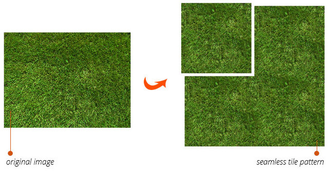
FREE SEAMLESS TEXTURES GENERATOR

seamless generator
Creator: The Orange Box
License: Declared as Free, no proper license given.

Free 10 Hires-Textures of Wood and Paint

wood and paint textures
Creator: Cool Joe
License: Attribution-NonCommercial-NoDerivatives.

Water Texture

water textures
Creator: Pagan-Stock
License: Give a credit.

Textures of Bark

tree bark texture
Creator: Olha Kozachenko
License: Attribution-NonCommercial-NoDerivatives.

10 Free Watercolor Textures

bright watercolor textures
Creator: Graphic Loot and Freepik.com
License: Free for personal and commercial use.

Halftone Textures

halftone textures
Creator: Simphiwe Mangole
License: Attribution-NonCommercial-NoDerivatives.

(dpe)

Categories: Others Tags: