Archive

Archive for August, 2016

Zoey: An eCommerce Platform With A Difference

August 22nd, 2016 No comments
Zoey Featured

There is no shortage of eCommerce platforms and tools for online businesses. However, most of them suffer from the same flaw: they are either overloaded and bloated, or they rely on heavy customization and coding skills.

Even more so, numerous eCommerce platforms tend to work well only if you extend their functionality by means of addons and plugins. Otherwise, it is nearly impossible to run an eCommerce store.

Ever faced the same problem with eCommerce platforms? If that is the case, this post has a special solution meant for you. Meet Zoey, a new eCommerce platform and online store builder.

What makes Zoey special? Well, it expects no coding skills from you, and works perfectly well right from the start.

Zoey: An eCommerce Platform With A Difference

What is Zoey?

As already stated, Zoey is an eCommerce platform and an online store builder. As an eCommerce platform, Zoey gives you absolute control over your online business. And as a store builder, it lets you put together your online shop within minutes using a handy drag and drop interface. Even if you have never built an online store before, or having no experience in coding, Zoey is very easy to master.

We will be giving Zoey a spin later in this article, but first, let us take a look at its major features.

Design

To begin with, Zoey offers an impressive arsenal of web design features that can give any other tool a run for its money. Don’t like coding? Have no fear, the drag and drop builder can be used by anyone. Need pre-made presets and design assets to save your time? How about a special style editor for controlling every single element of your site, and a live preview to help you view your changes in realtime? Yes, Zoey offers all of that.

Plus, since this is the era of the mobile web, Zoey offers special tools to preview and test mobile design. In addition to that, Zoey also comes with several free and fully responsive themes that are ready to be customized as per your needs.

zoey ecommerce

Infrastructure

Your online store is only as good as the infrastructure it is hosted on. After all, if your visitors find your website offline, there will be sales.

Zoey takes care of everything, thereby giving you time to focus on your actual business. Whether you need specialized datacenter location to target customers from a specific location, or a Content Delivery Network to boost the performance of your store, Zoey offers it all. You get to choose from 10 globally distributed datacenters and powerful scalable hardware. Your store also gets unlimited bandwidth, so have no fear even if you get millions of hits daily.

Also, Zoey implements site-wide HTTPS to foster a feeling of trust and security for your visitors and clients.

Marketing, Payments and Operations

Zoey offers a large array of marketing tools to help you drive more traffic and sales to your store. You can run batch promotions, discounts, special coupons and gift deals. Zoey has Search Engine Optimization tools that you can utilize in your store such as site wide HTTPS, advanced site map, and mobile friendly design. These are all things that Google looks at to give you a higher rankings in search. Zoey also gives you the freedom to customize H1 tags, title tags, meta descriptions, URLs and more to improve rankings.

Zoey comes with detailed statistics and reports for cases such as cart abandonment. You can also integrate it with various other platforms such as Google AdWords, Optimizely and MailChimp.

You can implement over 50 payment gateways on your store, including credit cards, PayPal, bank transfers and Cash on Delivery. If you are selling physical good on your store, you can select from various shipping carriers, manage inventory and even integrate with the likes of Etsy and eBay.

B2B eCommerce

Screen Shot 2016-08-19 at 11.13.52 AMIf you are running a wholesale business or B2B store, Zoey is the ultimate solution for you. Now merchants take take advantage of essential features needed to run a B2B business, such as site access restrictions. This will allow you to control the customers who can access your store or which customers have the ability to checkout. You can make the entire store password-protected so only the customers that you have pre-approved on the backend can view your store. Another setting in B2B is the pricing flexibility – which is extremely important for any B2B business. Zoey let’s you customize pricing based on customer group and order volume so you can manage different pricing for wholesale and retail customers. Furthermore, you can allow bulk orders, offer custom pricing for B2B buyers, and so on.

Well, enough with the features. How does Zoey perform in reality? I decided to give Zoey a spin and find out.

Zoey in Action

Once you successfully login to the admin panel, you will find it fairly similar to any modern-day CMS out there. There are specialized menus for each function to help you get started. I am going to run each menu one at a time, so as to give you a comprehensive picture of all that you can expect from Zoey.

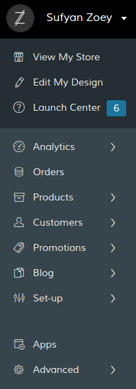
Zoey Menu

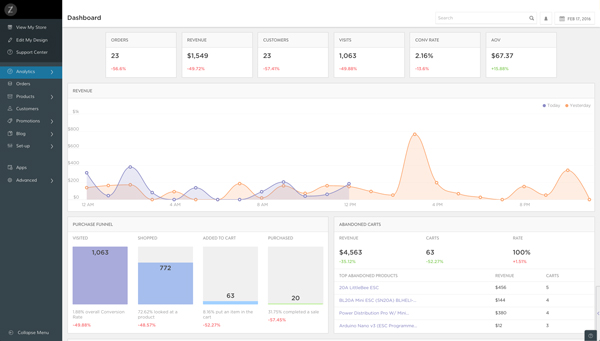
The first menu is fairly simple, whereas the Orders menu lets you view new orders and manage them accordingly. However, the standout menu, in my view, is the Analytics section. Now, many eCommerce platforms tend to outsource analytics to external services, such as Google Analytics or likewise. However, Zoey offers it all for you straight in the admin panel. You get details such as total number of orders, conversion rate, revenue earned, purchase funnel, etc. Furthermore, you also get to view analytics related to abandoned carts to help you better optimize your site.

Zoey Analytics eCommerce

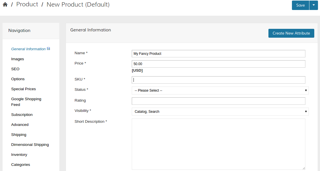
Adding products to your store is a breeze too. You can setup categories and attributes, specify gift cards or discounts, and add a product within minutes. Interestingly, Zoey lets you add SEO details, and upsell or cross-sell features right at the time when you add a new product. There is no special extension or page that you need to visit.

Add Products eCommerce

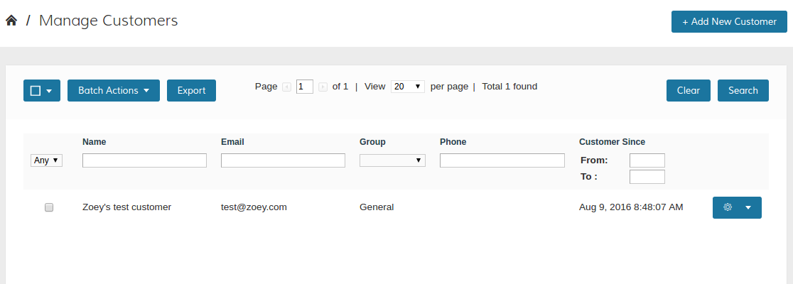
Similarly, you can create lists and groups of your customers, or export that list as a backup. Adding a discount rule is also pretty easy, perfectly with all the conditions and time limits for the particular discount.

Zoey Add Customer

In the Setup menu, you can add details such as shipping, localization, taxation, et al. Similarly, for advanced users, there are API integrations, URL rewrites and various other options available in the Advanced menu.

However, one of the most striking feature of Zoey is the Blog menu. Now, there are numerous blogging platforms out there, and there are numerous eCommerce platforms out there. However, what if your eCommerce solution allowed you to run your blog natively? I know many big online stores that use an external solution, such as WordPress or Ghost, to run their blog. This is often an unwanted maintenance on their hands, because more often than not, online stores tend to use their blogs only to mouth the company developments, announce new deals, etc.

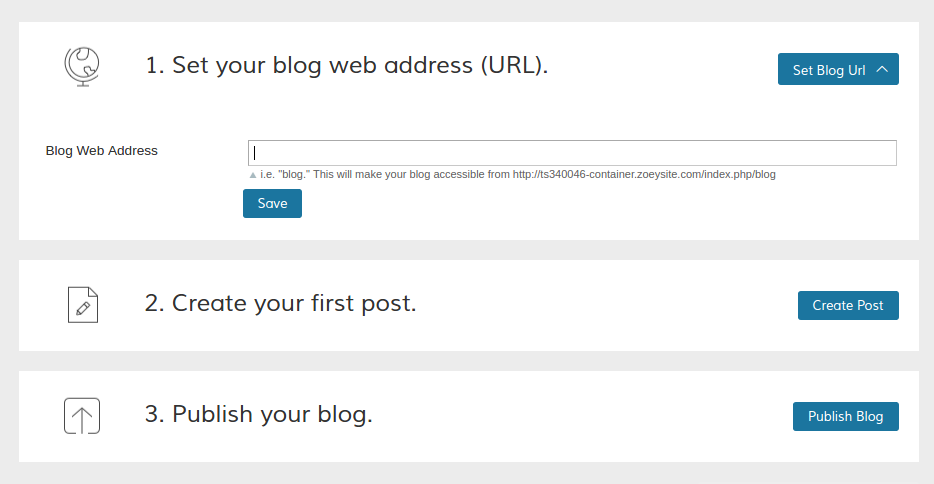
Zoey lets you run a blog from the admin panel itself. You just need to specify a blog address (such as mystore.com/blog or mystore.com/notes and so on), and then get started with writing.

Blogging Zoey

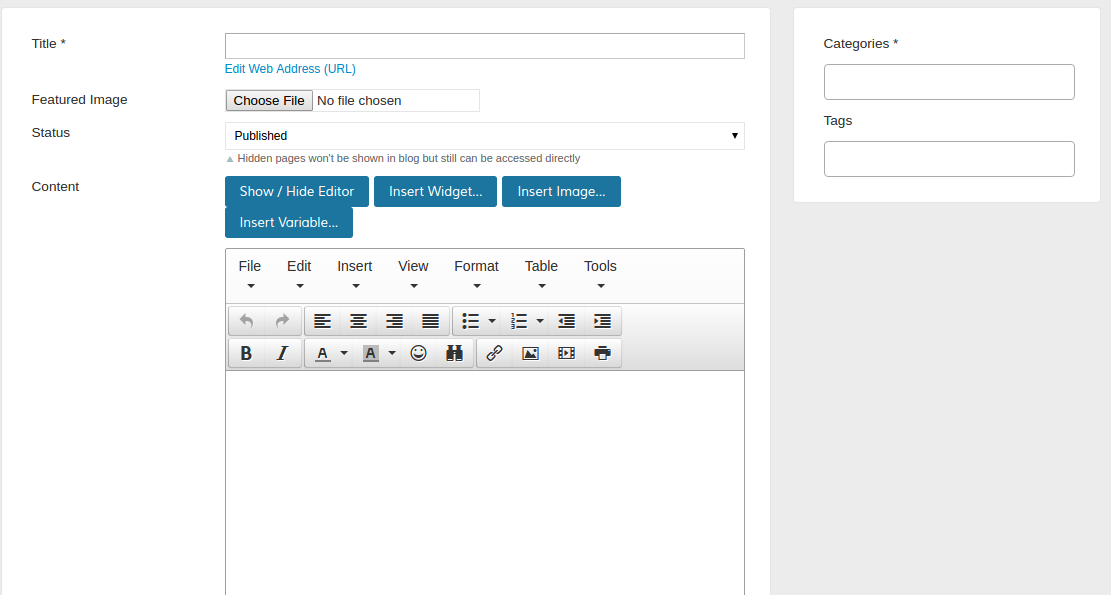
You can add excerpts, categories and tags to your posts in the blog.

Blogging eCommerce

As you can observe, Zoey’s backend is fairly simple and straightforward that can be mastered within minutes.

But wait, aren’t we forgetting something?

Yes, the drag and drop editor!

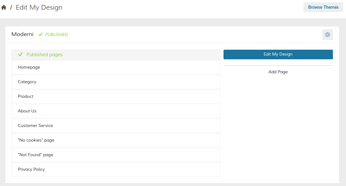
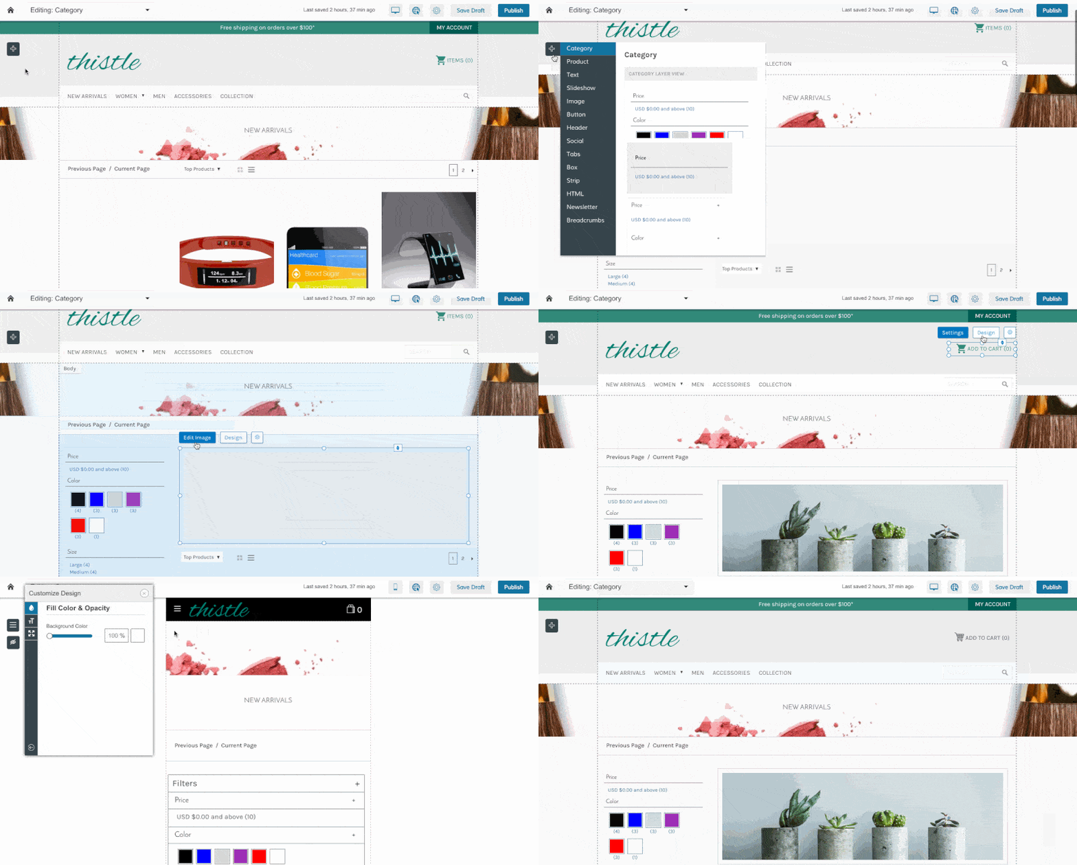
All you need to do is hit Edit My Design, and then select the page that you wish to edit.

Zoey Edit

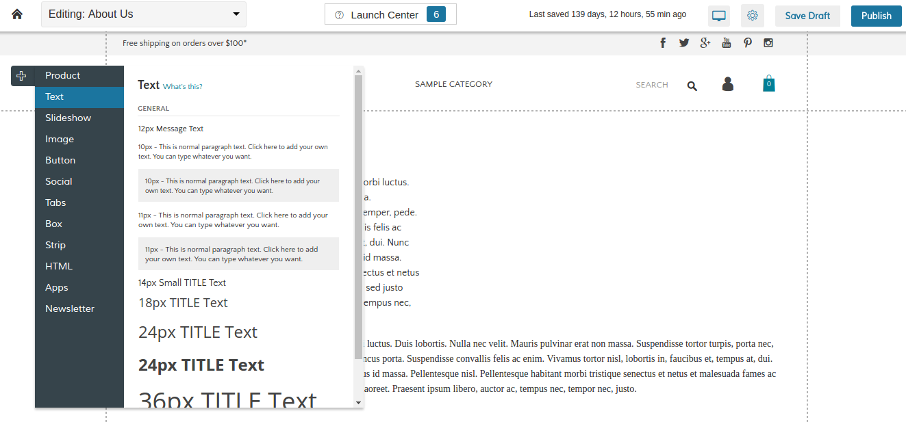
All edits happen live with previews, so you can be sure of what you are doing. You can drag and drop elements, or add new elements directly in the live editor.

Drag and Drop

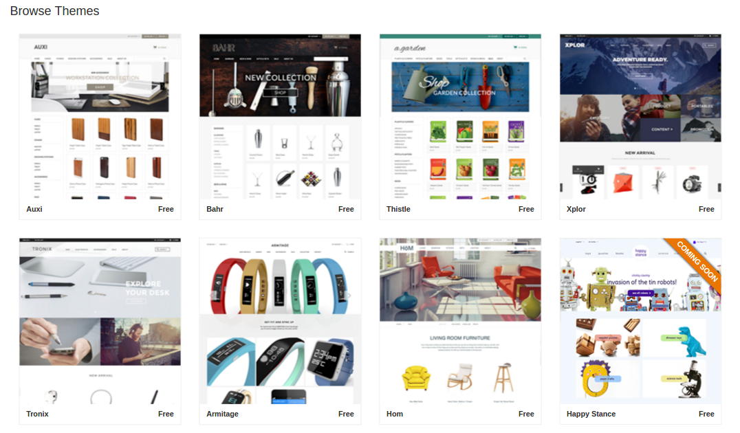
All themes are free and responsive, so you can select whichever one that you love the most.

Themes

Pricing

Zoey offers three plans for you to choose from. All plans come with support for responsive themes, advanced analytics, unlimited storage and bandwidth, custom domains, as well as Point of Sale and Amazon/eBay integrations.

Professional Plan costs $89 per month. If you need something extra, opt for the Business Plan at $199 per month that comes with support for HTTPS, B2B functionality, CDN, and multiple languages and currencies.

Beyond that, there is also the Premier plan that starts at $599 per month. It comes with enterprise level features such as custom apps and design, a dedicated account manager with priority support, and a lot more.

All plans come with a 14-day free trial, so you can give them a try with no string attached. Also, there are no setup or transaction fees involved in any plan.

Conclusion

Running an eCommerce store is complicated business. You have to take care of shipping, product management, taxes, customer support, and a lot more. Quite obviously, website management and development as well as hosting can be another chore that you’d be better off avoiding.

Zoey is very clearly a good fit for online stores and businesses. It does its job well, and lets you focus on the actual management of your business. You can easily forget about web hosting, running custom scripts to integrate payment gateways, or paying a hefty fees for getting a responsive site.

Furthermore, if you are a web designer yourself or a web design agency, you should by all means give Zoey a try right away! It goes without saying that you must be having various clients asking you to setup a website for their eCommerce store. Using Zoey, you can setup websites and stores within minutes, and since the interface is beginner-friendly, you can pass on the website to the clients easily.

So what are you waiting for? Go ahead and make use of the 14-day free trial, and check out Zoey right away!

Read More at Zoey: An eCommerce Platform With A Difference

Categories: Designing, Others Tags:

Websites We Like: August 2016

August 22nd, 2016 No comments

Here are some of the websites we’ve stumbled upon lately that have made us all collectively Oooo and Aaaah with delight. Sometimes we literally type “oooooo” into the Slack channel where we save and discuss these. It’s a fairly new thing we’ve started doing. Enjoy!

The Fine Line

The Fine Line series of articles by the New York Times explores the journey of four Olympic athletes and their extraordinary abilities.

A while back I moaned about the various problems of scrolljacking and now I want to apologize to the scrolljacking community. These articles prove that taking control of the scrolling momentum can feel incredibly intuitive if given the right amount of time and attention.

But what’s most fascinating with these articles, to me at least, is the combination of motion, visuals and sound. Each article has several recordings that are played over the text with accompanying background music and sound effects. This couldn’t have been an easy series of posts to create, as the time it took to plan, design and develop them must’ve been quite considerable.

FiveThirtyEight’s 2016 Election Forecast

FiveThirtyEight is well known for their visualizations and use of data in their coverage, but the latest charts that they’ve begun to use for their election forecast are more subtle and beautiful than ever before:

What impresses me about FiveThirtyEight is the restraint in the design, as there’s a very faint use of color to attract the eye to the important information and the use of the bold weights in their typographic palette encourages quick scanning of the information.

But jumping back to this chart specifically: if you want to learn more information about the data from one state in particular then you can click on the map to shift into a different view for closer analysis:

A Visual Introduction to Machine Learning

This is an essay, designed and written by Stephanie Yee and Tony Chu, which contains a number of beautiful animations and visualizations which are certainly worth scrolling through:

As you scroll further down the page you’ll find the data morph and bend to better work together with the content.

Figma’s 404 page

Figma is a design tool in the browser that lets designers collaborate better with one another and earlier this week I typed the wrong URL and found this lovely gem:

CSS Conf

Over on the new CSS Conf website there’s an interesting use of graphic shapes which I can only describe as “splotches” — SVG elements that overlap content like a transparent PNG might:

I think it’s neat because it’s visually striking and breaks up the monotony of seeing rectangles in every web page all the time.

Michael Ngo

Front-end developer Michael Ngo has a personal site that’s interesting for its use of animation, video and layout.

Each section of his portfolio looks like a custom layout, but taking a closer look under the hood each is made of tiny modules that can be used again and again.

Ohio Certifieds

Ohio Certifieds is a website designed to attract industrial investment in the state. Developers can select a plot of land or search for a plot based on a number of factors: what’s interesting here isn’t necessarily the data but the representation of it however.

Clicking around is really fun. If you select a plot then you’ll find a bevy of animations that direct your eye and give you a better idea of the space that you’re currently navigating.

Meet Graham

Meet Graham is a project, and a real-life model, of what a human being might look like if they were best shaped to survive car crashes. The site showcases the research experiment in order to bring to our attention the risks of driving and in order for us to learn more about the human body:

By viewing Graham in 3D it’s possible to look under the surface of the skin and pinpoint specific areas of the body that would need to be changed.

Try Typography

try.typography.com is a new project by Hoefler & Co. that lets you explore their range of typefaces. Ligatures, capitals, small-caps and stylistic alternates are among some of the options you can toggle and discover in more detail.


Did we miss any of your recent favorites, or what is so interesting about the sites we did show? Do you have a favorite website that we might’ve overlooked? Be sure to add a note in the comments below!


Websites We Like: August 2016 is a post from CSS-Tricks

Categories: Designing, Others Tags:

Adobe Typekit unveils major redesign

August 22nd, 2016 No comments

Adobe Typekit has just released a long-overdue update to its font browsing interface. Currently still in beta, the new UI makes finding, and using fonts substantially easier. This is the biggest update to Typekit’s UI in 5 years and comparing the old with the new offers a fascinating insight into the way design priorities have shifted in the last few years.

The new design is more responsive, the dated fixed-width column having been replaced by flexible columns that look and feel great even on a phone—on screens like the iPad Pro, it’s a pleasure to use. The new design makes maximum use of the viewport by filling the available space, and the filters can now be neatly tucked away when not required.

The new Typekit UI is substantially simpler than its predecessor. Take for example the Web/Desktop option introduced when Adobe began streaming fonts to Creative Cloud; the two toggle buttons have been replaced with an Include web-only families checkbox. (Anyone who produces mockups, style guides, or even graphics for clients will want to toggle that off immediately—so that Typekit only shows you fonts that can be synced as well as displayed on the web.)

Font syncing itself has also been sped up. To sync a font to Creative Cloud apps you no longer need to open a modal window, just click the Sync button next to the preview.

Happily, you can now enter numerals, punctuation, and diacritics as sample text. This is a godsend for designers working in languages other than English but also for anyone (such as myself) who enjoys browsing by ampersand.

You’ll also find easier access to premium fonts licensed through Typekit partners. If for example you’ve purchased a license for Frere-Jones’ new Mallory or Process Type’s beautiful Elena, you’ll find it listed under Purchased in the top left menu.

Perhaps the most welcome change has been the switch from infinite scrolling to pagination. In the old design, it was all too easy to click on a font for more details, then hit the browser’s back button and find yourself back at the start of your filtered results. Now, thanks to working with the browser’s default behaviour instead of against it, the back button takes you straight to the last page so you can continue browsing.

You can try out the new interface by logging into Typekit, clicking the Account link and toggling Early Access to On. The Typekit team are asking for feedback on the latest changes, so if there’s a feature you’ve always wanted, or if they’ve scrapped something you use everyday, now’s the time to speak up, via email or on Twitter.

Typekit is an excellent service, arguably one of Adobe’s best, but crowbarring new features like syncing, into a dated interface, lead to an increasingly frustrating user experience. Typekit’s new UI retains the best of the service, and maintains brand familiarity, while addressing most of its flaws.

What the new Typekit does best, is get out of the way. The new design is, if not actually invisible, certainly less opaque. That’s something we can all learn from.

8 Professional Graphic Design Magazine Templates – only $17!

Source

Categories: Designing, Others Tags:

Creating Animated GIFs the Right Way – with Cloudinary

August 22nd, 2016 No comments
Nicht komprimiertes und komprimiertes animiertes GIF

Animated GIFs are very popular, although there are other options – such as HTML5 video, CSS, and JavaScript – for animations. Short video clips are often created in GIF format and then shared on social media. Cloudinary, a cloud-based image and video management solution, enables you to quickly and automatically create animated GIFs. Cloudinary also helps you to optimize GIFs and converting them into video formats.

Optimal File Size and Image Quality

With a maximum of 256 colors, GIF doesn’t seem to be a good choice for photographic content. In addition, the format often results in rather large file sizes, especially when it contains animations. So, when you convert a video into an animated GIF, you must weigh between video quality and file size.

Cloudinary offers simple compression for animated GIFs, which you can easily apply to any GIF file that you host using its URL. Although this is a lossy compression, the original files remain untouched, which enables you to create an appropriately optimized version on-the-fly.

http://res.cloudinary.com/demo/image/upload/fl_lossy/image.gif

To apply compression, simply add “fl_lossy” to the image’s URL, and you’ll receive a version of your GIF animation that was optimized to be the best compromise between image quality and file size.

Not Compressed and Compressed Animated GIF

You can save up to 40 percent of file size when comparing an uncompressed GIF with a GIF optimized via “fl_lossy.” Because it is a lossy compression, you may notice a difference in image quality. But, overall, the image will still be impressive.

Drei Kompressionsstufen: 25, 50 und 75 Prozent

Three Stages of Compression: 25, 50 and 75 Percent

The additional parameter “q” also gives you the option to influence the GIF’s quality, which also affects the file size. The higher the value for “q,” the better the image resolution. Values between 0 and 100 are possible. 100 is the best quality, but it isn’t quite as good as an uncompressed image.

Manipulating Animated GIFs

Those familiar with Cloudinary also know that the service provides many options for manipulating images. You can crop and scale images, or apply various filters to add certain effects.

It’s possible to apply all of these options to animated GIFs, as well. For example, you can add the blur filter – “e_blur” – to an animated GIF. The effect will affect the entire animation.

http://res.cloudinary.com/demo/image/upload/e_blur:300/image.gif

GIF With and Without Blur

GIF With and Without Blur

Cloudinary offers two additional features specifically for animation. The parameter “pg” (“page”) enables you to display a particular frame of the animation. In the example, an animation’s eighth frame is displayed as a single image.

http://res.cloudinary.com/demo/image/upload/pg_8/image.gif

The parameter “dl” is short for “delay,” which lets you set up a delay between the animation’s frames. In the example, a short delay of 200 milliseconds is implemented between each frame, resulting in a slow-motion playback.

http://res.cloudinary.com/demo/image/upload/dl_200/image.gif

Converting Animated GIF Into Video Formats – and the Other Way Around

If you ever happen to need a video format version of your GIF animation, you can quickly make that change with Cloudinary. All you need to do is change the file ending from “.gif” to “.mp4” and your animation will be played as an HTML5 video in the MP4 format.

You also have the option to add other parameters to manipulate images. They also will be applied to modern video formats.

Animation as an HTML5-Video

Animation as an HTML5 Video

The file size of GIFs, which is the weakness of that format, becomes evident when it comes to the conversion into dedicated video formats. GIFs converted into the MP4 format are only a fraction of the file size of animated GIFs. This difference is evident when it comes to cutscenes.

Cloudinary also supports the WebM format. The conversion is just as easy, all you need to do is enter “.webm” as the file ending.

Browsers still support different formats of HTML5 videos. So, as a result, you should always implement your videos in the MP4 and WebM format as well. Cloudinary makes the creation of both very simple.

Of course, Cloudinary also enables you to do the same thing in reverse. If you have an MP4 video, you get to convert it into the animated GIF format. You also can apply the lossy compression.

Creating Animated GIFs From Single Files

Cloudinary not only lets you turn a cutscene into an animated GIF. You can even generate one from a bunch of single images. To do so, just upload all images that you want to turn into one animation to Cloudinary, and assign the same tag to each of them. The tag determines which files will be added to the animated GIF.

Afterward, the Cloudinary API can be used to merge all images with the same tag into one animation. Among other things, there’s a PHP library that lets you create that type of animation in a very uncomplicated way.

Uploaded File With Assigned Tag

Uploaded File With Assigned Tag

$result = CloudinaryUploader::multi("animation");

In our example, the Cloudinary API is accessed via PHP, and an animated GIF is created from all images with the tag “animation.” This animation is then accessible.

http://res.cloudinary.com/demo/image/multi/animation.gif

An important thing to note is that the file name consists of the tag (“animation” in this case), with the parameter “multi” in front of it. As you become familiar with the API, the creation of more complex animations is possible. You could place images above each other, or animate them to move across the screen.

Conclusion

Those that have already created GIF animations in Photoshop or other programs know about the peculiarities and difficulties in dealing with cutscenes. Cloudinary’s cloud service is an impressive proof of how easy it is to create, manipulate and convert animated GIFs on-the-fly.

If you’ve not used Cloudinary before, you should test drive the service. Cloudinary’s solution is not only very fast, but also offers plenty of features for the manipulation and display of images and videos.

(dpe)

Categories: Others Tags:

Five Rules Of App Localization In China: Money, Dating And App Store

August 22nd, 2016 No comments

I recently sat down with Rock Zhang, a Chinese mobile entrepreneur. Rock is my classmate from business school, and we have both worked in the mobile industry for a while. In an age when the best marketing is good product management, Rock knows how to make millions of Chinese users fall in love with an app. I asked him to share his thoughts on app localization.

For me, China has always been a hard market to crack. I’ve marketed several mobile apps in European and US markets, and my apps have been featured many times in the App Stores in Russia, Israel, Spain, Germany and the US. But in China, our growth was stalling, and I don’t think we ever got a request for promotional artwork to be featured in the App Store. Truth be told, my “Asian expansion strategy” usually boiled down to hiring freelance translators through Elance to help me localize App Store pages in Chinese, Korean and Japanese.

The post Five Rules Of App Localization In China: Money, Dating And App Store appeared first on Smashing Magazine.

Categories: Others Tags:

18 Creative Ways to More Traffic on Your Website

August 22nd, 2016 No comments
gold-163519_640

Many bloggers and website owners know the problem. You flounder, write excellent content, but the traffic you hoped for is not there. The users ignore your site, although there is enough potential. Today, I will present you 18 creative ways to solve this problem, and help you get more visitors onto your website.

Traffic is the currency in which websites are measured. Traffic gets you to – what I assume is – your goal: making money from your site or blog. You should be aware of one thing: these days, only writing or putting your online shop on the internet is not enough anymore.

There won’t be masses of people coming to your blog because you want them to. They should be asked, or even “persuaded” to do so. The 50/50 rule gives you a decent idea of this. 50 percent of your time is spent writing; the other half is put into the marketing of your website. Marketing means a lot of different things. The following 18 creative ways for more traffic can be described as such.

The Basic Requirements for More Traffic

Without these basic requirements, you won’t get anywhere, even if your marketing is creative. Make sure that the basic needs are met.

  1. Write Really Good Content – write in-depth posts that are well-researched, and composed extensively. At least 1.000 words per article.
  2. Write on a Regular Basis – publish a post at least once a week, twice is even better. Otherwise, you’ll be viewed as a hobby blogger, and not as a professional.
  3. Share Your Articles on Social Media – Facebook, Google+, and Twitter are the minimum requirements.
  4. Focus on the “Longtail Keywords”. Neil Patel has written a really good article on this topic.

On-Page-Optimizations for Increased Traffic

All the requirements are met? Fasten your seatbelt and let’s go.

1 – Fill Your Category Descriptions

The descriptions of your categories are important. They fulfill two tasks. Firstly, they inform your visitors what the articles within the categories are about. Your visitors will gain a brief overview. The second aspect is completely neglected by most bloggers and website owners.

In the Google search results, your categories often appear when a related term is searched. Thus, your categories should have a description. It should be just as long as the meta description of your posts, and not any longer. Then, they will be displayed completely.

For that, an SEO plugin with a small detour can be used. Open a new page or article, scroll down to the SEO area, and refine your category description. Then go back to your categories without saving, and copy your description into the box. Now save the description.

2 – Write a “New Here” Page

Whether the page is called “new here”, or “start here” doesn’t matter as long as it exists, and is a part of your main navigation. It’s where you get to link your best articles. Of course, this includes articles that you consider to be underrated.

Point out the most important articles and categories, tell something about you and don’t forget to add a subscription form to your newsletter.

3 – Refine Your Content

When your goal is an expert blog with lots of traffic, simply writing on a regular basis is not enough. The opposite is the case. You also have to take care of existing content, and either extend, refine, or even delete it.

Your old content is worth a lot. They only need to be polished. Good blogs attractive the old content and keep it up to date.

4 – Host a Giveaway

Giveaways always work well when you make the users share the post on social networks to participate. This kind of promotion will cost some money. However, you will get a lot of traffic in return.

You could offer a software or something similar in the giveaway. What exactly you should provide depends on the niche of your website. Depending on that, you may even get the prize for your giveaway for free. Message the companies that come to question and discuss what you plan, and what use your sponsors will have from that.

The chances are high that you will get the product provided for free.

5 – Hold a 30-Day Contest

Contests are popular as well. A 30-day challenge is a really exciting project that can prove to be very effective- Starting a contest is especially easy for bloggers. Maybe writing daily articles for 30 days straight?

The opportunities and topics are near endless; you’ll find the right thing. Whatever works best in your niche. To find the right topic, you could even ask Google about your niche and add “30-day challenge”.

6 – Start a Forum on Your Website

An active forum might be a magnificent way to bind visitors to your website and make them spend more time on your blog. A forum also lowers the bounce rate, which makes Google happy as well. By the way, forums tend to start to rank well for the appropriate keywords quickly. Starting a forum is fast and simple using bbPress.

Use Social Media to Boost Your Traffic

Social Media is one of the best ways to direct more visitors to your website. They provide very underrated ways to generate new, and fresh traffic.

7 – Optimize Your Profile

You know about the normal way of filling a profile. Add a good profile picture, a short description, and a link to your website. That is not the optimal way to use your profile.

Let’s assume that Twitter was your favorite network. Then, you could add a particular landing page that provides a checklist with tips and tricks for Twitter users. Or tools that help to manage Twitter more effectively. Such a page is almost guaranteed to drive more users to your website than a regular link to your blog.

Don’t forget using a “call to action”. This could either be used to collect email addresses for the newsletter or to lure your visitors deeper into your website.

8 – Use Facebook Groups

Facebook is the social network with the largest potential. In the past, running a Facebook page for your blog was indispensable, while today, Facebook groups often do the job much better. They offer lots of options that you should make use of.

Join the Facebook groups that deal with your niche. There, you will receive opinions of real people with real problems, and get to interact with them. You are also able to create articles that solve the problems you heard of in the group.

9 – Use Videos and YouTube

This will give you a new group of visitors that will come to your blog via YouTube. In the introduction video of your account, I recommend telling your visitors what your blog is about as precisely as possible. Be calm, smile, and give a detailed, but short introduction into what you’re doing.

In the Facebook groups, you learned about the problems and wishes of your target group. Write splendid and detailed posts on that, and extend them with a video. The video should briefly talk about the solution and summarize it. At the end of each video, you should make clear what you expect from the viewers. Of course, that’s a visit to your website.

10 – Optimize the Video Descriptions

The video descriptions on YouTube are crucial. Don’t just write what the video is about, but also add links to extending articles. Links to other social networks also belong into the description. In any case, you have to place a “call to action” that shows a URL of your website, which you want the users to click.

Add a brief description of what your website is about. Put effort into that. The more brains it takes, the more advantages you will be able to draw from the video portal.

11 – Use the YouTube Banner Ads

In contrast to the other methods described in this article, this is a method that you have to pay for, but it can pay off very quickly. The function is still rather unknown. To activate it, you need to visit YouTube Advertise, and sign up. Then, you get to start up your first campaign.

You have full control over the type and shape of ads, as well as over the desired goal of the ad. Your ad will be displayed to the YouTube users when completed. This type of advertisement also has the advantages that you can directly address a specific audience.

Other Options for More Traffic

Here, you’ll also find promising options. Some are guaranteed to work.

12 – Offer Content in Addition to Your Blog Posts

Additional content can be very effective if planned correctly. Many plugins allow you to “pay” for additional content with a tweet, a share, or a subscription to the newsletter. The additional content could be things like checklists, or small e-books. A PDF version of the article would be another possibility.

13 – Start an Affiliate Program

This is an option when you sell products via your website, e.g. ebooks. This solution is perfect for online shops that desire more traffic. The respective affiliate networks can be very helpful when it comes to the realization of an own affiliate program.

14 – Write Guest Posts on Other Blogs

This is a great, yet underrated option to boost the popularity of your blog. Today, many blogs have to put out new and fresh content constantly, and often even daily. Thus, most blog owners will be happy when you offer them a high-quality article as a guest blogger.

The better and the more detailed your guest article deals with a user problem, the more benefit you’ll be able to draw from it. Contact other blogs in your niche and offer them an excellent article. Only very few of them won’t want to have it.

15 – Use the Huffington Post as a Guest Blogger

The Huffington Post allows you to write articles for them in the blog area. The email address that allows you to apply for a blog access can be found under every article of the magazine. Write high-quality articles of 500 to 1,000 words for the Huffington Post.

When your articles are shared a lot, you’ll remain on the magazine’s landing page for a long time, giving you substantial advantages. Every article comes with a short author biography with a link to the full bio, where you get to place everything of importance.

16 – Write and Sell Ebooks

You don’t know how ebooks are related to traffic? Well, every e-book requires an imprint that could contain your important information. That’s the right place to link your blog and social media.

Of course, the single chapters also provide enough options to advertise your website. Write an additional blog article for each section, and link it on the end of the respective chapter. Additionally, you could directly link your site on Kindle Direct Publishing, when you upload the e-book there to sell it on Amazon.

17 – Offer Webinars or Online Workshops

People love being able to learn. Host free webinars and offer the people a first look at your topics. Webinars are a great way of sharing your knowledge with your readers.

Put in effort and always address the problems of your target group, and deal with them. However, you should not go into too much detail in the webinars.

When the webinars are successful, and people enjoy coming to you because you offer them, you can turn that into a business, and make money with your blog. You could offer online workshops or very extensive video workshops that you can charge for. This way, you receive traffic and earn money.

18 – Use the Power of Freebies

When working on the internet, forgetting the real world is not an uncommon thing. Sure, the idea of promoting a digital website in the real world is not as obvious. Nonetheless, such an advertising option is very promising. Just have someone create freebies, invest money into them, and gift them to members of your potential target group.

Here are Some Ideas for Cool Promotional Gifts:

  • T-Shirts With Your Brand and URL
  • Imprinted mugs. A very popular freebie. Almost everyone likes coffee, and will have your website in mind with every sip
  • Printed wall calendars
  • Ballpens

Bonus: Create a Printed Magazine Based on Your Blog

Buy a refill pad or something similar, and turn your articles into a magazine. Compile your best articles, make them look appealing in Word or Pages, and print them on magnificent paper. Create an interesting cover page, and create your magazine.

When it’s done, you could distribute it in your local cafés. Many people sit in the comfortable cafés for a while, and some of them might be part of your target audience. These people will be very happy about this type of promotion, and are likely to visit your website afterward.

(dpe)

Categories: Others Tags:

Zoey Business Subscription Giveaway

August 22nd, 2016 No comments
imac_holland_esquire

Zoey is an all-in-one eCommerce platform for ambitious merchants, and was built to offer a refreshing alternative: the ease of use of hosted platforms paired with the power of an on-premise solution.

We are giving away FREE Business Subscriptions to three lucky winners – Enter the Zoey Subscription Giveaway today.

1st Prize: One year FREE on Zoeya $2,388 value
2nd Prize: Six months FREE on Zoeya $1,194 value
3rd prize: Three months FREE on Zoeya $597 value

drag-drop-action (1)

Read More at Zoey Business Subscription Giveaway

Categories: Designing, Others Tags:

Popular design news of the week: August 15, 2016 – August 21, 2016

August 21st, 2016 No comments

Every week users submit a lot of interesting stuff on our sister site Webdesigner News, highlighting great content from around the web that can be of interest to web designers.

The best way to keep track of all the great stories and news being posted is simply to check out the Webdesigner News site, however, in case you missed some here’s a quick and useful compilation of the most popular designer news that we curated from the past week.

Note that this is only a very small selection of the links that were posted, so don’t miss out and subscribe to our newsletter and follow the site daily for all the news.

The Future of UX Design

Create a Website in 10 KB, Win Prizes!

We’re Happy to Announce Some Great Changes to the Grid Beta!

Candid Photos Reveal the Mess Behind Those Perfect Instagram Food Photos

Affinity Designer & Sketch Vs. Adobe Illustrator

Google is Building a New OS Called “Fuchsia”

This Design Process Helped Gravitational Go $0 to $150k in Sales Within Two Months

10 Coolest Hidden Firefox Settings You Should Know

Tim Cook: Running Apple ‘Is Sort of a Lonely Job’

Optical Adjustment – Logic Vs. Designers

Aurelius: Solve the Right Problems

Writing Less Damn Code

6 Fundamental Principles of Interaction

Mixed.parts: Animation Community

Moleskine Redesigns its Sketch-sharing Website

Women Code Better than Men, Unless We Know Women Wrote it

Collaborizm: A Workspace for Entrepreneurs, Engineers, & Creatives

How to Get Hired by Google, its Easier than You Think

NPR Website Latest to Drop Comments

Site Design: Ladygaga.com

Google: 10 Things We Know to Be True

User Interfaces from Movies, Tv, Video Games and More

Gawker Sold to Univision for $135 Million

This Supercomputer will Try to Find Intelligence on Reddit
MailPoet: Effortless Newsletters, Sent from WordPress

Want more? No problem! Keep track of top design news from around the web with Webdesigner News.

LAST DAY: CloudPress – WordPress Theme Builder, Lifetime Membership – from $27!

Source

Categories: Designing, Others Tags:

Comics of the week #353

August 20th, 2016 No comments

Every week we feature a set of comics created exclusively for WDD.

The content revolves around web design, blogging and funny situations that we encounter in our daily lives as designers.

These great cartoons are created by Jerry King, an award-winning cartoonist who’s one of the most published, prolific and versatile cartoonists in the world today.

So for a few moments, take a break from your daily routine, have a laugh and enjoy these funny cartoons.

Feel free to leave your comments and suggestions below as well as any related stories of your own…

Stale article

Tough choice

Kid designer

Can you relate to these situations? Please share your funny stories and comments below…

5 Beautifully Elegant Hand-Drawn Script Fonts from Moriztype Studio – only $9!

Source

Categories: Designing, Others Tags:

Quickly Change Hair Colour in Photoshop

August 19th, 2016 No comments
Dansky_How to Change Hair Colour in Adobe Photoshop

In this tutorial, we’re going to learn how to quickly change hair colour in Adobe Photoshop.

The Steps (1-7)

1. Open your photo in Photoshop.

quickly-change-hair-colour-adobe-photoshop-1

2. Create a New Layer from within the Layers Palette.

quickly-change-hair-colour-adobe-photoshop-2

3. Select White (#FFFFFF) as the Foreground Colour, and select a Soft Feathered Circular Brush. Start painting the white over the hair, zooming in and out as necessary, to ensure that only the hair is covered with white.

quickly-change-hair-colour-adobe-photoshop-3

4. With the white layer selected, set the Blending Mode to Soft Light.

quickly-change-hair-colour-adobe-photoshop-4

5. From the bottom of the Layers Palette create a new Hue/Saturation Adjustment Layer. Right-click this adjustment layer and select Create Clipping Mask.

quickly-change-hair-colour-adobe-photoshop-5

6. With the Adjustment Layer selected and in the Property Inspector, we can now adjust the Hue, Saturation and Lightness to achieve the desired hair colour.

quickly-change-hair-colour-adobe-photoshop-6

7. The Opacity can also be adjusted to increase or decrease how much of the original hair colour shows through the Adjustment Layer.

Download Adobe Photoshop.

Read More at Quickly Change Hair Colour in Photoshop

Categories: Designing, Others Tags: