Archive

Archive for August, 2016

634 Icons for Adobe Muse – Font Awesome Icon Set

August 16th, 2016 No comments
Muse For You - Font Awesome Quick Tip - Adobe Muse CC

634 Font Awesome Icons for Adobe Muse. No Coding Skills Required.

Adobe Muse CC Logo

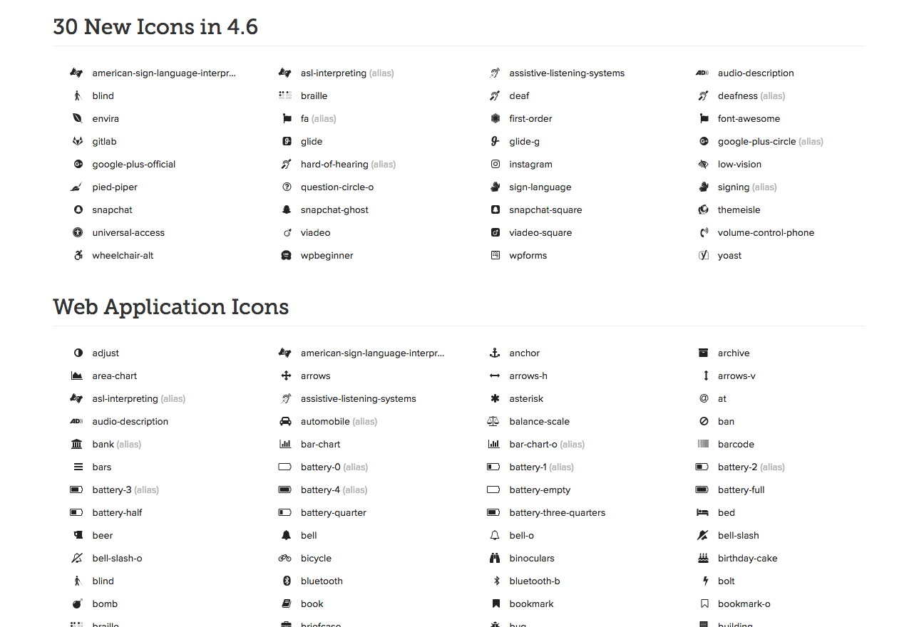
Icons are an essential part of any website. They can lead you to social media, represent an idea, or add more style to your website. One of the most known icons for web designers is the “Font Awesome” icon set. They are by Dave Gandy and are completely free. There are a total of 634 icons in the icon set. There is an icon for just about any topic you can think of, and the set also includes social media icons.

Muse For You - Font Awesome Quick Tip - Adobe Muse CC

What’s great about this icon set is that you can download it as a font and install directly into Adobe Muse. It takes less than 5 minutes and you can instantly have access to 634 “Font Awesome” icons for your Adobe Muse website.

Muse For You - Font Awesome Quick Tip - Adobe Muse CC

Here are the steps to install the icons into Adobe Muse:

1. Download the font from http://fontawesome.io/get-started/

2. Unzip the zip file and install the font onto your computer.

3. Go into Adobe Muse and select File—>Add/Remove Web Fonts…

4. Select “Self Hosted Fonts,” and click on “+Add Fonts.”

5. Drag and Drop the .woff, .eot, and svg files from the “Font Awesome” fonts folder.

6. After a few notices the font is installed into Adobe Muse.

7. Create a text box in Adobe Muse and then access the icons from the “Glyphs” panel. If you do not see the Glyphs panel go to Library—>Glyphs.

8. Done!

It’s that easy. You now have access to 634 icons that you can use for your Adobe Muse website. The icons work similar to fonts so you can change the color of the icons and make them any size you’d like.

In the video above I go over how to install the “Font Awesome” icon set and then where to access in Adobe Muse.

For more video tutorials and widgets for Adobe Muse visit http://museforyoushop.com.

Happy Musing :).

Read More at 634 Icons for Adobe Muse – Font Awesome Icon Set

Categories: Designing, Others Tags:

Staggering Animations

August 16th, 2016 No comments

The following is a guest post by David DeSandro. David wanted to offer a new feature in Isotope: staggered animations. Like so many things web, there are lots of ways he could have approached it. Here he looks at some of the possibilities, the advantages and disadvantages of each, and what he ultimately went with for Isotope.

Consider this cinematic Seinfeld moment:

The image of George running through a group of gulls stirs the emotions. The energy in his conviction is matched by the bursting energy of the birds. So how can we animate with this kind of energy?

George Costanza running through birds

Take another look at those gulls. It’s not that there’s a lot of them. The birds take flight individually. As each one flies, their numbers in grow, and the emotion lifts off with them. Go get ’em George!

Instead of animating a group of items all at once, we can recreate this same effect by staggering the animations. When each item’s animation is incrementally delayed, they appear as individuals, but still move collectively as a whole. The result is captivating and feels more true to life.

I recently released Isotope v3 with new staggered item transitions.

See the Pen Isotope – stagger by David DeSandro (@desandro) on CodePen.

While item transitions are easy to set up, they can be difficult to manage. Running multitudes of animations at different intervals gets complex. So let’s explore how to stagger item transitions.

We’ll used a simple animation for our example: moving a group of items horizontally. Items have CSS transition: transform 0.4s;. They move by toggling .is-moved class. The first demo moves all the items at once.

See the Pen single transition by David DeSandro (@desandro) on CodePen.

setTimeout

We can use setTimeout to stagger triggering the transitions. setTimeout will start the transition later with a delay in JavaScript.

See the Pen setTimeout by David DeSandro (@desandro) on CodePen.

This actually looks pretty good. To fine tune the animation, I want the items to move without overlapping. So items on the right start moving first when moving to the right. Items on the left start moving first when moving to the left. We need to reverse the setTimeout delay if moving to the right.

See the Pen setTimeout, forward & reversed by David DeSandro (@desandro) on CodePen.

Not bad! But now comes the premier test of any animation system: What happens when a change is triggered while animating? This edge case is too often overlooked. Any novice developer can add an animation. But if you care about your users, your animations should react instantly when acted upon. Animations should not impede on your users actions.

Try clicking the button while transitioning to see what happens.

It works. All the items end up where they are supposed to. But I don’t like how it behaves. It looks like the items get confused. Also try the non-reversed demo.

The forward/reversed transition continues through all the items. This isn’t good. The animation is still happening after the user has already reversed their action.

transition-delay

Let’s try something else. We’re already using CSS transitions, so it makes sense to use transition-delay. This demo uses JavaScript to set the incremental transition-delay in JS (but you could also use CSS preprocessor logic if that’s your thing). The transition is triggered at the same time for all items, but their delay differs by their transition-delay value.

See the Pen transitionDelay by David DeSandro (@desandro) on CodePen.

We can reverse the delay, to have similar behavior moving left and right, just like the setTimeout demo.

See the Pen transitionDelay, forward & reversed by David DeSandro (@desandro) on CodePen.

As for start-stopping, this transition-delay demo behaves differently. The forward/reversed demo stops in place for moment.

This could work, but its behavior still isn’t ideal.

Frame-based animation

There’s one more method to try out: frame-based animation. Using requestAnimationFrame allows us to have control of how each transition is triggered, when it is triggered.

See the Pen frame animation by David DeSandro (@desandro) on CodePen.

It’s got perfect behavior. Start-stopping reverses the animation right where it is, so there is no delay and no excess transitions. But this nice result comes at the cost of complexity. This demo requires double the amount of JavaScript, with an animation loop that has to run every frame.


So if you want to stagger animation, you’ve got options.

  • setTimeout will work, but is hard to cancel.
  • transition-delay will work, but might have delays.
  • requestAnimationFrame will work, but requires more JavaScript.

And there are lots more solutions out there: CSS animations, jQuery .animate(), GreenSock, D3, yada, yada, yada. All these solutions can be used for staggering animations. But I encourage you to investigate how well they hold up to edge cases when user actions occur during the animation.

Working on Isotope, I chose to use the transition-delay technique. It provided the best level of control, without too much complexity. Now Isotope users can add the final level of polish to their UI and take their experiences to new levels. Like a Costanza chasing his dreams.


Staggering Animations is a post from CSS-Tricks

Categories: Designing, Others Tags:

Solve your cashflow by getting paid up front

August 16th, 2016 No comments

As freelancers, we’ve all had to chase clients to get paid. You submit an invoice, and your client goes quiet. Thirty days, then sixty days go by. They stop emailing you, and suddenly you can’t get a hold of them.

And you’re freaking out because your bills keep coming in, but you’re not able to pay them. I’ve had this exact scenario play out in my design business more times than I care to admit. To solve this issue, I went looking for a way to avoid late payments.

What I found was that the easiest way to keep from having to chase clients for late payments was never to let that payment be late in the first place, by getting paid up front before starting any of the work.

Easier said than done, right? You’ve probably had a hard time getting a decent size deposit out of your clients, let alone the full amount upfront. But as you’ll see, getting paid in advance is easier than you think it is.

First though, let’s look at the benefits of getting paid in advance.

Why you should get paid up front

There are some obvious reasons for getting paid in advance:

  • You can put the money to use right away if needed
  • You don’t have to spend any time haggling with your clients over payment
  • You can rest easy at night knowing that money is in the bank

The first reason is really the most important one. Having cash on hand gives you options and keeps your business afloat. But aside from the cash-flow benefits, the reason I love getting paid up front so much is this:

It gives me peace of mind

  • No more wondering whether or not the client will back out of their end of the bargain and not pay
  • No more wondering whether or not the check is really in the mail
  • No invoices that are three weeks overdue

And really, just less time having to think about the money aspect of freelancing and more time concentrating on the work. Getting paid in advance lifts a huge burden off your shoulders.

Getting paid in advance makes it virtually impossible that the client will cancel the project

But another benefit you probably haven’t thought of is this: Getting paid in advance makes it virtually impossible that the client will cancel the project. And knowing that gives you some level of predictability to your revenue.

And in the unlikely chance the client does cancel, you’ll already be paid, and you can both just move on.

How to get paid in advance

(One caveat: You can’t get paid in advance if you’re pricing by the hour. If you haven’t already, consider making the switch to pricing per project.)

To get paid in advance:

  • You don’t have to hard-sell your client
  • You don’t have to have some intense negotiation about it
  • You don’t have to be a “natural” salesman

All you have to do is offer a small discount if they agree to full payment in advance. It’s as simple as offering a 5% to 10% reduction in the fee on your proposal.

It’s this simple…

I include the discount on my proposal just to the right of the stated price, “10% discount if paid in full at the time of signing.” To get the client thinking about it, I’ll often drop a little reminder hint on the client call before sending out the proposal, or after they’ve had a chance to review the proposal and want to go ahead with the project.

I do it over the phone or in email, both work well. When on the phone, I mention it as part of my process, or “next steps.” But it’s really subtle. I don’t oversell it at all. I just state it as an option they can take if they choose to. If not, no worries.

I’ll say something like, “How payment works is that I ask for 50% upfront, and the rest on X date. Or, if you pay in advance, I can reduce the fee by 10%.”

Via email, after they have agreed to work with me, I use this script below:

Subject: Project Contract

Hi Client,
I’ve attached the design contract for you to look over. Please let me know if you have any questions.
If everything looks good with the contract, the next step is to sign and send it back to me.
One quick question: How would you like to pay for this? The default I’ve included in the contract is 50% paid in advance and the balance on delivery of services.
The alternative is full payment in advance for a 10% reduced fee.
Please let me know which you prefer and it will be reflected on the invoice.
Let me know if you have any questions.
Thank you,
Ian

8 out of 10 clients take me up on the reduced fee

After they’ve had some time to think about it, this is usually the response:

Hi Ian,
We will take your final proposal of $X,XXX paid in full to start.

Or, another recent one:

Ian,
I’ve had a chance to review the contract. I’d just like to confirm that if the fee is paid in full at signing, I will receive a 10% discount?
Thanks

Why this works

Imagine a seesaw. On one side we have risk and on the other we have price. If you lower the risk side to the client (for example, in the form of multiple payments over time) the price they pay should goes up (because you are taking on more risk).

Conversely, if the client takes on more risk (by paying 100% advance) it’s fair to lower the price for the added risk they are shouldering. That’s exactly what I do when I offer a lower fee for full payment in advance.

But if I discount will I lose out on all that money?

Let’s say there’s an $80,000 job, you are probably saying to yourself, “He’s leaving eight thousand dollars on the table!” But really, what’s happening is that the discount is already baked into the price.

Sure, it’s money that I would have made if I were to break up the payments (and possibly even more money if I offer a payment plan over an extended period of time), but I set my pricing with the reduced fee in mind.

When I put together a proposal, the reduced price is the actual price that I’m targeting in my mind. If the client chooses not to take the reduced fee, and instead we do the typical 50% upfront deposit, I look at it as an added 10% fee for the hassle of breaking up the fee into two payments.

I go into writing the proposal with this mindset. I think of the actual price that I want to get, and then add 10% to that. Of course, I don’t share this with the client (who taught you how to negotiate?!). But again, to them, there are two options on the table. And the choice is theirs to make.

My price is not based on market pricing so whether the price is 10% lower, or 10% higher, it really doesn’t matter since there is no real “right” price for what I’m offering. The client has the option to go somewhere else and buy design work for $50, $500, or $5000. So which price is right? There is only what is “right” for that client.

And if you discard the notion of a “discount” (I prefer to call it a reduced fee) and instead look at it as two different options to choose from, it makes a bit more sense. The way I think of this from the freelancer’s side is as a pre-negotiated reduced price for getting paid in advance.

In any negotiation, when you walk into a room, you are going to have a price in mind that you are targeting. This is the price you are hoping to walk out of that negotiation with. You’re telling yourself, “I don’t want to walk away with less than X amount.” Here, that price is out in the open as a choice for the client to pick on their own and feel happy about getting a price that is 10% cheaper than the alternative.

And when a prospect tries to get you to lower your price, you can always point the client towards that reduced fee and say, “Yes, we can lower the fee by 10% provided you are willing to make the full payment in advance.” That way, you aren’t just giving in to the concessions they are asking for. Instead, you are trading something of value (a reduced fee), for something else that is valuable to you (being paid in advance).

The benefits to your business

Since switching to a pricing model built around getting paid in advance I’ve been able to:

  • better forecast my business income;
  • reinvest in and grow my business;
  • be selective of who I work with and work on the best client projects that come to me;
  • focus on doing the best work for my clients;
  • have the peace of mind that my bills are paid and I’m not going broke;
  • put away several months of income in the bank.

Many of those overdue client invoices do eventually get paid. But is waiting around for four or six weeks extra worth the frustration when they are better alternatives?

The Crafter Bundle of 9 Beautiful Script Fonts – only $15!

Source

Categories: Designing, Others Tags:

S(GH)PA: The Single-Page App Hack For GitHub Pages

August 16th, 2016 No comments

For some time now, I’ve wanted the ability to route paths for a GitHub Pages website to its index.html for handling as a single-page app (SPA). This is table-stakes because such apps require all requests to be routed to one HTML file, unless you want to copy the same file across all of your routes every time you make a change to the project. Currently, GitHub Pages doesn’t offer a route-handling solution; the Pages system is intended to be a flat, simple mechanism for serving basic project content.

In case you weren’t aware, GitHub does provide one morsel of customization for your project website: the ability to add a 404.html file and have it served as your custom error page. I took a first stab at an SPA hack simply by duplicating my index.html file and renaming the copy to 404.html.

The post S(GH)PA: The Single-Page App Hack For GitHub Pages appeared first on Smashing Magazine.

Categories: Others Tags:

ZingTouch: Extensive Gesture Recognition Via JavaScript

August 16th, 2016 No comments

The chance of your website being accessed via smartphone or tablet is constantly increasing. Mobile internet usage is growing, which makes it increasingly more important that you keep usability via touch display in mind when designing your website. Aside from simple taps, plenty of gestures used to control mobile devices have established themselves. ZingTouch is an extensive JavaScript library that you can use to make it easy to control your website via gestures.

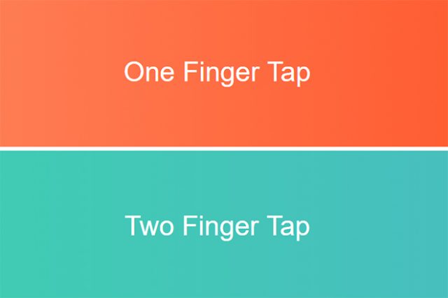
Tap Gestures

Standard Gestures for Multiple Fingers

Generally, JavaScript provides all options to interpret different gestures. For instance, touch events let you react to touches on the display, as well as record motions. Here, it is possible to recognize multiple fingers that are on the display at the same time.

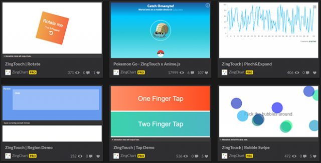
ZingTouch is there to enable you to catch and process all those many different common gestures. The JavaScript library is capable of interpreting both simple taps, and taps with multiple fingers, as well as reacting differently to each one.

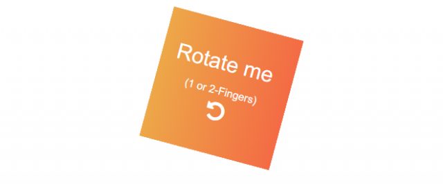
ZingTouch also recognizes rotations on the display, or the pinching and releasing of fingers.

Examples on CodePen

Examples on CodePen

Integrating ZingTouch and Recognizing Gestures

In order to use ZingTouch, the library needs to be integrated into your HTML document first. Subsequently, create a so-called region, which is supposed to react to a certain gesture. Such a region could be any HTML element.

var region = ZingTouch.Region(document.getElementById("container"));

In our example, the HTML element with the ID “container” is assigned to the variable “region” via “ZingTouch.Region()”. In the next step, a gesture that the region is supposed to react to is defined.

var geste = new ZingTouch.Tap({
  numInputs: 2,
  maxDelay: 1000
});

Here, a tap is defined using “ZingTouch.Tap()”. You can assign different parameters to it. “numInputs” determines the amount of meeting points that need to occur on the region. Furthermore, “maxDelay” defines the maximum duration of the tap in milliseconds.

Thus, in this specific case, two fingers have to be on the region for a maximum of one second. In the final step, the gesture is bound to the region via “bind()”, and a function that is started after a successfully executed gesture is determined.

region.bind(document.getElementById("container"), gesture, function(e) {
  console.log("Tapped.");
});

This simple example makes sure that a two-finger tap causes “Tapped.” to be written onto the element with the ID “container” in the console.

Six Individually Customizeable Gestures

Rotate-Geste

Rotate Gesture

Apart from the rather simple tap gestures, there are five more gestures available. You can realize rotation gestures, expand and pinch gestures, pan gestures, and classic swipe gestures.

There are different customization options for each gesture. With the swipe gesture for instance, you get to enter the speed with which the gesture has to be executed.

new ZingTouch.Swipe({
  escapeVelocity: 0.25,
});

Each gesture also has return values that can be read and evaluated. The swipe gesture displays an angle that represents the direction of the gesture.

region.bind(document.getElementById("container"), "swipe", function(e) {
  console.log(e.detail.data[0].currentDirection";
});

In this example, the gesture is simply handed over to the “bind()” method without any additional parameters. The direction angle “currentDirection” is written to the console on successful execution of the gesture.

Extensive Documentation

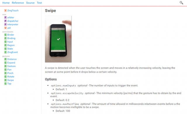
Extensive and Vivid Documentation

Extensive and Vivid Documentation

ZingTouch is a comprehensive tool that lets you cover all common gestures, and implement them into your own mobile webprojects without much effort. There’s a detailed documentation with plenty of examples available on CodePen.

The library is distributed under the free MIT license. Thus, you can also use ZingTouch for commercial purposes.

(dpe)

Categories: Others Tags:

Not So Fast! 5 To-Dos Before Approaching a Web Design Company

August 15th, 2016 No comments
web-design

You, a small business owner, have decided to take that daring first step into putting your presence online! Congratulations! You are ahead of many small businesses out there (the number is 6 out of 10 that are not online).

If that were not enough, instead of asking your nephew to do it, you have decided to be revolutionary and invest in getting it done by professionals. Colby Richards, Managing Partner for Brown Box Branding in Seattle, WA, says, “An appropriate digital marketing strategy will put your brand on top of your competition.”

But then you start to panic after reading all the ways websites do it wrong… Relax. We have lots of handholding in store for you here.

Before you approach a web design company, you want to have all your ducks in a row and show up to the meeting prepared. Guess what? You don’t need to know any of the techie stuff to get a stunning website made for you. What you do need is a clear-eyed view of your company that you can provide to the web designers.

Designing for a humanitarian website is different than designing a website for a brewery. This applies to everything from images, to font, to the written word. Your web designers are going to come into this knowing nothing about you. You need to show up prepared to give them a complete overview of what makes you stand out from the crowd so that they can translate that into digital form.

web-designHere is what you need to prepare:

1. What is your mission statement?

Chances are you already have one. But if not, you’ll want to write that down. Not on the back of a napkin either. Put everything into Word document files so you can send documentation over to the web designers. Even if your mission statement doesn’t end up on your site, a good web designer will appreciate this kind of information. Why? Because it will help him or her set the right tone for your online presence.

2. What have past customers said about you?

Get all the positive reviews that you can find and put them into another file. Customer reviews are positive proof of your business’s worth. Not only that, reviews can also provide your web designers with yet another piece to the puzzle about what makes your business great.

3. Who is your competition?

Who does your business compete with? Make a list. This will give your web designers a better grasp of your business sphere. If they are also providing you with a marketing strategy service, this info will enable them to figure out what advantages you have.

4. What do you want to offer via your site?

At this point, don’t worry about the details or your budget. You can cut back later if needed. Right now, let your imagination and your creativity soar. Look at other similar services and see what you could do that is alike but with a twist—or even better. Type that stuff out.

5. If you could close your eyes and claim any website for your business, what site would you choose?

This exercise is good only if you follow up with “Why?”

Think about why you like a certain site, and write your reasons down. Again, create a file on your computer listing the sites that you like, and write the one thing you like about each. Whether it’s the font choice, the color, or the ease of use. Bring this list to your web design meeting. This will give your designer an idea of what appeals to you visually.

Once you have files with your answers for each of the above questions, you are ready to have that first meeting with your web designer. It is helpful that you know some technical lingo and brushing up on that is good. But more important than that is providing the web design team with a crystal-clear view of who you are and what you want to share with your clients.

Want a stunning visual representation of your business? Show up prepared for a tell-all.

Read More at Not So Fast! 5 To-Dos Before Approaching a Web Design Company

Categories: Designing, Others Tags:

The Average Web Page (Data from Analyzing 8 Million Websites)

August 15th, 2016 No comments

The following is a guest post by Catalin Rosu, who along with some colleagues, dug up a ton of data about the HTML content of web sites. This is the most recent study of its kind and wildly fascinating to see the results. I find it especially fun to compare the top results to what I would have guessed would have won.

We’ve all been there. We try to improve our HTML code making it clean, beautiful, and readable. We do this in pursuit of better semantics and better accessibility, so that everyone can use it. It’s our top priority. And we always have questions:

  • What is the best way to structure the markup?
  • How are others doing it?

Questions like these were running through my mind. I wondered about how people write markup these days, as new web technologies emerge. So, I teamed up with a few of my colleagues at AWRCloud and we came up with a data set of over 8 million pages from Google top twenty results.

The studies that came before this one

Back in 2005, Ian Hickson, the editor of HTML5 specification, made an analysis of a sample of slightly over a billion documents, looking to see what the web is made of. A billion is an enormous number, but to Google, nothing is impossible. With this huge amount of documents, he extracted valuable information about popular class names, elements, attributes, and related metadata. The outstanding results were later published as Web Authoring Statistics, which is still the most powerful web authoring study ever made.

More recently, in 2008, the Opera Metadata Analysis and Mining Application crawler, MAMA, ended up analyzing about 3.5 million URLs. Brian Wilson, the author of this impressive work, expanded the study by publishing results detailing page structures, including HTML, CSS, and JavaScript.

One of the analyses from Web Authoring Statistics that later proved vital for the work in progress HTML5 development, was a list of the most popular class names in those HTML documents. The Opera MAMA crawler also searched for the most common class names and in addition to Google’s results and they’ve published relevant results on the popular ID attribute values given to elements as well.

What does this study add to the conversation?

The data for this study comes from 8,021,323 index pages gathered from the top twenty Google results for about 30 million keywords, chosen by keyword volume. Meaning: we had 30 million keywords. We ran a Google search for each of them and took the URLs for the top 20 results and added them to the list and removed the duplicates.

We can only assume that the relevance of these web pages to the general web population is very high. That is based on the likelihood these are popular and high-trafficked websites commensurate to their search result positions.

How fresh is this data?

The latest data set is from May 20th, 2016.

This new study will never surpass the former study Google made back in 2005. It’s not about overcoming Opera’s great study either. It’s about finding new and relevant insights on the actual markup used by the most popular and successful web pages on the internet.

So, how does the average HTML page look like nowadays? Take a look at the screenshots below and check out the study for the full statistics.

The Stats

Following our study, we find that the average website index page uses twenty six different different element types.

Most website use 26 different HTML elements, give or take a few, with a curious peak at 9.

The top twentysix elements used on the most number of pages are:


Unsurprisingly, and are used on all sites. Slightly surprising with at 99% – perhaps a very large website with a weird mistake? The table elements at the bottom of the list are still on a surprising nearly-third of all websites.

Among the document type declarations that specify which version of (X)HTML a page is using, the latest HTML5 doctype is clearly leading the way.


Nearly two thirds of all websites declare themselves at HTML5.

If we look at all the elements that are specifically about telling browser or search engines about the site and how to style it, we found about 175 million elements, and here’s how they broke down:

The breakdown of the 105 million elements for content sectioning looks like this:


s are the most popular heading elements and overall content sectioning element.

Of the billion text content elements:


The

has a commanding lead.

What’s the future of web?

Us web developers and web content creators are curious and interested in usage, statistics, and browser support. These are the things that led to the class names findings back in 2005, names known today as the most popular HTML5 tags.

The web is evolving fast. This isn’t new, but it can feel overwhelming. The trends are changing from year to year and as a web content creator, it requires motivation and effort to stay up to date. Think about how the markup and the average web page looked like ten years ago and how a modern web page looks like today.

We also used the study to look at emerging technologies like Web Components. While Web Components allows authors to create arbitrarily named elements, we can look for standards elements used in the creation of Web Components.

Nobody can predict the future. We can only guess how the average web page will look like ten years from now on. Next time we run this study (we’re considering quarterly), will we see things like Web Components rise?

And again, the complete data set is here.


The Average Web Page (Data from Analyzing 8 Million Websites) is a post from CSS-Tricks

Categories: Designing, Others Tags:

10k Apart

August 15th, 2016 No comments

This year is An Event Apart’s 10th anniversary. In order to celebrate, they are putting on competition called 10K Apart where people show off what can be accomplished in 10kB of data. This isn’t a new competetion- its first genesis has been a project called 5k way back in 2000-2002. This year is sponsored by Microsoft Edge and they’re giving away $10K in prizes to competitors. The judge panel has top professionals from web development, talented people like Sara Soueidan, Lara Hogan, Mat Marquis, Rachel Andrew and Heydon Pickering.

This competition is incredibly exciting as it focuses on things we as web developers can all benefit from thinking about. In terms of progressive enhancement, what is a usable baseline? How can we cleverly make our sites usable for a wide range of people? Aside from the clear benefit for performance, this contest focuses its attention on accessibility, designing for performance, and interesting innovations in the field.

Enter the contest! It should be great fun. My contribution was the SVG animation that you see on the homepage of the site (click the handle to watch it go again), created in less than 10kB with SVG and GreenSock, with particular help in SVG optimization from SVGOMG. Aaron Gustafson of Microsoft Edge has been hard at work on development for the site and everything you see there is under 10kB, as well, which is pretty rad.

Direct Link to ArticlePermalink


10k Apart is a post from CSS-Tricks

Categories: Designing, Others Tags:

10 Free Bootstrap PSD Grids for Excellent Webdesign

August 15th, 2016 No comments
bootstrap-grid-1

In web development, there are many factors that can optimize work processes. It’s not just the final result that counts, but also the amount of time that is put into the development of a website or a reusable template. Good PSD grids are still indispensable when it comes to designing a website and making your work flow more efficient. Thus, today, we’ll show you a couple of free Bootstrap PSD grids for your next project.

Efficient webdesign is essential nowadays. There’s a lot of competition on the market, and nobody can afford to put more time into the development of websites than necessary. That’s why front-end frameworks, like Bootstrap for example, have established themselves.

The mobile-first approach, the support of preprocessors, predefined HTML components, and jQuery plugins in conjunction with frequent updates are the reason for the Bootstrap framework’s popularity. Did you know that already two percent of all websites are created using Bootstrap? On WordPress.org, it seems as if there were no themes that don’t use a Bootstrap foundation lately.

So why shouldn’t you use the framework as well, and develop a solid prototype with the following grids?

1 – Bootstrap Responsive Grid by Michael Henning

This package allows you to develop website layouts for desktop, tablet, and smartphone layouts in Photoshop. It is compatible to Bootstrap 3.

2 – Free 12 Column Bootstrap v3.0.0 Grid Pattern PSD

Bootstrap aficionados will appreciate this freebie by Himanshu Softtech. The 12-column grid helps you develop a Bootstrap 3 website.

3 – Free Bootstrap 3 PSD Grid System

bootstrap-grid-3

The Free Bootstrap 3 PSD Grid System is an extendable, and updated version of its predecessor. This grid is also perfectly suitable for the development of mobile-first websites and saves you valuable time.

4 – Bootstrap Grid PSD Templates by Benny Schuurman

bootstrap-grid-4

These templates look a little raw and edged. However, if you ever need to switch between the design and the framework, you can use these grids with a low opacity to sketch columns and rows, and construct an organized structure.

5 – Bootstrap 3 Responsive Grid PSD Template by Quentin Starr

bootstrap-grid-5

The Bootstrap 3 Responsive Grid PSD Template has a total width of 1170 pixels, and comes with 12 columns, exactly meeting the Bootstrap 3 requirements. The author has considered all proportions and sizes, so that you are able to use these grids as the basis for any project.

6 – Free Printable Bootstrap Wireframe Template

bootstrap-grid-6

Accompanying digital solutions, there is paperbased media for the prototyping of Bootstrap websites as well. This freebie could prove to be a good tool when it comes to quickly sketching your ideas on paper. It also lets you visualize versions for the desktop and the mobile designs.

7 – Bootstrap 3 PSD

bootstrap-grid-7

Bootstrap 3 PSD comes with useful features like Retina solution, well-structured layers, and an excellently documented PSD file. Fully editable, it helps developers working out website designs based on the Bootstrap 3 framework.

8 – Responsive Bootstrap Grids

bootstrap-grid-8

Responsive Bootstrap Grids doesn’t need redundant extras. The clean, minimalistic appearance doesn’t distract you from your work. Use this grid to quickly design the layout and the interface without much effort.

9 – Bootstrap Grid Template For Retina, 4k, 5k (PSD + GuideGuide)

bootstrap-grid-9

The ultimate grid template for responsive design with Bootstrap. The template gives you a better impression of how your design will look on the most common screen resolutions and browsers.

10 – Bootstrap 3.0 Responsive Grid System PSD

bootstrap-grid-10

The author used Bootstrap 3 to develop a couple of projects and created this responsive grid template for that purpose. He recommends using GuideGuide for Photoshop if you want to create your own grids.

Conclusion

In order to really make work processes more efficient, you should start working with Bootstrap at a very early stage of development. Concept drafts should be made with a clean grid, following the framework’s rules. The key to success is a fitting PSD grid system. When everything in the layout process is aligned for the use of Bootstrap, the front-end development will be a lot faster.

(dpe)

Categories: Others Tags:

What’s new for designers, August 2016

August 15th, 2016 No comments
chat ui design kit

In this month’s edition of what’s new for designers and developers, we’ve included productivity apps, email marketing apps, UI kits, CMSs, startup resources, color tools, mobile apps, website building tools, graphic design apps, and much more. And as always, we’ve also included some awesome new free fonts!

Almost everything on the list this month is free, with a few high-value paid apps and tools also included. They’re sure to be useful to designers and developers, from beginners to experts.

If we’ve missed something that you think should have been on the list, let us know in the comments. And if you know of a new app or resource that should be featured next month, tweet it to [@cameron_chapman](http://twitter.com/cameron_chapman) to be considered!

Chat UI Design Kit

Form Bucket

Form Bucket offers form handling and automation for static websites. Redirect users to any URL and style forms with your markup and CSS.
form bucket

Coworkies

Coworkies helps connect members of coworking spaces so they can grow their network and find work opportunities. You can share knowledge, discover the coworking scene around you, and more.
coworkies

Pluck

Pluck lets you find people tweeting about a topic you choose, and then automatically sends a timely, relevant email to them.
pluck

Tooltip.io

Tooltip.io offers in-app messaging for user support. Answer frequent user questions inline with relevant, timely messages, all without writing code.
tooltip

EME

EME is an elegant markdown editor. It includes editor and preview panes (view either or both), and multiple export options.
eme

Blog Owl

Having a hard time coming up with blog topic ideas? Blog Owl will send you ideas and suggestions right to your inbox.
blog owl

How Much to Make a Logo

Ever wondered how much branding should really cost? How Much to Make a Logo asks a series of questions to give a rough estimate of what your branding project should cost.
how much to make a logo

Freeter

Freeter makes it easier to work on multiple projects at once. It offers tons of features to streamline your workflow.
freeter

Mobile App Revenue Calculator

Want to know how much money you could make with your ad-supported mobile app? SurveyMonkey’s Mobile App Revenue Calculator will tell you with just some basic information about the monthly active users and ad impression info.
mobile app revenue calculator

The Security Checklist

The Security Checklist is a vital resource for developers who want to make sure their sites are as secure as possible.
the security checklist

Onesheet CRM

Onesheet CRM is a simple, easy-to-use, and free customer relationship management program for use with Google Sheets. It’s perfect for tracking sales and leads in your small business.
onesheet crm

Product Pages

Product Pages is a curated gallery of beautiful product pages from around the web. New sites are added regularly.
product pages

Website Downloader

Website Downloader lets you download the source code of any website. Studying other people’s code is a great way to learn how to develop your own sites and apps.
website downloader

Startupvalue

Startupvalue lets you value your startup like a VC or banker would. Just answer a few questions to find out your valuation in minutes.
startupvalue

PANTONE Studio

PANTONE Studio is a free iOS app that makes it simple to convert inspiration around you to PANTONE colors, build and test palettes, and share color palettes with others.
pantone studio

BitBlox

BitBlox is a low-cost website building and hosting service. It has a drag-and-drop website builder, with no coding skills necessary.
bitblox

Sans Francisco

Sans Francisco is a collection of tools to help designers create better experiences. It includes tools for user research, typography, color palettes, iconography, stock photos, inspiration, prototyping, and more.
sans francisco

IncludeWP

IncludeWP is a directory of the best open-source frameworks for developing WordPress plugins and themes.
includewp

Screenful Power-Up for Trello

Screenful Power-Up for Trello helps you work better in Trello. It gives you visual dashboards and automated reports for sharing.
power-up for trello

The Ultimate Guide to Google Sheets

The Ultimate Guide to Google Sheets, from Zapier, will turn you into a spreadsheet expert. It includes hundreds of functions and the core tools you need.
ultimate guide to google sheets

Idea Buddy

Idea Buddy is your source for ideas. Enter an idea, get ten back. They have over 2500 ideas in the system so far and counting.
idea buddy

LaunchKit

Launchkit is a set of web-based tools for mobile app development for creating, launching, and monitoring apps. And now it’s been open-sourced!
launchkit

Drift

Drift is an AI-powered bot that helps you better engage with visitors to your website and build customer relationships. It integrates with Slack, WordPress, HubSpot, and more.
drift

Postleaf

Postleaf is a simple, beautiful blogging platform with inline editing. It has a beautiful UI, is fully responsive, and is easy to install.
postleaf

Talla

Talla is a virtual assistant you can add to your company’s Slack. It helps with communication, automation, and coordination for your team.
talla

Dual

Dual is a strategic two-player game about sequential thinking and logic. It’s a lot like programming, minus the coding.
dual

Redbeard

Redbeard is a native app development framework that’s boiler-plate-free. It includes tons of components and works with Objective-C and Swift.
redbeard

Tech Ladies

Tech Ladies connects women with the best jobs in tech, and connects companies with the best women tech makers. Above all, though, it’s a supportive community of women in tech from around the world.
tech ladies

99 Deductions

99 Deductions is a freelancers dream come true come tax time. It breaks down a bunch of possible deductions you might have based on your job.
99 deductions

Canva iPhone App

Canva, the simple to use graphics editor and design software, is now available as an iPhone app. While not as fully-featured as the web app, it’s still one of the easiest-to-use graphics programs available for iOS.
canva

Simpla

Simpla is an “open content ecosystem” aimed to replace your CMS. It’s framework-agnostic, standards driven, and has both free and paid plans.
simpla

Pitchcard

Pitchcard makes it easy to pitch your idea, get feedback, and find collaborators. You can explore ideas, offer help, and maybe even be part of the next big thing.
pitchcard

Umhlanga Font

Umhlanga is a free sans serif typeface with a condensed form and glyphs with plenty of character.
umhlanga

Sonder Font

Sonder is a font family that includes both serif and sans serif versions that work beautifully together, in rough and regular styles.
sonder

Gothvetica Font

Gothvetica is a merging of Gotham and Helvetica, and takes a form that is exactly in between the two.
gothvetica

Phalanx Font

Phalanx is a hand-drawn, distressed typeface available on a name-your-own-price basis.
phalanx

Bananas Font

Bananas is a free script font with a vintage vibe.
bananas

Azade Font

Azade is a display brush font with a grungy look that’s available in either PSD or AI format for personal use.
azade

Magnolia Script Font

Magnolia Script is an elegant free script font with support for multiple languages, including basic Latin, West European diacritics, Baltic, Romanian, Cyrillic, and more.
magnolia script

St. Jacques Font

St. Jacques is a mid-century modern all-caps typeface with a super thin sans serif appearance and a low crossbar that gives it an art deco vibe.
st. jacques

Paul Grotesk Font

Paul Grotesk is a modern san serif typeface with three weights available for free for personal use.
paul grotesk

Casual Font

Casual is a free serif typeface that is classy and elegant, perfect for fashion brands.
casual

Supermassive 1600+ Hi-Res Backgrounds Bundle – only $17!

Source

Categories: Designing, Others Tags: