Images Solved: Cloudinary is a One-Stop-Shop for Web Developers
As we develop web projects, we always want to enhance our end users’ experience. We want the sites to be fast and use minimal bandwidth, while also being visually impressive. Use of images is the key to making sites visually appealing, but in most cases they do not load fast and they add unneeded weight to the site. But this doesn’t have to be the case. Cloudinary offers the perfect solution to managing images, which helps you maintain that delicate balance between file size and quality.
Images: Sizes, Resolutions, Weight, Focus, Format
Images have always been complicated to manage. This was the case years ago when we were developing for fixed resolutions that were based on a common compromise. At first we designed for 800 pixels width, then for 1,024 pixels width – long before the mobile web came into being.
The evolution of mobile devices has confronted us with a slew of additional intricacies. Mobile internet connections are unpredictable, fast in some areas, but slow and limited in other areas. To ensure acceptable performance of our site on smartphones, small file sizes are a necessity.
Mobile devices also come in a plethora of screen resolutions and pixel densities. We must make sure that we can deliver a variety of image sizes to the appropriate devices, while ensuring they look sharp on every device.
But mobile isn’t the only issues. Some browsers still offer only mediocre support for modern formats. As a result, we’ve been forced to stick with more common formats, rather than taking advantage of the benefits of modern formats like WebP, BPG and FLIF.
Another issue we face in image management is that when reducing an image’s resolution we are forced to cut off content in order to maintain the primary focus point.
Because of these complexities, it was too difficult, time-consuming and resource-intensive to serve different formats to specific browsers, or crop images to keep the focus in place.
Cloudinary Solves Image Management Challenges
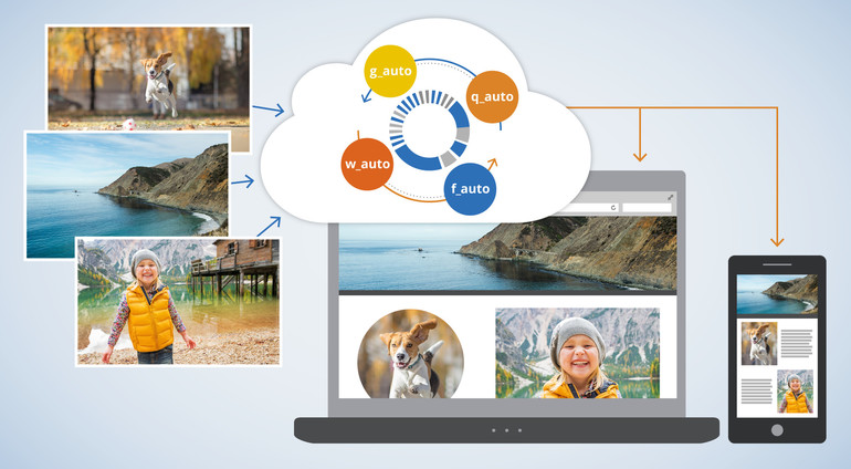
But what if there was a service that made it easier to do all these transformations? Imagine only having to upload a single high-resolution image file, which the service would use to generate all the resolutions, sizes, densities, formats, weights and crops as needed, on-the-fly. Even better – it would run automatically, without you having to manually make adjustments.
This service does exist, and it comes from Cloudinary, the well-known cloud-based image and video management system. Recent upgrades to the solution enable you to use their unique algorithms to take advantage of full automation. Here’s a look at some of the new features available through Cloudinary:
Automatic Content-aware Cropping
The new parameter g_auto ensures that images are cropped according to their main content element. With face detection and a content-aware cropping algorithm, Cloudinary guarantees to never lose the focus of your images.

Not the best examples for content-aware crops. (Photos: Cloudinary)

Automatically done content-aware crops using Cloudinary. (Photos: Cloudinary)
Intelligent Content-aware Encoding
The parameter q_auto is equally as powerful. Cutting down on file size is a process that involves decisions. How much clarity, sharpness, image quality are you willing to lose? What can you accept or – even more important – what level of quality do your visitors expect?
The answer is always the same. You want to keep the image quality as high as possible and the file size as small as possible. Cloudinary now takes care of that for you. It automates the file size versus quality trade-off decision, on-the-fly, by using perceptual metrics and heuristics that tune the encoding settings, then select the appropriate image format.
With Cloudinary, you will be guaranteed to always have the best quality at the lowest weight delivered to your site’s visitors.
Dynamic Format Selection
Adding to the effects of the content-aware encoding, Cloudinary now offers dynamic format selection. This algorithm does two things: it looks for the capabilities of the visitor’s browser, then delivers a format that might only be supported by that specific browser, such as WebP in Chrome. In addition, the parameter f_auto analyzes the image content to generally select the appropriate format.

If you’d upload a file like this as a JPEG, Cloudinary would make sure it gets delivered as a PNG. (Illustration: Cloudinary)
Automatic Responsive Images
Responsive images have created even more challenges for developers. Consider how many different devices, of different resolutions that are on the market now. Then you have to consider dealing with orientation change when devices are moved horizontally or vertically. This requires the creation of multiple versions of the same image, to ensure visual quality regardless of device or screen.
Cloudinary offers new parameters w_auto and dpr_auto do the job for you. The service simplifies dynamic image delivery for responsive websites on retina and regular displays, by automating the image width and Device Pixel Ratio (DPR) value decision based on the viewing device, display size and layout. All of this is derived from the single high-resolution image you uploaded.
For more details on Cloudinary’s new features read this blog post. It gives you code snippets and in-depth information on the processes behind the curtain. To test drive the features and see what they can do, visit Cloudinary’s demo page.
Disclaimer: This article is sponsored by Cloudinary.
