Archive

Archive for September, 2016

20 Exceptional Three.js Experiments

September 9th, 2016 No comments
Many Icons

Getting the most out of advanced JavaScript APIs has come into fashion these days. Mind-blowing Chrome experiments driven by WebGL, personal portfolios of creative art directors that are marked by high-end abstract animations based on Three.js, or just hero sections that are set in motion with the help of Tween.js, all these libraries are extremely popular nowadays.

They power projects that are so overwhelming and awe-inspiring that even the banal lack of full browser compatibility ( the majority of such projects are capable of working in its full capacity only in the latest browser versions) does not slow down this raging mainstream nor does not prevent people from loving them. More and more developers are joining this flow, trying out its possibilities and pushing boundaries. Today we are going to take a glance at one of them and pay attention to some successful experiments with Three.js.

Three.js is a relatively lightweight and quite intuitive JavaScript library, a constant companion of projects that were created on the basis of WebGL. When it comes to dealing with 3D graphics, it is in its element. With it, it becomes possible to generate complex animations massively overload the system. It lets you manipulate and tune all the vital details of the composition such as lights, materials, shaders, cameras, objects, etc. It programmatically creates a render and charges it with dynamic behavior taking into account all the rules of geometry, perspective, and physics. To sum up, it has something to offer to any sophisticated developer.

We have compiled a collection of Three.js experiments that are available on Codepen. Some of them such as the wave of particles have already found their place in real projects while others such as the water shader are just outstanding pioneering concepts.

Many Icons in 3D Using Three.js

Creator: Yasunobu Ikeda a.k.a @clockmaker

Three.js Particle Test

Particle test
Creator: Eric J Nesser

Wave of Particles

wave of particles
Creator: Chris Aldridge

Three.js Particle Stream

Particles Stream
Creator: Szenia Zadvornykh

My Three.js Practice

Transparent Globe
Creator: Esambino Wei Cheng Hsieh

Water Shader Implement in Three.js

water surface
Creator: Khangeldy

WebGL Particle Head

Head made of particles
Creator: Robert Bue

three.js Points Anti-gravity is Applied, ver2

points anti-gravity
Creator: yoichi kobayashi

Three.js + TweenMax (Experiment)

Flipping floor
Creator: Noel Delgado

Test of Three.js and Tween.js

Mario
Creator: cx20

Pixel Particles

Pixel Particles
Creator: Szenia Zadvornykh

3D Particles Forming Shapes

Forming shapes
Creator: Pål Smitt-Amundsen

Gridspace

Gridspace
Creator: halvves

Three.js CSS3D – Periodic Table

periodic table
Creator: i2801

Procedurally Generated Minimal Environment

Minimal Environment
Creator: Marc Tannous

3D Panorama Viewer by Three.JS

3d panorama
Creator: Max Chuhryaev

Ace Editor

Ace Editor
Creator: Jacob Davidson

Image Slider

Image slider
Creator: Kenji Saito

Water Shader

water shadder
Creator: Arnaud Rocca

Smoke

Smoke
Creator: Teo Litto

Categories: Others Tags:

Autoprefixing with CSS Variables

September 9th, 2016 No comments

I’d call this a bonafide CSS trick, courtesy Lea Verou.

Don’t miss the comments, in which Sérgio Gomes reminds us this might make it easier to change values in JavaScript, because you could skip worrying about prefixes there. Changing CSS variables in JavaScript is already rather appealing, as the changes will disperse throughout wherever they are used naturally.

And Andrea Giammarchi’s trick, where you create a setup that behaves almost like a @mixin with default values:

* {
  --box-shadow:
    var(--box-shadow-x, 0)
    var(--box-shadow-y, 0)
    var(--box-shadow-blur) /* no default, required */
    var(--box-shadow-radius, 0)
    var(--box-shadow-color, black);
  box-shadow: var(--box-shadow, initial);
}

p {
  --box-shadow-blur: 8px;
}

p.special {
  --box-shadow: 10px 0 0 green;
}

Direct Link to ArticlePermalink


Autoprefixing with CSS Variables is a post from CSS-Tricks

Categories: Designing, Others Tags:

The Beginners’ Guide to Creating a Digital Storefront

September 8th, 2016 No comments
olam-screenshot

Selling products is one of the best ways to make passive income from your blog. Unlike other blog monetization methods like advertisements, by selling products you don’t necessarily need a huge traffic base in order to make a steady stream of income.

Personally, I prefer selling digital goods to physical goods. It’s because creating and selling digital goods are easy and convenient. For instance, if you’re a blogger like me, you could easily create a digital book by doing what you’re really good at—writing. Or else, if you’re a programmer, you can release a new plugin/software under your brand name, which wouldn’t be a tedious task at all.

Once you created a product, all you need to do is to upload it on your website and start selling.

In this post, I’ll explain everything you need to know about starting a digital storefront.

Creating a dedicated store vs. integrating a store with your current website or blog

When you’re planning to create a digital storefront, probably one of the first questions you’ll be asking yourself is how you should create a store— either by creating a store on a separate domain or by integrating a store with your current blog.

Creating a separate domain for your storefront lets you brand it uniquely and independently of any of your existing websites. However, the main disadvantage of this approach is that you’ll need to grow a customer base from scratch for the store.

In fact, if you have already grown a massive follower base for your blog or website, integrating a digital store with it would be a convenient choice in terms of promotion.

Creating a storefront

Start with installing Easy Digital Downloads

edd plugin

With all the technologies available today in the market, creating a store is not at all a hassle. For WordPress, all you need to do is to install a free digital store plugin like Easy Digital Downloads and roll out your first product for sale.

While there are lots of ecommerce plugins in the market like WooCommerce, EDD stands out from the rest because it was built specifically for creating a digital store. So you don’t find any unnecessary options while listing your products on your store.

Additionally, you can easily find many useful add-on plugins that could extend the features of your digital store.

Choose the right theme

One of the problems with rolling out a storefront with EDD or any other popular ecommerce plugins is that not every theme would support those plugins.

For that reason, you’ll need to find a right theme that supports your preferred ecommerce plugin; in this case, EDD plugin.

While choosing an EDD supported theme wouldn’t be an issue when you’re launching a brand new store, you might not want to change your current theme of your established blog just for the sake of integrating a storefront with it.

So if you’re integrating a store with your established blog, you will need to check if your current theme does support the plugin.

If your theme supports it, you can simply start a new page and start adding your products on it. If not, you’ll need to replace it with a supported theme.

But, what if you’re fond of your current theme and are not interested in changing it?

Instead of changing the entire theme, simply add a subdomain, install WordPress on it and find a suitable theme that works fine with your storefront.

Olam screenshot

Olam – Easy Digital Downloads Theme could be a nice choice as it is specifically built for creating a digital storefront. Best of all, Olam is compatible with some of the most popular EDD extensions like Commissions, Frontend Submissions, Wishlists, etc. so compatibility wouldn’t be an issue.

Choose appropriate addon plugins

When you’re creating a brand new storefront, most likely you’ll need to extend the features of your site. You can find tons of different EDD add-on plugins for that. All you need to do is to install the right add-on plugins that suit your needs.

Below are a few popular add-on plugins for a digital store.

  • Free Downloads: Offering free downloads is one of the best marketing strategies to attract lots of potential customers for your digital store. Simply ask your users to enter their email address; you can send a download link to their email. It also includes full purchase tracking and automatic integration with various email marketing tools.
  • Invoices: Invoices extension lets your customers easily create HTML based invoices which they can then print and use for VAT compliance.
  • Stripe: This is one of the most popular EDD extensions. It allows you to accept credit card payment through your Stripe account. Though Stripe is a popular payment gateway, you don’t necessarily need to stick to it if you don’t already have an account. In fact, as an alternative, you can find tons of different supported payment gateways on EDD.
  • Frontend Submissions: If you’re planning to release multiple products on your blog, chances are you may need this premium add-on plugin. It helps you easily turn your EDD powered site to a full-featured marketplace.

Selling digital products- recommended practices

#1: Design matters

Although you’re selling tangible goods on your store, the presentation of your products and overall design of your store is crucial for driving sales. If you’re selling ebooks, create professionally designed covers for each one of your ebooks. If you’re releasing a plugin or software, you may need to display screenshots of it in order to entice customers to make a purchase.

#2: Focus on selling to repeat customers

Did you know it is easier to sell to an existing customer than to new ones? In fact, studies show that the probability of selling to an existing customer is 60-70% whereas selling to a new prospect is 5-20%.

So if you’re focusing heavily on acquiring new customers while undervaluing the importance of selling to your existing customers, chances are you’re leaving a lot of money on the table.

How would you reach out to your existing customers?

  • Segment your email list of your existing customers: If you haven’t started an email list, you might want to consider starting it. Once you created a list, segment your existing customers into a distinct group and start sending personalized emails targeting specifically them, which increases the likelihood of repeat purchase
  • Remarketing: Remarketing is a cost-effective advertising method that allows you to show personalized ads targeting a specific category of people who are either your existing customers or potential customers who has recently shown an interest in your products.

#3: Setting up your affiliate program

There are many self-hosted affiliate software out there that let you easily set up an affiliate program for your store. However, marketers like Syed Balki suggest not using a self-hosted affiliate platform especially if yours is a new store.

It’s because comparing with a self-hosting affiliate platform third-party system offers better tracking and fraud detection. Additionally, when you’re joining a large affiliate network like ‘Commission Junction’ or ShareASale, your business get more exposure, which likely brings in more affiliates.

Over to you

Have you ever launched a digital storefront? Share your thoughts and experience with us by commenting below.

Read More at The Beginners’ Guide to Creating a Digital Storefront

Categories: Designing, Others Tags:

Sponsor: Media Temple

September 8th, 2016 No comments

CSS-Tricks is a WordPress site hosted on Media Temple. In fact, I think it’s a poster child for a WordPress site. Meaning, it uses a slew of WordPress features that rather nicely support everything I want to do on this site. A blog! Forums! A Store! User management! Several unique taxonomies!

Media Temple has WordPress-specific hosting packages, and many other hosting packages ranging up through private virtual servers, dedicated servers, and even managed Amazon Web Services.

They know what they are doing over there, provide excellent support, and I recommend them for web hosting.

Direct Link to ArticlePermalink


Sponsor: Media Temple is a post from CSS-Tricks

Categories: Designing, Others Tags:

8-Digit Hex Codes?

September 8th, 2016 No comments

Weird right? 4-digit hex codes too. They are a way put alpha transparency information into the hex format for colors. You might be seeing it more all the sudden if you use Chrome, because it dropped in 52, and the DevTools seem to be defaulting to showing alpha transparent colors in this format even if you set it originally using something else.

Firefox supports it too, for the record.

Let’s look at how it works:

.element {

  /* This is green */
  background: rgb(0, 255, 0);

  /* It's the same as this */
  background: #00ff00;

  /* We could make it 50% transparent like this */
  background: rgba(0, 255, 0, 0.5);

  /* Or, with an alpha hex like this */
  background: #00ff0080;

}

Those last two digits represent the alpha transparency. But wait… the last two digits are “80”, not “50”. We’ll get to that.

First, remember how three digit hexes work?

.element {

  /* This */
  background: #900;

  /* Is the same as this */
  background: #990000;

}

It’s each digit doubled up. It’s the same way with four digits.

.element {

  /* This */
  background: #0f08;

  /* Is the same as this */
  background: #00ff0088;

}

The formats are sometimes referred to as #RRGGBBAA and #RGBA.

So how do you fit an “R” value (or “B”, or “G”, or “A”, for that matter) that is normally 0-255 (or 0.00 – 0.10) into just two digits? Alphanumerics!

0 = 00
1 = 01
2 = 02

9 = 09
10 = 1A
… then it starts to get weird …
11 = 1C
12 = 1F
… whatever, someone figured it out and it works …
254 = FE
255 = FF

It’s easy to find a converter.

That’s why “80” was really “50% transparency” in the example up top.

Also, here’s a chart that I adapted from here:

See the Pen XjbzAW by Chris Coyier (@chriscoyier) on CodePen.

Should you use it?

Probably not. It’s not very well supported yet and doesn’t have any advantages over rgba() or hsla(), other than, I suppose, a tiny amount of saved bytes.


8-Digit Hex Codes? is a post from CSS-Tricks

Categories: Designing, Others Tags:

Can web design stand the test of time?

September 8th, 2016 No comments

2016 marks my twentieth year as a web designer. While it’s crazy to think that so much time has gone by, it’s downright cringe-worthy to think of the sites I designed back then. Seriously, some of them look like they belonged in the dark corner of shame at GeoCities.

Humor aside, it’s understandable if a website built 20 years ago doesn’t quite live up to today’s expectations for form and function. After all, both technology and taste have changed a whole lot over that amount of time.

And, as designers, we evolve with those changes. Our existing skills are honed as we continue to learn new ones. New tools arrive to replace the old and outdated.

But it’s worth wondering if the sites we’ve created more recently will hold up better than their ancient predecessors. Is that even possible?

Is web design cyclical?

It seems that, at some point, just about every print design trend from the last half of the 20th century has made a comeback. The illustrated print ads of the 1950s, the psychedelic 60s, groovy 70s, futuristic 80s and grungy 90s have all been brought back into vogue.

If anything, web design has always been more about pushing forward than looking back

But what about web design? Well, I’m not always up on the latest fads but I haven’t seen table-based layouts or large images sliced into a hundred pieces much recently. Once in a while you see something from the past, but it’s usually as the butt of a joke. That sense of nostalgia just isn’t the same.

If anything, web design has always been more about pushing forward than looking back. But with all of the improvements made in recent years – maybe this could change to a degree.

Looking back to more recent times

As opposed to what I did in the 1990s and early 2000s, looking five or six years into the past brings me a different type of cringe. The designs themselves don’t get me—it’s more about functionality and how I chose to implement it.

2010 began the “WordPress Era” of my career, where I began using it regularly for site building. In those early days of creating with WordPress, my knowledge of how to get things done in development wasn’t quite as sharp. Plus, the software didn’t have as many helpful administrative and developmental features. So naturally, both the software and I have improved over time. Now, I’ve got a real comfort level and a process for it all (which, of course, means that it will all completely change any minute).

Probably the biggest thing missing from this time period is responsive design

Design-wise, I can certainly see that my work is a bit different now than it was then. Some of the more advanced CSS3 techniques weren’t widely used yet. Probably the biggest thing missing from this time period is responsive design. That was all coming into light but not as universal as it is now.

While the designs are different, they still look respectable (to me, anyway). Six years is certainly a lot less time for a design to get dated than twenty. But I’ll be interested in looking back on this crop of sites after a few more years and see how they hold up.

Stepping into the future

So how will the website you launched today hold up over time? I’d argue that, while the design trends will undoubtedly change, what we do today will hold up fairly well years from now.

That’s because we have reached a time when readability, accessibility and adherence to standards are so widely recognized and implemented by designers and developers.

It’s easy to see now that the designs of 15-20 years ago were, for the most part, missing those principles that we now hold dear. Not necessarily because designers didn’t care about them, but a lot of those concerns simply weren’t known at the time. The web was a new medium and best practices weren’t around in any widespread manner.

In that way, if we create something today that implements those best practices, we’re apt to have fewer cringe-worthy moments when looking back at our portfolios.

That’s not to say that we won’t have a laugh at a color choice or a bad stock photo we used. Those things will always change with the times. It just won’t be that put-a-paper-bag-over-your-head terrible site I mentioned earlier.

Now, to answer the question…

Designers will continue to push their craft forward – always finding new and creative ways to tell a story. While that’s important, it seems like the really big changes will be in what tools we’re designing with and the platforms we use to build websites.

Change will present new challenges and creative opportunities for designers

WordPress, for example, is planning to use a lot more JavaScript in its UI. Version 4.3 of the popular Jetpack plugin is going to use React.js for its administrative interface.

This type of change will present new challenges and creative opportunities for designers. Maybe that means our designs might not look dated as much as the way we implement them will.

So, I believe I have arrived at an answer: Yes, a web designer’s portfolio can stand the test of time. Just not in the nostalgic, cyclical way of print design. Technology simply won’t let us rehash the past very much.

Instead, we can look at a well-done website from 2016 and say that it looked and worked as it should given the technological constraints of the time. That’s something we should all be proud of—no matter how many years go by.

LAST DAY: 450+ Beautiful Design Elements by Joanne Marie – only $19!

Source

Categories: Designing, Others Tags:

How To Scale React Applications

September 8th, 2016 No comments

We recently released version 3 of React Boilerplate, one of the most popular React starter kits, after several months of work. The team spoke with hundreds of developers about how they build and scale their web applications, and I want to share some things we learned along the way.

We realized early on in the process that we didn’t want it to be “just another boilerplate.” We wanted to give developers who were starting a company or building a product the best foundation to start from and to scale.

The post How To Scale React Applications appeared first on Smashing Magazine.

Categories: Others Tags:

Top 6 Reasons Designers Should Use JotForm

September 8th, 2016 No comments
jotform-six-reasons-pic01-trio

JotForm’s Form Designer is a tool Noupe readers already know quite well. Throughout the years we have covered all of JotForm extensively because we are entirely convinced of its value. Today we present you the six most important reasons why you as a designer should be using JotForm.

Reason 01: The Point-and-Click CSS Form Theme Designer

Form Designer is the most advanced form designing tool available and is the fastest way to customize a form’s look and feel. We have reviewed this part of the service in-depth in this article. With JotForm designers find the best form creator available. This alone is enough reason to use the service.

If you don’t know about JotForm’s Form Designer, let me just throw the best features at you. Form creation with Form Designer is far faster than traditional CSS, yet also allows you to add custom CSS. The forms are mobile-ready by default. Form Designer is seamlessly linked to Google Fonts which gives you the freedom to choose from hundreds of fonts to create an outstanding typographic experience. You can even monetize your designs by offering them through the JotForm Theme Store. Noupe has covered the Theme Store in more detail in this post.

JotForm-designed Forms on Multiple Devices

Reason 02: Outstanding Features

Web forms don’t need to be boring. With JotForm’s Form Designer even less so. However, a nicely designed web form might still not cut it. What if we could add almost any element to our web forms quickly? Think of image sliders, YouTube videos, SoundCloud files and more.

JotForm works hard on providing you with the best widget experience any web form can offer. Besides the few that I named there are almost 400 widgets available altogether spreading over 18 categories of use cases. Chances are, the widget you need already exists.

Sometimes filling out a form is not a simple linear process. Instead, you might want to react differently to form actions the visitor takes. With JotForm you can create conditional logic using simple commands in a point-and-click manner.

The most simple example could be serving a custom “Thank you” page to different visitors with different form information. Besides that, you can always serve custom “Thank you” pages after the form is sent. You might want to open a page with the latest offerings or a special promotion or just a downloadable present as a reward. Whatever you want, do it with JotForm.

use-jotform-september16-pic02Setting up Conditional Logic in JotForm

If your forms are to be of the most sophisticated kind, you will like the collaboration features JotForm offers. With sub-users, you can build a team of designers working together in-house or in a spread environment that might even involve the client.

JotForm is available in 18 languages and provides full reports on all activity around your forms.

Learn more about JotForm features

Reason 03: Integrations Galore

JotForm has over 100 Form Apps, which give users the ability to send form response information to dozens of other helpful tools. This includes:

  1. CRMs like Salesforce, Highrise, Zoho, and Insightly;
  2. Email marketing software like Constant Contact, MailChimp, VerticalResponse, and GetResponse;
  3. File storage providers like Box, Dropbox, and Google Drive.

Besides that you can send response data to Google Sheets so that your whole team will see real-time updates made to shared spreadsheets. Store owners will want to collect payments through a form by connecting with PayPal, Dwolla, Stripe, and Authorize.Net.

use-jotform-september16-pic03Examples of PayPal Payment Forms

Reason 04: Time-saving Ease of Use

JotForm’s famous drag-and-drop form builder has been dubbed the ‘easiest form builder” by Entrepreneur Magazine. We here at Noupe had only praises, too. With this ease of use comes a time-saving aspect that’s not to be underestimated.

It’s not only that building forms is faster than with other tools. You also get into the driver’s seat much more rapidly, because there is no learning curve involved. JotForm is as intuitive as can be.

The next time-saving aspect is that you need no technical expertise whatsoever. It requires no more than five minutes from never having heard of JotForm to having your first form built successfully.

Reason 05: Affordability

JotForm offers more for free than any other form builder, with a starter (free) plan allowing users to receive up to 100 form submissions per month. For heavier usage, paid plans start at only $19 a month.

I know, it’s only a form in the end. And who wants to pay big time for something so subtle? JotForm definitely has that in mind when you look at their paid offerings.

Reason 06: Security

JotForm prides itself on being the most secure form builder. It uses Form encryption as well as secure (SSL) forms by default.

If you or your client resided in the European Union, you must make sure to adhere to the much stricter European data privacy regulations. That’s why JotForm decided to proactively make an offer. Starting December of last year clients can choose to store their data in JotForm’s European data centers with EU Safe Forms.

These data centers reside in the heart of Europe, namely the German cities of Frankfurt and Nürnberg. Those internet-savvy readers among you probably know that the DE-CIX in Frankfurt is the world’s largest internet exchange point. You will hardly find a better connection anywhere.

Conclusion: JotForm is the best form management solution out there. There is not a lot to be missed. In fact, I cannot think of one thing, even. It is affordable, secure, flexible, easy to learn and use, feature-packed and handsome. Go for it!

Categories: Others Tags:

WDL Shop: Noun Project, Design Bundle, and WordPress Theme Subscription

September 7th, 2016 No comments
WDL Shop: Noun Project

This week on the WDL Shop we’re featuring three amazing deals for designers. First, we have a 2-year unlimited subscription to the Noun Project for $49 – a 79 percent discount off the sticker price of $240! Save time creating icons by tapping into this massive collection of 430,000+ hand-drawn icons. These icons come in both SVG and PNG format and can be dragged and dropped using the Mac App – no download required. Hurry and get your 2-year unlimited subscription to the Noun Project before the sale ends on 9/10!

Next, we have a Lifetime Subscription to Premium Responsive WordPress Themes for $49. The subscription includes access to 95+ and counting fully responsive designs and layouts perfect for designers, photographers, freelancers and more. Your subscription includes the XML file and video instructions for each theme and top-tier support. There are 4 days left to grab this WordPress theme subscription on the WDL Shop.

Finally, we have Pay What You Want Design Asset Bundle. The 12 set asset bundle includes vectors, fonts, customizable infographics and more and is valued at $4,628. How it works:

  • Pay what you want —& if that’s less than the average price—you’ll still take home something great.
  • Beat the average price & you’ll take home the entire bundle.
  • Beat the Leader’s price & get entered into our epic giveaway—plus get featured on the Leaderboard!

WDL Design Bundle

Head over to the WDL Shop today to grab these and other awesome deals!

Read More at WDL Shop: Noun Project, Design Bundle, and WordPress Theme Subscription

Categories: Designing, Others Tags:

Top 10 Thrilled Reactions On the Divi 3.0 Release

September 7th, 2016 No comments
1

Web designer meets theme. Web designer invites theme to a test run. Theme is charming. Web designer falls in love. They move in together on a website. Then another. And another.

The relationship grows. Web designer offers loyalty. The theme offers an A/B testing feature. The web designer puts a ring on it, for a Lifetime Access. But there’s more than one happy ending in this unusual love story.

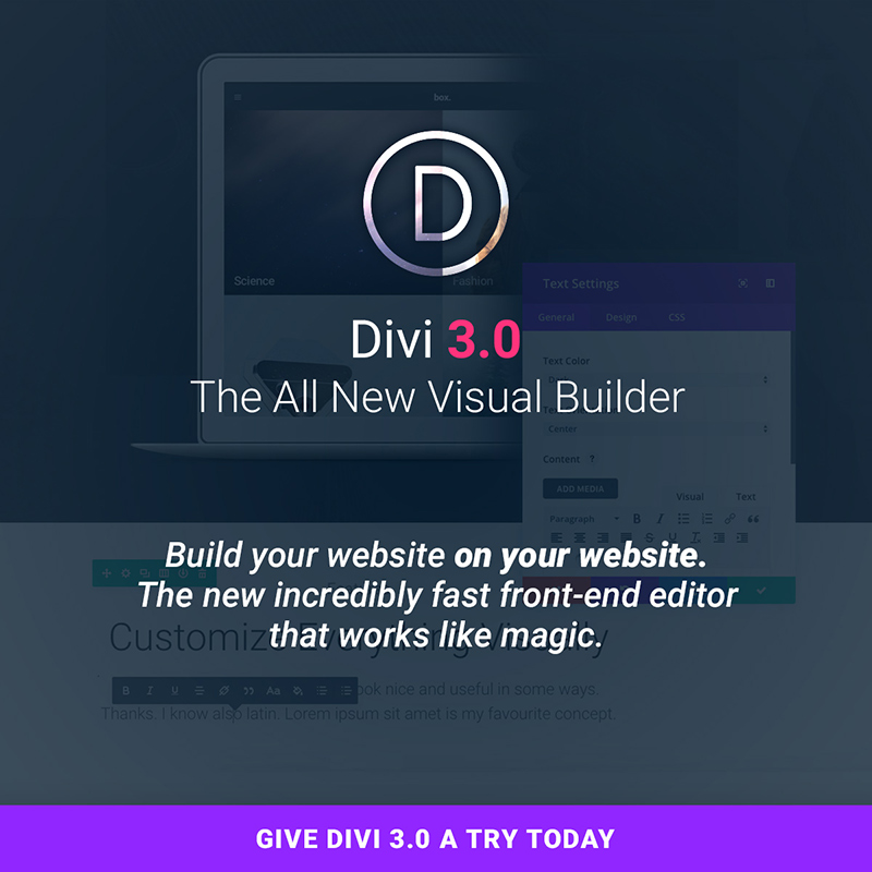
Today’s Divi 3.0 launch rewards current users and prospective users alike. The latest version of Divi introduces a groundbreaking improvement. Web designers all over the world see it as a revolution that changes the way we know the WP medium.

The Top Ten Reactions to the Divi 3.0 Launch

These user reactions range from serious and unusual, to downright funny. They all are enthusiastic, being part of love stories that web designers live with their favorite WP theme.

10. The cool front end builder that Divi launched delivered some unusual virtual encounters.

“Oh my heavens!!! that was sexual. ”- Michael Reynolds

“Lol I felt it too *puffs virtual e cig. lol “- Jermaine Young

9. Divi 3.0 even made people say goodbye to older friends:

“Good bye Visual Composer! Hello Divi” – Mark

8. Brought back nostalgia

“As a younger designer in the 1980s, I was blown away by WYSIWYG with PageMaker v1! This will give me the same thrill for on-line designing. Always had a need for speed.
Great work.” – Cristophe

7. Some even say that Divi is for WordPress what Pollock was for art:

WOW! This reminds me of what Jackson Pollock did for the artist. He changed the way artists worked and thought about their medium. ”- Joshua

6. Some people started thinking on changing careers:

“This totally makes my job obsolete. But very cool and impressive! ”- Nikolaj

5. Simply put, people felt understood.

“Finally. Somebody gets it. Been waiting like 10 years for this! ” – Teton

4. And reminded them of the childhood celebration:

“This is like being a kid and waiting for Christmas morning when you know you’re going to receive that long-awaited bicycle you’ve always wanted! Actually, even better!” – Susan

3. A launch capable of improving family relationships.

“Before I ever knew about WordPress, I used – dare I say it – “WIX” which, for obvious reasons, is very appealing to anyone who doesn’t know anything different. Their strength (in my view) has always been their visual editor.

When I started with DIVI last year, my secret wish was for the sort of visual editor they have, and which you are soon to release. And for this reason, I am recommending DIVI all the more in FB groups I belong to, and have even convinced my mother-in-law to commit to DIVI and not go with WIX.

Dude, you realize that my future is now in your hands, right?

Super excited!” – Ryan

2. It’s the launch that encouraged people to get in shape.

“I’m doing 1-armed pushups I’m so excited.” – Derek

2

  1. It simply blows newcomers away.

“OMG, I’m in disbelief!! I only joined the ET Dev club a week ago and I can’t believe the amassing difference between ET and another theme Dev’s. It feels like a privilege to even be here! WOW.

Not in my wildest dreams did I ever think I would be a customer of a product that is more than good, Yes I’m talking about Divi mostly, ET is way above my initial expectations, and I love it! I’ll be part of the family for life, that’s for sure.”- Liz

You Too Should Get Excited! – and Here’s Why

Divi 3.0 is new and it is modern; and for so many reasons. Let’s start with the new visual builder, Divi 3.0’s showpiece. Divi has long been a favorite of WordPress users because of its building block approach and the new and exciting features launched.

Unlike the current version of the Divi Builder, in which elements on the page are represented by blocks, elements in the visual editor are represented by themselves. You can click into any section, row or module and edit the element’s settings just like you would in the current builder. When in visual mode, however, the broader editing experience, particularly the interplay between a module’s settings and the actual output of those settings, is infinitely more intuitive.

When you make a change, it happens instantly (and I mean instantly)! All of the editing occurs in your browser which means there is no need to use Ajax calls to load elements or update the design, and since we are using React, updating the DOM is incredibly efficient. Building a new page is really really fast” explains Nick Roach, founder and CEO at Elegant Themes.

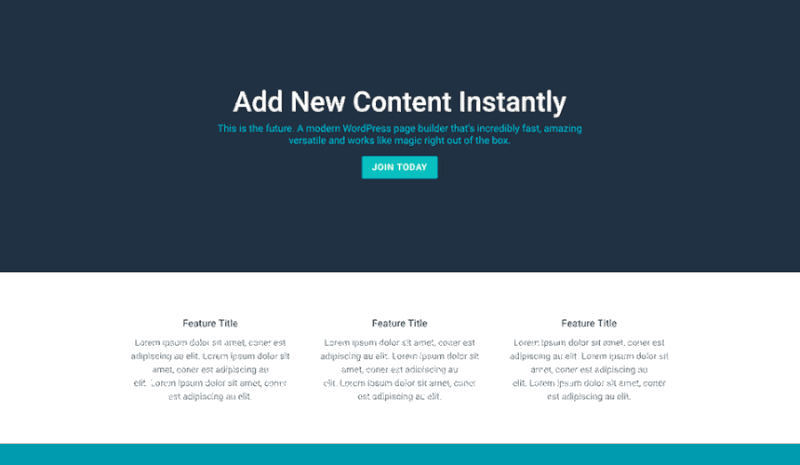
Divi’s 40+ content modules are still there to provide you will all the flexibility you need. Adding new content is even easier than dragging and dropping – just hover, and click – and it’s done. Easy, powerful, intuitive – all apply. Click here to discover more.

Easily Customize Everything

3

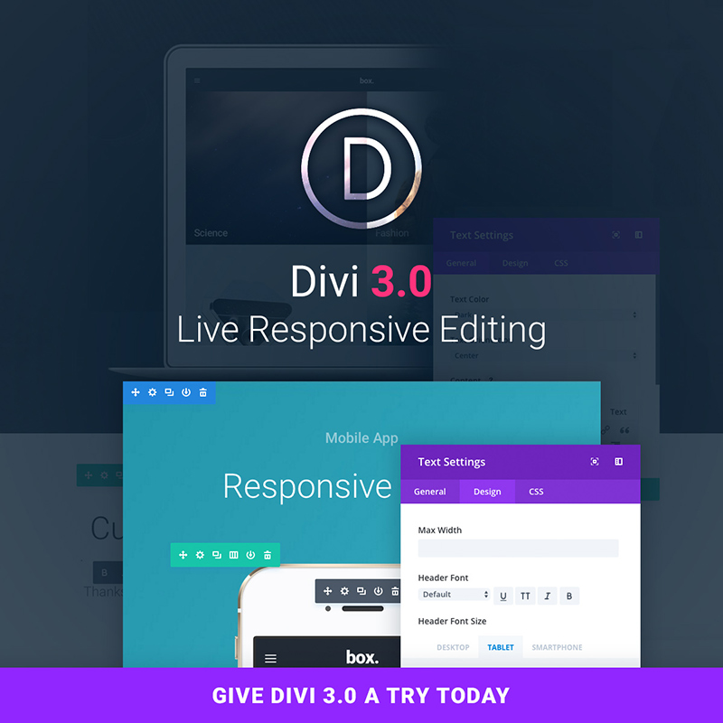
If you like seeing the design adjustments in real time, you’ll love Divi 3.0.

Any design element you are working with can be customized, with the results appearing in real time.

A sampling of what you can customize:

  • Fonts – There are dozens of custom fonts to choose from.
  • Text – Want to adjust text color, size, line height, or letter spacing?
  • Columns structures and row heights and widths are easily adjusted as well.
  • To add background colors, images, video backgrounds, and parallax effects is about as simple as it gets.
  • The same is true for dragging, dropping, and pasting content elements, or changing them by hovering and clicking.
  • Responsiveness – It’s a snap to apply different design settings for responsive breakpoints.

Enjoy the new Inline Editing Experience

4

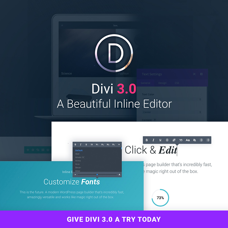
It’s simply a matter of click and edit. With Divi 3.0s visual builder, you simply click on the text, as viewed on your website, and start editing. You can add or delete text, highlight text, or adjust the font style, size, or spacing.

Experience Divi’s new Speed

This front end builder’s speed will give you the fastest WP web design experience you’ve ever encountered. There are few page refreshes required and no traditional page loading requirements at all. JavaScript powers the builder.

You are doing the building on your own browser, so there’s no need to rely on browser-to-server communication. The only time required is that needed by the application to compute each change. This is for all practical purposes, instantaneous. Internet speed is not an issue.

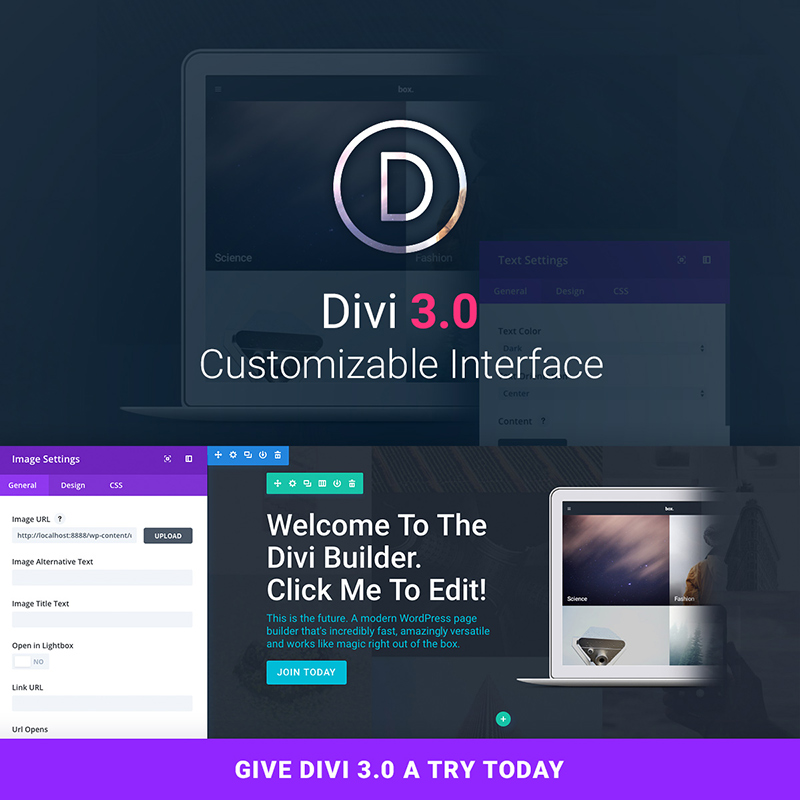
The Invisible, Customizable Interface

In this case, the invisible UI refers to its design. It is so perfect that it goes unnoticed. It doesn’t get in your way, it predicts your intentions, and it offers solutions. It doesn’t bombard you with options you have no immediate need for. Simple put – you’ll absolutely love the new web design experience.

This is the first WP page builder with a customizable interface. You can have the controls displayed in the manner of your choosing, so they never get in your way.

5

Powered by React

The visual builder in Divi 3.0 is a completely new application, built from the ground, using React and Flux. This new technology has allowed the Divi creators team to do some really amazing things. Their promise? To evolve along the community and change Divi for the better, for many years to come.

Falling in Love – Again

Web designers that are already using Divi know that falling in love over and over again, with the same theme is possible. Divi constantly reinvents itself. With this launch, you will practically build your website on your website.

You will gain time and experience a revolutionary way of web designing. Check out Divi 3.0 here.

Read More at Top 10 Thrilled Reactions On the Divi 3.0 Release
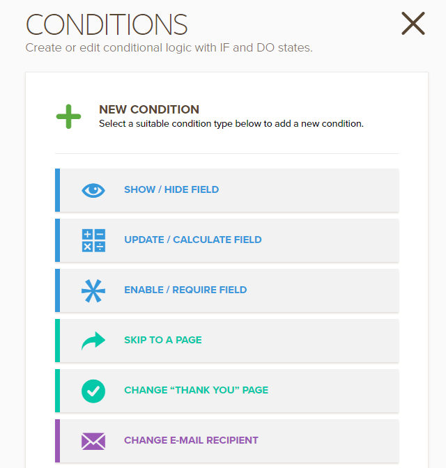
Categories: Designing, Others Tags: