Archive

Archive for September, 2016

Divi 3.0 introduces a new editing experience

September 7th, 2016 No comments

Elegant Themes released Divi 3.0 today. It’s the largest update of their flagship WordPress theme until now.

Divi 3.0 introduces a new way for site owners to create WordPress pages visually on the front-end of their website.

Divi 3.0’s brand new UI

With the latest version, Elegant Themes aims to create an invisible interface. The goal was to make the UI to not interfere with your design process. In Divi 3.0 all the previous highlights, outlines, and edit buttons are organized in a simple, efficient, editing process.

When you load the visual editor you’ll see your page exactly as it appears live. It’s like editing the actual page, with no awkward dashboard between you and the design. For example, you can click on some text, highlight a passage, and edit it right there on the page, without having to open up a separate editing panel.

Like the previous versions of Divi, all the page elements are represented by blocks. You can click on any of the rows or modules to edit them right there in the preview. Divi 3.0 still uses the process that existing users will recognize. It just makes the experience more intuitive.

Built from scratch with React

Divi 3.0 introduces an entirely new and up-to-date visual editing experience. The team at Elegant Themes has rebuilt it from the ground up, using Facebook’s popular React, and Flux JavaScript libraries.

This change in approach allows editing to take place on the page, and so Ajax calls have been eliminated from the backend. With the speed of React’s DOM updates, changes to your content are almost instantaneous; and you can drag, drop, resize, copy, and paste elements easily.

Divi’s pre-existing 40+ modules for adding content to your site have all been rebuilt and can be edited with this new frontend.

Lightning fast WordPress editing

Lightning fast, the new Divi building experience is probably slicker and more streamlined than any web builder you’ve tried to date.

Editing a module and seeing the results immediately on the page is a huge boon to designers used to working in dedicated graphics applications.

Divi 3.0

Launching today, Divi 3.0 is a must-have upgrade for Divi users.

Inspired by WordPress’ own move to JavaScript with last year’s Calypso release, Divi 3.0 hopes to become the next wave of WordPress Themes.

To try out Divi 3.0 for yourself. The Elegant Themes membership will get you full access to Divi 3.0 and al l of Elegant Themes’ theme collection!

The Complete Linocut Tool Kit from The Artifex Forge – only $9!

Source

Categories: Designing, Others Tags:

Make a Super Quick Little Slider to Play with Some Values

September 7th, 2016 No comments

It’s not all that hard to change some values in CSS and refresh a browser window. Or play with those values in DevTools. Or have a style injection setup, of which there are many ways. But sometimes it’s also nice to give yourself (or whoever else) a good ol’ fashioned UI control to play with a value.

Here’s a little example of a range input to control font-size:

See the Pen Range Slider Scaling by Chris Coyier (@chriscoyier) on CodePen.

First you need a range slider:

<input type="range" id="range" min="1.0" max="3.0" step="0.1" value="2.0" />

Then you attach an event handler to it in JavaScript:

var range = document.querySelector("#range");

range.addEventListener("input", function() {
  // do something with `this.value`
}

Every time that slider changes value, the function will be called, and you can access the slider’s current value with this.value.

Use it for anything you need a number for! Changing a price. Changing a color. Changing a size.

It’s kinda like a poor man’s dat.GUI.


Make a Super Quick Little Slider to Play with Some Values is a post from CSS-Tricks

Categories: Designing, Others Tags:

Breaking Out Of The Box: Design Inspiration (September 2016)

September 7th, 2016 No comments

Inspiration isn’t tied to a specific timeframe or shows up when you need it. There isn’t a magic formula to rely on. Luckily, this year’s summer vacation was fruitful in providing us with many visual stimuli to get the creative process going. Enjoy!

This illustration, just like all the other ones featured in today’s article, takes on curiosity and exploration of different tastes and flavors. Its composition and color palette are truly inspiring.

The post Breaking Out Of The Box: Design Inspiration (September 2016) appeared first on Smashing Magazine.

Categories: Others Tags:

Images Solved: Cloudinary is a One-Stop-Shop for Web Developers

September 7th, 2016 No comments
auto_everything_post

As we develop web projects, we always want to enhance our end users’ experience. We want the sites to be fast and use minimal bandwidth, while also being visually impressive. Use of images is the key to making sites visually appealing, but in most cases they do not load fast and they add unneeded weight to the site. But this doesn’t have to be the case. Cloudinary offers the perfect solution to managing images, which helps you maintain that delicate balance between file size and quality.

Images: Sizes, Resolutions, Weight, Focus, Format

Images have always been complicated to manage. This was the case years ago when we were developing for fixed resolutions that were based on a common compromise. At first we designed for 800 pixels width, then for 1,024 pixels width – long before the mobile web came into being.

The evolution of mobile devices has confronted us with a slew of additional intricacies. Mobile internet connections are unpredictable, fast in some areas, but slow and limited in other areas. To ensure acceptable performance of our site on smartphones, small file sizes are a necessity.

Mobile devices also come in a plethora of screen resolutions and pixel densities. We must make sure that we can deliver a variety of image sizes to the appropriate devices, while ensuring they look sharp on every device.

But mobile isn’t the only issues. Some browsers still offer only mediocre support for modern formats. As a result, we’ve been forced to stick with more common formats, rather than taking advantage of the benefits of modern formats like WebP, BPG and FLIF.

Another issue we face in image management is that when reducing an image’s resolution we are forced to cut off content in order to maintain the primary focus point.

Because of these complexities, it was too difficult, time-consuming and resource-intensive to serve different formats to specific browsers, or crop images to keep the focus in place.

Cloudinary Solves Image Management Challenges

But what if there was a service that made it easier to do all these transformations? Imagine only having to upload a single high-resolution image file, which the service would use to generate all the resolutions, sizes, densities, formats, weights and crops as needed, on-the-fly. Even better – it would run automatically, without you having to manually make adjustments.

This service does exist, and it comes from Cloudinary, the well-known cloud-based image and video management system. Recent upgrades to the solution enable you to use their unique algorithms to take advantage of full automation. Here’s a look at some of the new features available through Cloudinary:

Automatic Content-aware Cropping

The new parameter g_auto ensures that images are cropped according to their main content element. With face detection and a content-aware cropping algorithm, Cloudinary guarantees to never lose the focus of your images.

Not the best examples for content-aware crops. (Photos: Cloudinary)

Not the best examples for content-aware crops. (Photos: Cloudinary)

Automatically done content-aware crops using Cloudinary. (Photos: Cloudinary)

Automatically done content-aware crops using Cloudinary. (Photos: Cloudinary)

Intelligent Content-aware Encoding

The parameter q_auto is equally as powerful. Cutting down on file size is a process that involves decisions. How much clarity, sharpness, image quality are you willing to lose? What can you accept or – even more important – what level of quality do your visitors expect?

The answer is always the same. You want to keep the image quality as high as possible and the file size as small as possible. Cloudinary now takes care of that for you. It automates the file size versus quality trade-off decision, on-the-fly, by using perceptual metrics and heuristics that tune the encoding settings, then select the appropriate image format.

With Cloudinary, you will be guaranteed to always have the best quality at the lowest weight delivered to your site’s visitors.

Dynamic Format Selection

Adding to the effects of the content-aware encoding, Cloudinary now offers dynamic format selection. This algorithm does two things: it looks for the capabilities of the visitor’s browser, then delivers a format that might only be supported by that specific browser, such as WebP in Chrome. In addition, the parameter f_auto analyzes the image content to generally select the appropriate format.

If you'd upload a file like this as a JPEG, Cloudinary would make sure it gets delivered as a PNG. (Illustration: Cloudinary)

If you’d upload a file like this as a JPEG, Cloudinary would make sure it gets delivered as a PNG. (Illustration: Cloudinary)

Automatic Responsive Images

Responsive images have created even more challenges for developers. Consider how many different devices, of different resolutions that are on the market now. Then you have to consider dealing with orientation change when devices are moved horizontally or vertically. This requires the creation of multiple versions of the same image, to ensure visual quality regardless of device or screen.

Cloudinary offers new parameters w_auto and dpr_auto do the job for you. The service simplifies dynamic image delivery for responsive websites on retina and regular displays, by automating the image width and Device Pixel Ratio (DPR) value decision based on the viewing device, display size and layout. All of this is derived from the single high-resolution image you uploaded.

For more details on Cloudinary’s new features read this blog post. It gives you code snippets and in-depth information on the processes behind the curtain. To test drive the features and see what they can do, visit Cloudinary’s demo page.

Disclaimer: This article is sponsored by Cloudinary.

Categories: Others Tags:

Animating a Logo in Adobe Muse

September 6th, 2016 No comments
Muse For You - Animating a Logo in Adobe Muse - Adobe Muse CC

Animate a Logo in Adobe Muse. No Coding Skills Required.

Adobe Muse CC Logo Muse For You - Adobe Muse CC Greensock Logo

In this tutorial I will be going over how to animate a logo in Adobe Muse using the Muse Motion 2 Widget Powered by the Greensock Animation Platform (GSAP).

1. Open the logo in Adobe Illustrator.

2. Un-group the logo to be able to select all of the elements.

3. Change the colors of the logo if necessary.

4. Create a transparent square that is a bit larger than the logo. Send the square to the back.

5. Re-group the logo to align the perfect square and the logo. Align them vertically and horizontally so they are perfectly centered.

6. Un-group the logo.

7. Select each element individually with the square and paste each individual element into Adobe Muse.

8. Layer all elements on top of each other and assign the graphic style name motion1 through motion9 for each of the elements.

9. Open the Library Panel in Adobe Muse and drag and drop the “Muse Motion 2 – Add First” widget and place at the top of your Adobe Muse website. If you do not see the Library Panel go to Window > Library.

Muse For You - Animating a Logo in Adobe Muse - Adobe Muse CC

10. Drag and drop the “Muse Motion 2 – 2D Sequence,” below the “Add First” widget. We will be working mostly with the middle widget as these are the widgets that add animations to the elements on the Adobe Muse website. The “Beginning” and “End” widgets control the overall timing of the sequence and a few other options.

11. Add a rotation animation to the first middle Muse Motion 2 widget. Do this by going to “Rotate” and selecting “Enable Rotate.” Then enter in a 360 rotation value. The value can be negative. In the video tutorial the highest 360 rotation I enter is 1440. That is 4 rotations.

12. Change the duration of the rotation to 6 seconds or as long as you would like. The less time for the rotation the faster it will spin.

13. Copy and paste the first middle widget and change the graphic style name to “motion2.” Also add an earlier offset of 6 so that this animation starts at the same time as the first one. Change the rotation value to another variation of 360. The value can be negative if you would like the rotation to go in the opposite direction.

14. Repeat these steps for the rest of the elements. The graphic style name for each widget has to match the elements on the website.

15. Preview website in the browser and check animations.

*Note: Middle widgets need to be in between the “Beginning” widget and the “End” widget.

Watch the video above to see a demonstration of how to achieve this effect in Adobe Muse using the Muse Motion 2 widget found at http://museforyoushop.com.

For more video tutorials and widgets for Adobe Muse visit http://museforyoushop.com.

Happy Musing :).

Read More at Animating a Logo in Adobe Muse

Categories: Designing, Others Tags:

Top 14 Web Resources You Have To Use In Your Projects

September 6th, 2016 No comments
6. HotGloo

Talking about getting updated with today’s world? Let us help you find some of the most important services online that will help you in your career in the tech industry. Don’t just go and Google it, that’s what most people do. Let us give you invaluable advice about choosing a great service on design and developing.

1. Codester.com

Are you looking for one of the best marketplaces online for developers and designers? Then you must know about Codester, a great place where you can buy and sell various set of assets to make your development process a lot quicker. They have a great deal for everyone who decides to open a store there – a 70% commission, while you can keep selling the items on your own web page. Also, there is no minimum number of sales required for you to gain your monthly payment through PayPal or wire transfer. The products they have for sale are quite diverse, from backend PHP scripts to JavaScripts, from HTML5 themes to latest WordPress plugins. Even more, you can get graphic content, like icons and a logo for your app, or even a full user interface. This is the place for you to start a project in no time and get your business to the next step of shipping a project. They have source codes for Android, iOS Unity and even Tatanium apps. Codester comes with another way for you to increase your revenue through passive sales and even more, though, affiliate links. If you become an online marketer for them, by sharing your links to your followers, you get 20% of what they buy through them, just like that. With all these opportunities, why wouldn’t you start an account at Codester right now? Stop debating and start building!

2. Visme.co

2. Visme

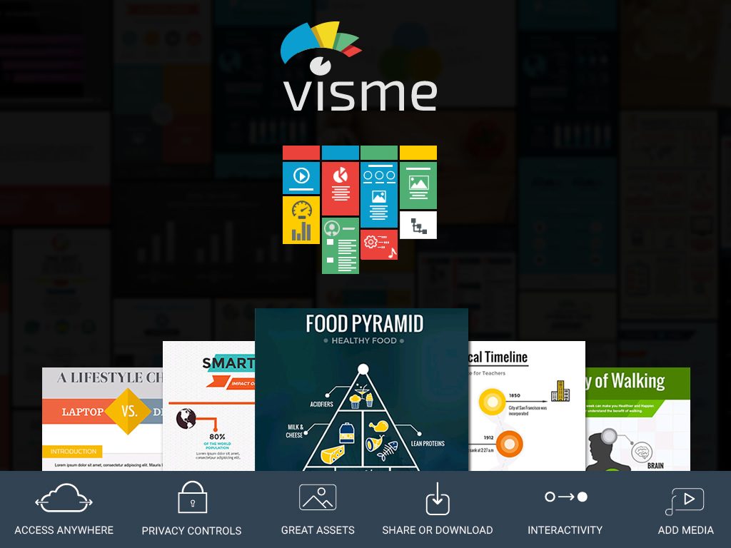
Your marketing strategy can be significantly improved by using Visme, a very handy tool which will give you the chance to create interesting and engaging content, that you can style however you wish. All you have to do is to have an idea and then Visme helps you easily bring it to life by providing you with a huge range of free images, icons, infographic visuals, fonts and so forth, that will enable you create presentations, infographics and other kinds of content.

Start with no skills of graphic design and finish with a professional looking piece of content in no time! All can be done through a simple and efficient dashboard that gives you a good range of options to choose from, in order to edit your projects, such as adding shapes, images, icons, videos, charts, graphs and audio. The final result will be stunning and unique, thanks to the wide library of customization options. The final part is the sharing! The content can be shared by using an URL, embedded in a website or downloaded as an image a PDF, or HTML-5 depending on your payment plan. Oh, did I mention that Visme’s biggest attraction is its price? It starts from just $4.50 a month, so anybody who needs professional looking visual content can now afford it. Awesome !

3. PSD2HTML.com

3. PSD2HTML

If you do not have so much time, are a skilled designer, but you require high quality, semantic and valid code, then PSD2HTML® would definitely be worth considering if you. They are a great team of over 470 professionals that will help you transform your visual representation of your desired website into a real, good-looking and functional website.

All you have to do is to send them the Photoshop design, make some notes about it and then select from a bunch of options, such as fluid or static width, browser compatibilities, resizable fonts, and cool add-ons. They will immediately process your request and, in no time, they will start working at your project, asking you relevant questions when needed.

Some of the services they provide you are front-end development (PSD to HTML Conversion), CMS-based development (PSD to WordPress) and email templates (PSD to Email). Apart from this, you can see their portfolio on their website – you will immediately become their fan, if not even their client. ?

4. Simbla.com

4. Simbla

Two of the many things that make Simbla special is the ease of use and the adaptability to any device. If you want to start using this powerful platform with amazing responsive website templates on Responsive website templates , all you have to do is to create an account which requires your email, your location and a password. Afterwards, you can choose a template and a suited name for your site. In case you need further instructions, you can take a quick tour before using it which will take you less than a minute to complete it. This is the best way to show you the basics of working in Simbla and help you save lots of time and effort in the future. You should go ahead and start benefiting from its responsive website templates.

5. Themify.me

5. Themify

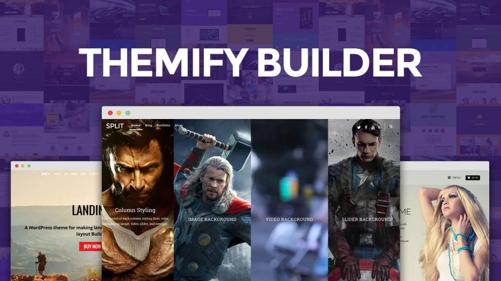
Themify is one of the most popular places to buy Word Press themes that will save you from the struggle of going through the endless list of themes before you find the beautiful and responsive one which you can trust. What makes it so popular is the wide range of options, meaning you can try out your website in different appearances before taking a decision. Let’s dive in!

6. HotGloo.com

6. HotGloo

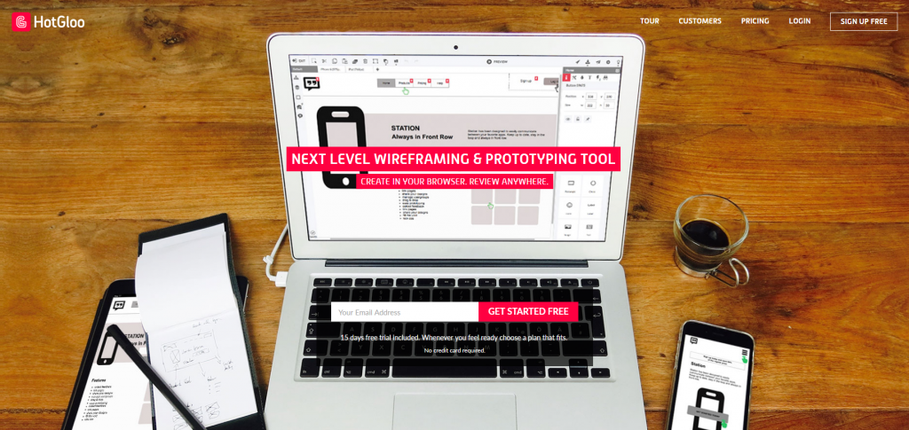
HotGloo is a wonderful wireframing tool with a mature, fully developed set of elements covering huge sets of icons and loads of pre-build UI widgets, fitting every need. Build and test your prototypes before you design and start coding. Collaborate with your team and show your work to your clients for approval. Their plans are starting as low as 13$/month. Try now!

7. Droplr.com

7. Droplr

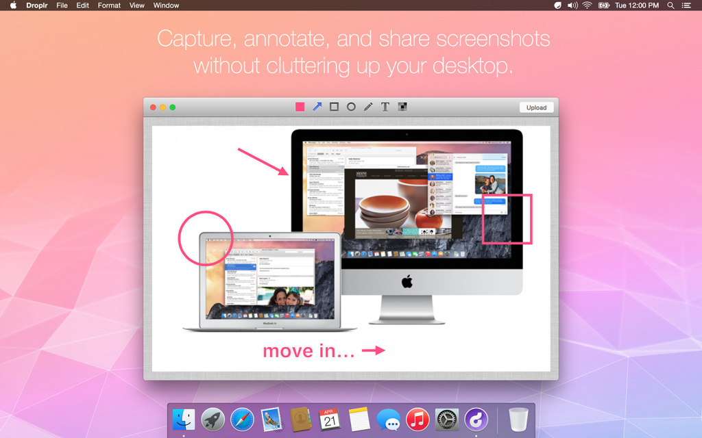
They say communication skills are something you are born with, but this time they’re proven wrong. Even though working in a team may seem difficult and stressful, Droplr makes it easy, efficient and quite fun. With its group conversations, its features which let you make changes on work projects in real time, all in one app, and the possibility of giving feed-back s in a GIF, everything you got so tired of can become really entertaining.

8. Codepad.co

8 codepad

On Codepad.co you can create shareable online snippets of code for your web developing projects. You have the possibility of controlling the version of your work, so you won’t lose anything. You can collaborate on public playgrounds, follow other popular developers and get their work in your timeline and create collections of different snippets for a larger scope. And if your work is astonishing, other people can send you job offers directly on your email.

9. Host-tracker.com

9 HostTracker

Thank to Host-Tracker, you can now be the first to know when your website is down! It is a very easy to use, but advanced website monitoring tool that gives you many great features to help you with the monitoring of your website. It targets various tasks, such as the simple checking of a web page or even enterprise-level features like database tests. Moreover, you have possibility to receive notifications about all changes, activities and the overall status of your website!

10. Redbooth.com

10. Redbooth

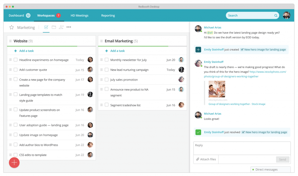
A teamwork management app must be able to keep you on track and aware of any changes or issues concerning your project in real time. Redbooth definitely thought this out, as it offers its online project management software on a wide variety of devices and platforms, such as Apple’s iOS and iPad and Android. It also lets you integrate your favourite apps, such as Outlook, Evernote and Dropbox. It fits all of your needs, according to your lifestyle, which is what made it successful.

11. Invoiceninja.com

11 Invoice Ninja

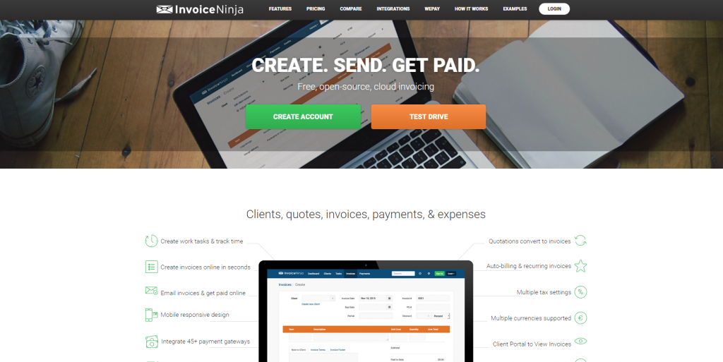
Except of all the services it offers, Invoice Ninja makes it look like it is all about your company, which is pretty flattering. Lots of options to design the template, like choosing out of a series of colors and styles in order to match your brand’s logo, actually encourage you to raise awareness of your company’s worth. Believing in yourself is the key to success and Invoice Ninja hands it to you, while also getting work done in seconds.

12. Colorlib.com

12. Colorlib

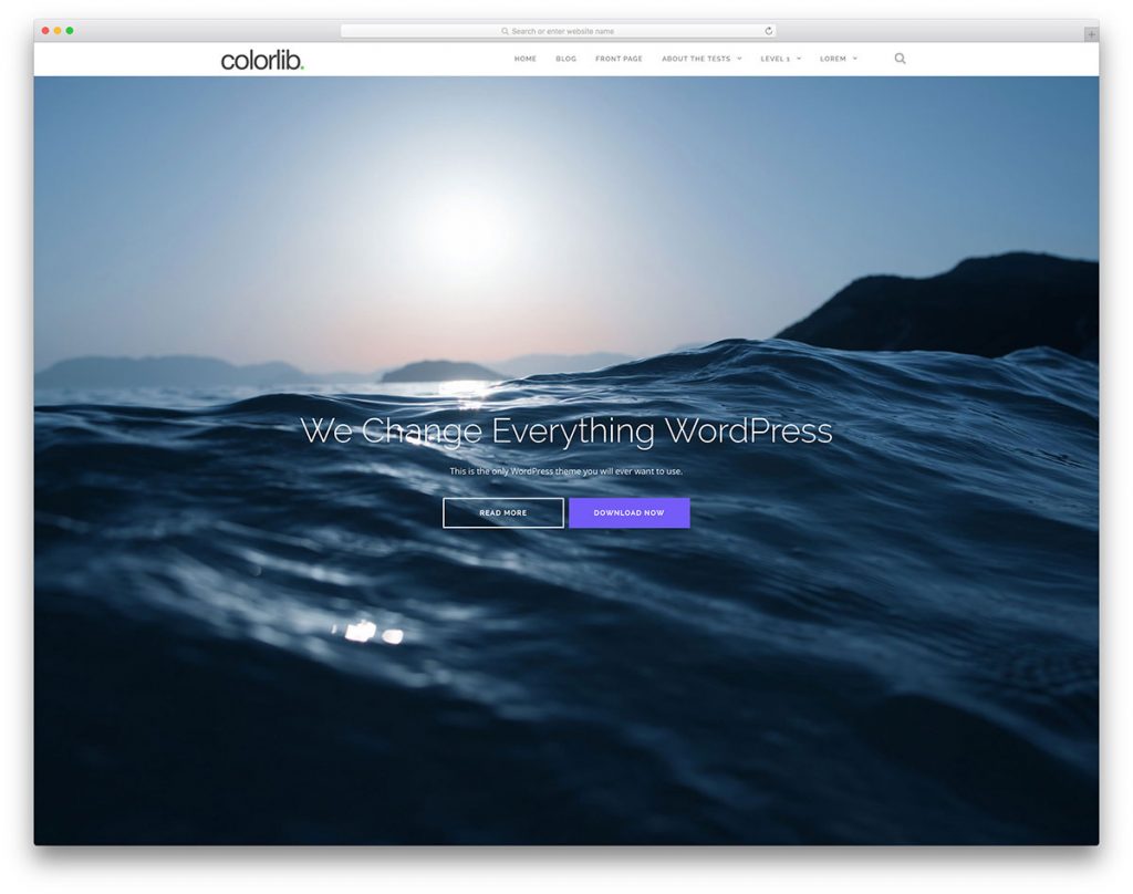
Are you planning to start a new blog but you can’t find the right theme ? Then you should definitely try Colorlib. This company has dozens of themes available for you to choose from. Some of them are even free so you’ll find the most suitable for your interests and budget. Some of the free themes are: Flexible, Illdy, Activello, Sparkling, Dazzling and many more.

13. wpDataTables.com

13. Touchmesoft.net

We found the solution to make your work with tables, charts and data management easy. It is called wpDataTables and it is a plugin from Touchmesoft.net that lets you create a responsive table in WordPress in a matter of minutes, and using it requires no coding! You can choose and customize the design, edit tables both from front-end and back-end and even pull table data from any source. Besides this, their tables are very responsive and can work on any device!

14. xFIVE.co

What does it mean for your organization to use the services of xfive? It provides Web design and Web development services. It specializes in front-end, back-end, Word Press, JavaScript, and Email development services. xfive will definitely help you get your business off the ground. Their motto is “Our mission, our commitment, our passion, that is to materialize the innovation dreams of our customers into tangible business”. Give it a try!

And to add more fun to our 14 excellent resources, we’re presenting a new, fun web developer comic by Browserling:

mermaid-fb

Who said web developer jokes aren’t funny? That’s exactly what Browserling‘s new web developer jokes comic tries to prove every week with a funny code/joke/cartoon. Their jokes are pretty hilarious. They offer their jokes for free for you to enjoy. Go to comic.browserling.com for all jokes and subscribe to their feed.

If you enjoyed our selection, as diverse as it was – a graphic-to-code conversion service, a market for developers and several theming websites – you can go right now to the ones you’ve found fit and check them out. If you start using their services, your work will certainly create more value and bring more revenue.

Read More at Top 14 Web Resources You Have To Use In Your Projects

Categories: Designing, Others Tags:

My New Favorite ES6 Toy: Destructured Objects as Parameters

September 6th, 2016 No comments

Like a lot of other developers, I’m working through my continued education learning what I can about ES6. One of the ways I’m doing this is to attend workshops by smart people. I went to Kyle Simpson’s ES6: The Good Parts course and found myself particularly interested in the practical applications of a piece of ES6 I had previously not noticed: Destructured Objects as Parameters.

Some background

As an application grows our function parameters can become bloated. This is a problem for a number of reasons:

  • We have to remember the specific ordering of these parameters when we call the function. If that’s more than three, it takes some context-shifting to compare.
  • We don’t have defaults out of the box
  • To properly self-document, we rely on naming very heavily. Naming arguments in code reviews are so fun!

How do we solve this with ES6?

Thinking very broadly about passing objects as parameters instead might seem at first to be pretty straightforward, and maybe even slightly more convoluted as people aren’t used to reading parameters and thinking of them this way. But look at all the issues from above that this solves:

  • You no longer have to remember the specific ordering
  • We can easily have optional parameters
  • We can have defaults, which is also nice because it’s self-documenting
  • We can have fallbacks for failure conditions, or decide not to if we want to show an error

Destructuring can help us easily extract and manipulate data from arrays or objects into distinct variables and make our parameters more meaningful. This helps us communicate our intentions to readers in the future and helps with maintenance.

What is destructuring?

Destructured objects as parameters combines a few things into one. Let’s start with the concept of destructuring as a whole before showing this particular application. There are a lot of uses and applications for destructuring, perhaps most commonly applied when you have a large JSON object or API and you want to extract meaningful variables from them. Destructuring is possible in ES5, but due to a combination of a lot of features in ES6, destructuring is a lot more legible and valuable.

We’re only going to be speaking about destructuring objects (not arrays), but it’s important to note that both are possible. We’ll start with a very basic and slim comparison of object destructuring in ES5 vs ES6:

Here is how we destructure an object in ES5:

var o = {a: 1, b: 2, c: 3};
  
var chico = o.a,
    harpo = o.b,
    groucho = o.c;

console.log(chico, harpo, groucho);
// 1 2 3

And now, its ES6 counterpart:

const o = {chico: 1, harpo: 2, groucho: 3};

const { chico, harpo, groucho } = o;

console.log(chico, harpo, groucho);
// 1 2 3

This has some really useful practical applications. We can create top-level variables from objects, a few properties at a time, and even extract them when they are nested a few deep.

const o = {
  chico: 1, 
  harpo: 2, 
  groucho: 3,
  othermarx : {
    zeppo: 4,
    isthatamarxbrother: {
      gummo: 5,
      polly: 6
    }
  }
};

const { gummo, polly } = o.othermarx.isthatamarxbrother;

console.log(gummo, polly);

We can even rename them in the process, by doing something like const { gummo, polly:cousin } = o.othermarx.isthatamarxbrother;

This article will not go over all of destructuring so that we can focus on one practical application. If you’re interested in learning more about it, how it applies to arrays in ES6, and some other nice uses, here are some good resources:

How do we use this in a function?

Let’s start with a really bare-bones example of a function with some parameters. Let’s say we need to have a manifest with a lot of standard shipment data. This data stays the same, for the most part, but has some deviation from day to day. Defaults make a lot of sense here, but we would have to write out something like this:

function shipmentES5Defaults(params) {
  params = params === undefined ? {} : params;
  var items = params.items === undefined ? 'bananas' : params.items;
  var number = params.number === undefined ? 5: params.number;
  var pkg = params.pkg === undefined ? 'crates' : params.pkg;
  console.log("We have a shipment of " + items + " in " + number + " " + pkg + ".");
}

shipmentES5Defaults();
// We have a shipment of bananas in 5 crates.

shipmentES5Defaults({
  items: 'cherries',
  pkg: 'bags'
});
// We have a shipment of cherries in 5 bags.

This is nice, because we have our defaults and don’t return an undefined if something isn’t specified.

But in ES6, we can use the destructured object we just covered as our parameters, allowing us a quick and easy way to provide defaults. Aside from being useful, it’s a bit self-documenting as well. This is pretty helpful and a really nice way to write our functions with legibility in mind. Not to mention that the ES6 template literal makes the string really easy to both read and write.

function shipmentES6({ items = 'bananas', number = 5, package = 'boxes' } = {}) {
  console.log(`We have a shipment of ${items} in ${number} ${package}.`);
};

shipmentES6({ package: 'crates' });
// -> We have a shipment of bananas in 5 crates.
shipmentES6({ items: 'tomatoes', number: 18 });
// -> We have a shipment of tomatoes in 18 boxes.
shipmentES6();
// -> We have a shipment of bananas in 5 boxes.

Aside from all of these benefits, if you and your coworkers or collaborators get used to writing in this style, then if you don’t pass a default, you are also communicating that there are no defaults and you’d rather it error out.

Stay tuned for our next post, where we’ll use this way of writing parameters to construct a SVG chart with no external libraries.


My New Favorite ES6 Toy: Destructured Objects as Parameters is a post from CSS-Tricks

Categories: Designing, Others Tags:

The Math of CSS locks

September 6th, 2016 No comments

Florens Verschelde digs into the numbers behind the concept Tim Brown was talking about the other day.

When I tried wrapping my head around Tim’s implementation, and creating variants of it, I had a hard time figuring out what was going on exactly. I did a lot of back-of-the-envelope calculations, and I thought it would be useful to share a mathematical explanation.

Here’s my layman’s explanation:

  1. You can make a value (like font-size) flexible with viewport units.
  2. Using just viewport units, that value might be too flexible, resulting in values that are too small or too big.
  3. You can “lock” the upper and lower limits with @media queries.
  4. You still need a fancy calculation to calculate the “middle” values between the two “locks”.
  5. The calculations can vary in complexity, especially when trying to use relative units and accommodate user font scaling.

The code ends up, in one particular example, like this:

@media (min-width: 320px) and (max-width: 959px) {
  h1 {
    font-size: calc( 1.5rem + 16 * (100vw - 320px) / (960 - 320) );
    /* For a negative slope, we have to invert the breakpoints */
    line-height: calc( 120% + 3.2 * (100vw - 960px) / (320 - 960) );
  }
}

Remember there is a PostCSS plugin.

Direct Link to ArticlePermalink


The Math of CSS locks is a post from CSS-Tricks

Categories: Designing, Others Tags:

Slicing SVG 9 Ways

September 6th, 2016 No comments

Paul Lewis animated a 3D Card Flip. Straightforward enough there, but this needed a shadow element as well:

The shadow may need to move around or fade, so we need a solution that we can animate with transforms & opacity, since they can be handed off to the GPU. It will need to be separate to the element it’s shadowing, since we will likely want to fade and move it without affecting the other element.

He tried box-shadow and filter: blur(), but both aren’t performant enough.

He tried an SVG element with a blur filter, but SVG alone can’t do 9-slice scaling (necessary to keep the corners from scaling awkwardly).

The winner was using an SVG image but applying it to an element via border-image, which essentially 9-slice scaling.

Direct Link to ArticlePermalink


Slicing SVG 9 Ways is a post from CSS-Tricks

Categories: Designing, Others Tags:

9 ways to wow users with email

September 6th, 2016 No comments

Email marketing might be one of the most effective ways of reaching out to your prospects with your marketing campaigns. But what about keeping them hooked to your brand? This has always been a challenge for email marketers.

Amongst the plethora of tactics applied to overcome this challenge, interactive email design is fast emerging as the most innovative, dynamic and trending way to keep subscribers interested and involved. Now this is sure to put a smile on the face of email designers and developers!

A text copy, however engaging its content might be, can still go unnoticed but interactivity in emails calls for some kind of participation, thus grabbing attention and keeping subscribers glued to your copy. It adds fun to the experience and helps to make a lasting impression.

And there’s more good news for the creative teams working behind the scenes: Gone are the days when ESPs would not support interactivity in emails. Subscribers can now take action in the email itself. Amazing interactivity options like Menus, Accordions, GIF, Flip effect, etc., not only make emails look enticing but also offer good CTRs. So, let your creative juices flow…

1. Menus in email

Provision to explore products/ services right in your inbox! Isn’t that cool? Menus in email provide you with that option. Be it the travel and hospitality industry or technology websites, manufacturing units or e-commerce websites, all can benefit by sharing information in menus.

Some industries that can benefit:

  • Travel and hospitality industry to share tour options
  • Media industry to share a big chunk of information in menus
  • E-commerce industry to launch new products, and also for cross selling
  • Manufacturing companies to send out processes to stakeholders

2. Accordions in email

Accordions help to send out a lot of content and still don’t let the email look lengthy. This is a great way to keep subscribers engaged without irritating them.

This can especially prove helpful while designing the mobile version of any email. Apart from the benefit mentioned above, with accordions, you can measure the clicks on tabs to find out what is gathering more attention and tweak marketing strategies accordingly.

Some industries that can benefit:

  • Retail brands to showcase many products and information in one email
  • Tech industry to display various navigation options
  • Media industry to compress their huge data in less space
  • All industries to send feedback emails with a questionnaire in accordion

3. GIF in email

Animated GIFs add fun and delight to an email. Fortunately, with many ESPs now supporting GIF in email, it is even easier to impress subscribers with GIFs.

According to MarketingSherpa, Dell increased its revenue by 109%, conversion rate by 103%, click rate by 43% and open rate by 6% through a GIF-centric campaign. Growth oriented businesses, too, can and should make the most of this highly profitable and easy-to-implement tool.

Some industries that can benefit:

  • Food/restaurant industry to promote products/ show procedures of cooking
  • E-commerce websites/ fashion brands to display several images of different or same product
  • Real estate industry to display pictures of sample houses
  • Automobile brands to showcase features/colors of models

4. Interactive graphs in emails

Interactive graphs in emails help to illustrate data, findings, annual reports, etc. in an impressive manner, leaving a long-lasting impact on minds of subscribers. Graphs also make the information credible, thus proving to be good for your business.

Some industries that can benefit:

  • E-commerce websites to provide comparative data for products
  • Educational industry to share achievements and records
  • Manufacturing units to share annual report outcomes with stakeholders
  • Research agencies to share their findings

5. Counters in email

Counters create that time-is-ticking-away feeling and thus ingrain a sense of urgency, which always works well in favor of a marketing campaign. Apart from that, it also creates an impression that the email is important and noteworthy. Thus, promoting events and sales with the help of countdowns is a sure-shot way to draw your subscribers’ attention.

Some industries that can benefit:

  • E-commerce websites during sale period to add a sense of urgency
  • Educational institutions to draw more admissions
  • Travel and tourism industry to present time specific/seasonal offers

6. Flip effect in email

This is another way of downsizing the content of your email. Flip saves space and you can flip flop the content you are interested in. Exhibiting multiple products, writing a product description at the back, offering discounts; all this can be done with flip effect.

Some industries that can benefit:

  • Retail brands to present products with information of the product using flip
  • Tour operators to display images and information of packages in flip
  • Companies wanting to share ebooks, whitepapers
  • Ecommerce industry to display sales/offers

7. Scratch effect in email

Sending offers to subscribers in order to convert them into leads is a part and parcel of any business. Scratch effect is an influential tool when it comes to presenting such offers. Your recipient has to scratch the code to redeem the offer. The interactivity makes the experience even more exciting.

Revealing codes with the scratch effect can be used by any industry to offer discounts.

8. Sliders in email

Sliders are space saving and attention seeking tools within your email. Maximum information can be packed in a small space, where the screen keeps sliding, showing multiple products/services at a time. The best part is that you can let your creative juices flow while designing each slide, making the subscriber curious by revealing just a little in every slide.

Some industries that can benefit:

  • Home décor industry to demonstrate various home products.
  • Tour operators to display offers/packages in one go
  • Healthcare industry to promote their services
  • Tech companies to showcase coupon codes/offers to other sectors

9. Rotating Banners in email

An image speaks louder than words and more than one can speak even louder. Rotating banners help to showcase all the images (or content) you want to popularize in limited space. Not to forget that the rotation effect makes the section conspicuous, grabbing attention.

Some industries that can benefit:

  • Cosmetic brands to display shades of various cosmetics
  • Banks to display account plans, special investment plans, etc.
  • Event management companies to exhibit their work, destinations, services, client testimonials, etc.
  • Universities to display pictures of their star performers.

Although many ESPs and email clients have now started supporting interactivity within emails; unfortunately, some still are unable to render some of the effects mentioned above. So, make sure you test them across each ESP and email client before sending them to your prospects.

Interactivity in emails

  1. Adding interactivity in emails is like doing a makeover of your old and dull plain text emails. The stunning and fresh look not only creates a great impression but also helps in improving your brand image.
  2. Most of the interactivity tools help to deliver maximum information in as little space as possible, without disturbing the beauty of the email, in fact enhancing it.
  3. Interactivity within emails can be responsible for better open, click-through and conversion rates.
  4. Interactivity within emails speeds up the conversion process by providing actionable tools within the inbox. Steps like taking the prospect to your website or a particular landing page can be skipped here.

With interactivity likely to be driving consumer interest in the near future, it is important that email marketers modify their campaigns to include interactivity in emails. Are you game for it?

The GIGANTIC Font Bundle (30 Fonts with Extended Licenses) – only $29!

Source

Categories: Designing, Others Tags: