Archive

Archive for September, 2016

Cookies & Co.: Storage Options in the Browser

September 6th, 2016 No comments
hunger-413685_1280-768x512

For the longest time, cookies were the only option to store information locally within the browser. Even today they are mainly used in combination with server-side sessions. However, thanks to HTML5, we have another option to locally deposit data in the browser. There’s the “Application Cache”, as well as “Web Storage”, and IndexedDB. But what are the different storage options there for and what can they do?

Saving Settings and Sessions Using Cookies

Cookies were already around during the Netscape days. They are used even today to save settings for websites and web services, or to manage sessions. A cookie is a text file that can contain up to 4 KB of text. You can set up cookies via JavaScript or server-side via PHP.

They are mainly important in combination with sessions. Whether it’s about the log in on social networks or in online shops: a cookie placed after the log in makes sure that the website recognizes you as a user.

The special thing about cookies is that you can add an expiry date to them. Thus, cookies usually have a limited lifespan. If no lifespan is set, a cookie will expire upon closing the browser.

Generally, cookies can only be read by the domain from which they are placed. Oftentimes, it’s also possible to restrict a cookie to certain subdomains or indices.

Saving Via “Web Storage”

With the introduction of HTML5, two other storage options were established: the “Web Storage”, which consists of “loacalStorage”, and “sessionStorage”. Both versions allow you to save variables and values in the browser, purely via JavaScript.

localStorage.setItem("name", "Manfred");
sessionStorage.setItem("name", "Manfred");

While using “localStorage” will keep deposited data in the browser permanently, “sessionStorage” only keeps them until the browser is closed.

In contrast to cookies, which are a simple text files, you get to distribute as many variables as you like, letting you save and access different information.

localStorage.getItem("name");

While cookies often work in conjunction with server-side session variables, “localStorage” and “sessionStorage” only provided a local storage option.

Saving Entire Websites Offline Using”Application Cache”

HTML5 focused more on mobile devices like smartphones and tablets. Thus, “Application Cache” lets you make an entire website available offline. Here, you can use a so called manifest file that determines which of a website’s resources are stored and made available on a device.

CACHE MANIFEST
index.html
stylesheet.css
logo.png

This file induced via “CACHE MANIFEST” contains all information needed for offline operation. Once downloaded, no internet connection is required to access the page. In contrast to browser cache, the information is permanently saved locally, similar to native mobile apps.

The manifest file has to be referenced in the page’s “” element.

<html manifest="http://www.example.com/manifest.mf">

IndexedDB: Database Within the Browser

IndexedDB and WebSQL are two approaches to establish databases set up locally within the browser. In the end, IndexedDB prevailed. In contrast to “Web Storage”, which only allows for the storage of simple variables and text based contents, IndexedDB provides much more complex storage options.

Using IndexedDB, you are able to create a full-fledged database in the browser, where you can not only deposit character strings, but also numbers and objects.

var request = indexedDB.open("example", 1);

In the example, a database is set up. Subsequently, you create so-called “stores”, in which you place single data sets.

request.onupgradeneeded = function() {
  var db = request.result;
  var store = db.createObjectStore("article", {keyPath: "id"});
  var titel_index = store.createIndex("by_title", "title", {unique: true});
  var autor_index = store.createIndex("by_author", "author");
  store.put({title: "HTML5 and CSS3", author: "Denis", id: 123456});
  store.put({title: "Mobile Apps", author: "Dieter", id: 234567});
};

request.onsuccess = function() {
  db = request.result;
};

Here, a “store” with articles is created. Afterwards, two indices are defined, both of which sort data sets differently. In the end, the data sets are written into the database via “put()”.

Conclusion and Developer Tools

chrome_entwicklertools_speicher

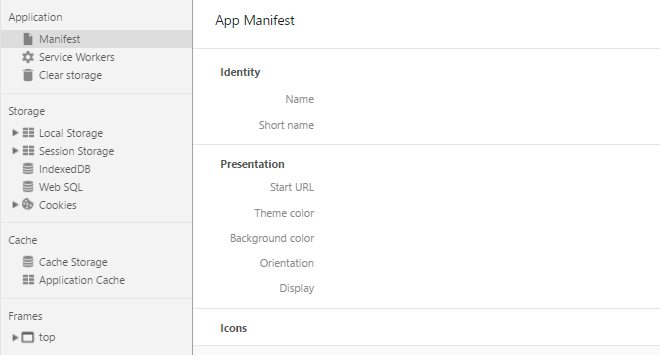
Developer Tools in Chrome

If you want to develop contemporary web applications with HTML5, “Application Cache”, “Web Storage”, and IndexedDB are three options for you to store information locally in the browser, as well as make them available offline. This is an especially important aspect when it comes to mobile web apps. Server-based solutions are not needed.

The developer tools of the recent browsers also let you display the stored content, as well as delete it if need be.

(dpe)

Categories: Others Tags:

Creating Gradients in Adobe XD

September 5th, 2016 No comments
Dansky_How to Create Gradients in Adobe XD

In this tutorial, we’re going to learn how to create gradients in Adobe XD.

The Steps (1-6)

1. Create a New Artboard in Adobe XD.
2. Select the Rectangle/Ellipse Tool and draw a shape, ensuring that the shape has a solid fill and no border.

creating-gradients-adobe-xd-1
3. With the shape selected, Left-click the Colour Picker from the Property Inspector, and from the dropdown menu at the top select Gradient. A gradient will be applied to your shape’s fill using two colours by default.
4. Left-click each swatch on the Gradient Slider and select your preferred colours as desired. New colours can be added by simply Left-clicking anywhere on the Gradient Slider, and colours can be removed by Left-clicking and dragging the swatches directly off of the Gradient Slider.

creating-gradients-adobe-xd-2
5. When a gradient is applied to a shape, a line connected by two dots is displayed upon opening the Colour Picker, this can be used to adjust the Angle of the gradient, as well as the Spread.
6. For a ‘harder’ division between two colours, drag the dots at either end of the line closer together. On the other hand, if you would like a smoother and more gradual gradient, simple move the dots further apart.

creating-gradients-adobe-xd-3

Download Adobe Experience Design CC (Adobe XD).

Read More at Creating Gradients in Adobe XD

Categories: Designing, Others Tags:

CSS-Tricks Chronicle XXVIII

September 5th, 2016 No comments

I was interviewed by Justin Crawford on the Mozilla Hacks blog about cross browser compatibility.

What motivates you to make the extra effort to build a cross-browser compatible site?

Money. People pay for websites that work for them. Here’s a little example: Just last week we were working on some drag-and-drop functionality in a new part of CodePen. Worked great in Chrome, didn’t work in either Firefox or Safari. Tim Holman, one of our front-end devs, had to spend a good part of a day implementing different fixes for both. Good thing we did that before launch, otherwise we surely would have turned some potential customers off.


Everybody at CodePen is chugging away at big new features. Those aren’t ready to share yet. We knew it would take awhile, so we take little breaks to release small features. Things like Autocomplete in the Pen Editor, Image Uploading from the Post Editor, Checking for unused classes, and a few other small releases like that, all documented on The CodePen Blog.


Speaking of The CodePen Blog, it recently had a minor facelift. The homepage for the Podcast, CodePen Radio, looks the most different. We’re over 100 episodes now. For #100, we talked about the biggest Pens in the history of CodePen. Since then we’ve kicked off a 10-part mini-series talking with other businesses that some kind of similarity with CodePen, so we can extract valuable business information from them live on the radio ;).


Remember how I wrote a book? I talked all about it over on ShopTalk Show, then the next week, we talked with a bunch of other recent tech book authors in a panel all about book writing.

Other than that, ShopTalk has mostly just been Dave and I chatting in non-live mostly Q&A episodes. We’ve been loving that. It keeps the show more focuses and easier to do. I’m sure we’ll have other guests and potentially do a live show here and there, but for the immediate foreseeable future we plan to do mostly rapidfire episodes.


I’ve had the good fortune of being on some other folks podcasts as well:

  • M. David Green and Tim Evko had me as a guest on Versioning Show. We talked about things like trying not to feel useless taking a three month break from JavaScript, reaching for comfortable tools, and some of the pain you feel when you do reach for new and uncomfortable tools.
  • Christopher Schmitt had me on Non Breaking Space Show. We talked a bit about the book some esoteric SVG features. Or perhaps esoteric for now, but the fact that SVG can do some amazing stuff that people are re-discovering all the time can easily become the hot-new-thing.

There is a somewhat recent change here on CSS-Tricks where we “flattened” the forums. When you visited the forums before, you were greeted with five different categories and had to drill down into them to see what people were talking about most recently. Those categories still exist, but now the homepage of the forums is recent posts in all the categories. I hope exposing the conversations more quickly encourages more people to post new threads and participate in the ones that are there.


I have a few conferences coming up this October:

And a few lining up in Europe next year! As ever, I’m trying to keep it light, but go to enough of them where I don’t feed sad and start to miss them.


CSS-Tricks Chronicle XXVIII is a post from CSS-Tricks

Categories: Designing, Others Tags:

50 fresh resources for designers, September 2016

September 5th, 2016 No comments

It’s that time again. Here’s this month’s collection of the best free stuff for designers. We’ve got fonts, icons, brushes, templates and few extra little tools to make life that bit easier. Browse through, have fun with them, and let us know which are your favorites!

Born

Born is a rather elegant ‘humanist serif’ typeface which comes with uppercase, lowercase, alternative glyphs, normal ligatures uppercase numerals and symbols, and punctuation marks.

PlayerTip

A fun font that calls to mind classic cartoons, PlayerTip is great for kids.

Courage

Courage is a display font inspired by Muhammed Ali, and available in 2 weights.

Gilroy

Gilroy is a modern sans serif with a geometric touch. Get two weights for free.

Olesia

Olesia is a handwritten font with a feminine feel, for adding some character to your designs.

kraM

KraM is a handlettered brush font that supports latin and cyrillic alphabets.

Anana

Anana is a free brush font with some freeform ligatures.

Kano

Kano is a geometric typeface, good for display with it’s sharp edges and interesting angles.

Hammock

Hammock is a handmade font with a fresh, outdoors feel.

Skywalker Shadow Grunge

Skywalker Shadow Grunge is an art deco style font, available as a free taster of the Skywalker font.

Bionic Regular

Bionic Regular is a free to use version of Bionic, a futuristic font.

Maddox Gothic

Maddox Gothic is a free display font.

Relate

Relate is a free UI Kit from InVision that features a clean, minimal style and vector only shapes to allow scalability with no optimization necessary. It’s available for Photoshop and Sketch.

Based

Based is a feed UI kit for sketch, with an easily customized minimal design style.

Chat UI Kit

Chat UI Kit is a free UI kit from CometChat which, as you might guess from the name, is a UI Kit for chat apps. Its currently available for Sketch, or as EPS, PSD or PNG.

Guacamole

Guacamole is a free UI kit from Avocode. Currently available for Photoshop, Adobe Xd and Sketch, and coming soon in React Native.

Windows 95 Kit

If you fancy a bit of nostalgia, or to remind yourself how poor interface design tended to be 20 years ago, here’s a ui kit based on windows 95.

Food Order App Kit

Free UI kit for a food ordering service app.

Ease UI Sample

A small taster of a modern, stylish UI kit.

Carioca Sample

A sample of 15 screens from the Carioca mobile UI kit.

Sign In / Sign Up UI Kit

Some stylish screens for a sign in/register page.

Luxe

Luxe is a Bootstrap website template aimed at the hotel industry.

Twist

Twist is a one page website template built using Bootstrap.

Zerif Lite

Recently updated, Zerif Lite is a fully responsive, one page WordPress theme.

Shop Isle

Recently updated, this fully responsive ecommerce WordPress theme has a clean look and is WooCommerce ready.

Components

Forked from Underscores, Components goes a step further and allows you to generate a starter theme based on a specific type, such as Portfolio, Magazine or Classic Blog.

Blaze_CSS

Blaze is a fully responsive, unopinionated modular CSS framework with built in components.

Minimal Icon Pack

A set of 1800 minimal icons featuring two styles: sharp, and rounded.

Bytesize

Style controlled SVG icon set.

Animal Icons

A collection of 71 cute little critters, available in various formats.

Crafticons

Crafticons is a set of 40 free outline icons.

Icons for Olympics

A small set of free icons in honour of Rio 2016 Part 1 (Olympics).

Wood Patterns

Set of 10 seamless wood patterns to use as backgrounds for a variety of projects.

Cloud Photos

Set of 10 cloud images which can be used as backgrounds in a variety of print or screen projects.

Abstract Photos

A set of 20 abstract photos for use as backgrounds. Each photo comes in two different versions.

Watercolor Brushes

A set of free watercolor effect brushes for Photoshop.

RLM Brush Collection

A set of brushes for Photoshop, including some nice detailing brushes.

Plant Brushes

A set of 130 ‘plant’ brushes for Photoshop.

Angular Material

Angular Material is a set of Material Design components for Angular 2.

svgo

svgo, or SVG Optimizer, is a handy little nodejs-based tool which strips out all the unnecessary information graphics apps add when exporting to SVG. Currently downloadable in several forms, or available as a web app.

EQCSS

EQCSS is a JavaScript plugin which enables the use of CSS @element queries.

Sketch Focus

Sketch Focus is a handy little plugin which allows you to add notes and tasks to your Sketch documents.

Summer Fun Vector Pattern

A fun little pattern using summertime icons.

Brand.ai for Sketch

Brand.ai‘s design asset cloud allows you to share design libraries in Sketch.

Astrum

Astrum is a lightweight pattern library. It features simple customisation and intelligent feedback.

Fractal

Fractal lets you build pattern libraries, using your choice of templating language, build tool and organisational model.

ColorCubo

ColorCubo is a very simple to use online color palette manager.

FreeHTML5 Generator

FreeHTML5.co has recently released this online drag and drop website generator based on Bootstrap.

Stella

A polished UI kit designed especially for use in blogs.

Paper Marbling Textures

6 handy textures for backgrounds.

2,000 Pixel-Perfect Icons in 4 Different Styles from Iconify – only $21!

Source

Categories: Designing, Others Tags:

The Building Blocks Of Progressive Web Apps

September 5th, 2016 No comments

The common wisdom for most companies that set out to build an app is to build a native Android or iOS app, as well as a supporting website. Although there are some good reasons for that, not enough people know about the major advantages of web apps. Web apps can replace all of the functions of native apps and websites at once. They are coming more and more to the fore these days, but still not enough people are familiar with them or adopting them.

Here, you will be able to find some do’s and dont’s on how to make a progressive web app, as well as resources for further research. I’ll also go into the various components and support issues surrounding web apps. Although not every browser is friendly to them, there are still some compelling reasons to learn more about this technology.

The post The Building Blocks Of Progressive Web Apps appeared first on Smashing Magazine.

Categories: Others Tags:

Images for Websites: Common Mistakes and Solutions

September 5th, 2016 No comments
The Images Make Up 76,8% of the File Size and Trigger 20 Queries.

Today, in the year 2016, all modern websites are rich of media, with even large format images being used. On average, images have a loading volume share of over 60 percent. This should be enough reason to take care of the optimization of photos and graphics, as well as to uncover the most common mistakes.

Many mistakes when it comes to images are made by designers and developers already. However, users are very careless as well, and often approach using photos for the web without the necessary knowledge.

The careless use of image media can come with disadvantages for a website’s loading speed. Taking a close look at a typical blog makes the problem evident:

Image Shares of a Regular Blog

To illustrate this, I measured my personal blog. Here, it becomes apparent that the image shares make up 76,8 percent of my website’s file size. In addition to that, the graphics trigger 20 HTTP queries.

The Images Make Up 76,8% of the File Size and Trigger 20 Queries.

Enough reason to take a close look at the most common mistakes when it comes to images, and provide the proper solutions.

1 – Using Graphics for Things That Could be Done Via CSS

Before CSS3, there was a time where graphics were used for all kinds of layout purposes. Back then, they were used for backgrounds, shadows, and symbols. Graphics were used for processes as well. Before CSS3, there was no other way to accomplish all of the above. However, there are still too many designers and developers that don’t use pure CSS, but instead leave the job to graphics and icons.

The Solution

Now, however, CSS3 is supported by all standard browsers. There is no reason to use graphics for any job anymore. Literally, all possible areas of application can be solved with pure CSS and Icon fonts. This brings big advantages regarding loading speed and helps saving bandwidth.

2 – The Wrong Graphic Format is Used

A very common mistake when it comes to using images on the web. All in all, one can say that the three most common graphic formats for the internet are JPG, PNG, and GIF. That’s the difficulty, as not every format can be used for every area of application.

Every format has advantages and disadvantages. So generally, the goal is to find the right format for a particular area, because that’s the only way to assure that the website loads fast, while the images are still displayed in high quality.

The Solution

Photos should always be used as a JPG. This helps both loading time and quality. The right format for logos, diagrams, supportive graphics with shadows, and anything similar is the PNG format. Here, you should check if a PNG8 is sufficient or if you need to use a PNG24. This can also save file size.

The use of GIFs can still be justified as well. Nowadays they are used to display short videos. However, it is often ignored that their file size is enormous. A conversion into a modern MP4 format helps you save a lot of file size. Did you know that a 6,3MB GIF is only 311KB after being converted into MP4??

Activating WebP Support

To save lots of bandwidth and file size, you could use the WebP format, developed by Google, to accelerate the internet. However, Chrome and Opera are the only browsers currently supporting the image format. There is no doubt that other popular browsers will follow soon, though. As you can see from this screenshot, the advantage is quite evident:

The Advantages of the WebP Image Format

3 – Using Non-optimized Images

Unoptimized images are one of the biggest speed hazards for websites. A lot of times, the images used are way too large, forcing the CSS to scale them down. I’ve seen countless amounts of blogs that used extremely high-resolution images. Accordingly, the loading time drops into unacceptable areas.

The Solution

Every image and every graphic should be optimized for the web before you use it for your website. The easiest way to do so is the “save for web and devices” function of Adobe Photoshop. Before that, the photo should be cropped to the proper size. Here, the article image sizes and the width of the content area can help you.

When using WordPress, a plugin for the optimization is a good idea. At the moment, the best one is Optimus HQ (19 Euro a year). But a free plugin like WP Smush is capable of achieving good results as well. Both plugins offer a function that lets you optimize all images in the media library belatedly.

When using one of these plugins, every image will automatically be optimized upon being uploaded into the library.

4 – Using Way Too Large Image Formats

Today, the majority of websites is responsive. It adjusts to any screen resolution so that it can be utilized on both smartphone and desktop computer without any issues. This makes the right way to handle images even more challenging.

Now you may be tempted just to use images that are needed for the maximum resolution. The CSS will take care of the adjustment to smaller screens. However, the file size stays the same, meaning that the image displayed on the smartphone is still huge, but merely adjusted to the small screen.

This will drive up the loading time on mobile devices for no reason.

The Solution

Cloudinary

The answer to this problem is to create different miniature versions of the same image and deliver the proper size depending on the device’s resolution. WordPress is already following this approach. However, the service Cloudinary is a far more efficient choice that offers a CDN for the images at the same time. Cloudinary also offers a free account which should be sufficient in most cases. A WordPress plugin is available as well.

5 – Not Using a Browser Cache for Images

This mistake is also very common, although very easy to remove and significant. Without a browser cache, the image material is reloaded upon every page call up. With a cache, however, it will only be loaded once and after that, it will be accessed from the cache, which takes significantly less time.

The Solution

A couple of lines of code for the .htaccess file can get rid of the problem very quickly. All necessary files are included in the cache.

View the code on Gist.

Conclusion

In 2016, handling images and graphics is still the most important task when it comes to a website. In this section lies the largest potential for the increase of a website’s loading speed. When all addressed points are taken care of, a significant performance boost is to be expected. Depending on how you handled the image material before, the difference can be up to multiple seconds.

Via: Source

(dpe)

Categories: Others Tags:

Popular design news of the week: August 29, 2016 – September 4, 2016

September 4th, 2016 No comments

I Quit Freelancing

This Could Be Mozilla’s Next Logo

Prismic.io: CMS Backend for your Websites

5 Design Jobs that won’t Exist in the Future

CSS3 Spinners

Adopt New Tech Before Everyone Else

The 5 Best Apps for Freelance Designers

Site Design: Wherecardsfall.com

Material Design Compatible Curated Color Palettes

CSS Positioning Explained by an Ice Cream Sundae

How to Create Trust with UX Design

Think Less. Design Better.

9 Psychological Insights I Use When Designing a Pricing Page

Checkout Pages – Curated Directory of the Best Checkout Pages

Hud – A Beautiful Way to Manage your UI Patterns

Hot not to Design a Jobs Page

How AI and Machine Learning Work at Apple

PechaKucha: The Art of Concise Presentations

Buffer Social Media Resource Kit

Forget Software; Now Hackers are Exploiting Physics

Design Principles FTW

Concept Inbox – Track Changes and Prototype Together with your Team

Write Better Emails Using A.I.

Timely: Automatic Time Tracking for Freelancers

Dyslexic Designers Just Think Different-Maybe even Better

Want more? No problem! Keep track of top design news from around the web with Webdesigner News.

LAST DAY: Get Creative with the Hard Work Notebook – only $8.20!

Source

Categories: Designing, Others Tags:

Comics of the week #355

September 3rd, 2016 No comments

Every week we feature a set of comics created exclusively for WDD.

The content revolves around web design, blogging and funny situations that we encounter in our daily lives as designers.

These great cartoons are created by Jerry King, an award-winning cartoonist who’s one of the most published, prolific and versatile cartoonists in the world today.

So for a few moments, take a break from your daily routine, have a laugh and enjoy these funny cartoons.

Feel free to leave your comments and suggestions below as well as any related stories of your own…

The comfortable designer

Storing up fat

Thanks for the quarter, but…

Can you relate to these situations? Please share your funny stories and comments below…

MOONS: An Elegant Font Family of 10 Typefaces – only $9!

Source

Categories: Designing, Others Tags:

Quickly Export Assets in Illustrator

September 2nd, 2016 No comments
Dansky_How to Quickly Export Assets in Adobe Illustrator

In this tutorial, we’re going to learn how to quickly export multiple assets in Adobe Illustrator.

The Steps (1-7)

1. Open your design file in Illustrator.

2. Go to Window > Asset Export, and the Asset Export Panel will appear. From here you can Drag each individual element within your design into the space at the top of this panel to add it to the list of assets to be exported. Grouped objects within Illustrator will be added as a single asset.

quickly-export-assets-adobe-illustrator-1

3. Double-clicking on an asset name, eg. ‘Asset 1′, will allow the asset to be renamed. The asset name will also make up part of the filename after being exported.

4. Go to File > Export > Export for Screens, and select the Assets tab. You can also select the icon at the bottom of the Asset Export Panel to display the same window that contains more options.

quickly-export-assets-adobe-illustrator-2

5. You can also added a Prefix that will be displayed at the beginning of the file name, and a Suffix that will be displayed at the end.

6. By selecting the folder icon you can specify a location that the assets will be exported to, and also select the iOS and Android presets, in addition to viewing more format options by Left-clicking on the ‘cog’ icon alongside.

quickly-export-assets-adobe-illustrator-3

7. To export in more formats simply select Add Scale and enter the Scale, Suffix and Format. Once you’re happy with your selection, go ahead and select Export Asset, to export the selected assets in all of the specified sizes.

Download Adobe Illustrator.

Read More at Quickly Export Assets in Illustrator

Categories: Designing, Others Tags:

Emotionally Complicated Class Names

September 2nd, 2016 No comments

Things can get a little saucy on Friday’s OK.


.side-by-side-unless-anything-whatsoever-out-of-the-ordinary-happens {
  float: hopefully;
}
.important-but-not-like-SUPER-important-just-medium-important {
  background: yellow !probably;
}
.another-wrapper-and-im-not-even-sorry-about-it {
  position: relative;
}
.this-wrapper-i-am-kinda-sorry-about {
  background: url(/images/overwhelming-movie-promo.png);
}
.this-is-definitely-the-first-element-on-the-page-it-will-never-change {
  font-size: awkard;
}
.slab-serif-but-not-like-in-your-face-slabby-just-a-tiny-little-jabber-outer {
  font-family: "FontTrendOfTheMonth", serif;
}
.this-would-be-nth-word(2)-but-thats-not-a-thing {
  /* forget it i'll just use javascript */
}
.listen-weve-all-done-things-we-regret-COUGH-KEVIN-COUGH {
  speak: none;
}
.ooooOOoOoOO-the-NEW-YORK-office-does-it-this-way-excuse-me {
  throw: shade;
}
.mobile-users-dont-need-this-content {
  content: "My boss told me so.";
}
.blue—like—the-blue-i-saw-in-your-eyes-that-day-at-the-zoo-when-you-left-me {
  visibility: hidden;
}
.but-ive-never-felt-this-good::before {
  transform: scale(2);
}

Emotionally Complicated Class Names is a post from CSS-Tricks

Categories: Designing, Others Tags: