Archive

Archive for September, 2016

Choosing The Right Prototyping Tool

September 22nd, 2016 No comments

When it comes to creating prototypes, so many tools and methods are out there that choosing one is no easy task. Which one is the best? Spoiler alert: There is no “best” because it all depends on what you need at the moment! Here I’ll share some insight into what to consider when you need to pick up a prototyping solution.

I’ve always wanted to stay up to date on the latest design and prototyping tools, testing them shortly after they launch, just to see if any of them might improve my workflow and enable me to achieve better results. In the beginning, a few years ago, I think it was easier than it is now to decide whether a new tool was useful. Nowadays, apps are being released every day, and it’s kind of difficult to give them all a proper try.

The post Choosing The Right Prototyping Tool appeared first on Smashing Magazine.

Categories: Others Tags:

Inky and Slinky

September 21st, 2016 No comments

Inky is kinda like a preprocessor for HTML created by Zurb, specifically designed for responsive emails.

I’m sure a lot of us have hand-coded HTML emails (I do it regularly) and know that it’s typically

soup. It’s not even just the tables that are annoying, but the fact that there are so many of them nested to do even fairly simple things it’s hard to keep straight.

Inky’s appeal is pretty clear from the first demo in their docs:

But how do you go about using it? Like any preprocessor, ultimately you need to convert its syntax into browser-readable code. Inky is in node, so you also use it much like any other node-based preprocessor. You can install it and call it directly from the command line, from within node code, or as a Gulp plugin.

This is where Slinky comes in.

Slinky makes it easier to play around with Inky. In fact it could be your primary workflow if you design one-off emails pretty regularly.

You edit this Pen:

See the Pen PGPNwk by Inky (@FoundationForEmails) on CodePen.

You should fork a copy so you can save it and get your own URL slug. Slinky will need that.

Zurb has this Pen set up so that it processes the Inky code and injects the processed code, so you can see the live results. You can even do additional styling with SCSS right in the Pen!

When you’re done, you hit the big pink “Get your HTML Email” button in the lower right of the preview.

You’ll hop back over to the Slinky page and it’ll give you all that raw HTML, inline CSS included:

That raw HTML is exactly what you need to send the email. It’s ready-to-go.

Say you’re using MailChimp to send HTML email. They have a “Code Your Own” option where you’d be just pasting in what you now have:

Or say you use service like that sends your emails via an API, like MailGun:

You’d do it like that, only pass an html parameter instead of text.

I’d say if you hand-write and maintain a good amount of HTML emails, this could be a pretty useful way to work.


Inky and Slinky is a post from CSS-Tricks

Categories: Designing, Others Tags:

Adobe’s Stock Contributor enters beta

September 21st, 2016 No comments

Adobe is going all out with their stock photo service. After integrating it with their CC applications, announcing plans to revolutionize the stock industry, and printing stock photos on t-shirts, we are getting a way to contribute our own photos…and vectors…and videos.

Adobe wants it all; with the new Adobe Stock contributor site, you can give it to them.

It’s a relatively simple platform for uploading files and selling them. It will also keep you informed of your files’ status during the approval process, and, of course, track your sales.

In addition to dragging and dropping files into the browser, you can also upload via FTP, which is useful for anyone with a lot of large files to upload. It should be noted that video uploads are only uploaded via FTP.

The service is currently in beta, but it’s already got some great features.

Let’s start with the obvious: Adobe CC integration. There’s already a new plugin for Adobe Lightroom and Adobe Bridge that will allow you to upload stock photos to the Stock Contributor site right from those apps. So don’t bother opening a browser window. Once you’re happy with a photo, just set it to upload, and move right on to the next one.

If we want to see an end to the kinds of stock photos that get ironically printed onto t-shirts, Adobe users will have to contribute something better

Secondly, Adobe is using machine learning to automatically assign keywords to uploaded photos based on similar images. Just upload, check the keywords, get rid of any that don’t apply, and add any you feel are missing. For people who upload a lot of photos at once, this should save a lot of time. Of course, this is machine learning. It won’t be perfect. However, it will get better as more people use it, and more images are uploaded. It’ll be fun to see how good computers get at identifying objects in photos.

Adobe has made much of their plans to revolutionize stock as a concept. The truth of the matter is that they’ll be selling the media that we upload. If we want to see an end to the kinds of stock photos that get ironically printed onto t-shirts, Adobe users will have to contribute something better.

Like other companies before it, Adobe’s just giving us an easy way to do that, and perhaps even profit from it. Almost makes me want to dust off my camera and hunt down my cats.

12,000+ Professional Icons in the iconapp.io Forever Plan – only $47!

Source

Categories: Designing, Others Tags:

You, the Font Designer – with Prototypo

September 21st, 2016 No comments
prototypo

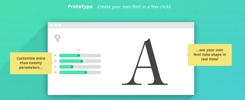
Did you know that there is one web-based software that allows you to create your very own font? And did you know that it is easier to use than whatever easy-to-use item you could come up with? I ain’t lying. The web app I am talking about is Prototypo. And it’s fun.

Say Goodbye to Comic Sans

I well remember the days of Comic Sans, and if you are living in carpet land, you will still suffer from the impact of that ubiquitous typeface on a daily basis. Powerpoint, I can smell you. Out of carpet land, the importance of Comic Sans has steadily decreased over the years, and that’s a good thing.

Today, web and graphic designers alike are faced with a variety of choices from larger and smaller type foundries around the globe. Google Fonts alone comes with hundreds of free fonts to choose from.

But still, with all the choices available, are we in paradise yet? Not really, as not only the free and paid font repositories grow fast. The need for fresh fonts grows even more quickly. And who wants to have his design look like that of the company around the corner?

Despite the plethora of fonts surrounding us, there is one thing missing – individuality. You simply cannot stand out by using the same assets that thousands other use. What you need and what you want is something unique.

In these days of deep pockets and short arms uniqueness is a thing customers do not want to pay for. Sure do they want it but as soon as you name a price you can see that look on their faces. Like they put their hand on a hot plate or suffered a lion’s bite in the neck. You know what I mean.

Designing a custom font is a whole lot of work. We both know it. And Adobe Illustrator is not a point-and-click tool for achieving rapid results, either. In the end, you do not design the custom typeface but go for a more or less valid choice from Google Fonts or some other type foundry. Your customer is not entirely satisfied, neither are you. But, hey, no ticky, no washy.

prototypo

Say Hello to Prototypo

Now sit back and relax. What if I told you that there is a way of reaching that level of exclusivity and individuality without having to invest a fortune in terms of client money or designer time? Would you believe me?

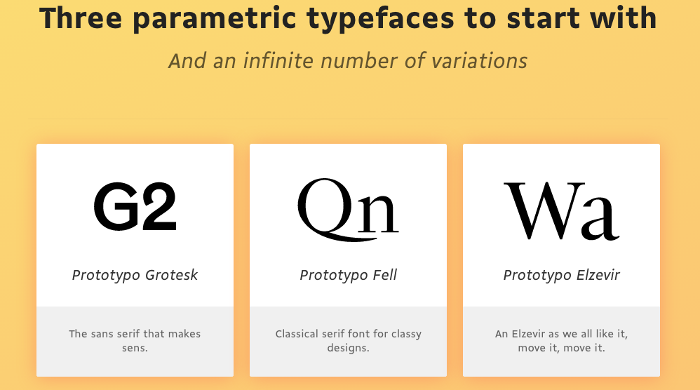
I won’t put you on the rack any longer. Let me introduce you to Prototypo. Prototypo is your solution for all things font. Based on three free-to-use base fonts you can design your very own typeface whether you want it straightforward and clean or complex and vintage or whatever strange or less strange ideas you pursue. Prototypo gives you full control over the process. The only limit is your imagination.

prototypo-animated

You don’t need to be a skilled font designer, however. You don’t even need to be a designer at all, though being one will help as the general sense of aesthetics is stronger in designers than in ordinary people. Think of the force. That’s also stronger in Jedi than in other people.

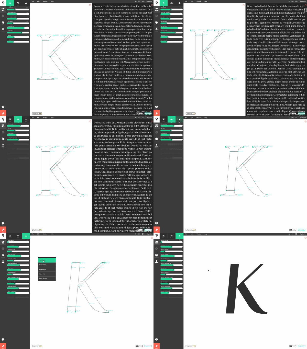
Creating a font in Prototypo can be done the hard way, letter by letter or in one go on a whole typeset. Prototypo features a plethora of sliders with which you customize every aspect of your own font in great detail.

You can modify individual letters by adjusting their paths and nodes just like you would in Adobe Illustrator. Yes, Prototypo is that powerful. But I bet you will go for the way of designing whole sets in one go as this saves you time which as we all know equals money.

Take the two minutes to watch the following video. It gives you a pretty complete impression of what to expect from the product:

Prototypo looks back at three years of development time. We can sure call it a ripe product by now. It is definitely not one of those quick shots we see more often than not these days. Prototypo grew slowly but steadily and today serves more than 8,000 designers that have created more than 10,000 unique fonts since.

Prototypo is not free, however. You can choose between two models. The simpler one comes at 15 dollars a month flat. If you are not into monthly subscriptions, you can as well purchase export credits. Each credit allows you to export one font. These credits come in packs of five and cost five dollars, one dollar per credit.

The choice of the plan will largely depend on what you intend to use the service for. Will you become a heavy user? Then you should probably opt for the yearly subscription even. This saves you quite a buck compared to the monthly plan as it costs 99 dollars per year. Do you expect to just export a font now and then, buy a batch of export credits.

In any case, make sure to play around with the free version to get a feel for what Prototypo can help you achieve. Stay updated by following their Twitter account.

Disclaimer: This post is sponsored by Prototypo. They took no influence on what we wrote, however.

Categories: Others Tags:

How To Design Error States For Mobile Apps

September 21st, 2016 No comments

To err is human. Errors occur when people engage with user interfaces. Sometimes, they happen because users make mistakes. Sometimes, they happen because an app fails. Whatever the cause, these errors and how they are handled, have a huge impact on the user experience. Bad error handling paired with useless error messages can fill users with frustration, and can lead to users abandoning your app.

In this article, we’ll examine how the design of apps can be optimized to prevent user errors and how to create effective error messages in cases when errors occur independently of user input. We’ll also see how well-crafted error handling can turn a moment of failure into a moment of delight.

The post How To Design Error States For Mobile Apps appeared first on Smashing Magazine.

Categories: Others Tags:

Placing a Video Within a Circle in Adobe Muse

September 20th, 2016 No comments
Muse For You - Placing a Video within a Circle in Adobe Muse - Adobe Muse CC

Place a Video within a Circle in Adobe Muse. No Coding Skills Required.

In this tutorial I will go over how to place a video within a circle in Adobe Muse using the Ultimate Video Widget 2.0 found at http://museforyoushop.com. We will also be using Adobe Photoshop to create the transparent circle.

Adding the Video

1. From the Library Panel drag and drop the “Ultimate Video Widget – Add First” and place at the top of your Adobe Muse website. If you do not see the Library Panel go to Window > Library.

2. From the Library Panel drag and drop the “Ultimate Video Widget ” and place below the “Add First” widget.

3. Open the “Ultimate Video Widget” and add the following files to the widget:

  • .mp4 video
  • .webm video
  • .ogv video

To convert your .mp4 files to .webm and .ogv you can use the following video converter: Miro Video Converter.

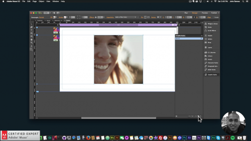
4. Create a rectangle in Adobe Muse and fill it with the video poster image. The video will fit inside of this rectangle so make it as small or as large as you would like.

5. Assign the Graphic Style Name that is in the widget to the rectangle via the graphic styles panel in Adobe Muse. If you do not see the graphic styles panel go to Window > Graphic Styles. There is a small icon in the bottom right of the graphic styles panel that allows you to create a new graphic style from the element selected. Once this button is clicked the graphic style name will be “Style.” You will want to double click on this graphic style and rename it to the graphic style name that is in the widget. In this case it is “video1.”

6. Preview in the browser to see the video within the rectangle.

Muse For You - Placing a Video within a Circle in Adobe Muse - Adobe Muse CC

Creating the Transparent Circle

To place the video within a circle we need to create a transparent circle. We will be using Adobe Photoshop for this.

1. Open Adobe Photoshop.

2. Create a new file preferably 1000px by 1000px.

2. Create a new layer.

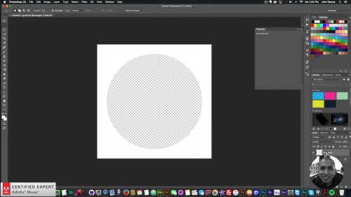
3. Select the rectangle tool in the toolbar and draw a white background over the new layer. The rectangle must fill the entire canvas. The color of this rectangle must match the background color of your website. In this case the background of the website is white so the rectangle is white.

4. Right click on this new layer and select “Rasterize Layer.”

5. Select the “Elliptical Marquee Tool” in the toolbar. Hold down the shift key and create a perfect circle over the layer with the white background. It can be as large or as small as you would like. The video is going to fit in this circle.

6. After the circle is created hit the “Delete” key. Then hide the first background layer in Photoshop by going to the layer and selecting the eye icon. You will notice that we now have a square with a transparent circle in the middle.

7. Save this file by going to File > Export > Save for Web and saving as a transparent PNG image.

Muse For You - Placing a Video within a Circle in Adobe Muse - Adobe Muse CC

Placing the Video within the Circle

1. Go into Adobe Muse and create a rectangle over the video rectangle.

2. Fill this rectangle with the image that was created in Adobe Photoshop.

3. Scale this image to fill and center it in the middle.

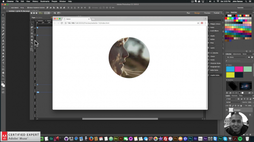
4. The video is now within the circle.

5. Preview in the browser to see the video within the circle.

6. Done.

Muse For You - Placing a Video within a Circle in Adobe Muse - Adobe Muse CC

View the video above for a live demonstration on how to place a video within a circle in Adobe Muse. For more video tutorials and widgets for Adobe Muse visit http://museforyoushop.com.

Happy Musing :).

Read More at Placing a Video Within a Circle in Adobe Muse

Categories: Designing, Others Tags:

Move a WordPress Site by Moving the Database and Files

September 20th, 2016 No comments

The following is a guest post by Erez Elias. Erez recently attended a WordCamp and wrote to me inspired to write something about WordPress. We agreed this was an interesting topic, and one I’ve been meaning to document myself as it’s something I’ve done about 100 times in my life and there is always one little detail I gotta look up.

One big source of frustration I’ve seen from WordPress users comes when they want to move their WordPress site. As in, move the entire website from one hosting company to another hosting company. In this article I will walk you through 4 simple steps of moving a WordPress website to a new hosting.

This article assumes that you have access to both the old server and the new server. You can log into both of them via FTP or SSH.

Step 1) Back Up the Database

WordPress stores data in a MySQL database. You’ll need to move this database to move the site, which is arguably the trickiest part. You’ll need to back up the database from the old site first.

Method 1) Use a Plugin

There is a method of backing up the database using a plugin. Note that If you are dealing with a large database (say, over 50 MB) you are better off using Method 2.

WordPress has numerous plugins to backup the database, my favourite is a plugin called wp-db-backup. Once the plugin is installed and activated, select Tools > Backup in the admin.

The plugin will look for other tables in the same database. These non “core” WordPress tables may have come from other plugins you’ve used that stored data in them.

Select whether you want the backup file sent to you by email or downloaded directly and click the Backup Now! button.

Method 2) Use the Command Line

We can get a little closer to the metal if we back using SSH. SSH (Secure Shell) is a network protocol that allows you to securely access your server over encrypted connection.

First, you will need to connect to the server. You need to have the server’s IP address, username, and password. You’ll also need a command line client like Terminal for Mac or Putty for Windows.

$ ssh username@[server-ip]

If it is the first time you establish connection you will see a prompt Are you sure you want to continue connecting? Type yes and press return. Then you will be asked to enter your SSH login password. After that, you’ll be connected to the server over SSH.

Now you can export the database with the following command.

$ mysqldump -u [username] -p [database_name] > [name_your_backup_file].sql

You’ll need to replace the options in [brackets] there with your own information. The username isn’t the same here as your SSH login, it’s your MySQL access username. The database name you can get from the `wp_config.php` file if you’ve forgotten. It will also ask you for a password after this command, which is the database password, which you can also get from the `wp-config.php` file.

This will create a file (which you named in the last part of that command) which is a complete backup of your database. You may want to navigate yourself to a convenient directory to run that command in, so it will create the file there. Or put that file path in the command itself.

You’ll need to get a local copy of this database.sql backup file. One way to do that is to FTP into the server, navigate to where you dumped it, and download it from there. Or, since you’re on the command line anyway, close out the SSH connection and use the scp command to download it. Something like:

$ scp [username]@[server-ip]:[backup_file].sql .

Step 2) Backup Files

Now it is time to back up the actual files from the old server. There are your theme files, plugins, uploads… everything. Even your WordPress core files, although this is as good a time as any to download a fresh copy of those for the new server.

To download all your files off the old server, use an FTP client like Filezilla to log into your server. Either download everything from the web root, or just the `wp-content` folder if you’re going to toss up a fresh copy of WordPress on the new server first.

It might take a while! It’s probably quite a few files and images.

Step 3) Move the Files to the New Server

Now you can log into the new server, also via FTP, and upload the files to the web root folder that you just downloaded from the old server. This also might take a little while (uploading is usually even a little slower than downloading).

Step 4) Import the Database to the New Server

In this step you will import the database to the server. This step also has two methods: via PHP myAdmin or via SSH.

Method 1) via Control Panel

Most web hosts will have some sort of control panel they offer that gives you access to things like databases. It might be cPanel. It might be Plesk. It might be some custom thing.

You’ll likely use the control panel to create the new database on your new server. It’s fairly likely the control panel gives you access to software called phpMyAdmin, which is a tool specifically for managing MySQL on the web.

Open the new database for the new site.

And now for the moment of truth: the importing of the backup `.sql` file from the old site!

Click on import tab in the top navigation.

Now you can select the `.sql` file on your local computer and run it (press the Go button).

Method 2) via SSH

If the database file is too large, like with exporting, you can SSH into the server and do the importing there. First upload the database export to the new server, then SSH into the server (instructions on that in a previous section), then run the following command to run the import:

$ mysql -p -u [username] [database_name] < [database_name].sql

Again the username here is the MySQL user, not the SSH user.

You might also need to change some options

If you are changing the URL of your website at the same time as moving servers, you might need to do some additional MySQL work. For example, if you’re changing from domain-one.com to domain-two.com, you’ll need to change the siteurl and home options in the wp_options table.

That won’t change hard-coded references to domain-one.com in post content though (e.g. image sources). If you need to change that too, there is some SQL you could reference in the post on moving WordPress to HTTPS that could be helpful

Hopefully, this article has helped you moving your WordPress site to a new location!


Move a WordPress Site by Moving the Database and Files is a post from CSS-Tricks

Categories: Designing, Others Tags:

A tactical approach for faster-loading media

September 20th, 2016 No comments
turtles

There’s no doubt that you want your website to look fabulous, with stunning images and a sharp graphic design. But, to paraphrase “The Little Prince,” what is most essential is often invisible to the eye. For websites, this invisible component is load speed, and it can have a significant negative impact on your site’s performance and user satisfaction.

Want to ensure the invisible doesn’t make itself known? To start, we should back up and talk about why fast loading is important in the first place. It’s simple—it’s all about the user experience. Users get impatient, have a low attention span and won’t hesitate to leave your website if they have to wait. One online survey of 2,500 online consumers found that 67 percent of U.K. shoppers and 51 percent in the U.S. admit that a site’s slowness is the top reason they’d abandon a cart in an online store.

And the impact of this impatience can affect your bottom line. Consider ecommerce giant Amazon, which revealed that a page load slowdown of only 1 second would cost it $1.6 billion in sales revenue every year.

Google also has incorporated site load speed into a list of factors influencing the search ranking position. From customer satisfaction, to revenue to search engine optimization—there are several good reasons to ensure your website delivers…and fast.

If your site is not performing optimally, here are tactics you can use to improve site load time while delivering media with visibly better results:

Save images for the web

Load speed optimization starts before the images actually land on your web page. When working on images in any sort of graphics tool, you must make sure to save them in a format that is compatible with web publication. Doing so limits the amount of metadata carried on an image and makes it easier to edit the image quality.

There are a variety of formats that are applicable for the web, such as:

  • Scalable Vector Graphics (.SVG) – preserves its quality no matter the size on screen, best for logos; lossless.
  • Portable Network Graphics (.PNG) – best for high-resolution, detailed graphic images you want to present in full quality; lossless.
  • Graphic Interchange Format (.GIF) – for simple animations; lossy.
  • WebP – an image format supported by Chrome browsers; either lossy or lossless.
  • Joint Photographic Experts Group (.JPEG or .JPG) – best for scalable images; lossy.
  • JPEG-XR – an improved variation of JPEG format supported by IE browsers, suitable for scalable images; lossy.
  • JPEG2000 – a higher-quality JPEG format supported by IE browsers; lossy.

Format comparison example:

196 KB in PNG format

turtles

25.2 KB in JPEG format with 80% quality

20.1 KB in WebP format with 80% quality

Consider lossy vs. lossless file formats

As mentioned in the list above, some file formats are very prone to lossy formatting, which means you can lose or alter information from the original file. Media files are perfect material for lossy formatting. Our eyes are not able to receive all the information coded in every pixel, which means you can easily cut down on redundant data and decrease the file size.

With lossy formats, the formatting eliminates some pixel data completely. But with lossless formats, the pixel information is compressed, but still maintained. Typically, lossy formatting provides more options for file quality and size.

Determine image size and quality

Image and video file formats have various properties, including their sizes. While some formats may be suitable for all devices, others will only load well on desktop screens. And, not all of them are suitable if you want to reduce your page load speed. You’ll also have to keep in mind that the image quality required for different screens will vary.

What can you do to make sure you use the best file format and quality for optimal load speed? There are a variety of tactics to ensure that you are using the best file format and quality for optimal load speed, such as:

  • Scaling or cropping images to match the display size—These are typical elements of responsive design. But it’s not all about responsive design, which we’ll explain in the next section.
  • Adjusting image quality to match the screen resolution—The lower the quality, the smaller the file size. Here’s where you want to remember to use lossy formats.
  • Converting lossless formats into lossy—This could entail replacing a PNG (lossless) file with a lower-quality (let’s say 70 percent) JPEG image. Another example is decreasing the size of animated GIFs when converting them to WebM or MP4 formats.

Think mobile-first

Picking the right approach to design will definitely help you change the way you perceive the role of images on your website. But what’s the practical difference between desktop-first and mobile-first? Here’s a comparison that can help you understand.

In a desktop-first approach to front-end development and web design, you start from the version of your website that uses heavy components by default. You get used to the thought that putting them there is kind of natural and obvious. Then, when designing the same website for tablets and smartphones, you wonder what elements you need to reduce to make things still work.

But the idea behind mobile-first front-end development and web design works on a precaution that the website should give you maximum necessary content with minimum space and weight. You obtain this effect by using responsive, scalable images, for which the quality can be adapted for particular devices. By starting from mobile and progressively enhancing for tablets and desktops, you reduce redundant elements.

Optimal load speed achieved

Load speed is crucial for user satisfaction, website conversion and search rank. As a result, you can’t overlook how images and media impact your site. To optimize load speed, you may experiment with file formats, scaling, adjustable quality, and other factors. Remember the difference between lossy and lossless formats, and make sure you use each format according to the file’s purpose. And you should consider mobile-first design, as it will help you create more efficient, faster-loading sites.

Cloudinary, an end-to-end image and video management service, can help with image optimization. It enables you to upload the highest quality picture, and provides automatic image cropping, conversion and optimization using our dynamic delivery URLs.

To test drive Cloudinary and learn how you can easily build a fast loading website, sign up for a free account.

[– This is an advertorial post on behalf of Cloudinary –]

Get Top Notch Professional WordPress Support and Customization from WPmatic

Source

Categories: Designing, Others Tags:

Understanding REST And RPC For HTTP APIs

September 20th, 2016 No comments

For the last few years, whenever somebody wants to start building an HTTP API, they pretty much exclusively use REST as the go-to architectural style, over alternative approaches such as XML-RPC, SOAP and JSON-RPC. REST is made out by many to be ultimately superior to the other “RPC-based” approaches, which is a bit misleading because they are just different.

This article discusses these two approaches in the context of building HTTP APIs, because that is how they are most commonly used. REST and RPC can both be used via other transportation protocols, such as AMQP, but that is another topic entirely.

The post Understanding REST And RPC For HTTP APIs appeared first on Smashing Magazine.

Categories: Others Tags:

Visual Hunt: More Than 350 Million Photos For Free Commercial Use

September 20th, 2016 No comments

Pictures say more than words. Especially graphic and web designers value the use of meaningful, professional photos. On the search for the right picture, we often end up with a commercial provider. Often neither the quality nor the quantity of the free providers is sufficient. Here, Visual Hunt is an exception in the truest sense of the word. With more than 350 million photos, you’re almost guaranteed to find the right images for any project. And even the quality of the photos is impressive.

The Best of Flickr and Co.

The reason why Visual Hunt provides over 350 million high-quality photos is, that the service collects the best images from creative-common, and public-domain websites on the internet. Don’t worry, the service doesn’t accumulate the material from random sources. Instead, it focuses on sources like Flickr, and other services with a good reputation and quality.
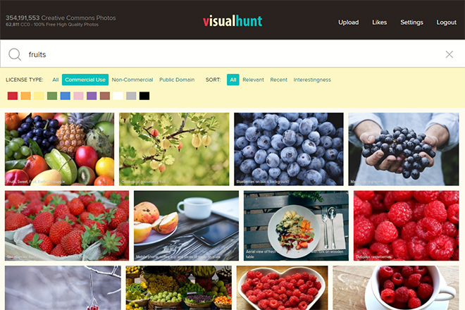
Search Results in Visual Hunt

Search Results in Visual Hunt

Additionally, all of Visual Hunt’s photos are hand-picked, were sighted, and equipped with keywords, guaranteeing good search results.

Over 60,000 Public-Domain-Photos

The different licenses under which the photos are provided are creative-commons- and public-domain-photos. The creative-commons license is in wide use on the internet. It allows you to use photos for free. However, the originator of the photos has to be mentioned.

If you are allowed to use a picture under the creative-commons license for commercial purposes or even edit it, depends on the originator. Licenses vary widely. However, you will get to see a very clear overview on what exactly you are allowed to do with a photo.
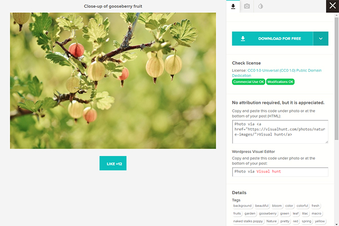
Preview With Information on License, Limitations, as Well as Conditions

Preview With Information on License, Limitations, as Well as Conditions

Aside from the creative-commons license, there are also about 60,000 photos available that are under the public-domain license. These photos can be used without any limitations, even without naming the originator. Thus, these images give you the highest level of freedom possible, although Visual Hunt would prefer if you named the originator of every picture you use.

It is even possible to specifically search for public-domain photos if you don’t want to name the originator, for design-related reasons, for example.

Search For Keywords, Colors, and Licenses

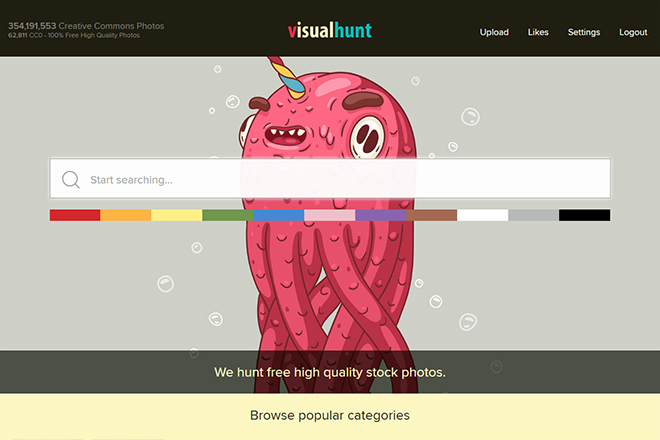
When offering this amount of photos, a good search function is key. Visual Hunt is also able to score in this regard. First, there’s the classic keyword search, which lets you find appropriate imagery. Here, you get to combine search terms, and you’re also able to exclude specific terms.
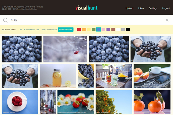
Search For Images of Specific Colors

Search For Images of Specific Colors

This lets you narrow down the number of photos by a good amount. When you’re not using photos for editorial, but for design purposes, the colors of the images are often an important factor. Here, Visual Hunt allows you to limit the results to a particular color. You get to pick one of eleven predefined colors that comes the closest to your expectations.

Last but not least, as mentioned before, you can also limit the results to certain licenses. The sorting function also helps you move results into different orders. For example, you can make it show the most relevant, or the newest photos that meet your search criteria most perfectly.

Download and Embed Without Registration

If you think you’ve registered on enough web services already, you’ll like Visual Hunt even more. The download of photos is possible without registration. You get to pick one of a couple of different resolutions. They are sorted into groups of different sizes.

Depending on the photos, they are available from S (640Pixel wide) up to 3XL. The size of 3XL also depends on each photo. Usually, it’s between 3,000 and 5,000 pixel, though. Thus, the photos can even be used for printing.
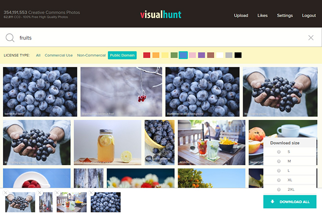
Downloading Via Lightbox

Downloading Via Lightbox

When searching for multiple photos, you don’t need to download them one by one. Instead, you can add all of them to a Lightbox, and download them later on. This way, you get to search through the images first and add every single that you wish to use to the Lightbox. The images in the Lightbox are displayed at the bottom border of the page.

Once you’re done, pick one size for the resolution of all the images, and download the complete content of the Lightbox as a single ZIP file.

Instead of downloading photos, Visual Hunt also provides the option to embed photos into your website or blog via an HTML snippet. Here, you can define the resolution using a slider, and simply copy the HTML part.
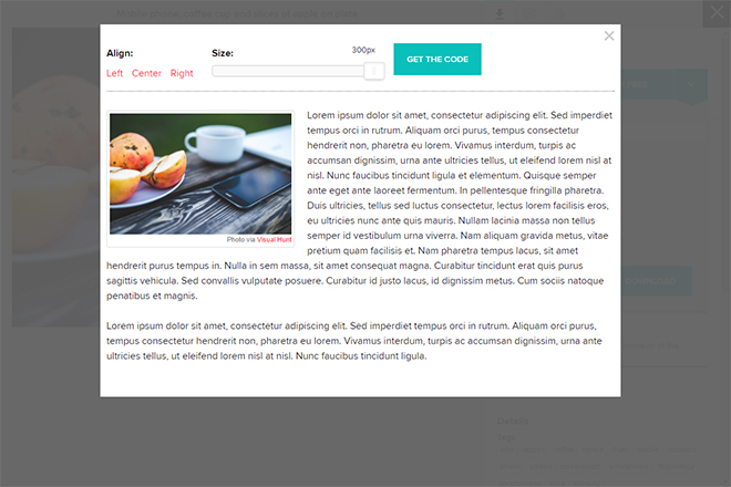
Embedding Photos Instead of Downloading Them

Embedding Photos Instead of Downloading Them

The information on the originator and the license will then automatically integrate. You also pick the orientation of the image, which can either adjust to the left, the center or the right. A preview shows you how the image will look.

The integration comes with the advantage that you don’t need to download the photos first, just to upload them again immediately afterwards. This also saves web space and traffic.

Uploading and “Liking” Photos

If you do choose to register at Visual Hunt, you are allowed to upload photos yourself. These are then sighted and, if they meet the quality criteria, added to the image portfolio of the public-domain license.

But be careful: as soon as a photo was uploaded, there’s no way back. In contrast to many other providers, you are not able to remove your photos later on.
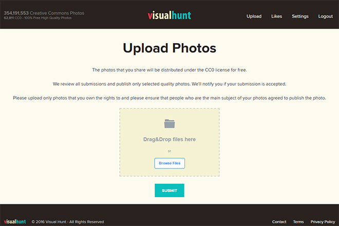
Uploading Photos

Uploading Photos

As a registered user, you can also rate pictures by distributing “likes.” This helps improving Visual Hunt’s supply, as you highlight only the very good photos (hopefully).

Conclusion

Even though 350 million photos is an impressive supply, the amount of available photos continues to rise. When visiting the page regularly, you’ll notice the constantly increasing number of photos in the tally. It does not only tell you about the total number of photos of Visual Hunt, but also the number of public-domain photos.

Not only the image quantity but also the quality is impressive. Thus, Visual Hunt is not just something for bloggers, and private projects. Visual Hunt is also a good fit for professional use in graphic and web design.

Categories: Others Tags: