Archive

Archive for September, 2016

Popular design news of the week: September 12, 2016 – September 18, 2016

September 18th, 2016 No comments

Every week users submit a lot of interesting stuff on our sister site Webdesigner News, highlighting great content from around the web that can be of interest to web designers.

The best way to keep track of all the great stories and news being posted is simply to check out the Webdesigner News site, however, in case you missed some here’s a quick and useful compilation of the most popular designer news that we curated from the past week.

Note that this is only a very small selection of the links that were posted, so don’t miss out and subscribe to our newsletter and follow the site daily for all the news.

The Beauty of Ultra-Minimal Web Design

It’s Time We Think Beyond Flat Design

75 of the Smartest Resources for Web Designers

The Job of a Web Designer is Changing (and That’s Good News)

Six Web Layout Myths Busted (bring More Art to Web Layouts)

Hamburger Menus and Hidden Navigation Damage UX

A Nerd’s Guide to Color on the Web

Sketch Vs. Adobe XD Vs. Figma

The Colors Used by the Ten Most Popular Sites

The Future of Design According to 7 Web Visionaries

Vue: A Simple, Powerful Library for Modern Web UI

Site Design: Revealapp.com

IBM is Gearing up to Become the World’s Largest and Most Sophisticated Design Company

The Font Wall: I Love Typography

Slack Beta: A Faster and Nicer Slack Built on Electron

Variable Fonts, a New Kind of Font for Flexible Design

Polr 2.0.0, an Open Source URL Shortening Platform, has been Released

Unsend.it: Un-send or Edit any SMS Text Message After You Sent it

Site Redesign: Whatsapp.com

Vimeo Business: Elevate your Video Marketing from Start to Finish

Adobe’s Cheeky New Clothing Line Celebrates Some of the Worst Stock Photos Ever

Evernote is Moving all its Data, Machine Learning to Google Cloud

App Tools: Curated List of the Best Tools in the Mobile App Ecosystem

The State of the Octoverse 2016

The Most Popular Color on the Internet Is…

Want more? No problem! Keep track of top design news from around the web with Webdesigner News.

LAST DAY: 8 Professional Graphic Design Magazine Templates – only $17!

Source

Categories: Designing, Others Tags:

Comics of the week #357

September 17th, 2016 No comments

Every week we feature a set of comics created exclusively for WDD.

The content revolves around web design, blogging and funny situations that we encounter in our daily lives as designers.

These great cartoons are created by Jerry King, an award-winning cartoonist who’s one of the most published, prolific and versatile cartoonists in the world today.

So for a few moments, take a break from your daily routine, have a laugh and enjoy these funny cartoons.

Feel free to leave your comments and suggestions below as well as any related stories of your own…

Outdated tools

Wrong reference

Spoiled design

Can you relate to these situations? Please share your funny stories and comments below…

Kid-Friendly TT Rabbits Font Family of 10 Adorable Typefaces – only $9!

Source

Categories: Designing, Others Tags:

Photoshop Express gets a UI update

September 16th, 2016 No comments

In Version 3 of Adobe’s Photoshop Express, the app’s entire interface gets a design makeover. This is a milestone of sorts since Photoshop Express rarely gets a redesign. In fact, the last time it was overhauled was more than 2.5 years ago in early 2014.

Back then, Express’ new look was considered modern for its time, but it hasn’t stood the test of time, and so an update was necessary. The new interface seeks to make Express more modern-looking and in line with today’s design standards.

Express’ new design doesn’t quite meet Google’s Material Design aesthetics, but it nonetheless provides the app with a much cleaner interface that’s characterized by fewer Holo menus and revamped iconography. It also seems more fitting for the Marshmallow and Nougat operating systems than older versions of the app.

Another bonus is that the redesign has optimized Express for tablet use, which should please users who want to go beyond the real-estate limitations of their smartphones to still use this functional app.

Overall, the redesign covers Express’ editor screens, share screens, settings, image picker and splash screen. When you look at what the old design of this app was just a few days ago and compare it to how it looks currently in the Google Play Store, it’s clear that the design changes are striking.

Adobe decided to unveil a bunch of new features together with this design overhaul, too, making this a thorough update for the app. Some of the app’s new features include:

• The ability to save images to users’ Creative Cloud libraries for additional editing on Photoshop’s desktop software.
• The chance to crop images for Facebook’s cover photo size.
• Redoing an action within Photoshop in the event that users change their minds again.
• New languages that were added (17 in total).
• Additional permissions handling for Android 6.0.
• Improved Facebook and Google sign-in integration.

In all, this update ought to please longtime mobile Photoshop users who’ve been clamoring for a fresher interface and now have even more reason to use this app.

85 High-Quality Ink Textures from Vintage Voyage Design – only $5!

Source

Categories: Designing, Others Tags:

20 Free Massive UI Bundles to Kickstart your Project

September 16th, 2016 No comments
Guacomole

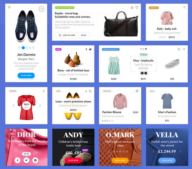
What does it take to breathe life into your idea, converting it from simple notion to digital mockup? The answer is trivial – lots of things. Starting from fundamental knowledge in design and not ending with working experience in image editor software such as Photoshop or Sketch, to say nothing about the time and efforts that should be put in, you need to be one smart apple. However, do not give up if you lack in web design skills or are familiar with Adobe Illustrator just by hearsay. In the era when the huge treasure chest called the Web is at your fingertips, it is much easier to achieve your goal and make your dream come true, destroying all the stereotypes. All you need are the proper tools of the trade. And when it comes to web or app design, there is no better assistant in creating prototypes than a pack of pixel-perfect retina-ready vector-based general user items that were crafted by real pros.

They are eager to keep you away from all the hassle inherent to early stages of design, save you time and brighten up the workflow. Each component will not only boast of matching color schemes, the optimal amount of white space or a perfect balance between the graphics and the content but will also convince you with a stylish look and contemporary features. With a well thought-out UI set, you can quickly and easily shape your idea. To give you some convincing proofs we have rounded up a list of 20 large bundles that are suitable for fulfilling different tasks.

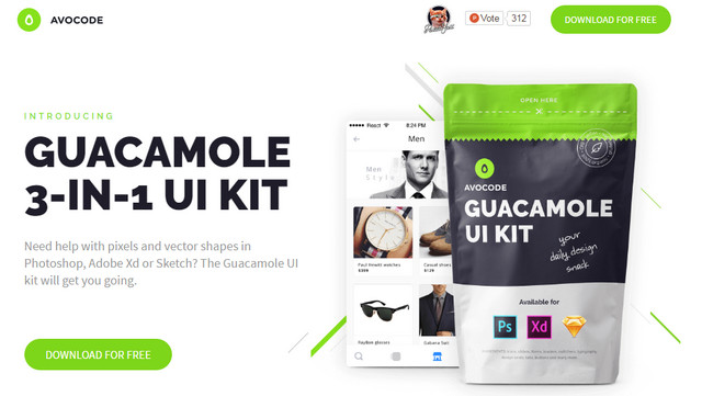
GUACAMOLE 3-IN-1 UI KIT

Creator: avocode
License: Declared as Free, no proper license given.

Deadline UI Kit


Creator: Rajesh Rajput
License: Free for personal and Commercial use.

Stella — Best Blog UI Kit

Stella
Creator: Arsen Kolyba
License: Attribution-NonCommercial.

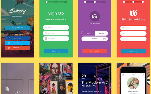
Sweety iOS UI Kit

Sweety UI kit
Creator: Damir Bektilov
License: Attribution.

Spot UI Kit

Spot UI Kit
Creator: Arun
License: Attribution 4.0 International.

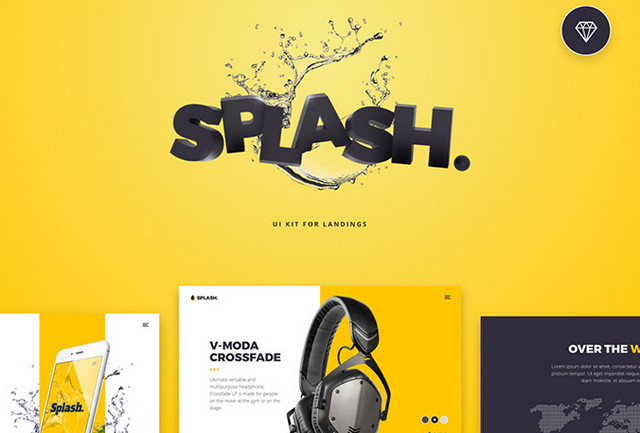
20 Splash UI Kit Screens

20 splash screens
Creator: Nick Parker
License: Declared as Free, no proper license given.

UI Tiles

UI Tiles - pack of flowcharts
Creator: pixelbuddha
License: Declared as Free, no proper license given.

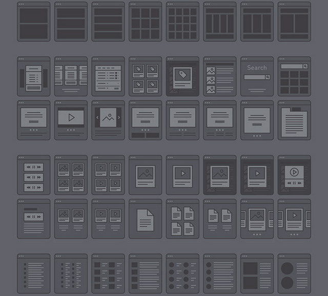
Wyre – Web Layout Flowcharts

Wyre - Web Layout Flowcharts
Creator: Petr Knoll
License: Declared as Free, no proper license given.

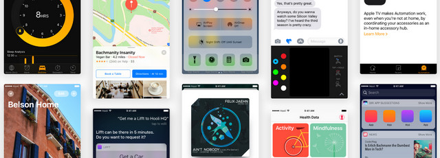
iOS9 Kit

ios9 Kit
Creator: ozzik
License: Declared as Free, no proper license given.

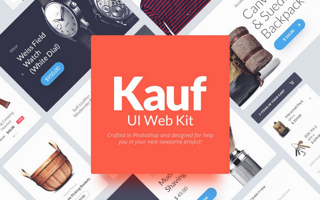
Kauf UI Web Kit

kauf ui web kit
Creator: Yebo creative
License: Declared as Free, no proper license given.

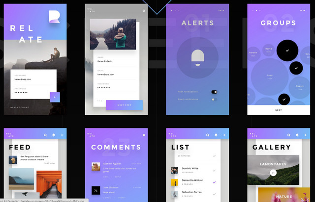
Relate UI Kit

relate ui kit
Creator: invisionapp
License: Declared as Free, no proper license given.

Puzzles – iOS UI Kit

puzzles - ui kit
Creator: CARLOS & RAMON
License: Declared as Free, no proper license given.

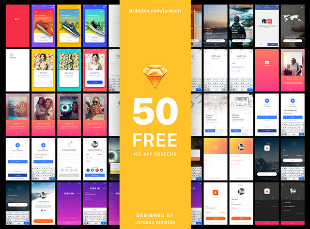
Sign In Project

Sign In Project
Creator: Jardson Almeida
License: Creative Commons 4.0.

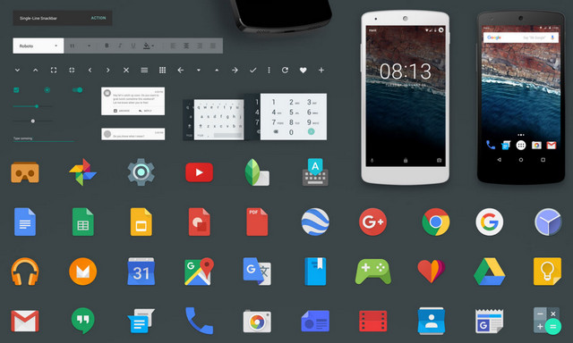
Android M GUI Kit

Android M GUI Kit
Creator: Hanii
License: Declared as Free, no proper license given.

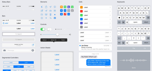
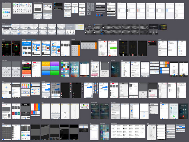
iOS 9 UI Kit

iOS9 UI Kit by Facebook
Creator: Facebook
License: Declared as Free, no proper license given.

iOS 9.3 iPhone UI Kit for Illustrator and Sketch

iOS9 UI Kit
Creator: Rusty Mitchell
License: Declared as Free, no proper license given.

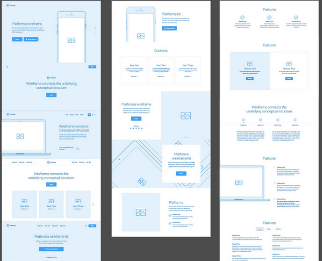
Platforma iOS and web wireframe kits

platforma ios screens
Creator: platforma
License: Declared as Free, no proper license given.

Tilt – UI Kit

Tilt - UI Kit
Creator: JARED LODWICK
License: Declared as Free, no proper license given.

Elton UI Kit

Elton UI Kit
Creator: pixelbuddha
License: Declared as Free, no proper license given.

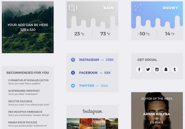
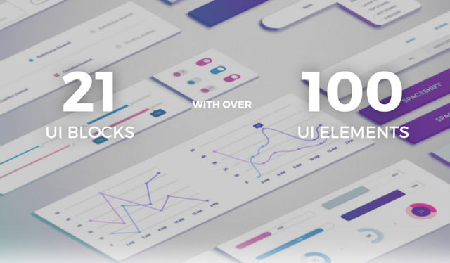
EarthShift — UI Kit

EarthShift UI
Creator: Arsen Kolyba
License: Free for personal and Commercial use.

Categories: Others Tags:

Shutterstock takes a bite out of Adobe’s stock

September 16th, 2016 No comments

When Adobe announced it was moving into the stock image market, the biggest benefit it brought to the table was tight integration with its Creative Cloud suite of applications—the ability to search for and license stock photography within the apps.

Now, Shutterstock, one of the largest and most popular stock providers has gone toe to toe with Adobe, by releasing a plugin for Photoshop that replicates that workflow.

The new Photoshop plugin from Shutterstock allows you to search for, trial, and license Shutterstock’s stock images, right from inside Photoshop.

Trial images

Like Adobe’s existing solution, Shutterstock’s new plugin allows you to drag stock images onto your canvas before you license them. The watermarked image can be manipulated just like any other bitmap. Once you’re happy, you can license the image via the plugin, and all changes you make will be applied.

The most notable benefit of this improved workflow is that you can try out artwork for free, and discard it if it isn’t working; you only pay for the imagery once you decide to license it.

This of course means that you can produce mockups for clients, and solicit their approval before purchasing the images.

We are bringing productivity, efficiency and inspiration to designers everywhere, through tighter integration of Shutterstock with their workflow — Jon Oringer, Founder and CEO of Shutterstock

Easy search

Shutterstock has almost 100 million image assets, with 140,000 content providers submitting 100,000 images daily. Making it substantially larger than Adobe Stock. Much of that 100 million images are too low in quality to be of use professionally, but that is the case with almost all stock providers.

With this plugin we are providing creative professionals the convenience to search for and test more images than ever, directly from the editing tool they are using — Jon Oringer, Founder and CEO of Shutterstock

If you use Shutterstock already, and have lightboxes set up, you’ll find them available in the plugin, so it’s possible to select images collectively online, and then access them from the plugin. It isn’t as streamlined as Adobe’s Shared Libraries however.

Seamless workflow

All of the best designer tools do one thing: minimise labor-intensive tasks to free up more time for creative investigation. There’s no question that the workflow pioneered by Adobe, and now adopted by Shutterstock, is vastly improved on the traditional browse-buy-download-open process used elsewhere.

Shutterstock’s new plugin replicates all of the major features of Adobe’s stock workflow. The only real difference is the licensing model. What will be really beneficial is if Shutterstock develop an equivalent plugin for other applications, Affinity Photo for example, and roll this workflow out industry wide.

The Shutterstock plugin works for Photoshop CC 2014 and CC 2015, on Mac and Windows. It’s currently only available in English.

85 High-Quality Ink Textures from Vintage Voyage Design – only $5!

Source

Categories: Designing, Others Tags:

The Art Of Hand Lettering

September 16th, 2016 No comments

Hand lettering has taken the world by storm. It has become the beautiful connection — a juxtaposition — between design and words. The letter forms in the typography have been broken down into their shapes, flourishes, and textures.

Hand lettering speaks volumes. This is an art form which allows us to see the space between the letters, and the style of the lettering as a piece of art that can deeply evoke emotions and bring meaning — nostalgia, happiness, joy, and love.

The post The Art Of Hand Lettering appeared first on Smashing Magazine.

Categories: Others Tags:

Introducing Adobe stock apparel

September 15th, 2016 No comments

There is now a clothing line for all of us, everyone. It’s just a line of t-shirts, really, but the imagery is something everyone can relate to. This is because everyone is represented in almost suspiciously multi-cultural images of people in business attire baring their perfectly white teeth.

I’m talking about t-shirts with stock photos on them. Adobe is a doing a very limited run of shirts that actually aren’t for everyone, sadly. It’s a direct advertising campaign to promote their very own new stock service.

The idea is that they intend to completely overhaul the stock industry as a whole. Whether or not they actually manage that will be something to see, but they seem confident enough. They’re already heralding the end of the old ways with this run of shirts that commemorate, and maybe eulogize, the more ridiculous trends in stock imagery.

In a way, ironic t-shirts are the perfect send-off to the photos of random caucasian models doing such caucasian things as laughing at salad, laughing with their grandparents, laughing while being vaguely outside… It’s like a horrible alternate universe where the Joker won. It would explain the dead eyes that accompany every perfect smile, as five to ten people stand around a computer together.

If I had that many people looking over my shoulder at once, I wouldn’t be smiling.

Besides that, you have the classic “frustrated man in front of his computer, after he presumably just lost a competitive game of Overwatch” imagery, “men in business suits with boxing gloves because corporate knows about the fight club and wants to avoid a lawsuit”, and even that one with the woman with the headset. You know the one. It’s that picture where she’s just told someone to restart their modem for the fifteenth time today, and no, they can’t have compensatory credit.

Not gonna lie, a part of me will miss these pictures that subtly portray the dystopian elements of modern life, if only by making the supposed happiness of their models look really, really fake. I’d totally buy one if Adobe was selling them to everyone.

I’m curious, though, to see if the new world of Adobe stock will really be that much better, or if we’ll be putting these new images on ironic t-shirts in a decade or so.

LAST DAY: Gorgeous Gioviale Script Font (1,000 glyphs) – only $15!

Source

Categories: Designing, Others Tags:

Project Muze: Cry for Joy?

September 15th, 2016 No comments
Project Muze: Even the Muse is Astonished. (Foto: Pixabay.com)

Project Muze, the new fashion experiment created in a cooperation between the companies Zalando and Google is well worth seeing. It might not do justice to the Zalando slogan “cry for joy”. But I cried nonetheless.

Project Muze: Even the Muse is Astonished. (Foto: Pixabay.com)

Can the Machine Inspire Your Clothing Style?

Project Muze may be great when looking at it from an academic level. Here, Google tries to display an example of applied machine learning. The project is supposed to be some type of muse for your clothing inspirations.

Sounds interesting, eh? This sure is a rather unconventional way to get to one’s own clothing design. All the algorithm asks of you is to answer a couple of questions that only deal with clothing in a peripheral way. The gender question seems feasible, although the answer won’t necessarily be evident when looking at the result. At this point in the process, I didn’t know that.

In the further progress of the “design process”, I need to classify my mood, name my taste in music, as well as enter my favorite type of art. In the end, Google believes that it has gathered enough information to be able to give me a personalized clothing suggestion.

This is the result:

This is Supposed to be My New Look? Interesting. (Screenshot: Dr. Web)

This is Supposed to be My New Look? Interesting. (Screenshot: Dr. Web)

Cry of Surprise: I Can’t Accept This!

Well, tell me what you think. Dieter wearing feminine pyjama pants, basically topless, and cluttered with black crystals? Seriously? Not even the most progressive stage director of any opera house in the world would make up something like that. And they do come up with some esoteric stuff often enough.

I thought I might just be difficult to classify, so I looked through the gallery of already existing drafts of other muse interviewers. And, what should I say? It’s not looking any better over there. Judge for yourself:

The Most Recent Trend Shows That Targes Are Back in Fashion. (Screenshot: Dr. Web)

The Most Recent Trend Shows That Targes Are Back in Fashion. (Screenshot: Dr. Web)

Two green targes are floating freely before and behind my upper body, while a swirling pattern is making my shirt and pants look like a colony of laevorotary bacteria, basically the Activia of overgarments. The attached targes remind me of the prime of the guillotine. Robespierre sends his greetings.

Or take a look at this design:

What Are You Supposed to Call This? A Generous Design? (Screenshot: Dr. Web)

What Are You Supposed to Call This? A Generous Design? (Screenshot: Dr. Web)

This looks like it could be taken from a gender-mainstreaming version of the Avengers. But nobody would put on something like this voluntarily. The bloomer-like bodysuit might prove to be quite comfortable on the couch after work. However, it doesn’t matter how long I think about this, I simply can’t wrap my head around what the strange cape, which is also able to float, is supposed to do.

Do You Really Have to do Everything That’s Possible?

Either I just don’t spend enough time in the world of modern fashion, which is certainly possible. Or this Google Experiment is just straight up garbage.

Of course, Project Muze is based on Google’s TensorFlow, which is a library for machine learning, and is most likely very challenging technologically. Zalando‘s 600 fashion experts also contributed significantly towards the predictive decisions based on current trends. From a technological standpoint, we most likely can’t address reproaches to the agency Stinkdigital either, which also worked on the realization of the website.

The result of all this effort is, simply put, unnecessary, and a good example that proves that you shouldn’t do everything just because you are able to do it.

I’m sure you’ll understand that I won’t get any more “inspiration” regarding my clothing style from Project Muze. That should be in the interest of all of us.

Categories: Others Tags:

Email finally wakes up to responsive design

September 15th, 2016 No comments

Email is far older than the web; introduced in 1972, anyone who’s ever tried designing for email can be forgiven for assuming that it hasn’t had an update since. It’s still routine for layout in email to be controlled with HTML tables, mention flexbox support to an email designer and watch them roll around laughing.

That’s all about to change, because Google, purveyor of some of the internet’s favorite email clients has just announced a major update that will finally enable responsive email design. The update affects several distinct email clients, all powered by Gmail, covering the web, desktop, Android, and iOS.

What’s actually being introduced is twofold: firstly, Gmail’s clients will now support CSS media queries; secondly, Gmail’s clients will now support external style sheets.

Gmail’s clients will now support CSS media queries

Not all media queries will be supported. Google have consulted with a range of email designers and settled on three key media queries: width, rotation, and resolution. These were selected based on their value in aiding responsive design. Helpfully, Google have provided full support details in their Gmail documentation.

The huge impact that media queries will inevitably have, has slightly overshadowed the other significant introduction, which is external style sheets. What this means is that CSS styles no longer need to be inline, significantly reducing the size of the email you send.

CSS styles no longer need to be inline

The change has been on Google’s wish-list for several years, but it’s been pressed to make the change in order to remain dominant in the market; there are some excellent alternatives to Gmail such as Polymail, and the rapid rise of Slack has revolutionized business communication.

Google are not the first to adopt CSS media queries for their email clients, and there are still some significant email clients that do not support them. However, Gmail’s prior lack of support was judged by many to be the last major stumbling block to responsive email design.

Yes, you’ve still got Outlook to contend with—an experience so poor, you’d think Microsoft were big stakeholders in a proprietry messaging app. But similarly, there are still people browsing the web in IE6. Progressive enhancement allows us to use modern techniques on the web without alienating luddites, and the same applies to email. There’s nothing to say that non-responsive email clients can’t use plain text.

Given the number of emails that are opened on mobile—last year it was reported that two thrirds of all emails received in the US were opened on mobile devices—this advance couldn’t come soon enough.

The responsive update to Gmail clients will roll out worldwide by the end of the month.

LAST DAY: Gorgeous Gioviale Script Font (1,000 glyphs) – only $15!

Source

Categories: Designing, Others Tags:

Sponsor: Divi 3.0

September 15th, 2016 No comments

Divi 3.0 and the future of WYSIWYG has arrived. Test out Divi’s new visual page builder for WordPress today and find out why it’s the best and easiest way to build a beautiful website. Now you can build your website on your actual website.

Simply drag, drop edit and combine over 40 content elements to create just about any type of page you can imagine. Adjust fonts, colors, sizing and spacing and observe your changes instantly. The new front-end editor is super fast because it requires little to no traditional loading. Give it a try today.

Direct Link to ArticlePermalink


Sponsor: Divi 3.0 is a post from CSS-Tricks

Categories: Designing, Others Tags: