Archive

Archive for September, 2016

Explaining CSS Levels

September 15th, 2016 No comments

Rachel Andrews:

… it doesn’t make sense to draw a line at which all work is stopped on all parts of CSS in order to declare that CSS version finished. Therefore, after CSS2.1 all the things that had been part of the 2.1 specification were broken down into modules.

It’s easy to joke “Maybe we’ll get that in CSS17!”, but that plays into the idea that CSS will be versioned (ala “ES6”), and those days area already over.

CSS3 sorta made sense. Tab Atkins said, of the split:

Some of our modules start out at level 3, if they extend something from CSS2.1.

But not all of them. Mostly, “CSS3” was just good marketing, like “HTML5” was. People really seemed to get it, but it’s not good for the language itself. As Rachel says:

The problem with monolithic specifications is that in order to finish the spec, every component part also has to be finished.

None of us want web standards to move slower. So, we version each module, and kill the monolith:

There has never been a CSS4. There will never be a CSS4. CSS4 is not a thing that exists.

Direct Link to ArticlePermalink


Explaining CSS Levels is a post from CSS-Tricks

Categories: Designing, Others Tags:

New Things at A Book Apart

September 15th, 2016 No comments

Direct Link to ArticlePermalink


New Things at A Book Apart is a post from CSS-Tricks

Categories: Designing, Others Tags:

Driving App Engagement With Personalization Techniques

September 15th, 2016 No comments

Once upon a time, in the not-so-distant past, people considered websites to be a prime indication of how users’ attention was brief and unforgiving. Remember the dreaded bounce rate?

Remember the numerous times you worried that your content and graphics might not be 100% clear to users? That was nothing. Compared to mobile, engaging users on the web is a piece of cake.

The post Driving App Engagement With Personalization Techniques appeared first on Smashing Magazine.

Categories: Others Tags:

Draw Letter ‘S’ Symbol in Adobe XD

September 14th, 2016 No comments
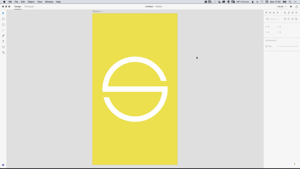
dansky_how-to-design-a-letter-s-symbol-in-adobe-xd

In this tutorial, we’re going to learn how to design a letter ‘S’ symbol in Adobe XD.

The Steps (1-11)

1. Create a New Artboard.

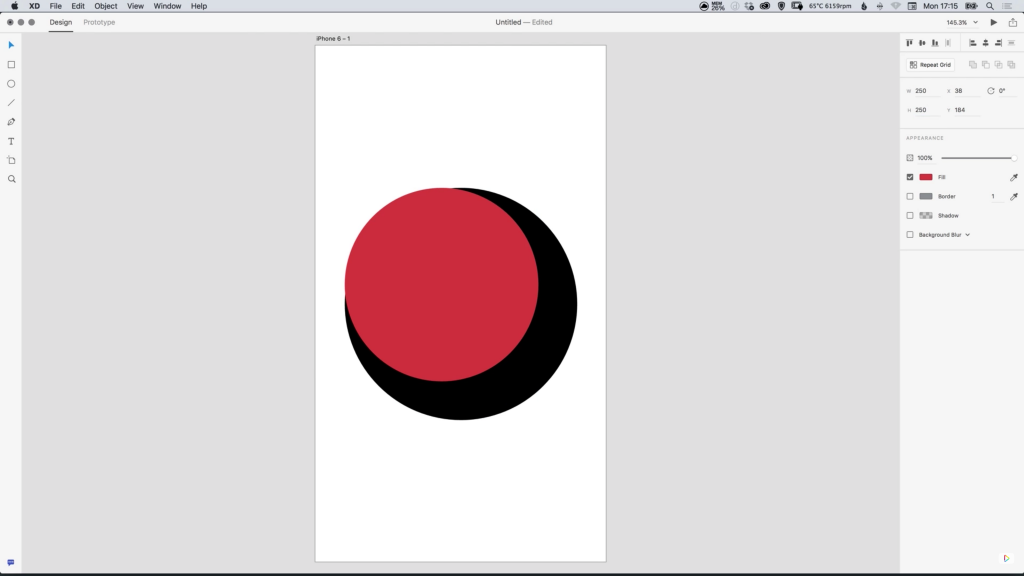
2. Select the Ellipse Tool and hold Shift to draw a circle. Give this circle a black Fill, with no border, and set the Width and Height to 300px.

draw-letter-s-symbol-adobe-xd-1

3. Press Cmd/Ctrl + D to duplicate the shape, and give this copy a Width and Height of 250px. Next, select both circles, and in the Alignment options ensure that the two shapes are aligned both vertically and horizontally.

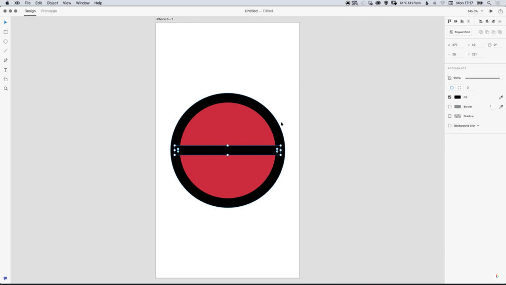
4. Select the Rectangle Tool and Left-click to draw a horizontal rectangle, and give this shape a Height of 25px, and a Width slightly less than the width of the circle created in Step 2. Repeat Step 3 to align all shapes both vertically and horizontally.

draw-letter-s-symbol-adobe-xd-2

5. Select the rectangle created in Step 4, press Cmd/Ctrl + D to duplicate the shape, and position this copy directly above the original rectangle. Give this shape the colour White #FFFFFF.

6. Repeat Step 5, and instead position another copy below the rectangle.

draw-letter-s-symbol-adobe-xd-3

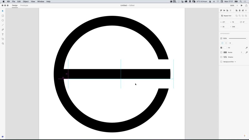
7. Move the top rectangle shape to the right to cover part of the circle, and move the bottom rectangle to the left to cover part of the circle on the opposite side.

8. Hold Shift and Left-click on both of the circle shapes, and in the Pathfinder options select Subtract, effectively ‘knocking out’ the smaller circle from the larger circle.

draw-letter-s-symbol-adobe-xd-4

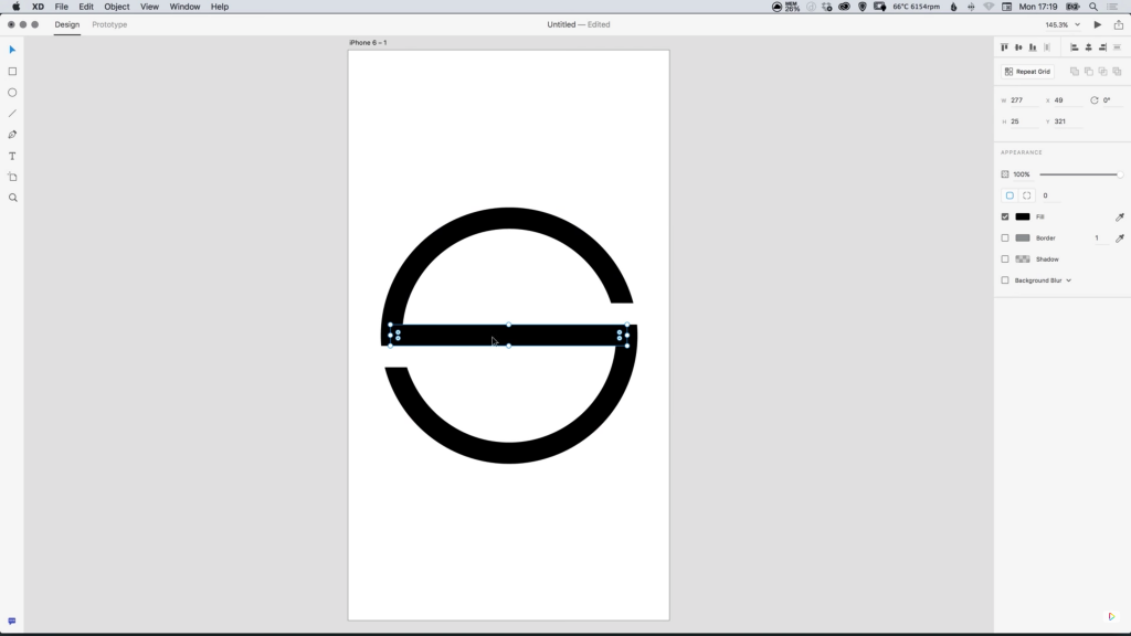
9. Hold Shift and Left-click on both of the white rectangle shapes, and in the Pathfinder options select Add to combine these into one shape. Repeat this step for all black shapes.

10. Lastly, Drag over all shapes on the artboard to select (now separated into black and white), and in the Pathfinder options select Subtract, leaving one complete ‘letter S’ shape.

draw-letter-s-symbol-adobe-xd-5

11. Select a Fill and Background colour of your choice!

Download Adobe Experience Design CC (Adobe XD).

Read More at Draw Letter ‘S’ Symbol in Adobe XD

Categories: Designing, Others Tags:

How great onboarding leads to great UX

September 14th, 2016 No comments

Did you know that the term “onboarding” comes from the HR department and refers to new hires acquiring necessary skills and knowledge in order to effectively join the company as a new employee?

It eventually changed its meaning to refer to new users who needed necessary knowledge in order to use a new product like a web or mobile app.

I like to think of onboarding as a big part of the journey a new user takes in signing up for a product. I also think onboarding is an ideal place to enhance (or ruin) new users’ first impressions of a product. Think about it: just because you signed up for an app doesn’t mean you plan on using it; let’s talk about that…

Good user experiences are the only experiences with longevity

The reason we stress over design is because we want to present the product in the best possible light. If the impression is bad then a user is unlikely to come back and recommend the product to someone else. If the user is not impressed, indifferent to the experience, that means there is room for improvement. On the other hand, if the user is impressed by what they experience they are much more likely to come back and enjoy the product again. Good user experiences are the only experiences with longevity.

There are many things that could affect a good user experience. This can range from making a complex interface friendlier to gamifying the product from the get go.

Duolingo

One of the things that fascinates me is the number of products that require a user to hand over their email address in order to use the product—get the email so you can harass a user who hasn’t returned in a while! They must have forgotten how much they loved us!—Is this the best experience we can come up with? If a user doesn’t want to come back no amount of email nagging is going to change their mind. Let’s give them an experience to successful that they return on their own.

I fell in love with Duolingo’s onboarding, because like many successful onboarding experiences, they allow you to use the app without signing up beforehand. (They recently redesigned, but I like these old designs better.) The experience is all about the user, their wants and needs. After clicking the “Get Started” CTA you’re posed a proposition in first-person language: “I want to learn…”. It’s personal, and it’s relevant.

Once a user picks a language they are shown how the app works in four simple steps. While the user is learning about the app there is a lot of positive reinforcement: the progress bars may be short, but they fill up quickly; the bottom of the model turns green with “Good job!” written inside; the continue button is green. Everything is nice and lovely and oh so positive. This may be overkill when you start to analyze it but I don’t see many apps praising me this much for using them. Or going through their walkthrough, for that matter.

When a user is introduced to the app, they are actually using it. Think about how powerful that is, and how rarely it is used. Instantly a user can be proud of their accomplishment of writing a quick sentence in a foreign language.

And, once the sentence is submitted there is more positive reinforcement for a job well done: at that point Duolingo knows you either love it or hate it, and if you love it, this is the perfect time to get you started with the app by getting your email. If you don’t care to use Duolingo, no harm done. Having the user pick a commitment is a clever way to get them to commit to learning a new language. Well played Duolingo, well played!

Oscar

I’d like to walk you through the signup and onboarding process that Oscar Health has. There are a few things about Oscar that I really enjoy. The overall aesthetic of the website is very clean and minimal but it’s still approachable and professional. I think they have a really great onboarding experience with perhaps a little room for improvement.

Oscar’s online presentation matters in how serious they are taken by potential customers. Take a look at the form for signing up for a new plan; it doesn’t look like a form. That’s important. You’re answering questions but the inputs are styled so lovingly. It’s natural, as if I was speaking with a person. (Did you notice that Oscar got right to business about me and my needs, instead of asking for my email?)

The original CTA is “Get Your Quote” and I was able to do that very quickly and easily without actually signing up for an insurance plan. But, let’s pretend to proceed with a plan anyways: The next step in the onboarding process, the app explains to the user what is happening. Right now, you can only sign up for new health insurance if something happened to your coverage and you have proof of this—something like losing your job and the coverage they provided or losing your COBRA benefits. I think it’s smart to tell the user up front as to why they can and cannot sign up; it takes a lot of guesswork out of the whole process. Let’s pretend we qualify…

During the process, the design of the whole thing feels consistent, like I’m still in the same place going after the same thing. The form still doesn’t feel like one as you move along the process. The last thing a user wants to be doing is filling out numerous forms, in any given setting. Styling the interactions not to feel like a form is a great step in making the experience not feel like a bureaucratic formality.

Another thing that’s very important in this sign up process is the fact that the steps are divided up, and you know where in the process you are. This further improves the form filling process.

There is one thing I wish the onboarding process did more of and that’s explaining why the information is necessary. They did this in the beginning—they were transparent as to the qualifications for health insurance. But why does my gender, my phone number, or my marital status matter? I know it somehow matters for health insurance because it’s always asked. Is that really necessary? It’s pretty personal information, especially my SSN—it would put the user at ease knowing why they’re being asked for this information.

Eventually, I’m asked to provide a password in order to save my information. They even say what their password formatting preferences are! (How rare is that?!) My other confusion is why the user is asked for a password before the address? It seems like the form is a little out of logical order.

Oscar’s onboarding experience is an improvement compared to many, especially when it comes to onboarding in the healthcare industry. It’s obvious they care about their people, just by spending a few minutes going through their onboarding experience.

Ultimate Retouch Panel 3.0 for Adobe Photoshop – only $17!

Source

Categories: Designing, Others Tags:

Using Dynamic Hashes in File Names with WordPress’ Enqueue Function

September 14th, 2016 No comments

The following is a guest post by Pascal Klau, a self-described trainee web developer from Germany working with WordPress, Gulp, and more recently VueJS and Webpack.

During my journey of learning web technology, I stumbled upon the importance of file caching. It’s a pretty important thing for web page performance. I also sometimes notice that when a file was changed, and you refreshed the page, the browser can still be using the old version (because of the cache). There is a solution!

Hashes Break Caches

Adding a hash in the file name lets the browser think it is a totally different file. Thus, “breaking the cache”. For example, if the file `main.3hZ9.js` changes to ‘main.8a3s.js`, the browser will definitely re-download it. This renaming can be done automatically by task runners.

There is a problem for those of us using WordPress though. You need to manually enqueue the files by name but you can’t know the randomly generated hash value.

wp_enqueue_script('main', get_template_directory_uri() . '/js/main.3hZ9.js', array('jquery'), null, true);

Adding the Hashes with Gulp

Before we tackle the WordPress issue, here is how to add hashes.

Since I’m using Gulp, gulp-hash came in handy. If you are using Grunt, there are equivalents.

// ES5
var gulp = require('gulp'),
    hash = require('gulp-hash');

var options = {
    hashLength: 4,
    template: '<%= name %>.<%= hash %><%= ext %>'
};

gulp.src('./js/**/*.js')
  .pipe(hash(options))
  .pipe(gulp.dest('build'));
// ES6 + Gulp 4
import gulp from 'gulp'
import hash from 'gulp-hash'

let options = {
  hashLength: 4,
  template: '<%= name %>.<%= hash %><%= ext %>'
};

export function hashing() {
  return gulp.src('./js/**/*.js')
    .pipe(hash(options))
    .pipe(gulp.dest('build'))
};

const dev = gulp.series(hashing);
export { dev };
export default dev;

The WordPress Solution

Here’s how we can enqueue the hashed files automatically! The trick is that we don’t need to know the hash name, we’ll have PHP find the file anyway.

First we get ready to look through the file system at the directory where our asset is.

function enqueue_files() {
  $dirJS = new DirectoryIterator(get_stylesheet_directory() . '/js');
}

Now we loop through all the files and filter for the ones that end in `.js`.

foreach ($dirJS as $file) {

  if (pathinfo($file, PATHINFO_EXTENSION) === 'js') {

  }

}

Dependencies need a name in WordPress, so we can base that off the file name. “main” would be better than “main.3hZ9” (because it doesn’t change), so we can strip the hash off for the enqueue name.

foreach ($dirJS as $file) {

    if (pathinfo($file, PATHINFO_EXTENSION) === 'js') {
        $fullName = basename($file);    // main.3hZ9.js
        $name = substr(basename($fullName), 0, strpos(basename($fullName), '.')); // main
    }
}

In WordPress, any asset you enqueue may need dependencies. You declare these yourself by passing an array of them to the enqueue function. Here, we’re checking the file and adding dependencies if needed:

foreach ($dirJS as $file) {

    if (pathinfo($file, PATHINFO_EXTENSION) === 'js') {
        $fullName = basename($file);
        $name = substr(basename($fullName), 0, strpos(basename($fullName), '.'));

        switch($name) {

            case 'main':
                $deps = array('vendor');
                break;

            default:
                $deps = null;               
                break;

        }
    }
}

All together now!

We have everything we need to enqueue the asset now, so here it is all together:

foreach ($dirJS as $file) {

  if (pathinfo($file, PATHINFO_EXTENSION) === 'js') {
    $fullName = basename($file);
    $name = substr(basename($fullName), 0, strpos(basename($fullName), '.'));

    switch($name) {

        case 'main':
            $deps = array('vendor');
            break;

        default:
            $deps = null;               
            break;

    }

    wp_enqueue_script( $name, get_template_directory_uri() . '/js/' . $fullName, $deps, null, true );

  }

}

It works the same way for CSS files except the slightly different WP enqueue function.

What about PHP filemtime?

With WordPress, you can add a cache-breaking URL parameter in its enqueue function with filemtime. It adds a timestamp every time you modify the file:

$file = get_template_directory_uri() . '/js/main.js'
wp_enqueue_script( 'main', $file, null, filemtime($file), true );

// => [...]/main.js?1203291283

Why am I not using this technique?

I am bundling JS files into `main.js` and `vendor.js` (in my case, with Webpack). When editing `main.js`, the timestamp for `vendor.js` changes as well. So it would be downloaded every time without being any different at all.

Hashes, on the other hand, stay the same.

Conclusion

Now you can add hashes dynamically to files when they change, through Gulp. And you can enqueue those files in WordPress without needing to know the new file names directory.


Using Dynamic Hashes in File Names with WordPress’ Enqueue Function is a post from CSS-Tricks

Categories: Designing, Others Tags:

Creating Websites With Dropbox-Powered Hosting Tools

September 14th, 2016 No comments

Let’s say you want to quickly sketch out your idea of a website, or just quickly whip up a small site for testing purposes. Also, neither should take a lot of time to build nor should they need a full-stack toolkit. So, where and how do you start?

Have you tried creating a website with some Dropbox-powered hosting tools? Well, they certainly can provide a fast and easy solution for these occasions. You don’t have to fiddle with servers or bother about deployment, some of them even come with pre-configured templates that you can use or customize to spare you coding time.

The post Creating Websites With Dropbox-Powered Hosting Tools appeared first on Smashing Magazine.

Categories: Others Tags:

Stocky.pro: Free Commercial-Use Photos, Music, Videos, and Graphics

September 14th, 2016 No comments
Stocky.pro: the Rather Plain, but Appropriate Landing Page

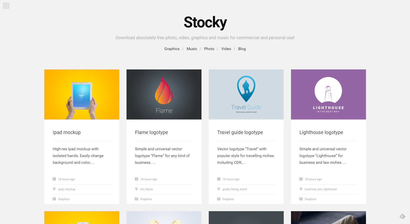
Is there a state called enough when it comes to free resources? I don’t think so. The fresh service Stocky.pro is additonally special, as it doesn’t only offer photos and graphics, but even music and videos for free use.

Stocky.pro: the Rather Plain, but Appropriate Landing Page. (Screenshot: Noupe)

Stocky.pro: A Lone Wolf From the Ural Has High Ambitions

Stocky.pro was brought into my filter bubble via Product Hunt. The page has gone online not too long ago. It is being run by the lone fighter Alexey Kokov from Yekaterinburg in the Russian Ural. Kokov’s goal is to offer all types of digital media that someone could ever need for commercial purposes for free via Stocky.pro.

This goes so far, that he actively asks his visitors to order certain content. He’ll take care of it and deliver just these materials on Stocky.pro. This sounds altruistic, and it probably is, at least for now. According to his own statement, Kokov prefers working on Stocky.pro during the night and on the weekends, as his main job and family already take up a majority of his time.

stocky-example

Preview on a Thematic Image Download. (Screenshot: Noupe)

Kokovs vision for Stocky.pro is running a content marketing hub, on which companies can both provide and freely access content. At the moment, he’s excluding advertisements. He does not want to sell premium services.

For us users, this means that Stocky.pro is completely free, and it is supposed to stay like this. The provided material can be used for free for any legal purpose, in private, commercial, and customer projects.

I was not able to make out how Kokov wants to earn money with this, yet. After all, he considers Stocky.pro to be his startup. Well, let’s just wait and see.

Stocky.pro: Manageable Offer With Any Theme Focus

When designing such a service on a drafting table, you most certainly would not act the way Kokov is acting with Stocky.pro. At the moment, you’ll already find a decent amount of different resources for digital use on Stocky.pro. However, the material provided is somewhat random, because the owner has dealt with some topics more than with others.

Thus, you need a good amount of luck trying to find what you really need in your current project on Stocky.pro. Things will be much easier on larger, classic stock providers.

However, one has to admit that the provided elements have good to very good quality. This includes the vector files as well as photos, videos, and music. The product range is small but the products are worth a look.

Stocky-Example: If You Are a blogging Knitter or a knitting Blogger, this Video could be Useful for You…

When it comes to music and videos, one thing that’s nicely done is the preview. Kokov uses YouTube for the videos, and Soundcloud for music. This way, you won’t have to blindly download something, and you’ll get to test whether the elements satisfy your needs in terms of content and quality.

There are no thematic divisions into categories (yet). Finding interesting elements is either done via browsing through what’s there, or using the free text search, which can be found hidden in a hamburger menu. Alongsinde the resources you’ll find a few tags to characterize the respective element. Clicking one of these tags will open a grid that contains all content with the same tag attached to it.

Talking about grids, Stocky.pro strongly reminds me of Pinterest and other card based designs.

Conclusion: At the very least, Stocky.pro should be in your bookmark collection for observation purposes. Free music and video sources are still quite rare. The rest is also promising.

Categories: Others Tags:

Animating a Moving Car in Adobe Muse

September 13th, 2016 No comments
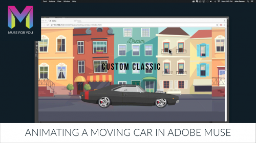
Muse For You - Animating a Moving Car in Adobe Muse - Adobe Muse CC

Animating a Moving Car in Adobe Muse. No Coding Skills Required.

Adobe Muse CC Logo Muse For You - Adobe Muse CC Greensock Logo

In this tutorial I will go over how to animate a moving car in Adobe Muse using the Muse Motion 2 Widget found at http://museforyoushop.com. We will also be using Adobe Illustrator.

1. Open the car vector in Adobe Illustrator.

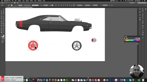
2. Copy and paste the different car parts from Adobe Illustrator into Adobe Muse. Wheels should be behind the body of the car and pasted in separately so we can rotate them. Center the car in Adobe Muse.

Muse For You - Animating a Moving Car in Adobe Muse - Wheels - Adobe Muse CC

3. Place the “Muse Motion 2 – Add First” widget at the top of your Adobe Muse website from the library panel. If you do not see the library panel go to Window > Library.

4. Place the “Muse Motion 2 – 2D Transformations” below the “Add First” widget.

5. Assign the graphic style name that is in the widget to the two wheels that were pasted in from Adobe Illustrator. The graphic style name for the first widget is “motion1.” The graphic style name is applied via the graphic styles panel. If you do not see the graphic styles panel go to Window > Graphic Styles.

6. Have the wheels rotate by going to the Muse Motion 2 widget and enabling the rotation option. Then set the rotation to 360. Make sure the easing option is set to “Linear” and that the widget has a repeat of –1 so it continues to rotate and has the moving wheel effect.

Muse For You - Animating a Moving Car in Adobe Muse - Adobe Muse CC

7. Group all of the car parts and resize the car to fit nicely on the website. To group select all of the elements, right-click, and select “Group.”

8. Next open the background vector in Adobe Illustrator and copy and paste into Adobe Muse. Resize the background so it looks like the car is on the street.

9. Copy and paste the background right next to the first background that was added so there are two backgrounds next to each other. This will give enough background for it to continuously play.

10. Copy and paste the first “Muse Motion 2 – 2D Transformations” widget and change the graphic style name to “motion2.” Apply this graphic style name to both backgrounds on the website.

11. Make the backgrounds move left by going into the Muse Motion 2 widget and enabling “Translate X.” Here enter in the width of the background but give it a negative value so it moves left. Change the duration to 6 seconds so the background does not move so fast. Also make sure the easing option is set to “Linear” and that the widget infinitely repeats by setting the repeat to -1. This will give the effect of the background continuously moving. Make sure the rotation is de-selected in this widget.

12. Preview page in the browser and watch the background move left and the wheels on the car rotate clockwise creating the moving car effect.

In the video above I go over a live demonstration on how to create this effect in Adobe Muse using the Muse Motion 2 widget and Adobe Illustrator.

For more video tutorials and widgets for Adobe Muse visit http://museforyoushop.com.

Happy Musing :).

Read More at Animating a Moving Car in Adobe Muse

Categories: Designing, Others Tags:

Create SEO-friendly URLs for Web Images with Cloudinary

September 13th, 2016 No comments

URLs for images are typically not useful for search engines because they’re comprised of an extensive list of random characters. To boost your site’s SEO ranking, you need concise, meaningful image file names that make it possible for search engines to extract information about a picture. Because uploaded image files rarely have descriptive names, it poses a challenge for developers and site content managers, who are tasked with maintaining short, meaningful, SEO-friendly URLs.

Cloudinary offers two features that can help developers improve search engine optimization of their images – Root Path URL and Dynamic SEO suffixes – and enables you to use your domain in the URL. These features are useful for a website, as well as a web application, owners, and are recommended for content-heavy sites, such as online magazines and news sites.

Root Path URLs

Cloudinary’s image URLs are delivered via CDN and use folder names as their path prefixes. These include resource and image types, such as /image/upload and /raw/upload. The most popular prefix among Cloudinary’s users includes /image/upload in its URL. Now, with Cloudinary’s Root Path URL feature, the /image/upload section of URLs can be removed, leaving only the image’s public ID (file name) at the path’s root – significantly simplifying the URL.

Below is an example of an image that was uploaded to Cloudinary and was assigned basketball_shot as the public ID:

http://res.cloudinary.com/demo/image/upload/basketball_shot.jpg

And here is an example of a Cloudinary image URL that uses the Root Path URL feature:

http://res.cloudinary.com/demo/basketball_shot.jpg

Both URLs yield the same uploaded image:

The Root Path URL capability also enables users to add parameters for on-the-fly image manipulation. For example, if an uploaded image needs to be cropped to 200 x 200 pixels, it can be transformed just by setting the width and height parameters to 200 and the crop mode to ‘fill’ (see text in red in URL below).

http://res.cloudinary.com/demo/w_200,h_200,c_fill/basketball_shot.jpg

Cloudinary’s client libraries (SDKs) can be used to build delivery URLs and add image tags. To do so, you only need to set the new parameter, use_root_path, to true.

For example, the code sample below was used to create an HTML image tag with an image URL using the Root Path URL feature:

  cl_image_tag("basketball_shot.jpg", :width=&gt;200, :height=&gt;200, :crop=&gt;"fill", :use_root_path=&gt;true)

Dynamic SEO Suffixes

Cloudinary offers users the ability to create image URLs that are more comprehensive and descriptive. Each image uploaded to Cloudinary is given a public ID, which is its name for delivery URLs. Users can define custom public IDs with a string of text or multiple folder names (separated by slashes) while uploading images. These public IDs can be as descriptive as necessary.

The Dynamic SEO Suffix feature goes further, allowing users to separate the process of uploading an image and assigning a public ID from creating descriptive URLs. If an image is not given a suitable name during the upload process, you will be able to assign additional URLs to the image afterward. For example, with this feature, you can dynamically add multiple suffixes to create as many descriptive URLs as necessary for your site. You may want to use these URLs to support different languages for a single image or to reflect specific content on certain pages.

To add a Dynamic SEO Suffix, an image’s path prefix must first be changed from the default /image/upload to the shorter version /images.

Here is an example of an image that was uploaded with the ID tepu4mm0qzw6lkfxt1m and is delivered by the following CDN optimized URL using a standard path prefix:

http://demo-res.cloudinary.com/image/upload/ltepu4mm0qzw6lkfxt1m.jpg

mage delivery
Below, the suffix basketball-game-in-college was added, which is the text that search engines use to index the page and image:

http://demo-res.cloudinary.com/images/ltepu4mm0qzw6lkfxt1m/basketball-game-in-college.jpg

In the URL below, the same image is given an additional, separate suffix in Spanish:

http://demo-res.cloudinary.com/images/ltepu4mm0qzw6lkfxt1m/baloncesto-juego-en-universidad.jpg

Additional image transformations then can be easily made by adding parameters to Cloudinary’s on-the-fly manipulation URLs. Here, the same image is transformed to a 200 x 200-pixel crop with rounded corners and increased saturation:

http://demo-res.cloudinary.com/images/w_200,h_200,c_fill,g_west,r_30,e_saturation:50/ltepu4mm0qzw6lkfxt1m/basketball-game-in-college.jpg

00x200 thumbnail with dynamic SEO suffix

This capability is also applicable for non-image raw file uploads and private images. For raw files, the resource type /raw/upload should be replaced by /files, and for private uploads, the resource type /private/upload should be replaced by /private_images. When using Cloudinary’s SDK for various development frameworks, set the new url_suffix parameter to any text, and the URLs will be built automatically with either a /files or /private_images prefix, as well as the added suffix.

Use Your Own Domain

You can also make your URLs more SEO friendly by using a custom domain (CNAME) for your URLs instead of the shared res.cloudinary.com. The SEO suffix and CNAME features also can be used together, for example:

http://images./w_200/afe6c8e2ca/basketball-game.jpg

It’s important to note, though, that to use the SEO suffix or CNAME features, your account needs to be setup with a private CDN configuration, which is only supported by Cloudinary’s Advanced Plan or higher.

With these capabilities, Cloudinary can help you easily create advanced image manipulation and delivery URLs, which will assist in optimizing your site for search engines. Cloudinary users can use both the Root Path URLs and Dynamic SEO Suffix features together to build a short and descriptive image URL. The Root Path URL capability is available for all accounts, including the free tier, and the Dynamic SEO Suffix capability is available with Cloudinary’s Advanced Plan or higher with a private CDN setup.

For more information, or to sign up for an account and test these features, visit the Cloudinary website.

Disclaimer: This post is sponsored by Cloudinary

Categories: Others Tags: