Archive

Archive for September, 2016

Transpiling ES6

September 13th, 2016 No comments
Cover of Let's Learn ES6

While support for ES6 is always increasing, we can’t always assume that users will be using a browser that supports all its features. So, in order to utilize ES6 features now and make sure we won’t run into cross-browser compatibility issues, we need to transpile our code.

Let’s look at two possible ways we can perform the task of transpiling our code. First, we will use npm scripts and Babel. For the second, we will look at using Gulp with Babel.

Babel

Babel is the go-to transpiler for ES6. It was originally called 6to5, but was later renamed to Babel as it was apparent that the name would not work moving forward. With the release of Babel 6, the focus turned more towards making Babel pluggable. It created a system that allows you to create plugins to transform your code! The default action for Babel in version 6 is not to transform your ES6 to ES5 anymore, so you now have to include various presets.

The presets in Babel allow you to either pick and choose the transformations that you want, or you can select the babel-preset-es2015 preset and work with all the features.

Babel CLI

In order to work with the three methods that we will look at, it is important to make sure you have Node.js installed. The easiest method would be to head over to the Node.js website and download the latest version for your operating system.

If everything goes as planned, you should have node available to you in your terminal. To confirm that Node.js is installed on your system, open your terminal and type node -v into the prompt.

$ node -v
v5.2.0

If you get a response that looks something like what you see above, you are good to go! If you are not super comfortable with the command line, I suggest checking out commandlinepoweruser.com by Wes Bos. It’s a great free video series to help you quickly get up and running with the common commands.

Once we have Node up and running we need to install the Babel CLI. To do so we will use npm. To test this, create a project folder and navigate there in the terminal. To get started we need to create a `package.json` file. To get this started with npm, we can run:

npm init

This will walk you through a few questions: what is the name of your project, version, description, etc. When it asks you about the “entry point”, you can leave it as `index.js` for now. Typically this would be the main file for your project. If you know ahead of time what that file will be named, add it now.

Once you are done with these steps, a new `package.json` file will have been created. Now, it’s time to install the babel package we need.

npm install --save-dev babel-cli

After running this line you will see a few new changes in your project directory. First, you will notice that there is now a `node_modules` folder, and second, that there is a new entry inside your `package.json` file. There is one key part to the code above: the --save-dev flag. This flag will save the module, babel-cli, in your package.json file under devDependencies section.

"devDependencies": {
  "babel-cli": "^6.6.5"
},

This section in the file is used for modules that will be used in development, meaning they are not needed in production. If we had run our install with --save instead, it would put the module under the dependencies section.

But, what is the point of all these sections? If you are unfamiliar with npm and the package.json file, it’s a file that you can take from project to project and run npm install and anything listed in devDependencies or dependencies will be installed for that project. If you wanted to install just the dependencies you could run:

npm install --production

There will be cases when you are developing your apps that you will want to use certain modules exclusively for development, and certain modules exclusively for production. Using --save and --save-dev you can put those modules in the right buckets.

Babel Presets

As mentioned earlier, Babel does not default to transpiling ES6 right off the bat. We have to include the babel-preset-es2015 module as well.

npm install --save-dev babel-preset-es2015

This module ensures that we have the ability to transpile our code.

Folder structure

Before we go too far, let’s talk about folder structure. If you are going to be following along, I have set up my folder structure as follows:

- project
    - src
      - app.js
    - public
    - package.json

In the root `project` folder I have a `src` folder and a `public` folder. The `src` folder is used to hold my pre-transpiled code. This would be the code that is written with the nice ES6 syntax, while the `public` folder will be the destination for our transpiled code. The `public` folder would also hold the CSS, HTML, and images that your app requires.

NPM Script

The first method of transpiling we will look at is using NPM to run Babel. In the `package.json` file there is a section called scripts where we can define commands we would like to run. Using the Babel CLI we can set up a script to compile our code and output it where we would like. The scripts section takes a JSON object as a value. The keys in this object will be the name of our script and the value will be the command to run.

"scripts": {
  "js" : "babel src/app.js --out-file public/app.js"
}

Adding the above to our package.json in the scripts section will take our code from src/app.js, run it through Babel, and output the file in public/app.js. The Babel command has many options to it that we will look at later, but the --out-file flag is used to determine the destination of the compiled source.

Go ahead and add some ES6 code to the `src/app.js` file. If you don’t know what to add, try this:

const person = {
  name: 'Ryan Christiani'
};

const testString = `My name is ${person.name}`;

If you type npm run js into your terminal you should have an output of something like this:

> testfiles@1.0.0 js /Users/yourusername/path/to/project
> babel ./src/app.js --out-file ./public/app.js

Now, the moment of truth: let’s look in the `public/app.js` file. Note that if you did not create one before, Babel will go ahead and create it for you.

const person = {
  name: 'Ryan Christiani'
};

const testString = `My name is ${person.name}`;

Huh… this looks exactly the same. That is because we have not utilized the es2015 preset yet!

babelrc

In order to tell Babel that we want to use presets that we have downloaded, we need to create a configuration file. This file is called `.babelrc`. If you have never worked with a dot-file before, you might think that it is a bit odd! Dot-files are meant to be hidden files and are typically used to store configuration information, or just to keep things hidden. By default you cannot see dot-files on your computer, however a quick Google search will show you how to turn them on for your finder. Since we are on the terminal, we can use the ls -a command to show any file or folder that starts with a `.`.

Sublime Text (the editor I am using throughout this book) or Atom will show you these files if you open your project folder in the editor.

In order to configure Babel to use our preset, we need to add this code to the `.babelrc` file.

{ 
  "presets": ["es2015"] 
}

Babel configuration files take a JSON object with a presets key that contains an array of the presets you would like to use. There are many presets you can use, check out the Babel docs for more information. Now, if you run npm run js it will properly transpile our code, changing the output to look like this:

'use strict';

var person = {
  name: 'Ryan Christiani'
};

var testString = 'My name is ' + person.name;

This is great, however let’s make our script a little more robust. Right now, when we run the script, it will output the file and stop. If you want to keep working on the file we need to run this over and over again. We can configure the script to watch over the files and run when they change!

"scripts": {
  "js": "babel ./src/app.js --watch --out-file ./public/app.js"
}

By adding the --watch flag, we are telling Babel to listen for any changes in the `src/app.js` file, and when changes are made we want to output a transpiled version of that code to `public/app.js`. There are plenty more things you can do with npm scripts and the Babel CLI, however let’s see how we can use Gulp and Babel to transpile our code!

Gulp

Gulp is a popular task runner that helps to automate your workflow. There are a ton of different task runners out there, including Grunt, Broccoli, and Brunch. For this book, we will look at how to configure Gulp to automate working with Babel, and later on in the book, we will use this to work with modules as well. So lets get started!

Getting started with Gulp

In order to get started with Gulp, we need to install it globally on our system. Gulp is another npm module, so we install it like such: npm install --global gulp-cli. When working with gulp we have to install it globally only once, and also locally in each new project. We can do this by running: npm install --save-dev gulp.

gulpfile.js

To configure gulp we must first create a new file called `gulpfile.js`. This will be used to define our tasks. If you have never worked in Node before, you might not be familiar with the require function. This is a function that will pull in any modules from the node_modules folder, or your own modules. Since we ran npm install --save-dev gulp that placed it in our node_modules folder. In the `gulpfile.js` we can get access to gulp by requiring it.

const gulp = require('gulp');

This will store Gulp on a new variable called gulp. You will notice that I used const here! This `gulpfile.js` will be our first JavaScript file that uses ES6. I won’t be going into much detail on the ES6 features we use here, that’s what this book is for! We will discuss these features in more depth later throughout this book.

Gulp is all about tasks. We will start by defining some simple tasks in this file.

const gulp = require('gulp');

gulp.task('js', () => {

});

gulp.task('default', () => {

});

The () => above is the syntax for an ES6 arrow function. Don’t worry if you aren’t familiar with this, we will discuss it later.

The two tasks we have created will work together, and also separately if we would like. The first of the tasks is one we will call js (note that you can call a task anything you want with the exception of default). The js task will deal with taking our JS and running it through Babel. In order to run this task we can run gulp js in our terminal. Of course, we have to define the task first.

The second task is called default. This is a special task: in here we can set up code that will kick off many other tasks, or in our case create a listener for when certain files change. To run this task we can simply type gulp in the terminal. Gulp knows that if it just sees gulp it will run the default task.

The js task

Before we get started we have to install a module the will allow babel to work with Gulp. Oddly enough this module is called gulp-babel. Type npm install --save-dev gulp-babel into your terminal to start downloading the gulp-babel package.

In our gulp file, let’s add these lines:

const gulp = require('gulp');
const babel = require('gulp-babel');

gulp.task('js', () => {
    return gulp.src('./src/app.js')
        .pipe(babel({
            presets: ['es2015']
        }))
        .pipe(gulp.dest('./public'));
});

gulp.task('default', () => {

});

The first thing we do is to require gulp-babel, then in our js task we return gulp.src('./src/app.js'). We return this to let gulp know that this will be an asynchronous event. The .src method lets us set the path for our file, and in this case it is a single file. When we get to the modules portion of this book we will change this to be a bit more robust. Gulp works with streams, meaning that we can keep moving the data down the pipe, so using the .pipe method we take the source files and send them through babel.

Just like earlier, we need to specify the presets we want to use. To do this, we can pass an object to the babel function to tell the babel plugin which preset we would like to use. Our source gets transformed into browser-ready code, and it gets passed along again, so we can pipe it into gulp.dest, which sets the final destination.

Now that our task is complete, running gulp js in the terminal should produce this output!

[19:50:35] Using gulpfile ~/Sites/lets-learn/book/testfiles/gulpfile.js
[19:50:35] Starting 'js'...
[19:50:35] Finished 'js' after 102 ms

If you don’t have any errors, then everything should be good. Gulp will have run, taken your `app.js` from the `src` folder, transformed it, and saved it to the `public` folder.

You might have noticed that this only ran once. If we change some code, we have to run it again. Let’s set up the ability for gulp to keep watching our files.

gulp.task('default', ['js'],() => {
    gulp.watch('src/app.js',['js']);
});

Altering the default task we add an additional argument, an array, for the tasks that we want to fire when we first use the task. The gulp.watch method takes a few arguments: a file path that waits for file changes, and an array of the task(s) you want to run. Now we can just run gulp.

$ gulp
[21:26:50] Using gulpfile ~/Sites/lets-learn/book/testfiles/gulpfile.js
[21:26:50] Starting 'js'...
[21:26:50] Finished 'js' after 102 ms
[21:26:50] Starting 'default'...
[21:26:50] Finished 'default' after 6.73 ms

Changing your `src/app.js` file will run the js task again! Hopefully this helps get you up and running so that you can start using ES6 today, even if the browsers you have to support do not support the features you want.


Ryan Christiani is the Head Instructor & Development Lead at HackerYou in Toronto and also the author of Let’s Learn ES6, a book with everything you need to know about the latest syntax in JavaScript.


Transpiling ES6 is a post from CSS-Tricks

Categories: Designing, Others Tags:

The only way to sell design

September 13th, 2016 No comments

Clients drag their feet.

You know they need a designer. They know they need a designer. It’s something you both have discussed, so why are they hesitating? You’ve been negotiating with them for almost a month and still no deal. You’re exhausted. You’re tired of dealing with them and they’re not even a client yet!

And then it gets worse.

They tell you they’re talking to six other designers. Your prospective client is using the information you give them as leverage. “I just want to make sure I get the best deal”, they tell you, as they drive the knife deeper.

They’re treating you like a commodity. You’re a professional and you’re amazing at what you do. That’s why they’re considering you. They’re not trying to cause trouble, but that’s exactly what you’re getting. You’re drained but they want to “negotiate” some more.

Sound familiar?

Clients freeze when it’s time to sign

When they’re stalling, it feels like they’ll never buy. Or if they do, that they’ll demand a discount. But why? Why is it so hard for them to make a decision?

Stalling is a natural part of the buying process. When it’s time to make a commitment, our fears and objections flair up. There’s questions to answer, risks to avoid, uniqueness to share, etc.

You want them to say “Yes” quickly. Here’s the bad news. That won’t happen unless you have the right ingredients in your freelance business. These ingredients set the tone for your relationship with clients. It tells them who you are, what you’re about and what they should expect.

When you have the right ingredients, clients will:

  • Approach with the right attitude. You’re viewed as a capable professional and you’re treated as an equal.
  • Commit quickly. They don’t want to miss out on the valuable things you provide.
  • Pay immediately. They quickly realize they’ll have to do their part to keep the relationship going.
  • Behave honorably. They realize they need you more than you need them.

These ingredients create intense desire in your client. Here’s the thing about the “right” ingredients, they’re determined by your client.

Getting clients to buy begins with whom?

So who are they? There’s a world of difference between the client who spends $2,500 dollars on their project versus the client who spends $25,000 or $250,000. Their mindsets are different. They have their own values. Oftentimes, they’re from different social classes.

Which means you can’t approach them all the same way. The obvious question at this point is “whom?” Whom do you focus your attention on? What do you say to them?

Step 1: Choose your ideal client

Do you prefer to work with fewer clients who have larger projects? Or do you prefer variety, working with lots of clients on small, easy-to-complete projects? You’ll need to choose the kind of projects you’re looking for ahead of time so you can plan your approach.

Next, you’ll need to identify the demographics and psychographics. Is your ideal client a small one-person business? A startup looking for something affordable? Or the small business with 25 to 50 employees and $3 million dollars in annual sales?

Clarity and specificity are important here. Your answers to the who question directly affects the client you’ll receive later. Know who you want? Good, take some time to…

Step 2: Learn who you’re dealing with

What do your clients want? What’s their goal? Are they coming into the relationship with objections, hang ups or dysfunctions?

What social class are they in? Upper class clients tend to focus on presentation and tradition. Middle class clients use quality as an important benchmark. Working class clients will focus on things like ownership and control.

Learn everything you can about your ideal client.

Figure out where they spend their time, whether they’re online or offline. Learn about the brands they follow, the games they play, the books they read, etc. You want to drill deep, getting an up close and intimate view of their culture.

Step 3: Feed their culture back to them

Let’s say you’re selling to business owners. Your research tells you you’re looking for a client who:

  • has a working class background.
  • has a decent sized vocabulary.
  • is a hardcore utilitarian.
  • wants his company to look bigger than it really is.

You know your ideal client has a chip on their shoulder. They’re focused almost entirely on results. They’re utilitarians so anything they do has to have a payoff. You also know a whole lot about their problems and the things they’re looking for in a designer.

So you feed their desires, goals, fears, frustrations — all of it — back to them in your marketing. You know where they spend their time so you advertise there, which immediately grabs their attention.

As soon as your ideal clients see your marketing materials they take action. They contact you and they reach out for more information. It’s great news but it’s really just the beginning. You’ve covered the basics, so you’re ready to…

Step 4: Add your secret ingredients

If your marketing has done its job, you’ve presented yourself well. You’ve answered each of your customer’s questions and objections. You’ve discovered the risk factors that would keep them from buying.

If you’re still seeing negative emotions (e.g. fear, distrust, nervousness) or, clients continue to react negatively to your marketing, there’s a hole somewhere. Find the hole first. Using these secret ingredients before you’re ready has the opposite effect, pushing clients away before they’re ready to buy.

You’re ready for the secret ingredients.

  • Authority. What makes you an expert on the topic? Why should business owners listen to you?
  • Urgency. Why should clients act now, today?
  • Scarcity. How do you show clients the demand for you exceeds supply?
  • Safety. Is it safe for me to work with you? Can I be vulnerable with you? Will you hurt me?
  • Ease of use. How easy is it to get started? What do I need to do?

Let’s take a look at each of these ingredients.

Ingredient 1: Authority

Authority increases your perceived value dramatically. As people, we want the best our money can buy. Authority is an easy way for people to establish hierarchy.

Let’s look at how Matt and Jason, two knowledgeable and experienced web designers, convey authority.

Jason:

  • tells clients he’s an expert;
  • posts his portfolio on Behance;
  • shares client reviews;
  • brags about his upwork profile rank.

Matt, on the other hand:

  • creates a free design rating tool. He promotes his tool and it becomes popular;
  • writes amazing content for Webdesigner Depot, A List Apart, SitePoint, etc;
  • develops a design planning checklist for entrepreneurs looking to redesign their site;
  • creates award winning, high performance designs for top shelf clients.

If you’re an inexperienced client, who would you choose? Exactly. When I first learned about authority I was depressed. How am I supposed to become an authority?

The answer is simple. Find a problem, then solve it.

You can do this with code or content. You can write blog posts, create helpful tools and resources, anything. Solve a problem. Then, tell every ideal customer you can find about it. Solve a problem, create a little leverage and presto! You’ve created authority.

Ingredient 2: Urgency

Urgency, when it’s applied properly, motivates a client to take action quickly. Could be a week, few days, or a few hours. The time-frame isn’t the tricky part. It’s the incentive.

Clients need an incentive that motivates them to act fast. When it comes to urgency, there are two kinds of incentives: pain and pleasure.

Infomercials do a great job with pleasure. “Order in the next 12 minutes and you’ll receive another rotochopper, ABSOLUTELY FREE!” If you’re in the market for a rotochopper, you’re beyond excited. You’re going to rush to your phone.

And then there’s pain. “This offer’s going away. It’ll be gone in the next 12 minutes, so you’ll want to act fast. Don’t miss out on this amazing deal.” Create the right kind of urgency and your response rates go through the roof.

Ingredient 3: Scarcity

Most designers don’t know their value. They approach clients with a needy mindset, treating themselves as ordinary, like this: “I’d love to talk with you. I’d be happy to work with you on your next design project. Feel free to get in touch if you’re interested as well.”

These kinds of approaches are unbelievably common. But they’re problematic; they tell clients you’re needy, that they have the upper hand (even if they don’t).

Now compare that with a response like this: “Interested in working with me? I have 2 client slots left this month. I only take on 8 projects at a time. Here are the projects I accept.”

Whoa. Completely different feeling isn’t it? Clients walk away with the feeling “this designer is in demand. They’re on top of things.”

That’s the power of scarcity at work.

But there’s a problem, the scarcity thing feels… sleazy. People abuse it, creating scarcity when there isn’t any. Have you run into that before? It’s pretty gross right? Your scarcity won’t be sleazy and it isn’t false. How do I know?

Time. You have the same amount of time as the rest of us. And you have to decide how you’ll spend it. So you decide ahead of time, e.g. I want to make X amount per project and I only want Y projects per week. Then, you set that boundary or limit with clients, instantly creating scarcity.

Ingredient 4: Safety

We designers have a bad habit. We make clients feel stupid. Sometimes it’s an accident, other times not so much. Just sayin’.

Most professionals (attorneys, accountants, engineers, etc.) make this mistake too. It’s an incredibly easy mistake to make when you’re good at something. But that simple mistake creates a lot of negative feelings: Shame, embarrassment, humiliation, etc.

Those feelings make clients feel unsafe. But here’s the thing, you’re going to miss some of these mistakes. If clients feel ashamed they don’t want to talk. They want to hide. Kind of hard to sell to a client you can’t find though isn’t it?

So what are you supposed to do? It’s not like you can get clients to tell you if you’ve screwed up. But you’ll lose them if they don’t.

What to do? It’s simple. You set the tone of the relationship right at the beginning, like this:

Hey Abby,
I just want you to know, any question is okay. If you’re unsure about anything it’s a good idea to ask. The last thing I want is for you to feel stupid or afraid to talk.
So I’ll make you a deal. Any question about our work together is fair game?
Deal?

Create a safe zone for clients. That’s what matters. How you do it is up to you.

Ingredient 5: Ease of use

Forcing clients to go through a boring, convoluted process is the worst. Don’t make it hard for them to contact you. Don’t make it hard for them to give you money.

Treat “ease of use” like the volume dial on your radio. Convenient enough to attract lots of the right clients, but difficult enough to discourage the wrong ones. Test things often, adjusting the dial until your marketing attracts the kind of ideal clients you’re looking for.

These secret ingredients, when they’re used together, get clients to buy much faster. If you’ve dealt with the other problems I shared earlier, the response is even more dramatic.

What if you do all this and they refuse to buy? It means there’s a missing piece in your marketing. Could be your presentation, your uniqueness, could be something else.

At that point you need some help.

So you ask for it. You need to find out why clients didn’t buy. So you send them an email with an anonymous one question survey. Your email could look like this:

Hey Steve,
I noticed that our communication dropped off a bit. Seems like you went in a different direction, which is totally cool.
Would you help us out and tell us why?
Was it the price or the offer? Too high?
Just bad timing?
Or maybe something else? I’m not trying to sell you anything. I just want to be more helpful to others in the future. Would you share your thoughts on how I can be better?
Thanks,
Andrew McDermott

Clients always drag their feet

… if we’re missing the right ingredients. They stall, haggle and complain. They push for incentives and discounts. All of that goes away when you have the ingredients they need.

You can give them the right ingredients. With a little bit of effort and the right amount of preparation, you can attract amazing clients. The kind of clients who jump at the chance to work with you.

It doesn’t have to be complicated, and it isn’t a long, drawn-out effort. But it does require commitment. Do what it takes, and you’ll have the financial stability and all-star clients you need.

No hesitation necessary.

9 Gorgeous Creative Watercolor Collections from Maria Letta – only $18!

Source

Categories: Designing, Others Tags:

20 Clean & Crisp Pre-Built Websites for Small Businesses

September 13th, 2016 No comments
be theme carver

Building a presentation website for a small business is a popular activity for many web designers; and the same might also be true for you. Small business websites need to be clean, crisp, and loaded with personality; giving you the opportunity to demonstrate your design skills in the best possible light.

While every small business has its unique characteristics, their websites must provide a good UX, take advantage of customization and branding options, be responsive, and include special pages that support their individual business models.

This popular WordPress theme provides the ideal solution for these needs, with its more than 220 professionally-designed and customizable pre-built websites. Over 45,000 professional web designers rely on this WP theme for their small business and other website projects.

  • Be Theme is easy to work with – no coding is required
  • There is never a problem finding a pre-built website that is perfect for your needs.
  • Pre-built websites can be installed with one click;
  • The latest design trends are represented.
  • Be is designed with quality in mind.

20 Pre-Built Websites That Are Changing the Way You Design for Small Businesses

Be Theme sets you up nicely to respond to the way in which small business clients often operate.

  • You will generally be working with a small team, so decisions can be made fast.
  • You can help the process along by using a pre-built website in place of a mockup. Your client will view your design faster, in greater detail, and with superior functionality.
  • With the help of Be Theme’s visual builder, you can make changes fast and on demand. You will Keep the design process simpler for all parties involved.
  • You can zero in on the fine details without having to spend an amount of time in doing so.

Examine these 20 examples of pre-built websites for small businesses. The first three show how they provide a strong base for a solid design.

Before

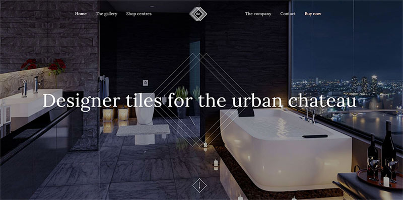
Be Tiles

  • This pre-built website shows the product together with the central message – up front
  • The graphic elements are laid out as if directed by an architect

After we changed it

2

Notice how the imagery and text have been customized to fit the client’s requirements. The UX elements remain basically intact. The hero image engages the visitor, the central message is clear, and navigation is intuitive.

Before

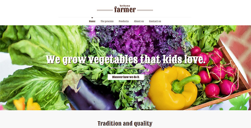
Be Farmer

3

This pre-built website is destined for use by a farm, a farming operation, or a seller of produce.

  • It has a nice human touch, the typography is in keeping with the brand, and there is a focus on a call to action.
  • The images are large and clear, and the menu covers the necessary bases.

How would you transform it?

After

4

You would first change the image to be more in line with your business – a seller of farm produce in this case. The “freshly harvested’ theme remains intact. The font has not changed (it could be of course), and a logo has been added. All of this can easily be accomplished in mere minutes.

Before

Be Tailor

5

This pre-built website is for a tailor shop

The graphical elements are consistent with the theme’s concept. From the images, to the messages and typography.

After we made the changes

6

Starting with Be Tailor, the structure is retained and the basic concept has been adhered to, but the vibe becomes manly, modern, and chic. Note how the subtle change in font creates a slightly less formal experience.

Check out this video and view how fast and smooth it is to remodel a pre-built website into a real working website.

17 more pre-built websites

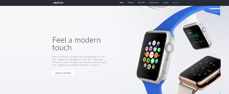
Be Watch

7

  • Ideal for a smart watch shop’s website.
  • The hero shot immediately engages the user, and the design is clean, with an abundance of white space.
  • The menu is not difficult to find, but it is not intrusive.

Be Architect 2

8

  • A pre-built website in which the elements combine to produce a unique, interesting experience.
  • This example shows one way in which a hero image, even an abstract one, can immediately engage a visitor.

Be Lawyer2

9

  • Corporate elegance on display, but with a vintage look.
  • The business’s UVP is clear and to the point.
  • An example of how symmetry of design can convey a sense of trust.

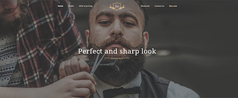
Be Barber 2

10

  • Vintage, professional, warmth – combined for this small business enterprise.
  • The design is kept simple throughout this pre-built website, with a generous use of white space.

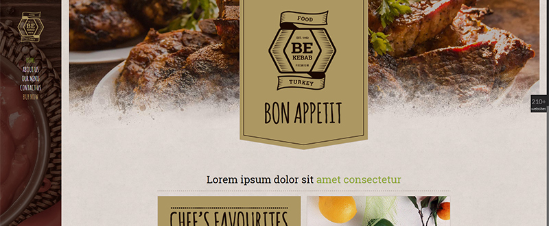
Be Kebab

11

  • Note how the logo, color, and typography nicely complement the imagery.
  • A good choice for a small, local business.

Be VPN

12

  • A formal, well-structured business website – with a human touch.
  • White space surrounds the message, with black to white font colors adding emphasis.

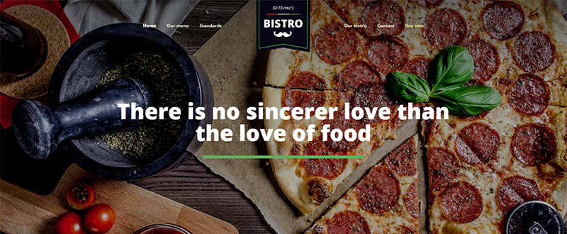
Be Bistro

13

  • Another great example for use by a local business.
  • Beautiful, big images, and a good UX to keep users engaged.

Be Car

14

  • Illustrating the sales power a hero image can have, together with the use of white space and a clever choice of colors.
  • A good example of a website design that conveys elegance and luxury.

Be Medic 2

15

  • For a clinic or medical center.
  • The focus is on producing a website that is professional and builds trust.
  • Special pages introduce team members.

Be Minimal

16

  • Minimalist designs find particular favor with creative enterprises.
  • A modern, video header, sends a strong, yet relaxing message.

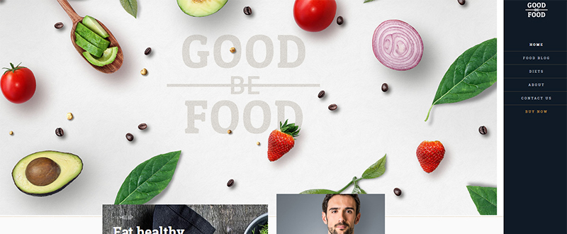
Be GoodFood

17

  • Dedicated to a food service, nutritionist, or dietician.
  • Good color and sharp imagery is all-important for a website following this theme.

Be Carver

be theme carver

  • Note how cleverly the message is made to stand out from the frame.
  • This website combines a minimalist approach with plenty of white space.
  • A good choice for an artisan looking for a one page website.

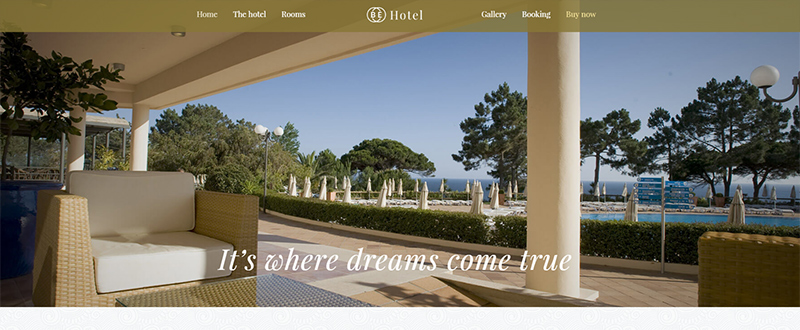
Be Hotel 2

19

  • For a hotel – where images can be relied upon to tell the story.
  • All the relevant sections (pages) are included – location, booking, rooms, etc.

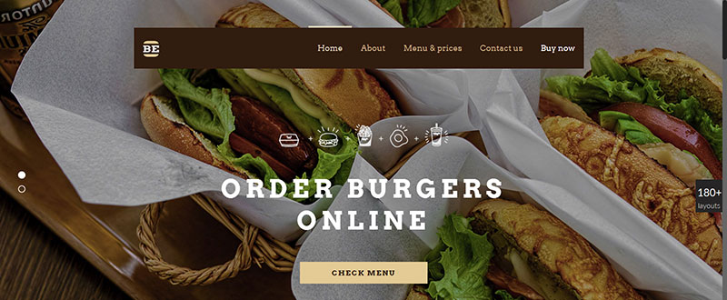
Be Burger

20

  • Destined for an online burger delivery service; can be easily customized for any catering or delivery service.
  • Modern, hip design.
  • The focus is on the products and is designed to convert the user.

Be Horse

21

  • For a horse farm, an equine or riding center, or even an equine veterinary service.
  • The hero image is strong, simple, and elegant.

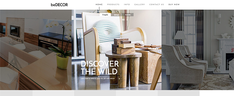
Be Decor

22

  • This prebuilt website could be used for an individual interior designer or for an interior decorating agency.
  • A showcase gallery and products section is included.

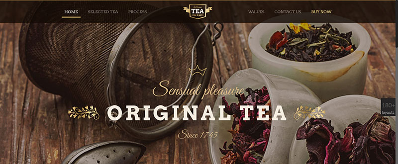
Be Tea

23

  • This old-fashioned look is ideal for use by a tea shop.
  • The design has a definite minimalist vibe, and makes excellent use of a range of colors.

Be Theme has what you need to create a beautiful website for virtually any type of small business or entrepreneur

This sampling of pre-built websites provides solid proof that when you purchase Be Theme, you can be assured of receiving tremendous value for money. Your ROI can be calculated in terms of greater productivity, increased money, consistently satisfied small-business clients, or all of the above.

With 220+ of these pre-built websites at your fingertips, each with a one-click install plus a ton of page and web-building features and with no coding skills needed, you will definitely get more than the value you are looking for. Be Theme’s history says it all. 45,000 professionals have used Be to create countless attractive, high-quality, and user engaging and converting websites. No wonder Be is a top 5 best seller on ThemeForest.

View all 220 pre-built websites here.

Read More at 20 Clean & Crisp Pre-Built Websites for Small Businesses

Categories: Designing, Others Tags:

How To Boost Your Conversion Rates With Psychologically Validated Principles

September 13th, 2016 No comments

It is often easy to overlook the underlying principles that compel people to take action. Instead, we tend to obsess over minute details — things like button color, pricing and headlines. While these things can compel users to take action, it is worth considering the psychological principles that influence users’ behavior.

Unfortunately, few organizations try to understand what influences user action. Research by Eisenberg Holdings shows that for every $92 the average company spends attracting customers, a meager $1 is spent converting them. Real conversion optimization is rooted deeply in psychology.

The post How To Boost Your Conversion Rates With Psychologically Validated Principles appeared first on Smashing Magazine.

Categories: Others Tags:

Sitemap With WordPress: A Table of Contents for Your Readers

September 13th, 2016 No comments
compact-archives

A professional blog is not only useful because it offers valuable content that the visitors like to read. Many other aspects also play a significant role when it comes to a professional appearance. One of them is the highest possible user-friendliness, as a good blogger will always think about his visitors first. To allow them to find the information they’re looking for as fast as possible, a sitemap for your blog makes sense.

A sitemap is very useful for your readers. They have an overview of all options that help them find the desired information as fast as possible. There’s no reason to not offer this service to your visitors as the sitemap itself is created very quickly. The structuring of your site before will require quite a bit of brainpower.

Before getting started, consider the following: you need to set yourself apart from the many blogs that already deal with your topics. Thus, it is necessary to empathize with your visitors and ask yourself what would help you on a stranger’s blog.

By the way: I’m not talking about the XML sitemap that Google and other search engines can access to better index your website.

Creating a Good Sitemap – How to

A sitemap for your visitors should contain the following elements:

  • An option to search for articles depending on year and month
  • A certain amount of articles per year should be displayed – maybe the last twenty
  • All articles categorized
  • All pages that you use in the theme
  • All categories with an RSS feed

This allocation gives your visitors a bunch of well-structured options to find the desired information. Two free plugins and a WordPress function are necessary to create the sitemap described above.

It is possible to compile the entire table of contents in the WordPress text editor, and no template files need to be altered.

1 – Compact Archives

Compact Archives categorizes archives depending on year and month. It provides a simple shortcode that allows you to add your sitemaps according to your requirements.

  • Developer: Syed Balkhi
  • Work in progress: yes
  • Latest version from: Eleven months ago
  • Costs: free via WordPress.org
  • License: GNU GENERAL PUBLIC LICENSE
  • Known compatibility issues: unknown
  • Developer Homepage: unknown
  • Download on WordPress.org

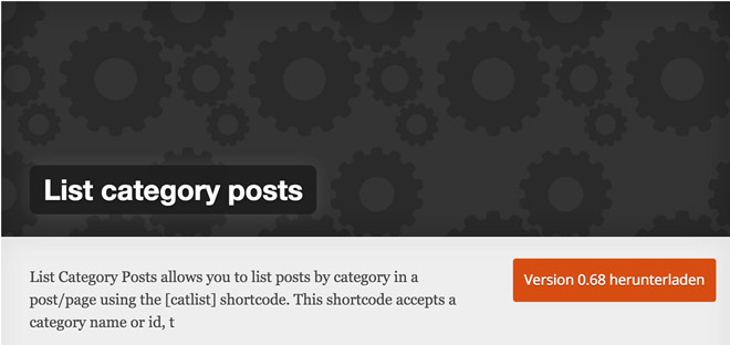
2 – List category posts

list-category-posts

This plugin provides lots of possibilities to set up a good sitemap, due to its plethora of shortcode configuration options. You get to categorize the articles depending on the year, month, category, tag, and many other characteristics. Here’s a full overview of the configuration variety of the shortcode.

  • Developer: fernandobt
  • Work in progress: yes
  • Latest version from: three months ago
  • Costs: free via WordPress.org
  • License: GNU GENERAL PUBLIC LICENSE
  • Known compatibility issues: unknown
  • Developer Homepage: Unknown
  • Download on WordPress.org

3 – Displaying all Categories With the RSS Feeds

The following code snippet belongs into the theme’s functions.php.

View the code on Gist.

Creating the Table of Contents (Sitemap)

I promised you that you wouldn’t need to touch a template file to compile a good sitemap. Of course, I’ll keep my promise. Thus, go to the WordPress dashboard, choose “Create => Pages”, and set up a new page titled “Sitemap”.

To get started, write a couple of words explaining on your sorting, so that readers receive a first orientation on what and where they need to search.

1 – Listing Articles by Year and Month

First, I list up the articles by year and month. This list also shows me the months in which nothing was posted. Months and articles are not clickable here.

View the code on Gist.

[compact_archive style="block"]

2 – Listing all Articles by Their Respective Years

The shortcode displays all articles from the respective year. When there are too many articles, you should alter the amount of displayed posts.

< ?php
[catlist year=2016]
// or reducing the amount of posts
[catlist year=2016 numberposts=-20]

3 – Sort Articles by Category

For this, we use the slug – meaning the URL – of the category. IDs can be used as well.

< ?php
[catlist name="wordpress"]
// Or by ID
[catlist id=20]

Find all configuration options of the list category post shortcode on this site:

How to use the Plugin

4 – Listing up all Categories With an RSS Feed

Now, the shortcode we created earlier will be put to use. It has no configuration options at all.

View the code on Gist.

Bonus: My Entire Configuration to Copy Into the Editor

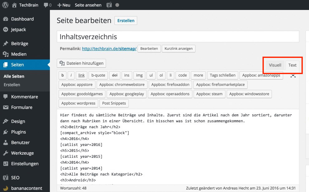
If you aren’t sure how you can use shortcodes, just copy my configuration into the text area of the WordPress text editor. At this point, you will want to switch from the visual view to the text view:

editor-textansicht

The Gist With my Settings:

View the code on Gist.

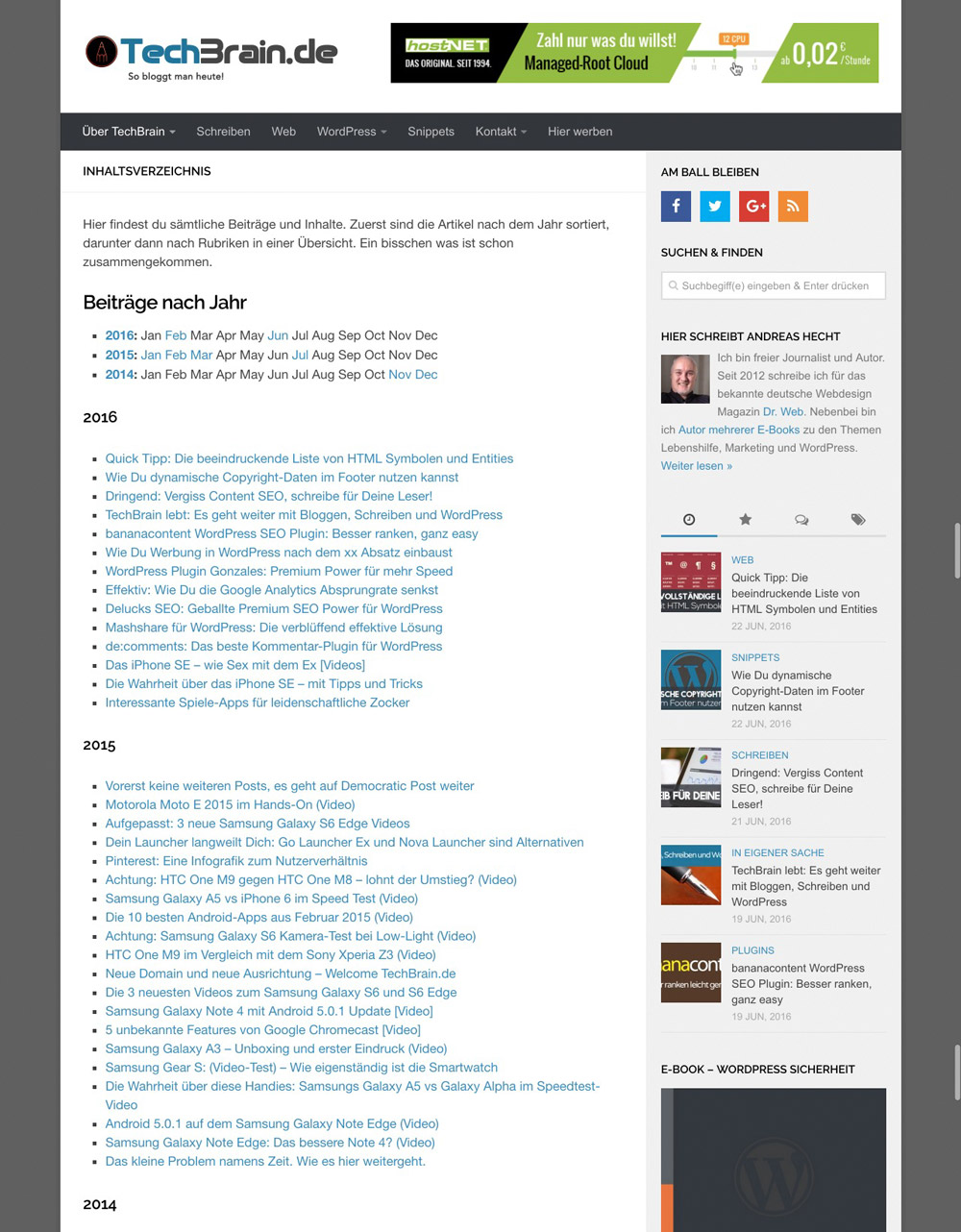
Screenshot of the Final Result

Sitemap TechBrain Preview

A part of the sitemap. Please click on the graphic to view the entire info.

Demo: TechBrain.de/sitemap/

Conclusion

Now link your sitemap prominently, so that your users will find it at first sight. That way you’ve already done a lot for user friendliness. On top of that, the advised table of contents should lower your bounce rate, and make Google happy, too.

(dpe)

Categories: Others Tags:

HostGator Review: A Powerful Web Host, or Another Average Web Host?

September 12th, 2016 No comments
dfgfh

HostGator Review: A Powerful Web Host, or Another Average Web Host?

“Powerful web hosting,” HostGator boldly claims on their homepage.

Web hosts are a dime a dozen these days, and claiming to be “powerful” — as far as web hosts is concerned — is very bold. Founded in a Florida dorm room in 2002 by Brent Oxley, HostGator is undoubtedly one of the biggest web hosts today. The giant web host has gone through a lot of stages since it was founded. It was acquired by EIG in 2012.

If experience with web hosts is anything to go by, it is clear that popular isn’t necessarily synonymous with quality. In this review, we will be doing a quick breakdown of HostGator to show you what we think about the giant host with over 400,000 customers.


An Overview of HostGator Plans

HostGator has evolved from the early days. Below is a quick overview of the main plans they offer:

hostgator website builderBasic Web Hosting: HostGator’s most basic web hosting plan starts with the “Hatchling” plan at $5.56 per month and can cost as much as $11.96 per month with their “Business” plan. All the basic plans come with unlimited bandwidth. The hatchling plan is limited to a single domain name, however.

Cloud Web Hosting: The cloud hosting plan starts with the “Hatchling Cloud” plan (2 cores, 2GB memory) at $7.16 per month. The most expensive cloud hosting plan is the “Business Cloud” plan (6 cores, 6GB memory), which costs $11.67 per month. All cloud hosting plans come with unlimited bandwidth and storage. The Hatchling plan is limited to one domain name.

Managed WordPress Hosting: With many competitors, like WP Engine (read our review), sprouting up to take over the WordPress hosting space, HostGator introduced their WordPress hosting plan with better features at a fraction of the cost. Their WordPress hosting starts with the “Starter” plan (1 site, 100k monthly visits and 1GB backups) at $7.96 per month. The most expensive plan is the “Business” plan (5 sites, 500k monthly visits and 5GB backups) at $14.36 per month.

Reseller Hosting: HostGator also has reseller hosting plans that start at $24.95 per month with their “Aluminium” plan (50GB storage, 500GB bandwidth and unlimited domains). The most expensive reseller plan is the “Diamond” plan (200GB storage, 1,400GB bandwidth and unlimited domains) that costs $99.95 per month.

VPS Hosting: Their VPS hosting starts with the “Snappy 500” plan (.5 core, 512MB RAM, 25GB storage and 500GB bandwidth) that costs $19.95 per month. The most expensive VPS plan is the “Snappy 8000” plan (4 cores, 8GB RAM, 240GB storage and 3TB bandwidth) that costs $159.99 per month.

Dedicated Hosting: Their dedicated hosting starts with the “Basic” server (4GB RAM, 500GB storage and 10TB bandwidth) that costs $174 per month for the first term. The most expensive plan is their “Pro” server (16GB RAM, 1,000GB storage and 25TB bandwidth) that starts at $374 per month. They have both Windows and Linux servers.


Pros of Using HostGator

hostgatorPricing: HostGator plans aren’t too expensive, and their plans are indeed affordable for the rates they offer as they claim — at least compared to competitors. HostGator has also improved in terms of being upfront with how much it actually costs to use their services. You will need to pay several years in advance to take advantage of some of their low prices, but this fact is clearly communicated on their website

45 Days Money Back Guarantee: HostGator also stands out with their 45 days money back guarantee. If you’re worried that you might not be satisfied with their services, this gives you extra assurance.

Addons and Bonuses: HostGator is a leader when it comes to bonuses and addons. Perhaps this is due to their massive size and how long they’ve been in business. Most new users enjoy addons such as credits to use for advertising on major ad networks, one click installs to make it easy to setup a website, integrations with major website builders such as Weebly and the option to add extra addons during the checkout process.

Good Support: Customer support is one of the major factors to consider when deciding on a web host. Most major web hosts try to limit access to support. That’s not HostGator. They offer 24/7 support through every major channel — including phone, live chat and email. They also have good support and you are likely to have your issues resolved by knowledgeable agents.

Free Migrations: If you’d like to move your site over to HostGator from other web hosts, you can count on them to assist. Their free migration service makes this process seamless. That said, many major web host offers free migration as well.

Easy to Use: At the end of the day, not everybody who wants to use a web host is a tech savvy web developer. HostGator easily counts as the web host for the average web user; they have a very simple and clean control panel (using the default cPanel), unlike the heavily-modified and confusing one used by their major competitors. They also have lots of tutorials and documentations that make it easy for you to solve most issues on your own.

Multiple Payment Options: This is worth highlighting on its own. HostGator allows you to pay through Credit/Debit Card and PayPal, so you can be rest assured as far as payment security is concerned.

Uptime: There are generally mixed reviews about HostGator’s uptime, with some reporting a perfectly fine experience while a few others have reported to the contrary. The good news, however, is that you can take advantage of their 99.9 percent uptime guarantee if you are not satisfied with their uptime.

Speed: There have been a few complaints about HostGator downtimes in the past. In fact, some of their downtimes have been widely reported in the media. Things appear to be much better now, and their cloud hosting seems to be in a league of its own as far as speed is concerned: It is one of the fastest web hosts out there.

hostgator


Cons of Using HostGator

Upsells and Cross Sells: I’m a little torn on this one, and I’ll tell you why: when most people sign up for a web host and see the advertised rate, they expect that to get them covered and expect to be sold nothing else. HostGator does upsell and cross sell, but they are for essential services such as site monitoring, SSL certificate and backup. Depending on who you ask, this could be a con or a pro.

Backups: Another reason why I included the upsells and cross sells as a con is because of the backups; most web hosts give you automated backups by default, but it is part of HostGator’s addon offer that you have to pay extra for. At the time of this review, site backups cost $19.95 annually. You might as well factor that into your cost for hosting with them.

First Time Pricing: While HostGator attempts to make this clear, it is still hidden below their pages where most users are unlikely to see it. Their advertised prices for most plans are for the first term only; once it is time to renew you’re likely to pay more than you paid initially.


John Stevens is a copywriter, web developer and web hosting enthusiast. He recently co-published a guide on how to start blogging. You can reach him via Twitter (@hostfacts).

Read More at HostGator Review: A Powerful Web Host, or Another Average Web Host?

Categories: Designing, Others Tags:

A Nerd’s Guide to Color on the Web

September 12th, 2016 No comments

There are a lot of ways to work with color on the web. I think it’s helpful to understand the mechanics behind what you’re using, and color is no exception. Let’s delve into some of the technical details of color on the web.

Color mixing

A huge part of working with color is understanding that the way that you used color as a child doesn’t work the same as how you use color on a computer because of color mixing. As a child, you’re working with paint. Paint and inks from a printer have tiny particles called pigments that mix together and reflect to present color to your eye. This is subtractive color mixing. The more colors you add to it, the darker it becomes, until we get brown. Primaries are close to what you’re used to: red, yellow, blue. But when you mix these colors with subtractive color mixing, you arrive at brown.

On a computer (or any monitor), we’re working with light. Which means that when all of the colors mix together, they make white. Before Isaac Newton’s famous prism color experiment, color was believed to be contained within objects rather than reflected and absorbed from the object. Isaac Newton used a prism to prove his theory that sunlight or bright white light was in fact several colors by using the prism to split apart the colors to make a rainbow, and then subsequently using a prism to attempt to further split the blue. The blue did not split, showing that the color wasn’t within the prism, but rather that the prism was splitting the light. This means that in additive color mixing, the type of color mixing you get in a monitor, red green and blue can be used to produce all colors, or rgb. In this type of mixing, red and green create yellow.

Additive and Subtractive Color Mixing

Monitors are many combinations of small bits of light combined that resonate to create a myriad of colors. Resolution refers to the number of individual dots of color, known as pixels, contained on a display. Before we had monitors, artists were using this type of light frequency. Seurat and the Pointillists used red and green to create yellow in paintings like “La Grande Jatte” (though he preferred the term chromo-luminarism. Others called it divisionism) This type of painting was created under the belief that optical mixing created more pure resonance in your eye that traditional subtractive pigment color mixing.

Seurat detail

Monitors are made in a few different display modes that change the way we perceive color through them. We express this the term “color bit depth”. The number of colors that can be displayed at one time is determined by this color bit depth. If we have a bit depth of 1, we can produce two colors, or monochrome. Bit depth of two levels creates 4, and so on until we reach a bit-depth of 32, though commonly monitors that project the web have 24 bit-depth density and 16,777,216 colors which is True Color and Alpha Channel.

We call this True Color because our human eyes can discern 10,000,000 unique colors, so 24-bit depth will certainly allow for this. In this 24-bit depth, 8 bits are dedicated to red, green, and blue. The rest are used for transparency or alpha channels.

Let’s use this information to unpack our available color properties on the web.

Color values

RGB Values

The last section illustrates what rbga(x, x, x, y); communicates, but let’s break that down a bit more, and show some other properties and their uses. In terms of web color values in an RGB channel, we specify color on a range from 0-255.

x is a number from 0-255
y is a number from 0.0 to 1.0
rgb(x, x, x); or rgba(x, x, x, y);

Example: rbga(150, 150, 150, 0.5);

Hex Values

Hex colors are a slightly different format to represent the values in the same way. Hex values are probably the most common way developers designate color on the web.

If you recall that a byte is 8 bits, each Hex color or number represents a byte. A color is specified according to the intensity of its red, green and blue components, so we call it a triplet, with each expressed in two places. One byte represents a number in the range 00 to FF (in hexadecimal notation), or 0 to 255 in decimal notation. Byte 1 is Red, byte 2 is green, and byte 3 is blue. Hexadecimal is named this because it uses a base 16 system. The values use ranges from 0-9 and A-F, 0 being the lowest value and F being the highest, or #00000 being black and #FFFFFF being white.

For triplets with repeated values, you can eliminate the repetition by writing in shorthand, for instance, #00FFFF becomes #0FF. This system is easy for computers to understand, and it pretty short to write, which makes it useful for quick copy paste and designation in programming. If you’re going to work with colors in a more involved way, though, HSL is a little bit more human-readable.

HSL Values

Hsl values work with similar semantics and ranges as rgb, but rather than working with values as the monitor interprets the colors, hsl values work with hue, saturation, lightness values. This looks syntactically similar to rgb values but the ranges are different. This system is based on a Munsell color system (he was the first to separate out color into these three channels, or create a three dimensional system based on mathematical principles tied to actual human vision).


Hue, Saturation and Lightness can be represented as a three-dimensional model.

Hue rotates in 360 degrees, a full circle, while saturation and lightness are percentages from 0 to 100.

x is a number from 0 - 360
y is a percentage from 0% to 100%
z is a number from 0.0 to 1.0
hsl(x, y, y); or hsla(x, y, y, z);

Example: hsla(150, 50%, 50%, 0.5);

It’s a relatively easy change (around 11 lines of code, to be precise) for the browsers to exchange between rgb and hsl values, but for us humans, the use of hsl can be a lot easier to interpret. Imagine a wheel, with dense and saturated content at the center. This demo does a pretty good job of showing how it’s expressed.


Chris also made a nifty tool a few years back called the hsla explorer, which you can check out here.

If you don’t feel particularly skilled working with color, hsla() allows for some pretty simple rules to create nice effects for developers. We cover more about this in the generative color section below.

Named Colors

Named colors are also available to us as developers. Named colors, though, have a reputation for being difficult to work with due to their imprecision. The most notable and “famous” examples are that dark grey is actually lighter than grey and lime and limegreen are totally different colors. There’s even a game where you can try to guess named colors on the web, made by Chris Heilmann. Back in the old days, chucknorris was a blood red color (it’s only supported in HTML now as far as I can tell), but that was my favorite. Named colors can be useful for demonstrating color use quickly, but typically developers use Sass or other preprocessors to store color values by hex, rgba, or hsla and map them to color names used within the company.

Color Variables

A good practice is to store color variables and never use them directly, mapping them instead to other variables with more semantic naming schemes. CSS has native variables, like:

:root {
  --brandColor: red;
}

body {
  background: var(--brandColor);
}

But they are fairly new and haven’t made their way into Microsoft browsers at the time of this writing.

CSS preprocessors also support variables, so you can set up variables like $brandPrimary to use through your code base. Or a map:

$colors: (
  mainBrand: #FA6ACC,
  secondaryBrand: #F02A52,
  highlight: #09A6E4
);

@function color($key) {
  @if map-has-key($colors, $key) {
    @return map-get($colors, $key);
  }

  @warn "Unknown `#{$key}` in $colors.";
  @return null;
}

// _component.scss
.element {
  background-color: color(highlight); // #09A6E4
}

Remember that naming is important here. Abstract naming is sometimes useful so that if you change a variable that was representing a blue color to an orange color, you don’t have to go through and rename all of your color values. Or worse yet, put up a sign that says “$blue is orange now.” *sad trombone noise*

currentColor

currentColor is an incredibly useful value. It respects the cascade, and is useful for extending a color value to things like box shadows, outlines, borders, or even backgrounds.

Let’s say you have created a div and then inside it another div. This would create orange borders for the internal div:

.div-external { color: orange; }
.div-internal { border: 1px solid currentColor; }

This is incredibly useful for icon systems, either SVG icons for icon fonts. You can set currentColor as the default for the fill, stroke, or color, and then use semantically appropriate CSS classes to style the sucker.

Preprocessors

CSS preprocessors are great for tweaking colors. Here’s some links to different preprocessors documentation on color functions:

Here are a few of the cool things we can specifically with Sass:

mix($color1, $color2, [$weight])
adjust-hue($color, $degrees)
lighten($color, $amount)
darken($color, $amount)
saturate($color, $amount)

There are truthfully dozens of ways to programmatically mix and alter colors with preprocessors, and we won’t go into depth for all of them, but here’s a great interactive resource for more in-depth information.

Color Properties

Color, as a CSS property, refers to font color. If you’re setting a color on a large area, you would use background-color, unless it’s an SVG element in which case you would use fill. Border is the border around an HTML element, while stroke is it’s SVG counterpart.

Box and Text Shadows

The box-shadow and text-shadow properties accept a color value. Text shadows accept 2-3 values, h-shadow (horizontal shadow), v-shadow (vertical shadow), and an optional blur-radius. Box shadows take 2-4 values, h-shadow, v-shadow, optional blur distance, and optional spread distance. You can also designate inset at the start to create an inverted shadow. This site has a great demo with easy, pasteable code.

Gradients

Linear gradients work by designating a direction. From/to (depending on the browser prefix) top, bottom, left, right, degrees, or radial-gradients. We then specify color stops and the color we want at each stop. These can accept transparency too.

Here’s an example:

See the Pen 0df6e25c52fedba5ed5fd221d082e539 by Sarah Drasner (@sdras) on CodePen.

Most of the syntax of gradients isn’t all that difficult to write, but I really enjoy working with this online gradient generator, because it also creates the complicated filter property for IE6-9 support. Here is also a really beautiful UI gradient creator. This one is pretty cool and it is open source and you can contribute to it.

Gradients are similarly easy to create in SVG. We define a block that you reference with an id. We can optionally define a surface area for the gradient as well.

<linearGradient id="Gradient">
  <stop id="stop1" offset="0" stop-color="white" stop-opacity="0" />
  <stop id="stop2" offset="0.3" stop-color="black" stop-opacity="1" />
</linearGradient>

These gradients also support opacity so we can have some nice effects and layer effects like animate them as as a mask.

See the Pen Animating transparent mask by Sarah Drasner (@sdras) on CodePen.

Gradient text is also possible in webkit only, we have a really a nice code snippet for that here on CSS-Tricks.

Generative Color

There are a few cool ways to drum up a lot of staggering colors at once. I find these to be really fun to play with when creating generative art or UI elements with code.

As long as you stay within the ranges designated in the last sections, you can use for loops in either Sass (or any CSS preprocessor) or JavaScript, or Math.Random() with Math.floor() to retrieve color values. We need Math.floor() or Math.ceil() here because if we don’t return full integers, we’ll get an error and do not get a color value.

A good rule of thumb is that you shouldn’t update all three values. I’ve had good luck with a lot of deviation in one range of values, a smaller deviation in the second set of values, and no deviation for the third, not necessarily in that order. For instance, hsl is very easy to work with to step through color because you know that looping through the hue from 0 to 360 will give you a full range. Another nice grace of hue-rotate in degrees is that because it’s a full circle, you don’t need to stick to ranges of 0 – 360, even -480 or 600 is still a value a browser can interpret.

Sass

@mixin colors($max, $color-frequency) {
  $color: 300/$max;
  
  @for $i from 1 through $max {
    .s#{$i} {
      border: 1px solid hsl(($i - 10)*($color*1.25), ($i - 1)*($color / $color-frequency), 40%);
     }
  }
} 
.demo {
  @include colors(20,2);
}

I use that to make fruit loop colors in this demo:

See the Pen React-Motion and Color Animation Experiment by Sarah Drasner (@sdras) on CodePen.

As well as this one, with a different range (scroll inside the list really fast):

See the Pen Playing with Lists and Scroll by Sarah Drasner (@sdras) on CodePen.

In the code below, I’m using Math.random() within rgb values to drum up a lot of color within the same range. This demo is creating a three-dimensional VR experience with React. I could have stepped through it with a for loop as well, but I wanted the color to be randomized to reflect the movement. Sky’s the limit on this one.

Click on the image to see the full demo.

JavaScript

class App extends React.Component {
  render () {
    const items = [],
          amt1 = 5,
          amt2 = 7;
    for (let i = 0; i < 30; i++) {
     let rando = Math.floor(Math.random() * (amt2 - 0 + 1)) + 0,
          addColor1 = parseInt(rando * i),
          addColor2 = 255 - parseInt(7 * i),
          updateColor = `rgb(200, ${addColor1}, ${addColor2})`;
      items.push(<Entity geometry="primitive: box; depth: 1.5; height: 1.5; width: 6" 
                material={{color: updateColor}} ...
                key={i}>
	    ...
        </Entity>);
    }
    return (
      <Scene>
       ...
       {items}
      </Scene>
    );
  }
}

GreenSock came out with a tool that allows you to animate relative color values, which is useful because it means you can grab a lot of elements at once and animate them relative to their current color coordinates. Here are some turtles that demonstrate the idea:

See the Pen Turtles that show Relative HSL tweening by Sarah Drasner (@sdras) on CodePen.

TweenMax.to(".turtle2 path, .turtle2 circle, .turtle2 ellipse", 1.5, {fill:"hsl(+=0, +=50%, +=0%)"});

Other Nice Color Effects

Mix Blend Modes and Background Blend Modes

If you’ve used layer effects in Photoshop, you’re probably familiar with mix blend modes. Almost every site in the 90s used them (mine did. *blush*). Mix and background blend modes composite two different layered images together, and there are 16 modes available. Going through each is beyond the scope of this article, but here are some key examples.

The top image or color is called the source, and the bottom layer is called the destination. The area between the two is where the blending magic happens and is called the backdrop. We’re mixing both according to fairly simple mathematical formulas.

If you want to get really nerdy with me, the color formulas for the blend modes depend on the type of effect used. For instance, multiply is destination × source = backdrop. Other effects are variations of simple math using subtraction, multiplication, addition, and division. Linear is A+B?1, while Color Burn is 1?(1?B)÷A. You don’t really need to know any of these to use them, though.

Here is some more extensive documentation, and here’s a very simple demo to illustrate color working with some of these effects:

See the Pen Demo-ing Mix Blend Modes with SVG by Sarah Drasner (@sdras) on CodePen.

This great article by Robin demonstrates some really complex and impressive effects you can achieve from layering multiple blend modes as well. Below we’ll cover mixing them with filters. There’s really a lot you can do in the browser these days.

Filters

CSS Filters provide a lot of cool color effects, as well as the ability to take a colored image and make it greyscale. We have a great resource here on CSS-Tricks that shows how these work, and the browser support is pretty high now. Bennett Feely also has this nice filter gallery if you’re feeling explorative.

Filters and Blur modes can work together! Una Kravets created this cool tool called CSS Gram combining some effects to create typical instagram filters, she has some nice documentation at the bottom.

feColorMatrix

Una has another article exploring the creation of these images with feColorMatrix instead, which is a filter primitive in SVG that can be applied to HTML elements as well. It’s very powerful, and allows you to fine-tune and finesse color. As the name implies, the base markup of feColorMatrix uses a matrix of values, and we apply it using it’s relative id.

<filter id="imInTheMatrix">
    <feColorMatrix in="SourceGraphic"
      type="matrix"
      values="0 0 0 0 0
              1 1 1 1 0
              0 0 0 0 0
              0 0 0 1 0" />
  </filter>

  <path filter="url(#imInTheMatrix)"  … />

We can also extend this matrix and adjust the hue, saturation, etc, of these values:

<filter id="imInTheHueMatrix">
  <feColorMatrix in="SourceGraphic"
    type="hueRotate"
    values="150" />
</filter>

Una’s article goes into depth exploring all of the capabilities here, but you can get even more information on this and a lot of other crazy SVG colors and gradient tools with Amelia Belamy-Royd’s O’Reilly Book, SVG Colors, Patterns & Gradients or Mike Mullany’s exploratory demo.

Accessibility and Other Things to Note about Color

A color is only a color in reference to another color. This is part of what makes color so difficult. You’re probably a little familiar with this in terms of accessibility. A light green on a black may be accessible, but when you change it to a white background it no longer is.

Accessibility in color can be measured with a number of tools. Here are some of my favorites:

It’s also really nice to set up your palette for accessibility from the start. Color Safe is a great tool that helps with that. Once you’re all set up, WAVE (Web Accessibility Tool) will help you evaluate your web page:

Color and Atmosphere

Color is affected by atmosphere, which is a pretty important thing to know if you’re going to create any kind of illusion of depth. Things that are closer to you are in higher saturation, and in more contrast. Things that are further away from you are going to look blurrier.


Landscape showing color contrasts from things closer and farther away

Shadows

Shadows are not grey, they are the compliment of the color of the light. If the light you shine on your hand has a yellow cast, the shadow will appear purple. This is useful knowledge if you’re making any super hip long shadows.

Shadow is the compliment of the color

Native Color Inputs

There is a native browser color selector that you can employ to help your users select colors dynamically. You can write or if you’d like to start off with color hinting. It’s that simple to use. Good job, browsers. One thing to keep in mind is that the way that it will appear will vary slightly from browser to browser, just like any other native controls. This pen from Noah Blon shows how to use that in tandem with a hue CSS color filter to dynamically select portions of an image to change the color of. The rest of image is greyscale, so it’s not affected. Pretty clever.

Fun Developer Stuff and Other Resources

  • The Color Highlighter Plugin for Sublime Text is what I use to easily see what color the browser is going to interpret. I like to use {"ha_style": "outlined"} but I know from this article that Wes Bos prefers “filled”.
  • There are some different traditional palette combinations, and online web resources that can help you drum these up. For the more scientific, Paletton or Adobe Color. Benjamin Knight recreated Adobe’s color tool in d3 on CodePen, which is pretty badass and worth checking out. If you want the web to do the heavy lifting for you (who doesn’t?), Coolors is as simple as can be.
  • If you need help interpreting colors, and want a quick simple tool to exchange types of color properties for you, Colorhexa has you covered in pretty much every type of color exchange you can think of.
  • For the nerdiest of color nerds, you can even have your console output in colors to you. Here’s a great Pen showing how that works.

Conclusion

The scope of this article is rather large, and the web has a lot of color to delve into, but hopefully this short article gives you a jumping off point for some experimentation and understanding.


A Nerd’s Guide to Color on the Web is a post from CSS-Tricks

Categories: Designing, Others Tags:

What’s new for designers, September 2016

September 12th, 2016 No comments
Moo.do

In this month’s edition of what’s new for designers, we’ve included productivity apps, email apps, free icon sets, UI galleries, color tools, CSS frameworks, stock image tools, and more. And as always, we’ve also included some awesome new free fonts!

Almost everything on the list this month is free, with a few high-value paid apps and tools also included. They’re sure to be useful to designers, from beginners to experts.

If we’ve missed something that you think should have been on the list, let us know in the comments. And if you know of a new app or resource that should be featured next month, tweet it to [@cameron_chapman](http://twitter.com/cameron_chapman) to be considered!

Moo.do

Moo.do is a task manager for Gmail. It interfaces with tasks, email, documents, calendar, projects, and contacts.

Diverse UI

Diverse UI is a collection of free stock photos of people from a variety of racial and ethnic backgrounds to bring some diversity to your designs.

diverse ui

Designer Emojis

Designer Emojis is a collection of 45 vector emojis you can download for free. They highlight the tricky yet rewarding job of being a designer.

designer emojis

Founder Catalog

Founder Catalog is a collection of what founders of some leading startups are writing about right now.

founder catalog

Stocky

Stocky is a source of free stock photos, videos, graphics, and music that you can use for both personal and commercial projects.

stocky

Startup Pitch Decks

Startup Pitch Decks is a collection of real world fundraising decks from startups like Airbnb, Buffer, YouTube, Mattermark, Buzzfeed, Crew, and more.

startup pitch decks

Adioma

Adioma is an easy to use infographic generator that lets you create things like timelines, organizational charts, and more.

adioma

UIDB

UIDB is a search engine that lets you find live examples of any UI. You can browse all the examples or check out the most popular tags.

uidb

Grid.Guide

Grid.Guide is a tool to help you create pixel perfect grids in your designs. Just enter your requirements and it will show you all the whole pixel combinations you can use.

grid.guide

Sunsama

Sunsama is a calendar built just for teams. It helps you run focused meetings, prioritize tasks, and more.

sunsama

Kin

Kin is a better calendar experience. It connects with Google, Office365, Trello, Facebook, GitHub, Meetup, Eventbrite, and Wunderlist.

kin

Timely

Timely is an automatic time tracking app for freelancers and teams. It works in the background, letting you focus on your work.

timely

Duet

Duet is a self-hosted alternative to Trello. It’s completely brandable, so you can make it match your business, and it has a one-time fee rather than a recurring monthly charge.

duet

Checkout Pages

Checkout Pages is a curated directory of the best checkout pages, with additional links to directories of pricing pages, product pages, and store pages.

checkout pages

Hud

Hud is a tool for managing and cataloging your UI patterns so you can share them with your team.

hud

Four Hour Book Club

If you’re an avid listener of the Tim Ferriss Show, then you’ll want to check out the Four Hour Book Club, which catalogs all of the books mentioned on the show.

four hour book club

Napkin

Napkin is a startup idea app for iOS. It lets you capture all of your business ideas in a simple, clean design.

napkin

Apply Pixels

Apply Pixels is a set of industry standard design tools and UI templates for supercharging your design workflow.

apply pixels

UI Temple

UI Temple is a curated collection of website designs to inspire you. Sort by industry, page type, color, and more.

ui temple

Kelir

Kelir is a free color picker app for Mac. It’s also got tools for creating palettes and gradients.

kelir

Wing

Wing is a minimal CSS framework. It’s perfect for smaller projects that don’t need all the features of a framework like Bootstrap or Foundation.

wing

Word Geeks

Ever need on-demand content written for your desing projects? Check out Word Geeks, an exclusive network of on-demand writers.

word geeks

Stockmagic

Stockmagic is a tiny app that lives in your menu bar that lets you find the best images on 25 of the biggest free stock photo services.

stockmagic

Rush

Rush is a communications app that lets you easily switch between mail and chat. It also includes a group calendar and other tools for teams.

rush

Polymail

Polymail is a powerful email productivity app that’s now available for iOS. It includes tons of advanced tools for contact management, too.

polymail

Open Icons

Open Icons are a set of 119 open source line drawing icons that include everything from sharing and downloading to bananas and ghosts.

open icons

Land

Land is a free ornate display font inspired by whimsical hand-lettering.

land

Banaue

Banaue is a free brush font with 104 characters, including all the basic glyphs you could want.

banaue

NS-James

NS-James is a free geometric sans serif typeface that’s versatile and highly legible. The “light” version is free.

ns-james

Luciano

Luciano is a fancy handwritten font with upper and lowercase glyphs.

luciano

Sadistic

Sadistic is a decorative display font perfect for horror projects. It comes with a complete set of Latin and Greek characters.

sadistic

Free Brush

Free Brush is a brush style font created for the fps.hu website and downloadable for free.

free brush

Hydrant

Hydrant is an inline shadow grunge font. It has a vintage style that’s perfect for branding and headers.

hydrant

Rocket Shadow

Rocket Shadow is a free vintage-style font that’s great for retro headers and branding.

rocket

North

North is a simple, geometric sans-serif typeface that’s great for things like logos and posters.

north

Noelan

Noelan is a modern calligraphy typeface that includes swashes for automatically connected initials and terminals.

noelan

Pixelbuddha Best-Sellers Bundle (with Extended License) – 97% off!

Source

Categories: Designing, Others Tags:

Content Security Policy, Your Future Best Friend

September 12th, 2016 No comments

A long time ago, my personal website was attacked. I do not know how it happened, but it happened. Fortunately, the damage from the attack was quite minor: A piece of JavaScript was inserted at the bottom of some pages. I updated the FTP and other credentials, cleaned up some files, and that was that.

One point made me mad: At the time, there was no simple solution that could have informed me there was a problem and — more importantly — that could have protected the website’s visitors from this annoying piece of code.

The post Content Security Policy, Your Future Best Friend appeared first on Smashing Magazine.

Categories: Others Tags:

LG UltraWide™ Festival – $10k Dream Canvas Prize

September 12th, 2016 No comments
01

Our environment affects so many aspects of our day-to-day life. For designers, overall productivity and the creative process can be heavily swayed by their workstation. Similar to painters of the past, who needed a brush and canvas to create their masterpieces, designers in the digital age need the right tools to bring their visions to life. A quick glance at any designers desk and you’ll find similar tools: a mouse instead of a brush, the computer and external storage, and the center of it all – the monitor. The right monitor, much like a good sketchbook for a painter, is a critical part of any designers environment, improving the productivity and accuracy of their workflow.

No stranger to the needs of digital creatives, LG introduced the world’s first 21:9 ratio monitor. Now, LG is upping their game, introducing a brand new larger 21:9 monitor with a 38” screen that reflects the needs of today’s digital designer. To celebrate, LG is hosting a creative competition to giveaway the perfect designer workstation worth $10,000. Not bad, right?

LG UltraWideTM Festival 2016 – Dream Canvas

LG UltraWideTM Festival reflects LG UltraWide Monitor’s desire to make your digital life wider, more fun, and more convenient. The online event supports your digital life dreams with a new theme every time.

At LG’s 2015 UltraWide Festival – Dream Setup, 3 YouTube tech stars helped bring the dream computer setup of 3 contestants to life. This year, with the 21:9 UltraWide’s expansive canvas as a stage LG’s is kicking off their second UltraWideTM Festival, geared specifically toward fierce designers, photographers, and creators full of creative passion. Anyone can easily enter this event by submitting an original 21:9 ratio image. The festival entries will be judged by three well-known and respected creators in design, photography and illustration.

LG UltraWideTM Festival Judges

1st Round

To enter the 1st round participants need to create and share a 21:9 image on their social media channels with the hashtags #LGUltraWideFestival, #DreamCanvas2016, #38UC99. From here, copy the link to your social media post and submit it on the Dream Canvas Campaign website where the judges will review your work. The 15 finalists who pass the 1st round will be awarded the very latest LG UltraWide 38” IPS USB-C monitor 38UC99.

LG UltraWide™ Monitor

Final Round

In the second and final round, the 15 finalists will be tasked with making a 3840 x 1600 px wallpaper creation that would fill up the UltraWide 38UC99 monitor. The 21:9 wallpaper artworks of each finalist will be made available for download from the campaign website during the judging process.

The winner will be chosen based on a combination of judges’ scores, public download, and LG’s in-house evaluation team scores. Here’s what the final winner will receive:

  • Create the workstation of your dreams with $10,000 worth of Dream Creative Desk Gear, in a combination of the winner’s choosing. Yep, $10,000 worth!
  • The winner’s work will be posted on the official Dream Canvas Campaign website, shared socially and displayed in global media outlets.
  • The winner’s work will be showcased at the LG exhibition booth in the world’s biggest consumer electronics show, CES, in Las Vegas 2017!

04

As a canvas and vital tool for an artist to convey his vision, LG’s 38UC99 UltraWideTM monitor is a dream canvas for all designers. The submission period is from Sept. 21st to Oct. 4th. Visit the campaign website now.

Read More at LG UltraWide™ Festival – $10k Dream Canvas Prize

Categories: Designing, Others Tags: