Archive

Archive for October, 2016

8 simple rules for a robust, scalable CSS architecture

October 31st, 2016 No comments

I don’t disagree on any particular point on this thesis by Jarno Rantanen.

This is the first I’ve seen this particular naming convention, which seems fine to me, but I’d add that any well-considering naming convention works.

Also, there is this:

Cascading styles will ruin your day, eventually.

A sentiment shared by many these days, and the likely culprit for all the peter-griffin-adjusting-the-blinds.gifs out there in the world. Again I don’t entirely disagree, but, there are styles I gotta imagine even hardened CSS module aficionados would allow to cascade. For instance: why wouldn’t I let the body copy font-family cascade?

Direct Link to ArticlePermalink


8 simple rules for a robust, scalable CSS architecture is a post from CSS-Tricks

Categories: Designing, Others Tags:

Desktop Wallpaper Calendars: November 2016

October 31st, 2016 No comments

Sometimes the best inspiration lies right in front of us. With that in mind, we embarked on a special creativity mission eight years ago: to provide you with inspiring and unique desktop wallpapers every month. Wallpapers that are a little more distinctive than the usual crowd and that are bound to fuel your ideas.

We are very thankful to all artists and designers who have contributed and are still diligently contributing to this mission, who challenge their artistic abilities each month anew to keep the steady stream of wallpapers flowing. This post features their artwork for November 2016. Both versions with and without a calendar can be downloaded for free. It’s time to freshen up your desktop!

The post Desktop Wallpaper Calendars: November 2016 appeared first on Smashing Magazine.

Categories: Others Tags:

My Favorite Halloween Pens

October 31st, 2016 No comments

The Halloween game over on CodePen is pretty strong. I’ve been keeping a Collection of them myself, but so have a lot of other people who put mine to shame. You can even search for Halloween Collections, if you really wanna follow the rabbit hole. Today is the day, so I figured we’d keep the spirit going by picking out some of my very favorites. Some new, some from years past.

To kick it off, how about a welcoming text animation, featuring a cute font and bouncy feel. Zane experimented with some preprocessors to keep some of the code tight, as well as utilized another Pen for help with the procedurally generated stars.

See the Pen Halloween Pen by Zane Riley (@zaneriley) on CodePen.

I love that everything about Steve Gardner’s infinite randomized ghosts are generated in JavaScript, right down to the SVG path data that draws them.

See the Pen SVG Ghosts by Steve Gardner (@steveg3003) on CodePen.

Just the perfect little ghost by Helen V. Holmes. I love it’s cutely placed smirk, chill bounce, and bold background color. The shadow that changes size is the tiny touch that brings it all together.

See the Pen ghost by Helen V. Holmes (@helenvholmes) on CodePen.

Amazing color palette on this one by Michael Zhigulin, that is entirely CSS drawing.

See the Pen Vampire and Pumpkins on Pure CSS by Michael Zhigulin (@michael-zhigulin) on CodePen.

Maybe I’m just a sucker for programmatically drawn characters.

See the Pen graveyard by jagarikin (@jagarikin) on CodePen.

The fixed-position-esqe bottom edge of this tiny ghoul’s shawl is what makes it for me.

See the Pen Little Halloween by Mohan Khadka (@khadkamhn) on CodePen.

The Sass mixins on this cute little bat by Bri Suffety look like they made this easier.

See the Pen Sona the Bat, created with CSS by Bri Suffety (@brisuffety) on CodePen.

Just when I think I’m about getting tired of SVG line drawing animations, I see one that does something special with it. This one by Ali Klein feels rather art directed, with certain areas waiting to burst into place with others waiting for a staggered ending. There is also some helpful looking functions in here for converting different SVG shapes into paths (the only element it’s practical to “draw”).

See the Pen SVG Path Animation by Ali Klein (@AliKlein) on CodePen.

Or maybe I’m just into “Day of the Dead” stuff after watching the lovely The Book of Life like three times. I know it’s a different holiday, but hey.

See the Pen Day of the Dead – CSS Sugar Skull by Anders Schmidt Hansen (@andersschmidt) on CodePen.

The crazy flappy bat is the best. It’s all done with no-blur box-shadow bits, so it’s just a single element. It reminds me of some old video game look that I can’t quite put my finger on.

See the Pen Bat Pixel Art Animation on one Div by Tim Guo (@timothyguo) on CodePen.

Why not get a little spooky with UI?!

See the Pen spooky to do list by danferth (@danferth) on CodePen.

Creepster is like the official font of Halloween, on account of it being available on Google Fonts, but the gradient Robin applied to it here is so great.

See the Pen Halloween Ghost button by Robin (@lessthanthree) on CodePen.

Canvas PLUS gooey SVG filters? Genius, Mai El-Awini.

See the Pen Witch’s Brew by Mai El-Awini (@maicodes) on CodePen.


My Favorite Halloween Pens is a post from CSS-Tricks

Categories: Designing, Others Tags:

Essential design trends, November 2016

October 31st, 2016 No comments

It’s time to break out of your (design) shell and try something bold. Larger-than-life bold techniques are the big theme this month as we look at three trends that incorporate items that make users look at the design.

Here’s what’s trending in design this month:

1. The color purple

Purple color palettes are traditionally somewhat rare. The color can be difficult to use in some situations and has such a range of emotional associations that many designers avoid it. Purple is not a common color option for brands either and might often be in conflict with the rest of the color palette.

But that’s not stopping designers anymore. Bold, purple color palettes are popping up everywhere, and they are pretty impressive.

Many of these design have a few commonalities that make purple a little easier to work with:

  • Monotone color schemes
  • Simple design patterns without a lot of competing elements
  • Minimal use of photography
  • Space themes (always a popular option with purple)
  • Use of darker purple hues (rather than pastels)

Because purple is such a striking color, particularly the dark, deep purples that many designers are using, a simple framework is an ideal option. Minimalistic styles or typography heavy designs can benefit from such a powerful color.

When choosing a purple to work with, a darker hue can be the best option. It will work well with light typography and it won’t have so much of a feminine association. The trendy route is to pick a bright purple that matches some of the regal tones from the material design palettes.

http://www.kikk.be/2016/

http://driver.xyz/

http://www.filippobello.com/en/

2. Giant buttons

A button can be the most important element in any design. Buttons do everything from take users to the next page, help complete a step in a path of actions, or submit information in a form. A button is the end goal of a call to action and completes a feedback loop between the user and the interface design.

While button design has evolved some in recent years, there haven’t been many trends as big as this one: Designers are incorporating giant buttons into designs. (This is almost the exact opposite of the last button trend, ghost buttons.) Giant buttons are a fun alternative for users, but there is a trick to it. Users have to know the buttons are buttons. They can’t hide as a different type of design element.

In each of the three examples below, clever hover animations are the secret to button identification. Each design takes a unique approach:

  • Bark Design: Large images display a headline and subhead as the user hovers indicating the potential for a click action.
  • Mt. Cuba Center: The plant identification site uses hover actions so that buttons almost jump off the screen with color and by changing size. The animations are hard to miss and the imagery is so engaging that you want to click. (Almost every image is a link to more information.) There are two types of buttons in the design: Images that have a card-style look at the giant round purple button, shown below. What’s especially nice about the round button is that it looks like a button, but because it is so big you second guess it, but the hover state reveals the click option. That’s a fun element for users.
  • Simon Foster: This portfolio site is interesting because elements that would not normally be used as buttons are just that. Each portfolio element is a button to more about the project. The simple black and white design comes to life with full color hover states that encourage users to click into each portfolio item.

http://barkdesignchicago.com/

http://mtcubacenter.org/

http://simonfosterdesign.com/home/

3. Geometric shapes

There are a number of ways to incorporate geometric shapes into a design project. You might use shapes as navigational elements, for buttons or background patterns. Cool geometry can also make an interesting overall aesthetic.

The use of hard-edged and straight-line geometric shapes takes some of the softness out of a design and gives it a more impactful feel. Sean Klassen juxtaposes soft and hard imagery in his portfolio website, below, by using flowers and complementary geometric shapes in the same dominant visual. All that really ties the elements together is color, but somehow the soft, curved lines of the roses and hard angles of the triangles work together.

Combining geometric shapes can also be a way to create a little something out of nothing when you are designing a website that really lacks visual information, such as The Graphic Design Conference, below. Shapes and bold color options can work together in a way that reminiscent of childhood. This subtle connotation can make a user feel fondly about a design.

Finally, converting a common element into a combination of geometric shapes can create a more interesting visual. The mouse, for example, from Cobay.es, below, would not be nearly as intriguing if it were a stock art version of a white mouse. That’s an image that users have seen, but the geometric version is different and the animated effect with the moving shapes around it adds to that visual interest.

http://seanjklassen.com/

http://projections.pl/?lang=en

http://cobay.es/en/

Conclusion

Do these bold design decisions appeal to you? Each of the trends this month are interesting on their own because they take common elements and super-size them. Bold color, giant buttons and fun geometry are all usable techniques, even if you don’t design an entire project around any one technique.

What trends are you loving (or hating) right now? I’d love to see some of the websites that you are fascinated with. Drop me a link on Twitter; I’d love to hear from you.

Lifetime Access to Premium WordPress Themes with Themezilla “Forever” Membership – only $49!

Source

Categories: Designing, Others Tags:

October 2016: Top 10 Best Free WordPress Plugins

October 31st, 2016 No comments
WooToolbelt

One of WordPress’ best traits is the adaptability to each user’s personal needs. In just a few clicks, you’ll install new features, and be able to use them in your theme. Thus, I’ll show you the newest and most promising free WordPress plugins of this month.

1 – WooToolbelt

WooToolbelt is literally the tool belt for the popular shop plugin WooCommerce. It lets you change a couple of things that would be difficult to adjust without using this plugin. For example, you get to alter button texts, turn off similar products, and adjust the shopping cart.

  • Developer: watwebdev
  • Work in Progress: yes
  • Latest Version From: 10.17.2016
  • Costs: free via WordPress.org
  • License: GNU GENERAL PUBLIC LICENSE
  • Known Compatibility Issues: unknown
  • Developer Homepage: unknown
  • Download on WordPress.org

2 – Podamibe Custom User Gravatar

The “Podamibe Custom User Gravatar” allows your users to upload and use custom gravatars.

  • Developer: Podamibe Nepal
  • Work in Progress: yes
  • Latest Version From: 07.10.2016
  • Costs: free via WordPress.org
  • License: GNU GENERAL PUBLIC LICENSE
  • Known Compatibility Issues: unknown
  • Developer Homepage: unknown
  • Download on WordPress.org

3 – WPSSO Strip Schema Microdata for Better Google

WPSSO Strip Schema Microdata for Better Google / Bing Schema JSON-LD Markup

The plugin with the long name should be a useful helper when it comes to removing old or incomplete scheme microdata markup from your website’s header. It removes all entries of the outdated standard, including plugins, and only leaves the new scheme JSON-LD markup behind.

  • Developer: JS Morisset
  • Work in Progress: yes
  • Latest Version From: 10.17.2016
  • Costs: free via WordPress.org
  • License: GNU GENERAL PUBLIC LICENSE
  • Known Compatibility Issues: unknown
  • Developer Homepage: unknown
  • Download on WordPress.org

4 – WP Plugin Banner

wp-plugin-banner

WP Plugin Banner creates a shortcode that lets you display any plugin banner from the official plugin index in conjunction with the plugin’s name.

  • Developer: Chris Klosowski
  • Work in Progress: yes
  • Latest Version From: 10.16.2016
  • Costs: free via WordPress.org
  • License: GNU GENERAL PUBLIC LICENSE
  • Known Compatibility Issues: unknown
  • Developer Homepage: unknown
  • Download on WordPress.org

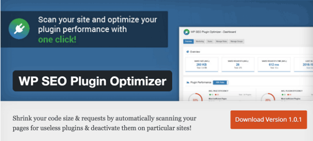
5 – WP SEO Plugin Optimizer

wp-seo-plugin-optimizer

The plugin scans your website for useless code from plugins in the source code of your website. Subsequently, you are able to deactivate the code wherever it is definitely not being used. This speeds your website up a little bit. On top of that, you also get a plugin performance monitoring which makes it easy to determine which plugins slow your website down.

  • Developer: BAVOKO
  • Work in Progress: yes
  • Latest Version From: 10.16.2016
  • Costs: free via WordPress.org
  • License: GNU GENERAL PUBLIC LICENSE
  • Known Compatibility Issues: unknown
  • Developer Homepage: unknown
  • Download on WordPress.org

6 – Email Media Import

Email Media Import lets you upload images into your library via email attachments. You’ll receive a special email address to which you send your images. The plugin then automatically adds them into your library.

  • Developer: metatavu
  • Work in Progress: yes
  • Latest Version From: 10.15.2016
  • Costs: free via WordPress.org
  • License: GNU GENERAL PUBLIC LICENSE
  • Known Compatibility Issues: unknown
  • Developer Homepage: unknown
  • Download on WordPress.org

7 – SM Vertical Menu

sm-vertical-menu

Would you like to place a vertical menu within your sidebar? If so, this plugin is the one for you. It creates an appealing menu that you can move into your sidebar with a widget.

  • Developer: Mahabubur Rahman
  • Work in Progress: yes
  • Latest Version From: 10.15.2016
  • Costs: free via WordPress.org
  • License: GNU GENERAL PUBLIC LICENSE
  • Known Compatibility Issues: unknown
  • Developer Homepage: unknown
  • Download on WordPress.org

8 – Grayscale Body

grayscale-body

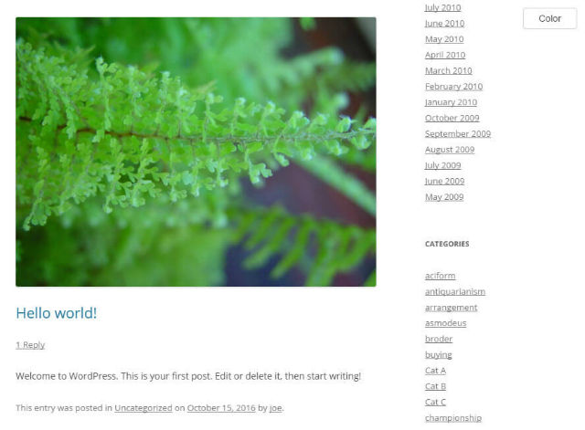
You’re looking for a nice change for your website without having to change the theme? Grayscale Body lets you activate a modern grayscale effect with just one click on the switcher.

grayscale-1

The theme with the grayscale effect

Das Original-Theme ohne Effekt

The original theme without the effect

  • Developer: jojoee
  • Work in Progress: yes
  • Latest Version From: 10.16.2016
  • Costs: free via WordPress.org
  • License: GNU GENERAL PUBLIC LICENSE
  • Known Compatibility Issues: unknown
  • Developer Homepage: unknown
  • Download on WordPress.org

9 – WordPress Bootscraper

wordpress-bootscraper

WordPress Bootscraper is a small but useful theme that can be used to deactivate redundant styles and scripts, that a standard WordPress installation installs by default. These pre-installed files are completely unnecessary for many themes. With the plugin, you get to clean up your theme and accelerate it.

  • Developer: Navneil Naicker
  • Work in Progress: yes
  • Latest Version From: 10.14.2016
  • Costs: free via WordPress.org
  • License: GNU GENERAL PUBLIC LICENSE
  • Known Compatibility Issues: unknown
  • Developer Homepage: unknown
  • Download on WordPress.org

10 – URL-Preview-Box

url-preview-box

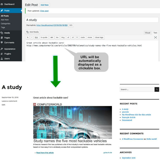
Using the URL-Preview-Box, your WordPress gains the same function as Facebook or Google+. Whenever you enter links in your posts, the plugin creates a small link preview, which it will also display in the finished article.

The Link Preview That the Plugin Automatically Created.

The link preview that the plugin automatically created. A function like a Facebook post.

  • Developer: mraliende
  • Work in Progress: yes
  • Latest Version From: 10.16.2016
  • Costs: free via WordPress.org
  • License: GNU GENERAL PUBLIC LICENSE
  • Known Compatibility Issues: unknown
  • Developer Homepage: unknown
  • Download on WordPress.org
Categories: Others Tags:

Popular design news of the week: October 24, 2016 – October 30, 2016

October 30th, 2016 No comments

Every week users submit a lot of interesting stuff on our sister site Webdesigner News, highlighting great content from around the web that can be of interest to web designers.

The best way to keep track of all the great stories and news being posted is simply to check out the Webdesigner News site, however, in case you missed some here’s a quick and useful compilation of the most popular designer news that we curated from the past week.

Note that this is only a very small selection of the links that were posted, so don’t miss out and subscribe to our newsletter and follow the site daily for all the news.

The Designers Guide to Git

10 Helpful Tools for Web Developers

10 Problems your Content Management System will not Solve and How to Overcome Them

What is Design Thinking and Why is it so Popular?

Design by Committee Ruins Famous Artwork

8 Things Every Creative Should Know

People are Freaking Out Over the New Macbooks’ Missing Escape Key

Presentation Design Inspiration

10 Tips to Teach Yourself Design & Boost your Design Skills

Design Freebies Websites

Indie Hackers – Learn How Developers are Writing their own Paychecks

The Power of Typography in Web Design

Why Friday’s Massive DDoS Attack Should Be Terrifying

Designers, We Need to Talk About Development

Material.io Gets a New Site Design

I Am Done Starting Startups

How to Make Color Overlays Work in your Design

Improving Perceived Performance with Multiple Background Images

You’ll Never Be a Design Specialist by Generalizing your Skills

How to Lift your UX Out of the Ordinary with Micro-Interactions

In Search of the Ultimate User Experience

Origami Studio by Facebook

How to Use CSS Shapes in your Web Design

When Illustrations Matter to the Design Process

Why is Creativity so Difficult?

Want more? No problem! Keep track of top design news from around the web with Webdesigner News.

LAST DAY: Learn 3D Modelling with The Blender Creator Course – only $19!

Source

Categories: Designing, Others Tags:

Comics of the week #363

October 29th, 2016 No comments

Every week we feature a set of comics created exclusively for WDD.

The content revolves around web design, blogging and funny situations that we encounter in our daily lives as designers.

These great cartoons are created by Jerry King, an award-winning cartoonist who’s one of the most published, prolific and versatile cartoonists in the world today.

So for a few moments, take a break from your daily routine, have a laugh and enjoy these funny cartoons.

Feel free to leave your comments and suggestions below as well as any related stories of your own…

Social alarm

A little busy

Fire in the sky

Can you relate to these situations? Please share your funny stories and comments below…

5 Authentic Vintage Handmade Fonts from TSV Creative – Only $12!

Source

Categories: Designing, Others Tags:

“A Quantum Leap”

October 28th, 2016 No comments

Trident ~> EdgeHTML
WebKit ~> Blink

… and now …

Gecko ~> Quantum

David Bryant:

The high-level approach is to rethink many fundamental aspects of how a browser engine works. We’ll be re-engineering foundational building blocks, like how we apply CSS styles, how we execute DOM operations, and how we render graphics to your screen.

He’s saying we’ll see it in 2017. Hopefully the hype is real! Mozilla having a super-competitive independant browser engine (as it long has) is very good for the web.


“A Quantum Leap” is a post from CSS-Tricks

Categories: Designing, Others Tags:

5 years of Foundation: a look back

October 28th, 2016 No comments

This month, ZURB celebrates the 5th birthday of its Foundation front-end framework. This popular framework is known for its responsive grid, CSS and HTML user-interface components, code snippets, and templates. What makes it stand out as well is that it’s an open-source project.

In a blog post earlier this month, Danny Codella, ZURB’s marketer, wrote about the occasion and the many ways that Foundation has changed the design and development world. Essentially, Foundation started its life merely as an internal ZURB style guide to help its team build websites faster and more efficiently. From there, it’s gone on to be a framework that’s currently used by thousands of brands and millions of users.

In the last five years, Foundation has become a favorite of some of the world’s best designers, developers, businesses and brands.

Here’s a quick recap of some of the most important firsts of Foundation’s young existence:

Responsiveness – What makes Foundation stand out is that it was the first open-source framework to embrace responsive design. This was a testament to Foundation’s and, more broadly, ZURB’s philosophy of being a trailblazer. A few years ago, when Ethan Marcotte was just beginning to explain what responsive design was, most companies were developing for fixed pixel widths. Foundation made it simpler for designers and developers to wrap their heads around responsive.

Semantic markup – HTML5 moved the web toward semantic markup. This permitted consistency between what people see in a webpage and what a text reader or web crawler can identify. This was a huge development in the last few years. Early adoption was slow, yet Foundation’s semantic approach to it helped balance things for developers.

Mobile-first – Now that mobile has overtaken desktop in the number of users, allowing for mobile-first design was really revolutionary. Foundation was instrumental in popularizing the mobile-first mentality of design, significant because it happened right before mobile really took off! The mobile-first approach was sorely needed, as designers and developers used to design for desktop screens first and then look at mobile as an afterthought, which, as some will remember, led to very bad user experiences on smaller devices.

SASS – Rebuilding with Sass showed the build process to one and all. This allowed designers and developers to take charge of this framework, bringing it from a mere theme that designers would build on top of to a truly customizable framework that’s ready for any design.

Accessibility – ZURB’s philosophy is that the web should be for everyone. Foundation reflected this belief in that its Foundation for Sites 6 was reworked to include accessibility standards and inform Foundation users how to make their sites more accessibility-friendly. In short, many are learning accessibility basics from this framework.

In the last five years, Foundation has become a favorite of some of the world’s best designers, developers, businesses and brands. This is due to Foundation’s role in being a trailblazer and moving the web forward this way.

Looking to the future, front-end development is a hot place to be. Browser tech is always advancing, and JavaScript frameworks are empowering developers to build more sophisticated applications. You can bet that Foundation is going to continue to be at the forefront of this movement.

Build your own custom Photoshop and Illustrator panels – only $9!

Source

Categories: Designing, Others Tags:

CodePen Talks with 10 Other Web Companies About How They Run Their Business

October 28th, 2016 No comments

We just wrapped up this mini-series, so I figured we’d put a bow on it. Perhaps of interest (and perhaps cathartic) to everyone else out there running small web software businesses.

Direct Link to ArticlePermalink


CodePen Talks with 10 Other Web Companies About How They Run Their Business is a post from CSS-Tricks

Categories: Designing, Others Tags: