Archive

Archive for October, 2016

Designing for short attention spans

October 12th, 2016 No comments

Recently-published research by comScore revealed that Smartphone apps now account for 50 percent of all digital media time. When we add in time spent on apps on other mobile devices — such as tablets — this number goes up significantly. Similarly, another study found that the number of mobile-only internet users has exceeded the number of desktop-only users.

…unless you smartly optimize your app and website for declining attention spans, your business will suffer.

While these studies mainly point to increasing adoption of mobile internet, there is another overlying issue thanks to an increasingly mobile world: declining attention spans.

A recent study by Microsoft revealed that we’re experiencing progressively declining attention spans. The study, which surveyed 2,000 people and monitored brain activity of 112 others, found that we now have an attention span of eight seconds, compared to an attention span of 12 seconds in the year 2000.

Decline in attention spans is even more pronounced for mobile apps users, with a recent study by Jampp revealing that the attention span of mobile app users is reducing by 88 percent year over year. According to the study, session length for e-commerce apps reduced by 35 percent in the first quarter of 2016 alone.

We’re now in a period of the “app attention span”, and unless you smartly optimize your app and website for declining attention spans, your business will suffer. Here are some tips to help you optimize your app and website for declining attention spans:

Speed things up

The Jampp study, referenced earlier, found that people spend less than an average of 60 seconds on mobile apps. A similar study found that a three seconds delay in website load time will result in 40 percent of users abandoning your website. The very first step is to make your website and app lightning fast. Make it easy for people to take the most basic action in your app, or on your website, in less than 60 seconds.

Most app developers make the mistake of loading their app with lots of unnecessary features in the hopes that users will find it interesting. Unfortunately, that’s one of the key reasons why users avoid apps. It is important to avoid over-complication. Instead, make it so that users can perform the most basic tasks in your apps in seconds.

Give people an indication of progress

…completeness meters are so effective that research shows that 75 percent of people prefer to have one.

It is sometimes impossible make your website or app as fast as you want it to be, especially when transactions or sensitive information — which often rely on third-parties to facilitate the transaction — is being transmitted securely. In such an instance what is the best thing to do? Give people an indication of progress.

Research shows that we despise uncertainty, and nothing irritates an already impatient user more than not knowing where he/she stands, and how much longer it will take for an action to complete. By giving indication of progress, however, you can change everything.

Many major sites use this with great success: when you create a new LinkedIn profile, there’s a completeness meter showing you how many steps are left before your profile is completed. A new Gmail account also shows you how complete your profile is and what you need to do to make your profile fully ready. The consequence of this is that you focus mainly on completing your profile instead of getting distracted by how long it takes. In fact, completeness meters are so effective that research shows that 75 percent of people prefer to have one.

More simply put, if you spent 5 minutes filling your profile and an indication shows you your profile is 70 percent complete, you try to make sure your effort is not wasted. “It’s only 30 percent more effort left,” you tell yourself. In the same scenario but without the completeness meter, however, you simply tell yourself, “Come on, I’ve spent five minutes on this stuff and there’s no end in sight. Okay, I give up!”

Here’s an example of Dropbox using the progress meter:

Below is an example of LinkedIn using progress meters:

linkedin-progress-meter

Image Credit

Avoid loading spinners as much as you can

At the end of the day, you need to realize that — for your app and website — there’s something else that matters much more than actual speed, and that is perceived speed.

No matter how fast your app or website is, it won’t make much of a difference if people perceive it to be slow. Naturally, in an attempt to give users an indication of progress, many developers decide to use a loading spinner; this actually creates a poor user experience, since it doesn’t give users an exact indication of how much progress they’ve made and how long they have to wait.

In fact, for Polar, adding loading spinners triggered a negative user experience and negative feedback; even though they optimized their app and made it faster, there was an uptick in negative feedback from users who encountered these loading spinners. After removing the spinner, however, things went back to normal.

Take advantage of background loading

The best apps have mastered the art of making actions appear seamless to users. A notable example of an app that does this effectively is the Instagram app. When a user tries to upload an image that should generally take 30 seconds to load, Instagram makes it appear as if they image loads instantly.

How do they pull this off? Through background loading: while a user is still captioning the image, adding title and tags, Instagram is slowly uploading the image in the background. By the time the user actually clicks “share”, the image is posted automatically. As far as the average user is concerned, Instagram is just a very fast app, and they completely discount the work that is being done in the background.

Image Credit

This goes to further advocate the importance of perceived speed. Make sure to leverage the power of background actions to deliver a much faster experience to users.

Use lazy loading

It is important to come to the realization that most of the people who use your app and website won’t need half of the functions. Loading each and every function contributes to a slower user experience. The solution is to use lazy loading.

With lazy loading you can delay the loading of certain objects until they are needed; for example, on a website that heavily uses images, it is expected that the images will contribute to a delay in site load times. Just take a look at Flickr, and you’ll realize how much of a nightmare the site will be without lazy loading.

With lazy loading, you can make it such that images don’t load until users scroll to where the images are. This will naturally save users a lot of initial load time, creating the perception that your site is much faster than it really is.

Bundle of 1300+ Amazingly Versatile Photoshop Brushes – only $19!

Source

Categories: Designing, Others Tags:

Top 15 Free WooCommerce WordPress Themes 2016

October 12th, 2016 No comments
topshop

Online shops are the new black. And because of its ease of use and professional feature scope more and more are created based on WooCommerce, the market leader of eCommerce plugins. More than enough reason for us to show you the most beautiful themes for WooCommerce. Now, your shop can shine in a fresh light, and enter the Christmas business prosperous of new functions.

1 – TopShop

TopShop is no simple shop theme, but can also introduce your visitors to the company behind the store. The shop area is fully equipped with all important features. Header, background, and colors are customizable.

  • Created by: Kaira
  • License: Free for personal and commercial purposes | GNU General Public License
  • Prepared for Translations: yes
  • Demo: TopShop Demo
  • Download on WordPress

2 – Shop Isle

shop-isle

Shop-Isle is a pure shop theme with everything that comes with that. It offers a slider, full-screen background images, parallax effects, and much more.

  • Created by: Codeinwp
  • License: Free for personal and commercial purposes | GNU General Public License
  • Prepared for Translations: yes
  • Demo: Shop Isle Demo
  • Download on WordPress

3 – Alpha Store

alpha-store

The Alpha Store theme was also developed specifically for WooCommerce, and comes with plenty of settings.

4 – Kakina

kakina

Kakina is another plugin developed specifically for WooCommerce, so it focuses entirely on selling products. The user can customize the header, the colors, and the background.

  • Created by: Themes4WP
  • License: Free for personal and commercial purposes | GNU General Public License
  • Prepared for Translations: yes
  • Demo: Kakina Demo
  • Download on WordPress

5 – eStore

eStore

eStore is a shop theme for the WooCommerce expansion with a delicate design. The landing page can be adjusted to meet the personal needs thanks to the many widgets. Aside from colors the user can also customize the logo and background.

  • Created by: ThemeGrill
  • License: Free for personal and commercial purposes | GNU General Public License
  • Prepared for Translations: yes
  • Demo: eStore Demo
  • Download on WordPress

6 – MaxStore

maxstore

MaxStore offers everything you need for an online store with WordPress. According to the developer, it is the fastest WooCommerce theme on the market.

  • Created by: Themes4WP
  • License: Free for personal and commercial purposes | GNU General Public License
  • Prepared for Translations: yes
  • Demo: MaxStore Demo
  • Download on WordPress

7 – TheShop

theshop

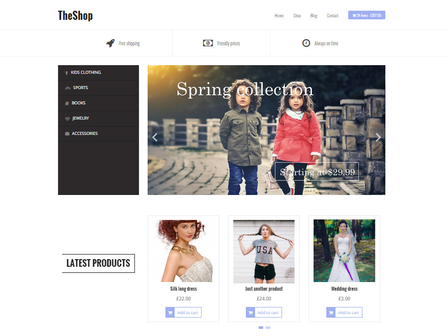
TheShop is a minimalistic shop theme with a custom landing page and provides different fonts and colors for you to use.

  • Created by: athemes
  • License: Free for personal and commercial purposes | GNU General Public License
  • Prepared for Translations: yes
  • Demo: TheShop Demo
  • Download on WordPress

8 – Shophistic Lite

shophistic-lite

Shophistic Lite is an appealing and minimalistic theme for WooCommerce.

9 – iShop

iShop

iShop has a pleasing design in magazine style. Colors, logo, and background are adjustable to your needs.

  • Created by: Sandy
  • License: Free for personal and commercial purposes | GNU General Public License
  • Prepared for Translations: yes
  • Demo: iShop Demo
  • Download on WordPress

10 – E-Commerce

e-commerce

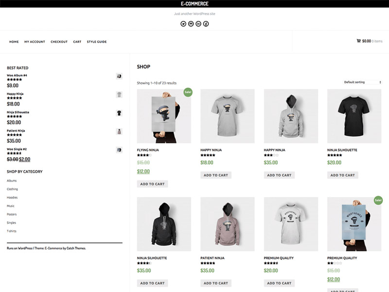
A minimalist, clear theme. It was developed specifically for WooCommerce and supports all relevant features. You get to alter the colors and the background.

  • Created by: Catch Themes
  • License: Free for personal and commercial purposes | GNU General Public License
  • Prepared for Translations: yes
  • Demo: E-Commerce Demo
  • Download on WordPress

11 – Shopera

shopera

Shopera is very well adjustable, and its style sets it apart from other WooCommerce themes. It comes with customizable colors, header, background, as well as a slider for your products.

  • Created by: Madars
  • License: Free for personal and commercial purposes | GNU General Public License
  • Prepared for Translations: yes
  • Demo: Shopera Demo
  • Download on WordPress

12 – purelyShopping

purelyShopping

Pure, minimalist, and appealing. This is purelyShopping. A slider and a custom landing page make for individuality.

13 – AccessPress Store

accesspress-store

AccessPress Store is rich with features and comes with good equipment. A slider and a fully customizable landing page help you sell your products.

14 – Multishop

multishop

An appealing theme with customizable background, and colors, as well as an exchangeable logo.

  • Created by: FasterThemes
  • License: Free for personal and commercial purposes | GNU General Public License
  • Prepared for Translations: yes
  • Demo: Multishop Demo
  • Download on WordPress

15 – Storefront

storefront

Storefront was designed and developed by the core developers of WooCommerce. Tons of personalization options are available to you. If that is not enough for you, the theme is also prepared for most WooCommerce extensions.

Conclusion

Out of all the themes developed for the shop extension, I’ve compiled the best ones here. There’s a wide variety ranging from straightforward and minimalistic ones to true feature giants. Are you still missing a theme?

Categories: Others Tags:

test

October 11th, 2016 No comments

test

Read More at test

Categories: Designing, Others Tags:

Lots of ways to add an ID to the `body` element

October 11th, 2016 No comments

The following is a guest post by Trishah Woolley. Over the years, Trishah has collected a ton of code snippets that to the job of adding IDs and classes based on some variable information, like the URL or data from WordPress. Each of these snippets were either either collected from documentation or a similar online resource, or written by Trishah based on standard features of the language and API’s involved.

Over the time I have been doing WordPress web design, there are occasions when I have needed to add an ID or class to the tag. For example: This often happens when integrating a 3rd party into WordPress that creates its own pages that WordPress doesn’t recognize. Or I need more nuanced classes for the site design I’m creating.

To change the look of these pages in a way that the styles are scoped just to that page, we need a way to target just that page or category of pages. Below are some of the ways I have found helpful to add IDs and classes to the of both non-WordPress (but still PHP) and WordPress pages.

PHP Variations

#01 – Add ID from the URL

This will strip the forward-slash, `.php`, and the `?pg=`, from the URL and use the rest as an ID. Change the array to match your particular situation.

<?php
  $page = str_replace(array('/', '.php', '?pg='), '', $_SERVER['REQUEST_URI']);
  $page = $page ? $page : 'default';
?>

<body id="<?php echo $page ?>">

Example:

http://domain.com/directory/test.php?pg=12345

Becomes:

<body id="directorytest12345">

#02 – Add ID and Class from URL

This looks for the `?` in the URL and turns what comes before it into an ID and what comes after it into a class.

<?php
  list($page, $class) = explode('?', $_SERVER['REQUEST_URI']);
  $page = str_replace(array('/', '.php'), '', $page);
  $class = str_replace(array('='), '', $class);
?>

<body id="<?php echo $page ?>" class="<?php echo $class ?>">

Example:

http://domain.com/directory/test/?pg=12345

Becomes:

<body id="directorytest" class="12345">

#03 – Add ID from file name

This removes the `.php` and uses the file name as the ID:

<body id="<?=basename($_SERVER['PHP_SELF'],'.php')?>">

Example:

http://domain.com/directory/test.php

Becomes:

<body id="test">

#04 – Add ID from First Level Directory

This will grab the first level directory and use it as the ID.

$url = explode('/', $_SERVER['REQUEST_URI']);
  $dir = $url[1] ? $url[1] : 'home';
?>

<body id="<?php echo $dir ?>">

Example:

http://domain.com/directory1/directory2/test.php

Becomes:

<body id="directory1">

WordPress Variations

WordPress has a native function for applying classes to the body:

<body <?php body_class(); ?>>

Which results in output like this, depending on what page you are on:

<body class="single single-post postid-245501 single-format-standard">

But you can still do more, like combine it with techniques from above and add classes of your own.

#05 – WordPress: Add a Class to Default Body Class

Add your own class to the ones generated by WordPress with this:

<body <?php body_class('class-one ); ?>>

Becomes:

<body class="page page-id-2 page-parent page-template-default logged-in class-one">

#06 – WordPress: Add Multiple Classes to Default Body Class

You can add multiple classes like this:

<?php body_class(array("class-one", "class-two", "class-three")); ?>

Becomes:

<body class="page page-id-2 page-parent page-template-default logged-in class-one class-two class-three">

#07 – WordPress: Add ID and Class to Body Tags

This just may be my favorite! It does the same as the one above but adds the new class to the WordPress’ body_class:

list($page, $class) = explode('?', $_SERVER['REQUEST_URI']);
$page = str_replace(array('/', '.php'), '', $page);
$class = str_replace(array('='), '', $class);
?>

<body id="<?php echo $page ?>" <?php if (function_exists('body_class')) body_class($class ); ?>>

Example:

http://domain.com/directory/test/?pg=12345

Becomes:

<body id="directorytest" and class="page page-id-2 page-parent page-template-default logged-in 12345">

#08 – WordPress: Use the Slug

<body id="<?php echo $post->post_name; ?>">

Example:

http://domain.com/category1/slug/

Becomes:

<body id="slug">

#09 – WordPress: Conditionally Add Extra Classes

This a body class to the ones generated by WordPress with conditional if() logic. For example, here we’re using the is_shop() boolean logic provided by WooCommerce:

<body <?php if (is_shop()) { body_class('shop'); } else { body_class(); } ?>>

Becomes:

<body class="page page-id-2 page-parent page-template-default logged-in shop">

#10 – WordPress: Add the Slug to the Body Class Defaults

We can also alter the output of the body_class() function by filtering it. We could do this in `functions.php` or our own functionality plugin.

Here we’ll add the slug:

function add_slug_body_class( $classes ) {
global $post;
  if (isset($post)) {
    $classes[] = $post->post_type . '-' . $post->post_name;
  }
  return $classes;
}
add_filter('body_class', 'add_slug_body_class');

Example:

http://domain.com/category/page-slug/

Becomes:

<body class="page page-id-2 page-parent page-template-default logged-in page-slug">

#11 – WordPress: Add to Body Class using function.php Filter

Add the following to functions.php:

function my_body_classes( $classes ) {
  $classes[] = 'class1';
  return $classes;
}
add_filter('body_class', 'my_body_classes');

Then it would output like this, just calling body_class() directly without doing anything else:

<body class="page page-id-2 page-parent page-template-default logged-in my_body_classes">

#12 – WordPress: Raw Filtering of Function using Functions.php

This is how you would add a single class of any name:

function my_body_classes( $classes ) {
  $classes[] = 'class1';
  return $classes;
}
add_filter('body_class', 'my_body_classes');

Becomes:

<body class="page page-id-2 page-parent page-template-default logged-in class1">

#13 – WordPress: Raw Filtering of Function using Functions.php to Add Multiple Classes, Conditionally

function my_body_classes( $classes ) {
  $classes[] = 'class1';
  if (is_shop()) {
    $classes[] = 'shop';
  }
  return $classes;
}
add_filter('body_class', 'my_body_classes');

Becomes this on a non-shop page:

<body class="page page-id-2 page-parent page-template-default logged-in class1">

Becomes this if the logic comes out true, i.e., on a shop page:

#14 WordPress: Remove Classes from Default Output using functions.php

With this you can remove classes from body_class():

function adjust_body_class($classes) {
  foreach ($classes as $key => $value) {
    if ($value == 'class-to-remove') unset($classes[$key]);
  }
  return $classes;
}
add_filter('body_class', 'adjust_body_class');

If we started with this:

<body class="page page-id-2 page-parent page-template-default logged-in">

And removed “page-parent”, we’d get this:

<body class="page page-id-2 page-template-default logged-in">

#15 WordPress: Add the Category

Adds the category to body_class():

function add_category_name($classes = '') {
  if (is_single()) {
    $category = get_the_category();
    $classes[] = 'category-'.$category[0]->slug;
  }
  return $classes;
}
add_filter('body_class','add_category_name');

Example URL:

http://domain.com/category1/post-title/ 

Becomes:

<body class="page page-id-2 page-parent page-template-default logged-in category1">

#16 WordPress: Add the Category via functions.php Filter

You can also do it via filter:

function add_category_to_single($classes) {
  if (is_single()) {
    global $post;
    foreach((get_the_category($post->ID)) as $category) {
      // add category slug to the $classes array
      $classes[] = $category->category_nicename;
    }
  }
  // return the $classes array
  return $classes;
}
add_filter('body_class', 'add_category_to_single');

Example URL:

http://domain.com/category1/post-title/ 

Becomes:

<body class="page page-id-2 page-parent page-template-default logged-in category1">

#17 WordPress: Add Browser Class Name

WordPress provides some Global Variables including booleans values on what browser is in use. You can add those to the body class as well:

function browser_body_class($classes) {
  global $is_lynx, $is_gecko, $is_IE, $is_opera, $is_NS4, $is_safari, $is_chrome, $is_iphone;

  if ($is_lynx) $classes[] = 'lynx';
  elseif ($is_gecko) $classes[] = 'gecko';
  elseif ($is_opera) $classes[] = 'opera';
  elseif ($is_NS4) $classes[] = 'ns4';
  elseif ($is_safari) $classes[] = 'safari';
  elseif ($is_chrome) $classes[] = 'chrome';
  elseif ($is_IE) $classes[] = 'ie';
  else $classes[] = 'unknown';

  if ($is_iphone) $classes[] = 'iphone';
  return $classes;
}
add_filter('body_class', 'browser_body_class');

Example with Chrome:

<body class="page page-id-2 page-parent page-template-default logged-in chrome">

Careful not to rely on these for important functionality! User agent testing, as this uses, is known for causing more problems than it solves.


Lots of ways to add an ID to the `body` element is a post from CSS-Tricks

Categories: Designing, Others Tags:

Create a Staggered Animation Sequence in Adobe Muse

October 11th, 2016 No comments
Muse For You - Staggered Animations Widget - Adobe Muse CC - Web Design Ledger

Create a Staggered Animation Sequence in Adobe Muse. No Coding Skills Required.

Adobe Muse CC Logo

In the video tutorial above I go over how to use the Staggered Animations Widget found at http://museforyoushop.com. With this widget you can create a staggered animation sequence with multiple elements – All with just one graphic style name.

Muse For You - Staggered Animations Widget - Adobe Muse CC - Web Design Ledger

FEATURES INCLUDE:

  • Animate multiple elements with one graphic style name
  • Set the delay for when each element animates in the sequence
  • Set the duration of each animation in the sequence
  • Choose from over 30 different easing options for the animation sequence
  • Autoplay the animation sequence
  • Infinitely loop the animation sequence
  • Add a play, pause, and restart button to control the animation sequence
  • Change the transform-origin of the transformations
  • Apply transformations randomly to the elements in the sequence for a more scattered effect
  • Disable animation sequence at a particular breakpoint
  • Lightweight for your website

TRANSFORMATIONS:

  • Scale – Make the elements larger or smaller.
  • Rotate – Rotate the elements in degrees.
  • Translate X and Translate Y – Move the elements on the x and y axis.
  • Border Radius – Change the border radius of the elements. Works well with rectangles and ellipses created in Adobe Muse.
  • Background Color – Change the background color of the elements. Works well with rectangles and ellipses created in Adobe Muse.

TRIGGER ANIMATIONS:

  • On Load
  • On Scroll
  • With Play Buttons

Muse For You - Staggered Animations Widget - Adobe Muse CC - Web Design Ledger

Here are the steps to create a staggered animation sequence.

1. Drag and drop the “STGRD – Add First” widget from the library panel and place at the top of your Adobe Muse website. If you do not see the library panel you can go to Window > Library.

2. Drag and drop the “STGRD – On Load” widget and place below the “Add First” widget.

3. Place all of your elements into Adobe Muse. If you are using a vector from Adobe Illustrator you can copy and paste each element into Adobe Muse. The elements will be pasted in as scalable vector graphics (SVG).

4. Select all of the elements in Adobe Muse and assign the graphic style name that is in the widget to the elements. This is done via the Graphic Styles Panel. If you do not see the graphic styles panel you can go to Window > Graphic Styles.

5. After the graphic style is applied you can set what animation you would like to apply to the elements. You can scale, rotate, translate x, and translate y. You can also change the background color and border-radius of the elements if they were created in Adobe Muse.

6. Preview page in browser to watch each element animate 1 by 1 after one another in a staggered fashion.

7. To change the speed of the stagger you can change the “Animation Stagger Delay” option and the “Animation Duration” option.

8. Done.

Muse For You - Staggered Animations Widget - Adobe Muse CC - Web Design Ledger

Note: If all elements were created in Adobe Muse you can create a transparent rectangle over all of the elements to have them animate in the order they are in within the Layers Panel.

For more widgets and video tutorials for Adobe Muse visit http://museforyoushop.com.

Happy Musing :).

Read More at Create a Staggered Animation Sequence in Adobe Muse

Categories: Designing, Others Tags:

The surprising history of emojis

October 11th, 2016 No comments

You encounter emojis on a regular basis in your 21st-century, tech-savvy lifestyle, but what is the history of emojis? They’re all over the place, and you really can’t interact with any device or platform these days without someone sending you an emoji or you sending one out yourself. This speaks to the ubiquity of this form of communication.

You spend some time on social media, and emojis are all over the place, whether it’s through Facebook’s Reactions that debuted earlier this year, or on Twitter’s platform with its extensive list of emojis.

How about text messages? Whether it’s regular SMS or popular messaging apps such as What’s App and Messenger, emojis are a popular feature of those communication mediums, too.

So how did things get this way that, in the 21st century, we’re completely crazy about and absorbed with emojis?

It didn’t happen overnight, to be sure, but emojis actually haven’t been around for very long at all, which speaks to how their popularity has spread like wildfire in recent years. If you’ve ever wondered how we got to this point where your friends and family are constantly texting you emojis in messages—and you’ve also been secretly doing it (and highly enjoying it!)—then you’re about to learn some things that may take you by surprise.

Here’s your comprehensive walkthrough on the fascinating and relatively new history of emojis in all their smiley and expressive glory.

Emojis are distinct from emoticons!

Before we get into the history of emojis in full, there needs to be a quick clarification on emojis versus emoticons, as people sometimes get the two confused or use the words interchangeably.

There’s a big difference between the two.

Emojis are real images and symbols that are rendered on your devices, whereas emoticons are simply expressions and faces created with basic characters from your keyboard.

For instance, the yellow smiley face and all its variations that’s rendered on your smartphone is an emoji.

This expression that indicates a smile— 🙂 —is called an emoticon.

Simple, ain’t it?

The origins of emojis

Where did emojis come from? They’re definitely a cultural phenomenon, as they originated from Japan, which you may have already guessed based on their name.

As the 20th century drew to a close, Japanese mobile-phone companies were under increasing pressure to support Japanese users’ obsession with images. They began to remark on a trend where a lot of picture messages were being exchanged by their Japanese client base. So instead of just ignoring this and focusing on how they could charge their customers more money, these Japanese mobile-phone companies actually gave their users more of what they wanted.

Take NTT DoCoMo, the biggest mobile-phone operator in Japan. In 1999, the company was already hard at work on something called i-mode, which is now an Internet service that’s extremely popular in the Land of the Rising Sun. i-mode was to be revolutionary for its time, combining email, news, weather forecasts and entertainment reservations as part of the planet’s very first mobile web platform.

Just call him “Mr. Emoji”

According to the Verge, the man we can thank today for emojis is Shigetaka Kurita, the father of the emoji. As an employee of NTT DoCoMo back in the day, he was part of the intrepid i-mode team that sought to revolutionize Japan’s means of communication.

However, he soon realized that digital communication—whether it’s email or, at the time, pagers—robbed human beings of the ability to communicate emotion. In Japan this is particularly important, as snail-mail letters have a tradition of being long-winded, full of honorifics, and emotional messages of goodwill. With digital, you ended up robbing people of this more personal aspect of communication, resulting in a relationship breakdown and miscommunication, that Kurita wanted to fix.

His solution was the emoji, which literally comes out to “picture” (e) and “character” (moji).

A very insightful Kurita quote from Storify explains his rationale for how he came up with emojis in the first place:

“Everything was shown by text. Even the weather forecast was displayed as ‘fine’. When I saw it, I found it difficult to understand. Japanese TV weather forecasts have always included pictures or symbols to describe the weather—for example, a picture of sun meant ‘sunny’. I’d rather see a picture of the sun, instead of a text saying ‘fine’.”

From his own words, we can clearly hear his frustration with text as a very limited medium to convey sufficient info. Further, it’s obvious that including these symbols would also provide much-needed emotion to a message, as someone looking at a weather forecast, going from Kurita’s own example above, would feel happier if they saw a picture of a sun instead of just a description of the forecast as “fine.”

After failing to convince big tech names like Fujitsu, Panasonic, and Sharp to design these emoji themselves, Kurita had no other choice but to put his design skills to work. (Which was a challenge since he majored in economics!) He and his team went old-school, putting down their emoji-design ideas on paper, striving to come up with a thorough set of 176 characters that were 12-pixel by 12-pixel. Hopefully, these would capture the entire breadth of human emotions. Needless to say, it was a tall order that was more ambition than pragmatism.

Still, Kurita and his team succeeded in creating a slew of emojis—everything from representations of jeans and art to bullet trains and, naturally, smiley faces—digging deep into his childhood fondness for things like manga and kanji for inspiration.

Now, to properly display these emojis in its mobile web platform, NTT DoCoMo decided to use an unused area of the Shift JIS Japanese character encoding scheme. Each code was to match a certain emoji, with each one coming preloaded on NTT DoCoMo mobile phones. As with today’s ease of selecting emoji in messaging apps, users in late-1990s Japan could efficiently choose which emoji they wanted to include in their email messages by picking them out of a grid inside the email app.

Emojis introduced to Japan’s carriers

After Kurita had finished his initial designs, he took them straight back to the major tech companies that initially rejected his suggestion that they design these emojis themselves. This time around, though, sensing that Kurita was on to something profitable that would catch on with Japanese consumers, they were more agreeable. Almost immediately, they took Kurita’s fledgling emoji designs and incorporated them as-is into their devices.

Kurita was surprised by this move because he expected the various manufacturers to still improve on his designs. You have to remember that his designs were very basic and rough since he only had a 12-by-12 grid in which to work. In such a small space, detail has to be sacrificed to a certain extent.

Initially, there was consistency to the emoji design since each manufacturer just used Kurita’s design as they were handed over. This allowed a certain “standard” to take form in these very early emoji days. Soon, though, this consistency would be thrown for a loop as NTT DoCoMo’s main competitors—J-Phone (now SoftBank) and AU—took some artistic license with Kurita’s rough designs.

In a calculated move to steal customers away from NTT DoCoMo, the competition wound up creating additional emoji that were more detailed; they also added some animation into the mix.

As you may have guessed, such a free-for-all resulted in chaos in the Japanese marketplace, as emojis being sent from one carrier weren’t able to show up on a competitor’s phone. Call it the problem of having a whole disarray of varying proprietary approaches. However, a breakthrough was finally reached in 2005, after a few years of this problem, as the carriers started to map their incoming signals to their own emoji character sets. Today, even with additional moves toward standardization of emojis in Japan, there can be as many as 800, depending on your phone and carrier.

Sure, today in Japan, carriers send and receive emoji with greater consistency than ever, so you won’t encounter nearly as many problems as you once would have with emojis not displaying. Nonetheless, Japan—the country that invented the emoji—still doesn’t have a single, unifying system for a single set of emoji characters!

That’s really interesting when you think about it, especially in the context of emojis having spread globally, way beyond Japan in the last few years, regardless of a standardized, single set of characters or not.

The message behind that is that tech users love their emojis, and they’re going to revel in sending them back and forth no matter what.

Enter Apple

If you want to thank a single company for popularizing emoji globally, look no farther than Apple. The company that gave us Steve Jobs’ leadership style, super in-demand handhelds like the iPhone, and the simplicity of everything syncing together seamlessly, also ensured that emojis would catch on all over the world.

How did they do it?

Wikipedia credits the global spread of emoji to the international inclusion of these symbols in Apple’s iPhones. The ease of emojis catching on in places outside of Japan, however, wasn’t made easy by an early decision Apple made.

According to NY Magazine, starting in 2007 with the first iPhone that was released, Apple wanted to make inroads into the tough Japanese market, so they thought to themselves what better way than to include emojis in our iPhones! After all, emojis had already been well-established in Japan by that time and were a cultural phenomenon there. Apple therefore supported a variation of SoftBank’s emoji set starting with the iOS 2.2 update.

That was at least the case in Japan. In North America, actually hid an emoji keyboard inside this early iPhone, hoping that North American users wouldn’t find it. Of course, as we all know, plans don’t always work out, and, sure, enough, tech-savvy North American users determined that they could force their iPhones to unlock this emoji keyboard by simply downloading a Japanese-language app. From then on, the use of emojis has spread like wildfire beyond Japan, as Apple realized the huge demand for this outside Japan, too.

It was only in 2011 that Apple began to officially support emojis internationally with the iOS 5 release. In just five, short years, these pictographs that started out from the imagination of one man working at NTT DoCoMo have become an indelible standard on mobile devices throughout the globe.

After Apple adopted emojis on their smartphones (and didn’t hide it from users outside of Japan!), the other big player in the mobile OS world soon followed suit: Google’s Android. With Android jumping on board the emoji bandwagon as well, emojis are today a standard in digital communication across all platforms.

The Unicode standard

The proliferation of emojis across the globe across all devices doesn’t just happen by magic. It took a lot of work and the Unicode Standard to make it a reality (and allow everyone from teen girls and boys to moms and dads to text emojis like mad). The Unicode Standard is a computing industry standard meant to ensure the consistent handling and encoding of text expressed in a majority of the globe’s writing systems.

Which, in layman’s terms, means: For you to be able to send that cute pile of poo emoji where you live in the U.S. to your chum in Asia, who’s using a totally different OS and platform, the Unicode Standard had to come into play. Otherwise, we’d still have that early chaos in Japan when its three biggest mobile carriers failed to standardize emoji sets—and, as a result, the emojis sometimes wouldn’t show up on competitors’ devices.

Back in 2010, certain emoji character sets were incorporated into Unicorn, which has enabled these emojis to be used not just outside of Japan, but also across various operating systems in a consistent fashion. Note that this occurred just one year before Apple finally succeeded in being able to support emojis internationally with its iOS 5 release.

So today, when you’re on Android, using Facebook and want to send that hot dog emoji to your mom, but she’s using an iMac and doesn’t really use mobile all too much, she’ll still get your lovely hot dog emoji in all its glory without any interruptions or problems. Ah, the glory of standardization in digital communication!

What does the father of the emoticon think?

We briefly mentioned emoticons earlier on to make clear the separation between emojis and mere emoticons. Amid all this hubbub surrounding the spread of emojis, it’s interesting to note what the man who invented the use of standard keyboard characters to convey some semblance of emotion thinks!

According to an interview with the UK’s Independent, Scott Fahlman, the Carnegie Mellon University professor who came up with emoticons three decades ago, lambasts emojis as being unsightly:

“I think they are ugly, and they ruin the challenge of trying to come up with a clever way to express emotions using standard keyboard characters. But perhaps that’s just because I invented the other kind.”

Fahlman invented emoticons as a way to allow those posting on the university’s electronic bulletin board to convey that they were merely writing something humorous, as opposed to something serious. Misunderstandings based on jokes written in messages on the bulletin board were a problem, and the good professor wanted to avoid any feelings of ill will growing out of mere miscommunication.

The constant, endless stream of emoji updates

Since this standardization and ensuing global popularity occurred a few years back, emojis have been continually updated on all major OS. It seems like every big update from Apple or Google brings with it a ton of new emojis that people will instantly latch onto like they’re the latest craze.

Here’s a rundown of some of the more memorable emoji updates in history:

2012 – Apple’s iOS 6 update begins to feature a gay and lesbian couple amid all their usual emoji characters like heterosexual couples, monkeys, painted fingernails and dancing girls. The gay and lesbian couple are shown holding hands (as much as Apple can accurately show pixelated characters holding hands).

2013 – Google finally added legitimate emoji support to its Android OS by making them part and parcel of the official Google keyboard app. Before this crucial and long-needed Android update, users had a hard time to make emojis work on their Android devices. They either had to memorize specific command words to select emojis, or they had to actually long-press their spacebars after they installed the correct language packs. As a result, Android users everywhere rejoiced, as they could now keep up with the fast and furious text messages of teen girls around the globe.

2014 – Apple decides that it’s finally time to make its emoji set a whole lot more multicultural. Filled with guilt about the lack of African-American emojis, the company finally rectified this error by working with the Unicode Consortium to include emojis depicting African-American faces in their character sets.

2015 – Just in time for the iOS 8.3 beta to its developers, Apple went a step further than its last update and made a full-out commitment to increase the racial diversity of its emoji sets. The big changes? Users for the first time ever could now hold down on specific emojis and choose the specific skin tone that they wanted. This extra step went a long way toward making more of Apple’s diverse, global user base feel represented in its emojis.

Later in 2015 – Apple releases a big update in version 9.1 for its iPhone and iPad models; the update comes with a whopping 184 more emojis for users to choose from. The most notorious addition is probably the middle finger, which pranksters had been calling on Apple to add for the longest time! Other noteworthy additions include the burrito, taco, unicorn, the Vulcan salute, the zipper mouth face, the writing hand, and the impressive speaking head in silhouette.

2016 – In its iOS 10 release, Apple finally gets to gender diversity, having already tackled racial diversity in years past. The company is releasing these new emojis in the fall, and they’ll feature more than 100 new and redesigned emoji characters that focus on gender diversity. Translation: You’ll now see more female athletes than ever as selectable emojis on your smartphone keyboard.

Later in 2016 – Apple and other big tech companies like Google and Microsoft (all of whom are voting members of Unicode) voted against including the rifle emoji to celebrate the Summer Olympics’ shooting events. What’s really ironic about this rejection is the fact that the pistol emoji (another gun emoji that has no connection to the relevant Summer Olympics) is already part of Apple’s emoji set from years earlier. Shortly thereafter, Apple decided to replace the pistol emoji with a green water gun that made its debut in iOS 10.

What does the future hold in store for emojis?

The thing about emojis is that they’re still a relatively new phenomenon—especially when we venture out of Japan. Known in Japan since 1999, emojis have only gotten popular globally since about 2011, thanks to Apple’s inclusion of them in their smartphone keyboards. In just a few, short years, people have taken to emojis like nothing before! When everyone including your mom texts them, then you know you have a global phenomenon on your hands.

Think of it: Every major tech platform today—whether it’s Apple, Google, Microsoft, you name it—has made room for emojis. You can send an emoji on an iOS device and have it show up no problem on an Android device. You can also send emojis on desktop and mobile devices. Clearly, the Unicode standard has ensured that virtually everyone on the planet with access to a digital device can send and receive emojis!

The father of the emoji, Kurita, still works in the tech industry as part of the online services of Namco Bandai games. No one could predict that emojis would take off as they did in only a relatively short time, not even Kurita. However, it’s perhaps the innate, human connection of these emojis that transcends mere cultures that explains why the emoji has done so well.

As Kurita says in reference to the implied messages behind some emojis:

“I used to think that was true just in Japan. But it’s the same everywhere,” he said. “That’s nice to know.”

What’s nice to know, too is that the world will continue to get more, unique emoji characters with every OS update across all devices.

90 Beautiful Marble Paper Textures with Extended License – only $14!

Source

Categories: Designing, Others Tags:

What’s The Deal With The Samsung Internet Browser?

October 11th, 2016 No comments

According to browser statistics, Chrome for Android is currently the largest mobile browser, or is about to become so. Still, too few web developers realize that these Chrome for Android numbers in fact contain several browsers, not just Google Chrome. After discussing the general state of affairs in this article, we’ll focus on the Chromium-based Samsung browser specifically.

In the past few years, just about all Android device vendors have upgraded their default browsers to Chromium… but not to Google Chrome. Instead, they took an older Chromium version of their choice, modified it somewhat, and added it to their devices as “Internet” or “Browser.”
The post What’s The Deal With The Samsung Internet Browser? appeared first on Smashing Magazine.

Categories: Others Tags:

Designing Card-Based User Interfaces

October 11th, 2016 No comments

Web and mobile apps are moving away from pages towards completely personalized experiences. These new experiences are built on an aggregation of many individual pieces of content. The way this content is now being presented is in the form of cards. The card-based interaction model is spreading pretty widely, and you can see digital cards almost everywhere — from news sites to food delivery apps.

In this article, I’ll explain what cards mean to UI designers, and I’ll review three popular card-based services. If you’re interested in prototyping your own card-based user interface, you can download and test Adobe’s Experience Design CC for free and get started right away.

The post Designing Card-Based User Interfaces appeared first on Smashing Magazine.

Categories: Others Tags:

Icons for Everyone: How to Use Font Awesome With WordPress

October 11th, 2016 No comments
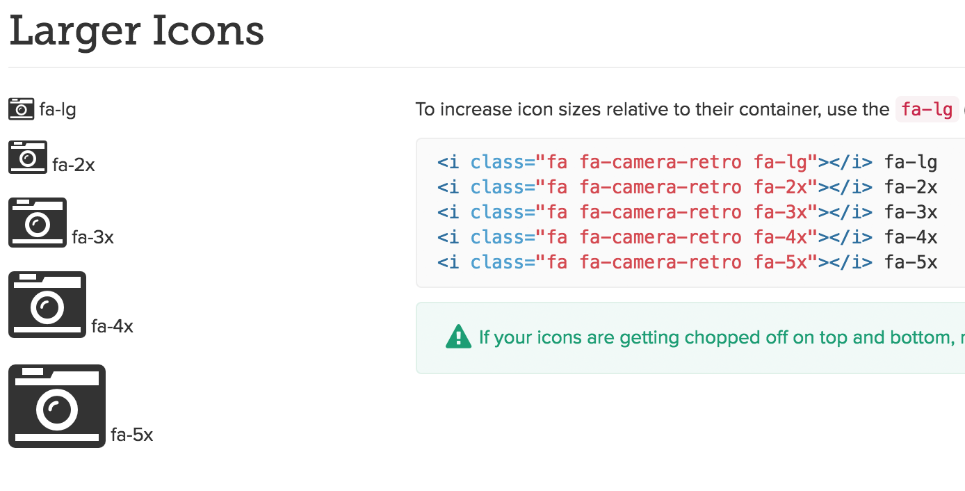
Adjusting the Icon Size is This Simple.

Font Awesome is one of the most popular icon fonts worldwide. By now, more than 60 million websites use the font to display pictograms in all colors and versions. These 60 million websites include whitehouse.gov, thebeatles.com, and washingtonpost.com. In this article, we’ll show you how you can use the icons for your blog.

Currently, Font Awesome provides 634 pictograms for a whole load of applications. For example, it is possible to use them to create social follow icons, like I did on my blog.

The Advantages of the Icon Font “Font Awesome.”

In comparison to used graphics, an icon font offers generous benefits. Icons can be scaled wonderfully, making it possible to display them in any desired size. On top of that, you can adjust them, so they have the colors you want them to shine in.

This might be substantial for a business website if there is a corporate identity to stick to. Adjustments happen via CSS. Thus, everything that CSS can do is possible. Size, colors, text shadow, and much more are all possible.

On the Following Page, You Get to Take a Look at All 634 Icons in an Overview.

How to Use Font Awesome in Your Theme

There are two options how to use the font in your theme. I will present them to you one by one. Which method you choose depends on whether you like the easier way of using plugins or the more tedious manual work. Either way, you’ll find the right method for you in this article.

1 – Manual Work. We Only Link the CSS File

Before you get to use the icons, you need the CSS for the icon font. The CDN service provider KeyCDN has hosted the font on their servers. This way, a simple link to the file in your header’s website is sufficient. A small code snippet that you need to copy into your theme’s functions.php takes care of that.

You can choose between two methods. Code number one links the CSS file in your blog’s header. Code two is ideal if you want to optimize the speed of your website. Then, the file is loaded into the footer.

View the code on Gist.

View the code on Gist.

Now, you are already able to use the icons. You have two options for the manual application. Option number one is the tag, provided for each icon by Font Awesome. Take a look at plenty of examples on the example page.

Adjusting the Icon Size is This Simple.

However, you’re not tied to the tag, but also able to define and use the icons in the CSS. This is useful for areas that don’t tolerate additional markup well. By the way, Less and Sass are supported just as well as pure CSS.

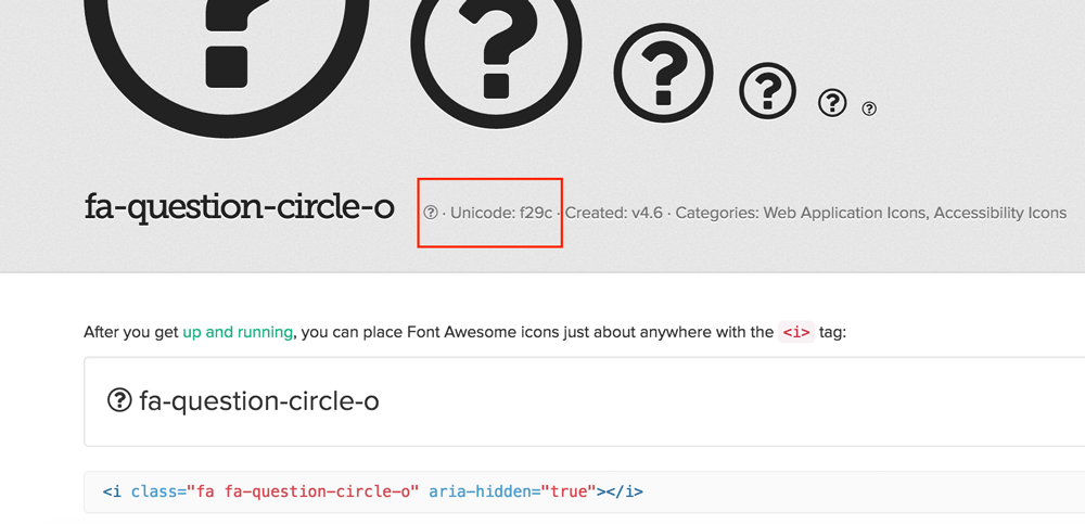
When you click an icon on the overview page of Font Awesome, you get to a page where the particular tag is displayed. Above that, you’ll also find the so-called Unicode, which is required for the use in the CSS file.

A part of my CSS for the social follow buttons (screenshot above) looks as follows:

View the code on Gist.

Find the Unicode Here:

font-awesome-unicode

Using the Icon Font in the WordPress-Editor

Of course, you can also use the neat icons directly within the WordPress editor when writing your articles. To do that, you have to pay the text area a visit and enter the corresponding tag where you want it to appear.

Visit the overview page of Font Awesome, pick an icon and click it. On the next page, you’ll find the proper tag for that icon.

2 – Easy Peasy, Using the Plugin »Better Font Awesome.”

better-font-awesome

  • Developer: Mickey Kay
  • Work in progress: yes
  • Latest version from: 06.01.2016
  • Costs: free via WordPress.org
  • License: GNU GENERAL PUBLIC LICENSE
  • Known compatibility issues: unknown
  • Developer Homepage: Unknown
  • Download on WordPress.org

Using this plugin won’t slow down your blog, as the necessary CSS file is loaded via jsDelivr CDN. The plugin is perfect for WordPress beginners, as it doesn’t require any programming knowledge.

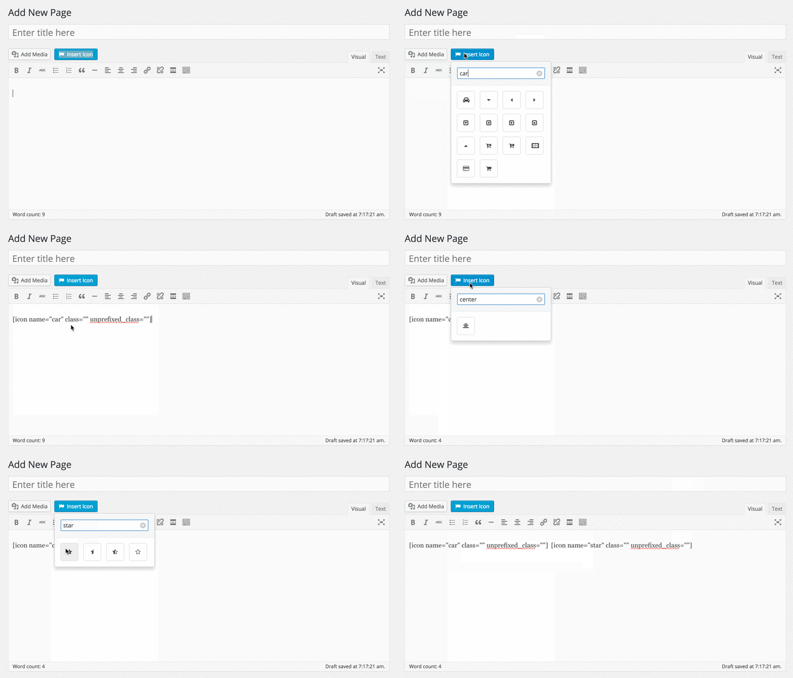
With this plugin, using the icons is very easy. There are three ways to use them.

Number 1: Directly Within the WordPress Editor With a Comfortable Generator.

screenshot-1

Number 2: Using Shortcodes

[icon name="flag" class="2x spin border"]

Number 3: The Well-Known HTML-Tag

<i class="fa fa-check-square-o" aria-hidden="true"></i>

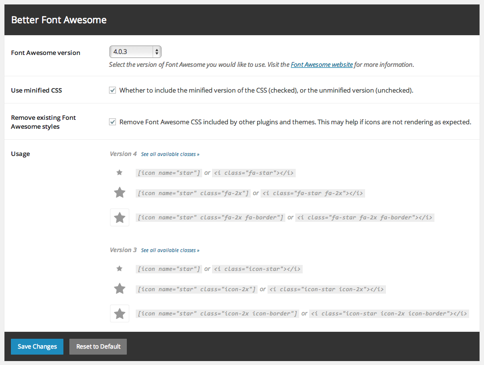
The Plugin Settings:

Find the settings under »Settings => Better Font Awesome“.

The Settings of Better Font Awesome

Here, you can choose which version of Font Awesome you want to use. The newest version, currently version 4.6.3, is recommended. The second option makes for a compressed CSS file that loads faster. You should tick that off.

The third option makes it so that other Font Awesome files that are used by other plugins are removed from “Better Font Awesome.” You should tick that off as well, as one version of the file is entirely sufficient.

The fourth area in the settings is a help for you if you want to use the shortcode or the HTML tag.

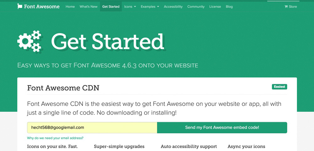
There’s a JavaScript Version as Well

Right. It exists. You can enter your email address under the menu item “get started,” to receive a JavaScript code that always keeps the icon font up to date.

font-awesome-install

However, this code has a huge downside. Although you can make sure that the code is delivered asynchronously after the registration, it still loads rather slowly. I have tried it for this article, and I was not impressed. My website was 400 milliseconds slower than it is with a linked CSS file.

Thus, I can’t recommend this variant.

Conclusion

Now, I introduced you to two ways of using the cool icons of Font Awesome. Whether you prefer the manual or the plugin version is up to you. I recommend both variants, excluding only the JavaScript version.

Categories: Others Tags:

Styling Underlines on the Web

October 10th, 2016 No comments
A thin, black underline with space around descenders

Styling the underlines that sit beneath links can be a tricky business, and I constantly forget what’s the best approach depending on the situation. Thankfully however, John Jameson gets us up to speed in this guest post.

There are a bunch of different ways to style underlines. Maybe you remember the article Crafting link underlines on Medium. Medium wasn’t trying to do anything crazy; they just wanted to create a pretty normal-looking line below their text.

A thin, black underline with space around descenders—via Marcin Wichary, Crafting link underlines on Medium

It’s a pretty basic underline, but it’s a good size and it skips descenders too. Definitely nicer than most browsers’ default. Well, it turns out Medium had to go through a lot of trouble to get that style on the web. Two years later, it’s still just as hard to style a good-looking underline.

Goals

What’s wrong with just using text-decoration: underline? If we’re talking about the ideal scenario, an underline should be able to do the following:

  • Position itself below the baseline
  • Skip descenders
  • Change color, thickness, and style
  • Repeat across wrapped text
  • Work on any background

I think these are all pretty reasonable things to ask for, but as far as I know, there’s no intuitive way to achieve all of them in CSS.

Approaches

So what are all the different ways we can underline text on the web?

Here are the ones I can think of:

  • text-decoration
  • border-bottom
  • box-shadow
  • background-image
  • SVG filters
  • Underline.js (canvas)
  • text-decoration-*

Let’s go down the list one by one and talk about the good and bad parts of each approach.

text-decoration

text-decoration is the most straightforward way to underline text. You apply a single property and that’s all there is to it. At smaller sizes, it can look pretty decent, but increase the font size and the same line starts to feel clumsy.

See the demo.

The biggest problem with text-decoration is its lack of customizability. It uses the color and font size of whatever text its applied to and there’s no cross-browser way to change the style. More on that later.

Good
  • Easy to use
  • Positioned below the baseline
  • Skips descenders by default in Safari and iOS
  • Wraps across lines
  • Works on any background
Bad
  • Can’t skip descenders in other browsers
  • Can’t change color, thickness, or style

border-bottom

border-bottom offers a good balance between being quick and customizable. This approach uses a tried-and-true CSS border, which means you can change color, thickness, and style with ease.

This is what border-bottom looks like on inline elements:

See the demo.

The big gotcha is how far away the underline is from the text — it’s completely below the descenders. You can address that by making elements inline-block and reducing line-height, but then you lose the ability to wrap text. Good for single lines, but not much else.

See the demo.

Additionally, you can use text-shadow to cover up parts of the line near descenders, but you have to fake it by using the same color as whatever background it’s on. That means it works only for solid-color backgrounds and not gradients or images.

See the demo.

At this point, there are four properties styling a single underline. That’s a lot more work than text-decoration.

Good
  • Can skip descenders using text-shadow
  • Can change color, thickness, and style
  • Can transition and animate color and thickness
  • Wraps by default unless it’s an inline-block
  • Works on any background unless using text-shadow
Bad
  • Positioned far away and difficult to reposition
  • A lot of unrelated properties to get it just right
  • Janky text selection when using text-shadow

box-shadow

box-shadow draws an underline with two inset box shadows: one to create a rectangle and a second to cover it up. That means you’ll need a solid background for this to work.

See the demo.

You can use the same text-shadow trick to fake gaps between the underline and the text’s descenders. But if the line is a different color from the text — or even just thin enough — it doesn’t really clash like text-decoration does.

Good
  • Can be positioned below the baseline
  • Can skip descenders using text-shadow
  • Can change color and thickness
  • Wraps across lines
Bad
  • Can’t change style
  • Doesn’t work on any background

background-image

background-image comes the closest to everything we want and with the fewest gotchas. The idea is that you use linear-gradient and background-position to create an image that repeats itself horizontally across lines of text.

You’ll have to display: inline; this approach too.

See the demo.

This approach doesn’t have to use linear-gradient either. You can bring your own background image for some cool effects.

See the demo.

Good
  • Can be positioned below the baseline
  • Can skip descenders using text-shadow
  • Can change color, thickness (allows half pixels), and style
  • Works with custom images
  • Wraps across lines
  • Works on any background unless using text-shadow
Bad
  • The image can resize differently across resolutions, browsers, and zoom levels

SVG filters

Here’s an approach I’ve been toying around with: SVG filters. You can create an inline SVG filter element that draws a line and then expands the text to mask out parts of the line we want to be transparent. Then you can give the filter an an id and reference it in CSS with something like filter: url(‘#svg-underline').

The advantage here is that the filter adds transparency without relying on text-shadow. That means you can skip descenders on top of any background, including gradients and background images! This one works only on a single line of text though, so heads-up on that.

See the demo.

Here’s what it looks like in Chrome and Firefox:

Browser support in IE, Edge, and Safari is problematic. It’s hard to test for SVG filter support in CSS. You can use @supports with filter, but that only tests if the reference works — not the applied filter itself. My approach ends up doing some pretty gross browser sniffing, so double heads-up on that too.

Pros
  • Positioned below the baseline
  • Skips descenders
  • Able to change color, thickness, and style
  • Works on any background
Cons
  • Doesn’t wrap across lines
  • Doesn’t work in IE, Edge, or Safari, but you can fall back to text-decoration. Safari’s underlines look good anyway.

Underline.js (Canvas)

Underline.js is fascinating. I think it’s super impressive what Wenting Zhang was able to do with JavaScript and some attention to detail. If you haven’t seen the Underline.js tech demo before, definitely stop reading for a minute and check it out. There’s a fascinating nine-minute-long talk on how it works, but I’ll give you the short version: it draws underlines with elements. It’s a novel approach that works surprisingly well.

Despite the catchy name, Underline.js is a tech demo only. That means you won’t be able to drop it into any projects without modifying it a whole bunch first.

It’s worth bringing it up here as a proof of concept. has the potential to create beautiful, interactive underlines, but you’ll have to write some custom JavaScript to get them working.

text-decoration-* properties

Remember the “more on that later” part? Well, here we are.

text-decoration works fine by itself, but you can add a few experimental properties to customize the way it looks:

  • text-decoration-color
  • text-decoration-skip
  • text-decoration-style

Just don’t get too excited. You know, browser support.

text-decoration-color

text-decoration-color lets you change an underline’s color separately from its text color. The property even has better-than-expected browser support — it works in Firefox and prefixed in Safari. Here’s the catch: If you’re not clearing descenders, Safari puts the line on top of the text. ?

Firefox:

Safari:

text-decoration-skip

text-decoration-skip toggles skipping descenders in underlined text.

This property is non-standard and works only in Safari right now, so you need the -webkit- prefix to use it. Safari enables this property by default though, which is why underlines skip descenders even on websites that don’t specify it.

If you’re using Normalize, know that recent versions disable the property to keep things consistent between browsers. You need to flip it back on if you want those dreamy underlines.

text-decoration-style

text-decoration-style offers the same sorts of lines you’d expect from border-style, but adds in wavy lines too.

Here are the different values you can use:

  • dashed
  • dotted
  • double
  • solid
  • wavy

Right now, text-decoration-style works only in Firefox, so here’s a screenshot:


An assortment of solid-color underline styles

Look familiar?

What’s missing?

The text-decoration-* properties are far more intuitive than using other CSS properties to style underlines. But if we take another look at our earlier requirements, these properties don’t offer a way to specify line thickness or position.

After doing a little research, I came across these two properties:

  • text-underline-width
  • text-underline-position

It looks like they were pitched in earlier drafts of CSS, but never implemented due to lack of interest. Hey, don’t blame me.

Takeaways

So what’s the best way to underline text?

It depends.

For small text, I recommend using text-decoration and then optimistically applying text-decoration-skip on top. It looks a little bland in most browsers, but underlines have looked that way forever and people don’t seem to mind. Plus there’s always the chance that if you’re patient enough, all your underlines will look awesome later on without you having to change a thing.

For body text, probably use the background-image approach. It works, it looks great, and there are Sass mixins for it. You can probably omit text-shadow it if the underline is thin or in a different color from the text.

For single lines of text, use border-bottom and whatever other properties you want to go with it.

And for skipping descenders on top of a gradient or background image, try using SVG filters. Or just avoid using an underline altogether.

In the future when browser support is better, the answer is text-decoration-* all the way.


Styling Underlines on the Web is a post from CSS-Tricks

Categories: Designing, Others Tags: