Archive

Archive for October, 2016

Cicada Principle and CSS

October 7th, 2016 No comments

Charlotte Jackson uses this classic clever technique to pseudo randomize border-radius, making irregular circles for a photo grid.

A cicada is a rather grim looking little bug. You may have heard of them. There is a kind called the Periodical Cicada, which simultaneously emerge in masses every 7, 11, 13 or 17 years; they find a mate and then they die. It’s not much of a life.

However, the interesting thing is that these numbers are all prime numbers.

Alex Walker dug into this back in 2011 and made some cool demos like randomized non-repeating backgrounds and infinite lego dude variations.

Here’s a demo by yoksel combining the idea with blend modes:

See the Pen The Cicada Principle background + background-blend-mode by yoksel (@yoksel) on CodePen.

Direct Link to ArticlePermalink


Cicada Principle and CSS is a post from CSS-Tricks

Categories: Designing, Others Tags:

Normalize (CSS) No More.

October 7th, 2016 No comments

Shaun Rashid:

… as I work with building responsive websites where the widening array of devices has changed the way that we design websites, I have fallen back to the age-old statement that answers the question of whether a website needs to look exactly the same in every browser. With the answer to that question, I have found that the reset/normalize stylesheet has become unnecessary.

I wonder how popular not using any sort of reset is already? As you look down the list of things that something like sanitize.css fixes, much of it is for browsers that I’d imagine a lot of people don’t worry too much about anymore, what with the evergreen-ness of most desktop browsers these days. Then remove the opinionated stuff and the stuff with only minor cross-browser differences and there isn’t much left.

I couldn’t live without this though:

* {
  box-sizing: border-box;
}

Direct Link to ArticlePermalink


Normalize (CSS) No More. is a post from CSS-Tricks

Categories: Designing, Others Tags:

Essential design trends, October 2016

October 7th, 2016 No comments

As the saying goes: Everything old is new again. That’s true in design for sure. This month some of the biggest trends in web design aren’t that new at all. Designers are reinventing old-school typography styles, returning to the grid and rethinking messaging on the home page.

It’s an interesting combination of visual elements that we’ve seen in the past, and will probably see again in the future. Here’s what’s trending in design this month:

1. Old school typography

More designers are taking an old-school approach to display typography. Gone are the ultra-thin or condensed sans serifs, and more traditional type styles are in. Old-style, modern and transitional serifs are the new go-to display type style.

It’s a bit surprising, actually. For years. The “rule” has been to use sans serifs to improve readability and designers did just that, often without question. The new use of serifs for big type — and even some smaller type — is refreshing and quite readable. The designs often live in a minimal space, so that type does not have to compete for attention and pairings focus on dark lettering on a light background. (All things that aid readability.)

Don’t know much about these type styles? Here’s a quick primer on each of these “new” old-school serifs:

  • Old-style: Lettering has an old-world vibe that carries over from some blackletter and gothic styles from early ages of printing. Letterforms often have small serifs (those tiny strokes at the end of longer stokes) and a rounded form. RSQ, below, is a perfect showcase of old-style typography.
  • Modern: This style of lettering is quite common in printed design, such as newspapers and magazines, but is just starting to make its way into web projects. Modern serifs have alternating thick and thin stroke widths in each letterform, sometimes with great amounts of contrast. Ink + Volt, below, uses a beautiful modern serif. But also note how the lettering is used. The type is inside of a white box so that the thin parts of each letter do not get lost in the video background, which would limit readability. This is the perfect solution for using a modern serif.
  • Transitional: These letterforms look a lot like modern serifs with one big difference – letters have uniform stroke widths. This makes traditional serifs easier to use because they can be more readable in more design situations.

Not all old-school typography falls into a serif category. Some of the old-school styles that are popping up just remind us of another time, such as that used by The Frontend Guide, below. The funky, tilted, late 1970s-early 80s theme really does take you to another time and place. (And that’s totally old-school.)

2. Defined grids

Sometimes you can see the grid, sometimes you can’t. Either way, a solid grid is the foundation for a design that’s clean organized and easy on the eyes.

More defined grids are making a comeback. Part of it might be from the influence of Material Design, which features plenty of elements in neat columns and rows, and part of it might be the ease of moving and rearranging elements in responsive frameworks.

Either way, defined grids can look amazing for a variety of projects on pretty much any screen. What’s nice about using a defined grid that is that it makes life really easy for the designer. Once you get the hang of working within a grid, placements, sizing and design options clearly present themselves to you.

The trick to using defined grids is not to look too structured or overly-gridded. For many designers this means switching up sizes on different “screens,” such as having a full width hero image over a grid of elements. The Elegant Seagulls “Decade” page, below does this nicely. The website also features subtle gridding on the homepage in the picture, which is dark any mysterious, leading you into the mystery-themed grid pages. High Tide, below, does something similar with a cool intro video above grid blocks.

But a grid can be well-defined and a little less boxed. Zumtobel, below, uses the letters in its named to create grid blocks for specific product information. Only on hover do you see the perfectly sized grid boxes, even though the placements are ideally spaced horizontally and vertically in a clean grid.

The more you think about grids, the more you will start to see them through the eyes of the designer who created each one. You can start with some of the common web grids if you aren’t comfortable with the idea or create your own. The trick is that you have to use the grid consistently for real visual success.

3. Minimal messaging above the “fold”

The question of the day is this: Is there enough information above the scroll to interest you enough to keep looking at the website? It can be tough to answer. But plenty of designers are betting on the idea that you will click or scroll, even if there is only one word on the screen.

With other visuals such as video, scrolling sliders or enticing product displays, users might do just that. But it can be a gamble, especially with designs that don’t include a navigation menu with minimal messaging.

Then there’s this: Plenty of users enter websites through pages other than the homepage, so why not take a risk there? Look at the data and clicks, see what happens.

This is one of those trends that will be interesting to watch. It could vanish almost as quickly as it has appeared, but there are a lot of sites using this model.

Conclusion

It’s a lot of fun to watch design trends cycle back into fashion. What’s nice about two of these trends — old-school typography and defined grids — is that they are highly usable in a number of design styles.

What trends are you loving (or hating) right now? I’d love to see some of the websites that you are fascinated with. Drop me a link on Twitter; I’d love to hear from you.

Flowers Bundle: 500+ Floral Compositions and 34 Patterns – only $19!

Source

Categories: Designing, Others Tags:

Web Development Reading List #153: Slow JavaScript, A Universal Typeface, And Healthy Work Environments

October 7th, 2016 No comments

While I was away on vacation, the web development community stayed consistent, and since I’ve been back, the same well-known, long-running discussions about JavaScript, frameworks, and progressive enhancement are full on again.

But on the other hand, we also see great new solutions for CSS, simple but efficient JavaScript libraries, and brave people sharing their personal stories from which we all can learn a lot.

The post Web Development Reading List #153: Slow JavaScript, A Universal Typeface, And Healthy Work Environments appeared first on Smashing Magazine.

Categories: Others Tags:

How a WordPress “Error” Almost Drove me Crazy

October 7th, 2016 No comments
man-674726_640

Originally, this article was going to be called “Server and WordPress Errors: the .htaccess Heredity.” However, this title would not have given you the slightest idea of what happened. Some errors are so stupid that you could start laughing out loud, were they not so sad. Read the story of a man in despair, fighting an error that was not an error. Don Quijote sends his best wishes.

It was meant to become a simple WordPress installation. Install it once, and done. This task is not really difficult, and usually, it doesn’t take much expert knowledge to solve it. Nonetheless, it brought me close to complete despair, as I had to find a solution to an error that was no error.

The Prologue – My Server-Move

A few months ago, I got a “Managed-Root Cloud Server” from hostNET for my websites. I’ve wanted to get away from my shared hosting and get something that is future proof, due to scalable resources.

I knew that my new server would have to come with an “Auto-Installer.” So I went ahead and tried it, installing WordPress for the first website in the main index, and not in a folder within said index. By the way, the main index I’m talking about is not the server’s root index, but the index in which the websites are deposited (HTML or public_html or something similar).

It took me a long time to realize that an installation via the auto installer was a poor solution. Normally, I set up a folder for each website in the main index, to which the respective domain will point. From my experience, that is the best solution.

In this case, however, I installed the WordPress for my first website directly within the main index. Afterward, I created a folder for every following website, but due to my dumb mistake, each folder was within the WordPress files of the first installation.

The Wrong and the Right Way With Multiple Websites

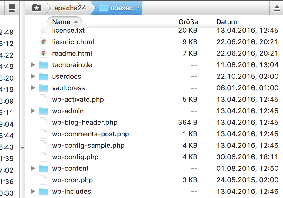
This is How an Organization With Multiple Websites Shouldn’t Look:

My Messy-Server, the Problem is Obvious.

There are Multiple Other Installations in One WP Installation.

When running multiple websites on one server, the structure shouldn’t look anything like the screenshot above. This causes significant problems and doesn’t help you keep an eye on everything.

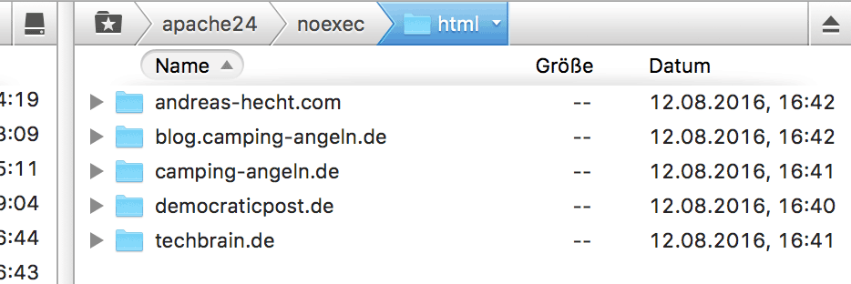
The Optimal Way of Organizing Many Websites on One Server:

This is What an Ideal Organization Structure for Multiple Websites Looks Like.

This is What an Ideal Organization Structure for Multiple Websites Looks Like.

An optimal structure for the organization of many websites always means setting up an own, explicitly named folder for each of the websites, to which the respective domain will point. This makes for a clear overview, and mistakes are spotted more easily, as no heredity can occur.

A WordPress Installation Attempt

Not expecting my day to become exhausting, I started the installation of a website. I created a folder, moved the WordPress files into it, create an own wp-config.php with the correct information from the previously set up database, and called up the installation routine.

http://mywebsite.com/wp-admin/install.php

However, instead of the installation routine, I got to see the following error notification:

Forbidden You don't have permission to access /wp-admin/install.php on this server

Even after many different attempts and tricks, I was not able to solve this issue. At one point, it became too much for me to handle, so I went ahead and fixed the problem with pincers.

The Interesting Answer to the Problem

My intuition made me test if I was able to access another file in the folder /wp-admin/ I created a file called temp.php, and entered the famous “Hello World.” After I moved this file into the folder, I had no problem calling it up in the browser. So I attempted a trick with the .htaccess file and entered the following:

View the code on Gist.

Of course, that didn’t work out either. Why should it? More on that later. First, I had to solve my problem.

Turn the temp.php Into the install.php

Accessing the temp.php I created in the folder /wp-admin/ was no problem. So I copied the content of the install.php into my temp.php and adjusted it a little. Read the exact procedure here:

Solving WordPress Errors: 403 Forbidden for /wp-admin/install.php

Now, I was able to install WordPress without any issues. And from this point on, I could have easily found the real cause of the problem. Unfortunately, I didn’t have a mirror at hand, though. Only after I published an article about my unconventional solution to the error, the actual cause of the error came to my mind.

The True Reason for the Problem: the .htaccess Heredity

The error had a perpetrator and a cause. The perpetrator was me, as I always protect my websites from any security gaps. That was also the reason for the problem.

Without thinking about it, I installed the WordPress for my first website in the server’s main index. The following websites all went into own folders within the first website’s WordPress installation.

This means that the .htaccess file of the first installation affects all files and folders in said installation. Including the other websites. That’s because a heredity occurs.

The first website for my standard .htaccess file. The according excerpt:

View the code on Gist.

This entry is highly efficient and prohibits any access to the install.php. If the file happens to be in a subfolder of the first installation, this entry will be in effect there as well. This is logical. But you have to come up with that first.

Conclusion: A Lot of Experience Does Not Protect You From Stupid Mistakes

Even webmasters and developers with lots of experience make mistakes. It is hard to admit this, but it’s true. Sometimes, you just miss the forest for the trees. It’s important to drill down on the mistakes so that you can learn from them. You’ll grow with errors and their solutions. I learned multiple things in that regard. My next time frame will be used for the reorganization of my server so that I can prevent this type of mistake from ever being made again.

(dpe)

Categories: Others Tags:

10 Tips to Improve Your Writing Style

October 6th, 2016 No comments
"Just Write"?

For some people, writing and filling a blog with entertaining content is only natural. They have a good understanding of language, and quickly learn to communicate effectively. The ideas for their articles as well as the readers seem to simply flow towards them. For most people, however, blogging is difficult. It takes a while until they found their rhythm and writing style. I wrote this article for these people.

Finding ideas and writing about them seems like an easy task. But especially in the beginning, the opposite is often the case. Even when the ideas flow to you, turning them into a decent post can be challenging.

How You Can Learn to Write Well

Just lining up words is easy. However, doing it in a way that entertains the readers is hard for the majority of writers. I keep on learning, and my way was not simple either.

“Just Write”?

Especially during the beginning, it was difficult to get ideas. It was easy to turn them into an article, but the style was beyond good and evil. It took me a long time to develop my own style. That’s why I know exactly how helpful practice is. As well as someone that takes you by the hand, and is patient enough to improve and form you. (Thank you, Dieter!).

I had a lot to learn, and I’ll give some of that to you today. Additionally, you’ll also get some ideas that could help your development.

1 – Action and Reflection

This is most certainly one of the best and most efficient ways of writing well. Write articles and analyze what you wrote shortly after that. Blogging means writing a lot, and then taking the time to critically review what you’ve written.

If you don’t have an editorial office behind you, you need to take on this task by yourself in order to get a profound feedback, since that is the best way to learn. Thus, look back at your ten latest posts and ask yourself the following:

  • Which articles have worked the best and why?
  • Which articles have not worked out and why?
  • On which articles did you receive the most comments and why?
  • What can you learn from the successful articles?
  • How could you further improve them?

Surely, there are a lot of other questions you could ask. But you’ll already be able to learn a whole lot by asking yourself the above questions once every two weeks.

2 – Set Yourself Challenges

Here, the goal is to leave the comfort zone by setting yourself a difficult task. Experiment with a different writing style, or try to use as few words as possible to describe a topic. You could also try eliminating your filler words to develop a clear style.

It’s also possible to pick a topic that you didn’t really dare to touch on before. Do things differently from what you’re used to. Challenge yourself and see what you get to learn from this process. Nothing forces you to publish these posts. This is all about the learning process.

3 – Write Guest Articles or Create Videos

Most bloggers only write for a single medium, being their own blog. That doesn’t have to be wrong by default, but you won’t learn a lot from that. If that’s the goal, you have to leave your comfort zone and write for other media as well.

I wrote for a political magazine that I founded with a colleague for almost a year. To do that, I had to step out of my comfort zone into something entirely new. I learned a lot during that time. Nonetheless, I am aware of the fact that I can still learn and improve every day.

Thus, I strongly recommend writing guest articles for other blogs. Preferably more successful blogs in your niche. These often want articles in a specific form, allowing you to improve your style due to their constructive criticism. You could also record videos and start a YouTube channel. This will also bring you forward in terms of your communication, as long as it suits you.

4 – Tackle the Printed Media

Writing for printed media, like a newspaper or a magazine, is not easy. Many would probably go much further and call it impossible. Nothing is impossible. That’s what you have to know. If you really want to write for a magazine or a newspaper, you will be able to accomplish that with a lot of tenacity.

The question is: how much are you willing to invest? When you give it all every day, continously learn, and don’t lose focus on your goal, you’ll do everything that’s necessary to achieve it. The path is hard, rocky, and long. But it can be walked.

5 – Ask for Criticism

Blogging is something that can get you very immediate criticism. When you already have enough traffic on your blog, ask your readers for direct feedback.

They will tell you what they like and what they don’t like. This way, you’ll find out about mistakes that you never would have thought about before. You’ll also be able to optimize your blog, as some of the feedback may be related to a technological issue.

You’ll get very good criticism from other bloggers. If you happen to know other bloggers due to guest articles, ask these people for criticism! As they view your blog with different eyes, you’ll get to hear things that often turn out to be extremely helpful.

However: You could also hear a lot of things that you’d consider to be harsh and ruthless. You need to go through that. You’ll learn a lot from something like that.

6 – Read and Analyze Other Blogs

This is one of the best tips I can give you. Reading very successful blogs is advantageous. Also read the authors in professional journals and analyze the style of the people behind these publications.

This is not about copying their style. Readers will notice when you try to mimic another blogger. However, some essentials may rub off on you. Maybe, it’ll be the way you write headings. It could also be the division of a post, or the way you write the summary at the beginning of an article.

There’s so much to learn from other bloggers and authors. Go and search.

7 – Read Your Articles Out Loud

This strategy will let you discover a bunch of stylistic mistakes. Some written paragraphs won’t sound half as pleasant as you thought they would when you say them. Whenever I’m not sure on how to word something, I read the passages out loud, which lets me find out if what I wrote is just straight up garbage.

If your post sounds bad, it IS bad. No successful book sounds bad when read out loud. Try Harry Potter or the Millenium trilogy. They are not only pleasant to read, but also sound nice. So nice that the people spend money to attend the readings of the authors.

8 – Criticise Your Old Articles

You’ve been blogging for a while? Then you’ve probably written plenty of articles, and you should have a sufficient collection of posts. Travel back in time and revisit them.

Analyze your own work from back in the day like someone that didn’t write them. Be harsh to yourself and ask yourself what you want to improve. Maybe, you’ll take it a step further and rewrite the articles and update them? This way you could get to evergreen content that will draw visitors to your website over and over again.

9 – Rent an Editor

If there’s one tip that can get you ahead, it’s this one. Of course, an editor is not free. However, backed up by a blog that already makes money, this step is not as expensive as it may seem.

Free editors mainly focus on the classic proofreading and editing of manuscripts. Formal and content-related aspects of a text are the focus of the work.

Rent a professional editor for a couple days or a week. Let the editor review every single post that you want to publish during that time. You can be sure that you’ll learn a lot. It could be frustrating, however, as an editor will show you every single mistake. In the end, you’ll be able to write better texts, though.

10 – Attend a Writing Course

Many professional editors offer writing courses for beginners and advanced users. Attending one of those courses can definitely help you improve while being much less expensive than renting an editor.

Go ahead and try to make this step if you have the necessary time and money. Keep in mind that you have nothing to lose, but a lot to win.

Conclusion: Keep it Up

Tackling a career as a blogger is no cakewalk. Particularly in the beginning, you will find it hard to assert yourself. Even later on, you’ll have to struggle a couple of times. You will be criticized, and there will always be something to improve and learn. Thus, the main characteristic you need is endurance.

(dpe)

Categories: Others Tags:

The Easiest Way to Find a New Job

October 6th, 2016 No comments

As a highly talented developer or designer, shouldn’t companies apply to you? On Hired the traditional process of finding a job is completely reversed. Hired expedites the job search process through an efficient system of:

  1. Companies competing for top talent with visibility into a candidate’s traction on Hired, driving rapid turnaround times from interview to final offer.
  2. Free personalized support to ensure your next job is your dream job. On Hired our Talent Advocates have your back, whether it’s negotiating compensation or preparing for interviews.
  3. Upfront salary, equity and bonus details in every interview request.

Try Hired Today

Direct Link to ArticlePermalink


The Easiest Way to Find a New Job is a post from CSS-Tricks

Categories: Designing, Others Tags:

Responsive Image Breakpoints Generator

October 6th, 2016 No comments

I’m guilty of using responsive images by taking a high res image and downsizing it a few times kinda randomly and using those as the srcset images. Basically the same “desktop”, “tablet”, “mobile” thinking I can also be guilty of with breakpoints.

Soooo what is the perfect way to do responsive images? Ideally we’d be sending the exact image that any device needs. If a device/browser/design combination requires an image to be 457px wide, in a perfect world, we’d send it a 457px wide image. But it’s impractical (from a lot of perspectives: creation, storage, caching) to make “one image per possible pixel width”.

There is a happy medium here. The Responsive Image Breakpoints Generator says:

Responsive websites, even the most modern ones, often struggle with selecting image resolutions that best matchthe various user devices. They compromise on either the image dimensions or the number of images. It’s time to solve these issues and start calculating image breakpoints more mathematically, rather than haphazardly.

It takes information like your breakpoints, your resolution needs, a reasonable change in file size between versions, and the image itself to create a all the images (and responsive images markup) you need to get to this happy medium.

Direct Link to ArticlePermalink


Responsive Image Breakpoints Generator is a post from CSS-Tricks

Categories: Designing, Others Tags:

Make better icons: a guide

October 6th, 2016 No comments
icon-design-03-opt

Iconography, or the art of creating suitable icons in web and app design, is probably one of the most underrated aspects of design. their size alone makes them easier to forget. Icons, in general, are drawn or created to be fairly small, and their importance to the totality of the design and usability is often overlooked.

At their best, icons can improve user experience in a big way. They direct users to perform actions in the interface. Also, the icons complement the theme your design offers your users. For example, icons that match the voice of your website can help the user acclimate with what kind of services or features you offer.

Realizing the importance of these tiny elements in the design, I have decided to create a guide for you to learn how to make your icons better. Here are a few tips for you to consider. I will note, however, that these are suggestions, and but not the only way to design icons.

So let’s start:

The warm up: what makes an icon “effective”?

Well-designed icons adhere to three attributes: aesthetic unity, form, and recognition. If you’re designing an icon set, you need to consider all three in order to make your icons really effective. These attributes, are essential to other design forms too, and they do not exist in independently of one another.

The attributes are:

Form

Form is the rudimentary attribute of an icon. Form defines the icon itself when its stripped down to its barest form. Once you remove the details of an icon, the form stands out. They are the circles, squares, horizontal lines, triangles, and many more. These primary geometric shapes are considered to be the most organic and fundamental structure of the icon. The idea is to think of a form first, start with the basic details, and build up from there.

In the icon above, the basic underlying shapes are highlighted in red to show the design’s rudimentary form.

Aesthetic unity

When multiple elements in the icon, and if possible, the whole icon set, are in sync, aesthetic unity can be achieved. Icons with these elements provide more cohesiveness in the design, and gives your work a sense of consistency.

In these icons created by Kem Bardly, we see that the dog icons possess a singular design style and concpet, creating uniformity in the aesthetics.

Recognizability

User-comprehension is the end-goal of an icon. At the end of the day, the icon exists because it replaces copy which would take more real estate in the design. An icon works if it embodies the the intent behind it. For example a mail icon usually means “messages”, or “e-mail”, and using it as an icon for “settings” just doesn’t make sense.

The above example shows the individuality of the icons, but also preserves the overall theme and color palette of the set, which makes it easier to see that they belong together.

Aside from that, recognizability also covers the need for an icon to be recognized as part of a set. Consistency is key.

Creating the icons

Use a grid

Grids are important; not only in iconography, but in other facets of design as well. There are lots of benefits in using a grid, and perhaps it is best to discuss them separately. In the case of icon design, you might work — for example — with a 32x32px area composed of a few parts.

In the grid above, we will basically allocate 2px from the outermost part of the grid to designate as a “safe-zone” which should, as much as possible, should be left empty. This is to create some breathing room around the icon, a bit like “padding” in CSS parlance.

Now that you have your grid ready, you need to remember general shape and orientation. Once you draw around the edges, right at the border of the safe zones, you will probably draw a polygon that will serve as a bounding box.

Generally speaking, circular icons should be placed in the center of the grid and would most likely intersect the outermost edges of the workable area. Remember, the safe zone should be avoided, but in a case where you would need to add some design accent that goes beyond the workable area to maintain the uniformity and the quality of the design, it can be excused.

Square icons should also be centered relative to the grid, and avoid extending to the outermost parts of the workable area. The middle should always be preserved in order to maintain visual weight in circular, and polygonic icons.

When icons are aligned diagonally, you should align them to the edges of the circular content area (see below). Take a look at the image and notice how the outermost parts of the icons align with the circle (although not exactly).

Remember that the grid is just a guideline, and it isn’t suppose to limit your design. You don’t need to fit everything exactly on the grid every time. It’s just there to help you maintain aesthetic consistency in your icons. So break the rules, if you have to.

The geometric side of icons

I took the second example, and simplified it down to its component outlines. That is because this is one of the most important aspects of creating an icon. You should start your design by drafting the finished product using simple geometry. Think of it like a pencil sketch before finishing a painting. You will be allowed to get rough, and make mistakes.

Curves, corners, and angles

Without variety, a design will look boring and mechanical. Good thing you can make use of curves, corners and angles in order to make the design more appealing to the eye. But you have to be precise about it. Almost exact measurements should be used in order to maintain uniformity in your icons.

Angles

In my experience, sticking to a 45-degree angle is always a good idea. The anti-aliasing of a 45-degree angle is always evenly steeped, meaning all the pixels active within the shape are aligned from end to end. This results into a crisp, and perfect diagonal sharp angle.

In most cases, this rule is always a must-follow but if the need arises to break it, you could try splitting it halves (22.5, 11.25 and so on) or using multiples of 15 degrees.

Curves are what separates amateurs from professionals. But the human body cannot create curves as perfect as tools from your software, so I would heavily advise you to rely on these shape tools and enter in specific numbers to create curves rather than drawing them manually.

Corners give off a specific sharpness and formality to the design. Normally, a corner becomes round at 2px, which, at 32x32px is a large radius. Make sure you pick the right radius that will fit your overall design motif.

Maintain the same design elements and accents

As we’ve discussed a lot of times earlier, the use of the same type or vibe of design is important to the overall feel and effectiveness of the icon. This is where you need to pay attention to the detail because small accents like a curved line, or a single shade of red can make or break the total consistency of the design. Note in the example below how I used a theme of rounded edges and corners mixed with sharp angles. I also maintained a specific color scheme to maintain the theme of the output.

Note that when you use the same design elements and details, you can easily change the whole design and feel of your set and everything will pretty much stay the same.

A note of warning though: do not fall into the trap of over-detailing the icons. You should remember that despite your focus on the little details that you do not forget that icons should instantly communicate an idea or a call to action. That is why keeping too many details will just make your iconography too difficult to understand, especially in smaller sizes (32x32px). Remember to prioritize function over detail.

A few things to remember before we say goodbye

Icons need to work harmoniously alongside the other elements within the design. Whether they are designed for desktop or mboile consumption, icons should be created with a wider perspective. You just don’t create icons individually, you create icons along the design itself.

The secret here is to approach the design process as this way: icons never function alone, no matter how solitary they may seem to appear. Remember to always evaluate your designs and see if they synergize with the other graphical properties of your project. Make sure they work as a whole in increasing the quality of the user experience.

LAST DAY: The GIGANTIC Font Bundle (30 Fonts with Extended Licenses) – only $29!

Source

Categories: Designing, Others Tags:

In-App Gestures And Mobile App User Experience

October 6th, 2016 No comments

Remember the days when hovering and clicking using the mouse were the most used trigger for interaction with site or app? Those days are gone. When Apple introduced the iPhone, multi-touch technology became mainstream and users learned that they could not only point and tap on the interface, but also pinch, spread, and swipe. Gestures are the new clicks.

The rise of touch and gesture-driven devices has dramatically changed the way we think about interaction. Gestures are more than merely entertaining, they are very useful and feel familiar. Today, the success of a mobile app significantly depends on how well gestures are implemented into the user experience.

The post In-App Gestures And Mobile App User Experience appeared first on Smashing Magazine.

Categories: Others Tags: