Archive

Archive for October, 2016

WordPress: Changing Your Permalink Structure Without Ranking Losses

October 20th, 2016 No comments
list-urls-plugin

There can be many reasons for changing your website’s permalink structure. Maybe you made the wrong choice while setting up your blog, or you want to change it for performance reasons. You didn’t dare to do it yet because you feared ranking losses? Today, we’ll show you how to change your permalink structure without having to be afraid of any losses in the visibility of the Google ranking.

The set up of permalinks is one of the first tasks that you need to approach when it comes to a new installation of WordPress and other content management systems. Many website owners put a lot of thought into this process; others might not have thought about an optimal structure enough.

Switching to a New Permalink Structure

A lot has changed lately. Google values very short URLs much more than speaking URLs, which are being valued less and less. The reason might be that Google is switching to short IDs itself, instead of using the long, speaking URLs.

However, changing the structure without a plan can also come with very real problems. Internal links stop working, the search engine removes the pages with dysfunctional URLs from the index, and won’t value the new structures as much as it was the case before that.

Nonetheless, changing the links without ranking losses is possible if done correctly. Here’s the guide:

Step One: Generate a List of the Old Permalinks

Before switching to a new permalink structure, a list of the old article links has to be created. Later, we will need redirections, so we need a list to make sure not to forget a URL.

The plugin List URLs which creates a CSV file with all URLs promises to provide an optimal and fast way to do so.

After the plugin’s installation and activation, generating a post URL list is only one mouse click away.

Step Two: Unlock Your New Permalinks

There are multiple options to choose from. Many recommendable variants are possible, but I tend to go with the shortest one – the pure article IDs. As Google uses this variant as well, one can assume that it will result in significant ranking advantages for websites with the shortest of all URLs.

Variant One: Post Name With IDs
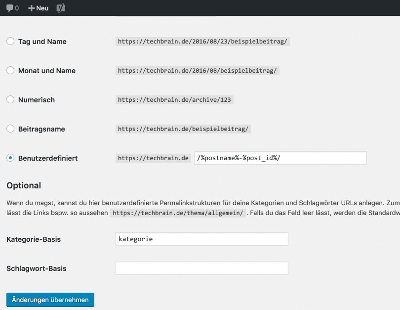
permalink-structure-one

The problem with this version is that the URLs will be very long if the article’s titles are long. You’ll always have to manually remove stop words and anything similar, to be left with three to four words in the URL.

Variant Two: The Pure IDs
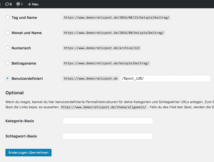
permalink-structure-two

Google is already using this version for tons of its services, like YouTube for example. The IDs also have another advantage, as they load faster, making them a part of a good speed optimization.

If you like to refine your articles and keep them up to date, I don’t recommend including a date in the URL. Your articles will look outdated too quickly.

Pick your preferred variant and click on “save changes.”

Step Three: Defining 301 Redirects

To make sure that you don’t retract ranking losses, you now need to set up 301 redirects from the old URLs to the new versions. This tells Google that the respective articles permanently moved to the new addresses.

If you’d want to save that step, it would be a bad idea, as the following would happen:

  1. All internal links that were created manually wouldn’t be updated anymore and lead into the void.
  2. All external links that lead to the articles would only produce 404 errors. Then, your visitors will see an error page instead of the information they’re looking for.
  3. During a search engine’s next visit on your pages, many 404 errors would be detected. These pages will then drop out of the ranking. Your website practically doesn’t exist anymore.

Thus, we have now arrived at the most important action, which is the redirection of the old permalinks to the new addresses.

There Are Two Redirection Options For You to Choose From:

Option Number One

is using a WordPress plugin. One that is constantly taken care of and working is Redirection.

redirection-plugin

You don’t need any experience with handling the .htaccess file when using this plugin. You can get your task done directly within WordPress using an easily understandable interface.

Option Number Two

is the manual creation of the rules for the server control file .htaccess. This certainly is no bad choice either. It follows the following scheme:

View the code on Gist.

The pattern is straightforward. The first part shows the old URL without your domain; the second part shows the new URL including your domain. Follow this scheme for all posts. Implement the code in the file above your WordPress rules.

I recommend realizing the forwardings using the .htaccess file. This way, you are on the safe side.

Test Your Forwardings

You have to be sure that the redirects work and redirect users to the new URL. Thus, enter some of the old addresses from your list, and check if they redirect correctly. Also, visit Google and look up your website and some of your listed posts.

Click them and see if the forwarding is executed correctly.

The Optional Step Four: Correcting Internal Links

This step isn’t necessary, as the 301 redirects are effective here as well. So, when a visitor clicks on the “wrong, old” links within your articles, he will be directed to the correct articles.

However, depending on traffic and web hosting, this can take half a second. Today, an additional half a second is unacceptable. Google and your visitors love fast websites, which is why a correction of the internal links to the new variants is recommendable.

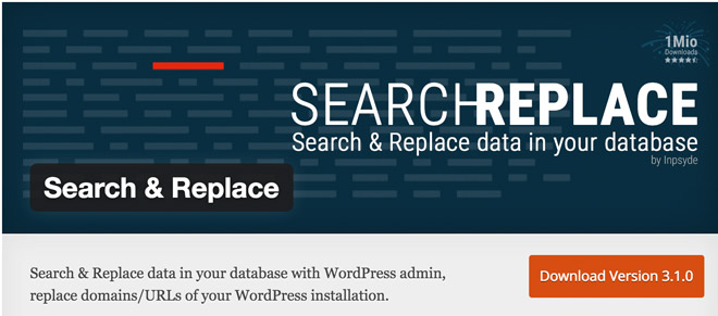
A fast and straightforward way to get this done is a plugin like Search & Replace.

search-and-replace-plugin

Using this plugin lets you identify every instance of old permalinks, and update them directly within the WordPress database. Then, links are not addressed via redirects anymore, but via the correct and fast new links instead.

Conclusion

Of course, altering the permalink structure can heavily affect a website’s ranking. However, when you approach the issue carefully and well-planned, it is always possible to accomplish it without ranking losses.
Categories: Others Tags:

WordPress Without Shame

October 19th, 2016 No comments

Even-handed take on WordPress by Gina Trapani. I’ve been unapologetically on WordPress for a long time.

I also can’t wait to see what the future of it will be:

Automattic’s React-based Calypso rewrite of the WordPress admin is a clear sign that at least the leaders of the community are trying to reimagine what a WordPress born in 2016 would look like. Eventually? Soon?

Direct Link to ArticlePermalink


WordPress Without Shame is a post from CSS-Tricks

Categories: Designing, Others Tags:

Web 2.0 meets MTV in Pandora’s new branding

October 19th, 2016 No comments

For once, I’m not starting off my article with a joke. When I say “Web 2.0”, I genuinely mean that style of design that we all (temporarily) embraced. Many a corner in Pandora’s new logo is curved, and they have brought back the bright and shiny gradient.

Okay, so it’s a bit muted compared to the shiny gradients of the past, but that’s to be expected. Where once we tried to ride Apple’s chrome style to glory, this new branding effort is tempered (yes… tempered) by the MTV-meets-Bauhaus style of graphics that accompany it.

But we need an example of what I mean. Here’s the Pandora logo all on its lonesome:

They are not messing around when it comes to their rounded corners.

Now here’s what the logo looks like in a more advertising-friendly/artsy context:

Like many big brands nowadays, there seem to be few strict guidelines for how the logo must or must not be used. They want the best of both worlds. They want their brand to be associated with a forward-thinking technology-based service, and art.

I think they’ve largely managed this. By drastically simplifying the letter form in their logomark, they have opened up its potential for use in more artistic contexts, while the regular version works perfectly well as an app icon, a letterhead, or what-have-you.

So congrats, Pandora. It works.

Woodford Bourne PRO Family of 18 Vintage Grotesque-Style Fonts – only $15!

Source

Categories: Designing, Others Tags:

Change Eye Colour in Photoshop

October 19th, 2016 No comments
dansky_change-eye-colour-adobe-photoshop

In this tutorial, we’re going to learn how to change eye colour in Adobe Photoshop.

Download Adobe Photoshop.

Read More at Change Eye Colour in Photoshop

Categories: Designing, Others Tags:

Designing for mobile app commerce

October 19th, 2016 No comments

One of the more lucrative projects for designers these days doesn’t even involve desktop. That’s because, in the last few years, more and more people have switched to mobile use, which also includes time spent shopping. A good rule of thumb as a designer is to go where your users are flocking, and you’ll find plenty of value there.

Designing for retail apps is extremely interesting because it all comes down to conversions. One wrong design decision, and that could well mean a lot of lost revenue for your client. While some of the conventions of good design and UX apply to retail apps, some design choices you’ll have to make to optimize UX may surprise you.

In the end, what matters is only what works and what doesn’t.

Include full product details and reviews

When designing your individual product pages on your retail app, be sure to give your shoppers everything they could want in the way of information. Although it’s mobile, they still want to be informed shoppers. You just have to make the most of your small screen real estate when designing individual product pages, so don’t waste space.

Amazon offers a clever example of getting around the limited screen space issue: They’ve simply decided to design long-scrolling pages in the app to let users scroll down to absorb all of the rich information on every, single product page.

Take the product page for the Saucony Original Men’s Shadow Original Sneaker.

This long-scrolling page features the following full product details:

• High-quality and sharp images from various angles
• Size and color info
• The price range
• Incentive info (free returns)
• Huge and noticeable call to action buttons
• A description
• A detailed features list
• Related items recommendations
• Customer questions and reviews

Getting all of this info inside of a retail app really improves the customer experience!

The customer reviews are helpful because they give added insight to potential buyers who want to know how people who’ve bought this item have found it.

If the world’s biggest online retailer has its product pages set up like this, chances are that it’s for good reasons, and to optimize conversions. Amazon offers designers a great template of how to design a mobile product page for success.

Cool it with the registration requests

A huge barrier to conversion is asking shoppers to register upfront. There’s a high risk that they’ll just leave right then and there. This is also true on the desktop. However, on mobile, your retail-app experience provides much smaller screen real estate, which makes registering an even larger hassle. That’s why, if you absolutely must ask your shoppers to register, you have to give something of extremely high value in return for their troubles.

Research from the Nielsen/Norman Group bears this out, as so-called login walls where shoppers are prompted to register before getting further in the app are discouraged.

Instead, you have three options:

• Use the reciprocity principle to give shoppers a high-value reason for registering upfront
• Utilize social login
• Let them use a guest-checkout feature that doesn’t make them waste time registering before they can use your app

When the brand for which you’re designing an app has low name recognition, then your benefit to get users to register has to be even greater than normal.

Men’s retailer Frank + Oak doesn’t require you to register upfront. In fact, you can just go ahead and shop immediately. However, when you do have something in your cart that you want to check out, they prompt you to register, but allow for social login, which has been shown to reduce cart-abandonment rates, since your shoppers don’t have to think of — and remember — a new username and password.

Let shoppers totally control their shopping carts/baskets

Good UX means giving your users full control inside of the retail app. According to Google’s own retail app recommendations, it’s a best practice to empower shoppers to edit their own carts or baskets at any stage in their buying flow.

If your shoppers have to go back a few steps in the buying flow — say, to one’s account page or a subsequent page — that causes frustration and leads to friction in what should ordinarily be a smooth conversion process. That frustration and friction can ultimately lead to abandonment and consequently fewer conversions and sales.

In the Walmart app, shoppers can directly edit the quantity of purchased items right on the checkout page without having to return to any prior page in the buying flow. As a result, shoppers who want to change their mind about how many items to buy have the full freedom and control to adjust the quantity to their liking until the very last moment before they tap the check out button.

When designing buying flows, ensure that your shoppers can always edit the quantity of items at any point after they’ve already added a product to their cart or basket.

Don’t make it hard to find customer-service information

In mobile retail, great UX intimately ties into providing excellent customer service. A huge component of customer service is always ensuring that customers can see the online retailer’s contact info because they’ll likely have questions or comments that they want to communicate via email or phone. Making this info easy to find also acts as a way of boosting your app’s credibility.

Wayfair’s app shows us how to display contact info readily, so that it puts the shopper’s mind at ease and provides great UX by offering contact info that’s very accessible. On their account page, shoppers can choose to email or directly call Wayfair in case they have questions or run into issues in their checkout process or broader app experience. Note how the contact info is near the top of the page; shoppers don’t even have to scroll down to locate it.

This is the epitome of usable design.

Shoppers are given choices as to how they want to get in touch with Wayfair—which also goes back to the design principle of giving your shoppers more control over their experience.

Retail apps are different from other apps

With no other apps do you have to design in such a way that directly affects conversions that matter the most to businesses, which is purchases for sales. That’s what makes nailing the design and UX for retail apps more urgent than other types of apps.

Some best practices apply to desktop, such as ensuring that all contact info is always readily available. However, some of what to do — like using long-scrolling pages — may seem a bit counter-intuitive on mobile, given the smaller screen real estate and the need to have a faster page and experience.

What matters most is designing for good mobile UX. When you do that, you can quickly determine what works and what doesn’t when designing for retail apps.

Woodford Bourne PRO Family of 18 Vintage Grotesque-Style Fonts – only $15!

Source

Categories: Designing, Others Tags:

Websites We Like: October 2016

October 19th, 2016 No comments

Another month, another collection of fascinating websites! Here’s a few that have caught our attention lately.

GitHub Octoverse 2016

Alongside releasing a bunch of neat updates, GitHub recently published their annual breakdown of what’s been going on in the community. It’s called the GitHub Octoverse:

It’s funny to think that the Octoverse used to be little blog posts and now they’ve flourished into beautiful standalone websites filled to the brim with infographics and charts.

I especially like the choice of big text and the use of the typeface Karla.

Intercom

Intercom, the customer communication platform, recently launched a redesigned website chock full of illustrations and beautiful imagery:

Every page on the website is worth exploring for the way in which they describe their product, their team and their goals. A cast of animal characters bring a sense of levity and quirkiness to what might be an otherwise straight forward and boring experience.

Digital Ocean

You might be already familiar with Digital Ocean, the cloud computing company, and they’ve launched a redesigned website, too.

The design team wrote about the goals of the redesign which included prioritising accessibility and CSS architecture:

The old digitalocean.com CSS had thousands of rules, declarations, and unique colors. The un-gzipped file size came out to a whopping 306 kB.

For the redesign, we implemented a new design system called Float based on reusable components and utility classes to simplify and streamline our styles. With the Float framework, which we hope to open source soon, we were able to get the CSS file size down to almost a quarter of its original size: only 80kB!

Stripe

Stripe also received a lovely redesign a short while back:

One neat thing I noticed was how the font Camphor is being loaded in the head:

<link rel="preload" href="/fonts/camphor/4b0f2143.woff2" as="font" type="font/woff2" crossorigin>

This is one of many useful tricks to loading a webfont super quickly, with preloading. It’s not an ideal approach, and you certainly shouldn’t be preloading multiple fonts because that’ll impact performance, but in this case since Stripe isn’t loading many weights then this is a solid approach.

Anyway, there’s a tiny bit of UI that stood out to me here: the hover states in the main navigation. There’s a delay as you hover over each item that feels in that wonderful “sweet spot” of animation that’s so hard to get right:

NYT: How to Meditate

The New York Times published an article on How to Meditate. The background animation and illustration is particularly beautiful on big screens:

Type Terms

Type Terms helps designers learn more about the specific elements of a letterform and typeface:

Again, subtle animations play a part in moving through the interface that really makes all the difference:

inspiring.online

inspiring.online, in the words of its creator Tim Holman, is…

…a blog for those looking for encouragement, and inspiration in the tech world, but is also an experiment. The entire blog is open source, so anyone can submit amendments to posts, fix spelling mistakes, add discussion links, and create new posts too! Ideally, it’s a great starting area for someone to enter the open source world!


And that’s it until next time! If you have any more websites that you’ve found interesting then be sure to let us know in the comments!


Websites We Like: October 2016 is a post from CSS-Tricks

Categories: Designing, Others Tags:

How To Build Honest UIs And Help Users Make Better Decisions

October 19th, 2016 No comments

Many apps today, such as Google Now, Spotify and Amazon, make assumptions about user preferences based on personal data. They may even use this information to make decisions on our behalf, without any direct input from us. For example, Facebook tailors your news feed and Amazon recommends products? —? both hiding “irrelevant” information and only showing what they think you will like.

This type of design pattern, where user choice is removed, has recently been coined “anticipatory design”. Its aim is to leverage data on user behavior to automate the decision-making process in user interfaces. The outcome lowers the excessive number of decisions people currently make, thereby reducing decision fatigue and improving decisions overall.

The post How To Build Honest UIs And Help Users Make Better Decisions appeared first on Smashing Magazine.

Categories: Others Tags:

WordPress and HTTP2 – An Introduction

October 19th, 2016 No comments
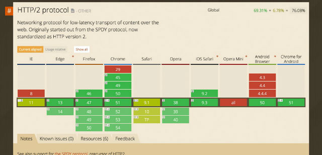
Browser-Support for HTTP/2. Green Means, That the Protocol is Supported.

During May of 2015, it was decided that HTTP/2 would become the new standard and that it would replace HTTP/1.1 in due time. The possible advantages of HTTP/2 are huge, however, the usability is not as easy is imagined. In this article, we’ll take a quick look at the benefits that this standard could provide for the website owners, as well as which requirements have to be met to use WordPress and HTTP/2.

How many articles about a website’s loading speed have your read already? Probably a whole lot. I’ve also published a couple of articles on the topic here at Noupe and even more over at our German sister site Dr. Web. An important part of performance optimization is the server, as no optimization can work without a proper server with a modern operating system.

That would be like tilting at windmills. As none of us is Don Quijote, we shouldn’t start with that, right?

What is HTTP and What is it Needed For?

In general, HTTP (Hypertext Transfer Protocol) is a way of communication between web server and browser. That means HTTP is the language that server and browser use to talk to each other.

I won’t really dig into that in this article, so if you want to find out more about it, look at the article on Wikipedia. The first version of HTTP, version 0.9, was created in 1991, the so-called Jurassic period of the internet.

A lot has happened since then. The websites primarily consisted of a background color, one or two graphics that were linked in the HTML, and lots of text. The first websites were only some KB in size, while today’s websites are thick and weigh up to multiple MBs.

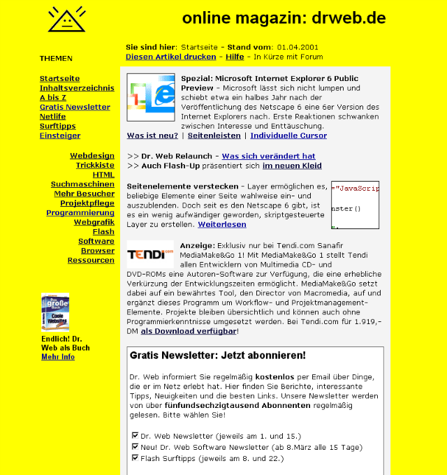
The development of websites is easily observed on the example of Dr. Web which we established in 1997 already. Noupe is more than ten years younger.

One of the First Versions of Dr. Web in the Internet's Early Days.

One of the First Versions of Dr. Web in the Internet’s Early Days.

Today, the actual amount of files that form a website has increased drastically. Back then, only a few files had to be loaded, and today, there are dozens of them. This progress increases the limitations that the old HTTP/1 protocol comes with. The result is an increased latency or a slow modern website.

This forced the development of HTTP/2. HTTP/2 can definitely be considered the evolution of the old protocol since the main goal was the reduction of the latency, which results in an increased loading speed with modern web browsers.

The Limitation of HTTP/1

Nowadays, browsers have to load dozens, or even hundreds of files to display a website. The following is loaded for the display:

  • The Website’s HTML
  • The Stylesheets (CSS)
  • The JavaScript
  • The Images
  • The Videos
  • External Files for Google Analytics, Ads and Anything Similar
  • Social-Sharing-Solutions

The big problem of HTTP/1 is that the browser creates a request for every single file that is mentioned in the HTML, CSS, and JavaScript. This might be hundreds of requests and connections. Hundreds of HTTP requests have to be executed, which can slow down a website significantly.

Speed-Optimization Under HTTP/1

Due to this limitation, a special concept on how to still make websites faster was created. Files were bundled to reduce the amount of requests, the size was reduced via compression, and the graphics were compiled to a sprite. HTTP/2 is supposed to solve these problems, as well as provide other ways.

The Difference Between HTTP/1 and HTTP/2

Please visit the HTTP/2 GitHub FAQ for the exact specification of HTTP/2. HTTP/2 was developed to be read by machines and not by humans. Thus, the new protocol is binary, as this optimizes the process of communication between browser and server.

On top of that, it’s much less prone to errors and able to interpret things like blanks, empty lines, line ends, capitalization, and other things much better.

The big difference between the two protocols are the connections, however. HTTP/1 only allows for one connection at a time, while HTTP/2 can process multiple connections at once because it makes use of multiplexing.

  • HTTP/1 has to create a query for every single file
  • HTTP/1 loads one file at a time
  • HTTP/2 is capable of loading many files with one connection
  • HTTP/2 allows for multiple connections at the same time

The Server Push Procedure of HTTP/2

The server push process is a function, where the server actually knows which files the browser requires before it queries the files. Then, the server pushes the files to the browser without waiting for the browser to request them. This accelerates the entire process of displaying a website.

Find More In-Depth Information Under Apache.org/Server Push

Those that want to experiment with the server-push procedure can find a free WordPress plugin here. HTTP/2 Server Push.

Why the HTTP/2 is Much More Efficient

  • It can build connections between client and server much faster
  • The connection between server and browser is more efficient and faster
  • Files and resources are transferred at the same time
  • Files can be pushed to the browser via server-push
  • It allows you to load and display more files at once

The Online-Demo: the Difference Between HTTP/1 and HTTP/2

How Can I Use HTTP/2 With my Website?

Whether you’re already able to use HTTP/2 or not depends on your web host. The new protocol is a part of the server operating system (Apache, NGINX, or ILS), and thus, has to be taken care of by your hoster.

If you happen to own an own server, you could upgrade tp HTTP/2 at any time.

Of course, there are already a couple of hosts that support and offer HTTP/2. However, that seems to be an exception for now. It’s possible to test if your web server or hosting package already provides the new turbo HTTP. To do so, use the online tool by KeyCDN:

HTTP/2 Test Tool

How to Use HTTP/2 With Your Website

Theoretically, HTTP/2 should be usable on any browser without any particular configurations. In theory. Unfortunately, things are different in practice, as the large browser creators have decided to only enable the support for the new protocol via TLS (HTTPS). Here’s an updated list of browsers that already support HTTP/2:

Browser-Support for HTTP/2. Green Means, That the Protocol is Supported.

One Click Opens the Interactive List on Caniuse.com

So you need an SSL certificate for your domain, as only then, you’ll get to enjoy the high-speed protocol.

Test: Which Website is Already Using HTTP/2

There’s a Google Chrome expansion that lets you see which site is already using HTTP/2.

The “HTTP/2 and SPDY indicator” Expansion

The expansion places itself next to the browser’s address bar and uses colors to show you whether the protocol is used or not. A blue flash means that the website is using HTTP/2 actively. Grey means that no support is available.

The Blue Lightning Means That HTTP/2 is Being Used.

The Blue Lightning Means That HTTP/2 is Being Used.

Going New Ways of Speed Optimization

The old ways of speed optimization are not effective anymore when using HTTP/2, so potential would be wasted. However, using the protocol on a daily basis doesn’t mean that files shouldn’t be condensed anymore, but only that you should think about which files won’t be condensed.

The possible advantage of loading many resources at once may also result in a slower website when all files aren’t condensed and compressed anymore. Having JavaScript delivered in a file compressed by Autoptimize, for example, results in a faster loading time as, due to optimized caching, the file is only loaded once when an according .htaccess file is available.

After extremely many tests, my way of speed optimization for advanced users has proven itself to be optimal.

Conclusion

Using HTTP/2 is definitely worth it, although you have to purchase an SSL certificate for the website. A free certificate from Let’s Encrypt is fully sufficient as well. The speed gain can be enormous, depending on the existing speed optimization concept. On websites designed for strong performance, with servers that already use PHP7, the speed growth will be a lot less significant.

Categories: Others Tags:

Double Panel Hover Box Effect in Adobe Muse

October 18th, 2016 No comments
Muse For You - Double Panel Hover Box WIdget - Adobe Muse CC

Add a Double Panel Hover Box Effect in Adobe Muse. No Coding Skills Required.

Adobe Muse CC Logo

Adding hover effects over images can really engage website visitors and add more styling to your website. In the video above I go over how to add and style the Double Panel Hover Box widget found at http://museforyoushop.com.

The Double Panel Hover Box widget is completely customizable and is responsive in width and height so the image keep its proportions as the browser size gets smaller or larger.

The steps to adding the Double Panel Hover Box widget are as follows:

1. Drag and drop the widget from the Library Panel. If you do not see the Library Panel go to Window > Library.

2. Add an image to the widget. If you would like the widget to be a certain size crop the image first to the desired dimensions and then place in the widget. For example if you wanted the widget to be a square you would crop the image to equal width and height before placing in the widget. After the image is placed you can resize the widget and the image will retain its width and height proportionally. You can use any photo cropping program or visit the following website to crop the image:

http://birme.net

Remove any extra space around the widget container by dragging in the sides of the widget container around the image.

Muse For You - Double Panel Hover Box WIdget - Adobe Muse CC

3. Set the maximum width and the minimum width for the image in the image section.

4. Set the colors of the panels in the effect section.

5. Set the transition speed of the panels in the effect section.

6. Add and style the text in the text section.

7. If you would like to link the hover box to an internal page, external page, or anchor point enter a link in the image section. There is the option to open the link in a new tab if it is an internal link or external link.

8. If you would like multiple Double Panel Hover Boxes with different styling simply change the instance number for each new widget.

9. Preview in the browser and hover over image to see effect.

10. Done.

Features Include:

  • Add multiple on one page
  • Set the image to be responsive with the built-in ‘Resize’ option in Adobe Muse
  • Set a maximum width and minimum width for the images
  • Customize the color of the hover effect
  • Set the speed of the hover effect
  • Add text over the hover effect
  • Set the color for the text
  • Set the font size for the text
  • Align text
  • Link image to an internal link, external link, or anchor point
  • Open link in a new page

For more video tutorials and widgets for Adobe Muse visit http://museforyoushop.com.

Happy Musing :).

Read More at Double Panel Hover Box Effect in Adobe Muse

Categories: Designing, Others Tags:

Ecommerce Design: Focus on Product Images

October 18th, 2016 No comments
xstore1

If you are working on e-commerce projects, you are familiar with the online shopper’s needs. The most important? The need to touch a product, or see it properly. To resolve this issue, modern e-commerce design techniques have evolved. One of the best ways to solve this problem is to use product image variation.

Product variation can involve showing a product from different angles, colors, or textures. Or all the above. Smart animations can also be brought into play. They allow a user to interact with a product.

Images can be easily used to communicate a specific brand atmosphere

If you have a client in need of an e-commerce website, your first choice for a WP theme should be one that has a clear focus on product variation. It can use animations or show variations in separate images.

The good news is that such a theme is available.

It’s a king-size one. It has 30+ good to go shops, and another extremely important feature – live support.

Why are Product Images So Important in Ecommerce?

Of all the factors that you must take into account in designing an e-commerce website, the way you show products is one of the most important. The goal of the designer must be to provide the best experience available. This has a strong impact on conversions.

Images can do so much. You can use them to inspire, to persuade, and even tell a story.

xstorenew2

An elegant, simple way of showing the products, in a ready-to-go shop for smartwatches.

Images are so powerful in fact, that attempting to run an online store without images of the produchttp://8theme.com/demo/xstore/landing-watch/t isn’t even an option. Depending on its use and its quality, an image can make or break a sale. Here’s why:

  • Surroundings can be important. A white background may be a best choice in many instances. Yet whatever the background is, it must make the product look good.
  • Showing the product at work is often an effective approach. Especially when showing the product in this light it may make it look simple, elegant, and innovative.
  • Details matter. Details can take the user up close to a product to a point where they can almost touch and feel it. This is especially true for clothing, other cloth items, and mechanical tools. When an image shows a person wearing a piece of clothing, or using a particular type of a tool, it’s easier for the visitor to put himself or herself in that person’s shoes.

Background, surroundings, details, and examples of use are all important factors in making a sale.

Tips for Creating Image Engagement on Your Website Using Product Variation Images

While the use of product variation images in websites is not new, it is growing trend in the ecommerce world. Here, we will look at four examples of ways in which you can use product variation images to great effect.

1) Showing Several Ways of a Product Being Used

This product page taken from the XStore e-commerce theme is a good example. Different instances of product variation are used in concert with the details of that product. One of these instances, a close-up, gives the user a greater feel for the product’s texture. Using a smart hover effect, the product is modeled in two different positions.

2) Using Quick View on the Category Page

xstorenew3

Notice the button that is active because of the hover effect

The hover effect is put to good use on the category page and the experience transforms. It becomes more natural. It is on this page where you give the user a first look at a product. Hovering above a product image produces a Quick View button. This encourages the user to examine the product in greater detail.

When the button is actuated, detailed information about the product appears. This also shows the Add to Cart button, and an opportunity to examine the product in even greater detail. Related products are also displayed, and the user can trigger a quick view of these as well.

3) Using an Environment-like Background on Each Image

xstorenew4

A concept image from the Drink good to go shop.

This creates a wealth of possibilities for a designer. The surroundings principles of good images are put in play in this e-commerce example. Each bottle of alcohol has a nature-related background image. This provides information about the production techniques or ingredients of the drink. Yet in a subtle, ingenious matter. Agree?

4) Using Several Close-up Details of the Product

xstorenew5

An example of this way of showing the product, from the Furniture ready to go shop.

You can also use a hover effect to allow a user to view a series of close-up frames of a given product. You can see how this can be done by clicking on the sofa in this XStore furniture shop.

In doing so, you will see a series of frames that give an up-close look at the sofa. Its construction, upholstery details, and texture. Exactly what a user would analyze in an offline shopping experience.

30+ Ready-to-Go Cool Shops Await Your Magic Design Skills

xstore-product-slider

You’ve seen some examples of how images with product variation can be effectively put to use in an e-commerce website. XStore will help a lot in achieving that.

It’s not only a king size theme – you have 30+ good to go shops, 1 click install.

You also get 6 free plugins, worth 117$.

These are: WPBakery Visual Composer, Revolution Slider WordPress Plugin, Smart Product Viewer 360, Infinite Scroll & Ajax Pagination, Subscriptio WooCommerce and GMAPS for Visual Composer.

The XStore team has also gone to great lengths to address and provide solutions to many of the problems web designers face. For example, a live chat is available if you have an urgent need for support. XStore is also the perfect choice for ensuring the mobile shopping crowd will be able to view your site’s pages properly.

Launched earlier this year, XStore is an aesthetically minimal theme, one that is easy to use. It that can produce SEO-optimized websites that search engines favor.

Discover the beautiful good to go shops here and take this king-size theme for a spin. It’s time for awesome e-commerce websites.

Read More at Ecommerce Design: Focus on Product Images

Categories: Designing, Others Tags: