Archive

Archive for October, 2016

Blogging for Beginners Vol. 4: The Optimal Sidebar

October 14th, 2016 No comments
youtube-1684601_640

So far, our small series “Blogging for Beginners” has dealt with choosing the right domain and web host, and it also gave good advice on an essential equipment of plugins and a theme. On top of that, we have also compiled lots of useful tips, tricks, and resources for excellent content for you. Today, we’ll talk about something that even experienced bloggers like to forget – the sidebar.

The sidebar is the element that most blogs from all over the world like to neglect. Most of the time, it’s either overloaded with tons of widgets or filled to the brim with advertisements. It seems like nobody puts thought into what makes a sidebar useful, and how it should be structured.

That’s why I’ll give you a recommendation on what makes sense and what doesn’t. But first, let’s take a look at the things that can easily be done incorrectly.

Common Sidebar Mistakes

For many bloggers, the sidebar seems to be the panacea for an extreme variety of features. However, this is not a good strategy. So, let’s take a quick look at all the mistakes you can make when working on your sidebar:

1 – Too Many Widgets

A sidebar should not be overloaded. Not every widget that exists should be used. Here, you should precisely filter what’s imperative. Tag-clouds, calendars, latest articles and comments, author biography, social media buttons, the latest videos, multiple newsletter forms, and ad banners. Your visitors will be overwhelmed by the mass of information, and won’t perceive any of the features.

2 – Confusing Variety of Widgets

If like mentioned in mistake number 1, you simply have too many functions and widgets in your sidebar, it can become confusing very quickly, resulting in the sidebar completely failing its purpose. Additionally, there might be visitors that will be scared off by a “messy sidebar.” Visitors will struggle to find the purpose of the sidebar. Many people will then assume that the rest of your blog is likely the same.

3 – Keep all Default Widgets Activated

When installing WordPress or activating a new theme, it’s no surprise when many of the default widgets move into your sidebar. I recommend checking that, and removing all widgets.

4 – The Infamous Blog Networks

Blog networks might be great, but most of the time, they don’t do much for you. These backlink banners don’t belong into the sidebar. In my opinion, they don’t even belong on a website at all. You will barely notice any traffic that comes from these networks, but in return, you give them a follow link to their website. They gain more visibility in the search results while you lose, as you don’t receive any value in return.

In addition to that, these buttons give your visitors a wrong impression, as they could easily assume that you were dependent on these networks. So, stay away from them! You don’t need them.

Google Ads in the Sidebar? No!

No Google Ads in the Sidebar, it Won't do You Any Good!

No Google Ads in the Sidebar, it Won’t do You Any Good!

This is easily the worst mistake that novice bloggers can make. When starting a blog, you shouldn’t put out any ads at all. Your goal is to gain readers. But that will only work when these readers can trust you.

This can only be accomplished when they feel like you want to help solve a problem, entertain them, or transmit knowledge. On top of that, using Google Adsense will ruin your blog’s loading time, which is a part of the Google index’ ranking factors.

There’s only one reason to use advertisements on a blog: You have to make a living off of blogging. That’s the only justification for ads on a blog. My personal blog, for example, is a (still rather small) part of my income that I need to make by writing.

That’s why you will find one single ad block of Google in the articles. There’s also a static ad block for my eBook listed in the sidebar. That’s it, and it will stay like that for a long time.

When, Where, and Why to Implement Google Adsense?

In General: If you use Google Adsense ads, place them within the post, and only place a single one. For one, that’s the best spot for ads, generating the most clicks, and second, users tolerate one Google ad. This space is already sufficient to produce a nice, passive income.

However: Google Adsense is only worth it when you already have a decent amount of traffic on your blog. You definitely should avoid that for the first year, and even then, only implement an ad block when you have at least 20,000 visitors on your website each month. It won’t be worth it below that since you’ll only get a couple of cents.

As there’s a payment limit of 70 Euro at Google, you could also wait two years for the first money, given a moderate amount of visitor traffic. Is it worth it? Better stay away from ads.

Very Clear: Google ads don’t belong into the sidebar, neither do similar ads. That would be the best way to put off your visitors, getting less and less traffic, instead of gaining any.

However, if you want to use an ad block within the articles, copy it, add this code, and place it in your theme’s functions.php:

View the code on Gist.

The Blog Sidebar as it Should be

An intelligently equipped sidebar can be an important element of your blog, which can support your efforts to build a well-visited blog significantly. Thus, you should think about what features make sense in the sidebar. Always keep in mind that the sidebar is supposed to support and extend the content area. So here’s my idea of a sensible equipment in the correct order (from top to bottom):

1 – Social Media Follow Buttons

Your readers should be able to see what social networks you use, and where they can follow you on first sight. You should pick the most important networks, and not instantly join every single one, and link it. Less is more. Only connect the networks that you actively use. Don’t forget to link your RSS feed as well.

Although RSS is going downhill, there still are a lot of people that like to look at, and read new articles in the feed reader. By the way: your feed should always show the full content, and not just the excerpt. Many people perceive that in a negative way.

2 – Your Author Bio – At Least an Extract

You should at least place a short author biography below your follow buttons. It doesn’t matter whether you are a professional blogger, or only run a personal blog, your identity is everything. This will give your blog a human touch, as well as an identity. You also work on becoming a brand at the same time.

Visitors of a website also like to know who’s writing, who’s behind the project. It’s also one of the fastest ways to create trust. A good author bio contains an extract of an “about me” page, which you should set up. It’s one of the four pages every blog should have.

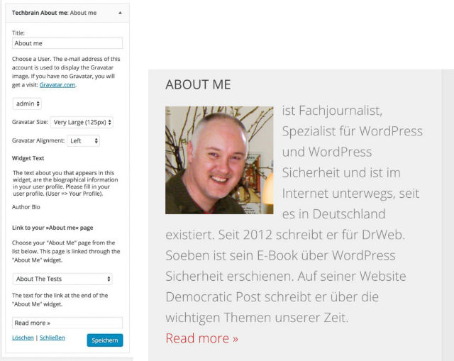
An Optimal Author Bio – Plugin Download

A good author bio in the sidebar contains a brief description of you, your motivation, a good image of you, and a link to your “about me” page. Recently, I wrote a small plugin for that, which will be implemented in the WordPress plugin index in the following days. An English and a German version are available. You can already download it over at Dr. Web:

Techbrain About Widget Download

Screenshots:

screenshots

3 – A Newsletter Form

If you were to offer a newsletter, the sidebar would be one of the best places to do so. Just make sure the form catches the eye. You could choose flashy colors to set it apart from the rest because the user has to be able to see it. This will also increase the amount of subscribers.

4 – Popular or Recommended Posts

There are tons of plugins that can display your most popular articles. One of them is WordPress Popular Posts. Popular posts are always generated dynamically and determined by the amount of clicks, or comments. However, you have no control over the display of these posts. Your most popular articles might not be your best ones.

That’s why I recommend linking your best posts, instead of your most popular ones. This is done manually. Pick the posts that you believe are your best ones, and link them via a text widget. Here, you have two options to choose from: you could either create a simple list with text links, or use “speaking” images and link them to the posts.

The Optimal Creation of Recommended Posts

The second option is the most appealing one. Find a suitable image for each article. Here, you’ll find free, and free to use images:

Noupe: Free Photos: 43 Handpicked Services For Free-to-Use Images

After you found a good photo, all you need to do is label it with the title of the article you want to link to it. The online service Canva allows you to do that very easily, and for free. We have already presented the tool before:

Noupe: Canva: Create Online Graphics Easily

Once you’re done creating your graphic, use a text widget and link the graphics to your articles. The code could look as follows:

View the code on Gist.

Text Widget Example

Ein Text-Widget mit zwei empfohlenen Beiträgen versehen.

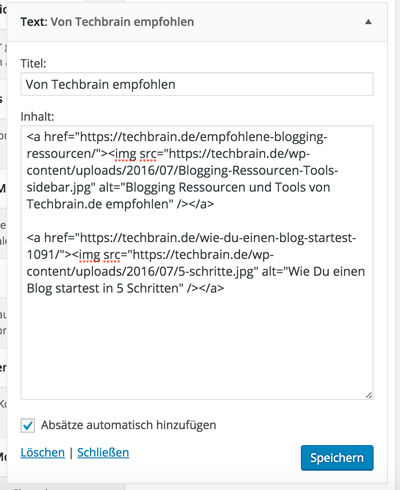
A text widget equipped with two recommended posts.

Please make sure that you don’t support too many posts. It shouldn’t be more than four.

How Good Posts Are Created Over Time

First class posts are not written overnight, and especially not during their first take on writing. The opposite is the case, as they are the result of constant refinement, and also the product of radical elimination of bad articles.

Motivating Closing Remarks

Expert blogs with a lot of visitors are not created as quickly as you’d like to. A lot of time and even more work has to be put into it. New content has to be constantly added, and old content should be refined, extended, or deleted. Blogs are like good wine. They need years to mature. However, that can only happen when you keep going, and put out new content every week while working on your old ones. Two new posts a week have already been proven to be ideal.

My advice to you: keep it rolling, keep putting out new content, and be patient. Get through the very slow beginning, and you’ll be rewarded at one point. Then, the readers will almost come to you automatically, and your content will be appreciated. You can do it!

(dpe)

Categories: Others Tags:

Oculus gets a browser, Facebook bids on virtual reality

October 13th, 2016 No comments

That’s right! The Oculus Rift is getting its very own web browser, currently named “Carmel”. Not much is known about the browser itself, other than that it will run on both the Oculus Rift, and Gear VR.

Yeah, that’s about it. What’s interesting, though, is that Facebook (Oculus’ parent company) is making a massive bid on VR getting popular. They’ve gone so far as to create ReactVR, which is, of course, based on their own React framework. ReactVR is meant to work hand-in-hand with WebVR, which is an API for creating virtual reality experiences that can be accessed immediately from the web.

Basically, if a company wants to give you a virtual-reality-based demo of its products, you won’t have to download an app just to see it. Just slip on your headset and go.

On a strictly personal level, I have trouble seeing this becoming a thing. It’s not because VR isn’t amazing. It’s because good VR headsets are still expensive, not to mention uncomfortable after long periods of use. I mean, the Oculus Rift costs $600 USD, while Samsung Gear is a lot cheaper, there’s still the cost of whatever Samsung phone you put in it. Meanwhile, the HTC Vive costs a whopping $800 USD.

I mean, it’s pretty much the opposite of mobile, which isn’t going anywhere.

I’m a fairly dedicated gamer, and I don’t see how anyone outside of Silicon Valley could ever think those are “affordable” options. Forget about people in other countries, like Mexico, where I am. In other words, if I, a gamer, see little practical use for VR until it gets cheaper, people probably won’t be buying an Oculus Rift to see VR content on the web (much of which will be product demos and advertising, basically).

Now, if Facebook wants to get ready for VR going big, they’re making the right moves. But how long will it be before we see options that really are affordable? Sure, there are some really cheap VR devices coming out of Asia, but we’re going to need to see something better, cheaper, and from more well-known brands before browsing the web on a headset gets big, at least in Western markets.

I mean, it’s pretty much the opposite of mobile, which isn’t going anywhere.

That said, I’m incorrigibly curious, and I want to see where this goes. I could be all wrong about it. It’ll be interesting to see what the web looks like if it goes virtual. It’ll bring a whole new dimension to responsive design, at the least.

LAST DAY: Better Branding Course – only $39!

Source

Categories: Designing, Others Tags:

Change Skin Colour in Photoshop

October 13th, 2016 No comments
dansky_change-skin-colour-adobe-photoshop

In this tutorial, we’re going to learn how to change skin colour in Adobe Photoshop.

Download Adobe Photoshop.

Read More at Change Skin Colour in Photoshop

Categories: Designing, Others Tags:

Declarative Data Fetching with GraphQL

October 13th, 2016 No comments

The following is a guest post by Nilan Marktanner from Graph.cool. I don’t know about y’all but I’ve spent plenty of time in my career dealing with REST API’s. It’s a matter of always trying to figure out what URL to hit, what data to expect back, and how you can control that data. A quick glance at GraphQL makes it seem like it simplifies things both for the creators and consumers of the API. Let’s let Nilan explain.

When it comes to standards for designing the API architecture for web services of all kinds, REST has been the state of the art for many years already. With the widespread popularity of REST, GraphQL’s claim to replace it as the API bridge between front end and back end has received a lot of scepticism. But GraphQL is already very well established, as evidenced by Facebook’s announcement of GraphQL being production ready and GitHub’s reveal of their GitHub GraphQL API.

The Infrastructure Required for GraphQL

Like with REST, several components are needed before we can use a GraphQL API.

  • A GraphQL Client – This allows us to fetch or modify data that is stored in the back end. Plain HTTP requests do a wonderful job if you work on smaller projects, as requests and responses are both encoded in JSON.
  • A GraphQL Back End – We have to expose a GraphQL schema that describes our API as a type system. A type system consists of different methods that are called queries (to fetch data) and mutations (to modify data). Here the real work happens, as we have to implement a mapping between these methods and our data layer. For example, a query allUsers to fetch all users might be mapped to a SQL query like SELECT * FROM USERS.

In this article we will explore a possible GraphQL API for an Instagram clone highlighting some of the benefits that GraphQL brings to the table.

The GraphQL Schema

The endpoints of a REST API are often reminiscent of the actual schema of the database. Endpoints like /users or /posts that enable access to the database tables User and Post are common.

The GraphQL Schema however needs to be built as a type system in a two step process.

Step 1

Object types are composed using primitive types like String and Boolean. In our case, we will build the User and the Post object types described in IDL syntax:

type User {
  id: String!
  name: String
  posts: [Post]
}

type Post {
  id: String!
  imageUrl: String
  description: String
  author: User
}

We have a User object type that consists of the fields name of type String and posts of list type Post (denoted by [Post]) and the Post object type that consists of a imageUrl and a description field of type String and an author field of type User.

Additionally to the fields mentioned above, both object types have the id field which is a required String (denoted by String!).

Step 2

These types are then used to define actual queries, like the allUsers query that can be used to fetch all existing users in the database. You can basically expose whatever you come up with, but most popular are queries to fetch all or one item of a specific type and so called mutations to create, update and delete items of a specific type.

Tooling

The type system encoded in the GraphQL schema paves the way for powerful tools like GraphiQL for example, which is maintained by Facebook. It allows the playful exploration of a GraphQL API.

Features like auto completion (as shown in the gif) and an automatically generated documentation increase developer experience a lot and are usually enough to get started with consuming an GraphQL API. Let’s now take a closer look at some queries and mutations!

GraphQL Queries

Queries in GraphQL are declarative and hierarchical. We’ll see in a moment what this means exactly, but rapidly changing data requirements in front end applications make this one of GraphQL’s biggest selling points.

Query Basics

Let’s assume that we are only interested in the id and name of all our users. Declarative means that we declare precisely what we are interested in:

query {
  allUsers {
    id
    name
  }
}

The query response contains only fields that we just declared:

{
  "data": {
    "allUsers": [
      {
        "id": "some-id",
        "name": "Nilan"
      },
      {
        "id": "another-id",
        "name": "Chris"
      }
    ]
  }
}

We can see that the structure of the query response follows the structure of the query closely. If we want to fetch more data with a query, we just include more fields:

query {
  allUsers {
    id
    name
    posts {
      imageUrl
    }
  }
}

Here we see what hierarchical means. The query follows the relationship hierarchy of our schema and we can select the fields we are interested in for all the posts as well. The response could be:

{
  "data": {
    "allUsers": [
      {
        "id": "some-id",
        "name": "Nilan",
        "posts": [
          {
            "imageUrl": "https://unsplash.it/200/300?image=31"
          },
          {
            "imageUrl": "https://unsplash.it/200/300?image=38"
          }
        ]
      },
      {
        "id": "another-id",
        "name": "Chris",
        "posts": [
          {
            "imageUrl": "https://unsplash.it/200/300?image=99"
          }
        ]
      }
    ]
  }
}

It’s also important to note that we just changed the query without touching our GraphQL backend and it still worked! Once we thought of a solid type system and exposed that in our GraphQL schema, we can change queries on the fly in our frontends and our GraphQL server will give back the correct response just like that. That also means no more hassle with multiple endpoints or API versions as is common in REST.

Combining fields hierarchically like we did also reduces the amount of HTTP requests between the frontend and the backend. Fetching a user and all of its friends typically needs at least two requests with REST, while we only needed one.

Advanced Query Features

GraphQL queries accept query parameters that are usually used to offer advanced features like filtering or pagination. We won’t go into depth here, but let’s see a few quick examples.

Filtering is pretty flexible and powerful. For example we can only show users with the name Chris:

query {
  allUsers(filter: {name: "Chris"}) {
    id
    name
  }
}

Unsurprisingly, the query response only contains one user:

{
  "data": {
    "allUsers": [
      {
        "id": "another-id",
        "name": "Chris"
      }
    ]
  }
}

With pagination we can express how many consecutive data items we are interested in. This is especially useful if we want to build a feed with several pages similar to Google search results.

Let’s only query the first of our users. We can use the first argument to accomplish that.

query {
  allUsers(first: 1) {
    id
    name
  }
}

And as expected we only get back the first user:

{
  "data": {
    "allUsers": [
      {
        "id": "some-id",
        "name": "Nilan"
      }
    ]
  }
}

Now if we want to query the second user, we can skip the first user and fetch only the next user by combining first with skip:

query {
  allUsers(first: 1, skip: 1) {
    id
    name
  }
}

This returns the second user:

{
  "data": {
    "allUsers": [
      {
        "id": "another-id",
        "name": "Chris"
      }
    ]
  }
}

These are only some of the ways we can use query arguments. If we wanted to provide another similar functionality, like sorting the query response by a field, we would have to define a new query argument in the GraphQL schema and implement that feature in the backend accordingly.

Mutations

Mutations are the counterpart to queries. While we can fetch data with queries, mutations allow us to create new data or update or delete existing data items. The respective mutations could be called createPost, updatePost and deletePost.

The values for the fields of the new data item are supplied with query arguments. Mutations require the selection of fields that will be returned as a query response as well. A mutation to create a new post could look like this:

mutation {
  createPost(imageUrl: "https://unsplash.it/200/300?image=27", description: "#random", authorId: "some-id") {
    id
  }
}

The response will contain the newly created id:

{
  "data": {
    "createPost": {
      "id": "some-newly-generated-id"
    }
  }
}

Conclusion

In this article, we got an overview of GraphQL as an alternative to REST.

We saw that GraphQL clients are needed to connect the front end with the backend and how a GraphQL schema for an Instagram clone can look like. We learned how we can use queries and mutations to fetch and modify data and the GraphQL API allows us to select exactly the fields we need in a declarative and hierarchical way. With filtering and pagination, we glanced at two powerful concepts while GraphiQL showed off the fantastic possibilities of tools that rely on the defined type system.

If you want to learn more about GraphQL, you should take a look at learn section of the GraphQL website and Learn GraphQL which are two very accessible resources.

Relay and Apollo Client are two popular GraphQL clients for JavaScript. If you are interested in Relay head over to Learn Relay for an interactive and comprehensive introduction to Relay.

graphql-js and Sangria are two popular libraries to build a GraphQL backend in JavaScript and Scala, respectively.

To get quickly started with GraphQL, you can checkout Graphcool which allows you to graphically define your models and fields to automatically generate a GraphQL backend and provides additional features like an advanced permission system and file management out of the box.


Declarative Data Fetching with GraphQL is a post from CSS-Tricks

Categories: Designing, Others Tags:

How to write clickbait-free headlines

October 13th, 2016 No comments

Content is design, and our content is full of clickbait, these days. Sadly, there are many sites that are still using this technique to draw traffic to their pages. That should bother you.

At the very least least, the recent decision by Facebook to update their algorithm such that it can filter out the sensational content should be a wake-up call. This was not their first backlash at such content. A 2014 update of their algorithm had the same purpose.

What’s the fuss about clickbait, anyway?

There are various concerns aroused by this kind of internet marketing trick. Basically, the reader is looking for value any time they visit a website. Understanding this, major search engines and internet platforms are looking for ways to improve the quality of content they avail to users. This is why they are continuously improving the search algorithms or news feeds to make sure they respond with search results that suit the reader best.

Why doesn’t clickbait meet this criteria?

A clickbait headline is manipulative

By merely reading a title, you cannot decide it is clickbait outright.

This kind of content thrives on manipulating the psychology of the reader. This is by using titles that give readers very little information (if any) about the content of the post just to spark their curiosity.

For instance, a YouTube video title reading: “This blind, autistic boy enters the stage- what happens next shocks everyone.” Of course, everyone wants to empathize with the physically challenged in the society. So, that portion alone plays with the emotions of the reader.

However, the title goes further to suggest, “What happens next shocks everyone.” Many will definitely want to click. It makes you curious to find out what the boy did to shock the audience.

Other examples of clickbait titles include;

  • You Won’t Believe How This Company Changed the Game
  • 7 signs you’re not as ethical as you think
  • 4 signs you are a terrible communicator

By merely reading a title, you cannot decide it is clickbait outright. This is because some catchy titles are actually followed by some meaningful content. This brings us to other factors that point out clickbait from a valuable title.

Clickbait is likely to exaggerate

When you read the title in the example given above, your mind is already expecting something shocking. Unfortunately, not a lot of content lives up to that excitement. Perhaps, for example, what the boy in the example above does isn’t shocking to a person who has lived with an autistic person before.

Basically, most of the clickbait is prone to messages that are misleading. They will cause you to expect something, but the content doesn’t live up to your expectations. You will end up being disappointed.

They are sensational but lack value

It will drive traffic to your website. Unfortunately, your success is likely to be short-lived.

Most clickbait headlines are created to attract attention. The way they are pushed on to the reader is also uncalled for. Ever noticed those links that pop up when browsing some websites almost every minute? You can hardly navigate the pages without being annoyed by them. Unfortunately, the suggested topics are totally unrelated to what you are looking for.

Also, they can be vague, just like, “You Won’t Believe How This Company Changed the Game.” The title doesn’t give you an idea of what information the post contains. In this case, you are pushed to imagine the value you might gain once you click it.

In an internet environment where search engines want to improve the user-experience, such content can be detrimental to your website. Also, people take note of such websites or titles very fast. They are likely to avoid them in future.

They will gain you visitors, but not buyers

In other words, this point is partly agreeing with the presumption that clickbait works. It will drive traffic to your website. Unfortunately, your success is likely to be short-lived. The visitors may not stick long enough for you to turn them into buyers. Why? This is because the content doesn’t match their expectations. Soon they will realize the hype behind your work is empty. Such content makes you appear suspicious or unreliable. Who wants to stick around or buy from such a seller?

Clickbait isn’t good SEO

It is a rule of the thumb that one should use SEO phrases in titles that are descriptive of the content. As mentioned earlier, clickbait lacks the information required to show what the reader expects to get from the content. In this case, you can hardly adhere to SEO rules when focused on clickbait.

How to make better headlines that still grab attention but aren’t clickbait

It tends to focus on getting people to the site, and doesn’t focus at all on what happens next.

The reader of today is thirsty for genuine posts, and headlines. Once they click and read through, they need to have their curiosity satisfied. They need to get what they clicked for.

But, it is vital to get people clicking your titles in the fist place. Otherwise, you won’t have enough traffic to your site. However, that doesn’t mean you concentrate on getting readers’ attention and fail to fulfill their expectations. This is the major problem with clickbait. It tends to focus on getting people to the site, and doesn’t focus at all on what happens next.

So, how can you break the bad habit and still catch their attention with your titles?

Tone the sensationalism down, build your authority

Be professional, be relevant. This is how you quench the curiosity of your readers. Also, work on establishing your voice or authority in the specific field. It builds confidence in the minds of readers, that you can meet their expectation every time they visit your website looking for some information related to what you offer.

Create honest and informative titles

What do your readers expect from your post? Let the title capture that. It is alright to put some energy in your titles. Every good title arouses some level of curiosity. Otherwise, how would they notice it or want to click it?

In this case, you won’t give everything your content contains in the title. That notwithstanding, let it be as clear as possible. Capture the information the readers can expect to find once they click. Then, make sure the content matches that.

Inspire them to learn

Do not write titles that are too obvious. People are attracted to unique rationale, and value propositions, as long as you can back it up. People love to learn tricks, see reasons, find ways, discover facts, and so forth. Tweak the obvious subjects to include such words in your titles.

Include trigger words such as how, when, why and what.

Such words can inspire people to want to discover, and learn. Human beings are curious to learn something new each day. When you structure your titles to suggest that you are offering answers or lessons, they are likely to attract people’s attention.

The key to having loyal readers lies in providing value to your readers in your content. Value supersedes catchy headlines. Make readers feel that your content was worth their while. While you’re at it, remember that not all catchy headlines are clickbait. Use the above tips to create attention-grabbing headlines, without resorting to outdated Internet marketing tricks.

LAST DAY: Better Branding Course – only $39!

Source

Categories: Designing, Others Tags:

Is jQuery Still Relevant?

October 13th, 2016 No comments

It took a minute, but I believe we have arrived at Baby Bear on the jQuery conversation. Some choice quotes from the ensemble cast blog post:

Nathanael Anderson: The biggest negative for jQuery in this day and age is that browsers are a lot more standard in coverage and directly messing with the DOM is slow unless you can do everything at one time; and jQuery was not designed for large change groups.

Todd Motto: Final thing from me: let’s not aim to dissuade jQuery developers from using it – it’s amazing, extremely mature and powerful, and its place in “modern web” has shifted, that’s all. In 5 years we’ll all be doing it wrong again.

TJ VanToll: To me, jQuery remains the gold standard for a library with an elegant API design and comprehensive documentation. Although I may not use it in every app nowadays, I still find it the easiest way to interact with the DOM and add powerful widgets to my apps.

And coincidentally, in Nicholas C. Zakas’s newsletter:

I ran into a former coworker shortly after leaving Yahoo as he was preparing to join a new company as a tech lead. During our conversation, he mentioned that his top priority would be to switch them over to YUI. The company was using jQuery, and he said he really didn’t want to use it. I gently suggested that, perhaps, this wasn’t really a battle he wanted to wage. He could certainly evaluate the overall architecture to see what improvements would be made, but going into a company and trying to get everyone to switch to your favorite library or framework is rarely a formula for success.

When I joined Box, I ran into a similar situation except that people seemed to assume that I would try to eliminate jQuery from the front-end. Time after time I was asked, “are you going to get rid of jQuery?” My response was always the same: “No, jQuery isn’t going anywhere. However, I want to make sure its position in the architecture is well-defined.”

Pledging allegiance to a particular technology or approach is fine so long as you don’t become dogmatic about it.

Direct Link to ArticlePermalink


Is jQuery Still Relevant? is a post from CSS-Tricks

Categories: Designing, Others Tags:

11 Common On-Site SEO Problems [Infographics]

October 13th, 2016 No comments
11 Common On-Site SEO Problems - Infographic

To assure good rankings in search engines, basic knowledge in search engine optimization (SEO) is required. However, many website owners don’t have a lot of know-how when it comes to optimizing websites for search engines. Today, we’ll impart the essential knowledge to you, so your site has the chance to look good in the ranking, and become successful.

SEMrush conducted a study that was meant to collect real data. To do so, anonymous information from about 100,000 websites was collected and evaluated. The results are the eleven most common SEO problems from the technological side, which can have a direct impact on ranking.

Problem 1: Duplicate Content

Der doppelte Content

Google defines duplicate content as follows:

Duplicate content generally refers to substantial blocks of content within or across domains that either completely match other content or are appreciably similar. Mostly, this is not deceptive in origin.

Supposedly, duplicate content was found on at least 50 percent of the examined websites. Google usually assumes that the duplicate content was not created on purpose. Thus, there will be no official sanctions for duplicate content. However, that doesn’t mean that a blind eye is turned here, as websites with duplicate content still rank lower than those without it.

That’s because the search engine often is unable to determine which version of the content is to be included in the index. Search engines were also developed to make the web a better place for the users in which information can be found easily. Thus, only unique content is considered valuable.

Further Information:

Test your website for duplicate content with the Duplicate Content Checker Tool.

Duplicate Content: Definition and Solutions for Duplicate Content

Problem 2: Missing Alt-Tags and Broken Image Links

No Alt-Tags and Missing, Broken Images

Today, images and graphics are an important part of content marketing. But they can also cause a ton of SEO problems. There are still a lot of webmasters that don’t use the important alt-tags for images, and also don’t make sure that the used images can always be displayed. However, both is important for the search engine optimization.

Alt-tags, for example, fulfil two purposes at once. For one, they appear when an image can not be displayed, and they are also necessary for the Google image search. Search engines still are not smart enough to interpret a picture without an alt-tag. Thus, these tags are crucial, as they help Google move the image into specific categories according to their description.

The tag also provides the option to enter your SEO keywords, which will make it even easier for Google to categorize the graphics. By the way, visually impaired people also benefit from an optimal alt-tag, as a good description gives them a good idea of what the image shows.

Images that are not displayed for some reason cause the same problems as broken links. They lead to a dead end. Both reasons may cause the search engine to degrade your website, as it offers a poor user experience.

Problem 3: Title-Tag Problems

title-tag-probleme

Search engines use title tags to determine what the page’s text is about. The titles along with a short description appear in the search results. However, the title was what the user would use to decide if he would visit your website or a different one. That’s why the correct title tag is one of your website’s most important elements. An element that may have a positive influence on the ranking.

The obvious mistakes made with using these tags are the following:

  • Duplicate Title-Tags – Very Common
  • Too Long Title-Tags – Rather Common
  • Missing Title-Tags are a Problem, but That is Not Very Common
  • Too Short Title-Tags – Very Rare

The length of the title tag is critical, as it determines how much of your title will be visible in the search results. The rule of thumb says that Google displays up to about 70 characters. So the title definitely shouldn’t be longer than that.

Some SEO tools, like Yoast SEO for WordPress, help you optimize the title tags.

Problem 4: The Meta Description

Problems With the Missing Meta-Description

In the search results, the meta description is displayed right below the title and is supposed to give the users a good impression of what the article is about. Supposedly, the meta description does not affect the ranking, but I have made the experience that a good description is definitely able to influence the ranking, at least a little.

However, a good meta description also results in a better page CTR, which is of particular importance for webmasters that integrate Google Adsense.

Many websites have duplicate meta descriptions while others don’t use any explicit descriptions. An SEO tool or a plugin for WordPress can help with that.

Further Information:

How to create the right meta description

Meta Description SEO Best Practices

Problem 5: Defective Internal and External Links

Problems With Defectove External and Internal Links

Defective links have the potential to be a huge SEO issue. One or two of them won’t be a problem. But when your website grows, this may lead to significant problems. Of course, the 404 error page could be set up accordingly, but then, the user will see that error page instead of the useful information he was hoping for.

If this happens often, a user will consider the website’s quality to be poor. There is another real problem on top of that. When a lot of broken links are located on your site, you’ll be faced with problems with the bots of the search engines. They always crawl a couple of your pages, and if there are a lot of “broken links,” they might not include these pages in the index anymore. This hurts your website’s authority tremendously.

SEMrush found out that 25 percent of the examined pages contained broken external links.

Thus, use an SEO tool or WordPress plugin to find these “broken links,” and to fix the problem.

Further Information:

5 Steps to Get Your Website Crawled Faster

Problem 6: Poor Text-to-HTML Ratio

A Bad Ratio of Text to HTML Source Code

A well-known SEO problem. A couple of websites have a reduced ratio of text in comparison with HTML code. This means that the respective website gives out proportionally more HTML code than readable text. There are many possible reasons for that, like too short texts, for example, which often don’t contain more than the 300 words asked for by Google.

However, the reason might also be a poorly coded website or a website that was not taken care of well enough. It could contain a lot of unnecessary code, or boast an excessive use of JavaScript, inline styles, or Flash.

Of course, a method popular among spammers where a lot of hidden text is used may also be to blame.

Solving This Problem is Rather Simple:

  • Remove the Unnecessary Code. This Reduces the Page Size and Improves the Speed.
  • Check Your Plugins, if You’re Using WordPress. You Don’t Need to Offer Every Single Toy.
  • Only Let JavaScript Load Where It’s Necessary.
  • Expand Your Texts to a Proper Average Length (At Least 500 Words, the More the Better).

Problem 7: Problems With the

Tag

Problems With the H1 Tag

In practice, this problem occurred to me a lot. Header tags, or headings, are imperative for search engine optimization. For instance, there should only be a single

heading on each of a website’s pages. Although due to HTML5, this dogma doesn’t seem to be as important anymore, the original tags of the headings still provide a useful hierarchy for search engine and user.

There are still a lot of websites created by developers, or themes provided for WordPress which use the header tags incorrectly.

It also seems to be important to know the difference between title tags and header tags. The title tag is what the search engine gets to see, while the header tags are the ones for the visitors. There is only one title tag per page, while header tags may appear more often, as heading 1, heading 2, and so on.

When the valid HTML5 markup is used, the

can be used multiple times on one page, if paragraphs of the same importance have to be labeled.

Further Information:

The Truth About Multiple H1 Tags in the HTML5 Era

Problem 8: Too Low Amount of Words

Problems With a Low Amount of Words Per Article

SEMrush was able to determine a too low amount of words in the articles of 18 percent of tested websites. Google does not give out an official minimum number of words, but it is known that Google wants to see at least 300 words used per article.

Let’s be honest; even 300 words are far too low for an article average. Google is known for ranking content with much more depth a lot better in the search results. On top of that, an article that dives deep into the matter also gets more backlinks. This, in return, also results in a better position in the ranking.

It is rather simple to make articles more extensive if you try to do so. An article with a linked infographic (like this one), can be described in words instead of just the graphic. Your readers will appreciate that.

Problem 9: Placing Too Many Internal Links

Problem, That Too Many Internal Links Were Placed

This problem is a tough one to crack. On the one hand, it is important to links articles with each other to help the search engine optimization. On the other hand, it is easy to integrate far too many page links. In the past, Google provided a guideline on the maximum amount of internal links. However, they have dropped this demand by now.

Today, a good SEO means creating a natural, internal linking of high quality. The links have to be relevant and useful, only then will Google appreciate the value, and give your page the according rank. So make sure that all of your internal links provide added value for the users. Always keep in mind that whatever is best for the users is also optimal for the search engine.

Problem 10: Wrong or Missing Language Declaration

Problem: The Wrong or Missing Declaration of the Language

The audience on the web is global. As most people are not able to read German content, it is important to declare the default language. Language declaration is necessary for many things, for example:

  • It informs the browser about the language of the content, which is important for translations and the correct display of the pages
  • It makes sure that the content appears in the correct language for screen readers and text-to-speech converters
  • It helps with the GEO localization and the international SEO
  • It helps to improve the important relevance score.

Use this list of language codes, to be able to give out the correct language declaration.

Further Information:

Problem 11: Temporary Redirects

Wrong Redirects - 302- Instead of 301-Redirects

Redirects are an excellent way to let the search engines know that a page has “moved” and is no longer available under the old URL. These redirects can either be permanent, in which case the status code 301 should be given out, or temporary, where code 302 is used. A permanent redirect with the status code 301 will not result in a loss of authority.

Things are looking different when it comes to a temporary redirect; among other things, it might cause an outdated page to be included in the index. The new page might get ignored by Google. This can cause real problems. Thus, if the change is permanent, you should always give out a 301 redirect. This is also the best approach according to Moz.

Otherwise, Google might assume that a 302 redirect was supposed to be a permanent redirect and then interpret it as a 301. This can cause a loss of traffic, so you should really take control over which redirect is given out where.

The Complete Infographic

Source and Infographic
Categories: Others Tags:

Affinity Designer 1.5 released

October 12th, 2016 No comments

The powerful and award-winning graphic-designer app Affinity Designer has just received a big update. This alternative to Adobe just released version 1.5, which is now available in the Mac App Store. According to a press release from Affinity, the new version is completely optimized for use with the newly released MacOS Sierra, which should provide designers with a seamless user experience in this Mac-only app.

Here’s a complete rundown of the major components of this big update:

  • Symbols
  • Constraints
  • Asset management
  • Text styles
  • Massive export improvements
  • New color picker tool
  • Style improvements

Here’s additional context on some of these new features.

Symbols empower designers to have multiple instances of the exact same object. It works like this: If they edit just one object, they’ll be able to edit all of the objects at the same time.

Designers can now use constraints to precisely control either the size or position of an object relative to its container. This makes it entirely possible to produce reusable elements that function in a pseudo-responsive fashion.

One of the more popular features of Affinity Designer is snapping power, which users regularly rave about. Thanks to features like snap-to-pixel and customizable grids, alignment is a cinch. At the same time, instant live feedback makes it a breeze for designers to keep close track of their design’s precision.

Now let’s switch gears to the asset management panel. This is another vital element of a much smoother and efficient workflow. It enables designers to simply drag and drop items either into or out of the panel. This makes for hassle-free access when it’s necessary.

Here’s a helpful and brief explainer video on all of the big, new features that version 1.5 has in store for designers.

Besides these big changes, Affinity is celebrating the release of version 1.5 by rewarding Affinity Designer owners with a free Grade UI web-design kit, which is worth $58.

Russian designer Sergey Azovskly, the kit’s creator, asserts that the kit is both useful and versatile for designers and developers. His objective was to provide designers with the chance to choose from a wide variety of options for the same component. Since creating a design from scratch takes a lot of time, the availability of a lot of universal components simply means that designers have the power to build a whole site design in only a few minutes, now.

Interested designers have to follow the in-app prompts in order to download the UI kit. The Windows version, which is currently in beta but whose official release is imminent at the time of this writing, will also get this free kit.

If you’re already an existing owner of Affinity Designer, then you’re not going to have to pay anything to get version 1.5. Serif, however, is also offering any new customers a 20% discount that’s only going to be around for a limited time on the standard Affinity Designer price.

Users can get Affinity Designer here from the Mac App Store.

Bundle of 1300+ Amazingly Versatile Photoshop Brushes – only $19!

Source

Categories: Designing, Others Tags:

Yarn

October 12th, 2016 No comments

From the didn’t see that coming news desk:

We’re pleased to announce the open source release of Yarn, a collaboration with Exponent, Google, and Tilde. With Yarn, engineers still have access to the npm registry, but can install packages more quickly and manage dependencies consistently across machines or in secure offline environments.

Yarn is a new package manager that replaces some of what npm does… that you can install with npm.

So, it’s faster. Dion Almaer:

Thanks to features such as its caching and parallelism approach you will be happy to see the dramatic speed up.

Yehuda Katz is a contributor, who says the open source setup of the project is one of its biggest assets:

… the Yarn project is set up as a community project, using a standard open source license, in its own GitHub organization, and set up to use the governance model that has worked effectively for Ember and Rust.

… I consider the technical details to be secondary to the way in which the project is set up to evolve.

Because of the clear benefits, neat features, and compatibility with the ubiquitous npm, I imagine usage of this will sweep the earth in short order.

What Yarn isn’t is a total replacement of npm. It looks like npm is still the directory, storage, and where you publish and maintain packages.

Direct Link to ArticlePermalink


Yarn is a post from CSS-Tricks

Categories: Designing, Others Tags:

Building “Topple Trump”, An Interactive Web-Based Quiz Game (Case Study)

October 12th, 2016 No comments

Editor’s Note: When it comes to elections, we are each given a choice in how to express our opinions and beliefs. Some designers and developers use their skills to further articulate their choice in one person. Here’s a glimpse into how Topple Trump!, an interactive responsive quiz game, was designed and built — combined with some valuable lessons learned along the way. This article is about techniques and strategies, so please avoid political flame in the comments.

Creating an online quiz that is simple to use, looks great and is really fun to play is one thing. Basing it on Donald Trump’s polarizing presidential campaign is another.

The brainchild of Parallax director and developer Andy Fitch, Topple Trump! has gone on to win numerous awards. But it was a real team effort that brought the game to life. Here’s a glimpse into precisely how that happened, touching on the development process, design considerations and some valuable lessons learned along the way.

The post Building “Topple Trump”, An Interactive Web-Based Quiz Game (Case Study) appeared first on Smashing Magazine.

Categories: Others Tags: