Archive

Archive for November, 2016

Experimenting with Color Fonts

November 29th, 2016 No comments

Over the past couple of weeks there’s been a lot of excitement over color fonts. Adobe describes the technology like this:

OpenType-SVG is a font format in which an OpenType font has all or just some of its glyphs represented as SVG (scalable vector graphics) artwork. This allows the display of multiple colors and gradients in a single glyph. Because of these features, we also refer to OpenType-SVG fonts as “color fonts”.

Back in March, Roel Nieskens wrote about his experience building a color font and described the problem that they intend to solve:

Typography on the web is in single color: characters are either black or red, never black and red.

So, with a color font, type designers can now embed multiple colors within the glyphs themselves. Then, a web designer can pick one of the options available with the font-variation-settings property in CSS. Below, I’ve made a demo that shows how this works with Trajan Color, a new font made by Adobe and now available with Typekit:

See how different parts of those glyphs, ABC, have different hints of color inside?

What this means is that when it comes to emoji and display type, designers will soon have more interesting choices at hand. For now, browser support isn’t that great but Adobe has provided everyone with a heads up over on the Typekit page designed by Nick Sherman:

Browser support for color fonts is still evolving, but exists in Firefox and Microsoft Edge (IE), and we expect more browser manufacturers will adopt the format before long. In browsers that lack color font support, they will fall back to regular monochrome glyphs.

I think that final point, about how color fonts fallback, was best illustrated by Roel Nieskens, which ought to be the perfect, progressively-enhanced thing that could happen in this situation:

Here are some examples of color fonts that you can experiment with today:

But beware! There are a few problems with this approach. The most troublesome being the size of the font file in my demo above: it’s 593 KB in all. Although, to be honest, in most projects we probably won’t need to load every variation of the color font which will greatly reduce the size of the font file we serve.

Secondly, it doesn’t appear that in CSS it’s possible to change the various colors inside a color font. So for a while, we’re stuck with whatever styles type designers provide for us in the font files themselves.

Regardless of those two pain points, though, I’m still very much excited by the emergence of color fonts and what that could mean for typography on the web. I can see old woodtype styles in particular coming back thanks in part to this new font format.

Make sure to check out the demo below (with Firefox or Edge) to see the color font effect:

See the Pen Color fonts demo by Robin Rendle (@robinrendle) on CodePen.


Experimenting with Color Fonts is a post from CSS-Tricks

Categories: Designing, Others Tags:

The ultimate guide to CMS, part 1

November 29th, 2016 No comments

Gather ’round friends, and I’ll tell you a story that is pure fabrication on my part, and also probably how it happened: Once upon a time, around 1995 (as far as I can figure out from searching around the web), some poor guy who worked as the “webmaster” for some large company was putting nearly every written piece of marketing content they had online. He was doing this because someone in management figured it couldn’t hurt, and he didn’t have that much else to do.

As he wrote endless lines of HTML code by hand, he thought, “There has got to be an easier way to do this.”

He began to imagine a system that could, perhaps, manage content more efficiently, and take some of the pain out of his job. Since he knew some basic scripting, he started to lay the groundwork for what would become the first Content Management System.

That’s how a lot of humanity’s problems get solved: people get bored, and sick of their work. In response to this stimulus, or lack thereof, we now have more CMSs than I personally care to count. They’re everywhere, and they can do just about anything. Now, the problem with this kind of endless choice is that, well, people don’t know where to start. How do you pick a CMS anyway?

That’s what this article is about. I’ve tried to make it as easy as possible to understand what a CMS does, and what kind of CMS you’ll need for different kinds of websites.

What is a CMS, exactly?

Think about a website. Any website. What’s on it? Stuff like words, pictures, videos, maps, contact forms, quizzes, polls, and more. All of that stuff (which we call “content”) needs to be organized.

It needs to be made available, and easy-to-find for the people who actually run the website, and for the users who browse it. It also needs to be easy to add more content, delete the stuff you don’t want anymore, move it around, or rename it.

Most CMSs allow only a select few to manage content. Community CMS like forums and social media sites allow every user to manage their own content, and then make that content available to everyone else.

Yes, you could do all of this manually. For many smaller websites, this is exactly what people do: they mess about with files and folders, and edit their pages in a plain text editor (like Notepad, but they usually use something more complex). If you only have, say, five pages, and you know what you’re doing—or can pay someone who does—then you’re set.

You probably don’t need a CMS.

But if you can’t afford to hire a professional, don’t have the time to do it yourself, and/or need a site that is larger and more complex, a CMS is worth it. It simply isn’t practical to build a website that big without something to automate at least a part of the process.

If you need to have more than one person contributing to a website, you absolutely need a CMS. Giving people access to the raw files would be a recipe for catastrophic user errors. Better to give them a system that allows them to add content without accidentally destroying anything important.

Who is this for?

This article is for web design clients, business owners, and other people whose eyes glaze over when you start throwing acronyms around. Designers and developers can look these things up for themselves, and will usually know what the buzzwords mean.

But if you’ve ever gone CMS shopping and thought, “Well that all would sound very nice if I knew what the heck they were talking about…”, then this article is for you.

I suggest having a read, narrowing down your list of options, and bringing it to your designer and/or developer to figure out which is the best option for you. If you’re in a large enough company that you have a whole design and development team, you should probably let them narrow down your list of options.

Types of content management systems

Now, the thing about building websites is that nearly everybody has different needs. Sure, you could try to build a CMS that can meet every single one of these needs. Plenty of people have tried.

…choose a CMS that meets your specific needs as closely as possible

These platforms tend to be massive, slow, riddled with security issues, complex to use from both the front and back ends, and a general pain in the rear. Also weirdly popular. And actually, no, I’m not talking about WordPress.

So the generally smarter solution is to choose a CMS that meets your specific needs as closely as possible. We’ll be talking about that more, later. First, we should talk about the kinds of content management systems that you’ll find out there.

I’ve come up with a list of the most common categories of CMS. Not only are there more CMS than I can actually list, there are more kinds than I can list. This is because there are custom CMSs out there made for every conceivable need that someone might have.

For the sake of your time, and mine, I’ve stuck with the most common categories.

Managed vs Hosted

Before we move on to categories like “blogging software”, or “e-commerce”, you need to choose where you want your CMS to be hosted. Some CMSs are provided as a service, and everything technical is handled by a third-party company.

These are called “managed CMSs”, or “managed platforms”, and often “SAAS platforms” (software as a service). Examples include Shopify, wordpress.com, and site-builders like Squarespace.

They have several advantages, including active support, constant development, and you never have to worry about updating the software yourself. Security is handled for you, too. There’s a lot to like.

Their disadvantages include a lack of control over certain things. You may not be able to make your site look or work exactly how you want it to. You don’t necessarily own your own data. If the company developing the platform decides to ditch a feature you like, you’re on your own. If they have to shut down operations for any reason, you’re on your own.

That said, many of these services have thousands, sometimes millions of happy customers. You could be one of them.

On the other side of the coin, we have “hosted platforms”. This kind of software can go on your own server, or a third-party server that you rent from someone else. Examples include the hosted version of WordPress, Magento, and Concrete5.

The primary advantage of these options is control. You can make everything work exactly how you want. You can often even extend the functionality yourself by building your own themes and plugins. If it’s an open source CMS, or you’ve bought the right kind of commercial license, you can even alter the basic functionality of the software itself, though this is usually inadvisable.

Updates can tend to undo all of your hard work.

The other advantage is the price. Managed platforms usually cost a monthly fee. Hosted platforms usually have a one-time cost, or no cost at all.

The disadvantage is that you’re on your own right from the start. You, or someone who works for you, have to install the software, keep it updated, and look after every technical detail, including security. You may find yourself paying for some sort of commercial support in any case.

However, for those people and organizations that want to retain full control over their experience with the software, their site’s functionality and aesthetics, their data, and the underlying technology, there’s nothing better than a hosted CMS.

Databases vs flat files

It’s worth noting that hosted CMSs also get divided into two types. In this case, they’re divided by the way they store the site’s settings, content and other information. This section is going to get more technical than business-oriented, but understanding this information will help you to make more informed decisions about the CMS you choose.

The most commonly-used CMSs, for the moment, all run on databases, which are managed by database servers. In this context, the database server is just a separate program that is designed to efficiently organize information, not necessarily a separate computer. Though… it can be on a separate computer, because, you know, nothing’s ever simple.

Basically, database servers are made to organize a bunch of information inside of a single file, and retrieve specifically requested information at a moment’s notice. They’re fast, efficient, and logical.

Once upon a time, this was the preferred method of organizing all information on a site because it’s a bit easier on the actual hardware. However, with advancements like caching and content delivery networks (CDN), this is no longer the case.

The alternative to using a database is to keep all of your information in “flat files”. The difference here is that all of the site’s content—pages, blog posts, etc.—is kept in a hierarchically organized set of text files. The content is stored and retrieved directly by the CMS, without an intervening database server.

Grav is one of the more popular new flat-file CMSs.

This approach is becoming more and more popular with content management systems for small-to-medium-sized sites, and static site generators (more on those later). These systems are sometimes easier to install, but the main advantage is that they can be used on more types of servers and web hosts.

Also, using flat files instead of a database server can sometimes reduce the cost of hosting. This is especially true if you’re using platform-as-a-service (PLAAS) hosting like Amazon Web Services, Microsoft Azure, or Heroku.

Framework CMS

A framework CMS is designed to handle just about any task you care to throw at it, so long as you have some programming skills, or a developer on the team. What it does is provide a basic, well… framework… for you to build your own CMS, usually with the help of modules or plugins made by the developers and the community.

The most well-known example is Drupal.

This is the kind of CMS you choose if you have specific, custom needs, but don’t want to build everything (especially the admin UI) from scratch. It is not the kind of CMS you pick if you want to get up and running fast. Framework CMS are often chosen by large organizations that need as much flexibility as they can get, and that have big budgets, or in-house design and development teams.

Blogging CMS

One of the more popular kinds of CMS, blogging systems are everywhere. Nearly every developer who wants to try their hand at building a CMS builds a blog engine at some point. Most of these don’t take off, but once in a while, you get a big hit.

There are blog engines for every programming language and hosting platform. There are blog engines designed for every possible form of blogging you could imagine. There are quite possibly thousands of hosted blog engines, and easily hundreds of managed blog platforms.

Some blog CMS, like the aforementioned WordPress and the newer Ghost, have both hosted and managed versions.

The big three kinds of blogs are text-based blogs, photo blogs, and video blogs. I won’t go into too much detail on this as the names are fairly self-explanatory. Most blogs are text-based, which can obviously have embedded images and video as well. The difference is mostly about the focus of the blog. In other words, if photos are the majority of your content and the primary attraction for your users, it’s a photo blog.

An example of a Ghost blog.

Community CMS

Some CMSs aren’t just about publishing your own content for your audience to see. There are many that are designed to encourage more user interaction, with a strong focus on building a community of regulars. These come in three main varieties:

Forums

If you spent any time just browsing the Internet in the pre-Facebook era, chances are that you’ve run into one of these. For everyone who was doing real-life stuff at the time, or is just very young, forums came before Facebook pages, and are infinitely better, if you can get people to stick around.

Basically, it’s a CMS that allows any member to start a discussion with other people. These discussions are usually sorted by topic or categories set up by the site’s administrator and/or moderators. It’s slower than a Slack channel, but the entire conversation is there for everyone to see, and it gives people more time to formulate replies.

Due to their past popularity, there are many, many software options for people who want a forum (heck, there are forum plugins for WordPress), but only a few big ones. Invision Power Board has been the leading commercial solution for years, and phpBB is the biggest open source alternative.

News boards

These are a bit like forums, only instead of people starting discussions with their own words, they submit news stories. Users can then leave comments on the news board itself.

Once upon a time, Digg was the big news board in town, especially for the tech crowd. In time, that mantle passed on to Reddit. If you’ve never been to a news board, you should check out Reddit to see how it works. Or if you want something more design-focused, check out our very own Web Designer News.

Most of these sites seem to have custom CMS. The most well-known consumer option is Telescope, which is free and open source.

Social networks

That’s right, you can make your very own Facebook clone with any one of a variety of managed services or hosted CMS. Or, you could build a dating site like OkCupid. Mind you, managing a social network of any kind is hard work, and you’ll likely never get as big as the big names.

Most people who build their own social networks these days have a very specific theme or central cause in mind, much like those who build their own forums and news boards. So, all of these are great options if you have a niche. Or, you know, just start with a Facebook page.

Like news boards, most social networks are custom-built. The best free/open source option I’ve found so far is Dolphin Pro. If you don’t mind paying someone to take care of the technical stuff, you can build a social network on the Ning’s managed platform.

E-commerce CMS

E-commerce systems are usually massive and complex by design. I mean, sure, the idea is simple: they let you sell things online. The reality is naturally a lot more complicated, as you might expect when running a business.

The big-name e-commerce CMSs don’t just show your products on the front end of a site, and put a “buy” button on the screen. They help you handle inventory, shipping, currency conversion, payment processing, taxes, customer service, and anything else you can imagine. They’re built to handle business, which can easily be as complicated online as it can be in person.

The three big names in e-commerce systems are Magento (Community Edition is free), ZenCart (fully open-source), and Shopify (a paid, managed platform).

This Magento demo is courtesy of IDW.

General CMS

General CMSs have a little bit in common with bare-bones CMS in that they’re made to handle a variety of needs (usually business needs), and are quite customizable. They are also usually extended or altered with plugins and modules.

The difference is in the user-friendliness. General CMS are made to be handled by non-programmers. Sure, coding expertise is helpful, but even a basic knowledge of HTML and CSS will take you a long way. Even that’s not entirely necessary though, as they’re usually designed to be fairly newbie-friendly.

Plugins often include simple things like basic blog modules, image galleries, add-on commenting systems, and that sort of thing.

There aren’t many big names in this category, because these CMS are, in a way, the spiritual children of the old, massive Portal CMS (see below). This category began as a sort of movement to make content management simpler.

Initially, things got very simple, as in the case of Wolf CMS (Yeah, it’s still around, and semi-active!) Nowadays, Pagekit (free and open source) looks like the epitome of a general CMS.

Portal CMS

Portal CMS hail from a time when every website wanted to be the next Yahoo(!), or AOL. This was back in the day when, rather than trying to get everyone signed up to the newsletter, every webmaster with ambition wanted their site to be your home page.

These sites were usually designed to show loads of information at once, anything you might possibly want from around the web. Thus, they were called “portals”. Most were custom-built, but of course people wanted ways to build their own.

One of the early options for this was Mambo, an open source CMS that died off a few years back. Now, many businesses swear by its successor, a fork of Mambo named Joomla.

Nowadays, portal CMS have been pared down a bit, as have most websites in general. They’re used to power websites for large companies who need their CMS to do literally everything. Joomla, for example, has modules for just about everything you can think of.

Naturally, this results in incredible complexity, and portal CMS often have quite the learning curve for administrators, designers, and developers alike. I personally have an aversion to that sort of complexity, but there are cases where it is necessary, and even invaluable.

If you are going to use a portal CMS, a developer is not absolutely required, but you should hire one anyway. Better yet, get one that specializes in the CMS you’ve chosen.

Site builders

Site builders have a lot in common with general CMS, in that they are designed to simplify the whole process of dealing with content for the site’s administrator more than anyone else. The difference is that they are also designed to make designing your own websites easy for anyone.

Think of these as more modern, and usually much less frustrating, versions of Dreamweaver and Frontpage. If that sent a shiver down your spine, don’t worry. Site builders have gotten a lot better.

They largely adhere to best practices and web standards. Even if they’re usually not as customizable as a site built from scratch, they usually offer more than enough options for the average website owner.

Of course, that depends on the site builder. They range from the dead-simple, template-dependent Wix, to the far more complex and customizable SquareSpace, to tools like WebFlow, which are all about designing your site from scratch, albeit with point-and-click tools.

Static site generators

Static site generators are not for the faint of heart, and almost always require some form of programming knowledge to implement. They usually don’t come with a user-friendly admin interface. Typically, content is created and stored in text files, often formatted in Markdown, and compiled into a static site for the server.

The upside to this is that static sites can be hosted on just about any kind of server. You don’t need server-side technologies like PHP, Ruby, or NodeJS to run them. They put less strain on the server itself, and often load quicker.

On the admin side, you get a lot of the data management features of a regular CMS. The data you store can be called up and displayed in a variety of ways, you can use templates, and so on. This allows you to manage blogs, or large and complex sites with a minimum of hassle, compared to hand-coding everything yourself.

The obvious downside is that whoever manages the content and updates the site will need to be comfortable putting all the content together in text files. They may also need programming knowledge.

There are dozens of semi-popular static site generators out there right now. The most well-known, at the moment, is the Ruby-based Jeklyll.

Wiki

That’s right, you can get your very own wikis up and running, and for free. Most of the best wiki software is available under one open-source license or another, including Mediawiki, the software that runs Wikipedia.

Naturally, these are large, often very complex CMS, with advanced systems for determining who is allowed to edit and change what. Their use case is rather limited by definition: a wiki is a massive, encyclopedia-style collection of information, usually used for reference.

That said, you can make a wiki on any subject, and large organizations often use them to display support-related information for their products.

Enterprise CMS

These are designed, well, for enterprises. They’re huge, they’re complex, they’re meant to handle massive amounts of information. I’ll be honest, having never worked in an enterprise-level company, I’m not entirely sure how they all work.

The general idea, as I understand it, is that they rarely have much to do with customer-facing websites. Enterprise Content Management (or ECM) handles all of the documents relating to the processes that a company uses to get things done. They serve primarily as a resource and reference point for employees.

They are also being used to store documents, both those regarding the company, and the customers. For example, if you handle a lot of contracts, you might store digital copies of them in an ECM, sorted by customer, for easy access. ECM, then, acts a lot like a digital file room.

Those times when they are used for customer-facing sites, those sites tend to be massive, as enterprise CMSs are designed for handling that amount of information. Think of University sites, government portals, and other sites like them.

Custom CMS

Last, though certainly not least, we have the custom-built CMS. These come in every shape and size, and are designed for every conceivable purpose.

The pros are fairly obvious. You get exactly what you want, and only that. This usually results in a smaller, faster CMS that just does what you need it to. However, if you have the need, and the budget, you can always have your favorite developer build more functionality on top.

The downside is that your support options will be severely limited. If the original developer is no longer available, a new developer might have trouble making sense of the old code.

Also, when server technologies get updated, a custom CMS will sometimes need to be adapted to them. CMS developed by a dedicated third-party will be updated automatically. If you have a custom CMS, you’ll need to hire a developer to do it.

Custom CMSs are often best suited to companies that have their own in-house development team to work on updates, upgrades, and security fixes.

How to Choose a Typeface Poster – only $15!

Source

Categories: Designing, Others Tags:

Start Here: 6 Large Collections for Founders, Designers, Marketers, and Other Web Workers

November 29th, 2016 No comments
startupcollections

Google is not always the best tool when looking for specific information. If you just went freelance, there’s a whole stack of collections that accumulate a lot of the things you need in one place. You’ll be set with three or four of these collections. Today, I’ll show you a few more.

Startup Collections

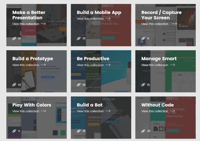
Startup Collections is a website that curates tools, and other resources, for founders, designers, developers, and marketers. Differentiating about this service is the task-orientated approach. The categories are not called “photos,” “videos,” and so on, but rather “Create a Prototype,” “Smart Management,” or “Be Productive,” for example. The presented services are not necessarily available for free.

The operator focuses a lot on completeness, but of course, he was not able to achieve that yet. Well, to be fair, the service is very young.

Marketing Stack

marketingstack

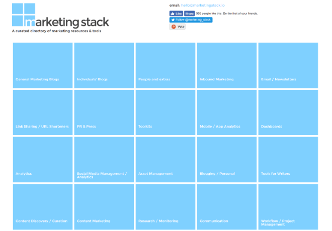
Marketing Stack is a curated index that fully focuses on marketing. Here, you’ll find everything that has the slightest ability to push your business or brand forward. You have to think broadly here. For instance, you’ll find tons of content such as eBooks, and other publications, but also writing tools (think about content marketing), and more. Digging through the Marketing Stack is a feature-length event, but only if you don’t click anything. If you do, it’ll take a lot longer.

Startup Stash

startupstash

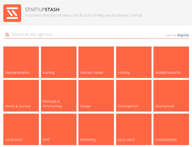
As to be expected due to the name, Startup Stash aims at founders that could use some help in all aspects of their startup business. Hundreds of products from 40 categories are waiting to be found by those in need ;-). Once again, you won’t find free services only, but also solid commercial offers, like consulting and hosting businesses.

According to the operator, Startup Stash has already supported more than 400,000 founders on their way. Like all the collections in this article, Startup Stash itself is free to use.

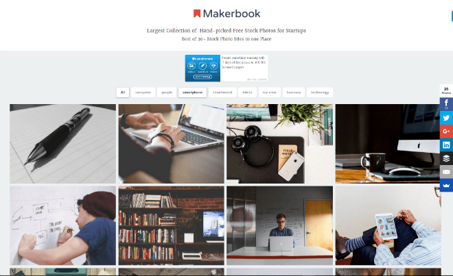
Makerbook

makerbook

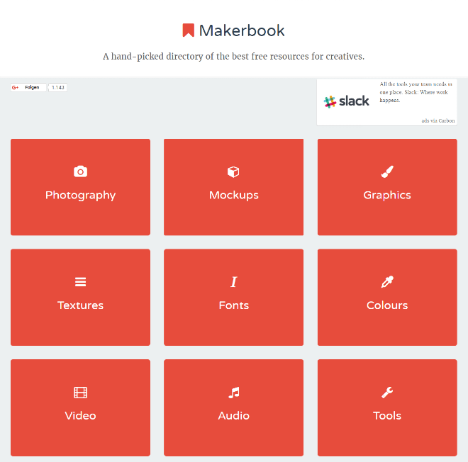
Makerbook by Craig Barber is all about the creative branch, hence the name. Craig tries to accumulate all services that offer tools and resources for creative workers on Makerbook. He only includes providers that offer their services entirely for free.

makerstock

On Makerbook, he also runs an additional curated photo collection with free, and completely free to use images, that are especially helpful for founders, called Makerstock. The photos are handpicked, and, according to Craig, taken from over thirty different photo providers.

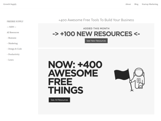
Freebie Supply

freebiesupply

Freebie Supply by Ali Mese from Singapore became one of these overnight successes. Originally, he simply put his favorite tools and resources into a default Squarespace template and made it available as a website. The extensive curation quickly spread among the web. The success surprised the maker.

Freebie Supply focuses on completely free offers as well, and, by now, it contains over 400 according links. Freebie Supply is not limited to elements for creative workers but also provides links on business topics or productivity. Of course, you’ll also find design resources.

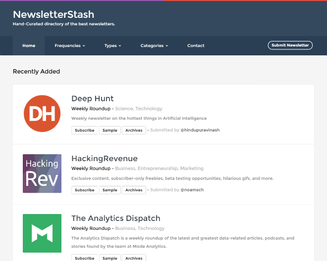
Newsletter Stash

newsletterstash

The “stash concept” attracts increasing attention. Newsletter Stash is a service that collects the best newsletters on different topics, like design, management, and so forth, while also providing the respective subscribe-buttons. You also get to view an example for each listed newsletter, as well as access to the respective entire archive.

Categories: Others Tags:

Creating a Cache-aware HTTP/2 Server Push Mechanism

November 28th, 2016 No comments
Cover of Web Performance in Action

If you’ve been reading at all about HTTP/2, then you’ve likely heard about server push. If not, here’s the gist of it: Server push lets you preemptively send an asset when the client requests another. To use it, you need an HTTP/2-capable web server, and then you just set a Link header for the asset you want to push like so:

Link: </css/styles.css>; rel=preload

If this rule is set as a response header for an HTML resource, say index.html, the server will not only transmit index.html, but also styles.css in reply. This eliminates the return trip latency from the server, meaning that the document can render faster. At least in this scenario when CSS is pushed. You can push whatever your little heart desires.

One issue with server push that some developers have speculated over is that it may not be cache-aware in all situations, depending on any number of factors. Read more…

Categories: Designing, Others Tags:

I totally forgot about print style sheets

November 28th, 2016 No comments

Manuel Matuzovic rediscovers @media print {} styles.

The first thing he shows in this article is a tweet by Aaron Gustafson in which Indiegogo’s website is pretty jacked up for print. It basically looks like a site in which none of the CSS loads at all, which is probably because they wrap all their styles in @media screen {}, or use . That’s fine if you intend to take a “start from scratch” approach to print styles. I generally prefer just not scoping screen styles and using a couple of print-scoped overrides (a “blacklist” instead of a “whitelist”).

Manuel pointed out that you can use Chrome DevTools to emulate print media, which is pretty dang useful! Here’s a quick video of that:


That screenshot of Indiegogo’s site also goes to show how inline SVG (or any images, I suppose) can get a little crazy if you don’t include any sizing information in the HTML. That prompted this tip:

good plan:

you can easily override with CSS and it prevents… (see image)https://t.co/TcgKHL0R60

— Chris Coyier (@chriscoyier) November 17, 2016

Even if CSS does load and size those SVG’s correctly, it might be helpful to have them sized approximately correct to begin with, to avoid what Sara Soueidan has dubbed ‘Flash of Unstyled SVG’.

Remember that attributes like width and height are extremely easy to override in CSS. Setting them at all in CSS will override them. They aren’t like inline styles.

Manuel’s article is loaded with 12 other hot tips on things to include in a print stylesheet that you might not think of: preventing orphans, forcing colors to print correctly, displaying otherwise-hidden content, providing alternate content for things that won’t print correctly, etc. Couple of other tips here.

Direct Link to ArticlePermalink


I totally forgot about print style sheets is a post from CSS-Tricks

Categories: Designing, Others Tags:

Essential design trends, December 2016

November 28th, 2016 No comments

Do you ever find yourself noticing that a certain design element just keeps popping up? Even those tiny details that look somewhat insignificant can be indicators of design trends. That is particularly true with the elements in this month’s roundup.

Each of these trends—white edges framing a web design, cinemagraphs and tiny loading animations—are seemingly simple details that enhance the visual experience for users.

Here’s what’s trending in design this month:

1) White edges

More web designs are using white edges or framing around the perimeter of the design in the web browser. It’s a new twist on an old idea when more websites were built to certain sizes and framing was used for odd browser widths.

It’s something that faded as more designers opted for responsive, full-width designs.

The new twist with framing is interesting and is a nice way to create a canvas for the design. Most of the sites using this trend include a white—common, but not mandatory—edge around the design. It’s a few pixels wide and is commonly placed around three or four sides of the design. (Some are opting to leave the frame off the bottom of the design to encourage scrolling.)

The nice thing about the white edge is that the design is clean with white lines that can help bring focus to strong color choices, draw the eye from the edge of the screen to other light elements (such as text boxes or calls to action) and edging can help create a background canvas for parallax scrolling or other animated effects.

Camden Town Brewery does this exceptionally well. The white framing fills in between elements of the design to create depth and focus for the user. White separation sets apart each new content section on the screen and contributes to overall organization of the design. (Plus, white accents really bring out the strong red and black color palette to keep the combination from feeling too overwhelming.)

2) Cinemagraphs

Cinemagraphs are photos with an element of motion in them. It can be anything from a photo of a person that blinks their eyes to the subtle cloud movement in the sky where nothing else moves. While the most common uses of the design trend still seem to be in advertisements and social media, web designers are beginning to incorporate this “live photo” technique as well.

It works because users are intrigued by movement. It’s effective for many of the same reasons video is a good option to grab a user’s attention. Movement and action is engaging. It’s interesting. It feels real.

When it comes to working with cinemagraphs, the bonus is that you can create a design with motion but without some of the high production that comes with a video project.

The trick to making cinemagraphs work is to root the motion in reality. Even if the scene is more imagined, such as Monochrome Paris, the laws of physics should apply to movement on the screen. Water should flow downstream, for example, gravity should be a force in how movement occurs.

The motion also needs to be simple and subtle. Too much movement, and a video might be a better option. What draws users into a cinemagraph is that element of surprise. What looks like a still photo in a hero image actually has something happening in it. That little divot will help draw people in, keep them engaged with the design longer and hopefully result in a website conversion.

3) Tiny Loading Animations

Load times are a big deal. But you can’t always account for the speed of the network a user is on; that’s where tiny loading animations can become a big deal.

What’s different about the tiny loading animation trend is that it’s a sometimes you see it, sometimes you don’t design element. Either way the design team has taken special care to ensure that every user comes to the website with a positive experience.

These tiny animations are identifiable by the fact that they aren’t really a part of the user experience that counts toward the overall website goal. They are a simple, small element that catches your attention for a quick second while the primary site design is served up.

The cool thing about the trend is that these tiny loading animations really are tiny, from the size of the visual itself to the action on the screen, there’s not a lot to see, but what is there is absolutely delightful.

Here are three great examples:

  1. Hannah Purmort’s loading animation is a single moving stroke in the opposite color combination of the main screen. The stroke is carried through the design in the scroll effect as well.
  2. Susa Ventures features a small icon with a tiny load bar. This one grabs your attention because the tiny gorilla is visually interesting and makes you curious about the website’s content.
  3. FPG uses a sketch that appears to be drawn on the screen as the rest of the homepage loads. The only cue that it’s actually a loading animation is that the rest of the screen is much more elaborate once loaded with running video and even more sketches. The effect is seamless and is over almost before the user realizes that it has started.

Conclusion

Details are at the heart of every good design. It’s important to remember that designing (and accounting for) things that not every user will notice is important. That’s how each of these trends connect—through small design elements that aren’t an obvious part of the overall aesthetic.

Those tiny elements might be the thing that really sets your website apart for a user. It might be the element of delight that brings someone back to your design. Details can be the differentiator between success and failure.

What trends are you loving (or hating) right now? I’d love to see some of the websites that you are fascinated with. Drop me a link on Twitter; I’d love to hear from you.

Art Text App for Mac Turns Text into a Masterpiece – only $19!

Source

Categories: Designing, Others Tags:

5 Things You Need to Know About WeTransfer’s Redesign

November 28th, 2016 No comments
wetransfer redesign

The filesharing company WeTransfer has pulled out probably the best redesign we’ve seen this year.
To be completely honest, I’m a bit buyest when I say that, because WeTransfer is a product that amazes me through its simplicity.

WeTransfer is the kind of product that embraced simplicity at its core and built the whole user experience with the KISS rule in mind. (Keep It Simple Stupid) Sometimes, all it takes to disrupt an industry it’s simplicity and delivering a straightforward experience to the users. Creating a clutter free design is definitely a difficult process. It takes courage and a very good understanding of your audience to be able to sacrifice features, visual elements or conventional design “must do’s” to the detriment of what’s relevant to your user.
Companies like Teamweek, Medium and of course, WeTransfer, are leveraging their simple design for creating a tool tremendously accessible to the masses.

What WeTransfer did with its new redesign is to push the limits of simplicity even further and created an utterly intuitive file sharing platform that is suited both for their Plus customers and for the average one-time user.

I’ve asked WeTransfer’s Senior Designer, Thomas Schrijer, for a reason why the redesign makes WeTranfer the go-to platform when it comes to filesharing, and he gave me five.

1. We Optimized the transfer window.

Our biggest challenge was improving the iconic transfer window. We had a few things that our users (and ourselves) wanted improved. There was no good overview when you added a lot of files, multiple email addresses or a long message. We made the behavior within the box a lot smarter. The box will now grow to fit all the contents. When you write a long message for example, the field will expand so the overview remains. wetransfer redesign

2. Clear navigation

We made massive improvements on the navigation side of things. In the previous version we had two labels attached to the left side of the box, which barely anyone noticed. Now we’ve put three main navigation items at the top right part of the screen which make it a lot easier to reach out for help, learn more about our service and manage your Plus account. All the information is presented in the panel, that covers the wallpaper. Because a piece of the wallpaper is always in sight, you’re able to go back from wherever you are. Wetransfer redesign

3. Our Plus users get way more attention on the new WeTransfer

There is now way more space to manage transfers and contacts. We’ve made a distinct section to personalize your wetransfer experience, under the label Profile. But this is just the start, we’re already thinking of ways to make our Plus users even happier. wetransfer redesgin

4. Brand refresh

With the new site also comes a new logo and identity. The focus is moving away from transferring, and towards we. We’ve collaborated with Paul van der Laan from Bold Monday to help us sharpen our ideas on the logo. Next to the logo we’ve introduced a new colour palette, updated typography and a visual language around particles.

wetransfer logo

5. Illustrations

When people interact with our service, they come across a few important moments. We’ve worked together with illustrators to mark these moments. Now when your transfer is done, you’ll get a thumbs up by a shark, or a cool pug smiling at you. We’ve added a level of emotion to our product by doing this. And it makes sense, because working with the creative community is a big part of our DNA.

wetransfer redesign

Read More at 5 Things You Need to Know About WeTransfer’s Redesign

Categories: Designing, Others Tags:

CSS, Logos, Colors: Three New Tools for Your Design Toolbox

November 28th, 2016 No comments
macBook-air-mockup-1

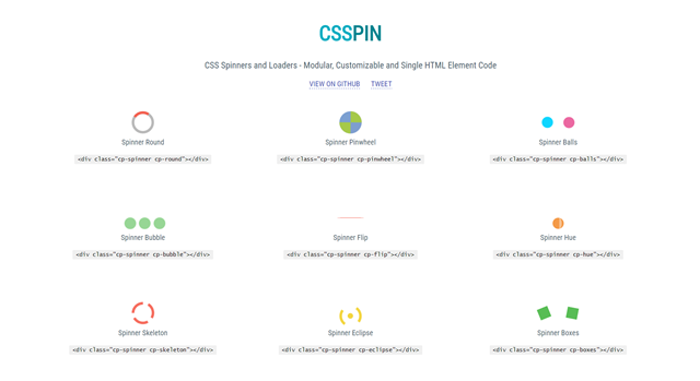
Over the weekend, I stumbled across a bunch of new services and tools that could help ease the life of designers and developers. Among them, there’s a solution for appealing loadtime indicators, aka spinners and loaders, a service that dissects popular logos, as well as a source of inspiration for contemporary color palettes.

CSSPIN: Spinners and Loaders From Pure CSS Based on LESS

csspin

Even though it’s only supposed to visualize that new content is being loaded, spinners and loaders, aka loading time indicators, are ubiquitous. On the CSSPIN demo page, you can see the beautiful variants the startup team Webkul from India has created in pure CSS. In comparison to the mostly boring concepts of common loaders, Webkul can definitely cause a stir.

The ten different, fully customizable indicators are available as a CSS file with all variants. However, there’s also a custom CSS file for each one. Surely, you don’t want to integrate all ten versions into the same project. You are also able to view and edit the development files as LESS. CSSPIN is distributed under the liberal MIT license, so you are allowed to use it for both private, as well as commercial purposes.

>”>Get it at Github >>

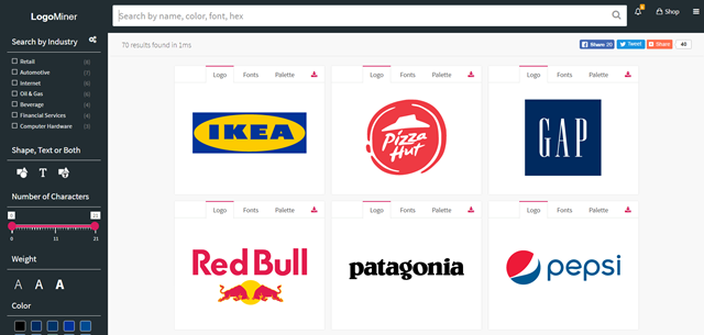
Logominer: Popular Logos Up Close

logominer

Logominer, developed by Piotr Gacon from Dublin, is a service that a lot of us would not even dare to run. Here at Noupe, we’ve already toyed around with the idea of dissecting popular logos, and explaining what was done, as well as why it works the way it does. After a short phone talk with our attorney, the topic was off the table.

Luckily, Piotr Gacon is in a different legal situation; I hope. On his website Logominer, he presents 70 of the world’s most popular logos. All of them are available for download in the formats JPEG, PNG, EPS, SVG, and PDF. Piotr also shows which fonts were used in the presented logos. You even get to display the color palette with information on the percentage shares of the respective colors used in the layout. By clicking on the respective color square, the according hex-value is copied to the clipboard.

You can search for branches, colors, fonts, font weight, the number of letters, and the division of pure typographic logos, and the ones that integrate shapes.

>”>Find Logominer Here >>

Color Farm: Color Palettes of Real Designs

colorfarm

Many designers use Dribbble Shots as a source of inspiration. In fact, you probably won’t find an overview of contemporary designs that changes faster than this one. The creators of the Chrome extension Panda, which also considers itself to be an inspirer in the form of an RSS reader, thought so, too.

Thus, they took popular Dribble shots, and extracted their respective color palettes. In contrast to other services, they didn’t display them as blend lines, but separated them into individual, colored squares surrounded by white space. This way, the individual colors can be assessed very well. A click on a color square copies the respective hex-value to the clipboard.

> “>Go to the Website With the Rainbow Rooster >>

Categories: Others Tags:

Sentence Length Colorization

November 27th, 2016 No comments

I think I had the same wooahhhhh coool reaction as so many others did when this tweet was going around:
The art of sentence length. Swoon pic.twitter.com/K91GEZTnKm

— Lucy Foulkes (@lfoulkesy) March 30, 2016

Certainly, good writing is more than just varied sentence length, but this is a fantastic visualization that makes an excellent point. It wouldn’t hurt to be able to see this kind of thing in our own writing, in an on-demand fashion while editing.

After tweeting that I wasn’t quite sure how best to go about it, a bunch of folks chimed in with their takes on how they would do it.


Dave took a crack at it within a single tweet. His idea is essentially:

  1. Loop through all paragraphs.
  2. Make an array of sentences by splitting the whole string on periods.
  3. Wrap each sentence in a span with a data attribute of how many words in that sentence.

The data attributes could then be used in CSS selectors to colorize. The idea didn’t quite work as written, but I was able to extrapolate that idea into a working concept, if slightly more verbose:

See the Pen Sentence Colorizer by Chris Coyier (@chriscoyier) on CodePen.

Note that this demo:

  • Doesn’t take into account almost any edge case. Note the hyphenated word fail there. Things like “Mrs. Robinson” would be an obvious edge case this doesn’t deal with.
  • Isn’t particularly efficient.

Before we get too far here, It was pointed out several times to me that the UI shown in that tweet looks an awful lot like Hemmingway App.

Indeed it does. I wonder if it’s some kind of hidden feature or something? I wasn’t able to find any sentence length colorizer feature poking around in there a bit. It highlights other things in useful ways though.

And speaking of highlighting sentences for useful alterior purposes, Tone Analyzer is an experiment to do that:

There is also an Angular JS lib that can be used to colorize arbitrary lengths of text:


Pim Derks created an actual bookmarklet to do the job! Very cool.

I’ll post here for posterity:

javascript:(function()%7Bvar%20colors%20%3D%20%5B'%23faf5cb'%2C%20'%23fcd2fa'%2C%20'%23c7f4c9'%2C%20'%23a7f3f1'%5D%3B%5B%5D.slice.apply(document.querySelectorAll('p%2C%20dt%2C%20dd%2Cli')).forEach(function(n)%7Bvar%20s%20%3D%20n.innerHTML.split('.%20')%3Bs.forEach(function(s)%7Bvar%20words%20%3D%20s.split('%20')%2Clength%20%3D%20words.length%3B%7D)%3Bvar%20r%20%3D%20''%3Bs.map(function(s)%7Bvar%20l%20%3D%20s.split(%22%20%22).length%2C%20c%3Bswitch(l)%7Bcase%201%3Acase%202%3Ac%20%3D%20colors%5B0%5D%3Bbreak%3Bcase%203%3Acase%204%3Acase%205%3Acase%206%3Ac%20%3D%20colors%5B1%5D%3Bbreak%3Bcase%207%3Acase%208%3Acase%209%3Acase%2010%3Acase%2011%3Acase%2012%3Ac%20%3D%20colors%5B2%5D%3Bbreak%3Bdefault%3Ac%20%3D%20colors%5B3%5D%3Bbreak%3B%7Dr%20%2B%3D%20'%3Cspan%20style%3D%22background-color%3A'%20%2B%20c%20%2B%20'%22%3E'%20%2B%20s%20%2B%20'.%20%3C%2Fspan%3E'%3B%7D)%3Bn.innerHTML%20%3D%20r%3B%7D)%7D)()

I was able to get it to work:

I also un-URL Encoded it, and dropped it here in a fork of my Pen so you can take a look at the code more easily (has some minor bugs like doubling up periods at the end):

See the Pen Sentence Colorizer by Chris Coyier (@chriscoyier) on CodePen.


Brandon Brule took a crack at it:

See the Pen Highlight sentence length by Brandon Brule (@brandonbrule) on CodePen.

I do like applying either styling or range-specific classes in JavaScript. The [data-wc] approach was hard because you have to be very explicit. You can’t really do [data-wc>10].


Antoinette Janus has a nicely-done take as well:

See the Pen Text Highlighter by Antoinette Janus (@acjdesigns) on CodePen.


Jonathan Williamson created a demo with a textarea and the colorization is separate and updated as-you-type:

See the Pen Gary Provost by Jonathan Williamson (@jon-w1) on CodePen.


The original tweet was all about the beauty of varied sentence length. Beauty in how the writing feels and reads. It wasn’t really about the colors or visualization of it, that just served to explain the message. But the colors were kinda beautiful too.

In another bit of prior art here, Sanne Peters did some visualized poems that maps words to colors so you can see them as well as read them:


Also remember we’re no stranger to Boomarklets That Help With Text™. A few years ago we tackled one that helped show you where an ideal line length for readability should land:

See the Pen Bookmarklet to make the text between 45 and 75 characters turn red. by Chris Coyier (@chriscoyier) on CodePen.


And that is what an active tweet thread can bring!


Sentence Length Colorization is a post from CSS-Tricks

Categories: Designing, Others Tags:

bgcolor=white

November 27th, 2016 No comments

Over two years ago, I published a dumb-funny little blog post called Please Don’t Learn To Code From Stock Photos. It got unearthed somehow and got shared around again recently.

Of course, it’s just for laughs, and by and large nobody took it too seriously. But also, there was one little thing in there that tickled the Well Actually Bone of quite a few developer folks. I’d say in the last year or so, 100 people or so have reached out to me one way or another to let me know.

The line of code in the stock photo was:

<body bgcolor=white>

And I said:

Better make damn sure the background color of the body is white because otherwise who knows what it might end up.

The correction I get is either:

  • Some version of IE had a light gray background, so if you wanted white you had to set white.
  • People can have user stylesheets that un-white the background.

To which I would say:

  • Interesting, I didn’t know that. Before my time. (Nor did I know that bgcolor was a thing at all! It’s one of those long-deprecated but still-working things.)
  • They did that on purpose. They may enjoy whatever background override they like.

I find it more interesting how insidious little ideas like this can be. At some point, this became a Very Important Best Practice and any written breach of it shall be issued an Official Warning, in perpetuity. Which is in contrast to the fact that I don’t think I’ve ever set an explicit white background on a site and don’t remember it ever coming up.


bgcolor=white is a post from CSS-Tricks

Categories: Designing, Others Tags: