Archive

Archive for November, 2016

4 compelling reasons you should embrace VR

November 21st, 2016 No comments

While none of us can predict the future, every designer should be thinking about it. All indications point to the next wave of devices that aren’t sitting on the tops of desks. They are wearable, and have canvas sizes that are vastly different than what you’ve been designing for.

But should you really care if you primarily design websites?

Yes, every device impacts one another

We don’t design websites in a bubble. Just think of the influences that mobile design has had on desktop websites. From responsive user patterns and thinking about cross-device design, to users coming back to the scroll, different screen sizes have significantly changed the way we think about desktop websites.

That will continue to happen to an even greater degree as more users adopt smartwatches or virtual reality devices. (And don’t downplay the significance of these devices; companies are pouring a lot of research and development into making these devices as commonplace as the iPhone.)

Here’s what to think about as a “website designer” (if anyone can really call themselves that anymore).

  • Containerized design will become more important for platforms that cross onto watches. Every “thought” or bit of information in the design, will be contained in a single design element. (On a watch screen, that’s the only way.)
  • On the flip side, the canvas will be never-ending for VR devices. The design process shares a lot of parallels with designing a gaming interface—where every twist, turn or change of perspective results in more information on a seamless canvas. This can be a little hard to imagine, but think about it like all the pages of your website are spread out and users move across them in a map-like fashion.

Yes, you want to have relevant skills

Just think if you had ignored mobile apps and responsive design and stuck to “desktop website design” a few years ago. You would already be unemployed, or close to it.

You need to understand where design is going and how devices impact the way things look and interact. The good news is that you probably have most of the skills to get you there, aside from learning a new interface.

The principles of good design are the same regardless of device. The big difference with both watches (tiny) and VR (massive) is scale. Fundamentals such as how to effectively use typography, contrast, color (depending on the device), and space will help you leap into designing for these devices with ease. You already have the basic tools to get started, you only need to learn the technology to apply it. And there are plenty of great resources out there for that.

Then there’s this: It’s only a matter of time before your boss or a client asks you to design a “website” for a watch, or with components of virtual reality. Will you be ready?

Yes, think of how you use the web

Users will adopt the technology, or some version of it. Just think of how you use the web, and how that’s changed in the last five-to-ten years. Now think about the things you are excited about. Do you have an Apple Watch? Are you on the Sony PlayStation VR waitlist? Did you at least want to touch Google’s Cardboard?

Then why would you ever think that you didn’t need to design for these—and the growing list of similar—devices? It’s not just designers that are excited about these things; there’s a large user-base of early adopters that can hardly wait to get their hands on this technology. And the most relevant companies, brands and websites will be available for these users the very first time they log on.

Yes, look at the buzz

Everywhere you look, someone is talking about virtual reality, augmented reality or some sort of wearable. It’s inevitable.

You want to be part of this in-crowd when it comes to your work. Designing for smaller devices and VR isn’t that much different than picking up another design trend. (Admit it, you tried a flat style project when everyone was buzzing about that, didn’t you?)

This is the same idea. When you see the new craze coming, you should be able to talk the talk and design the concepts. It might be a little out of your comfort zone; that’s OK. The idea is that you are keeping up with current trends enough to meet the changing demands of the industry.

No, you are ready to retire from design

So maybe you are done with this whole design career thing. That’s pretty much the only reason you should ignore watch, other wearable, or VR design. Some form of it is happening whether you like it or not. If you are planning to stay working in the field of design, and remain relevant, you need to understand these concepts.

On the other hand, if retirement or a new career path is knocking at your door, then forget about it. You don’t really need these skills anyway.

Conclusion

There’s nothing more exciting than a new way to think about creating visual content. Watch, wearable and virtual reality are just one more channel to communicate with users.

The mediums are quite different than some of what we are used to, from size to shape to function, but that doesn’t mean they can’t be awesome to work with. Remember, the principles of any good design apply to these new items. You already have the foundation to do something great. Give a new design technique a try, you might just like it.

Layers Pro Bundle: 4 Powerful WordPress Tools & More – only $39!

Source

Categories: Designing, Others Tags:

CSS Inheritance, The Cascade And Global Scope: Your New Old Worst Best Friends

November 21st, 2016 No comments

I’m big on modular design. I’ve long been sold on dividing websites into components, not pages, and amalgamating those components dynamically into interfaces. Flexibility, efficiency and maintainability abound.

But I don’t want my design to look like it’s made out of unrelated things. I’m making an interface, not a surrealist photomontage. As luck would have it, there is already a technology, called CSS, which is designed specifically to solve this problem. Using CSS, I can propagate styles that cross the borders of my HTML components, ensuring a consistent design with minimal effort.

The post CSS Inheritance, The Cascade And Global Scope: Your New Old Worst Best Friends appeared first on Smashing Magazine.

Categories: Others Tags:

Music Playlists To Fuel Your Coding And Design Sessions

November 21st, 2016 No comments

Some like it loud, others need some steady beats to stay focused, others calm tunes. A while ago we asked on Twitter and Facebook what music the web community is listening to when coding and designing.

The answers were as diverse as the community itself and certainly too good to live an existence only in a Twitter discussion. That’s why we’ve compiled those hand-crafted playlists, favorite artists, and loved soundtracks in this article to see which tunes fuel the web, and, well, first and foremost, to provide you with some new ear candy to get you through lengthy coding and design sessions, of course. Get your headphones ready!

The post Music Playlists To Fuel Your Coding And Design Sessions appeared first on Smashing Magazine.

Categories: Others Tags:

Better Media Management With WordPress Real Media Library

November 21st, 2016 No comments
wprml-teaser

WordPress users know this problem. WordPress’ media manager doesn’t allow for proper organizing of files. From around one hundred images up you’ll be unable to keep track. The WordPress Real Media Library fixes these, as well as other difficulties, and thus, it’s a must have for every WordPress user.

The Problem: Tons of Images

Here at Noupe, we keep over 10,000 images. You can probably imagine that nobody here has an overview of where to find which image, making it hard to spot existing images that may still be useful for the illustration of an article. By now I’ve gotten used to reuploading images, even though I know that they are on here, just because the search process takes way too long, and often enough, doesn’t even lead to the desired result.

Here, a reader recommendation for the WordPress Real Media Library (Thanks, Stefan) came in very handy. In contrast to other image management add-ons, the WordPress Real Media Library (RML) doesn’t replace the media manager, but builds upon it instead. This way, you don’t have to make the hard choice to stick with a third-party plugin forever, not knowing if it will still exist in three years from now. If the development of RML is ever stopped, or if you change your mind, nothing will happen to your images. They will all stay right where they were before. But, let’s take a more structured approach to this.

WordPress Real Media Library: Not Free, But Inexpensive

RML originates from the stable of the German developer Matthias Günter and is currently available in version 2.6.4. The plugin knows both English and German, and it adjusts the language according to your set system language.

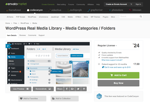
RML is not free, but a so-called premium plugin. However, considering the high utility of the solution that the plugin provides, the price is rather low. RML is available for 24 dollars only. It is distributed exclusively via Envato’s Codecanyon.

WordPress Real Media Library at Codecanyon

WordPress Real Media Library at Codecanyon

The price includes all future updates, as well as support for six months. To clarify that: you’ll receive all future updates, with only the support being limited to six months. For an extra 7.50 dollars, you can extend the support to 12 months. Almost 2,500 WordPress users have already decided to purchase the plugin.

WordPress Real Media Library: Easy to Install, Easier to Use

After the purchase, you download a 438 KB sized zip to your local hard drive. Next, choose Install > Plugins in your WordPress backend, and click the button Upload Plugin. After a click on choose file, move to the download folder, and select the zip archive with the plugin. After a successful upload, WordPress offers to directly activate the plugin, so just do that. That’s it. The WordPress Real Media Library is installed.

If you’re now looking for a menu item to use the RML, you won’t be successful. The WordPress Real Media Library directly integrates itself into the WordPress media management. After clicking on Media, your media library will open as usual. However, it now has an additional feature bar on the right of the backend navigation, and on the left of the actual media overview.

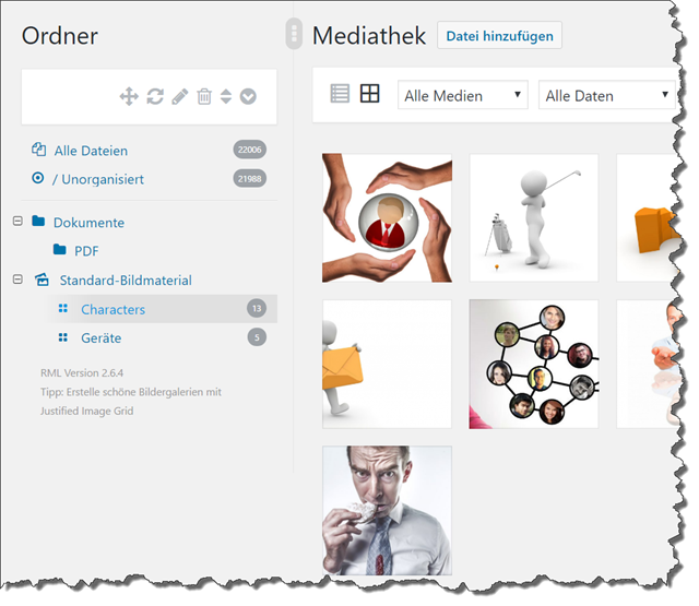
Immediately after the activation of the plugin, you’ll see a couple of icons that will help you edit the RML later on, as well as two “folders” with content. In All Files and /Unorganized, you’ll find all of your uploaded files for the time being. Now, it’s your job to get some order into your media library.

WordPress Real Media Library: First Sorts

WordPress Real Media Library: First Sorts

WordPress Real Media Library: The Different Folder Types and Their Structure

On the top left, next to the word folder, you’ll find two buttons that will help you construct the first structures. There’s the option to create a new folder or a new collection. Explaining the difference is very simple.

A new folder can contain every type of media content, including images. However, it cannot include galleries, which is why working with collections is better for image content. Collections themselves are not able to contain files. They only serve as superordinate sorting criteria for subordinate galleries. Let me specify.

I have set up a folder called “documents,” and within that, I created another one named “PDF.” Now, I will move all PDF files in my media library into the “PDF” folder via drag-and-drop. Now, they are easily accessible in one spot. This folder is a simple folder, and not a collection.

For image content that I want to use over and over again, I created a collection called “Standard Image Material.” As collections can’t contain files, I set up two gallery-file-folders in advance. One is named “Devices,” another one is called “Characters.” Now, I drag fitting images from my media library into the respective folder, which makes for an immediate assignment.

WordPress Real Media Library Latches Into the Visual Editor

WordPress Real Media Library Latches Into the Visual Editor

These gallery-file-folders can be addressed from within the WordPress visual editor. Via dialogue window, a folder like this is easily implemented into your article as a gallery. However, that’s not my case of application. I only want to create a clean, well-structured order, so that I don’t have to waste time searching for, or reuploading identical images.

WordPress Real Media Library: Flexible Integration From Within the Visual Editor

WordPress Real Media Library: Flexible Integration From Within the Visual Editor

The entire folder structure is flexible. You can turn subordinate folders into superordinate ones and vice versa. All of this is very simple thanks to drag and drop. The order of the folders can be changed the same way if needed. Even within the gallery-file-folders, altering the order of the images can be done the same way if need be. Otherwise, the sorting is done automatically, which won’t always get you the desired result.

No Decision for Eternity: RML is Just an Attachment

It’s important to know that all settings and assignments don’t affect the files themselves. So when deleting a folder, for example, you don’t delete the files inside. You only remove the assignment of the included images to this folder. So if you’re searching for a solution for physical data management, RML is not the right choice for you. If you want to assign individual images to different folders, you can either do this via drag and drop in the overview or via detail view of the respective image. There, you’ll find a button that grants you access to all existing folders, letting you make changes. The assignment of one image to multiple gallery-file-folders is not possible, although there may be a need for it.

The improved upload indicator that RML provides is also elegant. In contrast to the foggy loading bar of standard WordPress, RML shows you the upload progress in a contemporary way. By the way, all views work the same way as both a list, and as a grid.

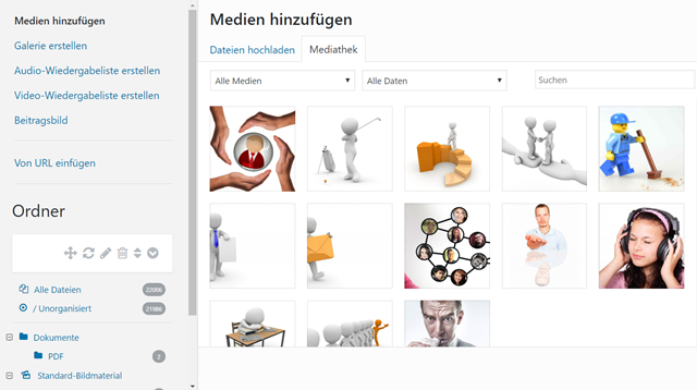
RML integrates itself into all relevant spots, meaning everywhere the media library is involved. Thus, you’ll also find the folders within the dialog add media, which you’ll access from within the editor on a regular basis, to implement images or other files into your article. Take a look for yourself and access the live preview on the Codecanyon product page. On there, you’ll get to equip a fully configurated backend with images, and other files, as well as toy around with the structure. I am sure; this will convince you.

The RML is Also Available in the Paste Dialogue

The RML is Also Available in the Paste Dialog

As the WordPress Real Media Library is a mere attachment to the existing media library, there are no issues when it comes to displaying the frontend. RML is fully compatible with all themes, including WooCommerce and others.

WordPress Real Media Library: Regular or Extended License?

In fact, the WordPress Real Media Library has two prices. If you want the plugin for yourself, or a customer for a website that doesn’t sell anything, the previously mentioned price of 24 dollars is applied. I assume that this will be the far more common case among our readers.

If you, or your client, want to sell something on the website, or if it’s a paid website, like an online magazine that you need to pay for, you need the Extended License for 120 dollars. This price is reasonable as well, especially considering the fact that your website’s goal is commercial success, it shouldn’t be complained about.

My Verdict: Unrestricted Recommendation

After using it for a short time only, I’m already asking myself how I got by without the RML. My ideas for different folder structures are flourishing. Although this will certainly keep me busy for a couple of days, I will have a very well structured media library afterward, in which I’ll be able to find every single element with ease, and also get to reuse them properly.

Due to the high utility, the price of 24 dollars is a real no-brainer, in my opinion. I paid more than that at Pizza Luigi last week. He doesn’t give me free updates either.

Categories: Others Tags:

Between the Wires

November 20th, 2016 No comments

A new interview series from Preethi Kasireddy and Vivian Cromwell, focusing on “how developer products are made”. I was honored to be lucky number three, in which I overshare about CodePen.

Direct Link to ArticlePermalink


Between the Wires is a post from CSS-Tricks

Categories: Designing, Others Tags:

Popular design news of the week: November 14, 2016 – November 20, 2016

November 20th, 2016 No comments

Every week users submit a lot of interesting stuff on our sister site Webdesigner News, highlighting great content from around the web that can be of interest to web designers.

The best way to keep track of all the great stories and news being posted is simply to check out the Webdesigner News site, however, in case you missed some here’s a quick and useful compilation of the most popular designer news that we curated from the past week.

Note that this is only a very small selection of the links that were posted, so don’t miss out and subscribe to our newsletter and follow the site daily for all the news.

6 Web Design Style Predictions for 2017

50 Tiny, Time-Saving, and Free Tools for Web Designers from 2016

Google Redesign Concept

Best Motion Graphics Trends in Design for 2017

The Top 5 Branding Trends of 2016

8 Non-Digital Tools to Add to your UX Toolbelt

Introducing the New Google Play Music

Joanna Stern on the New MacBook Pros

Blueprint – A React UI Toolkit for the Web

Typing Speed Test – A Simple Typing Test to See How Fast You Can Type

Westworld, a Tale of Two Logos

Apple is Reportedly Working on AR Glasses à la Google Glass

Classical User Interviews are a Waste of Time

Designing a Usable Dashboard

The Myth of the Portfolio Piece

Drowning in Colors

Don’t Defend your Work

The 8 Commandments of Creating an Awesome User Experience

Control Web Typography with CSS Font Display

Touch Bar Interface for Slack

Top 5 Typography Trends of 2016

Top 7 ECommerce UX Design Trends to Look Out for in 2017

Time to Toss Resumes on the Rejection Pile

Mashable Gets a Redesign

Now, More than Ever, Designers Must Transform America

Want more? No problem! Keep track of top design news from around the web with Webdesigner News.

LAST DAY: Ultimate Retouch Panel 3.0 for Adobe Photoshop – only $17!

Source

Categories: Designing, Others Tags:

Color Fonts

November 19th, 2016 No comments

Adobe explaining:

OpenType-SVG is a font format in which an OpenType font has all or just some of its glyphs represented as SVG (scalable vector graphics) artwork. This allows the display of multiple colors and gradients in a single glyph. Because of these features, we also refer to OpenType-SVG fonts as “color fonts”.

Support so far: Firefox 26+, Edge 38+

But good news, it’s progressive enhancement friendly. The Typekit announcement page:

In browsers that lack color font support, they will fall back to regular monochrome glyphs.

So, they are usable right now. It opens up such fun doors I imagine there will be plenty of fonts coming out that take advantage of it. I’d also imagine non-supporting browsers will be wanting to get on the fun-train.

Trajan Color on Typekit

Non-supporting browser Chrome on the left; Supporting browser Firefox on the right.

Apparently, there is a future for color bitmaps fonts, too.


Color Fonts is a post from CSS-Tricks

Categories: Designing, Others Tags:

Comics of the week #366

November 19th, 2016 No comments

Every week we feature a set of comics created exclusively for WDD.

The content revolves around web design, blogging and funny situations that we encounter in our daily lives as designers.

These great cartoons are created by Jerry King, an award-winning cartoonist who’s one of the most published, prolific and versatile cartoonists in the world today.

So for a few moments, take a break from your daily routine, have a laugh and enjoy these funny cartoons.

Feel free to leave your comments and suggestions below as well as any related stories of your own…

Uncool retro

Politician site

Not fair

Can you relate to these situations? Please share your funny stories and comments below…

Latina Complete Font Family from Latinotype – only $19!

Source

Categories: Designing, Others Tags:

The Different Ways of Getting SVG Out of Adobe Illustrator

November 18th, 2016 No comments

Let’s say you created a lovely vector illustration in Adobe Illustrator. Or you’ve used Illustrator to finesse some existing graphics. Or for literally any reason at all, you have a file open in Adobe Illustrator that you ultimately want to use on the web as SVG.

There are several different ways of getting SVG out of Illustrator, each one a bit different. Let’s take a look.

TL;DR: Exporting, like File > Export > Export As… SVG then optimizing is your best bet for the web.

The “Save As…” Method

Illustrator supports SVG as a first-class file format. You can File > Save As… and choose “SVG” as an option, as an alternative to the default `.ai` file format.

Using Edit > Save As… in Illustrator

There is even a button in the Save SVG options that come up called “SVG Code…” you can click to have Illustrator show you the code before saving it, presumably for copy-and-paste purposes.

If you search the web a bit about the differences between saving in different formats from Illustrator, you’ll find plenty of generic information telling you that SVG is for use on THE WORLD WIDE WEB, so if that’s where you intend to use this graphic, that’s the format you should save in.

Be careful here. Saving as SVG from Illustrator is fine, but the file is absolutely not ready for direct use on the web. When you “Save As…” from Illustrator as SVG, Illustrators primary concern is that you can open that file again in Illustrator just as you left it.

For example, Illustrator has proprietary features that aren’t a part of SVG. A simple example: guides. You won’t lose your guides saving as SVG this way, they are preserved just fine. But guides are meaningless in SVG on the web, so you’d be sending useless data if you use SVG saved this way directly on the web.

The file size of “Save As…” saved Illustrator SVG’s can be several orders of magnitude larger than a really web-ready version. Take a look at the CSS-Tricks logo “Save As…”‘d and one exported for the web.


410 KB for the “Save As…” version vs. 3 KB for the exported version.

It’s not entirely clear to us why “Save As…”ing as SVG would be a good idea. You may just want to keep files as `.ai` until you want to actually export for the web. Or if you do save as SVG, you might as well use the “Preserve Illustrator Editing Capabilities” checkbox and use a naming convention that is clear this is an “original” file, not a web-ready one.

Wait, “exported version”? Let’s look at that next.

The “Export As” Method

File > Export > Export As… is very different. You are “exporting”, and the implication is that the file that is generated is no longer an Illustrator-friendly and editable file, but a new file specifically for some other purpose.

JPG is one of the options, for example. You wouldn’t expect to be able to edit your vector art after exporting it as a JPG.

SVG is an option here too. The output is vastly different than “Save As…”. Exported SVGs actually are pretty close to web-ready. There is no weird doctype, loads of metadata, or proprietary Illustrator stuff. Exported SVG likely will not open in Illustrator in exactly the same way it was in the original file.

You’ll get a minimal export options screen, like this:


The SVG Options when exporting SVG.

The options shown there are good defaults. Quick overview:

  • Styling: “Presentation Attributes” means stuff like fill: red; rather than “Inline Styles” which means style=”fill: red;”. Presentation attributes are easier to override in CSS. Inline styles provide more style resilience. There is also an option to export styles in a block within the SVG, which may be efficient on SVG with lots of similar elements.
  • Font: “SVG” means to use elements (and friends), which is extremely efficient, provided the fonts you’ve used are available on the web site you intended to use it on. “Convert to Outlines” will turn the text into vector shapes on export, making sure it will look exactly right, but losing efficient, accessibility, searchability, and copy-ability.
  • Images: “Link” means that if there happens to be raster graphics within the SVG, it will link out to them rather than embedding them within the SVG, versus “Embed”ding them.
  • Object ID’s: Unique ensures that every ID is unique (good for the web), but you also have the option to make them very short (“Minimal”) or be based on layer names.
  • Decimal: 2 is probably fine. You’d only go up if you knew you were working with a really tiny viewBox and needed a lot of precision, or down if you were working on a giant viewBox.
  • Minify: We’re exporting for the web, so, yes.
  • Responsive: On means “don’t put width and height attribute”. Off means do. It actually might be smart leaving this off (see here).

Exporting this way is definitely good for the web. Although SVGO can still squeak a little bit more efficiency out of it yet, depending on the graphic of course.

The “Export for Screens” Method

Since version CC 2017, Illustrator has an File > Export > Export for Screens… method built specifically for exporting for digital devices. I’d say “the web”, but it has features for exporting for iOS and Android, so “Screens”, as they say, is appropriate.

This brings up an options dialog allowing us to select our artwork in different ways and exports the parts we want in the formats we want.


The “Export for Screens” options screen

This is really convenient UI! We can export just parts of our illustration in not only SVG, but other formats as well, at the same exact time. Picture an icon system. 20 artboards in a single document, and with one command you export all of them as SVG and multiple resolutions of PNG. Pretty nice.

Under the hood, it appears to be using the same system as “Export”, so you’ll get web-optimized output.

Artboards is one way of splitting up artwork to be exported separately. There is also an Asset Export panel that allows you to drag-and-drop bits of artwork intended to be output separately.

The “Copy Directly from the Artboard” Method

Speaking of selecting individual bits of artwork intended to be used as SVG, there is a slightly-lesser-known way to extract bits, and that’s as simple as Edit > Copy.

After copying, your clipboard will have inline SVG code on it that you can paste as text.

The code that you get is slightly different than any method we’ve looked at so far. It’s closest to the “Save As…” format though, in that you get the XML doctype and such. It’s not the web-optimized format we get from exporting. It does have it’s own viewBox cropped exactly to the elements edges.

If you use this to drop SVG right into your HTML, plan to do a little manual code cleanup.

Now that you have the SVG…

… now what?

  • Perhaps you’re gathering individual SVG icon files for use in an SVG icon system. As in, using a build tool to process them into a single file full of s to .
  • Perhaps you needed the `.svg` to use as an .
  • Perhaps you needed the `.svg` to use as a background-image in CSS.
  • Perhaps you’re going to drop the SVG code into HTML directly as inline SVG.

There are many ways to use SVG, but that always starts with getting the SVG to work with in the first place.


The Different Ways of Getting SVG Out of Adobe Illustrator is a post from CSS-Tricks

Categories: Designing, Others Tags:

Affinity Designer for Windows released

November 18th, 2016 No comments

I’ve actually been using the beta versions of both Affinity Designer and Affinity Photo for a little while now, in my daily work. Given their beta status, I haven’t gone so far as to design whole websites with these apps or anything of the sort, but I used them for small, quick tasks just to get a feel for them. I remain duly impressed.

Affinity Designer has come a long way. In my experience, it runs fast, it’s stable, and things only get a little bit weird when I use my video card’s dynamic super resolution feature to pretend that I have a 4K monitor for really big screenshots.

Affinity Designer has come a long way…In terms of speed, it has outperformed…Inkscape, by miles, and it outperforms Illustrator

In terms of speed, it has outperformed my usual OSS favorite, Inkscape, by miles, and it outperforms Illustrator by default. While it still can’t beat Inkscape for cross-platform usage, I mostly work on Windows in any case.

I only occasionally get lost in the interface, as the learning curve is actually fairly small. That said, I personally think the color picker could be a lot more intuitive. And I want a perspective transform tool.

Those small nitpicks aside, this app is definitely worth a look, especially if you’re working with a small budget. Since it’s on Windows now, it’s a perfectly viable solution for cross-platform (not including Linux) agencies and companies with in-house design teams.

Now, for those of you who haven’t been following along with my regular — and somewhat shamefully fanboyish — articles on Affinity Designer, here’s what you can expect from this app:

  • A complete vector and pixel editing toolset
  • 10 million+ percent zoom
  • Non-destructive effects and adjustment layers
  • RGB, CMYK, LAB, Pantone and ICC colour management
  • Advanced typography, including text styles and text-on-a-path
  • Effortless PSD, SVG, EPS, PNG and PDF/X handling
  • Unlimited artboards with device pre-sets
  • Super smooth gradients and color control
  • Standard and retina resolution pixel preview
  • Unlimited and saveable undo history
  • Incredibly powerful export capabilities
  • Symbols, including multiple versions and nested symbols
  • Constraints for pseudo-responsive design
  • Grids, guides and advanced snapping including pixel alignment
  • Fully customizable shortcuts.

Note: I just plain stole that list right from the press release… but it’s all true. It’s also perfectly matched with the Mac version. The Serif Windows development team has done some amazing work.

Now, I said it was on sale. I wasn’t kidding. Both the Windows and Mac (now with the mandatory Touch Bar support) versions are on sale for about $40 USD right now, right here… well… over on their site.

Now I need to come up with a new website idea just to design it for fun.

Christmas Bundle of 400+ Design Elements from Graphicdome – only $14!

Source

Categories: Designing, Others Tags: