Archive

Archive for November, 2016

True Lies Of Optimistic User Interfaces

November 15th, 2016 No comments

Three user interfaces (UIs) go to a pub. The first one orders a drink, then several more. A couple of hours later, it asks for the bill and leaves the pub drunk. The second UI orders a drink, pays for it up front, orders another drink, pays for it and so on, and in a couple of hours leaves the pub drunk.

The third UI exits the pub already drunk immediately after going in — it knows how the pubs work and is efficient enough not to lose time. Have you heard of this third one? It is called an “optimistic UI.”

The post True Lies Of Optimistic User Interfaces appeared first on Smashing Magazine.

Categories: Others Tags:

Recipe for Success: When to Post on Social Media [Infographic]

November 15th, 2016 No comments
The Best Times to Tweet

Bloggers like us want to be noticed. We want our posts to be read by as many people as possible. After we’ve written an article, we shoot it through all social media channels, hoping for feedback. But it’s not always the way we’d like it to be.

Have you ever thought about what the best time to post on social media is? The time where you’ll reach the largest possible amount of people with your posts? You should do that.

Today, blogging is not that easy anymore. There is way too much competition. Thus, it has become difficult to build an audience. Ten years ago, this was significantly easier. Growing a blog was done a lot faster.

To offset the small disadvantage, that today you have to be perceived in a completely different way, there are a couple of tricks, however. One of them is to always feed your social media accounts at the right time.

The Best Times to Post on Social Media

The infographic is not from this year. However, as far as we know, people’s behaviour has not changed. The content is still up to date. It deals with Facebook and Twitter, the two most popular networks.

The Best Times for Twitter

  1. The Best Time to Tweet (about anything)
    Around 5pm seems to be the best time for an important tweet. Around this time, a tweet receives the most attention, and thus, it also receives the most retweets.
  2. How Often You Should Tweet
    One to four tweets an hour have been proven to be the best solution. This strategy nets you the highest CTR (Click-Through-Rate). When you post more than that, less people will click your tweets.
  3. The Best Days to Tweet on
    In the middle of the week, as well as on the weekends is where you get the most clicks on your tweets.
  4. The Best Hourly Click Rate
    When your goal is to achieve the best possible click rate, try posting around lunchtime, and the early evening, when people are back home.

The Best Times for Facebook

  1. The Most-Shared Posts
    On Facebook, most posts are shared on Saturdays, as the majority of people is at home and available.
  2. The Most Shared Posts Per Hour
    The most posts are shared during lunchtime on weekdays.
  3. The Best Posting Frequency
    One posting every other day has shown to be ideal. Articles with this post frequency have the highest chances of getting likes and shares.

The Best Times to Share on Facebook

Download the Entire Infographic

Is This Information Always Valid?

Yes. And no. Generally, it always depends on you and your followers. You may have a very different and special audience, that can’t be squeezed into a bodice.

Find out the data that’s optimal for you. On Facebook, you’ll even be offered statistics that are useful for your page. You should use them for in-depth tests.

Testing, Evaluating, and Posting

Large blogs didn’t become large because they write articles that no other bloggers could write. This assumption would be completely wrong. Look at me: I write articles on here, and on my blog. However, they are read a lot more often on Noupe. Why? Because a lot more people know Noupe.

Large blogs have either existed for a long time already, or they have built a system. This process includes tests and evaluations. Both being just as important as writing good posts.

How You Can Test: A Recommendation

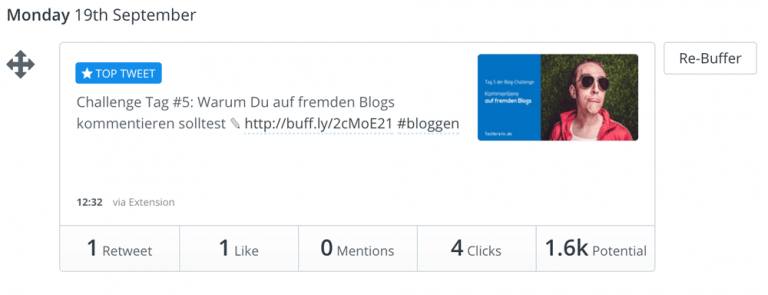
There are many tools to test the best times for social media. A great one is called Buffer. Buffer not only lets you share your posts, but also allows you to conduct a great evaluation, as you’ll receive a detailed statistic for each social network.

The Buffer Statistics

Now post the same article at different times per social media channel, and evaluate the data afterwards. After some time, you’ll have found the right day and the right hour for each network.

Infographic Source: Kissmetrics

Categories: Others Tags:

Text Mask Effect in Photoshop

November 14th, 2016 No comments
dansky_text-clipping-mask-effect-in-adobe-photoshop

In this tutorial, we’re going to learn how to create a text clipping mask effect in Adobe Photoshop.

Download Adobe Photoshop.

Read More at Text Mask Effect in Photoshop

Categories: Designing, Others Tags:

On-the-Fly Image Overlays using Cloudinary

November 14th, 2016 No comments

Image overlay isn’t solely about having the right touch to create an amazing visual. You also need a great tool that simplifies the process. Cloudinary, a cloud-based image and video service for websites and mobile applications, is exactly the tool you need.

How to Overlay Images

First open a free Cloudinary account, if you don’t already have one. Then upload images, either through the Cloudinary management console or using the API. Once an image is uploaded to your Cloudinary account it is stored on the cloud as well.

To create an overlay, you simply need to define how you would like to modify your original image within the image delivery URL. According to the directives added to the URL a new derived image is processed on the fly and cached. The result will be delivered super-fast via content delivery network (CDN). Any subsequent request to the same URL will be delivered from the cache.

Here we show how to put a company logo on a koala. With Cloudinary, this common task becomes an easy job. The koala original image URL is:

https://res.cloudinary.com/cld-name/koala.jpg

The image overlay URL is:

https://res.cloudinary.com/cld-name/l_cloudinary_icon,w_200,c_scale/koala.jpg

The URL structure is :

<domain name>/<cloud  name>/<image manipulation parameters>/<image  public-id>.<image format>

The overlay was created by adding the following parameters to the URL:

  • l_
  • w_
  • c_

Be sure to visit the image URLs shown in the examples here, and try them out.

Building the Image URL Using JavaScript

You can build the image URL yourself or use one of Cloudinary SDK libraries. In the following examples, I will use the core JavaScript library, which is pure Java Script, but there is a JQuery plugin, as well.

First you need to include the JavaScript source, which you can download from the cloudinary-core github project.

<script src="<path>/cloudinary-core-shrinkwrap.js"  type="text/javascript"></script>

Next you need to set your account cloud name in the code. The account name is defined when you register with Cloudinary. In the following examples, the cloud name is “cld-name.”

var cl = cloudinary.Cloudinary.new({cloud_name: "cld-name"});

Now, I will use the cl variable created here to call to Cloudinary methods. If you prefer to use JQuery, you can find it here.

This is the JavaScript call to build the image URL with the overlay shown:

cl.url("koala", { overlay: "cloudinary_icon", width: 200, crop: "scale" });

The parameters used in this call are the image public_id which is “koala,” the image overlay public_id, which is “cloudinary_icon.” For both, public_id means the name of the image in the Cloudinary media library. The next parameter is width = 200 pixels, which is used to resize the overlay image to be 200 pixel wide. The last parameter is crop which determines the crop mode used to resize the overlay image. The selected “scale” option resizes to the requested width while retaining the original aspect ratio. The result of this call is the “image overlay URL” as previously shown.

Creating Watermarks

A common and basic use case for image overlay is adding a watermark. It is a useful way to protect and copyright your images online. The image we started with already has our icon on it, but perhaps you prefer to add it in a subtler way, such as watermark. Here are the parameters required to do that:

  • Dimensions of the overlay is defined by width and crop sets the crop type.
  • The location to place the overlay is defined by: gravity
  • Visual effects applied on the overlay are: opacity and brightness effect
cl.url("koala", { overlay: "cloudinary_icon", width: 200, crop: "scale", gravity: "south_east", opacity: 50, effect: "brightness:200"});

Image URL:

https://res.cloudinary.com/cld-name/image/upload/l_cloudinary_icon,w_200,c_scale,g_south_east,o_50,e_brightness:200/koala.jpg

Dynamic Text Overlays

Creating dynamic text overlays opens up a world of possibilities. You can easily update banners with the latest deals and promotions. Google fonts are supported by default, but you also can upload custom fonts to your account. For example, announcing on a special sale happening only today.

cl.url("bag", { transformation: [
  {overlay: "text:roboto_60:EXTRA%2010%25%20OFF", color: "white", y: 110}, 
{overlay: "text:roboto_60:SALE%20ENDS%20TODAY", color: "white", y: 200}]});

Image URL: https://res.cloudinary.com/cld-name/image/upload/l_text:roboto_60:EXTRA 10%25 OFF,co_white,y_110/l_text:roboto_60:SALE ENDS TODAY,co_white,y_200/bag.jpg

Personalized Text Overlays

Text overlays can be personalized, as well. You can replace the text on the fly in your code using information stored on a cookie, showing each user its own text based on the information gathered from previous site visits. To make sure the text will be seen on any background color it is effective use a border font.

cl.url("gift", {  overlay: " text:arial_80_stroke:Happy%20Birthday%20John", color: "white", gravity: "north", y: 5, border: "2px_solid_black"});

https://res.cloudinary.com/cld-name/image/upload/l_text:arial_80_stroke:Happy Birthday John,co_white,bo_2px_solid_black,g_north,y_5/gift.jpg

You also have the option to implement it using Cloudinary cookie as a parameter within the image URL. You need to have your own CName setup by Cloudinary and then the URL will be:

http://CNAME/l_text:arial_80_stroke:__cld_attribute1__,co_white,bo_2px_solid_black,g_north,y_5/ gift.jpg

The text shown on the image will be the value of the cookie called __cld_attribute1__

Overlaying Social Profile Pictures

Using Cloudinary you can dynamically fetch the profile picture from social networks (Facebook, Twitter, Instagram, Google+) and use it as the base image or an overlay image.

cl.url ("KermitTheFrog", { type: "twitter_name", transformation: [ 
  { width: 150, crop: "scale"} , 
  { overlay: "instagram_name:realmisspiggy",  width: 150, crop: "scale", x: 150 },
{ border: "3px_solid_black"}]});

https://res.cloudinary.com/cld-name/image/twitter_name/w_150,c_scale/l_instagram_name:realmisspiggy,w_150,x_150/bo_3px_solid_black/KermitTheFrog.jpg

Face Detectionbased Overlay

In order to create a cool overlay, it is helpful to detect the face in the image, especially if you are planning to reenact the Venice mask carnival, as shown below. The overlay is automatically placed on the eyes that are detected in the image.

cl.url("team.jpg", { transformation: [ 
  { width: 640, crop: "scale",  } , 
{ flags: "region_relative", gravity: "adv_eyes", overlay: "harlequinmask", width: 1.7 }]});

https://res.cloudinary.com/cld-name/image/upload/c_scale,w_640/l_harlequinmask,w_1.7,g_adv_eyes,fl_region_relative/team.jpg

Another option is to automatically pixelate the faces for confidentiality.

cl.url("couple", { width: 640,  crop: "scale", effect: "pixelate_faces:10"});

https://res.cloudinary.com/cld-name/image/upload/w_640,c_scale,e_pixelate_faces:10/couple.jpg

Image Overlay on Video

Cloudinary also supports video, so the same API enables you to have images, animated gifs and videos interact. You can create an animated gif from several images, capture an image from an animated gif or a video clip, and even overlay an image on a video clip for a defined period of time as shown below.

cl.video( “run”, } controls: true, poster: cl.url(“run.jpg”, {resource_type: “video”}), transformation: [ { overlay: “candy”, width: 0.4, gravity: “south_west”, start_offset: “5”, end_offset: “7.5” }, { overlay: “candy”, width: 0.4, gravity: “south_east”, start_offset: “8”, end_offset: “12”, angle: “hflip”}]});

Summary

This is only the tip of the iceberg, Cloudinary supports a long list of image manipulation options which you can find hereand the same goes for video. In addition, images can be optimized for faster delivery by using features such as automatic format and automatic quality.
Now it is up to you, go ahead and improve your website visuals, as many studies have shown, the millennials prefer images to text anyhow.

(Disclaimer: This post is sponsored by Cloudinary.)

Categories: Others Tags:

An Intro to Monkey Testing with Gremlins.js

November 14th, 2016 No comments

A common idiom in our industry is, “You never can predict how the user will use your product once they get it in their hands.” If you’ve ever watched a stakeholder use a website or web application for the first time, you may know this firsthand. I can’t count the number of times I’ve seen a user seemingly forget how to use websites on a mobile device, or try to use it in a way that makes you think, “But no one would actually do that in real life!”

The thing is, you never really do know what a user may do in the moment. They might be in a frantic state of mind, trying to accomplish something too quickly, and don’t tap or type the way a calm, focused user might. This fits right into the all-too-common scenario of designing and developing for the best case scenario, and not thinking about edge cases or “what happens if things don’t happen perfectly in this order?” As developers, we tend to build things thinking that everything will be understood, that the user is rational and should just know that tapping around too quickly might cause something weird to happen. It can even affect those who might make accidental taps or clicks when not giving an app full attention – how many times have you accidentally tapped on a mobile device when you were walking and talking while also trying to reply to a tweet or email.

Building out tools to help us test the unpredictable aren’t entirely new. In 2012, Netflix had open-sourced their internal service Chaos Monkey, which “terminates virtual machine instances and containers that run inside of your production environment.” In plain language, it’s a service that tears down servers at random to ensure an entire system doesn’t violently collapse during a failure. Our development communities also remind us to not just design for “the happy path”, but how can we actually detect for unpredicted points of failure in our interfaces the way we can with our server architectures?

If a hundred monkeys at typewriters can write the works of Shakespeare, then one monkey should surely be able to find bugs and problems in our interfaces.

Bring in the monkeys

Monkey testing is a method of testing that generates random user input – clicks, swipes, entering input – with the sole purpose of finding issues with, or entirely breaking, your application. Unlike unit and acceptance testing, where you are writing test cases that occur in a specific order or set of conditions, which ultimately creates bias in how your interface is tested. Developers have less control over how a monkey test will execute, and since they are random every time they are run, you’ll never be testing for just one scenario, but rather an infinite combination of interactions.

Although this type of testing is available for most technology stacks, things built for the web haven’t necessarily got there yet. For example, the Android SDK has a UI Exerciser Monkey that handles most interface-level and system-level events. As web developers have begun to think more critically about performance and stress testing, some of these ideas have finally made it over to the world of the web in the form of Gremlins.js, a JavaScript-based monkey testing library written by the team at Marmelab.

Monkeys, Gremlins, And Other Fun Critters

Gremlins.js runs with as little or as much control as you could need. It has a fairly low time cost for initial setup.

There are three ways to start using Gremlins.js.

Standalone library

The easiest way to incorporate the library is to include the library directly into your site. This will put gremlins into your project’s global namespace, meaning that you can access it from anywhere within your project.

<script src="path/to/gremlins.min.js"></script>

<script type="javascript">
  // You can also run this in any file now!
  gremlins.createHorde().unleash();
</script>

Require.js module

If you are using Require.js in your project, you can import Gremlins.js in a non-global, as-needed fashion.

require.config({
  paths: {
    gremlins: 'scripts/libraries/gremlins.min'
  }
});

require(['gremlins'], function(gremlins) {
  gremlins.createHorde().unleash();
});

Bookmarklet

If you prefer to use monkey testing in a ad hoc manner, there’s even a bookmarklet that allows one-click testing on whichever page you are on. You can grab the bookmarklet from the installation instructions.

Monkeying Around

If you’ve opted for direct inclusion of the library or importing it through Require, you can now start playing around with Gremlins on our own! In our installation examples, we call gremlins.createHorde().unleash() – so what is this doing?

gremlins           // Yo, Gremlins
  .createHorde()   // Create me a default horde
  .unleash();      // Then immediately release them

See the Pen Gremlins.js out of the box by Alicia Sedlock (@aliciasedlock) on CodePen.

The default horde includes all five available types of randomly generated user interactions, otherwise known as “species of gremlins”, that include:

  • formFillerGremlin fills in inputs with data, clicks checkboxes/radio buttons, and interacts with other standard form elements
  • clickerGremlin clicks anywhere on the visible document
  • toucherGremlin touches anywhere on the visible document
  • scrollerGremlin scrolls the viewport
  • typerGremlin triggers random typing on a simulated keyboard

When triggered, gremlins will leave a visual indication on the screen for the action that was performed. They will also leave a log of the actions they took, found in the developer console, along with any additional data associated with that species. They’ll look something like the example below.

gremlin formFiller input 5 in <input type=​"number" name=​"age">​
gremlin formFiller input pzdoyzshh0k9@o8cpskdb73nmi.r7r in <input type=​"email" name=​"email">​
gremlin clicker    click at 1219 301
gremlin scroller   scroll to 100 25

By default, gremlins will be randomly triggered in 10 millisecond intervals for a total of 1000 times.

Alongside our “bad” gremlins who like to cause trouble, there are also helpful gremlins, called mogwais, available to us. They don’t interfere with our application like gremlins, and instead mostly do reporting on how our application is holding up, such as logging the current frame rate. Mogwais will throw errors if the frame rate drops below 10.

mogwai  fps  12.67
mogwai  fps  23.56
err > mogwai  fps  7.54 < err
mogwai  fps  15.76

The combination of gremlin and mogwai logging provides a great picture of everything that’s happened over the course of the test.

Without much of any customization at all, Gremlins.js gives us a pretty robust test right out of the box.

Advanced Monkeying Around

If after using the default configuration, you have needs not being met, there are a fair number of ways to customize the way things run. For example, perhaps you want to only focus on particular components on a page at a time, rather than always testing a page in its entirety.

Though we can’t scope all species of gremlins, we can limit toucher, clicker, and formFiller to scope certain areas of our page at a given time. Specifically, we ask a gremlin to check the parent of an element it attempts to target. If that element is within our scope, the gremlin will proceed with the action. Otherwise, the gremlin will reattempt to find an element to interact with. We can also tell the gremlin how many times we want them to try to attempt the action before giving up with maxNbTries.

gremlins.species.clicker().canClick(function(element) {
    return $(element).parents('.my-component').length;
    /**
       Is the element this gremlin attempted to click
       within our wanted scope? Let it proceed by
       returning true! Otherwise, tell it to try again
       by returning false.
    **/
}).maxNbTries(5); // Our gremlin will tolerate 5 false returns for canClick before it gives up and moves on

// Similarly, we can control the scope of formFiller and toucher.

gremlins.species.formFiller.canFillElement(/** do stuff here **/);
gremlins.species.toucher.canTouch(/** do stuff here **/);

See the Pen Gremlins.js out of the box by Alicia Sedlock (@aliciasedlock) on CodePen.

Custom Gremlins

If you’re feeling limited by the selection of gremlin species at your disposal, fear not! You can write your own custom gremlins to perform any other actions you may be expecting users to make. For example, do you want to check what happens if a user attempts to submit a form randomly at any given part of their experience? You can hope that clicker will randomly click on our submit button, or you can create a custom submission gremlin to increase our chances, as well as control of how it’s executed.

This requires a bit of understanding of how to create and customize DOM events in JavaScript, so let’s walk through the pieces involved in making a submission gremlin.

gremlins.createHorde() // first, create our horde 
  .allGremlins()      // and enable all gremlins
  .gremlin(function() {

    // Now let's define our submission gremlin
    var targetElement, availableForms;

    availableForms = document.querySelectorAll('form'); // Let's get all available form elements on the page
    targetElement = availableForms[Math.floor(Math.random()*availableForms.length)]; // Then let's grab a random element from those results

    // Now, we create a dummy submission event
    var evt = document.createEvent('HTMLEvents');  // Create an event container
    evt.initEvent('submit');  // Define our event as a submit event
    targetElement.dispatchEvent(evt);  // Finally, dispatch the submit event onto our randomly selected form

    // We also want to make sure to log this event like others gremlins do!      
    console.log('gremlin submit ', targetElement);
  })
  .unleash();

See the Pen Customized gremlin with Gremlins.js by Alicia Sedlock (@aliciasedlock) on CodePen.

If you’re looking for more guidance on creating custom events, checkout Mozilla Developer Network’s documentation on creating events, and definitely check out the source of how Gremlins.js creates its events (the clicker gremlin is a great place to start)

Seeding Hordes

Having a brand new horde execute every time you run this kind of test will help stress test your UI in a lot of different scenarios. However, if you unleash a horde, and end up with errors, how are you really supposed to know if you’ve fixed the issues that caused those errors?

For cases where you want to run the same horde multiple times, you can choose to seed the horde. This will give you the exact same horde every time you execute the test.

var horde = gremlins.createHorde();
horde.seed(1234);
horde.unleash();

You may want to weigh how often you uses seeded hordes versus randomized hordes in a long term solution. While seeded hordes allow for retesting, much of the benefit of monkey testing lies in its randomness, which becomes somewhat moot in a scenario where the same seed is always used.

Conclusion

The web community often talks about not making assumptions about our users. They may have slow connections, not-the-latest device line, or be impaired in a way that requires the sit their using to be accessible. We also can’t promise that five-year-old Jaime doesn’t grab their parent’s phone, start wildly tapping, and end up causing major issues with whatever thing they were using. Or Kassidy from marketing, after getting their hands on the product for the first time, feverishly clicking or tapping away in excitement. The order, speed, or repetition of any user action can’t be predicted. As developers, we owe it to our users to make sure that our services don’t become unexpectedly broken simply from expecting them to only take happy path actions.

The choices for client-side monkey testing are slim, but Gremlins.js gets the fundamentals down right out of the gate. As with any type of testing library or framework, we can only improve upon it if people use it! They are actively seeking contributors, so if you have a wishlist for things this library can do, let them know!


An Intro to Monkey Testing with Gremlins.js is a post from CSS-Tricks

Categories: Designing, Others Tags:

The best new portfolio sites, October 2016

November 14th, 2016 No comments

Hello readers! World events have been very interesting lately, but now it’s time for what we all know is really important: other peoples’ portfolios! Okay, it’s not that important in the grand scheme of things, but design is one thing we can all agree o… ahahaha.

I can’t even properly finish that sentence. Not even as a joke.

Now, I knew that some of you designers liked your asymmetrical post-modern designs but wow, you have outdone yourselves this month. We have a lot of them for you this time, so I hope you like minimalism and odd dimensions.

As always, if you’d like to contribute your own portfolio for next month’s roundup.

Alex Suarez

Alex Suarez’s portfolio uses semi-flat design tastefully. While the site may be a bit low on contrast, the layout works, the drop shadows actually work, and the overall style gives a very clear picture of what kind of work to expect.

Robin Saulet

Robin Saulet uses brush fonts and colorful photography to give us a bit of a retro feel, while keeping the colors muted enough that they don’t blind anyone. It works well when paired with the now-classic full-screen-sections layout.

Carina Czisch

Carina Czisch’s portfolio is about as minimalist as they come without being brutalist, and looks fantastic for it. Now, the (large) header being the same on every page might confuse some people with small screens, but otherwise, this site is just plain calming to lok at.

Owen O’Donnell

And here we have our first monthly it’s-nothing-too-original-but-still-well-done site! Good craftsmanship deserves appreciation, even if it’s similar to things you’ve seen before. I’d just recommend more paragraph breaks in the blog entries.

DUX

DUX doesn’t shy away from vibrant design. With the blues, greens, high contrast, geometric designs, and minimalist illustrations, this site is a glut of color and style. It’s enough to make you forget that it is, technically, a flat design.

I love my minimalism, but it’s fun to see designers go all out, too. Know when to follow your constraints, and when to break them.

Jens Nielsen

And we go back to the mostly-monochrome minimalism with Jens Nielsen’s portfolio. It’s small, it’s sweet, it’s smooth. Go check it out.

Florian Monfrini

Florian Monfrini’s portfolio follows the trend of many art-focused sites these days, with a focus on minimalism and asymmetry. As in other cases, it works quite well, here.

Re:collection

Re:collection is brought to you by minimalism, asymmetry, and presumably a whole lot of float: left;. I love it.

Liam Ricketts

Liam Ricketts’ portfolio takes things old-school with what may be one of the early 3D/Flash/Video effects I can think of. I don’t know what has possessed so many to make their photographs look like flags or other bits of cloth flapping in the wind, but here we are.

Combined with a dead-simple modern layout, the effect make this site stand out in a big way, and that’s never a bad thing.

AW&CO

AW&CO brings more minimalism, more asymmetry. There’s a more elegant/fashionable feel to it, though, which seems appropriate, given their clientele.

E-TYPES

E-Types bnrings us yet more minimalism, and more asymmetry, but this time, it’s spiced up with motion in tthe form of background videos implemented with HTML5.

Oblik

Oblik is one of those portfolio sites that likes to put their navigation all around the page. In this case, though, it makes sense. The navigation text on the upper left brings up a modal screen about the studio itself, and the ones on the bottom navigate through the projects.

See? Make a lot more sense than putting “About us”, “Work”, and “Contact” in three different corners.

Lionel Durimel

Lionel Durimel’s portfolio also makes use of some fairly original navigation. Use your mouse wheel to horizontally scroll through three rows of project names, and hover over one for a preview. The rest of the page layouts largely stick to convention, which is good for the usability.

Mozell

Mozell shows off their work in an interface that is more app/Powerpoint than site. For their content, though, it works.

Brave

Brave is a design studio that focuses on working with nonprofits and charities.They don’t do anything out of the ordinary in the layout department, but trheir chosen imagery (and background videos) are spot-on, and well-though-out.

13 Bytes

13 Bytes uses the hand-drawn look to impressive effect in showing off their own work. It’s not overdone, though. There’s just the right amount of sketchy illustrations and “hand-wrtten” text to offset the more normal sans-serif typography.

.DOT

.DOT is a master class in integrating vibrant branding into every part of a website without overwhelming and outshining the content.

The Hideout

The Hideout’s site is highly minimalist, but not post-modern. It’s just… regular modern, and all the more refreshing for it. The inclusion of subtle illustrated wood patterns is a very nice touch.

Brittany Chiang

Brittany Chiang’s portfolio is an excellent example of how high-resolution full-screen layouts should be done. The timeline section is pretty great too.

Jascha Goltermann

Jascha Goltermann’s portfolio combines that monochrome-with-neon-accents look with some subtle animation to spice things up even further. Once you get away from the flashy effects, the design itself is delightfully minimalist. I appreciate a design that only pulls out all the stops when it actually needs to.

Create Professional Product Screenshots with Smartmockups – only $14!

Source

Categories: Designing, Others Tags:

You, Me And The Emoji: Character Sets, Encoding And Emoji

November 14th, 2016 No comments

We all recognize emoji. They’ve become the global pop stars of digital communication. But what are they, technically speaking? And what might we learn by taking a closer look at these images, characters, pictographs… whatever they are ? (Thinking Face). We will dig deep to learn about how these thingamajigs work.

Please note: Depending on your browser, you may not be able to see all emoji featured in this article (especially the Tifinagh characters). Also, different platforms vary in how they display emoji as well. That’s why the article always provides textual alternatives. Don’t let it discourage you from reading though!

Now, let’s start with a seemingly simple question. What are emoji?

The post You, Me And The Emoji: Character Sets, Encoding And Emoji appeared first on Smashing Magazine.

Categories: Others Tags:

The Invasion of Sharing Buttons: Why Less is More

November 14th, 2016 No comments
invasion-694940_640

Sharing buttons are a wonderful thing. Every blogger or website operator wants their posts to be shared on social media. However, that is the first step into a thought trap. The assumption that your visitors will share more often the more options you provide is wrong.

The thought trap is very successful. You’ll find sharing buttons on almost every blog. On a lot of them, you’ll even see an incredibly high amount of sharing options.

Firstly, there’s Facebook (shares and likes), then there’s Twitter, Google+, LinkedIn, Buffer, Pinterest, Pocket, and a lot more.

More Sharing Buttons Mean More Shares? Nope.

You really expect to get more shares when you provide more options to do so? Unfortunately, the exact opposite is the case.

Here’s an Example; Maybe You’ll Feel the Same Way I do:

I’m a big fan of sweets. It doesn’t matter whether it’s sweet or salty, as long as it’s unhealthy. As this would make me rise like a yeast cake, I decided never to have that stuff bought by my wife for me but only buy these things on my own. Why? Read:

I’m standing in front of the giant wall of sweets to choose from. There’s plenty of delicious stuff. I walk from side to side, but I can’t decide. There are way to many options. Most of the time, I just end up going to the chocolate shelf, as there is much less to pick from. So I end up buying a bar of chocolate, although I would have liked to buy chips instead.

The range was too large, so I was unable to decide on one type of chips, which in this case is a good thing. My wife would have just brought me just about everything there was on offer.

Paradox? More Options Make for Less Shares

People are bad at making decisions. The more options to share your articles you give them, the fewer shares you will receive. Five, six, or seven buttons are counterproductive. Some of the world’s most successful blogs and magazines know this.

Let’s take a look at how many sharing buttons these websites provide:

  • mashable.com – two buttons
  • Neil Patel – four buttons
  • The Verge – four buttons
  • Lifehacker – two buttons
  • Smashing Magazine – two buttons
  • CoSchedule – four buttons
  • Buffer – three buttons

All of these are websites with a lot of traffic. They all receive more than enough data to evaluate and make intelligent decisions when it comes to achieving better results. Be assured that the amount of social buttons on these websites was not set at random.

Of course, there might also be websites that do well although they offer many additional buttons. The majority of website operators, however, will not do themselves a favor with a high amount of sharing options.

In general, you should only listen to your own data. That’s all that matters. In all cases I’ve seen, less sharing options have lead to an increase in quality traffic.

The quality of the content received from social media is important. That’s what you need to focus on.

How to Use Google Analytics in an Intelligent Way

So let’s look around in Google Analytics to find the most efficient social networks. With this data, you can then limit your sharing options to produce better results.

The Sharing Report

First, you need to determine which social network gets you the most traffic. So log into your Analytics account and navigate to:

Acquisition => Social => Overview

To get really meaningful information, I recommend displaying the data for a whole year. If your blog does not exist for this long yet, make it display the data from the day your blog was founded up to today.

Remember: You may have received a lot of traffic from one particular network throughout one month. In other months, the traffic from this network might be rather poor. That’s why you should look at a whole year.

You need to have an overview of a wide range to be able to build a profound opinion.

Here’s an example from my blog; although this orientation of it only exists since the beginning of June. That’s why the data is a bit “expandable.” The display period only ranges from 01/06/2016 to 10/25/2016.

sharing-daten-1-1200x355
An Overview of My Social Media Traffic. Twitter Has a Significant Lead. Regarding Quality As Well?

To get clearer data, look at the “Network Referrals“.

Acquisition => Social => Network Referrals

This brings up information that is a lot more meaningful:

sharing-daten-2-1200x452
Find the Important Data Under the Menu Item Network Referrals.

Sharing Buttons: The Correct Evaluation

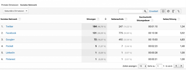
Twitter: When taking a look at the second screenshot, you’ll quickly notice that the largest amount of traffic on my blog comes from Twitter. However, the traffic is not of very high quality. Facebook in second place brings visitor traffic of significantly higher quality to my website.

With 131 sessions, Facebook at least causes 775 page views and an average session duration of 10 minutes on my website. On average, a visitor will look at 5.92 pages.

Google+: However, the best network for Techbrain.de is Google+, although it nets the lowest amount of shares, and leads the least amount of traffic to my page. Nonetheless, it only takes 72 sessions to generate 492 page views and an average session duration of 15 minutes. The viewed pages per visitor rise to 6.83 on average. This is very high quality.

I was surprised that I got the most valuable traffic from Google+. I expected it to be Facebook.

Summary of the Important Information:

  1. The Duration of the Session
    For how long does a visitor stay on your page?
  2. The Pages/Session
    How many pages does a visitor look at before leaving your website?
  3. Page Views
    What’s the average number of pages visitors from a particular network view?

The session duration and the viewed pages per session are the truly important ones. They are what determines the quality of your visitor traffic.

You don’t need visitors that will only stay on your page for 30 seconds. This traffic is completely useless.

LinkedIn and Pinterest entirely drop out in my case, they are useless visitor traffic. The situation with Pocket is pretty much the same, as their users barely look at other pages, and only spend a bit over two minutes on my blog.

What you need is high-quality traffic on your website. You need visitors that look at many pages per session and spend a lot of time on your site. You should optimize your site for these networks.

In my case, it’s very clear: I should optimize my site for Twitter, Facebook, and Google+. Twitter only because that’s where most users are from. Here, I need to test and keep an eye on the data to find out if the numbers will stay the same, or if they will improve over time. If the figures stay the same, I may remove the tweet button.

Conclusion

Less is more. That’s what we’ve learned today. It doesn’t make sense to offer as many buttons as possible, hoping that the shares will increase. The human nature is quickly overwhelmed with many options. This results in fewer shares than what would be possible. It’s important to optimize your page for the share buttons that net you a lot of high-quality traffic.

You don’t need any random visitor traffic, but high-quality traffic that brings your website forward. This is only possible with the right social-media buttons. Thus, my advice to you is an optimization for the three largest social networks according to your Google Analytics, and other data. Provide these buttons only. Chances are very high that your shares per article go up by a lot, and that your blog will indeed profit from this.

After 30 days, take another look at your data. A lot should have happened by now, allowing for further fine-tuning.

Categories: Others Tags:

FormLinter

November 12th, 2016 No comments

I absolutely love this idea from Thoughtbot. Just like automated tools that check your HTML for syntax, formatting, validity, or whatever else, FormLinter checks your

HTML for best practices. Things like every input having a label, using correct input types, required fields, and more.

Ben Orenstein:

Doing all these things right is worth the effort: improvements like these improve accessibility and increase conversions. However, checking this sort of thing by hand is tedious and error-prone.

We were testing some forms in the ol’ CSS-Tricks team chat and it was doing what it said on the box. On Geoff’s personal site, it gave his contact form a “B” for not having matching labels for inputs and not having any fields required (seems like a fairly high grade?). The form was output from the mega-popular “Contact Form 7” for WordPress, also a bit surprising.

Many of the forms we tested bombed the app though. No word on that. Might be an HTTPS thing?

Direct Link to ArticlePermalink


FormLinter is a post from CSS-Tricks

Categories: Designing, Others Tags:

Comics of the week #365

November 12th, 2016 No comments

Every week we feature a set of comics created exclusively for WDD.

The content revolves around web design, blogging and funny situations that we encounter in our daily lives as designers.

These great cartoons are created by Jerry King, an award-winning cartoonist who’s one of the most published, prolific and versatile cartoonists in the world today.

So for a few moments, take a break from your daily routine, have a laugh and enjoy these funny cartoons.

Feel free to leave your comments and suggestions below as well as any related stories of your own…

Looks can be deceiving

Always a designer

Baby scribble

Can you relate to these situations? Please share your funny stories and comments below…

150 Professional Flat Conceptual Icons – only $12!

Source

Categories: Designing, Others Tags: