Archive

Archive for December, 2016

Helpful Tools – November Edition

December 20th, 2016 No comments
div-table

The daily routine is an aspect that occurs in any workflow. Whether you are involved in a project where you can let your imagination run wild or an essential blog creation that feels awfully familiar, there will be steps that you will be doing all over again, like creating a table, adding animation, taking care of IE fallbacks, etc. It may seem that there is no way out of this. However, with some magic tools, it does not look that bad, and a dull routine can take a bit of a pleasant turn. Bearing this in mind, we have compiled a list of 10 helpful tools for web developers. Take a look at it, and maybe you will manage to find an instrument that will brighten up your daily tasks as well as save some precious time for you.

HTML Table Generator

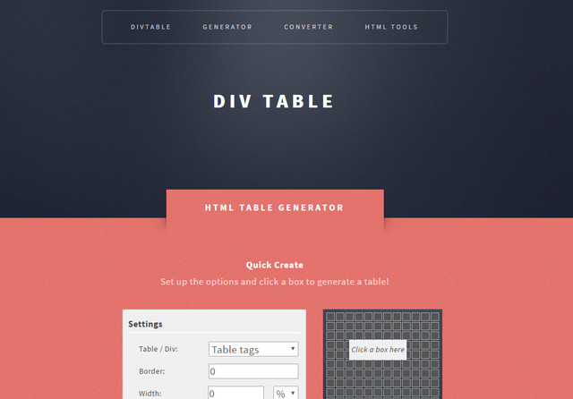
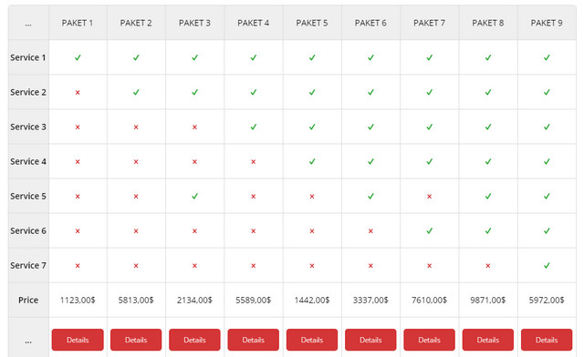
The HTML Table Generator allows building standard tables using div or table tags. The handy feature is an interactive preview.

Creator: divtable
License: Declared as Free, no proper license given.

Hammer

Hammer is intended to solve two main issues: adding support for gestures and minimizing the delay from clicks


Creator: Team of Volunteer Contributors
License: Declared as Free, no proper license given.

Kute.js

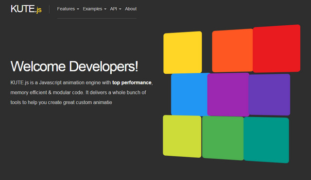
Not only is this JavaScript-powered animation engine aimed to create fancy dynamic effects, but it also boasts of top performance, fast code execution, and fallback options.

kute
Creator: thednp
License: MIT License.

Bless CSS

The tagline of Bless CSS speaks for itself. From the first seconds, it becomes clear that this plugin is eager to provide viable solutions for IE support

bless
Creator: Paul Young
License: See License file.

Patterns Lib

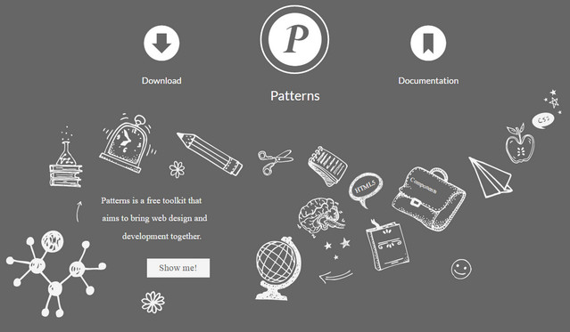
The Patterns library comprises reusable interaction patterns that can be applied to the project simply with the help of CSS classes and HTML attributes.

patterns
Creator: patternslib
License: Declared as Free, no proper license given.

CSSNano

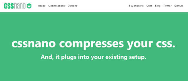
The service makes your style sheet as small as possible, putting your files through various focused optimization algorithms. The latter includes removing old vendor prefixes, converting color values, etc.

cssnano
Creator: ben-eb
License: MIT License.

Egjs

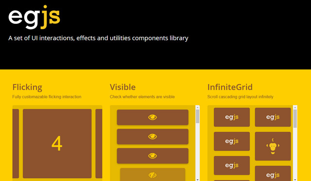
Egjs is a bundle of different UI interactions and eye-pleasing effects that were carefully assembled into one library. It covers eight standard components starting from basic utilities and ending with infinite grid element.

egjs
Creator: Naver Corp
License: Declared as Free, no proper license given.

Universal Collection of Transitions

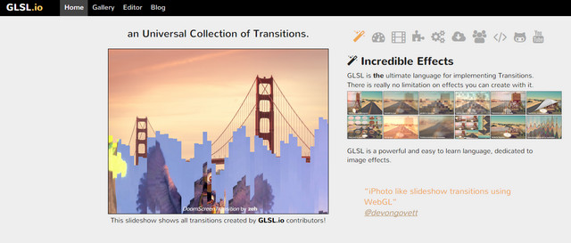
This is an open source collection of GLSL transitions that take image effects to the next level

glsl
Creator: Glslio
License: Declared as Free, no proper license given.

Sprite Spirit

If you need to inject some life into your images, then this instrument was created specifically for you. It generates an animation from a series of sprites providing you with a clean and neat CSS Mixin

sprite-spirit
Creator: Elior Shalev Tabeka
License: Declared as Free, no proper license given.

Bootstrap 4 Cheat Sheet

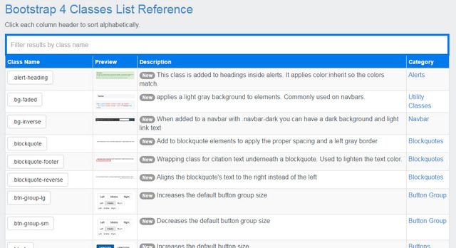
Bootstrap 4 is available in alpha version. If you are going to download and use it, then this cheat sheet will give you a head start.

bootstrap4-cheat-sheet
Creator: Bootstrap Creative
License: Declared as Free, no proper license given.

Categories: Others Tags:

Consulting: WordPress Premium Theme for the Consulting Business

December 20th, 2016 No comments

When offering consulting services, you should definitely take a closer look at the premium theme “Consulting.” It is one of the most popular themes on “Themeforest” for this purpose. And rightfully so.

Consulting: Landing Page. (Screenshot: Noupe Magazine)

StyleMixThemes Creates Application-oriented Themes Only

Last year, we already put the theme provider “StyleMixThemes” on your radar. Back then, we reviewed the beautiful gastronomy theme “Bon Appetit.” What we’ve noticed back then still applies to “Consulting.” StyleMixThemes doesn’t just make a theme with a somewhat fitting look for a particular branch. The developers actually look at what the chosen business needs, and create features and design strictly according to that. This way, you don’t get a uniform theme, but rather a specialized solution for a concrete application case.

Consulting Offers Many Design Options and Custom Tailored Templates

In the case of the theme “Consulting,” there are multiple dimensions to this specialization. First off, you get a reputable design concept that tries to meet the customer requirements for consulting websites. The 18 different layout variants all look serious and trustworthy, while still being modern and fresh. I especially like all four of the basic color schemes.

Four Reputable Color Schemes Are Available. (Screenshot: Noupe Magazine)

All four different headers use a horizontal navigation bar, which is generally fitting for business websites. Nonetheless, the variants are not too similar to each other, so it’s very likely that you’ll find something for your taste. My personal favorite is the bottom one, by the way.

Although There are Similarities, the Differences Between the Headers are Significant. (Screenshot: Noupe Magazine)

For the presentation of your service, different templates are available. An option to display multiple locations via a Google Maps integration is available as well.

Via Google Maps, Even Multiple Locations Can be Presented in a Clear Way. (Screenshot: Noupe Magazine)

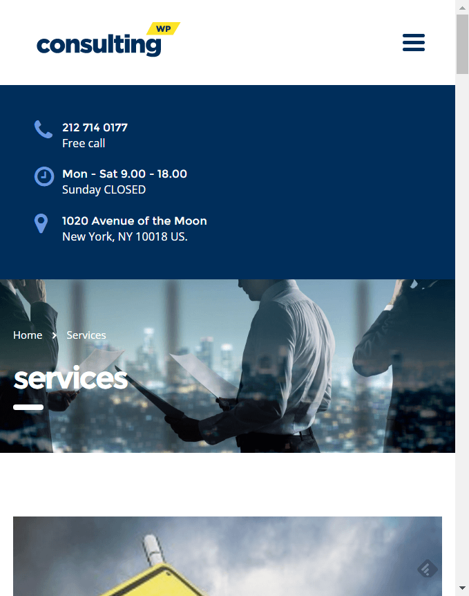
As it should be in 2016, “Consulting” is responsive, and thus, it looks good on all devices. On desktop-size screens, the theme reacts fluid, and always covers the full-screen width. With appropriate image material provided, this looks great. For my taste, “Consulting” looks best in full HD. On mobile devices, the theme scales down to a mobile layout with a hamburger menu. This may not be as impressive from a visual standpoint, but it still looks professional while providing access to all content.

Consulting: Desktop View. (Screenshot: Noupe Magazine)
Consulting: Mobile View. (Screenshot: Noupe Magazine)

If you want to promote your consulting expertise by the use of case studies, you will find two templates that were specially made for this purpose. Introduce your team via an eye-catching grid or by using a list. It’s also good to know that “Consulting” comes in eight different languages, being English, French, German, Italian, Portuguese, Spanish, Russian, and Arabic. If your language is missing, you can easily translate it using the included .pot file, and the free tool Poedit or WPML.

The theme price of 59 USD already includes the popular “Revolution Slider,” which alone would cost another 19 USD, and is used to realize powerful hero image or video presentations. Look at the demo, and you’ll know what I mean. The theme’s individual strengths are presented in detail on this page.

By the way: „Consulting” comes with demo content, so that creating a full site with content can be done fast and efficiently. This makes it easier to understand the layout, and – let’s be honest – you would’ve used some “Lorem Ipsum” either way. After your design is set, directly implement the final contents.

Consulting: Under the Hood

Under the hood, “Consulting” is based on Bootstrap and Sass. From within the customizer, you have access to all of the 700+ Google Fonts. If needed, integrate a shop via WooCommerce. The theme is prepared for that.

However, the most interesting feature under the hood is the Visual Composer. That’s no less than the world’s most popular page builder for WordPress. The Visual Composer has more than 1.5 million users to boast. Using this plugin, you get to build pages and posts in almost any desired layout, without requiring code knowledge to do so.

The functionality is simple:

Normally, the Visual Composer alone is 34 USD, but it’s already included in the price of “Consulting.” Let’s do some math. “Consulting” costs 59 USD. Let’s subtract the Revolution Slider’s 19 USD, and 40 USD remain. The Visual Composer for 34 USD is also included, so only six USD are left. This turns “Consulting” into a real no-brainer.

The delivery includes an extensive PDF guide, the actual theme, as well as a prepared child theme. Within the 30 MB large download, you’ll also find the PSD that contains all design variants, logically organized into layers.

Consulting: the PSD. (Screenshot: Noupe Magazine)

On top of that, StyleMixThemes provides 24-hour support on five days a week. Even in the comment section of the product page on Themeforest, the developers attempt to give out helpful information. In any case, it should be safe to say that StyleMixThemes is one of the professionals on the messy market of premium theme developers. Take a look for yourself.

Categories: Others Tags:

An Overview of Client-Side Storage

December 19th, 2016 No comments

Ire Aderinokun:

There are currently four active methods for storing data on the client side.

  1. Cookies (old school, still useful because they are sent with server requests)
  2. Local Storage (very easy to use)
  3. Session Storage (exactly the same, only clears when the tab is closed)
  4. IndexedDB (quite complex, quite powerful)

Direct Link to ArticlePermalink


An Overview of Client-Side Storage is a post from CSS-Tricks

Categories: Designing, Others Tags:

An Overview of Client-Side Storage

December 19th, 2016 No comments

Ire Aderinokun:

There are currently four active methods for storing data on the client side.

  1. Cookies (old school, still useful because they are sent with server requests)
  2. Local Storage (very easy to use)
  3. Session Storage (exactly the same, only clears when the tab is closed)
  4. IndexedDB (quite complex, quite powerful)

An Overview of Client-Side Storage is a post from CSS-Tricks

Categories: Designing, Others Tags:

What You Need to Know Before Building Your Small Business Website

December 19th, 2016 No comments

What You Need to Know Before Building Your Small Business Website

Having a website for your small business is essential. However, keep in mind that “Bad sites – ones full of mistakes – are almost as damaging as having no site whatsoever.”

There are number of errors you can fall into when crafting your website. You could have a terrible design or overload your site with text. Or you could have poor CTA’s and keyword targeting, thereby failing to convert visitors.

Because of the many details you need to consider, as well as the potential pitfalls, creating your business’s website can be overwhelming. You have a lot to consider, from how you want to advertise your business to how much and what kind of content you want to publish.

The first decision you need to make is whether or not you want to design your site yourself or hire someone else. Your answer to this question will narrow down how you should proceed. So which option should you choose?

Make Sure That Saving Money Is Worth It

One of the biggest influences on your decision will likely be cost. The expense of building your own website is going to be rather high when it comes to the number of zeros on the bill. There is no question that you will get what you pay for, but what you pay for also depends on precisely what you want from your website. There is no such thing as “one size fits all.”

Perhaps you want to establish a website that is more on the complex side. Maybe you’re looking for page after page of displayable content, each with its own child pages that branch out and interact with other pages on your site.

In this case, you will probably want to contract outside help to keep your project from getting too crazy. It’s easy to start out with a simple task only to discover that it is a lot more involved than you originally thought.

For example, suppose that you have a few products that you’ve already built out. Let’s say that one of them is an eBook for marketing automation. It is filled with gated content for email opt-ins that will bring consumers through the conversion funnel.

However, because you have to widen your funnel on the front end, you will need a substantial and robust blog. Your blog will need enticing and interactive graphics. You might need polls, a Disqus plugin, and a standout share bar, as well as CTAs splashed throughout each of your blog posts.

While you might know how to market your product, you could lack experience in developing a robust and beautiful blog. And building your blog is key to your success, so you will need a team that has had previous experience with gated content projects. In this situation it is far better to hire outside help than to handle everything on your own.

When You’ll Want to Do It Yourself

On the other hand, you might want a simple and straightforward website with minimal fluff and pizzazz. In this case, it could benefit you to look into what it takes to construct your own website. If building your own site is the best option for you, doing so will save you time and money in the long run.

What’s more, crafting your own small website from scratch can give you the skills to eventually be able to create one that is bigger and more cutting-edge. Start small on your own, and keep building on your knowledge.

The truth is, web design is not that hard to learn. There are many courses out there, as well as shared knowledge online. What might be most helpful is a course on web design and creation that trains you in the Java language.

Java is one of the many languages that computer software understands, and it is also one of the most popular. C++ is another well-known coding language with which you might be familiar.

Once you are immersed in the lingo of computer and web-based commands, the overall concepts will click. Then you will be able to leap back and forth between different computer-based languages.

Taking courses in web design will not merely allow you to overcome obstacles that will certainly come your way. The courses will also give you ideas for your website that you would otherwise not have considered. Educating yourself in this way can be a great strategy for setting yourself up for success as you build your site.

Remember, Creating and Maintaining Websites Takes Time

If you do decide to take the leap and construct your website on your own, then you should know that it will take time. Rome was not built in a day, and your website will not be either.

Building an entire website from scratch is tough, but worth it in the end. If you take the proper first steps, such as receiving a Java certification and training, you will streamline the time you spend working on your site.

No Matter What, Have a Plan for Debugging Your Site

Whether or not you decide to build your website by yourself or with an experienced web designer, you need to think of your site as a living thing that, much like you, can get sick.

“Getting sick” takes the form of overloading and crashing. Sometimes websites garner too much traffic for the server to support, and all that stress can cause the server to overload and crash. Other times, your coding (or your designer’s coding) might have a lapse that causes the site to crash.

When these events happen—and they do more often than you think—you should have a solution that will enable you to get your site debugged. If you hired a firm, chances are they will jump on the problem immediately and take care of the issue for you. But if you built the site yourself, you should know what to do when it gets buggy.

There Is Pride in Creating Something Amazing from Scratch

There are website building platforms out there that allow you to get a free site simply by clicking a few times. But those platforms (such as WordPress or Wix) tend to be very limited in terms of what they permit you to do.

That is why having the ability to construct your very own site is such a great skill to have under your belt. You can fix any issues you might encounter on your own. You will save a ton of money in the long run, and you will also have the pride of crafting something amazing with your own two hands.

Read More at What You Need to Know Before Building Your Small Business Website

Categories: Designing, Others Tags:

20 Code Snippets with Beautiful Pricing Tables

December 19th, 2016 No comments
ip-pricing-table

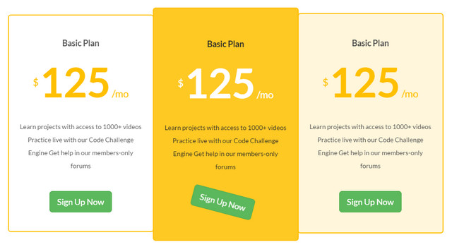
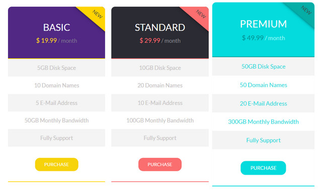
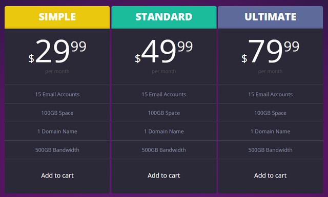
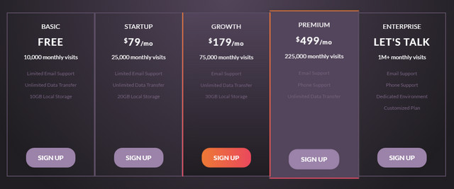
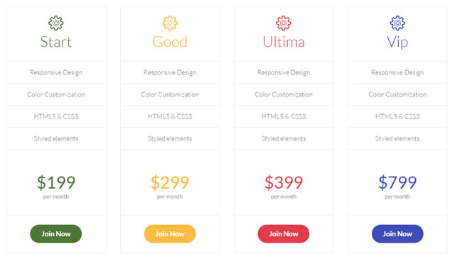
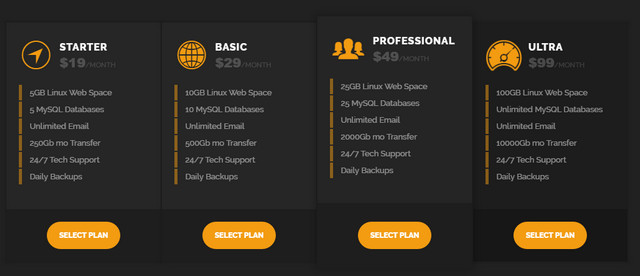
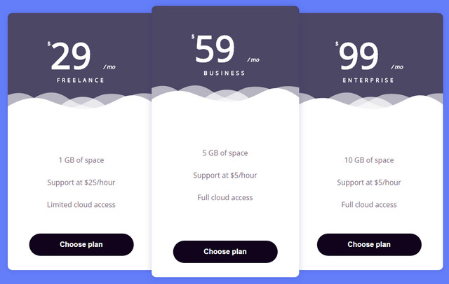
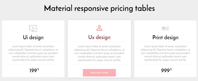
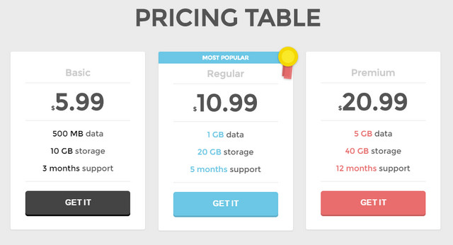
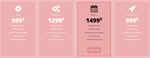
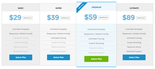
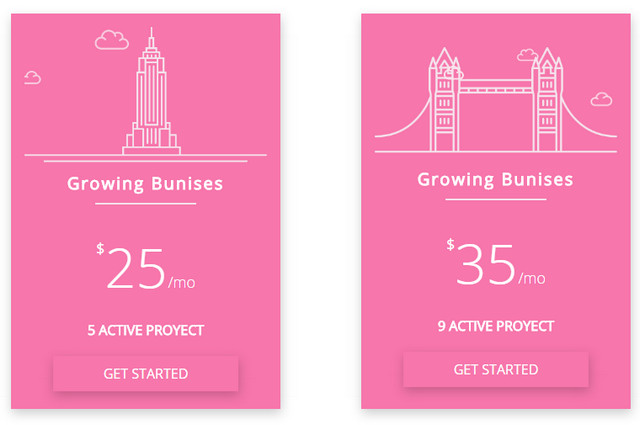
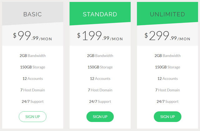
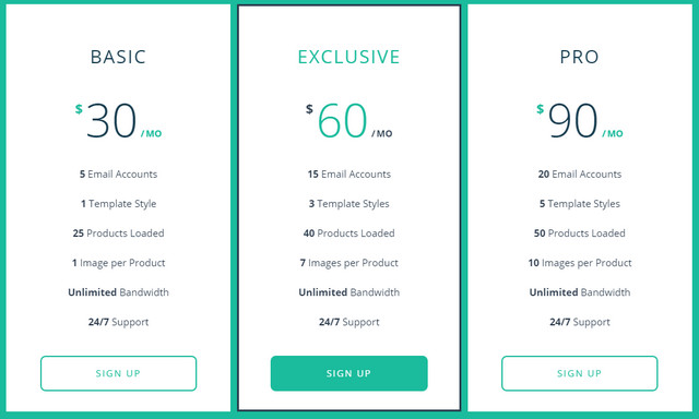
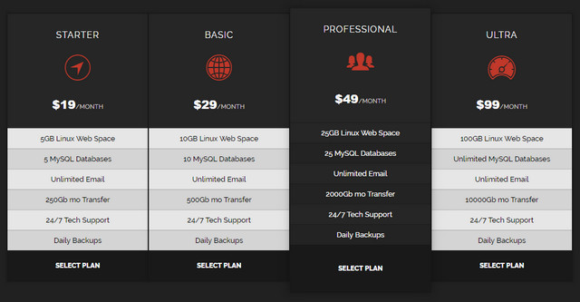
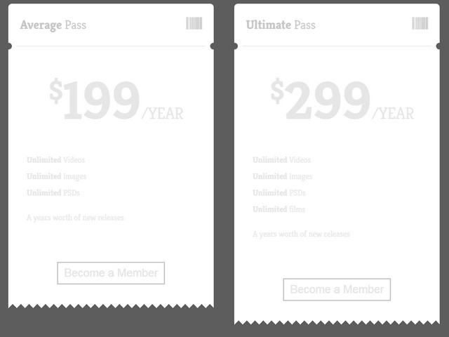
What is the best way to dish up data about your current services, its features, and pricing? Although the answer is banal, yet it is time-proven and still number one in this area – pricing table. It is the most efficient way to present the information in an enjoyable manner and easily digestible portions. All you need is to arrange everything into columns and rows, spice up these blocks with beautiful typography, vector graphics, and harmonized color schemes, and enrich it with prominent CTAs and dynamic behavior. As you can see, the creation of a simple pricing table requires skills both of the designer and developer; so if you lack one of them, then there is a fat chance that you will end up with a poorly baked component. Do not despair, if it is one of these cases. We have found a solution that may solve your problem at least partially – vigilantly crafted code snippets with pricing tables that look and feel great. Use them as a source for inspiration, representative example or a starting point.

There is a whole selection to choose from. We have found various samples. The majority of the listed below are responsive solutions that quickly adapt to your browser screen. Some of them look simple yet elegant, while others charm with sophisticated appearance and attractive design traits. Some of them are static others equipped with little dynamic effects that contribute to user experience and make the whole component look alluring.

Ip Pricing Table

Creator: Marcel

Adaptive Pricing Table


Creator: Alex

Flat Pricing Table Design

flat-pricing-table
Creator: Mehmet mert

Flat Pricing Table

flat-pricing-table-with-flip-over
Creator: Andy Tran

Pricing Tables

dark-pricing-table
Creator: Joseph Victory

Pricing Table

dark-table
Creator: Mike Torosian

Price

light-pricing-table
Creator: catcod

Pricing Table

compact-dark-pricing-table
Creator: LittleSnippets.net

Pricing Tables

bluish-pricing-table
Creator: Gerta Xhepi

Material Pricing Tables

material-rrsponsive-pricing-table
Creator: Kreso Galic

Flat pricing table

mini-pricing-table
Creator: Felix Franzén

Price Table Hover Effect

price-table-hover
Creator: Vladimir Lukyanov

CSS3 Pricing Table

pinkish-pricing-table
Creator: The Legend

Pricing Tables

responsive-pricing-table
Creator: Eric Thayer

Pricing Table

mini-pricing-table-2
Creator: Dany Santos

Bootstrap Pricing Table

bootstrap-pricing-table
Creator: Sahar Ali Raza

Flipping Pricing Table

mega-pricing-table
Creator: Felix Schwarzer

Responsive Flat Pricing Table

responsive-flat-pricing-table
Creator: Shane Heyns

Dark Themed Pricing Table

dark-themed-pricing-table
Creator: LittleSnippets.net

Pricing Table Tickets/Passes Flip

ticket-styled-pricing-table
Creator: Hans Engebretsen

Categories: Others Tags:

Scaling Responsive Animations

December 19th, 2016 No comments

Scaling our websites and applications so that they look great on every screen can be difficult. A big portion of that difficulty can be trying to get specific components, particularly ones that have pieces that have to stay a certain size (like animations), to look good regardless of the screen size. In this post, we’ll cover how to help keep our responsive animations sized the way we want them.

Before we get into specific techniques, there are a couple basic guidelines we want to keep in mind:

Guidelines for scaling responsive animations

1. Size the animations based on a container

Whether we’re using responsive or adaptive scaling (see below), we should try to size animations based on the container’s sizing. In responsive scaling this is simple enough, but in adaptive scaling we have to look to element (container) queries. The only exception is if we know that in every circumstance the element is going to be positioned and sized relative to the viewport. Even so, it might be wise to size each piece based on a container in case we change our minds later.

There have been times where I’ve finished polishing an animation exactly the way I want only to realize that it only works for that particular screen size. Those times have included making mistakes like using absolute units (like px), only viewing it in one screen size, using responsive units but failing to check extreme dimensions, and a couple other occasions where I had to go back and completely refactor my approach. Sizing animations relative to the parent elements helps prevent that from happening, as does the following point:

2. Know the environments in which it will be used

Will the animation be a module that is repeated across multiple parts of your application? Is it only going to be used for a page loader initially? Does it need to scale at all? Keeping this in mind can help determine the method in which an animation should be scaled and keep you from wasting effort.


Now, let’s look at the three most important ways that we can scale animations: scaling with responsive units, proportional scaling, and adaptive scaling.

Scaling with responsive units

Size pieces based on the parent

When we use responsive units like % or em, our animations automatically resize themselves based on the parent because their values change as their parent’s do.

  • In the case of percentages, the child’s width value is set by the parent’s value for the property, multiplied by the percent value set on the child.
  • In the case of ems, it looks at the parent’s font-size which determines the child’s size values, multiplied by the number of ems.

This allows us to make sure that each piece of our responsive animation retains the behavior we want with respect to each other.

Sizing containers based on the viewport

From there, if we size our containers relative to the viewport, our responsive pieces will then end up resizing themselves based on the viewport as well.

We could use percents to size our containers based on the viewport, but that often requires setting something like html, body { height: 100%; } and making sure that the parent is sized with respect to the body, which may not always be the case with nesting. Adding this new rule can also affect other style changes.

Alternatively, we can use viewport units, which sizes the container based on the viewport regardless of how deeply it is nested. One thing to keep in mind is that support for viewport units is not perfect, though it’s definitely in a state where it can be used for most projects.

I tend to use solely responsive units as a scalar for animations when it’s a really simple animation, such as this illusion. Most the time it requires a pairing of responsive units with an approach from below to keep the animation proportional.

Proportional scaling

There are three main ways we can keep our responsive animation proportional while scaling it.

1. Size based on the width

To keep an element sized based on the width of the container, we can use the following approach:

.container {
  height: 0;
  padding-top: 100%;
}

See the Pen Infinite Mountains CSS by Zach Saucier (@Zeaklous) on CodePen.

However, if you’re sizing your container based on the viewport, a more straightforward approach would be to use vw like so, though it doesn’t reach as far back regarding support.

2. Size based on the height

We can also size our container using the height by using vh as seen in this demo, but it is the least-used technique that I’ve seen. The only time I can recall doing something like this myself is when I used responsive units to create this loader, but even then I didn’t use a container or viewport units.

3. Size based on the larger dimension

Sizing based on the larger dimension is by far the most common way I size my responsive animations, especially my visualizations, because I almost always want all of my responsive animations to be seen entirely. This method ensures that that happens.

.container {
  max-width: 100vh;
  max-height: 100%;
  margin: 0 auto;
  overflow: hidden;
}
.container::before {
  content: "";
  display: block;
  margin-top: 100%;
}

See the Pen Swirling dots by Zach Saucier (@Zeaklous) on CodePen.

This technique doesn’t make use of the vmax unit, so any browser that supports viewport units (back to IE9) can use it. However, it does make use of a pseudo element (unless you want to use a real element) which should be kept in mind.

If you are scaling the container on the viewport itself and can use viewport units, it’s very simple to size based on the larger dimension. All you need is:

.container {
  width: 100vmin;
  height: 100vmin;
}
Here’s a demo for that.

This approach can be done only when the animation is sized with respect to the viewport, not some smaller container.

Adaptive scaling

Adaptive scaling is switching between variations at specific breakpoints. See Geoff Graham‘s CSS-Tricks article on the distinction between responsive and adaptive scaling.

At times we may want at least part of our responsive animations to change how they’re sized at a particular screen size. This is most commonly done when text or thin lines are used, though sometimes it’s also applicable when there are a lot of intricacies that would look busy when made smaller. Logos are probably the most commonly adapted elements because they need to be precise.

There’s no one way to make something adaptive, but I approach it in the same way I do responsive design: by scaling my animation until something starts to look ugly, then add a breakpoint to fix what looks ugly.

Sometimes it’s appropriate to mix responsive pieces with adaptive ones, such as in the Pen below. The top part is responsive but the text is adaptive to prevent text scaling from becoming ugly during in-between font sizes.

See the Pen Breakout by Zach Saucier (@Zeaklous) on CodePen.

A note on SVG

SVG can make use of any of the approaches outlined above. Most commonly, I treat SVG like a modular animation and make sure my SVG is sized by the SVG element itself, mostly treating it as a container based on the larger dimension, as covered above. This way it makes use of the vector nature of SVGs, allowing it to scale to be as large as it needs to be.

For more information on how to scale SVG specifically, check out Amelia Bellay-Royds‘ post on scaling SVG components here on CSS-Tricks or Sara Soueidan‘s Codrops post on making SVG responsive.

Make it look great in all contexts

With a bit of planning, animations can work just as well at small sizes as they do at large sizes. Don’t use pixel units, and make sure every width, height, and distance value are defined based on one or two variables based on the container/viewport dimensions or by font size.


Scaling Responsive Animations is a post from CSS-Tricks

Categories: Designing, Others Tags:

50+ best of “what’s new for designers” 2016

December 19th, 2016 No comments
theme.cards

Every month we bring you the best new apps, frameworks, design and mobile resources, business resources, and more. Here we are at the end of 2016, and we’ve compiled a roundup of the best of what we’ve featured this year, a total of more than 50 resources, carefully curated to make sure it’s the best of the best!

Much of what’s on the list this year is free, with some low-cost, high-value apps and tools also included. They’re sure to be useful to designers and developers, from beginners to experts.

Theme.Cards

Theme.Cards is a collection of the best free themes out there. There are collections of blog templates, landing pages, one page apps, Bootstrap themes, WordPress themes, and more.

Design Workflow with Sketch

Design Workflow with Sketch is a free e-course from Invision that shows you how to have a better, more streamlined workflow when you’re working with Sketch. Sign up to get weekly lessons delivered to your inbox.

Design Workflow with Sketch

Founder Mantras

Founder Mantras gives you a daily dose of wisdom from startup founders, owners, and independent creators. Subscribe for updates to your inbox.

Founder Mantras

Fabricator

Fabricator makes it simple to build your UI toolkit. Organize your design system the way you want, with the taxonomy you choose.

Fabricator

mjml

mjml is a framework for easily creating responsive emails. It’s component-based, and even works with Outlook.

mjml

Plain

Plain is an app prototype for one-touch email processing. It focuses on removing features to make email more efficient.

Plain

UX Assist

UX Assist lets you create products with predefined workflows, or create your own by adding and rearranging activities.

UX Assist

GrapesJS

GrapesJS is a free and open source web template editor that lets you build templates without coding.

GrapesJS

Milligram

Milligram is a minimalist CSS framework. It includes typography, buttons, forms, grids, and more.

Milligram

Ethical Web

Ethical Web is a set of ethical web design standards that focus on user-centered design, aiming to create a better web for everyone.

Ethical Web

365cons

365cons is a daily icon diary created by Amy Devereux. Icons are designed in a variety of styles, making it a great source of icon inspiration.

365cons

Dorkoy

Dorkoy is a drag and drop website builder that lets you create an unlimited number of websites for one yearly license fee. It offers more than 100 different kinds of content blocks, email support, and more.

Dorkoy

LOLColors

LOLColors offers curated color palette inspiration. Browse by latest or most popular.

LOLColors

Hugo

Hugo is an easy to use static website engine that aims to make website creation simple again. It’s great for blogs, docs, portfolios, and more.

Hugo

Just Good Copy

Need to create some amazing email copy and not sure where to start? Check out Just Good Copy for tons of email copy from great companies for ideas and inspiration.

Just Good Copy

Pattern

Pattern is a new offering from Etsy that lets you turn your Etsy shop into your own website, for just $15/month (with a 30-day free trial).

Pattern

Design Facts

Want to increase your knowledge of the design world in quick, easy to absorb bites? Design Facts gives you quick bits of information about the world and history of design.

design facts

Estimatr

Estimatr is a totally free tool for estimating accurate software. Stop using spreadsheets and equations to try to estimate things accurately.

Estimatr

Gutenberg

Gutenberg is a starter kit that brings meaning and craftsmanship to web typography. It’s flexible and simple to use.

Gutenberg

Min

Min is a “smarter” web browser. It uses DuckDuckGo for search, includes a calculator, and more. You can even jump to any site using fuzzy search and get suggestions before you start typing.

Min

Flexbox Patterns

Flexbox Patterns are a collection of user interface patterns for Flexbox. It includes examples and source code.

Flexbox Patterns

Email Toolbox

Email Toolbox is a collection of hand-picked resources for email marketers and designers. It includes links to people, courses, writings on email design, and more.

Email Toolbox

Maki

Maki is a set of icons for map designers. It includes 114 icons for things like parks, museums, and places of worship.

Maki

Proud

Proud is a time management app (iOS and Mac) made just for busy people. It acts like an external brain for your ideas and thoughts to help you remember what’s important.

Proud

Picnic CSS

Picnic CSS gives your native HTML elements a boost so that you don’t have to mix your presentation classes with your HTML. It’s entirely modular so that each part can be easily modified and tested.

Picnic CSS

Adobe Spark

Adobe Spark makes it simple to turn your ideas into social graphics, web stories, and animated videos, in just minutes.

Adobe Spark

Colicious

Colicious is a great tool for finding colors to use on your next project. Just hit the space bar or click the screen to get a new color.

Colicious

Nicely Done

Nicely Done is a gallery of digital product inspiration. View by most popular, or by tags and categories.

Nicely Done

Beetle

Beetle gives you access to marketing emails from top brands, all in one place.

Beetle

Slaask

Slaask is a customer service app for Slack that lets you bring all of your client and team communication together in one place.

Slaask

ColorDrop.io

ColorDrop.io is a great source for finding the best color palettes. Click on any palette to see the HEX and RGB values for each color.

ColorDrop.io

ZBS CRM

ZBS CRM is a customer relationship manager that uses WordPress. It’s completely free, with no recurring subscription costs.

ZBS CRM

Open Source @ IFTTT

Open Source @ IFTTT includes a bunch of open source resources from IFTTT, including app development tools, UI Kit resources, and more.

Open Source @ IFTTT

Form Bucket

Form Bucket offers form handling and automation for static websites. Redirect users to any URL and style forms with your markup and CSS.

Form Bucket

Blog Owl

Having a hard time coming up with blog topic ideas? Blog Owl will send you ideas and suggestions right to your inbox.

Blog Owl

Sans Francisco

Sans Francisco is a collection of tools to help designers create better experiences. It includes tools for user research, typography, color palettes, iconography, stock photos, inspiration, prototyping, and more.

Sans Francisco

Launchkit

Launchkit is a set of web-based tools for mobile app development for creating, launching, and monitoring apps. And now it’s been open-sourced!

Launchkit

Moo.do

Moo.do is a task manager for Gmail. It interfaces with tasks, email, documents, calendar, projects, and contacts.

Moo.do

Diverse UI

Diverse UI is a collection of free stock photos of people from a variety of racial and ethnic backgrounds to bring some diversity to your designs.

Diverse UI

Startup Pitch Decks

Startup Pitch Decks is a collection of real world fundraising decks from startups like Airbnb, Buffer, YouTube, Mattermark, Buzzfeed, Crew, and more.

Startup Pitch Decks

UI Temple

UI Temple is a curated collection of website designs to inspire you. Sort by industry, page type, color, and more.

UI Temple

Wing

Wing is a minimal CSS framework. It’s perfect for smaller projects that don’t need all the features of a framework like Bootstrap or Foundation.

Wing

Hero Patterns

Hero Patterns is a collection of repeatable SVG patterns for backgrounds on your digital projects. Select foreground and background colors prior to downloading.

Hero Patterns

Push by Zapier

Push by Zapier is a Chrome extension and app for building small, single-purpose workflows that live inside Google Chrome.

Push by Zapier

Disrupt Cards

Disrupt Cards are like a Silicon Valley-inspired game of Cards Against Humanity, with references and situations that will likely only make sense to those in the world of tech.

Disrupt Cards

Mastodon

Mastodon is a free, open-source social network server that’s decentralized. It allows anyone to build a social network seamlessly.

Mastodon

OPEN COLOR

Open Color is a color scheme for UI design that’s provided as CSS, SCSS, LESS, Stylus, Adobe library, Photoshop and Illustrator swatches, and Sketch palette.

Open Color

App Launch Checklist

The App Launch Checklist covers all the things you need to think about when launching a new app, from press kits to acquisition channels and more.

App Launch Checklist

Eve

Eve is a programming language designed for humans. It’s the first human-first programming platform that focuses on people over machines.

Eve

HTML Email

HTML Email is a set of templates you can use as the basis for developing responsive emails. They work in a variety of email clients and devices.

HTML Email

Stripe Radar

Stripe Radar is a set of modern tools for preventing fraud that fully integrates with your Stripe payments.

Stripe Radar

Fuzzy.ai

Fuzzy.ai lets you easily incorporate AI-powered decision making via an API. The algorithm improves automatically with no training data or data scientists required.

Fuzzy.ai

430 Vector Logo Design Templates & 200 Logo Kit Elements – only $17!

Source

Categories: Designing, Others Tags:

The (Not So) Secret Powers Of The Mobile Browser

December 19th, 2016 No comments

Apple taught us, “There’s an app for that.” And we believed it. Why wouldn’t we? But time has past since 2009. Our mobile users have gotten more mature and are starting to weigh having space for new photos against installing your big fat e-commerce app. Meanwhile, mobile browsers have also improved. New APIs are being supported, and they will bring native app-like functionality to the mobile browser.

We can now access video and audio and use WebRTC to build a live video-chat web apps directly in the browser, no native app or plugin required. We can build progressive web apps that bring users an almost native app experience, with a launch icon, notifications, offline support and more. Using geolocation, battery status, ambient light detection, Bluetooth and the physical web, we can even go beyond responsive web design and build websites that will automagically adapt to users’ needs and context.

The post The (Not So) Secret Powers Of The Mobile Browser appeared first on Smashing Magazine.

Categories: Others Tags:

Popular design news of the week: December 12, 2016 – December 18, 2016

December 18th, 2016 No comments

Every week users submit a lot of interesting stuff on our sister site Webdesigner News, highlighting great content from around the web that can be of interest to web designers.

The best way to keep track of all the great stories and news being posted is simply to check out the Webdesigner News site, however, in case you missed some here’s a quick and useful compilation of the most popular designer news that we curated from the past week.

Note that this is only a very small selection of the links that were posted, so don’t miss out and subscribe to our newsletter and follow the site daily for all the news.

18 Web Design Trends for 2017

7 Step Visual Web Design Process

Dark Side of UI: When Dark is Good for Users

How an Icon Ruined my Life

Culrs – A Simple, Smart Approach to Choose Color Palletes

20 Awesome Font Pairing Tools for Designers

Design Trend: Photos that Come Alive

16 Reasons to Pay for Better Designers

Web Design Isn’t More Boring, Isn’t Losing it’s Soul

If Designers Talked Dirty, this is What They Would Say

The 6 Best New UX Tools of 2016

Gitscout – A Beautiful Github Issues Experience for MacOS

Codevember: Amazing JS Experiment

What Next for CSS Grid Layout?

Ikea Renames its Products After Common Google Searches in New Ad

Medium’s Best Design Writing of 2016

Text Emoticon Generator

Uber is Fixing a Major UX Issue, Using your Favorite Color

Death to JIRA

The Best and Worst Branding of 2016

Introduction to the 8-Point Grid System

Email Clients the Jessica Hische Way

You’re Design Thinking Too Much

Strobe Illusion – You are About to Hallucinate

Inside IBM Studios

Want more? No problem! Keep track of top design news from around the web with Webdesigner News.

LAST DAY: Art Text App for Mac Turns Text into a Masterpiece – only $19!

Source

Categories: Designing, Others Tags: