Service Worker, what are you?
December 5th, 2016
No comments
Mariko Kosaka:
I finally figured out, it’s an alien you can invite to live on user’s browser.
Service Worker, what are you? is a post from CSS-Tricks
Mariko Kosaka:
I finally figured out, it’s an alien you can invite to live on user’s browser.
Service Worker, what are you? is a post from CSS-Tricks
I vividly remember waking up as kid to get ready for school at around 7:30 AM, to walk 2 to my neighborhood’s school, which was about 2 minutes away. I thought it was the worst thing in the world, especially during the winter time. (First world problems, right?)
There was one thing that cheered me up more than anything during the cold winters, and I think you already know what I’m talking about. It was of course, alcohol. Just kidding, it was hot cocoa. But not just any hot cocoa, it was Nesquik hot cocoa. And trust me, Mom, I knew when you replaced the real thing with that cheap Walmart knock off brand. Not cool, Mom, not cool.
Jokes aside, Nesquik probably played a big part in your childhood as well, and you are pretty familiar with the famous rabbit, Quicky.

Well, the bunny suffered a serious makeover and he now changed from the 2005 looking character, to this detailed and modern looking mascot. 
Frankly, I think the bunny looks fine (a bit creepy though), and it was surely nice of them to put some clothes on him. However, as a marketer, I am surprised that they had the guts to commit to this hugr change. Of course, every redesign is risky, but changing the image of such a widely known product is probably the riskiest. The thing that Nesquik did with this marketing move was adapting to the new technologized generation. Young, fickle, easily influenced kids are expressing brand preference at an earlier age than previous generations. Marketing experts say children can express brand awareness as early as the age of 2, an awareness encouraged by a world that offers more choices than ever before.
Kids are more likely to see a little of themselves in the mascot, therefore, more likely to convince their parents to buy the yellow box of awesomeness.
An important aspect that they haven’t considered is the Uncanny Valley effect. Some people are complaining that the mascot creeps them out, and I can see why. However, I think that kids see characters like Quicky every day and the mascot’s creepiness isn’t as visible to them as it is to some of us.
The Nesquik logo has also suffered some changes. While I like the new mascot, and the idea behind the rebranding, the new logo seems a bit incomplete. Although it looks a lot more friendly, and softer, you would expect a bit more, considering the potential.
I think the guys from AtomicVibe got it right.
“I can appreciate that the previous logo had endured since the ’90s, and thus, had cemented itself into our consciousness by virtue of nostalgia. But, in my opinion, this new logo attempts to make more of a visual connection to the product. Its smooth, soft, flowing, script-style curves are friendly, gestural, and expressive, and make me think of milk being splashed — more so than the previous version. Coincidentally, this new lettering seems to take its aesthetic cues from the product’s heritage. The product was called “Quik” from its inception in the ’40s through the ’80s, and this is a sampling of what the Quik logos looked like during that time period:

Thumbnail It was renamed “Nesquik” in the ’90s, and was subsequently rebranded. I don’t think the old logo was bad, per se, but compared to both the heritage Quik logos and this new refresh, the ’90s Nesquik logo just seems too stiff and rigid, too condensed, and too geometric — characteristics that don’t seem to fit with the “splishy-splashiness” of the product. “
The new Nesquik logo and the old logo are both suitable for the product they represent. The new one definitely brings more warmth and friendliness to the product, but it could still be improved a lot. You kind of know when a logo will be redesigned in a few years, so I’m really looking forward to the new one. Until then, this one will have do. It’s just “meh”.
Read More at We Don’t Know How to Feel About Nesquik’s Redesign

This month we got the opportunity to interview Kevin Ball and Rafi Benkual from ZURB. We got to talk about the future of the web, the state of web design today, and of course, about Foundation.
WebdesignerDepot: Hello Ladies and Gentlemen, I am Ezequiel Bruni for Web Designer Depot, and today we are talking to these two lovely people from ZURB, would you mind sharing your names with the audience?
Kevin Ball: Hi, I’m Kevin. I also go by KBall here at ZURB, and this is…
Rafi Benkual: I’m Rafi, and I’m Foundation Advocate here at ZURB.
KB: Oh yeah, I should say what I do. I’m the Foundation Lead.
WDD: Ok, Foundation Lead, what is it exactly that you do? You decide the direction for Foundation, or…?
KB: Ah, yeah, there’s a number of different pieces there. I’m less of a dictator, and more of a facilitator and a synthesizer. I spend a lot of time in conversations—both in person and online—just trying to get a sense of where people are struggling with Foundation, where the web is going, where responsive design is going, and trying to make sure we’re out ahead of that curve.
WDD: Ok, and Rafi, what do you do as… Foundation Advocate, was it?
RB: Yeah, that’s a hard one to describe, so there’s a lot of community advocacy, growing the community, marketing sales. And then also coding on both client projects, internal projects, and obviously everything with Foundation, and also working with the community to fix bugs, and make new features for Foundation.
WDD: How did you guys get your start in web design and development, and all of this?
KB: Uhh, sure, you want to go first, Rafi?
if you look at ZURBians who code, we’re probably 80% self-taught in one form or another
RB: You go first.
KB: Well, I’m longer. So I’m kind of an old-school guy, so I started in back-end hardware and low-level software, compilers, device drivers, and stuff like that. And then coming into 2008-2009 I was at a career transition, I founded a startup called Causes, which was doing social advocacy, non-profit work, and that sort of stuff online.
KB: Those of you who were paying attention to the web then may remember that Causes was the largest non-game application on Facebook, back when Facebook first launched applications. And so we were trying to ride that Facebook boom at a time when everybody was getting excited, so we were seeing hundreds of thousands of new sign-ups a day, riding the brand new open Facebook platform.
So that was my intro to the web, it was: “Welcome aboard, we’ve got an application. We’ve got a million people using it today.” And six months later, it was 15 million people, and by the time I left, it was over a hundred million people using the thing. So kind of riding that wave, and learning all about scaling large applications and how to do that.
It was kind of funny, ’cause I got a job at a web company, and in my interview, they had me do a bunch of data analysis, and I said, “Great, I’ve got it, how do you want it output?” And they said. “Well, just put it in a list. An HTML list.”, and I’m kinda like “Ok, what’s that?”, right? ‘Cause I was coming from this back-end deep-in-the-weeds thing, and they’re like, “Oh, ok, here’s the markup. Start going.”
KB: It turns out that when you’ve been doing deep coding and C and all of that, HTML is not so bad.
WDD: And Rafi, how’d you get started?
RB: Well actually, I came from a sales and marketing background, and from online retail and things like that, and I was actually friends with some people that worked at ZURB, and I would come around the office, helping out a lot.
And the boss kind of told us that he was looking to grow Foundation, and looking for somebody dedicated to the Foundation community. But I had never touched HTML and CSS before in my life, ’til like three years ago, so I had to learn Foundation in about a month, and then take a test and pass that to get hired on at ZURB.
That’s kind of where I started, I did it, and I did really well, and just immediately got thrown into the mix of fixing bugs in GitHub, which is crazy.
WDD: I have to say, you guys are a little lucky to have had actual training. I was self-taught and the only reason I kept going was because I didn’t know I sucked.
KB: Oh yeah, I know, I learned in-industry. I studied physics in school. I think, actually, if you look at ZURBians who code, we’re probably 80% self-taught in one form or another.
WDD: So that’s really cool. You’ve already addressed how you guys came to work at ZURB, and that’s interesting. How did you guys get assigned to Foundation specifically? Were you put directly on this project when you started, or were you doing other things first or…
KB: Rafi came straight into Foundation. I came in as an engineering lead at ZURB and sort of started gradually absorbing more and more projects, and kind of leading different ones. It got to a point where one of our previous Foundation leads left to move on to something else, and I was looking at all of these projects, saying, “Well these are all well and good, but what really gets me pumped, and really gets me excited is working on Foundation and interacting with its community.”
So I talked to the folks at ZURB, talked to the boss-man talked to everyone, I was like, “I’m doing all of these things, but really what I want to be doing is Foundation.” They kind of looked at me and said, “Great! Go!, Do!”
WDD: Ok, Kevin, when did you first realize that Foundation was going to be such a big deal, when did you first kinda get the sense that?
KB: So by the time that I got into Foundation—I mentioned that I got into the web, what is it, eight years ago now?—but I’ve been at ZURB just a year. So by the time I really got into Foundation, it was already a pretty big deal. To me, I think broadly, frameworks—Foundation and Bootstrap—kind of were… discovering them was huge for me. Because back when when I started doing web stuff even have a grid system, like 960, was a huge innovation. And then all of a su…
WDD [interrupting rather rudely, Ezequiel’s very sorry]: I know!
KB: More than just a basic grid, something that you can adjust, something that’s responsive, like, my goodness this is incredible. So coming from a development background, moving gradually more to the front end, having that type of resource, I could see that was huge even before it got huge.
every day we’re discovering brand new companies that have been using Foundation for a few years, and it’s just amazing to see
RB: Foundation was, by the time I started three years ago, already huge in the web development world. If you do web development, you probably knew of Foundation and Bootstrap, and then there weren’t really too many other frameworks out there at the time. Maybe Semantic was brand new, but that’s not really a full framework, so there wasn’t too much out there. So Foundation was already huge.
What happened was, as I started work on Foundation, I started realizing how many different brands and websites are built on Foundation, and that was really eye-opening to me. So every day we’re discovering brand new companies that have been using Foundation for a few years, and it’s just amazing to see. Check out our brands page and you can see all of the hundreds of huge brands that are on there, and there’s probably thousands more that we don’t even know about.
KB: Yeah it still trips me out sometimes, play a little bit on what Rafi’s saying, like you get down to the weeds, and you’re just doing the work, right, and then you step back…
Like, I’m a big sports fan… NBA.com recently did a re-launch. Their whole new site is built on Foundation. And of course I go and look at the site, and I’m like “Oh, there’s a bug, and there’s a bug…”, and I’m still down in the weeds. Then I step back and I’m like, “What am I talking about? This is my favorite sports league, and they’re built on the product that I worked on. This is incredible!”
WDD: [Laughs] That’s got to be an incredible feeling. Meanwhile, I have developed to tell when any website is built on Bootstrap. It’s not a super power I wanted when I was a child, but that’s what I have.
KB: It runs out it doesn’t require a huge super power, given the the approach that they’ve chosen to take. You know, this is one of the things that we talked about a lot with Foundation. Obviously, Bootstrap has a bigger audience at this time, and one of the reasons they have that is that they have such a strong visual opinion out of the box, which means that somebody who has no idea what they want something to look like… they can plug it in and it’ll look decent. It will look like Bootstrap, but it’ll look decent.
WDD: That’s true. That sort of out-of-the-box functionality is actually a huge part of the web today. Templates and themes are not going anywhere. Frameworks are not going anywhere, people will always need an easier way to just get something done, and faster… which is why Foundation and other frameworks are going to be such a huge part of the web moving forward.
How do you see Foundation moving forward?
KB: That’s a great question, and it’s something I spend a lot of my time thinking about. I can give you a short-term, a medium-term, and a long term answer to that. I think. In the short term, one of the places that we see that we have to get better, is in the pre-existing theming.
Foundation’s core is being extremely customizable, being just that: a Foundation that you can build on top of so that not every Foundation site looks alike. However, there’s a huge audience of people who need something that is a little bit more strongly-opinionated to start from.
And while that is possible right now, that is not as easy in Foundation as it should be, and so that’s a huge focus of ours over the next… I would say three-to-six months. Making it a lot easier for folks who are coming from a design background to create something that then folks who have no design background can just drop in and use all over the place.
WDD: Alright, so, child themes, essentially.
KB: Essentially, yeah. There’re a couple of different variations that we’re looking at for ways to do this. Because one of the things that is, as I said, kind of core to Foundation is this idea that it’s never, we’re always going to put the design audience first.
Like, everybody’s building responsive websites now, but they’re kind of going, many of them are going stale. Like, there’s a few patterns that people figured out, like there’s a hamburger icon, and the off-canvas menu, and all this stuff, and everybody’s stuck with this thing
ZURB is a design company, and that’s where we’re coming from, so however we end up implementing it, it cannot sacrifice that ability to implement your visual identity, your vision. But, we believe that we can make it a lot easier to sort of just drop things in and put stuff in place when you want to.
So that’s one area. Another huge area that we are looking at for medium-to-long-term is really trying to continue to push forward this idea of responsiveness. Foundation has always kinda been on the front edge of that, we were the first framework to go mobile-first, we put a whole bunch of different mobile things in there, and we’re starting to see this basic idea of responsiveness has won.
Like, everybody’s building responsive websites now, but they’re kind of going, many of them are going stale. Like, there’s a few patterns that people figured out, like there’s a hamburger icon, and the off-canvas menu, and all this stuff, and everybody’s stuck with this thing. “Ok, I’m gonna stack the content on mobile, and do this, that, and the other.”
But we think that, especially as mobile devices are becoming more powerful, becoming more prolific, there’s a whole range of possibility out there that is just barely getting played with right now. A responsive website right now often looks like something that is amazing on desktop and it works okay on mobile, or it’s amazing on mobile and works okay on desktop.
And we think that that’s unnecessary. You should be able to have something that is amazing on mobile, amazing on tablet, is amazing if you put the thing up on a TV, is amazing if you’re interacting with it via a screen-reader, so that all of these different things are not just kind of accounted-for, but actually optimized-for, if that makes sense.
WDD: That does make sense. Actually I was thinking about this as you were talking, because I’ve noticed that a lot of sites have adopted the mobile-first mentality, focusing way more on mobile than on larger screen sizes. Now, that’s fair because mobile is huge, mobile everywhere, everybody’s got a mobile phone whether or not they have a desktop or a laptop. They have mobile phones in places where they wouldn’t even have the power for a desktop.
However, screens in more developed places are also getting bigger, and of course more dense, as far as pixels go, and besides that, we’re getting 4K TVs, 4K monitors, the prices are very slowly going down, and what I’ve noticed is that a lot of web designers do not account for the larger screen sizes. These screens that are getting absolutely massive. And you don’t have the option to just maker the window smaller on TV, like a smart TV, or with an Xbox…
I’m a little bit curious, because everybody wants to customize for mobile, and that’s good, but what are you guys going to do in terms of helping your users optimize for the super big screens?
KB: This is something that the world broadly is grappling with, and this where I say that my role is not as a dictator, but rather as a synthesizer. So a couple of our designers were recently on a project that was focusing on big screens. It turns out that some of the things that we already have in Foundation enable you to do things like that, because you can customize your set of break points, you can add an extra, extra large break point. You can do a bunch of stuff for that already.
But people don’t really realize that, they aren’t aware of those options, so a lot of what we want to do there is simply publish best practices for targeting those things. The framework, conceptually works there. Folks are often taking the break points they get out of the box, and not thinking, “Ok, wait, does this actually apply to my entire audience? What are these folks working on?.”
Something that we see the need for, and are working on actively is just better education about what is there and how you use it.
RB: Inside the framework, there are, as you mentioned, mixins. We already have an extra large break point, and you can add more. And then there’s also media queries for pixel ratio and other things like that. I think what we need is… yeah, more best practices, more education on how to handle those situations.
KB: Some additional stuff we’ve got in the pipeline, in fact something I was playing with right up until this call, is something that helps across all the screen sizes: going to more vector graphics, and being able to do more things with vectors.
WDD: SVG. We’re all waiting for “The Year of the SVG”.
KB: “The Year of the SVG”, we have some fun stuff in the pipe to try to make that happen, so I think people don’t always realize how powerful SVG is. If you inline those things, then suddenly you can style them with CSS, you can manipulate them with JavaScript, plus they look beautiful on all screen sizes out of the box. So this idea of responsive imagery is something that we’re really excited about. Stuff that perhaps is not only responsive in that it scales with pixel density, and scales with size, but is also perhaps changing the features that are visible within an image based on screen size.
There’s all sorts of interesting possibilities there. I think what’s lacking right now is not the capability of SVGs, but the tooling. So that’s one thing that we at ZURB can really help push forward: tooling to make that easy.
I could go into more details, but, we’re going to be doing that soon.
WDD: I’m sorry, I just realized that I have literally never thought about the possibility that with an inline SVG image, you could literally drop objects from the image based on screen size. That’s actually kind of huge.
KB: It’s amazing, it’s incredible, and nobody’s doing it. They don’t think about it, because these things are sort of locked away in, “Oh, it’s an asset I’m going to load.” But no, these things are documents. You could do whatever the heck you want.
WDD: They’re documents as dynamic, and changeable, and malleable as HTML itself. That’s an important thing to remember. Second-to-last question in this section is: what is your favorite part about the framework as it is now? Are there any specific components that you think of your favorite, or maybe you worked on it so it’s your baby?
KB: I recently fell in love with responsive menus, and I mentioned that I haven’t been on the project that long. This is a pretty extensive codebase. I’ve been working on the project six/eight months, so I keep discovering new things. Responsive Menus are really powerful.
The core concept is that the type of menu you might use to do your navigation varies a lot by device. So for example, the pattern of a drop-down menu, which is something that’s been in frameworks like Bootstrap and Foundation for a long time, is extremely powerful on desktop and often almost unusable on mobile, especially if you’ve got nested layers to it. However, there are some menus that work perfectly on mobile, for example a drill-down menu. iOS popularized this. They gave us this idea of a drill-down menu where you tap on something and it slides over [to] the sub-menu, you drill down to the place you need to go.
Foundation supports both of those, and the way that it does it is actually using exactly the same markup, but with slightly different data-attributes for the JavaScript. What that enables is a responsive menu that behaves as a drop down when you’re at one break point, and shifts over to a drill-down when you’re at another break point. So you have the exact same markup, you tell it, “Hey, this is responsive”, to drill-down on small [screens], to drop-down on large [screens], and it just works.
WDD: I’d absolutely love to see more of that, because honestly, for example, drop-down menus where you choose your country or region are unusable on the desktop, much more so on mobile. Any drop-down with two-hundred or more entries is just ridiculous.
KB: Yes, one-hundred percent.
WDD: Those should be drill-down by default. But anyway, how about you, Rafi? Is there anything you like?
RB: Yeah, in recent projects, we just did a meetup on the Flexbox grid, and I’m really in love with the Flexbox grid. Just Flexbox in general… if you start to learn some of the properties, they’re not that hard to learn, and they’re really powerful, and really improve over a standard float grid. So if your project can allow it I would definitely—IE10 and up is the restriction—so, if your project allows it, I would definitely check out the Flexbox grid. Right now, it’s my favorite thing.
WDD: Ok, and the last question in this section is, well it’s not a question… I miss Orbit, guys. I do. I realize that sliders and carousels are not the best UX, but sometimes you just need one or the client asks for one, and I miss Orbit.
KB: Did you know it’s in six?
RB: They brought it back.
WDD: They put it back?
KB: It’s back in Foundation 6.
WDD: I actually did not… Wow, I have been out of the loop.
KB: So, the back story on that, in Foundation 5, we got to a point with Orbit where it was becoming a little too feature-heavy, and very hard to maintain as an open source project. We were trying to do too many things. It was trying to be everything. So when we re-vamped it for Foundation 6, we decided we wanted a simple feature-set, all of the markup on the page on load, instead of having JS dynamically add that stuff. And as something simple for prototyping or even a simple carousel for production, it works great.
If you’re looking for something a little bit more feature-rich, like being able to change how many slides per break point, or how many slides it moves over at once, maybe you wanna have like three on a page and then move one over each time, there’s other carousels out there for that that we’ve used in our projects. Like Owl, or Slick Carousel.
RB: So it went back to being more of a “Foundational” component, not trying to do everything, everywhere, but being something that focuses on getting the basics right, and letting you customize it into something much more. That’s a philosophy that Foundation has tried to do all the way, but occasionally lost its way on.
It’s something that we’ve definitely refocused on: making sure that things that we’re providing are not trying to do everything. They’re foundational, and they’re extensible. We make them such that you can interact with them, you can extend them, you can do all those things, but they’re not necessarily doing everything you want out of the box.
And one of the pieces that we sort of talked about, in being able to drop in themes, or child themes, or something like that… another piece of that is being able to drop in this concept of building blocks. Somebody who’s taken a bunch of pieces and wired them together and added a bunch of behavior on top, and making those easier to plug and play with.
WDD: Oh, so like modules, or plugins, like jQuery plugins but for… okay wow that could actually be pretty huge. Especially if people check them for compatibility and being able to easily drop them in. One thing I have had trouble with in the past was combining resources from various places. People sometimes use similar variable names and that screws everything up. Or the CSS is just incompatible because… reasons, because browsers.
KB: This is a real problem, and that’s why I think looking at the package managers that are out there… they’re not really designed for shipping markup and CSS very well.
WDD: They are not.
KB: So this isn’t a fully-solved problem. We’re looking at different ways that we can do it, but one of the things that we’re thinking about is making sure that you’re using and leveraging the same basic SASS variables of the rest of the framework such that if you’re dropping something in, it takes on your theme or your styles immediately.
WDD: Well that sounds like a great idea. I’ve always been impressed by package managers, but to be perfectly honest, if you come up with a solution that allows me to just drag files from a .zip file to my project folder, and it just works, that’ll do for me. I’m still a very manual kind of guy when it comes to my HTML and CSS. I don’t use a lot of package managers.
I realize they’re the future, yes, but I build smaller stuff, and that was another thing I was say about Orbit: I don’t need something full of too many features, most of the time, when I needed a carousel, I just needed to move images from right to left. That’s all I needed.
KB: Try it out in Foundation 6, it’s there. If something doesn’t work how you want, file a bug, and we’ll see about fixing it.
RB: There is a cool improvement on Orbit. It’s hooked in with Motion UI, so you can actually change the animations right in the HTML. So if you want a fade, or you want a slide, or you want to slip it out, or spin it in, or whatever crazy animations… it’s all hooked in there.
WDD: That’s definitely cool. Lastly, not least, and just for fun: how is your relationship with the framework that shall not be named?
Little-known fact: the inventors of Bootstrap actually used to work at ZURB
KB: Little-known fact: the inventors of Bootstrap actually used to work at ZURB.
WDD: Really?!
KB: Yeah. Mark Otto was a designer here, I believe. So the thing that may not be known is that Foundation and Bootstrap actually come from the same genesis. These are both frameworks that were inspired by what ZURB was doing for our clientele. We were building out these HTML and CSS style guides, and we wanted to systematize that a little, so the first open source version of Foundation was version 2. Version 1 was internal.
So Bootstrap and Foundation come from the same roots. They obviously have chosen different paths in terms of what they optimize for, and Bootstrap has been wildly successful with the developer audience. Foundation was, and continues to be more popular with the designer audience, because it doesn’t exert that heavy visual opinion on there.
WDD: That makes sense.
KB: To play a little bit more, obviously there’s a friendly rivalry going on.
WDD: Naturally.
KB: And I think we need to be talking to different folks. I talk to a lot of different people about Foundation, obviously, and the message we seem to get, particularly from more senior folks is that, “I like Foundation better, it’s more powerful. We’re using Bootstrap anyway, because all of my junior devs know it.” That’s compelling. It tells us what we need to be working on, right? One of the biggest things that we need to be working on is we’re winning the functionality battle, we’re winning the feature battle, we need to win the onboarding battle.
We need to improve our ability to… for people to pick this up and play with it out of the box. ‘Cause if all the senior folks like it better, and all the designers like it better… yes we obviously have to keep pushing forward, we mentioned there’s places like SVG, we can support making 2017 the year of the SVG, Foundation can help make that happen.
There are other pieces, CSS grid, there are other technologies that we can play the role we’ve always played of helping push the web forward. But we also need to be focused on how we can support the newbie audience which is huge. How do we bring people up, and help them learn?
The world and the web work better with competitors. The browser wars were stagnant until Google came along with Chrome and we saw incredible innovation. I think we need to keep looking at Bootstrap, Bootstrap should keep looking at us…
RB: They are.
KB: They are, we know that they are, and we’re looking at them, and I think that we can each take the best ideas coming from each other, and keep pushing the web forward.
WDD: Ok just make sure you steal Tyler Tate before they do. I don’t know if you’re familiar with his work. He did the 1KB CSS grid back in the day, in the days of 960.gs, he also did semantic.gs. It was one of my favorite LESS-based grid frameworks, well… more like grid generator, for a long time. Seriously, steal that guy.
KB: Ok, let me find him. Oh yeah, he’s local.
RB: That’s awesome.
KB: Tyler, if you’re watching this, let’s do coffee. I see that you’re into coffee, from your website. Design, code, coffee. Let’s do coffee, my treat.
WDD: Ok, seriously, Ladies and Gentlemen this episode is brought to you by caffeine, lots and lots of caffeine. Pick your brand, because no one’s paying me for this yet. So, on to the last couple of fun questions: Do you guys have a Twitter logo on a dart board somewhere in the office, and if not, why not?
[Some slightly uncomfortable laughing from them. More genuine laughter from me.]
KB: I’m actually a huge Twitter fan.
WDD: Ah darn it. I’m just joking around. And have you at least had a Nerf war with the Bootstrap dev team. Again, if not, why not? Get on this. You need to video this.
RB: I think that’s a great idea.
KB: That might be fun. Maybe paintball.
RB: We’ve got some dead ringers over here.
WDD: Ok, can we make this official? Would you like to call out the Bootstrap dev team? Challenge them to a paintball war?
KB: Paintball war, Bootstrap dev team. Mark, we’ve got your number.
RB: We have a lot more people, I dunno…
WDD: Thank you both for your time, and I’m very glad to have been able to talk to you, like this. Anything else you’d like to say to our readers/listeners before we go?
KB: There’s a lot of amazing stuff happening in Foundation. Version 6.3 is coming out in just a couple of weeks, and it’s gonna innovate more on Foundation and responsiveness, so definitely check that out. I’d say if you want to keep up to date with everything, check out foundation.zurb.com/learn/foundation-insider.html, and you can get on our mailing list.
RB: The other thing I want to call out is don’t hesitate to get involved. We have all sorts of different issues at different levels of difficulty. It feels like a big thing to touch the framework, but if you want to start getting involved as a contributor, come check it out. Ping one of us, ask, “Hey what’s something that I can work on?”
We’ll point you in the right direction, we’ll point you at where the file is that you might want to modify. We’ll get you started and going. This is a community project. We’re extremely proud of the fact that we have over eight hundred contributors in the history of the project, and we want to see you involved.
WDD: Alright, well thank you very much, and see you all around.
KB & RB: Thanks!
WDD: This is Ezequiel Bruni for Web Designer Depot signing off.
| Bundle: 200+ Highly Customizable Infographics – only $18! |

According to data from the Direct Marketing Association, you can expect a ROI of $38 for every $1 you invest in email marketing. This fact is further established by statistics from Monetate — based on an analysis of over 500 million shopping experiences — that found that email is the highest converting source of traffic… converting more than search and social traffic combined.
In fact, email is so powerful that it consistently accounts for the most holidays sales — in Black Friday 2015, email accounted for 25.1 percent of all sales. That’s the highest of every traffic source, and much more significant compared to the 1.6 percent of sales generated by social media.
With all these facts established, it is important to realize that there’s a right and wrong way to go about email marketing. Statistics from Microsoft reveal that the inbox of the average email user is made up of 50 percent newsletters and 20 percent social network updates. To help you get the best from your email marketing efforts, I digged into research to present you some proven ways to do more effective email marketing.
If you ask many people what the fastest way to build an email list, they will give a variety of answers ranging from investing in social media to having neatly designed forms and a clear message encouraging people to sign up. But, what indeed is the fastest way to build an email list? Offering an incentive!
By offering an incentive, many people have been able to quadruple the number of subscribers they get on a regular basis, permanently. In fact, offering incentives is so effective that Flyte New Media was able to increase their monthly subscriptions by 5,000 percent simply by offering an incentive. The initial message they used to try to get people to sign up was “Join Our Mailing List.” By changing this and offering an incentive, however, they were able to massively boost opt ins.
The traditional way of building an email list is to have the same sign up form on all pages of your site, lumping all users together and sending them the same messages. With this traditional approach, if you run a marketing blog someone who is interested in getting more traffic and someone who is interested in improving conversions will be getting the same message. Of course there must be a better way to go about this!
By segmenting your subscribers — right from when they sign up to your email list — you can ensure that you’re able to send only relevant, targeted messages to subscribers. In fact, segmentation is so powerful that, in a study, MarketingSherpa found that it is possible to boost conversion rates by up to 208 percent simply by sending targeted emails to segmented subscribers instead of sending the usual batch-and-blast messages. Data from Mailchimp also shows that segmented email campaigns usually result in 14.64 percent higher open rates and 60 percent higher click through rates.
Most people email their list infrequently — perhaps once a week or once a month, based on the assumption that they do not want to “disturb subscribers.” But how effective is that? If you are sending an email once a month or once every few months, there’s a high likelihood that most of your subscribers won’t even remember you.
In marketing, there is a rule of 7 that says that the average customer needs to see your offer at least seven times before really noticing it. In the same way, more emails is always usually a good thing — especially if you have been very infrequent with your emailings. UK insurance company Aviva was able to record massive gains simply by increasing send frequency. By increasing send frequency, Aviva was able to increase unique clicks by 304 percent, email revenue by 45 percent and requested insurance quotes by 48 percent.
Of course, this should be done artfully — too many emails is one of the top reasons people cite for unsubscribing from email lists. However, if done properly, sending more emails will always improve conversions, revenue and traffic.
Exactly how many subscribers can you get from a properly run giveaway? For Josh Earl, a giveaway resulted in almost 200,000 subscribers and a massive 3,418 percent increase in email list size in just 11 days.
If you’re experiencing slow email list growth and want to give things a boost, running a giveaway can really turbocharge your list growth. Here are some tips:
A lot of emails are not optimized for mobile devices, and the result is that they end up being ignored or deleted. Research shows that a whopping 65 percent of all emails get opened first on mobile devices, and more shocking is the fact that 75 percent of emails will be deleted if they can’t be read on a smartphone. If as much as 75 percent of your emails are deleted, what’s the point of email marketing?
Here are some tips to optimize your emails for mobile devices:
To do email right today the importance of automation cannot be overstated. Automation is so powerful that research shows that it can boost email opens by 8 times, result in 6 times more revenue and boost conversions by as much as 50 percent.
Right now, email marketing is much more complicated than sending the same email to everybody at the same time — with some email service providers, you can automate emails to be sent to people based on what they click, based on their time zone, based on which of your emails they open and based on other factors. In fact, some email service providers are already experimenting with Artificial Intelligence to monitor people’s habits and optimize your emails for them accordingly.
It is important to make effective use of the automation features offered by your email service provider, or switch to a more sophisticated service if your current email service provider doesn’t offer automation features.
Data from the USC Viterbi School of Engineering that analyzed 16 billion emails has found that 90 percent of people who don’t open your emails within 48 hours will never open it again. There are many reasons for this, but it’s especially worth noting that people are overwhelmed — over 2.5 million emails are sent every second.
When a good portion of subscribers are not opening your email, it can be because people are especially busy or because your email subject line is very busy. Regardless, it doesn’t end there — resending your email to those who did not open it at first can significantly improve your open and clickthrough rates — seven-figure blogger Pat Flynn reports an extra 10 to 15 percent increase in open rates simply by re-sending emails to people who failed to open his first email. Entrepreneur Neal Taparia records an increase in open rate of up to 54.7 percent by re-sending to subscribers who did not open his emails. Here are some tips:
Read More at 7 Data-Backed Tips for Effective Email Marketing

This past summer, I wrote The Essential Meta Tags for Social Media about how developers can prepare web pages to optimize their appearance when shared on social media. But what about creating the links to let users share these web pages? Facebook, Twitter, and LinkedIn offer numerous ways to do this, some involving button generators and others that require external JavaScript. To avoid all of that, though, you can create your own links to share web pages. And the best part is that it’s simple to do yourself. Here’s how.
When sharing web pages using links, you’re essentially submitting a GET request (i.e. clicking a link) to a URL provided by each social media service. Then, by appending a series of name/value pairs (query parameters like ?title=Title) to the end of this URL, you can specity the URL of the web page you want to share and, sometimes, additional information.
Now, certain symbols in GET requests known as “reserved characters”, need to be encoded properly so as not to interfere with normal browser functions. These characters are subject to “percent-encoding” – that is, they are represented in query parameters with a “%” followed by a two-digit hex code. These are the reserved characters and their percent-encoded equivalents.
| ! | # | $ | & | ‘ | ( | ) | * | + |
|---|---|---|---|---|---|---|---|---|
| %21 | %23 | %24 | %26 | %27 | %28 | %29 | %2A | %2B |
| , | / | : | ; | = | ? | @ | [ | ] |
|---|---|---|---|---|---|---|---|---|
| %2C | %2F | %3A | %3B | %3D | %3F | %40 | %5B | %5D |
Note: A space can be represented by “%20” or “+”.
Of course, there’s no need to memorize these hex codes. There are many resources that provide conversions (Bing has one built into the search engine) and, as you will soon see, JavaScript can also handle the heavy lifting in this regard. Let’s look at a few of the more popular social media services and learn how we can share web pages through them.
Per their Developer’s Guide, Facebook specifies the following URL to submit GET requests when sharing a web page:
https://www.facebook.com/dialog/shareWhile there are four query parameters available, only two are required: the URL of the web page that you want to share and an App ID, which developers can obtain by registering at Facebook. If you don’t have an App ID, the registration process is not onerous, but there’s no need to bother when an even simpler solution exists.
Facebook’s original method of sharing web pages, without the required App ID, is no longer mentioned in any of their documentation, but it’s still supported. In fact, with countless web sites using this method, I can’t imagine it would be deprecated anytime soon. This URL is:
https://www.facebook.com/sharer.phpThe only parameter available is “u”, which is used to specify the URL of the web page you want to share. Here’s an example that shares the home page of CSS-Tricks on Facebook – go ahead, cut-and-paste into a browser to see the result.
https://www.facebook.com/sharer.php?u=https%3A%2F%2Fcss-tricks.com%2FAs previously explained, the URL shared is necessarily percent-encoded. Also, note how “?” designates the start of the first query parameter. Subsequent query parameters are separated by “&” as will be seen shortly.
Twitter refers to sharing a web page via URL as a Tweet Web Intent – the URL to use is:
https://twitter.com/intent/tweetUnlike Facebook, where only the web page being shared can be specified, Twitter allows you to tack on some text and any number of hashtags. Users will have the opportunity to edit all of this before tweeting, but it gives them a head start in case they can’t be bothered. For example, let’s say you wanted to tweet the following information:
| parameter | value |
|---|---|
| url | https://css-tricks.com/ |
| text | Tips, Tricks, and Techniques on using Cascading Style Sheets. |
| hashtags | css html |
The URL for that, with the query parameters percent-encoded and line breaks added for clarity, is:
https://twitter.com/intent/tweet
?url=https%3A%2F%2Fcss-tricks.com%2F
&text=Tips%2C+Tricks%2C+and+Techniques+on+using+Cascading+Style+Sheets.
&hashtags=css,html
And that gives you:

You’ll notice that Twitter pre-selects the text, which allows for easy editing by the user. And, remember, the tweet needs to be under 140 characters, so best not supply any copy that’s too long. In the interest of simplicity, I omitted discussing three lesser-used parameters, which can be found described in detail at Twitter’s Developers Documentation. These additional parameters allow you to specify the username associated with the tweet, suggested related usernames, and an ID of a related tweet.
The URL to use when sharing on LinkedIn is:
https://www.linkedin.com/shareArticleIn total, there are five parameters available as detailed by this chart taken from LinkedIn’s Developers documentation:
| Parameter | Description | Max Length | Required |
|---|---|---|---|
| url | The url-encoded URL of the page that you wish to share. | 1024 | Yes |
| mini | A required argument whose value must always be: true | 4 | Yes |
| title | The url-encoded title value that you wish you use. | 200 | No |
| summary | The url-encoded description that you wish you use. | 256 | No |
| source | The url-encoded source of the content (e.g. your website or application name) | 200 | No |
In addition to the URL of the web page that you want to share, another query parameter called “mini” is required. But, as you can see, its value never changes, so we can hardcode that into the URL. To demonstrate, let’s share the following on LinkedIn:
| parameter | value |
|---|---|
| url | https://css-tricks.com/ |
| title | CSS-Tricks |
| summary | Tips, Tricks, and Techniques on using Cascading Style Sheets. |
| source | CSS-Tricks |
This gives the following URL – again, line breaks added for clarity:
https://www.linkedin.com/shareArticle
?mini=true
&url=https%3A%2F%2Fwww.css-tricks.com%2F
&title=CSS-Tricks
&summary=Tips%2C+Tricks%2C+and+Techniques+on+using+Cascading+Style+Sheets.
&source=CSS-Tricks
While not mentioned explicitly in their documentation, if the “title” parameter is omitted, LinkedIn will grab this content from the Open Graph tag from the shared page. Similarly, if the “summary” parameter is omitted, the Open Graph tag is used. As for the “source” parameter, nothing in the documentation specifies how this value is used or displayed when sharing a web page – it looks as if it can be safely ignored.
Knowing all of this, if the web page being shared has the proper complement of Open Graph tags, simply specifying the URL will suffice as the “title” and “summary” parameters will be suitably populated.
Now that we know the syntax to use when sharing web pages on social media, how exactly can we implement this code? Perhaps the most common way is simply listing a group of sharing links styled appropriately with CSS:
<ul>
  <li><a href="https://www.facebook.com/sharer.php?..." target="blank"><img src="facebook-icon.png" alt="Share Page on Facebook" /></a></li>
  <li><a href="https://twitter.com/intent/tweet?..." target="blank"><img src="twitter-icon.png" alt="Share Page on Twitter" /></a></li>
  <li><a href="https://www.linkedin.com/shareArticle?..." target="blank"><img src="linkedin-icon.png" alt="Share Page on LinkedIn" /></a></li>
</ul>
The adding of target="_blank" in the anchor tag allows the sharing dialog to appear in a new window or tab, which works well on all devices, from desktop to mobile.
But hard-coding these links, with the percent-encoding of the query parameters, can be tedious and error prone. For any web page dynamically served by a CMS, this would be the perfect opportunity to have this data crunching performed on the server side and inserted where needed in the HTML.
Another option is to use the Social Media Sharing: HTML Links Generator that I created on CodePen. This allows you to enter any or all of the necessary parameters we’ve just reviewed, and it will output the appropriate HTML for you to insert into your own code.
See the Pen Social Media Sharing: HTML Links Generator by Adam Coti (@adamcoti) on CodePen.
As a freelance web developer working almost exclusively on the front-end, I’ve opted to use JavaScript/jQuery functionality that, without customization, works as a turnkey solution for my projects. This way, I can be assured that all sharing links will be properly handled, whether I’m working on a static web site, customizing WordPress themes, or handing off templates to be integrated into a CMS.
This is the HTML I use, with classes designating the particular sharing service. In the JavaScript, the function setShareLinks(), which attaches click events to the share buttons, is called when the Document Object Model (DOM) is ready:
<ul>
  <li class="social-share facebook"><img src="facebook-icon.png" alt="Share Page on Facebook" /></li>
  <li class="social-share twitter"><img src="twitter-icon.png" alt="Share Page on Twitter" /></li>
  <li class="social-share linkedin"><img src="linkedin-icon.png" alt="Share Page on LinkedIn" /></li>
</ul>
function socialWindow(url) {
var left = (screen.width - 570) / 2;
var top = (screen.height - 570) / 2;
var params = "menubar=no,toolbar=no,status=no,width=570,height=570,top=" + top + ",left=" + left;
window.open(url,"NewWindow",params);
}
function setShareLinks() {
var pageUrl = encodeURIComponent(document.URL);
var tweet = encodeURIComponent(jQuery("meta[property='og:description']").attr("content"));
jQuery(".social-share.facebook").on("click", function() {
url = "https://www.facebook.com/sharer.php?u=" + pageUrl;
socialWindow(url);
});
jQuery(".social-share.twitter").on("click", function() {
url = "https://twitter.com/intent/tweet?url=" + pageUrl + "&text=" + tweet;
socialWindow(url);
});
jQuery(".social-share.linkedin").on("click", function() {
url = "https://www.linkedin.com/shareArticle?mini=true&url=" + pageUrl;
socialWindow(url);
})
}The URL of the current web page is easily acquired by reading a property of the document object. And, for Twitter, the Open Graph tag conveniently provides appropriate content for a default tweet.
Now, at the request of some of my clients, I launch the newly formed URL in a specially sized secondary (pop-up) window by utilizing window.open(). On most desktop browsers, this window is positioned horizontally and vertically centered on the screen. Interestingly enough, if a user is logged in to their social media account, Facebook and LinkedIn will resize this secondary window to the necessary dimensions. Twitter doesn’t, so I use a default width and height that provides it with enough real estate. As far as responsiveness, tablets and mobile devices interpret the secondary window as a new tab. A demo of this functionality can be found on CodePen.
See the Pen Social Media Sharing: Automated Link Creator by Adam Coti (@adamcoti) on CodePen.
But using a pop-up window, while once common, is now frowned upon for accessibility reasons. A simple solution is to set the variable params to an empty string in the above JavaScript. Doing so launches the URL in a new window or tab depending on the user’s browser setting.
As the gruesome saying goes, there are many ways to skin a cat. The above technique is simply my preferred method. You may have a better, more optimized way. Perhaps using data attributes in the HTML (to specify hashtags, for example) that can be read by JavaScript and appended as a query parameter where needed. Hopefully this can at least serve as inpiration for your own implementation.
The Simplest (and Most Performant) Way to Offer Sharing Links for Social Media is a post from CSS-Tricks
SVG is absolutely a vector graphics format. But it’s more than that. You can set type in it. You can place raster graphics in it. There is interactivity and animation. It’s more like a multimedia graphics format. Over on the Media Temple blog, I walk through the creation of a multimedia graphic to show off some of those possibilities.
See the Pen SVG is a cross-medium format! by Chris Coyier (@chriscoyier) on CodePen.
If we get SVG 2, it’ll be even more multimedia with the inclusion of audio, video, canvas, and more.
If you’d like to make SVG more of a part of you day-do-day workflow, and I suggest you do, pick up a copy of Practical SVG.
Direct Link to Article — Permalink
An SVG That Isn’t All… SVG is a post from CSS-Tricks

|
|
Time moves pretty fast. A new year will be upon us soon, and most of us probably haven’t even realized it. So while we’re almost ready to leave the autumn season (and 2016!) behind, let’s refuel our inspiration for another month and start working on our New Year’s resolution list. Observe closely at the following techniques used, and how the colors have been applied to add contrast and character. As always, there is a lot to learn.
I hope that these illustrations and photographs will inspire you to get creative and get ideas which you can apply in your own projects. Go ahead, don’t let anything come in your way, and let your artistic juices flow so you can create something beautiful and unique yourself. Let’s begin.
The post Breaking Out Of The Box: Design Inspiration (December 2016) appeared first on Smashing Magazine.
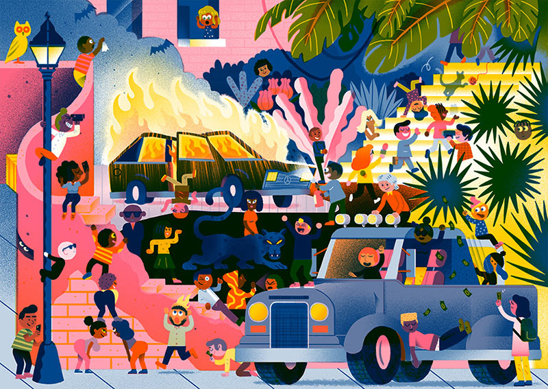
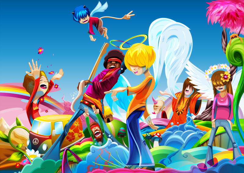
Today we are showcasing 20 incredible illustrations crafted by professional artists and designers from around the world. Hopefully, these excellent pieces of artwork will inspire your own creative work. Some of these illustrations are cute, others are ultra modern, but always an „explosion of colors“.
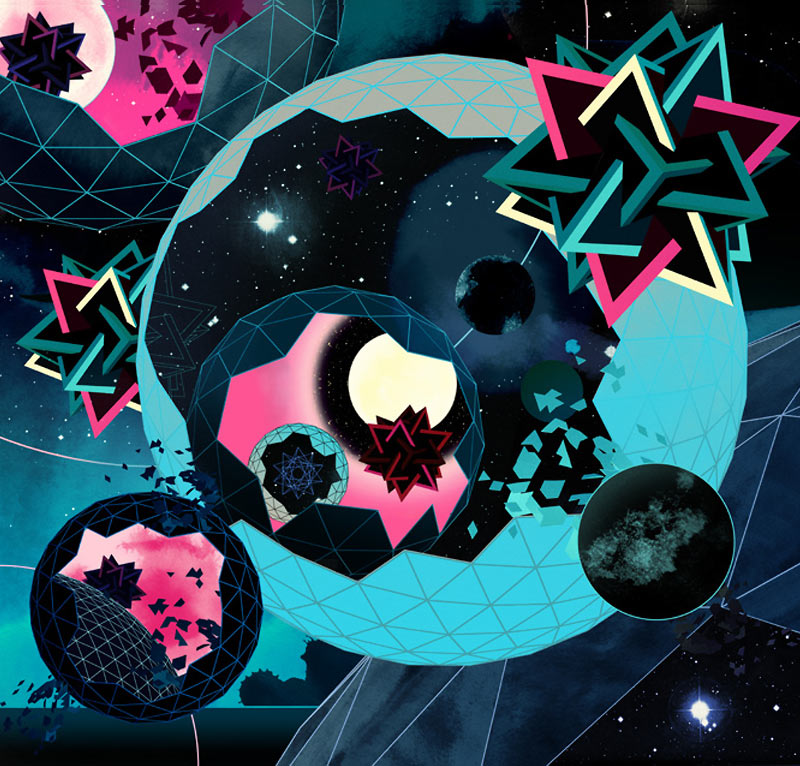
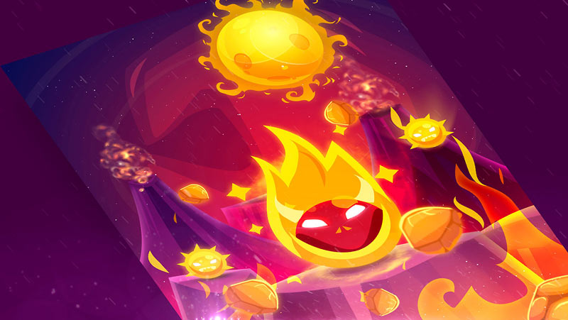
Slawek is a Concept Artist for animation and games. He exhibits 65 artworks of his great portfolio for your inspiration!
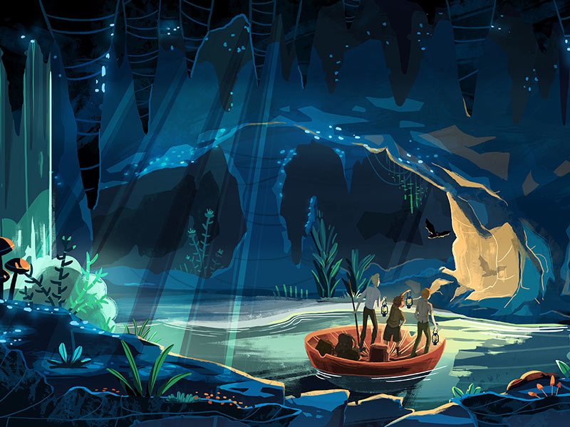
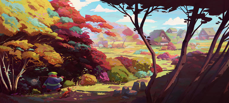
Krzysztof is a freelance digital painter and his biggest passion is creating environments and landscapes.
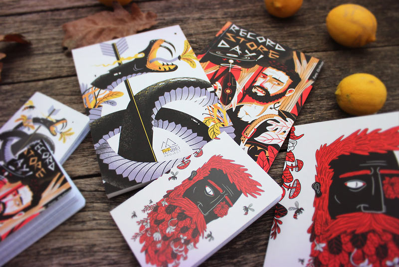
Sam is a UK based Illustrator. He worked with Adobe, Playstation, GQ, Easyjet, Samsung and many more.
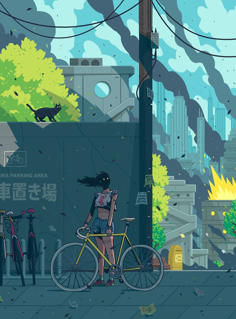
The design and animation BluBlu Studios is located in Warsaw and Tokyo. They make character-driven animated series, explainer videos, commercials, and illustrations.
Pierre Kleinhouse is an award-winning illustrator & visual designer. He likes to draw animals, plants, and characters, mixing his digital work with textures and old school techniques like silk screen printing.
Yime is a Spanish illustrator based in London. He likes to draw tattoos, illustrations and also mural paintings.
© Yime
Chris is an animator and illustrator from Sydney. He designs mobile games, created quirky characters, animated educational, websites and more.

© Crispe
Miquel Rodriguez is an illustrator from Barcelona. He loves to draw people smoking, but hates tobacco.
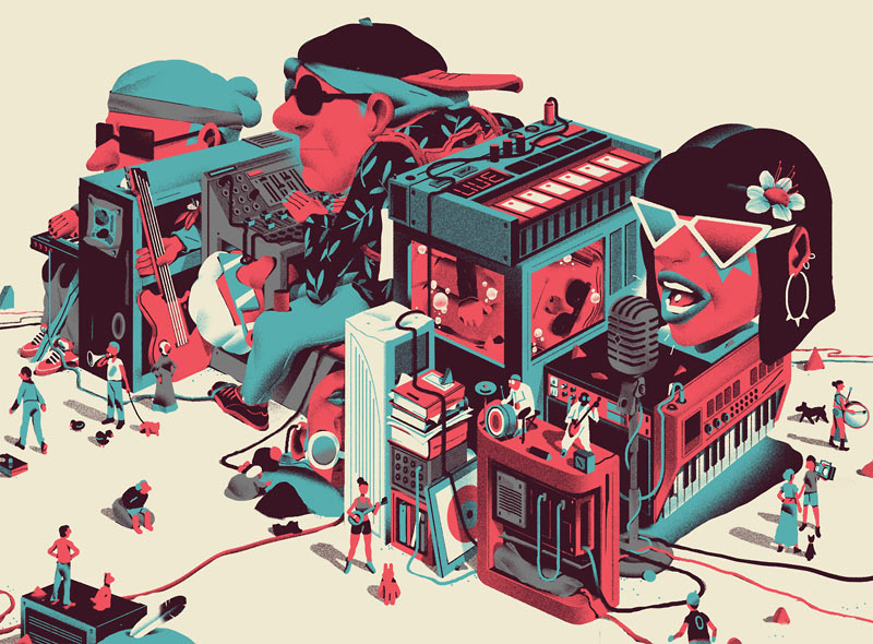
Ray Oranges is an illustrator based in Florence. He worked for Coca-Cola, Airbnb, Wired, Creative Review and Vodafone.
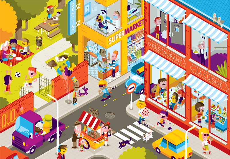
Superludico is a young, modern, colorful and playful design studio. I love this mix of illustrative elements and real models.
Zuco created concept arts, editorial Works, vector graphics, and even toys. Look at all these colors!
© Zuco
Nicolas is an illustrator and director at CRCR in Paris. Take a look at his great color combinations. What a red-green experience!
Although the illustrations may look simple, they are well thought through, and no detail is left to coincidence.
Originally from mainland China, Jing is an illustrator living in East London. She has been working for clients including the European Parliament, IBM, Canon, Samsung and many others.
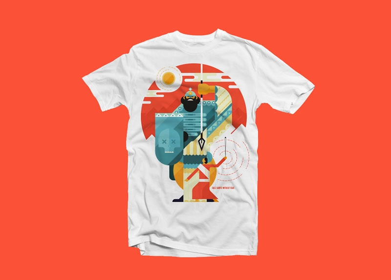
Jones and Co. is a family-run studio based in Cape Town, South Africa. Character design, editorial and all forms of vector illustration!
Ngoc Thuy Do is a Senior Web/UI/UX and Graphic Designer from Vietnam. Sweet and lovely Character designs and many more techniques.
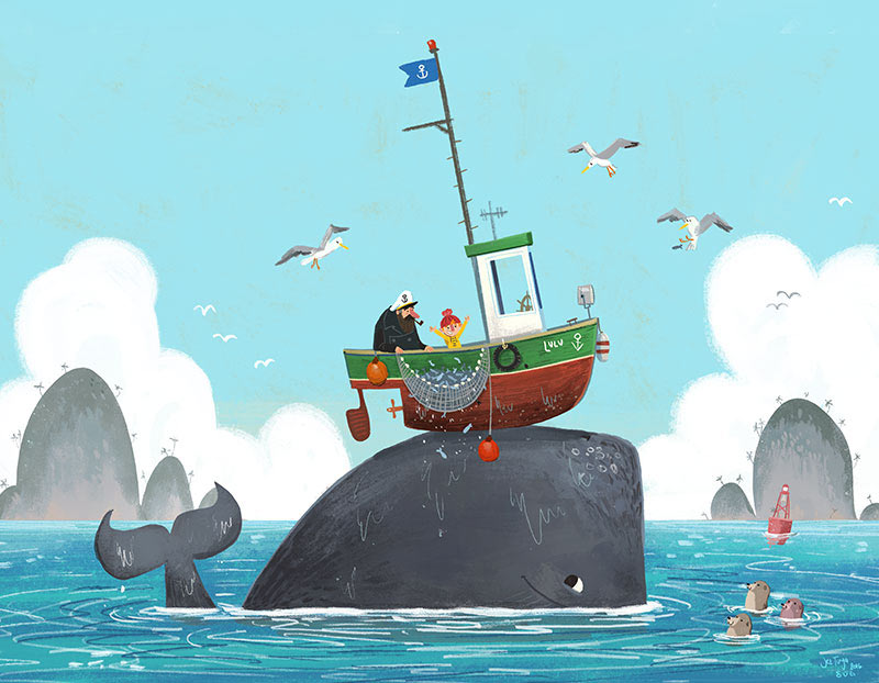
Charlie Bowden, Helen Boyle, and Amy Kitcherside are Pickled Ink and together have many years experience in the children’s publishing industry.
The Umer Artists Agency represents talented authors and artists like Marko Renko. An outstanding creative person.
Oscar is a Senior Creative in Bogotá, Colombia. This illustrator knows to use the effects of colors.
David is an Illustrator from Barcelona, Spain. Take a look at this Uncharted Fanart or his Monkey Island Characters.
Some highlights-of-highlights, based on Brian Krogsgard’s post:
Direct Link to Article — Permalink
State of the Word 2016 is a post from CSS-Tricks
A brand new course by Rachel Nabors. There is a lot here: learning the code and learning the tools to help work with the code and make sure you’re doing a good job. A couple favorite aspects of the course:
😉
Direct Link to Article — Permalink
Web Animation Essentials: CSS Animations and Transitions is a post from CSS-Tricks