Archive

Archive for January, 2017

How To Create Your Own URL Scheme

January 16th, 2017 No comments

A URL Scheme is like “http://…” or “ftp://…”. Those seem like a very low-level concept that you don’t have much control over, but actually, you do! What sounds like an exotic topic is not so exotic at all: we are constantly using different URL Schemes, on any given day. For example when we’re clicking a link to an iPhone app that launches the AppStore. Or when a friend sends us a link to a playlist and it opens in the Spotify desktop app.

In the following short tutorial, we’ll look at how custom URL schemes work on macOS and iOS.

URL Schemes and Document Types

Any macOS or iOS application can register itself as a handler for any URL scheme (like “http” or “https”) or document type (like “txt” files). Apart from those classics, however, an app can also register its own, custom URL scheme or document format.

If an app wants to indicate that it supports a certain document type or URL scheme, its “Info.plist” file has to be configured appropriately: the CFBundleDocumentTypes key lists the document types that the app supports, while CFBundleURLTypes is used for supported URL schemes.

In your own app, you can configure this easily via Xcode’s project settings: the “Info” tab offers sections for both “Document Types” and “URL Types”. The URL scheme can be any string we like (as long as it remains a valid URL format).

Xcode Project Settings

This enables the application to work with the configured types, for example, when opening files from Finder with “Open With” or handing off documents from one application to another on iOS.

Use Cases for Custom URL Schemes

In general, registering your own custom scheme allows you to route events directly to your application. When the user opens a URL with this scheme. As an example, let’s look at Tower, the Git desktop client that my team makes: opening the link “gittower://openRepo/http://github.com/jquery/jquery.git” on your machine will launch Tower and open the “Clone” dialog, with the appropriate clone URL pre-filled:

A custom URL scheme in action in the Tower Git client

Another use case for us is to make registering Tower easier for our users. After purchasing a license, our customers receive an email that contains a link like this one: “gittower://activateLicense/CODE/NAME”

This will launch Tower (or bring it to front) and open the registration dialog with the license information pre-filled. This is much for comfortable than fumbling with copy and paste (only to notice that you missed a character or included unwanted ones…).

On iOS, the use cases are very similar: applications also make use of custom URL schemes to launch an application and then display a certain screen inside the app.

To make a long story short: custom URLs are a great way to deep-link into your application!

An Example App

Let’s get our hands dirty and create our own application that handles a custom URL scheme. Let’s call the app CustomURLScheme and have it handle a scheme called (of course!) foo.

The sample code for this little tutorial can be found here.

Registering Our Custom URL Scheme

The first step is to register the application as a handler for our custom URL scheme, in our project’s Info.plist file:

<key>CFBundleURLTypes</key>
<array>
    <dict>
        <key>CFBundleTypeRole</key>
        <string>Viewer</string>
        <key>CFBundleURLName</key>
        <string>com.example.CustomURLScheme</string>
        <key>CFBundleURLSchemes</key>
        <array>
            <string>foo</string>
        </array>
    </dict>
</array>

Thereby, we ceremoniously offer to take the role of “Viewer” for the URL scheme foo.

For more information and a detailed explanation of all the possible configuration keys, you can have a look at Apple’s Property List Key Reference.

Handling Events from Your URL Scheme

The next step is to tell our application how to handle events that come in via our URL scheme.
For iOS applications, this is as simple as implementing the following delegate:

func application(_ app: UIApplication, open url: URL, options: [UIApplicationOpenURLOptionsKey : Any] = [:]) -> Bool

For macOS applications, we need to tell NSAppleEventManager that our application wants to receive events for opening URLs and provide a callback method to handle the event.

We first create an empty method with the expected signature in our AppDelegate class:

class AppDelegate: NSObject, NSApplicationDelegate {

  func applicationDidFinishLaunching(_ aNotification: Notification) {
  }

  func applicationWillTerminate(_ aNotification: Notification) {
  }

  func handleAppleEvent(event: NSAppleEventDescriptor, replyEvent: NSAppleEventDescriptor) {
  }
}

Then we call NSAppleEventManager‘s setEventHandler method from applicationDidFinishLaunching as follows:

func applicationDidFinishLaunching(_ aNotification: Notification) {
  NSAppleEventManager.shared().setEventHandler(self, andSelector: #selector(self.handleAppleEvent(event:replyEvent:)), forEventClass: AEEventClass(kInternetEventClass), andEventID: AEEventID(kAEGetURL))
}

Now, if you’d build and run the application, the event would be correctly passed to our callback method – but it’s still empty and won’t do anything.

The callback methods receive the incoming event as event: NSAppleEventDescriptor. NSAppleEventDescriptor has lots of properties and methods. If you only care for the URL, the following implementation will do the trick:

func handleAppleEvent(event: NSAppleEventDescriptor, replyEvent: NSAppleEventDescriptor) {
  guard let appleEventDescription = event.paramDescriptor(forKeyword: AEKeyword(keyDirectObject)) else {
      return
  }

  guard let appleEventURLString = appleEventDescription.stringValue else {
      return
  }

  let appleEventURL = URL(string: appleEventURLString)

  print("Received Apple Event URL: (appleEventURL)")
}

So the final implementation for macOS looks like this:

class AppDelegate: NSObject, NSApplicationDelegate {

  func applicationDidFinishLaunching(_ aNotification: Notification) {
    NSAppleEventManager.shared().setEventHandler(self, andSelector: #selector(self.handleAppleEvent(event:replyEvent:)), forEventClass: AEEventClass(kInternetEventClass), andEventID: AEEventID(kAEGetURL))
  }

  func applicationWillTerminate(_ aNotification: Notification) {
  }

  func handleAppleEvent(event: NSAppleEventDescriptor, replyEvent: NSAppleEventDescriptor) {
    guard let appleEventDescription = event.paramDescriptor(forKeyword: AEKeyword(keyDirectObject)) else {
        return
    }

    guard let appleEventURLString = appleEventDescription.stringValue else {
        return
    }

    let appleEventURL = URL(string: appleEventURLString)

    print("Received Apple Event URL: (appleEventURL)")
  }
}

Build and run the application and it should print the received URL to the debug console.

Once you have the URL, it’s up to you to translate it into an action you want your application to perform.

Registering an App as the Default Handler

Apart from our own gittower scheme, Tower supports two additional ones: github-mac and sourcetree, because these schemes are used on github.com and bitbucket.com to open clone URLs in a desktop application. Of course we don’t “blindly” overwrite other handlers! Users can explicitly choose to let Tower handle these URLs from GitHub and Bitbucket.

This is done with an interesting part of the CoreServices framework, the Launch Services API. Although the API is in C, it’s quite easy to write a Swift wrapper for the required methods:

import Foundation
import CoreServices

class LaunchServices {

  class func applicationsForURLScheme(scheme: String) -> Array<String> {
    if let applications = LSCopyAllHandlersForURLScheme(scheme as CFString) {
      return applications.takeUnretainedValue() as Array<AnyObject> as! Array<String>
    }

    return []
  }

  class func defaultApplicationForURLScheme(scheme: String) -> String? {
    if let defaultApplication = LSCopyDefaultHandlerForURLScheme(scheme as CFString) {
      return defaultApplication.takeUnretainedValue() as String
    }

    return nil
  }

  class func setDefaultApplicationForURLScheme(bundleIdentifier: String, scheme: String) -> Bool {
    let status = LSSetDefaultHandlerForURLScheme(scheme as CFString, bundleIdentifier as CFString)
    return (status == 0)
  }
}

This helper class provides the following core functionalities:

  • applicationsForURLScheme – Retrieve a list of application bundle identifiers that have declared support for a particular URL scheme
  • defaultApplicationForURLScheme – Return the application bundle identifier of the current default handler of a particular URL scheme
  • setDefaultApplicationForURLScheme – Set the default handler of a particular URL scheme to a new application bundle identifier

The macOS example project demonstrates how to use this class: it displays a list of all applications for a particular URL scheme, with the default application preselected (don’t worry: playing with the selection input does not change the default; it is read-only in this example).

Go Ahead, Create Your Own Scheme

Custom URL schemes are a great way to deep-link into your application and trigger actions. They are easy to set up (especially on iOS) and provide your users with convenient shortcuts when coming from other applications.

Have fun creating your own URL schemes!


How To Create Your Own URL Scheme is a post from CSS-Tricks

Categories: Designing, Others Tags:

The best new portfolio sites, January 2017

January 16th, 2017 No comments

Hello WDD readers! Start the year right by ignoring your resolutions, and focusing on this latest installment of awesome portfolios.

This month, we have a fairly eclectic collection to look at, with no one overriding theme. I have also discovered that website animation can sometimes look kind of blurry on Windows Remote Desktop, even when everything else looks sharp, so… there’s another use case for you all to consider. You’re welcome.

Act Normal

Act Normal’s website is standard fare on the surface. The layout is simple, the typography is great, and they make bold use of color to stand out. But the site really shines in the small details. The animations and illustrations used in between more common elements are nice little surprises. The site has character.

Mind you, the character gets a bit aggressive when you leave the tab, and the page’s title changes from “Act Normal” to “Get back in here!” Even the emoji-style favicon changes to reflect their disappointment, and I get enough of that from distant relatives, thank you very much. I don’t need it from a website.

Blah

With a name like “Blah”, you might expect this website to take a rather meta approach to their site and content. The distinctly modern, minimalist site doesn’t disappoint at all. It feels meta, but it handles like a clean, well thought-out portfolio. They don’t let their cleverness get in the way of usable design, for the most part, and for that, we can all be grateful.

Josh Sender

Josh Sender’s portfolio taps directly into my love of all things which are dead simple. This single-column, one-page layout presents his work as a collection of miniature case studies, and that’s all there is to it. That’s all it needs.

Every day, designers fight the temptation to overdo their designs because, “it just feels like something’s missing.” Half of these situations (at least) could be resolved by reorganization, rather than addition.

Stefanie Brückler

Stefanie Brückler’s site uses an effect that I’ve seen in a few places. Basically, there’s a simple fixed frame around the rest of the layout, and I kind of love it. It’s a very situationally useful design element, but it certainly mixes things up. It adds an extra touch of old-school elegance to something that might otherwise be a little too minimalist.

Phosphene

Phosphene’s portfolio is all about visual effects in video, so I’ll forgive them for the preloader. Like most other sites of its kind, it is heavy on the use of video footage and animation in its interface. When there is any text to speak of, the classic minimalism-with-asymmetry magazine-ad layout does a lot to convey the studio’s personality and culture.

Peter Tait

Peter Tait’s site is bold, and very, very blue (on the home page, at least). As in, it’s all blue except for the text and a few design elements. It’s always refreshing to see a designer take that kind of simple, yet all-encompassing risk when designing a site.

Okay, the color changes depending on the page you’re browsing. This simple act of art direction completely changes the tone and feel of the page to match the project you’re looking at. I could stand to see more of this in the future.

The Future Forward

The Future Forward has a bit of a classic feel while using a distinctly modern minimalist style. If you want a master class on how to organize relatively little content on a big screen, you can start here.

Darryn Thomas Ansted

This portfolio takes us from the modern to the almost post-modern. Here, white space reigns supreme, in a way that makes you think the way they framed the content is almost as important as the content itself.

Settle down, I said “almost”. In any case, the style perfectly fits the content, as this is a portfolio full of modern art.

Pogon

Pogon has more or less perfected the sidebar navigation layout. The sidebar shifts and adapts to whatever you’re doing on the site: it hides when you’re just scrolling through content, shows you the site’s navigation when you need it, and guides you through individual sections of the site when you need that. Plus, you get a lot more of that “bold and blue” style that I mentioned earlier.

Cecile Henryon

This is yet another stunning example of art-focused minimalism. This is also yet another site that is more like a presentation than a website in any classic sense. Go. Look. Learn. But know what to expect.

Veintido Grados (Twenty-two degrees)

Veintidos Grados combines minimalism and overlapping elements with (mostly) subtle background animation and parallax effects to make a visually striking portfolio. In a happy twist, the parallax feels natural, and not at all forced. In a site this colorful and intentionally flashy, it feels right at home.

Head Office

Head Office abandons the concept of the portfolio site entirely, by presenting the user with an “operating system”. That’s right, the home page looks like a very rudimentary desktop, and you browse through the content by opening up folders and files.

And the whole thing is yellow! It’s yellow by default, anyways. You can change that. But still, bold choice.

According to Head Office, it’s more than just a creative design. This “web operating system” is designed to explore the interactions between humans and machines, presumably to help them design better websites. Whatever the case, it’s certainly worth looking at.

Terring Photography

Björn Terring’s photography site does something very, very smart with its organization. The site starts out as a collage of his photographs, which veteran Internet users should have no issue with. For those who might prefer a more organized browsing experience, a list view is available right at the top.

It might be less-than-usable to put all of the contact info at the bottom.

Merci Michel

Merci Michel brings us another great example of the site-turned-presentation. The imagery of their projects is striking enough to work on its own, so why not?

Trionn

Trionn’s agency website is fascinanting in that it walks the line between the corporate and the artistic. It kind of reminds me of bank brochures I used to look at when I was a kid, and yet that feels like I’m doing this design a disservice, because there’s a lot of personality here.

I’m feeling confused, and I like it.

Eric Porter

Eric Porter’s one-page site combines “minimalist-ish”—that’s a word now, you’re welcome—design with good typography to make a design that would feel rather ordinary except for the use of diagonal lines and, once again, parallax. This time, the parallax effects are actually rather subtle. They’re designed to please the eye without distracting the focus, and that’s just perfect, in my opinion.

It seems to me that we, as a community, mnight be finally starting to get parallax right, as much as that is even possible.

Infinite Imaginations

Infinite imaginations combines a bit of a “techy” style with minimalism, understated animation, and the periodic table. I’m not even kidding about that. While the design does have its (miniscule) flaws, its reserved sense of style is both appealing and kind of relaxing.

Heather Shaw

Heather Shaw’s site is all about her graphics work, and her site sticks with that theme. It’s all about the strong use of color, and overlaying colors onto photos. Yeah, that’s one of the major themes, and it works, thanks to an abundance of contrast, large typography, and clear imagery.

Marija Zaric

We’ve seen sites that have almost no color to speak of, and sites that are saturated (pun intended) with it. Marija Zaric is one of the few who have found a happy middle ground between the two. While the site could, perhaps, make better use of white space, it’s a great example of a site that manages to use a fair amount of color without blasting your eyeballs.

Andretti Brown

Andretti Brown’s portfolio site is more resumé than portfolio. There is a small gallery of images to look through, and his latest Instagram posts (all showcasing his design work) in the side bar, but the majority of the site is dedicated to his work history, and other data that’s relevant to job hunting. The image gallery and the contact form are front-and-center, though, giving people a quick and easy way to reach him.

It’s simple, it’s stylish, and it does what it sets out to do, which is give all relevant information at a glance. It doesn’t do too well when you browse in a full window at very high resolutions, but is noteworthy for its approach to finding work.

Lovely Items: Drag and Drop Scene Generator – only $12!

Source

Categories: Designing, Others Tags:

Styled-Components: Enforcing Best Practices In Component-Based Systems

January 16th, 2017 No comments

Building user interfaces on the web is hard, because the web and, thus, CSS were inherently made for documents. Some smart developers invented methodologies and conventions such as BEM, ITCSS, SMACSS and many more, which make building user interfaces easier and more maintainable by working with components.

After this shift in mindset towards building component-based user interfaces, we are now in what we like to call the “component age.” The rise of JavaScript frameworks such as React, Ember and recently Angular 2, the effort of the W3C to standardize a web-native component system, pattern libraries and style guides being considered the “right way” to build web applications, and many other things have illuminated this revolution.

The post Styled-Components: Enforcing Best Practices In Component-Based Systems appeared first on Smashing Magazine.

Categories: Others Tags:

CSS: Pretty Buttons With bttn.css

January 16th, 2017 No comments

Do you like the current ghost buttons or the ones in Material Design? No matter which flat design concept you prefer, I’m sure the small stylesheet bttn.css has one or two buttons you’ll like.

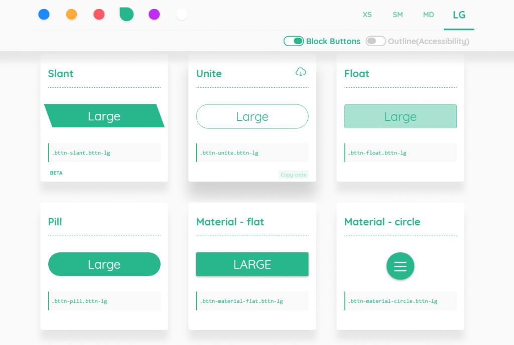
bttn.css: 13 Different Flat Style Buttons

Buttons in pure CSS are the way of choice for modern buttons. The stylesheet bttn.css makes the creation of appealing buttons very easy. All it takes is the distribution of predefined classes.

The following button

, for example, is created using the following class assignments:

<button class="bttn-slant bttn-lg bttn-success">large</button>

It doesn’t get much easier than that. bttn.css comes with thirteen buttons in six colors, and four sizes. Each parameter is attached as an additional class. The developer could’ve made the color definitions a bit clearer, however. You might figure out that bttn-success represents green, but bttn-royal for purple, or bttn-warning for orange requires an unnecessary faculty of abstraction which won’t even lead to the right associations in some parts of the world. Whatever, you have to figure out the six color classes if you want to use them.

bttn.css, Low File Weight, and Flexible Application

When compressed, bttn.css only weighs about 32kb, while the readable form takes up 42kb. If you find that too much for a few buttons, you can also download the CSS for each button separately. This way, the buttons weigh about 6kb a piece. Usually, one button per project is enough if you pay attention to creating a consistent user interface.

All parameters can be defined comfortably, and then be placed into your project via the clipboard. On the configuration page, you’ll also find the download option for the separate CSS files. In addition to their modern looks, they also come with contemporary animation effects, which still are not to be taken for granted.

bttn.css is created and taken care of by Ganapati Bhat, a frontend developer from Bangalore in India. The project is available for free use under the liberal MIT license on Github. Ganapi released the initial version in early November of 2016 and has been active since. In the meantime, his project has managed to be featured on ProductHunt, and it has also trended on Github.

Categories: Others Tags:

WebSlides

January 15th, 2017 No comments

Looks like a nicely done little system, by José Luis Antúnez for creating presentation slides.

WebSlides makes HTML presentations easy. Just the essentials and using lovely CSS.

An alternative to reveal.js. I like how it utilizes other open source projects.

I always feel like I should be using things like this for my presentations, as someone who normally very much likes working in HTML and CSS. But for some reason, I always reach for Keynote or Slides.com. I think it’s a brain-modes thing. When I’m in “I need to work on what I’m going to say at this presentation” brain-mode, I don’t want to be messing with markup, I just want to write and maybe pluck at some UI controls.

Direct Link to ArticlePermalink


WebSlides is a post from CSS-Tricks

Categories: Designing, Others Tags:

Modernizing our Progressive Enhancement Delivery

January 15th, 2017 No comments

Scott Jehl, explaining one of the performance improvements he made to the Filament Group site:

Inlining is a measurably-worthwhile workaround, but it’s still a workaround. Fortunately, HTTP/2’s Server Push feature brings the performance benefits of inlining without sacrificing cacheability for each file. With Server Push, we can respond to requests for a particular file by immediately sending additional files we know that file depends upon. In other words, the server can respond to a request for `index.html` with `index.html`, `css/site.css`, and `js/site.js`!

Server push seems like one of those big-win things that really incentivize the switch to H2. We have an article about being extra careful about caching and server push.

Direct Link to ArticlePermalink


Modernizing our Progressive Enhancement Delivery is a post from CSS-Tricks

Categories: Designing, Others Tags:

Modernizing our Progressive Enhancement Delivery

January 15th, 2017 No comments

Scott Jehl, explaining one of the performance improvements he made to the Filament Group site:

Inlining is a measurably-worthwhile workaround, but it’s still a workaround. Fortunately, HTTP/2’s Server Push feature brings the performance benefits of inlining without sacrificing cacheability for each file. With Server Push, we can respond to requests for a particular file by immediately sending additional files we know that file depends upon. In other words, the server can respond to a request for `index.html` with `index.html`, `css/site.css`, and `js/site.js`!

Server push seems like one of those big-win things that really incentivize the switch to H2. We have an article about being extra careful about caching and server push.


Modernizing our Progressive Enhancement Delivery is a post from CSS-Tricks

Categories: Designing, Others Tags:

Popular design news of the week: January 9, 2017 – January 15, 2017

January 15th, 2017 No comments

Every week users submit a lot of interesting stuff on our sister site Webdesigner News, highlighting great content from around the web that can be of interest to web designers.

The best way to keep track of all the great stories and news being posted is simply to check out the Webdesigner News site, however, in case you missed some here’s a quick and useful compilation of the most popular designer news that we curated from the past week.

Note that this is only a very small selection of the links that were posted, so don’t miss out and subscribe to our newsletter and follow the site daily for all the news.

5 Modern Website Background Ideas for 2017

10 Web Predictions for 2017

Ladies and Gentlemen: The Biggest Design Fail of 2017

Why are We all Moving Away from Apple?

Tiny Trends #1: Non-Rectangular Headers

24 Examples of Texture Usage in Web Design

Norway’s New Passport – Already a Design Classic?

Hello, Unsplash, Inc.

UX Design Trends to Follow in 2017

8 Free Apps for Picking a Colour Scheme

Microsoft’s Windows 10 Design Refresh Revealed in Leaked Screenshots

How Micro-Interactions Drive User Engagement

Graphic Designer Creates Epic Social Network for Superheroes and Villains

Hello it’s Charlie

How to Create Perfectly Centered Text with Flexbox

20 Sketch Tutorials for Beginner Designers

Mobile Website Speed Testing Tool – Google

Say Hello to Opera Neon

Showcase of Beautiful Websites with Glitch Effects

How to Create Spotify Colorizer Effects with CSS Blend Modes

Designing for Brand Interaction

Building a CSS Framework with Sass

Design Thinking, Where it Came from and the Types of People Who Made it All happen

The Evolution of UI/UX Designers into Product Designers

My Blend 2.0 – Visual Email & Unsubscribe

Want more? No problem! Keep track of top design news from around the web with Webdesigner News.

LAST DAY: 30 Sparkling Glitter Brushes from The Artifex Forge – only $7.50!

Source

Categories: Designing, Others Tags:

An Event Apart Discount Code

January 14th, 2017 No comments

I’ll be at all the 2017 An Event Apart shows. Coupon code AEACOY will get you $100 off any of them.

Direct Link to ArticlePermalink


An Event Apart Discount Code is a post from CSS-Tricks

Categories: Designing, Others Tags:

Comics of the week #374

January 14th, 2017 No comments

Every week we feature a set of comics created exclusively for WDD.

The content revolves around web design, blogging and funny situations that we encounter in our daily lives as designers.

These great cartoons are created by Jerry King, an award-winning cartoonist who’s one of the most published, prolific and versatile cartoonists in the world today.

So for a few moments, take a break from your daily routine, have a laugh and enjoy these funny cartoons.

Feel free to leave your comments and suggestions below as well as any related stories of your own…

Cost of living increase

Postdated check

Confidence booster

Can you relate to these situations? Please share your funny stories and comments below…

Beautiful Full-Color Deck of Playing Cards Illustrated by 55 Artists – only $13!

Source

Categories: Designing, Others Tags: