Add a Fullscreen Background Video to your Adobe Muse Website. No Coding Skills Required.
One question I get asked a lot is “Why is my fullscreen video not playing on my tablet and mobile device?” The answer to this question is that tablet and mobile devices do not automatically play video without a play button. This has to do with the fact that many users on a mobile device are on their data plan and if the video plays automatically it uses quite a bit of data as a video is larger than an image or plain text. That is why I decided to release the “Responsive Fullscreen Video” widget. With this widget the video plays automatically on a desktop computer, and once it reaches the size of a tablet or mobile device a play button appears. This gives the user the option to play the video by pressing the play button.
I recently released a new update that allows you to have the fullscreen video fixed in the background, or appear above the website before the user scrolls. You can now also add your own custom play and pause button.
The steps to add a fullscreen video are as follows:
1. Install the widget by clicking on the .mulib file. The widget then installs into the library panel in Adobe Muse.
2. Drag and drop the widget onto your Adobe Muse website from the library panel. If you do not see the library panel go to Window > Library.
3. Add your video in the “Video” section of the widget options. It is recommended to add at least a .mp4 video and a poster image. Most browsers now support .mp4 video.
4. Select wether you would like the video to be fixed in the background or appear as a cover video before the user scrolls by checking or unchecking the “Fixed in Browser” option.
5. There is the option to add an overlay color or pattern within the “Overlay” section.
6. In the “Play Button” section you can enable the play button by selecting the option “Enable Play Button on Tablet and Mobile.” You can then add your custom play and pause button and set the size of the button within the widget options. You can also re-position the play button vertically within the video. There is also the option to set at what breakpoint the play button will appear.
7. In the “Options” section you can enable or disable autoplay, loop, mute, and video re-sizing.
8. The “Breakpoint” section allows you to disable the entire video at a certain breakpoint.
9. Done! You now have a responsive fullscreen video on your Adobe Muse website.
Almost all mobile app developers have a website that describes what their app can do. Some of these websites are beautiful and unique. While some websites use photography as a background, others use typography, color gradients or even video backgrounds to leave their visitors speechless.
Do you need some inspiration for your landing pages? I’ve collected 19 of the best-designed app landing pages that keep readers craving more.
Saurochatkept their design simple yet complex through their color-changing gradient and the rounded shape of the overlay. We also like the font that they chose and the word placement.
Primernot only surprised us with their color-changing gradient, but also with their inter-changing objects in the background. We also think that the shadow positioned behind the phone mock-up was very well placed and quite genius, giving it that 3D look.
Square‘s page has clearly organized headlines, which kind of read as answers to frequently asked questions. There is plenty of white space (giving it a clean, simple, and modern appeal), succinct text, and matching, relevant images.
Coin displays its product’s positioning and differentiation through a visual journey of the Coin card. Just check out that fun animation — what a great way to represent how a product works.
Moovrsshow us their predominant color through the wallpaper color overlay and in the background of the phone mock-up. We also like that the image is a cut-off rectangle because that gives it it’s unique style.
Vee for Video shows off with their beautiful and colorful geometric background. They have rounded icons and some color overlay photos, but for the most part, they kept the geometric aspect.
Seattle Cider has a really cool, interactive display that tells the story of how cider is made from start to finish, while users scroll down. It’s a surprising and delightful user experience that goes above and beyond the typical product page. It doesn’t just display the products, it shows where they came from, and how.
NeuBible has all of their bases covered: a striking hero shot, clear messaging, and a prominent download button. Combined with a gorgeously designed app, these three features may help NeuBible convert the masses.
Qapital is notable in the fact that it takes a visual approach to a market that is usually appealed by practical messaging and conservative imagery. Large images dominate the splash page to reflect the app’s interface. Qapital does an excellent job of making finance feel exciting: a very tall task.
Mango’s website exudes friendly, approachable, and helpful brand personality. The video couldn’t be more delightful. I mean, a guitar-playing mango in a top hat? Yes, please.
Rizon displays a clean design and clear messaging. In a nice touch, Rizon’s logo mirrors the app’s main screen, which lets the user know what hour the best photos are taken (“The Golden Hour”). Visitors are prompted to sign up through a centrally located button and a straightforward preview of the application.
FiftyThreesurprises us with their simplistic design. It is so smooth and easy to understand just exactly what they do. We also like the clear fonts that were used.
Bellroy presents an interactive section that shows how the skinny wallet will fill up in comparison to a different wallet. As users move a slider back and forth along a line, both of the wallets fill up with cards and cash, visually displaying the very problem Bellroy’s skinny wallet solves.
Mylo has done the best job this year, implementing an auto-play feature along with a narrator (defaulted to mute), which clearly details the app’s value.
TriplAgent comes with a color gradient background. We like the design of the city guides. They are simple, striaght and to the point, and with a clean font, we give a thumbs up to them.
Oreo also took a unique design to this page. Even though the cookies themselves are monochrome, the page is wonderfully colorful. From the videos, to the backgrounds, and to the graphics, we love all of their color choices.
Panikstaggers us with a dark background and an iPhone that displays how their app works. They also put their included features. The logo looks pretty nice with a on button instead of just the letter I.
And that concludes our 19 favorite app landing pages. Did we miss something? Leave us a comment with your favorite landing pages below.
Another year in the bag! As we do every year, I’d like to look back at the year by-the-numbers and see how we did. It’s also an opportunity to say how grateful I am to you all. All things considered, the web design and development community is a pretty great one. Lots of sharing and caring. I consistently enjoy working on this site and being a part of the sub-community that happens here.
Statistics
There were 77 million pageviews this year, up from 73 last year, making it an all-time record breaking traffic year again. The other numbers that Google Analytics coughs up are Sessions (56 million, up from 51 million) and Users (steady at 21 million). No significant peaks throughout the year. Steady as she goes.
We published 442 posts and 43 pages (i.e. snippets/videos/almanac entries). I like that pace. We’re publishing content that has a pretty good shelf-life and it feels like we get to cover industry news. That’s up from publishing 378 posts in 2015 and 278 in 2014.
We don’t have a great way of figuring out what the most popular posts of this year were. If we put the year in the URL, that kind of filtering would be easy, but we don’t. The top five most trafficked posts of the year (any publishing date) were the flexbox guide, full page background images, media queries reference, the guide to centering, and using SVG. None of which were published this year, but of course that’s a bit slanted since posts published the year didn’t have a full year to get that traffic. The flexbox guide is actually our #1 most visited page, beating out the homepage by a decent margin.
Of people that use the search form we offer directly on the site (ranges from about 700-1800 searches a day), the two most popular search terms are “flexbox” and “svg”.
There is somewhat of a “long tail” effect. It’s not an enormously fat tail, but it’s there. If you take the total traffic to the 100 most visited pages, that only accounts for 33 million of the 78 million pageviews (43.47%).
Our traffic, looked at geographically, is long-tail-esque as well. The United States is still the top country, but down from 24% to 23%. India is up to 12% from 11%. UK down to 6% from 7%. If you look at the top 10 countries combined, it’s only about half of the traffic.
Google is good to us. Organic web search results in 87.75% of our traffic. Google alone is 86.40%, Bing at 0.82%. DuckDuckGo is at 0.5%, beating Yahoo at 0.3%. The top five leading non-search referral traffic sources are StackOverflow, Twitter, Feedly, Facebook and Reddit.
The mobile web trend continues to swerve around CSS-Tricks. Less than 5% of traffic comes from non-desktop devices. As Google Analytics breaks it down: 3.9% mobile and 0.74% tablet.
Forums activity is down with 1,640 new topics this year from 2,440 last year and 4,020 in 2014. 4,861 replies to those topics, which is a quarter of the 20,120 replies posted in 2014.
5,185 comments on the blog a drop from the 5,864 last year, but not as drastic a drop as the forums.
We received 1,372 messages through our contact form, down from 1,621 last year. 18,848 total!
Overall, while web traffic is up, engagement that happens directly on the site is down. As we can see in social media numbers, engagement elsewhere is up. We even have 32,174 subscribers on YouTube, which we hardly ever link to. This is the first year we’ve tracked that number, so we’ll see where that goes next year.
Just a few weeks ago we crossed over 300K followers on our Twitter account. That’s up 50,000 from last year, which is amazing, but actually significantly slowed growth as we gained 90,000 in 2015. 68K likes on Facebook, up from 59K last year.
Another milestone was the re-launch of our newsletter (subscription page). For years we sent out a weekly, but it was auto-generated from the RSS feed. Now it is custom written and much more interesting. There is even content in there that only goes into the newsletter. We started it nearly from the ground up, starting at 13K subscribers in February and ending the year at 21K subscribers.
The Lodge is soon to be a thing of the past on CSS-Tricks. All those videos will remain, but we’ll kind of roll them into the Video Screencasts area. I guess that’s a hint enough: a redesign is coming!
Goal Review
Develop new and strong reference material for the CSS-Tricks community.
I’ll give us a B- on that. My thinking at the time was that we need to publish more content like our “complete guides”, because those have so much value. One of those can be worth 100 or more other random blog posts. We did some of that, which I’m happy about. Perhaps not as much as I was envisioning, but my thinking on it has also changed a bit. Any given blog post is building toward a more comprehensive set of information on that subject. Perhaps that culminates in a “complete guide” at some point, or can be assembled into a valuable set of posts (see goals), or informs more posts on the subject. Our posts tend to have pretty good long-term value anyway, so keeping a steady publishing schedule of that kind of content is pretty great.
More focus on the developing “the voice” of CSS-Tricks.
I’ll give us an A- on that. I’m very happy with how that turned out this year. I wrote it down as a goal, because we have more humans writing things for CSS-Tricks than ever before. This year had the most guest posts as we’ve ever had in a year and the highest number of staff writers.
Left completely unchecked, I think the voice of the site would roam. I’d prefer that didn’t happen. I’d prefer that everyday readers can expect a certain consistent spirit, even when the author changes. Through editing, I think we did pretty well there. It is even codified now:
Friendly. Authoritative. Welcoming. We’re all in this together. Flexible (non-dogmatic about ideas). Thankful.
New Goals
Double newsletter subscribers. Seems doable since newsletters are pretty popular right now and ours is hopefully actually interesting. It’s a way you can keep up with the site and industry without much effort, which it seems like there are plenty of folks interested in doing that. That’s only 21K more folks, and since we have passed 300K Twitter followers, we gotta be able to make that happen.
More pairing videos. This will be harder to pull off since I’m traveling quite a lot this year and it’s hard to shoot video on the road. But I think it’s worth it. Two people talking through code together is so much fun and hopefully more engaging to watch than a solo video.
Maintain a mostly-daily publishing schedule. We’ve done it the last few years, so I hope we can keep it up. Sometimes it feels scary when there is a drought of news or ideas don’t seem to be flowing. But we have a pretty good idea board on Trello, plenty of staff, and a decent amount of guest-posting interest, I think we can do it.
Assemble content in more useful ways. This is my favorite goal. I think in the coming year we can leverage our archives of posts in better ways than we ever have.
Wrap Up
Happy new year! Thanks to all y’all for sticking around another year, making this place a community and a sustainable business.
New year, new design trends. One of the great things about web design is that it is constantly evolving. You can find trends or even just hints of things to come almost by chance as new ideas seem to populate all at once. This month’s examples are a lot of fun with websites using space in interesting ways, new online shopping experiences and the return of pastel color palettes.
Here’s what’s trending in design this month:
1) Exaggerated use of space
The right amount of space can make or break a design. Whether it is white, a background color or surrounds text or images, “empty” space in a design can speak volumes.
Exaggerated use of space is one of those design trends that can be a lot of fun, and when used well it can be rather effective in helping users know just how to look at or use a website or app. Open space is an extension of minimal styles that have been popular for some time, but with one major exception: Rather than a symmetrical outline with space all around, these designs balance images or text with space in a more asymmetrical format.
Think about it from the user perspective. They will likely be drawn immediately to the open part of the design (whether they think about it consciously or not). From there, the eye will hop to the more populated part of the design. The two step process grabs users’ attention and almost shows them where to look. (Pretty smart, right?)
This simple balancing act is visually interesting and great for making a strong impact. Look at the examples below and think about the space in relationship to what you see next:
Vera Wang: Space on the left moves the user to the clothing on the women. (Perfect for a fashion designer.)
Big Youth: Space around the text draws users to the headline. (The headline should always be one of the first things someone looks at on the page.)
David Robert: Space pulls the eye first to the person and then to his bio. Contrasting light and dark elements also help enforce this movement. (Interesting because you read from right to left and it feels quite creative. Something you’d probably look for in a designer.)
2) Shopping experiences
When it comes to shopping online, experience tend to fall into two categories: The almost seamless experience offered by major retailers such as Amazon or the clunky too-many clicks to checkout experience that is common among small shops.
There’s got to be something in the middle, right?
More retailers are opting for highly visual, more experiential design styles for their online stores. While the trend seems to work best for shops with only a few items to choose from, it’s a neat take on user experience.
The examples below tend to come from shops that are a little higher end and don’t hit you with huge navigation menus and hundreds of options right from the start. The focus is on the beauty or uniqueness of the item and the story behind it. Then on scroll or hover do you find that you can actually buy the item right there.
The design has a more visual feel, using Instagram-influenced photos, and card-style interfaces that encourage clicks. Items in these retail designs don’t seem to come with many options per item; items are more specifically made to order as is.
While this concept wouldn’t work well for shops with large inventories or complicated levels of options or customizations, it is a nice alternative for retailers that want to exhibit a high-end feel with a high-end design.
Each of these examples uses brilliant hover effects to show pricing but make the user want the item before they even think about impact to the pocketbook. The other commonality? You can’t find a single price until the scroll. The first screen is designed to increase desire through a product story.
3) Pastel color palettes
Softer colors are coming back in a big way. While brighter, bolder palettes have been the go-to for some time, that seems to be shifting.
The usage, however, is not. Pastel hues are being used with flat and material design projects in a way that gives new life to these design styles.
While you might think pastel colors are best saved for backgrounds, that’s not always the case either. While a pastel background can be easy to work with – many styles of text are highly readably on light backgrounds in darker colors – they can be used in other ways as well.
Pastel based images for hero headers and dominant imagery is popular. Many designers seem to be pulling color palettes from these images. (Or is it the other way around?) Either way, image and photo matching with pastels palettes can be a striking combination that set a softer tone, such as the website below for The Bridal Planner. The Infinity Foods uses a similar technique, pairing pastel neutrals with images that have a similar color theme.
Other designers are using less saturated color palettes as a new take on trends that some could argue to be overused. Rentberry uses a fun palette with a distinctly material style. What really makes the design pop is that it works and looks just as you would expect, but the color almost causes you to do a double-take. This little element of surprise is a fun bonus for users. (And an easy way for designers to make a mark on a design aesthetic that is all too common.)
Conclusion
While trends can be pinpointed in snapshots of time, they don’t always hang around. Which of these trends do you think is the most applicable to your projects? How do you see them evolving? (The shift in shopping experiences is intriguing and has the potential for staying power for low inventory, high end shops.)
<
p class=”p4?>What trends are you loving (or hating) right now? I’d love to see some of the websites that you are fascinated with. Drop me a link on Twitter; I’d love to hear from you.
Editor’s Note: New year, new challenges! You might have set up your New Year’s resolutions already, but if not, how about designing something… different for a change? Today, we’re happy to introduce Dorota, an artist who created a fun little project last year that was inspired by Twitter’s new logo based on 13 circles. Below you’ll find the lessons Dorota has learned along the process, so maybe you’d like to embark on a similar journey as well?
If you can make a bird out of circles, then you can probably make all sorts of animals. I wanted to add something more design-based to my portfolio, so I made that my personal challenge. The idea was to draw animals from exactly 13 circles, and I decided to match that number by making 13 animals. This makes for a nicer title for the project, and it helps to get others to share it around the web, too. Knowing what you want to create early on helps, because then all you have to do is figure out ways to make it happen.
Design Thinking means becoming more agile, speeding up innovation cycles, working in a more customer-oriented way. What happens if you don’t do that can be seen when looking at Nokia, Kodak, Blackberry, and other, previously successful, players.
What’s Design Thinking?
Of course, there’s a highly scientific explanation on „Design Thinking.” But don’t worry, I won’t show that one here. I want you to read this article without falling asleep.
“Design Thinking,” and I want you to keep in mind that comprehensible explanations are always simplifications, is a concept that helps you develop products and services in a way that potential customers will enjoy using them. This will be easier to understand after we take a look at how products were developed initially.
Let’s look back at the golden days of the computer industry. New devices hit the market in the nineties of the last millennium. Now, the machines that were newly placed on the desks of so many office workers needed software. People took what was available. Developers didn’t need to pay much attention to user-friendliness. There was no competition anyways, and even if there was, they were not working differently either.
Setting yourself apart from the competition was done via functionality. If you’re a bit older already, you probably remember the term “Feature War.” More and more features were shoved into the software. In the end, the resulting programs were bolides weighing tons, equipped with a feature set that nobody really needed – overkill.
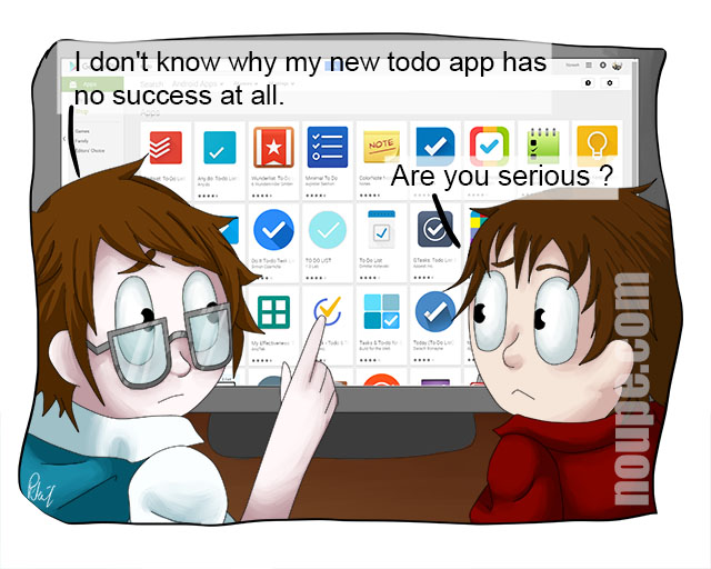
Mobile devices have led to a reversed evolution. Now, it’s crucial to create small, light, and easy-to-use solutions. App design has a much higher priority than conventional software design had back then. Nonetheless, there are millions of competitors. Even when looking at single product categories, you’ll still find dozens of alternatives. Just look for todo apps.
Solid Prototyping is Also Part of the “Design Thinking” Approach. (Photo: Stocksnap.io)
However, distinction from the competition via features doesn’t work anymore. Instead, it is mostly done via design. Nowadays, it is typical that projects with the better design manage to come out on top.
Here, design should be conceived multidimensionally. It does include the appearance, but not just that. Design starts much earlier. Even in the stage of you thinking about a new project, basically designing it, it is important to keep the right aspects in mind.
It’s wrong to start by thinking about what you can do with your skill set, or what would be especially interesting to you. Most of the me-too apps are created in this way or a similar one, and fail miserably.
Don’t Make the Same Mistake as Our Designer Here
Design starts earlier; it starts with the determination of the target audience. Which group has which problem? How does it solve it now, and how could you help solving it better? If businesses had asked themselves these questions more offensively in the past, a lot of them would still exist today.
Here, it’s important to check once made assessments again frequently. If companies like Kodak or Blackberry had reacted to altered market conditions, or different customer behavior in time, instead of sticking to their outdated business concepts, they wouldn’t look that bad today. The people at Nokia are particularly good at pulling the wrong lever.
By the way, there’s more than one book on the concept of „Design Thinking,” as well as entire conferences. So if someone wants to accuse me of not exhausting the topic, they are right 🙂
Now Why Should I Even Bother?
If you’ve read carefully up to this point, you surely got an idea or two. If you’re producing or selling goods or services, the concept of „Design Thinking” is sure to make your life a lot easier.
„Design Thinking” Can Have Calming Effects. (Photo: Stocksnap.io)
Take Apple for example. The company’s product range is very manageable, to say the least. Their stores are iconic, but basically, have nothing to show other than emptiness. The hardware, especially in the mobile section, is not revolutionary, and the feature set is smaller than that of the competition. Nonetheless, the business dominates the market. Why is that?
The products are radically simple and cut down to what Apple’s designers want to offer their users as a solution. This radical focus makes the devices very easy to handle, and they require a much lower learning effort than devices from other providers. At the same time, they are not any worse, although they are less capable in some aspects. Remember the keyword “Feature War”?
This knowledge can be relieving for your own profession. Don’t look at all the things you can do, but look at what you should do. Then take that, and realize it in the most simplistic, and most user-friendly way possible.
Amazon, for example, does not dominate the market because you can find things there that you can’t find elsewhere. It dominates because it makes the purchasing process so easy, that customers already like to visit Amazon for this simplicity. Trademarking the 1-click buy was a smart decision.
Now, take a look at your environment from the viewpoint of “Design Thinking.” If you are not completely uncreative, you’re sure to get ideas quickly. If not, ask your customers. They know more than they admit.
Every week users submit a lot of interesting stuff on our sister site Webdesigner News, highlighting great content from around the web that can be of interest to web designers.
The best way to keep track of all the great stories and news being posted is simply to check out the Webdesigner News site, however, in case you missed some here’s a quick and useful compilation of the most popular designer news that we curated from the past week.
Note that this is only a very small selection of the links that were posted, so don’t miss out and subscribe to our newsletter and follow the site daily for all the news.


