Archive

Archive for January, 2017

Essential design trends, February 2017

January 30th, 2017 No comments

An interesting visual presence above the scroll is the first impression a user gets of a website. Whether that user continues to click can depend on a number of things, including imagery, readability and overall interest in the content.

This month we are looking at three trends that make a distinct first impression—dark color overlays on images, brutalism and hollow lettering styles. Here’s what’s trending in design this month:

1) Dark overlay on images

It doesn’t matter if the hero image is still or moving, a dark color overlay can help even colors in a way that makes it easier to add text and other elements to a layer on top of the image. While this might sound like a shortcut at first, there’s a lot of value in this technique.

The primary reason to opt for a color overlay is to enhance readability. Most images contain light and dark color variances, making it a challenge to add lettering that is readable on every device. Even if there’s a perfect placement for desktop wide screens, the same image and text combination may render undecipherable on a mobile screen.

That’s where a color overlay helps. The semitransparent wash of color over an image or video should amp up the contrast. Then white or light-colored lettering has a place and will remain readable.

Dark color overlays are visually interesting for other reasons as well. Don’t get stuck in the trap that dark means black or gray. A dark overlay can be any color, such as the green used by Internetum, below. A fun or unusual color choice can help draw users into the design.

A dark overlay can do one more thing: it can help camouflage an image or video that you don’t want to be at the forefront of the design. This could be because the image is a little old, a little soft in terms of composition or just one that falls a little flat. A color overlay can change the mood of the image, make it a little less prominent and help the design focus more on other content, such as text, calls to action buttons or other graphic elements.

Overlays can be really dark, such as Digital Werk or can provide a subtle darkening in the manner of Lytton Living. You know you have the right balance when you can still see the image and all layered elements are easy to read.

2. Brutalism

Ugly. Harsh. Sharp. Busy.

These are just a few of the words that some have used to describe the brutalism website design trend. But just because a designer experiments with brutalism does not mean the design is a hot mess. It’s quite the opposite.
This style employs a different style and sensibility that includes things you see and things you can’t. Ben McNicholl described it this way in a post for Envato: “’Brutalism’ comes from the French word for ‘raw,’ so keep that in mind when you’re writing your code.
“A website doesn’t have to be a horror show of unordered images and clashing font colors; the way the code has been written is also symbolic of the style. Embedded CSS, untabbed code, HTML tables, the list goes on.”
There are enough examples of brutalism that there’s a whole website gallery devoted to these designs. In the introduction, the website refers to brutalism in this way: “In its ruggedness and lack of concern to look comfortable or easy, brutalism can be seen as a reaction by a younger generation to the lightness, optimism and frivolity of today’s web design.”

What’s particularly interesting about brutalism is that the design looks so different from all the flat and minimal styles that have been so prevalent. If you come across one of these designs, you can’t help but stop, look and explore. Whether you think it is beautiful or ugly or something in between, that’s the ultimate goal of any website design.

3. Hollow lettering

Letters with interesting fills are beginning to pop up all over the place. What’s interesting about this trend is that it has two distinctly different looks:

  • Hollow lettering over an image or colored background, such as C&C Coffee.
  • Lettering filled with an image on a plain background, such as The London Loom, with an alternative version where you can almost see the image with a background with subtle transparency, such as My Mother Before Me.

While this trend has a lot of visual impact and is a lot of fun, it can be somewhat difficult to execute.

When it comes to hollow lettering over a photo, there aren’t always that many typeface options to choose from and designers can get stuck using the same few fonts. This is not an ideal situation for web projects at all. There’s more flexibility for non-web projects where you don’t have to worry about font integration and rendering.

When it comes to filled lettering, the trick to making it work is that the images inside letters need to be discernable. If users can’t tell what the image is, then the design won’t be effective. To help, most designers opt for thick block letters here so there is more room for images to show through. Images are often more abstract, or textiles or landscapes because the human brain tends to fill in the blanks of the image and it still works for them. It’s much more difficult to use images with faces or objects that you need to see in a certain way because they have to be positioned perfectly within characters.

Despite being somewhat challenging, both lettering styles can be visually interesting and fun to create.

Conclusion

Unlike some other trends where you can implement small changes, these three options present more of an overall style shift. Can you see yourself using any of them in future projects?
What trends are you loving (or hating) right now? I’d love to see some of the websites that you are fascinated with. Drop me a link on Twitter; I’d love to hear from you.

15 InDesign Magazine & Brochure Templates – only $24!

Source

Categories: Designing, Others Tags:

Stop Losing Prospects With Disappearing Contact Form Submissions

January 30th, 2017 No comments

Ever wondered why your conversion rates are so low even though you spend a good amount of time sharing your latest stories on social media and receiving a good amount of traffic?

While user experience and market fit are crucial for every business, a surprising reason for low conversions could be a misbehaving contact form on your website. Over the past 2 months we have worked with 3 successful businesses online with broken contact forms that prevented prospects from connecting with business development or support staff.

In each of the three cases incoming emails have been lost entirely, or over 50% of the submissions were not passing due to technical errors – such as JavaScript conflicts, AdBlock extensions, email server limits or upgrades that broke anything behind the scenes, hence preventing a successful contact with company’s reps.

I failed to contact the business through their form

The worst part is that, in many cases, customers would give up on getting in touch with you, and the problem may be lurking in your platform for months.

Here are 7 suggestions for preventing complete dependability on a flaky contact form and increase the conversion rates for your business.

1. Simplify Your Contact Form

Longer contact forms asking for too much personal data would send some of your prospects away. Keeping it simple would save everyone time, and reduce the gap between you and your potential clients.

In addition to the marketing aspect of the problem, longer contact forms present more opportunities for a contact form to stop working. For example:

  • a phone field would require validation that wouldn’t match a country code format;
  • a text field may accept HTML which isn’t validated properly behind the scenes;
  • numeric fields could strip values for customers who input text instead.

Validation labels may be invisible for some reason (such as disabled JavaScript or a styling glitch), and that’s yet another problem that you would have to worry about in a traditional setup.

A study by Unbounce reported 15% conversion rate on forms with 6+ fields, 20% with 3-5 fields, and 25% for contact forms with only 3 input fields.

Simplify your contact form and reduce the number of lost prospects on the way.

2. Use Gravity Forms

WordPress website owners who heavily rely on contact forms can benefit from using Gravity Forms.

Gravity Forms is a powerful plugin that allows for building complex forms, include conditional statement, integrate with membership platforms and payment gateways. But in addition to that your contact submissions are stored in the WordPress database as well – visible from a list in the administrative dashboard.

Even if your email server is down, not responding, hitting spam filters or anything along those lines, a submission would be processed and ready for review in your WordPress admin area.

As an added benefit, you can leverage the power of the plugin for other uses – such as receiving guest posts for your website (automatically published as drafts to your editors).

3. Stop AJAX Submissions

AJAX submissions are often used in contact forms as they provide a better customer experience – getting a form submitted without refreshing the entire page.

The problem is that AJAX may be interrupted in different cases, such as:

  • A minor JavaScript glitch in your site that interrupts other features
  • A PHP notice or warning that interrupts the successful callback and freezes the submission process
  • Clients using old unsupported browsers (such as corporate networks running Internet Explorer 7)
  • Intranets disabling JavaScript for non-whitelisted websites

Disabling AJAX submissions and sending users to a helpful “Thank You” page can solve some of those problems and increase the success rates of your contact form submissions.

4. Hide Warnings and Notices on Production

Some production websites allow error printing on the front-end even for third-party visitors. Those messages appear in the header or within the content area of your website in the event of a code warning or a communication error with the site.

This may not be obvious to you or your development team when the site appears to be working properly. Sadly, customers could still manage to interact with areas of your website in a “creative way” that triggers and displays errors on the site. And new notices or warnings can show up after updating a plugin or introducing a content change by editors.

That leads to poor customer experience, and is a potential security vector that hackers could use for learning more about your hosting provider and installation, coming up with effective strategies for breaking into your website.

Disabling debugging output on production sites is a must, and should improve the overall user experience. It will also ensure that contact form entries don’t get lost due to those code glitches getting in the way and interrupting the submission process, hence losing your emails on the way.

5. Live Chat

Integrating a live chat in your website is a good way to interact with your visitors in real time, and also let them report a problem easily before closing the browser window.

There are plenty of live chat services that provide a simple embed script (or an extension for various CMS) and pop up on your website given predefined conditions. You can enable the chat globally across your entire site, or only on pages where visitors are expected to get in touch with you (such as the Contact Us page or a Customer Service documentation).

6. Ticketing System

Who handles contact form entries for your business?

If your company employs more than 20 people, chances are that different inquiries are handled by different staff members within your company. Multinational businesses even have different branches and offices, with responsible people for each location.

One creative way to solve that problem is by integrating a ticketing system in a contact form’s disguise. There are plenty of Software as a Service help desks that could be integrated in your website, as well as outstanding plugins for WordPress website owners such as Awesome Support. Similarly to Gravity Forms mentioned above, a ticketing system will also store the contact form submission in a separate database which solves the “disappearing emails” aspect of the problem.

Additionally, a business assistant or a customer support agent of yours can easily reassign tickets to different team members. This can even be done automatically with some software solutions, with a conditional rule assigning a ticket to an agent depending on the selected department or product in your form.

7. IM channels and Social Media

During the third quarter of 2016, Facebook reported 1.79 billion monthly active users. Gen Y communicates primarily through instant messengers and social media, as the majority of college students applying for job expect a phone call instead of an email as they don’t actively use emails for business.

Twitter revolutionized the social interactions with businesses and influencers by providing a transparent and open channel for everyone to connect with corporations and individuals outside of their network, which also increased the importance of the Community Manager position for brands managing their conversations across various online channels.

Providing multiple contact alternatives for website visitors is more time consuming, but the easier it is for a prospect to communicate with you, the higher the possibility for them to become a regular client. Consider providing a phone number, Twitter account and Skype or WhatsApp accounts that visitors may use for contacting you. With the rise of the smartphone industry and low-cost plans with 3G and 4G, consumers often find it easy to communicate through online channels other than email for questions, support, or setting appointments.


Email isn’t going anywhere, but due to technical malfunctions and zealous spam filters, communication may be lost in-between. Make sure that you provide a bulletproof solution for your customers and contact alternatives in order to provide incredible customer experience and close more leads for your business.

Read More at Stop Losing Prospects With Disappearing Contact Form Submissions

Categories: Designing, Others Tags:

Offsetting Paths in Adobe Illustrator

January 30th, 2017 No comments

In this tutorial, we’re going to learn how to offset paths in Adobe Illustrator.

Download Adobe Illustrator.

Read More at Offsetting Paths in Adobe Illustrator

Categories: Designing, Others Tags:

I’m Loyal to Nothing Except the Dream

January 30th, 2017 No comments
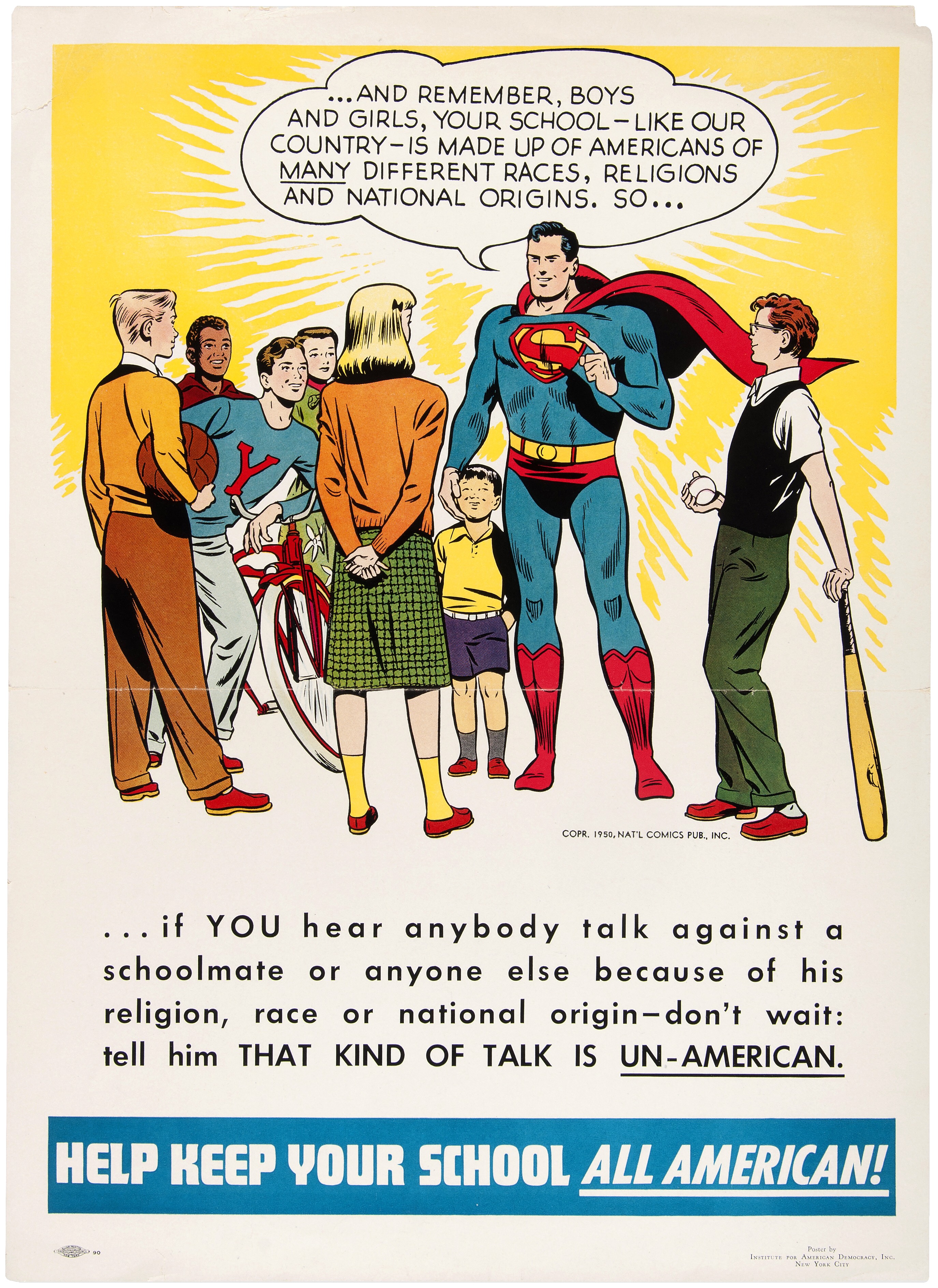
Help Keep Your School All American!

There is much I take for granted in my life, and the normal functioning of American government is one of those things. In my 46 years, I remember presidents roughly beginning with Carter; I’ve lived under nine different presidents. I’ve voted in every presidential election since 1992, but I do not consider myself a Democrat, or a Republican. I vote based on leadership – above all, leadership – and issues.

In my 14 years of blogging, I’ve never written a political blog post. I haven’t needed to.

Until now.

It is quite clear something has become deeply unglued in the state of American politics.

As of 2017, the United States, through a sequence of highly improbable events, managed to elect an extremely controversial president.

A president with historically low approval ratings, elected on a platform many considered too extreme to even be taken literally:

Asked about Trump’s statements proposing the construction of a wall on the US-Mexico border and a ban on all Muslims entering the country, Thiel suggested that Trump supporters do not actually endorse those policies.

“I don’t support a religious test. I certainly don’t support the specific language that Trump has used in every instance,” he said. “But I think one thing that should be distinguished here is that the media is always taking Trump literally. It never takes him seriously, but it always takes him literally.”

The billionaire went on to define how he believes the average Trump supporter interprets the candidate’s statements. “I think a lot of voters who vote for Trump take Trump seriously but not literally, so when they hear things like the Muslim comment or the wall comment their question is not, ‘Are you going to build a wall like the Great Wall of China?’ or, you know, ‘How exactly are you going to enforce these tests?’ What they hear is we’re going to have a saner, more sensible immigration policy.”

A little over a week into the new presidency, it is quite clear that Trump meant every word of what he said. He will build a US-Mexico wall. And he signed an executive order that literally, not figuratively, banned Muslims from entering the US — even if they held valid green hards.

As I said, I vote on policies, and as an American, I reject these two policies. Our Mexican neighbors are not an evil to be kept out with a wall, but an ally to be cherished. One of my favorite people is a Mexican immigrant. Mexican culture is ingrained deeply into America and we are all better for it. The history of America is the history of immigrants seeking religious freedom from persecution, finding a new life in the land of opportunity. Imagine the bravery it takes to leave everything you know behind, your relatives, your home, your whole life as you know it, to take your entire family on a five thousand mile journey to another country on nothing more than the promise of a dream. I’ve never done that, though my great-great grandparents did. Muslim immigrants are more American than I will ever be, and I am incredibly proud to have them here, as fellow Americans.

Trump is the first president in 40 years to refuse to release his tax returns in office. He has also refused to divest himself from his dizzying array of businesses across the globe, which present financial conflicts of interest. All of this, plus the hasty way he is ramrodding his campaign plans through on execurive order, with little or no forethought to how it would work – or if it would work at all – speaks to how negligent and dangerous Trump is as the leader of the free world. I want to reiterate that I don’t care about party; I’d be absolutely over the moon with President Romney or President McCain, or any other rational form of leadership at this point.

It is unclear to me how we got where we are today. But echoes of this appeal to nationalism in Poland, and in Venezula, offer clues. We brought fact checkers to a culture war … and we lost. During the election campaign, I was strongly reminded of Frank Miller’s 1986 Nuke story arc, which I read in Daredevil as a teenager — the seductive appeal of unbridled nationalism bleeding across the page in stark primary colors.

Daredevil 233 page excerpt

Nuke is a self-destructive form of America First nationalism that, for whatever reasons, won the presidency through dark subvocalized whispers, and is now playing out in horrifying policy form. But we are not now a different country, we remain the very same country that elected Reagan and Obama. We lead the free world. And we do it by taking the higher moral ground, doing what is right before doing what is expedient.

I exercised my rights as a American citizen and I voted, yes. But I mostly ignored government beyond voting. I assumed that the wheels of American government would turn, and reasonable decisions would be made by reasonable people. Some I would agree with, others I would not agree with, but I could generally trust that the arc of American history inexorably turns toward justice, towards freedom, toward equality. Towards the things that make up the underlying American dream that this country is based on.

This is no longer the case.

I truly believe we are at an unprecedented time in American history, in uncharted territory. I have benefited from democracy passively, without trying at all, for 46 years. I now understand that the next four years is perhaps the most important time to be an activist in the United States since the civil rights movement. I am ready to do the work.

  • I have never once in my life called my representatives in congress or the house. That will change. I will be calling and writing my representatives regularly, using tools like 5 Calls to do so.

  • I will strongly support, advocate for, and advertise any technical tools on web or smartphone that help Americans have their voices heard by their representatives, even if it takes faxing to do so. Build these tools. Make them amazing.

  • I am subscribing to support essential investigative journalism such as the New York Times, Los Angeles Times, and Washington Post.

  • I have set up large monthly donations to the ACLU which is doing critical work in fighting governmental abuse under the current regime.

  • I have set up monthly donations to independent journalism such as ProPublica and NPR.

  • I have set up monthly donations to agencies that fight for vulnerable groups, such as Planned Parenthood, Center for Reproductive Rights, Refugee Rights, NAACP, MALDEF, the Trevor Project, and so on.

  • I wish to see the formation of a third political party in the United States, led by those who are willing to speak truth to power like Evan McMullen. It is shameful how many elected representatives will not speak out. Those who do: trust me, we’re watching and taking notes. And we will be bringing all our friends and audiences to bear to help you win.

  • I will be watching closely to see which representatives rubber-stamp harmful policies and appointees, and I will vote against them across the ticket, on every single ticket I can vote on.

  • I will actively support all efforts to make the National Popular Vote Interstate Compact happen, to reform the electoral college.

  • To the extent that my schedule allows, I will participate in protests to combat policies that I believe are harmful to Americans.

  • I am not quite at a place in my life where I’d consider running for office, but I will be, eventually. To the extent that any Stack Overflow user can be elected a moderator, I could be elected into office, locally, in the house, even congress. Has anyone asked Joel Spolsky if he’d be willing to run for office? Because I’d be hard pressed to come up with someone I trust more than my old business partner Joel to do the right thing. I would vote for him so hard I’d break the damn voting machine.

I want to pay back this great country for everything it has done for me in my life, and carry the dream forward, not just selfishly for myself and my children, but for everyone’s children, and our children’s children. I do not mean the hollow promises of American nationalism …

We would do well to renounce nationalism and all its symbols: its flags, its pledges of allegiance, its anthems, its insistence in song that God must single out America to be blessed.

Is not nationalism—that devotion to a flag, an anthem, a boundary so fierce it engenders mass murder—one of the great evils of our time, along with racism, along with religious hatred?

These ways of thinking—cultivated, nurtured, indoctrinated from childhood on— have been useful to those in power, and deadly for those out of power.

… but the enduring values of freedom, justice, and equality that this nation was founded on. I pledge my allegiance to the American dream, and the American people – not the nation, never the nation.

Daredevil 233 page excerpt

I apologize that it’s taken me 46 years to wake up and realize that some things, like the American dream, aren’t guaranteed. There will come a time where you have to stand up and fight for them, for democracy to work. I will.

Will you?

[advertisement] At Stack Overflow, we help developers learn, share, and grow. Whether you’re looking for your next dream job or looking to build out your team, we’ve got your back.
Categories: Others, Programming Tags:

10 Helpful Tools for Web Developers – January 2017

January 30th, 2017 No comments

Creating a website from scratch can be an enjoyable, interesting and engaging job. Though, along with compelling and thought-provoking tasks that as a rule make your day, there are stages of prototyping that can easily ruin all the fun with its banality and boring pieces of work that should be done. Unfortunately these “party poopers” occur here and there and pretty much everywhere; there is no way to avoid them, but there is a way to make them less tedious and time-consuming. The Web is teeming with numerous online problem-solvers that transform such tasks into a delightful pastime. And today we are going to share with you a dozen of tools for enhancing your everyday work.

Kernel.CSS

This lightweight framework is intended to assist developers in building various kinds of projects. It works equally well whether you need to prototype a website or application.

Creator: ionogy
License: Special license featured in LICENSE.txt

Flexbox Patterns

CJ Cenizal has assembled a collection of practical examples in which flexbox lays in the core of the functionality. There are code snippets of tabs, site header, feature list, card group, etc. While all the solutions are considered to be practical, not all of them can be easily put into the play; some of them require tiny enhancements to bring benefits.


Creator: CJ Cenizal
License: Feel free to use these styles however you like.

Date Dropper

If you seek a powerful date picker solution for your interface, then we got you covered. Try out the Date dropper. Along with standard features that are essential for such plugins, it has a translation mode that lets you create an ideal interface for your audience.


Creator: Felice Gattuso
License: MIT License, CC BY 4.0.

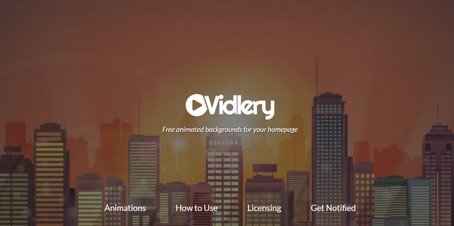
Vidlery

Animations are everywhere. It is a huge trend nowadays. If your budget does not allow ordering unique “living illustration”, you can resort to some free options available on Vidlery. The latter offers a small collection of free short animations from different categories.


Creator: Animations World
License: CC0 1.0 Universal (CC0 1.0).

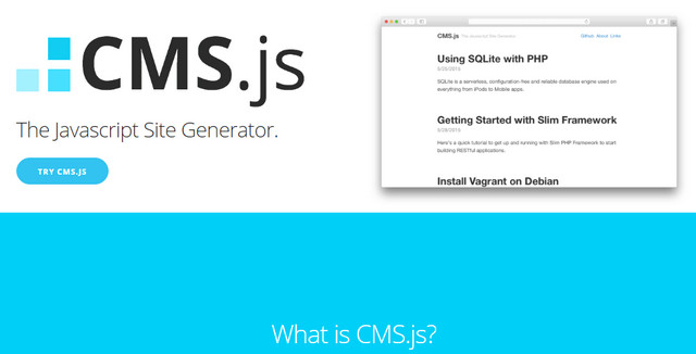
CMS.js

CMS.js is a JavaScript-powered feature-rich website composer. All you need is to provide the content; all the heavy lifting will be done by the generator. As a result, you will get a single page website with a proper markdown.


Creator: cdmedia
License: The MIT License.

CSS Peeper

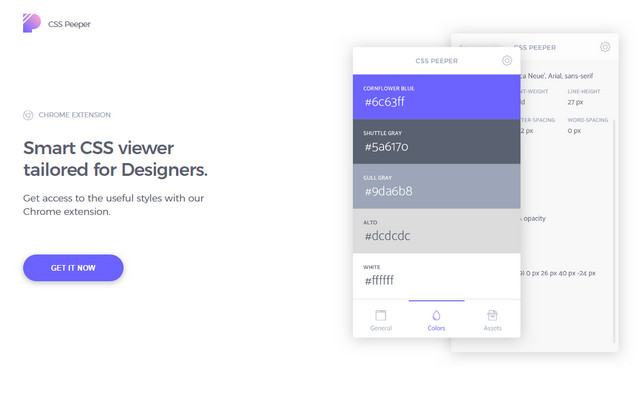
CSSPeeper is a Chrome extension that makes the life of designers and developers a bit easier. It gives you instant access to color values, typography or object sizes used on the website, showing styles in a friendly manner.


Creator: Dawid Mlynarz & Jedrzej Sadowski.
License: Declared as Free, no proper license given.

Clippy

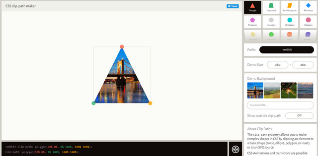
Need to make complex shapes using only CSS possibilities, then you will certainly appreciate this online tool. It has a handy interface where you can quickly create custom clip-paths or use predefined polygons.


Creator: Bennett Feely
License: Declared as Free, no proper license given.

Awsm.css

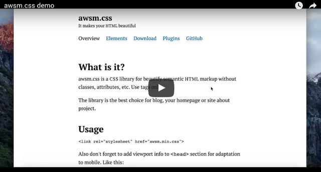
Igor Adamenko shares with the community his custom-made CSS library that establishes a solid foundation with a neat semantic HTML markup for any web project. It leverages only HTML5 tags.


Creator: Igor Adamenko
License: MIT.

Masonry

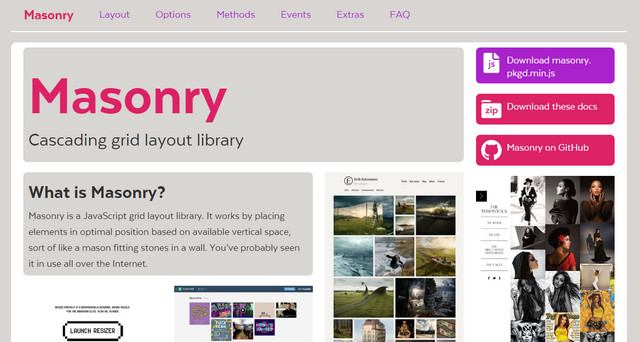
Masonry is a great solution when you want to build a grid-like structure such as gallery or portfolio section. Its primary task is to arrange elements and preserve as much space as possible, thereby producing an optimal and densely-packed layout.


Creator: Dave DeSandro
License: MIT License.

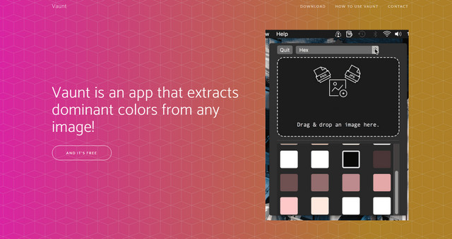
Vaunt

Getting the most out of a clustering algorithm, this simple application derives dominant colors from any image without a hitch. All the shades are available in several formats; just copy the required ones to the clipboard.


Creator: Guled.
License: Declared as Free, no proper license given.

Categories: Others Tags:

Free, faster.

January 29th, 2017 No comments

Ethan Marcotte, on time- and budget-constrained organizations websites:

Between the urgency of their work and the size of their resources, spending months on a full redesign isn’t something they can afford to do. Given that, a free theme for, say, WordPress can yield a considerable amount of value, especially to budget-constrained organizations. They can launch their redesign more quickly, and continue reaching the people who need their information most.

So Ethan takes a look at a bunch of free themes, so at least a responsible choice can be made there, and finds

the results were surprising: on a 3G connection, the slower themes I tested took anywhere from 45-90 seconds for any content to appear. In other words, the pages took roughly a minute before they were usable.

Pretty rough.

What I find particularly scary is that these are just empty themes. I usually attribute the slowness of sites in this category (off the shelf, slap-a-CMS on it) to be what happens on top of the theme. Stuff like uploading too many/too large of images and installing a million plugins that load their own set of resources.

I think it shows off some recent technology in a new light: saving us from ourselves. HTTP/2 makes concatenating resources less important, and that’s saving us from ourselves and those million plugins individual CSS and JavaScript files. WordPress does responsive images by default now, that’s saving us from ourselves and ensuring we aren’t loading more image than we need. AMP, as a technology, is saying y’all have lost the plot here and we need to save you from yourselves.

Direct Link to ArticlePermalink


Free, faster. is a post from CSS-Tricks

Categories: Designing, Others Tags:

Popular design news of the week: January 23, 2017 – January 29, 2017

January 29th, 2017 No comments

Every week users submit a lot of interesting stuff on our sister site Webdesigner News, highlighting great content from around the web that can be of interest to web designers.

The best way to keep track of all the great stories and news being posted is simply to check out the Webdesigner News site, however, in case you missed some here’s a quick and useful compilation of the most popular designer news that we curated from the past week.

Note that this is only a very small selection of the links that were posted, so don’t miss out and subscribe to our newsletter and follow the site daily for all the news.

10 Hottest Web Design Trends You Gotta Know for 2017

Best Practices for Long Scrolling

Add Pre-Designed Buttons to your Site with Butns.css

Material Design – Helpful Resources, Tools and Code Snippets

Designers React to the Mozilla Rebrand

Flex your Design Muscles with these 10 Creative Exercises

The End of User-Friendly Design

This is the Guy You Have to Thank (or Blame) for Comic Sans

How to Spot a Design Poseur

How to Make your Web Text Unreadable – ColorWiki

Npm for Beginners: A Guide for Front-end Developers

Identity Design: 5 Basic Types of Logos

12 Inspiring Ecommerce Website Designs

How Intuitive Website Design is the Key to Better Conversions

Want to Become a Coder? Act like A coder.

Site Design: Upstatement

Making Responsive HTML Email Coding Easy with MJML

Every Website will Break (Eventually)

5 Designing Lessons You Should Learn from Milton Glaser

New Identity for London Symphony Orchestra

Quirky Font Magically Adjusts to What You’re Writing

Fullstory Launches Free Edition for UX Designers

Don’t Set Goals, Create Systems

What is UX Writing?

Creative, Win More Clients – 14 Proven Ways

Want more? No problem! Keep track of top design news from around the web with Webdesigner News.

LAST DAY: 4 Minimal Font Families, 150 Unique Fonts – only $17!

Source

Categories: Designing, Others Tags:

The Media Object, A Bunch of Ways

January 28th, 2017 No comments

The Media Object pattern is: image thingy on the left, heading and text on the right.

That’s what Nicole Sullivan called it and the name stuck. It’s a pretty simple pattern, but like all things web design, it can be done many ways.

Bootstrap’s version

Let’s take a crack at a lot of those ways. In these demos, I’m not particularly focusing on naming conventions, semantics, or browser support. Just possibilities.

With Floats

Certainly, we could float the image to the left!

See the Pen Media Block #1 by Chris Coyier (@chriscoyier) on CodePen.

But just floating means you get wrapping. Wrapping might be perfectly fine, or you might not want it.

I’d say in the typical media object pattern, there is no wrapping.

To fix that, we could make sure all the text is wrapped in an element, then make sure that element has padding-left equal to the width of the image and any white space between them.

See the Pen Media Block #2 by Chris Coyier (@chriscoyier) on CodePen.

Or, you could float both sides:

See the Pen Media Block #3 by Chris Coyier (@chriscoyier) on CodePen.

With Flexbox

Flexbox makes quick work of it!

See the Pen Media Block #4 by Chris Coyier (@chriscoyier) on CodePen.

Note that we’re allowing the to become a flex item. We used align-items: flex-start; to make sure it doesn’t stretch out to the same height as the text.

With Tables

The media object could be a two-cell row of a table:

See the Pen Media Block #5 by Chris Coyier (@chriscoyier) on CodePen.

If you wanted to keep non-

markup, it’s still possible to make it behave like a table via display: table;:

See the Pen Media Block #6 by Chris Coyier (@chriscoyier) on CodePen.

With Grid

Grid layout allows us to define a set of columns. It’s quite easy to set up the first column to the fixed width we want, and the second column to take up the rest of the space.

See the Pen Media Block #7 by Chris Coyier (@chriscoyier) on CodePen.

Like in flexbox, we can avoid the image stretching itself out by aligning it to the top with align-self: start;.


I’m sure y’all can find about a dozen more ways to do it!


The Media Object, A Bunch of Ways is a post from CSS-Tricks

Categories: Designing, Others Tags:

Align SVG Icons to Text and Say Goodbye to Font Icons

January 28th, 2017 No comments

Elliot Dahl:

At Pivotal we’ve created an SVG icon system with React for use on our suite of products. This article is about my approach to styling the SVG icon system with CSS to make it easy and effective to use.

Alignment and icons (of any sort) will probably always be a bit tricky. It depends on two things that will be different on every site: the font and the icons. Elliot was able to get perfect alignment with Arial by pulling the icons down with bottom: -0.125em; because Arial sites right along the baseline and the icons themselves were designed with a 12.5% ring of white space around the edges. It’s a fairly common practice to design SVG icons with space along the edges (as annoying as it might be for alignment) because without the space, you might get awkward clipping on the edges with certain browsers/resolutions/zooming/etc (sorry I don’t have more detail handy).

Direct Link to ArticlePermalink


Align SVG Icons to Text and Say Goodbye to Font Icons is a post from CSS-Tricks

Categories: Designing, Others Tags:

Comics of the week #376

January 28th, 2017 No comments

Every week we feature a set of comics created exclusively for WDD.

The content revolves around web design, blogging and funny situations that we encounter in our daily lives as designers.

These great cartoons are created by Jerry King, an award-winning cartoonist who’s one of the most published, prolific and versatile cartoonists in the world today.

So for a few moments, take a break from your daily routine, have a laugh and enjoy these funny cartoons.

Feel free to leave your comments and suggestions below as well as any related stories of your own…

Cheap stock art

Computer stalker

Photoshop workout

Can you relate to these situations? Please share your funny stories and comments below…

7 Beautiful Script Fonts from Unicode – only $12!

Source

Categories: Designing, Others Tags: