Archive

Archive for January, 2017

The Next Chapter

January 25th, 2017 No comments
Chocolatey.IO - Software Management Automation

Six years ago I started working furiously on this little side project about package management for Windows. It started to grow and over time it became clear that it was going to be something important. A community flourished and there was a tremendous uptake for this little tool.

Fast forward to present, starting soon I will be focused solely on Chocolatey as the Founder of Chocolatey Software, Inc*! It’s an exciting opportunity to really see where we can take this Windows software management thing!

It’s a bit bittersweet as I’ve had the opportunity work with a lot of fantastic folks at Puppet and do some really awesome things for furthering automation on Windows. In many ways Puppet has been an amazing place to work (I highly recommend it, they have the remote employee situation handled). However, an opportunity to follow my first love, Chocolatey, is a dream I won’t pass up.

Not everyone gets the opportunity to follow their dreams, so when you get a chance it can be both a thrilling and scary experience! Here’s to the future of Chocolatey and Windows automation!

* – For those keeping track – Chocolatey Software was formed in November 2016 as a spin off of RealDimensions Software, LLC

Categories: Others, Programming Tags:

How To Boost Your Freelance Web Design Career By Building a Network

January 24th, 2017 No comments

Hey there freelance web designer – you’re leaving money on the table!

We all know about the struggles of starting a career in freelance web design. You’re probably not aware of the right places to look for work, you might be underselling your services – maybe even working for free to build up a nice portfolio. You still have to build confidence to start charging a decent rate. It’s tough, but we keep at it to be able to succeed when we’ve built a good name for ourselves.

Eventually you learn – you start making good contacts and the work starts rolling in. If you’ve worked hard enough and made enough good contacts, you might now start to struggle in a different (much more positive) way.

You start to struggle to fit all of the work you have in your day. And this is the point where you start leaving money on the table – you start to refuse work simply because you don’t have enough time to service all of your clients.

Yet – it doesn’t have to be this way – there’s a little trick we’re going to show you today which will boost your freelancing web design revenue. At the same time, done right, you can possibly starting working less hours rather than more.

The dangers of refusing freelance web design work

If you’re in a position that you are struggling to keep up with work coming your way – well done! You’ve done such a great sales and marketing job, that clients are clamouring to get just a little bit of your time.

It’s a fantastic position to be in. One that most of your peers envy.

You’re not only filling all your hours – you can actually start choosing who to work with or the jobs you take.

If there is a client or a job which you don’t want to work on, do a little magic with the numbers when writing your web design proposal. Double or triple your rate – that way, your client will either get discouraged by the price. If they’re not sufficiently discouraged you’re going to get a nice windfall from that client or piece of work.

You’re not refusing outright a job which you’d rather not be working on. You’re just earning more money from it.

You can actually start charging better rates overall should you want to. That will automatically shrink your client base, because the ones who might have initially been attracted to your (cheaper) prices would now start shirking away.

There is a problem with both these approaches though.

They work well as long as there is a bounty of work. If times get tough, you will have alienated quite a few of your clients. These clients would by then have moved on and you’re unlikely to win them back. The fact that you snubbed them when you had better clients or jobs will be a turn off to them, even if you actually ask them very very nicely.

Let’s face it, they’ll think, if you snubbed them once, you’ll do it again.

So what’s a better approach?

Don’t refuse them – outsource the work to your own network of web design freelancers.

Establish your own network of web design / development freelancers

Whilst building your own network of clients, there is another piece of networking you should be doing – establishing a network of freelancers which operate in the same or similar niches as you do.

If you’re a web designer, you should network with:

  • Other web designers for when you are overwhelmed with work
  • Web developers for when you need to customize stuff
  • Designers for all creative work
  • Photographers / video or other online content providers

You get the idea.

Same goes for any content writer or anybody working in a niche related to the web design niche. Network with freelancers doing web design so that you’ll be able to take all of the work which comes along.

That way, when and if a client comes for the full package, you can provide them with the all of the services they need.

Heck you can even actually pitch a whole package if you see that your client has that specific need.

Stop doing the work you hate – start working on the things you love.

We’re in the day and age of digital workers. Freelance web designers have the luxury of working from anywhere – infact quite a few of them do. More than that, you can outsource the work to countries where labour is cheaper.

That gives you the opportunity to markup the work of others. To have a bit of an analogy, in essence, you will be the Quality Assurance manager in a factory of “manual labourers”.

Or the architect at a construction site. You won’t be dumping the concrete. You will, on the other hand, be testing that the quality of the concrete is good enough for your (web)site.

Rather than being the manual labourer yourself, you define the requirements and make sure these requirements are rigorously met, on time and at the right budget.

You’re simply the project manager of the jobs you’re unable to do, whilst still doing the jobs you enjoy doing.

Use the 80-20 rule as your guiding principle.

If you are able to spend 80% of your time doing the work you love and the other 20% of your time, managing your network of freelancers, you’re going to easily double the amount of hours you could be charging for.

This will drastically boost your revenue potential.

If you do freelance web design and enjoy designing pages, but don’t really like doing coding, you’ll need to have a bunch of WordPress developers ready for hiring. You can then outsource the development work to these designers and you can keep working on work you love doing best.

How to create a network of cheaper freelancer web designers

The biggest challenge in all of this is to actually build a reliable network of web design related freelancers.

Let me tell you a bit of story.

We tend to get quite busy publishing content at DART Creations – so when we do to need development work, we typically outsource to our trusted developers.

Yet finding reliable WordPress developers was not a pleasant experience for us.

We tried hiring developers first on a few of the most popular freelancing websites out there. We set up a project and a budget and waited for the offers to start pouring in. They did of course – from all sorts of people, the ones with great reviews and exorbitant prices and the ones with fewer reviews and more decent prices.

We chose somebody who seemed to be a good balance between good reviews and prices.

Our first hiree turned out to completely “borrow” code from another plugin.

Our second hiree wasn’t very responsive – although we agreed a timeline, we had to remind, nag and eventually beg for the code to be submitted.

The quality of the resulting code left much to be desired.

They had asked for payment outside of escrow services and trying to recover any money after that mess required chargebacks on credit cards. In a few words – too much hassle.

(Lesson learnt: never make payments outside of an escrow service – even if it’s more expensive, you’re protected against poor work)

The tried and tested way to hire freelancers

1. Physical networking

Working online has it’s benefits. Yet, there is something about meeting a person face-to-face where you can make an instant judgement on whether that person is reliable or not.

Get in touch with your peers in real-life as much as possible and network. Go to web design, WordPress and development conferences – and always network as much as possible.

Don’t stick to a single group of people with whom you “make friends”. Meet as much as possible with different people, always with a lookout to acquiring new contacts.

Attend local developer meetups with the same thing in mind. Wherever there is a gathering of people who operate in your niche, go and make contacts.

2. Online networking

Whilst physical networking is great – you should still network online. Find online groups of peers. Whether your favourite online hangout is Facebook, Google+, reddit, or some forum, always keep networking online. The more groups / conversations you join, the larger the possibilities of networking.

Give back to the online communities you join.

That way when you do stuff to network, you’ll be known as “the one who helps often”.

3. Vet freelance web designers and developers before going all out

You should never assign somebody to important jobs unless you’ve already tested them out on smaller jobs.

Essentially, if you don’t know a person, you really can’t be sure about the quality of work they provide, their timeliness, their communication efficiency.

Reviews can guide you, but you’ll find that quite a few reviews might be skewed and not provide a true picture of the actual skill set of the person you are hiring.

You’ll need to slowly get to know the person you are hiring by giving them a small task. This task should not be crucial to the success of a project. It should be a piece of work which you can afford to trash and give to somebody else.

4. If you’re in a hurry – hire multiple freelancers for the same job

When you’re pressed for time with a tight deadline for a piece of work and don’t have the time to vet a new hiree, there is a tried and tested way to mitigate your risk.

Rather than hiring a single developer, you should hire multiple developers (or whatever the task you need to do is).

You’re going to pay a premium for this, but you should see this as an investment in future projects. It is also a better guarantee of a good result.

Probable scenario – one hiree does not deliver or deliver sub-par work (work is thrown away, hire is abandoned). Second hiree provides good quality work.

Best-case scenario – both hirees provide excellent quality work. You’ll still have to throw away one of the results, but you’ve found two excellent freelancers for your network which you’ll be able to use in future projects.

Worst-case scenario – both hirees deliver poor quality work. You’ll have to abandon both hirees and their work and in all likelihood you’re going to have to perform some contingency planning.

A way to mitigate the worst case scenario is give the hirees a due date which is a week or two before the project deadline. That allows you some leeway to find a replacement, although you’re going to have to pay through the nose this time to make sure the quality is top-notch and the project is delivered on time.

Make hay while the sun shines

As long as you’ve got work coming in, creating a network of freelancers working around your web design is an excellent way to boost your freelancing web design revenue. Given that they are freelancers, with no fixed commitment, you’re not risking much in reality.

It’s a win-win situation for you.

Stop leaving money on the table. You never know when the good times will dry up.

Read More at How To Boost Your Freelance Web Design Career By Building a Network

Categories: Designing, Others Tags:

The simple formula for great UX design

January 24th, 2017 No comments

We’re in the midst of a digital renaissance. With the rise of startups and transformative tech companies like Apple and Google, the user’s experience has never been more important. That means that the humble designer is suddenly essential to the experiences of billions of people.

And we designers have risen to the challenge. As a young designer, I delighted in exploring new tools, developing my processes, and working with cohesive design teams. I spent hours crafting my skills, from wireframing to sketching, and even attempting to master Photoshop’s innumerable keyboard shortcuts. I figured the more skills I had, the more techniques I knew, the better designer I’d become, right?

Wrong.

As I got older and gained experience, I realized that none of these things were the main contributing factors to great UX design. Despite the rapid rise of fancy new tools, it became more and more clear to me that the secret to creating great user experiences lies in something more fundamental: the ability to listen. After all, the foundation of great design doesn’t start on an art board; it starts with a problem.

But listening is easy, right?

Conversing a daily part of the human experience, it’s how we communicate. Because we do it so often, it’s easy to think that listening is a skill we’ve mastered.

But here’s the thing: listening isn’t the same as hearing. You can hear the sounds of what someone says, but real listening requires focus on both verbal and non-verbal cues. It means paying attention not only to the words someone says, but how they speak, and the way they use their language, voice, and body.

…we’re doing a lot of hearing, but not a whole lot of listening.

According to numerous studies on the way we communicate, we spend 60 percent of our time “listening,” but only retain 25 percent of the information that comes in. That’s means we’re doing a lot of hearing, but not a whole lot of listening.

To make matters worse, we live in an age where our attention is constantly being distracted. In our perpetually “connected” culture, there are nearly 11 million things fighting for our attention every second. The result? We impatiently crave instant soundbites, replacing the art of conversation with personal broadcasting.

In this environment, it’s easy to miss the insights we need to solve problems in a meaningful way.

So what’s the solution?

As you’ve probably already figured out, there are many types of listening and not all listening is created equal. The subtle art of listening includes everything from critical listening—where you evaluate and analyze—to empathetic listening—where you listen to understand a person’s emotions.

In design, the most helpful type of listening is conscious listening, otherwise known as “active listening.”

So how can we learn to consciously listen?

In his TED talk “5 Ways to Listen Better,” sound expert Julian Treasure shares an effective framework called the RASA—Receive, Appreciate, Summarize, Ask—method. I’ve heard designers from Nike to Nickelodeon swear by its ability to help them get the insights they need during the design process. And using this in my own career, I’ve found that whether I’m doing client research or getting user feedback, the result is the same: my clients feel understood, I get the insights I need and, best of all, I connect deeply with the problem I’m tasked with solving.

The four steps of RASA

Receive

Treasure describes “receive” simply as “pay attention to the person.” But the word itself is evocative. When you’re receiving from someone, you’re not simply sitting near them while they talk. Instead, think of this step as a the state your mind should be in as you listen: open, curious, and analytical. Receptive.

If you’re open to receiving during the discovery process, even the sometimes frustrating process…can be extremely fruitful.

Every UX project begins with a discovery phase, which is the perfect opportunity to get a deep understanding of the problem that needs solving. If you’re open to receiving during the discovery process, even the sometimes frustrating process—like when your client rambles off in a vague direction—can be extremely fruitful. As the designer, it’s your responsibility to find the insights within your client’s words, even asking the same question in multiple ways if that’s what’s needed.

Appreciate

When listening, it’s obviously not enough to sit in front of the other person like a stone cold statue. Great listening means showing appreciation through encouraging sounds or gestures to show that you’re engaged and present. For Treasure, “appreciate” comes in the form of small noises like “okay” or “mm hmm.”

Feedback is the lifeblood of our industry, and the more engaged and appreciative you are with your user, the more honest and meaningful information they’ll give back to you. Think about subtle gestures like facing your client when listening, nodding in agreement, or verbally thanking them as they share with you.

Summarize

Think about a time that you shared something personally meaningful with another person, and they reflected back what they heard to you. Feels pretty great, right? When you take the time to summarize and reflect key ideas back to the other person, it shows them that you’ve fully understood what they’re saying. Treasure suggests starting with the word “so” to indicate when you’re summarizing someone’s thoughts back to them.

Ask

At the end of the discovery phase—or even throughout, if it’s appropriate—be mindful and ask thoughtful, open-ended questions that drive the conversation deeper. This is where the importance of active listening is really emphasized, because it’s impossible to ask meaningful, relevant questions unless you’re fully present and listening to the other person. By asking the right questions, you can glean insights from your users that will help you truly solve their problems.

Putting it all into practice

Having a simple framework like the RASA method has helped me stay committed to developing my most important skill as a designer: my ability to listen well. It’s helped me discover that when my client feels truly heard, they are willing to go deeper and share more than I ever imagined, helping me develop the solutions that meet their core needs.

And the great thing about conscious listening is that it doesn’t just apply to listening to others; it applies to listening to ourselves as well. Don’t be surprised if, as you start creating the space to really hear what’s going on for someone else, you simultaneously develop self-awareness and the ability to critique your own work with an unbiased eye. And your design work? It’s only going to get better.

FotoForm: The World’s First Geometric 3D Photo Animator – only $17!

Source

Categories: Designing, Others Tags:

Need Lorem Ipsum? Inside HTML?

January 24th, 2017 No comments

Emmet is great for that. With it installed in the code editor you are using, you can type “lorem” and then tab and it will expand into a paragraph of Lorem Ipsum placeholder text. But it can do more! You can control how much you get, place it within HTML structure as it expands, and get different bits of it in repeated elements.

Put lorem ipsum in a paragraph

A list of lorem ipsum

Modules with fake content

A complete document


Need Lorem Ipsum? Inside HTML? is a post from CSS-Tricks

Categories: Designing, Others Tags:

Making Responsive HTML Email Coding Easy With MJML

January 24th, 2017 No comments

Email is one of the best ways to engage with your users, especially during the holiday season. However, if you want to stand out, no matter how beautiful your emails are, you need to make sure they render correctly in your reader’s inbox, regardless of what email client they’re using. Creating responsive email is not an easy task, and there are various reasons for that.

First, there is no standard in the way email clients render HTML. This is true for email clients from different companies, such as Outlook and Apple Mail, but not only. Even different versions of Outlook, such as Outlook 2003, Outlook 2013 and Outlook.com, render HTML differently.

The post Making Responsive HTML Email Coding Easy With MJML appeared first on Smashing Magazine.

Categories: Others Tags:

5 Best Places To Find Deals For Designers and Bloggers

January 24th, 2017 No comments

If you’re like most people, you’re probably too careful when spending money online on digital products. Instead of buying assets from popular online marketplaces, you spend a lot of time looking for free alternatives and taking risks downloading pirated content.

Well, there’s no shame in that. You work hard to earn your money and you should always be careful when spending that money. Although, unfortunately, those free stuff you download online are often very poor in quality and they’ve already been used by thousands of other people so your designs always end up looking like someone else’s creation.

When doing professional work, you shouldn’t cheap out. Because the quality of your work heavily reflects on your reputation. And for designers, reputation is everything.

But, that doesn’t mean you have to buy expensive design assets or pay full price either. There are plenty of great sites you can explore to find great discounts and deals to grab your favorite mockups, fonts, graphics, web hosting, themes, and many other online services.

In this article, we’ll share with you some of our favorite Deals sites designers and bloggers can use to find special coupons and discounts.

Design Bombs

Design Bombs is a blog that shares useful guides, tips, and tutorials for both professional designers and bloggers. The site has a special Deals section that includes many different types of deals and coupons that help designers and bloggers save a lot of money. The coupons on this site range from 20% to 60% of savings when buying web hosting, themes, graphics, illustrations, icons, and more.

In addition, Design Bombs also has a section for Freebies, lots of articles dedicated to designers, and beginner guides such as how to choose the right WordPress hosting and How to start a WordPress blog. Whether you’re a blogger looking to use unique graphics to include on your blog posts or a graphic designer looking for fresh graphics for your next project, this site got deals for all.

Mighty Deals

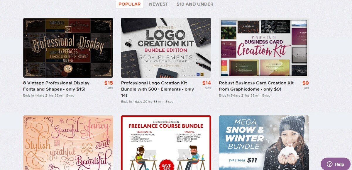
This is yet another popular site for finding deals on many different types of content, such as fonts, textures, brushes, online courses, design elements, and much more. The site includes deals starting at $10 and above. And there’s also a Free Deals section on the site where you can download mockups, fonts, and icon packs for free.

The site also has deals for web designers and bloggers as well. The deals on this site will help you save 50% to 90% when buying design assets.

WPKube

WPKube covers all things related to WordPress and blogging. This blog is filled with tutorials, how-to guides, tips, and tricks on how to make the most of WordPress platform and building blogs. If you’re new to WordPress, WPKube is a blog you must follow.

The Coupons and Deals section of the website also includes lots of deals for buying WordPress themes, plugins, web hosting, and other services at incredible discounted rates. The WPKube deals for WordPress plugins and themes will come in handy when building your next blog or even upgrading the existing website.

In addition to deals, they also have some in-depth guides such as What is Managed WordPress Hosting, How to install WordPress, and more.

Design Cuts

Design Cuts is a curated marketplace full of deals for designers. There are deals on this site for unique typefaces, card designs, graphics, backgrounds, brushes, and so much more. The deals on Design Cuts will allow you to save up to 99% when buying various content for your projects.

The learn section on Design Cuts features lots of free tutorials and tips on design, like installing fonts, downloading resources, and more. There’s also a Freebie section as well.

Ecommerce Booth

Building an eCommerce website is not easy, especially when you have to worry about making the site look perfect in every way, setting up payments, and offer a great user experience to the customers. The Ecommerce Booth is a great blog you should follow if you’re thinking about starting an eCommerce business.

The Deals section of the blog also includes several great deals for saving money when buying web hosting for your eCommerce website and using website builders like Squarespace to create landing pages or easily build an online shop without any experience in web development.

Wrapping Up

All the deals sites in this list are often updated with new deals and coupons. Remember to bookmark them to come back later so that you’ll never miss a great deal ever again.

Next time when you’re in the market looking for new stuff for a design project or for building a new blog, don’t go buy stuff directly, use a coupon and save some money! It’s not being cheap, it’s how smart folks spend their money.

Categories: Others Tags:

Theme Juice: This Tool Lets You Create Local WordPress Sites Quickly

January 24th, 2017 No comments

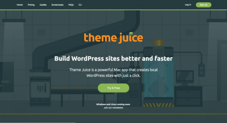
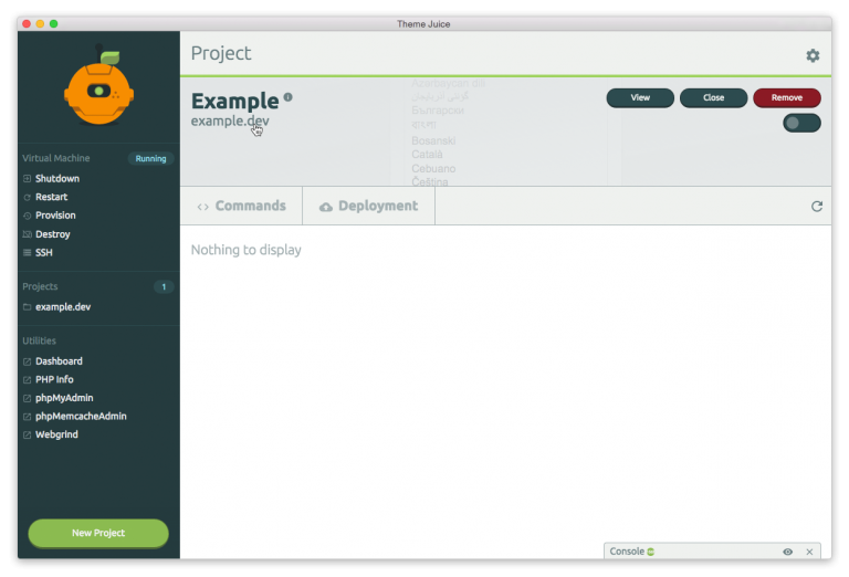
The fewest designers use Github or similar platforms but develop locally. For that, there are some proven solutions, but the new Mac App Theme Juice makes all of it easier.

Theme Juice Landing Page (Screenshot: Noupe)

Theme Juice Creates Local WordPress Installations

Theme Juice is a software that makes the creation, and operation of local WordPress installations very easy. By concept, Theme Juice is not even limited to WordPress, but overall, the feature set is adjusted to this type of sites. However, you can also use it to run Magento or Drupal, for example.

At the moment, Theme Juice is only available for Mac users. Versions for Windows and Linux have already been announced, and are supposed to be released “soon.” Theme Juice can be tried out for free for 30 days. After that, it costs 6 dollars a month, or 49 dollars a year. Of course, the price includes all updates, as well as a quick support.

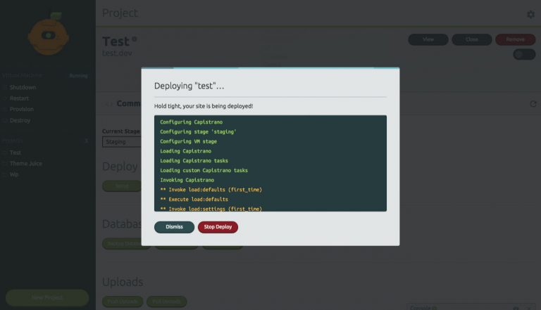
Theme Juice is a wrapper for established technologies, like Vagrant, XCode Command Line Tools, and VirtualBox. After the installation, you’ll be notified that these additional components are required for a smooth functionality.

Theme Juice: a Virtual Machine is Created. (Screenshot: Noupe)

The LAMP stack at the basis of the WordPress installation was handwritten, and of course, there are alternatives that work outside of a paid program.

What makes Theme Juice worth considering is the fact that the software does not only install an executable Apache environment on your Mac but even places this environment within a virtual machine. This way, the functionality of your projects is not dependent on the existence of your particular system configuration. Instead, Theme Juice installations run on every AMP stack. If you can’t decipher the abbreviation: A is for Apache, M for MySQL, and P for PHP. For the first letter, you’ll often find the M for macOS, or the L for Linux.

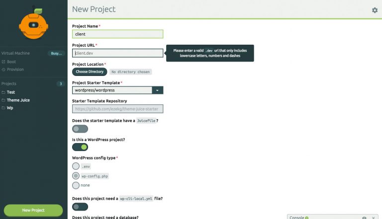
Theme Juice: the Project is Being Configured. (Screenshot: Theme Juice)

Here, Theme Juice doesn’t just install a universal virtual machine. You can determine exactly which start configuration you want to work with. This allows you to start every new project with a default structure when it comes to plugins, themes, and so on. Of course, there are other solutions for that already as well. Here at Noupe, we’ve already presented a good one called WP-Staging. However, this solution also requires an already installed WordPress site.

Theme Juice is an all-in-one solution. In the beginning, all you have is a running OS. Then, you install Theme Juice and its dependencies. Now, you create a project and have Theme Juice generate a respective virtual machine. Next, you install WordPress. Done. Without Theme Juice, this would’ve taken a lot more time, and knowledge. Thus, the tool definitely has its right to exist. As we all know, time is money, so using Theme Juice lets you save a lot more than it costs you every month.

Theme Juice: Project Dashboard (Screenshot: Theme Juice)

Once it’s running, you can keep managing your projects via the intuitive Theme Juice Dashboard. This way, the tool warrants the connection between development site and productive installation. Databases, for example, are migrated with a simple click. The deployment is done via SSH. Not insignificant either: all projects in the development area run with an SSL encryption by default.

Theme Juice: Not Free, But Inexpensive

In the end, the only downer is the fact that Theme Juice is not free. However, it’s just a small one, as 49 dollars a year, or six dollars a month (for those with commitment phobia), won’t make you poor. I already mentioned that just a few projects are enough for the saved time to exceed the input cost.

On top of that, Theme Juice doesn’t quit its service once the subscription ends. You just won’t receive any more updates, and no support, bur you’re free to keep using the software for as long as you want. By the way, your license is platform independent. So, if you’re working with Mac, Windows, and Linux, your license won’t prevent you from doing that. However, this will only be relevant once the app is available for Windows and Linux.

Take a look for yourself. But keep in mind that you have to lodge a valid method of payment at the beginning of the test phase. I don’t like this type of approach in general. If you’re convinced of your product, you don’t need mantraps like that. Maybe the makers of Theme Juice will come to their senses in this regard…

Categories: Others Tags:

8 reasons 80s flair will rule design in 2017

January 23rd, 2017 No comments

Trends come and go in waves. The latest wave when it comes to web design is totally 1980s.

From bright color to flat design and plenty of gnarly geometry, lots of designs feature these looks. For many designers, the 80s are a flashback to their youth, and this trend has everyone totally amped. Here’s why 80s style is the bomb, and a few ways to help you use the trend like a total boss. (And no more 80s lingo puns … we promise!)

1) Everything that is old is new again

This might hurt a little bit for all you children of the 80s, but this era is officially retro. To make it a little less painful, we’ll call the decade “modern retro.”

What’s different about this “old” style is that elements that were physical or designed for early screens are the influence for websites and apps. This includes using design elements that bring back the nostalgia of early Nintendo gaming systems, proving the popularity of pixelated designs, or the style of posters and album labels.

The old, new style includes all of the 80s charm you would expect with in-your-face colors plus everything you want in a website today, from great animation or sliders to easy-to-read typography. So while you might catch a bit of 80s and think the design is old at a glance, these little touches prove the newness of the design.

Look at The Vinyl Lab, for example. The design is 80s aesthetically, but as you scroll the site feels modern and it works just as well on phones and smaller devices. So is the design new or old? You decide.

2) Patterns and shapes provide visual interest

Geometric shapes and fun patterns can give your design just the kick it needs. This little change can also serve as a transitional element if you are revising a design aesthetic from one of the uber-minimal styles that was recently popular.

Either option can be a good alternative to a full-scale redesign while keeping modern design elements.

Your visual style can help you determine which option is best:

  • Use a pattern if the design is clean and organized and something in the background won’t get in the way of content.
  • Use geometric shapes to add a bold, pop of color or interest to a photo or overall design that seems a bit lackluster. Caava Design, below, uses colorful geometry in a way that’s sure to inspire.

3) Influence of fashion

Like it or not, 1980s fashion will be one of the biggest trends of the year, according to W Magazine.

Before you roll your eyes and ask why fashion matters, there is a correlation. Regardless of the type of design—fashion, art, home and interiors, website—each genre of design impacts every other one. Pantone’s color of the year doesn’t stop with designers working on posters; it applies to pretty much everything.

So what we see on runways, from big hair to crop tops to leggings, will influence websites. Elements of the 80s might show up in the clothes people wear for photos, or even to balance out the imagery itself. You might have to use oversized typography to offset super-sized hair on a model, for example.

Textiles can be an indicator of visually pleasing elements all around. If shoppers are buying plenty of neon orange shirts or pants with bold patterns, they won’t find these design elements offensive when they back up and support content online.

4) Memphis design trend gains traction

The Memphis design trend is packed with bright color and lots of shapes and lines. It’s a little more distinct than using the concepts alone. The origination of the aesthetic pattern is the Memphis Group, a bunch of interior designers in the 1980s.

The Memphis style is really flat and features vectorized elements in an almost cartoon-style. Elements are often layered on top of a white or light background or black to create maximum contrast between elements. The style is fun, light and attention-grabbing. These are likely the reasons the style is starting to gain more traction.

5) Space and dark styles provide intrigue

The 80s are notably known for art styles that use neon on dark backgrounds and space themes. There was a definite and distinct fascination in design with the unknown, and color palettes included combinations that included purples and oranges or yellows.

Space, in particular remains a dominating theme, and many space-based designs create some of the nostalgia from this era of design. The recent televisions show “Mars,” below, uses this idea with a dark background and bright logotype treatment featuring an almost 3D shape element in the lettering.

6) Influence of material and flat dominate

It seems like flat and then material design patterns have been at the forefront of the design conversation for some time now. So it’s somewhat of a natural evolution that these more current trends are the combining force with the modern retro concept.

This includes colors, layering styles and overall modern twists on how 80s themes are combined with today’s elements to create a sense of another time with a user interface that visitors expect.

7) “Cute” icongraphic styles are totally hip

Many 80s styles included lots of cute little icons on a canvas. From tiny palm trees and sunglasses on shirts to squiggles and lines on notebooks, iconography was a ‘thing’ in the 80s.

It’s re-emerging. With so many cool icons styles—line art, hand drawn and full color options—iconography can be a go-to art style for a design framework. Using icons can provide a lot of flexibility for projects where other visuals are lacking and can provide an interesting way to help visually organize content.

Here’s the trick to using 80s iconography: lots of little icons all over the place. The more random placements appear, the more 80s flair the design will have.

8) Bold color is made for screens

A client once asked why posters weren’t commonly neon green. It’s because you almost need the backlighting of a screen to really get that neon light look. Some of the colors that were popular in ads and television show intros—think Miami Vice—just work better on screens.

Bright color schemes have been growing in popularity, another trend that connects to flat and material design. This seems to be a natural response to all the black and white palettes that seemed to be on every other design at the height of the minimalism phase. The shift is allowing designers to really play with the design more and exhibit more creative color freedom.

Conclusion

Here’s one of the biggest reasons 80s design is making a comeback: because 80s style is trickling back into pop culture. Maybe part of it has been a nostalgia that happens every generation or so. Maybe it is because every style has a cycle that comes and goes.

But as long as you see 80s influences in elements such as pop culture or fashion or music, the same influences are likely to impact the way we think about design as well. Enjoy the trend; the 80s were a lot of fun, and your modern retro design should reflect that.

Exclusive: 2017 Valentine’s Bundle of 35 Fonts – only $24!

Source

Categories: Designing, Others Tags:

A Case Study: Is App Indexing For Google Worth The Effort?

January 23rd, 2017 No comments

Will the resources spent implementing app indexing for Google search be a boon or a bust for your app’s traffic? In this article, I’ll take you through a case study for app indexing at our company, the results of which may surprise you.

App indexing is one of the hottest topics in SEO right now, and in some sense for good reason. Google has only been indexing apps for everyone for a little more than two years, and with only 30% of apps being indexed there is huge potential for websites to draw additional search traffic to their apps.

The post A Case Study: Is App Indexing For Google Worth The Effort? appeared first on Smashing Magazine.

Categories: Others Tags:

Using GSAP to Animate Game UI with Canvas

January 23rd, 2017 No comments
Animate all the thing! Meme

The year was 1995; Toy Story hit the theaters, kids were obsessively collecting little cardboard circles and Kiss From a Rose was being badly sung by everyone. I was a gangly ten-year-old, and like any other relatively tall kid I was often addressed to by “you must be so good at basketball!”. So I practiced and practiced spending hours on the court of my elementary school. Eventually, I realized, much to the dismay of aunts and other cheek-pinchers alike, that while occupying vertical real estate might give you an advantage in the art of basketball, it does not ensure it.

Fast forward 21 years later. Now a tall and gangly developer, still bad at basketball, I was faced with a project: Designing and implementing a full motion video web basketball game for the NBA’s Detroit Pistons. Throwing balls around is one thing; throwing pixels around?—?now that’s finally a basketball challenge I can ace!

While developing the game I used many neat things like canvas, SVG and CSS animations, gesture recognition and a video stream that’s dynamically constructed on the fly. It’s really amazing what we can do with just a browser these days. Go ahead, give it a spin.

In this article, I want to focus and show you how I implemented the animation for the Superpower Gauge using vanilla JS in conjunction with GSAP. This is the motion reference I used while implementing the animation, created in After Effects:

In 1on1, once the user succeeds making a move, they’re awarded combo points. The gauge sits at the top left corner of the screen, and its task is to convey to the user the amount of their combo points as denoted by the number of red segments. At certain times in the game, the Superpower Gauge becomes active, notifying the user they can click it to make their in-game avatar perform a special move.

The basic structure of the Superpower is achieved with one Canvas element and a bit of simple geometry:

See the Pen Pistons Superpower: Structure by Opher Vishnia (@OpherV) on CodePen.

Essentially, there are two main components here?—?the central image and the gauge segments. The image is the easy part, it’s just a trivial use of canvas’ drawImage. The gauge segments is where things get interesting. I defined a general options defined with some properties to play with later on like the number of segments, radius, width and so on. Then I iterate over an array of segment objects and use their properties (strokeStyle, lineWidth) to draw the actual segments with the canvas arc function. So far so good?—?but where’s the animation?

I was debating whether to use a canvas animation framework but ultimately decided against it. This is because I needed to use several types of animations in the project: Canvas, SVG and CSS/DOM, and no one framework does it all. In addition, all of the animations had to run smoothly on top of playing video, on both desktop and mobile with varying capabilities and network conditions. This means that performance was nothing if not paramount, and I wanted to know exactly which code powers the animation. Luckily GSAP (aka Greensock AKA TweenMax AKA TweenLite) allows me to do just that.

GSAP is cool. It enables you to animate pretty much anything! The trick is that the animation API accepts not only DOM/SVG objects but also arbitrary JS data structures, whose properties you can then “animate”.

The basic idea is that you use GSAP to change the properties of these objects over time. These values specify how the UI looks at any given point in time. On each requestAnimationFrame you make a draw call to the canvas to draw the state of the UI based on those objects.

function render() { 
 //draw the animation state
 drawComboGui();
 
 //draw the image
 ctx.drawImage(...);
 //render on the next frame as well
 window.requestAnimationFrame(render)
}
render();

Here’s a breakdown of the different animations implemented:

Gauge fills up

See the Pen Pistons Superpower: Gauge fill by Opher Vishnia (@OpherV) on CodePen.

Let’s discuss the anatomy of this animation. At idle state, all yet-to-be filled segments of the gauge are gray and thin, and filled segments are red and slightly thicker. Once the next segment of the gauge fills up, all previous active segments change color to white, grow in thickness and start glowing. The following segment is then filled, and lastly, all the segments stop glowing and return to their original, active width.

Remember that array of segment objects? Here’s where they come into play with GSAP. The function addActiveSegment is the heart of the magic, where we use TweenMax.fromTo to animate properties like lineWidth and anglePercent. The GSAP colorProps plugin allows us to make smooth transition in color properties like strokeStyle and activeStrokeStyle. I’m using the delay property to time the various components of this animation.

TweenMax.fromTo(segments[index], expandAnimLength, {
  anglePercent: 0,
  colorProps:{strokeStyle: options.activeStrokeStyle},
}, 
{
  anglePercent: 1,
  colorProps:{strokeStyle: options.activeStrokeStyle},
  ease: Power0.easeIn,
  delay: growAnimLength
});

Like I mentioned earlier, the render function then calls drawComboGui on each requestAnimationFrame, ideally 60 times a second. In drawComboGui first we clear the canvas from any previous data drawn onto it before drawing the current state.

To create the glow effect, I drew two segments on top of each other. The bottom one uses shadowBlur on the canvas path, and the top one has no shadow blur. This makes the blurred element “peek” behind the non-blurred one, resulting in the glow effect.

There are several extra animations for the Superpower gauge. The Superpower enabled and Superpower disabled are very simple in concept to the gauge fill up discussed here. They are implemented by animating the width of the image and the active segments.

superpower charged
Superpower charged
Superpower discharged

The Superpower charged and Superpower discharged animation require other techniques like animating image sprites and applying a blur-on-the-fly filter. It’s a bit out-of-scope right now, but it will be discussed in a future article!

There’s one major gotcha when it comes to implementing UI for games. Games are extremely stateful. In any given moment the state of the game, and by proxy, its UI can change. In the Superpower Gauge’s particular case? — ?it means that at every moment the gauge might fill up, become enabled, be discharged or become disabled. This can happen even while in the middle of an animation! What do you do when that happens, though?

You have two options?—?one is to stop whatever animation is currently playing and abruptly transition to the new animation. The problem with this approach is that the experience for the user is very jarring, detaching them from the game and ultimately conveying more noise than information. This is the exact opposite of what a good interface should do.

The other option is to queue up the animations, so each animation is fired before the last one starts. This gets a little tricky, since an animation might be comprised of smaller sub-animations, but thanks to GSAP’s Timeline feature, the task of herding all these states and animations becomes much more manageable. Instead of calling TweenMax.to, you initialize a Timeline instance object and use it to make to calls. By default, these to calls define new animations to start at the end of the timeline forming an animation queue, but this is highly configurable! You could, for example, define an animation to start at an offset relative to the timeline end, or at an absolute position on the timeline. This also allows you avoid having to use the delay property to calculate queuing of animations, which tends to get cumbersome when dealing with multiple animations.

Here’s an implementation of the gauge fill up animation using GSAP’s Timeline. Try to click the “Add Segment” button while an animation is already in progress.

See the Pen Pistons Superpower: Gauge fill with Timeline by Opher Vishnia (@OpherV) on CodePen.

I hope this helps you tackle some challenges and issues you encounter in your game/site/project. If you have any questions or if you’d like to know how I tackled other UI elements in the game feel free to hit me up on Twitter!

Epilogue

While I still get assaulted once in awhile by low hanging branches and my hoop-shooting skills leave much to be desired, ?when it comes to quickly pressing key combos, Andre Drummond has nothing on me.


Using GSAP to Animate Game UI with Canvas is a post from CSS-Tricks

Categories: Designing, Others Tags: