Archive

Archive for January, 2017

20 Best Resources to Learn Photoshop Within a Few Days

January 23rd, 2017 No comments

There are countless Photoshop resources online for beginners and experienced designer. But which websites are right to enhance your designing skills? Your search is over. Here is a list of 20 of the best sites to learn Photoshop online.

Adobe TV

Adobe makes Photoshop, so Adobe TV is your first step into Learning Resources and Tutorials.

© Adobe TV

Phlearn

Phlearn is one of the most popular Photoshop resources. You will find hundreds free and premium Photoshop tutorials.


© Phlearn

Lynda

Leading online learning platform that helps you learn creative skills to achieve professional goals.
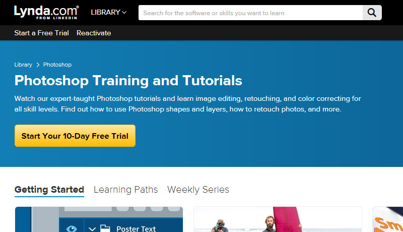

© Lynda

Photoshop Cafe

This Cafe is all about Photoshop, Lightroom, and Photography. Worth checking out all premium learning resources.


© Photoshop Cafe

KelbyOne

KelbyOne is another premium tutorial site. Many of the instructors are leaders in the field, help you learn everything about Photoshop, Lightroom and Photography.


© KelbyOne

Udemy

Udemy has a great range of online classes for Photoshop. It´s easy to find the best ones according to user reviews and ratings.


© Udemy

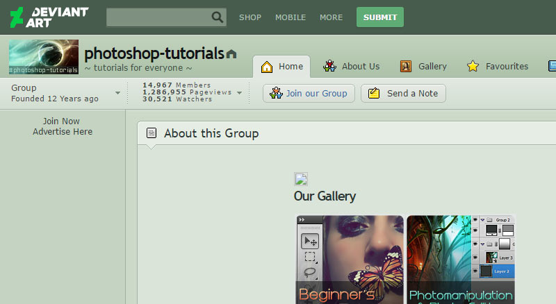
DeviantArt

DeviantArt is a creative online community. Divided into different categories, it is easy to find Photoshop tutorials that instruct viewers on specific techniques, and on painting an image from scratch.


© DeviantArt

Tuts+

Envatos Tuts+ offers hundreds of free tutorials. Its extensive library of premium tutorials is one of the most useful.


© Tuts+

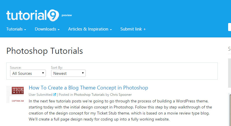
Tutorial9

Tutorial9 is entirely free. A great resource for Photoshop guides and tutorials (more than 9!).


© Tutorial9

Photoshop Creative

The first choice for Photoshop fans who want in-depth, step-by-step tutorials for Adobe Photoshop and Photoshop Elements.


© Photoshop Creative

Vandelay Design

Home to hundreds of Premium-quality design resources including PSDs, brushes, mockup templates, and more.


© Vandelay Design

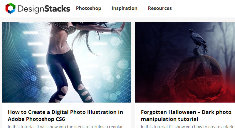
DesignStacks

A great source with over 2,500 published design-related articles and tutorials.


© DesignStacks

PSD Dude

If you like Photoshop, you should bookmark this blog. Useful resources and quality design inspiration.


© PSD Dude

PS Hero

PS Hero is a fantastic Photoshop resource run by Hero – a surfer and graphic designer based in California.


© PS Hero

PSD Learning

Knowledge organized in different categories with hundreds of easy to follow tutorials.


© PSD Learning

Spoon Graphics

Spoon Graphics is home to a range of design tutorials, free resources and inspiration to help you have fun creating cool stuff.


© Spoon Graphics

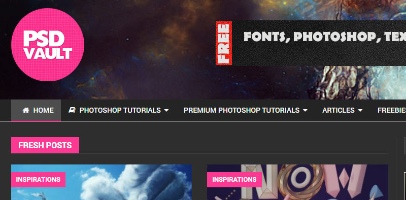
PSD Vault

PSD Vault focuses on providing high quality, step-by-step Photoshop tutorials to all Photoshop lovers and hobbyists around the world.


© PSD Vault

Learn Photo Editing

35+ awesome tutorials for only $27 for a Lifetime Membership. Learn how to take a photo and create something amazing out of it.


© Learn Photo Editing

Adobe KnowHow

Photoshop courses in a personalized learning experience. Make notes and cue points alongside the video content.


© Adobe KnowHow

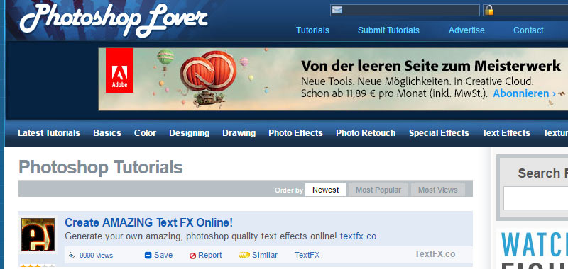
Photoshop Lover

Photoshop Lover is a project that aggregates the tutorials from other sites. Great to find more websites from where you can learn Photoshop.


© Photoshop Lover

Categories: Others Tags:

Popular design news of the week: January 16, 2017 – January 22, 2017

January 22nd, 2017 No comments

Every week users submit a lot of interesting stuff on our sister site Webdesigner News, highlighting great content from around the web that can be of interest to web designers.

The best way to keep track of all the great stories and news being posted is simply to check out the Webdesigner News site, however, in case you missed some here’s a quick and useful compilation of the most popular designer news that we curated from the past week.

Note that this is only a very small selection of the links that were posted, so don’t miss out and subscribe to our newsletter and follow the site daily for all the news.

Splashify – Beautiful Desktop Wallpapers for Mac and Windows

CSS: Pretty Buttons with Bttn.css

Web Design Predictions for 2017

Mobile UX Trends for 2017

6 UX Design Trends to Follow in 2017

How to Design a Large Scale Responsive Site

Japanese Artist Creates Miniature Dioramas Daily for 5 Years

QUIZ: What CSS Framework Should You Use?

15 Unique Website Layouts

Designing in Color

So, You’re Starting a Design Studio?

Site Design: Odegoods.com

CSS Grid. One Layout Method not the Only Layout Method

Useless UI

How to Break the Grid Without Making a Mess

7 Rules for Creating a Simple Design

Mozilla Launches New Brand Identity

A Framework for Building a Design Practice

Hi-Res Shots of Rogue One’s Interfaces

A First Look at Google’s New GMB Website Builder

Flat Design. History, Benefits and Practice.

NYTimes Website Redesign

Arrival – Mozilla Open Design

TinyFaces – Free Crowd-sourced Avatar Gallery Including Sketch Plugin

2016 — The Year of Stranger Design Things

Want more? No problem! Keep track of top design news from around the web with Webdesigner News.

LAST DAY: 20 Superb New Website Templates from GT3Themes – only $17!

Source

Categories: Designing, Others Tags:

A Table With Borders Only On The Inside

January 21st, 2017 No comments

You know, like a tic-tac-toe board. I was just pondering how to do this the other day, as one does. There are three ways I can think of. One involves a good handful of rules and is the way I intuitively think of, one involves a deprecated attribute, and one is very simple and feels kinda like a CSS trick.

Possibility #1) Removing the Borders You Don’t Need

This is the first way I think of. Add a border everywhere, then remove the border on the

  1. The top of every cell in the first row
  2. The bottom of every cell in the last row
  3. The left of the first cell in every row
  4. The right of last cell in every row
table {
  border-collapse: collapse;
}
table td {
  border: 5px solid black; 
}
table tr:first-child td {
  border-top: 0;
}
table tr td:first-child {
  border-left: 0;
}
table tr:last-child td {
  border-bottom: 0;
}
table tr td:last-child {
  border-right: 0;
}

See the Pen Inside Border on Table #1 by Chris Coyier (@chriscoyier) on CodePen.

Possibility #1) The `rules` Attribute

This is not recommended as it’s a deprecated attribute. But, that’s what rules was specifically for.

See the Pen Inside Border on Table #1 by Chris Coyier (@chriscoyier) on CodePen.

You can control the color with border-color, but not border-width or border-style.

Possibility #3) Using `border-style: hidden;`

This is the one that feels like a CSS trick to me.

table {
  border-collapse: collapse;
  border-style: hidden;
}
table td {
  border: 5px solid black;
}

MDN has an explanation:

In case of table cell and border collapsing, the hidden value has the highest priority: it means that if any other conflicting border is set, it won’t be displayed.

By putting border-style: hidden; on the table itself, it means that “hidden” wins on that outside edge, but only the outside edge, not any of the other borders on the inside cells.

See the Pen Inside Border on Table #3 by Chris Coyier (@chriscoyier) on CodePen.


Can you think of other ways?


A Table With Borders Only On The Inside is a post from CSS-Tricks

Categories: Designing, Others Tags:

Video Transcripts

January 21st, 2017 No comments

None of the videos in our entire video screencasts library have captions / subtitles / transcripts. That means all of that content is rather useless to the deaf, as was made quite clear to me in this recent email:

I’m a big fan of CSS-Tricks and I make a lot of use of your written content, however the same can’t be said for your videos as I’m deaf. It may not be viable for your business but subtitles on your videos would enable access to me – and probably thousands of others – who can’t follow your videos via sounds.

I like shooting videos. We have a couple lined up we’ll be doing soon. It’s true that it’s not exactly viable to do subtitles for them. The videos are already not really viable, we just do them sometimes for fun. I can’t justify the time or money to subtitle them.

But that’s where you could come in. If you’d like the sponsor the videos having subtitles, get in touch. I’m sure we can arrange a way such that you could pay for it, and we could have a third-party subtitle the videos, and we’d credit you for the support.


Video Transcripts is a post from CSS-Tricks

Categories: Designing, Others Tags:

PDF files can be converted into Word files to better suit text manipulation

January 21st, 2017 No comments

Word documents are the staple of text manipulation. The Microsoft provided Office suite has helped many generations over the years, and is the go-to service for when it comes to either drafting up a quick document or writing a full-blown 10 page document. Often times people are put in a situation where they are

Categories: Designing, Others Tags:

Comics of the week #375

January 21st, 2017 No comments

Every week we feature a set of comics created exclusively for WDD.

The content revolves around web design, blogging and funny situations that we encounter in our daily lives as designers.

These great cartoons are created by Jerry King, an award-winning cartoonist who’s one of the most published, prolific and versatile cartoonists in the world today.

So for a few moments, take a break from your daily routine, have a laugh and enjoy these funny cartoons.

Feel free to leave your comments and suggestions below as well as any related stories of your own…

Computer vomit

Don’t judge a designer by its cover

Painful feedback

Can you relate to these situations? Please share your funny stories and comments below…

Create beautiful demos and trial accounts for any WP product – only $9!

Source

Categories: Designing, Others Tags:

Neon Text Effect Photoshop Tutorial

January 20th, 2017 No comments

In this tutorial, we’re going to learn how to create a neon text effect in Adobe Photoshop.

Download Adobe Photoshop.

Read More at Neon Text Effect Photoshop Tutorial

Categories: Designing, Others Tags:

Infographic: What’s a graphic designer?

January 20th, 2017 No comments

Ever wondered how you measure up to the rest of the industry? How do you compare to the average age, location, and salary of other graphic designers? Did you know that our industry is dominated by young women?

Happily, now you can learn everything you ever needed to know about your job, with this exclusive infographic designed by vexels.com (formerly VectorOpenStock) for WebdesignerDepot readers. You’ll find some fun data, ideas about the life of a graphic designer, a typical creative process, and even learn which skills are most in-demand.

Embed:

Gerlach Sans Family with 16 styles – only $15!

Source

Categories: Designing, Others Tags:

Mozilla Unveils Appropriate Rebrand For Their Open Internet Goals

January 20th, 2017 No comments

Mozilla has had a few different looks during its 18-year history, but none have ever been quite as appropriate, or quite as wonderfully geeky, as their newest rebranding efforts. As the creators of the only popular web browser that is completely not-for-profit, Mozilla has always had a different approach from competitors such as Google Chrome and Microsoft Edge. Now, Mozilla will be focusing even more intensely on some of these differences, including their commitment to an open and free online world.

The New Logo

Aside from everything else, Mozilla’s new logo is instantly eye-catching and will speak to those who are in the company’s target audience. The logo now says Moz://a, and it’s hard to believe that they’re the first well-known entity to utilize this easily recognizable reference to a web address. However, the average computer user can only perform the most basic tasks, so choosing to switch Mozilla to Moz://a is actually a very bold move that risks alienating a lot of people.

Of course, Mozilla knows their core audience, and they’re definitely no longer speaking directly to average or beginner users. In fact, their rebranding was partially crowdsourced, and hardcore users were given the opportunity to make their thoughts known about different logo options in August 2016.

Open Design Expansion

It would be easy to look merely at the aesthetic changes that Mozilla has undertaken, but that’s not the only thing that this rebrand seeks to accomplish. Asking others for their input on the logo design was unusual enough, and this definitely helps set Mozilla apart from other similar tech companies. To keep the open design concept alive and well, Mozilla is also making their new custom font, Zilla, free for everyone to use.

Fighting for an Open and Free Internet

Mozilla has a history of standing up for the rights of Internet users, and this rebranding is meant to reflect those values. Creative Team leader Tim Murray indicated on the company’s blog that Mozilla “want[s] to be known as the champions of a healthy Internet. An Internet where all are free to explore and discover and create and innovate without barriers or limitations.” Murray went on to state, “today, we believe these principles matter more than ever.”

This standpoint is what influenced the decision to use the “://” in the new Mozilla logo. After all, if they’re going to appoint themselves as spokespeople and guardians for the concept of an open and free global Internet, it makes perfect sense to use the language of the Internet within their designs.

With many challenges facing the open and free usage of the Internet, including politicians who have called for parts of it be shut down, Mozilla definitely has their work cut out for them. On the plus side, cultivating and expanding their member base of intermediate and advanced Internet users can give them the power of many voices banded together to fight for one shared cause. Will their rebrand be enough to help them reach such a lofty goal? Only time will tell, but Mozilla’s history has them well-positioned to make a positive difference.

Read More at Mozilla Unveils Appropriate Rebrand For Their Open Internet Goals

Categories: Designing, Others Tags:

Animate to Different End States Using One Set of CSS Keyframes

January 20th, 2017 No comments

I have recently live coded a pure CSS random rainbow particle explosion. There’s a source in the middle of the screen, and rainbow particles shoot out with different speeds at different moments and then fade out. It might seem like the kind of thing that requires a lot of work and code, but it’s something I did quite quickly and with only 30 lines of SCSS.

GIF of the particle explosion animation.

This writeup is about showcasing one particularly cool trick: there’s just one set of keyframes used to move all those particles on the screen! There’s a second one that’s responsible for fading them. But, even though they end up in completely different positions on the screen, only one set of keyframes is in charge of that.

Let’s see how it all works!

Structure

There’s not much going on here. We just drop 400 particles into the body element. I used Haml because I feel it provides the simplest way of looping that doesn’t even involve a loop variable I’m not going to need anyway. Note that it’s all down to personal preference. I tend to go with the preprocessor that gives me the result I want with the least amount of code because the less I need to write, the better. In this particular case, it happens to be Haml. But, at the end of the day, any preprocessor that lets you generate all the .particle elements in a loop works just fine.

- 400.times do
  .particle

Basic styles

The first thing we do is size our particles and absolutely position. I chose to make them 4x4 squares because I was going for a pixelated look.

$d: 4px;

.particle {
  position: absolute;
  width: $d; height: $d;
}

Random positioning on the screen

We loop through these 400 particles (note that the number in the @for loop in the SCSS needs to be the same number as the one we’ve used in the Haml loop) and we translate them at random x,y points on the screen, where x is between 0 and 100vw and y is between 0 and 100vh. random(100) gives us random integers between 0 and 100.

At the same time, we also give these particles different random backgrounds so we can see them. We pick the hsl() format because it’s the most convenient one here. random(360) covers the entire hue wheel giving us random values between 0 and 360.

Hue scale from 0 to 360.

We then max out the saturation (100%) and set for a lightness above 50% (65% in this case).

.particle {
  /* same styles as before */

  @for $i from 0 to 400 {
    &:nth-child(#{$i + 1}) {
      transform: translate(random(100)*1vw, random(100)*1vh);
      background: hsl(random(360), 100%, 65%);
    }
  }
}

We can now see our particles distributed all over the screen:

See the Pen by thebabydino (@thebabydino) on CodePen.

They trigger scrollbars, so we set overflow: hidden on the root element. We also give it a dark background so we can see our light rainbow particles better:

html {
  overflow: hidden;
  background: #222;
}

This way, we get a pretty night sky:

See the Pen by thebabydino (@thebabydino) on CodePen.

Animation

The next step is to animate these particles, making them shoot out from the middle of the screen. This means our animation starts at the 50vw,50vh point:

@keyframes shoot {
  0% { transform: translate(50vw, 50vh); }
}

We don’t specify a final (100%) keyframe. If this is isn’t specified, it gets automatically generated from the styles we have set on the elements we animate – in our case, these are the random translates, different for each and every particle.

We want the motion of the particles to be fast at first and then slow down, which means we need to use an ease out type of timing function. We can just go for the plain old ease-out, or we can use a more advanced one (I go to easings.net for this). We then give our animation a dummy duration of 3s and make it repeat infinitely.

.particle {
  /* same styles as before */
  animation: shoot 3s ease-out infinite;
}

We get the following result:

See the Pen by thebabydino (@thebabydino) on CodePen.

The particles shoot out to different positions in the plane, just like we wanted. But they all animate at once, which isn’t what we want. So the first fix is to give each one of them a different, random animation duration between 1s and 3s within the loop:

.particle {
  /* same styles as before */

    @for $i from 0 to 400 {
        $t: (1 + .01*random(200))*1s;

        &:nth-child(#{$i + 1}) {
            /* same styles as before */
            animation-duration: $t;
        }
    }
}

This is much better:

See the Pen by thebabydino (@thebabydino) on CodePen.

Then we give each particle a random negative delay between 0% and 100% of its animation-duration ($t) in absolute value:

.particle {
  /* same styles as before */

    @for $i from 0 to 400 {
        $t: (1 + .01*random(200))*1s;

        &:nth-child(#{$i + 1}) {
            /* same styles as before */
            animation-delay: -.01*random(100)*$t;
        }
    }
}

See the Pen by thebabydino (@thebabydino) on CodePen.

Finally, we don’t want the particles to just disappear, so we add a second animation (with the same duration and the same delay) to fade them out:

.particle {
  /* same styles as before */
  animation: shoot 0s ease-out infinite;
  animation-name: shoot, fade;
}

@keyframes fade { to { opacity: 0; } }

We now have the final result!

See the Pen by thebabydino (@thebabydino) on CodePen.


Animate to Different End States Using One Set of CSS Keyframes is a post from CSS-Tricks

Categories: Designing, Others Tags: