Archive

Archive for January, 2017

Web Development Reading List #166: Efficient Docker, CSP Learnings, And JavaScript’s Global Object

January 20th, 2017 No comments

What fuels your work? What fuels your mind? What do you do on a non-productive day or when you’re sad? Nowadays, I try to embrace these times. I try to relax and not be angry at myself for not being productive.

And the fun fact about it? Well, most of the times when I could convince my mind that not being productive is nothing to feel bad about, things take a sudden turn: I get my ideas back, my productivity rises and, in effect, I even achieve more work than on an average day. It’s important to try to be human.

The post Web Development Reading List #166: Efficient Docker, CSP Learnings, And JavaScript’s Global Object appeared first on Smashing Magazine.

Categories: Others Tags:

High-Quality Stock Videos: 20 Free (or Almost Free) Sites to Download

January 20th, 2017 No comments

Over the last years the quality of online stock footage has increased dramatically. A creative video intro or looping video background on the front page is perfect to draw attention. You can use stock footage in your personal (and most of it in your commercial) projects. We’ve rounded up 20 of the best free stock video websites! Enjoy!

Pexels

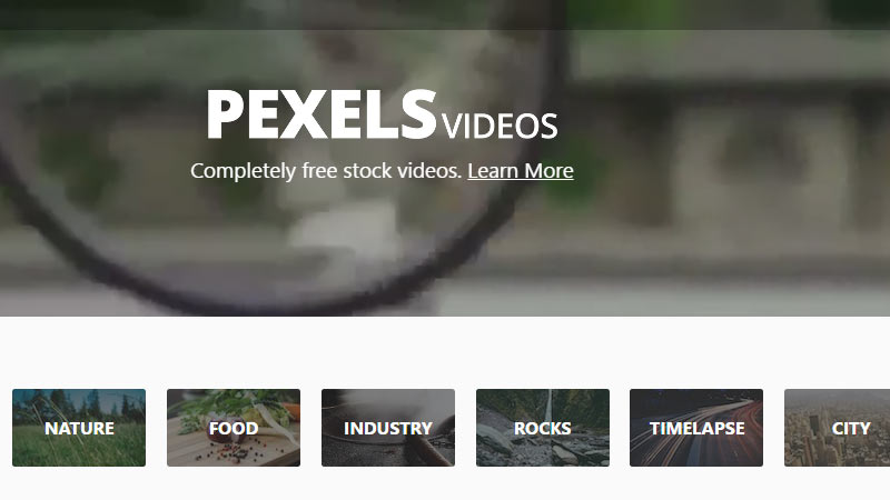
Pexels Videos offers completely free videos. All videos are licensed under the Creative Commons Zero license.

© Pexels

videvo

Videvo offers completely free stock video footage and motion graphics for use in any project. It`s one of the largest online resource dedicated to free HD stock footage.


© videvo

Motion Elements

MotionElements is a microstock marketplace for video makers. It offers everything from stock videos, music, 3D models, After Effects and Apple Motion templates.


© Motion Elements

Partners In Rhyme

This is a great source for free Video Background Loops. Just download and use the video clips.


© Partners In Rhyme

Videezy

Videezy is the place to share your Free HD Stock Videos, b-roll, backgrounds, and other cool free video footage.


© Videezy

XStockVideo

All the footage in web resolution (960×540) is free to download and free to use in a ‘Free to view video project’ (promotional, educational, client, youtube without ads).


© XStockVideo

Free HD Footage

Free-HD-Footage offers some most unique HD Footage, and proudly sharing that footage with all of us.


© Free HD Footage

Pond5

Pond5 focuses on content for those who need footage, sound effects, images, and after effects for their projects.


© Pond5

IgniteMotion

IgniteMotion.com is a high-quality resource for digital downloads of high-definition videos for use by all.


© IgniteMotion

Dissolve

Some free stock video clips for use in commercials, documentaries, and feature films, and license stock photography for use in your designs and creative work.


© Dissolve

Bottle Video

One of the largest free stock footage and lowest priced royalty free HD stock footage libraries.


© Bottle Video

Distill

Distill delivers 10 free HD Videos every 10 days. Free For Your Personal and Commercial Use!


© Distill

Life of Vids

Free royalty-free Videos, Clips and looping footage without copyright restrictions.


© Life of Vids

coverr

coverr is a cooperation between the CodersClan and Veed.Me teams. A growing library of free videos video intros or looping video backgrounds.


© coverr

vidsplay

All Vidsplay footage is completely free. The database is updated on weekly basis.


© vidsplay

Footage Crate

Footage Crate offers free and royalty-free video resources in many genres. Take a look at the FX category.


© Footage Crate

Cute Stock Footage

Cutestockfootage main idea is to deliver video, sound, and photo material for any creative enthusiast for free or for a small fee.


© Cute Stock Footage

Beachfront B-Roll

High-quality free stock videos and animated backgrounds for any production purpose.


© Beachfront B-Roll

Free Art

A selection of video clips to download without registration. Some great Video Backgrounds!


© Free Art

Videoblocks

One Month of unlimited Downloads cost $79. With more than 100,000+ stock videos you`ll get something for your money.


© Videoblocks

Categories: Others Tags:

50 creative card UI designs

January 19th, 2017 No comments

When I was a kid I was desperate for a Polaroid camera: to be able to take a photo and see it—almost—right away was fantastic to me. With ‘normal’ cameras, you had to wait until you finished the whole film, then you had to take it to get developed, and that could take a week. So, quite often, by the time you got to see your photos, the connection to them was a little more distant. With polaroids, it was there and then. Not only that, the format of the classic polaroid included the white frame with the space at the bottom where you could write something: the date, where it was, who you were with, what you were doing—whatever you wanted to say about the picture or the moment.

the classic polaroid included the white frame with the space at the bottom where you could write something…Sound familiar?

Sound familiar? So much of social media takes it’s visual cue from the classic polaroid—80 years old this year. The influence can be seen in Facebook posts, Instagram, Twitter, and, of course, Pinterest. This in turn has had a knock on effect on website design generally. It is an interface style that users have become comfortable with through social media. It is based on a grid, but the items, or cards, are compartmentalized in such a way that they feel like separate entities. (Rather like a bunch of polaroids pinned on a wall.)

Card layout is an integral part of material design. The separation is often achieved by using shadows, which gives the illusion of depth, or a slight color difference. It is a popular choice for news websites, magazine sites and blogs, all of which are presenting the user with ‘snapshots’ of stories that they may then choose to click on to read more. It is also popular for portfolios as it allows a lot of different content to be presented simultaneously, but clearly.

As this card layout style has become more popular it has evolved as designers play around with it, finding ways to create card layouts that feel fresh and interesting. Some use asymmetry to great effect, some put lots of space between cards, others put none at all. Most card layouts use images, but there are a few that just use text, at least on some of the ‘cards’. Some have the image and text visible on the ‘front’, others display their text only on interaction.

What is great to see is this functional, practical layout style being adapted and shaped by different creative approaches, so that it does not become stale.

AIGA

cssdsgn

Awwwards

Shopify Themes

WordPress.com Themes

Polaroid

Casual start

Rightmove

UXPin

We Occupy

UI8

Our Daily Edit

Penguin

Cutler and Gross

Extended Play

Bertus Gerssen

Rogers Stirk Harbour and Partners

Re:collection

Rosie Lee

Jules Tardy

Facebook Design

HelloFresh Blog

designboom

It’s Nice That

Excelsiorama

Handsome Frank

Behance

Dribbble

The Vinyl Factory

Cineworld

Kickstarter

The British Museum

The Tate

Elam Artists

POP Montreal

Library of America

The Verge

The Guardian

The BBC

Vogue

Vice

Wallpaper

Dazed

AnOther

Surface

Design Week

Wired

Kinfolk

Pitchfork

Grafik

LAST DAY: Build Websites and WP Themes Faster with Pinegrow Web Designer – only $24!

Source

Categories: Designing, Others Tags:

Graphic Design Trends for 2017 – Minimalist, Environmental and Bold

January 19th, 2017 No comments

Graphic design trends are typically a mixture of classic favorites and fashion inspired choices, along with a reflection of societal values and concerns. 2017 is definitely poised to continue this trend, and there are some interesting variations between industries and target markets. Overall, though, you can expect the general theme and tone of 2017 to include and embrace even more minimalism and incorporating an organic, eco-friendly look and feel.

Soothing Design Elements

2016 was a tumultuous year, regardless of what side of the social or political fence you fall on. This is expected to influence graphic design in a very noticeable way as we attempt to push forward by looking far back into the past. In a nutshell, this means that simplicity and soothing elements are likely to be the king of graphic design in 2017.

Many studies have determined that spending time in nature is one of the most soothing and relaxing things a person can do, so it’s not surprising that green is going to be one of this year’s biggest colors. Green is known to be quiet and restful, which are qualities that most people are looking for right now. In fact, the spa industry has been using green as one of its primary graphic design colors for many years, and it’s also a very popular choice for healthcare sites. Bringing this color to other industries makes perfect sense right now.

As an added bonus, green ties into another societal element that will have a big influence this year: the environment. When you put all of this together, green seems like the natural choice for color of the year. Other colors that will be popular in 2017 include charcoal gray, brick red, olive green, maroon brown and khaki.

Environmental Influences

Recycling, upcycling and other similar concepts have become extremely popular. Additionally, becoming more self-reliant through gardening and homesteading is something that is no longer done merely by hobbyists and survivalists. Instead, people throughout the U.S. and other nations are fighting for their right to convert their yards into a garden, and community gardening has also become extremely popular. All of this shows an interest in not only conservation but also returning to a simpler, less stressful time.

Graphic designers will be tasked with bringing these societal trends into their websites, logos, packaging and much more. Again, green fits the bill quite nicely, and you can expect to see lots of handwritten fonts and hand drawn imagery. Retro fonts will also continue to be popular, and minimalism that uses green and white will be appealing to many consumers.

Truth on Display Branding

Another aspect of simplicity and minimalism that is expected to grow in popularity this year is the idea of truth on display branding. This means that see-through packaging with minimal wording will continue to attract attention.

Consumers also want to have a better understanding of the ethical and environmental impact of their purchases, so expect to see a big push toward highlighting positive features of products and companies.

Simple yet Bold

Of course, not all companies are going to switch to a soft, green look, nor should they. But the retro feel is being utilized by long-standing companies such as Kodak. There will also be plenty of other examples of bold colors and simple lines, especially in logos. This is going to be most prevalent among tech companies and businesses that are primarily targeting a younger demographic. Although these looks will still be simple, the boldness of their color palette will stand out in a year filled with green and other earth hues.

Hands on Women and the ‘90s Continue

Photographic choices have a huge impact on consumer opinions, and 2017 isn’t going to shy away from trying to evoke a specific emotion. This is going to be the year of tough, modern women, which means ads and website imagery will lean more toward beautiful women getting stuff done as opposed to just looking beautiful. Photos will also continue to have a candid feel, along with referencing the ‘90s. Perfect studio shots will be exchanged for realistic, spontaneous and filter free images of life.

The Impact of the Health and Wellness Movement

So far, 2017’s graphic design trends will result in realistic photos, lots of green, simple lines, minimalist packaging and putting the truth on display. All of these concepts speak to those who are interested in the environment and simple living, but they will also attract members of the health and wellness movement. In 2016, gym memberships, meditation and Yoga classes experienced a huge upswing in popularity. 2017 will continue on this path, and Tai Chi, spas and massage therapists are likely to benefit.

This matters to graphic designers because of the psychological benefits and ramifications of such a popular trend. For example, consumers who are drawn into the health and wellness movement are going to be less interested in snack food unless the design and other advertising elements highlight the positive aspects of these options. The huge increase in gluten free marketing is part of this, and now that sugar is being blamed for weight gain, expect to see food with a low amount of sugar touting this in all of their design choices.

Ultimately, graphic designers will need to speak to the environmental and wellness concerns of most consumers in order to capture their attention in 2017. Those who make the conscious decision to buck this trend will do so at their own peril, unless they’re only targeting young consumers or some other very specific demographic. Therefore, get used to the color green because it’s going to be everywhere this year.

Read More at Graphic Design Trends for 2017 – Minimalist, Environmental and Bold

Categories: Designing, Others Tags:

Boost Your Sales: E-commerce Content Marketing Done The Right Way

January 19th, 2017 No comments

Content marketing is an essential part of every e-commerce business’s marketing plan. It’s an amazing way to help engage with target audiences and help boost a business forwards. However, it’s vital to know that e-commerce content marketing can be both positive and negative. If done incorrectly, it can have an adverse effect on your business and be a waste of both time and money.

In this article, we’ll focus on how to properly apply a positive e-commerce content marketing campaign. More to the point, how can online companies use it to their advantage? If you continue reading, you’ll find five points that show the right ways to use content marketing for your e-commerce business:

Photography

Photos do everything you want them to and serve an exceptional purpose. They’re there to show consumers your products and highlight special features and details.

The whole nature of an e-commerce business means you’re selling products to people on the internet. If you have something to sell, it makes sense to try and advertise and promote it as much as possible. You want to show people your products and let them be amazed by how great they look. What’s the best way to do this? With a photo-heavy content of course!

Photos do everything you want them to and serve an exceptional purpose. They’re there to show consumers your products and highlight special features and details. You see so many brands using photos as their primary source of content production in a marketing strategy. For instance, when our digital agency, Avex Designs, created a website for KITH, the NYC-based fashion label, we put a strong focus on high-resolution product and lifestyle photography. Our case-study touches on the fact that you need high-resolution images. You can’t get away with pixelated and blurry photos of your products, as it makes your product seem sub-par.

The way you promote this visual content is also extremely important. The best idea is to take to social media, particularly Instagram, and post photos there. This helps you reach wider audiences and can also increase web traffic to your e-commerce site. People on social media see these awesome pictures, love what they’re looking at, and click a link to take them to the product page on your site. Speaking of your site, this is also another place you should post photos. A lot of popular e-commerce companies will have plenty of product photos on their home/landing pages to entice audiences and keep them on the site.

Create A Dedicated Content Site

A dedicated content site may sound like some fancy and impressive thing, but in reality, it’s a blog. Many e-commerce sites choose to create a blog that’s integrated into their original site. If you have a look on the biggest brand sites out there, you’ll usually find a link to the blog at the bottom of the homepage. However, this is not necessarily the best way to do things, as it can be difficult for people to find your blog if they don’t know it exists. Plus, integrated blogs usually get pushed down to the bottom of your content priority list. Posts rarely get updated as, quite honestly, you forget the blog exists.

So, what an e-commerce business can do is create a separate site that’s dedicated to creating content. It’s a standalone blog or media outlet that provides people with information on numerous issues relating to your business. For example, if you own a fashion brand, then a special fashion blog should be started to go alongside your website. The purpose of this is to create a whole hub where you provide internet users with as much content as possible. In fact, if you’re ever on a blog that’s dedicated to a particular industry – especially fashion – a little bit of research may show you that it’s owned by an e-commerce brand.

The key is ensuring this site is always updated with regular content and blog posts. This can include long informative posts where you provide information that users will find helpful. It can also include visual content too to keep everyone engaged. Also, ensure you link back to your e-commerce site to keep that traffic flowing.

Customer Generated Content

For an e-commerce site, generating your own content can sometimes be difficult and hard to sustain. Thankfully, you have loads of customers that are willing to help with your content mission! You can showcase content that’s generated by your customers, and it will have a brilliant effect. As an example, many companies will share images of real customers using or wearing their products. They showcase this on social media, their website, their blog – everywhere.

The benefit of this is that it shows other consumers that real people are enjoying your products. It’s a great way to break the mold from the usual scripted photoshoots with models, etc. You’ve got real people taking photos of themselves and sharing it with your business. It helps build a higher degree of consumer trust as people often rely on the opinions of others to influence their buying decisions. So, your company can benefit from an increase in customers and sales figures!

Additionally, you get content generated for free without having to do any work. Just ask for customers to send in photos on social media and then share them or put them on your site. Very simple, and highly cost-effective.

Create Video Content

In general, visual content is always seen as the most effective form of e-commerce content marketing. We already touched upon photos, but there is more to consider. A lot of businesses make a mistake by only focussing on still images when producing visual content. If you do this, then you’re missing out on a major player; video.

Video content is all the rage and is proven to be extremely effective. There are a plethora of ways a company can use video content to market their advantage. One popular form of e-commerce content marketing includes filming instructional videos. This is highly encouraged if your business sells things that people need help with. For example, let’s say your e-commerce company sells something that has to be put together. Sure, you can include instructions on the packaging, but most people prefer to watch a video. So, upload a video to YouTube instructing people on how to put everything together. The benefit of instructional videos is that you’re highly likely to get a lot of views as your company is the main authority on the matter. Why watch a video from a random person when you can find an instructional video from the company that made the product? The more views you get, the more you increase brand identity and build awareness of your company.

Instructional videos aren’t the only thing you can create either. One of my favorite ideas is using video to show people around your business. If people go to the ‘About Us’ section on your e-commerce site, they’re usually faced with lots of text. Spice things up a bit and include a video that gives people a tour of your office headquarters and provides a background on your business. Video keeps people more engaged and helps form a bond between you and the consumer.

Make Good Use Of FAQs

With FAQs, you have the chance to create informative content that people are eager to view.

Frequently asked questions are a very good example of e-commerce content marketing done right. Every company should have some FAQs on their site; it’s a must. It’s almost guaranteed that someone out there will have a question that needs answering. So, stop them from searching the web and finding the answer themselves and provide it for them on your website. That’s the key with FAQs; you should include questions that aren’t always directly related to your company. Obviously, there are few questions like ‘How fast is delivery’ that need to be related to your business. But, there might be some questions that are more broadly related to the products you sell and the industry you’re in.

With FAQs, you have the chance to create informative content that people are eager to view. Again, it pays to be creative when answering your frequently asked questions. This is another place where you can include some video content for a few of your answers. Otherwise, text content will be effective, as long as its creative and doesn’t bore people. Make sure every question is answered as simply as possible, assume that everyone reading the answer has no knowledge of the topic in question. This helps you create responses everyone can understand.

The great thing with FAQs is that they can also be a valuable SEO tool too. It’s another area where you can include keywords to help rank your site higher. In essence, it’s content marketing that’s very practical.

All five of the above points are great for e-commerce content marketing. They show you the right way to do things and ensure that your company uses content in the most effective fashion. It’s all about creating content in different ways using a combination of both images, videos, and text. If you can get your customers involved with content creation, then you’re always going to reap a lot of benefits too. E-commerce content marketing isn’t as difficult as it might sound, particularly if you take onboard all of the info in this article.

Categories: Others Tags:

Fully Managed Cloud Hosting

January 19th, 2017 No comments

Do you have a client that requires absolutely zero downtime?

How about any sites that have unpredictable traffic? Welcome spikes in visitors that can happen anytime, but can be a big problem for web servers.

You should look at Fully Managed Cloud Hosting on Media Temple. It may be the perfect home for these projects. It’s Amazon Web Services hosting, with white-glove support from Media Temple’s AWS-certified Cloud Architects. This is instant scaling, super high-performance web hosting that you don’t have to manage yourself.

Direct Link to ArticlePermalink


Fully Managed Cloud Hosting is a post from CSS-Tricks

Categories: Designing, Others Tags:

People’s Names That Break Websites

January 19th, 2017 No comments

I heard from Alex Goldman of Reply All (a super duper very great podcast with stories loosely originating from the internet):

We’re doing a story about people that have names that websites and computers don’t seem to like – for example, we spoke to a guy named William Test, and a woman named Katie Test, both of whom can’t seem to keep a hotel or airplane booking because the name “test” is flagged by internal systems.

We also spoke to a guy named Christopher Null who had the same problem, and woman named Joan Fread, who can’t use paypal because her last name is the same as a PHP command.

I’m curious if there’s anyone in the dev community that is thinking about this, and how to deal with it. Is it even considered a problem? Is the population that this affects so small that people don’t even think about it?

I wrote back, but that was a few months ago and I haven’t heard anything. I figured I’d post my response here since it is really an interesting topic and maybe through the comments here we can stir up some interesting bits he can use.

This is my response:


At the end of the day, it’s sloppy programming. No software should accept a name input and at any point treat that as code. If your last name is like the famous XKCD comic, in a well-designed system, that should be fine.

There are some valid reasons to “flag” names. At my company (CodePen), we flag names for bad language. You can’t sign up as “Sh*tfucker Dirtyballs”. We do that on purpose, to promote a healthier community.

There is a difference between names and usernames. It’s slightly more legit to have stricter rules around usernames. We have a file called “username_blacklist.rb” in our codebase that prevents the usage of lots of words. The reason for this isn’t because we’re worried about overriding Ruby functions or anything, but 1) We use usernames in URL’s, meaning we need to reserve some of those for our own use and 2) again, bad language filter. 3) Spam. If a username has “watchsocceronline” (for example) in it, we flag it for a spam review.

The “real world” of programming is complicated. It’s not terribly surprising that companies write “band-aid code” that fixes a problem quickly instead of well. Writing code that blocks/flags a last name of “delete” is easier to write than auditing a whole codebase for situations in which that string causes problems.


What experience to y’all have with this?


People’s Names That Break Websites is a post from CSS-Tricks

Categories: Designing, Others Tags:

Color in UI Design

January 19th, 2017 No comments

Erik D. Kennedy:

So if color theory doesn’t provide a solid basis for color in UI design, what does? Let me throw an opinion at ya’: color modifications. It’s the tweaking of color that counts, not the picking of them from the color theory hat.

Ahmad Shadeed with some similar thinking an examples.

Direct Link to ArticlePermalink


Color in UI Design is a post from CSS-Tricks

Categories: Designing, Others Tags:

Internationalizing React Apps

January 19th, 2017 No comments

First of all, let’s define some vocabulary. “Internationalization” is a long word, and there are at least three widely used abbreviations: “intl,” “i18n” and “i10n.” All of them mean the same thing.

Internationalization can be generally broken down into three main challenges: Detecting the user’s locale, translating UI elements, titles as well as hints, and last but not least, serving locale-specific content such as dates, currencies and numbers. In this article, I am going to focus only on front-end part. We’ll develop a simple universal React application with full internationalization support.

The post Internationalizing React Apps appeared first on Smashing Magazine.

Categories: Others Tags:

20 Inspirational Dashboard Designs

January 19th, 2017 No comments
20 Inspirational Dashboard Designs

In this world full of data, every online business has to deal with infinite data in order to operate their business and stay competent. Therefore, you need to have a dashboard that is cleanly designed and well managed so that you can easily find your needed data at the time of necessity. A poorly designed dashboard not only wastes your effort but it also takes lots of your time. So, to help you have a beautifully designed admin dashboard that is equally stunning and easy to use, we have collected few admin dashboard designs below.

Story Book

Having troubles mining data? If you are looking for a beautiful admin dashboard that can help you find the data that you need quickly, Story Book is the right admin dashboard for you. This dashboard comes with a responsive design, a font icon set, additional functionality and a new, yet flatter look. This minimalist designed admin dashboard uses opacity, gradients and color in great ways. The blur BG, grid and transparency make Story Book an absolute winner. If you are going to start a project then, this admin dashboard will surely be a great help. Think about using it.

Panels Dashboard

20 Inspirational Dashboard Designs

Panels dashboard is another beautifully designed admin dashboard by Cosmin Capitanu. It is visually stunning admin dashboard with nice use of grids and colors. The designer has made a great use of color palette. The dashboard layout is well structured and is designed in such a way that it fits the content perfectly making the life of the user easier. If you want a dashboard that knows what you are trying to accomplish then, Panels dashboard is the right choice to be made.
iPad Dashboard

20 Inspirational Dashboard Designs

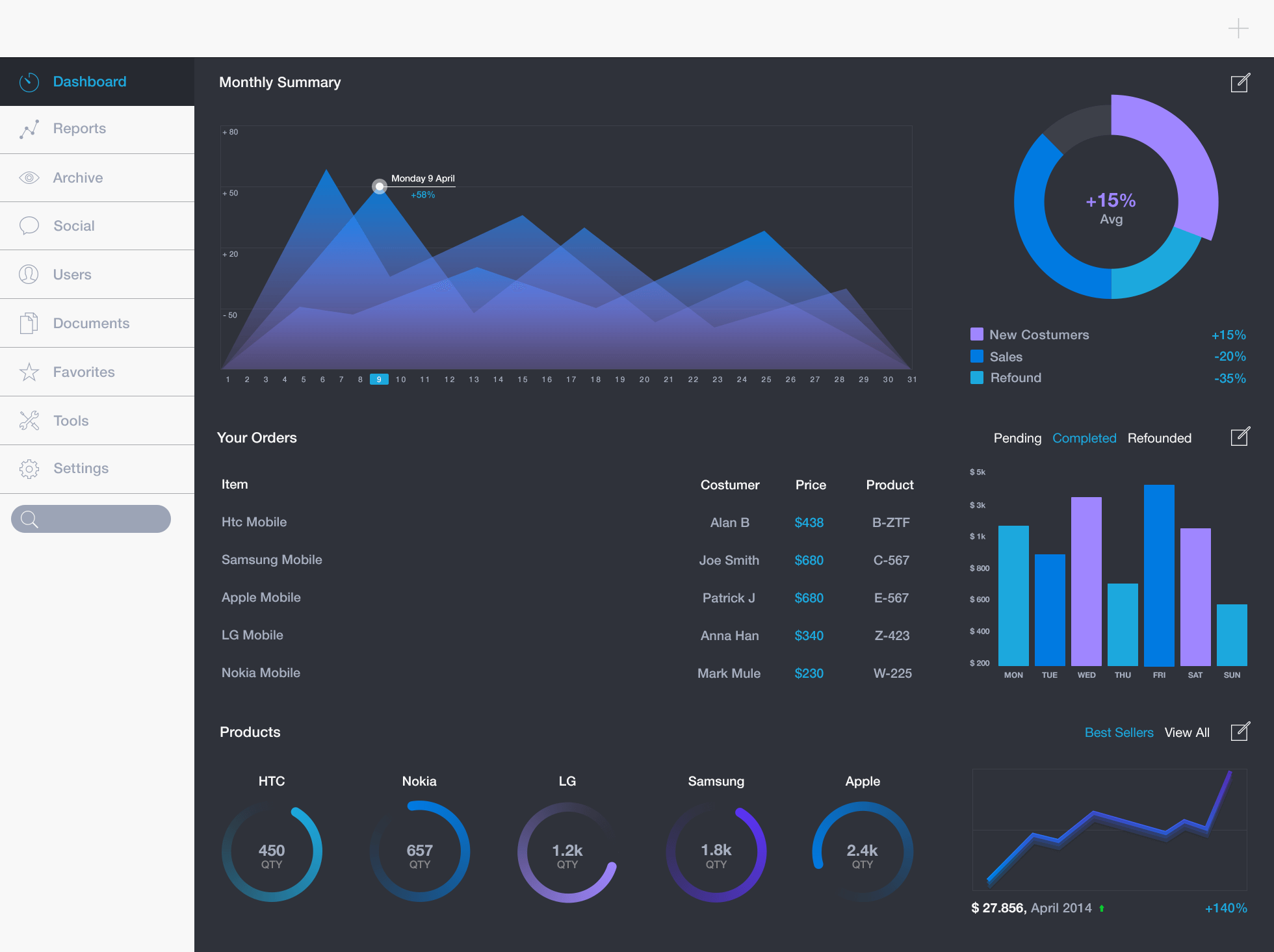
iPad dashboard designed by Davide Pacilio, is a really cool admin dashboard for those who are working on an iPad application project. This stylish, but probably a bit too basic admin dashboard uses one or two different shades to represent the data. The dashboard has really good contrast and gorgeous color schemes with nice interfaces. If you are big fan of UX, you really need to check out this admin dashboard. You will fall in love with it.

Fitness Web App: Sessions

20 Inspirational Dashboard Designs

Fitness Web Apps: Session is a gorgeous, modern admin dashboard for fitness websites which has given a great attention to user experience. The dashboard is responsive and fluidly scales to mobile. This simply amazing and elegant admin dashboard really has dug the color, fonts, icons and type choices. Personally, I just loved the colors, easy to use and clean interface and the transparency in the top bar. With the customised features, this admin dashboard helps you to keep the track of total running time and schedule to help you organise your health chart better. It really gives you a right feel.

To-Do Dashboard

20 Inspirational Dashboard Designs

To-Do dashboard is another superbly designed dashboard for a work management. The use of colors and visualisations are done beautifully, making it look more attractive from each angle. The dashboard also uses a graph at the bottom of a page taking over the whole area. It is totally a winner dashboard with lots of cool features for those who are looking for easy to use, beautiful colors, clean interface and a beautifully designed admin dashboard for their work.

Developer

20 Inspirational Dashboard Designs

Are you looking for admin panel for your web app project? If yes, then, Developer may be right choice for you. Developer is a robust and mobile friendly and responsive, feature rich HTML5/CSS3 template. It comes with adaptive layouts, different set of styles, fluid responsive elements, innovative controls, and media queries events, etc. All you need to do is, write your code, and rest is handled by responsive web design.

Rolodex Dashboard

20 Inspirational Dashboard Designs

Rolodex Dashboard is another functional admin dashboard designed by Ben Cline. This is a desktop option for user and merchant dashboard. The designer has made a classy use of shadow, 3D/flat elements, high level data, modular widgets, with nice gradient backdrop and long shadows to give depth. The translucent background just suits well with this UI in the front. It seems like the designer has called out high level data along with the final value. If you have a number of activities or contributions, then, Rolodex is perfect for you.

Dashboard Web App UI: Job Summary

20 Inspirational Dashboard Designs

Dashboard Web App UI: Job Summary designed by Mason Yarnell, is a professional quality and extremely robust, innovative and cutting edge, completely responsive admin dashboard for career app project. You can filter the summary of progress by fields on the user’s profile (organization, role, location, etc.). The dashboard comes with flat style design, solid and functional layout, gorgeous color themes, and many more. You will just love how this flat style design is transforming so beautifully to UI work. The horizontal and vertical navigation of the dashboard is well executed and looks totally fantastic and, about the graph at the center, they are simply awesome.

Grouply

Grouply is a highly innovative, fresh, and beautifully designed admin dashboard template for social network for schools crafted by Jakub Antalik. This well organised, clean, and stylish dashboard comes with a great color scheme, typography, solid layout, simple user interface, flat design and many more. Unlike other social networks, Grouply has succeeded to design a visually appealing, yet clean layout with the right mix of muted and lively.

Droplr Dashboard

20 Inspirational Dashboard Designs

Droplr is another simple, yet elegant looking admin dashboard designed by Victor Erixon. Its design is simplistic and streamlined. The design is entirely responsive with a clean and elegant interface, making a perfect browsing experience. You can easily get your work done in a matter of moments with its clean UX. If you are a fan of progressive design, then you really need to check out Droplr dashboard.

Flat Lab

20 Inspirational Dashboard Designs

FlatLab is one of the best Premium Admin Dashboard template designed in Bootstrap. This fully responsive dashboard comes with a flat color, clean content placement, reusable UI components, easy customisation and professional coding. In the design of this product, modern web technology HTML5 and CSS3 are used. FlatLab is well suited for all kinds of web applications including custom admin panel, CMS, CRM, corporate, business website, blog, etc. FlatLab is compatible with all major browsers and devices.

B&I Dashboard

20 Inspirational Dashboard Designs

B&I Dashboard is another amazing, visually appealing admin dashboard which works greatly to the development of the branding and identity skill set. It offers a neat layout and gorgeous color schemes, simplifying and enhancing the customisation experience. If you are looking for a dashboard for the development of the illustration and information architecture skill set, gradient style and vibrant colors for impact, then B&I dashboard is the one for you.

Tapdaq Assets Manager

20 Inspirational Dashboard Designs

Designed by an enthusiastic product designer, Jan Losert, Tapdaq Assets Manager is an admin dashboard for managing creative on Tapdaq Dashboard. Simplistic design, clean layout and easier interface make this dashboard most user friendly dashboard template on the market.

Timeline

20 Inspirational Dashboard Designs

For those who are searching for a simple yet, innovative admin dashboard, Timeline is an ideal choice. The dashboard has the right mix of colors which makes it look precise. With the solid layout, the dashboard separated different categories cleanly so that you can organise them easily without having to deal with any sort of confusion.

Xonom Admin Dashboard

Another outstanding admin dashboard designed by Cosmin Capitanu. This amazing product can enhance your admin panel with its unique and elegant look. The idea is to color it green. Designer has done a great job making nice use of translucence and gradients. You will love the color scheme, well organised content and pretty amazing icons used in the dashboard. If you are looking for a panel that measures medical data and informs you if the current body facts are dangerous for your health, this is the best choice for you.

Ladder Board

20 Inspirational Dashboard Designs

Social media has become one of the most powerful platforms for marketing your business and getting leads. And managing all those accounts and connections is tiresome. To reduce your stress and help you better manage your social connections, Vivek came up with Ladderboard dashboard design. This simple, subtle and clean admin dashboard uses the glass effect which makes it stand out.

Pastel Dashboardy

20 Inspirational Dashboard Designs

Pastel dashboard is a powerful, featured packed admin dashboard which is entirely responsive, capable of working with all kinds of mobile devices. This excellent admin UI theme comes with an intuitive and stunning interface, 200+ carefully crafted graphs, iPhone web app with native gestures, animated log in screen, beautiful gallery, gorgeous menus, and many more.

Ice Wrap E-mail Client

20 Inspirational Dashboard Designs

Years ago, e-mails were used just as a means of communication, but, now e-mails are the most effective business marketing strategy that every business takes. So, if you are an e-mail marketer then, Ice Wrap E-mail Client is for you. Ice Wrap E-mail Client is an astoundingly alluring, clean and responsive admin dashboard for managing your e-mails. This admin dashboard has a nice minimalistic UI with a good visual design and color combination. If you are a flat look fan then, you will surely love this concept. Besides its beautifully clean and neat design, Ice Wrap E-mail Client has a solid layout and nice clean interface which makes your mail so attractive that you would love looking at it.

Bills Bills Bills

20 Inspirational Dashboard Designs

Bills Bills Bills is another amazing and user friendly admin dashboard designed by Cosmin Capitanu. The design is super clean and elegant with great spacing, type and color palette. With no doubt, Bills Bills Bills is clean, nimble and highly flexible. The super engaging and flat UI design is worth trying for.

Ultramarine Admin

Ultramarine admin is a gorgeous, modern admin dashboard designed by Cosmin Capitanu. Like his other admin dashboard designs, Cosmin has made sure to keep the design flat, clean and inspirational. The graphics is made visible as possible so that the status of the category could be viewed at a glance. Of course, the layout is entirely responsive and compatible to all browsers and devices.

Tying it all Together

Dashboards might not seem so important to you, but they do have their real purpose and role in a project. There are tons of admin dashboards designed in the market today, and with millions of designers in the world, each day new designs are introduced. Among these designs, we tried our best to showcase 20 most innovative, stunningly beautiful dashboard design concepts which will inspire you in the above article.

Hope, above mentioned collection of admin dashboards will give you some inspiration, if they do, then, mention the dashboard that you liked the most in the comment box below.

Categories: Others Tags: