Archive

Archive for January, 2017

Tinder for Bananas

January 17th, 2017 No comments

I saw this little web app by Das Surma going around the other day. It’s funny, but it’s also a really compelling demo app for a bunch of modern technologies. I’m sure that’s the whole point of it.

  • Minimal build process. Just Gulp to use Babel and PostCSS. It’s heavy on ES6+ and CSS custom properties.
  • Loads of custom elements, like , with the Polymer polyfill for those.
  • Icons are super tiny SVG, they look hand-golfed.
  • ServiceWorker for offline cache.
  • Mobile and performance-first design and interactions.

Maybe it’ll be like the HTML5 Boilerplate of the future.


Tinder for Bananas is a post from CSS-Tricks

Categories: Designing, Others Tags:

8 simple steps to better icon design

January 17th, 2017 No comments

Icons are everywhere. From app icons on home screens to graphic representations that lead users through a design, icon design is a big deal.

There’s a fine art to good icon design. Not only does the element have to render recognizably at the smallest of sizes, good vector-based icons can be scaled to use in oversized proportions as well. Some designers are even using icon-style images for dominant visuals.

So where do you start? Here’s a guide to designing a better icon in eight (somewhat) simple steps.

1) Start with a grid

Good icon design starts with a solid foundation. A simple square block grid is all you need to start sketching an icon.

Use the same gridded paper you worked with in grade school to create icon sketches with pencil and paper or start with a square pixel grid in design software. You should probably design on a square canvas, as most icons end up needing to fit in in square spaces. (This includes everything from icons for apps to icons in website designs or for social media profiles.)

Once you have a grid, make sure to give yourself an element of white space around the perimeter. This will give you just enough flexibility to add a background if needed and keep the icon from getting cut off in applications that might have rounded edges or other types of beveling.

Just because your grid is square doesn’t mean your icon has to be. It can be round or more rectangular. Remember: As you design something that isn’t square, it should line up horizontally and vertically centered in the grid for ease of use later. It will also help you maintain a consistent scale for an icon set.

The grid is just to help you create a framework where you can design consistently. As a bonus you can also use the grid to help draw elements of the icon; use gridlines to draw straight angles or determine placement of strokes within the design.

2) Build with geometry

Icons are often small, so building with elements that users recognize at a glance is important. That’s why so many icons are rooted in geometric shapes.

Circles, squares and triangles are the most popular combinations of shapes. Users don’t have to think about them or question what they are. Each shape is simple and identifiable. Then they can be merged and connected to create other elements with that same geometric styling.

Look at the icon for Dropbox, for example. It is nothing more than a few squares linked together to form a box. The concept is creative, simple and easy to read at any size.

Another popular “geometric” option is to use a single, block letter as part of the iconography. While this doesn’t work well for widespread application, it can serve as a functional brand identifier. Facebook is a primary example of this icon usage in action.

3) Create a unique shape

While starting with circles and squares is helpful, you want to create a shape that’s yours. This is most important if you are working with a brand-identifying icon. Even seemingly complicated icons often start with simple shapes that are morphed into something more unique.

When it comes to uniqueness, there are a few design elements to think about.

  • Stay away from images. They won’t look good small.
  • Stay away from text. Users won’t be able to read it.
  • Some trends are worthwhile. Flat and almost flat icon styles work wonders.
  • Work with straight lines and angles connected by points on the grid. Curves can get awkward quickly.
  • The best icons work in color but are also recognizable as black and white outlines.

4) Give it plenty of room

Icons need plenty of space to breathe. Think of how icons are used. Particularly if you are designing an app icon that users will see on top of crazy wallpapers on their devices, the design needs to set inside the frame a bit to make it more readable and distinguishable.

Within your grid, create a consistent border around the edge. Think of this space almost like you would when working with a bleed in print design. The color needs to extend to this part of the canvas, but it will likely be unseen.

5) Stick to brand colors

Don’t get crazy with icon color palettes just because you can. If you are creating something for brand work, stick to your color palette. While you may diverge from your normal brand logotype for an icon, color should stay consistent.

If you are working on an icon set for a web design package or other use, start with black or white icons first. Then add color as you get closer to completing the design. By working with simple elements with high contrast – black on white or white on black – you really get a feel for how each icon looks in space. If it works independent of color, chances are greater that it will work well with color added also.

6. Use consistent divots

Pay attention to every detail in the icon design. Did you cut out an angled corner in the design? Then consider doing it on all of the corners.

While these tiny details might not seem important – they may not even be completely visible at the smallest sizes – they can add a classic flair to icons used in more graphic displays.

More designers are using icons as buttons throughout designs and to help lead the eyes between more text heavy elements. Carefully crafted icons can help delight the user and encourage website conversions.

7. Design for the smallest size

While icons could be used at almost any size, you want to craft the design so that it works at the smallest of sizes. Commonly favicon icons are uploaded at just 16 by 16 pixels. Is your icon decipherable at this size?

If the answer is no, you have two choices:

  1. Start over with the icon design.
  2. Create an alternate icon for tiny spaces, such as favicons.

8) Don’t decorate

Finally, keep it simple. Resist the urge to decorate your icon design. Some of the best apps still suffer from awkward icons. (Wunderlist immediately comes to mind. Just think of how much nicer it would look without the shadows and outlining.)

Decoration just ends up looking awkward in these small spaces. It can also overwhelm the design. Think about icons as design accent marks, they aren’t the primary focus. If a user lingers on an icon too long because they are trying to work out the meaning of it, they can lose track of what they are supposed to do. Icons should signal quick interactions.

Conclusion

Icon design can be a lot of fun if you have time to hone this skill. But if you aren’t an expert don’t worry. There are plenty of great shops out there that release icon sets for you to use in your projects.

If you are just starting with icon design, it is worth downloading one of these sets. Toss the icons on a grid and pick them apart. You can learn a lot about how to better create your own simple shapes from this exercise.

Mega Font Bundle of 32 Vintage, Grunge Font Families – only $29!

Source

Categories: Designing, Others Tags:

An Inferno on the Head of a Pin

January 17th, 2017 No comments

Today’s processors place more and more heat-generating transistors in an ever shrinking space. The CPU power watt budget might go from:

  • 1000 watts on a specialized server
  • 100 watts on desktops
  • 30 watts on laptops
  • 5 watts on tablets
  • 1 or 2 watts on a phone
  • 100 milliwatts on an embedded system

That’s three orders of magnitude. Modern CPU design is the delicate art of placing an inferno on the head of a pin.

Look at the original 1993 Pentium compared to the 20th anniversary Pentium:

1993

Pentium

66 Mhz

16kb L1
3.2 million transistors
Intel Pentium G3258 20th Anniversary Edition 2014

Pentium G3258

3.2 Ghz

2 core / 4 thread

128kb L1, 512kb L2, 3MB L3
1.4 billion transistors

I remember cooling the early CPUs with simple heatsinks; no fan. Those days are long gone.

A roomy desktop computer affords cooling opportunities (and thus a watt budget) that a laptop or tablet could only dream of. How often will you be at peak load? For most computers, the answer is “rarely”. If not, your situation gets more … challenging.

Sometimes, I build servers.

Inspired by Google and their use of cheap, commodity x86 hardware to scale on top of the open source Linux OS, I also built our own servers. When I get stressed out, when I feel the world weighing heavy on my shoulders and I don’t know where to turn … I build servers. It’s therapeutic.

Servers are one of those situations where you may be at full CPU load more often than not. I prefer to build 1U servers which is the smallest rack mountable unit, at 1.75″ total height.

As you can get so many cores on a die these days, I only build single CPU servers. One reason is price; the other reason is that clock speed declines proportionally to the number of cores on a die (this is for the Broadwell Xeon V4 series):

cores GHz
E5-1630 4 3.7 $406
E5-1650 6 3.6 $617
E5-1680 8 3.4 $1723
E5-2680 12 2.4 $1745
E5-2690 14 2.6 $2090
E5-2697 18 2.3 $2702

Yes, there are server CPUs with even more cores, but if you have to ask how much they cost, you definitely can’t afford them … and they’re clocked even slower. What we do is serviced better by a smaller number of super fast cores than a larger number of slow cores, anyway.

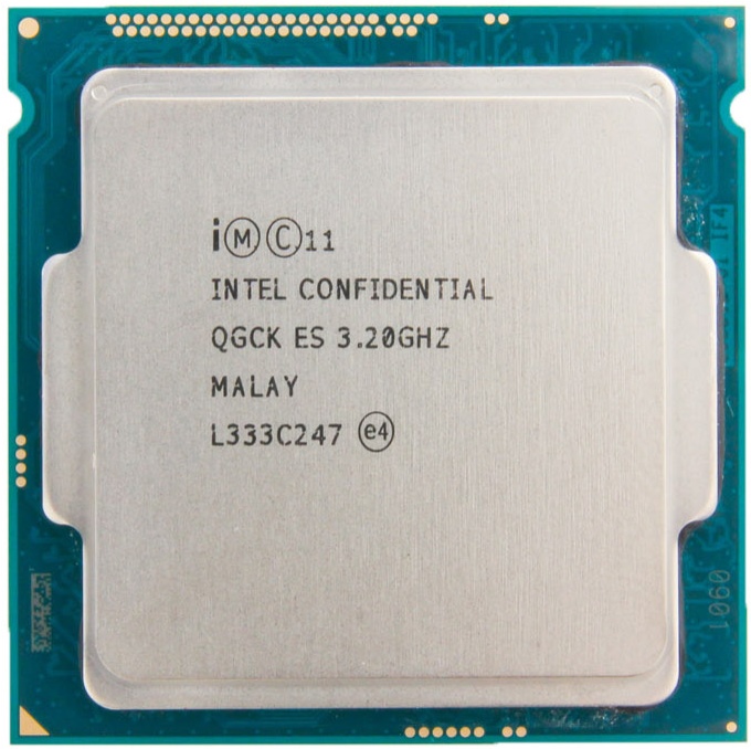
With that in mind, consider these two Intel Xeon server CPUs:

As you can see from the official Intel product pages for each processor, they both have a TDP of 140 watts. At this point I’m looking at the specs, thinking maybe this is an OK tradeoff.
Here’s what I actually measured with my trusty Kill-a-Watt for each server build as I performed my standard stability testing, with completely identical parts except for the CPU:

  • E5-1630: 40w idle, 170w mprime
  • E5-1650: 55w idle, 250w mprime

I am here to tell you that Intel’s TDP figure of 140 watts for the 6 core version of this CPU is a terrible, scurrilous lie!

This caused a little bit of a problem for me as our standard 1U server build now overheats, alarms, and throttles with the 6 core CPU — whereas the 4 core CPU was just fine. Hey Intel! From my home in California, I stab at thee!

But, you know..

Better Heatsink

The 1.75″ maximum height of the 1U server form factor doesn’t leave a lot of room for creative cooling of a CPU. But you can switch from an Aluminum cooler to a Copper one.

Copper is not usually all that necessary; it is significantly more expensive than aluminum, so it’s usually cheaper to throw a larger mass of aluminum at the cooling problem when you can. But copper dissipates more heat in the same form factor when space is a constraint, which it definitely is in a 1U case.

The famous “Ninja” CPU cooler came in copper and aluminum versions which means we can compare apples to apples. At 12v (max fan speed):

  • Aluminum Ninja had 24C rise over ambient
  • Copper Ninja had 17C rise over ambient

You can scale the load and the resulting watts of heat by spinning up MPrime threads for the number of cores you want to “activate”, so that’s how I tested. And each run has to be overnight to be considered successful!

  • Aluminum heatsink — stable at 170w (mprime threads=4), but heat warnings with 190w (mprime threads=5).
  • Copper heatsink — stable at 190w (mprime threads=5) but heat warnings with 230w (mprime threads=6).

This helped, noticeably. But we need more.

Better Thermal Interface

When it comes to server builds, I stick with the pre-applied grey thermal interface pad that comes on the heatsinks. But out of boredom and a desire to experiment, I …

  • Removed the copper heatsink.
  • Used isopropyl alcohol to clean both CPU and heatsink.
  • Applied fancy “Ceramique” thermal compound I have on hand, using an X shape pattern.
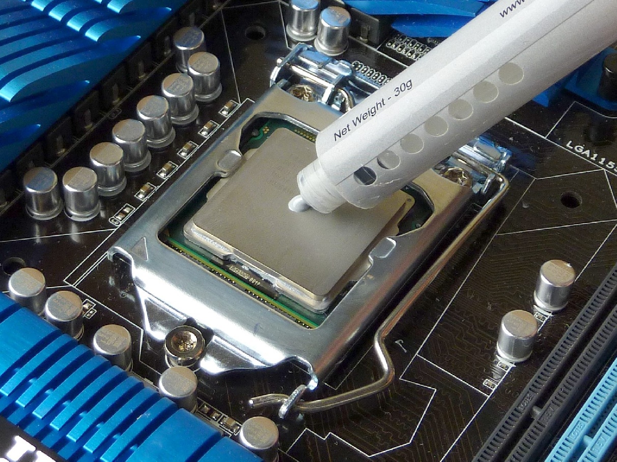
I wasn’t expecting any change at all, but to my surprise with the new TIM applied it took about 2-3x as long to reach throttle temps with mprime threads=6. Before, it would thermally throttle within a minute of launching the test, and after it took ~10 minutes to reach that same throttle temp. The difference was noticeable.

That’s a surprisingly good outcome, and it tells us the default grey goop that comes pre-installed on heatsinks is … not great. Per this 2011 test, the difference between worst and best thermal compounds is 4.3°C.

But as Dan once bravely noted while testing Vegemite as a thermal interface material:

If your PC’s so marginal that a CPU running three or four degrees Celsius warmer will crash it [or, for modern CPUs, cause the processor to auto-throttle itself and substantially reduce system performance], the solution is not to try to edge away from the precipice with better thermal compound. It’s to make a big change to the cooling system, or just lower the darn clock speed.

So we’re not done here.

Ducted Airflow

Most, but not all, of the SuperMicro cases I’ve used have included a basic fan duct / shroud that lays across the central fans and the system. Given that the case fans are pretty much directly in front of the CPU anyway, I’ve included the shroud in the builds out of a sense of completeness more than any conviction that it was doing something for the cooling performance.

This particular server case, though, did not include a fan duct. I didn’t think much about it at the time, but given the overheating problem this 6-core CPU and its 250 watt heat generation was putting on our 1U build, I decided I should build a quick card stock duct and test it out.
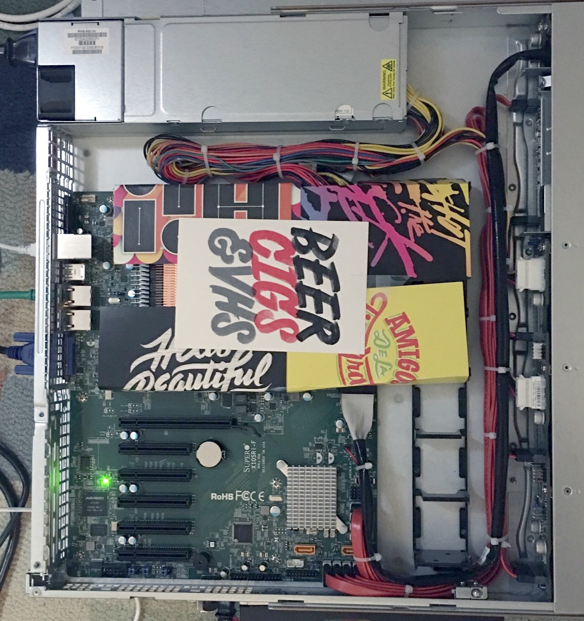
(I know, I know, it’s a super janky duct! But I was prototyping!)

Sure enough, this duct, combined with the previous heatsink and TIM changes, enabled the server to remain stable overnight with a full MPrime run of 12 threads.

I think we’ve certainly demonstrated the surprising (to me, at least) value of fan shrouds. But before we get too excited, let’s consider one last thing.

Define “CPU Load”

Sometimes you get so involved with solving the problem at hand that you forget to consider whether you are, in fact, solving the right problem.

In these tests, we defined 100% CPU load using MPrime. Some people claim MPrime is more of a power virus than a real load test, because it exerts so much heat pressure on the CPUs. I initially dismissed these claims since I’ve used MPrime (and its Windows cousin, Prime95) for almost 20 years to test CPU stability, and it’s never let me down.

But I did more research and I found that MPrime, since 2011, uses AVX2 instructions extensively on newer Intel CPUs:

The newer versions of Prime load in a way that they are only safe to run at near stock settings. The server processors actually downclock when AVX2 is detected to retain their TDP rating. On the desktop we’re free to play and the thing most people don’t know is how much current these routines can generate. It can be lethal for a CPU to see that level of current for prolonged periods.

That’s why most stress test programs alternate between different data pattern types. Depending on how effective the rotation is, and how well that pattern causes issues for the system timing margin, it will, or will not, catch potential for instability. So it’s wise not to hang one’s hat on a single test type.

This explains why I saw such a large discrepancy between other CPU load programs like BurnP6 and MPrime.

MPrime does an amazing job of generating the type of CPU load that causes maximum heat pressure. But unless your servers regularly chew through zillions of especially power-hungry AVX2 instructions this may be completely unrepresentative of any real world load your server would actually see.

Your Own Personal Inferno

Was this overkill? Probably. Even with the aluminum heatsink, no change to thermal interface material, and zero ducting, we’d probably see zero throttling under normal use. But I wanted to be sure. Completely sure.

Is this extreme? Putting 140 TDP of CPU heat in a 1U server? Not really. Nick at Stack Overflow told me they just put two 22 core, 145W TDP Xeon 2699v4 CPUs and four 300W TDP GPUs in a single Dell C4130 1U server. I’d sure hate to be in the room when those fans spin up. I’m also a little afraid to find out what happens if you run MPrime plus full GPU load on that box.

Servers are an admittedly extreme example of CPU heat and size tradeoffs, one of the few left. It is fun to play at the extremes, but the CPU inside your phone makes these very same tradeoffs on a much smaller scale. Tiny infernos in our pockets, each and every one.

[advertisement] At Stack Overflow, we put developers first. We already help you find answers to your tough coding questions; now let us help you find your next job.
Categories: Others, Programming Tags:

19 Wonderful Logo Ideas to Get You Inspired

January 17th, 2017 No comments

Creating a logo is not that simple as it may seem at the first glance. It requires a lot of refinement and improvement before the final logo comes. Ink and a white piece of paper are the best tools for creatives to get inspired. No program can give the same kind of freedom as paper does.

Most graphic designers put their ideas on paper first, and then edit them with Photoshop, Illustrator, or other digital editing programs. The main goal of any logo is to be remarkable, memorable and simple at the same time.

Finding inspiration for your next logo design is easy if you know where to look for it. You can either follow great design marketplaces like Designhill or keep an eye on Logospire and their feed.

Here are 20 wonderful logo sketches from all over the web that could inspire you for your next project which needs illustrations of any kind. Don’t pass by our previous collection of typography sketches!

1. LogoPack 2013 by Mike | Creative Mints

2. PopChicken Gourmet Express // Identity by IndustriaHED™ Branding

20 Wonderful Logo Sketch Examples to Get Inspired

3. AppleJack Logo by Artua

20 Wonderful Logo Sketch Examples to Get Inspired

4. DANGERDUST BRANDING by DANGERDUST

20 Wonderful Logo Sketch Examples to Get Inspired

5. Map pins – heart by Eddie Lobanovskiy

20 Wonderful Logo Sketch Examples to Get Inspired

6. The Fitness Lab by Matt Vergotis

20 Wonderful Logo Sketch Examples to Get Inspired

7. Logos 2012 by Mike | Creative Mints

20 Wonderful Logo Sketch Examples to Get Inspired

8. Mission Oaks Cafe Sketchin’ by Mike Jones

20 Wonderful Logo Sketch Examples to Get Inspired

9. Chalet Monticello by Jackson Alves

20 Wonderful Logo Sketch Examples to Get Inspired

10. Hand Lettering by Valentina Badeanu

20 Wonderful Logo Sketch Examples to Get Inspired

11. PizzaLista – 2013 by DotHaus

20 Wonderful Logo Sketch Examples to Get Inspired

12. Ink & Paper – 2014 by Alexandre Godreau

20 Wonderful Logo Sketch Examples to Get Inspired

13. LOGO by Gülsah Alc?n

20 Wonderful Logo Sketch Examples to Get Inspired

14. Logotypes & Icons by Mike

20 Wonderful Logo Sketch Examples to Get Inspired

15. AspireBoard sketches by Eddie Lobanovskiy

20 Wonderful Logo Sketch Examples to Get Inspired

16. Logos by Ink Ration

20 Wonderful Logo Sketch Examples to Get Inspired

17. Logo Design by Eddie Lobanovskiy

20 Wonderful Logo Sketch Examples to Get Inspired

18. ARTY by Andrey Anikanov

20 Wonderful Logo Sketch Examples to Get Inspired

19. Logotypes collection | 2012-2013 by Mike

20 Wonderful Logo Sketch Examples to Get Inspired

Read More at 19 Wonderful Logo Ideas to Get You Inspired

Categories: Designing, Others Tags:

Designing Better App Icons

January 17th, 2017 No comments

Creating that singular piece of graphic design that users will first interact with each time they encounter your product can be intimidating. A beautiful, identifiable and memorable app icon can have a huge impact on the popularity and success of the app. But how exactly does one make a “good” app icon? What does that even mean?

Fear not, I’ve put together some tips and advice to help answer these questions and to guide you on your way to designing great app icons. I’ve been designing, making resources and giving talks about icon design for the past couple of years. In this article, and in the video at the end, I’ll sum up what I’ve learned about this amazing craft.

The post Designing Better App Icons appeared first on Smashing Magazine.

Categories: Others Tags:

Freebie: 430 Free Icons All Around Gesture Control

January 17th, 2017 No comments

This icon package is different from the others. Here, you won’t find the thousandth variant of the Wifi symbol. Instead, all of the 430 icons deal with the gesture control of modern user interfaces.

194 Megabyte Gesture Control: It Doesn’t Get Any More Detailed

Kanin Abhiromsawat, working under the alias eucalyp, is a graphic designer, and illustrator from Thailand, who’s enjoying a rather impressive follower count of about 47,000 people on Creative Market. There, he sells some huger and broader, as well as some more targeted icon collections, as well as avatars, and cartoonish character depictions. On Creative Market, you’d have to pay ten dollars for his collection of 430 gesture icons, but on Designer Mill, you can get it for free.

Don’t be irritated when Designer Mill redirects you to Gumroad. Although initially a sales platform, quite a few publishers distribute their freebies over it, too. Once you’ve arrived at Gumroad, just enter a zero in the input field “Name a fair price,” and click on “I want this.” After that, a popup opens, in which you have to enter your email address ( it doesn’t matter what kind of address). The download is started right afterward, right there. You don’t have to wait for the confirmation mail from Gumroad.

Illustrator, EPS, JPG, SVG, and PNG in Different Resolutions

Once you’ve shoved the 194 MB heavy download archive onto your local harddrive, and unzipped it, you’ll find the icon set in plenty of different flavors, all cleanly structured in folders. The folder named AI provides the widest range of options, containing all symbols as single, fully editable Adobe Illustrator files. It also includes all pictograms in the formats EPS, SVG, and JPG, as separate files each. PNG fans will find almost 4,000 files, as eucalyp has put in the effort to provide all symbols in the formats 16×16, 24×24, 32×32, 48×48, 64×64, 96×96, 128×128, 256×256, and 512×512 pixels. The package couldn’t be any more complete.

Example Icon as a PNG in 512×512 Px

As mentioned before, you won’t find an all-round icon set, but a highly specialized compilation of symbols for smartphone controls, gestures, and fingerprints. The icons are especially well suited for tutorials, as well as other explanatory texts and material.

As you can see from the included readme file, using the icons is free for both private, and commercial purposes, even customer projects. You should add this set to your designer toolbox. I’m sure you’ll need it sooner or later.

Categories: Others Tags:

The Line of Death

January 17th, 2017 No comments

Eric Lawrence has written a pretty scary post about browser security and malicious websites that hope to trick us:

When building applications that display untrusted content, security designers have a major problem— if an attacker has full control of a block of pixels, he can make those pixels look like anything he wants, including the UI of the application itself. He can then induce the user to undertake an unsafe action, and a user will be none-the-wiser.

And the problem is even worse on mobile:

Virtually all mobile operating systems suffer from the same issue– due to UI space constraints, there are no trustworthy pixels, allowing any application to spoof another application or the operating system itself

Direct Link to ArticlePermalink


The Line of Death is a post from CSS-Tricks

Categories: Designing, Others Tags:

Simbla Unveils the Future of Website Builders

January 16th, 2017 No comments

Website builders have come a long way since the early days of Geocities and Angelfire, which is truly fortunate for businesses and consumers. Simbla has become one of the innovative leaders that keep pushing these builders to new and exciting levels, and 2017 is poised to offer the best experience to date.

A prime perk of website builders is that they have made it possible for even novices to create a professional looking site, but one of their biggest drawbacks has been a lack of integration with the latest and greatest features. For example, apps are everywhere these days, and all of your clients use them on a daily basis. However, even though apps are incorporated in so many other ways, website builders have been far behind on offering integrated web applications. This problem is being put to rest by the website builder, though, so you’ll be able to make a truly dynamic website that consumers can easily connect with. The best part? You’ll be in control of how the web applications work!

2016: The Year in Review

To truly appreciate the major changes that Simbla is unveiling this year, it’s important to take a look back at where they’ve come from. Simbla kicked off 2016 with the launch of their comprehensive bootstrap website templates, along with the block method. Although many builders offer drag and drop technology, the block method introduced a much easier way to choose individual elements, or blocks, and put them in place on any webpage. In other words, standard templates can be given a new look by adding or deleting blocks at will.

In mid-2016, Simbla reached new heights by adding an online database system. This is another example of Simbla’s commitment to offering an unusual website builder experience. One of Simbla’s primary goals is to enable users to make their site look like it was designed from scratch by a professional. With the online database system, users can now create a dynamic database and then easily connect this directly to their website.

The latter half of 2016 saw the release of many web widgets. These widgets were designed to work between the database and website in order to perform a wide variety of actions. In other words, customizing websites to create a unique look and feel became even easier.

2017: The Future of Website Builders

Even though Simbla has already developed several exciting new options for their website builder, the company is not going to merely rest on its laurels throughout 2017. Instead, the Simbla team has made a concentrated effort to turn the world of website builder software upside-down.

Long gone will be the days of having to choose between a seemingly endless list of website builders that all do the exact same thing. Now you’ll have the ability to add dynamic website applications that contain useful app widgets. These widgets will be able to drop down onto any of the user’s pages, making the process of using the site as simple and intuitive as possible.

Web application incorporation alone would be something to get excited about, but Simbla isn’t stopping there. When you create or update your website with Simbla’s software, you’ll gain the ability to completely control everything about the apps you choose, including their appearance and how they behave and work for users and admins. To tie in these improvements with last year’s developments, the apps will also use the database and all of its abilities to offer the best possible end result.

Standing Apart from the Crowd

As you can see, Simbla has created several new website builder options that make them stand apart from the crowded virtual sea that’s inundated with similar companies. Just as Simbla has done this to provide real value to website owners and users, it’s important for your company or personal site project to stand out from your competitors’ websites. One of the best aspects of choosing Simbla as your website builder is that you will automatically gain the tools needed to make your site look different and perform in new, user friendly ways.

It’s hard to know at this point what Simbla will do in 2018 and beyond, but they’ve already built a proven track record of innovation that makes it clear their future will continue to change the world of website builders. What we know for sure is that Simbla is becoming more than an average website builder. The company is going to change from a simple website builder in to a whole different concept. Simbla is offering a full business environment solution, a database in the backend, a designed website as an interface and web apps connecting them booth for a smooth user experience.

Read More at Simbla Unveils the Future of Website Builders

Categories: Designing, Others Tags:

Opera Neon

January 16th, 2017 No comments

Hot takes!

  • I wanted to give it at least a few days of full-time use, but you can’t use extensions (yet?). The web is too hard for me to use without 1Password and Ghostery.
  • The UI feels fresh and interesting. UI polish seems like an excellent direction for Opera to go. Since moving to Blink they aren’t spending (as many) resources on under the hood browser stuff, they might as well polish up the hood itself. It’s neat how it uses your desktop background as its background. It’s not transparent, though, it’s just a duplicate image.
  • The pop-out videos are pretty sweet. Safari can do it too, but the tray of media in Neon is an upgrade. I don’t understand why Chrome and Firefox can’t do this… isn’t it a macOS level thing?
  • Weird bug: doesn’t seem like you can ?V paste into the address bar?

Direct Link to ArticlePermalink


Opera Neon is a post from CSS-Tricks

Categories: Designing, Others Tags: