JotForm 4.0: The Next Revolution in Form Design is Here
Noupe readers know that we really do love JotForm over here. Up until today we thought we couldn’t expect more but JotForm surprised us one more time. With JotForm 4 they are revolutionizing form design again.
JotForm: Innovative Since 2006
JotForm is a dinosaur in terms of the web. It’s been ten years since they started out on their mission to provide the world with the best form builder available. Today JotForm is proud to have 2.5 million users working with their product.
We here at Noupe support JotForm since 2014. 2014 was the year where JotForm introduced their revamped form designer. They really got me excited that day. I wrote this article. Last autumn we gathered the top six reasons why designers should use JotForm and found a service that kept getting better and better still.
At that point, JotForm allowed you to create forms that
- work responsively on any device,
- are lightning-fast, both to set up and to execute,
- are secure, by using form encryption and SSL by default,
- allow full design customization, even through custom CSS,
- are stored in compliance with local data privacy regulations, so that even Europeans can use them without hard feelings,
- offer integration with more than 100 third-party services, such as SalesForce, MailChimp, Dropbox and others,
- can be used to collect payments via PayPal, Stripe and others,
- let you integrate almost any thinkable element, such as image sliders, YouTube videos or SoundCloud files quickly,
- can execute conditional logic to react to form input individually.
You might assume that such a feature-rich product should be hard to get accustomed to, but the opposite is the case. JotForm is almost intuitive to use, no learning curves involved.
I was totally satisfied with the feature set that was available last fall.
JotForm 4, Next Generation Form Building
These days JotForm rolls out its newest iteration, JotForm 4. And I have to admit that I was skeptical at first. They created quite a buzz in the industry and before I got to know their latest offering I thought they were just beating the big drum for something only slightly altered from the version before.
Boy, was I wrong. JotForm 4 really is a revolution in form building and design. All the features we already loved have improved. More lovable features have been added. Let me highlight my favorites.
Should you not have the time to read on, watch the following video. It’s only two and a half minutes long and will give you a solid impression of what to expect as well:
Mobile Form Building and Design
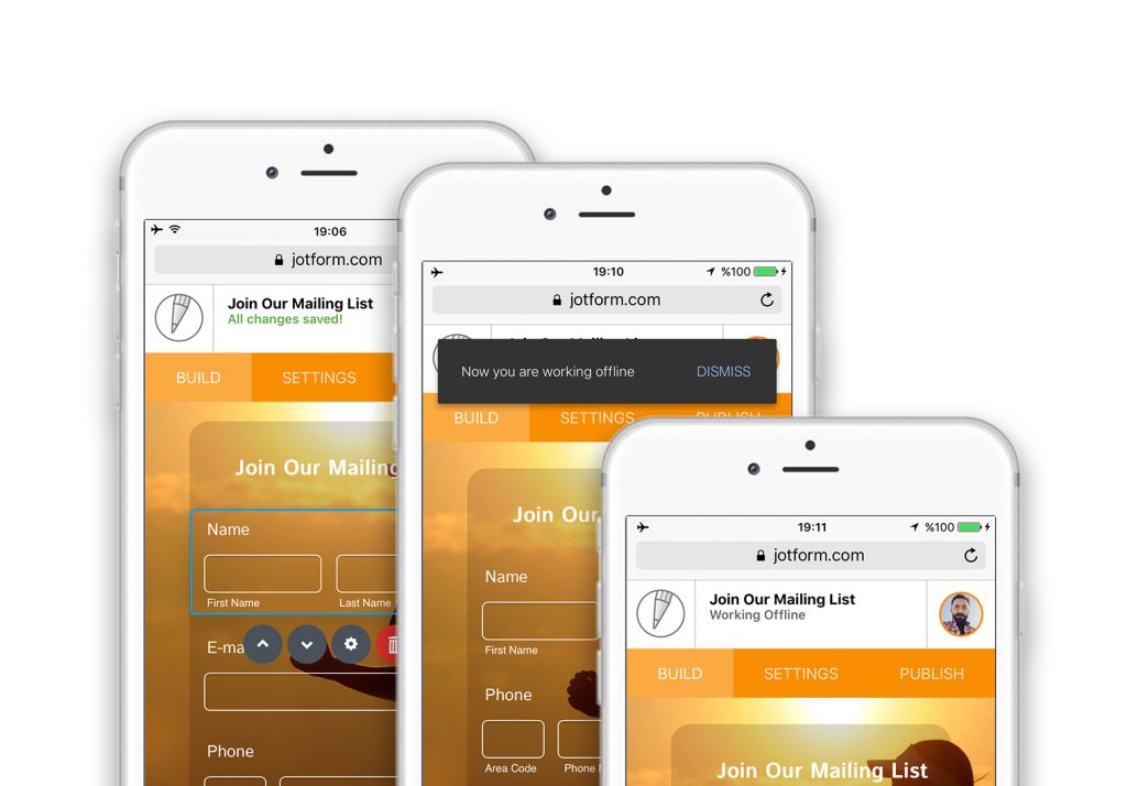
JotForm has already been able to create forms that work flawlessly on any device. From version 4 on you can not only build forms for mobile devices, you can even build them from mobile devices.
I don’t know whether you are going to roam the forests busy building web forms from now on but if you’d wanted to you could. Technically the option of building complex forms from smartphones is not trivial. So cudos to the JotForm team for making this possible.
Offline Editing and Real-Time Collaboration
Should you lose the web connection while roaming the woods, don’t worry. JotForm 4 will synchronize all your edits the next time the internet connection reappears. No longer lost work, thanks to continuous storing and offline support. Yes, you read that right. Continuous saving is one of the new features as well.
This allows for an elaborate revision history that lets users view a history of revisions made to any form and easily revert back to a previous version with a single click which will then be written into the revision history as well 😉
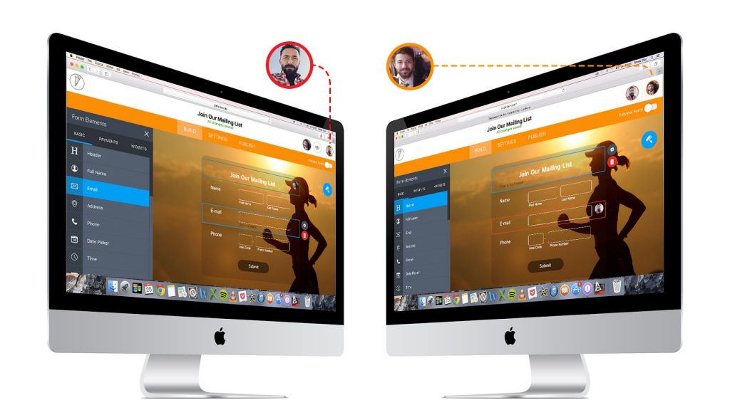
Collaboration has been possible before, but with JotForm 4 it becomes real-time collaboration. You can now work on forms with your team much like in Google Docs. Changes are immediately synced team-wide. Everyone always works with the most recent version of the form.
Tighter Integration of Form Designer and Theme Store
The Form Designer has been the most attractive addition to the feature range of JotForm back in 2014. Shortly after that JotForm introduced the Theme Store that we covered in this article. Form Designer allowed you to prettify your forms and create a kind of template from that design. The template could then be sold or given away through the Theme Store which basically is a market place for common and not so common form needs.
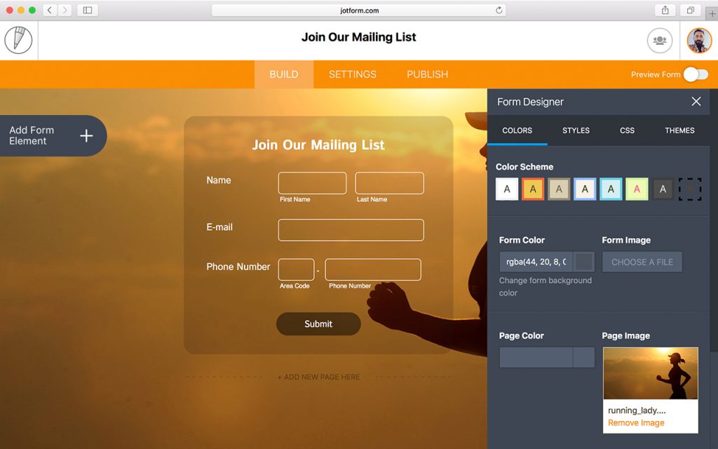
JotForm 4 makes both the Form Designer and the Theme Store directly accessible from within the form builder. You no longer need to switch views too reach either of these which makes for a much smoother work flow.
Updated and Improved Functionality
Besides these shiny new additions to the feature set JotForm revamped some of their functions to streamline the product even more.
Smoother Drag and Drop
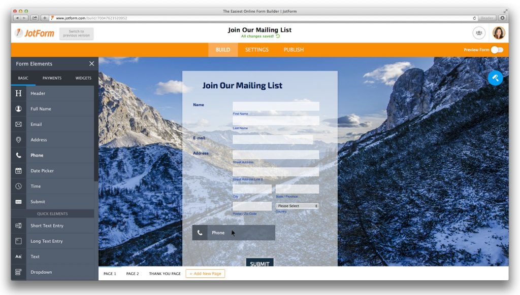
Dragging form fields from one area to another has been improved for a smoother experience, including between different pages in a single form.
In-Page Preview
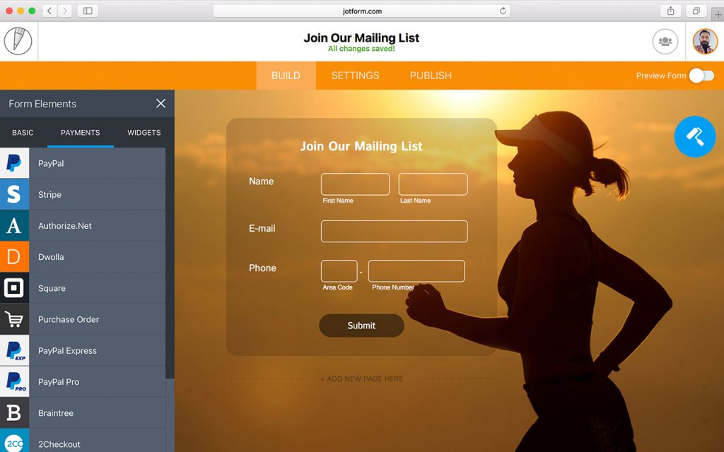
Previously, users could preview a form within a smaller pop-up. With JotForm 4 form previews now display in the same window in their full size, and can be toggled on and off with a single click.
User Friendliness
From the insights of 18 months of user testing data, JotForm incorporated the best aspects and improved the overall design and UI experience.
Improved Pagination
Instead of adding a Page Break field in order to separate a form into multiple pages, users can now add new pages to their forms with a single click.
Improved Wizards
All of JotForm’s wizards have been updated for greater ease of use. Form Settings, Conditional Logic, Emails, Integrations, and Thank You Page wizards are now located on their own tab for easier updating. Also placed into a separate tab are wizards for Quick Share, Embed, and Platforms. In-page wizards, such as Payment and Question Properties, have been updated for readability and organization.
New Features, Old Pricing
It was always a plus of JotForm that price-wise they did keep in mind that forms are just forms. Their offering has always been moderately priced and this does not change even with the massively improved JotForm 4.
All the paid plans are permeable, so you can start with the Free Plan to see whether the product is for you and upgrade from there to Bronze for 19 USD to Silver for 39 USD to Gold for 99 USD. The plans are priced as a monthly recurring subscription which you can cancel at any time. That’s what I call fair.
Now go and see for yourself. I told you, it’s free. No risk involved.
