Archive

Archive for February, 2017

An Introduction to the Reduced Motion Media Query

February 10th, 2017 No comments

The open web’s success is built on interoperable technologies. The ability to control animation now exists alongside important features such as zooming content, installing extensions, enabling high contrast display, loading custom stylesheets, or disabling JavaScript.

Sites all too often inundate their audiences with automatically playing, battery-draining, resource-hogging animations. The need for people being able to take back control of animations might be more prevalent than you may initially think.

A brief history of Reduced Motion

When it was released in 2013, iOS 7 featured a dramatic reworking of the operating system’s visuals. Changes included translucency and blurring, a more simplified “flat” user interface, and dramatic motion effects such as full-screen zooming and panning.

While the new look was generally accepted, many people using the updated operating system reported experiencing motion sickness and vertigo. User interface movement didn’t correspond with users’ feeling of movement or spatial orientation, triggering the reported effects.

Although technology inflicting adverse effects existed before this, the popularity of iOS gave the issue prominence. Apple has great support for accessibility, so an option in the operating system preferences to disable motion effects for those with vestibular disorders was added in response.

Vestibu-what?

Your vestibular system provides an internal sensor to communicate your body’s physical position and orientation in the world, and is key to controlling balance and eye movement. Vestibular disorders can cause your vestibular system to struggle to make sense of what is happening, resulting in loss of balance and vertigo, migraines, nausea, and hearing loss. Anyone who has spun around too quickly is familiar with a confused vestibular system.

Vestibular disorders can be caused by both genetic and environmental factors. It’s part of the larger spectrum of conditions that make up accessibility concerns and it affects more than 70 million people.

Pssh! I feel fine! This’ll never happen to me

Remember: we’re all just temporarily-abled. Feeling a little dizzy might not seem like that big a deal, but that moment of nausea might be a critical one: losing balance and falling down, a migraine during an interview, nausea-triggered vomiting while working a food service job, passing out while operating a car UI, etc.

So what can we do about it?

Enter a new Media Query

Safari 10.1 introduces the Reduced Motion Media Query. It is a non-vendor-prefixed declaration that allows developers to “create styles that avoid large areas of motion for users that specify a preference for reduced motion in System Preferences.”

The syntax is pretty straightforward:

@media (prefers-reduced-motion) {
  .background {
    animation: none;
  }
}

Safari will parse this code and apply it to your site, letting you provide an alternative experience for users who have the Reduced Motion option enabled. Think of this new Media Query like @supports: describe the initial appearance, then modify the styles based on capability.

How to test

So, how do we check this bad boy out? Provided you’re up to date with MacOS, you should be able to check it out in Safari Technical Preview.

Go to System Preferences, select the Accessibility options, click the Display tab, and check the Reduce Motion option. You’ll see that the example animation in the CodePen example below updates when the checkbox is toggled. The pulsing circle is changed to an inert square:

See the Pen Reduce Motion Media Query Example by Eric Bailey (@ericwbailey) on CodePen.

Here’s a quick video if you don’t have access to this:

Need a more practical example of how the media query could be applied?

This feature from the New York Times opens with full-screen autoplaying video that simulates falling from a great height.

It’s sudden and unexpected, and a strong candidate to trigger vertigo.

The Reduced Motion Media Query, could provide an alternative that replaces the falling animation with a screenshot of the final frame of the animation. The content of the article is still communicated thematically. A beautiful rendering of the proposed Gateway project draws the reader in. The other less-dramatic animations in the feature remain unchanged, as they are both subtle with their transitions and activated by the reader deliberately browsing the page.

The impact of the story is preserved while not having the potential to inflict harm on the person trying to read it. It’s a win-win!

Hmph! Seems like a lot of work

Even if you ignore all the benefits of building accessible sites, it’s probably a good idea to get comfortable working with User Queries.

As capabilities traditionally controlled by the operating system are integrated into the browser, crafting experiences that gracefully adapt to a person’s preferences will become increasingly important. Reduced motion is likely to be supported by other browsers soon as part of a wave of new User Queries.

The browser’s opinion needs to also be considered. Without a designed alternative, the browser’s fallback settings for reduced motion or may not create a desirable experience. In fact, if animation alone communicates important information about your site, it may be lost.

So, should I get just play it safe and get rid of all my animation?

Doing so would be a dramatic and not necessarily valid option. Animation, when used with discretion and restraint, can be a great way to communicate relationships between parts of your site or transitions between states, direct a person’s attention, simplify the understanding of complicated concepts, or to simply add some fun. Used properly, animations can aid in accessibility by helping address cognitive accessibility concerns.

If you would like more information on what kinds of animation are more likely to trigger vestibular issues, Val Head has written an excellent post on A List Apart on the subject.


An Introduction to the Reduced Motion Media Query is a post from CSS-Tricks

Categories: Designing, Others Tags:

CSS Rooster

February 10th, 2017 No comments

A Bot that Writes CSS Classes for HTML with Deep Learning

I played with it for a bit to see if I could get it to do anything impressively analytic. I took some semantic HTML and removed all the class names from it with the RegEx class="[a-zA-Z0-9:;.s()-,]*". I dropped the class-free HTML into the Rooster, and it did generate new classes:

But the new classes seemed entirely based on what the tag is.

Categories: Designing, Others Tags:

A Month of “Hello, World!” Learning 30 new languages in 30 days.

February 10th, 2017 No comments

Genki Hagata:

My “aha moment” came around day 16, when I came to the perhaps obvious realization that every Javascript framework is just someone’s organized, opinionated way of writing code.

Direct Link to ArticlePermalink


A Month of “Hello, World!” Learning 30 new languages in 30 days. is a post from CSS-Tricks

Categories: Designing, Others Tags:

Blog2Social for WordPress Boosts Your Social Media Strategy

February 10th, 2017 No comments

Today marks the beginning of a small series, in which we’ll present the best premium plugins for WordPress. Plugins that are worth spending money on, as they are much better, and much more useful than their free counterparts. We’ll start with the social media plugin “Blog2Social” which has convinced me after an in-depth test.

All bloggers and website operators have one thing in common: they want to be found, and they want their content to be read. A very important part of a promotion strategy is posting the articles on the social media channels.

A plugin that takes care of these posts for you once an article was published can be helpful. There are many plugins that do that, such as Jetpack, for example.

However, using a plugin can also come with a bunch of disadvantages.

Why Most Social Media Plugins Suck

  • You can’t customize your posts for the social media, only the title, excerpt, and the article image will be posted.
  • Your social media accounts are triggered right after your article has been published.
  • You can only supply one account per network.

These three things heavily restrict your range. The postings on social media should be customized so that you set yourself apart from your competition. Users are more likely to click customized content.

Your range gets a significant boost as soon as you fuel your social media accounts during the most optimal times. We’ve already written about that before:

Recipe for Success: When to Post On Social Media [Infographic]

Why Blog2Social is Better

Imagine there was a plugin that automatically posts your articles on social media at the right times. Every social media account would get its post at the time where the most users are online.

On top of that, every post would be adjusted to the requirements of the respective networks. Every article could receive a unique teaser, a custom image, and specific hashtags and links.

To your followers, all of this would feel as if you manually wrote each post on social media. You think there was no way this exists? Blog2Social makes all of this possible!

Here Are Some of the Advantages:

  • The social media plugin Blog2Social publishes blog posts on your profiles, business pages, and community websites, as well as in groups on all of your networks.
  • You get to individually adjust your social media posts to the requirements of the networks using comments, #hashtags, tags, or @handles – all in one step, and very easy.
  • Publish new or older articles with adjusted images, and backlinks to your website.
  • You can create different profiles for multi-author blogs, which can be connected to different profiles, pages, and groups. This lets you boost your range even more.

A Video is Worth a Thousand Words:

Blog2Social Supports the Following Networks

Aside from the “regular” social media, Blog2Social also supports blogs, business, image, and social bookmark networks. For example:

  • Twitter
  • Facebook – Profiles, Groups, and Pages
  • Google+ – Profiles, Pages, and Groups
  • LinkedIn – Profiles, Business, and Focus Pages
  • Xing – Profiles, Business Pages, as well as your XING Groups
  • Flickr
  • Pinterest
  • Instagram
  • Tumblr
  • Medium
  • Torial
  • Diigo – Automatically publish a link to your blog post, and create a bookmark for your post
  • Delicious – Automatically publish a link to your article, and create a bookmark for your post including tags.

Installing Blog2Social, and Requesting a Premium Test License

  • Developer: Blog2Social
  • Work in Progress: Yes
  • Latest Update: 26.01.2017
  • Costs: free via WordPress.org (Premium licenses exist)
  • License: GNU GENERAL PUBLIC LICENSE
  • Known Compatibility Issues: unknown
  • Developer Homepage: Blog2Social Homepage
  • Download on WordPress.org

After the download and installation, the plugin needs to be set up in the settings. To be able to use the full scope of functions, a premium license is needed.

Testing the Premium Functions for Free for 30 Days

You don’t have to buy a pig in a poke since you get to check the premium functions for free for 30 days. You don’t have to give any payment data; the license expires automatically.

Register on the website of Blog2Social to receive your test license via email.

Setting Up and Using Blog2Social

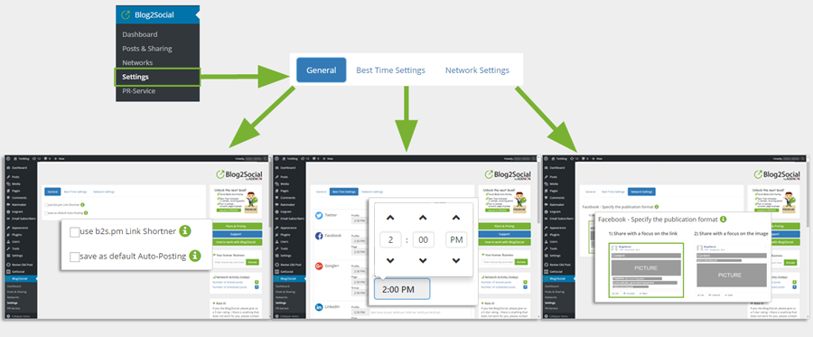
On the Blog2Social „Settings“ page you can check the option to use the link-shortener and activate auto-posting by default (General). The “Best Time Settings” show pre-defined time windows suggesting best times to post. You can edit the suggested times and save them for the “My times” button on the “Custom Scheduling & Sharing” page. On the “Network Settings” you choose your preferred posting format for your Facebook posts.

1 – The Settings

After the installation, go into the settings and tick the selection box for the link shortener. The Blog2Social shortener transforms your links, and publishes them on social media in that shortened form.

If you choose this option, you prevent that the networks deny frequently repeated posts with the same links. The b2s.pm shortener generates a new link for each social media post. This is important if you want to post your articles multiple times on the same networks.

On the right side of the settings, you enter your test license or your premium license. The second option in the settings lets you define the times on which your posts will be published.

I recommend using the “Best Time Scheduler.” This tool is a premium feature that always posts your social media posts during the times when the most people are online on each respective network.

This Increases Your Article’s Range Significantly.

Blog2Social provides a complete time scheme for the best times to share on the different social media channels. If you choose this option, the calculated time frames are displayed below the respective networks. You are able to edit these times, or create a custom time scheme for sharing your blog posts from scratch.

2 – Connecting Networks

Connect all of your networks, pages, and groups in just a few clicks.

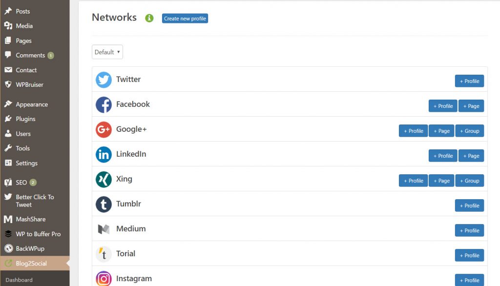
Set up your accounts under the menu item “Networks.” The plugin’s premium version provides a lot more sharing options. You can not only connect your profiles but also link pages and groups that you’re active in.

This feature can be useful when it comes to Google+ or Xing, as many users of these networks are very active in groups.

Additionally, a premium license also allows you to connect, and supply multiple accounts per network, which can be very handy especially for highly active social media users.

3 – Customizing and Sharing Posts

Sharing Individual Posts Made Easy With Blog2Social.

Assigning Unique Texts to Each Network

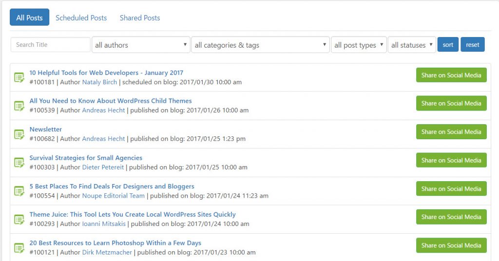
The menu item “Dashboard” displays your blog posts. It only takes one look to see if, and when your posts have been shared. A click on the button “Share on Social Media” opens a new window, where you can customize your posts before sharing.

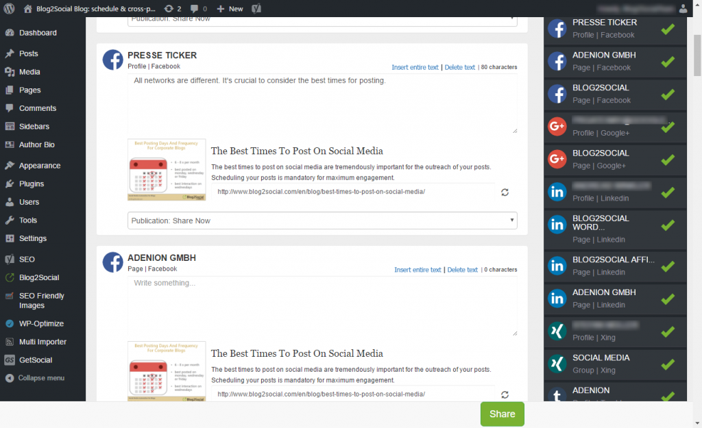
Here, you get to write a unique text for each social network, as well as add hashtags, and links. On the right side of this window, you have the option to deselect social media accounts that you don’t want to post on anymore. A click on the respective profile turns off the account.

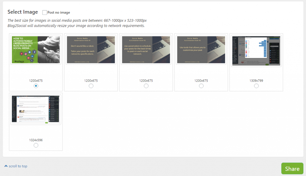
The Image Selection

When you scroll all the way down, you get to the picture selection. Here, you can choose if you want to transfer images. You also get to select which images will be posted.

Once you set everything, all there’s left to do is to click “Share.” Now, your blog posts will either be posted at the times you defined or at the best times as identified by Blog2Social.

Sharing Immediately After Releasing an Article

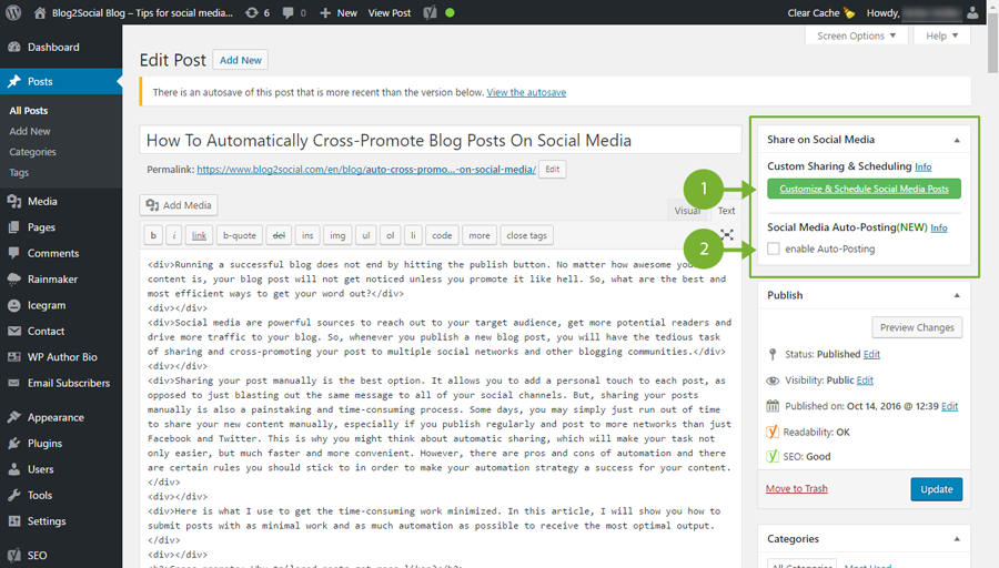
The plugin adds a new button to the “Publish” field on the “Publish Post” page of your WordPress.

Blog2Social provides two general options for sharing your blog posts on social media:

1. Custom Sharing & Scheduling to customize your posts individually in one easy step and to schedule your post or to publish immediately;
2. Auto-Posting to automatically share your blog posts whenever you publish a new post.

The Cool Premium Functions of Blog2Social

The plugin really excels when it comes to its premium functions.

Here are all the advantages of the premium version at a glance:

  1. Multiple Accounts, Profiles, Groups
    In addition to the profiles, you are also able to connect pages, groups, and communities as well as multiple profiles, pages and groups per network in just one easy step. (geänderter Text)
  2. Creating Different Profiles
    Under the menu item “Networks” you can set up different profiles of network combinations, allowing you to switch between them whenever you want to. Very useful for a multi-author blog, for instance.
  3. Social Media Auto-Posting
    Automatically share your blog posts on your selected social networks whenever you publish your post.
  4. The Best Time Scheduler
    Time can be the decisive factor when it comes to a post being noticed or drowned in the flood of messages. It takes a lot of experience, and analysis to figure out the ideal times for each network. That’s why Blog2Social has put a lot of time into figuring out the actual best times to provide in the “Best Time Scheduler”. You can define your own custom times or you can edit any suggested time according to your needs. (Den Satz bitte am Ende anhängen.)
  5. Staggered Sharing
    Determine your times for automatic sharing on the different networks.
  6. Repeated Sharing
    Share your posts on individual networks repeatedly.
  7. Social Media Planner (Neu eingefügt)
    Schedule your social media posts for up to 52 weeks in advance.
  8. Sharing Old Blog Posts
    You can also share earlier blog posts on your networks. Select between calendar and list view.
  9. Reporting
    Follow the state of your releases directly to the place of publishment via links.
  10. Changing the Time Schedule
    If necessary, check and modify the planned social media postings.
  11. Performance Report (coming soon)
    Observe the likes, comments, and shares for each posting

The Prices of Blog2Social

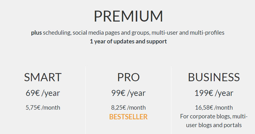
The prices for the plugin’s individual premium licenses are fair.

The smart license for only 69 Euro a year should be sufficient for the majority of users. The pro license is suitable for smaller multi-author blogs with up to five users.

Buy a Premium License for Blog2Social »

Conclusion

Blog2Social is the most elaborate social media plugin that I have tested so far. I purchased the premium (smart) license, and I can only recommend it.

Categories: Others Tags:

Web Development Reading List #169: TLS At Scale, Brotli Benefits, And Easy Onion Deployments

February 10th, 2017 No comments

Everyone here can have a big impact on a project, on someone else. I get very excited about this when I read stories like the one about an intern at Google who did an experiment that saves tons of traffic, or when I get an email from one of my readers who now published an awesome complete beginner’s guide to front-end development.

We need to recognize that our industry depends on people who share their open-source code and we should support them and their projects that we heavily rely on. Finally, we also need to understand that these people perhaps don’t want a job as an employee at some big company but remain independent instead. So if you make money with a project that uses open-source libraries or other resources, maybe Valentine’s Day might be an occasion to show your appreciation and make the author a nice present.

The post Web Development Reading List #169: TLS At Scale, Brotli Benefits, And Easy Onion Deployments appeared first on Smashing Magazine.

Categories: Others Tags:

Best of 2016: 100 Free GUIs for Mobile and Web Designers

February 10th, 2017 No comments

It comes as no surprise that in today’s fast-paced world where applications and websites are generated at the speed of light rapid prototyping has become a commonplace. The GUIs, icons, vectors, mockups, templates and photography stocks have occupied not only its niche in the market but also won the love of the creative folks’ thanks to its versatility, viability, and usefulness. Among all this rich diversity of available graphical stuff, the GUI packages are one of those that skillfully balance between the ready-made solutions like website templates and raw material like icons or standalone mockups. These “Lego” bricks that have an ability to quickly and painlessly change its color, theme, and style will give you a head start in any work. 1-2-3 and your idea is on a digital sheet of paper in the Photoshop or Sketch environment. Whether you need to build an application or landing page for this application, the ready-made starter kit is an effective solution nowadays.

2016 was rich in free UI packs. Though like in 2015, the designers preferred to give away tools for building mobile applications rather than website interfaces; nevertheless, we managed to find some exceptional GUI sets for web prototyping. Together with the app screens, concept applications, the range of elements inherent to iOS systems, they complete our collection.

Elegant Material UI Kit

Creator: Eugene UX
License: Attribution.

Moon Wireframe Kit


Creator: George Frigo
License: Declared as Free, no proper license given.

Global Store. E-commerce Free PSD UI KIT


Creator: Sergey Melnik
License: Attribution-NonCommercial-NoDerivatives.

iOS 10 GUI


Creator: Facebook
License: Declared as Free, no proper license given.

Mercatus UI Kit


Creator: Rui Paz + coded Vasco at Gaspard&Bruno
License: Declared as Free, no proper license given.

Slides Design Resources


Creator: designmodo
License: CC 4.0.

Landing page for restaurant | 37 free .psd blocks


Creator: Volodymyr Kurbatov
License: Attribution-NonCommercial.

Amsterdam – UI Kit


Creator: Chus Margallo
License: Declared as Free, no proper license given.

mOnochrome


Creator: Andrey Shilov
License: Declared as Free, no proper license given.

Landing – Free UI Kit


Creator: lstore.graphics
License: Free for personal and commercial use.

EarthShift – UI Kit


Creator: Arsen Kolyba
License: Attribution-NonCommercial-NoDerivatives.

Stella – Blog UI Kit


Creator: Arsen Kolyba
License: Attribution-NonCommercial.

Kauf – Web UI Kit


Creator: Yebo creative
License: Declared as Free, no proper license given.

Sweety iOS UI Kit


Creator: Damir Bektilov
License: Attribution.

Freeland – UI Kit


Creator: symu
License: Declared as Free, no proper license given.

55 Elements


Creator: TOMASZ MAZURCZAK
License: Free for personal and commercial use.

Deadline UI Kit


Creator: Rajesh Rajput
License: Attribution-NonCommercial-NoDerivatives.

iOS UI Kit for Adobe Project Comet (Experience Design)


Creator: Roman Kryzhanovskyi
License: Free for personal use; For commercial use contact the author.

UI Kit: Carlyle


Creator: Print Express, Matt Skiles
License: Free for personal and commercial use.

Joocy: A Free UI Kit


Creator: Matt Skiles
License: Free for personal and commercial use.

Pearl UI Kit


Creator: Huseyin Emanet
License: Use the resource, without restriction.

Vincent


Creator: Angelika Sosnova
License: Attribution-NonCommercial-NoDerivatives.

iOS 9.3 iPhone UI Kit for Illustrator and Sketch


Creator: Rusty Mitchell
License: Declared as Free, no proper license given.

iOS9 GUI


Creator: Facebook
License: Declared as Free, no proper license given.

iOS9 GUI for Sketch


Creator: design+code
License: Declared as Free, no proper license given.

Travel Blog UI Kit


Creator: Francesca Chiti
License: Declared as Free, no proper license given.

The tvOS GUI Kit


Creator: Josh Clement
License: Declared as Free, no proper license given.

macOS UI Kit for Sketch


Creator: alexkaessner
License: MIT.

Material UI Kit


Creator: Eugene UX
License: Declared as Free, no proper license given.

Chat UI


Creator: invisionapp
License: Declared as Free, no proper license given.

Google Material Design UI Kit


Creator: Nik Pletikos
License: Free for personal and commercial use.

Fade App UI Kit


Creator: David Perger
License: Free for personal & commercial use.

#DoEpicShit Free UI Kit


Creator: Riyadh Gordon
License: Attribution.

Wirebase


Creator: Patryk Zabielski
License: Declared as Free, no proper license given.

Eppe UI Kit


Creator: Eppearance Agency
License: Attribution.

Material Design Wireframe Kit v_02


Creator: Dan Shipley
License: Declared as Free, no proper license given.

Messaging Design UI Kit


Creator: layer
License: Declared as Free, no proper license given.

Guacamole – UI Kit


Creator: avocode
License: Declared as Free, no proper license given.

Instagram UI Kit


Creator: Mohamed Kerroudj
License: Declared as Free, no proper license given.

Creastore – UI Kit


Creator: Andrey Antar
License: Declared as Free, no proper license given.

10 Login Screens


Creator: George Vintila
License: Attribution 3.0 Unported.

Mobile UI Kit


Creator: Factorial Complexity, Vikes Kolomiets
License: Ask for author’s permission.

Aerea – UI Kit


Creator: Juan Luis Valle
License: Attribution.

Avital Mobile UI Kit


Creator: pixelbuddha
License: Declared as Free, no proper license given.

Daily UI – 30 Elements


Creator: symu
License: Declared as Free, no proper license given.

Free Modern and Clean iOS movie App UI Kit


Creator: Loic Leser.
License: Declared as Free, no proper license given.

“Miam” is a free IOS UI Kit for your cooking apps


Creator: Loic Leser
License: Declared as Free, no proper license given.

iOS 10 Complete UI (Sketch + PSD for iPhone 5, 6 and 6 Plus)


Creator: Oz Pinhas
License: Declared as Free, no proper license given.

Subscribe Box – Free UI Kit


Creator: cueblocks
License: Declared as Free, no proper license given.

iOS 10 GUI


Creator: Tushar Merwanji
License: Declared as Free, no proper license given.

Snap – Mobile UI Kit


Creator: Murat Mutlu
License: Declared as Free, no proper license given.

Kavina Dashboard Analytics Light Version


Creator: Septiandika Pratama
License: Declared as Free, no proper license given.

Free Dashboard Design


Creator: UInugget.com
License: Attribution-NonCommercial-NoDerivatives.

50 PSDs UI


Creator: Sherif SALEH
License: Attribution-NonCommercial-NoDerivatives.

Web style UI Kit


Creator: Shakil Ali
License: Declared as Free, no proper license given.

Dashboard UI Design


Creator: Nenad Milosevic
License: Declared as Free, no proper license given.

Mobile Apps


Creator: Mateusz Czajka
License: Free for personal and commercial use.

Inspirational UI Elements


Creator: Dea_n
License: Declared as Free, no proper license given.

Inspirational UI Elements vol.2


Creator: Dea_n
License: Declared as Free, no proper license given.

Set of Micro Wireframes for a Web App


Creator: Sergey Pikin
License: Declared as Free, no proper license given.

Dashboard Template


Creator: Abdullah Noman
License: Declared as Free, no proper license given.

Calendar UI


Creator: Dan Vineyard
License: Free for personal and commercial use.

UI Starter Kit


Creator: Hila Yonatan
License: Free for personal and commercial use.

Fruitos – Creative App Desogn


Creator: Abdullah Al Mamun
License: Declared as Free, no proper license given.

Mini Wireframes White


Creator: Luka Dadiani
License: Declared as Free, no proper license given.

Social Leads App


Creator: Drew Andersen
License: Declared as Free, no proper license given.

Taxi Mobile App UI Design


Creator: peerbits
License: Declared as Free, no proper license given.

Simple UI


Creator: Nhat Hoang
License: Declared as Free, no proper license given.

Nike Futuristic UI Concept


Creator: Joshua Oluwagbemiga
License: Attribution-NonCommercial.

Music Player UI Kit


Creator: uiuxassets
License: Declared as Free, no proper license given.

Daily UI – 30 elements


Creator: Patryk Wasik.
License: Declared as Free, no proper license given.

Clean and Modern iOS UI Kit


Creator: Sandeep Kasundra
License: Declared as Free, no proper license given.

Wyre – Web Layout Flowcharts


Creator: Petr Knoll
License: Declared as Free, no proper license given.

Elton UI Kit


Creator: pixelbuddha
License: Declared as Free, no proper license given.

Chart UI Kit


Creator: Xer.Lee
License: Declared as Free, no proper license given.

Free UI PSD Mobile App Fashion & Ecommerce ver 2.0


Creator: Hoang Bin
License: Attribution-NonCommercial-NoDerivatives.

Crisp eCommerce UI Kit


Creator: Baltazar Pazos
License: Declared as Free, no proper license given.

Free UI Kit


Creator: Artiom Piatrykin
License: Declared as Free, no proper license given.

Fitness App UI Kit


Creator: Dhanish Gajjar
License: Declared as Free, no proper license given.

Tremble UI Kit


Creator: webdonut
License: Declared as Free, no proper license given.

iOS9 GUI Kit in Vector


Creator: designshock
License: Free for personal use.

Platforma iOS and web wireframe kits

Creator: webdesignerdepot
License: Declared as Free, no proper license given.

Edacious Free UI Kit


Creator: Mushfiq
License: Declared as Free, no proper license given.

Cards


Creator: Samir Alley
License: Declared as Free, no proper license given.

Cinema UI Kit


Creator: Xer Lee
License: Attribution-NonCommercial-NoDerivatives.

Move – Mobile UI Kit


Creator: Volodymyr Kurbatov
License: Attribution-NonCommercial-NoDerivatives.

Bricks


Creator: Kurbatov Volodymyr
License: Declared as Free, no proper license given.

Hooked UI Kit for Adobe XD


Creator: XDGuru.com,
License: Free for personal and commercial use.

Touch Bar UI Kit


Creator: Keir Ansell
License: Declared as Free, no proper license given.

Flat UI Delivery App


Creator: DEGRANGE Quentin
License: Free to use for commercial and non-profit use.

Banking UI Kit


Creator: Murat Mutlu
License: Declared as Free, no proper license given.

20 Splash Screens


Creator: Nick Parker
License: Declared as Free, no proper license given.

Phenix UI Kit


Creator: Mert Oztopkara
License: Declared as Free, no proper license given.

CRM Dashboard UI


Creator: Ljubica Jovanova
License: Ask for author’s permission.

Fashion App Freebie


Creator: designerbundle
License: Declared as Free, no proper license given.

UI for eCommerce Mobile App


Creator: Peerbits Solution
License: Attribution-NonCommercial-NoDerivatives.

Small UI Kit


Creator: Christina Opanasko
License: Attribution-NonCommercial-NoDerivatives.

UI Kit


Creator: Bradley Bussolini
License: Declared as Free, no proper license given.

Facebok Analytics UI Pack


Creator: Mike Finch
License: Declared as Free, no proper license given.

TapNews – Free Mobile UI Kit


Creator: Sergey Melnik
License: Attribution-NonCommercial-NoDerivatives.

Categories: Others Tags:

On-Site Search Feature. The Art Of Being Accessible.

February 9th, 2017 No comments

Easy navigation is one of the most critical aspects of every website design.

After all, the vast majority of Internet users have only basic computer skills, so you need to ensure that they can find what they’re looking for. A navigation bar with descriptive page names is the first step toward keeping visitors engaged, but if you have a lot of details on your site, it’s vital to include an on-site search feature as well.

Keep in mind that you cannot rely on Google and other search engines to send visitors to the ideal page on your site. Instead, you need to operate as if they will always be directed to the home page and take steps to simplify the process of finding everything that’s kept on internal pages. Depending on the type of site you run, your on-site search could be very basic or advanced. Either way, the key is to make sure the average Internet user can get solid results with every search string.

The Benefits of a Constrained Search

People are used to being able to type in as little or as much as they want into Google’s search engine. This freedom often leads to less than stellar results, though, and that’s exactly what you want to avoid on your site. Instead, consider providing a search box that can only accept relevant data.

For example, the on-site search used by Addiction Helper is designed to help people in need quickly find access to treatment options. To make this process as smooth as possible, users can only enter their postcode or city name. This leads to accurate results based in or near the target area, which allows visitors to skip over any inapplicable information.

Of course, there are situations where constrained search needs to expand beyond a mere one or two options. Real estate sites such as Nick Marr, the House Shop provide a great example of when and how to expand a constrained search. The House Shop on-site search can be used with nothing more than a postcode or city name, but it can also be expanded to provide higher quality results. In other words, if someone specifically wants a two bedroom house within a certain price range, they can add those details to refine their search.

In either case, site visitors are able to access the details they need without looking through a virtually countless list of pages and choices. This is the main perk of using a constrained search. It ensures that everyone can find what they’re looking for quickly and with minimal computer skills. The simplicity of the process is actually what makes it the most powerful option for location based searching.

Improving Open-Ended Searches

Web Design Ledger offers an example of the open-ended search feature that is more commonly used by most sites. In this particular instance, it makes the most sense not to constrain people to only one or two search options. However, open-ended on-site search can easily become an unwieldly beast that makes the process way too cumbersome for users. Therefore, it’s necessary to be careful with the parameters of the search feature.

What people want is to find the most relevant results for their search. If you were to search for “Adobe Illustrator” and receive a long list of results that don’t actually feature information on this software, you would quickly become frustrated and leave the website. Many sites have their search parameters set so widely that this is exactly what happens. Instead of learning from useful tutorials or quickly finding tips for beginners, a poorly defined on-site search could bring up dozens of instances of the word Adobe or illustrator without them having anything to do with each other.

To avoid this, your on-site search must be set up to look for the exact phrase first. Although the articles that aren’t related could still show up, they should be filtered to land underneath the most relevant results. The same process is important for eCommerce sites.

In the Adobe Illustrator example, the newest version of the software should come up first, followed by any recent books on this topic. Amazon typically does a good job of sorting by the latest releases, and they also often indicate which item in the search results is most popular. This method of sorting makes things much easier for consumers.

Consider Directing Searches to a Specific Page

After deciding if a constrained or open-search is best and tweaking the results to be as relevant as possible, you’ll need to decide if you want to skip the search results page altogether. Some sites direct each search to a specific URL instead of offering a long list of articles or products. This could mean making a landing page for each popular search term that has all of the details about the term in question. To clarify, if WebDesignLedger took this approach, they would have an internal link for /adobeillustrator that would be almost like a homepage for all of the articles about this software.

Another option, which is most applicable to eCommerce sites, would be to have the term direct people to the URL that the system deems most appropriate for their search. If you were to enter Adobe Illustrator in this scenario, you’d be taken directly to the sales page for this item. This can reduce the amount of time consumers spend looking, but it might also backfire because some people want to see multiple options and make their own decision.

Bottom Line for On-Site Searches

No matter what you decide to do with your on-site search feature, the most important factor is that it needs to actually work properly. If you put in a search term and get way too many unrelated results, be sure to tweak the engine. This isn’t the late 1990s anymore, and no one wants to see every instance of simple words such as “and” or “the” when they put in a long-term search string. Unfortunately, many on-site search engines still make this mistake, and it’s a big turn off for visitors. Avoiding this problem will provide the specific and more powerful results people want with every search engine experience.

Read More at On-Site Search Feature. The Art Of Being Accessible.

Categories: Designing, Others Tags:

7 unique design decisions

February 9th, 2017 No comments

I am always looking for inspiration, for great design that challenges convention. This post is all about unique layout solutions; that means I will be talking about eight different websites which present something typical, in a unique way. We’ll go over unique layout solutions from showing off products, to incorporating personal and human elements in a website.

1. Harvard reinvents the infamous carousel

Harvard’s School of Design website has a unique way of approaching navigation. When you first land on the homepage, there is a visual display of the navigation. Of course, every single link isn’t represented here, just a few key ones. Many websites have embraced linking to the more important pages in the header of the home page; that’s what brought us carousels for instance. But, I have yet to see another website present it in this way. The navigation may be small but it’s front and center. More importantly, it looks like it belongs there. It’s executed exceptionally.

The images on the left overlap each other but you can still see how many are there. There is a clear relationship between the image and the titles on the left-hand side. The images rotate in relation to the items on the left. However, at any given time, you know what information is available for you. It’s like Harvard’s School of Design created an improved version of what the carousel should have been in the first place. Not only is usability taken seriously in this design solution, the layout is unique as well. Both of those factors combined make for a fantastic visual design.

2. Tra goes off grid

It’s quite obvious that Tra‘s website uses a non-traditional layout. The website is, overall, minimal. They also use a reverse color scheme where the background is black and text is white. The color scheme most certainly gives it a wow factor. However, this is about the layout of Tra’s website. Let’s start with the homepage: there are a few pieces of text on the homepage, most of it overlaps the background image at least a little, except for the paragraph copy from under the “We know people” section. The copy is aligned specifically to be off the image. It’s different, it’s unique, it’s noticeable.

On the about page, there is a little bit more order and use of a grid. But, the grid is still irregular. It seems as if each section of the about page has its own grid. The thing that captivated me the most about this page is the cut off image from the top left of the webpage. It just doesn’t fit into anything. Naturally, that makes me curious. It turns out the image is a gallery—you have to click it to make the images open. That’s a pretty clever way to leverage a layout; people who care to investigate are rewarded with a bunch of images. The people who don’t care to, don’t lose out on as much. It’s a fun easter egg.

3. Scrollable shoe photos within a fixed page

This example of a unique layout solution revolves around an online shoe retailer. Feit‘s product page is just brilliant. First of all, the design utilizes the full width and height of the screen. That means that every area of the screen has been designated with a specific purpose. Second, of all, the website is simple, minimal and clean. That means that even though the design does use the full screen, it’s not messy. That’s a very good thing as plenty of design relies on whitespace to make for a clean and light looking website.

The thing that impressed me the most about this specific product page is the way the layout is divided. The page is specifically divided into three different sections. First, there is the navigation on the left-hand side. It’s pretty standard and nothing too special. Then there is the right-hand side with the product details. Both, the left-hand side navigation and the details section are fixed to the screen. But, the last section, the middle photo section, is filled with scrollable photos. I think it’s a brilliant solution because it’s not the most common solution.

Often time, if there is a big list of product photographs, the information about it stays behind. Here, as I scroll down I still see the description and name of the product, I still see the different colors it comes in and can access more information such as details about the material as I please without having to scroll up and down. Overall, this is a seamless experience for a potential customer.

4. Showing off multiple sides of a product at a single glance

Here we have another product page and another way to display a product. Okay, fine, we also have another shoe example too! Afura‘s website also has a unique display method. This time the shoes are shown in multiple different shots atop the page. It’s actually part of a carousel UI element. However, the usability here isn’t a big issue. For starters, there are three images displayed by default on a desktop or laptop screen sizes. The default images all have the same background which makes a nice and seamless display. If a user doesn’t realize that the images are part of a carousel they will at least see three different images of the product on their computers. For smaller screen sizes like tablets, the default is to display two images at a time; that’s still pretty good. All in all, the display of the shoe products here is a unique design solution.

5. Opendoor shows off their humans

I, for one, believe the web is an impersonal place where we don’t usually see the human being; the real people behind apps, products, companies and so on. I’ve always strived to include a human element within my designs. I can see that Opendoor wants to do the exact same thing. On their home page, about halfway down, is a section called “We’ve got your back.” It’s supposed to explain that there are real human beings behind the Opendoor company who are there to help their customers every step of the way. Now, Opendoor could have just left it there but instead, they placed a big photo of one of their employees.

This section has very little text. Instead, the photo and face are the bigger part of the section. I’d even say that the photo overpowers the section in 100% positive way. If the photo had been a thumbnail or an avatar, the effect wouldn’t even exist. If the photo had been a medium sized square (say at least 300px by 300px) right next to the copy, the effect wouldn’t be the same. The choice to use such a large image of Mark’s friendly face was a good call; not only does this design decision provide a human and personalized design element, it’s a creative as well. Without this photo, there would be no personal impact on the user. Without this specific layout, this section would have a whole different emotional effect.

6. UX Flow shows a little animation can go a long way

This next example of a unique layout solution has to do with animation. If you take a look at the home page of UX Flow and scroll down a little bit you may notice that one of the section’s backgrounds animates in. It’s honestly nothing fancy but it is unique. Backgrounds don’t ease in as you scroll on a web page. If anything, over the last few years we’ve seen different elements from within a section fly in or out as you scroll. But, I haven’t seemed that many background animations besides parallax. The reason this is important is that a background defines a section. And, although, this isn’t some crazy animation it is still impressive.

Not everything needs to be bold, loud and obnoxious to be impressive. Sometimes the subtle things like a small and quick ease-in animation is just enough to produce a unique experience for a user. This is most definitely one of those times. Another thing that’s important to notice is that the sections between which the animation happens don’t have unique layouts themselves. That’s okay; the transition is noticeable as you go from one section to the next it’s still part of the layout even if it’s not the end layout made by the animation.

7. Ted Todd integrated map

The visual design and overall user experience of Ted Todd‘s website is well designed. For the sake of this article, I’d like to talk about the way Ted Todd uses the location and map section on their website. Towards the bottom of their homepage, there is a section designated for the different office locations the company has throughout Florida. There are multiple reasons why this section is amazing. First, the section does use the layout in a unique way to provide a stellar design solution. The most noticeable thing about this section is the light shape of Florida to the right. The visual of Florida with its many dots is a fantastic way to show off the company’s reach. They don’t just say they are in Florida, the design shows you exactly where. It’s an easy visual to digest and it is executed in a fantastic way too.

The next important thing about this section are the dots. They are actually interactive. When you hover over them you get the name of the town or city the Ted Todd Insurance office is located in. But, if you click it the whole section shifts left to make room for details about the specific office. You get the office’s phone number, address, open hours in addition to a list of employees. I like this design solution because it allows a user to quickly navigate to a location near to them. It’s visually a lot more interesting and unique representation than if the information was stacked on top of each other on a page title “Our Florida Offices,” don’t you think?

LAST DAY: Course Bundle – Clients From Hell’s Complete Guide to Freelancing

Source

Categories: Designing, Others Tags:

How To Create A Realistic Clock In Sketch

February 9th, 2017 No comments

Creating a clock in Sketch might not sound exciting at first, but we’ll discover how easy it is to recreate real-world objects in a very accurate way. You’ll learn how to apply multiple layers of borders and shadows, you’ll take a deeper look at gradients and you will see how objects can be rotated and duplicated in special ways. To help you along the way you can also download the Sketch editable file (139 KB).

This is a rather advanced tutorial, so if you are not that savvy with Sketch yet and need some help, I would recommend to first read “Design a Responsive Music Player in Sketch” (Part One | Part Two) that cover a few key aspects in detail when working with Sketch. You can also have a look at my personal project sketchtips.info where I regularly provide tips and tricks about Sketch.

The post How To Create A Realistic Clock In Sketch appeared first on Smashing Magazine.

Categories: Others Tags:

We built a PWA from scratch – This is what we learned

February 9th, 2017 No comments

I hadn’t considered the fact that if you’re fingerprinting your assets (e.g. style.987987090897.css) to take advantage of browser cache, you’ll need to update your Service Worker every time you do that. But I guess you’ve got a build step anyway, so it can be updated in both places:

… we used a NodeJS module called Stacify to automatically create new version numbers in all the places when a file is changed.

Direct Link to ArticlePermalink


We built a PWA from scratch – This is what we learned is a post from CSS-Tricks

Categories: Designing, Others Tags: