Archive

Archive for February, 2017

Affinity Designer: The Perfect Tool for UI and UX Design

February 3rd, 2017 No comments
The perfect tool for UI and UX design

Affinity Designer has quickly built a formidable reputation as the fastest, smoothest, most precise professional graphic design app available. A coveted Apple Design Award, and thousands of 5 star customer reviews on the Mac App Store are testament to that.

It’s already proved revolutionary for creative professionals working on branding, icons, illustrations, concept art and print projects. With the latest features added in version 1.5, we’re changing the game for UI, UX and web designers too.

Here are 15 reasons why:

1. The complete package

Affinity Designer is a fully-fledged professional graphic design application, not a one trick pony. This means it’s packed with all the tools necessary for end-to-end production of UI – from initial concepts to the creation of every asset to final device ready output.

Fully Featured

Including all the tools you need in a professional vector design app, carefully considered and meticulously developed for designers like you.

Fast

Watch all your adjustments, effects, transformations and brushes take effect in real time, with pan and zoom at up to 60fps, no matter how large the project.

Accurate

Affinity Designer boasts the incredible ability to zoom in by more than 1 million per cent, and tools with the precision to match.

Compatible

Integrates easily into your familiar workflow in any colour space, with the best PSD import engine and full support for SVG, EPS, PDF, PDF/X and FH files.

2. Symbols taken to another level

New in v1.5, the Symbols feature allows you to have multiple instances of the same object, where editing one object will change all versions simultaneously. But it’s not as simple as that – Affinity Designer offers the most powerful toolset available for control and management of your symbols.

Nested Symbols

Nested Symbols

Nested Symbols lets you build up intricate designs by using unlimited levels of symbols within symbols. At the same time, it keeps your workflow organised and manageable even with the most complicated work.

In place, real time editing

In place, real time editing

Edit in place on a document and the changes will be updated instantaneously, in real time on every version. So when you’re designing for different devices, you can see immediately how different versions are going to look.

Unlimited versions

Unlimited versions

Use attribute sync to attach or detach symbol properties allowing for customization of individual instances of your symbol. Whether it’s color, text, shape, size, stroke or effect, you maintain total control over which properties are shared and which of them stay unique.

3. Designs that respond

The Constraints feature, new in v1.5, delivers the ability to control the position or size of an object relative to its container, making it possible to create reusable elements which perform in a pseudo-responsive fashion.

An invaluable addition when working on different device sizes or for responsive web design, it’s another Affinity Designer feature engineered to make your creative process as smooth as possible.

Designs that respond example - Before
Designs that respond example - After

4. Perfect pixels

One of the standout features of Affinity Designer is the seamless way in which it enables you to work with both vectors and pixels interchangeably in the same document. This completely removes the frustration of switching apps – your workflow is covered end-to-end.

Comprehensive pixel editing tools

Comprehensive pixel editing tools

Our Pixel Persona allows you to switch to working with pixels on the same document at a single click and boasts an eye-popping array of selection tools and brushes to inspire raster creativity.

Real time pixel preview

Real-time pixel preview

Perfection is assured by viewing your work in pixel preview mode. This allows you to view vectors in both standard and retina resolution, giving you a completely live view of how your design will export.

5. Amazing effects

Affinity Designer’s non-destructive workflow mean you can refine and polish your UI elements with customizable layer effects such as blurring, glows and drop shadows. Any combination of different effects, fills and strokes can be saved as styles too to quickly apply to other objects.

Amazing effects

6. Total precision

Full control over your grids and snapping options is one of the features which continually wows users of Affinity Designer.

Alignment is easy with customizable grids and v1.5 now offers instant live feedback making it a breeze to guarantee the precision of your design.

What’s more, the Force Pixel Alignment snapping option is a treat for UI and web design, and the ability to save your favorite snapping configurations as presets is a huge time saver.

Total precision example - After

7. Advanced typography

Whether you want to add eye-catching text for headlines or flow text along a curve, the full range of professional typography tools is baked into Affinity Designer. You have full control over all properties like kerning, leading and tracking, and all attributes can be saved to text styles to be re-used and edited instantly across your entire design.

Advanced typography

8. Asset management

Affinity Designer’s new asset management panel is another key element of a smoother workflow. It couldn’t be simpler – just drag and drop items into, or out of, the panel for easy access when you need them. Build up full galleries of objects, organized in your own folder structure, making them instantly available whatever project you are working on.

Asset management

9. Huge documents, zero lag

Affinity Designer has the most advanced memory management system available. Whether you are working on huge retina website mock-ups, or a project with hundreds of artboards, you can still pan and zoom at 60 fps, with all edits and adjustments happening in real time with no lag.

Huge documents, zero lag example - Before
Huge documents, zero lag example - After

10. Powerful export

Our dedicated Export persona puts everything you need for image export into one complete workspace. It’s never been easier to export all your elements in any size, resolution, and format, ideal when you’re creating designs for different display types. What’s more in v1.5 you can specify different folder locations for different elements in the same document, so re-exporting even the most complicated of projects is now a one click process. You can even automatically generate Xcode assets and Spine JSON from your designs to improve your workflow.

Powerful export

11. Outline View

Instantly switch to a wireframe view of your design, even viewing in split screen if you wish. It’s really powerful way to see all the elements across all layers in your project and adds incredible efficiency to selecting the right target object in complicated multi-layered designs.

Outline View

12. Artboard-aware embedded document editing

One of the most impressive features of Affinity Designer is the ability to edit embedded documents in real time – seeing changes reflected instantly in your mock-up view.

Version 1.5 adds the much-requested feature of having artboard-aware embedded documents. This means you can now instantly switch between different screens or pages to see how every element of your design will look.Artboard-aware embedded document editing example - Before

13. Unlimited undo

We’ve got your back. Affinity Designer’s rich history means you can undo, or redo, more than 8,000 steps. In fact, the savable, shared history allows you to undo steps later even if you’re on a different machine, or working in a different Affinity app.

For extra peace of mind, Snapshots allows you to store documents at different stages, while the unobtrusive Auto Save protects you against unexpected interruptions.

14. Free UI kit worth $58

Sergey Azovskiy’s incredible Grade UI kit is included for free with every purchase of Affinity Designer. Featuring 10 categories, 100+ icons, and an incredible 1000+ elements, this UI kit is something every creative should tuck away in their toolbox. Bought separately, it’s worth more than you pay for the app!

Free UI kit worth $58

15. No subscription. Just €49.99

Your purchase of Affinity Designer for a one-off payment includes free future updates too.

AFFINITY DESIGNER

Professional graphic design software

Buy for Mac Buy for Windows

Categories: Others Tags:

Colorful Inspiration For Gray Days: Illustration And Photography At Their Best

February 3rd, 2017 No comments

If it’s still snowy where you live, then you’re probably tired of the cold weather by now. Winter may be in full swing but that shouldn’t stop us from hunting for inspiration. While the gray days always seem to find a way to make us more and more anxious for springtime to finally arrive, it’s also a time we can use to reflect on our work and perhaps better decide what it is that we hope to improve or change in the next months.

Believe it or not, some of these photographs and illustrations are the starting point of a design that I create. They are the spark that sets the process of creation in motion. It doesn’t take much; it can be any part of an element that catches my eye, be it a particular color, style, texture, or anything really. You’ll find a bit of everything in today’s selection: Architecture, colors, some of the best photographs from 2016, and more. I hope you’ll like my playground! 😉

The post Colorful Inspiration For Gray Days: Illustration And Photography At Their Best appeared first on Smashing Magazine.

Categories: Others Tags:

Clippy: Visual Generator for Complex Clipping Paths With CSS3

February 3rd, 2017 No comments

The CSS attribute clip-path allows you to make sure that not the entire content of a box is displayed in the browser by using complex clipping paths. This way, powerful effects are possible. The web app Clippy takes care of the coding for you. You compile your clipping paths visually and immediately see the result.

The CSS Attribute clip-path

Clip-path is the successor of the attribute clip, expanding it significantly. Previously, clip only allowed for rectangular shapes. The newer attribute clip-path lets you create clipping paths of almost any desired shape.

Apart from basic shapes, such as circle, ellipse, or polygon, you can also use SVG graphics as shapes for the clipping paths. This reaches a new, previously impossible, flexibility in terms of presentation. As long as your shapes have the same amount of path points, you can also apply CSS animations and transitions to them, causing very subtle motion effects.

Bennett Feely and His CSS Experiments

Regular readers already know Bennett Feely from Pittsburgh, Pennsylvania. Two months ago, we presented his project Image Effects here. Image Effects is an example of the smart use of combinations, and repetitions of different modern CSS attributes, allowing you to create image effects that you would not have created with pure CSS up to this point. Image Effects is a visually working app as well, and it automatically generates the required code snippets for you.

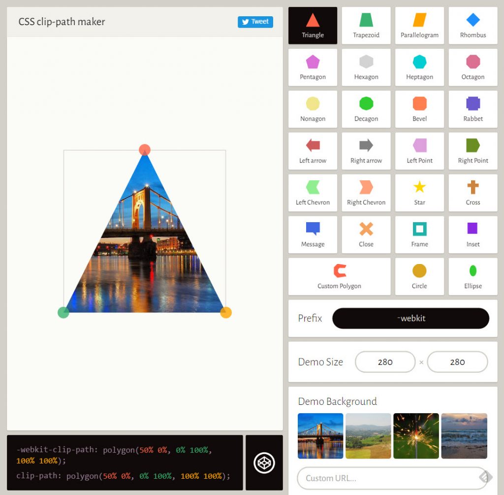
Clippy Provides an Intuitive Editor Interface. (Screenshot: Noupe)

Clippy works in a very similar way, but looks much more elegant, offering an appearance more oriented towards common interface editors. This makes getting started quite simple.

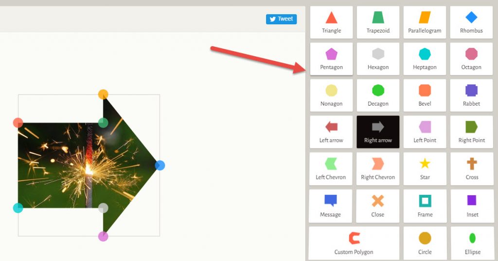
26 basic shapes are the perfect equipment for the first 1,000 steps. The button Custom Polygon takes you a couple of steps further, as it lets you build shapes that are as complex as you want them to be, by just placing path points within the image, that are automatically connected by Clippy.

Clippy Provides 26 Basic Shapes and an Editor For Your Own Complex Shapes. (Screenshot: Noupe)

On the left, you’ll always find a preview, which can be resized by entering pixels on the right, below the shape selection. The background can be changed as well. Here, Bennett has provided four examples to choose from. However, entering a URL of your desired image enables you to load it into the background as well.

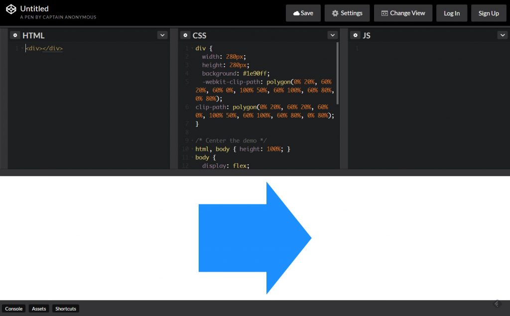
Below the preview window, there’s a permanent display of the current CSS code, which you copy into your project using the clipboard. On the basis of the displayed code, it’s also possible to switch over to Codepen and keep on experimenting there.

Directly Continue to Edit Each Code Snippet Via Links to Codepen. (Screenshot: Noupe)

Bear in mind that Clippy only generates the code for the clipping path. You have to add the respective image yourself, and the text flow surrounding the shape has to be built manually as well. To do that, use the attributes from the shape- array, like shape-outside.

In Clippy, you decide if you want to use the browser prefix webkit, which makes sure that the code works in Apple’s Safari. As of right now, there is no browser that fully supports clip-path in its entirety. clip-path is not supported at all in Microsoft’s Internet Explorer, and Edge, as well as in Opera Mini. In Firefox you will want to enable clip-path by setting the appropriate settings flag as mentioned on Caniuse.

Of course, Clippy is free to use, and does not require you to setup an account.

Categories: Others Tags:

5 psychology rules every UX designer must know

February 2nd, 2017 No comments

Experience-based design…if that’s how you define your work as a designer, it might be a good time to reevaluate your approach.

Now, there’s nothing wrong with being an experienced designer; your experience could be an asset! However, it is essential to realize that there are many moving parts in a working design. For example, do you know that you shouldn’t just drastically redesign a website? Or that the color that works on the exact same website (featuring the same thing and in the same niche) will differ if the audience was predominantly male compared to if the audience was predominantly female?

There’s a psychological approach to web design—based on decades of studies and psychology experiments. Below are five psychology-backed UX tips for your next redesign:

1) Weber’s law of just noticeable difference

Anyone who’s used Facebook over the last 5 years knows that not much has changed in that time. Facebook is a mega corporation worth over $350 billion, so you might expect a lot to have changed in three years. Why is Facebook retaining every key element of its design? The answer to this same question explains why every major website—including Google, Twitter and Amazon, despite their large budgets—do not make drastic redesigns.

It is explained by Weber’s law of just noticeable difference, which states that the slightest change in things won’t result in a noticeable difference; if you’re looking at a bulb, for example, and the light dims or brightens just a bit, you’re unlikely to notice the change—if it brightens significantly, however, you will notice the change. In the same way, if you’re carrying a weight of 100kg, removing 1kg from it is unlikely to make much of a difference in the weight, you’re unlikely to notice it. If you were to remove 10kg from the 100kg weight, however, the difference in weight becomes instantly apparent.

Research shows that we dislike a massive change in existing structures and systems, even if those changes will benefit us, and there is ample evidence that show protests when major websites make massive changes and redesign.

Simply put, Weber’s law coupled with our natural averseness to change shows that the best way to approach a redesign is subtly; make your redesign slow and subtle, changing a little here and there gradually—in such a way that most people won’t even know you’re doing a redesign—until you’ve completely revamped the redesign. Not only will this ensure your design is well accepted by the majority, but a good portion of your audience would have gotten used to your redesign before it is completed and very few will complain.

2) Understand that we respond to color differently

While we often deeply trust our instinct and experience, it is another thing for them to stand science’s test. For example, do you know that the same design that works for an audience of male readers often won’t work for an audience of female readers—even if it’s for the same website selling the very same products?

One of the most important factors you should consider when redesigning a website is the audience. Are the audience predominantly male or female? This matters a great deal!

Research has found that people will form an opinion about things within 90 seconds, and that color influences up to 90 percent of the opinion people form. The color you use for your design alone can make it a failure or success.

That said, it is important to realize that men and women see colors differently. The graphics below show the colors both men and women like as well as the colors they dislike the most:

Colors they like

Colors they dislike

Image Credit: HelpScout

When doing your next redesign, consider the audience of the website that will be using the design. Are they primarily male or female? Let their gender influence the color you use.

3) The sensory adaptation phenomenon

Have you ever wondered about why you don’t feel your clothes or shoes? Ever wondered about why, even though you were initially irritated by it, you no longer notice your neighbor’s dog’s constant barking?

This is explained by a psychological phenomenon called “sensory adaptation.” It states that we tend to tune out stimulus if we get repeatedly exposed to it—initially, we find it annoying, but later we just don’t notice it.

Now, how does this relate to web design? It’s simple: you design a website and use the very same color scheme and button color for important parts that you want the user to take action on. Due to the fact that these essential parts blend in with the design color scheme, and that people have been seeing the same color all over your design, people are naturally wired to tune them out—they don’t see the key elements on your page, and you lose out on conversions.

When designing or redesigning a website, it is essential to make your CTAs stand out; if the whole design color scheme is blue, you must not use the color blue for the CTA or to highlight the most important action on the page. Most people believe the color red or orange is the most effective for boosting conversions; it isn’t. A color red button used on a page with red color scheme will convert awfully, but a color green button on the same page will convert much better.

Use something that stands out for essential elements; this way, it doesn’t activate people’s sensory adaptation, and your conversion doesn’t suffer.

4) Type: bigger is better!

When it comes to text, designers often obsess over look and appeal: “Wow, should I use a serif?” “That new font looks dope! Let me give it a shot!” Except that psychology shows that, when it comes to design, most of the things we designers give importance to are not what the end users really care about. Why we care about aesthetics and how appealing the latest typeface will make our design appear, the average user cares about basic things like usability.

In essence, the average user cares a lot more about font size than about font type. In fact, research has shown that people want type to be bigger and simpler, and that larger type elicits a strong emotional connection in readers.

In essence, people want simple, large type. Based on data from available research, experts advise not using a font-size lesser than 16px.

5) Perceptual set

Is this a monster or a tree?

Okay, how about this, is it a vase or two faces?

What you see will differ depending on your experiences; as with the image of the “vase or two faces,” if you’re an artist, especially if you just finished working on a vase, you’re likely to see a vase in the image. If you just left a gathering of lots of people, and if you’ve not seen a vase in months, you’re likely to see two faces.

This phenomenon is explained by the “perceptual set theory,” which explains our tendency to perceive information based on our expectations, existing information and experiences. In essence, people from different cultures are likely to perceive the very same thing differently.

The implication for web designers is that people have certain expectations of web design—some general and some based on certain industries. For example, most people have a certain expectation for where a site’s navigation bar will be (in the header), putting it elsewhere (in the footer, for example) will confuse a lot of users and lead to bad user experience. The same goes for every element of your site design.

It’s good to be innovative. When you’re going to be innovative, however, make sure you include clues to guide people about the new elements. Most importantly, test people’s response to the new elements and readily change anything people do not respond well to.

LAST DAY: Mega Snow & Winter Bundle from Feingold Design – only $11!

Source

Categories: Designing, Others Tags:

Intro to Vue.js: Vuex

February 2nd, 2017 No comments

This is the fourth part in a five-part series about the JavaScript framework, Vue.js. In this part, we’ll cover Vuex for state management. This is not intended to be a complete guide, but rather an overview of the basics to get you up and running so you can get to know Vue.js and understand what the framework has to offer.

Article Series:

  1. Rendering, Directives, and Events
  2. Components, Props, and Slots
  3. Vue-cli
  4. Vuex (You are here!)
  5. Animations (Coming soon!)

Vuex

If you missed the last few sections on components and Vue-cli, you might want to go review those before reading on. Now that we know the very basics about how components and passing state and props around, let’s talk about Vuex. It’s a useful tool for state management.

Previously, we’ve passed state from a top level component down, and siblings did not share data. If they needed to talk to each other, we’d have to push the state up in the application. This works! But once your application reaches a certain complexity, this no longer makes sense to do. If you’ve worked with Redux before, all of these concepts and the implementation will be familiar to you. Vuex is basically Vue’s version of Redux. In fact, Redux will work with Vue as well, but with Vuex, you have the benefit of using a tool designed to work specifically with your framework.

First, we’ll install Vuex:

npm install vuex

or

yarn add vuex

I set it up this way: within my `/src` directory, I create another directory named store (this is a preference, you could also just create a `store.js` file in that same directory), and a file named `store.js`. The initial set up in `store.js` would look something like this (vstore sublime snippet):

import Vue from 'vue';
import Vuex from 'vuex';

Vue.use(Vuex);

export const store = new Vuex.Store({
  state: {
    key: value
  }
});

key: value is a placeholder for any kind of state data. In other examples we’ve used counter: 0.

In our `main.js` file, we’d perform the following updates (updated lines highlighted):

import Vue from 'vue';
import App from './App.vue';

import { store } from './store/store';

new Vue({
  el: '#app',
  store: store,
  template: '<App/>',
  components: { App }
});

After we get it set up, we can place our data() in the file as the state as we’ve previously done with components, and then we’ll either use this state or update it with the following three means:

  • Getters will make values able to show statically in our templates. In other words, getters can read the value, but not mutate the state.
  • Mutations will allow us to update the state, but they will always be synchronous. Mutations are the only way to change data in the state in the store.
  • Actions will allow us to update the state, asynchronously, but will use an existing mutation. This can be very helpful if you need to perform a few different mutations at once in a particular order.

Sometimes it’s difficult to understand why you might work with asynchronous state changes if you haven’t before, so let’s first go over how that would happen in the abstract and then dive into something real in the next section. Let’s say you’re Tumblr. You have a ton of heavy gifs on a page that doesn’t end for a long time. You only want to load a certain amount at a time, say 20, until the user gets 200px away from the bottom of the original page.

You could have a mutation that displays the next 20. But you don’t have the next 20 yet, nor do you know when you hit the bottom of the page. So, in the app itself, you create an event that listens to the scroll position and you trigger an action.

The action then retrieves the URLs from the database for the next 20 images, and wraps the mutation, which adds the 20 images to the state and displays them.

Actions, in essence, create a framework for requesting data. They give you a consistent way to apply the data in an asynchronous manner.

Most Basic Abstract Example

In the example below, we’re showing the most basic implementation of each, so you get a sense of the setup and how it would work. Payload is an optional parameter. You can define the amount you are updating the component by. Don’t worry, we’ll use an actual demo in a moment, it’s just important to get the base concepts first.

In `store.js`:

export const store = new Vuex.Store({
  state: {
    counter: 0
  },
  //showing things, not mutating state
  getters: {
    tripleCounter: state => {
      return state.counter * 3;
    }
  },
  //mutating the state
  //mutations are always synchronous
  mutations: {
    //showing passed with payload, represented as num
    increment: (state, num) => {
      state.counter += num;
    }
  }, 
  //commits the mutation, it's asynchronous
  actions: {
    // showing passed with payload, represented as asynchNum (an object)
    asyncDecrement: ({ commit }, asyncNum) => {
      setTimeout(() => {
        //the asyncNum objects could also just be static amounts
        commit('decrement', asyncNum.by);
      }, asyncNum.duration);
    }
  }
});

A really nice feature here is we can return the entire state object in the mutations, but we don’t have to, we can just use what we need. Time travel debugging (walking through the mutations to find errors) will still work either way.

On the component itself, we would use computed for getters (this makes sense because the value is already computed for us), and methods with dispatch to access the mutations and actions:

In `app.vue`:

computed: {
  value() {
    return this.$store.getters.value;
  }
},
methods: {
  increment() {
    this.$store.dispatch('increment', 2)
  }
}

Or, you can use a spread operator. I find this useful when you have to work with a lot of mutations/actions:

export default {
  // ...
  methods: {
    ...mapActions([
      'increment', // map this.increment() to this.$store.commit('increment')
      'decrement',
      'asyncIncrement'
    ])
  }
}

Simple Real Example

Let’s look at the Weather Notifier App again, with a very small and simple amount of state in the Vuex store. Here’s the repo.

See the Pen Vue Weather Notifier by Sarah Drasner (@sdras) on CodePen.

In `store.js`:

import Vue from 'vue';
import Vuex from 'vuex';

Vue.use(Vuex);

export const store = new Vuex.Store({
  state: {
    showWeather: false,
    template: 0
  },
    mutations: {
      toggle: state => state.showWeather = !state.showWeather,
      updateTemplate: (state) => {
        state.showWeather = !state.showWeather;
        state.template = (state.template + 1) % 4;
      }
  }
});

Here, we’re setting the state of showWeather, this is set to false at first because we don’t want any of the animations firing right away, not until the user hits the phone button. In mutations, we set up a toggle for the state of showWeather.

We’re also setting the template to 0. We’ll use this number to cycle through each of the weather components one by one. In mutations, we have a method for updateTemplate. This both toggles the state of showWeather, and sets the template to the next number, but it will wrap around to zero when it hits the number 4.

In App.vue:

<template>
  <div id="app">
    ...
    <g id="phonebutton" @click="updateTemplate" v-if="!showWeather">
       ...
    </g>

    <transition 
        @leave="leaveDroparea"
        :css="false">
      <g v-if="showWeather">
        <app-droparea v-if="template === 1"></app-droparea>
        <app-windarea v-else-if="template === 2"></app-windarea>
        <app-rainbowarea v-else-if="template === 3"></app-rainbowarea>
        <app-tornadoarea v-else></app-tornadoarea>
      </g>
    </transition>
    ...

  </div>
</template>
<script>
  import Dialog from './components/Dialog.vue';
  ...
  export default {
    computed: {
      showWeather() {
        return this.$store.state.showWeather;
      },
      template() {
        return this.$store.state.template;
      }
    },
    methods: {
      updateTemplate() {
        this.$store.commit('updateTemplate');
      }
    },
    ...
    components: {
      appDialog: Dialog,
      ...
    }
}
</script>

In `dialog.vue`:

<script>
export default {
  computed: {
    template() {
      return this.$store.state.template;
    }
  },
  methods: {
    toggle() {
      this.$store.commit('toggle');
    }
  },
  mounted () {
  	//enter weather
  	const tl = new TimelineMax();
    ...
  }
}
</script>

In the component itself, we’re listening to the changes of state in store with the computed showWeather() and template() functions, and using toggle() and updateTemplate() in the methods to actually commit to the store’s mutations. App uses showWeather to advance the template and toggle the animations, while Dialog merely toggles the component visibility. You can also see how we are showing and hiding different child components based on the value of template in the App , and toggling the state with updateTemplate().

This is a pretty basic example, but you can see how with a complex app with tons of state, it would be helpful to manage the state all in one place, rather than moving it up and down our components. Particularly when siblings need to talk to siblings.

If you’re interested in digging into Vuex deeper, there are great docs here. You might have noticed that we used some components in this last demo, as well as lot of animations. Let’s talk about that next!

Article Series:

  1. Rendering, Directives, and Events
  2. Components, Props, and Slots
  3. Vue-cli
  4. Vuex (You are here!)
  5. Animations (Coming soon!)

Intro to Vue.js: Vuex is a post from CSS-Tricks

Categories: Designing, Others Tags:

The Art of Labeling

February 2nd, 2017 No comments

There’s a lot of neat tricks in this video by Rob Dodson where he focuses on accessibility tricks in Chrome’s DevTools. A few notes:

  • Chrome DevTools has an experimental feature to help with accessibility testing that you can unlock if you head to chrome://flags/ and turn on in the DevTools settings.
  • Wrapping an in a gives the input a name of the text in the label, even without a for attribute.
  • The aria-labelledby attribute overrides the name of the element with the text taken from a different element, referenced by ID. It can even compose a name together from multiple elements, including itself.
  • Adding tabindex='0' to an element will make it focusable.

Direct Link to ArticlePermalink


The Art of Labeling is a post from CSS-Tricks

Categories: Designing, Others Tags:

A Couple SVG Icon Links

February 2nd, 2017 No comments
  • WordPress’ new TwentySeventeen default theme uses an SVG icon system. It was contributed by Sami Keijonen who had some prior experience in that, and wrote up a bit about it here. The theme has functions that spit out correct/accessible markup for them.
  • Webpack now has a SVG sprite loader, which allows you to import myGreatIcon from './my-great-icon.svg'; like you do with other resources in webpack.
  • Both aforementioned projects note IE/Edge’s lack of ability to from a file path and thus recommend svgxuse and svg4everybody respectively.
  • I still haven’t seen anyone talk about an SVG icon system where they say, screw it, we’re running HTTP/2, we’re just going with . I’ve also never seen an SVG icon system that utilized fragment identifiers (Safari and Android are problematic here, so that’s not terribly surprising).

A Couple SVG Icon Links is a post from CSS-Tricks

Categories: Designing, Others Tags:

Mobile-First Is Just Not Good Enough: Meet Journey-Driven Design

February 2nd, 2017 No comments

In a recent sales meeting for a prospective healthcare client, our team at Mad*Pow found ourselves answering an all-too-familiar question. We had covered the fundamental approach of user-centered design, agreed on leading with research and strategy, and everything was going smoothly. Just as we were wrapping up, the head of their team suddenly asked, “Oh, you guys design mobile-first, right?”

Well, that’s a difficult question to answer. While the concept of mobile-first began as a philosophy to help prioritize content and ensure positive, device-agnostic experiences, budgetary and scheduling constraints often result in mobile-first meaning mobile-only.

The post Mobile-First Is Just Not Good Enough: Meet Journey-Driven Design appeared first on Smashing Magazine.

Categories: Others Tags:

WordPress: Use Lightroom to Load Images Into Your Blog

February 2nd, 2017 No comments
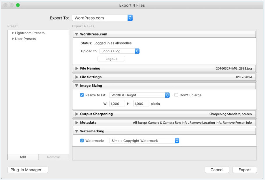
Export and Upload Directly From Within Lightroom. (Screenshot: Automattic)

Are you a user of Adobe’s photo lab Lightroom, and do you run a blog on the WordPress foundation? If yes, you have already met the majority of requirements to use the new free Lightroom plugin by Automattic.

Time Saver For Photo Bloggers: Upload Directly from Lightroom

If your blog runs on WordPress.com, the cloud solution of the WordPress creators, there is nothing that stops you from using the Lightroom plugin. If you’re using a self-hosted variant, you’ll also need the Jetpack plugin, which we’ve already given some useful advice on here.

Export and Upload Directly From Within Lightroom. (Screenshot: Automattic)

Another requirement for the successful operation is a Lightroom license, such as subscribers of the Creative Cloud should have, as Automattic’s Lightroom plugin is not a plugin for WordPress, but one for Lightroom. Once installed, it connects your Lightroom installation to one or multiple of your blogs. The respective target blog can be selected comfortably in the export dialog.

The Lightroom Plugin Offers Many Settings

While exporting your photos from Lightroom, you get to define many different settings. This allows you to set the maximum resolution, as well as the compression rate, and a naming convention for the exported files. When it comes to resolution and compression, you can go all out. This assures that even HiDPI devices will always get to see the best version of your photos. WordPress takes care of the required cropping.

Lightroom Plugin: the Export Dialogue. (Screenshot: Automattic)

However, you should definitely keep our tip on Optimus HQ in mind. This plugin compresses your uploads on the fly. You don’t have to do anything else.

During the export from Lightroom, the images can even be sharpened automatically. If your pictures have titles, or captions, WordPress will automatically keep them intact. The export and upload occurs in the background, without any action from you being needed.

If you’re already using Jetpack as it is, you already know that using it requires a WordPress.com account, even if you are self-hosted. If you didn’t know that, just go ahead and create one. It’s free and uncomplicated. For any concerns regarding data protection law, check out our article on Jetpack linked above.

Here, you’ll find the Lightroom plugin by Automattic available for download.

Categories: Others Tags:

JotForm 4.0: The Next Revolution in Form Design is Here

February 2nd, 2017 No comments
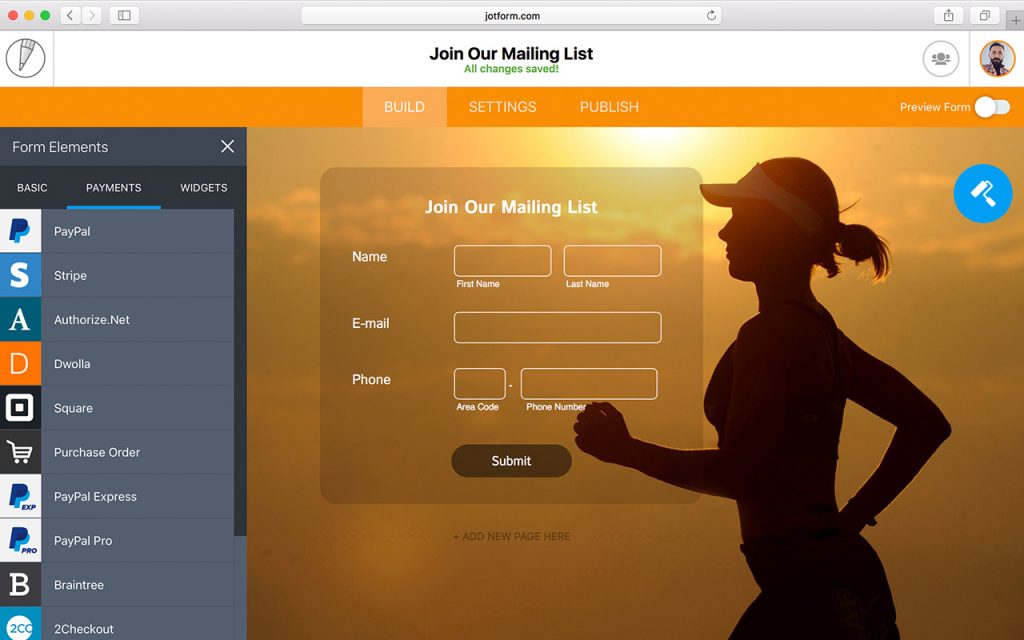
JotForm 4: Offline Editing. (Image: JotForm)

Noupe readers know that we really do love JotForm over here. Up until today we thought we couldn’t expect more but JotForm surprised us one more time. With JotForm 4 they are revolutionizing form design again.

JotForm: Innovative Since 2006

JotForm is a dinosaur in terms of the web. It’s been ten years since they started out on their mission to provide the world with the best form builder available. Today JotForm is proud to have 2.5 million users working with their product.

We here at Noupe support JotForm since 2014. 2014 was the year where JotForm introduced their revamped form designer. They really got me excited that day. I wrote this article. Last autumn we gathered the top six reasons why designers should use JotForm and found a service that kept getting better and better still.

At that point, JotForm allowed you to create forms that

  • work responsively on any device,
  • are lightning-fast, both to set up and to execute,
  • are secure, by using form encryption and SSL by default,
  • allow full design customization, even through custom CSS,
  • are stored in compliance with local data privacy regulations, so that even Europeans can use them without hard feelings,
  • offer integration with more than 100 third-party services, such as SalesForce, MailChimp, Dropbox and others,
  • can be used to collect payments via PayPal, Stripe and others,
  • let you integrate almost any thinkable element, such as image sliders, YouTube videos or SoundCloud files quickly,
  • can execute conditional logic to react to form input individually.

You might assume that such a feature-rich product should be hard to get accustomed to, but the opposite is the case. JotForm is almost intuitive to use, no learning curves involved.

I was totally satisfied with the feature set that was available last fall.

JotForm 4, Next Generation Form Building

These days JotForm rolls out its newest iteration, JotForm 4. And I have to admit that I was skeptical at first. They created quite a buzz in the industry and before I got to know their latest offering I thought they were just beating the big drum for something only slightly altered from the version before.

Boy, was I wrong. JotForm 4 really is a revolution in form building and design. All the features we already loved have improved. More lovable features have been added. Let me highlight my favorites.

Should you not have the time to read on, watch the following video. It’s only two and a half minutes long and will give you a solid impression of what to expect as well:

Mobile Form Building and Design

JotForm has already been able to create forms that work flawlessly on any device. From version 4 on you can not only build forms for mobile devices, you can even build them from mobile devices.

I don’t know whether you are going to roam the forests busy building web forms from now on but if you’d wanted to you could. Technically the option of building complex forms from smartphones is not trivial. So cudos to the JotForm team for making this possible.

Offline Editing and Real-Time Collaboration

Should you lose the web connection while roaming the woods, don’t worry. JotForm 4 will synchronize all your edits the next time the internet connection reappears. No longer lost work, thanks to continuous storing and offline support. Yes, you read that right. Continuous saving is one of the new features as well.

JotForm 4: Offline Editing. (Image: JotForm)

This allows for an elaborate revision history that lets users view a history of revisions made to any form and easily revert back to a previous version with a single click which will then be written into the revision history as well 😉

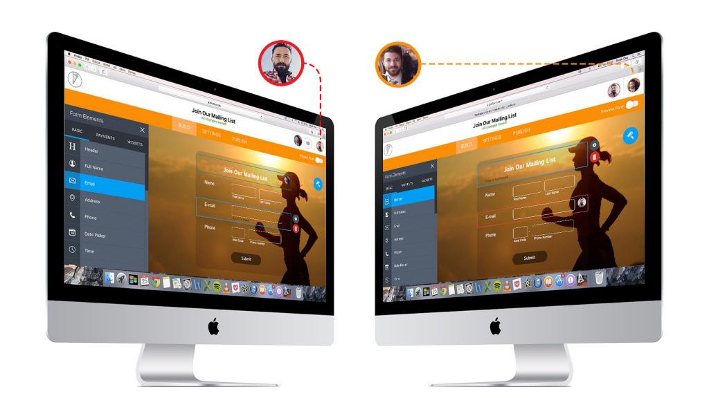
Collaboration has been possible before, but with JotForm 4 it becomes real-time collaboration. You can now work on forms with your team much like in Google Docs. Changes are immediately synced team-wide. Everyone always works with the most recent version of the form.

JotForm 4: Real-time Collaboration. (Photo: JotForm)

Tighter Integration of Form Designer and Theme Store

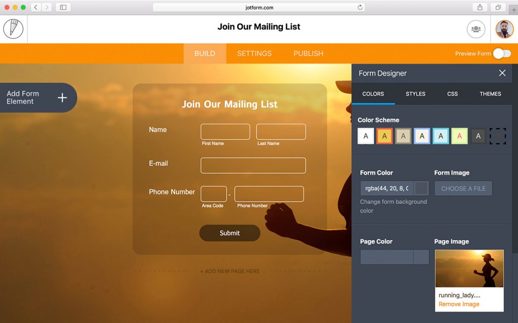
The Form Designer has been the most attractive addition to the feature range of JotForm back in 2014. Shortly after that JotForm introduced the Theme Store that we covered in this article. Form Designer allowed you to prettify your forms and create a kind of template from that design. The template could then be sold or given away through the Theme Store which basically is a market place for common and not so common form needs.

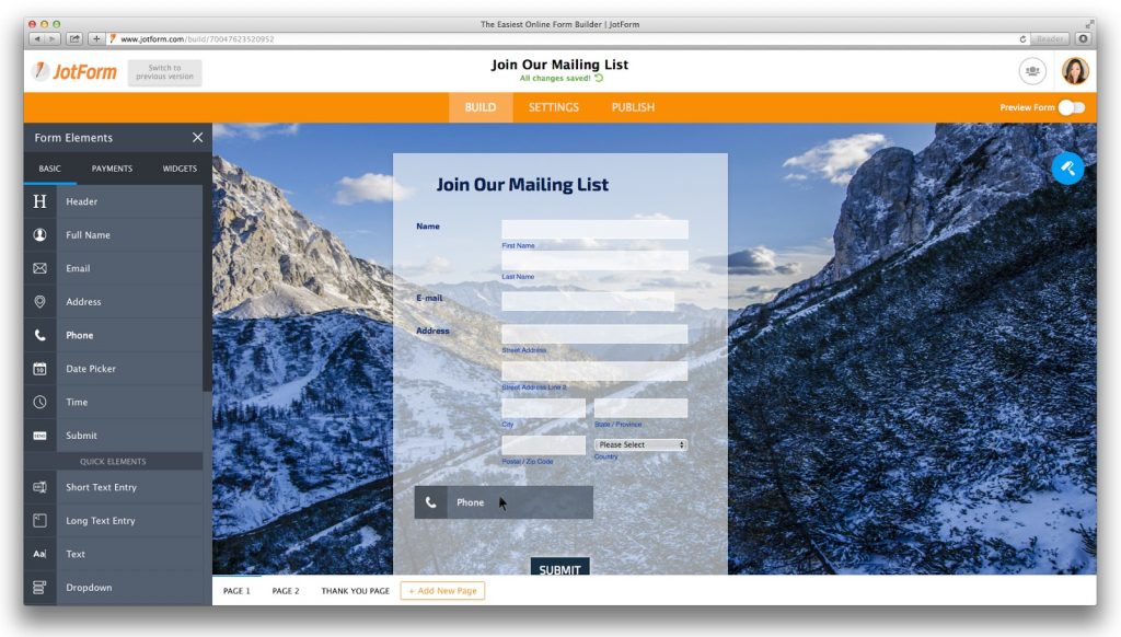
JotForm 4: Form Designer is now fully integrated into the Builder. (Screenshot: JotForm)

JotForm 4 makes both the Form Designer and the Theme Store directly accessible from within the form builder. You no longer need to switch views too reach either of these which makes for a much smoother work flow.

Updated and Improved Functionality

Besides these shiny new additions to the feature set JotForm revamped some of their functions to streamline the product even more.

Smoother Drag and Drop

Dragging form fields from one area to another has been improved for a smoother experience, including between different pages in a single form.

JotForm 4 brings a smoother drag and drop experience. (Screenshot: JotForm)

In-Page Preview

Previously, users could preview a form within a smaller pop-up. With JotForm 4 form previews now display in the same window in their full size, and can be toggled on and off with a single click.

User Friendliness

From the insights of 18 months of user testing data, JotForm incorporated the best aspects and improved the overall design and UI experience.

Improved Pagination

Instead of adding a Page Break field in order to separate a form into multiple pages, users can now add new pages to their forms with a single click.

Improved Wizards

All of JotForm’s wizards have been updated for greater ease of use. Form Settings, Conditional Logic, Emails, Integrations, and Thank You Page wizards are now located on their own tab for easier updating. Also placed into a separate tab are wizards for Quick Share, Embed, and Platforms. In-page wizards, such as Payment and Question Properties, have been updated for readability and organization.

JotForm 4: Improved Integrations Panel. (Screenshot: JotForm)

New Features, Old Pricing

It was always a plus of JotForm that price-wise they did keep in mind that forms are just forms. Their offering has always been moderately priced and this does not change even with the massively improved JotForm 4.

All the paid plans are permeable, so you can start with the Free Plan to see whether the product is for you and upgrade from there to Bronze for 19 USD to Silver for 39 USD to Gold for 99 USD. The plans are priced as a monthly recurring subscription which you can cancel at any time. That’s what I call fair.

Now go and see for yourself. I told you, it’s free. No risk involved.

Categories: Others Tags: