Archive

Archive for February, 2017

Is Your Business Ready for Innovation?

February 23rd, 2017 No comments

Some of you might be familiar with the Diffusion of Innovation. It is a theory that seeks to explain how new ideas and technology spread and is typically used to explain consumers’ adoption of technology.

Through our course of work, we’ve come to realise this theory can also be used to describe the readiness of a business for innovation.

Innovators

First we have the Innovators. They are companies that view innovation as a driver for their business. They constantly look at what they can do next, investing in R&D to create new technology, products and services to better serve their customers needs. They have a great creative culture, experiment often and learn from failure.

For them, being so ahead of the curve, they need to educate others on the benefits that their new product or services offer.

Early Adopters

Early adopters are open to, but cautious about innovation. They are typically very aware of what leading businesses in their industry and similar industries are doing. After doing their homework, they create their own products and services inspired by what the innovators are doing.

Being earlier on the curve, their challenge is to convince customers of the value they provide and to adopt the solutions offered.

Early Majority

They try new ways of doing things, but are less consistent with doing so. They know they should innovate and are driven to do so due to a competitive business environment.

They typically innovate from outside in, focusing more on products and services they deliver, sometimes forgetting to change their internal processes to support what they deliver. They need to look their businesses not just from the front-end but also the back-end, so they continue to deliver what they aspire to do.

Late Majority

Being less open to innovation, they wait to see what works and what doesn’t work, enabling them to avoid the common pitfalls. They focus their energies on providing those products and services they are sure people need, but in a more efficient and streamlined manner.

As they arrive later on the market, gaining market share is a challenge as the innovators, early adopters and early majority have taken up a good chunk of market share.

Laggards

Typically the most risk averse, they wait until almost all their peers and competitors have moved ahead before they realise “I need to do something”. They may not keep up with technology, often updating their processes only because the old way is far too inefficient and the new way is the norm.

They are often caught in a situation where they have to compete with other more innovative businesses. Due to their lack of innovation, they find it hard to survive. A vicious cycle of daily fire-fighting drains time and money, affording them little capacity for innovation.

What do you all think? We love to hear your thoughts, let us know in the comments below!

The post Is Your Business Ready for Innovation? appeared first on Design Sojourn.

Categories: Designing, Others Tags:

What is Design Worth? A Masterclass on Design’s Value

February 23rd, 2017 No comments
MethodologyBanner-DebRobb

Our partners Methodology.sg is running an awesome Masterclass workshop called: DESIGN LEADERSHIP: How to Identify and Communicate the Value of Design.
Details as follows:

Design as a Strategy is the next big thing. Enlightened companies such as Apple, Dyson and PepsiCo have bet on Design and won. But to bet on something you need to know its value, unfortunately many designers and creatives find it hard to identify and put a value on design. Thus communicating and articulating this value to business stakeholders becomes a big challenge.
Our next Masterclass Workshop Design Leadership – Identifying and Communicating the Value of Design was created to solve this challenge.
Delivered by expert and renown Design Leaders, Robb Ziegler & Deb Mrazek, this workshop is ideal for Creatives, Policy Makers, Design Managers, Account Directors, Design Educators or Design Thinkers who want to bridge the gap between their passion in Design and the value of their work.
Date: 9 – 10 March 2017
Time: 9.00am – 5.30pm
Price: $1,200 nett (Original Price $1,700)
More: http://methodology.sg
Spaces are limited, so email admin@methodology.sg to reserve your place now!

The post What is Design Worth? A Masterclass on Design’s Value appeared first on Design Sojourn. Please click above if you cannot see this post.
Categories: Designing, Others Tags:

What is Design Worth? A Masterclass Workshop on Design’s Value

February 23rd, 2017 No comments
MethodologyBanner-DebRobb

Our partners Methodology.sg is running an awesome Masterclass workshop called: DESIGN LEADERSHIP: How to Identify and Communicate the Value of Design.

Details as follows:

Design as a Strategy is the next big thing. Enlightened companies such as Apple, Dyson and PepsiCo have bet on Design and won. But to bet on something you need to know its value, unfortunately many designers and creatives find it hard to identify and put a value on design. Thus communicating and articulating this value to business stakeholders becomes a big challenge.

Our next Masterclass Workshop Design Leadership – Identifying and Communicating the Value of Design was created to solve this challenge.

Delivered by expert and renown Design Leaders, Robb Ziegler & Deb Mrazek, this workshop is ideal for Creatives, Policy Makers, Design Managers, Account Directors, Design Educators or Design Thinkers who want to bridge the gap between their passion in Design and the value of their work.

Date: 9 – 10 March 2017
Time: 9.00am – 5.30pm
Price: $1,200 nett (Original Price $1,700)
More: http://methodology.sg
Spaces are limited, so email admin@methodology.sg to reserve your place now!

The post What is Design Worth? A Masterclass Workshop on Design’s Value appeared first on Design Sojourn.
Categories: Designing, Others Tags:

Best of 2016: 100 Free WordPress Themes

February 23rd, 2017 No comments

There is nothing permanent under the moon. Though, it seems that this truth constantly avoids WordPress since year after year we see only improvements from its side.
Started as a platform for blogging, this incredible CMS has grown up into a sterling website builder. It is with us for more than a decade and it surely is not going anywhere in the near future. According to the latest statistics, it has already powered a quarter of all the websites on the Web (and this is almost 250 million sites). And that’s not just small blogs or local personal portfolios. It provides a solid foundation for the 30% of the most popular and content-heavy portals around the Globe including such Goliaths as Mashable, Bloomberg, Microsoft, Samsung, MTV and so on.
Speaking in 72 languages it gathers under one roof numerous nationalities, becoming a truly universal tool. It has a relatively intuitive system that can be improved by means of plugins and themes in just several clicks. It has everything to build a place where you can communicate with the online audience, share interesting facts, show your works or even sell your goods. With all that, it still remains an open-source project: free, without hidden fees and “traps».

A gazillion of people both newbies and professionals are already enjoying benefits from it, so why not to start your adventure. Just download the CMS, and we will provide you with the best free WordPress themes from 2016. Choose one and get down to business.

All the themes listed below are fully responsive. Some of them are ideal partners to start your blog or magazine; others can be used to promote your products and even open your e-store.

Muso

Creator: Bandthemes
License: GPLv2.

Teletype


Creator: Dinev Dmitry
License: GPLv2.

Planum


Creator: Dinev Dmitry
License: GPLv2.

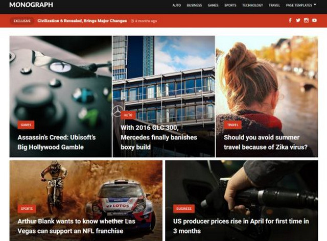
Monograph


Creator: ilovewp
License: GPLv2.

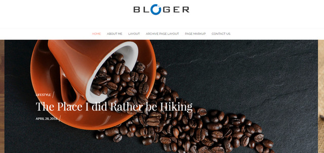
Blogger


Creator: ilovewp
License: GPLv2.

Writee


Creator: Scissor Themes
License: GPLv2.

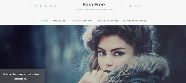
Fora


Creator: Rizzo Andrea Luigi
License: GPLv2.

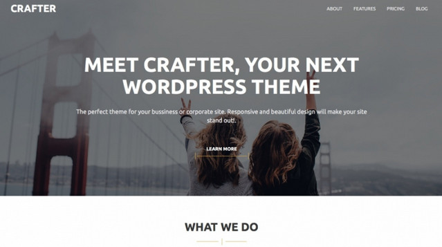
Crafter


Creator: Quema Labs
License: GPLv2.

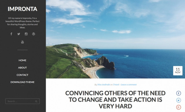
Impronta


Creator: Quema Labs
License: GPLv2.

Caos


Creator: Quema Labs
License: GPLv2.

Ocin Lite


Creator: Quema Labs
License: GPLv2.

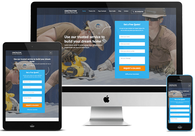
Construction Landing


Creator: Rara Theme
License: GPLv2.

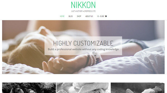
Nikkon


Creator: Kaira web
License: GPLv2.

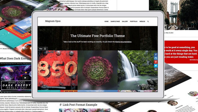
Magnum Opus


Creator: Michael Van Den Berg
License: GPLv2.

Alpha Centauri


Creator: Michael Van Den Berg
License: GPLv2.

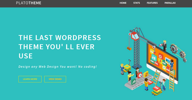
Plato


Creator: Alexitsios
License: GPLv2.

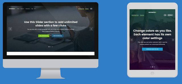
BusinessX


Creator: Alexandru Cosmin
License: GPLv2.

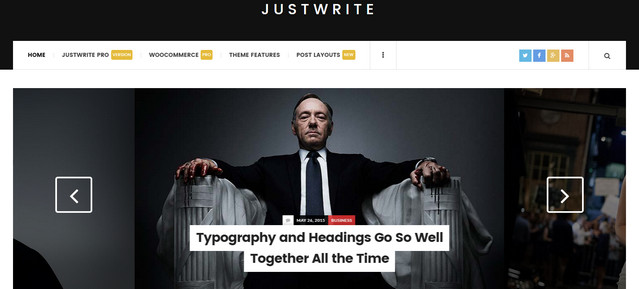
JustWrite


Creator: Alexandru Cosmin
License: GPLv2.

Imagined


Creator: electricwp
License: GPLv2.

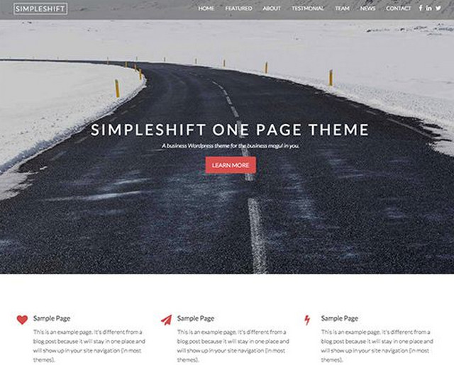
SimpleShift


Creator: Themeshift
License: GPLv2.

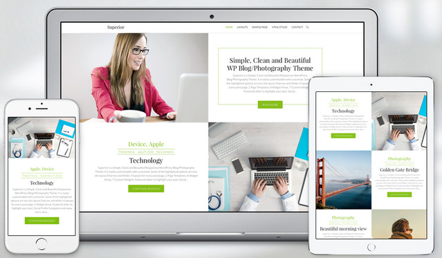
Superior


Creator: Theme Horse
License: GPLv2.

NewsCast


Creator: Theme Horse
License: GPLv2.

Bohaute


Creator: fashion blogger
License: GPLv2.

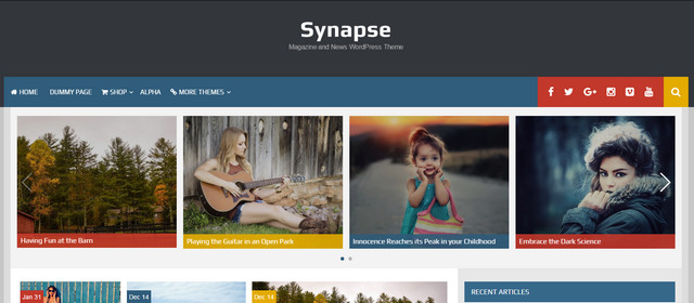
Synapse


Creator: Rohit Tripathi
License: GPLv2.

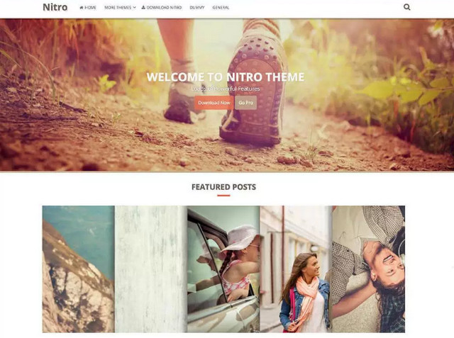
Nitro


Creator: Rohit Tripathi
License: GPLv2.

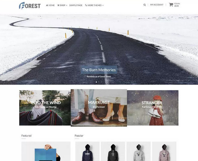
Forest


Creator: Rohit Tripathi
License: GPLv2.

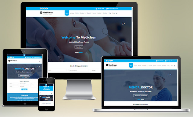
Mediclean


Creator: wen themes
License: GPLv2.

Shopstar


Creator: Out the Box
License: GNU General Public License.

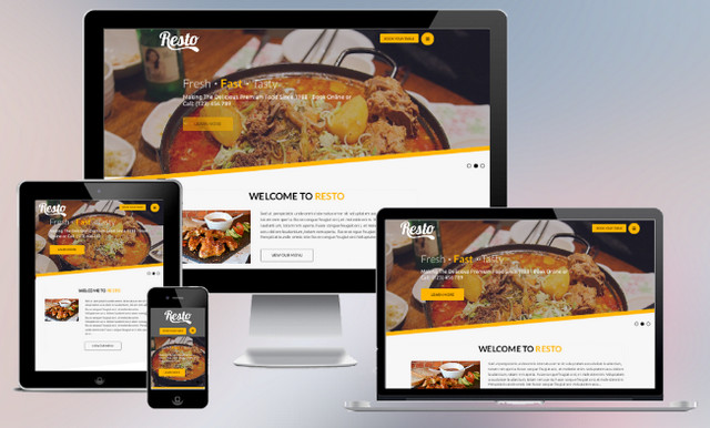
Resto


Creator: Evision Themes
License: GPLv2.

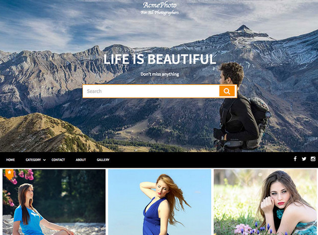
AcmePhoto


Creator: Acme Themes
License: GPLv2.

Launch


Creator: Themely
License: GPLv2.

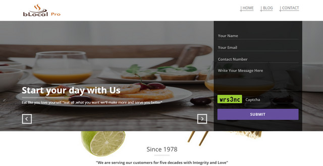
Blocal


Creator: InfoTuts
License: GPLv2.

Rock Star


Creator: Catch Themes:
License: GPLv2.

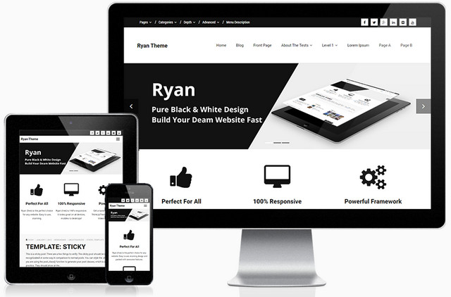
Ryan


Creator: ThinkUpThemes
License: GPLv2.

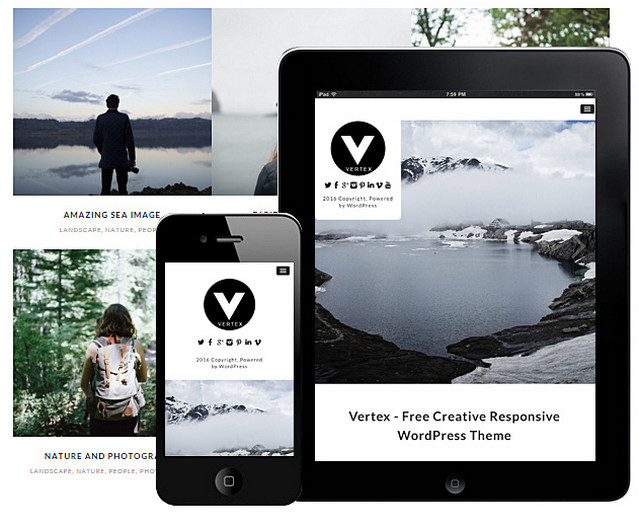
Vertex


Creator: Dessign Themes
License: GPLv2.

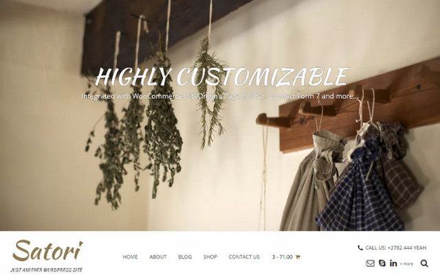
Satori


Creator: Kaira
License: GPLv2.

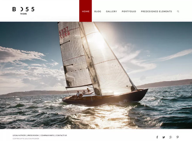
Boss


Creator: Divpusher
License: GPLv2.

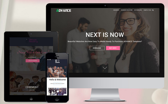
Advance lite


Creator: Imon Themes
License: GPLv2.

Rock n Rolla


Creator: Bandthemes
License: GPLv.2.

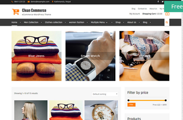
Clean Commerce


Creator: Wen Themes
License: GPLv2.

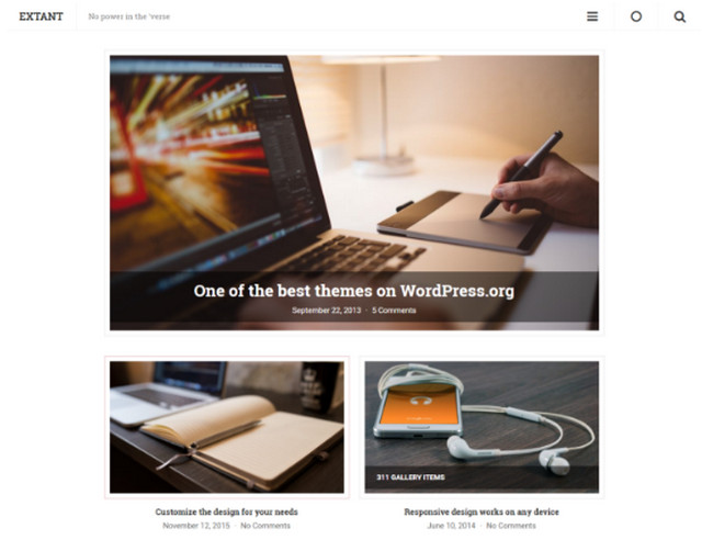
Extant


Creator: Justin Tadlock
License: GPLv2.

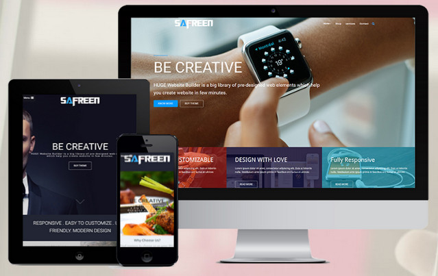
Safreen


Creator: Imon Themes
License: GPLv2.

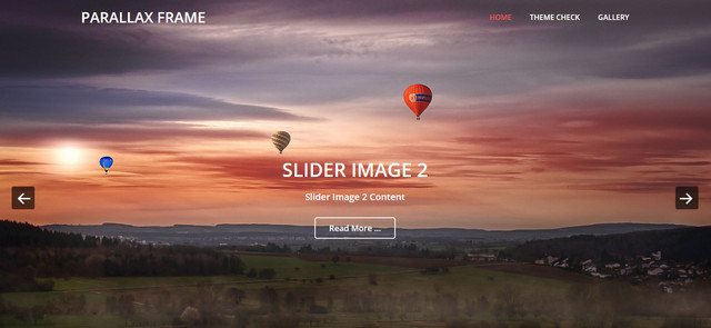
Parallax Frame


Creator: Catch Themes
License: GPLv2.

Masonry


Creator: Dessign Theme
License: GPLv2.

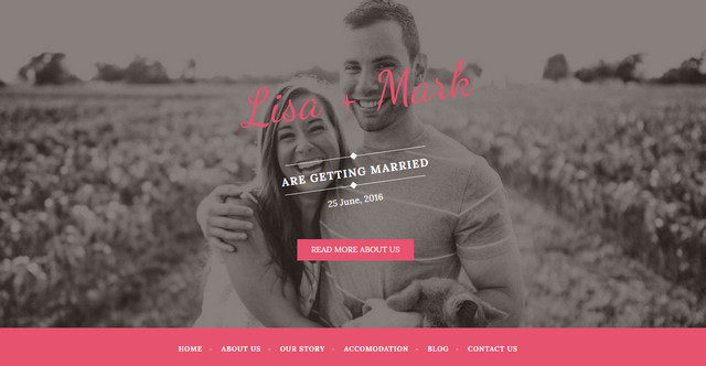
Wedding Bride


Creator: Alexitsios
License: GPLv2.

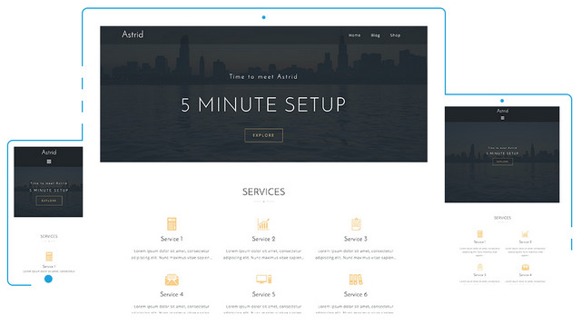
Astrid


Creator: aThemes
License: GPLv2.

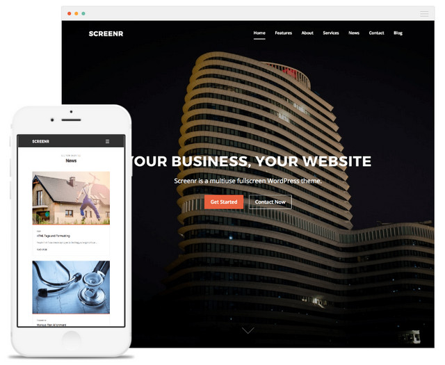
Screenr


Creator: FameThemes
License: GPLv2.

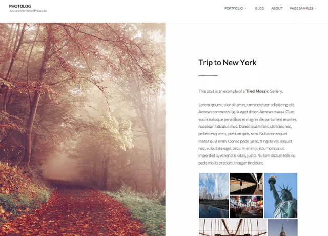
PhotoLog


Creator: Thad Allender
License: GPLv2.

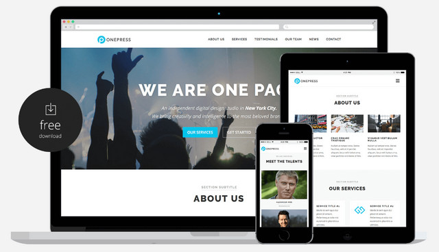
OnePress


Creator: Famethemes
License: GPLv2.

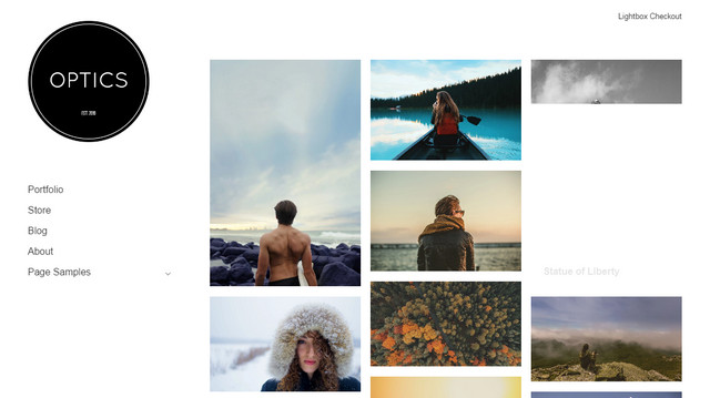
Optics


Creator: graph paper press
License: GPLv2.

Sider


Creator: graph paper press
License: GPLv2.

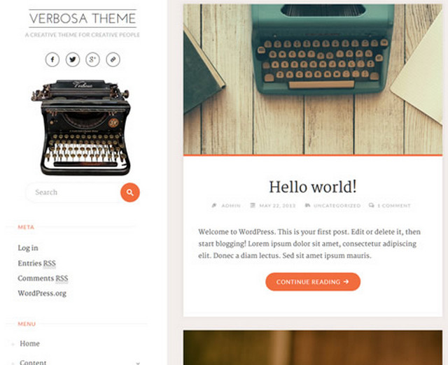
Verbosa


Creator: Cryout Creations
License: GPLv2.

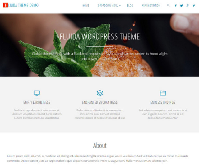
Fluida


Creator: Cryout Creations
License: GPLv2.

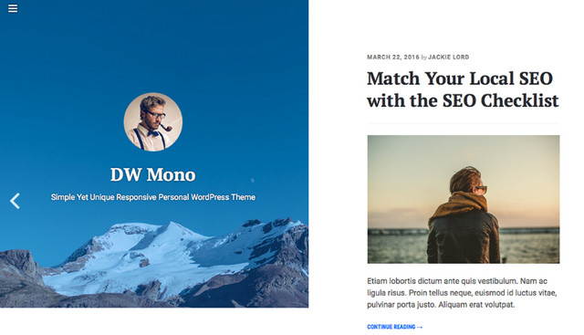
DW Mono


Creator: Design Wall
License: GPLv2.

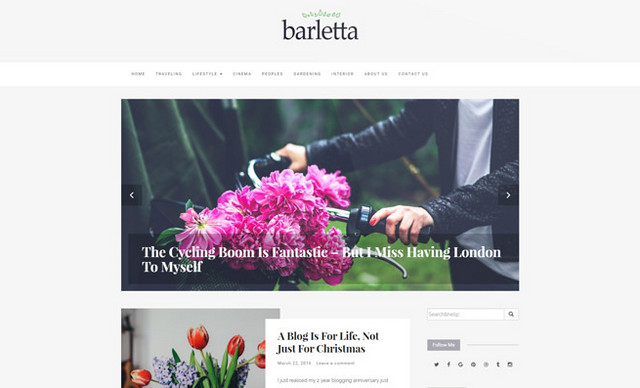
Barletta


Creator: Mooz Themes
License: GPLv2.

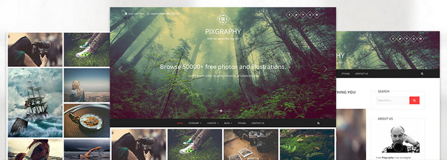
Pixgraphy


Creator: Themefreesia
License: GPLv3.0.

ShopIsle


Creator: Themeisle
License: GPLv2.

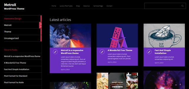
MetroX


Creator: Themeisle
License: GPLv2.

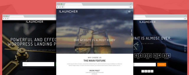
The Launcher


Creator: Accesspressthemes
License: GPLv3.

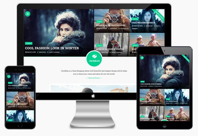
Faceblog


Creator: Mystery Themes
License: GPLv2.

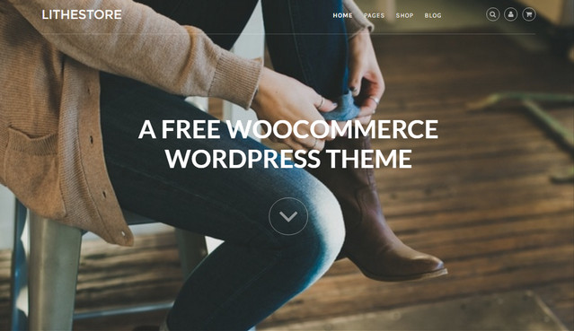
LitheStore


Creator: John Wu
License: GPLv2.

PhotoBook


Creator: DaisyThemes
License: GPLv2.

FoodHunt


Creator: Themegrill
License: GPLv2.

Creattica


Creator: wpHoot
License: GPLv3.

Customizr


Creator: Nicolas GUILLAUME
License: GPLv2.

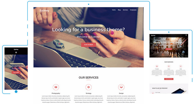
Sydney


Creator: aThemes
License: GPLv2.

Silk Lite


Creator: pixelgrade
License: GPLv2.

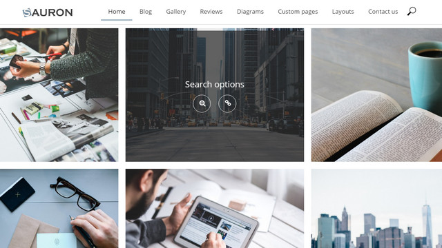
Sauron


Creator: Web Dorado
License: GPLv2.

BlogIM


Creator: indigothemes
License: GPLv2.

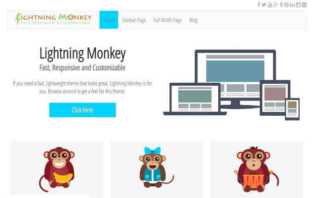
Lightning Monkey


Creator: Stratosphere Digital
License: GPLv2.

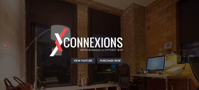
Connexions Lite


Creator: SketchThemes
License: GPLv2.

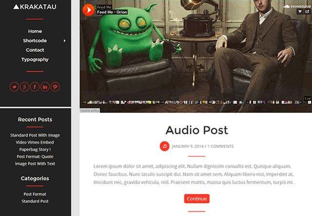
Krakatau


Creator: Themes Awesome
License: GPLv2.

Kiyoshi


Creator: felixdorner
License: GPLv2.

WpF Flatty


Creator: A1ideas
License: GPLv2.

Photo Perfect


Creator: WEN Themes
License: GPLv2.

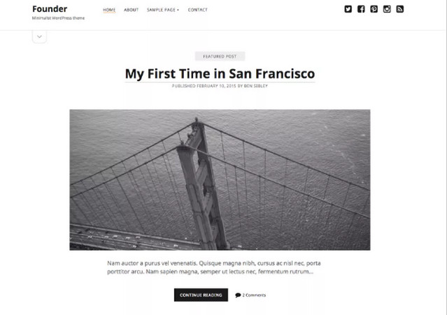
Founder


Creator: Ben Sibley
License: GPLv2.

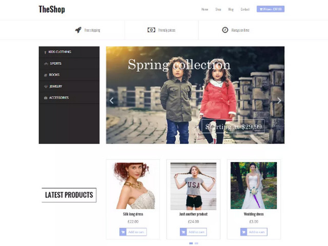
The Shop


Creator: aThemes
License: GPLv2.

Realistic


Creator: Asmi Khalil
License: GPLv2.

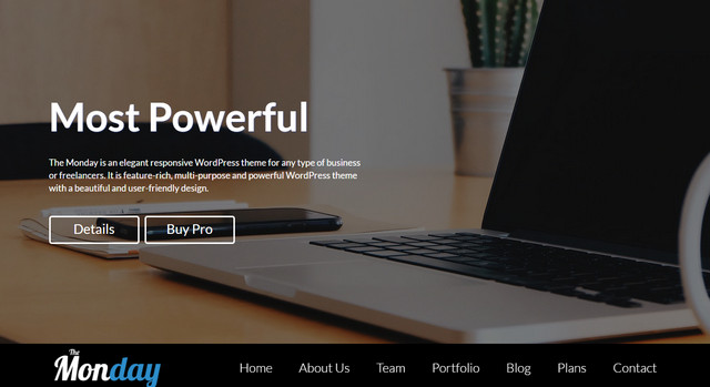
The Monday


Creator: Access Press Themes
License: GPLv2.

Politics


Creator: Rescue Themes
License: GPLv2.

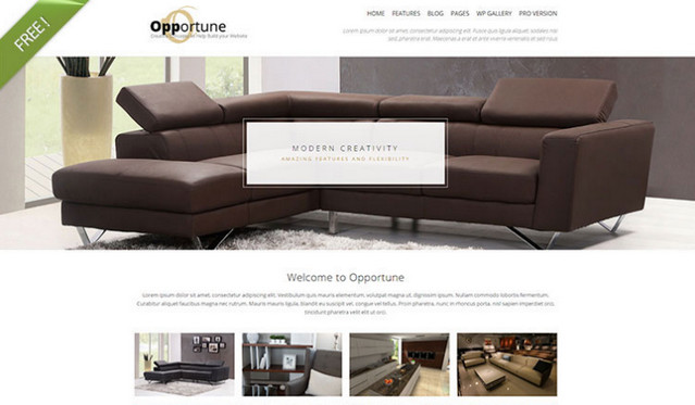
Opportune


Creator: Shaped Pixels
License: GPLv2.

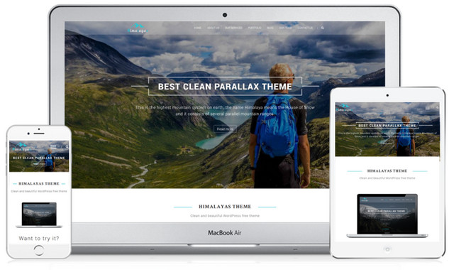
Himalayas


Creator: ThemeGrill
License: GPLv2.

Allegiant


Creator: Cpothemes
License: GPLv2.

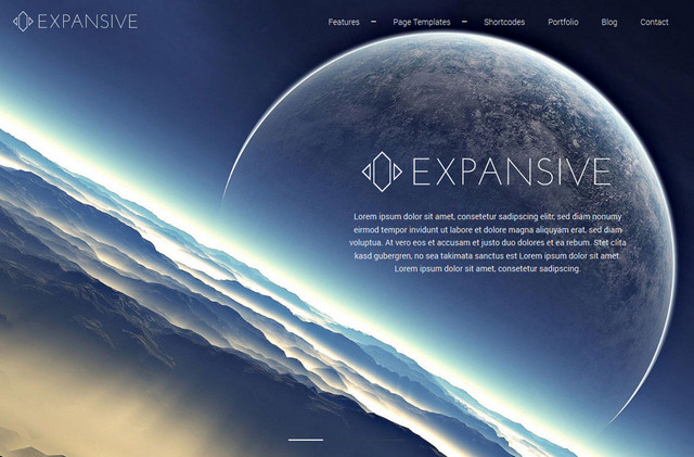
Expansive


Creator: Cpothemes
License: GPLv2.

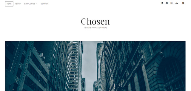
Chosen


Creator: Ben Sibley
License: GPLv2.

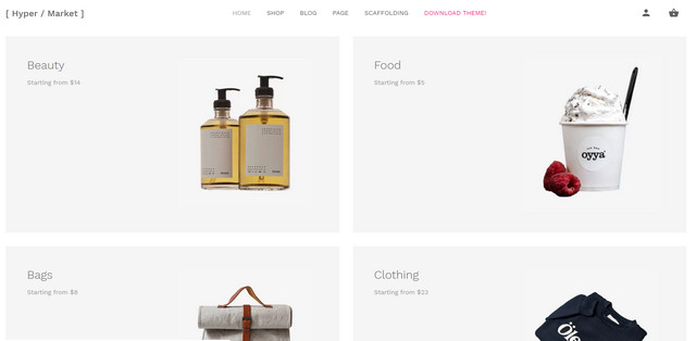
Hypermarket


Creator: Mahdi Yazdani
License: Declared as Free, no proper license given.

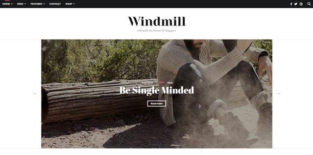
WordPress Theme for Bloggers


Creator: The Happy Bit
License: Declared as Free, no proper license given.

Pen Theme


Creator: Anpsthemes
License: GPLv2.

Vesta Lite


Creator: Mahdi Yazdani
License: MIT & BSD.

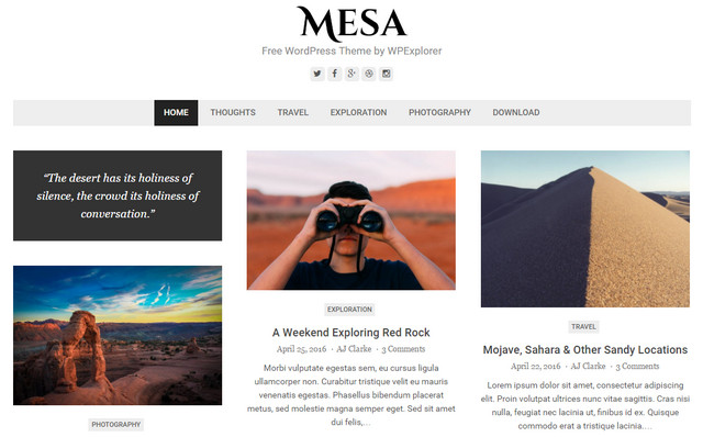
Mesa


Creator: WPExplorer
License: GPLv2.

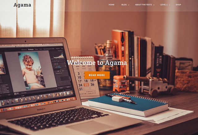
Agama


Creator: Theme Vision
License: GPLv2.

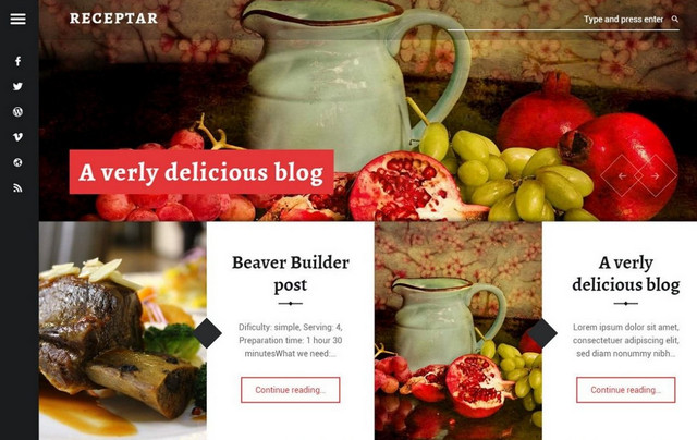
Receptar


Creator: WebMan Design | Oliver Juhas
License: GPLv2.

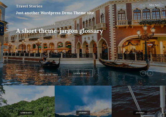
Travel Stories


Creator: Bestweblayout
License: GPLv2.

Pixova Lite


Creator: Macho Themes
License: GPLv2.

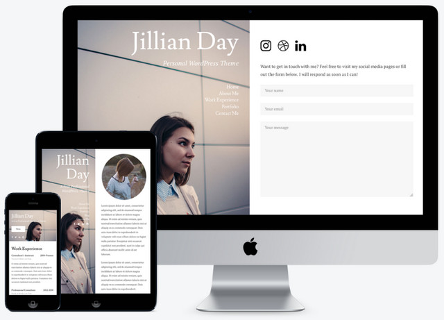
Personal


Creator: Modern Themes
License: GPLv2.

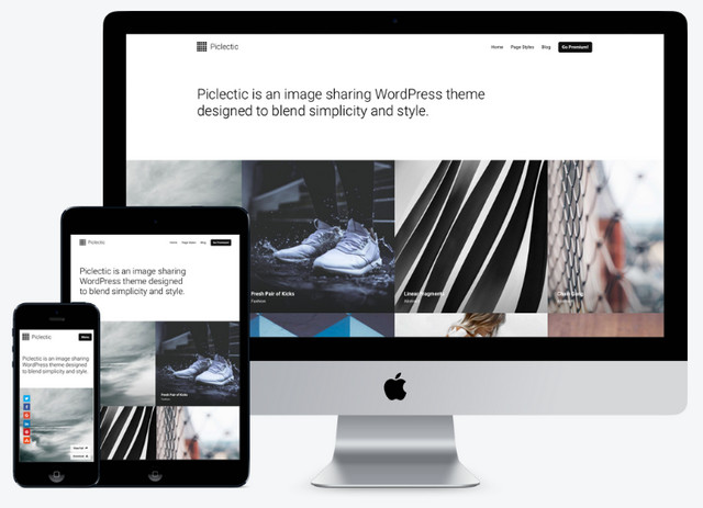
Piclectic


Creator: Modern Themes
License: GPLv2.

Resi


Creator: Modern Themes
License: GPLv2.

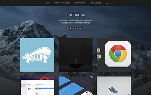
Hitchcock


Creator: Anders Norén
License: GPLv2.

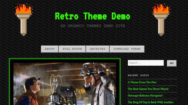
Retro Theme


Creator: Organic Themes
License: GPLv2.

For the Future


Creator: natasha
License: GPLv2.

Categories: Others Tags:

Do responsive sites have to be so tall on mobile?

February 22nd, 2017 No comments

Kevin Vigneault:

I don’t believe that the overall page length itself is inherently problematic. I have noticed though that in many responsive designs, purposeful groupings of content are easy to spot on larger screens, but get muddled when things start to stack on mobile screens.

This is probably mostly a problem on “content” sites in which you smash things down into the ol’ tube of content. I don’t mind the tube, but I think Kevin is doing some smart thinking here. There are plenty of different patterns that can happen while tubizing, and it’s probably not thought about enough.

This site is particularly guilty. A quick document.documentElement.offsetHeight test showed 14749px, more than double the height of an example Kevin pointed out that was a bit excessive.

Direct Link to ArticlePermalink


Do responsive sites have to be so tall on mobile? is a post from CSS-Tricks

Categories: Designing, Others Tags:

Set a Timed Debugger To Web Inspect Hard-To-Grab Elements

February 22nd, 2017 No comments

The DevTools (in any browser) are an invaluable development tool for CSS developers. If you need to see (and play with) the styles on any given element, a quick inspection is only a few clicks away.

Right click on something and “Inspect Element”, or, open DevTools and use its selection tools to grab what you need.

But… sometimes it can be difficult or impossible to target the element you need to target in the DevTools. The DOM events needed to work with the DevTools themselves can interfere.

Say I inserted an element on the mouseenter event of a certain other element, then removed it on mouseleave.

Try as I might, I just can’t target that newly-added element for inspection.

Chrome DevTools can simulate a :hover style, but that doesn’t really help us here. It doesn’t fire the DOM event, it just simulates the CSS state.

This is very useful, but won’t help us here.

The trick is to fire a debugger; right when you need it

A debugger; statement, when the DevTools are open, kinda freezes the DOM. No more events are fired and script excecution is completely paused.

But… you can still use DevTools!

This is your opportunity to select that otherwise-impossible thing to select and do what you need to do. You can put that debugger; statement right in your code where you need it (remember DevTools has to be open for it to work). Or (Tim Holman taught me the trick) you can trigger it with a setTimeout() right from the console.

setTimeout(function() {
  debugger;
}, 3000);
Give yourself a few seconds to get the DOM how you need it, then the debugger; will fire and you can inspect as needed.

I tried this, and it works, in Chrome, Firefox, Edge, and Safari, so it’s a pretty cross-browser DevTools friendly trick. Only Chrome and Safari let you do mouse selection of elements while in debugger mode though, so in Edge or Firefox, you might have to do the drilling through the Elements tab to find what you need manually.


Set a Timed Debugger To Web Inspect Hard-To-Grab Elements is a post from CSS-Tricks

Categories: Designing, Others Tags:

4 simple steps for perfect web navigation

February 22nd, 2017 No comments

From checking movie times, to reading a Photoshop tip, to reviewing the daily news, we can find almost any information we are looking for on the Internet. One part of a website that is especially important in helping us find what we are looking for is its navigation.

When we engage with a website we use its navigation to help us find what we are looking for. Unfortunately, many websites have navigation that wasn’t particularly well planned. Sure it may work well enough to get to the information we are looking for, but often, it is only after some confusion—and utilizing that classic method of searching the web known as trial and error—that we able to do so.

If the navigation of a website is poorly organized, has confusing wording or has too many links, it reduces our ability to use it to find what we are looking for in a quick and easy manner. Obvious and intuitive navigation is one of the key building blocks of a great website.These practices listed below will help you create more effective navigation as part of your website.

1. Make it clear

When a website visitor doesn’t know what to expect when clicking a link, or how to easily find what they are looking for, confusion results. Reduce confusion by designing your website’s navigation to be easy for visitors to understand.

Abercrombie & Fitch’s website provides an example of this concept. Their navigation is easy to understand from the first moment a visitor arrives at their website.

The use of clear labels, that are obvious at a glance, lets visitors know what your company does. From the start, they will know they are at the right place and how to get to where they want to be. Thoughtfully consider the terminology you use for the navigation of your website, making it easy for visitors to find what they are looking for.

Avoid creating navigation around the format of content, for instance, rather than having a videos page, create a ‘how to’ section with content separated by topic. Make it easy for users to find what they are looking for by describing content in the terms they will use. Visitors to your website probably will not be looking for a videos section, but they may be looking for tips on how to set up your product or how to use certain features.

Make it clear for visitors which items are navigation items. Subtlety will not help your website visitors get to where they want to be. For instance, even though it may look great to you, making links a slightly darker shade of gray than website text does not help create a great user experience. Don’t make visitors work to use your site.

2. Stay consistent

I am sure you have been to websites where it looks like part of their navigation was tacked on as an afterthought or it just doesn’t belong. This lack of consistency works to reduce trust on the part of site visitors, additionally, it reduces the quality of the user experience. If something just looks tacked on to you, it will most likely look the same or worse to your customers.

The nice, clean navigation of Bouguessa’s website is consistent and helps improve visitors’ experiences while on their site.

Another issue that tends to reduce the quality of navigation, is having items on menus that aren’t links, especially when they appear to be. When visitors click on menu items that don’t link it increases the level of confusion and consequently, the level of frustration. Use visual design to show which items are links and which are not, for instance, if you have headers as part of a mega menu, use a different font style, color or whitespace to indicate they are headers and not links.

Secondary navigation should also be designed consistently across your website. Apply the same focus and consideration to secondary navigation that you do to primary navigation. Regardless of where visitors are headed on your site, you want to provide a great experience.

If you have pages that are of primary importance that you want to be easier to access, create a feature block on your homepage or section landing page for it. Website visitors pay attention to these blocks, meanwhile, trying to highlight items on navigation menus can often disrupt the menu.

3. Keep it concise

Avoid creating menus with too many items. It is best if you can limit the number of items included as part of your menu to seven. Having fewer items to choose from is better for your website’s visitors. It creates less mental strain on the part of your visitors as they are making decisions and increases the chances that they will move forward.

Research has shown that the human brain uses chunking as a method to improve recall. By breaking data up into relevant groups or chunks, it allows us to understand and remember it better. This is an especially effective technique for larger websites that need more than seven menu items. By breaking menu items up into groups you will be helping your website visitors.

Remember that each time you remove an item from your menu or an element from your page; you are making everything else a little more visually prominent. When you remove something, you make other items more likely to be seen and clicked on. Carefully evaluate what you really need as part of your website and be willing to remove the items you don’t need to streamline and improve the experience.

The Olson Kundig website provides a great example of a website with a streamlined navigation experience.

Additionally, you will want to consider the order you use within your navigation. Just like in other areas of life, items at the beginning or end will stand out to users. User attention and retention are at their highest at the beginning or end of a list. This is the result of our basic psychology. As humans, we are wired to remember items at the beginning (primacy) or at the end (recency).

Leverage this phenomenon and put important items at the beginning or end of your menu. By putting items that are important to your customers in these areas you make it easier for visitors to use your website. If you are not sure which items are most important to your customers, take a look at your analytics and see which pages of your website get the most traffic.

4. Use a flat architecture

Great navigation begins with a well thought out information architecture (IA).As you consider the organization of your website you will want to keep the architecture as flat as possible. Allow your website visitors to reach any page within one or two clicks.

When you have fewer levels it is quicker, easier and less confusing for your customers to get to where they want to be. Limit the number of levels to help make navigating simple for your visitors.

To help organize your site, separate pages into groups and instead of nesting groups within groups within groups, look to create the flattest organization possible. Consolidate content where appropriate, perhaps even considering grouping the pages differently than you currently are doing to enable this, but make sure that your groupings are consistent with the how your customers view your products. Odd groupings that don’t make sense to users will not help you, even if they help flatten your website hierarchy.

Use visual design to help users understand the hierarchy when they are looking at your menu. Using font styles, sizes, colors, and whitespace can help visitors understand navigation levels. Clearly differentiate secondary navigation in a way that separates it from primary navigation in a harmonious way.

150 Massive Business Cards Bundle from Marvel Media – only $17!

Source

Categories: Designing, Others Tags:

My Journey Of Learning Programming Through Flatiron School #12

February 22nd, 2017 No comments

My name is Mason Ellwood, and I’m currently working on Flatiron School’s Online Full Stack Web Development Program. Each week, I’ll be writing about my experience, what I’m learning, and tips on learning to code.

Something that I have struggled with personally, is finding a comfortable place to work. I do not believe I am a complete introvert because I love being around and interacting with people. With this personal trait sometimes it is hard to sit in front of a computer all day which lacks that “human” aspect.

Learning to overcome this, I have set a routine for myself. Weekly I work to update my surroundings and interactions I have with people to break the monotony of isolating work. This has helped me to maintain sanity while establishing a productive routine to get through school.

Spending all day at a computer “learning” in an online program is challenging, and I won’t beat around the bush. It is easy to get distracted and set focus on other things. When your time frame to complete school is “self-paced” it is hard to set that pace aggressive enough to complete the school in a timely manner. Setting a schedule for myself through location and set aside time has increased my chances of success dramatically and I encourage you to the do same.

Boolean Enumerables:

As stated in previous posts; Module Enumerables are able to provide a set of methods that can search, sort, manipulate, and transverse a collection` such arrays or hashes. With your understanding of arrays, loops, and hashes you will be able to pick up on this concept quickly. There not really doing anything new, just doing the same thing in less line while being more semantically correct.

As I talked about before, #all iterates over a block and returns true or false, depending on the value being passed. Unlike the #all? Enumerator which must return true for each iteration of the entire #all? Method to return true.

Every iteration, every loop for the block must return true, or else it will return false like the example above.

Unlike #none? Which is the opposite of of #all?, which we are interested in none of the elements in an expression returning true within the block passing to #none?

This expression #none? Returns true because none of those numbers will produce a true expression when asked if they are even within the block. The way #none? Works is that no iteration of the block passing to #none? Can create a true expression. #any? Ensures that at least one element in a collection will create a true expression within the block passed.

#include? Will return true if the given object exists in the element if no match returns false.

I have only covered a few that I tend to use quite often. For a more comprehensive list, please visit ruby-doc.org (http://ruby-doc.org/core-2.4.0/Enumerable.html). Again ruby-doc.org will save your life over and over again. Next we will get into Hashes and Regex and finally move onto Object Oriented Ruby! These are concepts that I am currently fighting to understand so bear with me through these next couple of confusing posts.

Read More at My Journey Of Learning Programming Through Flatiron School #12

Categories: Designing, Others Tags:

The Hipstory Collection – 21 Famous People Depicted As Hipsters

February 22nd, 2017 No comments

Hipstory is a project created by Amit Shimoni, an Israeli artist (29), graduate of the Be’zalel Academy of Arts and Design in Jerusalem.

A little bit about the creator, Shimoni is the founder and operator of his design studio Amit Shimoni Illustration based in Tel Aviv where he happily lives with his wife Noga and their adorable dog Adam. Among the studio’s projects Shimoni worked with top brands in Israel and around the world including the New York Times and illustrating a cover for the New York Observer. Shimoni received over 300 media coverage worldwide including leading magazines, newspapers and TV Shows like The Guardian, The German Stern, Wired magazine, Vice, Entertainment weekly and Comedy Central.

Shimoni’s artwork is exhibited in galleries around the world including Berlin, Madrid, Tel Aviv, New York and more.

HIPSTORY doesn’t talk about politics, it talks about generation Y.

“I often find myself wondering about the difference between my generation and the great leaders of modern history. About their belief system, the way they thought and what motivated them to act for change. Compared to our more self-centered generation which in my opinion is in a constant chase after fashion, style and trends as a way of self-expression while steering away from the big ideologies and meanings. I wanted HIPSTORY to re-imagine the great leaders of modern history and place them in a different time and culture era- ours. I wanted to created a sort of mirror- a mirror that on the one hand is supposed to make one smile, and on the other to make him think. As I see it criticism doesn’t always have to be poignant it can simply be a method to arouse discussion and show things under a certain light”.

What is the creation process of HIPSTORY?

“For every character I try putting my own interpretation, but I’m always leaving a place for the viewers own interpretation. During my thinking process I study each character as a leader and as a person. I try bringing a new twist to the smallest details that define the character, for instance, on Obama’s chest you can find the words “Hope” and “change” which are details anyone can recognize. On the other hand, I also leave details that are less notable like the tattoo on his right shoulder which represents a scene from Moby-Dick which probably just a few can recognize as Obama’s favorite book.”

For more information about Hipstory, you can visit their website at http://www.shimoni-illustration.com.

1. Albert Einstein

2. Donald Trump

3. Dalai Lama

4. Santa Claus

5. Shimoni Che

6. George Washinton

7. Margaret Thatcher

8. Queen Elizabeth

9. Vladimir Putin

10. Barack Obama

11. Martin Luther King

12. Angela Merkel

13. Nelson Mandela

14. Abraham Lincoln

15. Vladimir Lenin

16. John F. Kenedy

17. Hillary Clinton

18. Mahatma Gandhi

19. Winston Churchill

20. Queen Beatrix

21. Benjamin Zeev Herzl

Read More at The Hipstory Collection – 21 Famous People Depicted As Hipsters

Categories: Designing, Others Tags:

20 Best Business & Services WordPress Themes

February 22nd, 2017 No comments
business featured image

No modern business can be a success without solid web presentation. Most of the entrepreneurs understand this very well. Web design services are in demand now and will be asked for many years to come.

However, not every website will make a business thriving. It should look trendy, use advanced technologies, be simple, user-friendly, and comply with the latest web design and development standards. If you are a web developer, this compilation will help you build such kind of website quickly, without extra efforts, deliver it to the customer and take your money for a great job.

Business & services WordPress themes for the compilation were created by TemplateMonster.com, a famous industry leader.

Buying templates from the experienced, highly professional companies like TemplateMonster guarantees your and your customers’ satisfaction. The templates will be easy to handle, which will free your time and the result will exceed clients’ expectations. By the way, the guys from TemplateMonster have more than 26 000 of templates in stock, but their inventory is being replenished daily.

Please view this 2-minute video to know about one of their latest releases – Monstroid2 – a multipurpose WordPress theme.

The theme takes the first place in our list.

But this is not all good news for today. The company launched a new service for its partners and clients. It is TemplateMonster Web Studios Catalogue.

The best thing about this catalogue is that it is useful both for end users looking for professional assistance and web design studios seeking for the ways to expand their client base and increase their income.

The Catalogue includes a list of all web design studios and freelancers who have successfully completed TemplateMonster’s certification and proved their high level of expertise of working with TemplateMonster’s WordPress, Joomla, OpenCart, PrestaShop, HTML5, Magento, Drupal, and Moto CMS themes.

The Catalogue features an extended list of TemplateMonster’s partners. The availability of integrated advanced search form allows people to come across the right studio in their location quickly and easily. Thus, one can filter all partners by country, city, and CMS they work with.

The Catalogue also includes a rating chart. Depending on the number of projects you have launched, you receive a rank on the chart. The greater amount of released sites results in higher rankings.

TemplateMonster’s audience vast, it consists of the users of different backgrounds and skills levels. A list of certified partners allows them to come across the best studio or a freelancer who can get their theme customized in the short run.

A person who buys a template is not necessarily aware of what to do with it next. How to get it installed and modified according to personal needs. That is why they start looking for third party agencies who can do the job for them. TemplateMonster Web Studios Catalogue saves the users’ time on search and helps them come across contacts of certified partners who know how to work with TemplateMonster’s themes.

In addition to being listed on a certified partners chart, every freelancer and web design studio can let the audience know more about their services, recent projects, story, and read TemplateMonster’s feedback on a separate profile page. This is where you can locate personal information, contact details, links to social media profiles, a list of CMS that your studio works with, pricing, and any other information that you want to share. Whenever a client reaches the page, he/she can get in touch with a studio via a request form.

Hopefully, the above info was useful for you. Are you ready to view the showcase of 20 best business & services WordPress Themes right now?

Have an efficient browsing!

Monstroid2 – Cool Multipurpose WordPress Theme

If you like all-in-one solutions, Monstroid2 is the theme for you. It has a clean and crispy design, bulletproof layout consistency, and intuitive navigation. It includes 9+ pre-built websites, 7 customizable header styles, and 4 customizable blog styles. Moreover, the theme has GPL3 license, which means that you buy it once and use forever. The theme has extensive plugins block, WooCommerce Plugin, and a number of other extraordinary features that will make your project one-of-a-kind.

Details | Demo

Financial Services WordPress Theme

Choose this theme for your financial company even if you know nothing about coding. Build pages easily without touching it. Take advantage of more than 25+ modules, a library of presets, and drag-and-drop functionality. Also, with an advanced set of configuration options, you can easily customize the design of your theme. Choose from a variety of layout options and experiment with your pages structure.

Financial Accounting WordPress Theme

Details | Demo

Financial Advice WordPress Theme

The theme is built on Cherry Framework 4. This framework that offers you easy-to-install themes with solid Bootstrap options, numerous shortcodes, and widgets, and a foolproof way to update the current design. MotoPress Editor plugin can ease the process of editing your website. With its help, you will have an opportunity to manage page elements in the visual mode. Drag and drop is always good.

Financial Advisor Services WordPress Theme

Details | Demo

Market Research Agency WordPress Theme

The theme offers Content Modules that allow you to add multiple content types to your page. This includes buttons, images, pricing tables, contact forms, sliders, and much more. Each of them has an extended set of options that you can tweak to match the style of your website. Take advantage of custom widgets that enrich your theme with advanced functionality. Simple Slider, post carousel, and social media widgets help you build a stronger online presence, and offer you additional ways for displaying your content.

Business Analysis and Market Research Agency WordPress Theme

Details | Demo

Emmet – Business Responsive WordPress Theme

All sections of the front page of this theme are completely customizable. Change texts, images, and links to each section or simply hide them. Choose one of the predefined colors or make your own one to make your website colorful and outstanding. The theme is equipped with Visual Page Builder, a complete solution for building responsive pages without coding, by dragging and dropping content elements. You can display your projects in Portfolio section, present offerings in Pricing Tables, introduce the stuff in a Team section, put Newsletter form, edit Testimonials sections, set Contact Form, and adjust Google Map to show your location.

Business Responsive WordPress Theme

Details | Demo

News GPL WordPress Theme

This theme for news portal comes with Live Customizer. It gives you the possibility to see the results on the fly when you make changes to your website. A huge set of Premium Widgets like Calendar, Social media block, and others makes theme layout user-friendlier. The theme is highly customizable (it provides a front page for various layouts). Besides, intuitive navigation and fabulous readability will make the users come back to your website every now and again.

KingNews GPL WordPress Template

Details | Demo

Top Level Business Company WordPress Theme

This theme for a business company is very attractive. Parallax effect adds depth and perspective to its layout. You can choose between multiple slider plugins when crafting your pages, including Cherry Simple Slider and Premium MotoPress Slider coming with the template. They allow you to assemble professional-looking slides of text, images, and videos, spicing them up with various transition effects. Use 80 handy shortcodes to simplify the embedding of media content.

Business Company WordPress Template

Details | Demo

Cozy House WordPress Theme

The theme is delivered with Cherry Real Estate Plugin. It will turn your website into a true Real Estate monster. Add properties to your site and let your clients find exactly what they need. Filter the search results by required categories and see where exactly the property is located on a map with preview markers. You can also allow your visitors to leave property submissions by filtering out a form and assign each of the submission to one of your agents.

Real Estate Agent WP Theme

Details | Demo

Professional Financial Advisor Services WordPress Theme

Stock Ticker Widget is included into template’s package. This financial data widget displays real-time market prices and statistics information on your website. It provides your site users with access to the latest financial data of the needed companies in the elegant and readable way. The site users are able to calculate their lease payments for particular periods by submitting real prices online on your website with Lease Calculator Widget. The widget will help you enhance the overall user experience by providing useful tools for the customers’ needs.

Financial Advisor Responsive WordPress Theme

Details | Demo

Business Consultant Services WordPress Theme

With background video, you will be able to tell much more about your company. Using large, browser-size videos as a background for your web page improves a visual experience in a creative way. Enhance the mood and atmosphere onsite or demonstrate your product in action. You can tell a complete story that will be easy and fun to view – as opposed to regular, static pages. The theme is provided with parallax effect as well.

Business Responsive WordPress Theme

Details | Demo

Good Advice WordPress Theme

This theme was crafted for you with care. Enjoy the sleek, modern design of your theme. Each element of a design is carefully created and corresponds with the latest web design trends. Customize your site with multiple theme options. View all the changes you make to your design life, without reloading your page.

Financial Advisor WordPress Theme

Details | Demo

Real Estate Responsive WordPress Theme

This theme lets you showcase your projects using a large variety of layouts and filter options. It has a full support for the dsIDXpress plugin. Embed live real estate data from an MLS directly into your blog. The dsIDXpress is not included in the package and has to be installed separately. The theme is mobile-friendly and looks great on any device and screen resolution.

Bellaina - Real Estate Responsive WordPress theme

Details | Demo

Stylist Responsive WordPress Theme

The theme includes an Appointment Booking Plugin. This is a must-have plugin that allows your guests to book appointments with or without registration. The plugin comes with color pickers to help you apply suitable website colors. It can be easily integrated with WooCommerce payments and read-only appointment calendar feeds. Backend plugin management is a real ease.

Business Responsive WordPress Theme

Details | Demo

Business Consultations WordPress theme

This business theme is WPML Ready. WPML makes it easier to run multilingual WordPress site with a single install. With WPML you can modify pages, posts, custom types, menus, and even the theme’s text so that the right ones are displayed in every language. Advanced SEO support is integrated into the theme. This is important because SEO optimized pages can help you find your site easier on the web.

business consultant WP theme

Details | Demo

Business Solutions WordPress Theme

This business theme is provided with MegaMenu. It is a powerful tool for creating a better look and professional navigation easily without technical knowledge. It allows organizing your categories, subcategories easily with different content showing-off. Also, the theme contains a Contact Form. By means of this built-in web form, customers can easily get in touch with you, inquire more information about your services and give their feedback on using them.

Business Firm WordPress Theme

Details | Demo

IT WordPress Theme

Owing to the valid, semantic code your site will have better SEO ratings, impress your visitors with faster page loading speeds and get more flexible. All PSD files are fully customizable and were optimized to be used equally well by experts and beginners. The detailed documentation covers all the ins and outs of your theme. Use it to squeeze the most out of your website’s functionality. The theme is Cross Browser compatible, so doing whatever changes to your website, be certain to have its look and performance the same perfect in all browsers.

Information Technology WordPress Template

Details | Demo

Business News Responsive WordPress Theme

The theme includes Custom Page Templates. Build a unique and stylish site for any kind of business with a variety of custom pre-designed page templates. It is possible to use unique types of posts for various info like customers’ testimonials, team bio posts, company services description, and other posts you would like to highlight. Every page of your website can possess its inimitable charm. All you need to do is to choose from a list of available post formats, individually designed to match different tastes and needs.

Business Responsive WordPress Theme

Details | Demo

Advertising Agency WordPress Theme

This theme for an advertising agency is responsive. Your site will quickly adapt to any gadget with any screen size the user has at hand right now. Text and images are flexible as well, so they will be rendered correctly. This will boost your conversion as your visitors will have no limits in terms of their location or device. The theme is retina ready, by the way.

Advertising Agency WP Theme

Details | Demo

Contemporary Business Firm WordPress Theme

Built by qualified developers, the theme ensures a cutting-edge performance on all screen resolutions and modern browsers. Find and change any element of the theme quickly and easily. The code of the theme is clean, well-structured, and carefully commented. Written in accordance with the latest web-standards, it lets you understand the purpose of any of its elements easily. The template’s package includes 24/7 effective and friendly support.

Business Firm WP Theme

Details | Demo

Financial Vision WordPress Theme

The theme is not only responsive but retina ready. The retina ready templates will perform and look awesome even on displays with high pixel density. In this way, they will help you keep the site up to date for years to come. The theme is built on Cherry Framework 4. It is a simple framework that offers you easy installation, solid Bootstrap options, numerous shortcodes and widgets, and loads of other helpful features.

Financial Consultant WordPress Theme

Details | Demo

This was the utmost collection of 20 best business and services WordPress themes. Did you find anything suitable for your business? Please tell us which theme did you choose and what features were crucial for you. Please also let us know what do you think about TemplateMonster’s web studios catalog? Are you going to get on the chart? Any feedback is welcome in the comment section.

Read More at 20 Best Business & Services WordPress Themes

Categories: Designing, Others Tags: