Archive

Archive for February, 2017

WordPress Trend 2017: Plugins as SaaS

February 16th, 2017 No comments

The SaaS trend has been unabated for years now. Developers are happy about that; users aren’t. Now, the trend is also making its way to the developers of WordPress plugins. Let’s see what the up- and downsides are.

WordPress Plugin as SaaS: Not All New

I’m sure you know one of the oldest SaaS plugins for WordPress: Akismet. Akismet simply connects your blog to the API of Automattic’s spam preventer.

Akismet: SaaS Veteran Made By Automattic. (Screenshot: Noupe)

The entire logic, especially the algorithm that provides the spam detection, doesn’t run on your blog. That’s good, because otherwise, your server’s performance would most likely suffer. The spam detector’s logic would be pretty vulnerable as well, as it would only have to be extracted from the plugin code via reverse engineering. VaultPress, the backup plugin, made by the same people, works as a SaaS, the long version being “Software as a Service.”

SaaS in General: A Concept Asserts Itself

SaaS solutions offer the advantage of higher cost efficiency for larger installations. Instead of one-time license fees per user, the client pays significantly lower, monthly fees which can definitely accumulate over one or two years, matching or even exceeding the original purchase cost. However, the monthly burden is light. For the most part, the fees also include continuous support, meaning functional updates, expansions, as well as the necessary support. This way, the customer always receives an up-to-date version of the product.

Since the client normally only has to run a small part of the SaaS solution’s functionality locally, using applications that require particular processing power is possible as well. To achieve that, the SaaS providers use scalable platforms, like Amazon Web Services or Microsoft’s Azure. These platforms make sure that performance and storage can be scaled infinitely – an ability that the local computer does not have. This lets the application become as powerful as you want it to, as there are no physical limits.

Nonetheless, customers still have mixed feelings towards the concept. The desire to own something that you pay for is still spread too widely. However, this desire has already been softened over the years, with the triumphal march of streaming services being a significant factor in the media section. Today, the problem is more rooted in the private section, where many potential customers still prefer a one-time payment over paying every month.

Disadvantages from the customer’s point of view would be the necessity of a permanent, stable internet connection, as well as the related security concerns. A possible total failure in case of bankruptcy of the SaaS provider can not be written off either.

SaaS: a Reliable Internet Connection Should be Granted. (Photo: Pixabay)

The SaaS provider, on the other hand, enjoys better control over his product, as well as the ability to implement changes, and improvements at any time, without having to stick to update cycles. Overall, the provider has a lot more sovereignty over his product than before. By expanding his solution, the provider always has the option of upselling, meaning additional offers being made to the existing customers.

The liquidity effect of the SaaS solution should not be underestimated either. Over the period X, the customers will pay their usage fees on a regular basis. This type of numbers is perfect for any bank and grants planning security for the respective periods of time. On the other hand, the SaaS provider has to finance any investment into the infrastructure with the usage fees. Especially in the beginning, this risk is not to be taken lightly, while it basically doesn’t exist when selling stand-alone plugins running on client hardware.

WordPress and SaaS: WTF?

As mentioned before, SaaS for WordPress plugins is not an entirely new concept. And, in fact, the model can make sense for many commercial plugins, but it makes much less sense for others. In general, the SaaS model allows for more powerful functional add-ons than the previous model of installing a bunch of PHP files with the complete program code. That should be undisputed.

The concept of “pension-like” income seems to be the key reason as to why this solution is so attractive to WordPress developers. Of course, it is somewhat unfair to call it pension-like income, as that would imply payment without service. With SaaS plugins, developers are likely to be busier than ever before. That’s because, with monthly fees, the clients expect a consistently high value in return. Nonetheless, the perspective of getting paid each month is increasingly fascinating for freelance developers.

What’s the Deal With the Idea to Design WordPress Plugins as SaaS Solutions?

Returning Income

Over the course of a year, a monthly usage fee adds up to a nice amount of money that you may not have been able to demand as a single payment. It’s very likely that a SaaS model will get you more money for your plugin than before. For the first time, you can make clear liquidity plans. Calculate how many subscribers you need to cover your yearly costs. There’s something to be said for that.

Making Money by Time Passing – It’s Not That Simple. (Photo: Pixabay)

Protection From Piracy

You don’t give out your code, so you can be sure that nobody can steal it. This is an essential factor if you create plugins for a living. Reverse engineering of plugins is not that hard, but it’s an entirely different thing with “real software.”

Easier Development

You do what you want, whenever you want to. At most, your customers may be happy if you hyperactively push out new features. Nobody has to install updates anymore, and you don’t need to care about the security of old versions. Life can be so simple.

You’ll also like to hear that the cloud server you want to use is the only relevant environment that your SaaS has to run on. For the first time, it doesn’t matter what environment requirements your clients have – a dream come true.

Feedback and Usage Data

As of right now, you don’t know anything about your customers. You don’t know where your plugin is being used. You don’t know the size of the page that it serves. You don’t know if it works smoothly and if the occurring errors are critical or not. You don’t know anything, except for the fact that you sold it.

Of course, all of this changes once you design your plugin as a SaaS. Doing so gives you access to all the things you didn’t have access to before. And these aren’t irrelevant either. Essentially, you get a kind of automatic feedback from usage data. You can see the weaknesses of your plugin, and if it doesn’t do what it’s supposed to in any regard.

Another aspect is just as important. You get target group metrics. You have access to more than sheer addresses. You can effectively look into the needs of your potential clients, allowing you to further develop your product based on secured data. This begins with you seeing what type of website typically uses your plugin, and to what extent. I wouldn’t even be surprised if you discovered one or two features that nobody ever uses.

Why Wouldn’t You Offer WordPress Plugins as SaaS?

Of course, there are plugins, like Akismet as mentioned earlier, that can’t be realized as Saas if you don’t want to make compromises regarding the scope of service, and the performance. This phenomenon only applies to a minority of possible plugins, though. Thus, in most of the cases, you won’t have to compare and weigh the advantages and disadvantages.

One’s Fate Lies in God’s Hand in SaaS and At Sea (Alteration). (Photo: Pixabay)

Risk of Customer Acceptance Regarding the Price

Not everyone will like renting a plugin. Thus, an excellent communication strategy is required to convince potential buyers. This may be a general truth that applies at all times. But it’s also important that your product allows for the believable development of this type of strategy.

If you developed an exotic plugin that allows your customers to import a remote file format, to execute a particular action that may be required once a year, you’d have a tough time trying to come up with a reasonable strategy that leads to a constant income. In that case, you should identify your target audience, and sell your plugin via one-time payment.

Risk of Customer Acceptance Regarding Data Protection

When your plugin processes information, that doesn’t necessarily happen on your customers’ servers. For you, this is beneficial, as you don’t have to worry about processor power and storage space. However, you’re the one who pays for AWS or Azure, or any other platform service provider when running your plugins as SaaS.

Depending on what type of information is being processed, your clients will only feel safe if it’s made clear, who stores the data, as well as where, and why it’s stored. A server location within the customer’s country should lower the acceptance threshold, but a particular suspicion could remain. You can’t really influence this psychological question. But it has the potential to massively affect the sales of your plugin.

Conclusion: WordPress Plugins as Saas? Yes, But…

I think it should be pretty clear that the idea to offer WordPress plugins as SaaS neither is clearly amazing nor completely dumb. As always, the truth is somewhere in between and heavily depends on the factors of each individual case. In general, it can be said that SaaS becomes increasingly more relevant the more features the plugin offers. If, on top of that, there are aspects of machine learning included, there’s no way around SaaS. Overall, all aspects brought up in this article have to be applied to the own idea, and then be weighed.

If you can imagine a smooth entry into the world of SaaS, you should definitely check out Freemius. They basically offer a narrow-gauge SaaS out of the box.

Further Reading:

  • The Problem in WordPress – Musings on Plugins & SaaS | Chris Lema
  • WordPress Plugins: SAAS! Gota Go SAAS. Right Brah? | Josh Pollock
  • Careful! This Simple Pricing Experiment Cost Us $2,000 in Revenue | Freemius
  • 8 Awesome WordPress Web Apps Paving the Way for WordPress as a SaaS Platform | Elegant Themes
Categories: Others Tags:

Websites We Like: February 2017

February 15th, 2017 No comments

It has been a while since we’ve taken stock of all the beautiful websites out there. Here’s our favorites from the past couple of weeks!

Fuzzco

Who says the web should scroll in one direction? Not the creative agency Fuzzco which on their homepage lets you navigate the page in a very interesting way and this compliments the visual design, too:

Tuna

Tuna is a specimen for the typeface of the same name by Felix Braden and Alex Rütten. This serif is designed specifically for on-screen reading and so it looks beautiful even at small sizes:

Web Field Manual

The Web Field Manual is a collection of articles about UX, UI and all-round general web design advice:

But one of my favorite parts of this site is all the teeny tiny and subtle animations that you might miss if you happen to rush through it. Here’s one example where the title will animate upwards on load (I especially like the background triangles that animate in, too):

New Acton

I’m not entirely sure what this website for New Acton is advertising (is it like a mall? Or an art space or something?) but either way the website is undeniably beautiful with illustrations that break up and shiver as you hover the cursor over them:

Bumpers

Bumpers is an app that lets you record audio and the website is pretty darn snazzy; there’s lots of inline SVG and peculiar full-screen illustrations to look at here.

MailChimp’s 2016 Annual Report

A while back MailChimp made a beautiful annual report with statistics about what the company has been up to over the past twelve months. What really stands out here are the animations and illustrations which perfectly compliment the humour and wit in the writing:


OK, so that’s it until next time! Oh and make sure to add a comment below if there’s any delightful websites that you think we should take a look at.


Websites We Like: February 2017 is a post from CSS-Tricks

Categories: Designing, Others Tags:

My Journey Of Learning Programming Through Flatiron School #11

February 15th, 2017 No comments

My name is Mason Ellwood, and I’m currently working on Flatiron School’s Online Full Stack Web Development Program. Each week, I’ll be writing about my experience, what I’m learning, and tips on learning to code.

Last week I was reading on wired that the next big blue collar job was going to be coding. I did not really know what to think of this. At first glance, programming lost its luster of being an untapped needed career, making me (a programmer) replaceable. This has always been the case but the recent boom of programmers is scary when entering a profession, competing against some of the smartest people in the industry.

On Wednesday I went to meet up with my weekly trivia team, and a new guy came who was a “full stack” developer. He used that term loosely because of the “what the heck does that entail” title that holds. But he kind of reaffirmed my fear of the article and agreed. Sure he said but this is no different than any other career now. It seems like everyone is fighting to stay ahead of the curve and automate as many processes as they can. Because technology has become such a cornerstone for many companies, automating and maintenance surly would follow. But because of this the need for “maintenance” increases especially within the dev community.

He agreed with the article, but development turning into the lusterless career path is not true. The need for developers is greater now that it has ever been. Being apart of the growing community of developers is a great place to be right now. And the need for “you” in a company setting is only going to become more prevalent.

Search Enumerables

So picking up where we left off. Every method in Ruby must return a value. When we iterate or enumerate over a collection with #each, its return value is always the original constant. With this in mind, if we want to display the changed array values, dependent on what your method does, you may need to add an empty array ( new_array = [ ] ) to shovel ( << ) those values into.

There are many forms of #each, that can enact different outcomes. A few of the others are:

  • #select => When you invoke #select on a collection, the return value will be a new array containing all the elements of the collection that causes the block to pass a return value as true.
  • #detect/#find => #detect and #find can be used interchangeably. This will return only return the first element that makes the block true.
  • #reject => #reject will return an array with the elements that return a false value

These listed above are all apart of the family of search enumerators whose purpose is to help you refine a collection to only matching elements.

A few that I use most often, I have found, is #each, #collect or #map (which are interchangeable), and each_with_index. A little more about enumerators can be found, and a quick reference that I have found very useful, is located here (http://ruby-doc.org/core-2.2.0/Enumerator.html). You will use these all the time, and I know how important this concept is. Locating and changing information based within your set of data is a key to programming. Essentially programming is the pushing and pulling of data and data manipulation. Being able to quickly and effectively iterate through data will increase your chances of landing a job, and becoming an officiant “blue collar worker” – as Wired so eloquently stated.

Read More at My Journey Of Learning Programming Through Flatiron School #11

Categories: Designing, Others Tags:

Context is key for effective UX Design

February 15th, 2017 No comments

When designing for UX, it’s the hidden factors that determine whether you solve a problem, or create a new one.

I recently read UX Researcher Sam Ladner’s commentary on why Cortana doesn’t work at work. She argues that the virtual assistant would have far less utility in the workspace, despite Microsoft’s intentions. As she explains, it’s a matter of context:

First, Cortana will make more “boundary work” for office workers. The mere act of trying to keep your private life private at work is turns out to be, well, work. Recent research has found that keeping work and life private actually causes cognitive overload. If people use Cortana as intended, she is poised to make that much worse.

Second, Cortana demands office workers treat their workplaces as if they were kings and queens, instead of pawns and rooks. Voice interactions require workers to own their workspace, something that we know they do not do. Typical workers share their workspaces with others, and because we are apt social animals, we tend to comply with unwritten rules of workplace etiquette. [Emphasis mine.]

In short, many of us will be uncomfortable blurting instructions to a desk-side robot.

Daily problems

This had me thinking about all the moments in my life where, due to context, I didn’t use a product as intended.

Here’s one example: on my way to a restaurant for lunch, I found an app that would let me order my food in advance so that I could bypass the line. Sounds like a fine idea! But this brought up a slew of questions?—?in a busy restaurant at noon, where do I pick up the food? It wasn’t clear. How long would it take? This also wasn’t clear. Should I insert myself at the front of the line and demand my meal? What if the cashiers are busy with other customers? Will I inconvenience the staff and annoy the waiting patrons?

The anxiety about the process of ordering in advance was worse than had I chosen to wait in line

The anxiety about the process of ordering in advance was worse than had I chosen to wait in line. Which in the end, is exactly what I did.

Later on, after the trauma had worn off, I decided to try ordering a coffee through a local shop’s app. This experience was better. The app gave me a time for pickup as well as an exact location (an exterior window) where my coffee would be waiting. No ambiguity. The designers understood the implications of a chaotic café and designed around it.

Professional problems

In 2016, I was part of the team that designed the new FreshBooks iOS app. From the start, we knew we had to better understand how our users?—?freelancers and small business owners—used mobile to run their businesses.

Through interviews, we learned that mobile helped our users plan their day, set reminders and check payments. What surprised us was that many were reluctant to use mobile while in the presence of their clients.

What tool do you use, the mobile app that will let you enter a quote straight into the system…or your notebook, crammed with post-its and to-do lists…?

The reason was simple: using mobile implied distraction. For example, put yourself in the shoes of a wedding planner. You’re with a new client, and you’re working out an itemized list of services that will turn into a quote.

What tool do you use, the mobile app that will let you enter a quote straight into the system and send it to your client immediately; or your notebook, crammed with post-its and to-do lists, within which you’ll scrawl the list out in pen?

We found that many would choose the latter. When using mobile, how does the client know you’re not answering another client’s email? Or texting your mother? Or playing Dots?

The notebook, meanwhile, announces “I’m focused on you.” This is the same reason why many people prefer to write in a notebook in a meeting, or when conducting interviews.

Perception is reality

As humans, context has great implications on our behaviour. Environmental and social factors don’t just impact our own perception. They affect how we’re perceived by others as well as how we feel we’re perceived by others. This can be a strong motivator.

This is especially true when we’re worried about negative perception. We’ll do anything to avoid it. When ordering food, I was anxious about looking like a pushy jerk. So I decided to wait. When working with clients, small business owners worried about appearing distracted and disrespectful. So they optimized perception over productivity. In the case of Cortana, knowledge workers may feel judged by their peers when barking out to-do lists. So they may choose not to use it.

What can we do?

Designing around context is a hard problem. Context varies moment to moment. Every human comes with their unique set of anxieties and apprehensions. It’s not enough to predict these hidden factors from behind our desks. As designers, we need to experience our user’s context first hand.

This means getting out of the office and seeing the world through the eyes of who we’re designing for. Becoming skilled in the subtle art of observation. Understanding what solutions our users are “hiring” and “firing” throughout their daily lives.

These are skills that take time to build, and may be intimidating to many of us. It certainly was to me. But take the plunge. When you come back from your first field visit, invigorated and surprised, you’ll know it was worth it.

Because one thing’s for certain—whether it’s eating lunch, pleasing a client, or working with a virtual assistant, context is key.

Aching to get out into the field? Here are some resources to help you get started: Practical Ethnography?—?Sam Ladner, Interviewing Users—Steve Portigal.

Video Course: Build Responsive Real World Websites with HTML5 and CSS3 – only $17!

Source

Categories: Designing, Others Tags:

The Realities Of User Experience Design Within The Luxury Industry

February 15th, 2017 No comments

For luxury companies and upscale lifestyle service providers, excellence in experience is an essential component of the value delivered. Conceptually different from the mass market, the luxury domain relies not only on offering the highest differentiated products and services, but on delivering experiential value.

Adopting technology and embracing a digital presence through platforms and initiatives, the luxury industry today is tackling the challenge of designing an unparalleled user experience (UX) online. In this article, we’ll present a case study and share observations on the peculiarities of the UX design of a luxury lifestyle service platform and its mobile apps.

The post The Realities Of User Experience Design Within The Luxury Industry appeared first on Smashing Magazine.

Categories: Others Tags:

Color Supply: Finding Harmonious Colors Made Easy

February 15th, 2017 No comments

Color Supply is a new web app, that makes it easier for you to find harmonious color combinations. This is achieved due to a heavily visual approach, and the immediate display of possible results in the selected colors. This way, you quickly gain an impression of what fits, and what won’t work as well.

Color Supply by Design by Numbers

According to himself, Mason, the creator of Color Supply, has over ten years of experience as a professional designer. He names a few noteworthy references, including Disney, Visa, and Coca Cola.

On his website, “Design by Numbers“, he provides profound courses, and ebooks on design topics. After I was able to take a look into one of his ebooks, I can say that Mason knows what he’s talking about.

Color Supply: Harmonious Color Palettes in No Time

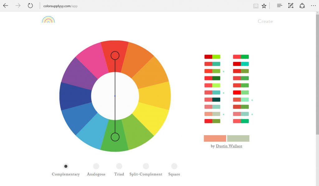
Color Supply is a very clean web app with the central element being a classic color circle comprised of 12 color fields. Use your mouse to define your desired color combination. Here, you can assume that the colors will always harmonize, as Mason provides different harmony theories.

Color Supply: the Central Control Element. (Screenshot: Noupe)

With standard settings, you’ll always get the direct complementary colors. It’s also possible to select three colors placed right next to each other (analogous colors), or the triad, where the selection of three colors is done via an isosceles triangle, as well as the square, which defines the colors in the four corner points.

Next, you’ll find the actual combination options for the selected basic colors to the right of the color circle. After all, the 12 color fields don’t represent the entirety of the respective color values.

Color Supply: Examples for the Application of the Selected Colors. (Screenshot: Noupe)

Below the color circle, four icons with the respective color scheme selected are displayed. You’ll also find an according pattern, as well as presentations of the possible color gradients. All of these details are being created based on the chosen color values.

Thus, play around with the selection until you find your desired combination. As the web app works entirely lag free, this is actually fun. I should also mention that the colors are named by their hex values. This way, no intermediate steps via Photoshop, or other editors are necessary to use the colors in web design.

Color Supply: Hex Values and Possible Color Gradients. (Screenshot: Noupe)

Free Book Chapter and Best Practice Color Combinations

It’s also noteworthy that some of the color combinations were manually created by more or less well-known designers and illustrators. So, if you’re a fan of the school XY, you’ll be happy to see that illustrator Z gives you access to his best practice. I prefer relying on my own skills.

Last but not least, I want to let you know that you can get the chapter about colors from Mason’s ebook as a free PDF file, as soon as you sign up for his email newsletter. The chapter consists of a total of 24 pages. Here, Mason explains the individual harmony theories that you can use in Color Supply, and provides several fitting examples from the world of web design. This is definitely useful.

Long story short: Play around with the color circle, or get inspiration from fellow designers. In any case, Color Supply belongs into your toolbox.

Categories: Others Tags:

The 25 Most Creative Valentine’s Day Ads Design

February 14th, 2017 No comments

First things first, I would like to say Happy Valentine’s Day to all the couples out there. For those of you who don’t have a significant other in your life, Happy Independence Day!
Valentine’s Day is certainly a celebration that we are very fond of. What started as a fertility celebration in Ancient Rome, now has become a 448 million dollars celebration where people around the world are eating approximately 58 million pounds (263.083.57 Kg) of chocolate. Now, major corporations and retailers are taking full advantage of this pink and chocolatey monster Valentine’s Day has become, and they are all fighting for a piece of exposure.
Luckily for us, this means that people with more money than Romania’s GDP are going all in and spend tons of money on creative ad campaigns.

You probably don’t have their kind of money but this Valentine’s Day ads might be just the right thing you need in order to inspire you this Halloween.

So without further ado, here are the 25 most creative Valentine’s Day Ads Design.

Dom Francisco

Ikea

Virgin mobile

Wurst

Schick

Up & Down Apparel

Kolner Zoo

SexyAvenue

Supreb

Corazon

Yemekspeti

Adria

Nissan

Heineken

Heineken

Conrad treasury

Levis

Orko’ss

Splash

Wellington Zoo

Vodafone

La Benedicta

Durex

Nakshatra

Conclusion

Of course, there are more creative Valentine’s Day ads out there and you probably saw some. If you think you can pin point a creative ad that we haven’t mentioned, drop a comment bellow and we’ll get it featured.

Read More at The 25 Most Creative Valentine’s Day Ads Design

Categories: Designing, Others Tags:

Creating Non-Rectangular Headers

February 14th, 2017 No comments

Over at Medium, Jon Moore recently identified “non-rectangular headers” as a tiny trend. A la: it’s not crazy popular yet, but just you wait, kiddo.

We’re talking about headers (or, more generally, any container element) that have a non-rectangular shape.

Such as trapezoids:

By Patrick Kantor

Or more complex geometric shapes:

Robin Movies by Asar Morris
By Marc Clancy

Or rounded/elliptical:

Music app landing page by Ibnu Mas’ud

Or even butt-cheek shaped:

Plutio by Ian Assam. Sorry Ian, I can’t unsee it. And now, dear reader, you can’t either.

My money is on these gaining popularity too. So let’s beat the crowd, and talk about a few ways of coding these up. Because let’s face it: they do look pretty awesome.

Image

Perhaps the simplest way to create any of the non-rectangular headers pictured above is to slap an image on top of your header.

See the Pen Image file-based non-rectangular header by Erik Kennedy (@erikdkennedy) on CodePen.

But there are a few issues here:

  • Responsive behavior? These masks tend to be full-width, and it becomes tedious to define multiple widths of the shape (e.g. srcset) or risk pixelation of raster assets.
  • It’s a totally separate file that needs to be fetched from the server – seems wasteful for simple shapes.
  • It’s slow to iterate in-browser if you have to re-export an image file(s) from your design program.

We can solve all of these problems at once. You might already know where this one is going.

SVG

Compared to exporting a JPG from Sketch, using an inline SVG is more performant, easy to make responsive, and easy to iterate the design of. In fact, for most cases, this is the way I’d recommend using. Versatile, cross-browser, vector, and fabulous.

See the Pen SVG trapezoidal header by Erik Kennedy (@erikdkennedy) on CodePen.

With an angled background one like, one choice you have to make is: what should remain constant as the screen-width changes, the angle or the height differential between the two sides?

If you want the angle to remain constant, set the height of the SVG in vw:

If you want the height differential to remain constant, set the height of the SVG in pixels:

And you need not pick just one – we can style this responsively, since SVG elements are subject to media queries. Check out this geometric style header at widths below and above 700px.

See the Pen Responsive SVG header by Erik Kennedy (@erikdkennedy) on CodePen.

Shoot, son. What’s not to love? Oh, and we can even do the butt-cheeks style.

See the Pen SVG “butt-cheeks” header by Erik Kennedy (@erikdkennedy) on CodePen.

(Perhaps that’s more properly done with beziers, but you get the idea!)

One more thing worth nothing, and that is if you want to do an SVG background entirely in CSS, you could save the SVG and reference its URL in a pseudo element.

header::after {
  content: "";
  position: absolute;
  bottom: 0;
  width: 100%;
  height: 100px;
  background: url(divider.svg);
}

And if you use `divider.svg` as a repeating element in different scenarios, you can also color it different as you need:

header::after polygon {
  fill: white;
}

But here’s an issue: what if the section below the header has a complicated background? In all these examples so far, we’ve just assumed a plain white background. What if there’s a fancy gradient, or another background image or something? Then what?

clip-path

This property comes to the rescue if you have a moderately complex background below the header, and therefore want the masking to be done from within the non-rectangular header, as opposed to by an element after it.

See the Pen Non-Rectangular Header Using Clip-Path by Erik Kennedy (@erikdkennedy) on CodePen.

And like the similar SVG syntax, if you want to change the responsive behavior of the above from angle-is-held-constant to height-differential-is-held-constant, you can change the calculated height to a simple percentage.

Clip-path’s biggest downside? Browser support is not that great. However, depending on how important your non-rectangular header or div is, it might qualify as a progressive enhancement. In which case, clip-path away!

border-radius

Now, up to now, we’ve only mentioned methods that work for generating all the shapes I called out above. However, if we know what particular shape we want our header to have, we might have access to an easier way.

For instance, a convex elliptical header is a perfect fit for border-radius.

See the Pen Convex elliptical header by Erik Kennedy (@erikdkennedy) on CodePen.

And a concave elliptical header could simply have the border-radius on the element after the header.

section {
  border-bottom-left-radius: 50% 20%;
  border-bottom-right-radius: 50% 20%;
}

Another benefit to this method is that the background of the section below the header could still have background images.

transform: skew

If we know that we want to create do a trapezoidal header, we can use a CSS transform to skew the whole thing.

See the Pen Trapezoid Header Using Transform: SkewY by Erik Kennedy (@erikdkennedy) on CodePen.

This has the side effect of skewing any child elements of the skewed element, so you’ll want to add a child element in the header that gets skewed, and everything else will go in sibling elements.

Skewed.
And unskewed.

Stripe’s homepage design uses this method, and even more brilliantly, they include a few children spans (each is a block of color) that get skewed with the parent element, creating a more complex and colorful effect.

Which is best?

As far as I’m concerned, SVG is generally the way to go. However, if you have a more complex background below the header, then the best choice depends on the shape. In that case, I’d investigate if skew or border-radius could meet the art direction needed, or if browser support was enough of a non-issue to go with clip-path.

Allows complex BG below Browser support Shapes creatable
Image No Yes All
SVG No Yes All
Clip-path Yes No All
Border-radius Yes Yes Elliptical only
Transform: skew Yes Yes Trapezoidal only

Erik Kennedy is an independent UX/UI designer and the creator of Learn UI Design, a practical online video course about visual design for screens. Includes color, typography, process, and more. Over 16 hours of video across 30+ lessons.


Creating Non-Rectangular Headers is a post from CSS-Tricks

Categories: Designing, Others Tags:

Slave To The Ribbon: Four Tough Questions Every SaaS Designer Faces

February 14th, 2017 No comments
Slave to the Ribbon: Four Tough Questions Every SaaS Designer Faces

My SaaS company, MeisterLabs, did its first usability test this year on our mindmapping product MindMeister. It was an eye-opening experience for a team that focuses on designing beautiful and easy to use software. It also forced us to think harder about our design philosophy and the hard questions that SaaS designers have to answer, one way or another.

1. Where do you land on the Snapchat-Word continuum?

Part of the usability test involved eye-tracking software that allowed us to see what parts of the interface people were looking at.

Despite all the innovations on interface design and UX that we’ve seen over the last years, it quickly became apparent that when people get stuck in software, they invariably look up. As in: they are checking the place where Microsoft Word or Outlook typically have a big multi-tab collection of text elements, icons and random drop down menus, also known as The Ribbon.

This, of course, means every SaaS designer needs to make a choice about where they want to position themselves: on the Snapchat end of the continuum, where users are supposed to figure things out and try to remember the secret combos that unlock certain pages and functionalities – or on the Microsoft end of things, where elements are expectedly found at the top of the interface.

In the more scientific terms of Don Norman’s classic “The Design of Everyday Things“, this is the battle between affordances (all the useful things that a product can do for a user) and the signifier (the interface elements that inform the user where they can push, pull, click or dial).

The light of a lamp is the affordance. The light switch is the signifier.

Industrial designers have decades of experience in frustrating users by hiding signifiers because they find minimalism more beautiful. The result is that you can’t find the light switch (hidden in the wallpaper), can’t open the kitchen cabinet (you have to push the edge, not pull), or you can’t get water from the tap (you have to wave at the tap in exactly the right spot).

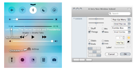
In software, we’re evolving in the same direction. Quora user Ivan Boyko recently made a good case about the arrival of flat design, and how it ruined the accessibility of the web. Yes, flat design is prettier, but it also leaves less room for signifiers like the glass edge that showed you which buttons were clickable in iOS. The consequence is that today, you have to just know which buttons in iOS are clickable and which ones aren’t (Read the piece here, it’s interesting – pictures below taken from the original Quora post).

While I agree that flat design can make software a bit more challenging to use, I’m convinced that software design needs to err on the side of innovation and minimalism. Our industry is better off following the lead of bold companies like Snapchat or Apple. Ditching the headphone jack will be uncomfortable for a while. But it will be replaced by something simpler and leaner, forcing other companies to follow suit.

2. How does you interface grow with the user?

Then there’s the opposite problem: how do you avoid a design that is too simple for advanced users?

It’s quite clear that your software needs to be easy to understand for beginners. In the app industry, we know that a mere 16% of users will return to an app for a third try if the first two experiences were glitchy or unsuccessful. So you have to nail that first experience.

But new users will quickly become more sophisticated. They want to do more. They want to add images. They want to present their content to others or share their content. They want to create links between their content. Maybe they like your software so much that they’ll find use cases that push your interface to its very limits. A good problem to have, no doubt, but still a challenge we need to solve.

This is probably the hardest question for a software designer: How can I design software that meets the user with functionality at exactly the right moment in their customer journey?

This remains one of the most challenging questions for me personally: when you’re working on an app for more than a decade, the temptation can arise to complicate things – and maybe overcomplicate them.

One thing I do know is that software with different modes or states are not the answer. In my previous job, I had to help users with software systems. My first question was always: “Please tell me what mode your system is in?” People never knew the answer to that – they always needed to look it up.

3. What is the reward?

This is one question that you need to be able to answer clearly – whether you launched your product yesterday or you’ve been on the market for ten years.

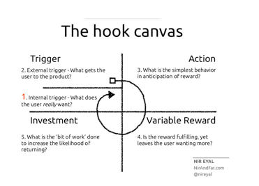
In his bestselling book Hooked, entrepreneur and design expert Nir Eyal tries to explain how some companies create products that you just can’t put down. The golden standard are of course products like Facebook, which studies have proven our brain wants to check every 31 seconds.

What is it that makes you fall in love with these products? One of the main attractions of truly “habit-forming” products, Eyal concludes, is that they reward the actions they trigger.

Rewards can be anything. The only thing really required is that your user experiences a small, almost imperceptible boost of pleasure. In other words: the feeling you get when you finish assembling a piece of IKEA furniture.

Slave to the Ribbon: Four Tough Questions Every SaaS Designer Faces

For example, Eyal points out that LinkedIn provides users with reward when they input more details about themselves into the professional networking platform. A graphic pops up that illustrates how close to complete your profile is, building incentive in users to finish what they started. When you’ve provided enough information, LinkedIn lets you know that your profile has reached “All Star” status. Eyal says that the graphic increases the likelihood of users to open a premium account (and thus launch into the investment phase).

Knowing your product’s reward will allow you to reduce the time your user needs to get that very first boost – and reducing your ‘time to wow’ will increase the likelihood of bringing the user back a second time.

4. Are you future proof?

Finally, there’s the question: How will we survive the onslaught of new technologies that launch every day?

Augmented reality, virtual reality, artificial intelligence (the list goes on …) will change how users interact with content: they’ll be able to verbally access information (no more UI required!) or experience it in 3D (UI everywhere around you!).

The main difference seems to me the fact that the workspace will include the entire field of vision rather than a 24 inch slice of it. But that will probably be compensated partly by the fact that hand gestures aren’t as granular as the pointer of a mouse.

And at the same time the fundamentals will remain. We follow the 98 percent rule – in any productivity tool, about 98 percent of the UI should be reserved for the user’s content. This principle is at the core of MindMeister and our second product, MeisterTask. Stuffing the entire field of vision with possible action buttons will be just as confusing as offering a nine tab ribbon with 25 clickable items per tab. The more things change, the more they stay the same. I look forward to discussing software design with you in the comments or on Twitter: @mhollauf

Categories: Others Tags:

Most of the web really sucks if you have a slow connection

February 14th, 2017 No comments

Dan Luu on the sorry state of web performance:

…it’s not just nerds like me who care about web performance. In the U.S., AOL alone had over 2 million dialup users in 2015. Outside of the U.S., there are even more people with slow connections.

This other note is also interesting, and I think that Dan is talking about Youtube’s project “Feather” here:

When I was at Google, someone told me a story about a time that “they” completed a big optimization push only to find that measured page load times increased. When they dug into the data, they found that the reason load times had increased was that they got a lot more traffic from Africa after doing the optimizations. The team’s product went from being unusable for people with slow connections to usable, which caused so many users with slow connections to start using the product that load times actually increased.

Direct Link to ArticlePermalink


Most of the web really sucks if you have a slow connection is a post from CSS-Tricks

Categories: Designing, Others Tags: