Color Theory for Web Designers – How to Choose the Right Color Scheme for Your Website
You have decided to create a website. One of the first questions that you will face sounds like “What colors should I choose to make it professional and at the same time visually appealing?” This is not surprising because color is the first things that attract your visitors’ attention, that’s why a color scheme is considered to be the foremost thing every designer should know.
Color affects not only the appearance of a website, but also its effectiveness. It means that an average time spent on site, a number of returned visitors, and even conversion depend on the choice of the color scheme. Moreover, taking into account visualization of modern technologies, color plays one of the main roles on the Internet. And you shouldn’t forget this rule when you start your own website.
However, some of us can hardly pick up a t-shirt that matches the color of the jeans, so it’s not always entirely clear how to choose the right color scheme for your website. But don’t give up, because the theory of color comes to the rescue. Having studied its basics, you will be able to create beautiful and effective color combinations. All experienced web designers rely on the theory, which means that you can do that too! Let’s talk about its main principles, and you will see that everything is much easier than it seems.
Your Working Tool
A color wheel is a basic element of the color theory. We think you all saw him, but if not, here you are:
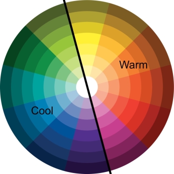
Color circle is your main working tool, clearly demonstrating how colors are created and combined. They are divided into three basic ones – red, blue and yellow, that can be used to create additional colors like green, orange, and purple.
However, circle does not always consist of six sectors, they can include twelve or more variations. In this case, six colors are added as a result of primary and secondary colors mixing. Those are yellow-green, green-blue, blue-violet, violet-red, red-orange and orange-yellow. There are circles that contain 24 sectors with even more additional hues.
Warm and Cool Colors
All color wheels can be divided into two halves. One of them includes warm colors like yellow, orange and red (most shades of brown also belong to the warm color palette). Cool colors are: blue, green, purple and all shades of gray. And here goes the question “Which colors are better – warm or cool?” The answer is obvious – there is no “better” color. Your choice should depend on the effect you are going to achieve and on associations with a particular feeling or idea. Warm colors are considered to be cheerful, friendly and stimulating; cold colors are in most cases calming and relaxing.
As a result, the choice of color depends on your corporate style, needs, and an atmosphere you want to create. If you like experimenting, and you probably do :), you can mix warm and cool colors, the main thing here is to know how to do that right, and in the next part, we will show that to you.
Color Mixing Basics
There are several working color schemes based on the position of colors in the circle. Let’s start with the simplest one, and then move on to more complicated schemes:
Complementary color scheme
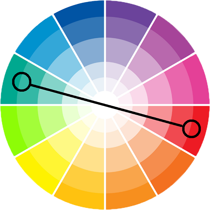
According to this scheme, you can combine two contrasting colors located opposite to each other. For example, you can use red and green, or yellow and purple. For a more elegant combination, it is recommended to add neutral additional shades – beige, light brown, light gray, black or white. Those can be the background colors, for instance.
Analogous color scheme
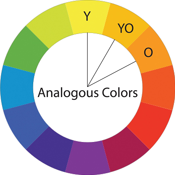
According to this scheme, three colors located next to each other are used. Examples: orange, yellow-orange and yellow, or purple, blue-violet and blue. All these colors will be well combined with each other because of their close neighborhood in the color circle.
Color triad
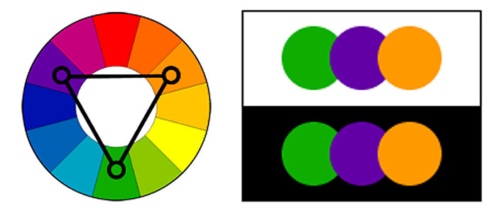
Speaking about this scheme it will be necessary to remind you some basic geometric rules. Do not be afraid, there is nothing complicated: you take any three colors equidistant from each other. If you connect them using lines, you will get an equilateral triangle. Possible combinations are: yellow-green, orange-red and violet-blue; yellow-orange, red-violet and blue-green. This is a very rich, contrasting scheme, so you will need to find a balance and choose one color as the main one, and make the other two additional.
Split-complementary color scheme
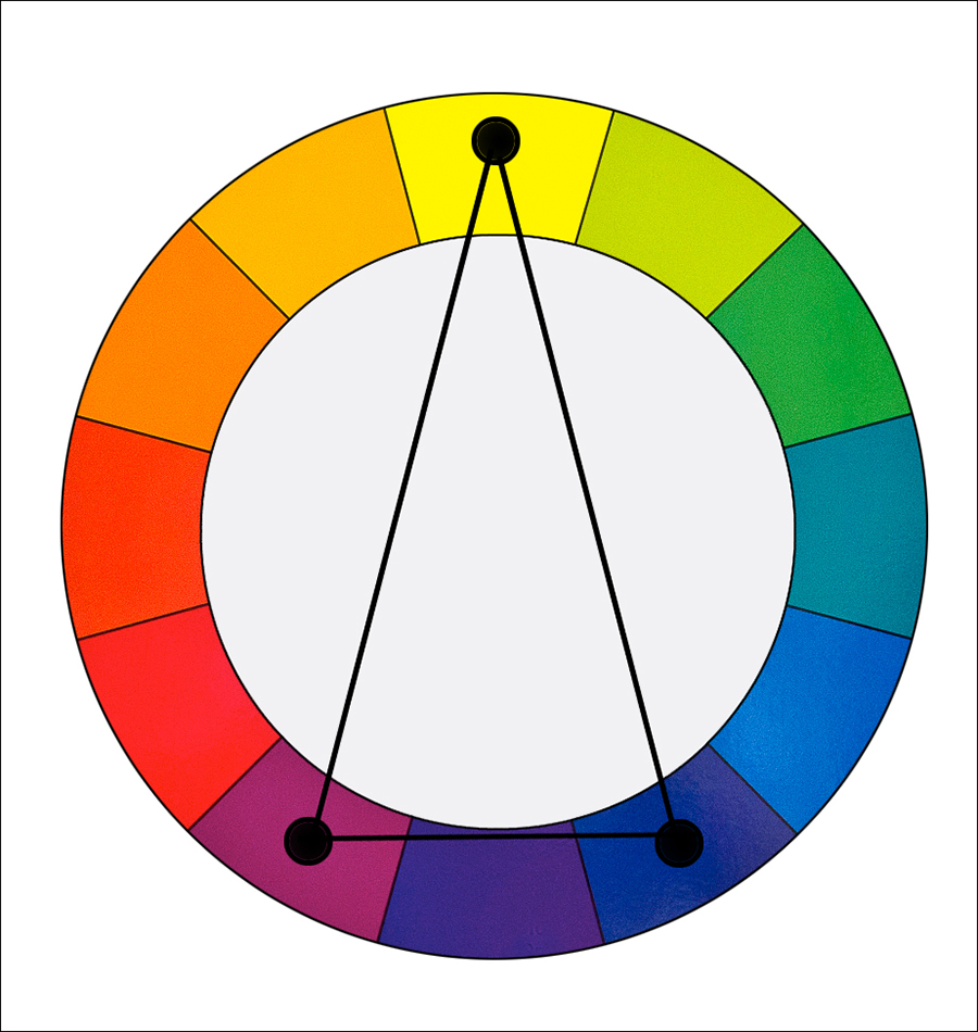
In this scheme, you select a color as the main one and combine it with the other two, that are standing close to its complementary color on the color wheel. If you connect the selected colors with lines, you will get an isosceles triangle. Possible options are: red, yellow-green and blue-green, or purple, yellow-orange and yellow-green. This is a rather contrasting scheme, that has less tension than a complementary one.
Rectangle color scheme
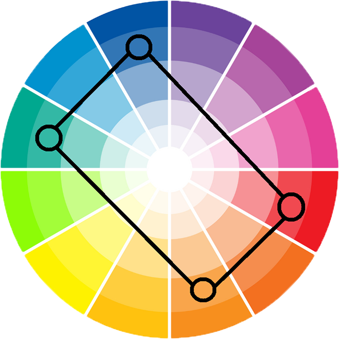
Here you need to choose two pairs of complementary colors. If you connect them with lines, you will get a rectangle. Example: yellow-orange, yellow green, blue-violet and red-violet. This scheme is a perfect option for unusual combinations and creative websites. Though, if you are afraid of creating a color chaos on your website you can choose one color as the basic, and use the other three to make accents.
Monochromatic color scheme
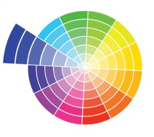
It is clear from the name that this scheme combines shades of the same color. You can both mix dark and light shades, and choose either dark or light variations.
From Theory to Practice
Congrats! Now you know the main color schemes and understand their pros and cons. Let’s see how to use this knowledge in practice. Here are some premium WordPress themes with different color schemes created by TemplateMonster. I think they can be good examples and a source of inspiration. If you have carefully read through the theory and are ready to show your knowledge – guess which color schemes were used in each of the websites and comment below.
Houston Business WordPress Template

Bright Print Shop WordPress Design

Fast Cleaning Service WordPress Theme

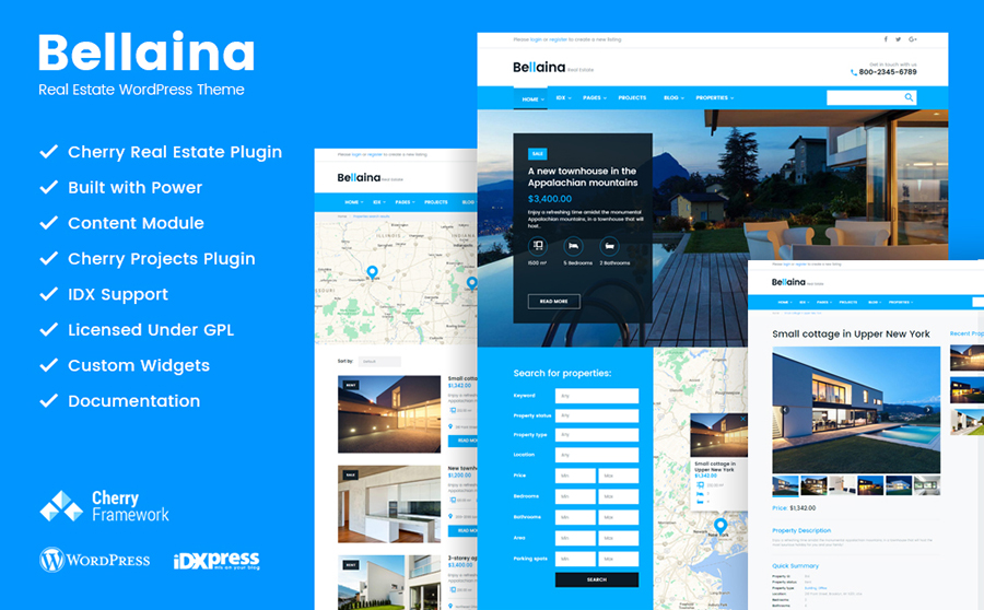
Bellaina – Realtor Services WordPress Template
Sweet Cakes and Bakery WordPress Theme

Wine Store WooCommerce Theme
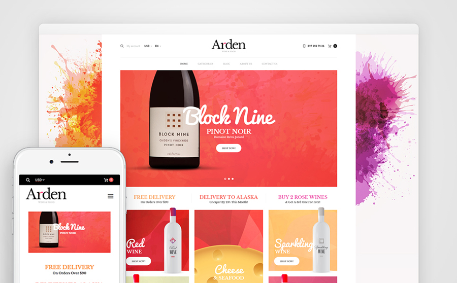
Fashionable Apparel WooCommerce Website

Sketchfield – Web Design WordPress Site

SEO Agency WordPress Theme

Elegant Photography WP Design

WordPress Theme for Professional Designer

Reliable Financial Company WordPress Theme

Bright and Fashionable WordPress Template

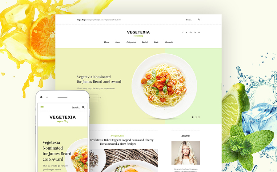
Vegetarian Restaurant WordPress Theme
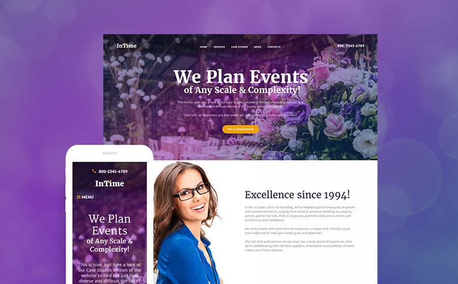
Best Event Planner WordPress Design
Read More at Color Theory for Web Designers – How to Choose the Right Color Scheme for Your Website
