Archive

Archive for March, 2017

Web Development Reading List #173: CSS Grid Support, A Virtual DOM Alternative, And Designing Better Cards

March 10th, 2017 No comments

This week was a big week in terms of web development news. We got much broader support for CSS Grids and Web Assembly, for example, but I also stumbled across some great resources that teach us a lot of valuable things.

With this Web Development Reading List, we’ll dive deep into security and privacy issues, take a look at a lightweight virtual DOM alternative, and get insights into how we can overcome our biases (or at least how we can better deal with them). So without further ado, let’s dive right in!

The post Web Development Reading List #173: CSS Grid Support, A Virtual DOM Alternative, And Designing Better Cards appeared first on Smashing Magazine.

Categories: Others Tags:

Password Rules Are Bullshit

March 10th, 2017 No comments
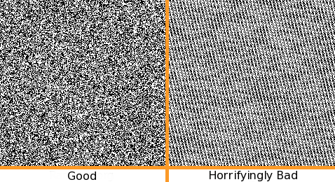
entropy visualized

Of the many, many, many bad things about passwords, you know what the worst is? Password rules.

If we don’t solve the password problem for users in my lifetime I am gonna haunt you from beyond the grave as a ghost pic.twitter.com/Tf9EnwgoZv

— Jeff Atwood (@codinghorror) August 11, 2015

Let this pledge be duly noted on the permanent record of the Internet. I don’t know if there’s an afterlife, but I’ll be finding out soon enough, and I plan to go out mad as hell.

The world is absolutely awash in terrible password rules:

But I don’t need to tell you this. The more likely you are to use a truly random password generation tool, like us über-geeks are supposed to, the more likely you have suffered mightily – and daily – under this regime.

Have you seen the classic XKCD about passwords?

We can certainly debate whether “correct horse battery staple” is a viable password strategy or not, but the argument here is mostly that length matters.

That's What She Said

No, seriously, it does. I’ll go so far as to say your password is too damn short. These days, given the state of cloud computing and GPU password hash cracking, any password of 8 characters or less is perilously close to no password at all.

So then perhaps we have one rule, that passwords must not be short. A long password is much more likely to be secure than a short one … right?

What about this four character password?

?????

What about this eight character password?

????????

Or this (hypothetical, but all too real) seven character password?

@codinghorror I’m sorry but your password must contain 1 char each from: Arabic, Chinese, Thai, Korean, Klingon, Wingdings and an emoji

— Finley Creative (@FinleyCreative) March 3, 2016

You may also be surprised, if you paste the above four Unicode emojis into your favorite login dialog (go ahead – try it), to discover that it … isn’t in fact four characters.

Oh dear.

"💩".length === 2

Our old pal Unicode strikes again.

As it turns out, even the simple rule that “your password must be of reasonable length” … ain’t necessarily so. Particularly if we stop thinking like Ugly ASCII Americans.

And what of those nice, long passwords? Are they always secure?

aaaaaaaaaaaaaaaaaaa
0123456789012345689
passwordpassword
usernamepassword

Of course not, because have you met any users lately?

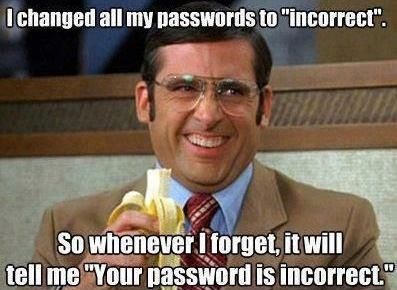
I changed all my passwords to

They consistently ruin every piece of software I’ve ever written. Yes, yes, I know you, Mr. or Ms. über-geek, know all about the concept of entropy. But expressing your love of entropy as terrible, idiosyncratic password rules …

  • must contain uppercase
  • must contain lowercase
  • must contain a number
  • must contain a special character

… is a spectacular failure of imagination in a world of Unicode and Emoji.

As we built Discourse, I discovered that the login dialog was a remarkably complex piece of software, despite its surface simplicity. The primary password rule we used was also the simplest one: length. Since I wrote that, we’ve already increased our minimum password default length from 8 to 10 characters. And if you happen to be an admin or moderator, we decided the minimum has to be even more, 12 characters.

I also advocated checking passwords against the 100,000 most common passwords. If you look at 10 million passwords from data breaches in 2016, you’ll find the top 25 most used passwords are:

123456
123456789
qwerty
12345678
111111
1234567890
1234567
password
123123
987654321
qwertyuiop
mynoob
123321
666666
18atcskd2w
7777777
1q2w3e4r
654321
555555
3rjs1la7qe
google
1q2w3e4r5t
123qwe
zxcvbnm
1q2w3e

Even this data betrays some ASCII-centrism. The numbers are the same in any culture I suppose, but I find it hard to believe the average Chinese person will ever choose the passwords “password”, “quertyuiop”, or “mynoob”. So this list has to be customizable, localizable.

(One interesting idea is to search for common shorter password matches inside longer passwords, but I think this would cause too many false positives.)

Also of note: only 5 of the top 25 passwords are 10 characters, so if we require 10 character passwords, we’ve already reduced our exposure to the most common passwords by 80%. I saw this originally when I gathered millions and millions of leaked passwords for Discourse research, then filtered the list down to just those passwords reflecting our new minimum requirement of 10 characters or more. It suddenly became a tiny list. (If you’ve done similar common password research, please do share your results in the comments.)

I’d like to offer the following common sense advice to my fellow developers:

1. Password rules are bullshit

  • They don’t work.
  • They heavily penalize your ideal audience, people that use real random password generators. Hey guess what, that password randomly didn’t have a number or symbol in it. I just double checked my math textbook, and yep, it’s possible. I’m pretty sure.
  • They frustrate average users, who then become uncooperative and use “creative” workarounds that make their passwords less secure.
  • Are often wrong, in the sense that they are grossly incomplete and/or insane, per the many shaming links I’ve shared above.
  • Seriously, for the love of God, stop with this arbitrary password rule nonsense already. If you won’t take my word for it, read this 2016 NIST password rules recommendation. It’s right there, “no composition rules”. However, I do see one error, it should have said “no bullshit composition rules”.

2. Enforce a minimum Unicode password length

One rule is at least easy to remember, understand, and enforce. This is the proverbial one rule to bring them all, and in the darkness bind them.

  • It’s simple. Users can count. Most of them, anyway.
  • It works. The data shows us it works; just download any common password list of your choice and group by password length.
  • The math doesn’t lie. All other things being equal, a longer password will be more random – and thus more secure – than a short password.
  • Accept that even this one rule isn’t inviolate. A minimum password length of 6 on a Chinese site might be perfectly reasonable.
  • If you don’t allow (almost) every single unicode character in the password input field, you are probably doing it wrong.
  • It’s a bit of an implementation detail, but make sure maximum password length is reasonable as well.

3. Check for common passwords

As I’ve already noted, the definition of “common” depends on your audience, and language, but it is a terrible disservice to users when you let them choose passwords that exist in the list of 10k, 100k, or million most common known passwords from data breaches. There’s no question that a hacker will submit these common passwords in a hack attempt – and it’s shocking how far you can get, even with aggressive password attempt rate limiting, using just the 1,000 most common passwords.

  • 1.6% have a password from the top 10 passwords
  • 4.4% have a password from the top 100 passwords
  • 9.7% have a password from the top 500 passwords
  • 13.2% have a password from the top 1,000 passwords
  • 30% have a password from the top 10,000 passwords

Lucky you, there are millions and millions of real breached password lists out there to sift through. It is sort of fun to do data forensics, because these aren’t hypothetical synthetic Jack the Ripper password rules some bored programmer dreamed up, these are real passwords used by real users.

Do the research. Collect the data. Protect your users from themselves.

4. Check for basic entropy

No need to get fancy here; pick the measure of entropy that satisfies you deep in the truthiness of your gut. But remember you have to be able to explain it to users when they fail the check, too.

In my opinion, the simplest way to do this is to ensure that there are at least (x) unique characters out of (y) total characters. And that’s what we do as of the current beta version of Discourse. But I’d love your ideas in the comments, too. The simpler and clearer the better!

5. Reject special case passwords

I’m embarrassed to admit that when building the Discourse login, as I discussed in The God Login, we missed two common cases that you really have to block:

  • password equal to username
  • password equal to email address

? If you are using Discourse versions earlier than 1.4, I’m so sorry and please upgrade immediately.

Similarly, you might also want to block other special cases like

  • password equal to URL or domain of website
  • password equal to app name

In short, try to think outside the password input box, like a user would.

[advertisement] Building out your tech team? Stack Overflow Careers helps you hire from the largest community for programmers on the planet. We built our site with developers like you in mind.
Categories: Others, Programming Tags:

Free Sparkly Icons To (Literally) Make Your Designs Shine (30 Icons, EPS, SVG)

March 10th, 2017 No comments

What would life be without surprises? Pretty plain, wouldn’t you agree? Today, we are happy to announce a freebie that bubbles over with its friendly optimistic spirit, bound to sprinkle some unexpected sparks of delight into your projects: Ballicons 3. If that name rings a bell, well, it’s the third iteration of the previous Ballicons icon set created by the folks at Pixel Buddha.

This icon set covers a vibrant potpourri of subjects, 30 icons ranging from nature, travel and leisure motifs to tech and office. All icons are available in five formats (AI, EPS, PSD, SVG, and PNG) so you can resize and customize them until they match your project’s visual style perfectly. No matter if you like it bright and bubbly or rather sleek and simple — the set has the makings to become a real allrounder in your digital tool belt.

The post Free Sparkly Icons To (Literally) Make Your Designs Shine (30 Icons, EPS, SVG) appeared first on Smashing Magazine.

Categories: Others Tags:

Noupe Exclusive: 350+ Free Icons For Our Readers

March 10th, 2017 No comments

Icons are always useful. This is the same for both you and us. We got together with the vector acrobats from Vexels to create an icon collection with more than 350 pictograms that you can use completely for free, and for any purpose you want to. Enjoy!

Our icon set contains symbols for social media, general business applications, and all types of contact pictograms. For that, we have chosen the most up to date design variants. The symbols come in flat design, as line icons, in offset style, with long shadows, as well as sporting the newest material design. This should allow for the creation of all conventional designs. If you are not one hundred percent content with the pictograms, you can simply edit them yourself, as you not only get each icon as an individual PNG with the measurements 1200 x 1200 pixels but also as an individual SVG, as well as a layered Adobe Illustrator format.

This overview gives you an impression of what to expect:

An Overview of All Pictograms. (Overview: Vexels)

The download of the 18 megabytes heavy ZIP archive is not tied to any preconditions. All you have to do is attach the note “Designed by Vexels” to projects that you use the set in. After the download and unzipping of the archive, you’ll find a folder named ICONS on your local drive, in which the individual design variants are stored, divided into further subfolders.

Download the Zip archive now (18MB): 350+ Icons for Business and Contacts

Categories: Others Tags:

BetterWebType: Free Course on Web Typography

March 10th, 2017 No comments

On BetterWebType, you can attend a free email class with ten lectures on better web typography. It’s completely free and run by Matej Latin, the creator of the Gutenberg starter kit.

Better Web Typography For a Better Web

This is the slogan that Matej Latin will welcome you with on his website BetterWebType. Regular readers of Noupe already know Matej Latin. About a year ago, we gave you an in-depth introduction to his project Gutenberg here.

Matej calls Gutenberg a “Meaningful Web Typography Starter Kit,” which means that, by using Gutenberg in our projects, we are always on the safe side, without needing to put in an extra effort. Gutenberg takes care of the basics by itself. The project was created based on Sass. This allows you to work with mixins, providing your designs with a level of flexibility that would not have been possible without variable markup.

While a starter kit can definitely help the clueless to avoid the roughest mistakes, solid knowledge is undisputedly better. Latin agrees with the founder of iA, Oliver Reichenstein, who said that web design is 95 percent typography more than ten years ago already.

To account for this aspect, Latin considers it necessary for web designers and developers to upskill in this section more than ever. To make this possible, Latin offers a free class on web typography.

BetterWebType is not a disguised acquisition scheme with reduced usefulness, but a full-featured, actually free class in ten lectures. There are no charged add-ons, expansions, or other tricks either. BetterWebType is and, according to Latin, will stay free.

BetterWebType Covers the Basics and Exceeds Them

BetterWebType already has more than 3,000 subscribers. It covers all basics, including the question how fonts should be selected and combined; a problem that many people don’t put enough thought into.

Other lectures deal with ligatures, small caps, quotation marks, vertical and horizontal rhythm, and a lot more. The lectures are sent to you via email. The class takes ten days, with you receiving one lecture a day.

BetterWebType: Who Learns What? (Screenshot: Noupe)

The reading effort for each lesson is about five to ten minutes. At the end of each, you’ll also receive more in-depth tips on what you learned. These can be articles, websites, or book recommendations. From time to time, you’ll also be asked to solve a task. How much time you end up putting into the class is up to you.

BetterWebType is made to allow both designers and developers alike to profit from it. Prior knowledge generally is not required, but complete cluelessness in HTML and CSS would definitely be a problem.

For the participation, it is enough to tell Latin your first and last name, as well as an email address. Obviously, the email address should be functional, as that is where the lessons will go.

Categories: Others Tags:

Web agencies and chatbots – the race to stay relevant

March 9th, 2017 No comments
Web-agencies-and-chatbots

Mobile messaging and chatbots are here, and it looks like they are here to stay. As a web agency, you have most likely heard of the chatbot trend and are pondering whether or not you should be getting involved.

What are chatbots, exactly? Is it worth tweaking your cold pitch to include them? What upside will they (realistically) bring to your business?

These are the exact questions I am going to answer in this article.

I am going to show you why, as a web professional, you need to look into chatbots today. In fact, ideally, yesterday.

A quick overview of the chatbot trend

Before we go further, we need to get you up to speed.

What is a chatbot? A chatbot is a program designed to communicate with human users through a conversational interface.

Chatbot growth has accelerated fast. It all started in 2015 when mobile messaging became a bigger channel than social media.

In 2016, a few businesses realized the potential mobile messaging could have on its bottom line. Facebook created the perfect bot-storm by opening its Messenger API, allowing geeks all over the world to build bots for free.

facebook-messenger-growth-graph

Facebook Messenger’s user base keeps growing, a fantastic opportunity for chatbots. (source)

Now 2017 has been deemed to be ‘the year of the chatbot’.

Use cases have started popping up everywhere, some simple and silly like the cat chatbot (meow?), some more advanced and AI-driven like Unilever and PG tips’ Monkey bot (tea anyone?).

Now you are caught up let’s move on.

Why should your web agency care about chatbots?

To differentiate yourself

Your industry is tough. There are a plethora of options for potential clients; competition is fierce.

Standing out from the crowd is more important than ever. Chatbots will help you do just that.

It will take the market a year or so to catch up to the chatbot trend. It will take another few years for your competitors to figure out what to do with them, how to pitch them, and how to build them. You will have the upper hand as you have already figured it all out.

Become ‘the’ agency in your neck of the woods who can talk intelligently, and effectively pitch chatbots today, not in three years.

Get ahead of the curve

As a web agency, you often are considered the ‘internet translator’ for the less tech-savvy. Your clients come to you with ideas, things they have seen or heard somewhere else and ask, “can you do that for me?”

If it has not already, this is going to happen to you with chatbots, very soon. The truth is, across the planet, it is going on right now.

When your competitors are asked: “do you know anything about chatbots?”. They reply something along the lines of “I do not, let me look into it”.

Become the agency that says “Yes”.

Chatbots are becoming an extension of websites and a brand

Web design and web development have, for many years, relied on principles of design, visuals, functionality, typography and UI.

The somewhat lesser-important parts of a brand’s identity are now front and centre.

– What is our voice?
– Do we use emojis?
– Are we fun or serious?
– What is our tone?
– How approachable are we?
– What words should we use to communicate?

As a web agency, it will become part of your role to help clients define their conversational identity and help them with everything around their project, from planning the build to benchmarking their chatbot’s user engagement and making sure it is a success.

pg-tips-monkey-chatbot

PG tips’ Monkey chatbot has a fun and approachable personality. (source)

You need to dig into chatbots, conversational commerce, conversational UI, and all the other implications of moving a brand from one-way (‘this is us’) into two-way (‘this is us, let’s chat’).

Chatbots are a powerful tool

Speaking of conversational commerce, we need to touch on what chatbots are good at.

So far, we have looked at why chatbots are beneficial to your company. For your clients, on the other hand, chatbots are an amazingly powerful tool.

It may be through content distribution via the channel consumers prefer (as opposed to good old email marketing). Alternatively, maybe assisting sales by offering a new lead gen channel or perhaps decluttering the helpdesk by automating responses to 80% of incoming enquiries. Whatever their use, your clients will treasure the chatbot you deliver.

By looking into chatbots today, you are not only giving your agency a head start on competitors; you are setting your clients up to do the same thing against theirs.

Great, where do I start?

1. Get learning

First things first, you need to get up to speed on this whole chatbot thing.

Thankfully, content from thought leaders is starting to spring up. Look for content produced by companies that build chatbots, work in AI, and deal with conversational interfaces every day.

2. Partner up

Learned enough to realise chatbots have a place in your business? Fantastic. Time to partner up.

(Good) Chatbot building is a unique and brand new industry; it may take your staff time to learn the technical skills required to develop solutions for your clients. In the meantime, you should find a chatbot building company you can rely on to help bring your clients’ project to life.

3. Start pitching

You have done some reading. You have found a partner you can count on. Now to the fun part: pitching and saying “yes, we know about chatbots”.

Go through your existing client list and think about which would benefit from automating parts of their business processes using a chatbot.

Make use of your new knowledge and help your current (and future) clients stand out from the crowd.

Become the chatbot hero your clients deserve.

Read More at Web agencies and chatbots – the race to stay relevant

Categories: Designing, Others Tags:

7 Design Myths That Will Wreck Your Site

March 9th, 2017 No comments

When I was a junior designer I made plenty of mistakes. I believed false assumptions mostly because I did not have the experience yet to know better. I still don’t know it all. But, I am always eager to learn new things about design and to see which preconceived notions are accurate or a complete myth. That’s how this post came about. I want to address seven common design myths which I still see influencing design decisions.

Unfortunately, false design myths like these to lead to poorer quality design and poorer experiences for end users. We can avoid this by making smarter design decisions to improve the quality of our designs.

1. The homepage is your most important page

For a long time, people believed the homepage was the most important page. Way back when, it may have been the case when the homepage served as the main directory in getting around to the rest of the pages. It’s no longer the case. The way we browse, and even find web pages, has changed dramatically. Often, visitors will land on a web page from a direct link to a product page, missing the home page altogether. This direct access to other pages is largely due to SEO results or links shared on social media.

Today, home pages serve one main purpose: to get you to the content, whatever it may be. For websites that are constantly filled with new content such as BuzzFeed or Darling Magazine, the home page serves to show the top stories. There are also websites that show off products or services, like Maison Deux. In both of those cases, the user is bound to enter the content specific page because they are not there for the homepage, the directory, they are there to consume information or make purchases. Next, there are services like Mailchimp or InVision where users are interested in using web apps instead. There are plenty of websites out there whose homepage you don’t see as a logged in users, such as Facebook.

Viewing many design gallery sites such as Dribbble, Behance or Awwwards by the sheer number of showings of creative and amazing home pages. There is nothing wrong with having a great looking and well functioning homepage. However, let’s get one thing straight: compared to other pages on a website, a homepage is not as important.

2. Minimalism is the only way to achieve simplicity

Minimalism is a style, while simplicity is about the overall feel and functionality of an application or website. A complicated and extensive design can be made simple. The goal of simplicity isn’t to have the minimal amount of things such as steps, UI elements or interactions.

Steven Sinofsky put it well. He explains that minimalist design decreases the visual surface of a design and its experience, whereas simple design—which he calls frictionless design—decreases the energy required for the experience.

Let’s take for instance the UX of a form with no labels but only placeholder text. We all know this infamous pattern. So although having less visual elements, in this case missing a label, is more minimal the interaction is often confusing for users filling out the input. The interaction is no longer simple. Adding the extra UI element, the label, even providing an example outside of the placeholder, adds to the quantity of UI elements. But, the interaction becomes simpler, easier and more intuitive for the users. That’s a great differentiation between minimalism and simplicity. They are not one and the same.

3. Limit the number of navigational choices

Many people misinterpret George Miller’s theory that the human minds can keep track of 7 (plus or minus 2) bits of information at a time. His theory still holds true but it’s exclusive to the human cognitive condition regarding short term memory. Somehow this theory made its way into web design, specifically to navigation and menus.

Additionally, there is research on limiting the number of choices, which was popularized by Barry Schwartz. Barry Schwartz’s research was referring to choices in product. In his research, Schwartz was referring to jams where the customers had a harder time picking, committing and therefore purchasing a jam if there were a multitude of options. The customers were purchasing jams at a significantly higher rate if they were presented with just a few choices. This can apply to any other product like cars, phones or online subscriptions. They key here is still products.

The job of a navigation is to help a visitor explore what a website has to offer.

Neither of those two pieces of research has anything to do with navigation. The job of a navigation is to help a visitor explore what a website has to offer. Back in 2006, Jared Spool wrote on the topic of link-rich websites which are sites filled with many links and pages. In the article he uses an old version of the Dove website to demonstrate his point, and although the website has changed, the conclusion still stands. Dove’s sitemap was more usable to a visitor than their own homepage’s navigation. The reason for this is that is allowed anyone looking for a specific product to find the necessary product page.

Navigation can be large but still allow the user to browse to the product they are looking for. Good navigation won’t hide the multitude of pages. Instead, it will cluster and group them into similar categories to be findable by a visitor. Now, if the groups and clusters are poorly made that’s also not helpful to the user. The bottom line is, hiding pages from the navigation is not beneficial to the user.

4. Everything must be no more than three clicks away

On computer interactions, the rule is said to be three clicks but this rule has also been extended to mobile devices in the form of two taps. Multiple usability studies prove that this is bogus.

Visitors and users don’t care about the exact amount of clicks or taps. They care about obtaining the information they are looking for, they care about finishing the task they are doing. Additionally, it’s relevant to the user whether clicking through will get them to the desired information. If the user feels they won’t find what they need in their journey, they may leave without clicking just once even though the information might be revealed after a single click. Users will keep on going through as many as 25 clicks, as found by UIE, in order to complete their tasks. The UIE research also states the importance of user satisfaction is also irrelevant to the three click rule.

5. Mobile device users are always on the go and are always distracted

When speaking about mobile apps or responsive websites, both of these points are mentioned. First, mobile device users are presumed to be on the go. Second, they are also presumed to be distracted. Way too often, these two assumptions seem to go hand in hand with one another. Someone who is on the go is bound to be distracted. The fact of the matter is, neither is actually the case.

68% of mobile page views happened at home…mobile interactions such as reading articles or shopping, is mostly done at home

Let’s tackle the first assumption first. A 2012 Google study found out that majority of smartphones were used at home, 60% to be exact. Another study in 2012, this time by InsightsNow on behalf of AOL, found that 68% of mobile page views happened at home. InsightsNow’s study excluded texting, calling and emailing. But, as you can imagine, playing games, browsing Tumblr or Facebook, and any other mobile interactions such as reading articles or shopping, is mostly done at home. Although we should still keep designing for on the go use, it’s not the primary way most of us use our mobile devices now.

Next is the assumption regarding distractions. Distractions are eminent everywhere, albeit it working, watching tv, driving or using a mobile device. That’s just a fact of life. Just because someone is using their smartphone instead of a desktop computer does not make them more distracted. I will point to the same 2012 Google study which found that while using a PC 67% of the time a user is also using another device compared to 57% while using a smartphone.

6. Good usability is good enough without aesthetics

Don Norman devotes a whole book to explain how emotions and design go hand in hand. That’s because while great usability may be a great start and it’s certainly necessary, it still may not actually be good enough. Don Norman’s book centers around emotional connections created through design. Positive emotions can be powerful in helping sell products. There are numerous studies to show that more attractive products appear to perform better than products with poorer designs. Not to mention that first impressions are excessively made through appearances.

More importantly, looks and design are often related to credibility. Stanford University’s Credibility Project proved just that. They presented people with websites to learn about the correlation of credibility. They found the 46% of people based the credibility of a website by its appearance. Emotional responses play a greater role in connecting with people than usability. Emotions are human while usability is technological. Therefore, great visual design and aesthetics is a competitive advantage and a differentiator within a marker. Ultimately aesthetics help enhance usability as mentioned in Don Norman’s book, Emotional Design.

7. Your users will tell you what they want

This one is my favorite. Asking your users for feedback is important. It’s equality important not to take their feedback literally. Noah J. Goldstein wrote:

people’s ability to understand the factors that affect their behavior is surprisingly poor.

And he couldn’t be more right. This type of thinking goes back to days of Henry Ford where he famously said: “If I had asked people what they wanted, they would have said faster horses.” That’s because people are bad at explaining their own behavior patterns, intentions, and behavior predictions. This phenomenon is also known as introspection illusion, in psychology. It’s okay, I’m bad at it too.

Another reason why listening blindly can lead to trouble is that people often speak only about the solution to the problem they might be facing. As a designer, I’m sure you’ve received design feedback such as “make the text bigger” with no explanation as to why. A client or a colleague might have a hard time reading the text with a smaller font or they might feel that the smaller font is less noticeable compared to everything else in the section’s design. The same goes for user feedback. Like I said, it’s important to listen to customers and users. But, it’s more important to get to the bottom of the problem first. Do further research based on user feedback, requests or complaints to figure out what the problem at hand might be, and solve it for that instead of their comments alone.

Conclusion

There are still many more design myths and assumptions out there. These are the seven most common ones I see other designers cling to, especially junior designers or design students. We’ve all been there—I’ve been there. It’s important to realize that these assumptions are baseless and be smart about them moving forward. Hopefully, exposing these seven will help you make better and smarter design choices.

302 Found

Found

The document has moved here.


Apache Server at www.mightydeals.com Port 80

Source

Categories: Designing, Others Tags:

An Event Apart Seattle – April 3-5, 2017

March 9th, 2017 No comments

An Event Apart Seattle is coming up! Less than a month away. If you’ve been trying to decide, now is the time to pull the trigger before it sells out. I’ll be there doing three official things. One, I’ll be speaking. Two, I’ll be giving a workshop on the last day. Three, I’ll be on a discussion panel talking about staying on top of this field.

The workshop on the final day is called A Day Apart, and you buy tickets for the conference and the workshop separately or as a package deal.

If you’d be just visiting Seattle, that’s perfect, as the event is perfectly situated to enjoy a lot of the best of Seattle.

The lineup is excellent.

Speaker Lineup
  • Sarah Parmenter: Practical Branding
  • Krystal Higgins: Onboarding for Any Situation
  • Luke Wroblewski: Obvious Always Wins
  • Val Head: Motion In Design Systems: Animation, Style Guides, and the Design Process
  • Ethan Marcotte: Design Beyond Our Devices
  • Jeremy Keith: Evaluating Technology
  • Rachel Andrew: New CSS Layout Meets the Real World
  • Jen Simmons: Designing with Grid
  • Eric Meyer: Design for Real Life
  • Una Kravets: The Joy of Optimizing
  • Chris Coyier: 10 Things You Can and Should Do With SVG

After the first day, there is an opening night happy hour with provided snacks and beverages. That goes right into an evening panel discussion Val Head, Jeffrey Zeldman, and I will be having a chat on how to stay on top of your field and be a lifelong learner.

Speaking of staying on top of your field, that will be a nice segway into my workshop on the final day. Speaking of which, this is what I’m calling it:

Tall order, hey? I think we can get through it though, together. There is a lot to talk about.

We’re going to start with a design, but also talk about the process and journey of building websites from idea to design to development through deployment. We’ll talk about a lot of the tools along the way.

We’re going to look at a lot of code. That’s the job. Front-end developers spending a lot of time looking at and writing code. As we’ve covered many times on this site, there are often lots of different ways to do similar things in front-end development, we’re going to spend time exploring those situations because that’s all part of the job.

There is going to be lots of these things:

And some of these:

And some of these:

And why not a few of these:

I’m excited for all this. I really enjoy front end development, as I suspect a lot of you do, so I look forward to some pretty epic nerding out about all-things-that with whomever of you can make it.


An Event Apart Seattle – April 3-5, 2017 is a post from CSS-Tricks

Categories: Designing, Others Tags:

Simple Little Use Case for `vmin`

March 9th, 2017 No comments

Viewport units are things like 10vw (10% of the viewport width) or 2vh (2% of the viewport height). Useful sometimes, as they are always relative to the viewport. No cascading or influence by parent elements.

There is also vmin, which is the lesser of vw and vh, and vmax, which is the greater. These values can be used for anything that takes a length value, just like px or em or % or whatever.

Let’s take a look at a tiny design pattern that makes use of vmin.

A header block!

If we set the padding of an

like so:

header {
  padding: 10vmin 1rem;
}

We get some fixed padding (1rem) on the outsides, so for example text set inside there never actually touches the edges. We also get a header that sizes itself in what feels like an appropriate way depending on the screen real estate.

Large and in charge on large desktop views.
When there is less vertical room, it shortens up so that it isn’t getting in the way of content.
Portrait mobile views seem balanced.
Small screen landscape
Super tall and narrow still feels right. Which it doesn’t really factoring in just viewport height alone.

Sizing based on the minimum of the two browser window dimensions seems to feel right, rather than basing it solely on width or height.

Here’s the demo.

Here’s a video:


Simple Little Use Case for `vmin` is a post from CSS-Tricks

Categories: Designing, Others Tags:

Sketch Vs. Figma: The Showdown

March 9th, 2017 No comments

The past year has seen quite a rise in UI design tools. While existing applications, such as Affinity Designer, Gravit and Sketch, have improved drastically, some new players have entered the field, such as Adobe XD (short for Adobe Experience Design) and Figma.

For me, the latter is the most remarkable. Due to its similarity to Sketch, Figma was easy for me to grasp right from the start, but it also has some unique features to differentiate it from its competitor, such as easy file-sharing, vector networks, “constraints” (for responsive design) and real-time collaboration.

The post Sketch Vs. Figma: The Showdown appeared first on Smashing Magazine.

Categories: Others Tags: