Archive

Archive for March, 2017

Quiz: Do You Really Hate Comic Sans?

March 3rd, 2017 No comments

You’re a designer: you use Moleskine notebooks, the stickers on the back of your MacBook Pro are artfully arranged, there’s a motivational poster hung over your standing desk, and…you wear your hatred of Comic Sans like a badge of honor.

Forget the “no bad typeface” rule, Comic Sans offends your very being. The infuriatingly omnipresent font is used by everyone, from your grade school teacher, to your grandmother, and every time you see it, you die a little on the inside.

But do you really loath the world’s least-endorsed typeface? Or does seeing Vincent Connare’s magnus opus everywhere from gravestones to financial reports, give you a secret thrill?

Which of these pairs most offends your aesthetic senses, and is it Comic Sans?

Which sports branding uses Comic Sans?

Which movie poster uses Comic Sans?

Which Oscar winner uses Comic Sans?

Which Obama uses Comic Sans?

Which police warning uses Comic Sans?

Which subway sign uses Comic Sans?

Which magazine cover uses Comic Sans?

Which iPhone microsite uses Comic Sans?

Which error message uses Comic Sans?

Which album cover uses Comic Sans?

Can You Identify Comic Sans?

0–3 Correct
Are you sure you’re a designer? Try Again.

Share your Results :


Can You Identify Comic Sans?

4–6 Correct
Not Bad, order yourself that “I love Helvetica” T-shirt you’ve been hankering after.

Share your Results :


Can You Identify Comic Sans?

7–9 Correct
Wow, your Comic Sans detector is set to maximum.

Share your Results :


Can You Identify Comic Sans?

10
You cheated, right? Either that or you’re Vincent Connare…

Share your Results :


Spotted a hidden gem in there? Alongside Comic Sans, the typefaces used were (in order): Comic Relief, Jollygood Sans, Architect’s Daughter, Comic Neue, Komica Text, Cartoonist Hand, Jollygood Sans (again), Suplexmentary Comic, Comic Neue Bold, Comic Relief (again).

302 Found

Found

The document has moved here.


Apache Server at www.mightydeals.com Port 80

Source

Categories: Designing, Others Tags:

Weapons of Math Destruction

March 3rd, 2017 No comments

I think you’d do well to read Cathy O’Neils Weapons of Math Destruction: How Big Data Increases Inequality and Threatens Democracy. I saw her read at the Miami Book Fair several months ago, and immediately bought a copy. I even got her to sign it which is kinda cool 😉

Cathy’s big idea is that we’re absolutely surrounded by algorithms that inform big decision making. There are lots of good algorithms that help us. Sadly, there are lots of insidiously, dangerous, bad algorithms that do serious damage, and they are lurking all about disguised as good algorithms.

One aspect of a good algorithm is some kind of feedback and correctional system. Early on Cathy points to some advertising algorithms as an example of a healthy algorithm. For example, if an algorithm is in place to recommend a product you should by, and it does a terrible job at that, it will be tweaked until fixed, thereby correcting what is has set out to do. Moneyball-style algorithms are the same. The data is open. Baseball team manager use algorithms to help recruit for their team and manage how they play. If it isn’t working, it will be tweaked until it does.

A bad algorithm might lack a feedback loop. One of her strongest examples is in the algorithms that rate teachers. There is plenty of evidence that these algorithms are often wrong, ousting teachers that definitely should not have been. And not in a “they tested badly, but have a heart of gold” way, in a “the algorithm was actually just wrong” way. What makes something like this a “weapon of math destruction” (WMD) then, is the fact that it affects a lot of people, screws up, and there is no correction mechanism. There are lots of interesting criteria, though. I’ll let you read more about it.

There is an awful lot of considerations and nuance here, and I think Cathy delivers pretty gracefully on all that. She has an impressive pedigree academically, professionally, and journalistically. There is some pitchfork raising here, but the prongs are made of research, data, and morals.


Weapons of Math Destruction is a post from CSS-Tricks

Categories: Designing, Others Tags:

Just Another HTTPS Nudge

March 3rd, 2017 No comments

I was strongly reminded about the scariness of non-secure websites the other day.

I’m using Xfinity as an internet service provider, and they give you a device that is both a cable modem and a router.

Here’s a tiny bit of backstory. I use a VPN, and I discovered that in using their modem directly, the VPN wouldn’t work. I’m not sure why. I didn’t dig into it very far, because I have a modem of my own I’d prefer to use. So I plugged that in, which worked… but not particularly well. The connection was spotty and slow, even right in my own house.

I think (maybe?) it was competing WiFi signals from the two routers sitting right next to each other. Don’t quote me on that. The reason I think that is because, fortunately, I was able to turn off the router on the Xfinity device, and that solved the problem. The speed and connectivity was back. To their credit, it was really fast. The Xfinity device has a featured called “Bridge Mode” that is specifically for turning off the router so that you can use your own. I was able to enable that, use my own router, get the speed back, and connect to the VPN.

Win! That lasted for a few months. Then recently there was some weird big internet outage in our area. Xfinity notified us about it. They had to push some updates or something to our device, and that broke everything again. I struggled with it for days, but what ultimately worked was turning off Bridge Mode, and turning it back on again (isn’t it always?).

In those in-between days, the only thing I could figure out to get online was to connect to the SSID “xfinitywifi” that this router seemed to be emitting. This “xfinity” network is unusual because it behaves kinda like a coffee shop or university hotspot in that it pops up that weird browser modal and you have to log in with your (Xfinity) credentials. It’s a value-add kinda thing for their service. Their routers are dotted all over the place, so if you’re a customer of theirs, you get internet (“for free”) a lot of places. My fiance was at the doctor with my fiance the other day, and she was using it there.

If that’s the network you’re connected to, Xfinity performs man-in-the-middle attacks on websites to send you messages. Here’s an example of me just looking at a (non-secure) website:

Man-in-the-middle, meaning, this website had no such popup in its code. Xfinity intercepted the request, saw it was a website, and forcefully injected its own code into the site. In this case, to advertise an app and to tell you about security. Ooozing with irony, that.

If they can do that, imagine what else they can do. (Highly recommended listening: ShopTalk #250) They could get even more forceful with advertising. Swap out existing advertising with their own. Install a keylogger. Report back information about what you’re doing and where you are. Install a Service Worker so weird things could happen behind the scenes?! You might not even know it anything is happening at all.

This might seem a little tin foil hatish, but realize: they’ve already been incentivized to do this. All the incentive is there to keep milking value out of this superpower they have.

Some good news: Individual websites can stop this with HTTPS. That’s a massively good step. With HTTPS, the traffic packets are encrypted and Xfinity can’t read or manipulate them effectively. Through metadata, they might be able to guess what they are (e.g. know you’re streaming a video and throttle speed), but there isn’t much else they can do.

It’s not just this one indiscretion, Xfinity also uses this tactic to send you other messages.

@chriscoyier @XFINITY also how they warn you about bandwidth or billing issues. not fun.

— David Bisset (@dimensionmedia) February 24, 2017

@chriscoyier @XFINITY I have seen an ISP adding ads to bing home page. ?

— AKT (@itsakt) February 25, 2017

It’s this double whammy of scary:

  • Seriously?! You require me to have a box in my house that broadcasts a public WiFi hotspot that I can’t turn off?
  • Seriously?! You use that hotspot to perform man-in-the-middle attacks on anybody using it?

I’m sure it’s not just Xfinity, it’s just that’s what I’m using now and have now seen it with my own eyes.
To be clear, I’m sure I signed something that allows them to do everything they are doing and I don’t think anything they are doing is technically illegal (again, don’t quote me on that).

Being upset at them, and telling them about it, is a good step. Fighting back is another. Internet access is vital, so you have to use something, but if you have an option, is there an ISP that doesn’t do this available to you? Use them. Money talks.

Again, HTTPS solves this on a per-website basis. Jeff Atwood sums this up pretty well:

  1. You have an unalienable right to privacy, both in the real world and online. And without HTTPS you have zero online privacy – from anyone else on your WiFi, from your network provider, from website operators, from large companies, from the government.

  2. The performance penalty of HTTPS is gone, in fact, HTTPS arguably performs better than HTTP on modern devices.

  3. Using HTTPS means nobody can tamper with the content in your web browser. This was a bit of an abstract concern five years ago, but these days, there are more and more instances of upstream providers actively mucking with the data that passes through their pipes. For example, if Comcast detects you have a copyright strike, they’ll insert banners into your web contentall your web content! And that’s what the good guy scenario looks like – or at least a corporation trying to follow the rules. Imagine what it looks like when someone, or some large company, decides the rules don’t apply to them?

The move to HTTPS is non-trivial, and introduces somewhat complicated dependencies. It’s easy to forget to renew your certificate and break your entire website just like that. I’m not arguing against HTTPS (exactly the opposite), but you should know that it requires some upfront work and some diligent maintenance.

If you’re on WordPress like me, I wrote up how I moved to all-HTTPS going on two years ago. It involved a little database work even, getting URL’s pointing to the right places.

SSL certificates (the main prerequisite for HTTPS) also have traditionally cost money. No more! Let’s Encrypt is here:

Lets Encrypt is a free, automated, and open Certificate Authority.

There is an in-progress WordPress plugin for it. Let’s hope that gets off the ground. Just a few days ago I used the Let’s Encrypt Plesk extention to put HTTPS on ShopTalk’s website and it took me like 5 minutes. I’ll have to write that up soon.

Also check out the really excellent Moving To HTTPS Guide:

A community site to help site owners migrate to HTTPS with a simple tested process. Allowing you to filter the plan based on multiple platforms (WordPress, Magento, and more), hosting environments (cPanel, Apache, and more) along with the level of control / access you have over the site.


Just Another HTTPS Nudge is a post from CSS-Tricks

Categories: Designing, Others Tags:

Become a Blogger to Inspire Others

March 3rd, 2017 No comments

Blogging is everywhere around us and has become a niche market over the last couple of years which enables people to connect together on forums and in writing. Blogging somehow similar to journalism and combines various areas of our lives such as marketing, business and even fashion, food as well as travel in order to

Categories: Designing, Others Tags:

Randomizing SVG Shapes

March 3rd, 2017 No comments

SVG shapes are all built from numbers. Obvious, perhaps, but also, I’m not sure we take as much advantage of that as we could with inline . For example, it’s pretty easy to generate a new pseudo-random number in JavaScript:

function getRandomInt(min, max) {
  return Math.floor(Math.random() * (max - min + 1) + min);
}

Now imagine a bunch of variables set to random numbers, and using ES6 template literals to stitch them together:

let newPoints = `${x1},${y1} {x2},${y2} {x3},${y3} {x3},${y3}`; 

Which makes a valid syntax for the points attribute of a .

let polygon = document.querySelector("polygon");
polygon.setAttribute("points", newPoints);

A more detailed example of that, and a demo, over on the Media Temple blog.

Direct Link to ArticlePermalink


Randomizing SVG Shapes is a post from CSS-Tricks

Categories: Designing, Others Tags:

Inspiring Illustrations With Plenty Of Bright Colors And Cool Patterns

March 3rd, 2017 No comments

It’s almost time to leave winter behind us here in the Northern Hemisphere. Most of the time, the weather can’t quite make up its mind, and so the days pass by with half of the sky sunny while the other half gray. Nature usually tends to have a strong impact on my mood, and so these days I feel like I’m literally in a gray zone — between winter and spring.

I’m not sure about you, but with springtime lurking around the corner, my need for extra inspiration is even bigger. So, I hope that this month’s set will give you just that spark you need to cheer you up and boost your creativity.

The post Inspiring Illustrations With Plenty Of Bright Colors And Cool Patterns appeared first on Smashing Magazine.

Categories: Others Tags:

How to Use Tooltips as Microinteractions

March 3rd, 2017 No comments

Tooltips are potentially the best and most efficient approach to onboarding new users to any given app, software, program or user interface. They’re generally very helpful, clear-cut in their communication, and unobtrusive, so users can do what the tooltips suggest without running into any impediment.

Looked at in this way, your average tooltip is easily a micro interaction, as it helps users achieve a single task or helps users manipulate a process. A micro interaction is a subset of the user experience: It’s a dynamic process that’s initiated by a trigger, causes something to happen, provides feedback to the user, and then informs the user as to the next step.

Good tooltips are designed to be so discreet that, sometimes, you’d swear they were never there. That’s the indication of a great micro interaction, too: You only really miss them if they’re not there all of a sudden to help you achieve a task.

Let’s take an in-depth look at what tooltips should be used for, what matters in tooltip design, and what to include and what to avoid.

Use cases for tooltips

Tooltips exist to boost your site’s or app’s UX. That’s pretty much it. These micro interactions have to make life easier for your users in some way, shape or form. Although their purpose is straightforward, correctly and consistently implementing them in your platform may be a different story since it can get tricky to make the right call.

Unfamiliar Icons or Buttons

When your users encounter icons or buttons that are unfamiliar to them or are otherwise not labeled, then it’s a good idea to design some tooltips into the interface. Even if an icon or button is familiar-looking, but still needs a short explanation to onboard users quickly—say, in the case of a cogwheel on a dashboard—then including a tooltip makes all the sense in the world.

Additional (non essential) information

Here’s the key: not essential. A tooltip can provide extra information to users, so that the screen isn’t overly full of unnecessary text.

A great example of this is when you have tabs open in your browser: when you hover with your cursor over the tab, a tooltip will quickly appear, telling you the exact webpage title of where you are. Now, this extra info isn’t essential, but it’s nice to have when you want to make a note of exactly what page you’re visiting.

If the info is essential, a tooltip’s no good. The info should be included permanently right in your interface for user convenience and quick reference.

Tooltips aren’t ideal for everything

By the same token, tooltips can quickly become harmful to great UX on a device when they’re used incorrectly. Overdoing their use is a sure way to make your users sick and tired of what is otherwise a very helpful means of guiding your users through an interface you just designed.

Unintuitive design

Unintuitive design is when your design forces your users to keep relying on a tooltip to make it through your interface. In such a scenario, the best tooltip won’t help because, blatantly, something’s wrong in your design that keeps forcing your users to keep checking the tooltip too much. A tooltip should really only be used for onboarding users to a specific process, but, after that initial tutorial, users should be able to do things themselves.

Interaction with the tooltip’s content

Sometimes, it becomes necessary for users to actually interact with the content inside of the tooltip itself. For example, a tooltip’s content might include a call to action button, and the content may prompt users to click on the button. It could be anything from a signup button to login link.

However, it’s considered sub-par design to include such interactive elements inside your tooltips if they disappear when your users move their cursors to the tooltip…to follow the call to action. Just think of how frustrating that is to users—especially when your tooltip tells them how they can perform the action to begin with!

In such cases, just allow the calls to action to speak for themselves, designing them significantly enough so that they can get noticed all on their own.

Rules for awesome tooltip design

How you design your tooltips to provide micro interactions that guide users, and provide feedback, makes a great difference to their enjoyment of your interface. By spending a bit of extra time on how you design tooltips, you can provide a helpful experience to your users instead of one they get frustrated with.

Minimalism

As with so much else in web design, minimalism makes for a superior interface. There’s less chance of something not being as clear as it should to the user…and thereby ruining what should otherwise be a helpful micro interaction. Minimalism means basic colors, copy and language.

Sustainability

Your tooltip should be as helpful, unobtrusive and convenient to users the 100th time, as it was the very first time. Resist the temptation to go with questionable or clever design cues and go with tried, tested and true instead.

Noticeability

Tooltips should be easy to find and see without users having to resort to any detective work on the screen. One way to achieve this is by using very obvious visual or directional cues, such as arrows going from the tooltip to the element (button, icon, etc.).

Relevant and sensible information

When a tooltip appears, the info therein has to be easily understood by your users. This means short sentences with very clear language. Since the on-screen area for a tooltip is limited anyway, it’s necessary to be very concise. Nonetheless, you should also refrain from providing info that’s redundant since the info in a tooltip should only be a supplement to info that’s not immediately apparent in your interface.

This can’t be stressed enough: By thinking through how you design your tooltips, you can make them live up to their purpose and avoid the worst kind of tooltip, which is the one that hampers the task you want users to accomplish smoothly.

Tooltips: the epitome of microinteractions

In many ways, tooltips are the ultimate microinteractions. They help your users achieve a task or manipulate a process in an interface that you’ve designed. Depending on how you design them, you can save your users a lot of trouble or make life harder for them.

Unfortunately, it can be quite easy for designers to get a tooltip wrong—to the detriment of their users. To ensure stellar tooltip design each and every time, it helps to fully understand the true nature and reason of using tooltips in the first place, along with what works in tooltip design and what doesn’t.

Only then can you provide your users with the relevant information they need to efficiently understand your interface in a convenient and simple way.

302 Found

Found

The document has moved here.


Apache Server at www.mightydeals.com Port 80

Source

Categories: Designing, Others Tags:

Web Development Reading List #172: On Reporting Bugs, DNS Subdomain Takeovers, And Sustainable UX

March 3rd, 2017 No comments

As web developers, we all approach our work very differently. And even when you take a look at yourself, you’ll notice that the way you do your work does vary all the time. I, for example, have not reported a single bug to a browser vendor in the past year, despite having stumbled over a couple. I was just too lazy to write them up, report them, write a test case and care about follow-up comments.

This week, however, when integrating the Internationalization API for dates and times, I noticed a couple of inconsistencies and specification violations in several browsers, and I reported them. It took me one hour, but now browser vendors can at least fix these bugs. Today, I filed two new issues, because I’ve become more aware again of things that work in one browser but not in others. I think it’s important to change the way we work from time to time. It’s as easy as caring more about the issues we face and reporting them back.

The post Web Development Reading List #172: On Reporting Bugs, DNS Subdomain Takeovers, And Sustainable UX appeared first on Smashing Magazine.

Categories: Others Tags:

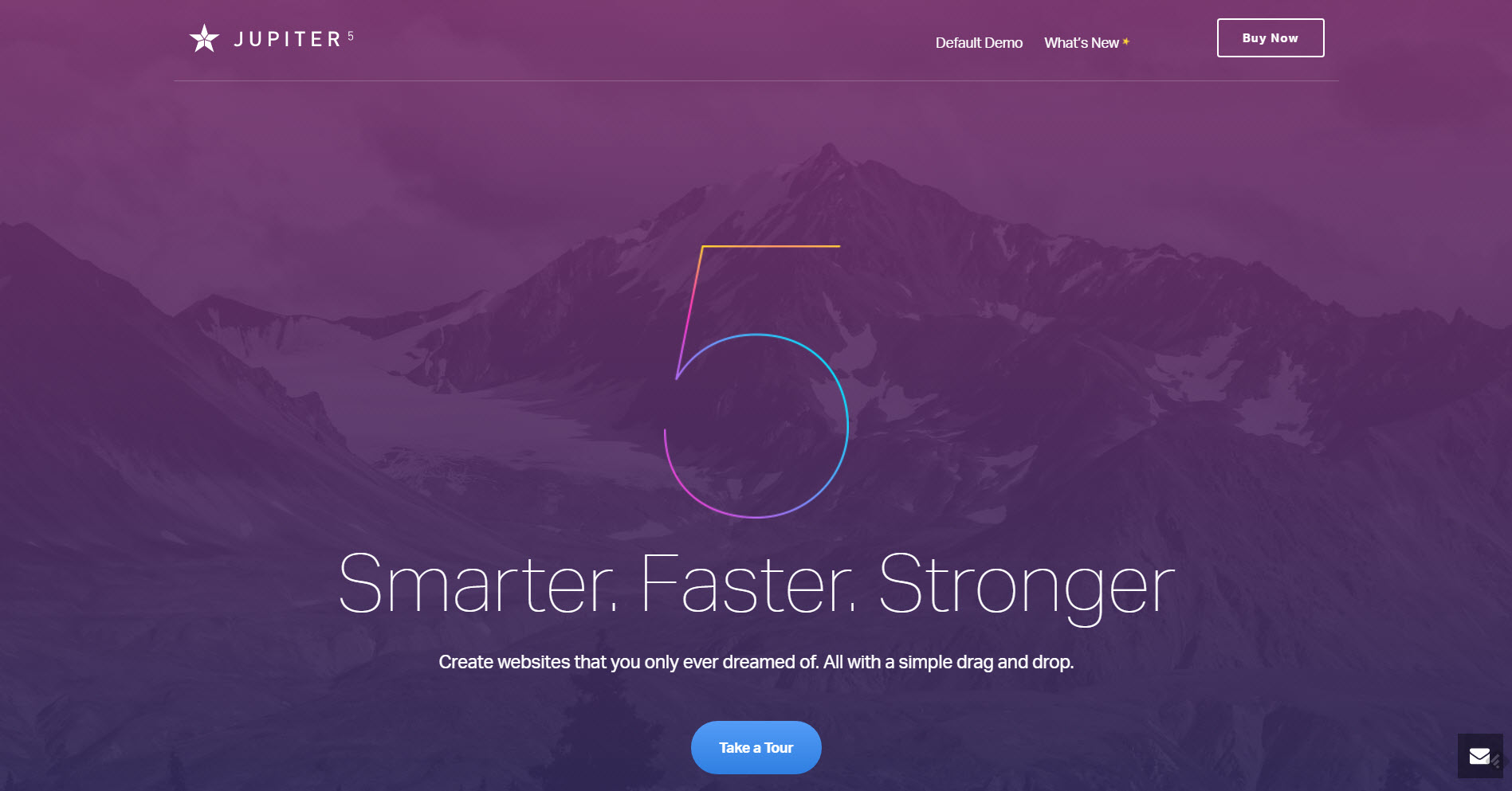
Jupiter: Premium WordPress Theme for Designers and Non-Designers

March 3rd, 2017 No comments

It’s always a tightrope walk when a theme developer attempts to create a product for both the average page owner, as well as the professional web designer. Artbees Themes’ Jupiter, which is currently available in version 5, gets this done.

Jupiter can look like this, or completely different. (Screenshot: Noupe)

Jupiter: Sold Since 2013

Jupiter is a pretty mature, while still actively developed theme. The developer studio Artbees Themes entirely focuses on WordPress as their design platform. In contrast to other studios, they don’t toss tons of themes on the market and have been sticking to their strategy of trying to cover the market with a total of two products for years now.

Both products are premium WordPress themes. The theme that today’s article is not supposed to be about is called “The Ken,” and is said to be an excellent choice for the self-presentation of the creative industry. At 49 USD, it is the cheaper of the two themes. According to Artbees Themes, more than 3,000 users have already chosen “The Ken.”

However, Jupiter, which Artbees Themes calls the only real multi-purpose theme on the market, is even more successful. The theme has accumulated more than 55,000 users already. Jupiter’s flexibility is mainly based on the fact that the 125 included, ready-made templates cover the majority of possible application areas out-of-the-box. I don’t know of any other theme with such a large, and ever-expanding range of templates at no additional cost.

And at 59 USD, the theme is not even expensive. If you keep in mind that this price already includes the license of the Visual Composer, which is a drag-and-drop page builder, Jupiter only nets at 25 USD. In any case, Jupiter is worth its price. In contrast to others, Artbees Themes don’t even ask for update fees. You pay the price of 59 USD once and receive all following updates for free.

You can tell that Artbees Themes is serious about Jupiter, simply because they have been continuously developing it since 2013. I have checked the numbers several times, since, these days, this type of commitment seemed so unlikely to me.

I was already convinced of Jupiter at this point. Anyone that isn’t convinced yet will definitely change their mind after taking a look at the feature set.

Jupiter 5: Completely Refurbished Codebase

In fact, Jupiter is well-suited to do everything you can, or can’t imagine. The developers put a lot of focus on keeping Jupiter extremely performant in all of its shapes.

Jupiter in Version 5. (Screenshot: Noupe)

As if Artbees followed our five-piece series on WordPress performance, they optimized all possible corners to get the last bit of speed out of the theme. They have even kept in mind to only load styles and scripts when needed.

It’s no surprise that Google PageSpeed gave them a rating of over 90 out of 100 for both desktops and mobile devices. That’s because the developers have taken and refurbished the entire codebase for Jupiter’s version 5. According to Artbees, every line of code was evaluated, and rewritten if necessary. A switch to a modular framework has been done as well. With that new foundation, it can deal with large amounts of data and changes better.

Jupiter 5 is Almost Entirely Adjustable

Artbees uses a method of Parallax Scrolling called “native Parallax,” with the rendering being done directly by the GPU. The 125 available templates make use of the function to different extents. The adjustment of designs is downright fun.

Overall, it’s the high flexibility regarding customization which lifts Jupiter 5 above the competition. This flexibility is also what makes this theme interesting for both page owners and web developers. While the page owner directly picks and configures one of the 125 templates until he’s satisfied, the developer can do a lot more with the given variety.

The large template portfolio is not the only way to turn the design into your own. I especially enjoyed the variety of different header styles. You can choose 18 different designs for the navigation header of your website. In contrast to what you’d expect from the name, you can implement it almost anywhere you want to. Jupiter’s designs even allow you to run a very appealing online shop.

One of Jupiter’s 125 Templates. (Screenshot: Noupe)

Beyond the fact that Artbees makes WordPress design much more comfortable, the developers came up with some unique ideas to further improve the user experience. For example, they implemented the category showcase. You assign a thumbnail to each WordPress category, and you instantly get an alternative way of presenting your content. The photo display does not require any additional plugins either.

If you want to add a price table to a product or service, you’ll be interested in the integrated “Pricing Table Builder.” Comfortably configure your pricing table from the backend.

Artbees also has fresh ideas for custom design. For example, you can use SVG shapes as containers for your icons, and also equip them with color gradients. Add color gradients to headings and buttons, if you feel like doing so. These are only the new features of version 5.

Before the release of the new version, Jupiter already had more than 100 readymade elements like sliders, photo grids, tabs, hero video, and image areas, carousels, accordions, and a lot more to offer.

Calling Jupiter a premium WordPress theme is an understatement. It’s more like a full-grown WordPress website builder. As such, it serves the target groups of ambitioned page owners and professional designers alike. We can well call it “made by designers for designers” while the ever-growing portfolio of professional templates keeps it also in the game for those who are seeking to get to results quickly.

Take a look for yourself! In the demo, you’ll find all included components behind the respective navigation item in the page’s header. But surf there when you have some time to spend. It will take a while to go through all there is to explore.

Disclaimer: This article is sponsored by Artbees Themes. The words are our own. Artbees Themes did not influence the content in any way.

Categories: Others Tags:

3 Months with Figma: Why it Changes Design Forever

March 2nd, 2017 No comments

Like most designers, I started with Photoshop, using it for over half a decade. From there, Sketch burst onto the scene and did not take long to announce itself as the go-to tool for designers. For the last three months, I have been using Figma each and every day, integrating it into my workflow and exercising its features across a broad spectrum of projects. The results have been overwhelmingly positive and as such I have selected a number of key features of Figma which I found to be extremely useful and often innovative.

Sketch is a highly competent and all-around excellent piece of software. Adobe XD is another piece of software which I was just getting used to using. So when I first began testing Figma, I was somewhat reluctant and skeptical as to its place in what is now a very competitive market. In this article I’m going to discuss why Figma is now my primary tool for design, why I believe it changes how we design, and why I believe it will become the next industry-standard tool.

Accessibility

Figma is extremely accessible. It’s available on Mac, Windows, and through modern browsers (unlike Sketch which is confined to the Mac). This instantly makes it more inclusive, and allows for collaboration not just with other designers, but developers, copywriters, and more. It’s universal and as a result makes the design process something which is far more collaborative and complete.

Your files are accessible anywhere. No download, no syncing. You could be at a public computer, a colleagues computer, or even on a Chromebook, yet your designs remain accessible to view and edit.

The accessibility ties in closely with its key feature, collaboration. By intertwining the two, collaboration becomes something quite extraordinary. You could have a use case where a designer is working in real-time with other designers, developers and copywriters. The possibilities are unique and exciting. I think as more designers and teams explore using Figma as a primary tool, more and more interesting ways of implementing the technology into a workflow will become apparent.

Lightweight

Figma is very lightweight. You don’t even need to have the application installed. Simply open a browser tab and you are set. At the same time, you don’t need to install any fonts, plugins, color palettes, or resources. It’s all readily accessible at the click of a button. For me, the way it implements Google fonts is particularly useful when working on multiple machines—we all know how tricky it can be to keep and maintain fonts in sync across multiple devices, and the impossibility of doing so on a public, or colleague’s computer.

Version History

The version history is a key feature in combination with the collaboration technology. The last situation you want is to come back to your design and see somebody has made changes that cannot be easily undone or restored. Sketch also has this technology, but at the expense of masses of disk space. Many of us have experienced this issue, and seen first hand just how enormous the backups can become when working in large files each and every day. Figma stores all these backups in the cloud. First and foremost, that means they are safe if you lose your computer, or you encounter a technical issue. Secondly, it’s not going to fill your computer with version backups like Sketch.

Pen Tool

The pen tool is something to behold. It’s so easy to use and puts other software to shame. It’s important to try it to appreciate its benefits, but it certainly makes it hard to go back to using Sketch or Adobe.

Constraints

Constraints allow you to produce responsive designs with ease. By constraining elements, a simple resize of the frame allows you to visualise the design at multiple widths and heights—something where previously you had to produce multiple mockups and wait until the development phase to see just quite how it would work in reality.

Components

Components do away with symbols (in Sketch), and a separate page to house them all in. They provide something far more intuitive and lightweight. Effectively, a component acts as the symbol, and then all copies of the component are called instances. One particular use case that I use time and time again, is to produce multiple color variations of the same design. Then, any changes I make to the original component are instantly reflected in the instances, while keeping color changes intact. Of course, the possibilities are endless and and there are so many ways to implement this feature into your designs.

Support

The support in Figma is impeccable. From the documentation, to the live chat within the application, it has it all. The chat is particularly useful for asking questions and reporting any issues. The staff are responsive, helpful, and genuine, and this has certainly helped me cement Figma as my go-to design tool.

Conclusion

Figma still has its deficiencies—it’s not yet a perfect tool by any means. The Sketch import is often buggy and sometimes inaccurate. The lack of shared styles is one key aspect I miss from Sketch. That being said, it’s an extremely exciting tool. It’s rethinking every aspect of the design process from the ground up, and innovating in ways we haven’t seen since the inception of Sketch. The team are quick to push updates and as such it’s now at the point where I can comfortably remove Sketch from my dock, and move forward with a highly-capable and innovative tool for designing.

302 Found

Found

The document has moved here.


Apache Server at www.mightydeals.com Port 80

Source

Categories: Designing, Others Tags: