2018’s Trends in Web Design and Web Development
The web is becoming increasingly complex. Design from a purely visual perspective is barely relevant. The topics that will set the trends in 2018 are different.
Conventional web design pretty much only exists in email newsletters. As if the nineties were not over yet, fixed definitions and tables are still used as layout frameworks. As a veteran, one can quickly become wistful. Nowadays, the design is more development than visual design, and the functionality is a lot more important than pure looks.
Thus, I don’t see our designs advancing in 2018 from a visual point of view, as minimalism has been established for years, and is unlikely to ever vanish due to the steadily growing mobile web usage. As a result, I don’t expect brand new trends and believe that trends we can already see will just increase in popularity. Examples being:
Bold, Flat Colors
Somehow, your design needs to stand out from the others. This results in a trend for bold colors. The term is a good description of what it’s about. Colors are used with such strong contrasts, that it almost takes courage to do so.
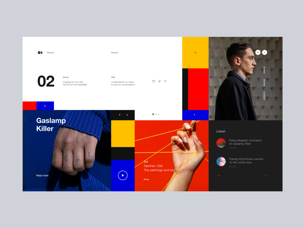
Mixing is possible as well, as long as the harmony of the overall image remains intact. The recently presented Mondrianism is an excellent example for that.
Soft and Complex Micro-Interactions
Regular readers might get the idea that micro-interactions are one of my favorite topics. In fact, there are tons of releases on the topic elsewhere (in German language).

Fluid Switch | Leo Zakour
Briefly summarized, micro-interactions are the essential interface elements between your visitors and your goals. As websites become increasingly similar, the micro-interactions are what sets you apart. Read the linked articles to learn more.
For 2018, I expect micro-interactions to become more complex regarding their visual presentation, and to feel even more seamless than they already do. This takes skillful animation and experienced handling of the related data transfer.
Individual Illustrations and SVG
SVG as a vector format is excellent for responsive websites, meaning it is excellent for all sites that are being developed now and in the future. Since the display does not have to be calculated based on pixels, SVG is equally sharp and crisp in all resolutions. Additionally, the SVG support in browsers is no longer a brake shoe.
While the aesthetic and technological quality of images used in web design has increased significantly, also due to the increasing number of professional free photo providers, this circumstance boosts the effect of uniformity, instead of reducing it.
Because of that, and the above-mentioned advantages of SVG, illustrations are increasingly popular with designers and their clients. A custom illustration suits the minimalistic designs, while still being different from the competition next door. This can’t really be said for photos.
Thus, in 2018, many designers will use illustrations. Depending on the demand, this is even cheaper than holding your own photo sessions. And all of us had to learn drawing as it is. Those who didn’t, collaborate with an illustrator.
More Authentic Photos
Since there is no lack of good photos, it will be hard to stand out. Of course, this also brings up the question if that is even necessary. If you conclude that you have to differentiate yourself via images, you won’t get around a different approach as it is.
Taking more authentic photos sounds like a plausible piece of advice. However, what does that mean? My advice is to consider pictures as stories. What you’re doing is storytelling with image material. Your photos don’t just show the product in a professional way; they tell a story that can but doesn’t have to be related to the product.
Authenticity does not always require professional (and expensive) settings, and can also be achieved with a smartphone camera. It all depends on what you want to present, and why.
More Interesting Typography
The future of typography is colorful. The so-called color fonts are responsible for this, and we posted an in-depth article on them here. Some even claim that colorful fonts dominate designs more than images ever did. Aside from the color fonts, we can also look forward to using variable fonts.

Variable fonts can be manipulated in real time. Instead of multiple versions, like “thin” or “bold,” resulting in multiple files for marginal changes, variable fonts offer everything at once. If you want to learn more about that, I recommend reading this article.
Virtual and Augmented Reality
Both VR and AR are nothing new. Here at Noupe, we touched upon this topic ten years ago already. The rapid technologic progress is the reason why this has only now become the near future. Current smartphones are the ideal platform for experiments with augmented reality. Just recently, the AR stickers in the Pixel 2’s Google Camera impress the masses. Pokemon Go also continues to be profitable.
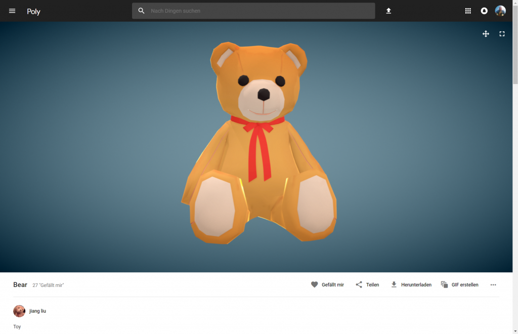
Google supports designers and helps them get into VR/AR with its Poly platform, which we presented here. If you ask me, I think – of the two – AR has more potential, and I expect it to have a faster and more significant impact on the mass market. VR will remain a niche topic for a while.
Progressive Web Apps Instead of Native Apps
The trend away from native apps and towards progressive web apps (PWA) should continue as well. Around the same time last year, I wrote a more in-depth (German language) article on the topic here. This post has lost nothing of its currency.
Progressive web apps are web offers usable on mobile, which progressively adapt to the abilities of the device and browser they are used on. The more potent the device and the browser, the more performant the app. For the creation, open web standards are used exclusively. However, progressive web apps cannot access all device functions yet, making them unfit for some application cases. As PWA live and die by the browser support, every year is a new chance.
Speech as a Search Tool
With an expanded definition of design, SEO is moved into the focus as well. Here, we experience a veritable trend towards speech search. More and more users don’t use individual keywords for the conventional Google search, and instead, use entire sentences via different speech assistants.
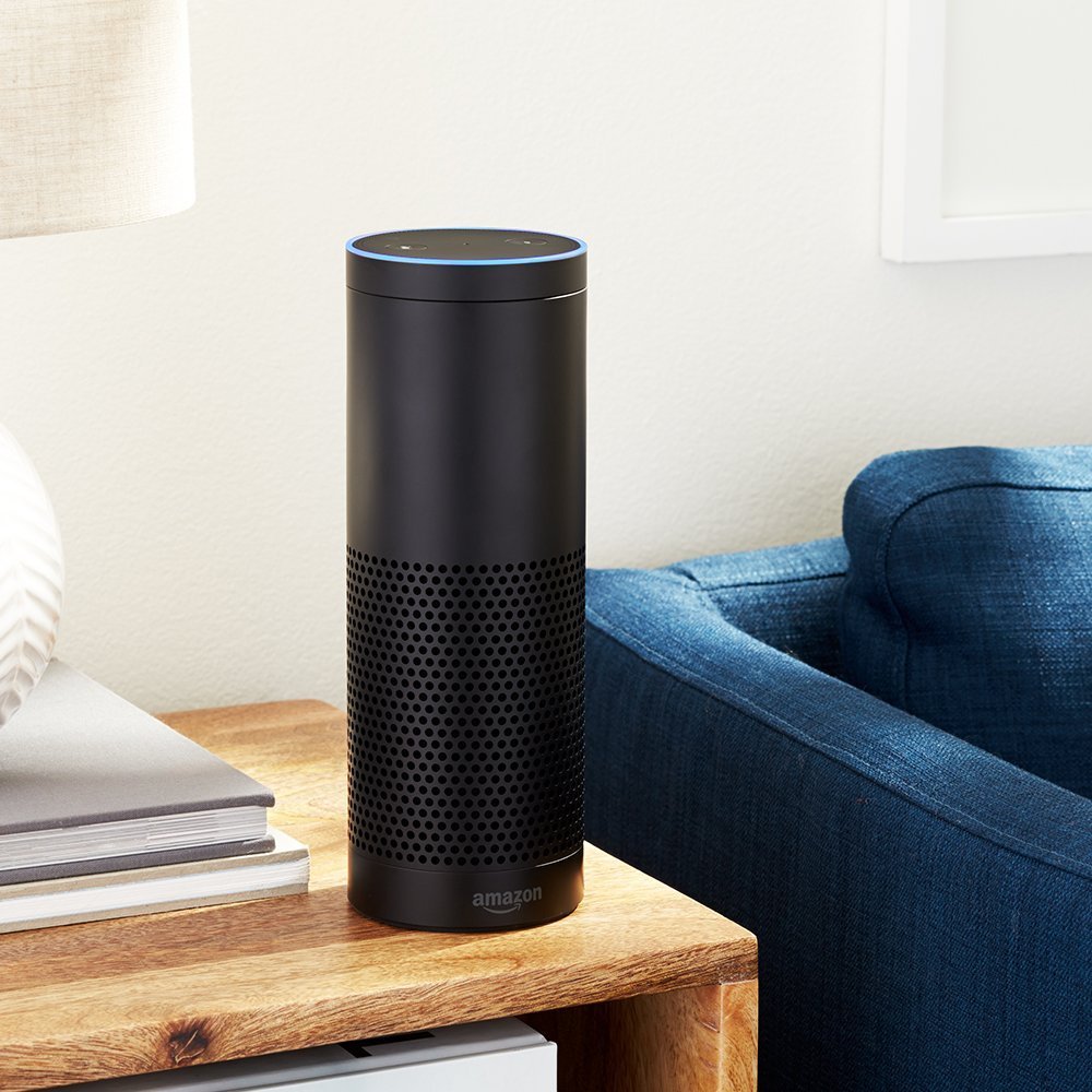
Thus, there is no way to avoid preparing our content for this new way of searching. I told you everything you need to know about it in this article.
Conversational Interfaces
Conversation is a synonym for communication. At least, it’s its original form. As a result, we are very experienced with it and are accordingly natural when dealing with it. If we can solve something with a conversation, we will automatically prefer this form over all other options.
Thus, it only makes sense that “conversational” user interfaces are the future. The fact that “Conversational Interfaces” are not the default yet doesn’t prove that we do have something against it. In the past, the technological options just were not sufficient to realize a clean and functional interface. Once again, the progress comes in handy.
More on conversation interfaces, like Alexa and Co., as well as the increasingly more popular chatbots, can be found right here (in German language).
Artificial Intelligence
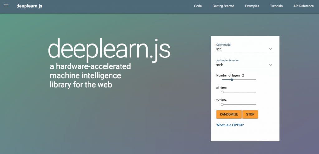 For the sake of completion, the buzz topic of the year shouldn’t be left out. I don’t think that elements of AI will be reflected in the everyday design or everyday development. Nonetheless, we shouldn’t lose track of the progress. Projects such as Google’s Deeplearn.js lower the entry level. Let’s talk about that at the end of 2018…
