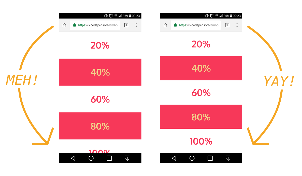
The trick to viewport units on mobile
Viewport units have always been controversial and some of that is because of how mobile browsers have made things more complicated by having their own opinions about how to implement them.
Case in point: should the scrollbar be taken into account for the vw unit? What about a site’s navigation or page controls — should those count in the calculation? Then there are physical attributes of the devices themselves (hello, notch!) that can’t be overlooked.
First, a little context
The spec is pretty vague about how viewport units should be calculated. With mobile devices, we’re often concerned with the vertical height, so let’s look specifically at viewport height (vh):
vh unit
Equal to 1% of the height of the initial containing block.
So yeah, no clear guidance there when it comes to handling device and browser-specific differentiations.
vh was initially calculated by the current viewport of your browser. If you opened your browser and started to load a website, 1vh was equal to 1% of your screen height, minus the browser interface.
But! If you start scrolling, it’s a different story. Once you get past a piece of the browser interface, like the address bar, the vh value would update and the result was an awkward jump in the content.
Safari for iOS was one of the first mobile browsers to update their implementation by choosing to define a fixed value for the vh based on the maximum height of the screen. By doing so, the user would not experience jumps on the page once the address bar went out of view. Chrome’s mobile browser followed suit around a year ago.
As of this writing, there is a ticket to address this in Firefox Android.
While using a fixed value is nice, it also means that you cannot have a full-height element if the address bar is in view. The bottom of your element will be cropped.

CSS Custom Properties: The trick to correct sizing
The idea struck me that CSS Custom Properties and a few lines of JavaScript might be the perfect way to get the consistent and correct sizing I needed.
In JavaScript, you can always get the value of the current viewport by using the global variable window.innerHeight. This value takes the browser’s interface into account and is updated when its visibility changes. The trick is to store the viewport value in a CSS variable and apply that to the element instead of the vh unit.
Let’s say our CSS custom variable is --vh for this example. That means we will want to apply it in our CSS like this:
.my-element {
  height: 100vh; /* Fallback for browsers that do not support Custom Properties */
  height: calc(var(--vh, 1vh) * 100);
}
OK, that sets us up. Now let’s get the inner height of the viewport in JavaScript:
// First we get the viewport height and we multiple it by 1% to get a value for a vh unit
let vh = window.innerHeight * 0.01;
// Then we set the value in the --vh custom property to the root of the document
document.documentElement.style.setProperty('--vh', `${vh}px`);
So, we told JS to grab the height of the viewport and then drilled it down into 1/100th of that total so we have a value to assign as our viewport height unit value. Then we politely asked JS to create the CSS variable (--vh) at the :root.
As a result, we can now use --vh as our height value like we would any other vh unit, multiply it by 100 and we have the full height we want.
See the Pen Viewport Height on Mobile (no resize on update) by CSS-Tricks (@css-tricks) on CodePen.
Whoa, there! One more little detail.
While our work might look done at this point, those of you with an astute eye for detail may have caught that the JavaScript fires but never updates the size of our element when the viewport’s height changes. Go ahead and try resizing the demo above.
We can update the value of --vh by listening to the window resize event. This is handy in case the user rotates the device screen, like from landscape to portrait, or the navigation moves out of view on scroll.
// We listen to the resize event
window.addEventListener('resize', () => {
  // We execute the same script as before
  let vh = window.innerHeight * 0.01;
  document.documentElement.style.setProperty('--vh', `${vh}px`);
});
?? Updating the value of --vh will trigger a repaint of the page and the user may experience a jump as a result. Because of this, I’m not advising that this trick should be used for every project or to replace all usage of the vh unit but only when you may need your users to have an exact viewport unit value.
Also, you may want to implement a debounce method for the resize event to avoid triggering to many events while the user is resizing their browser’s window. You can learn more about it with this article: Debouncing and Throttling Explained Through Examples
See the Pen Correct Viewport Height on Mobile by CSS-Tricks (@css-tricks) on CodePen.
You can now resize the demo above and notice that the CSS variable is updated accordingly.
While I recently used this technique on a project and it really helped, you should always think twice when replacing the browser’s default behaviors. (For example, this comes up a lot with ::focus.) Also, browsers tend to update very fast these days, so beware that today’s solution may not work tomorrow.
In the meantime, I hope this article helps! ?
The post The trick to viewport units on mobile appeared first on CSS-Tricks.