Sticky, Smooth, Active Nav
Just like the title says! Here’s a sidebar navigation bar that…
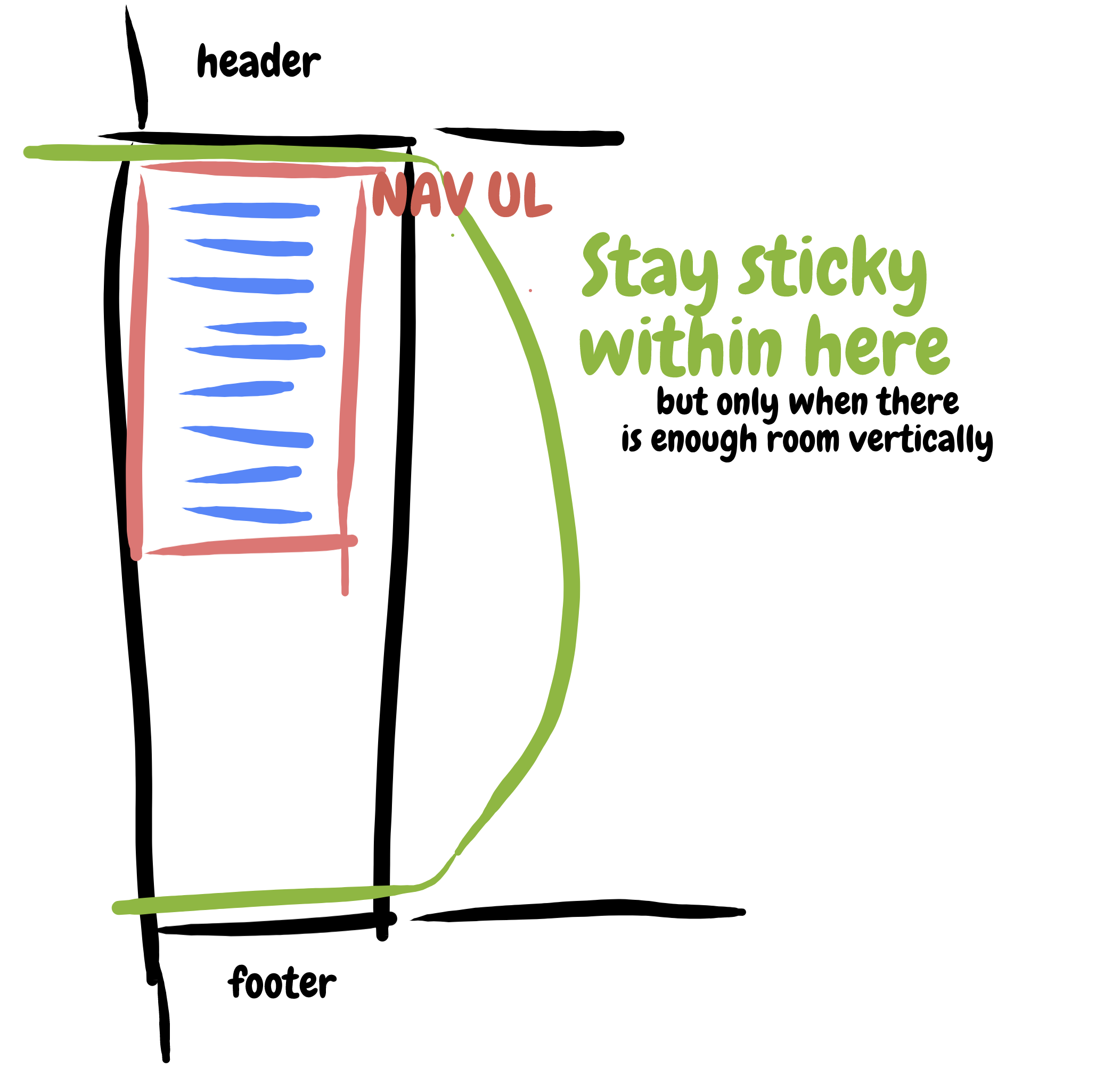
- Uses sticky positioning. It stays on the screen when it can, but won’t overlap the header, footer, or ever make any of it’s links inaccessible.
- Scrolls smoothly to the sections you click to.
- Activates the current nav based on scroll position (it’s a single page thing).
See the Pen Sticky, Smooth, Active Nav by Chris Coyier (@chriscoyier) on CodePen.
Sticky
It’s easy to toss position: sticky; top: 0; on something. But for it to work, it’s gotta be within a taller parent element. So, the unordered list (
- ) within the navigation (
) works great here. Thanks to the CSS grid layout, the
is as tall as the position: -webkit-sticky; for iOS.
I also tossed in a magic number for the vertical media query so that it doesn’t stick in such a way that you can’t get to the lower navigation items:
/* Only stick if you can fit */
@media (min-height: 300px) {
  nav ul {
    position: sticky;
    top: 0;
  }
}
Smooth
In my first crack at this, I thought about JavaScript-based smooth scrolling. It’s even native these days with no need for frameworks. You can target an element and smoothly scroll to it:
document.querySelector('.hello').scrollIntoView({
  behavior: 'smooth'
});
Bringing that to an arbitrary set of nav…
let mainNavLinks = document.querySelectorAll("nav ul li a");

mainNavLinks.forEach(link => {
  link.addEventListener("click", event => {
    event.preventDefault();
    let target = document.querySelector(event.target.hash);
    target.scrollIntoView({
      behavior: "smooth",
      block: "start"
    });
  });
});
That’s supported in both Chrome and Firebox, but not Edge or Safari.
Then it occurred to me, CSS can do this! There is a scroll-behavior property and you can put it on the document to make everything scroll that way:
html {
  scroll-behavior: smooth;
}
Since our navigational links are hash/jump/anchor links, that’s literally all we need. Forget the JavaScript. Especially because the browser support for scroll-behavior is the same as the “smooth” version of .scrollIntoView().
Active
This is a bit trickier, particularly because this is a single-page scrolling app rather than individual pages with their own separate documents. If they were separate documents, we’d change an active class somewhere in the navigation or use a body.specific_page class or something.
Instead, we’ll need to look at the scroll position of the page, decide which section is in view and mark it that way. There might be some kinda fancy IntersectionObserver way to handle this, but I couldn’t quite wrap my head around that, so instead I’m just looking at all the relevant sections, doing a little measuring and math, and deciding if the link is active that way.
let mainNavLinks = document.querySelectorAll("nav ul li a");
let mainSections = document.querySelectorAll("main section");

let lastId;
let cur = [];

window.addEventListener("scroll", event => {
  let fromTop = window.scrollY;

  mainNavLinks.forEach(link => {
    let section = document.querySelector(link.hash);

    if (
      section.offsetTop <= fromTop &&
      section.offsetTop + section.offsetHeight > fromTop
    ) {
      link.classList.add("current");
    } else {
      link.classList.remove("current");
    }
  });
});
The scroll handler there should trigger a little warning flag. That’s the kind of thing that should probably be throttled, like if you have lodash available:
window.addEventListener("scroll", () => {
  _.throttle(doThatStuff, 100);
});
I just didn’t do that here to keep the demo dependency-free.
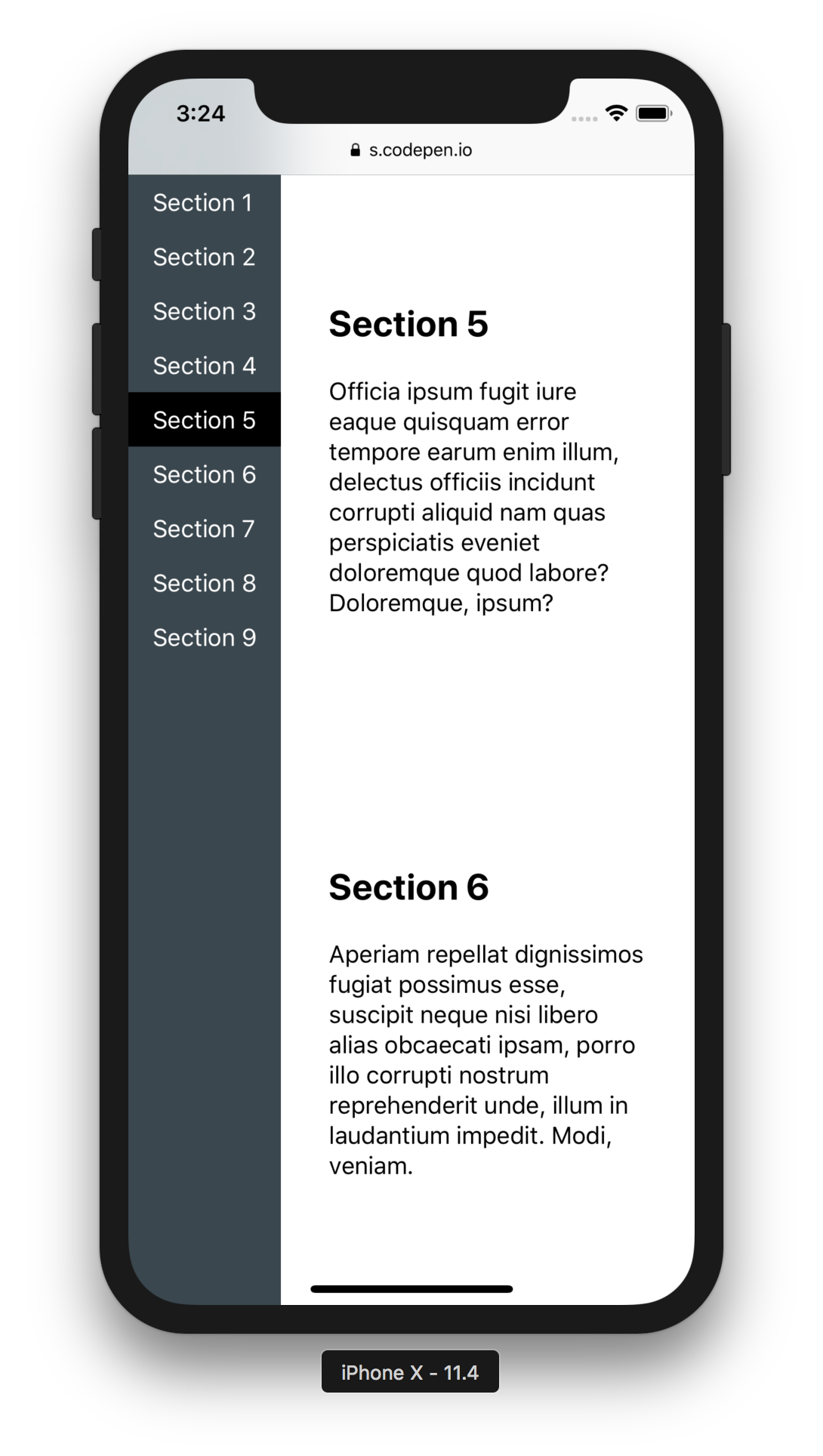
Oh! And it largely works fine on mobile (iOS here):

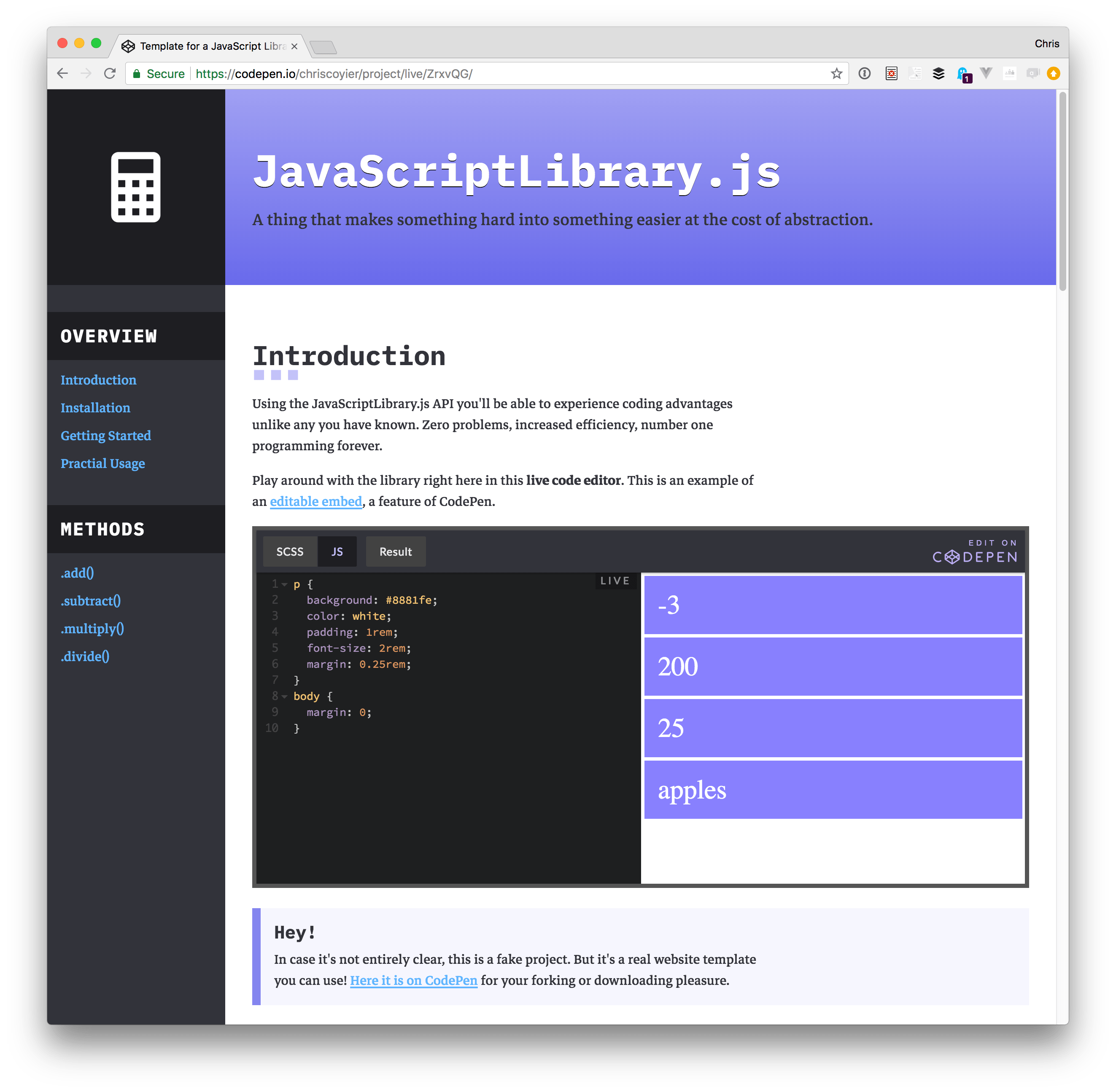
A Free Template for JavaScript Library Homepages
I used all this stuff in this template I made that you’re free to use for whatever.
The post Sticky, Smooth, Active Nav appeared first on CSS-Tricks.
