Practical CSS Scroll Snapping
CSS scroll snapping allows you to lock the viewport to certain elements or locations after a user has finished scrolling. It’s great for building interactions like this one:
Browser support and basic usage
Browser support for CSS scroll snapping has improved significantly since it was introduced in 2016, with Google Chrome (69+), Firefox, Edge, and Safari all supporting some version of it.
This browser support data is from Caniuse, which has more detail. A number indicates that browser supports the feature at that version and up.
Desktop
| Chrome | Opera | Firefox | IE | Edge | Safari |
|---|---|---|---|---|---|
| 69 | No | 63 | 11* | 18* | 11 |
Mobile / Tablet
| iOS Safari | Opera Mobile | Opera Mini | Android | Android Chrome | Android Firefox |
|---|---|---|---|---|---|
| 11.0-11.2 | No | No | No | No | 60 |
Scroll snapping is used by setting the scroll-snap-type property on a container element and the scroll-snap-align property on elements inside it. When the container element is scrolled, it will snap to the child elements you’ve defined. In its most basic form, it looks like this:
<div class='container'>
  <section class='child'></section>
  <section class='child'></section>
  <section class='child'></section>
  ...
</div>
.container {
scroll-snap-type: y mandatory;
}
.child {
scroll-snap-align: start;
}This is different to the first version of the spec, which allowed you to set snap-points manually using the repeat keyword:
.container {
  scroll-snap-points-y: repeat(300px);
}
This method is pretty limited. Since it only allows evenly-spaced snap points, you can’t really build an interface that snaps to different-sized elements. If elements change their shape across different screen sizes, you’re also bound to run into issues.
At the time of this writing, Firefox, Internet Explorer, and Edge support the older version of the spec, while Chrome (69+) and Safari support the newer, element-based method.
You can use both methods alongside each other (if your layout allows it) to support both groups of browsers:
.container {
  scroll-snap-type: mandatory;
  scroll-snap-points-y: repeat(300px);
  scroll-snap-type: y mandatory;
}

.child {
  scroll-snap-align: start;
}
I’d argue a more flexible option is to use the element-based syntax exclusively and loading a polyfill to support browsers that don’t yet support it. This is the method I’m using in the examples below.
Unfortunately the polyfill doesn’t come with a browser bundle, so it’s a bit tricky to use if you’re not using a build process. The easiest way around this I’ve found is to link to the script on bundle.run and initializing it using cssScrollSnapPolyfill() once the DOM is loaded. It’s also worth pointing out that this polyfill only supports the element-based syntax, not the repeat-method.
Parent container properties
As with any property, it’s a good idea to get familiar with the values they accept. Scroll snap properties are applied to both parent and child elements, with specific values for each. Sort of the same way flexbox and grid do, where the parent becomes a “flex” or “grid” container. In this case, the parent becomes a snap container, if you will.
Here are the properties and values for the parent container and how they work.
scroll-snap-type “mandatory” vs. “proximity”
The mandatory value means the browser has to snap to a snap point whenever the user stops scrolling. The proximity property is less strict—it means the browser may snap to a snap point if it seems appropriate. In my experience this tends to kick in when you stop scrolling within a few hundred pixels of a snap point.
See the Pen Scroll-snap-type “Mandatory” vs “Proximity” by Max Kohler (@maxakohler) on CodePen.
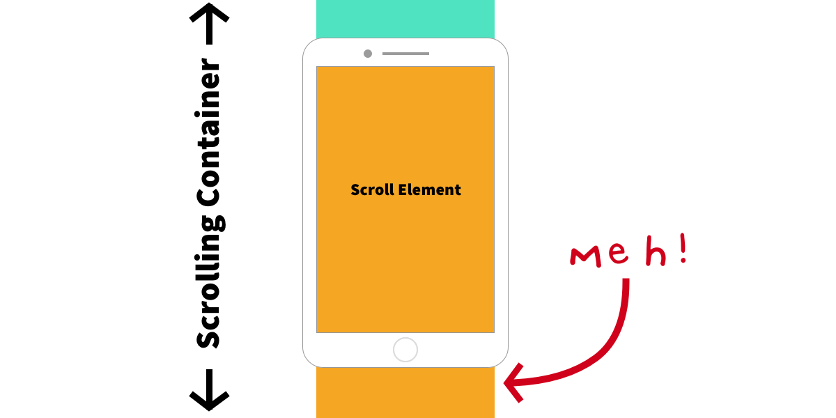
In my own work, I’ve found that mandatory makes for a more consistent user experience, but it can also be dangerous, as the spec points out. Picture a scenario where an element inside a scrolling container is taller than the viewport:

If that container is set to scroll-snap-type: mandatory, it will always snap either to the top of the element or the top of the one below, making the middle part of the tall element impossible to scroll to.
scroll-padding
By default content will snap to the very edges of the container. You can change that by setting the scroll-padding property on the container. It follows the same syntax as the regular padding property.
This can be useful if your layout has elements that could get in the way of the content, like a fixed header.
Properties on the children
Now let’s move on over to the properties for child elements.
scroll-snap-align
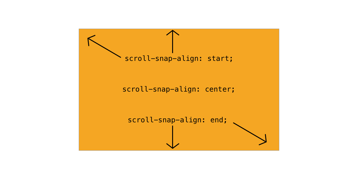
This lets you specify which part of the element is supposed to snap to the container. It has three possible values: start, center, and end.

These are relative to the scroll direction. If you’re scrolling vertically, start refers to the top edge of the element. If you’re scrolling horizontally, it refers to the left edge. center and end follow the same principle. You can set a different values for each scroll direction separated by a space.
scroll-snap-stop “normal” vs. “always”
By default, scroll snapping only kicks in when the user stops scrolling, meaning they can skip over several snap points before coming to a stop.
You can change this by setting scroll-snap-stop: always on any child element. This forces the scroll container to stop on that element before the user can continue to scroll.
At the time of this writing no browser supports scroll-snap-stop natively, though there is a tracking bug for Chrome.
Let’s look at some examples of scroll snap in use.
Example 1: Vertical list
To make a vertical list snap to each list element only takes a few lines of CSS. First, we tell the container to snap along its vertical axis:
.container {
  scroll-snap-type: y mandatory;
}
Then, we define the snap points. Here, we’re specifying that the top of each list element is going to be a snap point:
.child {
  scroll-snap-align: start;
}
See the Pen Vertical List by Max Kohler (@maxakohler) on CodePen.
Example 2: Horizontal slider
To make a horizontal slider, we tell the container to snap along its x-axis. We’re also using scroll-padding to make sure the child elements snap to the center of the container.
.container {
  scroll-snap-type: x mandatory;
  scroll-padding: 50%;
}
Then, we tell the container which points to snap to. To center the gallery, we define the center point of each element as a snap point.
.child {
  scroll-snap-align: center;
}
See the Pen Horizontal, different sized images by Max Kohler (@maxakohler) on CodePen.
Example 3: Vertical full screen
We can set the snap points directly on the element:
body {
  scroll-snap-type: y mandatory;
}
Then, we make each section the size of the viewport and define the top edge as a snap point:
section {
  height: 100vh;
  width: 100vw;
  scroll-snap-align: start;
}
See the Pen Vertical Full-Screen by Max Kohler (@maxakohler) on CodePen.
Example 4: Horizontal full screen
This is the same sort of concept as the vertical version, but with the snap point on the x-axis instead.
body {
  scroll-snap-type: x mandatory;
}

section {
  height: 100vh;
  width: 100vw;
  scroll-snap-align: start;
}
See the Pen Horizontal Full-Screen by Max Kohler (@maxakohler) on CodePen.
Example 5: 2D image grid
Scroll snapping can work in two directions at the same time. Again, we can set scroll-snap-type directly on the element:
.container {
  scroll-snap-type: both mandatory;
}
Then, we define the top-left corner of each tile as a snap point:
.tile {
  scroll-snap-align: start;
}
See the Pen 2d Snapping by Max Kohler (@maxakohler) on CodePen.
Some thoughts on user experience
Messing with scrolling is risky business. Since it’s such a fundamental part of interacting with the web, changing it in any way can feel jarring—the term scrolljacking used to get thrown around to describe that sort of experience.
The great thing about CSS-based scroll snapping is that you’re not taking direct control over the scroll position. Instead you’re just giving the browser a list of positions to snap in a way that is appropriate to the platform, input method, and user preferences. This means a scrolling interface you build is going to feel just like the native interface (i.e using the same animations, etc.) on whatever platform it’s viewed on.
To me, this is the key advantage of CSS scroll snapping over JavaScript libraries that offer similar functionality.
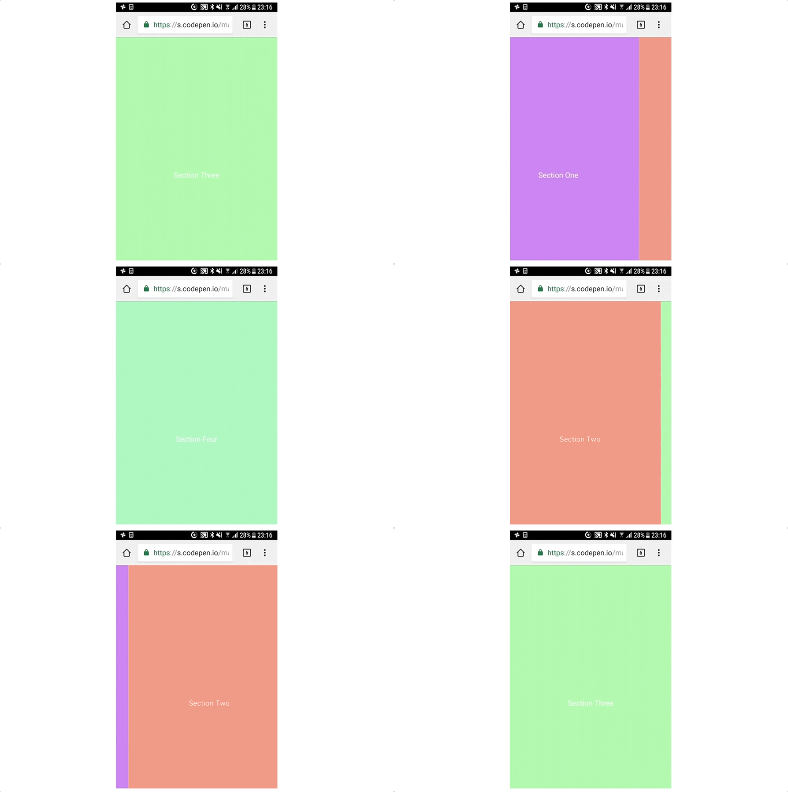
This works fairly well in my experience, especially on mobile. Maybe this is because scroll snapping is already part of the native UI on mobile platforms. (Picture the home screens on iOS and Android—they’re essentially horizontal sliders with snap points.) The interaction on Chrome on Android is particularly nice because it feels like regular scrolling, but the viewport always happens to come to a stop at a snap point:
There’s definitely some fancy maths going on to make this happen. Thanks to CSS scroll snapping, we’re getting it for free.
Of course, we shouldn’t start throwing snap points onto everything. Things like article pages do just fine without them. But I think they can be a nice enhancement in the right situation—image galleries, slideshows seem like good candidates, but maybe there’s potential beyond that.
Conclusion
If done thoughtfully, scroll snapping can be a useful design tool. CSS snap points allow you to hook into the browser’s native scrolling interaction, so your interface feel seamless and smooth. With a JavaScript API potentially on the horizon, these are going to become even more powerful. Still, a light touch is probably the way to go.
The post Practical CSS Scroll Snapping appeared first on CSS-Tricks.
