Super-Powered Grid Components with CSS Custom Properties
A little while ago, I wrote a well-received article about combining CSS variables with CSS grid to help build more maintainable layouts. But CSS grid isn’t just for pages! That is a common myth. Although it is certainly very useful for page layout, I find myself just as frequently reaching for grid when it comes to components. In this article I’ll address using CSS grid at the component level.
Grid is neither a substitute for flexbox nor vice versa. In fact, using a combination of the two gives us even more power when building components.
Building a simple component
In this demo, I’ll walk through building a text-and-image component, something you might commonly find yourself building on a typical site, and which I have frequently built myself.
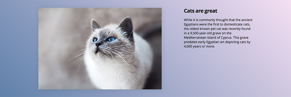
This is what our first component should look like:

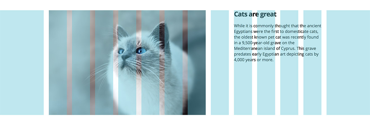
Let’s imagine that the elements that make up our component need to align to the same grid as other components on the page. Here is the same component with grid columns overlaid (ignoring the background):

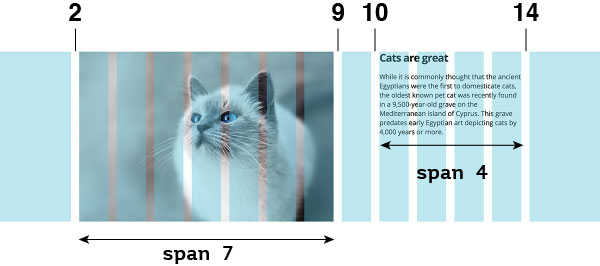
You should see a grid of 14 columns—12 central columns of a fixed width and two flexible columns, one on either side. (These are for illustration purposes and won’t be visible in the browser.) Using display: grid on an element allows us to position that element’s direct children on the grid container. We’re keeping things simple, so our component has just two grid children—an image and a block of text. The image starts at Line 2 and spans seven tracks on the column axis. The text block starts at Line 9 and spans five columns.

First, and importantly, we need to start with semantic markup. Although grid gives us the power to place its children in any layout we choose, for accessibility and non-grid-supporting browsers, the underlying markup should follow a logical order. Here is the markup we’ll be using for our grid component:
<article class="grid">
  <figure class="grid__media">
    <img src="" alt="" width="800px" height="600px" />
  </figure>
  <div class="grid__text">
    <h3>Heading</h3>
    <p>Lorem ipsum...</p>
  </div>
</article>
The .grid__media and .grid__text classes will be used for positioning the child items. First, we will need to define our grid container. We can use the following CSS to size our grid tracks:
.grid {
  display: grid;
  grid-template-columns:
    minmax(20px, 1fr) repeat(12, minmax(0, 100px)) minmax(20px, 1fr);
  grid-column-gap: 20px;
}
This will give us the grid we illustrated earlier—12 central columns with a maximum width of 100px, a flexible column on either side, and a gap of 20px between each column. If you’re curious about the minmax() function I wrote an article about it, which explains what’s going on with our grid columns here.
In this case, as both our image and text block will be on the same grid row track (and I want the track size to just use the default auto, which will size the row according to the content within), I have no need to declare my grid row sizing here. However, explicitly placing the grid items on the same row will make things easier when it comes to different component variants, which we’ll get to shortly.
If you’re new to Grid and looking for ways to get started, I recommend heading over to grid-by-example.com. Don’t worry too much about the grid-template-columns declaration for now—many of the points in this article can be applied to simpler grids too.
Now, we need to place our grid items with the following CSS. Grid offers us a whole range of different ways to place items. In this case, I’m using grid-column, which is the shorthand for grid-column-start / grid-column-end:
.grid__media {
  grid-column: 2 / 9; /* Start on Column 2 and end at the start of Column 9 */
}

.grid__text {
  grid-column: 9 / 14; /* Start on Column 9 and end at the start of Column 14 */
}

.grid__media,
.grid__text {
  grid-row: 1; /* We want to keep our items on the same row */
}
If you find it tough to visualize the grid lines when you code, drawing it in ASCII in the CSS comments is a handy way to go.
Here’s a demo of our component in action—you can toggle the background on and off to show the grid columns:
See the Pen Grid component with toggle-able background by Michelle Barker (@michellebarker) on CodePen.
Component variants
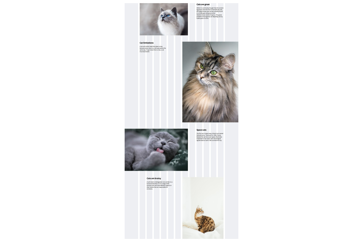
Building our component is simple enough, but what if we have many variants of the same component? Here are some examples of different layouts we might want to use:

As you can see, the text blocks and images occupy different positions on the grid, and the image blocks span a different number of columns.
Personally, I have previously worked on components that had as many as nine variants! Coding grid for these types of situations can become difficult to manage, especially when you take things like fallbacks and responsiveness into account, because our grid declarations can become difficult to scan and debug. Let’s look at ways we can make this easier to manage and maintain.
Consistency
First, let’s determine which property values are going to remain consistent among our component variants, so that we can write as little code as possible. In this case, our text block should always span four columns, while our image can be larger or smaller, and align to any column.
For our text block I’m going to use the span declaration—that way, I can be sure to keep this block a consistent width. For our image, I’m going to keep using the start line and end line instead, since the number of columns the images span varies between the different component variants, as well as its position.
Naming grid lines
Grid allows you to name your lines and refer to them by name as well as number, which I find extremely helpful when placing items. You might not want to go too crazy with naming lines, as your grid declaration can become difficult to read, but naming a few commonly-used lines can be useful. In this example, I’m using the names wrapper-start and wrapper-end. Now, when placing items against either of these lines, I know they’ll align to the central wrapper.
.grid {
  display: grid;
  grid-template-columns: [start] minmax(20px, 1fr) [wrapper-start] repeat(12, minmax(0, 100px)) [wrapper-end] minmax(20px, 1fr) [end];
}
Pre-fixing grid line names with *-start and *-end has the added advantage of allowing us to place items by grid area. By setting grid-column: wrapper on a grid item, it will be placed between our wrapper-start and wrapper-end lines.
Using CSS Variables for placement
CSS variables (also known as custom properties) can allow us to write more maintainable code for our components. They enable us to set and reuse values within our CSS. If you use a preprocessor like Sass or Less, it’s likely you’re familiar with using variables. CSS variables differ from preprocessor variables in a few important ways:
- They are dynamic. In other words, once they are set, the value can still be changed. You can update the same variable to take different values, e.g. within different components or at different breakpoints.
- They cannot be used within selector names, property names or media query declarations. They must only be used for property values (hence they’re known as custom properties).
CSS variables are set and used like this:
.box {
  --color: orange; /* Defines the variable and default value */
  background-color: var(--color); /* Applies the variable as a property value */
}
We can take advantage of the fact that CSS variables allow defaults—so that if a variable is not found, a fallback value will be used.
You can set a default value for a variable like this:
background-color: var(--color, red);So, in this case, we’re setting the background-color property to the value of --color but if that variable can’t be found (e.g. it hasn’t been declared yet), then the background will be red.
In the CSS code for placing our grid items, we can use a variable and declare a default value, like so:
.grid__media {
  grid-column: var(--mediaStart, wrapper-start) / var(--mediaEnd, 9);
}

.grid__text {
  grid-column: var(--textStart, 10) / span 4;
}
We don’t need a variable for the text span declaration, as this will be the same for each component variant.
Now, when it comes to our component variants, we only need to define the variables for the item positions when they are different from the original:
.grid--2 {
  --mediaEnd: end;
  --textStart: wrapper-start;
}

.grid--2,
.grid--4 {
  --mediaStart: 8;
}

.grid--3 {
  --mediaStart: start;
}

.grid--4 {
  --mediaEnd: wrapper-end;
  --textStart: 3;
}
Here’s the result:
See the Pen CSS Grid components with variables by Michelle Barker (@michellebarker) on CodePen.
For comparison, placing items in the same way without using variables would look like this:
/* Grid 2 */
.grid--2 .grid__media {
  grid-column: 8 / end;
}

.grid--2 .grid__text {
  grid-column-start: wrapper-start;
}

/* Grid 3 */
.grid--3 .grid__media {
  grid-column-start: start;
}

/* Grid 4 */
.grid--4 .grid__media {
  grid-column: 8 / wrapper-end;
}

.grid--4 .grid__text {
  grid-column-start: 3;
}
Quite a difference, right? To me, the version with variables is more readable and helps me understand at a glance where the elements of each component variant are positioned.
Variables within media queries
CSS variables also allow us to easily adjust the position of our grid items at different breakpoints by declaring them within media queries. It’s conceivable that we might want to show a simpler grid layout for tablet-size screens and move to a more complex layout once we get to desktop sizes. With the following code, we can show a simple, alternating layout for smaller screen, then wrap the variables for the more complex layout in a media query.
.grid__media {
  grid-column: var(--mediaStart, wrapper-start) / var(--mediaEnd, 8);
}

.grid__text {
  grid-column: var(--textStart, 8) / span var(--textSpan, 6);
}

.grid--2,
.grid--4 {
  --mediaStart: 8;
  --mediaEnd: 14;
  --textStart: wrapper-start;
}

/* Move to a more complex layout starting at 960px */
@media(min-width: 960px) {
  .grid {
    --mediaStart: wrapper-start;
    --mediaEnd: 9;
    --textStart: 10;
    --textSpan: 4;
  }

  .grid--2 {
    --mediaStart: 9;
    --mediaEnd: end;
    --textStart: wrapper-start;
  }

  .grid--2,
  .grid--4 {
    --mediaStart: 8;
  }

  .grid--3 {
    --mediaStart: start;
  }

  .grid--4 {
    --mediaEnd: wrapper-end;
    --textStart: 3;
  }
}
Here’s the full demo in action:
See the Pen CSS Grid components with variables and media queries by Michelle Barker (@michellebarker) on CodePen.
Performance
One thing to be aware of when using CSS variables is that changing a variable on an element will cause a style recalculation on all of that element’s children (here’s an excellent article that covers performance of variables in great detail). So, if your component has many children, then this may be a consideration, particularly if you want to update the variables many times.
Conclusion
There are many different ways of handling responsive design with CSS grid, and this certainly isn’t the only way. Neither would I advise using variables for all your grid code in every part of your project—that could get pretty confusing and would likely be unnecessary! But, having used CSS grid a lot over the past year, I can attest that this method works really well to keep your code maintainable when dealing with multiple component variants.
The post Super-Powered Grid Components with CSS Custom Properties appeared first on CSS-Tricks.