Wufoo really is firing on all cylinders lately! As you may know, I’ve been using Wufoo here on this site, and pretty much every other site I’ve ever made, to power the web forms for over a decade. That’s a dang long time, which more than proves to me Wufoo is a form solution to trust. But also a product that improves!
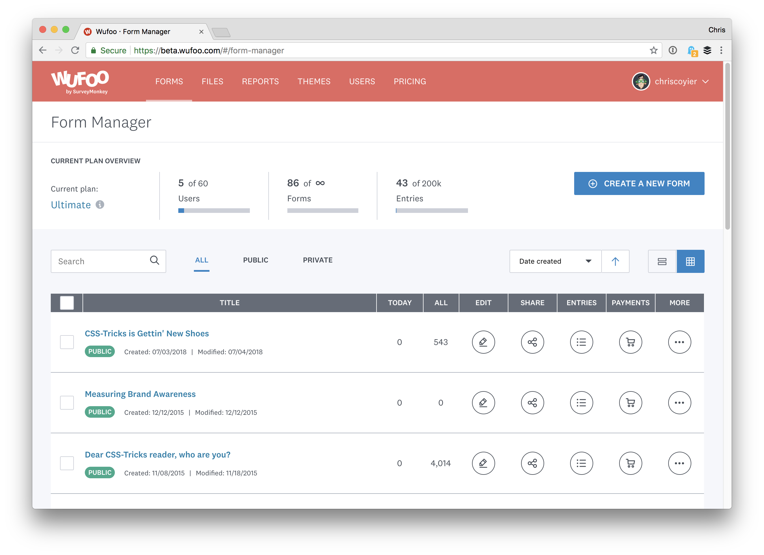
The new Form Manager has a modern and clean look. You can tell this has been a massive cleanup and give them better place to iterate from:
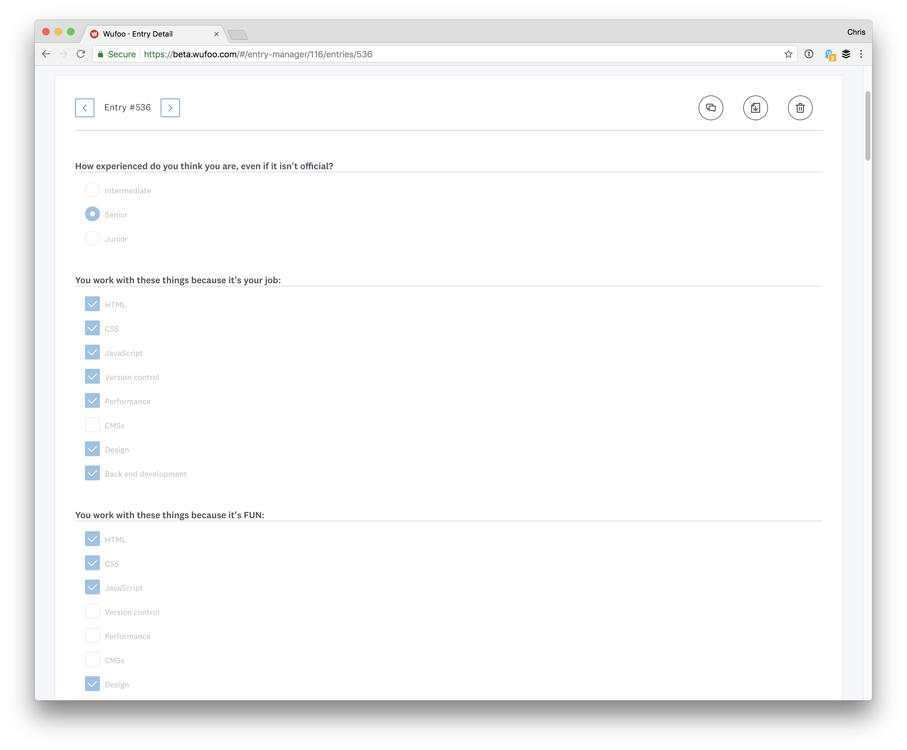
The Entry Manager is the biggest upgrade so far. You can view more entries at a time and navigate between entires much easier. I quite like how each entry takes you through kind of a ghosted version of the form itself, seeing exactly what someone entered:
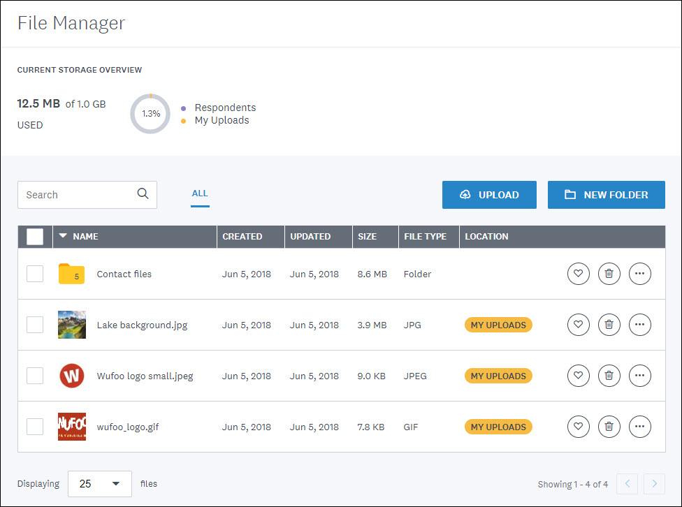
The Files Manager is a brand new thing! Wufoo forms can collect files easily, so if that’s a thing you use, it might be mighty handy for you to be able to browse and manage those from the manager.
Those are great improvements for you for getting around and doing stuff within Wufoo, but of course, the most important thing is that you can build powerful forms very easily on Wufoo and integrate them anywhere you need to.
Have you performed a mobile speed test lately? How does your website rank? A slow website can turn mobile users away. Ideally, you want your design to load just as quickly for 3G users on phones as it does for desktop users on Wi-Fi. (That’s a pretty big ask, but there are things you can go to make it happen.)
First, test your mobile speed. And then use these tips to improve your performance, and keep more users on your site longer.
1. Optimize Images
One of the biggest problems with website speed is image size. Images can actually account for most of the downloaded data on a page and by formatting and saving images the right way, you can seriously cut down on the number of bytes required to serve this information.
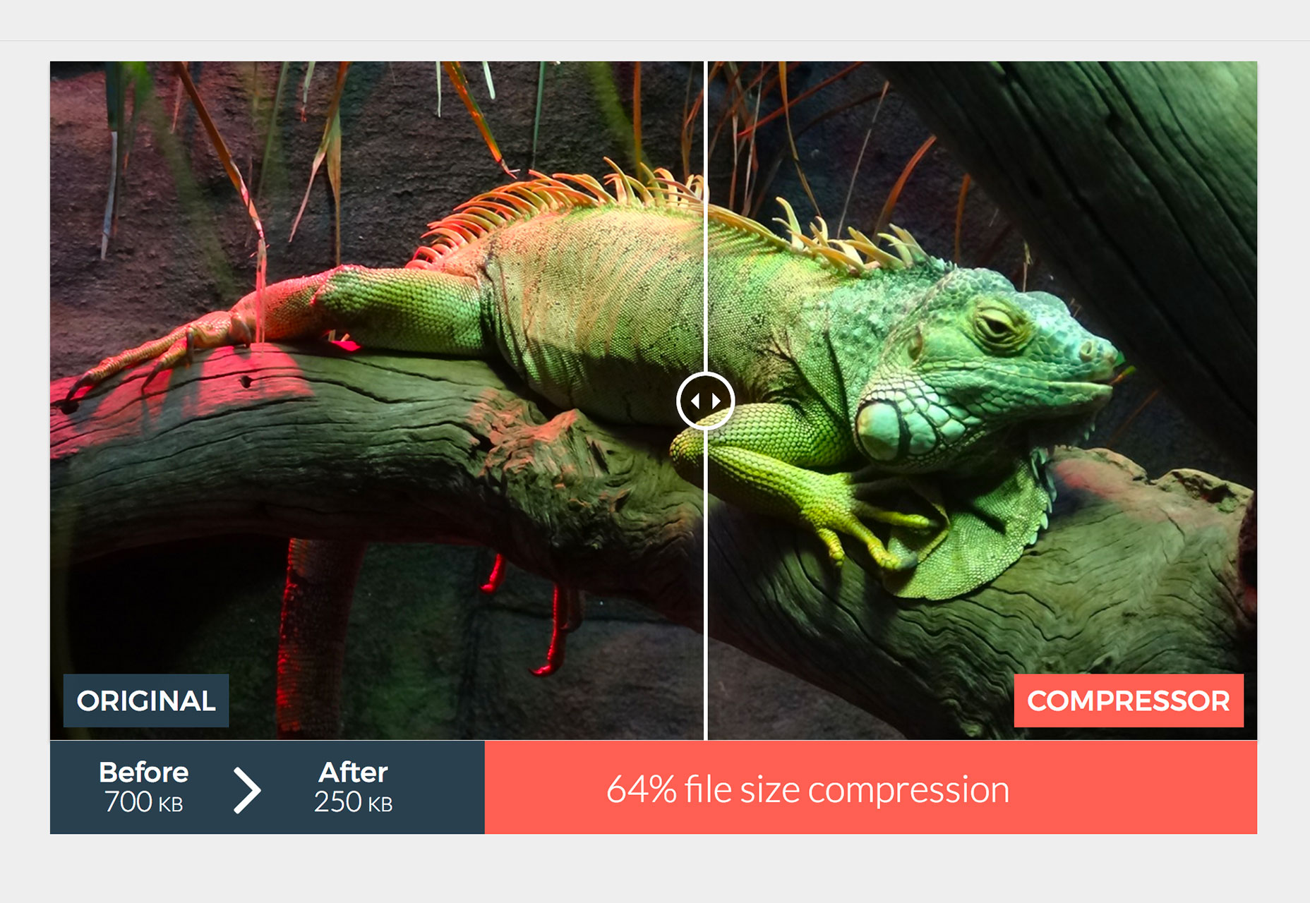
The easiest way to optimize images is to work with them before upload. Crop images to the necessary size and save for the web before adding them to your content management system. Then compress images to get that file size as tiny as possible.
The cheapest hosting plan is not right for every website. Slow hosting is an oft-hidden problem and is common with websites that have grown steadily over time, but not upped their hosting plans.
To ensure that your hosting plan is built for speed, opt for a dedicated server option. If you need something a little more budget-friendly, the next best option is VPS hosting, where you have shared hosting with dedicated server resources.
Then, think about load killers such as video content. Host those files using external tools when possible. Services like YouTube are perfect for this. (And it might be something you are doing already.) Essentially, you link to these files in their native locations rather than adding them to your site files.
3. Pay Attention to JS
JavaScript powers many of the cool effects and things that happen on websites. There’s not much of a way to get around it.
Take care with how you use JavaScript and it won’t slow down your website for mobile users.
Put JavaScript at the bottom of files: Browsers won’t load other elements while JavaScript is loading. Solve this problem by moving JS scripts to the bottom of the page when you can. That way HTML content renders first and you can use a visual cue to let users know more data is coming if necessary.
Optimize and minify: Smaller files load faster. Don’t forget this applies to code as well.
Use asynchronous JavaScript: Opt for asynchronous JS loading until after the first render for all non-critical elements. This allows scripts to load at the same time rather than one-by-one.
4. Use Lazy Loading
Logically, it just makes sense to load content from top to bottom, right?
Lazy loading allows the content on the screen to load first and then load everything else. (Google likes this option when it comes to speed and search engine optimization.)
There are plenty of WordPress plugins that can help you do this that are simple and pretty lightweight. Try something like Lazy Load or WP Rocket.
5. Make Use of Caching
From Google: “Caching allows a browser to store frequently requested files on the user’s device for a set period of time. When caching is enabled, subsequent page loads can be more efficient.”
Enabling caching is one of the most-recommended options for boosting page speed. Users will thank you.
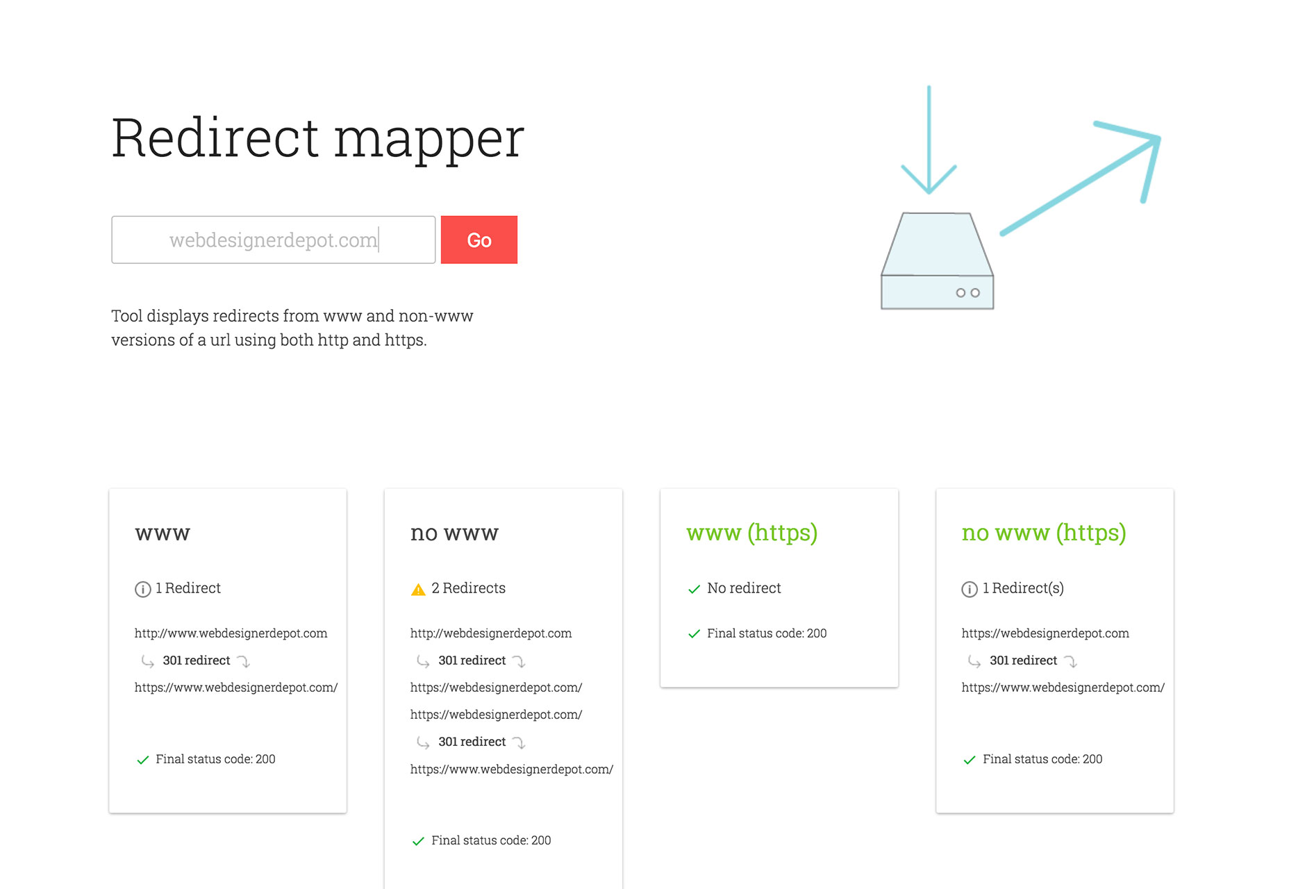
6. Cut Down on Redirects
Do you know how many redirects are on your website? While redirects can be useful for a number of reasons, they will slow your site down. The best advice when it comes to redirects is to eliminate unnecessary ones.
The biggest speed eater is a 301 redirect, which gets users from an outdated page to a new version. Think about your content and if this action is still necessary. A redirect audit might be in order.
Accelerated Mobile Pages is an open-source Google imitative that is designed to create pages the load quickly on mobile devices.
Create AMP versions of landing pages to make best use of the technology. These pages use the AMP HTML format and AMP JavaScript and it’s an ideal solution for websites that do a lot of online advertising or send users to specific locations.
The big bonus is that AMP pages load pretty much instantly. The downside is that it’s a little more work on the back end.
There’s plenty of information about the AMP Project available.
8. Remove Tap Delays
Have you ever noticed that there’s a slight delay between when you tap something and when the action happens on a mobile device? This delay was designed originally to make it easier for devices to recognize a double-tap. (That function is pretty much obsolete.)
From Google’s Jake Archibald about the simple change: “The performance difference is huge! Having a UI that responds instantly means the user can quickly press each button with confidence, rather than pausing and waiting for a response.”
9. Consider Progressive Web Apps
If you have a website with plenty of interactive content and dynamic features a progressive web app might be the solution.
PWAs are websites that work like apps (but without the download).
What’s nice about PWAs is that they are searchable like websites, there’s no install or updating required. They also tend to work offline and allow for push notifications and they are super fast because of the method of caching used.
The tricky part is that this is a developer-only option and not for a beginning website builder. But it is definitely worth looking into if your website requires content that’s always changing and isn’t as fast as it should be.
Plugins have a lot of value in creating website functionality. But because they are so easy to find and install, many websites have a ton of unused plugins running in the background.
That’s adding weight and code to the design. That’s more stuff the user has to download before they see the design. And it is slowing your website down.
When it comes to plugins, only keep what you need and are actually using. Deactivate and delete everything else. Then make sure you are keeping plugins updated. Outdated, unsupported or misconfigured plugins are speed killers.
Think about plugins that do the same thing – read descriptions and documentation with updates – and get rid of redundancies here.
Finally, get rid of plugins for things that you can do manually (font installations, header tag insertion, analytics etc.).
I ran across a super cool design for a login form over on the website theory11.com. Actually, the whole site and the products they make are incredibly well designed, there’s just something about the clean and classy form that really got me. Plus, it just so happened that the CodePen Challenge that coming week was based on forms, so I took a few minutes and tried slapping it together.
Fadeout vector pattern
One of the things I thought was super classy was the way that vector wallpaper-eque pattern was not only there but faded out sort of radially. I didn’t try to match the pattern exactly—I just grabbed one from the Assets Panel in CodePen and dropped it onto the element as a SVG data URL background-image with a low fill-opacity. Then a radial gradient sits on top and creates the fading effect—a radial gradient with the same base background color that fades away.
If you peek at the double border code on theory11’s site, you’ll see it’s done with a single 2px solid border on a parent and another on the child element, with a bit of padding to space them out. Perfectly fine way to do it, of course. But it reminded me of the fact that you can literally do double as a border style. You have very little control over the spacing, but hey, it’s close!
form {
  border: 7px double #AA8B59;
}
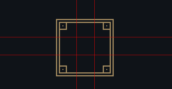
What about them corner boxes?
I had fun building the rest of it out, but I stopped short of dealing with those corner boxes. I thought about it though! My first thought was psuedo elements, as those are wonderful little tools for adding extra flair without any extra HTML. Except… you only get two of those and we need four here. Turns out that’s how they do it—they get four because they use both the parent and the child (to get the border).
Peter Schmalfeldt took a crack at doing it that way:
Another possibility would have been border-image. I find use cases for border-image rather rare, and the syntax pretty hard to grok, but this is kind of the perfect situation for it. The property uses “9 slice scaling,” so imagine an image being cut up like a tic-tac-toe board. Then each of those areas can repeat or stretch (or variations of those). A graphic like this brown shape:
Nine-sliced:
And all those non-corner sections repeating directionally to make whatever middle space is needed.
Logical box model properties: margin, padding, and border all get an upgrade for more use cases. Think of how we have margin-left now — the “left” part doesn’t make much sense when we switch directions. Now, we’ll have margin-inline-start for that. The full list is margin-{block,inline}-{start,end}, padding-{block,inline}-{start,end} and border-{block,inline}-{start,end}-{width,style,color}. Here’s Rachel Andrew with Understanding Logical Properties And Values.
Environment variables (i.e. env(safe-area-inset-top);): Apple introduced “the notch” with the iPhone X and dropped some proprietary CSS for dealing with it. The community quickly stepped in and now we have env() for browsers to ship stuff like this.
I guess we can give this version number a well-deserved nice.
When we, at Webdesignledger, love something, we make sure that it is shared with all of our readers. We appreciate hard work and we want to make known the designers who painstakingly create amazing fonts. Therefore, today’s blog post is about Nicky Laatz, the talented creator of Summer Loving Font.
Nicky Laatz has been creating fonts for quite a while now, and there’s no doubt that all of them are pretty impressive. The Cape Town based designer has gained recognition on social media and on platforms such as Creative Market and Behance, where her projects have been viewed 180,000 times. She takes pride in her hand-lettering, font designs, and illustration and rightly she does. Nicky Laatz’s portfolio will give you a hard time choosing from all her amazing font designs. Our team of designers has decided to make Summer Loving Font the star today. With no further ado,
Summer Loving Font
The font is ultra-textured, designed with high resolution paintbrush detail, to give your project the touch it needs. We wholeheartedly recommend it to you as the go-to font whenever you design a summer poster, your beachy restaurant menu, T-shirt prints, any summery campaigns, so on and so forth. Summer Loving Font has the power to give any of your projects a tropical vibe and we are completely in love with it.
The pack its creator offers when purchasing the font, includes the following:
THE SUMMER LOVING SVG FONT
Letter Alternatives
Ligatures
Swashes
THE SUMMER LOVING SANS SVG FONT
A smooth-edged All-Caps Sans-Serif SVG Font
THE SUMMER LOVING REGULAR SCRIPT FONT
A Standard Font that maintains a vector brush texture
THE SUMMER LOVING SOLID BRUSH FONT
A Standard Font of the Brush SVG Script font. It maintains a vector brush edge but with a solid fill
THE SUMMER LOVING SOLID SANS FONT
A Standard Opentype Font Version of the All-Caps Sans SVG font with a solid fill
A Handy Get started Help file and Video Tutorial links
The Summer Loving Font can be purchased on Creative Market for the affordable price of $22. Visit the designer’s store and you’ll find more amazing fonts. Some of them are:
The Stay Classy Font Duo
The Lovestory Font Collection
Chin Up Buttercup!
Signature Collection Script Font
Just Lovely Font & Extras
Make sure you visit Nicky Laatz’s store on Creative market, her Instagram profile, and her Behance portfolio for a ton of good stuff and inspiration. Also, visit us daily for more snippets of creativity, inspiration, and good vibes.
The process of a web browser turning HTML, CSS, and JavaScript into a finished visual representation is quite complex and involves a good bit of magic. Here’s a simplified set of steps the browser goes through:
Browser creates the DOM and CSSOM.
Browser creates the render tree, where the DOM and styles from the CSSOM are taken into account (display: none elements are avoided).
Browser computes the geometry of the layout and its elements based on the render tree.
Browser paints pixel by pixel to create the visual representation we see on the screen.
In this article, I’d like to focus on the last part: painting.
All of those steps combined is a lot of work for a browser to do on load… and actually, not just on load, but any time the DOM (or CSSOM) is changed. That’s why many web developers tend to partially solve this by using some sort of frontend framework, such as React which, apart from many other advantages, can help to highly optimize changes in the DOM to avoid unnecessary recalculating or rendering.
You may have heard terms such as state, component rendering, or immutability. All of those have something to do with optimization of DOM changes, or in other words, to only make changes to the DOM when it’s necessary.
To give an example, the state of a web application may change, and that would lead to a change in UI. However, certain (or many) components are not affected by this change. What React helps to do is limit the writing to the DOM for elements that are actually affected by a change in state and ultimately limit the rendering to the smallest part of the web application possible:
DOM/CSSOM → render tree → layout → painting
However, browser painting is special in its own way, as it can happen even without any changes to the DOM and/or CSSOM.
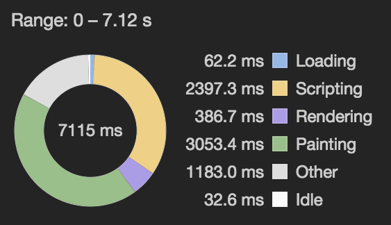
Example of page performance summary
The diagram above was generated using Chrome’s performance panel in DevTools (more on that later) and it shows how much time was taken by each task in the browser in the recorded time (0-7.12s) after reloading of a page. As you can see, painting takes a significant part, and that’s not automatically a bad thing. In this particular example, the increased painting is caused by a combination of animated GIFs on the page and canvas drawing (at 60fps), where both don’t cause any changes to the DOM or its styles, while still triggering painting.
Another good example of a feature that may cause painting without any outside intervention is the CSS animation property, and compared to animated GIF or canvas, it is probably more common on the web. An animation is usually triggered by user input, like hover, but thanks to animation and @keyframes rules, we can even create quite complex animations running constantly on the page without much of an effort, which is pretty amazing.
What some might not realize, is that those animations can easily get out of hand and constantly trigger painting, and that can cost us a lot of processing power. Of course, there are some rules that can be used to avoid painting. Most obvious is limiting manipulation of elements to CSS transform and opacity properties, which by default don’t trigger paint, unless some special circumstances are in place, such as animating an SVG path.
Paint flashing
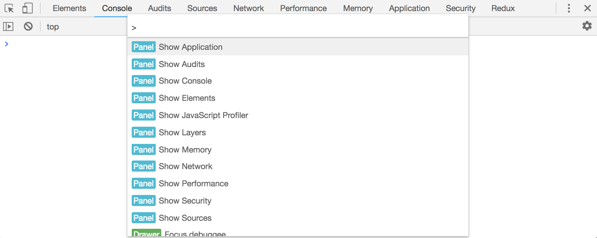
You likely know that Chrome has DevTools. What you might not know about is a little shortcut (Shift+Cmd+P on Mac or Control+Shift+P on PC) which can be used inside DevTools to bring up a little search bar and command menu.
Command Menu
I’ve started digging around it, and apart from many other useful and incredibly interesting options, a render panel caught my attention.
Render Panel
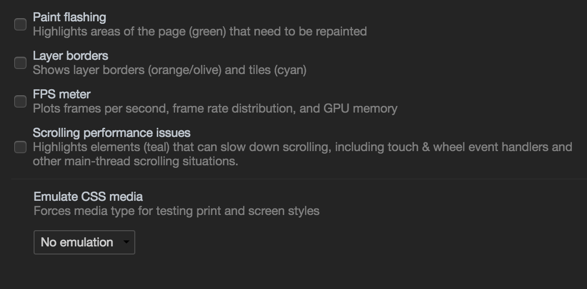
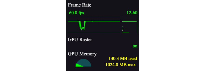
At the first sight, you can see some interesting options that can be very helpful when it comes to debugging animation on the web, like an FPS meter.
FPS meter
Layer borders and paint flashing are also interesting tools. Layer borders are used to display the borders of layers as they are rendered by the browser so that any transformation or change in size is easily recognizable. Paint flashing serves to highlight areas of the webpage where the browser is forced to repaint.
Paint flashing
After discovering paint flashing, the first thing I did was check it out on a project of mine. In most places, there was no trouble. For instance, any movement triggered by scroll on the website was powered by the CSS transform property, which as we covered, doesn’t cause painting. The painting was present where one would expect it to be, like changes in text color on hover, but that’s not something that should be much of a concern due to its area and presence only on hover of the element. To sum it up, you can always find something to improve, even if you wrote the code yesterday…
But one thing was a slap in the face.
It doesn’t matter how experienced or careful you are, you can — and most likely will — make a mistake. We’re just people and some would argue that fixing your own bugs is most of the job when it comes to development. However, for a bug to be fixable, we need to be aware of it… and that’s exactly where the render panel helps.
Case study
Let’s take a closer look at the actual issue. The design came in with the request for a noisy background. That kind of effect that old TVs had when there was no signal.
It is known that GIFs have many issues, where performance is certainly one of them, so I definitely couldn’t use that for a whole page background. If you’d like to read some more on why to avoid GIFs, here is a good resource with a bunch of reasons.
Using JavaScript is definitely an option in this case. Displaying or hiding elements with a slightly moved background was the first thing that came to my mind, and using canvas could help too. However, all of this seemed a little overkill for simply having a background. I decided to go for a CSS-only approach.
My solution was to take a small “noisy” PNG image as a background-image, enable background-repeat and throw it over a one-color background. How did I achieve the noise effect? With infinite CSS animation! By setting the background-position to different value over the period of 200 milliseconds. Here’s how that turned out:
Can you guess the problem? It seemed like a quite an elegant solution to me, and I was excited about my achievement of making it through without a crappy GIF and even not a single line of JavaScript. Just simple CSS that is optimized in browsers these days.
Well, the paint flashing showed something completely different. The layer of the size of the window was constantly repainting, without the user even doing anything. You can see the paint flashing in the demo above if you enable it in the render panel (note that paint flashing doesn’t show up in embedded pen).
Without paint flashing (left) vs. with paint flashing (right)
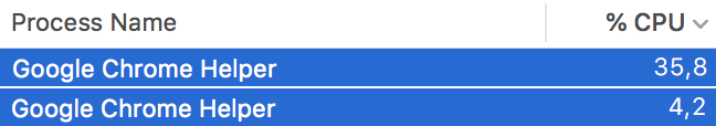
That certainly doesn’t play well with the performance of the website and drains laptop batteries like there’s no tomorrow.
CPU usage for the animation done with background-position (top) and transform (bottom)
All of this CPU usage could have been avoided by replacing the changes to background-position using transform or opacity.
I’ve been doing web development for a while and I knew very well that animating a background is never a good idea. This felt like a rookie mistake. People make mistakes… but that’s not the whole story. The website was all laggy and uncomfortable to navigate. How did I miss it?
Something that certainly plays a big role is the fact that I am (and you may be as well) a little spoiled when it comes to development equipment. I have a nice, powerful computer for work and access to speedy internet. Unless we write some really crappy code, anything we write runs quite smoothly in our eyes. But that’s not always the case for our users.
A similar problem applies to many other things — like display size. Using a little exaggeration, while we are developing on 27” display with 4K resolution and getting the designs primarily for 1920×1080, our visitors come in mainly from 1366×768 laptops and have a completely different workflow when it comes to using a computer.
Conclusion
While this article started off as a piece about painting, its main topic is really much more about being mindful of the impact our code has on the painting process or performance in general. While painting serves as a good example of something that can be problematic and easily missed, it’s more of a disconnect between developer and user that is the issue.
The web is a place of many environments, where the developer’s environment is often far different than the user’s. While there is no need to change our ways or switch to lazy computers, it definitely helps to see our work the way it is seen by others from time to time. My suggestion is: when you come home from work and have a little free time, try to pick up your old computer and check your work there, to get a little closer to what your users experience.
If you don’t have this kind of computer around, tools like render panel can turn out to be awfully handy.
We are continuing our exploration of video from Smashing Conferences this year with two videos that explore the impact of third party scripts. These scripts can add functionality, and give us valuable information, but what do they cost?
These two talks will help you to assess the third party scripts you might be considering adding to a site, and to be able to advise your clients or team members when the request comes in to add yet another script to a global include file!
Name That Script!
Recorded at the SmashingConf in San Francisco earlier this year, Trent Walton asks how can we objectively measure the value of third party scripts for advertising, A/B testing, or analytics? We need to consider their impact on web performance, user experience, as well as understand if they really help our business goals.
A/B Testing, Ads and Other Third Party Tags
At the SmashingConf in London, Andy Davies approached the same subject from a technical angle, showing us the impact that “just a snippet of JavaScript” can have.
The average internet connection in the United States is about six times as fast as it was just ten years ago, but instead of making it faster to browse the same types of websites, we’re simply occupying that extra bandwidth with more stuff.
Nick clearly explains what he means by bullshit, and one can see a connection to Brad Frost’s similarly framed argument. Nick talks about how each incremental interaction is a choice and connects the cruft of the web to the rise and adoption of frameworks like AMP.
Ethan Marcotte paints things in a different light by looking at business incentive:
…ultimately, the web’s performance problem is a problem of profitability. If we’re going to talk about bloated pages, we should do so in context: in the context of a web where digital advertising revenue is cratering for publishers, but is positively flourishing for Facebook and Google. We should look at the underlying structural issues that incentivize a company to include heavy advertising scripts and pesky overlays, or examine the market challenges that force a publisher to adopt something like AMP.
In other words, the way we talk about slow websites needs to be much, much broader. If we can do that, then we’ll have a sharper understanding of where—and how—the web can be faster.
It’s a systemic state of the industry problem that breeds slow websites. The cultural fight to fix it is perhaps just as important as the technical fights. Not that there isn’t a lot to learn and deal with on a technical level.
Addy Osamai wrote up a deep dive (a 20-minute read, according to Medium) that explores the cost of JavaScript to overall web performance. Everyone seems to agree JavaScript is the biggest problem area for slow websites. It’s not preachy but rather a set of well-explained principles to follow in this era where the use of JavaScript is trending up:
To stay fast, only load JavaScript needed for the current page.
Embrace performance budgets and learn to live within them.
Learn how to audit and trim your JavaScript bundles.
Every interaction is the start of a new ‘Time-to-Interactive’; consider optimizations in this context.
If client-side JavaScript isn’t benefiting the user experience, ask yourself if it’s really necessary.
Studies have shown that over 70% of Americans do not enjoy their work. That’s a pretty sad statistics, if you ask me. Hopefully, the 30% left includes a big majority of the American designers, web developers, letterers, and all the other design related fields. But in case you are one of the struggling ones, we have something that we hope will lift your spirits.
Are you sitting at your desk waiting for the day to be over? Did you have enough of pretentious clients who simply can’t make up their mind? Do you want a holiday on an island, away from the office you work from? These, among others, are symptoms of hard work done the hard way. In fact, what you need to actually do is to say “ENOUGH” and really mean it. Enough to the old way of doing things, and accept some basic principles about your job. Design has to be enjoyable, not exhausting. Where could you find better pieces of advice if not from you predecessors, famous designers who can direct you to success the best?
You can read book, you can get better trained, you can listen to podcasts, and you can sit back and relax. The famous designers we feature today took time to tell you some important lessons in few words. With no further ado:
“The nature of process, to one degree or another, involves failure. You have at it. It doesn’t work. You keep pushing. It gets better. But it’s not good. It gets worse. You got at it again. Then you desperately stab at it, believing “this isn’t going to work.” And it does!”
“If a client comes to you and says that they’re not really sure what to do, that’s one of the best relationships you can possibly have—when there’s an acknowledgment of a goal but the path to the end product is unknown, and they’re open to the collaboration.”
“My work is play. And I play when I design. I even looked it up in the dictionary, to make sure that I actually do that, and the definition of “play,” number one, was “engaging in a childlike activity or endeavor,” and number two was “gambling.” And I realize I do both when I’m designing.”
“You approach each project searching for a dozen great ideas, not just one or two. After about seven designs, you realize there really are infinite ways to look at a problem. I now completely enjoy the process, though I’m keenly aware that all but one of those dozen great ideas will eventually be killed. It’s strangely liberating.”
“I have a bunch of calendars I used before I went digital. Every once in a while, I’ll open up one from 1991 and look at all the names and appointments and things that, at the time, seemed so important. Meetings that I was really worried about, things that I was getting calls four times a day about, and I wonder, “Where did it all go? Where are they now?” It’s so strange, everything has disappeared. The only thing that stays behind is the work.”
“Typography is like fashion, it changes. So I try to stay away from anything that might date itself or will be so flashy or interesting that it’s going to take away from any of the other imagery. When I look back to the very first thing that I did with Apple, it was trendy and the font evoked a certain kind of futuristic thing, which I wouldn’t do now. I think typography is best when you feel it but it doesn’t get in the way.”
“Do things you believe in. There’s a constant battle between good and bad, but as least if you do things you believe in, you’re trying to keep it on the right side of good. As far as you can, try to do what you believe in, because then you hold on to yourself. I don’t really have much money – I don’t own my home, but I’m happy with what I’ve done. I might regret some mistakes I made, but I don’t regret the work I made.”
“People never talk about the enjoyable process of designing, they always concentrate on the intellectual side of problem-solving. But I think it’s fair enough to do a piece of design which is an enjoyable process for you as a designer. And that’s what a lot of these typefaces are. I don’t design them necessarily to sell, or even to use them myself. I don’t think about the audience at all when I’m doing them. What I think about is the process that goes on between me and the typeface.”
We hope that you enjoyed this blog post enough to share it with other people who need some fresh air in the storm of their job. Also, visit us daily for more snippets of inspiration!
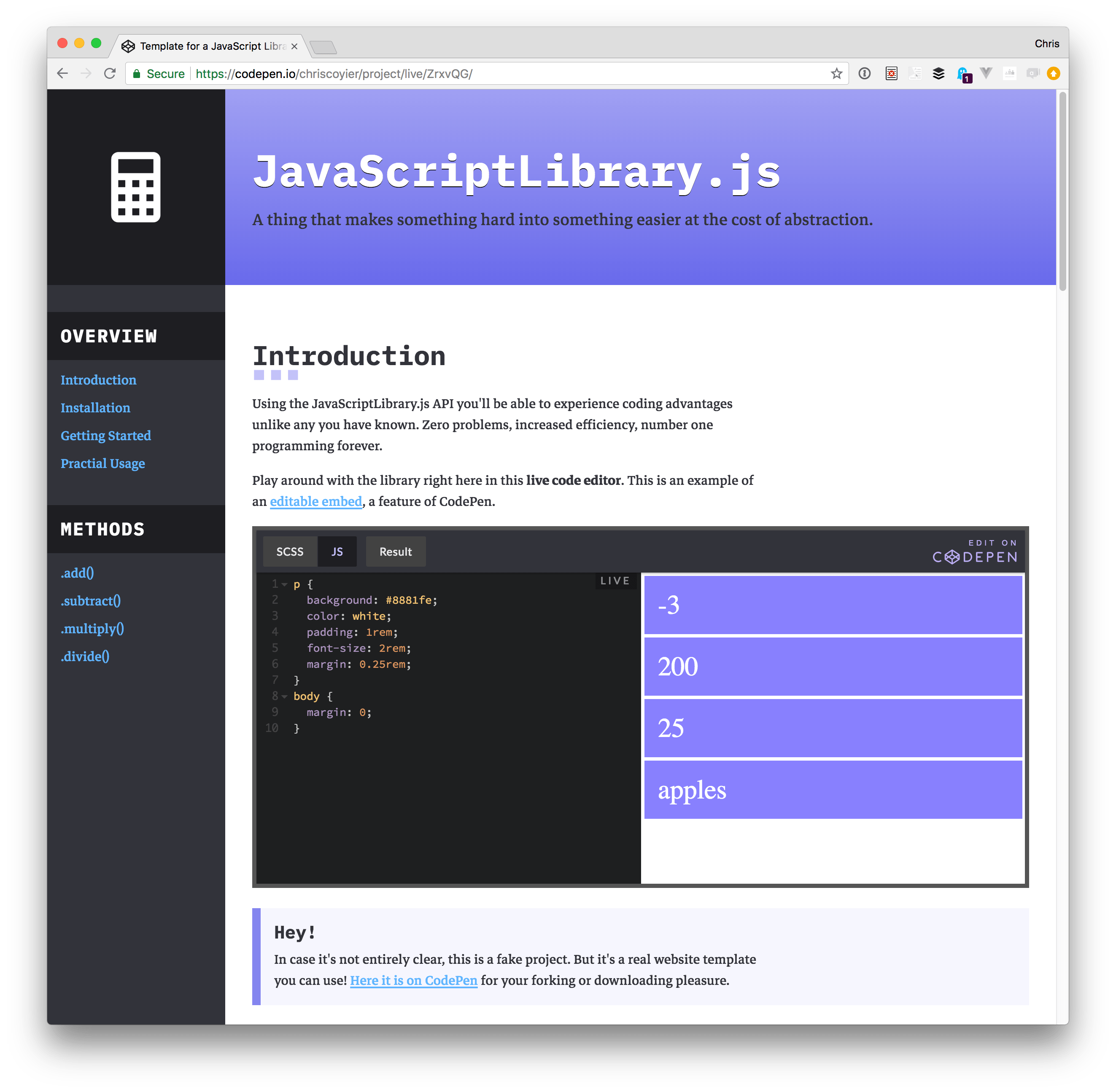
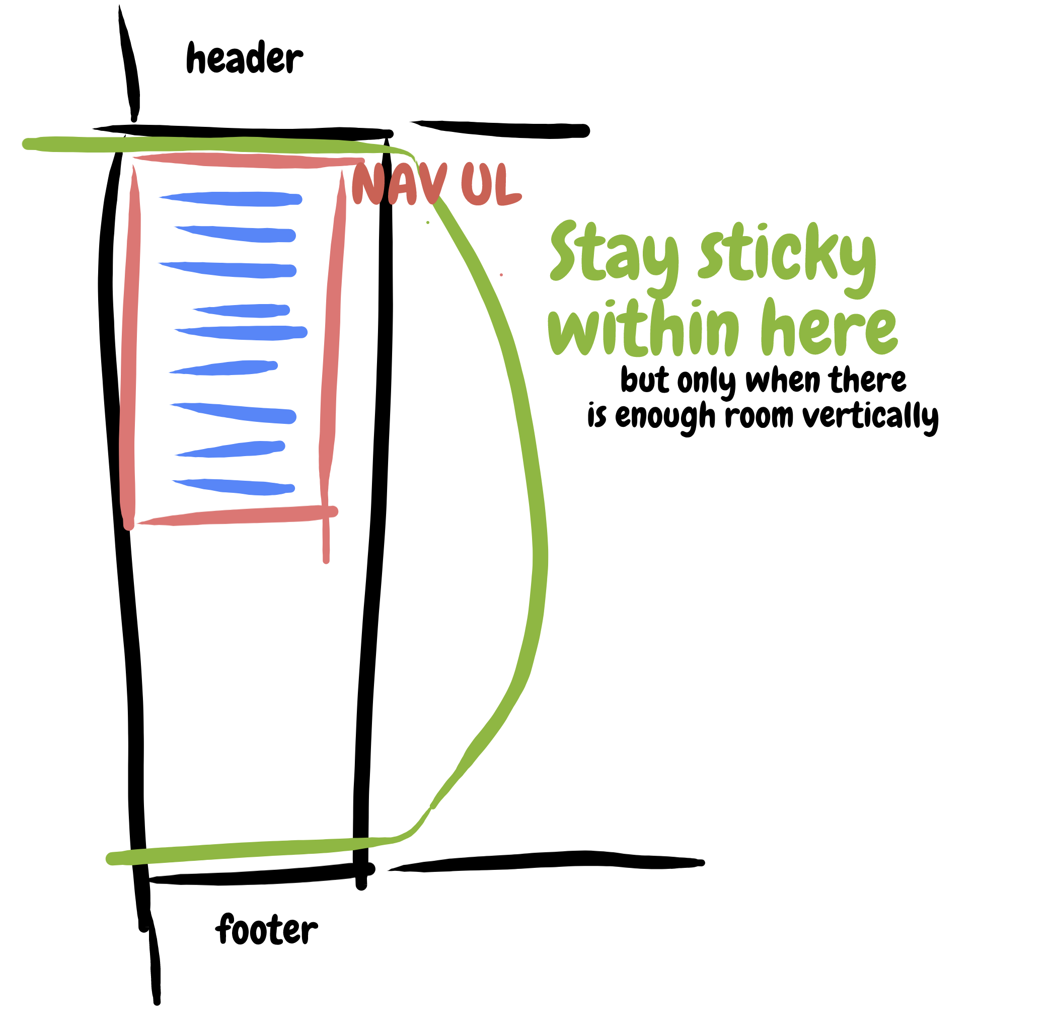
It’s easy to toss position: sticky; top: 0; on something. But for it to work, it’s gotta be within a taller parent element. So, the unordered list (
) within the navigation () works great here. Thanks to the CSS grid layout, the is as tall as the content area. However, note that that we also gotta position: -webkit-sticky; for iOS.
I also tossed in a magic number for the vertical media query so that it doesn’t stick in such a way that you can’t get to the lower navigation items:
/* Only stick if you can fit */
@media (min-height: 300px) {
  nav ul {
    position: sticky;
    top: 0;
  }
}
Smooth
In my first crack at this, I thought about JavaScript-based smooth scrolling. It’s even native these days with no need for frameworks. You can target an element and smoothly scroll to it:
let mainNavLinks = document.querySelectorAll("nav ul li a");

mainNavLinks.forEach(link => {
  link.addEventListener("click", event => {
    event.preventDefault();
    let target = document.querySelector(event.target.hash);
    target.scrollIntoView({
      behavior: "smooth",
      block: "start"
    });
  });
});
That’s supported in both Chrome and Firebox, but not Edge or Safari.
Then it occurred to me, CSS can do this! There is a scroll-behavior property and you can put it on the document to make everything scroll that way:
html {
  scroll-behavior: smooth;
}
Since our navigational links are hash/jump/anchor links, that’s literally all we need. Forget the JavaScript. Especially because the browser support for scroll-behavior is the same as the “smooth” version of .scrollIntoView().
Active
This is a bit trickier, particularly because this is a single-page scrolling app rather than individual pages with their own separate documents. If they were separate documents, we’d change an active class somewhere in the navigation or use a body.specific_page class or something.
Instead, we’ll need to look at the scroll position of the page, decide which section is in view and mark it that way. There might be some kinda fancy IntersectionObserver way to handle this, but I couldn’t quite wrap my head around that, so instead I’m just looking at all the relevant sections, doing a little measuring and math, and deciding if the link is active that way.
let mainNavLinks = document.querySelectorAll("nav ul li a");
let mainSections = document.querySelectorAll("main section");

let lastId;
let cur = [];

window.addEventListener("scroll", event => {
  let fromTop = window.scrollY;

  mainNavLinks.forEach(link => {
    let section = document.querySelector(link.hash);

    if (
      section.offsetTop <= fromTop &&
      section.offsetTop + section.offsetHeight > fromTop
    ) {
      link.classList.add("current");
    } else {
      link.classList.remove("current");
    }
  });
});
The scroll handler there should trigger a little warning flag. That’s the kind of thing that should probably be throttled, like if you have lodash available:


