Web designers are some of the hardest working people I know. Which is why I don’t envy them having to design websites and other content for clients while managing their freelance design business and continually being on the lookout for new clients.
Something I’m reminded of when I think about this, however, is the fact that it’s 25% more expensive to find new clients than retain the ones you already have. It makes sense when you think about how much time you put into scouring the web for clients, reaching out in the hopes of pitching your portfolio, and, possibly, onboarding them as a client.
it’s 25% more expensive to find new clients than retain the ones you already have
Retaining clients, on the other hand, just doesn’t require as much work. You’ve already laid the foundation and established a relationship with them. It’s simply a matter of doing things along the way that prove your continued value to their business while also occasionally surprising and delighting them. This is where loyalty comes into play.
Client loyalty is typically evidenced by one of three actions:
A client continues to purchase the same service or product from you.
A client is willing to be upsold or cross-sold on other services or products you offer.
A client regularly refers others to your business.
In so doing, the client has demonstrated that they prefer working with you over all others.
For web designers, client loyalty is huge. Think about how much easier it would be to run your business if you had a steady and predictable stream of revenue coming through. Not only that, consider the fact you’ll be able to work with the same clients (that you hopefully love as much as they love you) through the years. In exchange, your clients get a high-quality web design partner that helps their businesses grow.
7 Ways to Build Loyalty with Your Web Design Clients
In order to build loyalty with web design clients, you have to first figure out what they value most. This will differ from client to client, and industry to industry. However, these 7 ideas should get you thinking about how this could work for your business.
1. Handle the Initial Project Like a Pro
The work you do on a first-time project will lay the groundwork for any future relationship you have with the client, so make sure your process is refined and your service/solution is the best it’s ever going to be.
Every base of the web design lifecycle is covered and well-explained.
For your own business, consider some of the following upgrades:
Create a client contract (if you don’t have one already) that covers every angle.
Conduct thorough research into a client’s background before meeting and, again, before commencing work.
Invest in a professional grade project management and collaboration platform.
Designs can go out of style fast, so always design with the future in mind.
Specialize. If you don’t have a design specialty or industry of focus, get one. It’ll make you a more effective designer if you’re awesome at one thing instead of being okay at a few.
2. Communicate Like a Partner
From the very first interaction you have with a prospect to the very last you have with a current one, be ready to leave a positive impression. While I realize that can get tricky—especially as you enter feedback stages—always remember that: 1) you are here to create something your clients will love, and 2) you are the professional designer that knows best.
If there happens to be a disconnect between what the client wants/loves and what you believe is the better course of action to take, the way you communicate may make all the difference in the world.
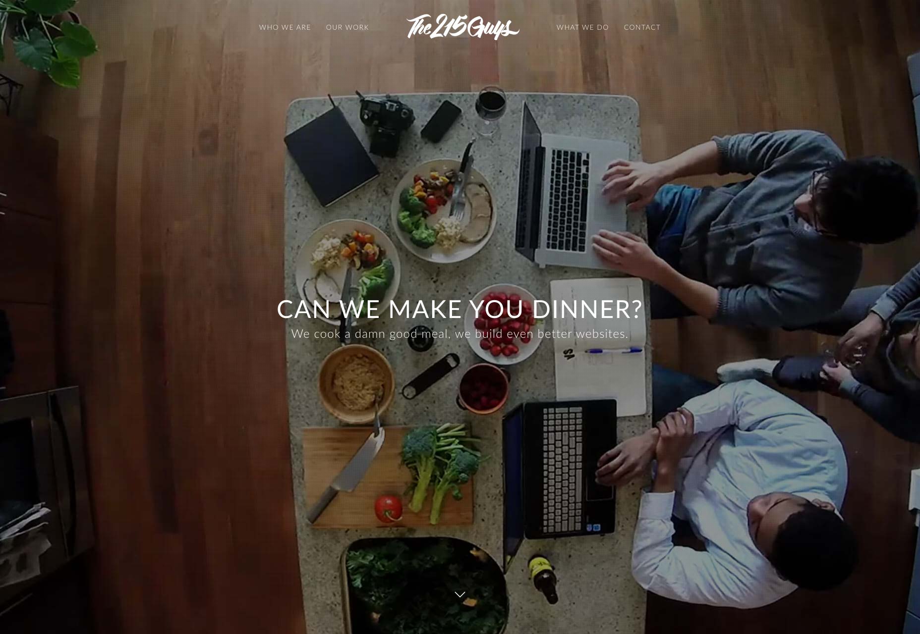
The 215 Guys are a fantastic example of this. If their website is this straightforward, relatable, and welcoming, think about how smooth their communications and relationships are when they actually work with a client.
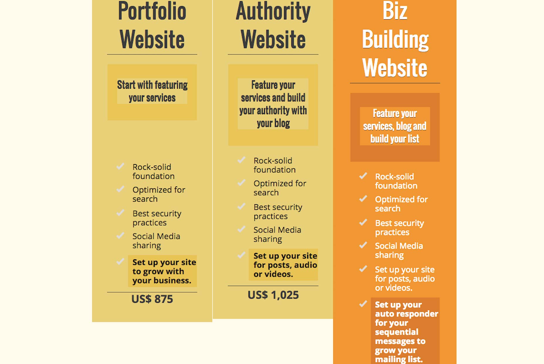
3. Anticipate Their Needs
Web design agencies aren’t the only ones that can create tiered design packages for clients. Freelance designers could and should be doing this too. After all, your clients aren’t all going to be the same size or have the same needs as everyone else. Why not anticipate those needs to by developing packages that account for those varying needs?
Here’s an example from Tina Cook who is not only a web designer, but a marketer and coach as well.
As you can see, her packages are also a great way to up-sell clients and also get them thinking about what she can do for them in the future.
4. Offer Monthly Retainer Services
Even if clients didn’t think about what would happen after the completion of their project, you can bet they will quickly come to that realization once you’ve handed it off. Websites are a lot of work and not a lot of business owners, managers, or marketing executives have the time or know-how to maintain the design or create content; let alone do anything advanced like A/B testing.
So, have those monthly retainer service packages well-defined and ready to share with those clients when they inevitably call you a month or two later with the following: “Can you just make this small tweak?” “Can you help me publish my blogs?” “I feel like there’s more we should be doing, but I’m not sure what that is. Help!”
5. Offer Other Design Services
If you like the idea of having recurring monthly services to offer clients, but don’t want to do design tweaks and other support or testing-type services, think about using your design skills in other ways. For instance, you could design:
Fonts
Icons
Illustrations
Infographics
Blog visuals
eBooks or white papers
Email marketing templates
Social media skins
Branding elements
Website templates
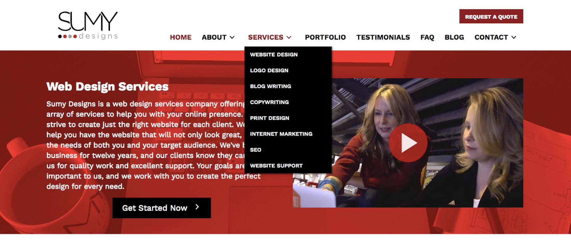
Or you could branch out like Sumy Designs has done and offer writing, SEO, or development services.
6. Commemorate Special Days
From the very get-go, pay special attention to the shared moments that are important to you and the client. Like when you completed your first project together. Or celebrating the anniversary of your partnership. Send them a small gift for each special occasion or simply give them a discount on the next month’s services. Take this time to show them you value them as a client and partner.
7. Launch a Loyalty Program
Taking the last one a step further, think about launching a loyalty program. This means giving clients something extra—something that no one else has access to—in exchange for their continued loyalty. Some examples:
Lower pricing for signing long-term contracts.
Free month of service in exchange for referrals.
Discounted services when they try something new you’re about to launch.
Monthly rebate for paying each invoice by the 10th.
Free hour of support each month for filling out survey.
A loyalty program also gives you a chance to share high-quality blog and newsletter content with clients. Since they’re already primed to watch for offers and news from you, this is an audience that will be really receptive to this.
Focus on Loyalty
If you haven’t focused too much on generating longer-term relationships with clients by building loyalty, it’s not too late to start. Focus on creating opportunities in which you give them even more reason to trust you and to prefer your services above all others. If you can regularly give them something of value, you’ll find that they’re more willing to keep working with you or, at the very least, refer others to you.
I really like Zero to One by Peter Thiel. So much so, that I’m slowly reading it chapter by chapter to internalize the information.
If you are interested in how game-changing strategies behind new products and services are conceptualized, this book is for you.
I particularly like his thoughts about how monopolies are for the greater good. However, before you get the pitchforks (just kidding), what he is actually saying is to find an area (or niche) that you can own, “monopolize” it, and thus a platform to grow your business from.
On the other hand, if you don’t have the time to read the book, which I highly recommend you do, check out the quick overview below that covers the key points but still misses the full flavor Peter’s arguments and thoughts. Enjoy!
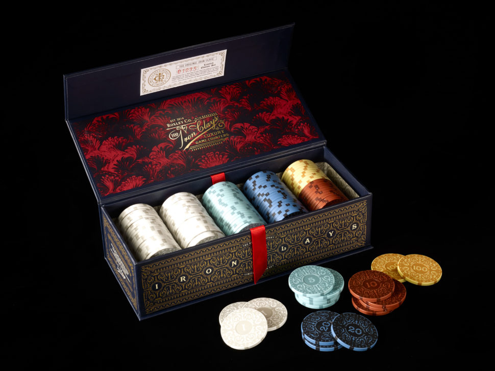
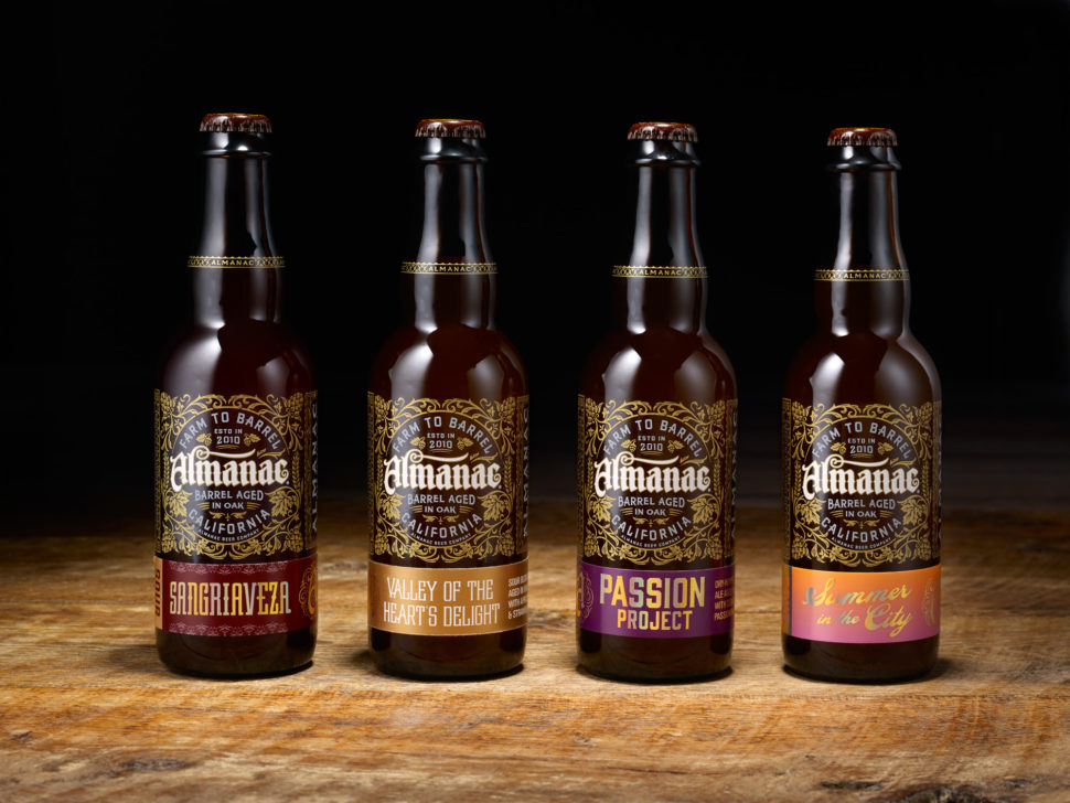
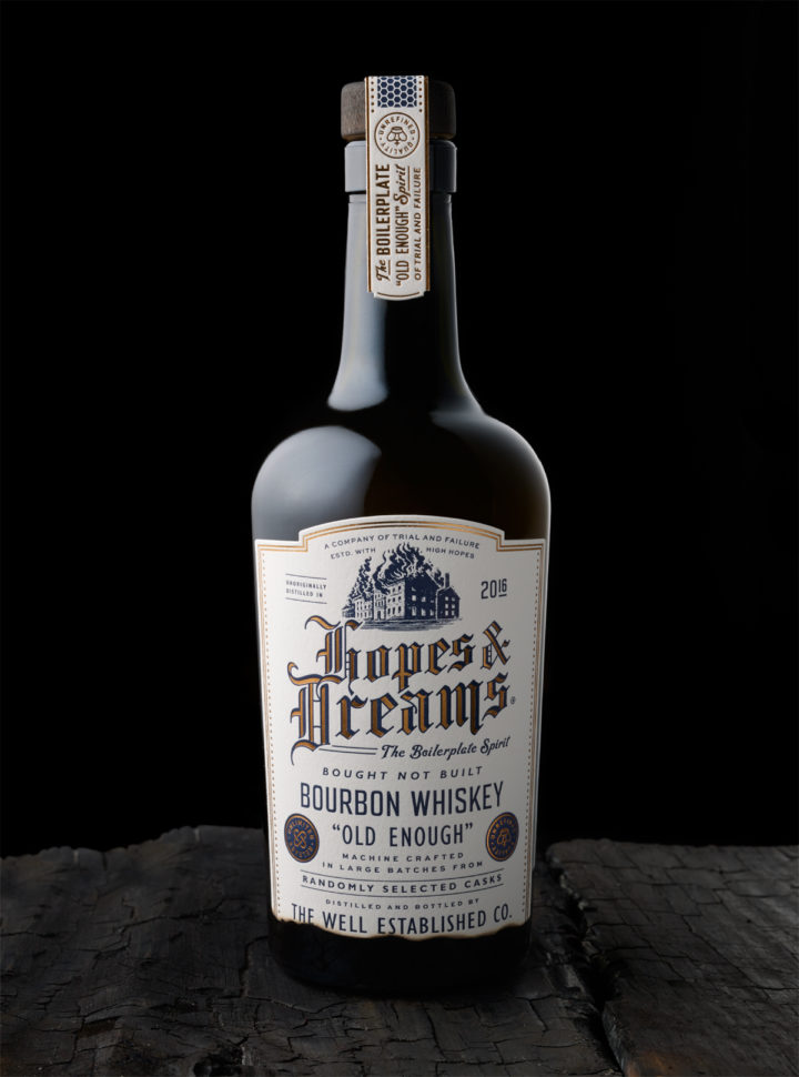
Chad Michael Studio makes sure that every branding and packaging design is high class. Read more to find out all about his work and important projects that made him a guru of beer design.
Who is Chad Michael?
Chad Michael had founded of the eponymous studio in 2014, after working as head designer for several of the New York’s most awarded agencies. He realized that designs require a lot of time and dedication in order to come out as desired so he has decided to select his clients and not accept every job that shows up. He maintains a close relationship with his clients to make sure that they are happy with the final product.
What does he do?
Simply put, he creates art. Chad Michael Studio gained its recognition for the complexity and meticulosity
of the designer’s work. He divided his work in three main segments which he describes as follows:
Innovation
From custom bottle structures, closure designs, to unique printing techiniques the studio has everything in place to give your product the ability to stand out from the crowd.
Branding
Well-executed, iconic logo design is a necessity for any successful brand especially when the company is a start-up. Countless hours are poured into each brand to ensure it separates you from everyone else.
Packaging
The aim is to never repeat what has already been done in the marketplace so pushing boundaries and the unexpected is the goal for every project.
Would you like a walk through Chad Michael Studio’s portfolio?
Now that we’ve gone over a glimpse of the studio’s amazing work, I believe we all agree that they deserve a ton of recognition and appreciation. Chad Michael Studio has received many awards the years due to their high quality services. Some honorable mentions are:
Styling and accessibility are often at odds with each other. Scott O’Hara has this repo that shows how the two can work really well together in the context of form controls.
A common misconception is that the focus style can only use the outline property. It’s worth noting that :focus is a selector like any other, meaning that it accepts the full range of CSS properties. I like to play with background color, underlining, and other techniques that don’t adjust the component’s current size, so as to not shift page layout when the selector is activated.
The nice thing about Scott’s repo is that it serves as a baseline that can be pulled into a project and customized from there. Sort of like WTF, forms? but with a clear—ahem—focus on accessibility. Styles are considered, but less the point.
While we’re on the topic, let’s not let Dave Rupert’s “Nutrition Cards for Accessible Components” go unnoticed. It also shipped recently and—aside from being a clever idea—is a truly useful thing to reference the accessibility expectations of specific components. Definitely worth a bookmark. ?
I love shopping online. I can find what I need and get most things for a decent price. I am Nigerian currently working and studying in India, and two things I dread when shopping online are:
Filling out a credit card form
Filling out shipping and billing address forms
Maybe I’m just lazy, but these things are not without challenges! For the first one, thanks to payment processing services like PayPal and e-wallets, I neither have to type in my 12-digit credit card number for every new e-commerce site I visit, nor have to save my credit card details with them.
For the second, the only time-saving option given by most shopping websites is to save your shipping address, but you still have to fill the form (arrghh!). This is where the challenge is. I’ve had most of my orders returned because my address (which I thought was the right address) could not be located or confirmed by the app for one reason or another.
Address inputs are challenging
Getting a user’s address through an input form is a clean solution but can also be a herculean task to the user. Here’s why:
If the user is new in a particular city, they might not know their full address
If the user wants to ship to a new address which isn’t saved (e.g shipping to a workplace or a friend’s address instead of the saved home address)
If the user resides in a city with very difficult address systems
If the user is plain lazy like me
A potential solution: get the address automatically
Getting the user’s address by the tap/click of a button. Yup, that’s easy! The UX is great as it saves the user both the time and effort of filling out some form. It will also save the store owner time, effort, and even money in some cases, as there’ll likely be a reduction in the number of incorrectly placed orders or shipments.
Let’s build a mini app that gets a user’s address and shows it on a Google Map interface using vanilla JavaScript. The concept is as follows:
Get the HTML button and listen for a click event
Get the user’s location (latitude and longitude) on a button click
Show the user’s location on a Google map
Pass the latitude and longitude to the Google Maps Geocode API URL
Display the returned address (or list of addresses) on the UI for the user to select one
Listen for map events and repeat steps 4 and 5
Pre-fill the form with the address data the user selects
Getting started and setting up
To build this app, we’re going to use the Materialize CSS framework to save us some time fussing with styles. Materialize is a modern responsive front-end framework based on Google’s Material Design system. The beta version works with vanilla JavaScript.
A basic setup using Materialize’s CSS and JavaScript files in a document is like this:
We’re also going to use the Google Maps API for displaying the map and getting the user’s human-readable address. We’ll need an API key to do this. Here’s how to get one:
Click “Enable” on the new page that comes up. Go back to the previous page and do a search for “Geocoding API,” click on it and enable it as well
Then, on the right nav of the page, click on Credentials, copy the API key on the page and save it to a file
Now, let’s update our document to show the map and let the user know it can be used to get their current location as the address. Also, we will add a form that’s pre-filled with the address the user selects.
...
<body>
<div class="container">
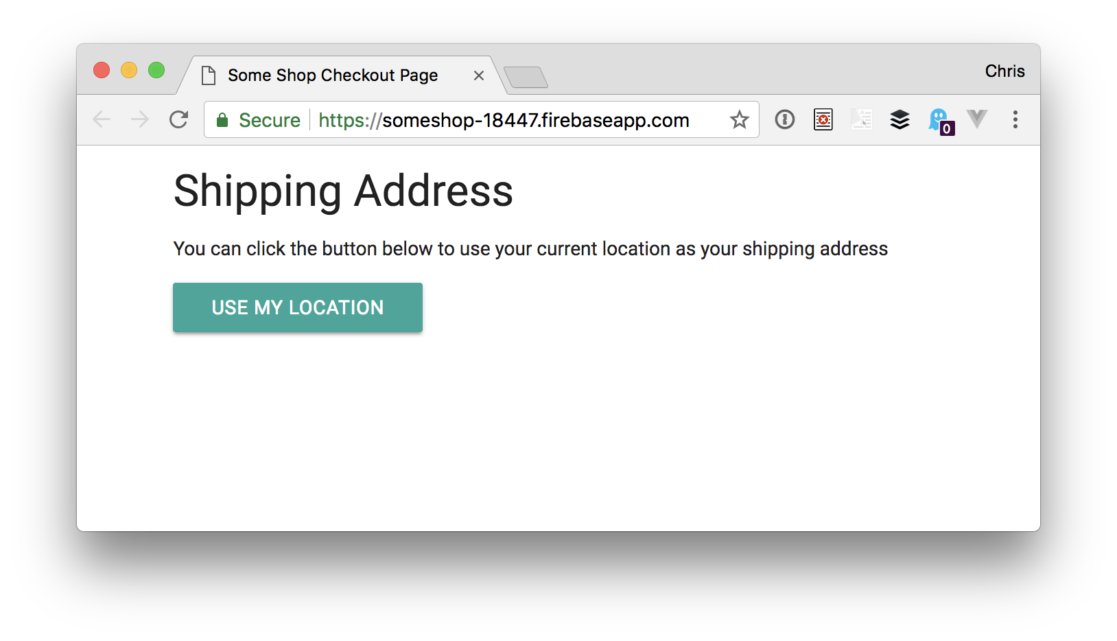
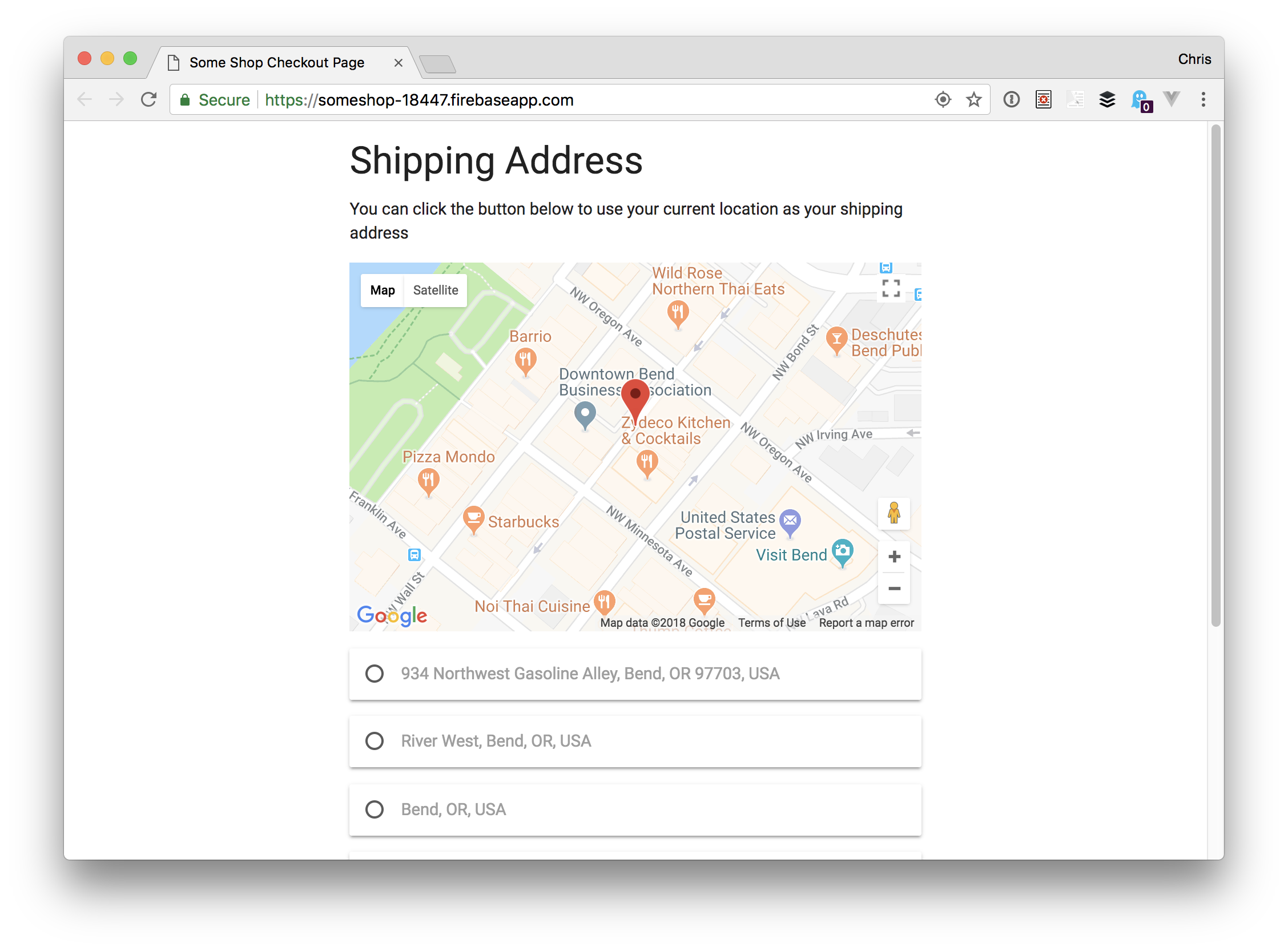
<h3>Shipping Address</h3>
<p>You can click the button below to use your current location as your shipping address</p>
<div id="map">
</div>
<button id="showMe" class="btn">Use My Location</button>
<form id="shippingAddress">
<div id="locationList"></div>
<br>
<div class="input-field">
<textarea class="input_fields materialize-textarea" id="address" type="text"></textarea>
<label class="active" for="address">Address (Area and Street)</label>
</div>
<div class="input-field">
<input class="input_fields" id="locality" type="text">
<label class="active" for="locality">Locality</label>
</div>
<div class="input-field">
<input class="input_fields" id="city" type="text">
<label class="active" for="city">City/District/Town</label>
</div>
<div class="input-field">
<input class="input_fields" id="postal_code" type="text">
<label class="active" for="pin_code">Pin Code</label>
</div>
<div class="input-field">
<input class="input_fields" id="landmark" type="text">
<label class="active" for="landmark">Landmark</label>
</div>
<div class="input-field">
<input class="input_fields" id="state" type="text">
<label class="active" for="State">State</label>
</div>
</form>
<!-- You could add a fallback address gathering form here -->
</div>
<script src="https://cdnjs.cloudflare.com/ajax/libs/materialize/1.0.0-beta/js/materialize.min.js"></script>
<script src="https://maps.googleapis.com/maps/api/js?key=YOUR_API_KEY"></script>
<script src="js/main.js"></script>
</body>
</html>
While we are here, let’s style things a bit to make this look a little better:
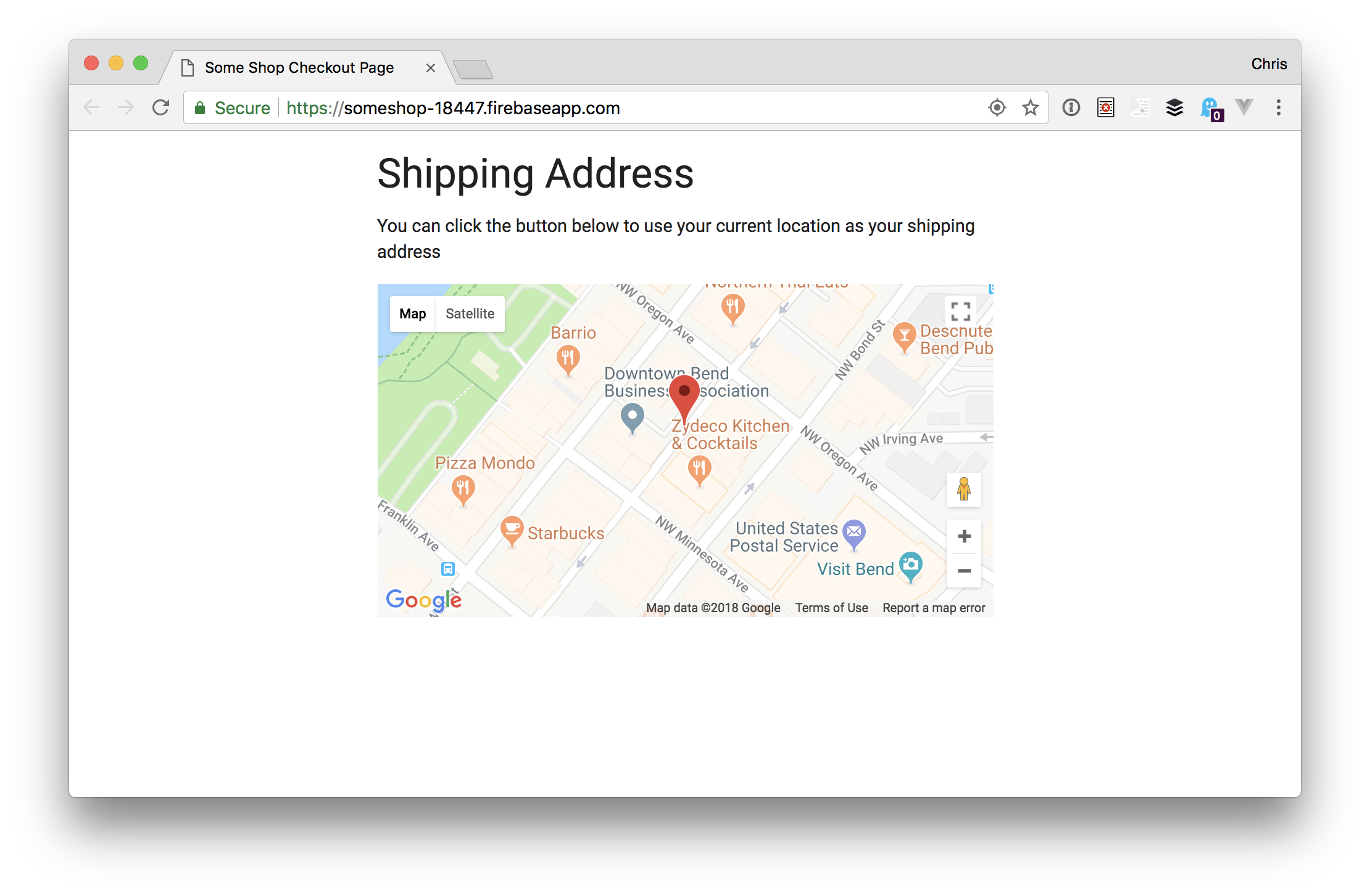
This CSS hides the map until we are ready to view it. Our app should look like this:
Let’s plan this out
Our app will be making use of the HTML5 Geolocation API to determine our user’s current location as well as Google’s Geocode API with a technique called Reverse Geocoding. The Geocode API takes a human-readable address and changes it into geographical (latitudinal and longitudinal) coordinates and marks the spot in the map.
The user is located with the HTML5 Geolocation API (navigator.geolocation)
We get the user’s geographic coordinates
We pass the coordinates to the geocode request API
We display the resulting addresses to the user
Most times, the geocode returns more than one address, so we would have to show the user all the returned addresses and let them choose the most accurate one.
Phew! Finally, we can get to the fun part of actually writing the JavaScript. Let’s go through each of the steps we outlined.
Step 1: Clicking the button
In our main.js file, let’s get a reference to the HTML button. While we are at it, we’ll set up some other variables we’ll need, like our API key.
//This div will display Google map
const mapArea = document.getElementById('map');

//This button will set everything into motion when clicked
const actionBtn = document.getElementById('showMe');

//This will display all the available addresses returned by Google's Geocode Api
const locationsAvailable = document.getElementById('locationList');

//Let's bring in our API_KEY
const __KEY = 'YOUR_API_KEY';

//Let's declare our Gmap and Gmarker variables that will hold the Map and Marker Objects later on
let Gmap;
let Gmarker;

//Now we listen for a click event on our button
actionBtn.addEventListener('click', e => {
  // hide the button
  actionBtn.style.display = "none";
  // call Materialize toast to update user
  M.toast({ html: 'fetching your current location', classes: 'rounded' });
  // get the user's position
  getLocation();
});
When the click handler for our button runs, it:
Hides the button
Alerts the user that we are getting their current location (a “toast” in Materialize is like a popup notification)
Calls the getLocation function
Step 2: Get the user’s location (latitude and longitude)
When our getLocation function is invoked, we need to do some more work. First, let’s check if we can even use the Geolocation API:
getLocation = () => {
  // check if user's browser supports Navigator.geolocation
  if (navigator.geolocation) {
    navigator.geolocation.getCurrentPosition(displayLocation, showError, options);
  } else {
    M.toast({ html: "Sorry, your browser does not support this feature... Please Update your Browser to enjoy it", classes: "rounded" });
  }
}
When we have support, it calls geolocation’s getCurrentPosition method. If it doesn’t have support, then the user is alerted that there’s no browser support.
If there is support, then the getCurrentLocation method is used to get the current location of the device. The syntax is like this:
success : This is a callback function that takes a position as its only parameter. For us, our success callback function is the displayLocation function.
error : [optional] This is a callback function that takes a PositionError as its sole input parameter. You can read more about this here. Our error callback function is the showError function.
options : [optional] This is an object which describes the options property to be passed to the getCurrentPosition method. You can read more about this here. Our options parameter is the options object.
Before writing our displayLocation function, let’s handle the showError function and options object:
// Displays the different error messages
showError = (error) => {
  mapArea.style.display = "block"
  switch (error.code) {
    case error.PERMISSION_DENIED:
      mapArea.innerHTML = "You denied the request for your location."
      break;
    case error.POSITION_UNAVAILABLE:
      mapArea.innerHTML = "Your Location information is unavailable."
      break;
    case error.TIMEOUT:
      mapArea.innerHTML = "Your request timed out. Please try again"
      break;
    case error.UNKNOWN_ERROR:
      mapArea.innerHTML = "An unknown error occurred please try again after some time."
      break;
  }
}
//Makes sure location accuracy is high
const options = {
  enableHighAccuracy: true
}
Now, let’s write the code for our displayLocation function inside our main.js file:
The first line takes our lat and lng values and encapsulates it in the latlng object literal. This makes it easy for us to use in our app.
The second line of code calls a showMap function which accepts a latlng argument. In here, we get to instantiate our Google map and render it in our UI.
The third line invokes a createMarker function which also accepts our object literal (latlng) as its argument and uses it to create a Google Maps Marker for us.
The fourth line makes the mapArea visible so that our user can now see the location.
Now, let’s get to creating our functions. We will start with the showMap function.
showMap = (latlng) => {
  let mapOptions = {
    center: latlng,
    zoom: 17
  };
  Gmap = new google.maps.Map(mapArea, mapOptions);
}
The showMap function creates a mapOptions objects that contain the map center (which is the lat and lng coordinates we got from displayLocation) and the zoom level of the map. Finally, we create an instance of the Google Maps class and pass it on to our map. In fewer words, we instantiate the Google Maps class.
To create a map instance, we specify two parameters in the constructor: the div the map will be displayed and the mapOptions. In our case, our div is called mapArea and our mapOptions is called mapOptions. After this, our created map will show up, but without a marker. We need a marker so the user can identify their current position on the map.
Let’s create our marker using the createMarker function:
The position property positions the marker at the specified latlng
The map property specifies the map instance where the marker should be rendered (in our case, it’s Gmap)
The animation property adds a little BOUNCE to our marker
The clickable property set to true means our marker can be clicked
Finally, we instantiate the Marker class in our Gmarker instance variable
So far, our user’s location has been fetched, the map has rendered and the user can see their current location on the map. Things are looking good! ?
Step 4: Pass the latitude and longitude to the Geocode API
Google’s Geocoding API will be used to convert our user’s numeric geographical coordinates to a formatted, human-readable address using the reversegeocoding process we covered earlier.
…where the outputFormat may either be a json or xml which determines the the format used to deliver the data. The parameters part is a list of parameters needed for the request.
The getGeolocation function takes two arguments ( lat and lng } concatenates them to form a new latlng variable that is passed to the URL.
Using the Fetch API (more on this here), we add the new latlng and __KEY into the Geocode request URL. Then, on the response object we get back, we pass the .json method to resolve the promise with JSON. Finally, we log the response in our console.
To make use of our newly created function, we have to call it in the displayLocation function. So let’s update our displayLocation function to contain the getGeolocation function call:
displayLocation = (position) => {
  const lat = position.coords.latitude;
  const lng = position.coords.longitude;
  const latlng = { lat, lng }
  showMap(latlng);
  createMarker(latlng);
  mapArea.style.display = "block";
  getGeolocation(lat, lng)// our new function call
}
The returned data should look something like this:
Step 5: Display the returned address(es) for the user to select
At this stage, we have made a request to Google’s Geocoding API and have gotten our result logged in the console. Now, we have to display the results in a UI for our user. This requires two things:
Create a new function that handles creating HTML elements
Update our getGeolocation function to make the function call
Let’s create the function that would take care of creating the HTML elements and updating the DOM.
populateCard = (geoResults) => {
  geoResults.map(geoResult => {
    // first create the input div container
    const addressCard = document.createElement('div');
    // then create the input and label elements
    const input = document.createElement('input');
    const label = document.createElement('label');
    // then add materialize classes to the div and input
    addressCard.classList.add("card");
    input.classList.add("with-gap");
    // add attributes to them
    label.setAttribute("for", geoResult.place_id);
    label.innerHTML = geoResult.formatted_address;
    input.setAttribute("name", "address");
    input.setAttribute("type", "radio");
    input.setAttribute("value", geoResult.formatted_address);
    input.setAttribute("id", geoResult.place_id);
    addressCard.appendChild(input);
    addressCard.appendChild(label)
    return (
      // append the created div to the locationsAvailable div
      locationsAvailable.appendChild(addressCard)
    );
  })
}
In this function, we iterate through our results and create some HTML elements (div , input and a label), append the input and the label to the div and finally append the new div to a parent div (which is locationsAvailable). Once we get the result from our API call, our DOM will be created and displayed to the user.
Next, we update our getGeolocation function to call our populateCard function by replacing the last line of getGeolocation with this:
.then(data => populateCard(data.results));
…which means our updated function should look this:
At this point, everything should be working fine. Our user clicks a button, gets a location displayed on the map along with a list of addresses that match the current location.
Step 6: Listen for map events and repeat steps 4 and 5
If our user decides to move the map or marker, nothing happens to the UI — new addresses aren’t not displayed and everything remains static. We’ve got to fix this, so let’s make our app dynamic by listening for map events. You can read all about Google Map Events here.
There are three events we want to listen for:
drag: This is fired once the user starts dragging and continues to drag the map
dragend: This is fired once the user stops dragging the map
idle: This is fired once every event has been fired and the map is idle
Quick Question: Why are these events best suited for our app?
Quick Answer: The first two events will make sure that our map marker stays in the center of the map during the drag event while the idle event will make a geocoding request with the new coordinates.
To listen for these events we have to update the showMap function with the following:
Gmap.addListener('drag', function () {
  Gmarker.setPosition(this.getCenter()); // set marker position to map center
});
Gmap.addListener('dragend', function () {
  Gmarker.setPosition(this.getCenter()); // set marker position to map center
});
Gmap.addListener('idle', function () {
  Gmarker.setPosition(this.getCenter()); // set marker position to map center
  if (Gmarker.getPosition().lat() !== lat || Gmarker.getPosition().lng() !== lng) {
    setTimeout(() => {
      updatePosition(this.getCenter().lat(), this.getCenter().lng()); // update position display
    }, 2000);
  }
});
As explained above, the first two event listeners simply ensure that the marker remains in the center of our map. Pay closer attention to the idle event listener because that is where the action is.
Once the idle event is fired, the marker goes to the center, then a check is done to find out if the current position of the marker is the same with the lat or lng values received by the displayLocation function. If it is not the same, then we call the updatePosition function after two seconds of idleness.
Having said that, we have to make a few updates to the showMap function. First, on the function header, we have to include more parameters and on the showMap function call. We need to add the new arguments there, too. Our showMap function should look like this:
showMap = (latlng, lat, lng) => {
  let mapOptions = {
    center: latlng,
    zoom: 17
  };
  Gmap = new google.maps.Map(mapArea, mapOptions);
  Gmap.addListener('drag', function () {
    Gmarker.setPosition(this.getCenter()); // set marker position to map center
  });
  Gmap.addListener('dragend', function () {
    Gmarker.setPosition(this.getCenter()); // set marker position to map center
  });
  Gmap.addListener('idle', function () {
    Gmarker.setPosition(this.getCenter()); // set marker position to map center
    if (Gmarker.getPosition().lat() !== lat || Gmarker.getPosition().lng() !== lng) {
      setTimeout(() => {
        updatePosition(this.getCenter().lat(), this.getCenter().lng()); // update position display
      }, 2000);
    }
  });
}
And our displayLocation function should look like this:
displayLocation = (position) => {
  const lat = position.coords.latitude;
  const lng = position.coords.longitude;
  const latlng = { lat, lng }
  showMap(latlng, lat, lng); //passed lat and lng as the new arguments to the function
  createMarker(latlng);
  mapArea.style.display = "block";
  getGeolocation(lat, lng);
}
Having listened for the map events, let’s repeat Step 4 and Step 5.
We start by writing our updatePosition function. This function will perform only one action for now, which is to pass the new lat and lng values to the getGeolocation function:
After getting the new position and fetching addresses, our DOM should re-render for the user, right? Well, it doesn’t. And to fix that, we create a function that will force the DOM to re-render:
// check if the container has a child node to force re-render of dom
function removeAddressCards(){
  if (locationsAvailable.hasChildNodes()) {
    while (locationsAvailable.firstChild) {
      locationsAvailable.removeChild(locationsAvailable.firstChild);
    }
  }
}
It checks if the locationsAvailablediv has any childNodes, and if it does, it deletes them before creating new address cards. The populateCard function is now updated to this:
populateCard = (geoResults) => {
  // check if a the container has a child node to force re-render of dom
  removeAddressCards();

  geoResults.map(geoResult => {
    // first create the input div container
    const addressCard = document.createElement('div');
    // then create the input and label elements
    const input = document.createElement('input');
    const label = document.createElement('label');
    // then add materialize classes to the div and input
    addressCard.classList.add("card");
    input.classList.add("with-gap");
    // add attributes to them
    label.setAttribute("for", geoResult.place_id);
    label.innerHTML = geoResult.formatted_address;
    input.setAttribute("name", "address");
    input.setAttribute("type", "radio");
    input.setAttribute("value", geoResult.formatted_address);
    input.setAttribute("id", geoResult.place_id);
    addressCard.appendChild(input);
    addressCard.appendChild(label);
    return (
      locationsAvailable.appendChild(addressCard);
    );
  })
}
We are done and are now able to fully get and display the user’s address!
Step 7: Pre-fill the form with the address data the user selects
The final step is to fill the form with the address the user selects. We need to add a click event listener to the address card and pass the address as argument to the callback function.
Here’s how we add the event listener in the populateCard function:
You should note that the geoResult argument in the above callback is the selected address object from the results array. That said, update the populateCard function to accommodate our new line of code.
The inputClicked function uses a series of if statements to assign values to our form elements. so before working on it, let’s bring our form elements into the equation:
Having done this, let us now work on pre-filling the form with the address_components in the inputClicked function.
inputClicked = result => {
  result.address_components.map(component => {
    const types = component.types
    if (types.includes('postal_code')) {
      inputPostalCode.value = component.long_name
    }
    if (types.includes('locality')) {
      inputLocality.value = component.long_name
    }
    if (types.includes('administrative_area_level_2')) {
      inputCity.value = component.long_name
    }
    if (types.includes('administrative_area_level_1')) {
      inputState.value = component.long_name
    }
    if (types.includes('point_of_interest')) {
      inputLandmark.value = component.long_name
    }
  });
  inputAddress.value = result.formatted_address;
  // to avoid labels overlapping pre-filled input contents
  M.updateTextFields();
  // removes the address cards from the UI
  removeAddressCards();
}
The above block of code iterates over the clicked (or selected) address component, checks the types of components and finally assigns them to the input fields if they match.
M.updateTextFields() function is from Materialize and it ensures that the label does not overlap with the input fields values and the removeAddressCards() function removes the address cards from the UI.
With this, we are done with our app and have saved our users lots of typing and headaches! Surely they will thank us for implementing such a hassle free solution.
This whole UX experiment can be seen as a shortcut that will help the user pre-fill the shipping address form. We should clearly state here that the returned addresses isn’t always 100% accurate. But that’s why we allow the address to be manually edited in the UI.
Isn’t it crazy to think that just ten years ago, we were talking about the new revolutionary iPhone and how it was going to change our lives forever?
Fast-forward to 2018, and Apple’s never-ending stream of iPhone updates are old news.
The real hot topic is AI?—?aka, how computers are starting to outsmart us.
As always, technological advancements change (and will continue to change) our experience with products.
Meanwhile, technology con
Ladies, Gentlemen, and Our Secret Reptilian Overlords, I asked for more color in last month’s article, and you have delivered. It’s August, now, and to distract myself from the oppressive heat, I have gathered some 20 of these more colorful designs together for your perusal.
So as you might guess, there’s a fair bit of variety this month. There’s still some good old monochromatic minimalism for those of you who like that, so never fear. There’s just a bit more balance, this time around.
Note: I’m judging these sites by how good they look to me. If they’re creative and original, or classic but really well-done, it’s all good to me. Sometimes, UX and accessibility suffer. For example, many of these sites depend on JavaScript to display their content at all; this is a Bad Idea, kids. If you find an idea you like and want to adapt to your own site, remember to implement it responsibly.
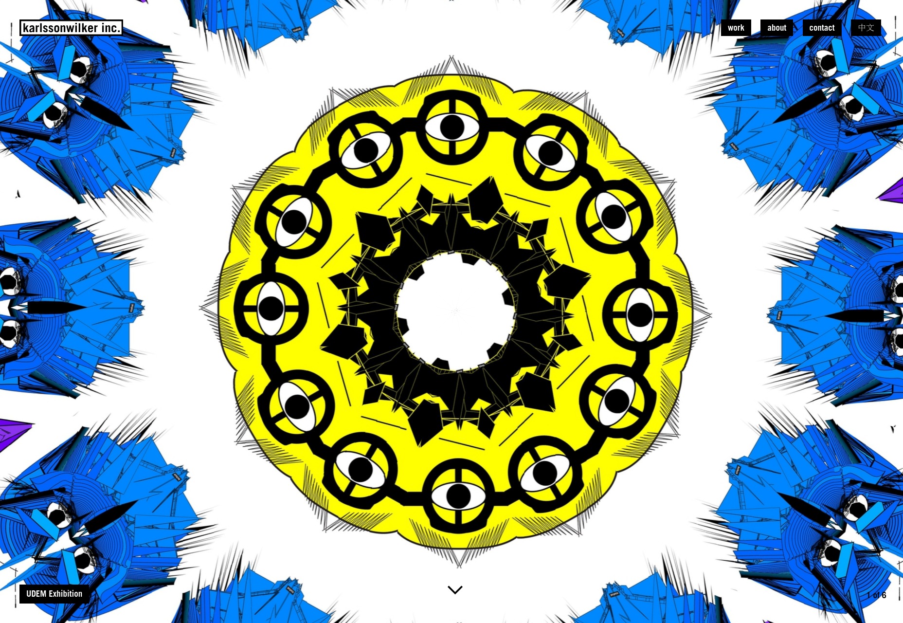
karlssonwilker
The karlssonwilker agency site is a blow to the eyeballs. Whether or not that’s a good thing is going to be down to personal taste; but I literally can’t remember the last time I saw an actual animated kaleidoscope effect used on the Web.
I definitely can’t remember the last time I saw one used this well. There’s also a rather interesting use of flowchart-style layout on the “About” page. Yeah. Flowcharts.
Platform: WordPress
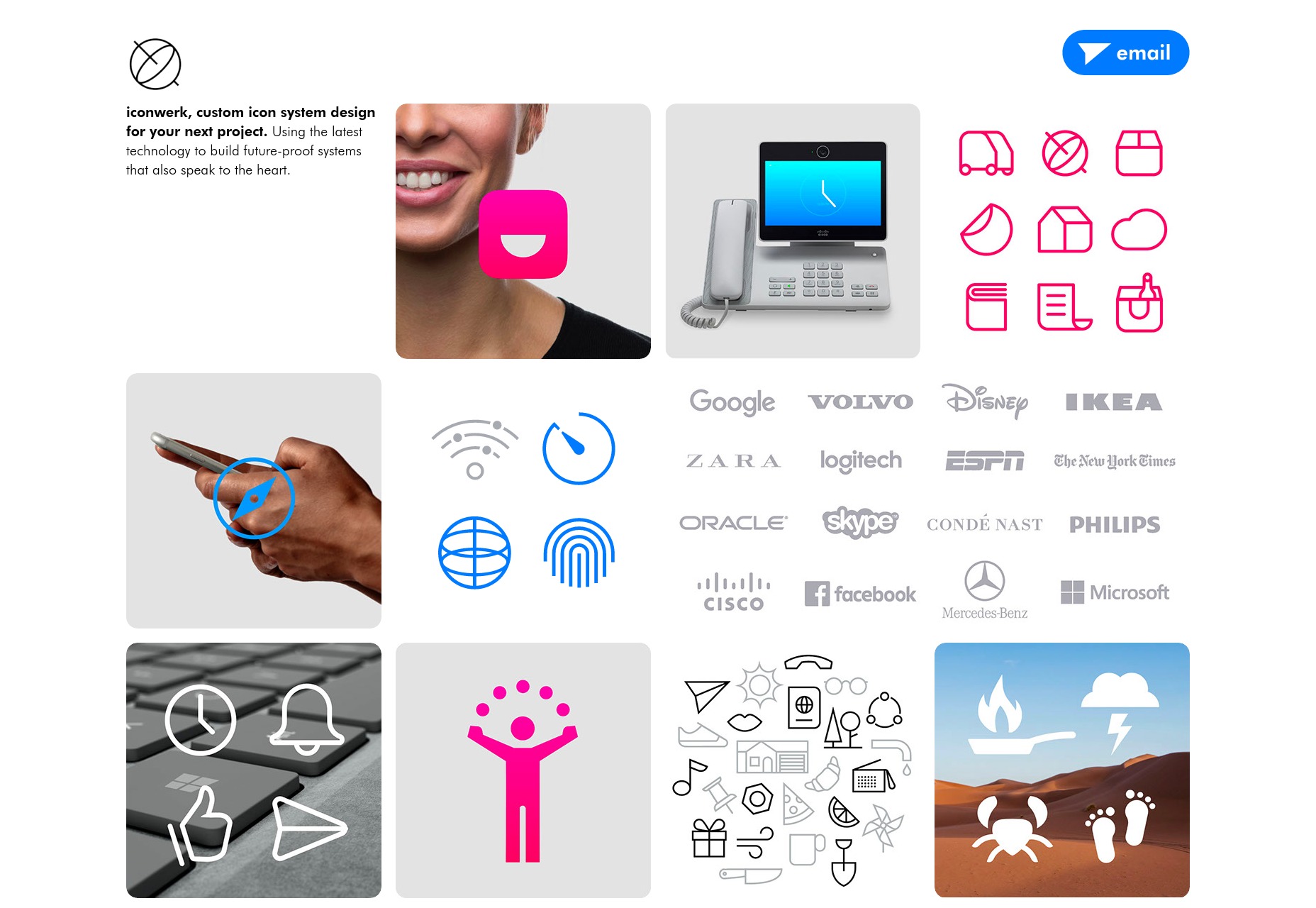
iconwerk
iconwerk is the first icon designer portfolio that I’ve seen in a while. It’s a meta work of genius. Before you can click on individual projects, you’re given a grid of images that contain icons, clients lists, and other snapshots of their work, but also kind of look like icons in their own right.
That’s right, they put icons in your icons, so you can look at icons while you look at icons.
Platform: Static Site
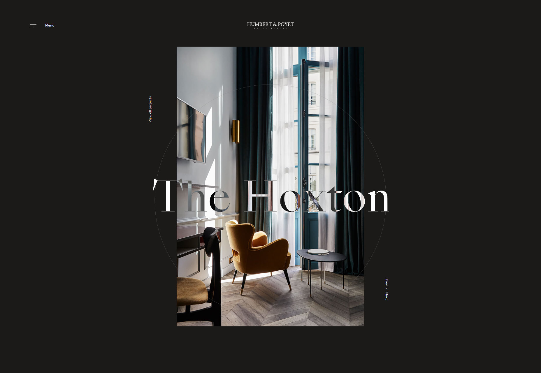
Humbert & Poyet
Humbert & Poyet is an architecture firm, so expect a lot of the usual: animation everywhere, elegant serif type, and text overlapping onto other elements. As is usual though, it’s all about how these elements are combined. In this case, the result is a visual treat that is greater than the sum of its parts.
Platform: Static Site
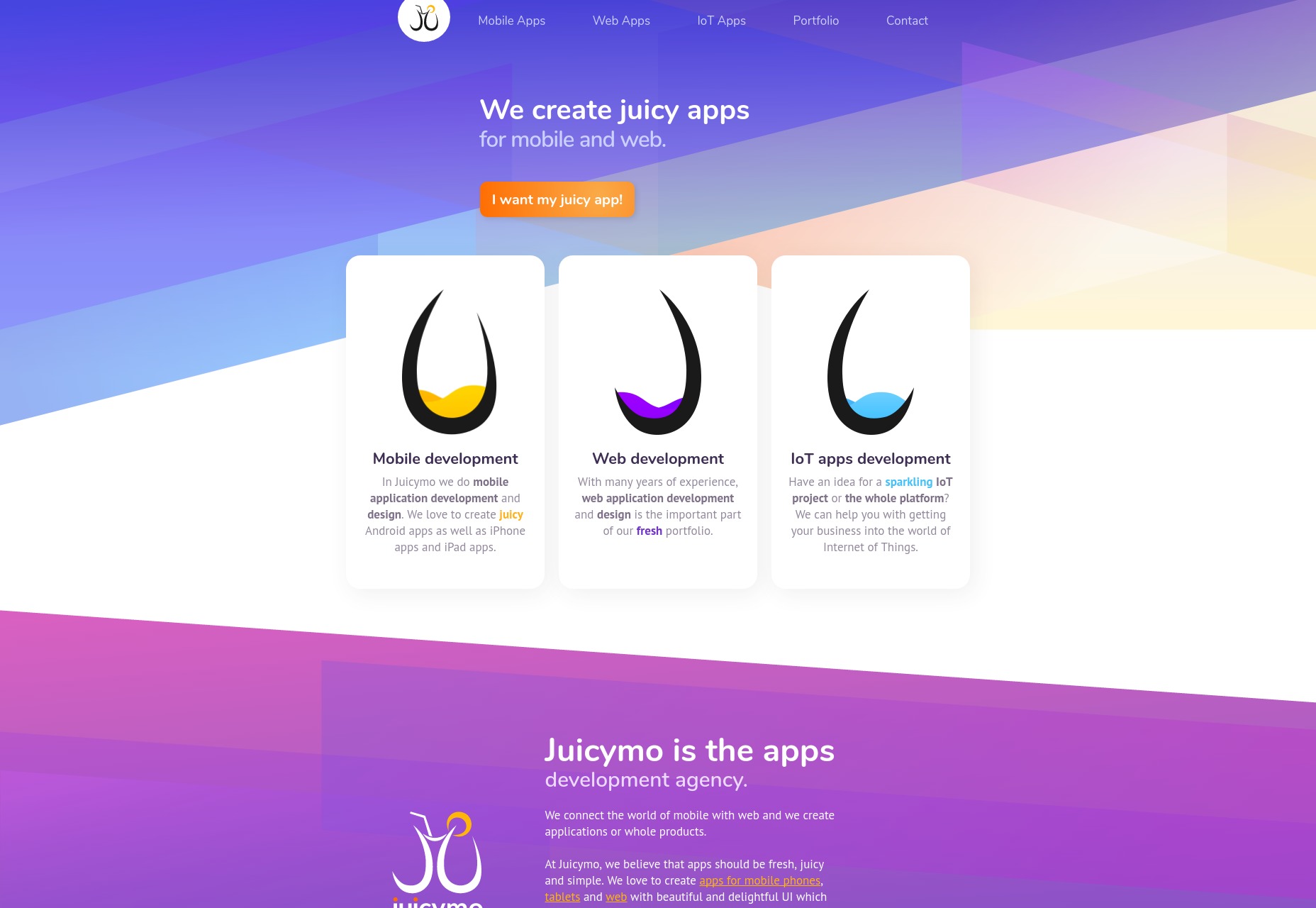
Juicymo
Juicymo is a mobile app developer, and their site goes all in on the flashy visuals you might expect from them. We get gradients galore, a lot of diagonal lines (a personal favorite of mine), rounded corners, and overall it’s just bright and colorful.
Really, it’s as if Web 2.0 and flat design had a baby. This makes it stand out, and I rather like it. Man, I never thought I’d miss rounded corners.
Platform: Static Site
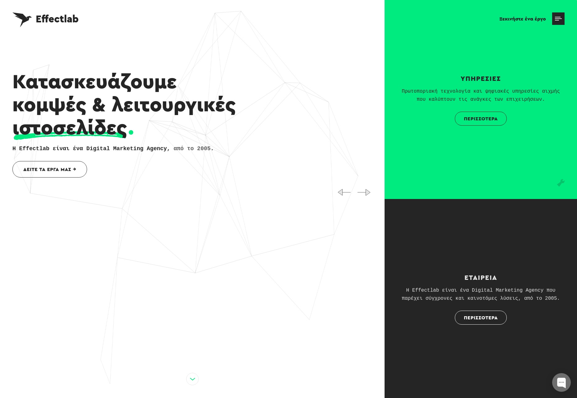
Effectlab
Effectlab brings us back to that good old flat design with strong type and animated geometry on the home page. Further in, we get some overlapping elements, and a strong use of their admittedly limited color scheme.
To bring us back to the typography, I haven’t seen a lot of Greek websites. But even so, the text feels beautifully rendered, and some of the more rune-like characters absolutely bring out the nerd in me.
Platform: Static Site
Jveb Studio
Jveb Studio uses light animation and background illustration to fantastic effect. With a clearly modern-yet-artistic style, this is a simple-looking site that nonetheless has a fair few moving parts under the hood. Give it a look.
Platform: WordPress
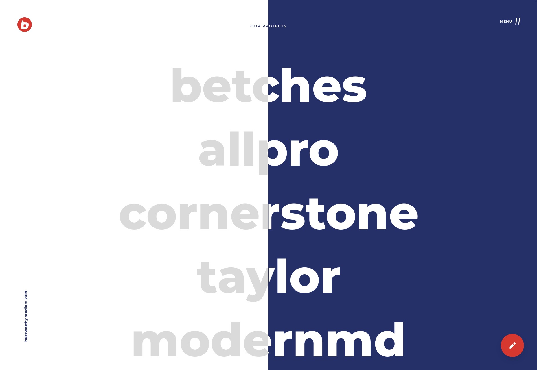
Buzzworthy Studio
Buzzworthy Studio showcases their projects with a list of names, like many sites do nowadays. Overall, their style is clean, playful, and very marketing-friendly, which works for them. Animations is clearly emphasized, but not overwhelming, and I particularly like the way they use color.
Platform: Static Site
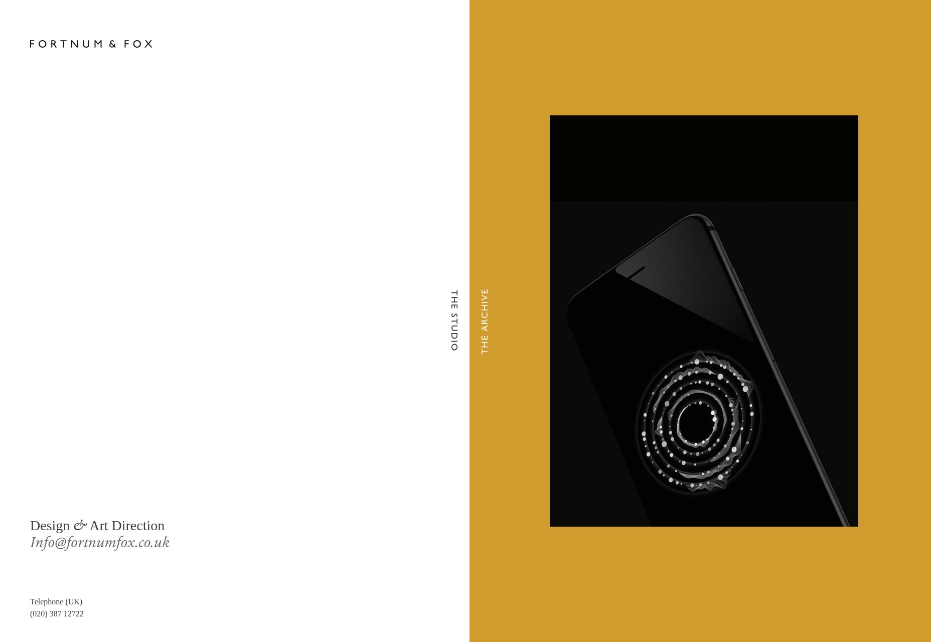
Fortnum & Fox
Fortnum & Fox also embrace the dual-color background, but takes more of an earth-tone approach for the most part. But instead of only using this theme on the home page, the site doubles down on the dual-background theme, featuring it prominently when displaying portfolio items.
As presentation sites go, it looks elegant and fancy. It takes some inspiration from print design, without feeling trapped by its inspiration.
Platform: WordPress
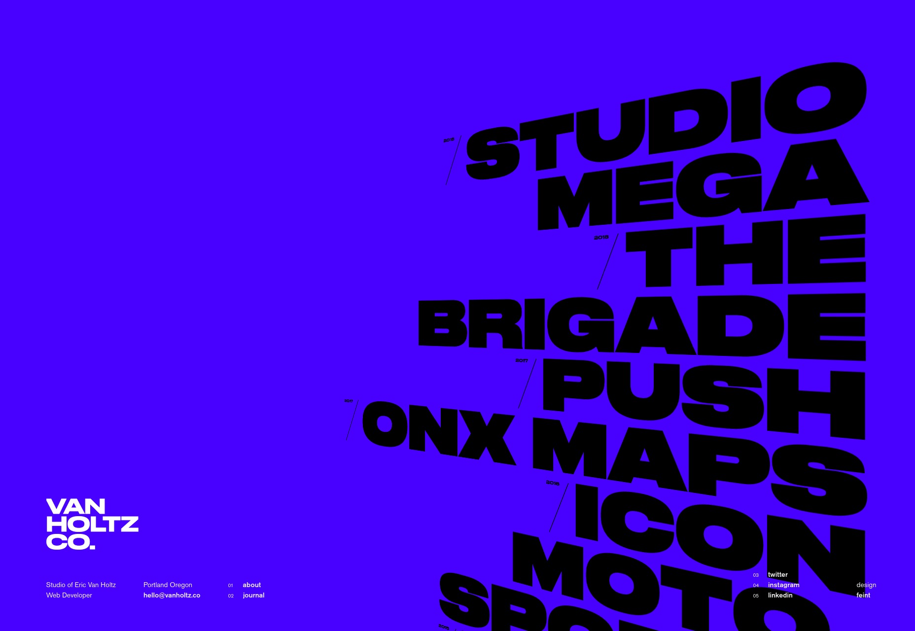
Eric Van Holtz
Eric Van Holtz’ portfolio goes big and bold with both color and type, combined with a light dash of animation, and a penchant for those diagonal lines I like so much. It’s a design that doesn’t hold back, and so is memorable.
Platform: Static Site
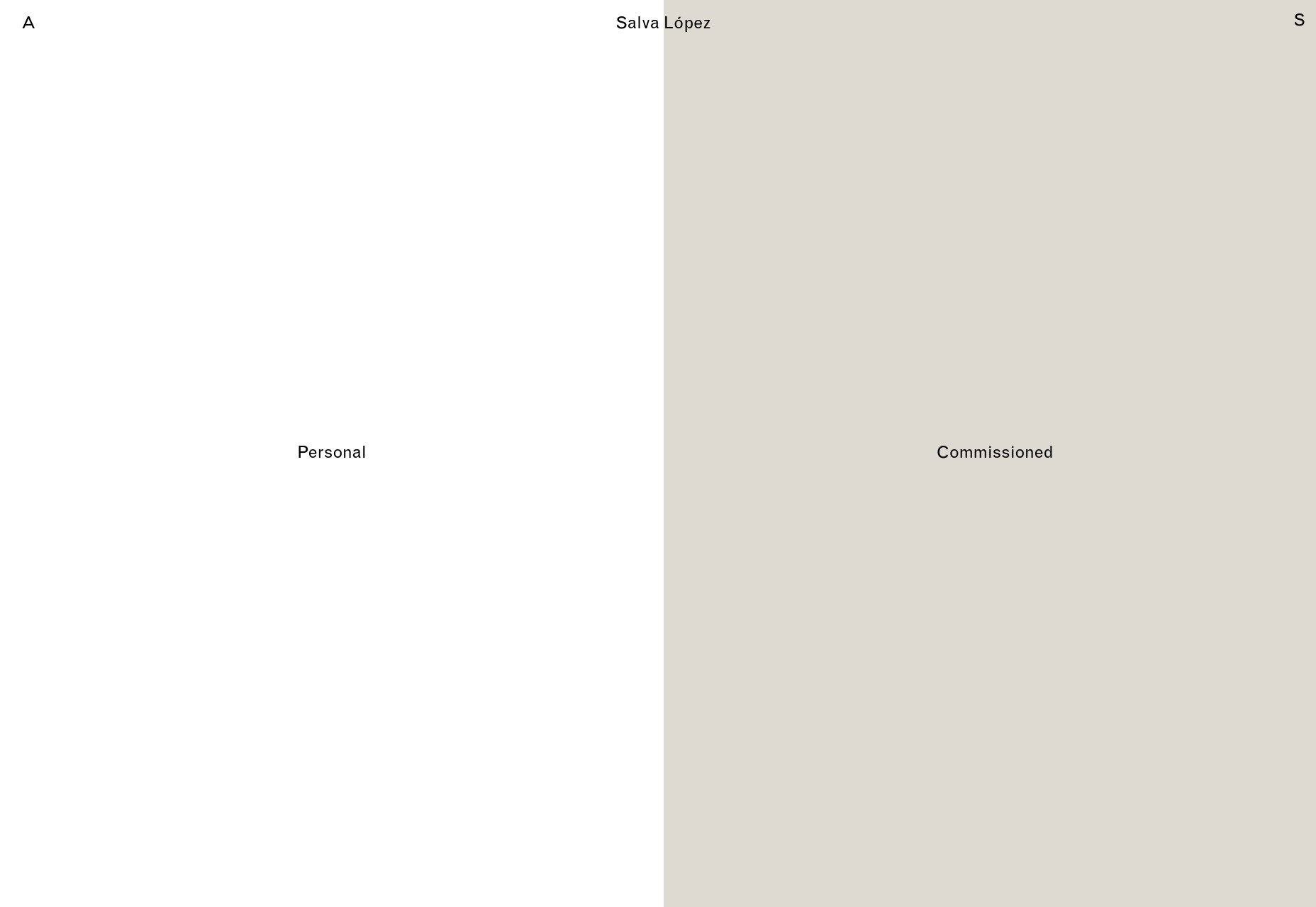
Salva Lopez
Salva Lopez’ portfolio seems to embrace the “split website” theme as well, with all of his photography organized in “personal” and “commissioned” categories. It’s a simple site with little text and lots of galleries, but that’s basically what you want from a photography portfolio, no?
Platform: WordPress
2xElliott
2xEllliott is a design consultancy, so their site’s aesthetic embraces that sort of corporate-elegant feel we’ve come to expect from that sort of agency. There’s a heavy emphasis on imagery, art direction, and not using more pages than you have to.
By that I mean that clicking on navigation items like “News” or “Contact” will open up a side panel to show that content, since there’s not enough of either to warrant their own pages. It’s a bit JS-dependent for my taste, but I otherwise like the approach.
Platform: WordPress
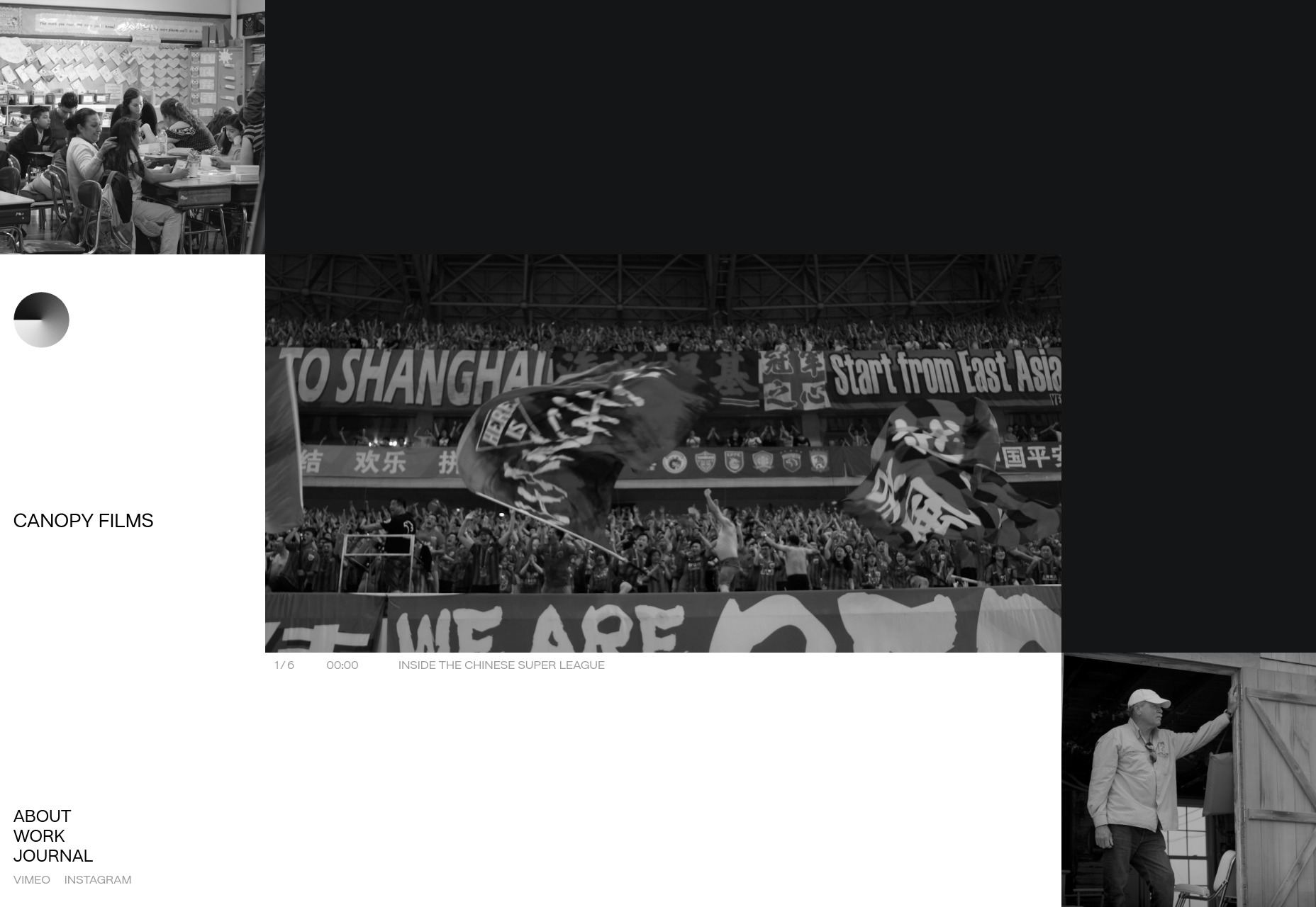
Canopy Films
Canopy Films’ site takes a highly grid-based approach to showing off its videos, and the grid itself is… animated? I’ll be honest, I’m not sure how that’s done; but it’s actually a pretty cool effect. And that’s coming from Mr. I-wish-sites-depended-less-on-animation. The rest of the site is fairly clean and modern, and is just generally worth a look.
Platform: Static Site
JOJX
JOJX goes for that dead-simple minimalism that was everywhere in last month’s article. Since it’s a portfolio site for directors, that works just fine. It’s just you, some navigation, a video, and a title. What more do you need?
Platform: WordPress
Humble
Humble takes much the same approach to showing off its video portfolio as JOJX, above. They use more color, though, with a bit of asymmetry and element overlap thrown in. It’s an excellent example of how two designs that are very similar on paper can have wildly different personalities.
Platform: WordPress
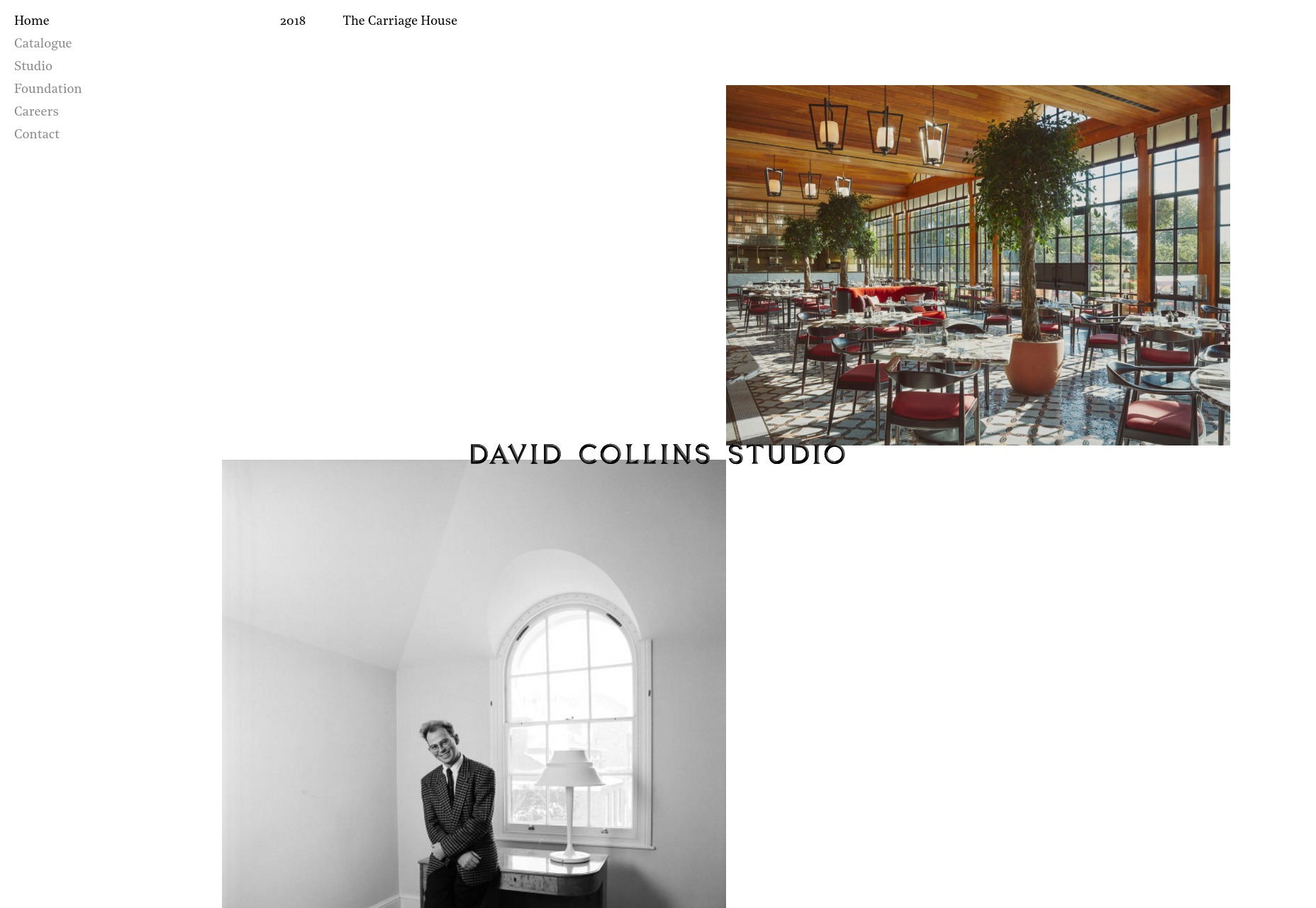
David Collins Studio
The David Collins Studio site takes me way back to like, a month or so ago, with its serif type, and minimalist collage approach to the art of the portfolio. It’s simple and elegant, and fairly effective.
Platform: Static Site (?)
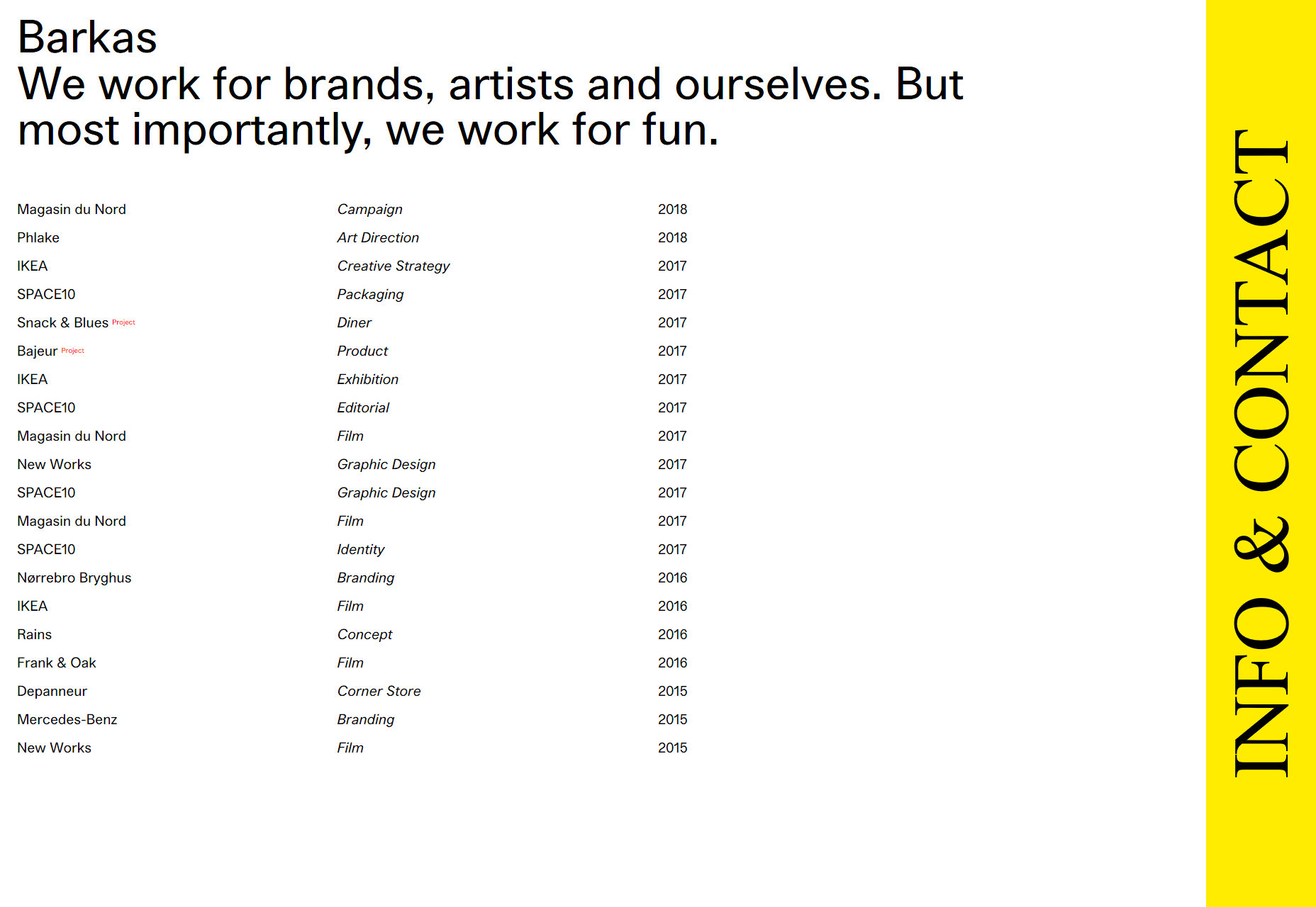
Barkas
When you first load this portfolio up, it kind of feels like a spreadsheet that’s much prettier than it ought to be. As someone who kind of likes spreadsheets to begin with, that’s actually a compliment.
I’m not a huge fan of the cursor change, but otherwise it’s a good-looking portfolio that gets straight to the point.
Platform: WordPress
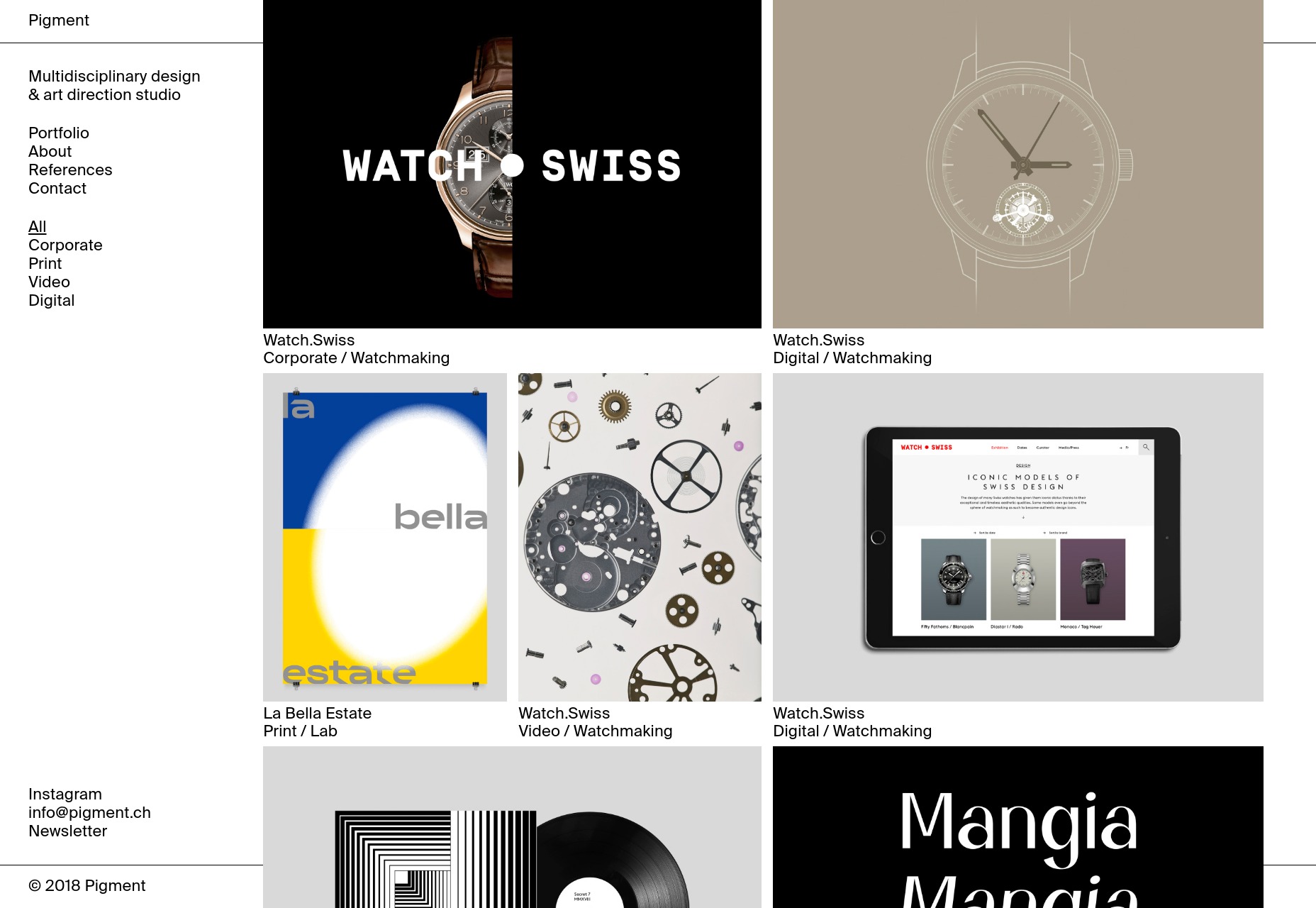
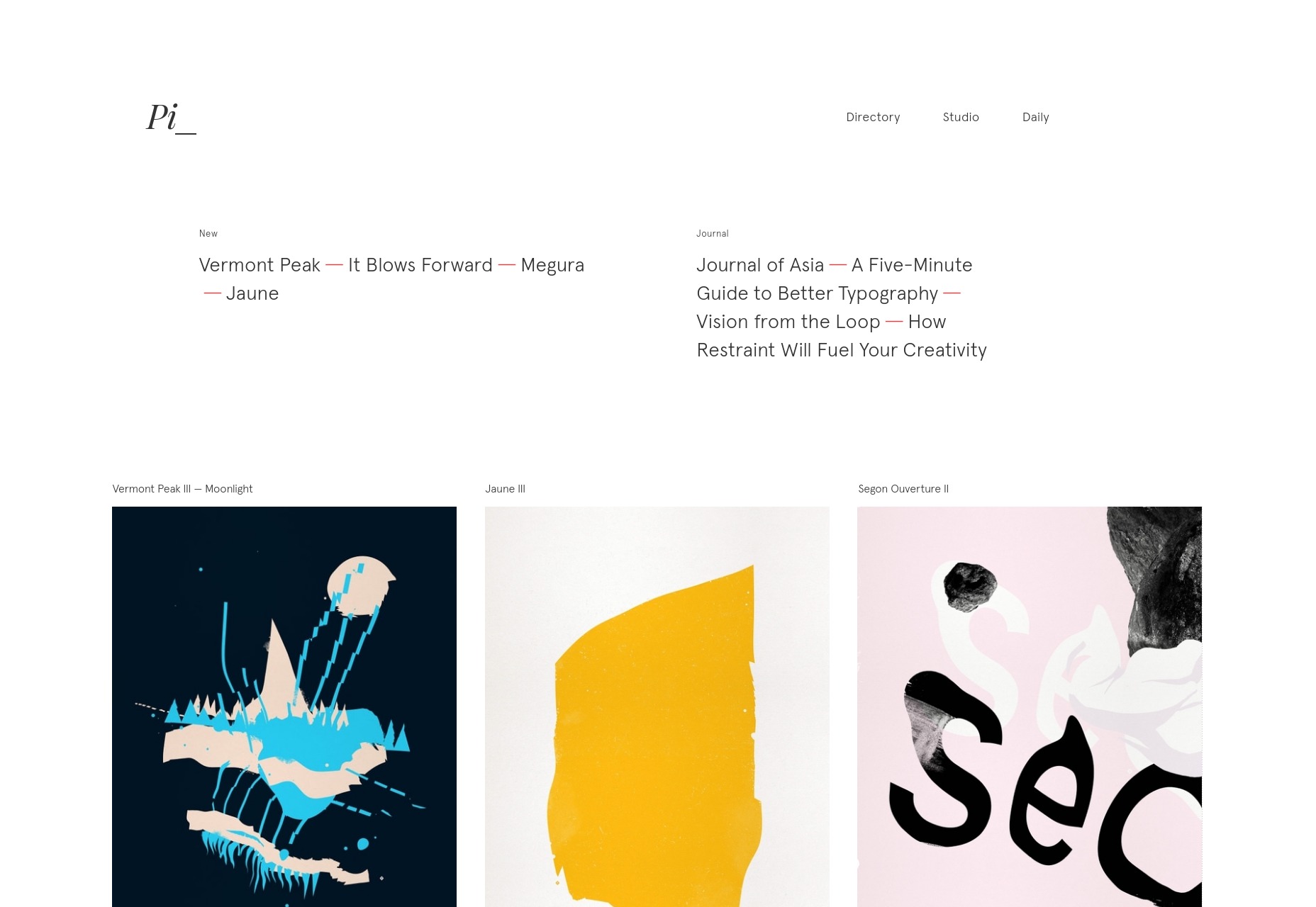
Pigment
Pigment shows off their work in a decidedly modernist fashion, with lots of white space and good old black borders. I do find their two-column approach to the actual portfolio items interesting. It looks like a good way to prioritize some of your work while not quite hiding the rest of it.
I also kind of like the way it looks like most of the content is “floating” above the rest of the page/background. It’s an effect you don’t often see in such a relatively flat design. It’s depth without any trace of skeuomorphism.
Platform: WordPress
Pierrick Calvez
Pierrick Calvez’ site is pretty much peak minimalism, but it’s good-looking for all that. I appreciate the way the zoom function works on individual portfolio images, and the typographical style of the whole thing.
Platform: Webflow
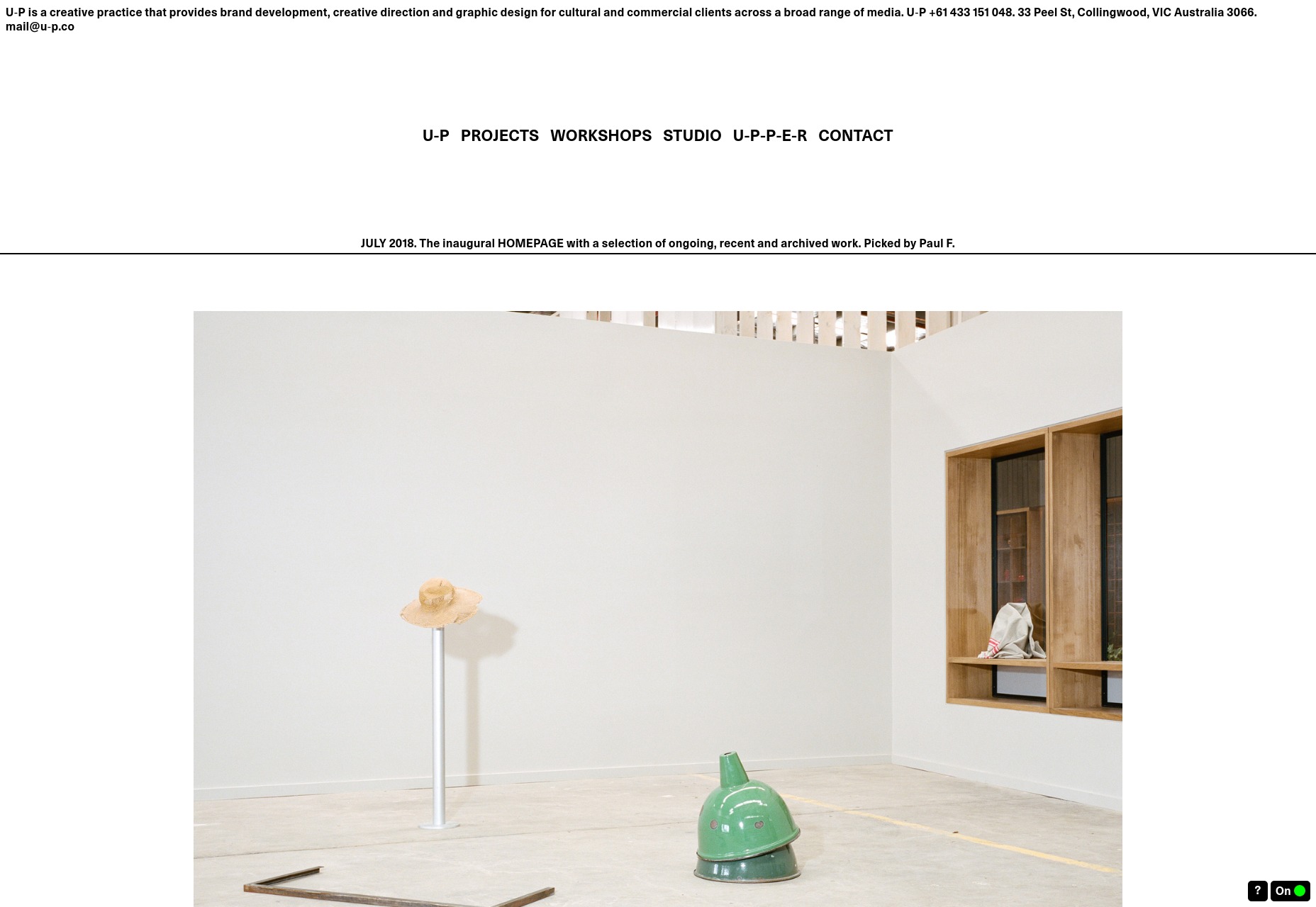
U-P
U-P is hard to classify. It’s so reminiscent of the Wild West days of the Internet that it’s almost brutalist. And yet, it looks good in a way that is sometimes a little cramped. Despite its design roots, it follows fairly modern usability conventions. It works, even if it sometimes seems like it shouldn’t.
That’s always impressive.
Platform: Static Site
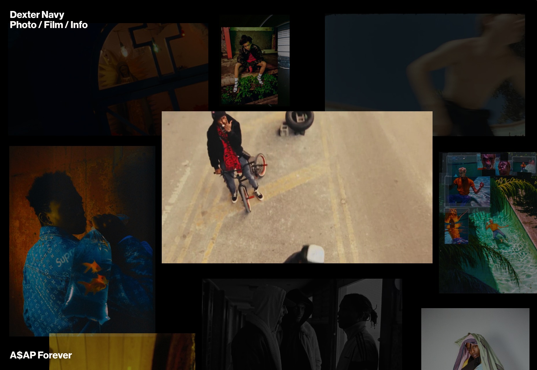
Dexter Navy
Dexter Navy’s site is an odd duck, and I quite like it. Some photographers and videographers have collage-style sites. Others do that “preview-on-hover-over-the-title” thing. This one manages to combine them both in a riot of color and movement that still manages to feel purposeful.
The photography and video are mixed together delightfully. I also quite like the horizintal-scrolling image galleries for each project.
(This is a sponsored article.) The entire ecosystem in which we are designing and researching the user experience is shifting and changing constantly. Traditional UX skills need to be expanded to meet the reality of the modern digital ecosystem. Understanding the user is essential to the job, but you also need to understand the wider user context. How do they discover they have a need? How do they find and evaluate a product to meet that need?
This three-part series outlines the three phases of the product life cycle, the future of UX, and the skills and approach you’ll need to design modern digital products.
Part 1: Attraction Going out there to get users to evaluate your product.
Part 2: Activation Signing up, onboarding users, asking for payment.
Part 3: Retention Encouraging users to come back and keep using and paying for your product.
Due to their technical skills, creativity and deep understanding of user needs, UXers are in a perfect position to apply marketing, SEO and growth-hacking tools and processes to their work.
For focused UX efforts, it’s all about knowing user outcomes at each stage of their journey.
The days of changing the text on one button and having a dramatic effect on the user experience are behind us. Luckily, we have the processes and skills in our UX toolbox to meet this changing world.
More often than not, there are many small usability and experience issues throughout a user journey that cumulatively create a poor experience.
Mapping out the full user life cycle will help us discover and fix these problems. It’s often the case that a problem at the very beginning of the user journey only surfaces when a user drops out further along in the product life cycle.
We need data to help us understand how UX professional can improve performance. We’ll need user research data, business metrics, data to frame decisions made when improving UX, and metrics to help us understand the business values.
Marketing metrics tracked by team employing growth hacking. (Source). (Large preview)
Plotting Out the Journey
When we talk about the attraction phase, we’re talking about users discovering they have a need, discovering our product and visiting our website to see if our product meets their needs.
Within the life cycle, we can split the larger three phases into smaller phases to help us plan our approach. In this case, we can use Philip Kotler’s model (expanded to six steps by Bryony Thomas):
Awareness: realizing they have a need;
Interest: looking for something to help with that need;
Evaluation: looking at products that help with their need;
Trial: trying the product to see if it meets their need;
Adoption: choosing a product and using it for a while;
Loyalty: deciding to continue using the product or switching to a different one.
We’re interested in the first three parts, which fall under the attraction phase.
We’ll look into trial, adoption and loyalty in future parts of this series.
We’ll use the customer life cycle to align user needs and expectations — what they want and when they need it — to business metrics. We’ll also look at a tool and UX process to use at each step on the journey.
As we move through the process we’ll use the example of a money management app that helps people understand what they are spending and save money.
1. Awareness: They Understand That They Have A Need
The first battle isn’t fought on the ground but in the mind of the customer. It isn’t fought with your built out solution but instead with an offer.
This is most challenging phase because there is very little that is concrete in terms of user need.
Users can’t articulate what they want, but by looking at how they complete a task or the context of their life, we can identify the problems they face, how they address (or don’t!) the problems now, and potential product features to address the problems.
The goal here is to identify unmet, hidden user needs. This is something Amazon, for example, is very good at.
The secret to Amazon’s success? Be the first to uncover hidden needs. Jeff Bezos, founder of amazon.com. (Large preview)
How To Identify A Need And A Solution Using Fro-Tos
A good technique to use here is to plot the current problem as articulated by the user and then the result of that problem being solved.
Al Ramadan, in his book Play Bigger, named this overarching science category design.
Category design takes people on a journey. We refer to it as creating a from/to. Actually, we use a shorthand term: frotos. Remember, a great new category is one that solves a problem people didn’t know they had, or solves an obvious problem no one thought could be solved.
You have to help them move from the way they used to think, to a new frame of reference. This is what it means to condition the market. You have to first define and market the problem — and only then can you help people understand that you can solve the problem better than anyone else.
The “from” is the problem the user is facing. The “to” is the solution your product offers. The solution described here are the words the user uses to solve the problem.
If we take the example of our money management tool, in user research, we would identify the from as:
I don’t have much money left at the end of the month. Why?
The user then identifies the to as:
I need to something to help me analyze what I spend.
Put the two together and you have frotos: a definition of the problem and an articulation of the solution.
User research helps us uncover the hidden needs and identify the frotos.
User Research To Uncover Frotos And Other Useful Details
Traditionally, user research has been focused on the experience of the product. We need to expand user research to include all parts of the user acquisition phase.
It’s not easy to research with users who aren’t yet interacting with you. We can turn to the same tools that we are using to raise awareness to also find users to research with.
Recruit and conduct research with users who might respond to your product’s messaging by using Facebook ads or Google demographic targeting. You can then use a tool like Ethn.io to ask them a few questions to aid with recruitment.
The value in researching users who are in the user acquisition phase is that they don’t bring any preconceptions of your product. In fact, when you are reaching out to users for them to give you feedback, don’t talk much about who you are researching for.
Ethnographic and contextual research is the most useful tool here. Going out and observing users in their homes and offices is a great technique. Watching a user go through a typical task will help you identify their needs. You can’t simply ask users what their unmet needs are because they won’t know. The only true way to get to unmet need is to observe behavior.
With our money management app, we might observe that some potential users under 30 years of age don’t have much money left at the end of the month to save or are curious about how much they spend on coffee.
The user research can also uncover any common identifiable traits (and patterns of behavior) that your users show, such as age-related (for example, they are under 30) or interests they share (love of coffee). We can use these traits to target them in our messaging.
The goal from the user research is to uncover unmet needs and identify the frotos: the from state and the to state.
An example of a froto might be:
FROM I love coffee, but it can get expensive. I wonder how much I spend a month on coffee?
TO I need to know how much I spend on expensive luxuries like coffee, so that I can reduce my spend.
Below is a high-level journey map for our money management app, showing needs mapped against each phase of the life cycle.
In the awareness phase, we can see how the need is quite abstract, but we can clearly see a need for our product. Our money management app can help people understand their current spending. (Large preview)
Personas To Target
Personas are a divisive issue in the UX world. For the purpose of targeting users in the intent stage, we need to know demographic traits and interests.
We can then use tools such as Facebook ads to target the users who will respond to our frotos.
Facebook ad targeting: We can see how easy it is to find the users we are looking for based on their interests and age group. (Large preview)
In Facebook ads, we can target a specific age group who are coffee lovers. We can use this to target users who might be in the market for our product because they might spend a lot on coffee. Let’s roll up our sleeves and start designing the interactive elements to support this behavior.
Prototyping Attraction
Prototyping and wireframing have traditionally been limited to designing just the product. A modern UXer needs to take prototyping into the wider context and design interactions from the very beginning of the user journey. Rapid prototyping interactions at each step of the product life cycle to gather user feedback and validate ideas can save a lot of time, money and effort later.
For our money management app, we’ll design a Facebook ad to target potential users. We know what copy to include in the ad from our frotos.
An example showing how easy it is to create a Facebook ad prototype interaction. (Large preview)
When we get our target users and run user testing on the prototype, we’re testing the entire user experience — from awareness onwards — receiving high-quality UX insights from all parts of the user journey.
The attraction phase is really important for the user experience because it’s where expectations are set. As shown below, we need to use the tools and UX activities at our disposal to design the interactions with our user as we would design the interactions within the product.
An overview of tools and activities to use to improve the UX during the attraction phase. (Large preview)
2. Interest
The interest phase is characterized by the user looking for a product to help with the frotos we identified during the awareness phase.
Here, we’ll be working with our SEO colleagues, which means we UXers need to know the tools and processes that SEO practitioners use to help design the search and discovery journey.
Back To The Experience Map To Review The Interest Phase
We used user research to identify the frotos and the questions and information at each step of the journey.
We can see from the related search terms what other words our target audience might type in when looking for our product. These words will help us design and improve the search user experience.
You can also use the free Google keyword research tool from SERPS.com to help define the terms used by your users to describe the problem. The higher the volume, the more likely a person is to search for that term.
A list of related search terms based on our initial query. Also shown is the relative popularity of each term. (Large preview)
We can use these search terms to refine the language we use when building the next part of our prototype.
Design The Ad In Your Prototype Tool
We can use Google’s Keyword Planner to design the interest phase of our prototype. You can update the text and the design will change in real time. This is the best approach because Google is constantly changing the format of paid and organic search listings, and any design templates will be quickly out of date.
Creating the ad in Google’s tool shows a live preview of how it will look. (Large preview)
You can also live prototype the ad in using Google’s tools on desktop and mobile.
You can preview the ad on desktop and mobile. (Large preview)
Our prototype now contains details for the first two subphases of the attraction part of the user life cycle.
Now that we have generated interest in the product, we need to start looking at how our user will evaluate our product to see if it is something they would want to invest time in.
3. Evaluation
The evaluation phase is all about the first visit to our website and that all-important first impression.
We need to look at where users are landing from, be it Facebook ads, Google search results or indeed other routes to our product, such as YouTube, Instagram or Pinterest.
Google Analytics can tell us the most common landing pages and where people come from. A report named “Network Referrals” can help.
We can see here that Facebook is major source of inbound traffic. (Large preview)
SiteTuners’ custom Google Analytics report identifies landing pages with a high bounce rate. We can interpret these as pages users are interested in, but users can’t find what they need or the messaging might not resonate with them. This report is fantastic for UXers to find pages that are causing problems and need to be improved.
Google Analytics shows pages with high-traffic and high-bounce rates (i.e. problematic pages). (Large preview)
Quick Sprout‘s tool is great for evaluating landing pages to give you some clues as to why the page we identified from the custom report is failing.
Prototype The Landing Page
User research has helped us define what our users need at each step, and we’ve mapped out those needs. If it’s an existing product, then we know which landing pages are causing us problems.
The journey map can help us determine the type of copy to include on the landing page — what the user is expecting to see, what questions they need answering and what concerns they may have.
The three parts of the attraction phase and user questions and information needs. (Large preview)
We can then directly translate the user needs into the design for the landing page.
A quick mockup of the landing page meeting the user questions and information needs. (Large preview)
Understanding and mapping the problems users have, the solutions they need, as well as the questions they have when evaluating will make designing this page a straightforward task. If we have an existing but underperforming landing page, we’ll know what content the user is expecting and can evaluate and recommend what needs to change.
Previously, when prototyping we may have used lorem ipsum text. Now, we don’t need to because we have the copy we need. We can design the calls to action to reflect the problems our users are facing, increasing the likelihood of them using our product. No more need for lorem ipsum!
This landing page is just the start. In the next UX life cycle article, we’ll look at further enhancements.
User Research The Journey, Including The Landing Page
We can now use the prototype to user test the whole attraction journey, from initial awareness to evaluation. Another Smashing Magazine article has some great suggestions to help with your user research.
Just Scratching The Surface
We’ve looked at how UXers can learn from other disciplines, such as marketing and SEO, to better understand, research, design and improve the attraction phase of the product life cycle.
If you’d like to learn more, I suggest these great books:
In the next part of the series, we’ll look at the next phase, activation: helping users to sign up, onboard and pay for your product.
This article is part of the UX design series sponsored by Adobe. Adobe XD tool is made for a fast and fluid UX design process, as it lets you go from idea to prototype faster. Design, prototype and share — all in one app. You can check out more inspiring projects created with Adobe XD on Behance, and also sign up for the Adobe experience design newsletter to stay updated and informed on the latest trends and insights for UX/UI design.
Every week users submit a lot of interesting stuff on our sister site Webdesigner News, highlighting great content from around the web that can be of interest to web designers.
The best way to keep track of all the great stories and news being posted is simply to check out the Webdesigner News site, however, in case you missed some here’s a quick and useful compilation of the most popular designer news that we curated from the past week.
Note that this is only a very small selection of the links that were posted, so don’t miss out and subscribe to our newsletter and follow the site daily for all the news.
Evolving the Firefox Brand
The Age of the Wordless Logo
How I Built my Side Project and Got 31,000 Users the First Week
Art and Copy: Bridging the Gap Between Design and Content
W. E. B. Du Bois’ Staggering Data Visualizations
Educational Website Design Trends to Follow in 2018/2019
Six Lessons Learned by Creating a Design System at a Fast-moving Start-up
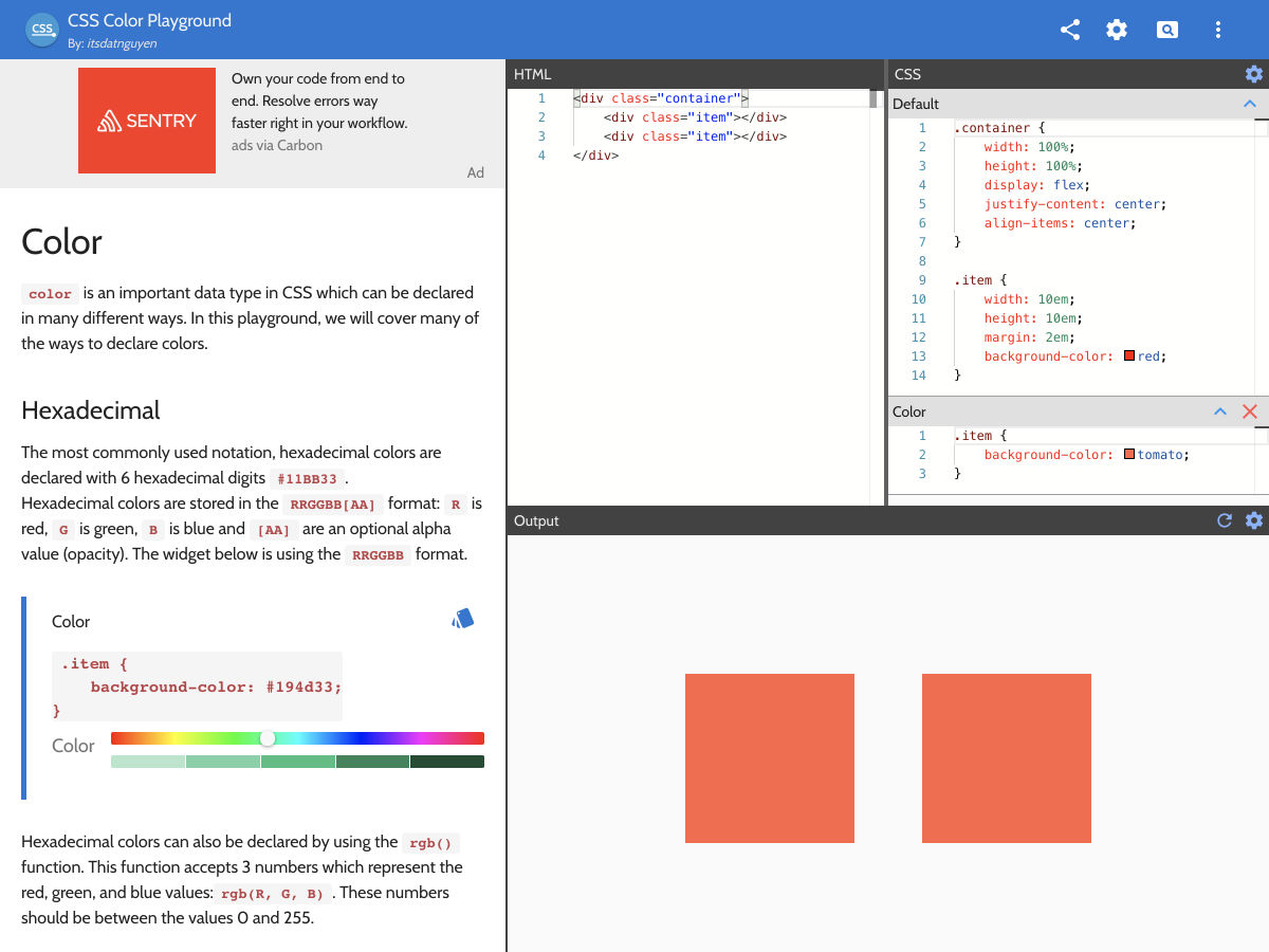
CSS Color Playground
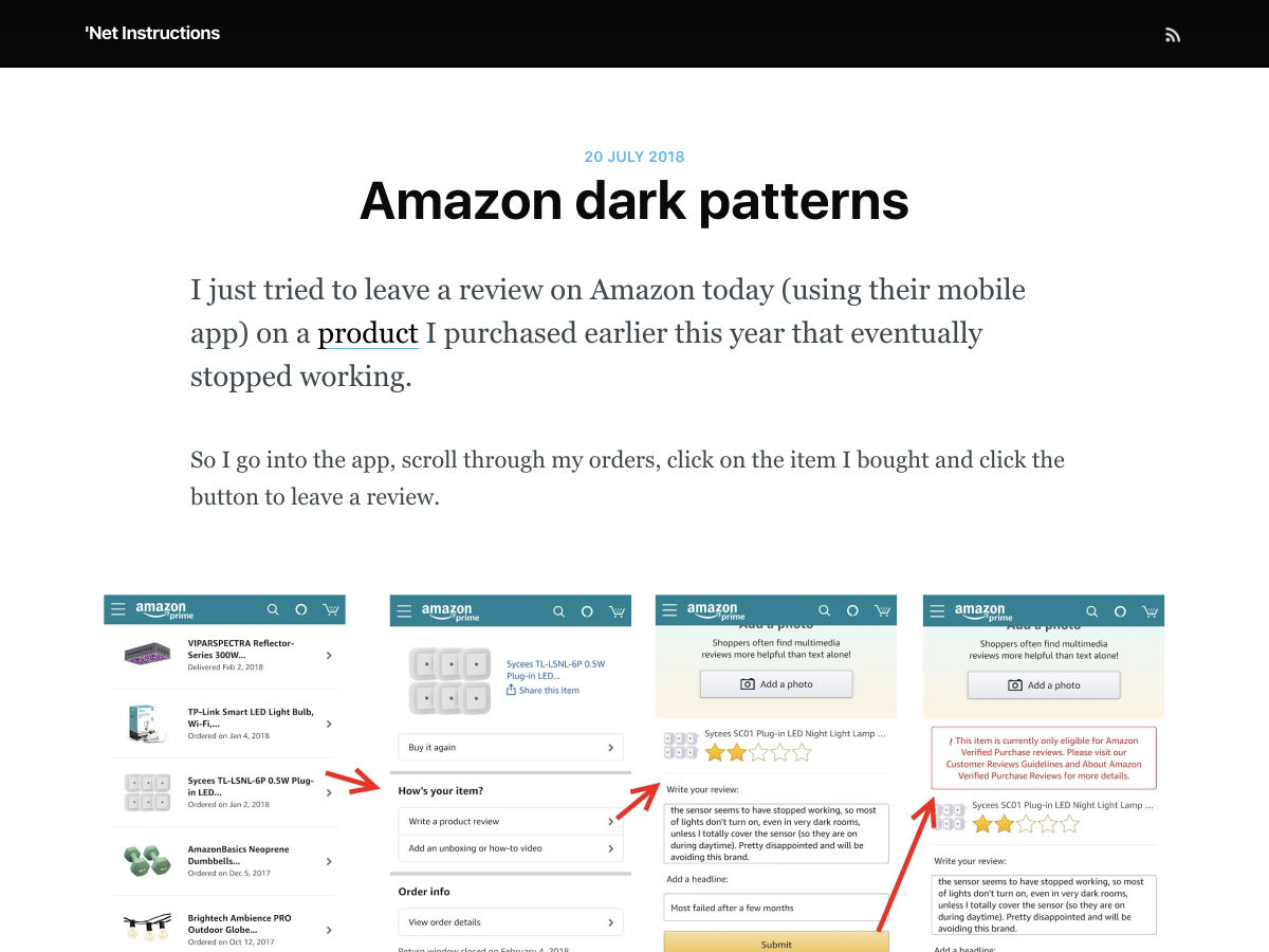
Amazon Dark Patterns – Censuring Unhappy Customers
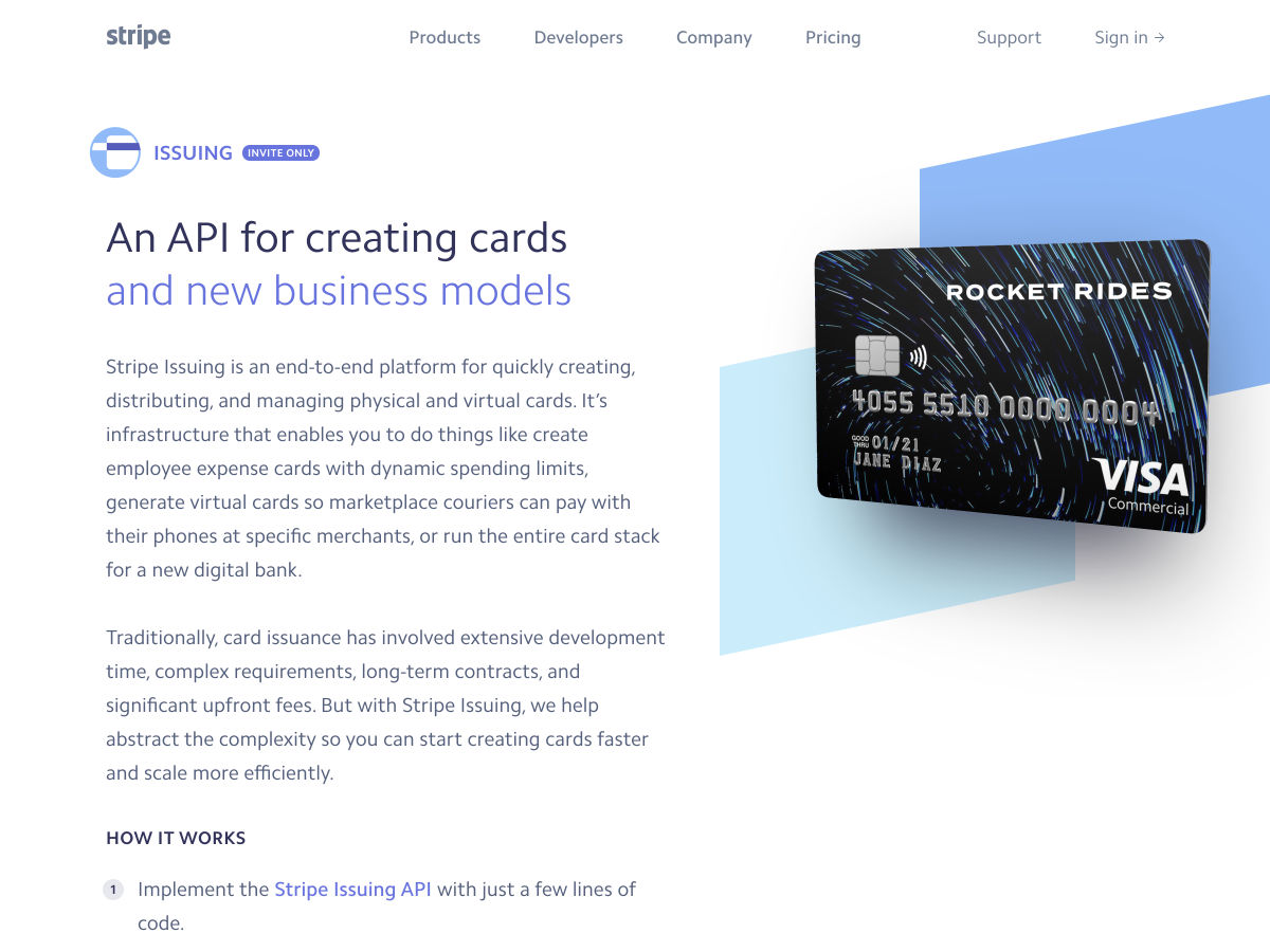
Stripe Issuing
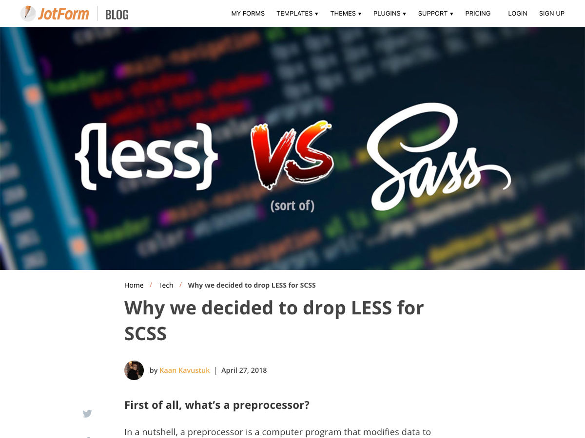
Why We Decided to Drop LESS for SCSS
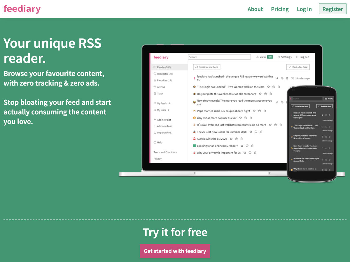
Feediary – Your Favourite RSS Content, with Zero Tracking & Zero Ads
Sketch Vs Adobe XD: Which One Should You Use?
How to Get Users Hooked on your Interfaces
The Impact WordPress has Had on the Web
The Software Design Trends that We Love to Hate
Evaluating Best Buy’s Website Design – A UX Case Study
Slack Copywriting: What They Say to 9.6 Million Pageviews Every Month
Napkin Note – Email Yourself Quick Thoughts on the Fly
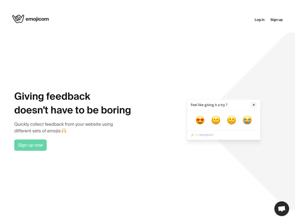
Emojicom: Giving Feedback Doesn’t Have to Be Boring
“Painterly Pantones”: Photographer Edith Young on her Art History-inspired Series of Colour Palettes
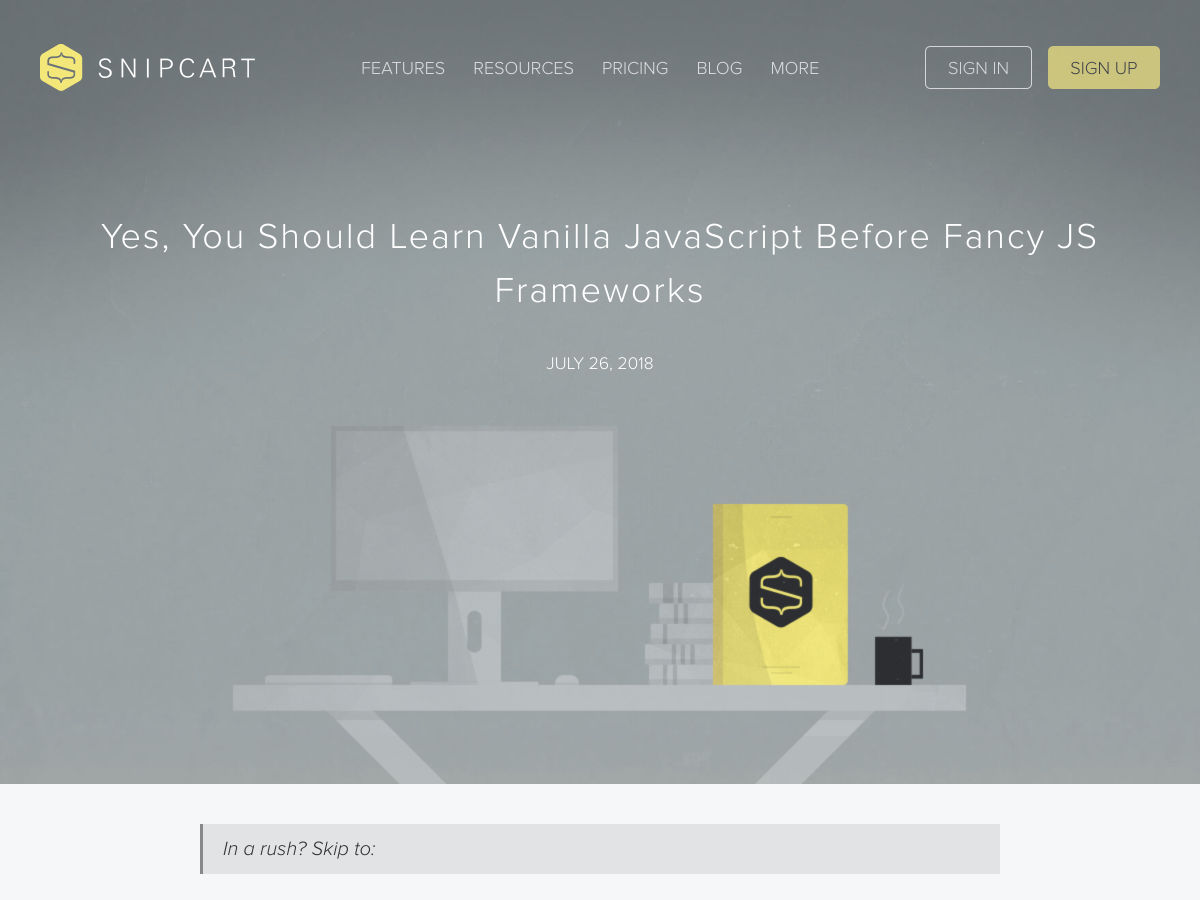
You SHOULD Learn Vanilla JavaScript Before JS Frameworks
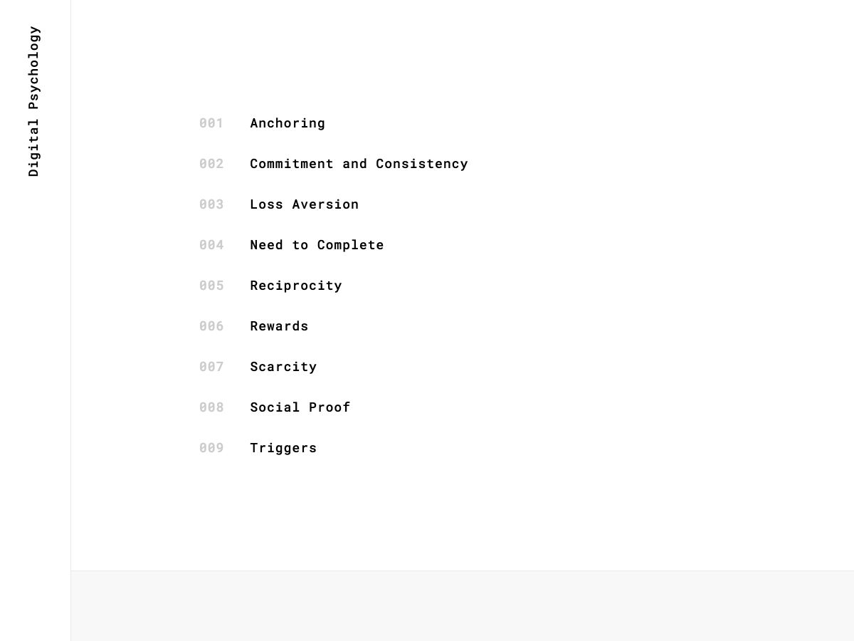
Digital Psychology
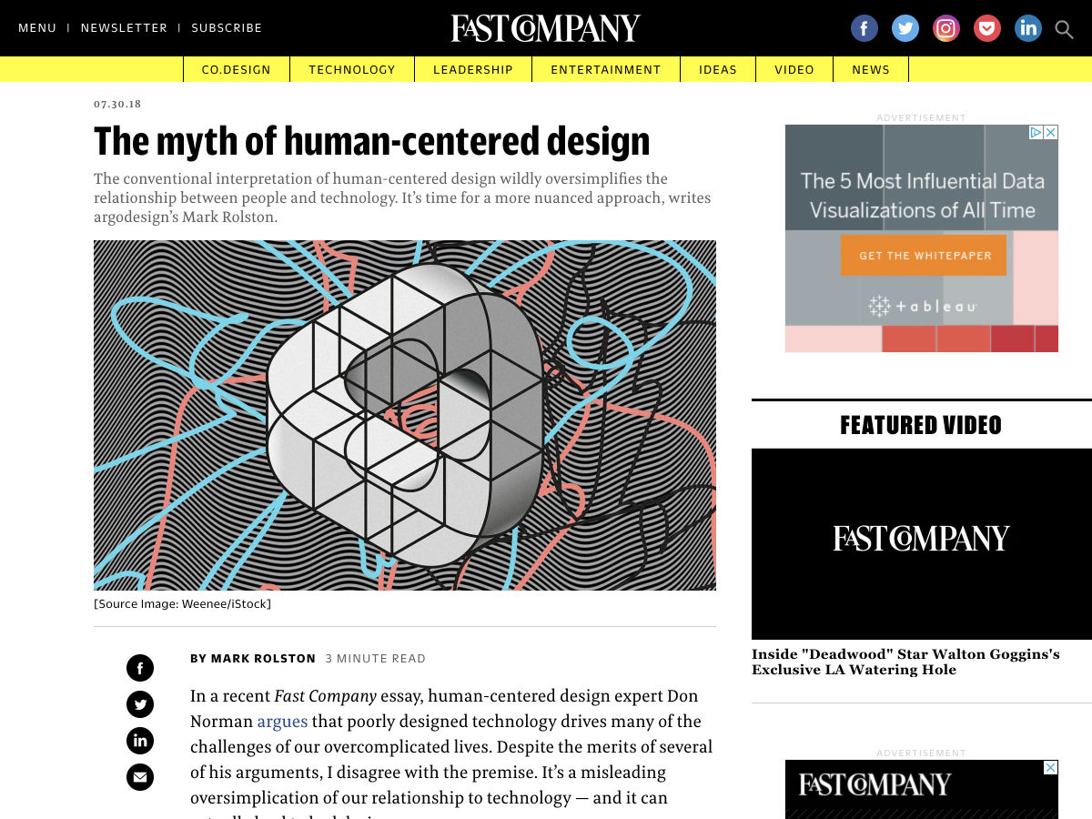
The Myth of Human-centered Design
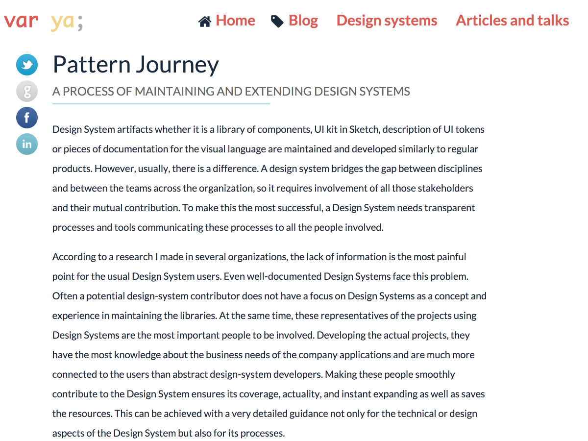
Pattern Journey – A Process for Extending Design Systems
Want more? No problem! Keep track of top design news from around the web with Webdesigner News.
Every week we feature a set of comics created exclusively for WDD.
The content revolves around web design, blogging and funny situations that we encounter in our daily lives as designers.
These great cartoons are created by Jerry King, an award-winning cartoonist who’s one of the most published, prolific and versatile cartoonists in the world today.
So for a few moments, take a break from your daily routine, have a laugh and enjoy these funny cartoons.
Feel free to leave your comments and suggestions below as well as any related stories of your own…
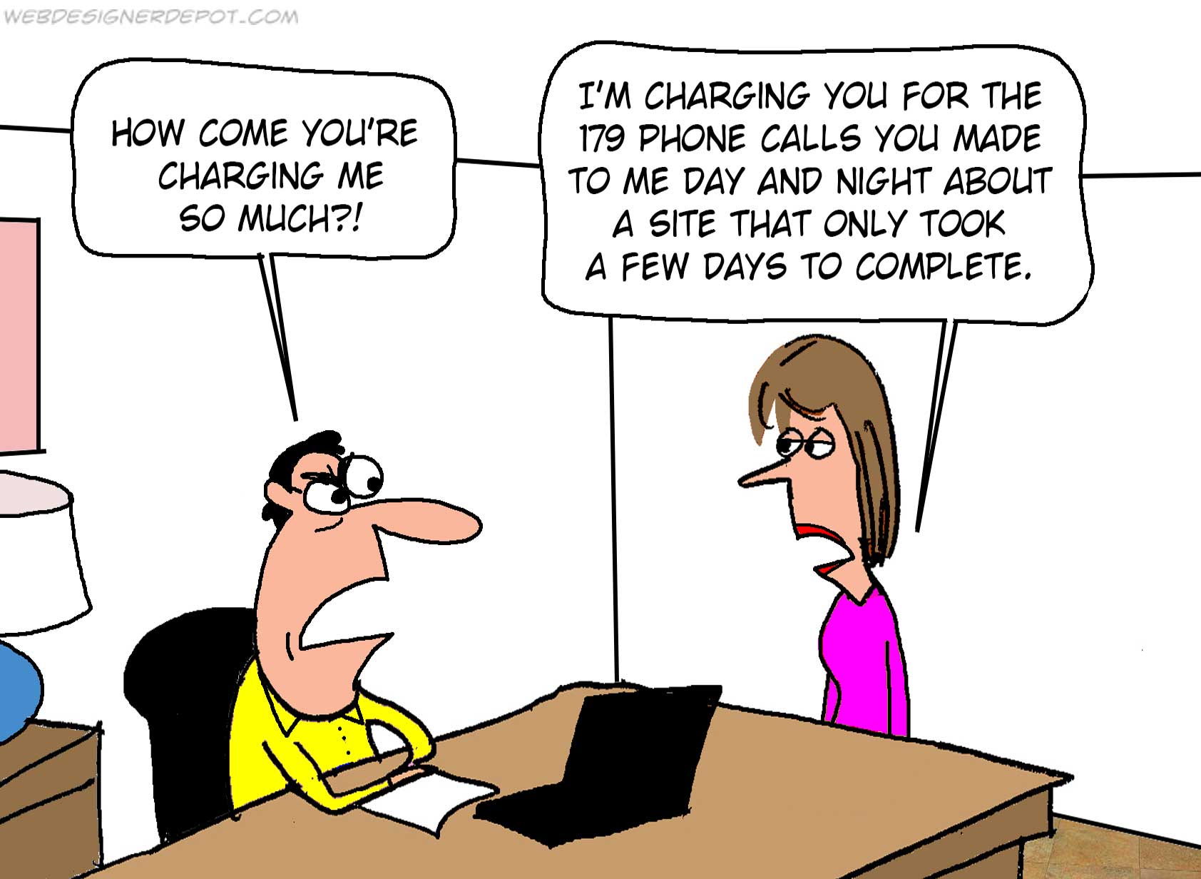
Time is money
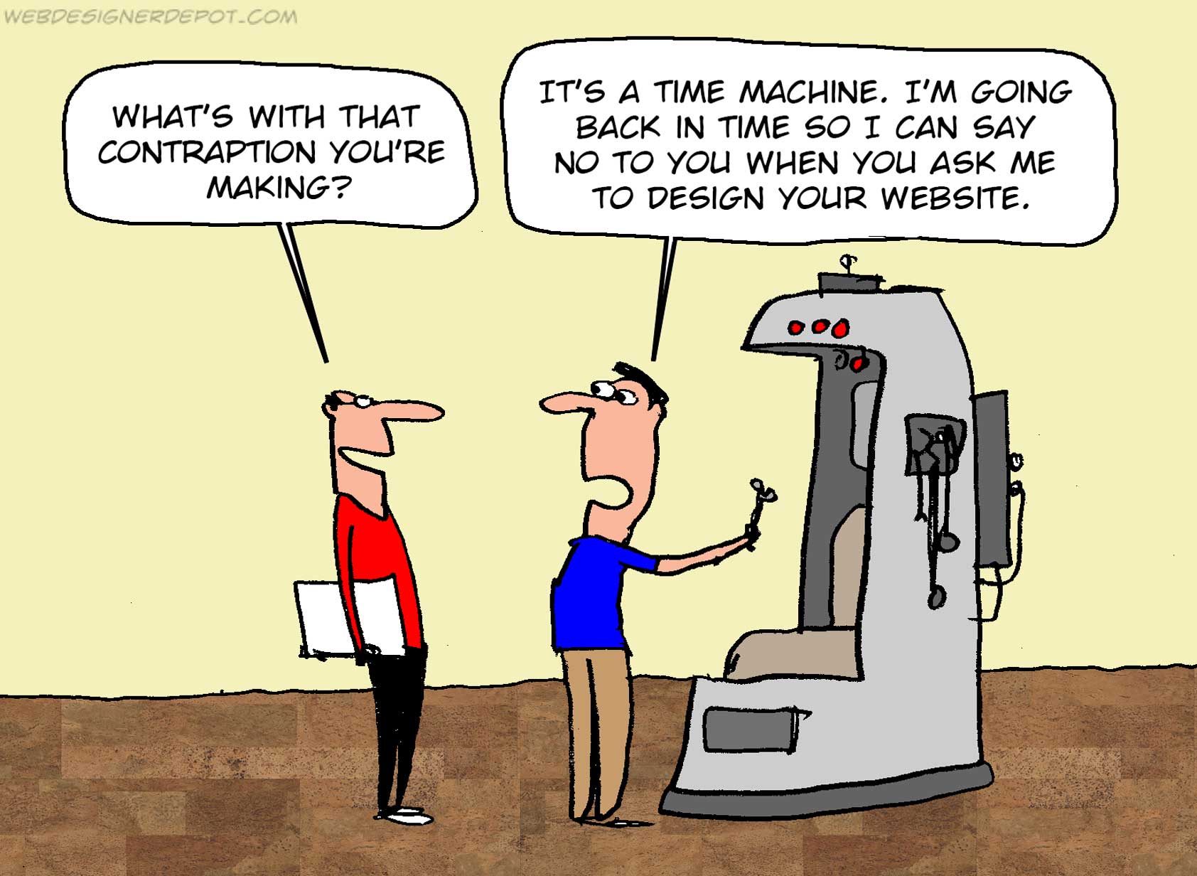
Time machine
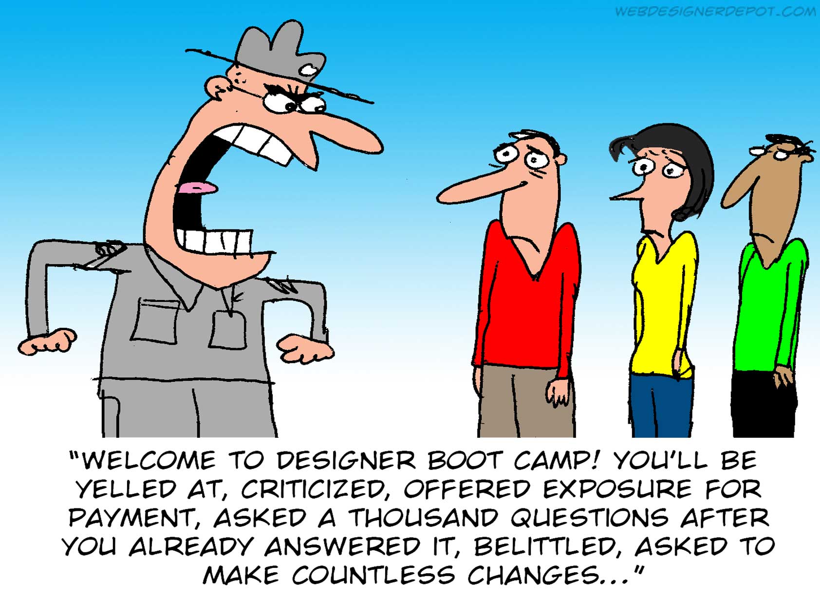
Designer boot camp
Can you relate to these situations? Please share your funny stories and comments below…


 , kids. If you find an idea you like and want to adapt to your own site, remember to implement it responsibly.