Using data in React with the Fetch API and axios
If you are new to React, and perhaps have only played with building to-do and counter apps, you may not yet have run across a need to pull in data for your app. There will likely come a time when you’ll need to do this, as React apps are most well suited for situations where you’re handling both data and state.
The first set of data you may need to handle might be hard-coded into your React application, like we did for this demo from our Error Boundary tutorial:
See the Pen error boundary 0 by Kingsley Silas Chijioke (@kinsomicrote) on CodePen.
What if you want to handle data from an API? That’s the purpose of this tutorial. Specifically, we’ll make use of the Fetch API and axios as examples for how to request and use data.
The Fetch API
The Fetch API provides an interface for fetching resources. We’ll use it to fetch data from a third-party API and see how to use it when fetching data from an API built in-house.
Using Fetch with a third-party API
See the Pen React Fetch API Pen 1 by Kingsley Silas Chijioke (@kinsomicrote) on CodePen.
We will be fetching random users from JSONPlaceholder, a fake online REST API for testing. Let’s start by creating our component and declaring some default state.
class App extends React.Component {
  state = {
    isLoading: true,
    users: [],
    error: null
  }

  render() {
    <React.Fragment>
    </React.Fragment>
  }
}
There is bound to be a delay when data is being requested by the network. It could be a few seconds or maybe a few milliseconds. Either way, during this delay, it’s good practice to let users know that something is happening while the request is processing.
To do that we’ll make use of isLoading to either display the loading message or the requested data. The data will be displayed when isLoading is false, else a loading message will be shown on the screen. So the render() method will look like this:
render() {
  const { isLoading, users, error } = this.state;
  return (
    <React.Fragment>
      <h1>Random User</h1>
      // Display a message if we encounter an error
      {error ? <p>{error.message}</p> : null}
      // Here's our data check
      {!isLoading ? (
        users.map(user => {
          const { username, name, email } = user;
          return (
            <div key={username}>
              <p>Name: {name}</p>
              <p>Email Address: {email}</p>
              <hr />
            </div>
          );
        })
      // If there is a delay in data, let's let the user know it's loading
      ) : (
        <h3>Loading...</h3>
      )}
    </React.Fragment>
  );
}
The code is basically doing this:
- De-structures
isLoading,usersanderrorfrom the application state so we don’t have to keep typingthis.state. - Prints a message if the application encounters an error establishing a connection
- Checks to see if data is loading
- If loading is not happening, then we must have the data, so we display it
- If loading is happening, then we must still be working on it and display “Loading…” while the app is working
For Steps 3-5 to work, we need to make the request to fetch data from an API. This is where the JSONplaceholder API will come in handy for our example.
fetchUsers() {
  // Where we're fetching data from
  fetch(`https://jsonplaceholder.typicode.com/users`)
    // We get the API response and receive data in JSON format...
    .then(response => response.json())
    // ...then we update the users state
    .then(data =>
      this.setState({
        users: data,
        isLoading: false,
      })
    )
    // Catch any errors we hit and update the app
    .catch(error => this.setState({ error, isLoading: false }));
}
We create a method called fetchUser() and use it to do exactly what you might think: request user data from the API endpoint and fetch it for our app. Fetch is a promise-based API which returns a response object. So, we make use of the json() method to get the response object which is stored in data and used to update the state of users in our application. We also need to change the state of isLoading to false so that our application knows that loading has completed and all is clear to render the data.
The fact that Fetch is promise-based means we can also catch errors using the .catch() method. Any error encountered is used a value to update our error’s state. Handy!
The first time the application renders, the data won’t have been received — it can take seconds. We want to trigger the method to fetch the users when the application state can be accessed for an update and the application re-rendered. React’s componentDidMount() is the best place for this, so we’ll place the fetchUsers() method in it.
componentDidMount() {
  this.fetchUsers();
}
Using Fetch With Self-Owned API
So far, we’ve looked at how to put someone else’s data to use in an application. But what if we’re working with our own data in our own API? That’s what we’re going to cover right now.
See the Pen React Fetch API Pen 2 by Kingsley Silas Chijioke (@kinsomicrote) on CodePen.
I built an API which is available on GitHub. The JSON response you get has been placed on AWS — that’s what we will use for this tutorial.
As we did before, let’s create our component and set up some default state.
class App extends React.Component {
  state = {
    isLoading: true,
    posts: [],
    error: null
  }

  render() {
    <React.Fragment>
    </React.Fragment>
  }
}
Our method for looping through the data will be different from the one we used before but only because of the data’s structure, which is going to be different. You can see the difference between our data structure here and the one we obtained from JSONPlaceholder.
Here is how the render() method will look like for our API:
render() {
  const { isLoading, posts, error } = this.state;
  return (
    <React.Fragment>
      <h1>React Fetch - Blog</h1>
      <hr />
      {!isLoading ? Object.keys(posts).map(key => <Post key={key} body={posts[key]} />) : <h3>Loading...</h3>}
    </React.Fragment>
  );
}
Let’s break down the logic
{
  !isLoading ?
  Object.keys(posts).map(key => <Post key={key} body={posts[key]} />)
  : <h3>Loading...</h3>
}
When isLoading is not true, we return an array, map through it and pass the information to the Post component as props. Otherwise, we display a “Loading…” message while the application is at work. Very similar to before.
The method to fetch posts will look like the one used in the first part.
fetchPosts() {
  // The API where we're fetching data from
  fetch(`https://s3-us-west-2.amazonaws.com/s.cdpn.io/3/posts.json`)
    // We get a response and receive the data in JSON format...
    .then(response => response.json())
    // ...then we update the state of our application
    .then(
      data =>
        this.setState({
          posts: data,
          isLoading: false,
        })
    )
    // If we catch errors instead of a response, let's update the app
    .catch(error => this.setState({ error, isLoading: false }));
}
Now we can call the fetchPosts method inside a componentDidMount() method
componentDidMount() {
  this.fetchPosts();
}
In the Post component, we map through the props we received and render the title and content for each post:
const Post = ({ body }) => {
  return (
    <div>
      {body.map(post => {
        const { _id, title, content } = post;
        return (
          <div key={_id}>
            <h2>{title}</h2>
            <p>{content}</p>
            <hr />
          </div>
        );
      })}
    </div>
  );
};
There we have it! Now we know how to use the Fetch API to request data from different sources and put it to use in an application. High fives. ?
axios
OK, so we’ve spent a good amount of time looking at the Fetch API and now we’re going to turn our attention to axios.
Like the Fetch API, axios is a way we can make a request for data to use in our application. Where axios shines is how it allows you to send an asynchronous request to REST endpoints. This comes in handy when working with the REST API in a React project, say a headless WordPress CMS.
There’s ongoing debate about whether Fetch is better than axios and vice versa. We’re not going to dive into that here because, well, you can pick the right tool for the right job. If you’re curious about the points from each side, you can read here and here.
Using axios with a third-party API
See the Pen React Axios 1 Pen by Kingsley Silas Chijioke (@kinsomicrote) on CodePen.
Like we did with the Fetch API, let’s start by requesting data from an API. For this one, we’ll fetch random users from the Random User API.
First, we create the App component like we’ve done it each time before:
class App extends React.Component {
  state = {
    users: [],
    isLoading: true,
    errors: null
  };

  render() {
    return (
      <React.Fragment>
      </React.Fragment>
    );
  }
}
The idea is still the same: check to see if loading is in process and either render the data we get back or let the user know things are still loading.
To make the request to the API, we’ll need to create a function. We’ll call the function getUsers(). Inside it, we’ll make the request to the API using axios. Let’s see how that looks like before explaining further.
getUsers() {
  // We're using axios instead of Fetch
  axios
    // The API we're requesting data from
    .get("https://randomuser.me/api/?results=5")
    // Once we get a response, we'll map the API endpoints to our props
    .then(response =>
      response.data.results.map(user => ({
        name: `${user.name.first} ${user.name.last}`,
        username: `${user.login.username}`,
        email: `${user.email}`,
        image: `${user.picture.thumbnail}`
      }))
    )
    // Let's make sure to change the loading state to display the data
    .then(users => {
      this.setState({
        users,
        isLoading: false
      });
    })
    // We can still use the `.catch()` method since axios is promise-based
    .catch(error => this.setState({ error, isLoading: false }));
}
Quite different from the Fetch examples, right? The basic structure is actually pretty similar, but now we’re in the business of mapping data between endpoints.
The GET request is passed from the API URL as a parameter. The response we get from the API contains an object called data and that contains other objects. The information we want is available in data.results, which is an array of objects containing the data of individual users.
Here we go again with calling our method inside of the componentDidMount() method:
componentDidMount() {
  this.getUsers();
}
Alternatively, you can do this instead and basically combine these first two steps:
componentDidMount() {
  axios
    .get("https://randomuser.me/api/?results=5")
    .then(response =>
      response.data.results.map(user => ({
        name: `${user.name.first} ${user.name.last}`,
        username: `${user.login.username}`,
        email: `${user.email}`,
        image: `${user.picture.thumbnail}`
      }))
    )
    .then(users => {
      this.setState({
        users,
        isLoading: false
      });
    })
    .catch(error => this.setState({ error, isLoading: false }));
}
If you are coding locally from your machine, you can temporarily edit the getUsers() function to look like this:
getUsers() {
axios
.get("https://randomuser.me/api/?results=5")
.then(response => console.log(response))
.catch(error => this.setState({ error, isLoading: false }));
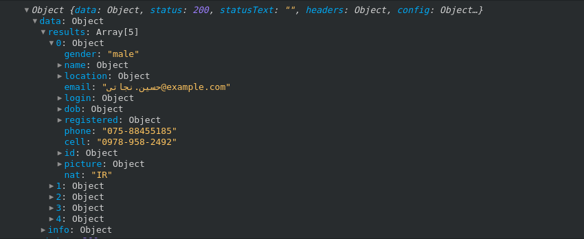
}Your console should get something similar to this:
We map through the results array to obtain the information we need for each user. The array of users is then used to set a new value for our users state. With that done, we can then change the value of isLoading.
By default, isLoading is set to true. When the state of users is updated, we want to change the value of isLoading to false since this is the cue our app is looking for to make the switch from “Loading…” to rendered data.
render() {
  const { isLoading, users } = this.state;
  return (
    <React.Fragment>
      <h2>Random User</h2>
      <div>
        {!isLoading ? (
          users.map(user => {
            const { username, name, email, image } = user;
            return (
              <div key={username}>
                <p>{name}</p>
                <div>
                  <img src={image} alt={name} />
                </div>
                <p>{email}</p>
                <hr />
              </div>
            );
          })
        ) : (
          <p>Loading...</p>
        )}
      </div>
    </React.Fragment>
  );
}
If you log the users state to the console, you will see that it is an array of objects:
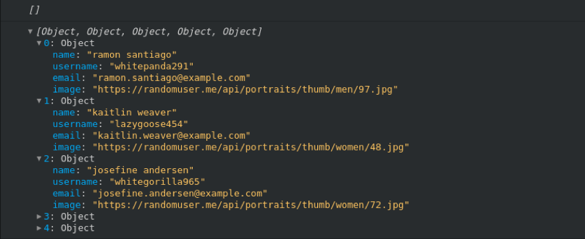
The empty array shows the value before the data was obtained. The returned data contains only the name, username, email address and image of individual users because those are the endpoints we mapped out. There is a lot more data available from the API, of course, but we’d have to add those to our getUsers method.
Using axios with your own API
See the Pen React Axios 2 Pen by Kingsley Silas Chijioke (@kinsomicrote) on CodePen.
You have seen how to use axios with a third-party API but we can look at what it’s like to request data from our own API, just like we did with the Fetch API. In fact, let’s use same JSON file we used for Fetch so we can see the difference between the two approaches.
Here is everything put together:
class App extends React.Component {
  // State will apply to the posts object which is set to loading by default
  state = {
    posts: [],
    isLoading: true,
    errors: null
  };
  // Now we're going to make a request for data using axios
  getPosts() {
    axios
      // This is where the data is hosted
      .get("https://s3-us-west-2.amazonaws.com/s.cdpn.io/3/posts.json")
      // Once we get a response and store data, let's change the loading state
      .then(response => {
        this.setState({
          posts: response.data.posts,
          isLoading: false
        });
      })
      // If we catch any errors connecting, let's update accordingly
      .catch(error => this.setState({ error, isLoading: false }));
  }
  // Let's our app know we're ready to render the data
  componentDidMount() {
    this.getPosts();
  }
  // Putting that data to use
  render() {
    const { isLoading, posts } = this.state;
    return (
      <React.Fragment>
        <h2>Random Post</h2>
        <div>
          {!isLoading ? (
            posts.map(post => {
              const { _id, title, content } = post;
              return (
                <div key={_id}>
                  <h2>{title}</h2>
                  <p>{content}</p>
                  <hr />
                </div>
              );
            })
          ) : (
            <p>Loading...</p>
          )}
        </div>
      </React.Fragment>
    );
  }
}
The main difference between this method and using axios to fetch from a third-party is how the data is formatted. We’re getting straight-up JSON this way rather than mapping endpoints.
The posts data we get from the API is used to update the value of the component’s posts state. With this, we can map through the array of posts in render(). We then obtain the id, title and content of each post using ES6 de-structuring, which is then rendered to the user.
Like we did before, what is displayed depends on the value of isLoading. When we set a new state for posts using the data obtained from the API, we had to set a new state for isLoading, too. Then we can finally let the user know data is loading or render the data we’ve received.
async and await
Another thing the promise-based nate of axios allows us to do is take advantage of is async and await . Using this, the getPosts() function will look like this.
async getPosts() {
  const response = await axios.get("https://s3-us-west-2.amazonaws.com/s.cdpn.io/3/posts.json");
  try {
    this.setState({
      posts: response.data.posts,
      isLoading: false
    });
  } catch (error) {
    this.setState({ error, isLoading: false });
  }
}
Base instance
With axios, it’s possible to create a base instance where we drop in the URL for our API like so:
const api = axios.create({
  baseURL: "https://s3-us-west-2.amazonaws.com/s.cdpn.io/3/posts.json"
});
…then make use of it like this:
async getPosts() {
  const response = await api.get();
  try {
    this.setState({
      posts: response.data.posts,
      isLoading: false
    });
  } catch (error) {
    this.setState({ error, isLoading: false });
  }
}
Simply a nice way of abstracting the API URL.
Now, data all the things!
As you build React applications, you will run into lots of scenarios where you want to handle data from an API. Hopefully you know feel armed and ready to roll with data from a variety of sources with options for how to request it.
Want to play with more data? Sarah recently wrote up the steps for creating your own serverless API from a list of public APIs.
The post Using data in React with the Fetch API and axios appeared first on CSS-Tricks.


