Archive

Archive for August, 2018

On Switching Code Editors

August 1st, 2018 No comments

I’m sure a lot of you are like me and have switched code editors a number of times. I think my first major editor was Coda. Then I moved to TextMate when I started working primarily on local. Then Sublime Text. And, most recently, VS Code. I bet your journey was different. I know lots of folks that quite love Atom, Brackets, WebStorm, and even BBedit. You do you!

For me, that’s four changes in a dozen years, or a change every three years. Moving isn’t something I do quickly. Here’s a collection of thoughts around the idea of changing editors.

When moving, I have to take time to make sure it works pretty much like the old one.

Otherwise, I’ll just end up disliking it to the point that I switch back a day or two later. It’s happened to me every time I switch. I have little false-starts after a switch where I go back to the old editor because something bugged me too much or it affected my productivity and I gave up. (Now that I know I do this, I don’t let a single false-start make me feel like the editor I’m trying is never a possibility.)

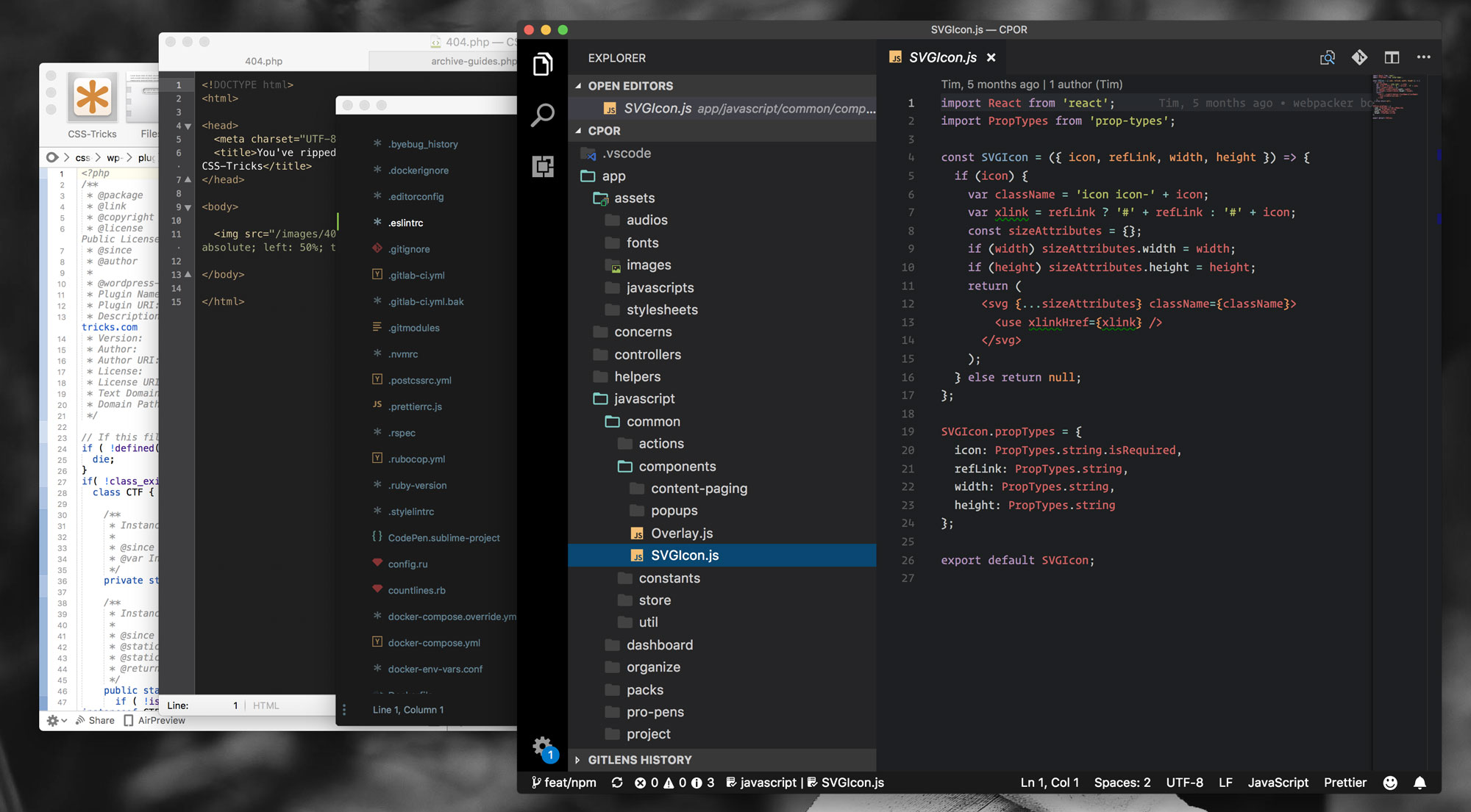
My latest switch was from Sublime Text to VS Code. I’d become become very used to the key bindings (e.g. CMD+Shift+d to duplicate a line) in Sublime Text, so thankfully VS Code has that covered.

I was amazed to find even my VIM friends happy and comfortable in VS Code. (Fun fact: we have key bindings choices in CodePen, too.)

Nothing can be too obnoxious.

In one of my first attempts at switching, I found the UI in VS code to be too cluttered and the find-in-project feature to be a little slow and awkward. Those things bugged me to the point they caused false-starts and I went back to Sublime Text.

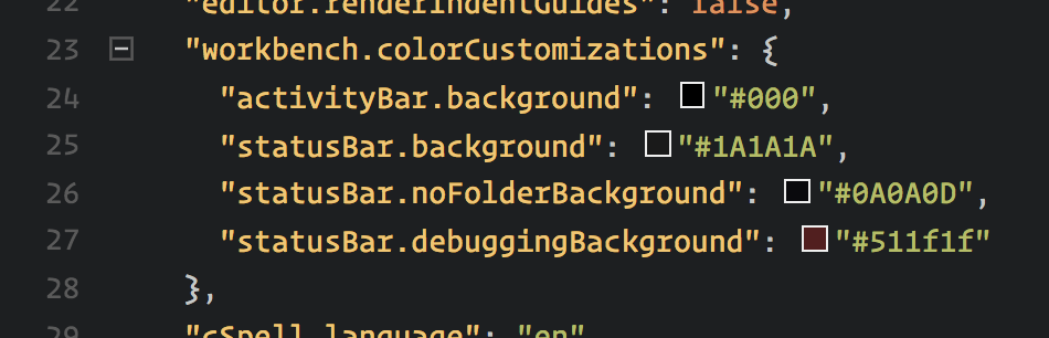
On this last switch attempt (my 3rd or 4th maybe?) I finally have a theme I quite like (customized a smidge), found some settings to clean up the UI (I removed the whitespace indicators which were overwhelming to me, and overrode that intense blue footer with something more chill).

In working with find-in-project a bit more, I’ve grown to get used to it. I finally might even like it more than Sublime, as the sidebar approach is more consistent than opening a new tab of results. I find the jump-to-line feature works more consistently and search feels more the first-class citizen it should be.

Another factor would be Emmet. I’m quite sure that I’d be too annoyed writing HTML and CSS in an editor without Emmet, and I’d just give up and use something else that had it. Emmet isn’t even an extension in VS Code, it’s built in.

I’m cool with making small changes after a successful switch.

Once I’ve actually done it, and made the switch to full-time use, then I can make some changes. Maybe I’ll learn some new key commands. Maybe I’ll add an extension that adds functionality I’ve never had before. Maybe the editor affects some workflow thing in a way I’m now willing to try.

The new editor better have some killer feature that incentivizes me to switch.

If it’s exactly the same, why bother?

The new editor needs to be faster (or feel just as fast). Or should look better. Or it should have some awesome package that is only available on it. Ideally all of that.

In this recent switch for me, it was GitLens.

How cool is that?

It ought to have a plugin architecture.

Meaning that anyone can write code to extend the editor. I’m fairly certain that having a plugin architecture (plus a healthy amount of community momentum) is what is key to any editor’s success. Sublime’s package manager, and the subsequent built-in packages feature of VS Code, seem crucial. Not only for functionality but even just for the look of the editor. I wouldn’t use an editor with a look I hate, but I’d be tempted to if the functionality was awesome. That’s a non-issue with a plugin-based editor. Open source seems smart as well.

Careful for those GOTCHAs.

One of those was spell-checking for me. In Sublime Text, it was an option under the View menu. I had it checked all the time, and it spell-checked all the time.

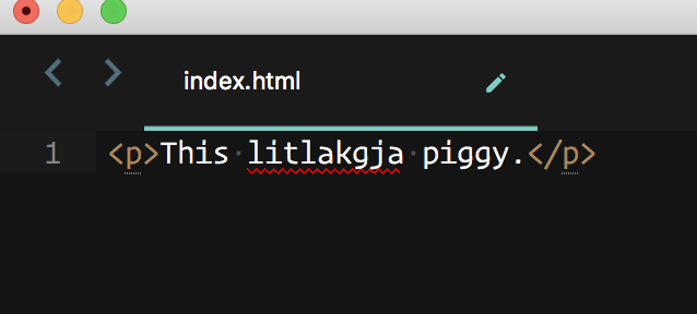
This is not a thing in VS Code. That was dangerous after switching because, who knows, I may have been committing typos all over the place. Fortunately, this extension seems to be doing the trick. Thank jeepers for extensions!

Your thoughts!

I thought it might be interesting to ask what y’all think about when switching code editors. There were lots of responses. I picked out as many as I could here and focused on one thing that you mentioned.

The post On Switching Code Editors appeared first on CSS-Tricks.

Categories: Designing, Others Tags:

Noma Bar’s Illusions Will Make You Double Take

August 1st, 2018 No comments
Noma Bar

Illustrations of any kind are quite a hot topic lately. Today, we will be expanding on this idea, and going over the work of one of the most world-renowned illustration artists.

Noma Bar is an Israel-born artist whose works are simple, yet powerful. He has designed over one hundred magazine covers, published over 550 illustrations, and has released three books for his work:

Possibly just as intriguing as the illustrations themselves, is the fact that Noma manages to create them digitally. Technology has made many people’s jobs easier, but for Noma, this sort of digital art has paved the way for his style. This look wouldn’t be possible without the aid of technology. At least, it would look completely different.

Noma’s works were published in many prominent magazines all around the world, such as Random House, Time Out London, BBC, The Observer, The Economist, and Wallpaper. His works help us understand how the human brain works and how it perceives images and illustrations. Noma’s signature style is that his drawings and animations have a limited color palette, a lot of white space, and simple shapes, which converge to form new meanings:

IBM: Drivers Can See Traffic Jams Before They Happen

Noma Bar

Red Riding Hood

Noma Bar

Great Jones Street

Noma Bar

Kenny

Noma Bar

IBM: Now Food Can Tell You How Fresh It Is

Noma Bar

IBM: In India Tiny Loans Can Make Bigger Difference

Noma Bar

Burka Ban

Noma Bar

Negative Space Book Cover

Noma Bar

Bomb

Noma Bar

Pensions & Property

Noma Bar

Iraq Oil

Noma Bar

Tea For Two

Noma Bar

Hunger

Noma Bar

Escape The Weather

Noma Bar

Final Cut

Noma Bar

Power To The Individual

Noma Bar

Banged Up

Noma Bar

Shy Guy

Noma Bar

War and Peace

Noma Bar

Pointed Sense

Noma Bar

Wish You Were Here

Noma Bar

Gun Crime

Noma Bar

Red Riding Hood

Noma Bar

Audrey Hepburn

Noma Bar

Desert War

Noma Bar

Drugs and doping in professional cycling

Noma Bar

How fashion loves art

Noma Bar

Steven Spielberg

Noma Bar

Pulp Fiction

Noma Bar

Mad Men

Noma Bar

Which one is your favorite? Tell us in the comment section below, and don’t forget to like, share, and subscribe for more daily snippets of creative designs!

Read More at Noma Bar’s Illusions Will Make You Double Take

Categories: Designing, Others Tags:

User Experience Psychology And Performance: SmashingConf Videos

August 1st, 2018 No comments
SmashingConf New York 2018, with Dan Mall, Sara Soueidan, Sarah Drasner and many others.

User Experience Psychology And Performance: SmashingConf Videos

User Experience Psychology And Performance: SmashingConf Videos

The Smashing Editorial

2018-08-01T13:30:35+02:002018-08-02T08:33:10+00:00

Today, we’d like to shine a light on two videos from our archives as we explore two very different approaches to User Experience (UX). The first explores how we relate our websites to the needs and situations of our visitors, trying to meet them where they are emotionally. The second is a detailed technical exploration into how we measure and track the data around performance as it relates to user experience.

The second video may seem unrelated to the first video; however, while the collecting and analyzing of data might seem very impersonal, the improvements we can make based on the information makes a real difference to the experience of the people we build our sites to serve.

Designing Powerful User Experiences With Psychology

Recorded at the SmashingConf in San Francisco earlier this year, Joe Leech explains how psychology impacts user experience. Joe explains the frustrations people using our products face, and the things happening in their everyday lives and environment that can make interacting with our websites and applications difficult. He goes on to help us understand how we can design in a way to help these visitors rather than frustrate them.

How’s The UX On The Web, Really?

Once you have created a great user experience, how do you know that it is really working well? Especially in terms of site performance, we can track how people are using our sites and examine that data to see what is really happening.

At the SmashingConf in London, Ilya Grigorik was the Mystery Speaker and spoke about the ways to assess performance in real terms, and benchmark your application against other destinations on the web.

Enjoyed listening to these talks? There are many more SmashingConf videos on Vimeo. We’re also getting ready for the upcoming SmashingConf in New York — see you there? 😉

Smashing Editorial(ra, il)
Categories: Others Tags:

Firefox Working on a Rebrand

August 1st, 2018 No comments

Hey guys, remember Firefox? Remember the Mozilla Application Suite? That second one isn’t relevant, but everyone knows that nostalgia is an attention-grabber. Now that you’re here, let’s move on with that first item: Firefox. It’s getting a logo change… eventually. The Mozilla foundation wants your help deciding which direction to go.

The Firefox logo as we know it was a collaboration by Daniel Burka, Stephen Desroches, and the inestimable Jon Hicks. It was they who introduced us to that little blue ball, and the weirdly-charismatic-even-when-we-can’t-see-his-face fox.

Over the years, though, it has been changed, and simplified. As our collective Western aesthetic evolved, and as screens got smaller and smaller, it needed to change with the times. And now, once again is changing, because Firefox isn’t just a browser anymore; it’s the head of a product family, as Mozilla themselves put it in their own post on the topic.

Since a product family needs to more or less match, visually speaking, Firefox’s logo needs to change to allow more flexibility. It needs to be adaptable to other software. To this end, the branding team at Mozilla has come up with two different branding systems, and is looking for feedback on them.

To have your say, leave them a comment on the blog post linked above.

Note that neither of these systems are anywhere close to finalized. Mozilla even refers to them as “a work of fiction” at this point, which should tell you about how close they are to being implemented. Every icon has yet to undergo quite a bit of iteration before any decisions are made.

System 1

This first system emphasizes thick geometric shapes, and a strongly yellow-to-red palette, though there is some variation in the color. Of the two, this almost feels a bit more “classic Firefox”.

System 2

The second system introduces a bit more color variation, with thinner lines.

My Opinion

These design systems both seem very, very corporate, which I suppose is appropriate, now. I do not think, however, that they are devoid of personality or history like some other recent logo redesigns have been. This is an actual evolution of the brand, rather than a surgical removal of everything fun and/or dated.

Like many in the comment section of the original post on Mozilla’s blog, I think the Firefox icons from System 2 should be combined with the other icons from System 1. It just seems to fit better that way.

The only thing that worries me a little is this quote at the end: “With your input, we’ll have a final system that will make a Firefox product recognizable out in the world even if a fox is nowhere in sight.” I don’t think they actually have any plans to remove the fox imagery; but if that question ever comes up, here’s my community feedback: Keep the damn fox, mmmkay?

Add Realistic Chalk and Sketch Lettering Effects with Sketch’it – only $5!

Source

Categories: Designing, Others Tags: