Archive

Archive for August, 2018

Everything You Need To Know About Alignment In Flexbox

August 13th, 2018 No comments

Everything You Need To Know About Alignment In Flexbox

Everything You Need To Know About Alignment In Flexbox

Rachel Andrew

2018-08-13T14:00:57+02:002018-08-13T14:00:50+00:00

In the first article of this series, I explained what happens when you declare display: flex on an element. This time we will take a look at the alignment properties, and how these work with Flexbox. If you have ever been confused about when to align and when to justify, I hope this article will make things clearer!

History Of Flexbox Alignment

For the entire history of CSS Layout, being able to properly align things on both axes seemed like it might truly be the hardest problem in web design. So the ability to properly align items and groups of items was for many of us the most exciting thing about Flexbox when it first started to show up in browsers. Alignment became as simple as two lines of CSS:

See the Pen Smashing Flexbox Series 2: center an item by Rachel Andrew (@rachelandrew) on CodePen.

The alignment properties that you might think of as the flexbox alignment properties are now fully defined in the Box Alignment Specification. This specification details how alignment works across the various layout contexts. This means that we can use the same alignment properties in CSS Grid as we use in Flexbox — and in future in other layout contexts, too. Therefore, any new alignment capability for flexbox will be detailed in the Box Alignment specification and not in a future level of Flexbox.

The Properties

Many people tell me that they struggle to remember whether to use properties which start with align- or those which start with justify- in flexbox. The thing to remember is that:

  • justify- performs main axis alignment. Alignment in the same direction as your flex-direction
  • align- performs cross-axis alignment. Alignment across the direction defined by flex-direction.

Thinking in terms of main axis and cross axis, rather than horizontal and vertical really helps here. It doesn’t matter which way the axis is physically.

Main Axis Alignment With justify-content

We will start with the main axis alignment. On the main axis, we align using the justify-content property. This property deals with all of our flex items as a group, and controls how space is distributed between them.

The initial value of justify-content is flex-start. This is why, when you declare display: flex all your flex items line up against the start of the flex line. If you have a flex-direction of row and are in a left to right language such as English, then the items will start on the left.


The items are all lined up in a row starting on the left
The items line up to the start (Large preview)

Note that the justify-content property can only do something if there is spare space to distribute. Therefore if you have a set of flex items which take up all of the space on the main axis, using justify-content will not change anything.


The container is filled with the items
There is no space to distribute (Large preview)

If we give justify-content a value of flex-end then all of the items will move to the end of the line. The spare space is now placed at the beginning.


The items are displayed in a row starting at the end of the container — on the right
The items line up at the end (Large preview)

We can do other things with that space. We could ask for it to be distributed between our flex items, by using justify-content: space-between. In this case, the first and last item will be flush with the ends of the container and all of the space shared equally between the items.


Items lined up left and right with equal space between them
The spare space is shared out between the items (Large preview)

We can ask that the space to be distributed around our flex items, using justify-content: space-around. In this case, the available space is shared out and placed on each side of the item.


Items spaced out with even amounts of space on each side
The items have space either side of them (Large preview)

A newer value of justify-content can be found in the Box Alignment specification; it doesn’t appear in the Flexbox spec. This value is space-evenly. In this case, the items will be evenly distributed in the container, and the extra space will be shared out between and either side of the items.


Items with equal amounts of space between and on each end
The items are spaced evenly (Large preview)

You can play with all of the values in the demo:

See the Pen Smashing Flexbox Series 2: justify-content with flex-direction: row by Rachel Andrew (@rachelandrew) on CodePen.

These values work in the same way if your flex-direction is column. You may not have extra space to distribute in a column however unless you add a height or block-size to the flex container as in this next demo.

See the Pen Smashing Flexbox Series 2: justify-content with flex-direction: column by Rachel Andrew (@rachelandrew) on CodePen.

Cross Axis Alignment with align-content

If you have added flex-wrap: wrap to your flex container, and have multiple flex lines then you can use align-content to align your flex lines on the cross axis. However, this will require that you have additional space on the cross axis. In the below demo, my cross axis is running in the block direction as a column, and I have set the height of the flex container to 60vh. As this is more than is needed to display my flex items I have spare space vertically in the container.

I can then use align-content with any of the values:

See the Pen Smashing Flexbox Series 2: align-content with flex-direction: row by Rachel Andrew (@rachelandrew) on CodePen.

If my flex-direction were column then align-content would work as in the following example.

See the Pen Smashing Flexbox Series 2: align-content with flex-direction: column by Rachel Andrew (@rachelandrew) on CodePen.

As with justify-content, we are working with the lines as a group and distributing the spare space.

The place-content Shorthand

In the Box Alignment, we find the shorthand place-content; using this property means you can set justify-content and align-content at once. The first value is for align-content, the second for justify-content. If you only set one value then both values are set to that value, therefore:

.container {
    place-content: space-between stretch;
}

Is the same as:

.container {
    align-content: space-between; 
    justify-content: stretch;
}

If we used:

.container {
    place-content: space-between;
}

This would be the same as:

.container {
    align-content: space-between; 
    justify-content: space-between;
}

Cross Axis Alignment With align-items

We now know that we can align our set of flex items or our flex lines as a group. However, there is another way we might wish to align our items and that is to align items in relationship to each other on the cross axis. Your flex container has a height. That height might be defined by the height of the tallest item as in this image.


The container height is tall enough to contain the items, the third item has more content
The container height is defined by the third item (Large preview)

It might instead be defined by adding a height to the flex container:


The container height is taller than needed to display the items
THe height is defined by a size on the flex container (Large preview)

The reason that flex items appear to stretch to the size of the tallest item is that the initial value of align-items is stretch. The items stretch on the cross access to become the size of the flex container in that direction.

Note that where align-items is concerned, if you have a multi-line flex container, each line acts like a new flex container. The tallest item in that line would define the size of all items in that line.

In addition to the initial value of stretch, you can give align-items a value of flex-start, in which case they align to the start of the container and no longer stretch to the height.


The items are aligned to the start
The items aligned to the start of the cross axis (Large preview)

The value flex-end moves them to the end of the container on the cross axis.


Items aligned to the end of the cross axis
The items aligned to the end of the cross axis (Large preview)

If you use a value of center the items all centre against each other:


The items are centered
Centering the items on the cross axis (Large preview)

We can also do baseline alignment. This ensures that the baselines of text line up, as opposed to aligning the boxes around the content.


The items are aligned so their baselines match
Aligning the baselines (Large preview)

You can try these values out in the demo:

See the Pen Smashing Flexbox Series 2: align-items by Rachel Andrew (@rachelandrew) on CodePen.

Individual Alignment With align-self

The align-items property means that you can set the alignment of all of the items at once. What this really does is set all of the align-self values on the individual flex items as a group. You can also use the align-self property on any individual flex item to align it inside the flex line and against the other flex items.

In the following example, I have used align-items on the container to set the alignment for the group to center, but also used align-self on the first and last items to change their alignment value.

See the Pen Smashing Flexbox Series 2: align-self by Rachel Andrew (@rachelandrew) on CodePen.

Why Is There No justify-self?

A common question is why it is not possible to align one item or a group of the items on the main axis. Why is there no -self property for main axis alignment in Flexbox? If you think about justify-content and align-content as being about space distribution, the reason for their being no self-alignment becomes more obvious. We are dealing with the flex items as a group, and distributing available space in some way — either at the start or end of the group or between the items.

If might be also helpful to think about how justify-content and align-content work in CSS Grid Layout. In Grid, these properties are used to distribute spare space in the grid container between grid tracks. Once again, we take the tracks as a group, and these properties give us a way to distribute any extra space between them. As we are acting on a group in both Grid and Flexbox, we can’t target an item on its own and do something different with it. However, there is a way to achieve the kind of layout that you are asking for when you ask for a self property on the main axis, and that is to use auto margins.

Using Auto Margins On The Main Axis

If you have ever centered a block in CSS (such as the wrapper for your main page content by setting a margin left and right of auto), then you already have some experience of how auto margins behave. A margin set to auto will try to become as big as it can in the direction it has been set in. In the case of using margins to center a block, we set the left and right both to auto; they each try and take up as much space as possible and so push our block into the center.

Auto margins work very nicely in Flexbox to align single items or groups of items on the main axis. In the next example, I am achieving a common design pattern. I have a navigation bar using Flexbox, the items are displayed as a row and are using the initial value of justify-content: start. I would like the final item to be displayed separated from the others at the end of the flex line — assuming there is enough space on the line to do so.

I target that item and give it a margin-left of auto. This then means that the margin tries to get as much space as possible to the left of the item, which means the item gets pushed all the way over to the right.

See the Pen Smashing Flexbox Series 2: alignment with auto margins by Rachel Andrew (@rachelandrew) on CodePen.

If you use auto margins on the main axis then justify-content will cease to have any effect, as the auto margins will have taken up all of the space that would otherwise be assigned using justify-content.

Fallback Alignment

Each alignment method details a fallback alignment, this is what will happen if the alignment you have requested can’t be achieved. For example, if you only have one item in a flex container and ask for justify-content: space-between, what should happen? The answer is that the fallback alignment of flex-start is used and your single item will align to the start of the flex container. In the case of justify-content: space-around, a fallback alignment of center is used.

In the current specification you can’t change what the fallback alignment is, so if you would prefer that the fallback for space-between was center rather than flex-start, there isn’t a way to do that. There is a note in the spec which says that future levels may enable this.

Safe And Unsafe Alignment

A more recent addition to the Box Alignment specification is the concept of safe and unsafe alignment using the safe and unsafe keywords.

With the following code, the final item is too wide for the container and with unsafe alignment and the flex container on the left-hand side of the page, the item becomes cut off as the overflow is outside the page boundary.

.container {  
    display: flex;
    flex-direction: column;
    width: 100px;
    align-items: unsafe center;
}

.item:last-child {
    width: 200px;
}
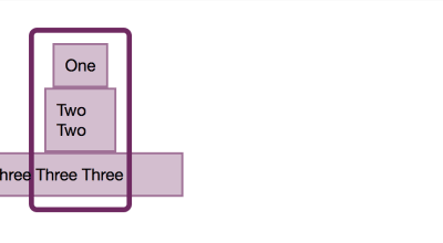
The overflowing item is centered and partly cut off
Unsafe alignment will give you the alignment you asked for but may cause data loss (Large preview)

A safe alignment would prevent the data loss occurring, by relocating the overflow to the other side.

.container {  
    display: flex;
    flex-direction: column;
    width: 100px;
    align-items: safe center;
}

.item:last-child {
    width: 200px;
}
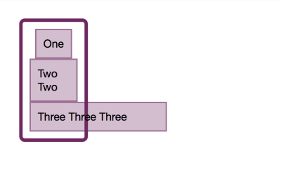
The overflowing item overflows to the right
Safe alignment tries to prevent data loss (Large preview)

These keywords have limited browser support right now, however, they demonstrate the additional control being brought to Flexbox via the Box Alignment specification.

See the Pen Smashing Flexbox Series 2: safe or unsafe alignment by Rachel Andrew (@rachelandrew) on CodePen.

In Summary

The alignment properties started as a list in Flexbox, but are now in their own specification and apply to other layout contexts. A few key facts will help you to remember how to use them in Flexbox:

  • justify- the main axis and align- the cross axis;
  • To use align-content and justify-content you need spare space to play with;
  • The align-content and justify-content properties deal with the items as a group, sharing out space. Therefore, you can’t target an individual item and so there is no -self alignment for these properties;
  • If you do want to align one item, or split a group on the main axis, use auto margins to do so;
  • The align-items property sets all of the align-self values as a group. Use align-self on the flex child to set the value for an individual item.
Smashing Editorial(il)
Categories: Others Tags:

What’s New for Designers, August 2018

August 13th, 2018 No comments

What’s old is new again; that’s the theme this month with new tools for designers with a few new tools that are rooted in the “old” concepts of design theory. From working with typefaces, to a color wheel, this roundup is packed with goodies. And then there are some new “new” tools as well, including a couple of cool 3D elements.

If we’ve missed something that you think should have been on the list, let us know in the comments. And if you know of a new app or resource that should be featured next month, tweet it to @carriecousins to be considered!

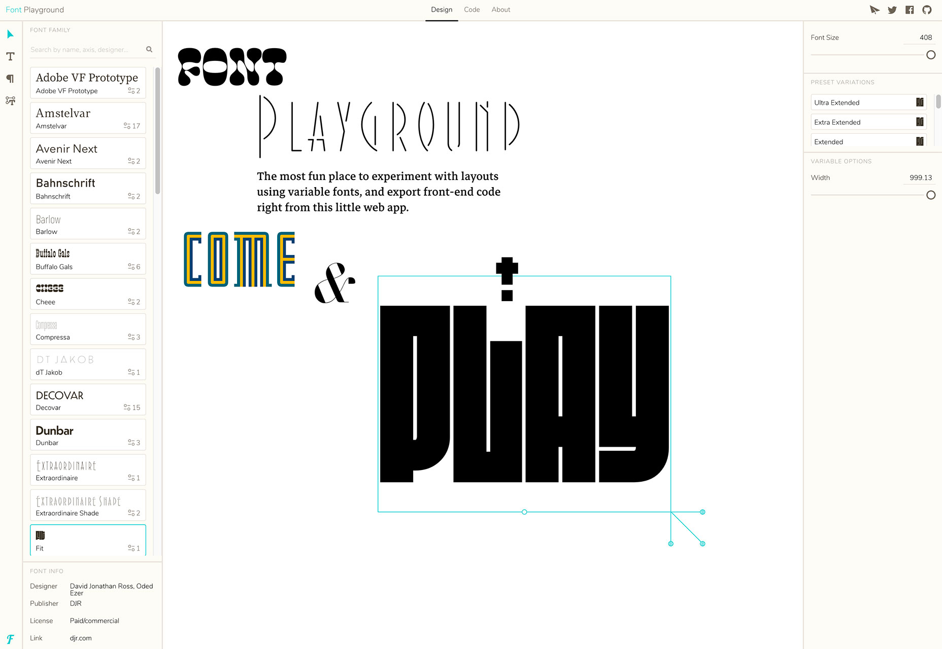
Font Playground

Font Playground is a tool to help you experiment with variable fonts and even export front-end code. Variable fonts, which are single font files that behave like multiple fonts, are gaining popularity, making this something you should probably experiment with.

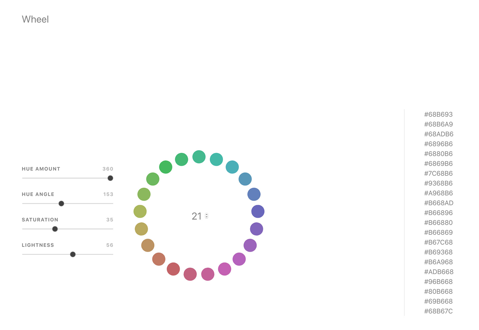
Color Wheel Generator

Color Wheel Generator provides color-perfect matches for all hues around the color wheel in HEX format. Adjust settings such as hue, angle, saturation and lightness to see perfect matches from every location on the wheel.

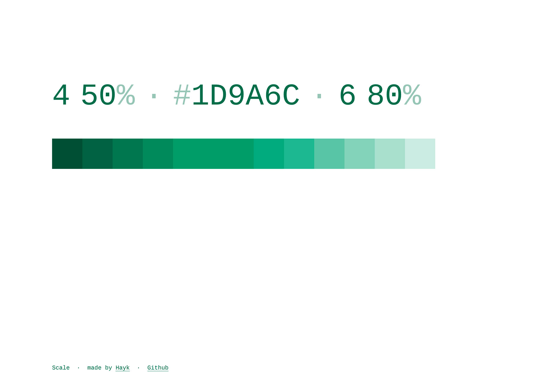
Scale

Scale is a tool to help you see a color scale for actual use. See tints of a color in steps so you know exactly what colors will look like.

Rockstar

Rockstar is a dynamically typed Turing-complete programming language. It is designed for creating computer programs that are also song lyrics, and is heavily influenced by the lyrical conventions of 1980s hard rock and power ballads. (So, it is a super-fun programming language to experiment with.)

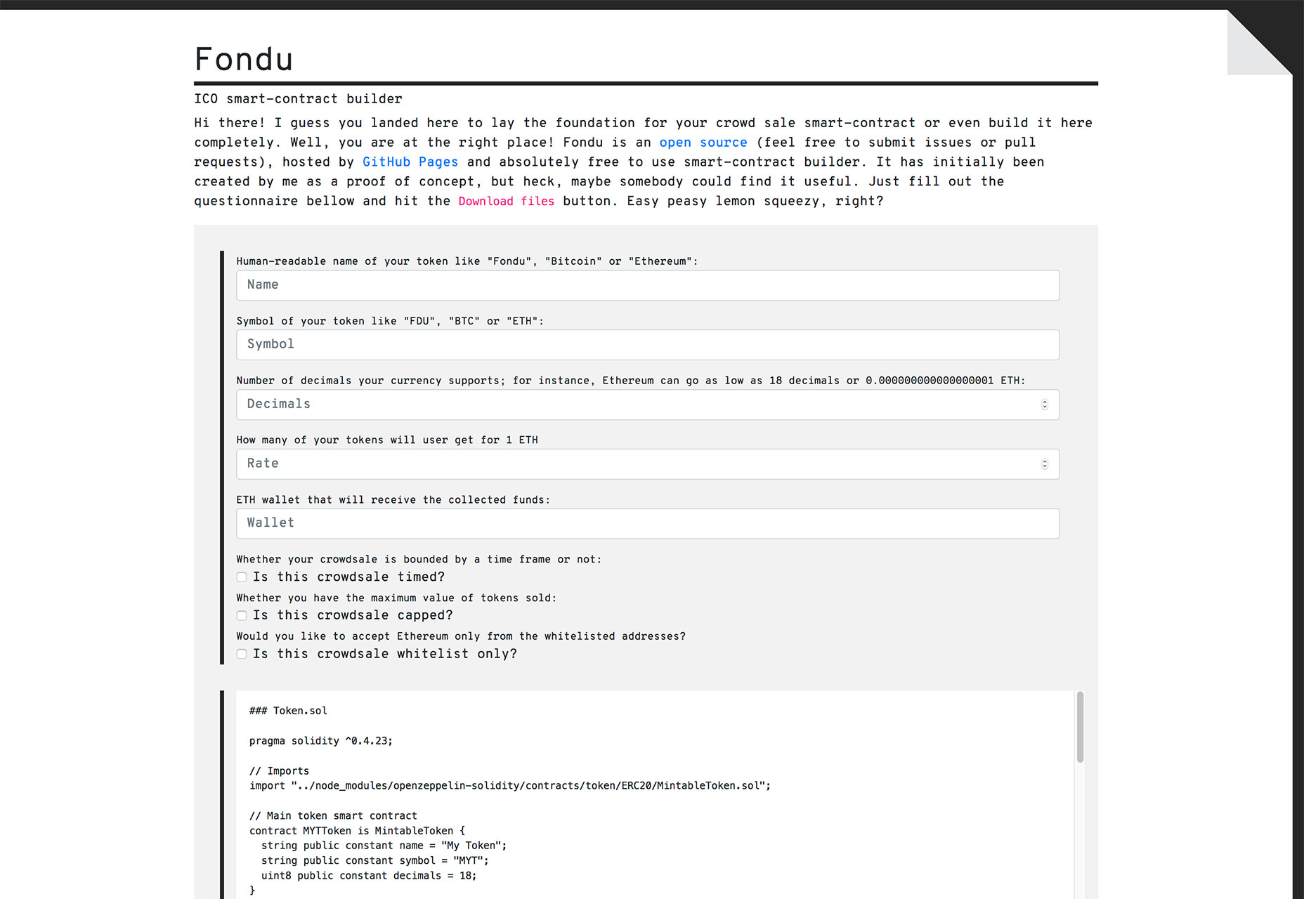
Fondu

Fondu is a smart contract building tool. The open-source contract is designed for launching an initial coin offering or crowdfunding campaign. Fill out the questionnaire and download your contracts.

Font Memory Game

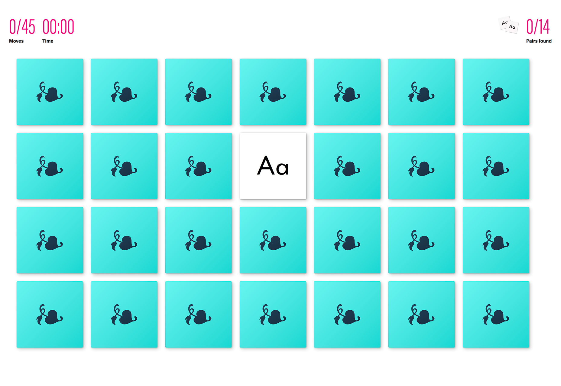
The Font Memory Game can help you train your eyes to notice details in typography and better identify different typefaces. (It’s harder than you think!)

Fusion.js

Fusion.js is now available for public use. The Uber project is described as “is a good choice for someone looking for an open source boilerplate to build a modern, non-trivial web app.” It is a MIT-licensed JavaScript framework that supports popular libraries like React and Redux, and comes with modern features like hot module reloading, data-aware server-side rendering, and bundle splitting support. It provides a flexible plugin based architecture.

StyleURL

StyleURL lets you export and share CSS changes directly from Chrome DevTools so you can use it with an existing workflow. It generates a link which loads CSS changes into existing webpages automatically so that you can share tweaks visually.

Keyframes

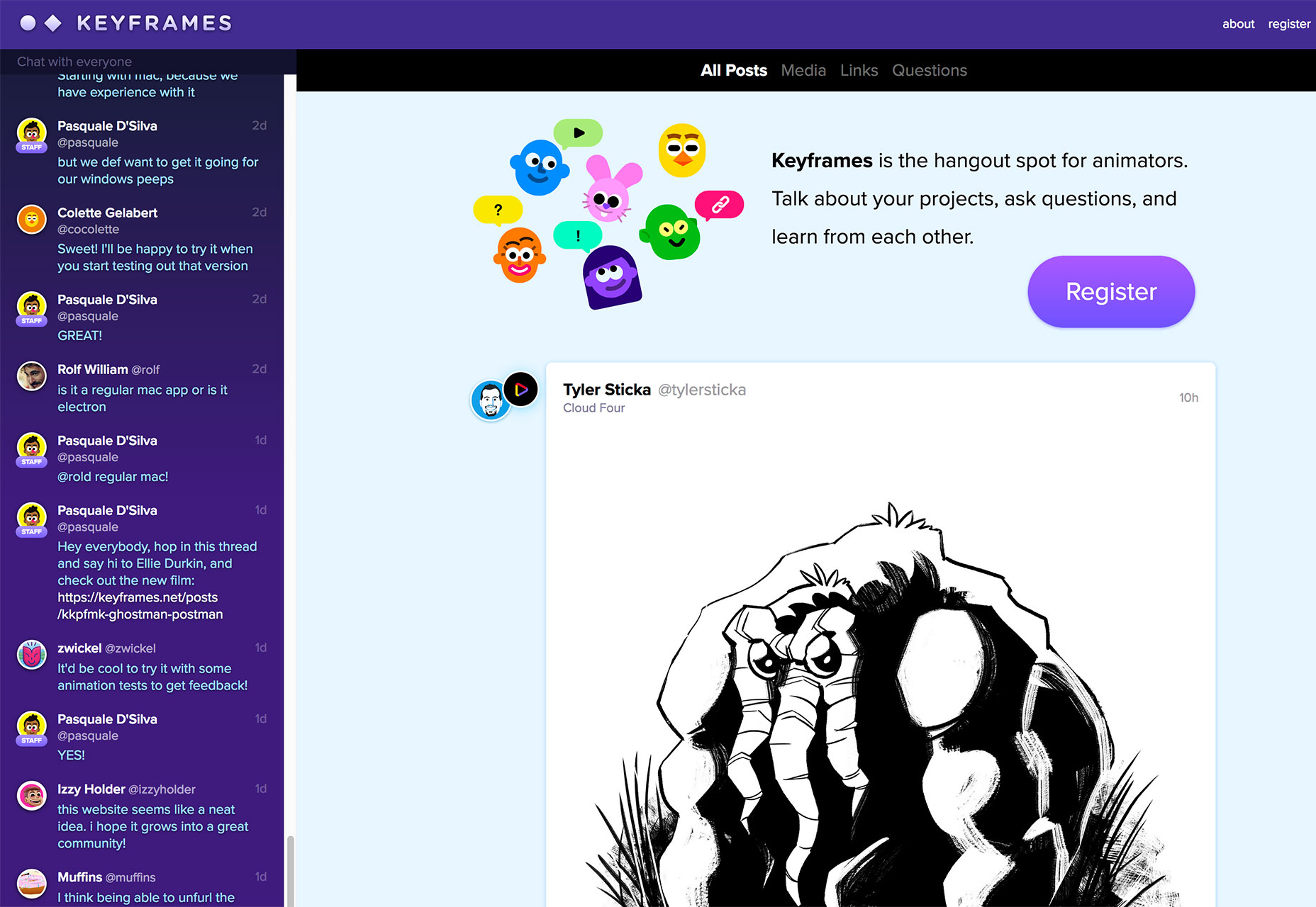
Keyframes is a new online hangout for animators. You can chat about and share projects, ask questions and use the community as a learning tool to up your animation game.

Brandcast Team Edition

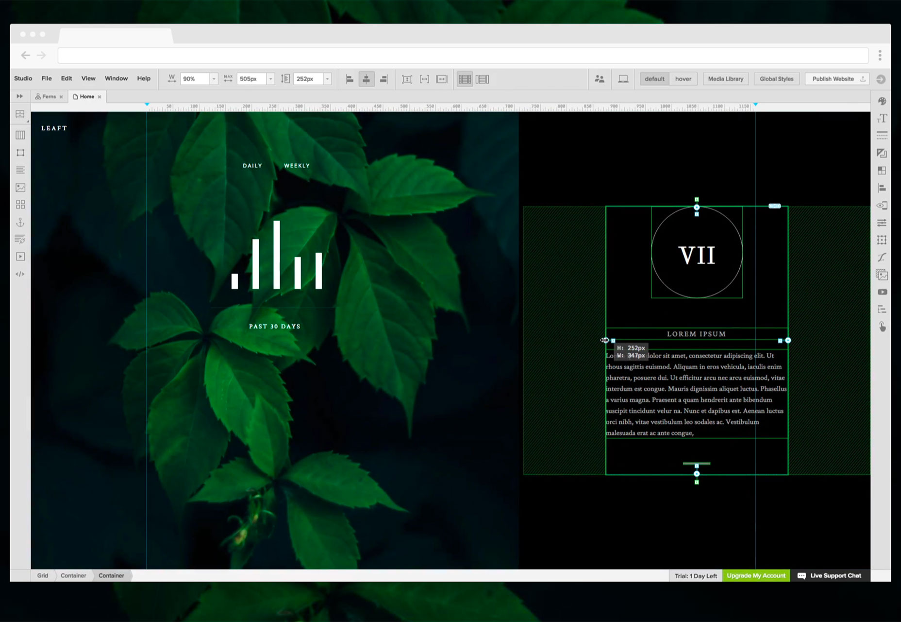
Brandcast Team Edition makes it easy for teams to work on code-free website design projects together. The tool allows marketing teams to create completely custom websites and interactive sales and marketing collateral without a single line of code. The release allows everyone – from designers to copywriters – to work on projects together within the interface.

Pair & Compare

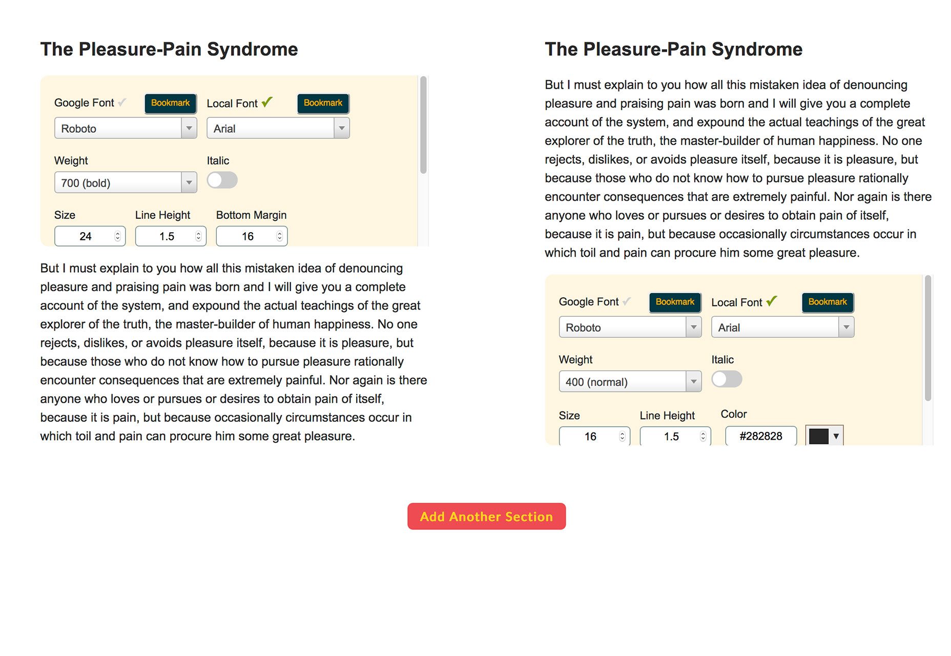
Pair & Compare lets you find and preview font pairs. Test Google fonts (and more) right on the screen and change settings to match your project needs — background, text width, font size, line height and more.

Emoji Tweeter

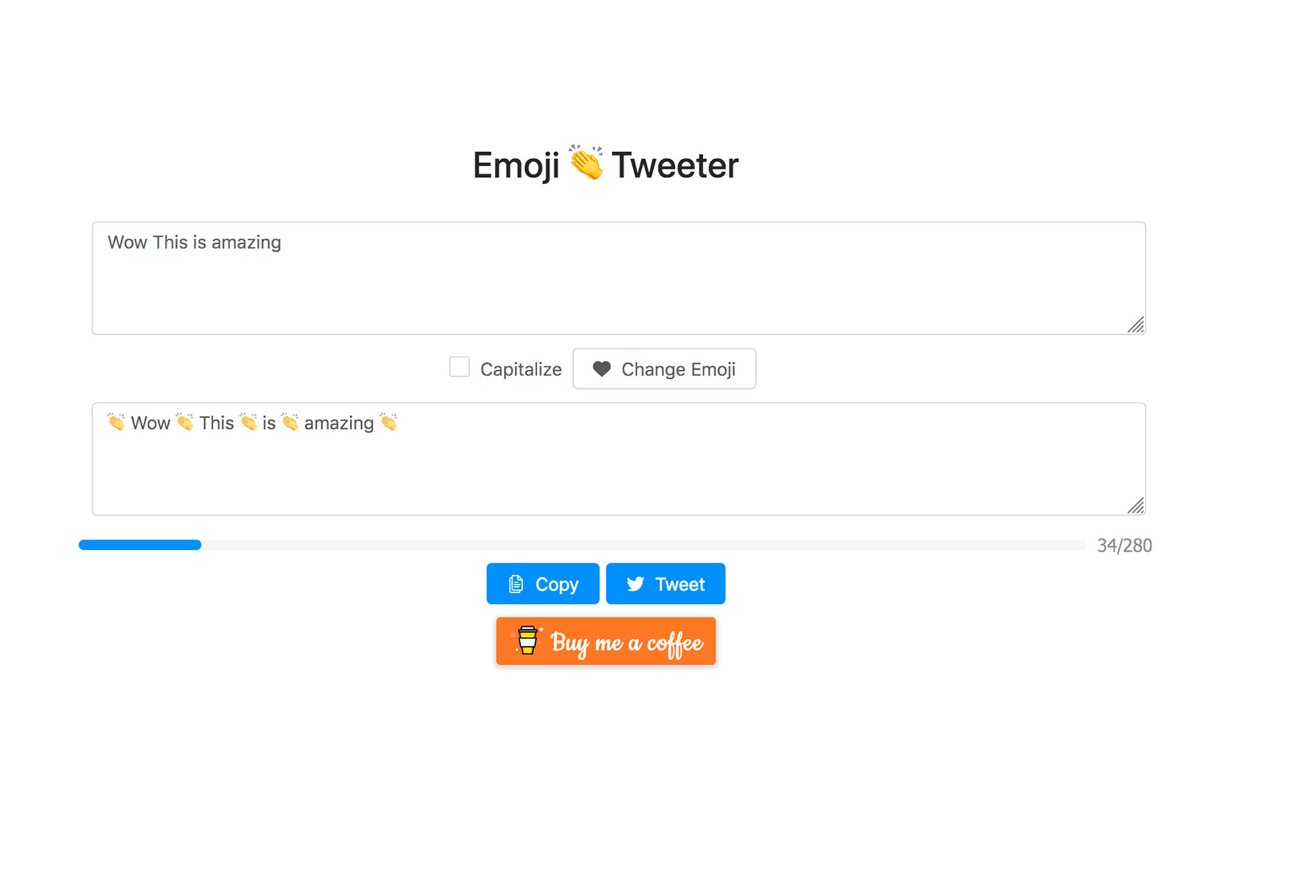
Emoji Tweeter lets you create tweets from a desktop computer complete with emojis. It’s basically an emoji keyboard.

3D Cube Form

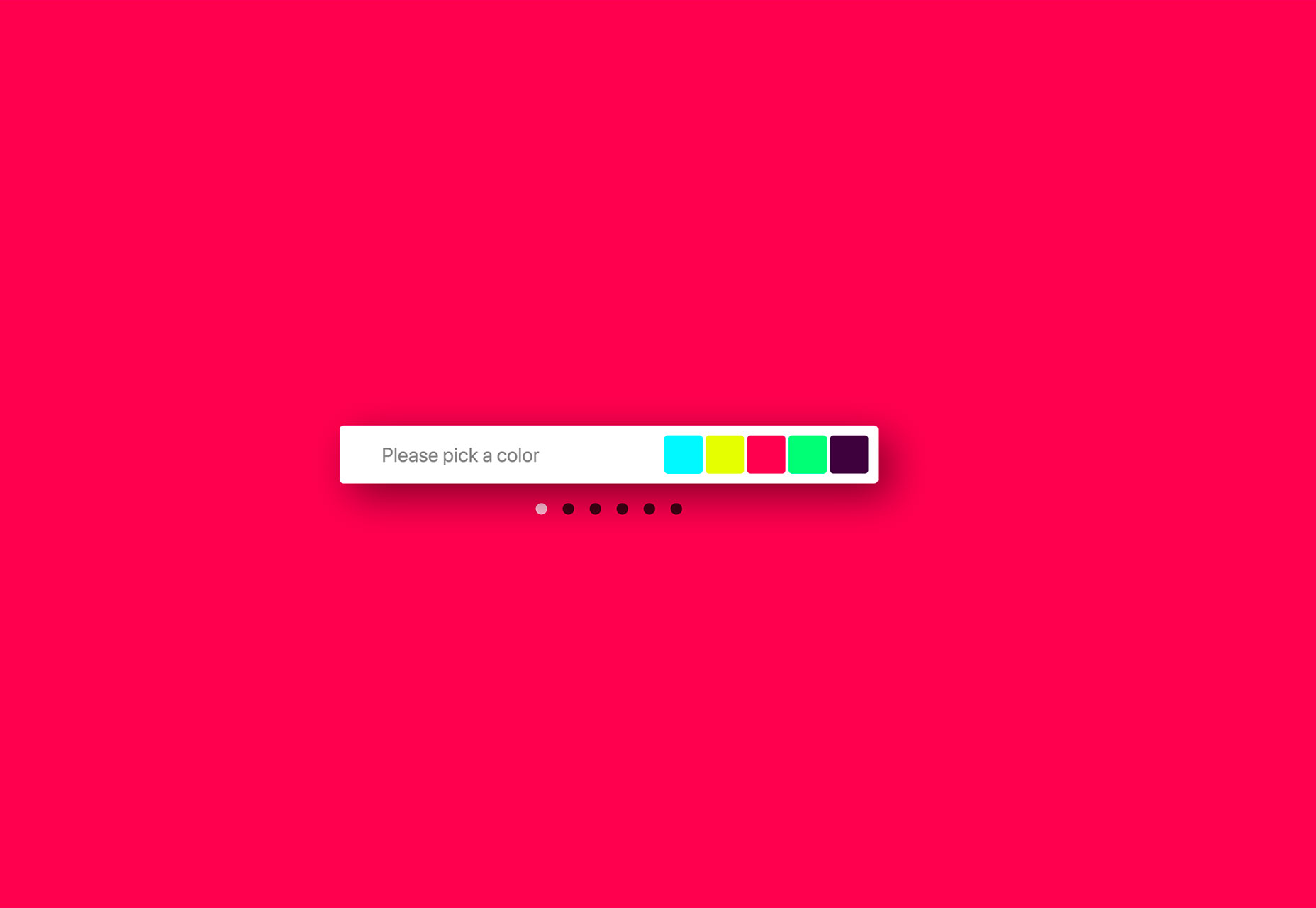
3D Cube Form makes you say “that’s cool.” The form tool is interactive and starts with a color picker — engaging, right? Then the user enters details based on form fields. It’s fun and different; it might not work for every project, but is definitely worth your time.

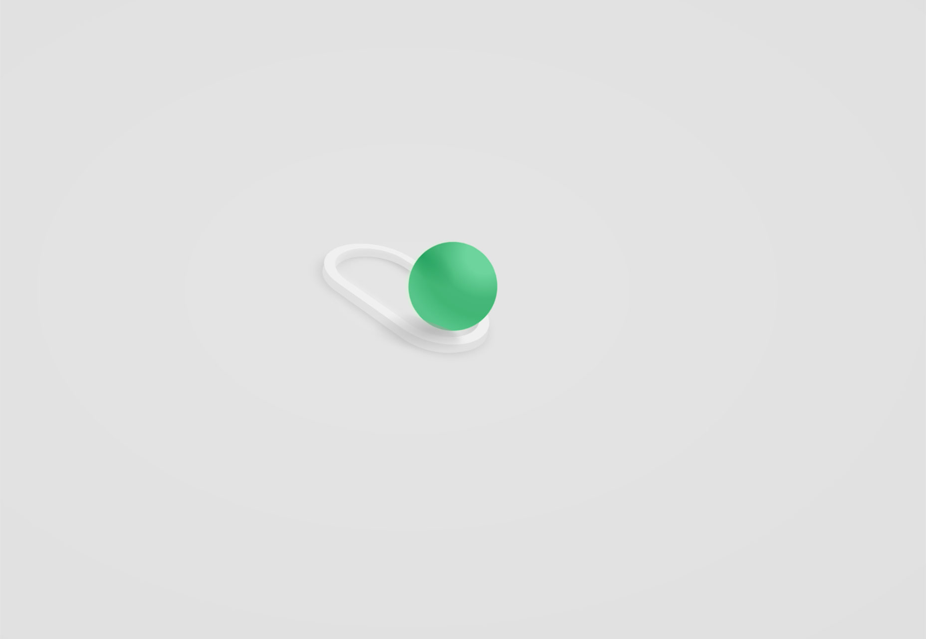
3D Toggle

3D Toggle is a cool animation that changes how you think about toggle actions. You’ll want to click it into action.

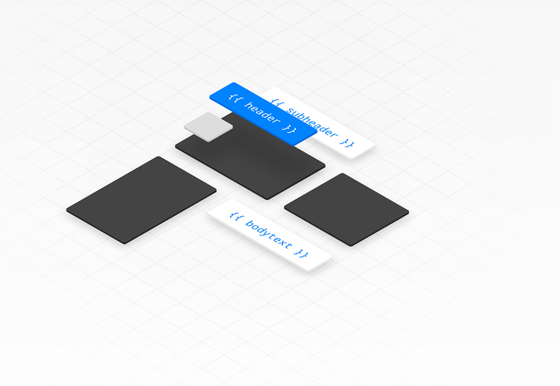
Malvid

Malvid is a tool to help you develop components with an interactive user interface so that you can preview and document web components as you create them. The tool analyzes your folder structure to turn files into a visual UI and it works using an API or CLI tool.

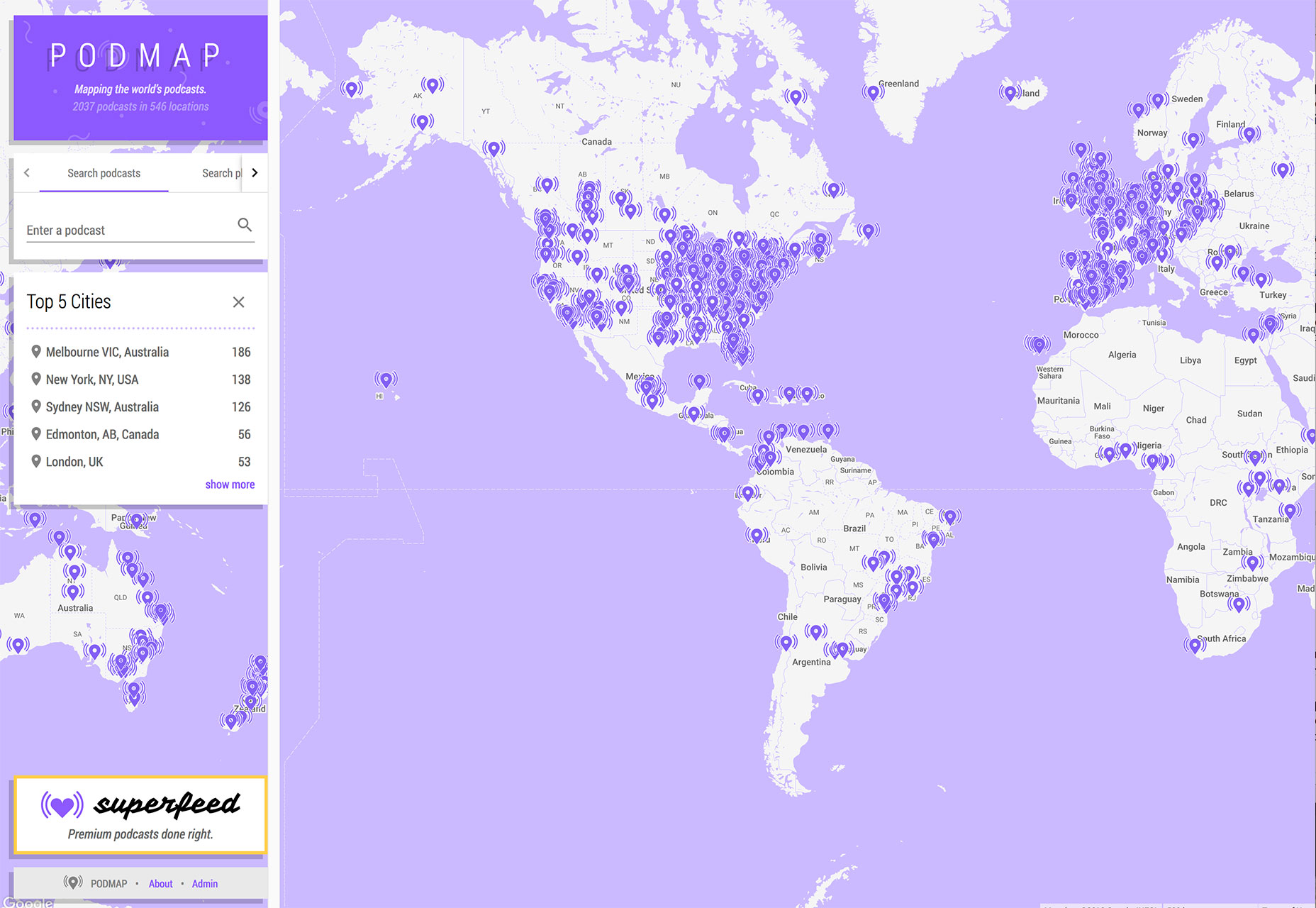
Podmap

Podmap is a cool data visualization tool that maps the world’s podcasts so you can find something new to listen to near you. Search by geolocation, podcast name or filter by country.

CoolHue

CoolHue is a JSON-rendered gradients palette. It includes 60 gradient options so you can add a trendy color effects to projects with ease. You can also grab CoolHue palettes for Photoshop or Sketch.

Tutorial: Animated SVG Neon Light Effect

The Animated SVG Neon Light Effect tutorial allows you to take a cool custom effect that you create in Adobe Illustrator and then move it to Sketch and export a sleek SVG image that is lightning fast for websites and apps. The step-by-step guide shows you how to do everything from creating the nifty effect to applying it for use (no more heavy gifs!). Plus, the tutorial includes downloadable project files to get you moving through the project with ease.

Aunofa Serif

Aunofa Serif is a tall and distinct serif typeface for display. The free version includes only uppercase characters. The paid version includes a script option as well.

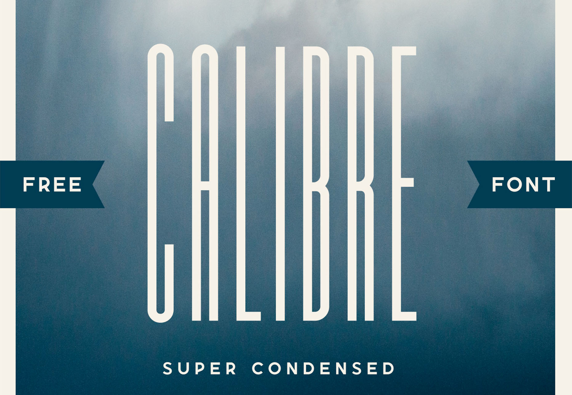
Calibre

Calibre is a super-condense font that’s a fun choice for display with just a few words. The x-height is incredibly high in this uppercase font. It also includes numbers and a few glyphs.

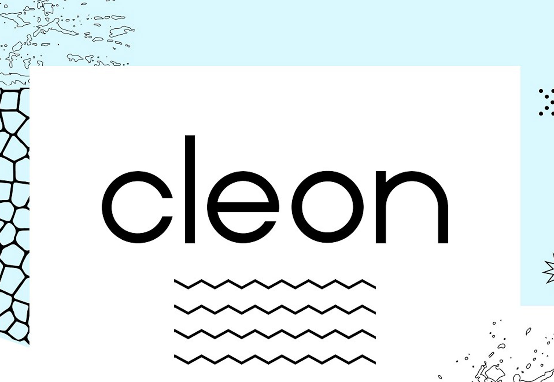
Cleon

Cleon is a round sans serif appropriate for a variety of uses. It includes upper- and lowercase letters, numerals and some punctuation.

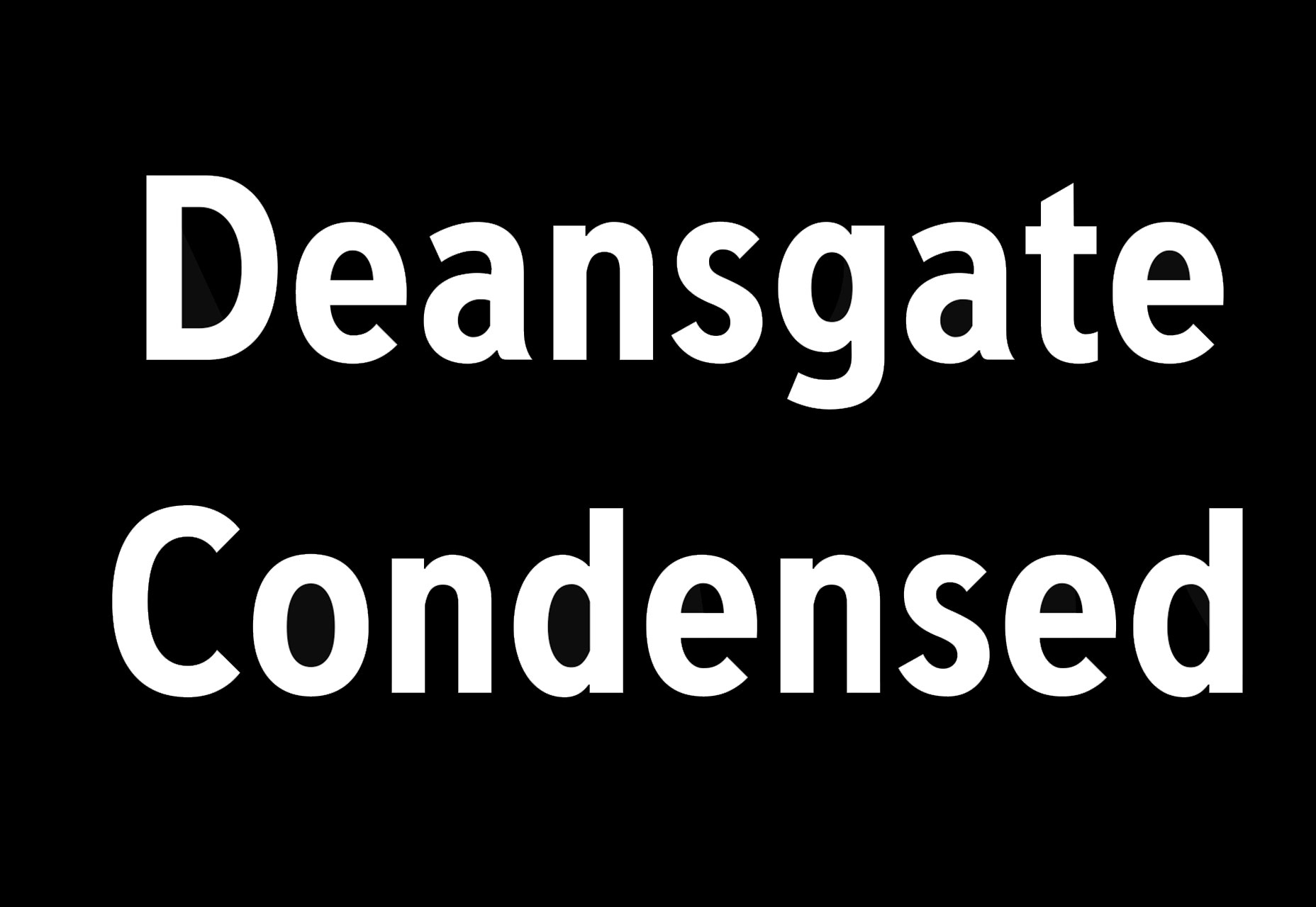
Deansgate Condensed

Deansgate Condensed is a clear and distinctive typeface that resembles the type used on street name signs in Manchester. Distinct characters include a point Z and points on the M and W.

Facon

Facon is a trendy display font in a ragged style. The letterforms include distinctive cutouts. It is an uppercase font with numbers and some special characters.

Mercy

Mercy is a highly readable sans serif with interesting curves for some of the letters – note the “M” in the image. It comes with a limited character set – just 69 elements – but does include italics of each.

Add Realistic Chalk and Sketch Lettering Effects with Sketch’it – only $5!

Source

Categories: Designing, Others Tags:

Popular Design News of the Week: August 6, 2018 – August 12, 2018

August 12th, 2018 No comments

Every week users submit a lot of interesting stuff on our sister site Webdesigner News, highlighting great content from around the web that can be of interest to web designers.

The best way to keep track of all the great stories and news being posted is simply to check out the Webdesigner News site, however, in case you missed some here’s a quick and useful compilation of the most popular designer news that we curated from the past week.

Note that this is only a very small selection of the links that were posted, so don’t miss out and subscribe to our newsletter and follow the site daily for all the news.

20 Must-Have Wireframe Templates and UI Kits for your Design Library

Common Webpage Design Mistakes

5 Extensions that Transform Google Chrome into a Modern Browser

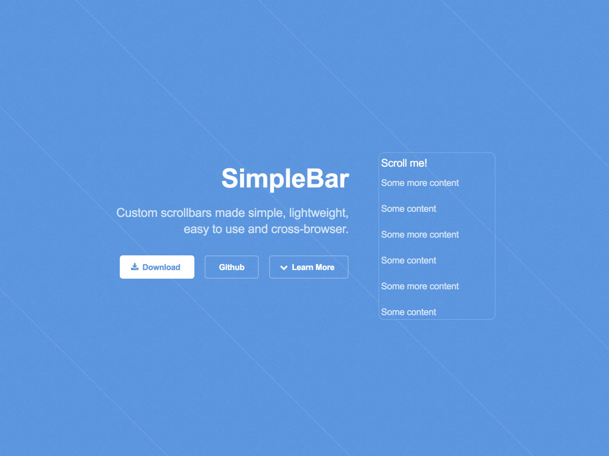
SimpleBar – Custom Scrollbars Made Simple

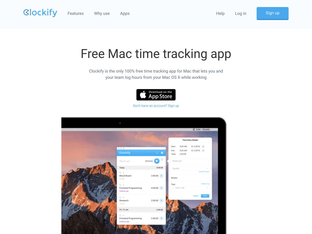
Clockify for Mac – The Only Truly Free Time Tracker & Timesheet for Teams

Everything Bad About Facebook is Bad for the Same Reason

Site Design: Bill Hinderman

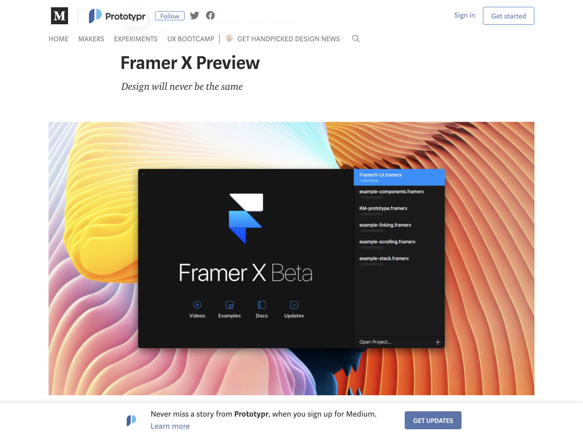
Framer X Preview

Asora Clickbait Detector – Detects Clickbait Posts on Social Media

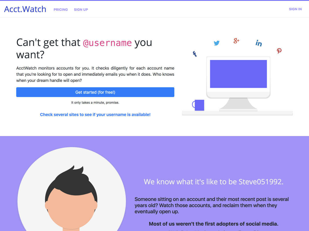
Acct.Watch – Monitors Accounts so You Can Have the @username You Want

Oilist 2.0 – Ground-breaking Generational Art App

Racism in Design, Who’s To Blame?

Turn Designs to Native Mobile Apps

UX Case Study: Google Maps Vs. Waze Mobile Apps

Take Another Look at Tumblr

The Doomed Toys “R” Us Rebrand that Never Came to Be

Drawser – Free Browser-based Vector Graphics Editor and Design Sharing

Be Better: Process

How to Design an Effective Welcome Email

Design Trends for Fixed Navigation Menus in Web Design

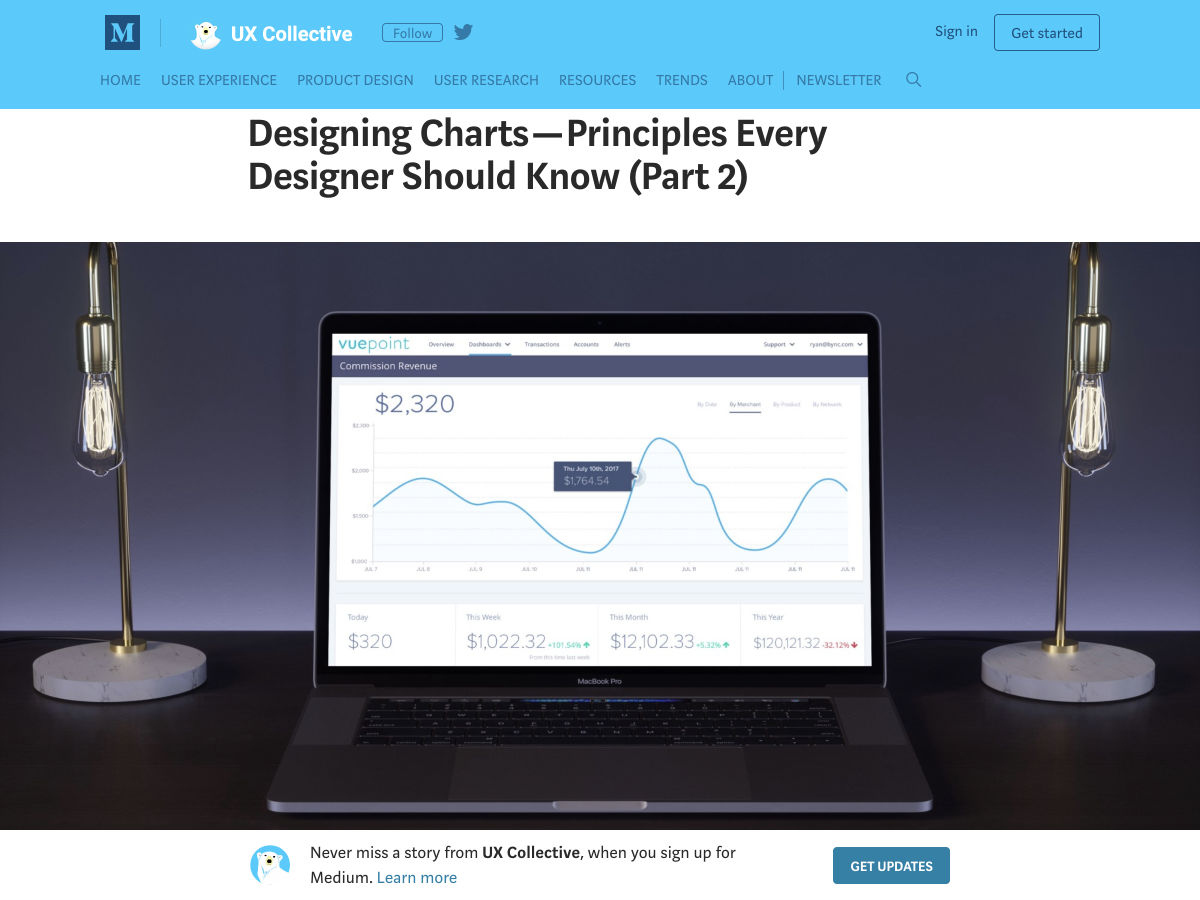
Designing Charts – Principles Every Designer Should Know

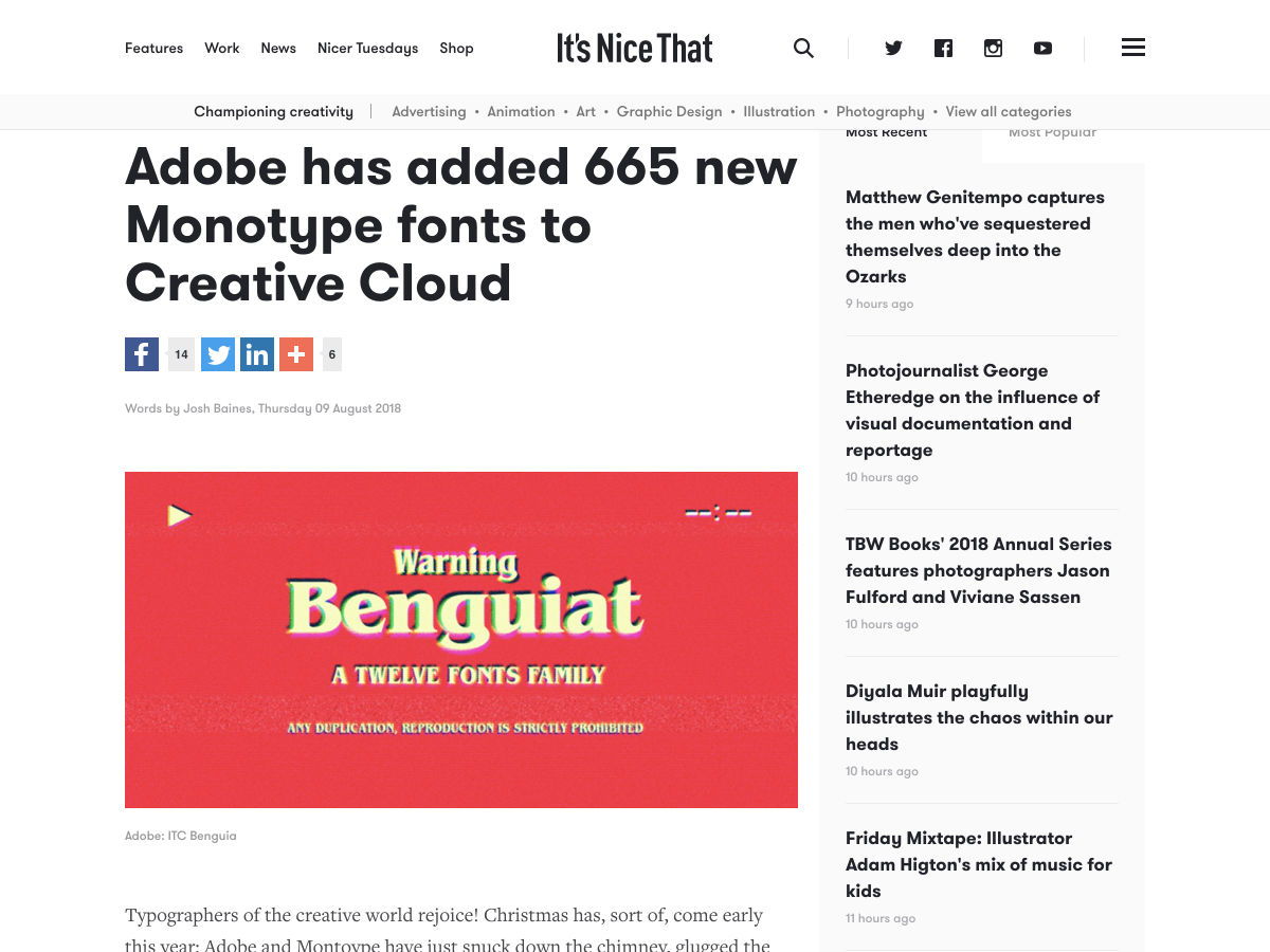
Adobe has Added 665 New Monotype Fonts to Creative Cloud

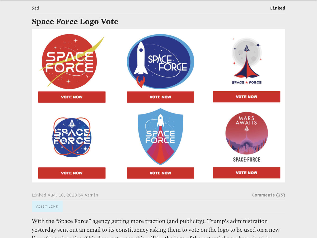
Linked: Space Force Logo Vote

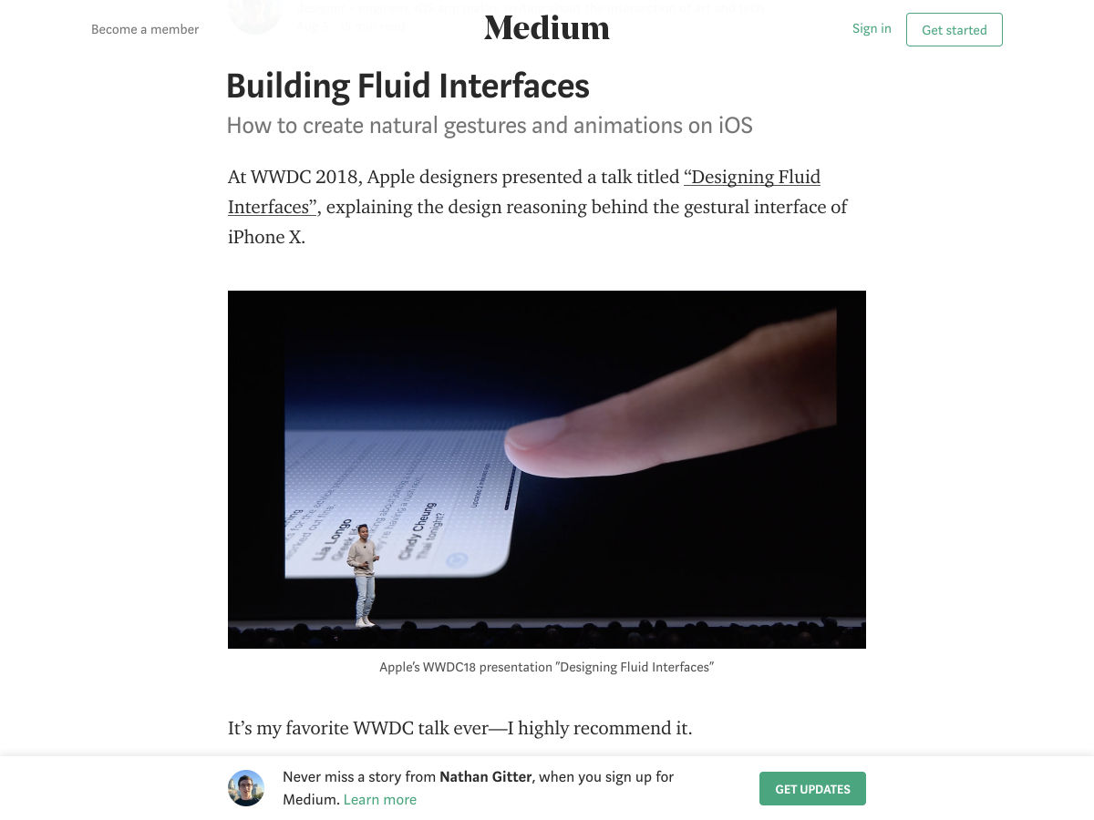
Building Fluid Interfaces

How to Land a Remote Freelance Web Development Job in 21 Days Without a Fleshed Out Portfolio

Want more? No problem! Keep track of top design news from around the web with Webdesigner News.

Add Realistic Chalk and Sketch Lettering Effects with Sketch’it – only $5!

Source

Categories: Designing, Others Tags:

40 Funny Jokes Only Designers Will Understand

August 10th, 2018 No comments
funny jokes

Sit down, grab a coffee, and enjoy these 40 Funny Jokes Only Designers Will Understand! Psss, I’m sure other people from this office would like to hear/read them!

Have you ever had one of those days when the weather is gloomy, deadlines are tight, and clients are frustrating? We are all human, whether your job is, and we all need to relax and laugh heartily from time to time. Studies have shown that over half of the American employees do not find their jobs satisfying, many actually despise every minute spent at work. Pretty sad, isn’t it? Some people change their jobs, other go through a career reorientation, but the vast majority prefer to not “risk” it and they continue to work in the same toxic place.

Now, weather you are in the last category or not, you need to make your job fun and enjoyable. How do you do that? That’s something you have to find out; we can’t make a list of recreational activities for each and every job on this planet. Buy one thing we know for sure is that today we are helping out our fellow designers.

As the saying goes, the day without laughter is a wasted day. In this collection, we have handpicked hilarious funny jokes from all over the world wide web which only a designer will understand. So, let’s lighten up your mood. Scroll down and enjoy.

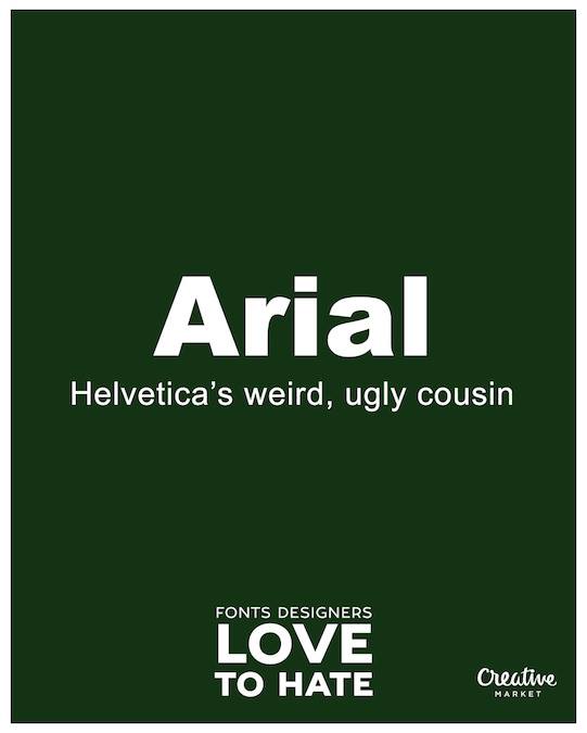
Arial

arial

Stay CMYK

fun-stay-cmyk

Fonts

funny-fonts

Arial

arial-attack

Things Not to Say

things-not-to-say

Black and White

black-and-white

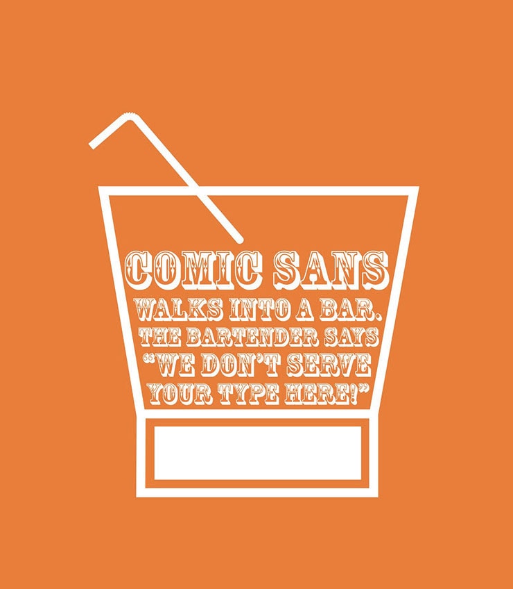
Comic Sans

comic-sans

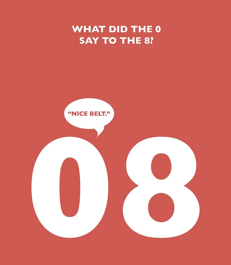
What did 8 said to 0

say-to-zero

Budget

budget-designer

Keep Calm

keep-calm-and-force-quit

Oh, Crop!

oh-crop

Clients Comments

sharp-suits-worst-client-comment-posters-2

Travel

sharp-suits-worst-client-comment-posters-6

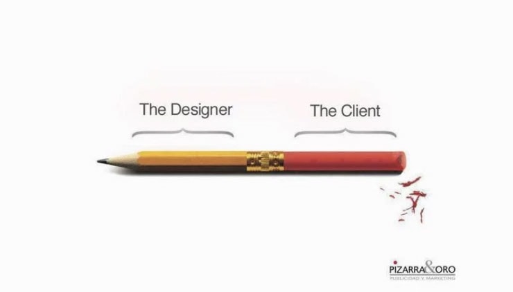
Designer vs Client

designer-vs-cliemt

Graphic Design 101

design-101

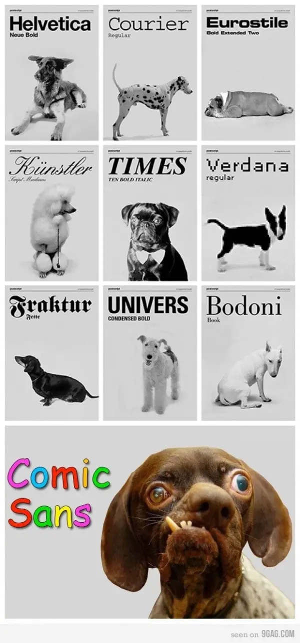
Font Guide

font-dogs

Logo

word-doc

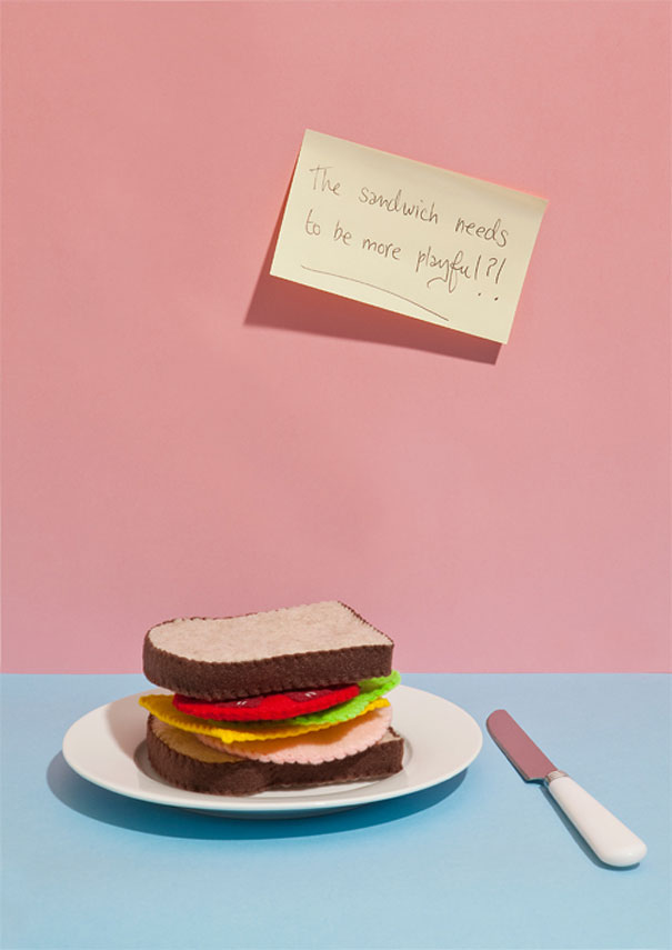
Playful

sharp-suits-worst-client-comment-posters-9

Layers

DesignerProblems4-copy

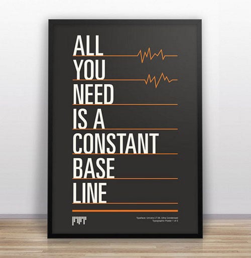
All You Need

designer-jokes-design-humor-11

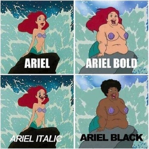
Arial

the-little-mermaide

Font of You

font-of-you-713x1024

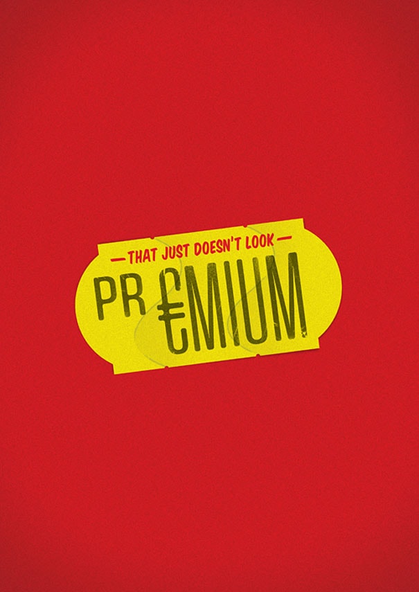
Premium

sharp-suits-worst-client-comment-posters-13

My Coffee Type

coffee-type

Helvetica

what-the-helvetica

Type of Fun

sharp-suits-worst-client-comment-posters-15

Colorful

sharp-suits-worst-client-comment-posters-16

Safe Design

safe-design

Charge per Hour

Office_Poster-charge-hour

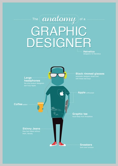
Designer

fun-poster

Target Audience

sharp-suits-worst-client-comment-posters-7

I Know What I Want

I-know-what-i-want

Cheaper

cheaper

Bold

bold-font

New Roman

get-with-the-times-new-roman

Burning Calories

burning-calories

Target Audience

target-audience

Off Brand

off-btrand

Office Talk

Dont-speak-Klingon

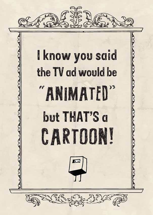
Animated Ad

animated-ad

If this blog post made helped your day at work pass quicker, do a good deed by sharing with other fellow designers who could use a good laugh. Have you ever tried to make up design related jokes? What’s the funniest you’ve ever hears? Share it with us in the comment section below and we will mention you in a future post!

Read More at 40 Funny Jokes Only Designers Will Understand

Categories: Designing, Others Tags:

The Cost of JavaScript in 2018

August 10th, 2018 No comments

Even though we mentioned it earlier, I thought this outstanding post by Addy Osmani all about the performance concerns of JavaScript was still worth digging into a little more.

In that post, Addy touches on all aspects of perf work and how we can fix some of the most egregious issues, from setting up a budget to “Time-to-Interactive” measurements and auditing your JavaScript bundles.

Embrace performance budgets and learn to live within them. For mobile, aim for a JS budget of

Super specific and super practical!

Surprisingly, Addy mentions that “the median webpage today currently ships about 350KB of minified and compressed JavaScript,” which seems like an awful lot lower than I’d expected, if I’m being honest. The stat that scares me most is that the median webpage takes around fifteen whole seconds until it’s interactive. And pulling all that JS into a Web Worker or caching with Service Workers won’t even make up that time to interaction. Yikes.

Another key point: not all bytes are equal. For example, 200KB of JavaScript is not equal to a 200KB JPG image file:

A JPEG image needs to be decoded, rasterized, and painted on the screen. A JavaScript bundle needs to be downloaded and then parsed, compiled, executed —and there are a number of other steps that an engine needs to complete. Just be aware that these costs are not quite equivalent.

Direct Link to ArticlePermalink

The post The Cost of JavaScript in 2018 appeared first on CSS-Tricks.

Categories: Designing, Others Tags:

Switch font color for different backgrounds with CSS

August 10th, 2018 No comments

Ever get one of those, “I can do that with CSS!” moments while watching someone flex their JavaScript muscles? That’s exactly the feeling I got while watching Dag-Inge Aas & Ida Aalen talk at CSSconf EU 2018.

They are based in Norway, where WCAG accessibility is not a just good practice, but actually required by law (go, Norway!). As they were developing a feature that allows user-selectable color theming for their main product, they faced a challenge: automatically adjusting the font color based on the selected background color of the container. If the background is dark, then it would be ideal to have a white text to keep it WCAG contrast compliant. But what happens if a light background color is selected instead? The text is both illegible and fails accessibility.

They used an elegant approach and solved the issue using the “color” npm package, adding conditional borders and automatic secondary color generation while they were at it.

But that’s a JavaScript solution. Here’s my pure CSS alternative.

The challenge

Here is the criteria I set out to accomplish:

  • Change the font color to either black or white depending on the background color
  • Apply the same sort of logic to borders, using a darker variation of the base color of the background to improve button visibility, only if background is really light
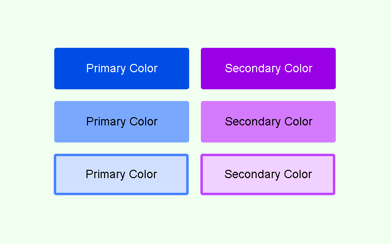
  • Automatically generate a secondary, 60º hue-rotated color

Working with HSL colors and CSS variables

The easiest approach I could think for this implies running HSL colors. Setting the background declarations as HSL where each parameter is a CSS custom property allows for a really simple way to determine lightness and use it as a base for our conditional statements.

:root {
  --hue: 220;
  --sat: 100;
  --light: 81;
}

.btn {
  background: hsl(var(--hue), calc(var(--sat) * 1%), calc(var(--light) * 1%));
}

This should allow us to swap the background to any color we’d like at runtime by changing the variables and running an if/else statement to change the foreground color.

Except… we don’t have if/else statements on CSS… or do we?

Introducing CSS conditional statements

Since the introduction of CSS variables, we also got conditional statements to go with them. Or sort of.

This trick is based on the fact that some CSS parameters get capped to a min and max value. For instance, think opacity. The valid range is 0 to 1, so we normally keep it there. But we can also declare an opacity of 2, 3, or 1000, and it will be capped to 1 and interpreted as such. In a similar fashion, we can even declare a negative opacity value, and get it capped to 0.

.something {
  opacity: -2; /* resolves to 0, transparent */
  opacity: -1; /* resolves to 0, transparent */
  opacity: 2; /*resolves to 1, fully opaque */
  opacity: 100; /* resolves to 1, fully opaque */
}

Applying the trick to our font color declaration

The lightness parameter of an HSL color declaration behaves in a similar way, capping any negative value to 0 (which results in black, whatever the hue and saturation happens to be) and anything above 100% is capped to 100% (which is always white).

So, we can declare the color as HSL, subtract the desired threshold from the lightness parameter, then multiply by 100% to force it to overshoot one of the limits (either sub-zero or higher than 100%). Since we need negative results to resolve in white and positive results to resolve in black, we also have to invert it multiplying the result by -1.

:root {
  --light: 80;
  /* the threshold at which colors are considered "light." Range: integers from 0 to 100,
recommended 50 - 70 */
  --threshold: 60;
}

.btn {
  /* Any lightness value below the threshold will result in white, any above will result in black */
  --switch: calc((var(--light) - var(--threshold)) * -100%);
  color: hsl(0, 0%, var(--switch));
}

Let’s review that bit of code: starting from a lightness of 80 and considering a 60 threshold, the subtraction results in 20, which multiplied by -100%, results in -2000% capped to 0%. Our background is lighter than the threshold, so we consider it light and apply black text.

If we had set the --light variable as 20, the subtraction would have resulted in -40, which multiplied by -100% would turn 4000%, capped to 100%. Our light variable is lower than the threshold, therefore we consider it a “dark” background and apply white text to keep a high contrast.

Generating a conditional border

When the background of an element becomes too light, it can get easily lost against a white background. We might have a button and not even notice it. To provide a better UI on really light colors, we can set a border based on the very same background color, only darker.

A light background with a dark border based on that background color.

To achieve that, we can use the same technique, but apply it to the alpha channel of a HSLA declaration. That way, we can adjust the color as needed, then have either fully transparent or fully opaque.

:root {
  /* (...) */
  --light: 85;
  --border-threshold: 80;
}

.btn {
  /* sets the border-color as a 30% darker shade of the same color*/
  --border-light: calc(var(--light) * 0.7%);
  --border-alpha: calc((var(--light) - var(--border-threshold)) * 10);
  
  border: .1em solid hsla(var(--hue), calc(var(--sat) * 1%), var(--border-light), var(--border-alpha));
}

Assuming a hue of 0 and saturation at 100%, the above code will provide a fully opaque, pure red border at 70% the original lightness if the background lightness is higher than 80, or a fully transparent border (and therefore, no border at all) if it’s darker.

Setting the secondary, 60º hue-rotated color

Probably the simplest of the challenges. There are two possible approaches for it:

  1. filter: hue-rotate(60): This is the first that comes to mind, but it’s not the best solution, as it would affect the color of the child elements. If necessary, it can be reversed with an opposite rotation.
  2. HSL hue + 60: The other option is getting our hue variable and adding 60 to it. Since the hue parameter doesn’t have that capping behavior at 360 but instead wraps around (as any CSS type does), it should work without any issues. Think 400deg=40deg, 480deg=120deg, etc.

Considering this, we can add a modifier class for our secondary-colored elements that adds 60 to the hue value. Since self-modifying variables are not available in CSS (i.e. there’s no such thing as --hue: calc(var(--hue) + 60) ), we can add a new auxiliary variable for our hue manipulation to our base style and use it in the background and border declaration.
.btn {
  /* (...) */
  --h: var(--hue);
  background: hsl(var(--h), calc(var(--sat) * 1%), calc(var(--light) * 1%));
  border:.1em solid hsla(var(--h), calc(var(--sat) * 1%), var(--border-light), var(--border-alpha));
}

Then re-declare its value in our modifier:

.btn--secondary {
  --h: calc(var(--hue) + 60);
}

Best thing about this approach is that it’ll automatically adapt all our calculations to the new hue and apply them to the properties, because of CSS custom properties scoping.

And there we are. Putting it all together, here’s my pure CSS solution to all three challenges. This should work like a charm and save us from including an external JavaScript library.

See the Pen CSS Automatic switch font color depending on element background…. FAIL by Facundo Corradini (@facundocorradini) on CodePen.

Except it doesn’t. Some hues get really problematic (particularly yellows and cyans), as they are displayed way brighter than others (e.g. reds and blues) despite having the same lightness value. In consequence, some colors are treated as dark and given white text despite being extremely bright.

What in the name of CSS is going on?

Introducing perceived lightness

I’m sure many of you might have noticed it way ahead, but for the rest of us, turns out the lightness we perceive is not the same as the HSL lightness. Luckily, we have some methods to weigh in the hue lightness and adapt our code so it responds to hue as well.

To do that, we need to take into consideration the perceived lightness of the three primary colors by giving each a coefficient corresponding to how light or dark the human eye perceives it. This is normally referred to as luma.

There are several methods to achieve this. Some are better than others in specific cases, but not one is 100% perfect. So, I selected the two most popular, which are good enough:

  • sRGB Luma (ITU Rec. 709): L = (red * 0.2126 + green * 0.7152 + blue * 0.0722) / 255
  • W3C method (working draft): L = (red * 0.299 + green * 0.587 + blue * 0.114) / 255

Implementing luma-corrected calculations

The first obvious implication from going with a luma-corrected approach is that we cannot use HSL, since CSS doesn’t have native methods to access the RGB values of an HSL declaration.

So, we need to switch to an RBG declaration for the backgrounds, calculate the luma from whatever method we choose, and use it on our foreground color declaration, which can (and will) still be HSL.

:root {
  /* theme color variables to use in RGB declarations */
  --red: 200;
  --green: 60;
  --blue: 255;
  /* the threshold at which colors are considered "light". 
  Range: decimals from 0 to 1, recommended 0.5 - 0.6 */
  --threshold: 0.5;
  /* the threshold at which a darker border will be applied.
  Range: decimals from 0 to 1, recommended 0.8+ */
  --border-threshold: 0.8;
}

.btn {
  /* sets the background for the base class */
  background: rgb(var(--red), var(--green), var(--blue));

  /* calculates perceived lightness using the sRGB Luma method 
  Luma = (red * 0.2126 + green * 0.7152 + blue * 0.0722) / 255 */
  --r: calc(var(--red) * 0.2126);
  --g: calc(var(--green) * 0.7152);
  --b: calc(var(--blue) * 0.0722);
  --sum: calc(var(--r) + var(--g) + var(--b));
  --perceived-lightness: calc(var(--sum) / 255);
  
  /* shows either white or black color depending on perceived darkness */
  color: hsl(0, 0%, calc((var(--perceived-lightness) - var(--threshold)) * -10000000%)); 
}

For the conditional borders, we need to turn the declaration into a RGBA, and once again, use the alpha channel to make it either fully transparent or fully opaque. Pretty much the same thing as before, only running RGBA instead of HSLA. The darker shade is obtained by halving each color channel.

.btn {
  /* (...) */
  /* applies a darker border if the lightness is higher than the border threshold */ 
  --border-alpha: calc((var(--perceived-lightness) - var(--border-threshold)) * 100);
  border: .2em solid rgba(calc(var(--red) * 0.5), calc(var(--green) * 0.5), calc(var(--blue) * 0.5), var(--border-alpha));
}

Since we lost our initial HSL background declaration, our secondary theme color needs to be obtained via hue rotation:

.btn--secondary {
  filter: hue-rotate(60deg);
}

This is not the best thing in the world. Besides applying the hue rotation to potential child elements as previously discussed, it means the switch to black/white and border visibility on the secondary element will depend on the main element’s hue and not on its own. But as far as I can see, the JavaScript implementation has the same issue, so I’ll call it close enough.

And there we have it, this time for good.

See the Pen CSS Automatic WCAG contrast font-color depending on element background by Facundo Corradini (@facundocorradini) on CodePen.

A pure CSS solution that achieves the same effect as the original JavaScript approach, but significantly cuts on the footprint.

Browser support

IE is excluded due to the use of CSS variables. Edge doesn’t have that capping behavior we used throughout. It sees the declaration, deems it nonsense, and discards it altogether as it would any broken/unknown rule. Every other major browser should work.

The post Switch font color for different backgrounds with CSS appeared first on CSS-Tricks.

Categories: Designing, Others Tags:

(Deliberate) practice makes perfect: how to become an expert in anything

August 10th, 2018 No comments

The human race is out-doing itself.

We’re faster, smarter, stronger, more emotionally-intelligent and artistically-gifted than ever before.

Take a look at any profession in the world today.

From music to maths to track running, the previously-impossible is being achieved every day.

Where does this continuous, steep upswing in the standards of excellence come from?

No, there hasn’t been a surge of extraordinarily talented people being born.

Categories: Others Tags:

5 Ways to Deal With Projects for Friends & Family

August 10th, 2018 No comments

It always starts as an innocent conversation. Whether it’s an email, an SMS conversation, or face-to-face, it starts simply enough: “Hey, how are you doing? How are the cats? Did you see the new Netflix show that we all insist must be watched?” You know, normal stuff.

But then comes the non sequitur. Many of your old friends and family don’t know enough about technology to ease into the topic. It just comes out of the blue.

“So I hear you know how to do websites and stuff…(?)”

And that’s it. The silence lingers in the air. Flashbacks of people who never talked to you until their laptops broke down assail your tranquility. The storm rages within. You plaster on your best friendly smile; and ask the one question that usually makes them back down: “Sure! What’s your budget?”

I gave birth to you! That’s my budget

At this point, they might say, “Not much. What’s the going rate for a friend?” or, “It’s just a quick website!”, or, “I gave birth to you! That’s my budget.”

It’s frustrating. Doing business with family or friends is a risky proposition at the best of times. If anything goes wrong, it could seriously strain your relationship. You also might end up doing a lot of work for nothing.

How then, do you handle it?

1. Don’t

It would be wrong of me not to mention this option. Mind you, it’s your family. You know them better than I do, so you have to figure this out for yourself. It should be noted, however, that this is by far your safest option.

It might be worth explaining in general terms that you can’t take on their project right now (you’re swamped with work, you’re in the middle of moving offices, you’re thinking of taking holy orders) and recommending another designer or developer. Recommend someone you know is good, and who works at a price range that is comfortably within their budget—it can still reflect badly on you if your recommendation doesn’t work out for them.

2. Set Clear Goals and Limits for the Project

So you’ve decided to actually take on the project. You poor foo…I mean…good for you! We’ve all done it. They’re our friends and family, after all. Don’t they deserve some consideration? What’s wrong with doing them a favor? Those are all good points. For your own sanity, however, it is important to make sure they know, in some detail, how much you’re actually willing to do for them.

This is actually one of the few reasons I might offer to build them a site for free (more on pricing later). In this case, I clearly state that I’m more than happy to build them a site for free; but it’s going to be on my terms. I will build a site that meets their needs; but I get total creative control. And it’s probably going to be pretty simple.

If you do take money, I would clearly state that they will be treated like any other client. They need to understand that every project has limits, and a point where it ends.

3. Set Clear Personal Boundaries

This isn’t the same as just not taking work calls at dinner. These are family and friends. You might see them for drinks later that day. You might see them at dinner, or at the park with their kids. Simply put, there are far more opportunities for them to bring up work when it’s not time to work. Some people are considerate, and will understand the need for time off intuitively; others will not.

Some people…will understand the need for time off intuitively; others will not

The only way this gets fixed is with communication. You’ll need to clearly state when you are willing to talk about work, and when you are not. And if, like me, you’re kind of obsessive once you start a project, you’ll need to be firm with yourself. If you break your own rules, they will too.

4. Clearly Discuss Payment

In some cultures, it’s customary to say things like, “Ah, we’ll work it out later. Don’t worry about that, yet.” This tendency is even more prevalent when dealing with friends, where discussing money up front might seem like a sign of distrust.

Well, I’m telling you to worry about it now. Discuss payment up front like you would with any regular client. Even if you do trust them implicitly, treating their project like any other at the beginning will set the tone for the rest of your time working with them. In theory, it’ll help them take it as seriously as you do.

Lastly: Either don’t take money, or don’t take less than full price. If you’re going to do it for free, I’d say that you shouldn’t accept anything less than full control of the project, as stated before. If you’re going to take money, I think you should ask for the full price. They will be expecting full-price work, even if you gave them the “friend discount”, so don’t short-change yourself.

5. Go All Out

Go nuts! Give it your best effort, within the limits on the project that have been previously established. It’s one thing if you screw up a project for a client with whom you have no personal relationship. It’s unfortunate, but you can recover from that. You might even be able to fix it.

Screwing up a project for someone you interact with more regularly will have far-reaching consequences in your personal life. Chances are, they talk to other people you know. I could go on; but that’s really scary enough.

Whether you’re working for free or for money, do your best to make this some of your finest work. Your relationships will thank you for it.

Add Realistic Chalk and Sketch Lettering Effects with Sketch’it – only $5!

Source

Categories: Designing, Others Tags:

30 Clean and Minimalist Website Designs for Inspiration

August 9th, 2018 No comments
minimalist website designs

Thousands and thousands of new websites get launched every year, hoping to capture the interest and attention of a many readers. The content, of course, is crucial, but so is the canvas people choose to publish their work on. People seem to adopt a more basic and fewer color themes, creating Clean and Minimalist Website Designs. Would you like to see some of them? Check them out below!

A popular statement says “The less is more” and it’s true. Our collection of clean minimalist website designs proves it. Minimalist websites became quite famous over the years. There are a lot of advantages of clean, simpler websites, such as speed of loading and focus on the most important things. They are also super stylish!

The minimalist design makes the content, the product you sell, or your artwork the star of the website. Besides, they give a professional impression to the audience. A minimalist website design fits almost any type of business, especially the technology oriented ones, desingers’ blogs, fashion publications, and many others.

Sometimes it may be quite challenging to save the balance between a minimalist design and the client’s requirements. The websites collected below are great examples worth to follow and get inspired from.

1. Why we Explore

2. Steve

steve

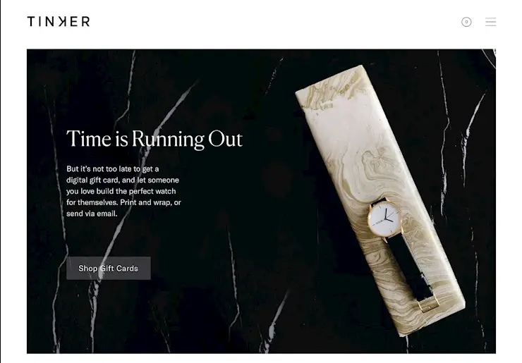
3. Tinker

tinker

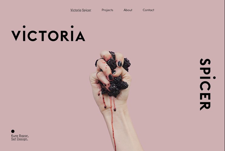
4. Spicer

spicer

5. Pauwels

pauwels

6. Etq.-amstedam

etq-amsterdam

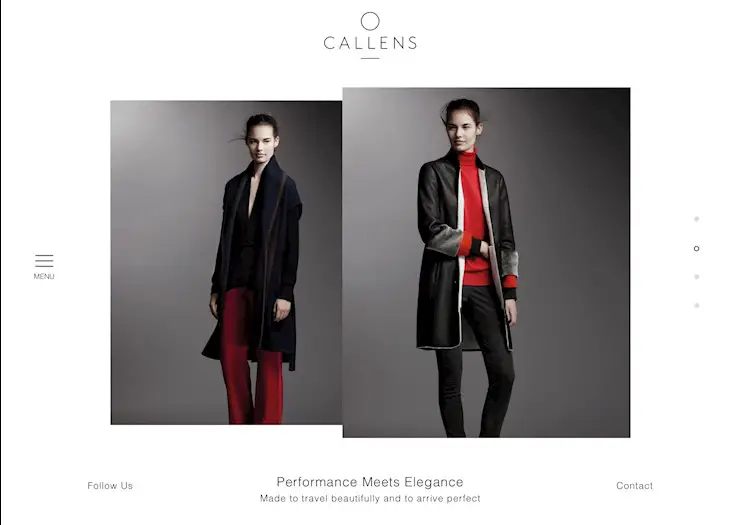
7. Callens

callens-clo

8. Tina Gauff

tina-gauff

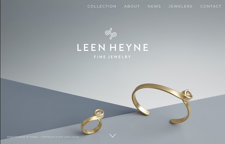
9. Leen Heyne

leen-heyne

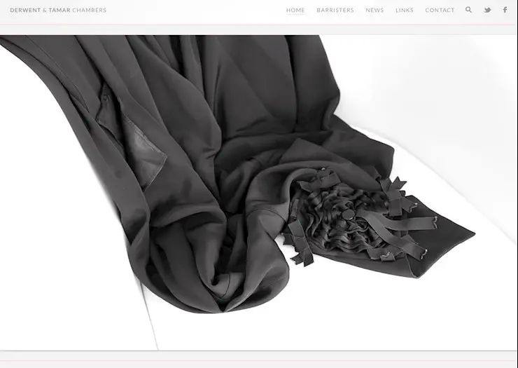
10. Derwent and Tamar chambers

derwent-and-tamar-chambers

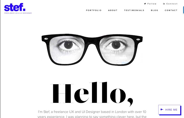
11. Stef

stef

12. Panini Bay

panini-bay

13. Carlo Barberis

carlo-barberis

14. Dennis Adelmann

dennis-adelmann

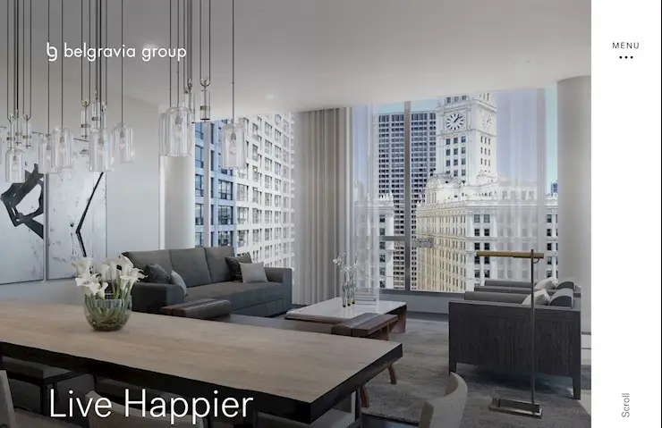
15. Belgravia group

belgravia-group

16. Supima

supima

17. Mikiya Kobayashi

mikiya-kobayashi

18. Charbono

charbono

19. Elite

elite

20. Sliders

sliders

21. Sendamessage

sendamessage

22. Richard

richard

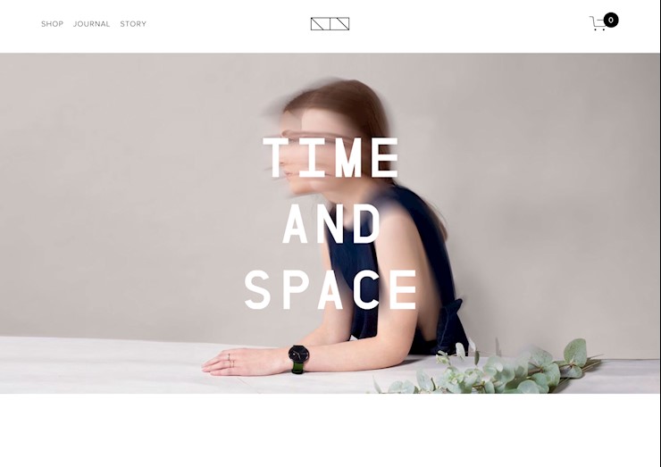
23. Time and space

time-and-space-ntn

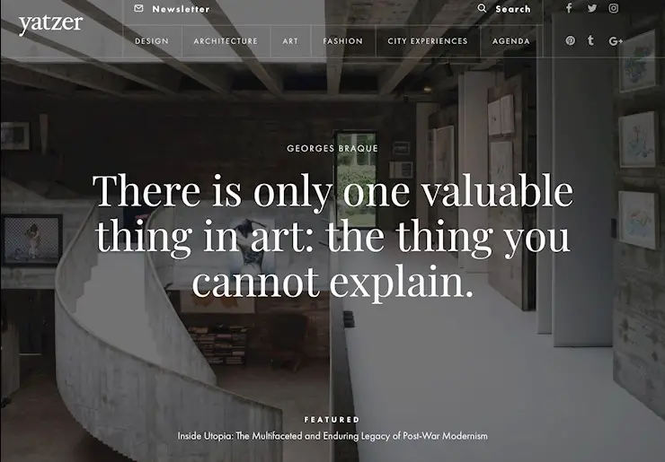
24. Yatzer

yatzer

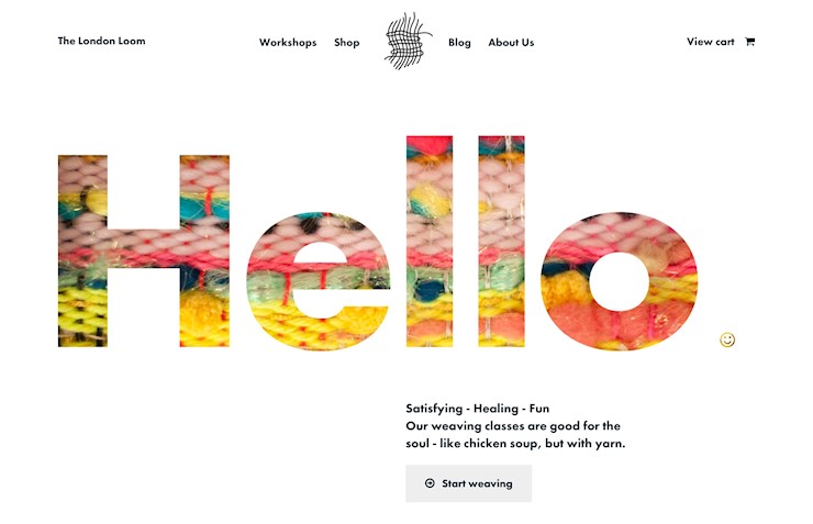
25. The London Loom

the-london-loom

26. Maaemo

maaemo

27. Matt Quinn

matt-quinn

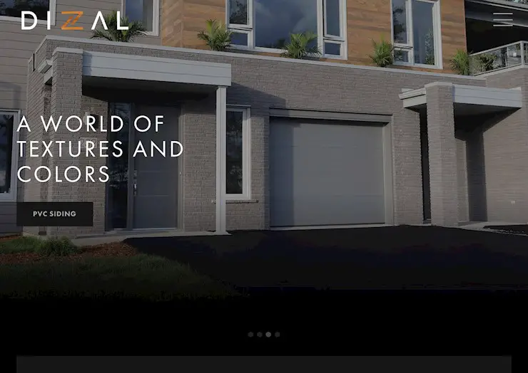
28. Dizal

dizal

29. Essential

essential

30. Shantell Martin

shantell-martin

You’ve succesfully made it to the end of the article! Yay! We truly hope that you have found it inspiring and the minimalist website design you are working at the moment won’t give you headaches anymore. We would appreciate if you shared this article with other minimalism lovers!

Read More at 30 Clean and Minimalist Website Designs for Inspiration

Categories: Designing, Others Tags:

Five interesting ways to use Sanity.io for image art direction

August 9th, 2018 No comments

When we saw Chris put up a list of cloud-hosted data-stores, we couldn’t resist letting him know that we also had one of those, only ours is a fully featured CMS that come with a rich query language and an open source, real time, collaborative authoring tool that you can tailor to your specific needs using React. It’s called Sanity.io.

“Add us to your list!” we asked Chris. “No, your stuff is interesting, can’t you write about you,” he replied. “Maybe something that would be useful for people working with images.” Challenge accepted!

Systems like Sanity wants to free your content from the specific page it happens to be sitting on, so that you can flow it through APIs. That way you can reuse your painstakingly crafted content anywhere you need it.

So, what does this mean for images?

Images are the odd ones out. We can capture documentation articles, pricing plans or project portfolios as potentially complex, but ultimately graspable data-structures that machines can query and process in many useful ways. But images? They’re really just bags of pixels sitting at the end of a CDN, aren’t they?

We came up with some ideas anyway because everyone needs images and images should be just as willing to travel to new and exciting places and services as the rest of your structured stuff.

So, here we are with a medium-sized bag of image tricks you can pull off with Sanity.

1. Grab the palette from image metadata

Ever tried to overlay text over a random image submitted by a user? How did that work out? We’ve usually ended submitting our images to filters till they’re predictable and skulked home with a moody expression.

We thought it would be nice to ship an image palette with your pictures so you can select between dark and light typography as well as pair visual elements with image color. This makes legibility so much better and prevents clashes between the colors of images and text.

See the Pen Access image colors as metadata in Sanity by Knut Melvær (@kmelve) on CodePen.

2. Get low-quality image placeholders

However fast and nearby your CDN is, it still takes time to transmit large image files. So, we included a Low-Quality Image Placeholder (LQIP) with your image metadata. It’s a base64 encoded string of your photo at 20px width. Getting LQIP in the first request lets you bake a proxy image right into the HTML.

<figure
  style={{
    backgroundImage: `url(${mainImage.metadata.lqip})`,
    paddingTop: `calc(100% / ${mainImage.metadata.dimensions.aspectRatio})`
   }}
>
  <img src={`${mainImage.url}`} />
</figure>

A challenge with image placeholders is being able to predict the dimensions of the image in a fluid layout. In this example, we used the aspect ratio that also comes in the metadata object to calculate the padding-top trick. That means that you don’t have to calculate the aspect ratio yourself, and e.g. output it as a custom property combined with CSS variables.

See the Pen Get Low Quality Image Placeholders out of the box by Knut Melvær (@kmelve) on CodePen.

3. Use on-demand image transforms

You should be able to store archival originals and get the image in whatever resolution and format you need. Go ahead, upload your 268 megapixel TIFF, and ask for a 128×128 cropped JPEG with a 50% blur.

The transforms are generated from URL-parameters and generated on the first request. We cache the result locally and on a CDN so many requests for the same result image will be super snappy.

Take this image of the Carina Nebula. We uploaded a 29.566 x 12.960 version of it. Let’s say we wanted a PNG version with a 500px width. Attach ?w=500&fm=png to the image URL, and there it is:

Source File

Not only is it hard to hear screaming in space, it’s also hard to judge directions. But let’s say you need to rotate the image. Well, you can append &or=90 and it’s tilted 90 degrees (and scale it down to 128px):

Source File

Not to ruffle any feathers at NASA, but if you want to simulate spherical aberration on your new 1.5bn USD telescope, you can do that by adding ?blur=30 to the image-url!

Source File

The image pipeline is good for your SVGs as well. Say you need to offer a JPG Open Graph (og:image) to Facebook or you have an urgent need to add this SVG of a forklift as a Slack emoji:

Source File

Get the 128×128 PNG version you need, by appending the URL parameters w=128&h=128&fm=png just like this.

You also have control of background color, with bg= Let’s say we, for some reason, wanted this forklift on a lovely purple background.

And, finally, if you want to link to this image and trigger a download for the user, you can append dl= to make it happen.

Download the Image

It’s not always as fun as this to mess around with URL parameters, so we made a JavaScript library that makes it a bit easier. Install it with npm install --save @sanity/image-url and learn how to use it (we use it in the demos throughout this post).

4. Crop and scale to fit around a focus point

Those pesky images with their fixed aspect ratios. In addition to not knowing the pixel density of the output device, you often don’t even know what crop would be best suited for the layout. Even on a single website, you’ll often use the same image in different layouts, and often need to serve them up to third parties, like Facebook, that expects specific aspect ratios.

Custom crop and hotspot in Sanity Studio

To ease the pain of dealing with this, we’ve let content editors set hotspots and crops for images. We have also made a JavaScript package that does all the hard work of making the correct image transform URLs for you. Simply pass an image asset and the size you want and we’ll figure out the crop and scale.

See the Pen Custom crop and hotspots by Knut Melvær (@kmelve) on CodePen.

5. Make a real-time photomap

If this isn’t turning it up to 11, it’s at least a good 10.5.

We can extract EXIF and geo-location data from an image. EXIF-data contains information about the camera state when the photo was taken (e.g. exposure, aperture, lens, if the flash went off etc). Due to privacy concerns (we take GDPR-compliance super seriously) we have turned the feature off by default, but if you set [options: { metadata: ['exif', 'location' ] } in your schema options, they will be included.

We have made a tiny demo that lets you upload an image and, if it has location data (e.g. typically those you take with your phone), it will automatically pop up in the map — because the API is real-time with listeners!

See the Pen Shared Realtime Photo Map by Knut Melvær (@kmelve) on CodePen.


If you want to test out Sanity and these features yourself, you can get started with writing npm i -g @sanity/cli && sanity init. Even though the CLI guides you through the installation process, it’s worth checking out the documentation (if not for the illustrations alone) and there are always people that want to help out with the nitty gritty in our Slack group.

The post Five interesting ways to use Sanity.io for image art direction appeared first on CSS-Tricks.

Categories: Designing, Others Tags: