Nested Links
The other day I posted an image, quite literally as a thought exercise, about how you might accomplish “nested” links. That is, a big container that is linked to one URL that contains a smaller container or text link inside of it that goes to another URL. That’s harder than it might seem at first glance. The main reason being that…
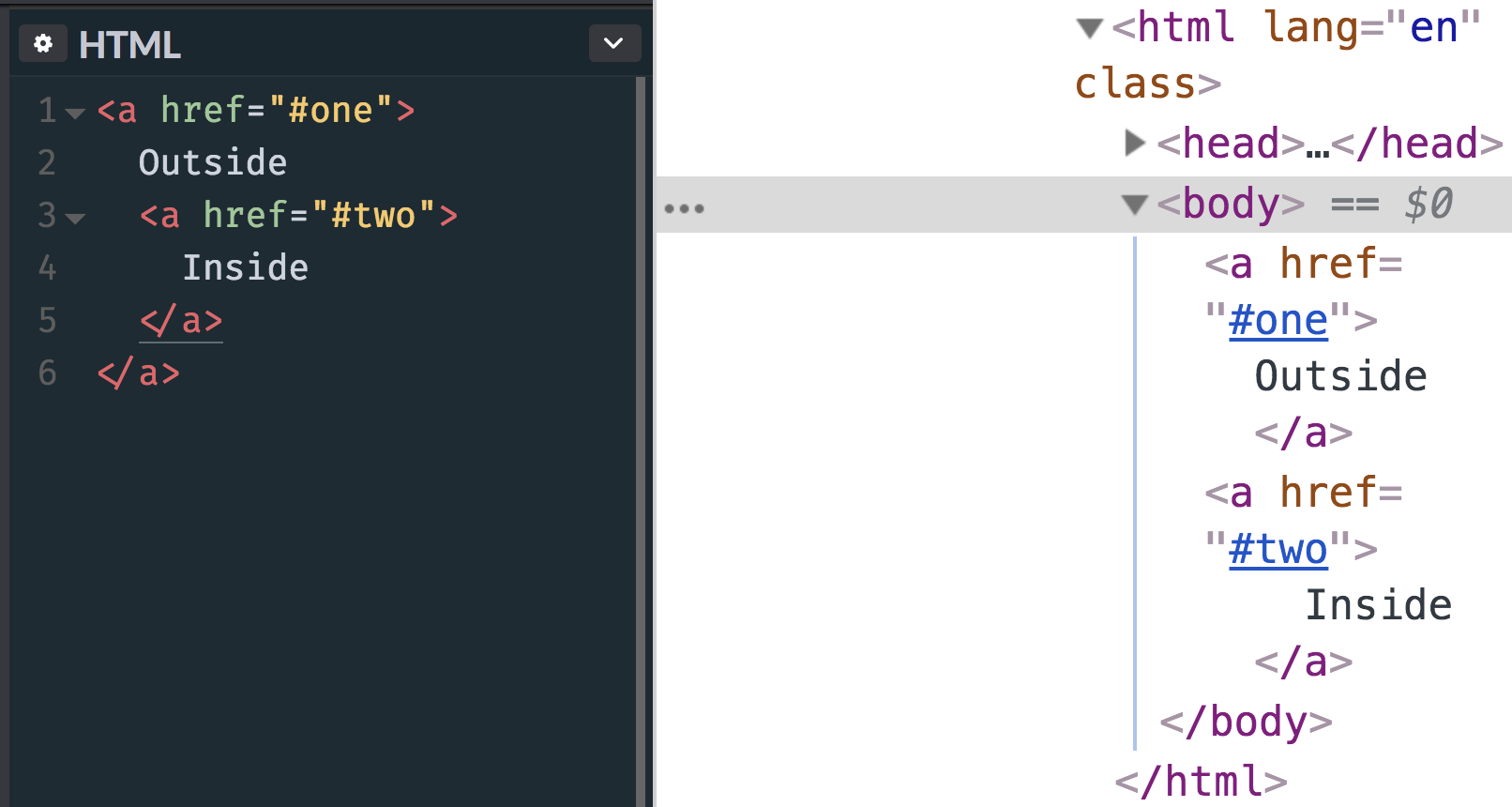
<!-- this is invalid and won't render as expected -->
<a href="#one">
  Outside
  <a href="#two">
    Inside
  </a>
</a>
Eric Meyer once called for more flexible linking, but even that doesn’t quite handle a situation where one link is nested inside another.
Here’s what happens with that HTML, by the way:

My first inclination would be to simply not nest the links in the markup, but make them appear nested visually. Some folks replied to the tweet, including Nathan Smith, who shared that same thought: have a relatively positioned parent element and absolutely position both links. The larger one could fill up the whole area and the smaller one could sit on top of it.
See the Pen “Nested” links by Nathan Smith (@nathansmith) on CodePen.
It’s finicky, as you’ll need magic numbers to some degree to handle the spacing and variable content.
My second inclination would be to deal with it in JavaScript.
<div
  onclick="window.location='https://codepen.io'"
  style="cursor: pointer;"
  tab-index="1"
>
  Outside
  <a href="https://css-tricks.com">
    Inside
  </a>
</div>
I have literally no idea how kosher that is from an accessibility perspective. It looks gross to me so I’m just going to assume it’s bad news.
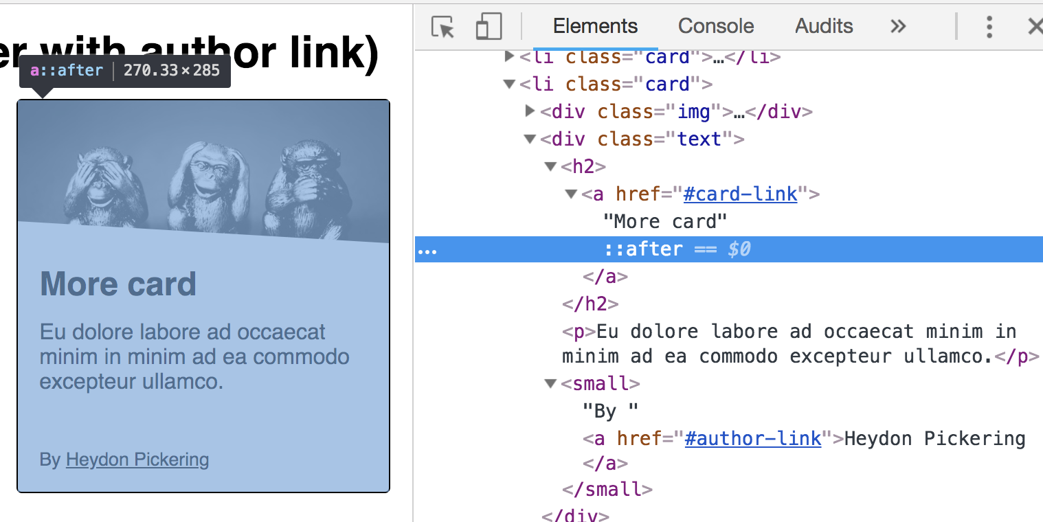
Speaking of accessibility, Heydon Pickering has a whole article about card components which is a popular design pattern where this situation often comes up. His solution is to have a relatively positioned parent element, then a normally-placed and functional main link. That first link has an absolutely positioned pseudo-element on it covering the entire card. Any sub-links are relatively positioned and come after the initial link, so they’d sit on top of the first link by way of z-index.

And speaking of stacking pseudos, that’s the approach Sean Curtis uses here:
See the Pen Pretend nested links by Sean Curtis (@seancurtis) on CodePen.
Other solutions in the “crafty” territory might be:
- Using a
actionattribute acts as a link. - Using an
element to wrap the inner link.
Sara Soueidan responded with her own post!
I had the same requirement a couple of years ago when I was building the front-end foundation for Smashing Magazine. So I thought I’d write my response to Chris’s thread out in the form of a blog post.
Sara has written about this with much more detail and care than I have here, so definitely check that out. It looks like both she and Heydon have landed on nearly the same solution, with the pseudo-element cover that contains sub-links poking above it as needed.
Have you ever done it another way? Plenty of UX and a11y to think abbout!
The post Nested Links appeared first on CSS-Tricks.