Archive

Archive for September, 2018

Twenty Years as a Freelance Web Developer: Wisdom Gained and Lessons Learned

September 18th, 2018 No comments

In the summer of 1998, when President Clinton fended off allegations of sexual impropriety and Donald Trump filmed a cameo in a Woody Allen movie, I embarked on my career as a freelance web developer. Twenty years and more than 300 websites later, I’m still at it—always working on my own and always from home. Over that time, I’ve had the pleasure of partnering with many prominent advertising agencies and boutique design firms as well as scores of local businesses and individuals.

Those interested in making the switch to freelancing have often asked me for advice, and I’ve been happy to help with whatever words of wisdom I can provide. This article is a distillation of much of that. And it may prove helpful not only to developers and programmers who wish to freelance, but also designers, project managers, copywriters—anyone who desires to work independently from home in our industry. It’s a career path that I have loved, but it’s not for everyone.

My background

None of this was planned. I did have a teenage interest in programming, first learning BASIC on the Timex Sinclair 1000 and then Assembly Language on the Apple II. Despite this, after graduating college, I pursued a career on the business side of magazine publishing. Less than six years later, however, I needed a change, and my path took me to Pratt Institute in New York where I enrolled in a graphic design program. This included electives in HTML and JavaScript that unexpectedly rekindled my desire to program. A teacher then referred me to a recruiter and my new career as a freelance front-end developer was born.

The primary element of successful freelancing

When I’m asked the more existential question of how I’ve survived so long as a freelancer, my response is always the same: above all, be reliable. Don’t get me wrong; it’s important that my delivered websites work as promised—requirements must be met and best practices followed. But I quickly found that my clients were not necessarily looking for perfection in the work itself. In fact, to this day, I often have the odd feeling that no one even looks at my code as long as there aren’t any bugs.

What really matters is delivering on time. Deadlines are sacrosanct. If project managers, who seem perpetually overworked and under pressure, can depend on me to keep to a schedule, that’s one less part of their overall responsibilities to keep them up at night. For that, I’m routinely thanked. My creative use of CSS or efficient JavaScript coding? Rarely is that even acknowledged.

Achieving this kind of reliability ends up being the primary challenge for a freelancer, especially when juggling multiple projects for multiple clients. Then there’s the additional stress of knowing that there’s no one to step in during sickness or emergencies. My go-to sports metaphor is that working as part of a group is like being on a basketball team. Having a poor shooting night? Dish the ball off to one of your teammates to pick up the slack. A freelancer working from home is more like a boxer—you’re alone in the ring with no one else to take credit or assume blame. Throwing in the towel is not an option.

Inevitably, though, there will be issues that can affect a freelancer’s ability to be reliable. Delays occur, scopes change, deadlines shift. That’s when open and honest communication with the client is necessary. In earlier days, I feared that I wouldn’t be hired for future projects if I rocked the boat in any way. In reality, though, I have found quite the opposite to be true. If the best interests of the project and its processes are kept in mind, I believe clients appreciate when red flags are pointed out, as difficult as those conversations may be. Being a successful freelancer is not the same as one who is excessively pliant. One must be proactive in voicing concerns that may affect his or her role on any project.

Be the generalist who specializes

My specialty is front-end development. Clients hire me to take beautiful designs and translate them into code that works in everyone’s browsers. To do this, I’ve had to master HTML, CSS, and JavaScript. Despite having marketable knowledge in related areas, including Flash when it was popular and now WordPress, my core expertise remains unchanged. And it’s this core expertise that gets me work.

This is important because I have found that most projects for which I’m hired as a freelancer, particularly the larger ones, resemble an assembly line—different individuals are tasked to complete one specific part of the process while working alongside others doing the same. Ultimately, everything is assembled into the final product. It’s in these instances when I’m utilizing that one skill that I’m expected to do very well. That I possess much ancillary knowledge is irrelevant.

As I’m sure everyone has noticed, the descriptives “full stack developer” and “full stack designer” have gained prominence of late. In earlier days, we simply referred to these individuals as having a broad skill set in their discipline. Whatever the terminology, having a wide swath of knowledge is certainly a huge plus and can only serve to extend one’s career, but bear in mind that it’s important to have that one defined skill that you do better than most. The freelancer who is the proverbial jack of all trades and master of none is not often seen as enticing to hire.

The myth of diversification

My perception early on was that being a freelancer would provide more financial security than the alternative. Instead of having all my eggs in the one basket of a permanent employer, I expected to spread the risk among a roster of clients. There would always be someone to pick up the slack if any one of them flew the coop.

In practice, though, I have found this to be an unsustainable model as it’s simply not possible to satisfy all requests for your services during peak times—there’s only so much work any of us can handle at once. This results in some clients necessarily forced to look elsewhere to staff their projects. Then, the next time around, you may no longer be at the top of their resource list of freelancers.

This contributes to the inevitable equilibrium where one or two clients emerge to represent well more than half of my business. I’ve seen this dynamic play out again and again, no matter the ups and downs of the economy and demand for my services. The smaller, less-frequent clients are there for when I’m otherwise available but are not my priority. On the bright side, having primary clients who hire me on a regular basis provides a dependable source of income; the negative is that I’m rarely as diversified as I once hoped I would be.

Homebound networking

So how does one obtain work in the first place? After using a recruiter early on, which, for me, was particularly necessary since I lacked any relevant experience, my network expanded as people with whom I had worked inevitably moved on to new employers. These contacts, most often designers and project managers, kept me in their virtual Rolodex as a potential resource, thus growing my network.

My other significant channel for leads has been from the simple act of meeting people in everyday life and sharing with them what I do for a living. These casual conversations —even with those who seemingly had no need for my services—often create serendipitous opportunities that lead to new work. As the saying goes, it’s not the people you know, but the people they know. Don’t be shy—tell the world what you do to help generate word-of-mouth referrals. You are your own greatest advocate.

While LinkedIn serves as a useful conduit for exposure, it’s the freelancer’s own website that provides the best and most-controlled opportunity to show who you are and what you do. But, as someone who has consulted with clients in hiring decisions, I have seen so many of these websites obscure the very information necessary to make such a choice. Avoid the temptation of making the website itself a demonstration of one’s skills. Eschew needless animations or distractions. It’s best to keep key information, such as the portfolio and resume, easy to find and, yes, even to print.

Of course, the more repeat business one can secure, the less need there is to obtain new clients. I believe the personal relationships I have sought to cultivate are what have helped me with this. By meeting with key contacts in person, unspoken bonds are formed that lead to genuine partnerships, transcending traditional employer/contractor interactions. In the age of Skype and Slack, the freelancer working from home can go long stretches without any direct face-to-face communication with those for whom they are working. If logistically possible, one must move past the screen and make an impression in the real world.

Show me the money!

There’s no question that my least favorite part of freelancing is the constant need to submit estimates. In fact, I tend to look at it as a no-win situation. If my estimate is readily accepted, there’s a shallow feeling that I’ve left money on the table; if a client responds in disbelief that I asked for so much, I feel a sense of shame that I’ve greatly overreached. But there’s a misplaced fear that by asking for too much, the client will be offended and walk away. That’s never happened to me. If anything, apologies are offered and negotiations commence.

Always remember, though, that your work has value and deserves to be compensated appropriately at market rates. By significantly underbidding estimates, which is always a temptation when work is slow, it implies to a client that you don’t value your own work. On those rare occasions when I’ve made the mistake of selling myself short, I tend to work on those projects “angry”—not at the client, but at myself for being placed in a situation where I must invest more time for less money.
The invoice has been submitted and paid. Then what? Many prominent financial advisors recommend keeping a three- to six-month reserve fund for emergencies. What I say is that, as a freelancer, you can never save enough. Booms and busts are common in the modern economy and seem to happen with greater frequency. Therefore, save and then save some more. I’ve endured two major economic downturns—the collapse of the dot-com bubble in 2001 and the Great Recession of 2008. Each time, my income essentially dried up for a lengthy duration. Having enough savings set aside enabled me to ride out the storm.

Maintaining a work/life balance

Much has been written lately about the mental health challenges faced by those who work in our industry. Most of us go through various stages of our career when, at times, the stresses of one’s professional and personal experiences can take their toll. I have not been immune to this. As my career progressed, the care-free mindset of youth was gradually supplanted by concerns of where my life was headed. Self-confidence became self-doubt. I don’t see this necessarily as a manifestation unique to our industry, but simply the result of being a human being in modern society.

Working from home as a freelancer can make matters worse. In the relative isolation of a home office, it’s easy to slip into a downward spiral without having others nearby to offer encouragement. When the time came, it was my responsibility to make a concerted effort to reach out to my clients and friends (often one and the same) for support. People can relate and empathize. We are not alone in our struggles.

What helps most in keeping myself balanced is getting away from the computer, or any video screen for that matter, as often as possible. Regardless of workload, I make sure to take trips to the gym, visit friends, or simply go for a walk. I also frequently take classes that have nothing to do with my career to stimulate different parts of my brain. Right now, I’ve dedicated a significant amount of free time to learning German, which is a welcome challenge wholly unrelated to web development.

When teaching yourself something new related to work, try creating projects that are both rewarding and challenging. To keep motivated, pretend to be your own client and set deadlines and milestones. Last year, I did just that and developed a jQuery plugin, which I wrote about for CSS-Tricks, that allows the browser to read webpages aloud. It was a terrific learning experience, and I had fun along the way.

Moving forward

These have been my own reflections on a freelance career that’s closer to its end than its beginning. Others with a similar career history may have different impressions and advice—the comments section below is a terrific forum for voicing any corroborating or contrasting opinions.

As with any career path, being a freelancer has embodied its own set of rewards and sacrifices. And while my regrets are few, those who consider freelancing will have to decide for themselves whether it’s right for them. The liberating part of making that decision is that there really is no “right” answer. We are all different, always changing, ever evolving. What didn’t work for us professionally ten years ago may feel perfectly appropriate at a later time.

In a sense, though, perhaps the decision has already been made for us. With the era of lifetime employment long past and companies discharging employees at a faster rate than ever before, it may be time to recognize that we are all freelancers now.

The post Twenty Years as a Freelance Web Developer: Wisdom Gained and Lessons Learned appeared first on CSS-Tricks.

Categories: Designing, Others Tags:

Fixed Elements And Overlays In XD: Incredibly Easy And Fun Methods For Your Prototypes

September 18th, 2018 No comments
Examples of brands using fixed elements and overlays

Fixed Elements And Overlays In XD: Incredibly Easy And Fun Methods For Your Prototypes

Fixed Elements And Overlays In XD: Incredibly Easy And Fun Methods For Your Prototypes

Manuela Langella

2018-09-18T12:30:32+02:002018-09-20T11:42:41+00:00

(This article is kindly sponsored by Adobe.) A fixed element is an object you set to a fixed position on the artboard, allowing other items to scroll underneath. This way, you get a realistic simulation of scrolling on desktop and mobile. With the new overlay feature, you can simulate interactions such as lightbox effects and submenus.

How do famous brands use fixed elements and overlays? Well, let’s take a look at some examples to get some inspiration first.


Examples of brands using fixed elements and overlays
From left to right: 1) McDonald’s mobile home 2) A submenu slides up when you click on the hamburger menu. This is an example of an overlay. 3) Netflix’s Italian mobile website home screen. 4) Netflix sets its call to action as a fixed element. When you scroll down, the button stays fixed to the bottom of the screen. 5) Adobe mobile home 6) By clicking on the menu symbol, a submenu comes out as an overlay. (Large preview)

In this tutorial, we will learn how to set a menu bar as a fixed element and how to apply an overlay transition in a prototype, to simulate a menu opening from the click of a button. Both examples will be done in a mobile template, so that we can see our simulation in action directly on our mobile device. I’ve also included an Illustrator file with icons, which you can use to set up your examples quickly.

Let’s get started.

Preparing The Mobile Template

Open Adobe Xd, and choose the “iPhone 6/7/8 Plus” template. Then, go to File ? Save As and choose a name to save your file (mine is mobile.xd).


(Large preview)

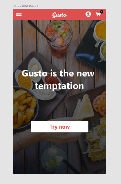
Let’s create a restaurant app in which people can select what to order from a list of food.

We will create two home layouts. The first one will be a long page, which we will use to see how fixed navigation works. The second will have a full-screen image, and the user will be able to click and open a menu bar that overlays the home screen.

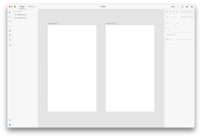
To get started, click on the artboard icon on the left side, and click to the right of your current artboard. This will create a second identical artboard, near the first one.


(Large preview)

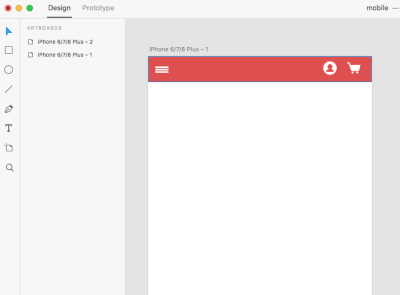
Let’s begin to design our elements, starting with the navigation bar. Click on the Rectangle tool (R) and draw a shape 414 pixels wide and 48 pixels tall. Set its color as #DE4F4F.


(Large preview)

I’ve prepared some icons in Illustrator to use in our layout. Just open the Illustrator file I’ve provided, and drag and drop the icons in your library, as shown below:

Large preview

In doing so, your icons will be automatically uploaded to your Adobe XD library, too.

To learn more about how to use libraries in different apps, read my earlier article, in which I go over some examples of how to add icons and elements to a library (in Illustrator, for instance) and then access them by opening that library in other apps (XD, in this case).

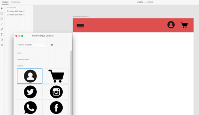
Once you have added the icons, open your XD library. You should see the icons in place:


(Large preview)

Drag and drop the icons on your artboard, as shown below. Position them, and make sure they are all about 25 pixels wide.


(Large preview)

Because we need our icons to be white, we have to modify these. We can directly modify them in the library, as demonstrated in my previous tutorial. With that done, we’ll see them updated in XD directly, without having to drag them from the library again.


(Large preview)

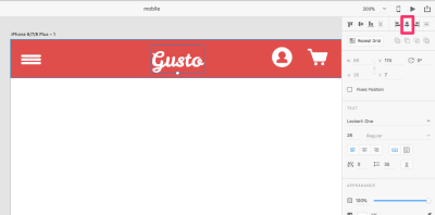
Now that the icons we want are in place, let’s create a logo. Let’s call this app “Gusto”. We’ll simply use the Text tool to add it. (I’m using the Leckerli One font here, but feel free to use whichever you like.) Align the logo to the middle of the navigation bar by clicking “Align center (horizontally)” in the right sidebar.


(Large preview)

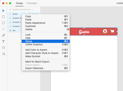
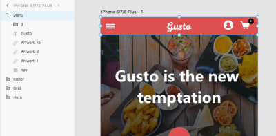
Group all of the navigation elements together, and call the group “Menu”. To do this, select all elements in the left panel, right-click and choose “Group”.


(Large preview)

(Large preview)

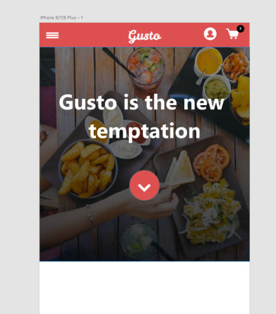
Let’s add a beautiful hero image. I selected one from Pexels. Drag it on your artboard, and resize its height to 380 pixels.


(Large preview)

Now, click on Rectangle tool (R), and draw a rectangle the same size as the hero image, and place it on the image. Set a gradient for the rectangle’s color, using the values shown in the image below.


(Large preview)

(If you’d like more information about gradients, feel free to see my previous tutorial on how to apply them in XD.)

Insert some white text on the hero image and a circle for a button. Place a little circle with a number on the cart icon as well; we will need it later.


(Large preview)

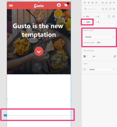
Next, let’s increase the artboard’s height. We have to do that in order to insert new elements and to create the scrolling simulation.

After double-clicking on the artboard, set its height to 1265 pixels. Be sure that “Scrolling” is set to “Vertical” and that the “Viewport Height” is set to 736 pixels. A little blue marker will allow you to set the scrolling boundary towards the bottom of the artboard, as seen below:


(Large preview)

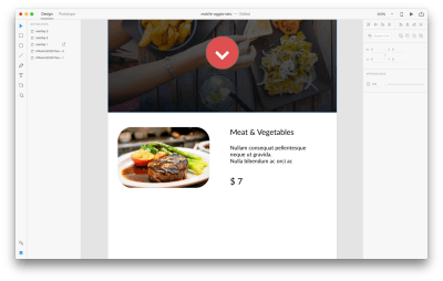
Let’s add in our content: Gusto’s mouthwatering menu. Click on the Rectangle tool (R) to create a rectangle for the picture that we will add.


(Large preview)

Drag and drop a picture directly into the box we just created; the image will automatically fit in it. Click on it once, and drag the little white circle from an angle inwards, in order to round all of the angles. Their values should be around 25, as shown in the picture below. Get rid of the border by unchecking the border value in the right sidebar.

Large preview

Click on the Text tool (T), and write a title on the right side of the image. I chose Lato as the font, at 14 pixels. Feel free to use another font, but maintain the 14-pixel size.


(Large preview)

Grab the Text tool (T) again, and write some lines for the description (Lato, 10 pixels) and for the price (Lato, 16 pixels).


(Large preview)

Take the Rectangle tool (R) and draw a rectangle of 100 by 30 pixels. Color it with the same orange we used on the button for the hero image; add the text “Add to Cart” with the Text tool (T); and add the cart icon from the library. All of these steps are covered in the short video below:

Finally, click on “Repeat Grid” to create a grid for this section. Once that’s done, we can change images and text easily, as shown in the video below:

If you want to learn more about how to create grids, follow my tutorial.

I used the following pictures from Pexels:

  • https://www.pexels.com/photo/close-up-of-food-247685/
  • https://www.pexels.com/photo/food-dinner-pasta-spaghetti-8500/
  • https://www.pexels.com/photo/selective-focus-photography-of-beef-steak-with-sauce-675951/
  • https://www.pexels.com/photo/food-plate-chocolate-dessert-132694/
  • https://www.pexels.com/photo/bread-food-sandwich-wood-62097/

Add some titles, descriptions and buttons.


(Large preview)

Finally, let’s add a rectangle for the footer, with the text “Gusto” in the center. Set the rectangle’s fill color to #211919.


(Large preview)

Yes! We’ve completed the first template design. Let’s set up our second template before we begin prototyping.

For our second mobile layout, just copy and paste the navigation and hero section from the first layout, and size the hero image to be full screen. Then, add a “Try Now” button to it.

In the short video below, I show you how to copy and paste elements into the second artboard, create a new button with the Rectangle tool (R) and write text on it with the Text tool (T).


(Large preview)

Excellent! Let’s move on and create our prototypes.

Setting Fixed Elements

We want to make the top navigation of our layout fixed, making it stick to its position as we scroll the artboard.

Click on your “Menu” group to select it, and select “Fixed Position” in the right sidebar.


(Large preview)

Important: In order for all elements to scroll under the menu, the menu should be on top of all other elements. Simply place the menu folder at the top, in the left sidebar.


(Large preview)

Now, to see your fixed navigation in action, simply click on the “Desktop Preview” button and try scrolling. You should see this:

Large preview

Tremendously simple, isn’t it?

Setting Overlay Elements

To see how overlays work in XD, we first need to create the elements that will be overlaid. When you click an item in the menu, what would you expect to happen? Exactly: A submenu should appear.

Let’s create three different submenus, like the ones in the image below, using the Rectangle tool (R). I chose a rectangle because the menu will overlay the screen, so it will cover not the whole artboard but just a part of it.

Follow the video below to see how I created the three overlay menus. You will see that I used the Rectangle tool (R), Line tool (L) and Text tool (T). We’re using rectangles to create the menu backgrounds because we need an object to overlay the screen. I’ve included the icons in the Adobe Illustrator file which you can directly download over here.

Below, you’ll see how I use “Repeat Grid” and how I modify elements inside of it.

Here is the final result:


(Large preview)

We will work on the second home layout at this point.

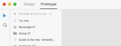
Set the visual mode to “Prototype”, selecting it from the top left of the screen.


(Large preview)

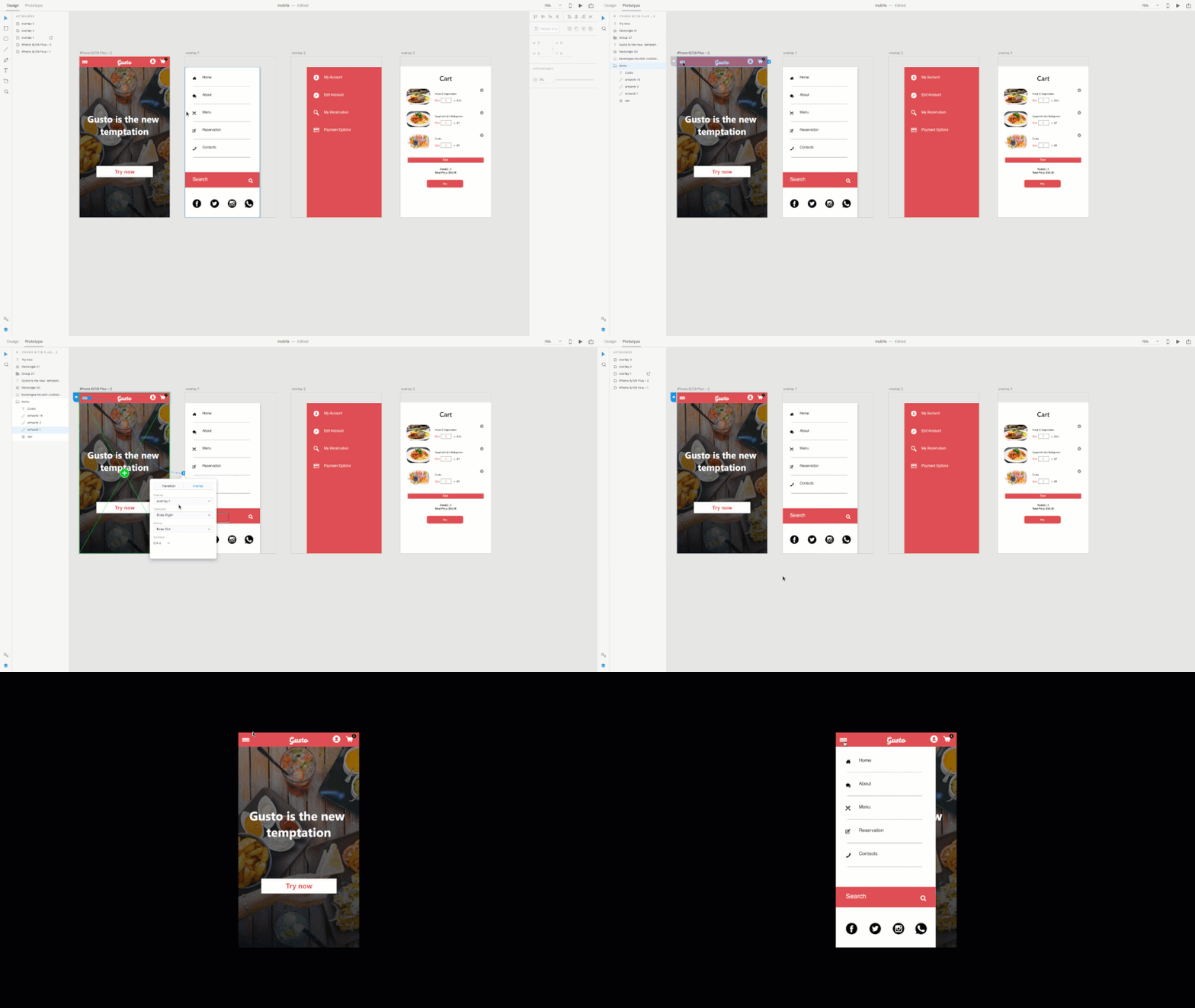
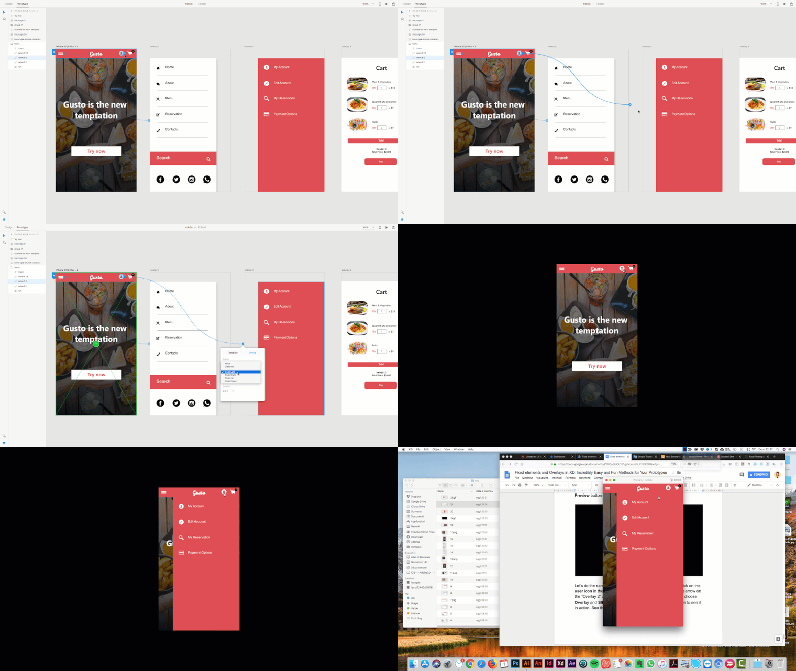
Next, double-click on the little hamburger menu icon, and drag and drop the little blue arrow onto the “Overlay 1” artboard. When the popup window appears, choose “Overlay” and “Slide right”. Then, click the “Desktop Preview” button to see it in action.

Large preview

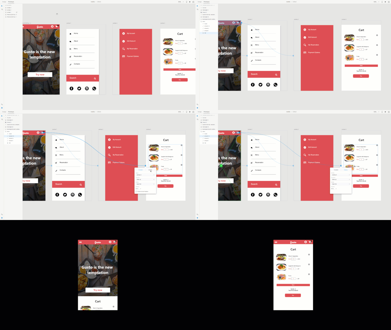
Let’s do the same thing with the user icon and cart icon. Double-click on the user icon in Prototype mode, and drag and drop the little blue arrow onto the “Overlay 2” artboard. When the popup window appears, choose “Overlay” and “Slide left”. Then, click the “Desktop Preview” button to see it in action.

Large preview

Now, double-click on the cart icon in Prototype mode, and drag and drop the little blue arrow onto the “Overlay 3” artboard. When the popup windows appears, choose “Overlay” and “Slide left”. Click the “Desktop Preview” button again to see it work.

Large preview

We’re done! These great new features are super-easy to learn, and they’ll add a new level of interactivity simulation to your prototypes.

Quick tip: Want to preview the layout on your phone? Just upload your XD file to Creative Cloud, download the XD app for mobile, and open your document.

Here’s what we have learned in this tutorial:

  • set and create mobile layouts and elements,
  • set fixed elements,
  • use overlays to simulate a click-to-open submenu.

Where would you use fixed elements or overlays? Feel free to share your examples in the comments below!

This article is part of the UX design series sponsored by Adobe. Adobe XD is made for a fast and fluid UX design process, as it lets you go from idea to prototype faster. Design, prototype and share — all in one app. You can check out more inspiring projects created with Adobe XD on Behance, and also sign up for the Adobe experience design newsletter to stay updated and informed on the latest trends and insights for UX/UI design.

Smashing Editorial(il, yk)
Categories: Others Tags:

What makes a good front-end developer?

September 17th, 2018 No comments

Defining what a front-end developer is and what they do is tough as it is. So, how do we set the bar for what makes for a good front-end developer?

Here’s what a few folks have to say on the topic.


I’ll argue that front-end developers need to master four different skills.

  1. Empathy
  2. Code
  3. Design
  4. Communication

Zell Liew


Front-End Developers, having learnt HTML, CSS and JS, are forced to take functionality into account when creating user experiences or making sure that the two disciplines work as one from a development perspective. They become all-rounders, having to understand what is actually happening between the AJAX data and the PHP file that’s sending off a mail or returning errors.

Daine Mawer


In my opinion, what defines a good front-end developer is one that has skilled knowledge of HTML, CSS, JS with a vast understanding of User design thinking as they’ll be building web interfaces with accessibility in mind. They should also be excited to learn, as the world of Front-End Development keeps evolving. The ability to stay in the loop is critical.

Egwuenu Gift


After I started to feel more comfortable with my responsibilities … I soon found my next challenge: to help build a stronger connection between the design and development teams. Though we regularly collaborated to produce high-quality work, these teams didn’t always speak the same language.

Ronald Méndez


I think that front-end developers need to have a holistic view of the architecture of the software that they and their team are creating. They can’t silo themselves on the Front-End, but need to have an appreciation for the complexities of the Back-End as well in order to create the best user experience for their customers. In the end, it’s about continual learning and team communication, as well as listening to the customer to create a great experience.

Jen Looper


The longer I work on the web, the more I realize that what separates the good people from the really good people isn’t what they know; it’s how they think. Obviously knowledge is important—critical in some cases—but in a field that changes so quickly, how you go about acquiring that knowledge is always going to be more important (at least in the long term) than what you know at any given time. And perhaps most important of all: how you use that knowledge to solve everyday problems.

Philip Walton


Having a working understanding of HTML, CSS and JS is certainly a no-brainer, but it’s only one part of the equation. I believe a good front-ender connects the dots between user experiences and business goals while closing any gaps that would prevent holistic user flows. That requires good communication, creative problem solving, empathy and, perhaps above all, an willingness to listen to and accept criticism.

Geoff Graham


It’s a difficult question in some ways because the nature of Front-end Development is constantly expanding. The types of things we build as front ends become increasingly complex and varied.

For that reason, I think a good Front-end Developer understands the scope, requirements, and technical restraints of the project they are currently working on. This can invariably mean: what their teams expect from them, what their users need, and because things are changing- curiosity!

Sarah Drasner


I admire how good front-end developers answer questions. If they’re super dogmatic about this one particular approach to something being the only one true way then I start to worry. Take SVG illustrations. Or image optimization. Or how to markup navigation. There’s a lot of different ways to tackle each of those things and none of them are perfect. On this note, Chris wrote a wonderful post all about dogmatism a while back and I think about it all the time. That’s the mark of a great front-end developer right there: someone who’s okay with not having the perfect answers all the time.

Robin Rendle


A good front-end developer is flexible, eager to learn, eager to share and has a pragmatic approach to the ever-changing landscape

Oh yeah, and something something cascade.

Andy Bell


What do you think?

This is an open conversation. No right answers. No wrong answers. How would you grade a “good” front-end developer?

The post What makes a good front-end developer? appeared first on CSS-Tricks.
Categories: Designing, Others Tags:

What makes a good front-end developer?

September 17th, 2018 No comments

Defining what a front-end developer is and what they do is tough as it is. So, how do we set the bar for what makes for a good front-end developer?

Here’s what a few folks have to say on the topic.


I’ll argue that front-end developers need to master four different skills.

  1. Empathy
  2. Code
  3. Design
  4. Communication

Zell Liew


Front-End Developers, having learnt HTML, CSS and JS, are forced to take functionality into account when creating user experiences or making sure that the two disciplines work as one from a development perspective. They become all-rounders, having to understand what is actually happening between the AJAX data and the PHP file that’s sending off a mail or returning errors.

Daine Mawer


In my opinion, what defines a good front-end developer is one that has skilled knowledge of HTML, CSS, JS with a vast understanding of User design thinking as they’ll be building web interfaces with accessibility in mind. They should also be excited to learn, as the world of Front-End Development keeps evolving. The ability to stay in the loop is critical.

Egwuenu Gift


After I started to feel more comfortable with my responsibilities … I soon found my next challenge: to help build a stronger connection between the design and development teams. Though we regularly collaborated to produce high-quality work, these teams didn’t always speak the same language.

Ronald Méndez


I think that front-end developers need to have a holistic view of the architecture of the software that they and their team are creating. They can’t silo themselves on the Front-End, but need to have an appreciation for the complexities of the Back-End as well in order to create the best user experience for their customers. In the end, it’s about continual learning and team communication, as well as listening to the customer to create a great experience.

Jen Looper


The longer I work on the web, the more I realize that what separates the good people from the really good people isn’t what they know; it’s how they think. Obviously knowledge is important—critical in some cases—but in a field that changes so quickly, how you go about acquiring that knowledge is always going to be more important (at least in the long term) than what you know at any given time. And perhaps most important of all: how you use that knowledge to solve everyday problems.

Philip Walton


Having a working understanding of HTML, CSS and JS is certainly a no-brainer, but it’s only one part of the equation. I believe a good front-ender connects the dots between user experiences and business goals while closing any gaps that would prevent holistic user flows. That requires good communication, creative problem solving, empathy and, perhaps above all, an willingness to listen to and accept criticism.

Geoff Graham


It’s a difficult question in some ways because the nature of Front-end Development is constantly expanding. The types of things we build as front ends become increasingly complex and varied.

For that reason, I think a good Front-end Developer understands the scope, requirements, and technical restraints of the project they are currently working on. This can invariably mean: what their teams expect from them, what their users need, and because things are changing- curiosity!

Sarah Drasner


I admire how good front-end developers answer questions. If they’re super dogmatic about this one particular approach to something being the only one true way then I start to worry. Take SVG illustrations. Or image optimization. Or how to markup navigation. There’s a lot of different ways to tackle each of those things and none of them are perfect. On this note, Chris wrote a wonderful post all about dogmatism a while back and I think about it all the time. That’s the mark of a great front-end developer right there: someone who’s okay with not having the perfect answers all the time.

Robin Rendle


A good front-end developer is flexible, eager to learn, eager to share and has a pragmatic approach to the ever-changing landscape

Oh yeah, and something something cascade.

Andy Bell


What do you think?

This is an open conversation. No right answers. No wrong answers. How would you grade a “good” front-end developer?

Direct Link to ArticlePermalink

The post What makes a good front-end developer? appeared first on CSS-Tricks.

Categories: Designing, Others Tags:

It’s UltraWide Time!

September 17th, 2018 No comments

(The UltraWide Time of Alan Walker – LG UltraWide Festival 2018)

For all you creators out there! LG understands there’s more to the final output. There’s also the “process.” All the hours spent working, toiling, creating, that no one ever sees. The endless brain-strain and ideating a creator dedicates to their goal is what makes up their UltraWide Time. Few will ever see or understand the process, where all the work and magic happen. But LG understands.

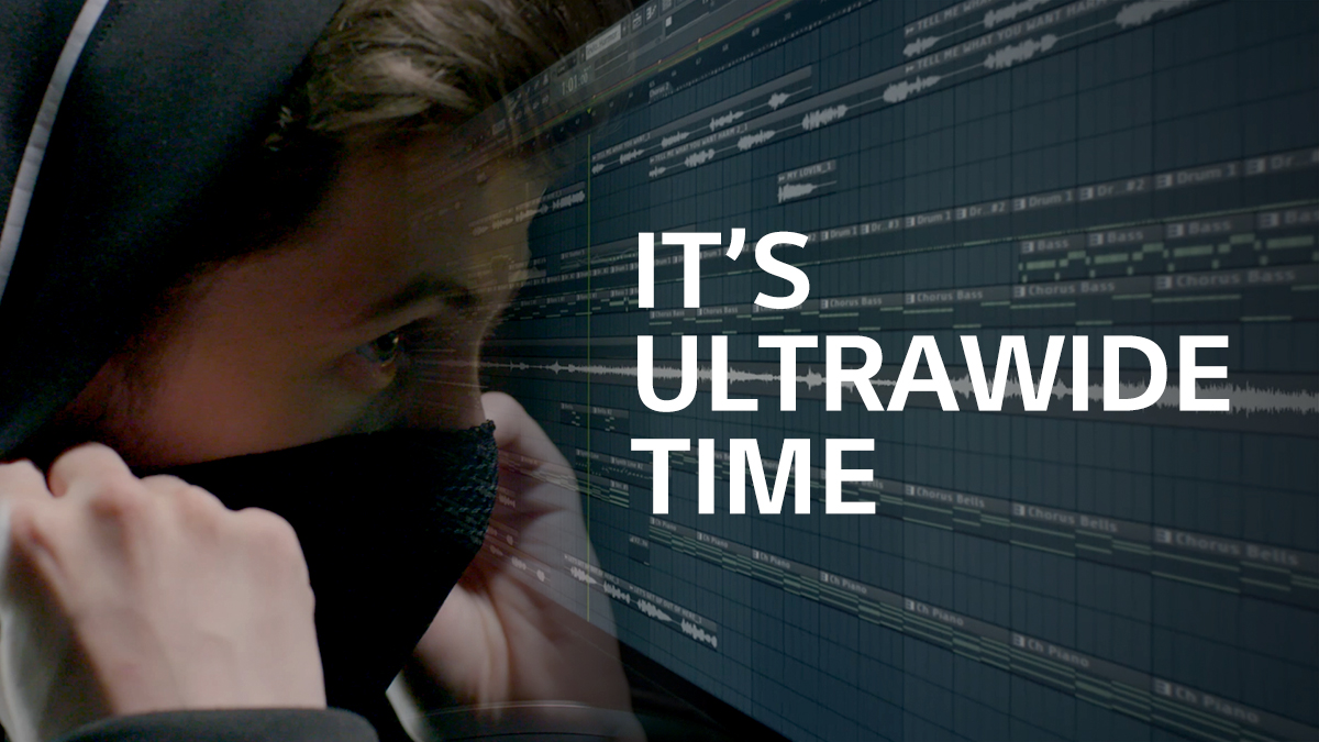
One of the highlights of this year’s LG UltraWide Festival is Alan Walker, a multiple-platinum DJ/Producer. Alan says he spent years wondering if the countless hours at his computer desk would ever be rewarded. “Making music takes a lot of time and effort, not something that just happens with a snap. It takes time but is a very fun road to go.” He still spends long nights composing on his UltraWide monitor.

Then there’s Action Movie Kid. Daniel Hashimoto and his son created a smash hit YouTube channel. It features a kid surrounded by eye-popping special effects. For this dad and son, “quality time” is spent in front of a camera and computer. Daniel says “my UltraWide Time is for imagination. Every afternoon we come up with something amazing.”

The theme for this year’s LG UltraWide Festival is “My UltraWide Time.” LG focuses on the long hours and tireless effort of passionate creators. This year, instead of your final product, LG wants to know about your nitty gritty “process.” Who would have ever thought? It’s simple to enter. Take a short quiz, describe a moment, or share a story about your creative process. Get all the rules and details at LG UltraWide Festival event page, or simply do a search for ‘LG UltraWide’.

LG actually understands the hours it takes to create just a few moments of work, and is excited to show creators some support through this event. This is the 4th straight year since 2015 that LG has given a boost to deserving creators through the UltraWide Festival.

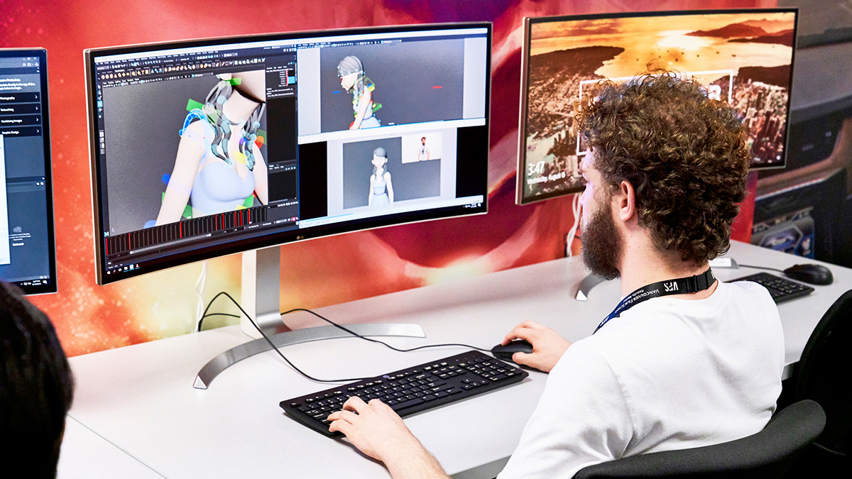
In fact, LG’s support for creators extends beyond the LG UltraWide Festival. LG equips world-class DJs with UltraWide monitors through the UltraWide Studio program. Also, LG’s UltraWide Academy Sponsorship nurtures the next generation of international artists. Top design, art, and animation schools are provided with state-of-the-art equipment and space for all things creative. The UltraWide Academy Sponsorship first sponsored a brand-new computer lab at Parsons School of Design in 2016. Next was the Royal College of Art in 2017. This year, LG decked out the Vancouver Film School, recently ranked the No.1 International Animation School, with an academy lab. LG is clearly showing its long-term commitment to gifted students in the process of honing their talents.

The new facilities impressed Vancouver Film School’s Head of Animation, Colin Giles. He says, “The creative digital art is an exciting canvas for any idea you can create with the possibilities being endless. The students will benefit from this strong partnership with LG and the LG UltraWide Monitor Academy Lab by having access to a literal canvas that removes any possible barrier to their imagination. With a wide, seamless screen that allows for a more immersive use of the software at hand and a color range that meets their own imagination their creations will jump into reality. ‘The more you see, the better you create’ has never been truer than at VFS.” To see photos of the VFS Academy Lab, head over to @LG_UltraWide Instagram account

Once in a great while, a company truly understands creators. It’s nice to see LG focusing on the long, hours of work others rarely see. It’s especially heartening that the process is getting some respect. It’s time worth cherishing, as much as the result.

Read More at It’s UltraWide Time!

Categories: Designing, Others Tags:

KINDRED STUDIO Makes Us Feel Nostalgic for Vintage Art

September 17th, 2018 No comments
kindred Studio

You have to allow yourself to fail in order to become successful. You have to be brave and think outside the box. When Plan A doesn’t’ work, B is just another letter. Kindred Studio was never plan B, but a passion waiting to be followed. That’s what made it successful.

Andrew Fairclough believed a Business Degree would open a door to a successful job so he decided to complete one. Not very late after, he realized that he was wasting his time doing something that doesn’t make him happy. While many people don’t have the guts to change a job, because they fear failure, even in the same field, Andrew swallowed his fears and went down a different path. We could easily say that his new interests were as opposite as the North Pole from the South Pole. The brave youngster began working in an agency designing skate and snowboard graphics.

Soon after his first designs, big companies noticed and appreciated Andrew’s work. Inspired by mid century designs, illustrations, vintage sci-fi, surrealism, and comics, as well the textures of degraded print, the designer worked on snowboard graphics, record covers, game posters, magazine editorials, book covers, T-shirt graphics, etc.. Most of the time, he chooses to work with monochromatic and restricted color pallets, a technique that brings out the nostalgia of vintage art, while designing something completely new.

In early 2016 Andrew founded True Grit Texture Supply. His aspiration as a new business owner was to provide high quality textures, photoshop brushes and resources for like-minded, creative individuals. When he is not designing, he’s teaching others the valuable skill set that he once taught himself. Also, when visiting his website, you can also buy vintage posters directly from his Print Shop.

As mentioned earlier, Kindred Studio’s got world-wide recognition. Important brands started contacting them, and the designer’s portfolio has been growing ever since. Below, we have cataloged several pieces of the studio’s work. Without further ado and in no particular order:

TOTAL CONTROL

Kindred Studio

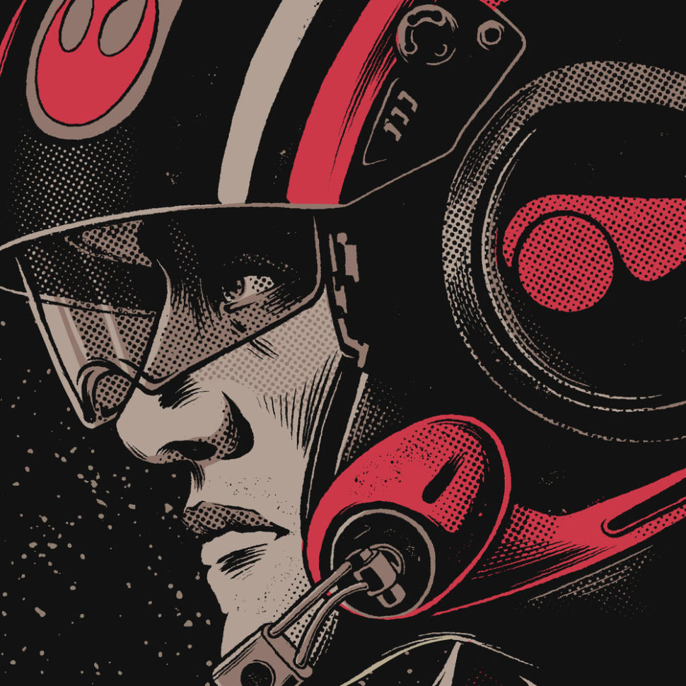
RADIO VELVET X STAR WARS

Kindred Studio

MILLER LITE FOOTBALL

Kindred Studio

TURBOLAND

kindred studio

ART VS SCIENCEkindred studio

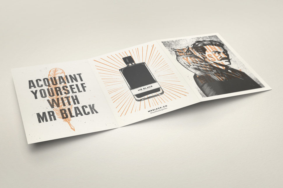
MR BLACK

kindred studio

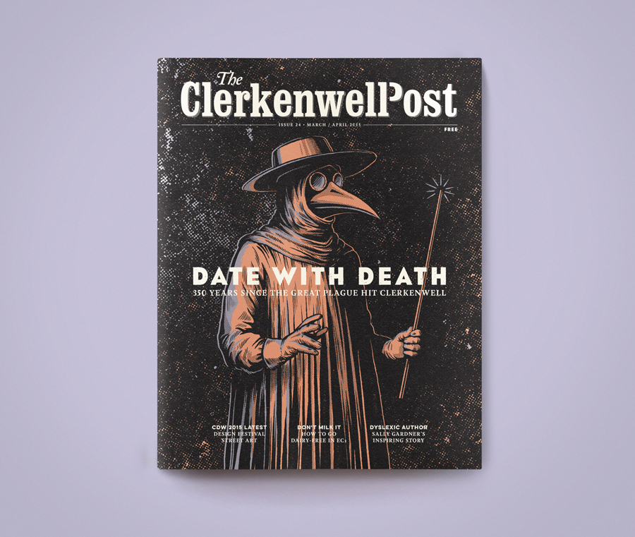
THE CLERKENWELL POST

kindred studio

INSIDER GUIDESkindred studio

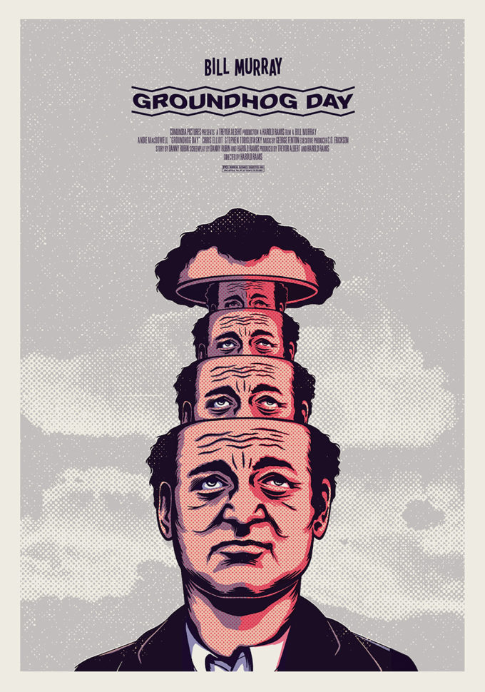
NOT FOR RENTAL – GROUNDHOG DAY

kindred studio

8 BIT LOVE – BAD TASTE

kindred studio

Read More at KINDRED STUDIO Makes Us Feel Nostalgic for Vintage Art

Categories: Designing, Others Tags:

Aspect Ratio Media Elements and intrinsicsize

September 17th, 2018 No comments

If you need an aspect-ratio sized

(or any element that can have children), you can do it. Perhaps the cleanest way is a custom-property-sized pseudo-element that pushes the correct minimum height through padding-based-on-width.

But media elements like don’t have children. The tag isn’t self-closing, but when it is supported (almost always), the content of it is replaced with a shadow DOM you don’t control. Besides, these are the only two elements that “size to an external resource.” So, how do you enforce aspect ratio on them when using a variable width like 100% or 75vw? Well, once they load, they will have their natural aspect ratio, so that’s nice. But it also means they don’t know the height while they are loading and it may cause performance jank-ening reflow.

One solution is to put them into a container with an aspect ratio, forcing them to the corners with absolute positioning. But, all by themselves, they are incapable of sizing to the aspect ratio correctly until they load.

Hence, the intrinsicsize attribute for “all image element types (including SVG images) and videos” that is now under development.

<img intrinsicsize="400x300" style="width: 100%">

The explainer document is helpful. The reason it is intrinsicsize and not aspectratio is because an aspect ratio doesn’t provide as much useful or usable information. I’d love to see it work on any element and be brought to CSS as well.

The post Aspect Ratio Media Elements and intrinsicsize appeared first on CSS-Tricks.
Categories: Designing, Others Tags:

Flexbox: How Big Is That Flexible Box?

September 17th, 2018 No comments
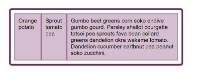
Three items with space at the end

Flexbox: How Big Is That Flexible Box?

Flexbox: How Big Is That Flexible Box?

Rachel Andrew

2018-09-17T13:30:30+02:002018-09-20T11:42:41+00:00

This is the third part of my series on Flexbox. In the past two articles, we have looked at what happens when you create a flex container and explored alignment as it works in Flexbox. This time we are going to take a look at sizing. How do we control the size of our flex items, and what choices is the browser making when it controls the size?

Initial Display Of Flex Items

If I have a set of items, which have variable lengths of content inside, and set their parent to display: flex, the items will display as a row and line up at the start of that axis. In the example below my three items have a small amount of content and are able to display the content of each item as an unbroken line. There is space at the end of the flex container which the items do not grow into because the initial value of flex-grow is 0, do not grow.


Three items with space at the end
The flex items have room to each be displayed on one line (Large preview)

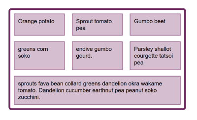
If I add more text to these items, they eventually fill the container, and the text begins to wrap. The boxes are assigned a portion of the space in the container which corresponds to how much text is in each box — an item with a longer string of text is assigned more space. This means that we don’t end up with a tall skinny column with a lot of text when the next door item only contains a single word.


Three items, the final item has longer text and the text wraps
The space is distributed to give more space to a longer item (Large preview)

This behavior is likely to be familiar to you if you have ever used Flexbox, but perhaps you have wondered how the browser is working that sizing out, as if you look in multiple modern browsers you will see that they all do the same thing. This is down to the fact that detail such as this is worked out in the specification, making sure that anyone implementing Flexbox in a new browser or other user agent is aware of how this calculation is supposed to work. We can use the spec to find this information out for ourselves.

The CSS Intrinsic And Extrinsic Sizing Specification

You fairly quickly discover when looking at anything about sizing in the Flexbox specification, that a lot of the information you need is in another spec — CSS Intrisnic and Extrinsic Sizing. This is because the sizing concepts we are using aren’t unique to Flexbox, in the same way that alignment properties aren’t unique to Flexbox. However, for how these sizing constructs are used in Flexbox, you need to look in the Flexbox spec. It can feel a little like you are jumping back and forth, so I’ll round up a few key definitions here, which I’ll be using in the rest of the article.

Preferred Size

The preferred size of a box is the size defined by a width or a height, or the logical aliases for these properties of inline-size and block-size. By using:

.box {
    width: 500px;
}

Or the logical alias inline-size:

.box {
    inline-size: 500px;
}

You are stating that you want your box to be 500 pixels wide, or 500 pixels in the inline direction.

min-content Size

The min-content size is the smallest size that a box can be without causing overflow. If your box contains text then all possible soft-wrapping opportunities will be taken.

max-content Size

The max-content size is the largest size the box can be to contain the contents. If the box contains text with no formatting to break it up, then it will display as one long unbroken string.

Flex Item Main Size

The main size of a flex item is the size it has in the main dimension. If you are working in a row — in English — then the main size is the width. In a column in English, the main size is the height.

Items also have a minimum and maximum main size as defined by their min-width or min-height on the main dimension.

Working Out The Size Of A Flex Item

Now that we have some terms defined, we can have a look at how our flex items are sized. The initial value of the flex properties are as follows:

  • flex-grow: 0
  • flex-shrink: 1
  • flex-basis: auto

The flex-basis is the thing that sizing is calculated from. If we set flex-basis to 0 and flex-grow to 1 then all of our boxes have no starting width, so the space in the flex container is shared out evenly, assigning the same amount of space to each item.

See the Pen Smashing Flexbox Series 3: flex: 1 1 0; by Rachel Andrew (@rachelandrew) on CodePen.

Whereas if flex-basis is auto and flex-grow: 1, only the spare space is distributed, taking the size of the content into account.

See the Pen Smashing Flexbox Series 3: flex: 1 1 auto short text by Rachel Andrew (@rachelandrew) on CodePen.

In situations where there is no spare space, for example when we have more content than can fit in a single line, then there is no space to distribute.

See the Pen Smashing Flexbox Series 3: flex: 1 1 auto long text by Rachel Andrew (@rachelandrew) on CodePen.

This shows us that figuring out what auto means is pretty important if we want to know how Flexbox works out the size of our boxes. The value of auto is going to be our starting point.

Defining Auto

When auto is defined as a value for something in CSS, it will have a very specific meaning in that context, one that is worth taking a look at. The CSS Working Group spend a lot of time figuring out what auto means in any context, as this talk for spec editor Fantasai explains.

We can find the information about what auto means when used as a flex-basis in the specification. The terms defined above should help us dissect this statement.

“When specified on a flex item, the auto keyword retrieves the value of the main size property as the used `flex-basis`. If that value is itself auto, then the used value is `content`.”

So if our flex-basis is auto, Flexbox has a look at the defined main size property. We would have a main size if we had given any of our flex items a width. In the below example, the items all have a width of 110px, so this is being used as the main size as the initial value for flex-basis is auto.

See the Pen Smashing Flexbox Series 3: flex items with a width by Rachel Andrew (@rachelandrew) on CodePen.

However, our initial example has items which have no width, this means that their main size is auto and so we need to move onto the next sentence, “If that value is itself auto, then the used value is content.”

We now need to look at what the spec says about the content keyword. This is another value that you can use (in supporting browsers) for your flex-basis, for example:

.item {
    flex: 1 1 content;
}

The specification defines content as follows:

“Indicates an automatic size based on the flex item’s content. (It is typically equivalent to the max-content size, but with adjustments to handle aspect ratios, intrinsic sizing constraints, and orthogonal flows”

In our example, with flex items that contain text, then we can ignore some of the more complicated adjustments and treat content as being the max-content size.

So this explains why, when we have a small amount of text in each item, the text doesn’t wrap. The flex items are auto-sized, so Flexbox is looking at their max-content size, the items fit in their container at that size, and the job is done!

The story doesn’t end here, as when we add more content the boxes don’t stay at max-content size. If they did they would break out of the flex container and cause overflow. Once they fill the container, the content begins to wrap and the items become different sizes based on the content inside them.

Resolving Flexible Lengths

It’s at this point where the specification becomes reasonably complex looking, however, the steps that need to happen are as follows:

First, add up the main size of all the items and see if it is bigger or smaller than the available space in the container.

If the container size is bigger than the total, we are going to care about the flex-grow factor, as we have space to grow.


flex items with spare space at the end
In the first case our items have available space to grow into. (Large preview)

If the container size is smaller than the total then we are going to care about the flex-shrink factor as we need to shrink.


flex items overflowing the container
In the second case our items are too large and need to shrink to fit into the container. (Large preview)

Freeze any inflexible items, which means that we can decide on a size for certain items already. If we are using flex-grow this would include any items which have flex-grow: 0. This is the scenario we have when our flex items have space left in the container. The initial value of flex-grow is 0, so they get as big as their max-width and then they don’t grow any more from their main size.

If we are using flex-shrink then this would include any items with flex-shrink: 0. We can see what happens in this step if we give our set of flex items a flex-shrink factor of 0. The items become frozen in their max-content state and so do not flex and arrange themselves to fit in the container.

See the Pen Smashing Flexbox Series 3: flex: 0 0 auto by Rachel Andrew (@rachelandrew) on CodePen.

In our case — with the initial values of flex items — our items can shrink. So the steps continue and the algorithm enters a loop in which it works out how much space to assign or take away. In our case we are using flex-shrink as the total size of our items is bigger than the container, so we need to take away space.

The flex-shrink factor is multiplied by the items inner base size, in our case that is the max-content size. This gives a value with which to reduce space. If items removed space only according to the flex-shrink factor then small items could essentially vanish, having had all of their space removed, while the larger item still has space to shrink.

There is an additional step in this loop to check for items which would become smaller or larger than their target main size, in which case the item stops growing or shrinking. Again, this is to avoid certain items becoming tiny, or massive in comparison to the rest of the items.

All that was simplified in terms of the spec as I’ve not looked at some of the more edge-casey scenarios, and you can generally simply further in your mind, assuming you are happy to let Flexbox do its thing and are not after pixel perfection. Remembering the following two facts will work in most cases.

If you are growing from auto then the flex-basis will either be treated as any width or height on the item or the max-content size. Space will then be assigned according to the flex-grow factor using that size as a starting point.

If you are shrinking from auto then the flex-basis will either be treated as any width or height on the item or the max-content size. Space will then be removed according to the flex-basis size multiplied by the flex-shrink factor, and therefore removed in proportion to the max-content size of the items.

Controlling Growing And Shrinking

I’ve spent most of this article describing what Flexbox does when left to its own devices. You can, of course, exercise greater control over your flex items by using the flex properties. They will hopefully seem more predictable with an understanding of what is happening behind the scenes.

By setting your own flex-basis, or given the item itself a size which is then used as the flex-basis you take back control from the algorithm, telling Flexbox that you want to grow or shrink from this particular size. You can turn off growing or shrinking altogether by setting flex-grow or flex-shrink to 0. On this point, however, it is worth using a desire to control flex items as a time to check whether you are using the right layout method. If you find yourself trying to line up flex items in two dimensions then you might be better choosing Grid Layout.

Debugging Size Related Issues

If your flex items are ending up an unexpected size, then this is usually because your flex-basis is auto and there is something giving that item a width, which is then being used as the flex-basis. Inspecting the item in DevTools may help identify where the size is coming from. You can also try setting a flex-basis of 0 which will force Flexbox to treat the item as having zero width. Even if this isn’t the outcome that you want, it will help to identify the flex-basis value in use as being the culprit for your sizing issues.

Flex Gaps

A much-requested feature of Flexbox is the ability to specify gaps or gutters between flex items in the same way that we can specify gaps in grid layout and multi-column layout. This feature is specified for Flexbox as part of Box Alignment, and the first browser implementation is on the way. Firefox expects to ship the gap properties for Flexbox in Firefox 63. The following example can be viewed in Firefox Nightly.

See the Pen Smashing Flexbox Series 3: flex-gaps by Rachel Andrew (@rachelandrew) on CodePen.


Three rows of items with gutter spacing between them
The image as seen in Firefox 63 (Large preview)

As with grid layout, the length of the gap is taken into account before space is distributed to flex items.

Wrapping Up

In this article, I’ve tried to explain some of the finer points of how Flexbox works out how big the flex items are. It can seem a little academic, however, taking some time to understand the way this works can save you huge amounts of time when using Flexbox in your layouts. I find it really helpful to come back to the fact that, by default, Flexbox is trying to give you the most sensible layout of a bunch of items with varying sizes. If an item has more content, it is given more space. If you and your design don’t agree with what Flexbox thinks is best then you can take control back by setting your own flex-basis.

Smashing Editorial(il)
Categories: Others Tags:

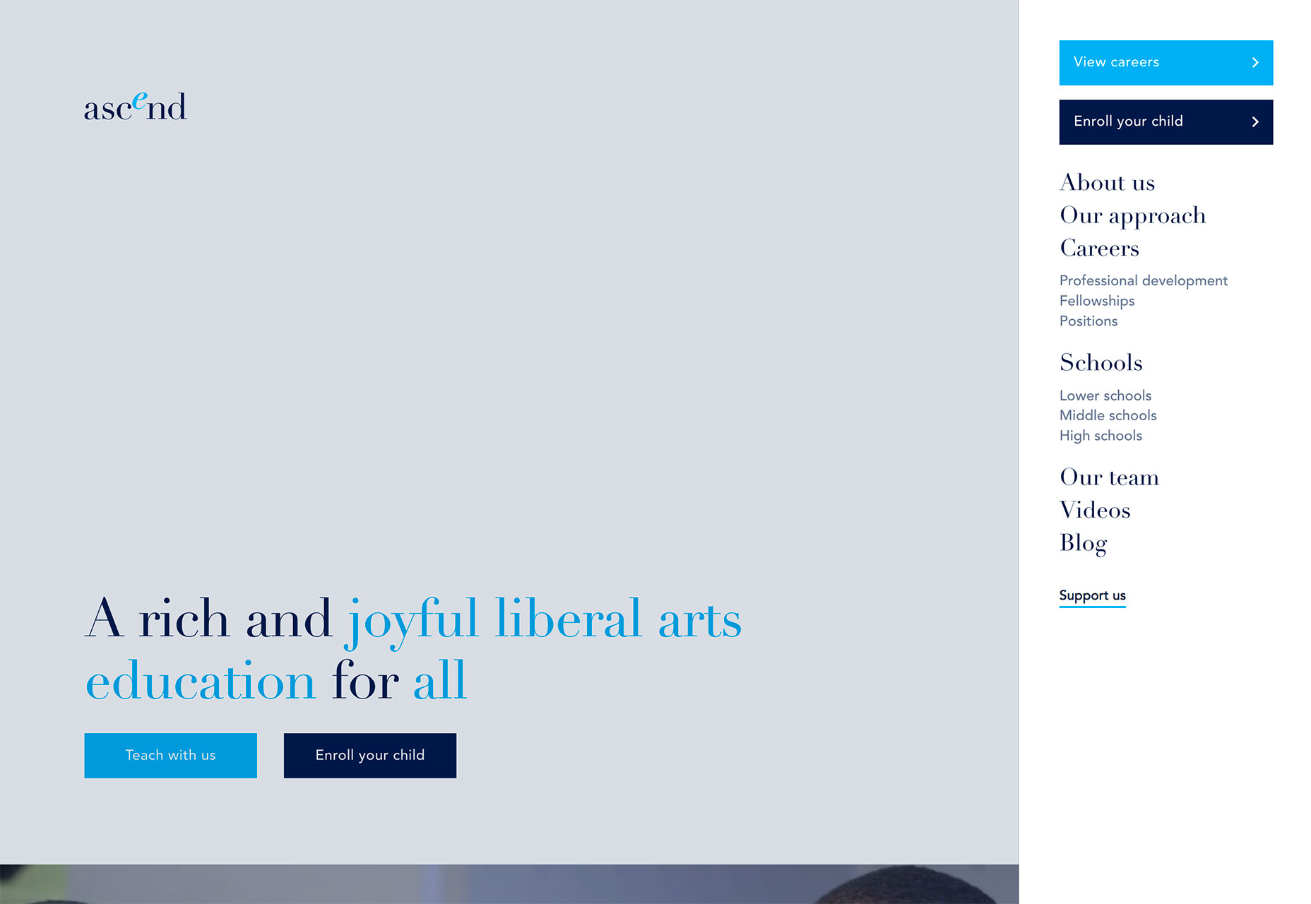
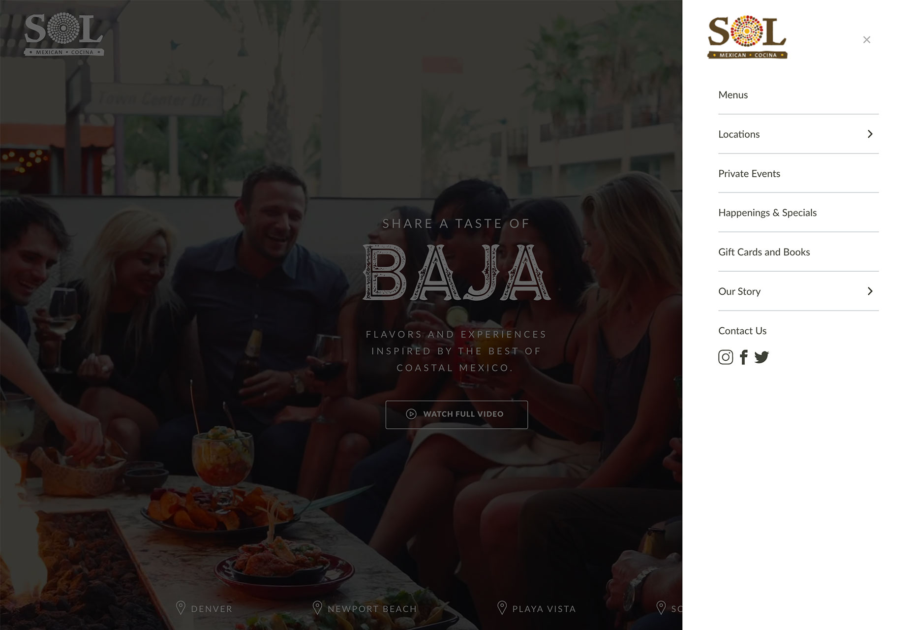
Loving & Hating the Hamburger Icon

September 17th, 2018 No comments

I love the hamburger menu. I hate the hamburger menu.

I am constantly contradicting myself about this tiny website element; whether I think it works beautifully…or just makes a mess.

And I’m not alone. While this icon has exploded in popularity, there’s still significant debate as to whether it is the right choice for tucking navigation menus into websites. It’s a debate I have with myself (and team) every time we approach a new project as well.

Because while I love the simplicity of the hamburger menu and the clean canvas it provides, there are some lurking usability issues that just keep nagging me. That’s why I have a distinct love-hate relationship with the hamburger menu.

Love: Clean Design Canvas

The extra space provided by using a hamburger menu icon can create a cleaner, sleeker, more modern feel to the design. I love the look of a minimal design without clutter and layers of elements piled on top of each other.

This design element can encourage your team to actually think about and make certain content and usability decisions as well. Because the hamburger icon doesn’t contain the space to expand to those all-encompassing mega menus that were popular for a while, you have to determine what’s important enough to be a part of the main navigation. And this is an important discussion to have.

Having a limited amount of space for navigation can help the team focus on website goals and what users are doing and what you want them to do. (Gotta love that!)

Hate: Challenging for Some Users

That tiny little icon with three stacked lines still isn’t wholly familiar to some users. If you manage or are building a website with a distinctly older audience or one that’s not so mobile savvy, a hamburger icon can be confusing.

This segment might not ever click or tap the icon, leading to abandonment of the website.

While this tool tends to work well with more “techie” audiences, it’s not for every user group. If the primary users of your website are on desktop devices, it’s worth reconsidering.

Love: Acceptance as a Mobile User Pattern

It’s fun to watch something happen before your eyes. When the first few websites started using hamburger icons, many of us thought it would never catch on.

The opposite has been true.

On mobile devices, use of the hamburger icon to signal hidden navigation is generally accepted. Most mobile users understand what it is and how it works.
This user pattern also solved a problem with mobile navigation – those tiny little words were difficult to tap. With pop- or slide-out navigation from the hamburger icon, designers are leaving more space around each element and even designing individual navigation links to have the look of buttons, making the style highly usable.

Hate: There’s a Tendency to “Overstuff” Them

Because navigation from a hamburger icon looks and feels like its own page, there’s this tendency to overstuff it with information.

This drives me crazy! I don’t want to scroll in your navigation page. Pick a few important navigation elements, show them to users and move on. Don’t overstuff the navigation because you don’t want to make content and goal decisions.

Every website should have a few pages that are a priority for users to find and visit. Those should be in navigation that opens from the hamburger menu.

Love: Easy and Direct Access to Key Links

Elements in hamburger navigation provide direct access to content.

According to the Nielsen Norman Group, direct access allows users to click or tap right to a “preferred item, instead of forcing users to go through your content in serial order.” The alternative is sequential access, where users have to see multiple elements before getting to the one they want (think carousels for navigation or multi-level mega menus).

Direct access is important because it makes it quick and easy for users to get where they want in the website architecture. Fewer clicks to access information is a good thing.

I know what you are thinking: I already recommended that menus be streamlined to the most important information, so how is this quicker and easier for all users?

Simple: Include search in your navigation if you can’t highlight everything you need to. If users don’t see exactly what they are looking for, there’s a way to find it.

Hate: Lack of Immediate Information

One of the things I hate about hamburger menus is that they can hide some of the context of a website. A good navigation menu provides cues about the content of a website right away with keywords and information at the top of the screen.

It’s not always the case – especially if the design is well planned – but often these cues are missing when navigation is tucked inside a hamburger.

It’s important that the design doesn’t lose this context with that information written into the visible copy on pages.

Love: Extra Real Estate on the Hamburger Screen

The pop- or slide-out nature of the hamburger icon navigation screen gives designers an extra space and bit of real estate to be creative.

Take advantage of that space to do something that will delight users. I absolutely love clicking that icon and getting something special that contributes to my overall user experience.

Use that space to provide extra information, re-emphasize an important fact or create a delightful interaction.

Hate: It Takes Multiple Clicks to Discover New Things

Is your attention span as short as mine? If I have to click all over the place to find things on a website, I tend to just check out.

Sometimes a hamburger icon can lead to “multiple click/tap fatigue.” Navigation elements are hidden. You have to click to find them. What you are looking for isn’t there. You have to click somewhere else to search. You have to click into and out of the navigation.

All of this clicking can get tedious – even if it does happen in a matter of seconds. (And the average attention span isn’t getting any longer.)

Wrapping Up

So what’s the verdict? Do I love or hate the hamburger menu icon?

It’s both. I’ll continue to love and hate it until a better solution comes along. How do you feel about it?

Add Realistic Chalk and Sketch Lettering Effects with Sketch’it – only $5!

Source

Categories: Designing, Others Tags:

Popular Design News of the Week: September 10, 2018 – September 16, 2018

September 16th, 2018 No comments

Every week users submit a lot of interesting stuff on our sister site Webdesigner News, highlighting great content from around the web that can be of interest to web designers.

The best way to keep track of all the great stories and news being posted is simply to check out the Webdesigner News site, however, in case you missed some here’s a quick and useful compilation of the most popular designer news that we curated from the past week.

Note that this is only a very small selection of the links that were posted, so don’t miss out and subscribe to our newsletter and follow the site daily for all the news.

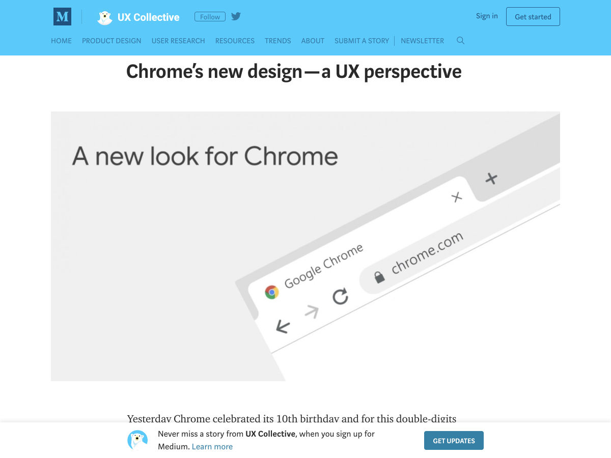
Chrome’s New Design – A UX Perspective

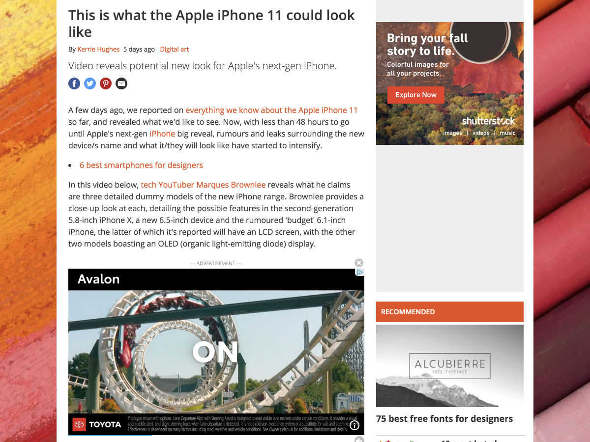
This is What the Apple iPhone 11 Could Look like

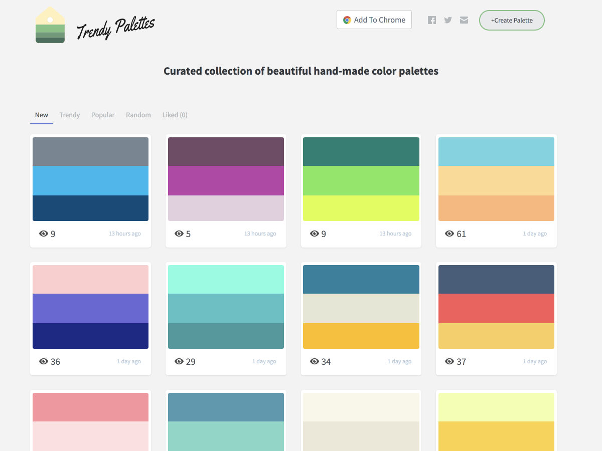
Trendy Palettes – Free and Open Collection of Color Palettes, Updated Daily

Taking Ownership as a New Grad Designer at Google

Helping Users “Get It”

If Screen Product Designers Designed Physical Products

Disruptive Interfaces & the Emerging Battle to Be the Default

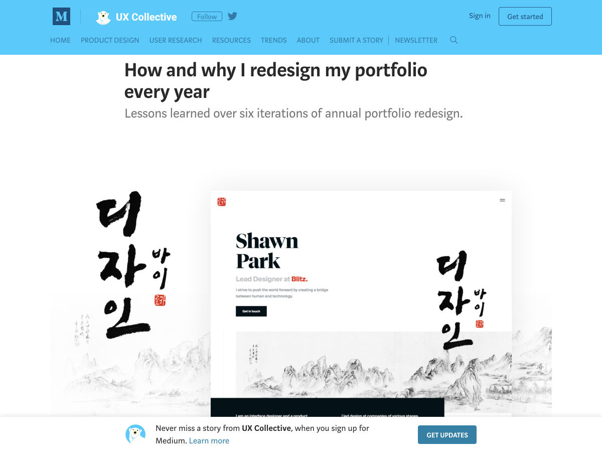
How and Why I Redesign my Portfolio Every Year

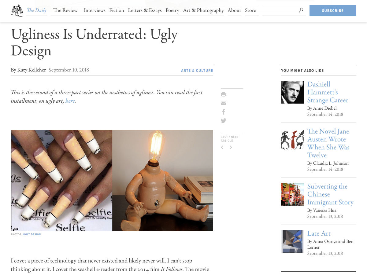
Ugliness is Underrated in Design

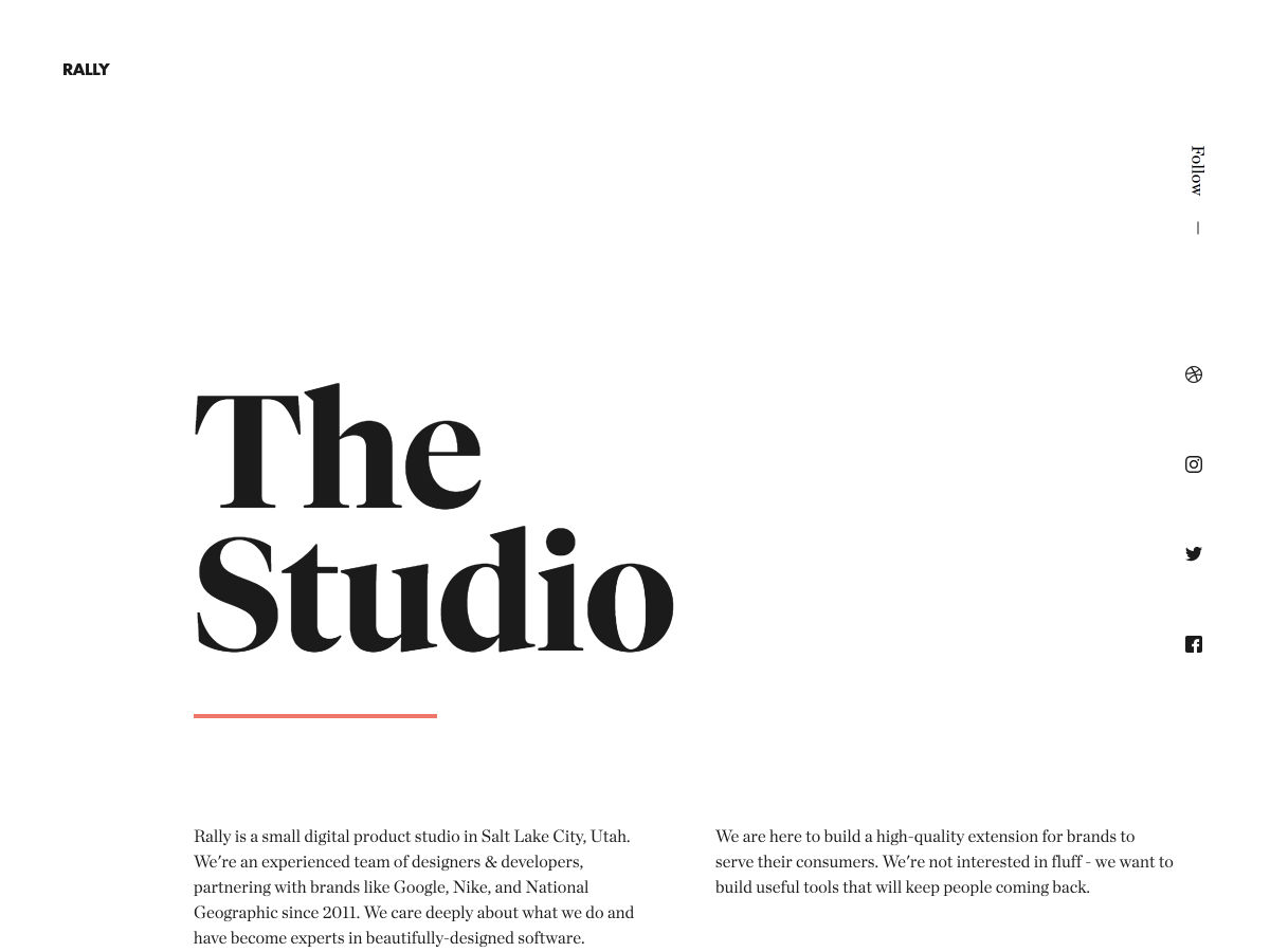
Site Design: Rally Interactive

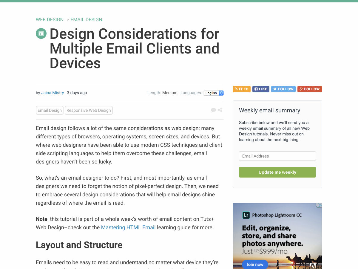
Design Considerations for Multiple Email Clients and Devices

15 Best Google Fonts by the Numbers for 2018

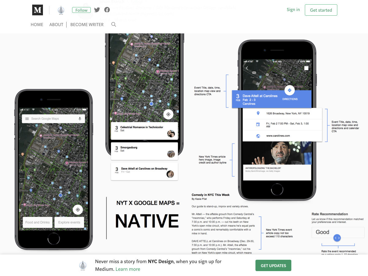
New York Times X Google Maps: UX Case Study

Pencil – An Intelligent Writing Environment

10 Simple Design Principles to Create Stunning Graphics

Getting Permission for User-Generated Content

Uber Rebrand 2018

Meet Elizabeth Maxwell, Partner and Design Director of Beagle

Site Design: iPhone X Website

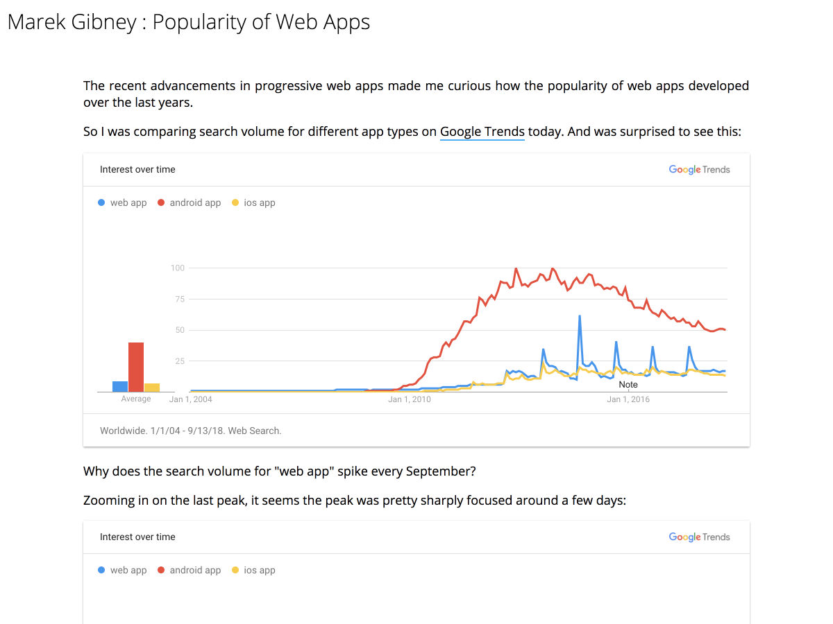
The Popularity of Web Apps Spikes Every September

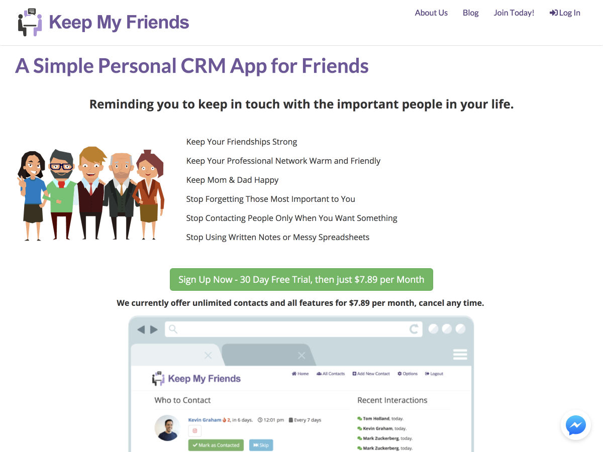
Keep my Friends – A Lightweight, Personal CRM to Improve your Relationships

9 Tips for Designing Faster and More Efficiently so You Don’t Go Insane

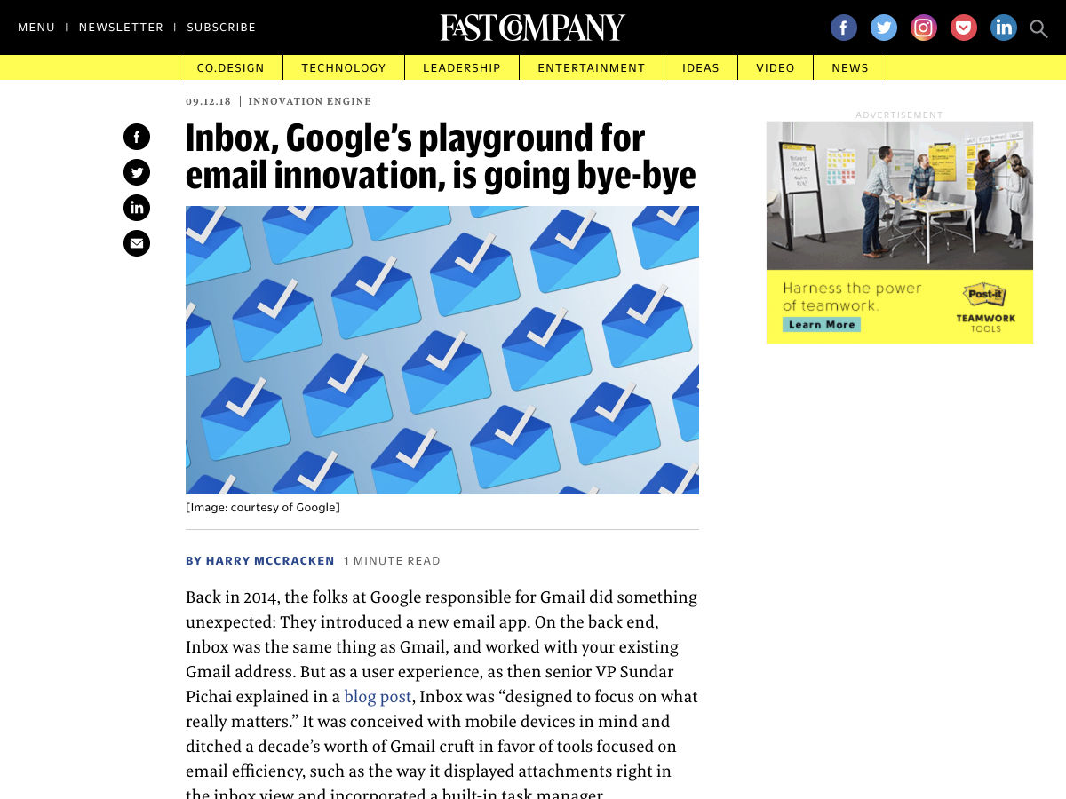
Google is Discontinuing Inbox

How to Disable Gutenberg and Keep the Classic Editor in WordPress

Color Leap – History’s Palettes

Want more? No problem! Keep track of top design news from around the web with Webdesigner News.

Add Realistic Chalk and Sketch Lettering Effects with Sketch’it – only $5!

Source

Categories: Designing, Others Tags: