A Look at the New iOS 12
As an iPhone user, you probably gag at the sight of an update notification. It often takes a while, and who knows if your precious phone’s interface will ever look the same again. For the most part, iOS updates usually are aimed at bug fixes, a few fresh graphical updates, and new emojis every once in a while, but that all changes now.

Speed and performance
If you’ve ever owned an iPhone, you’ll know that once update time rolls around, the speed at which your phone operates drops drastically. This is for a few reasons, but you can usually blame it on an older processor running a newer software.
With this new update, Apple really focused all their efforts into making sure that everyone would be able to enjoy this new update, no matter what phone or processor they were using. During the WWDC demo they were boasting that by updating to iOS 12 on an iPhone 6 plus, apps will load 40% faster, the keyboard will come up 50% faster, and sliding to take photos will be up to 70% faster. Those are impressive numbers.

The cons to iOS 12
We don’t want to dwell on the negatives of the new update too long, as there really aren’t that many. Apple really tackled the root of their negative feedback, but let a few slightly annoying issues in the process.
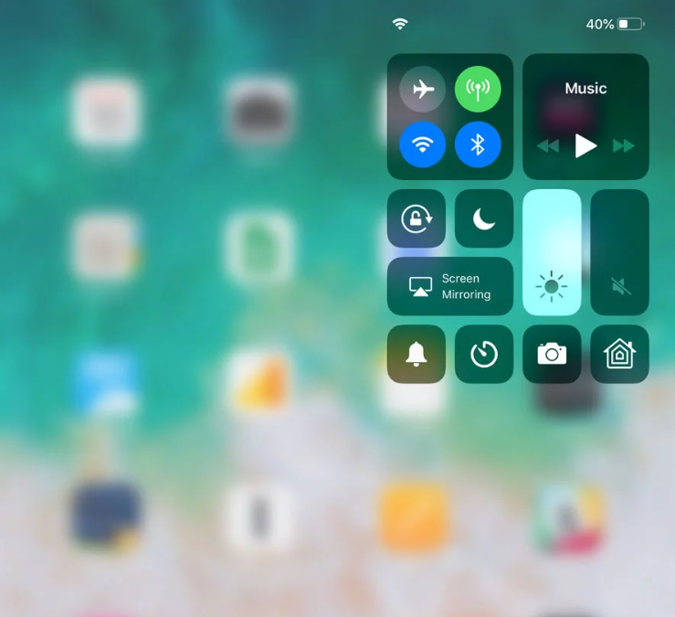
Let’s start with the new Dock. In iOS 10, they made it to where you simply swiped up from the bottom of your screen, and you had access to the Dock. In iOS 11, they changed it to where you only have to swipe up slightly from anywhere on the screen. Now, in iOS 12, you have to swipe down from the top right of the screen. It’s very specific, and highly unnecessary.

This leads us into the last and definitely most important issue iOS 12 has left us with. Since we’re now swiping down from the top right, the top of the screen is just too crowded. If you’re using an iPad, you now have three down-swiping functions. You can swipe from anywhere on the screen to bring up Siri, the top left to bring up notifications, and the top right for the Dock.
Unsurprisingly, this new feature was catered towards the newest generation of iPhones, as they don’t have a home button, and require special functions. For those specific phones, this new feature sort of makes sense, for literally everyone else, it doesn’t.

What do you think of the new iOS 12? Do the improved speeds and performances outweigh the new Dock function? Let us know!
If you enjoy stories like this, and want to stay up-to-date with design related topics, be sure to check in with Webdesignledger regularly!
Read More at A Look at the New iOS 12