Styling the Gutenberg Columns Block
WordPress 5.0 is quickly approaching, and the new Gutenberg editor is coming with it. There’s been a lot of discussion in the WordPress community over what exactly that means for users, designers, and developers. And while Gutenberg is sure to improve the writing experience, it can cause a bit of a headache for developers who now need to ensure their plugins and themes are updated and compatible.
One of the clearest ways you can make sure your theme is compatible with WordPress 5.0 and Gutenberg is to add some basic styles for the new blocks Gutenberg introduces. Aside from the basic HTML blocks (like paragraphs, headings, lists, and images) that likely already have styles, you’ll now have some complex blocks that you probably haven’t accounted for, like pull quotes, cover images, buttons, and columns. In this article, we’re going to take a look at some styling conventions for Gutenberg blocks, and then add our own styles for Gutenberg’s Columns block.
Block naming conventions
First things first: how are Gutenberg blocks named? If you’re familiar with the code inspector, you can open that up on a page using the block you want to style, and check it for yourself:
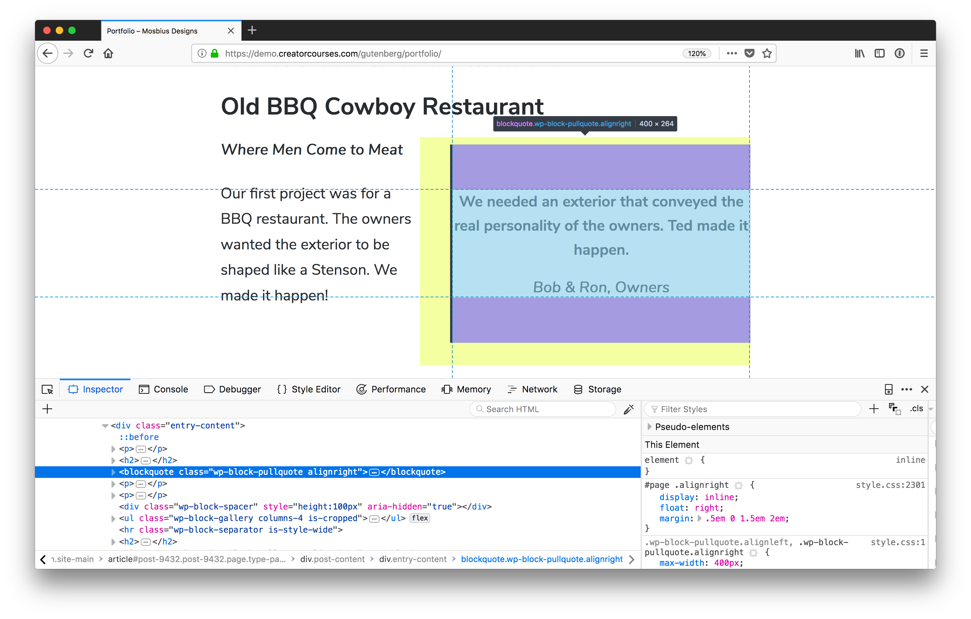
wp-block-pullquote.Now, it could get cumbersome to do that for each and every block you want to style, and luckily, there is a method to the madness. Gutenberg blocks use a form of the Block, Element, Modifier (BEM) naming convention. The main difference is that the top level for each of the blocks is wp . So, for our pull quote, the name is wp-block-pullquote. Columns would be wp-block-columns, and so on. You can read more about it in the WordPress Development Handbook.
Class name caveat
There is a small caveat here in that the block name may not be the only class name you’re dealing with. In the example above, we see that the class alignright is also applied. And Gutenberg comes with two new classes: alignfull and alignwide. You’ll see in our columns that there’s also a class to tell us how many there are. But we’ll get to that soon.
Applying your own class names
Gutenberg blocks also give us a way to apply our own classes:
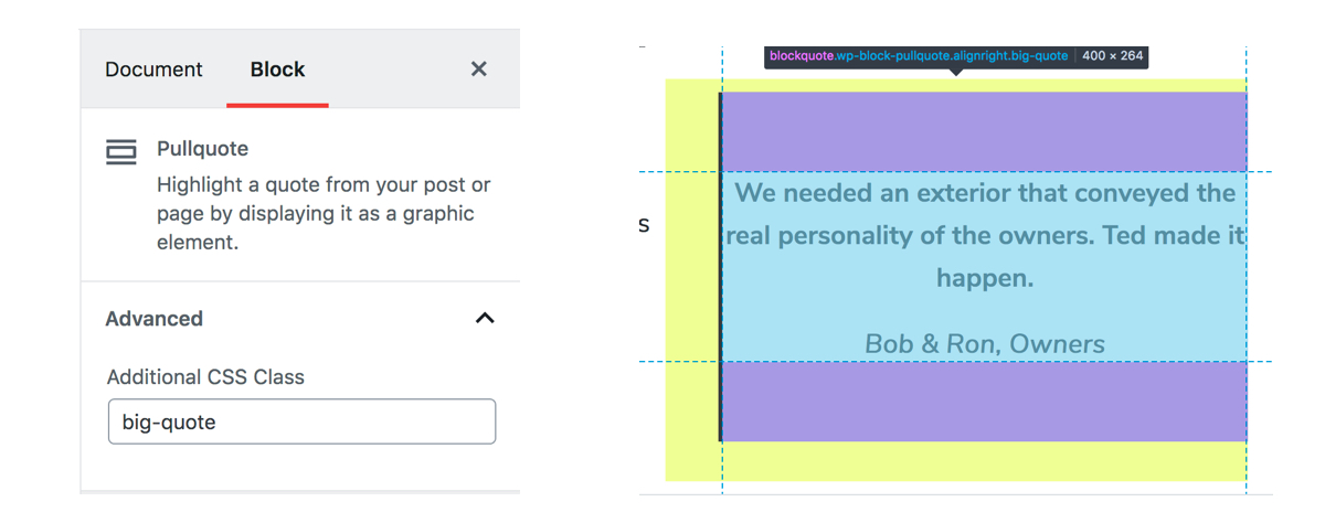
This is great if you want to have a common set of classes for blocks across different themes, want to apply previously existing classes to blocks where it makes sense, or want to have variations on blocks.
Much like the current (or “Classic”) WordPress post editor, Gutenberg makes as few choices as possible for the front end, leaving most of the heavy lifting to us. This includes the columns, which basically only include enough styles to make them form columns. So we need to add the padding, margins, and responsive styles.
Styling columns
Time to get to the crux of the matter: let’s style some columns! The first thing we’ll need to do is find a theme that we can use. There aren’t too many that have extensive Gutenberg support yet, but that’s actually good in our case. Instead, we’re going to use a theme that’s flexible enough to give us a good starting point: Astra.

Astra is a free, fast, and flexible theme that has been designed to work with page builders. That means that it can give us a really good starting template for our columns. Speaking of which, we need some content. Here’s what we’ll be working with:
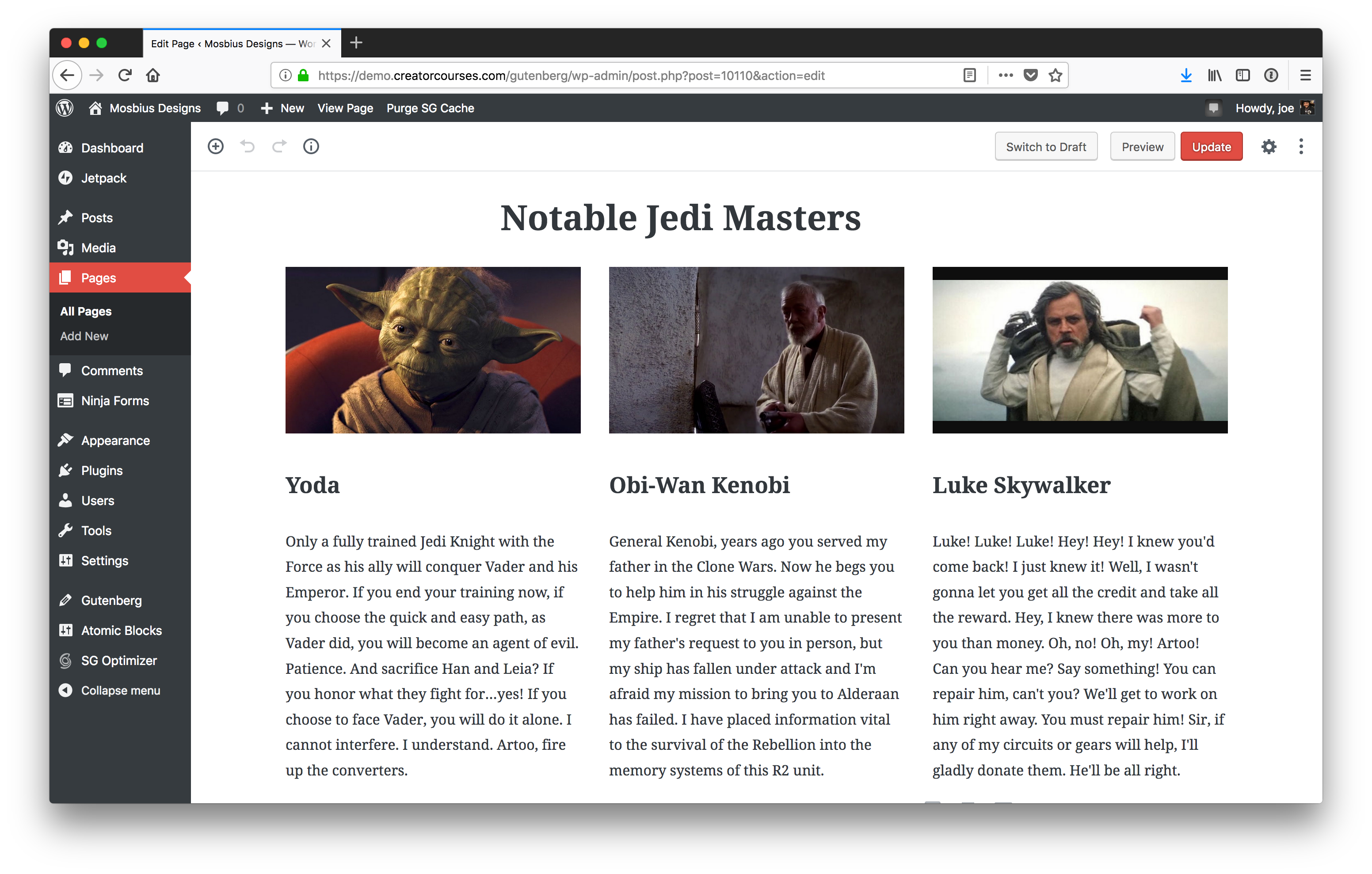
We have a three-column layout with images, headings, and text. The image above is what the columns look like inside the Gutenberg editor. Here’s what they look like on the front end:
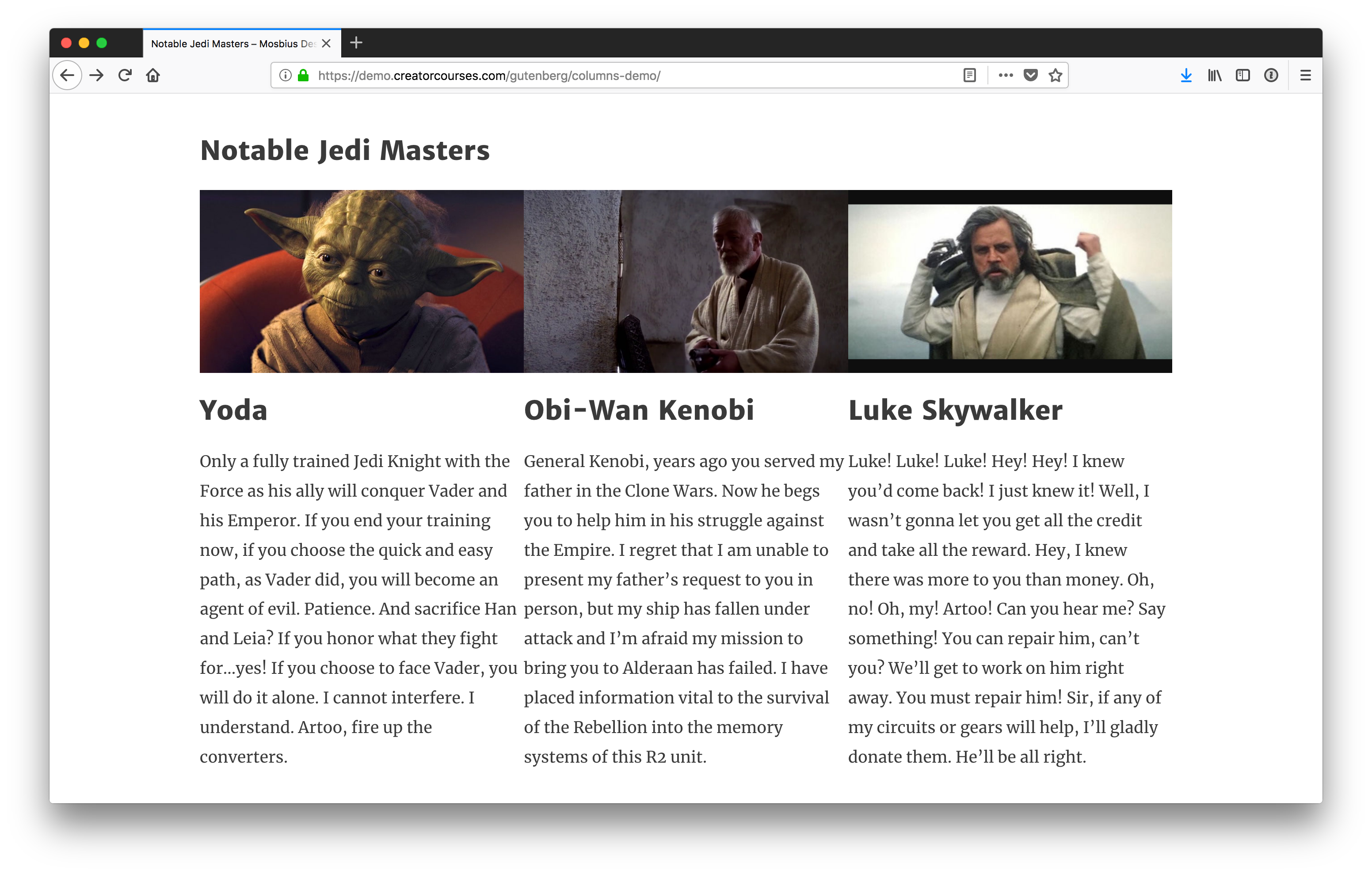
You can see there are a few differences between what we see in the editor and what we see on the front end. Most notably, there is no spacing in between the columns on the front end. The left end of the heading on the front end is also lined up with the left edge of the first column. In the editor, it is not because we’re using the alignfull class.
Note: For the sake of this tutorial, we’re going to treat .alignfull, .alignwide, and no alignment the same, since the Astra theme does not support the new classes yet.
How Gutenberg columns work
Now that we have a theme, we to answer the question: “how do columns in Gutenberg work?”
Until recently, they were actually using CSS grid, but then switched to flexbox. (The reasoning was that flexbox offers wider browser support.) That said, the styles are super light:
.wp-block-columns {
  display: flex;
}

.wp-block-column {
  flex: 1;
}
We’ve got a pen with the final styles if you want to see the result we are aiming for. You can see in it that Gutenberg is only defining the flexbox and then stating each column should be the same length. But you’ll also notice a couple of other things:
- The parent container is
wp-block-columns. - There’s also the class
has-3-columns, noting the number of columns for us. Gutenberg supports anywhere from two to six columns. - The individual columns have the class
wp-block-column.
This information is enough for us to get started.
Styling the parents
Since we have flexbox applied by default, the best action to take is to make sure these columns look good on the front end in a larger screen context like we saw earlier.
First and foremost, let’s add some margins to these so they aren’t running into each other, or other elements:
/* Add vertical breathing room to the full row of columns. */
.wp-block-columns {
  margin: 20px 0;
}

/* Add horiztonal breathing room between individual columns. */
.wp-block-column {
  margin: 0 20px;
}
Since it’s reasonable to assume the columns won’t be the only blocks on the page, we added top and bottom margins to the whole parent container so there’s some separation between the columns and other blocks on the page. Then, so the columns don’t run up against each other, we apply left and right margins to each individual column.
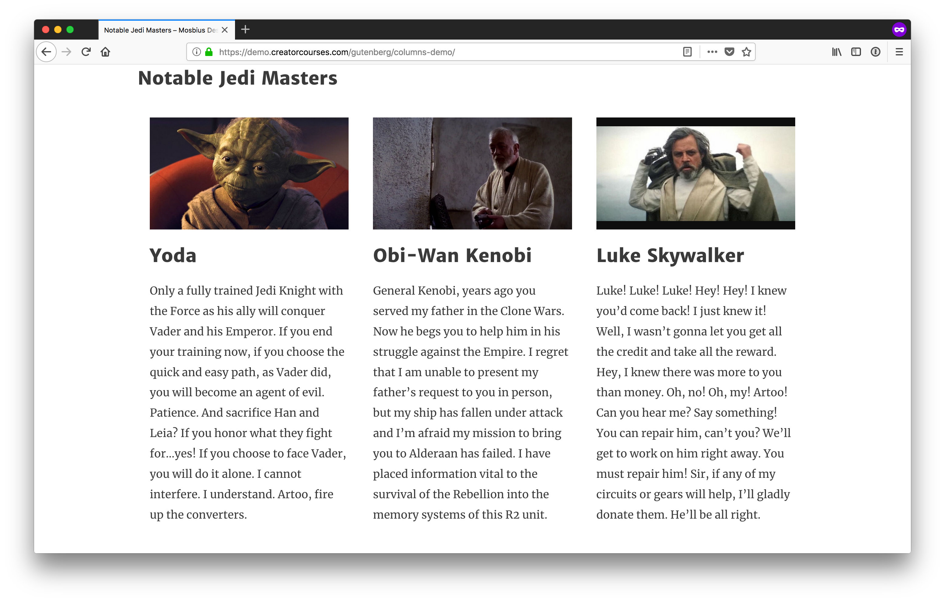
These are starting to look better already! If you want them to look more uniform, you can always throw text-align: justify; on the columns, too.
Making the columns responsive
The layout starts to fall apart when we move to smaller screen widths. Astra does a nice job with reducing font sizes as we shrink down, but when we start to get around 764px, things start to get a little cramped:
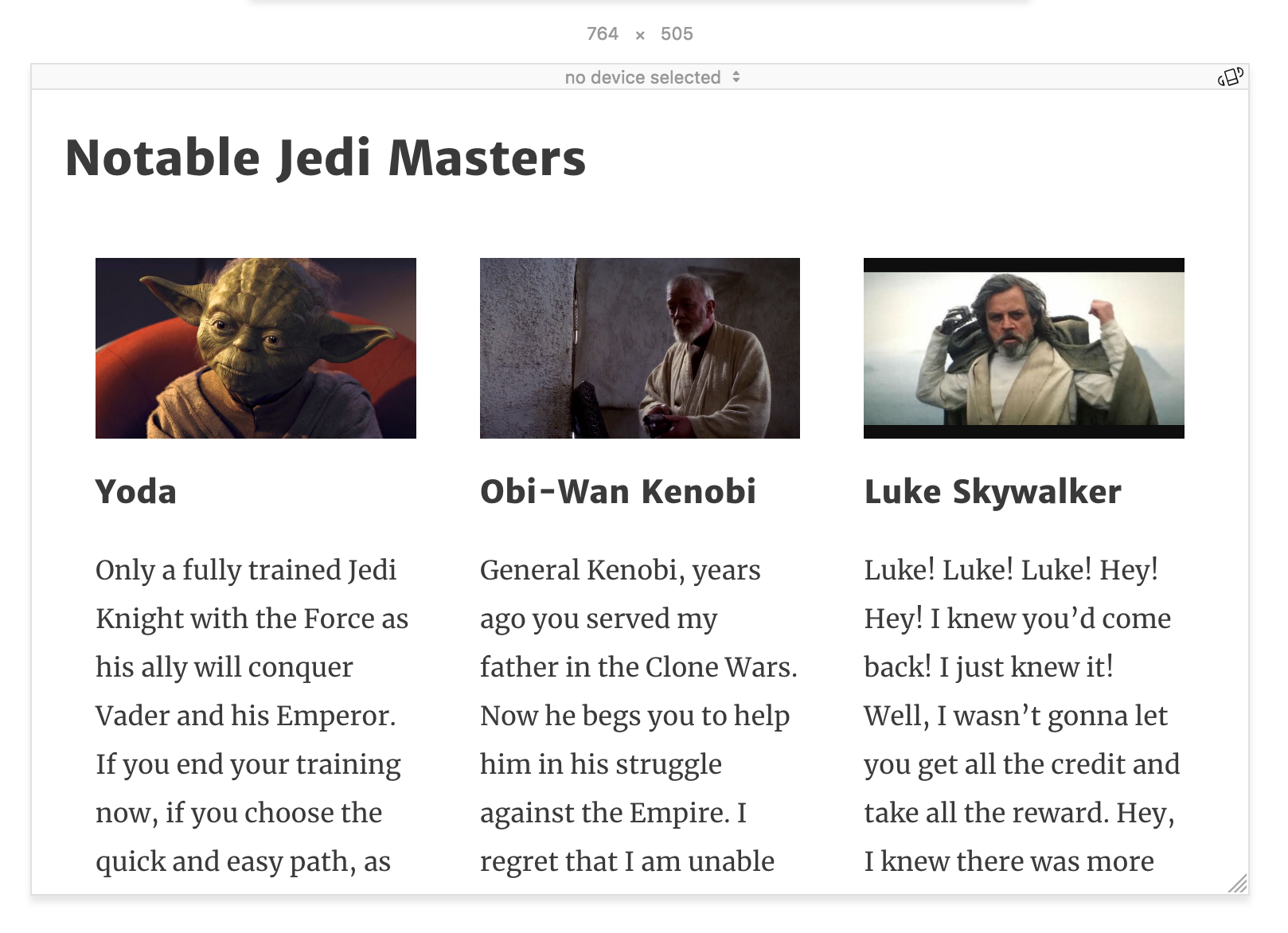
At this point, since we have three columns, we can explicitly style the columns using the .has-3-columns class. The simplest solution would be to remove flexbox altogether:
@media (max-width: 764px) {
  .wp-block-columns.has-3-columns {
    display: block;
  }
}
This would automatically convert our columns into blocks. All we’d need to do now is adjust the padding and we’re good to go — it’s not the prettiest solution, but it’s readable. I’d like to get a little more creative, though. Instead, we’ll make the first column the widest, and then the other two will remain columns under the first one.
This will only work depending on the content. I think here it’s forgivable to give Yoda priority as the most notable Jedi Master.
Let’s see what that looks like:
@media screen and (max-width: 764px) {
  .wp-block-columns.has-3-columns {
    flex-flow: row wrap;
  }

  .has-3-columns .wp-block-column:first-child {
    flex-basis: 100%;
  }
}
In the first few lines after the media query, we’re targeting .has-3-columns to change the flex-flow to row wrap. This will tell the browser to allow the columns to fill the container but wrap when needed.
Then, we target the first column with .wp-block-column:first-child and we tell the browser to make the flex-basis 100%. This says, “make the first column fill all available space.” And since we’re wrapping columns, the other two will automatically move to the next line. Our result is this:

The nice part about this layout is that with row wrap, the columns all become full-width on the smallest screens. Still, as they start to get hard to read before that, we should find a good breakpoint and set the styles ourselves. Around 478px should do nicely:
@media (max-width: 478px) {
  .wp-block-columns.has-3-columns {
    display: block;
  }

  .wp-block-column {
    margin: 20px 0;
  }
}
This removes the flex layout, and reverses the margins on the individual columns, maintaining the spacing between them as they move to a stacked layout.

Again, you can see all these concepts come together in the following demo:
See the Pen Gutenberg Columns by Joe Casabona (@jcasabona) on CodePen.
If you want to see a different live example, you can find one here.
Wrapping up
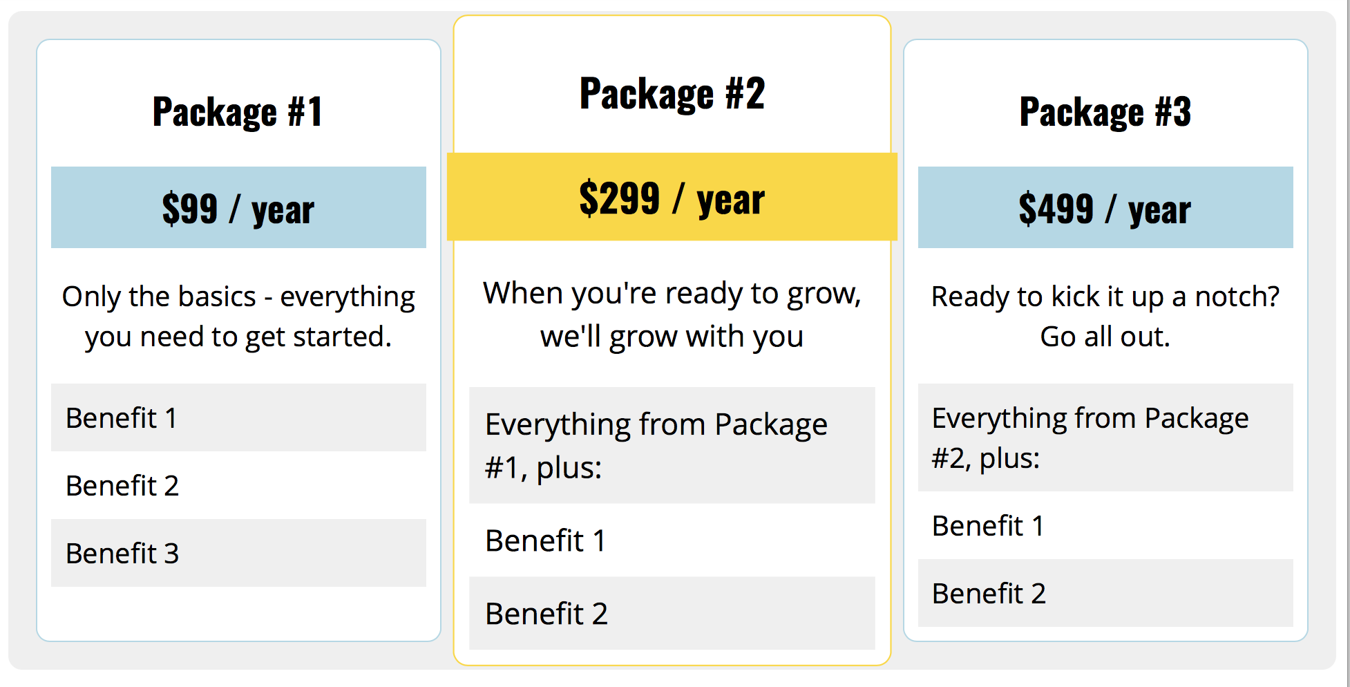
So, there you have it! In this tutorial, we examined how Gutenberg’s Columns block works, it’s class naming conventions, and then applied basic styles to make the columns look good at every screen size on the front end. From here, you can take this code and run with it — we’ve barely scratched the surface and you can do tons more with the CSS alone. For example, I recently made this pricing table using only Gutenberg Columns:
And, of course, there are the other blocks. Gutenberg puts a lot of power into the hands of content editors, but even more into the hands of theme developers. We no longer need to build the infrastructure for doing more complex layouts in the WordPress editor, and we no longer need to instruct users to insert shortcodes or HTML to get what need on a page. We can add a little CSS to our themes and let content creators do the rest.
If you want to get more in-depth into preparing your theme for Gutenberg, you can check out my course, Theming with Gutenberg. We go over how to style lots of different blocks, set custom color palettes, block templates, and more.
The post Styling the Gutenberg Columns Block appeared first on CSS-Tricks.